The A+Product Awards is open for entries, with a Main Entry Deadline of June 24th. Get started on your submission today!
Deconstructivism is one of the most divisive architectural styles. The style and the corresponding movement emerged in the 1970s and became known in the 1980s with projects around the world by Peter Eisenman, Frank Gehry, Zaha Hadid, Rem Koolhaas and Bernard Tschumi etc. Several architects associated with the discipline-shattering movement are still highly active or have their influences long-lasting today, although their practices have undoubtedly evolved.
Yet, when it comes to describing deconstructivism, the term remains somewhat elusive. Buildings under this umbrella follow no specific forms and methodology, yet they can be seen as a reaction against the central tenets of modernism and classical architecture. The resulting buildings often seem extraterrestrial that so different from their ordinary surroundings.
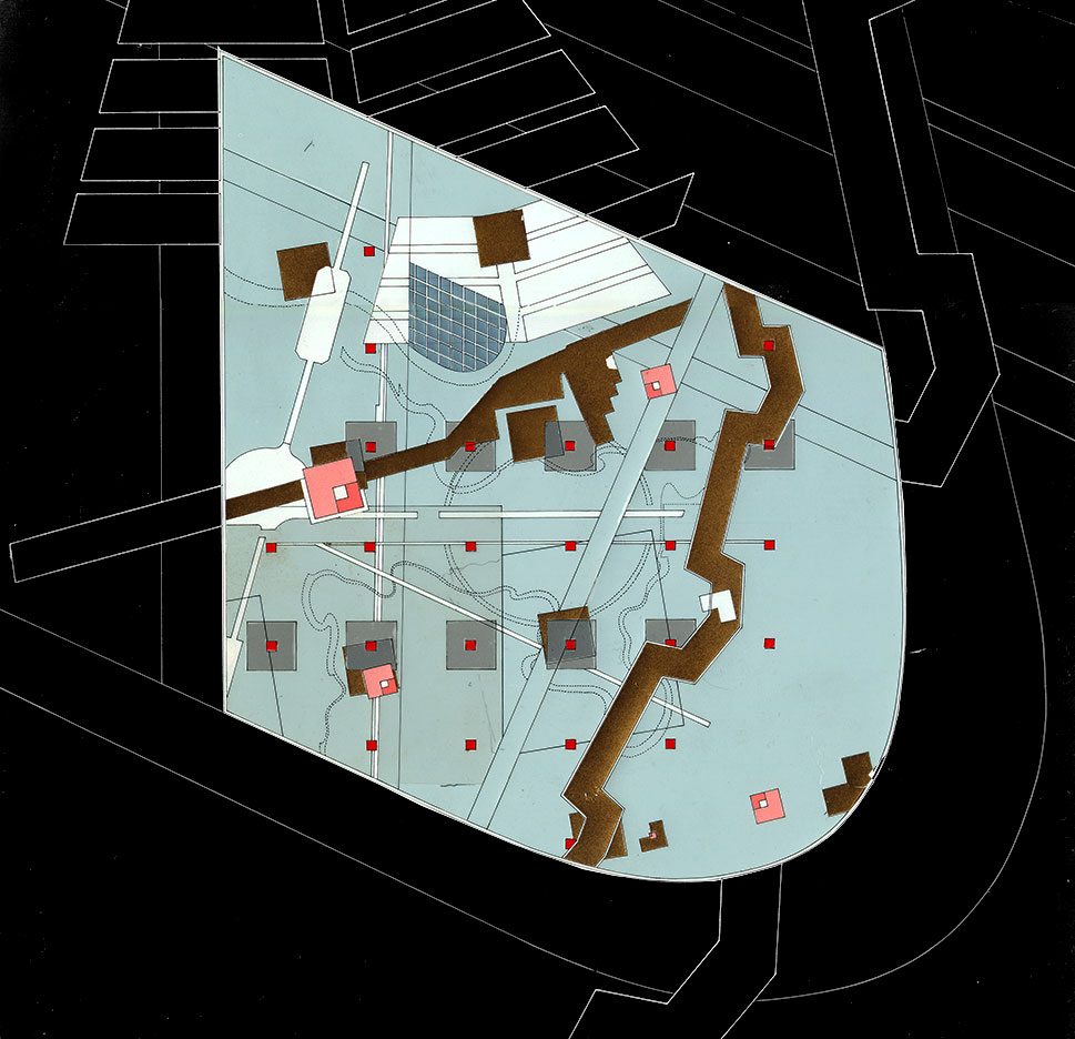
Eisenman Architects, La Villette, Paris, France, 1987. © Eisenman Architects.
Jacques Derrida and Peter Eisenman
The movement was rooted in the influential theories — that originated in the field of literature — by the philosopherJacques Derrida, of whom Eisenman was a close friend. Eisenman then translated Derrida’s ideas into architecture, for example, from chora (driven from Plato’s theory by Derrida) to absence and presence.
The philosopher and the architect were invited by Bernard Tschumi to design a garden in Parc de la Villette. With the design, they deeply investigated how to represent the unrepresentable. Beyond this, they not only contemplated how to represent the void, but also how to make emptiness meaningful — a delayed reaction to the horrors of World War Two, made possible by the machine-age technology that modernists had embraced in a utopian light. Although this project was never fully materialized, the investigation was rich enough to grow into the publication Chora L Works.
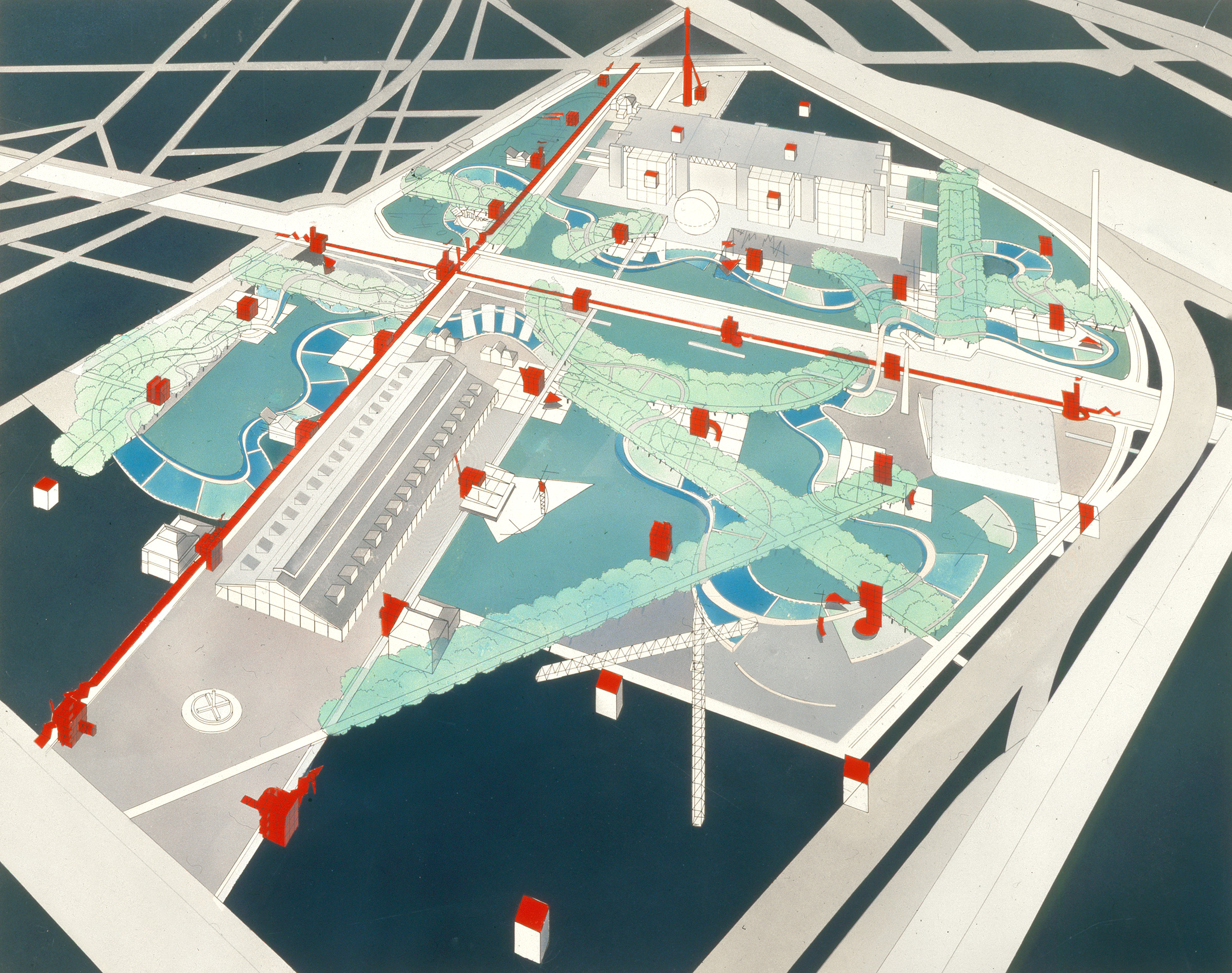
Perspective drawing of Parc de la Villette © Bernard Tschumi Architects.
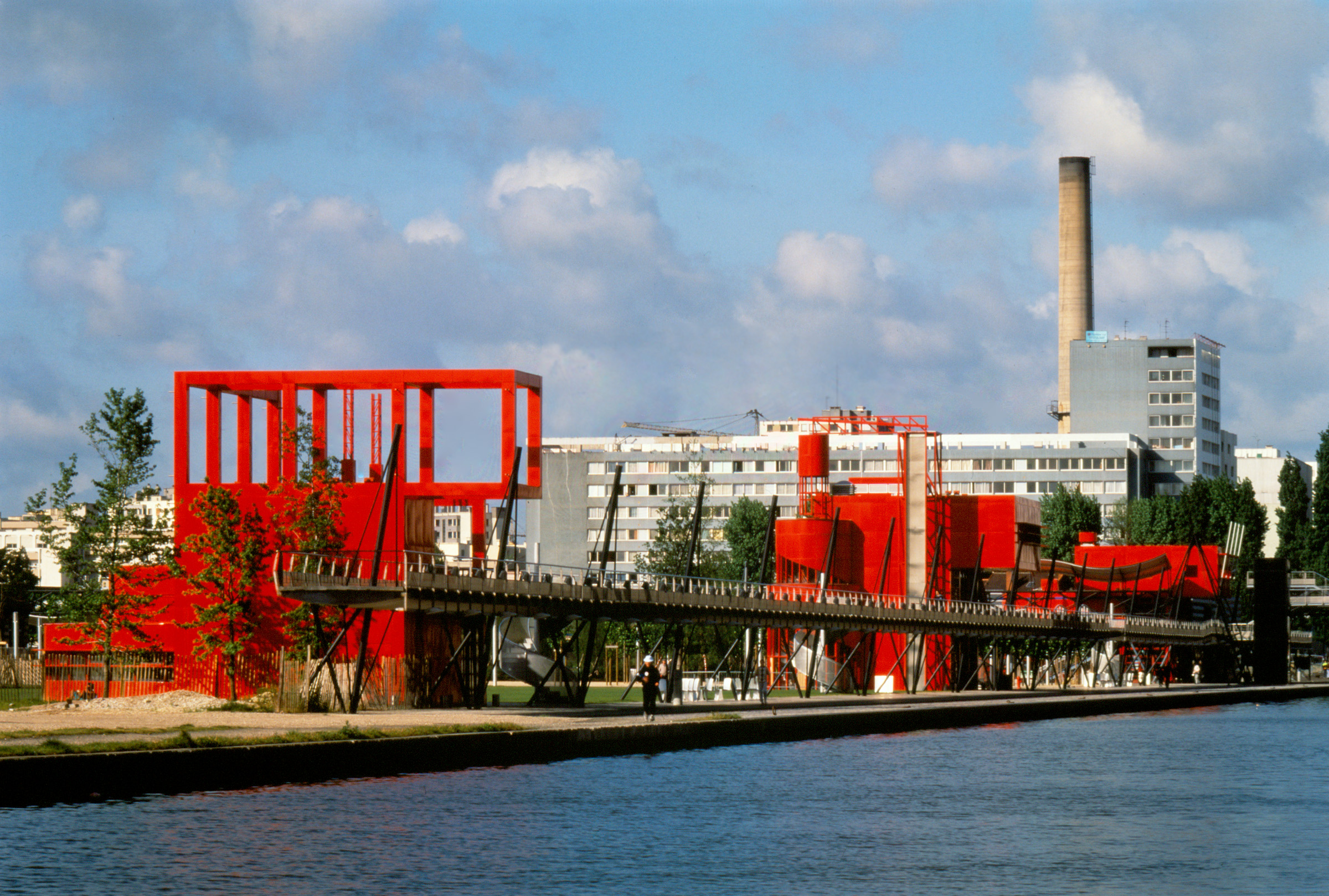
A look of Parc de la Villette from across the river, photo by Peter Mauss/Esto, courtesy of Bernard Tschumi Architects.
Bernard Tschumi
Parc de la Villette by Bernard Tschumi is believed the first built Deconstructivist project. The massive park consists of a group of buildings, walkways, bridges, gardens and more planned across a surprisingly large site in the City of Light.
The project encompasses buildings neatly placed in a matrix and a walkway system from a plan view. The walkways are in straight lines, arcs and curves that spread in a seemingly random manner and force no particular circulations. The red enameled steel buildings have no clear meaning either in themselves or from one to the next.
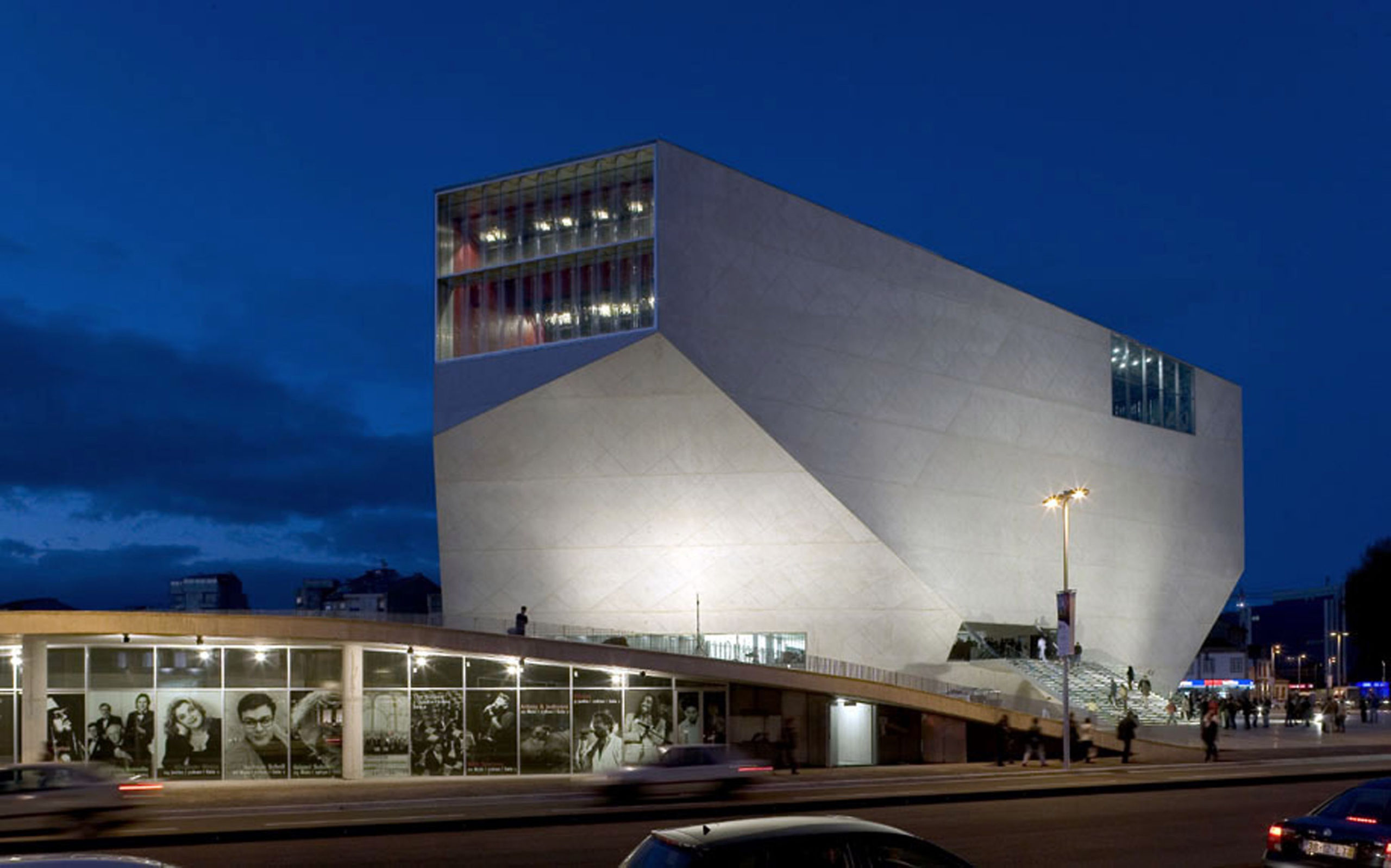
Exterior of Casa da Musica by OMA, Porto, Portugal
Rem Koolhaas
With hard-edged facets of different shapes, Koolhaas’s architecture is like cubism in three dimensions. The form can be rather simple, such as Casa da Musica. The skin made of white concrete folds into an irregular geometry that resembles an ore as well as a ship – but nothing that can be recognized exactly. The placement of glazing is unpredictable and even by seeing what’s behind the windows, the spatial arrangement of the concert hall remains unclear.
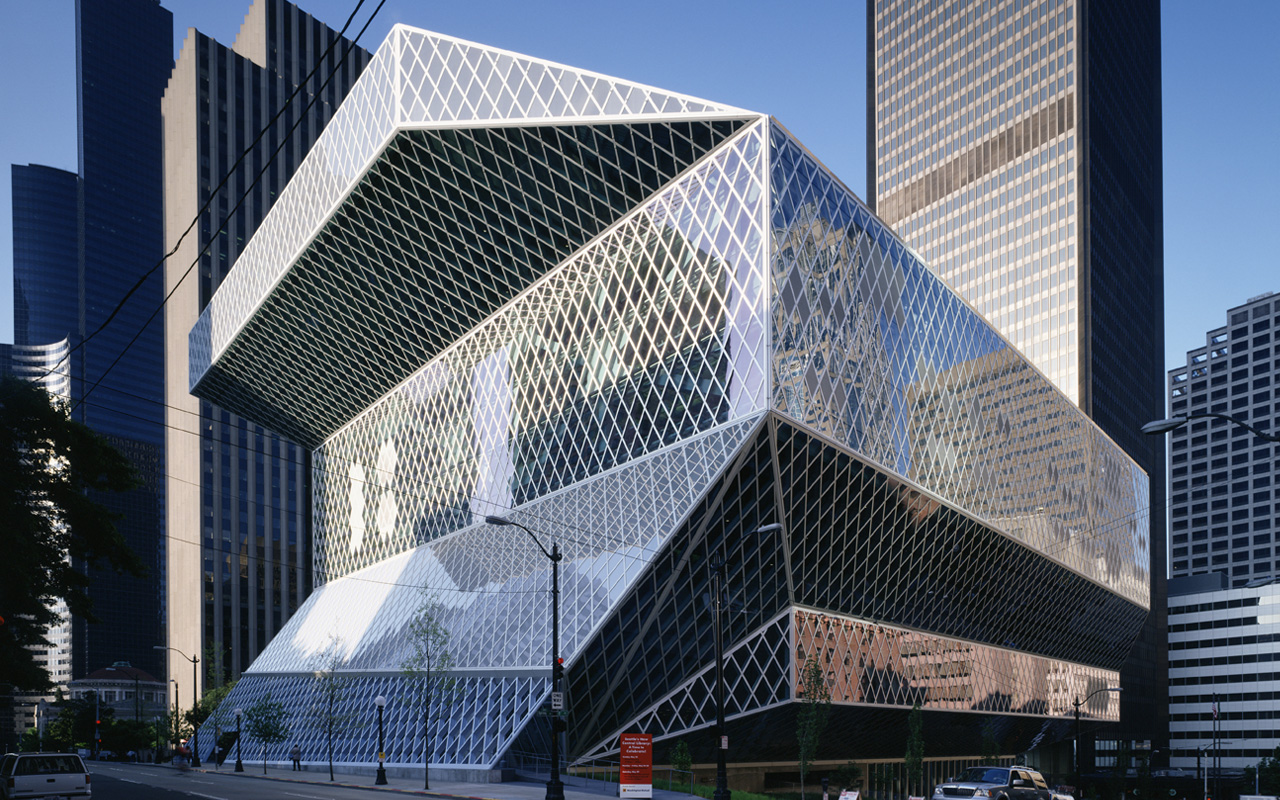
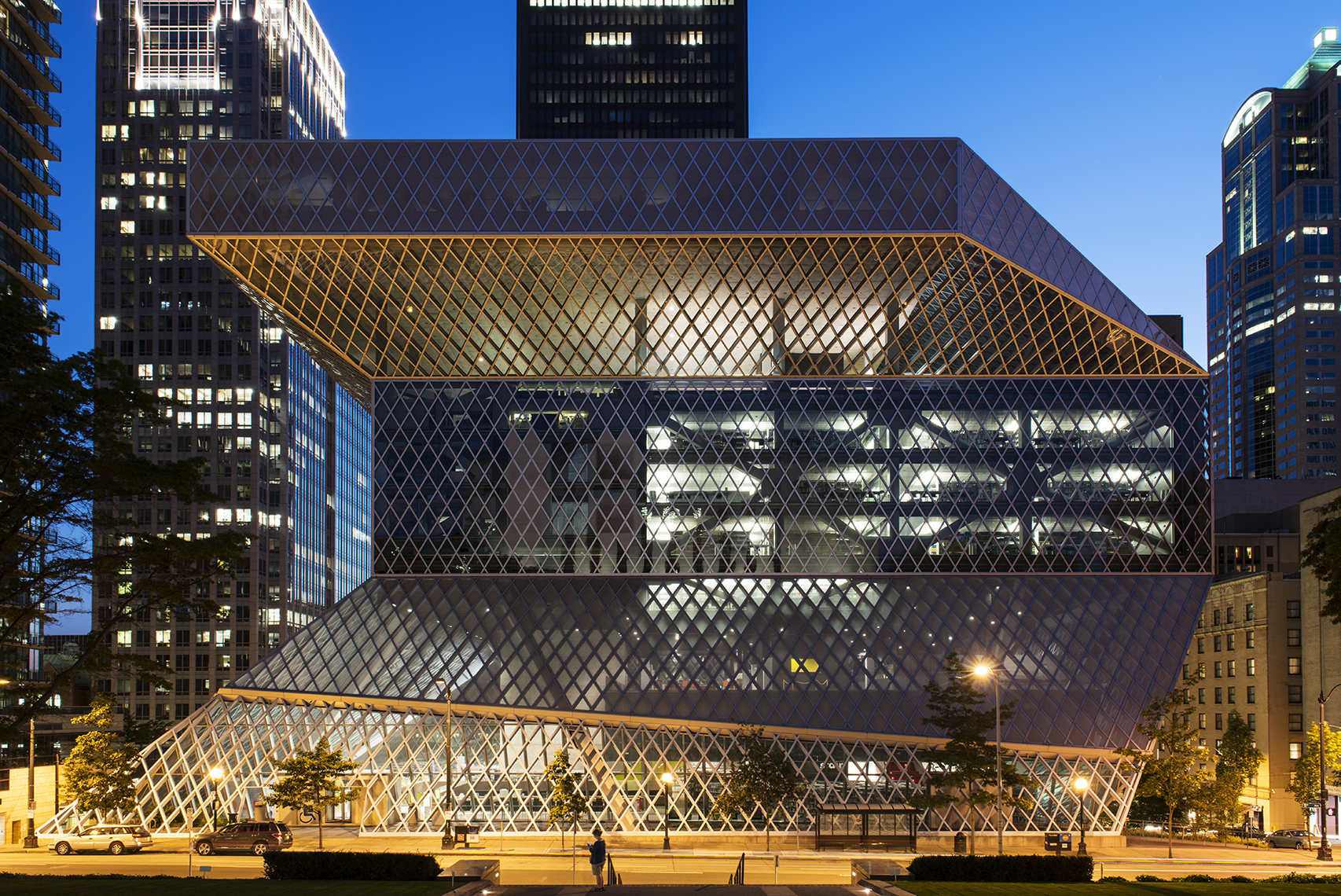
Day and night view of Seattle Central Library by OMA, Seattle, Washington.
There are complicated forms like that of Seattle Library as well. The form reminds people nothing of a library building. It is hard to tell from its appearance the function of the building at all. During the night, when the glass skin is lit from the inside, the spaces are revealed, surprising yet reasonable that are not betraying the overall form.
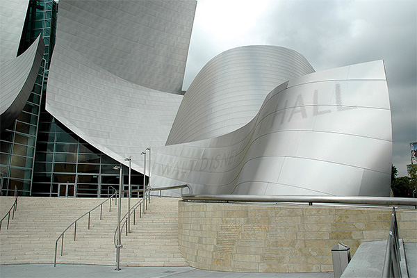
Exterior of Walt Disney Concert Hall by Gehry Partners, L.A., California.
Frank Gehry
Gehry’s style is unforgettable and probably the easiest to associate with “radical.” Famous for drawing laconic sketches on napkins and other such items, his costly public structures, covered in distorted metal panels, instantly became landmarks once built.
The metal skin can be solid, hiding everything inside, like that of Walt Disney Concert Hall. Similar to Koolhaas’s buildings, you can read nothing specific from the form since the form does not follow functions. The plan behind the crazy skin is extraordinary, too. Walls can run perpendicular to each other while turning freeform a few steps away.
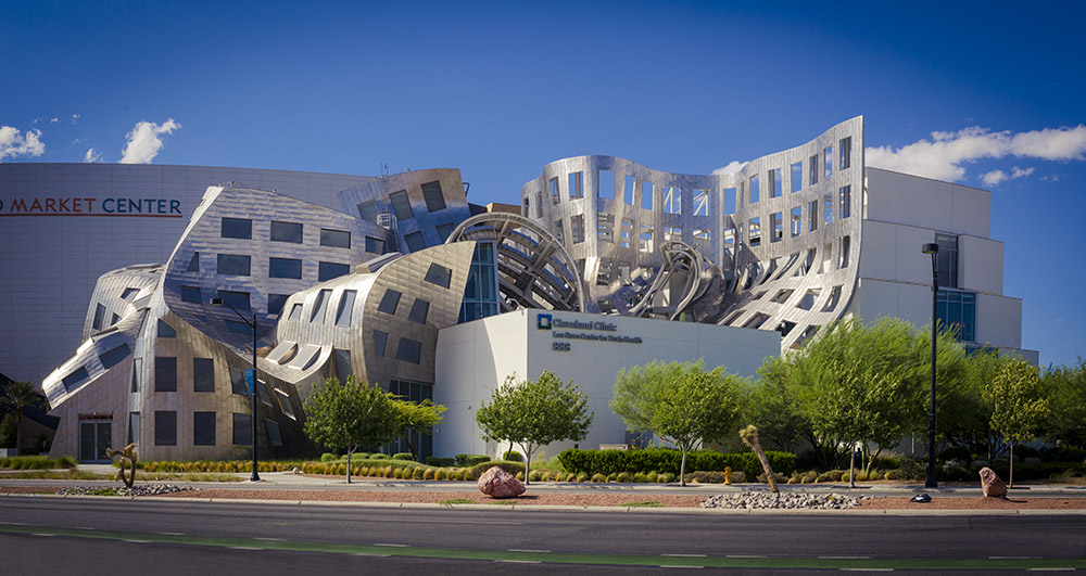
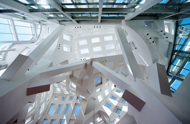
Exterior and interior of Lou Ruvo Center for Brain Health by Gehry Partners, Las Vegas, Nevada
Or, the appearance can be like Lou Ruvo Center for Brain Health, where regular façades with rectangular windows in lines are distorted into extreme forms. It is like Dali’s drawing, building up a surreal atmosphere by deforming ordinary objects of everyday life. Some of the distorted facades are “real”, sheltering spaces underneath. Some are rather “fake”, being simply massive shapes that fly above the head. The building is disassociating “facades” with the function of sheltering and enclosing.
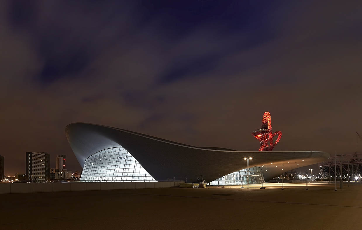
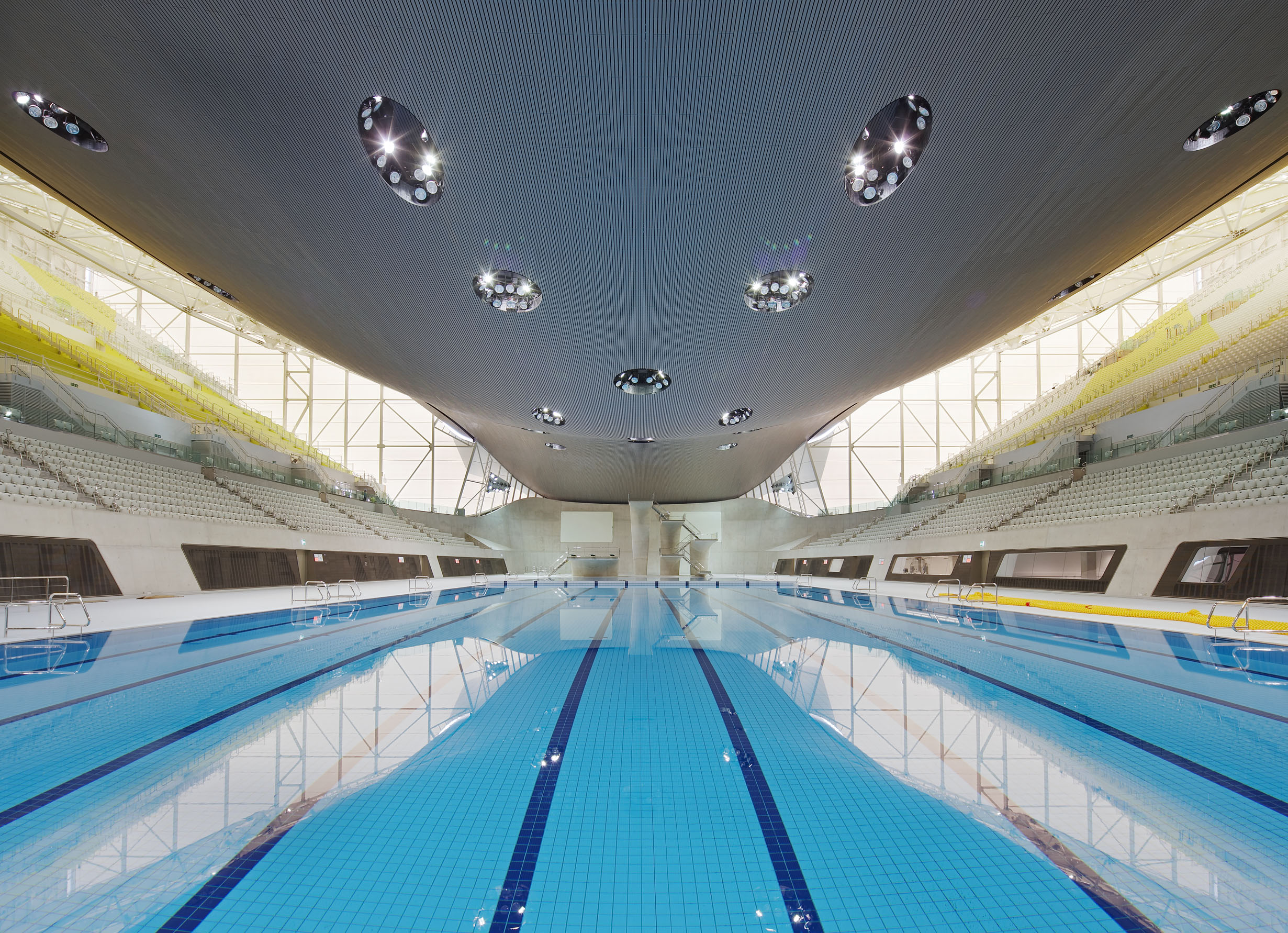
Exterior and interior of London Aquatics Centre by Zaha Hadid Architects, London, England
Zaha Hadid
Featured by smooth surfaces and skew shapes rounded at the corners, Zaha Hadid’s buildings possess a futuristic feeling. They are non-referential to the architectural style of any region and any generation, resulting in the buildings appearing often alien to their surroundings. The fluid forms sometimes recall natural existence, though that likeness stays only for a second.
For example, London Aquatics Centre, which was originally built for the London 2012 Olympic Games, has a shell-like roof. The massive roof is grounded at three points, all at the ends of the structure, creating a column-less interior. The three feet are hidden by other structures. The roof is therefore uninterrupted and looks like something soft that falls on top of the building.
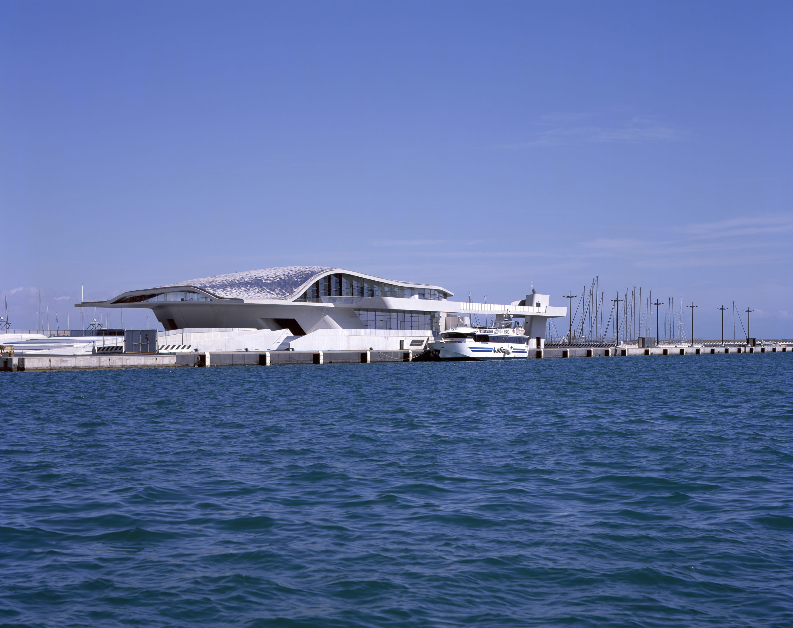
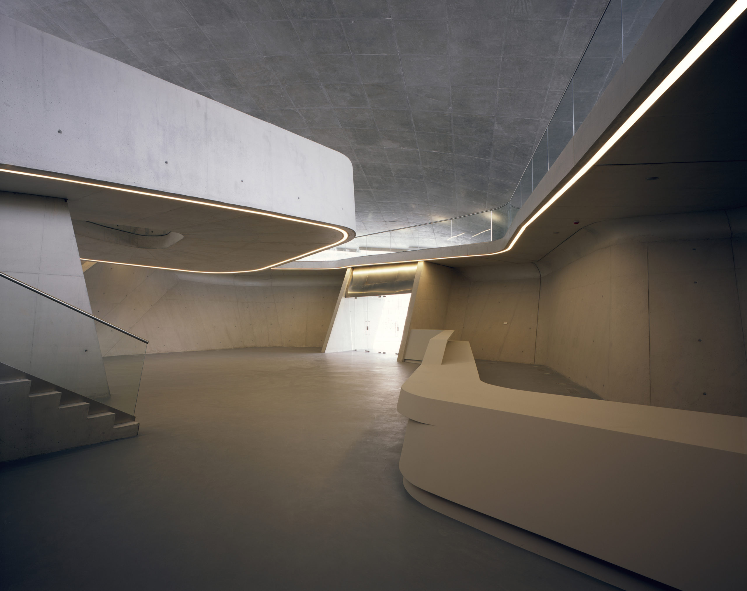
Exterior and interior of Salerno Maritime Terminal by Zaha Hadid Architects,Salerno, Italy
Salerno Maritime Terminal is more “solid” than the Aquatics Centre. It is shaped like a manta on the upper half, while a steady lower part makes it resemble a spaceship in sci-fis. The mosaic on the roof appears like the reflection on the inner side of an oyster.
None of the above architects has style alike. Rather, their style seems personal and non-referential. The forms are free from stereotypes of functional spaces following certain looks. More radically, even the traditional logic of spatial arrangement is challenged, e.g. in Parc de la Villette. They break the box of modernism, bringing contemporary architecture to a larger stage of experimentation.
The A+Product Awards is open for entries, with a Main Entry Deadline of June 24th. Get started on your submission today!

