Local studio Best Practice Architecture has used punchy colours, glass bricks and dichroic glass inside an optometry store in Seattle’s Leschi neighbourhood.
For Eye Eye‘s second location, founder Will Pentecost got back in touch with Best Practice Architecture, which had completed the brand’s first brick-and-mortar store back in 2015.
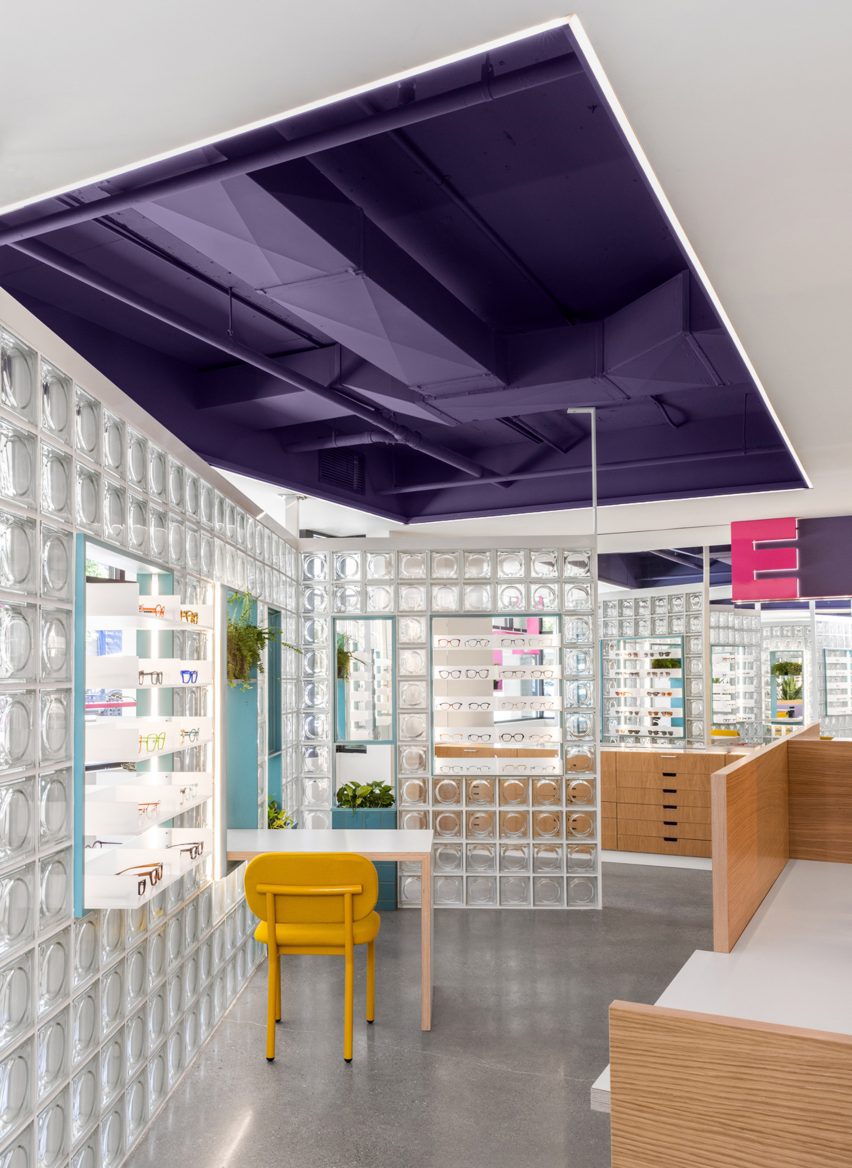
Unlike the inaugural space, the new store does not benefit from tall ceilings and a strong street presence.
So the architects had to get creative to turn the “drab” commercial building into a fun and inviting environment.
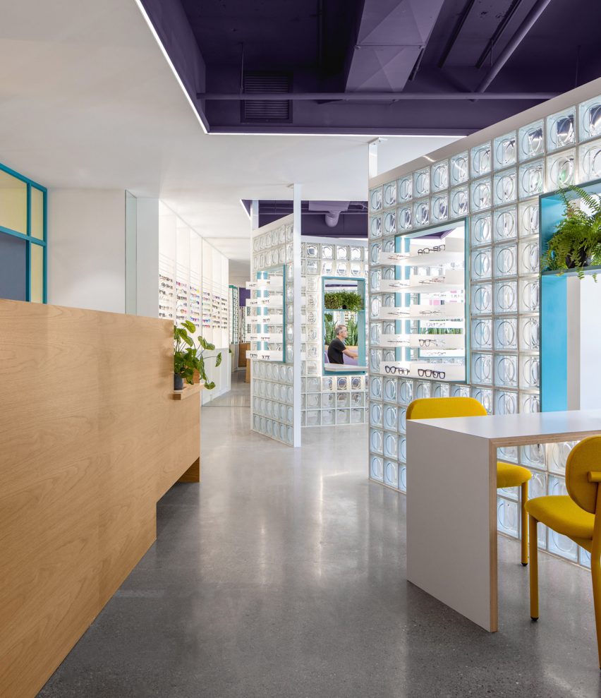
“The client gave Best Practice free range to transform the interior with only three requests: include glass blocks, use lit signage, and incorporate design language from the original location without being too repetitive,” said the studio.
The retail area is situated at the front of the space, facing the street through large windows, while the examination rooms and staff facilities can be found at the back.
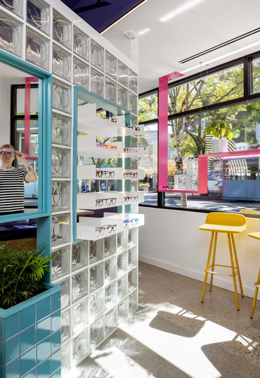
The specified glass blocks are used to divide the store, forming angled walls with openings that feature mirrors, product displays and furniture that spans both sides.
“Carefully placed to create an interesting circulation flow and contrast with the orthogonal layout, the clever design provides both form and function, welcoming filtered daylight deep into the space while accommodating basic retail needs,” said Best Practice.

Cutouts in the low ceiling add extra height and expose ductwork that is painted purple – a hue that’s repeated in the upholstery of a banquette tucked in the corner for consultations.
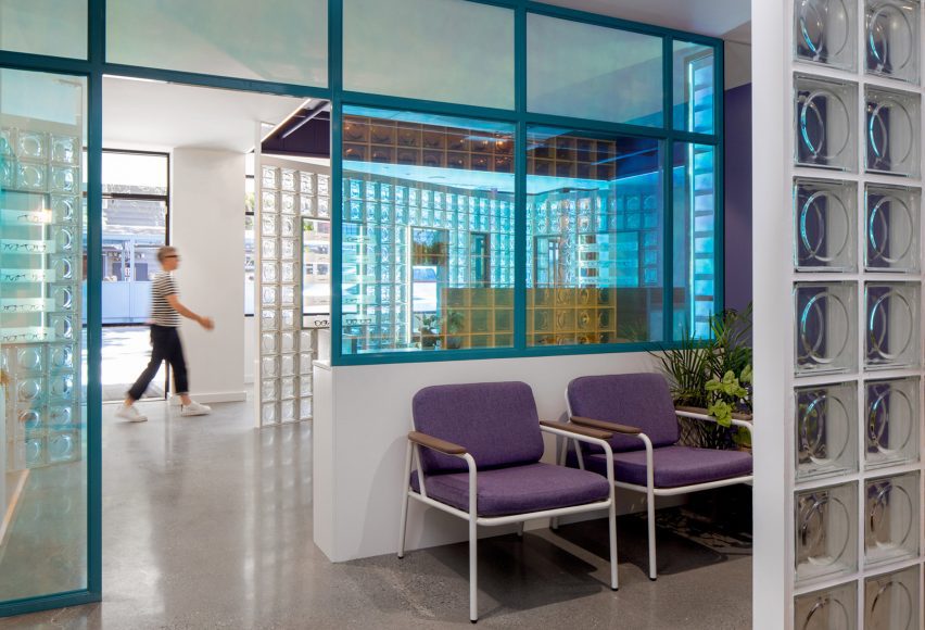
More purple covers the walls in the examination reception area, which is separated from the store by a screen of dichroic glass that changes colour depending on the angle from which it’s viewed.
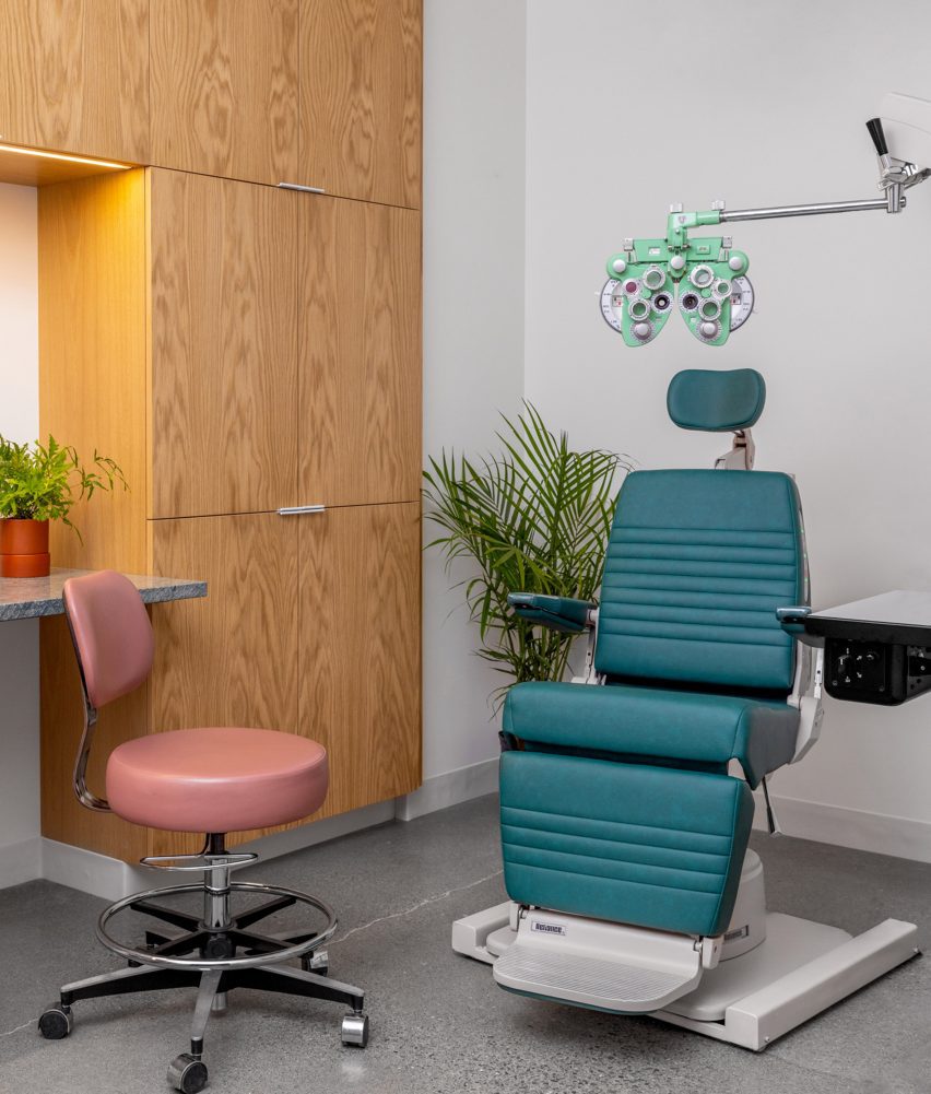
The glass blocks appear again as a partition between the clinic reception and the exam rooms behind, which are outfitted with custom medical equipment and wood cabinetry.
Signage that echoes the original Eye Eye branding is also installed in the retail space, including a concentric circle that echoes vintage eye tests and two large “E” letterforms.
“With this new space, Best Practice brings Eye Eye’s vision to life once again through an exploration of materiality, the patient experience, and a fresh take on a commercial space,” said the studio. “It’s an eye care clinic reimagined.”
Founded in 2011 by Ian Butcher, Best Practice Architecture has completed a variety of projects in and around its home city of Seattle.
These range from updating a historic bungalow and transforming a storage shed into backyard studio, to designing a men’s footwear store.
The photography is by Rafael Soldi.
Project credits:
Architect: Best Practice Architecture
Design team: partner in charge: Kailin Gregga; partner/principal architect: Ian Butcher; lead designer/project architect: Sarah Smith
Contractor: Metis Construction
Graphics and branding: Drew Hamlet
Custom signage: Western Neon
Custom casework: Creoworks

