red bricks shape out a modern bakery cafe by sukchulmok
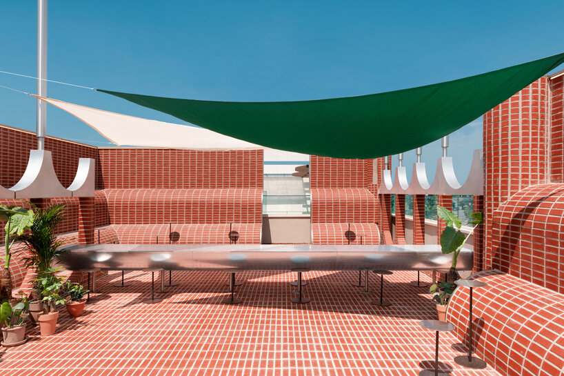
Design practice sukchulmok constructs ‘parconido’ bakery cafe in northern Gyeonggi-do, South Korea, utilizing subtle contemporary materials and shaping simple rounded forms. The cafe presents a consistent space in which forms, furniture, and lighting are designed to create a unified atmosphere. The project draws from ‘European’ architectural elements applying red brick in combination with stainless steel.
The structure develops in layers ‘stuck one by one’ with columns that surge everywhere and rounded walls wrapping the open layout. Although the walls and columns compose different shapes, they all present a radius of 600 mm. Following this design rule that acts as a reference point throughout the construction, the project generates a sense of unity while still avoiding monotony. The contemporary café is built out of stacked clay bricks with no holes, that are cut off by two-thirds of the thickness and form a coating skin on an iron frame to relieve the load.
all images by hong seokgyu
smooth edges and round shapes generate a sense of expansion
The furniture, manufactured in perfect circles, is appropriately blended into the space in various forms, such as concrete castings, combined wooden textures, and overlapping circular pipes. The fittings highlight the round spaces while travertine limestone, usually suitable for the fountains in squares of Europe, is designed to cover the floor, walls, and ceiling of the rooms. The angles in the indoor space are smoothed out in round shapes blurring the boundaries of each zone and generating an illusion of expansion and weightlessness.
The mixture of the three main materials, red brick, travertine, and wood, adorns the interior space in warm tones. All fittings and fixtures are custom-made and produced to fit the unique rounded design of the café.
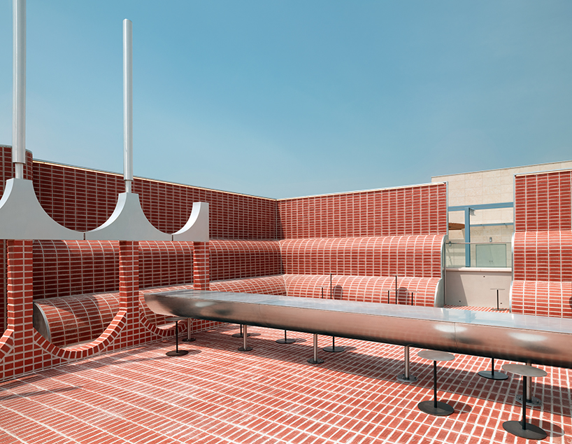
stacked clay bricks are cut off by two-thirds of the thickness forming a coating skin on the iron frame
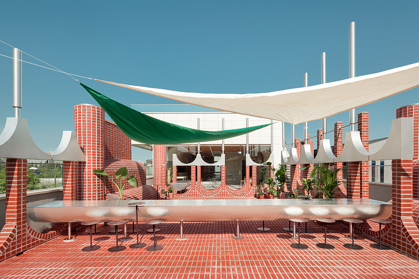
an elongated form of stainless steel shapes up an outdoor table
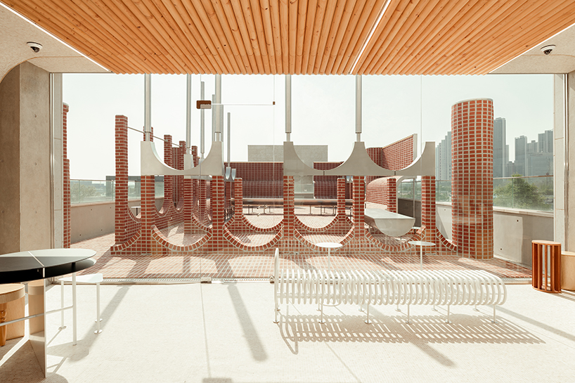
on the third floor, a terrace can be seen following the extended passageway
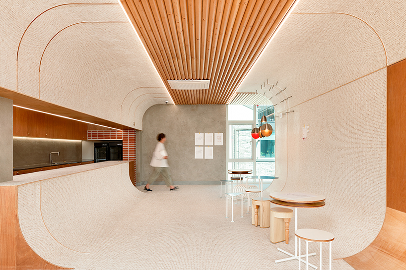
a sense of expansion and uniformity is adjusted both vertically and horizontally through curved forms

