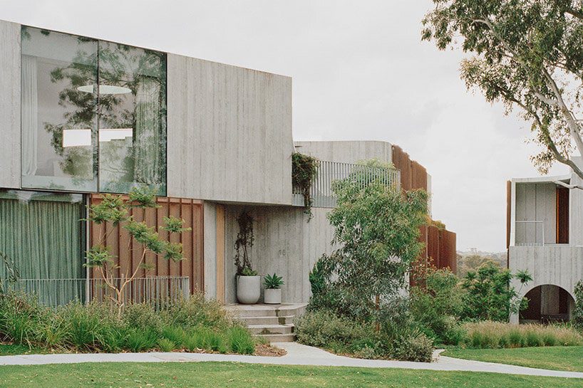
fenwick st: design-focused homes for hew, australia
Melbourne-based architecture studio Edition Office presents Fenwick St, a newly completed residential development situated on the edge of the Birrarung/Yarra River in Kew, Australia. This location offers unobstructed connections to breathtaking landscapes rarely found in such close proximity to the city. With the site surrounded by well-preserved 1950’s and 1960’s post-war houses, the architects sought to create the concrete complex as a contextually sensitive addition that balances density with visual porosity, while ensuring a connection to the lush natural surroundings.
 images © Rory Gardiner | @arorygardiner
a trio of residential pavilions
To maintain a strong connection to the distant vista while preserving the link between Fenwick St and the public realm, Edition Office emphasized drawing these connections deep into the plan and through the site to the street. In order to achieve this, the architects designed three visually independent pavilions rather than a single large structure. This approach allowed for a balance of similar scaled forms with neighboring houses and enabled the framing of views within the site itself.
The pavilions, connected by a common basement, were strategically positioned to optimize the site’s characteristics. Located at a sharp bend in the street, the split between the pavilions occurs at the fulcrum, creating a dynamic arrangement. As the pavilions extend past the site, they lower in scale at the street level, aligning with the neighboring residences, while gradually increasing in height as they integrate with the terrain leading to the escarpment.
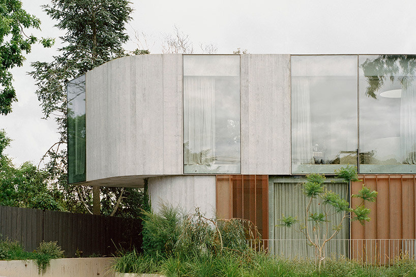
nine new dwellings are created on a site that previously accommodated only one
edition office Integrates the lush landscape
The living spaces within Fenwick St were carefully planned to open towards the north, the river, and the valley, allowing the distant landscape to become an integral part of the internal experience. Circulatory paths were strategically designed to draw the surrounding environment deep into the plan, while bedrooms and ancillary spaces opened to the green spaces between pavilions, offering views through a copper mesh privacy veil. This nature inspired the team to blend the architecture into into its surroundings, with landscape designed by Eckersley Garden Architecture.
The need to anchor the building into the site led to a construction that appears rooted to the ground. By slightly shifting and rotating each floor plate, movement was introduced to the shear walls, softening the overall mass and scale. Copper screening was used to bring delicacy to the purposefully heavy pre-cast concrete construction, with the screens expected to age gracefully over time.
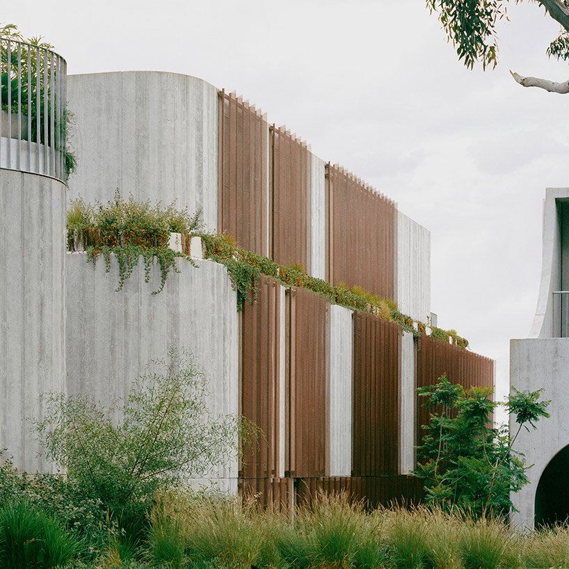
copper screening delicately balances the heavy pre-cast concrete construction
In addition to connecting with the landscape, creating light-filled private spaces filled with comfort and attention to detail was a key driver for Edition Office in the design of Fenwick St. Flack Studio, responsible for the interiors, imbued the spaces with warmth, calmness, and moments of dramatic nuance. Material tactility and the evolving patina of surfaces, such as the weathering copper screens and the maturation of the surrounding gardens, added depth and character to the interiors. The careful craftsmanship of junctions and thresholds enhanced the joy of navigation throughout the spaces.
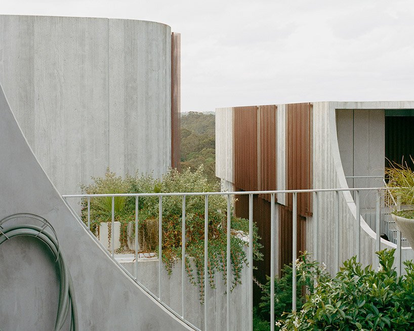
the complex takes shape as three visually independent pavilions rather than a single large structure
The project brief called for the creation of nine new dwellings on a site that previously accommodated only one. In order to respect the immense environmental and cultural value of the location, Edition Office aimed to minimize the perceived mass of a single large volume. Instead, the design resulted in three distinct forms that conform to the domestic patterns and scale of the existing streetscape. These wedge-shaped pavilions meet at their narrowest points, creating moments of architectural exuberance and unobstructed sight-lines both within the site and towards the horizon.
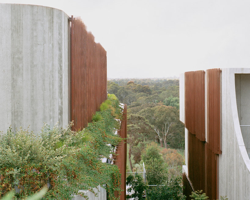
the environment is drawn deep into the plan, while interiors open to the in-between green spaces

