Architizer is thrilled to announce the winners of the 11th Annual A+Awards! Interested in participating next season? Sign up for key information about the 12th Annual A+Awards, set to launch this fall.
Designing industrial buildings, particularly factories, is usually a process that is dominated by the complicated functional and logistical requirements that limit architects creatively, overpowered by the technical specifications of the machinery and the production lines that occupy the entirety of the building space and leave little space for the form to develop beyond the functional limitations.
That being said, one would ask, What comes first? Form or Function?
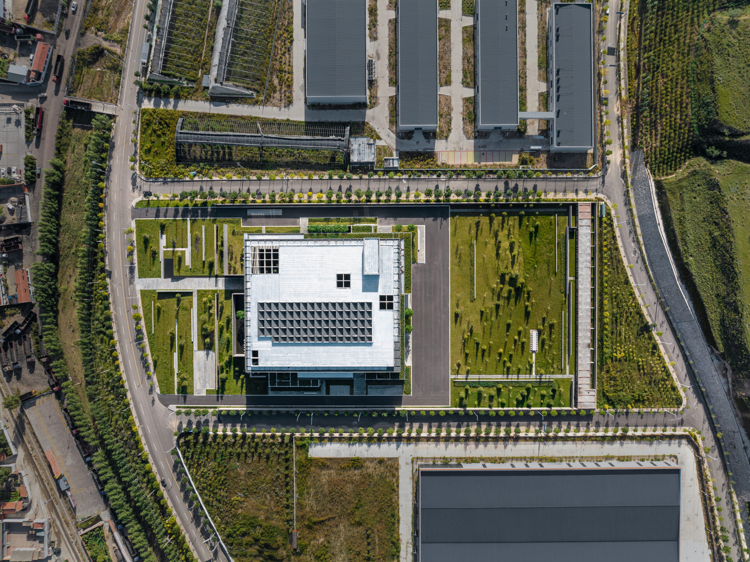
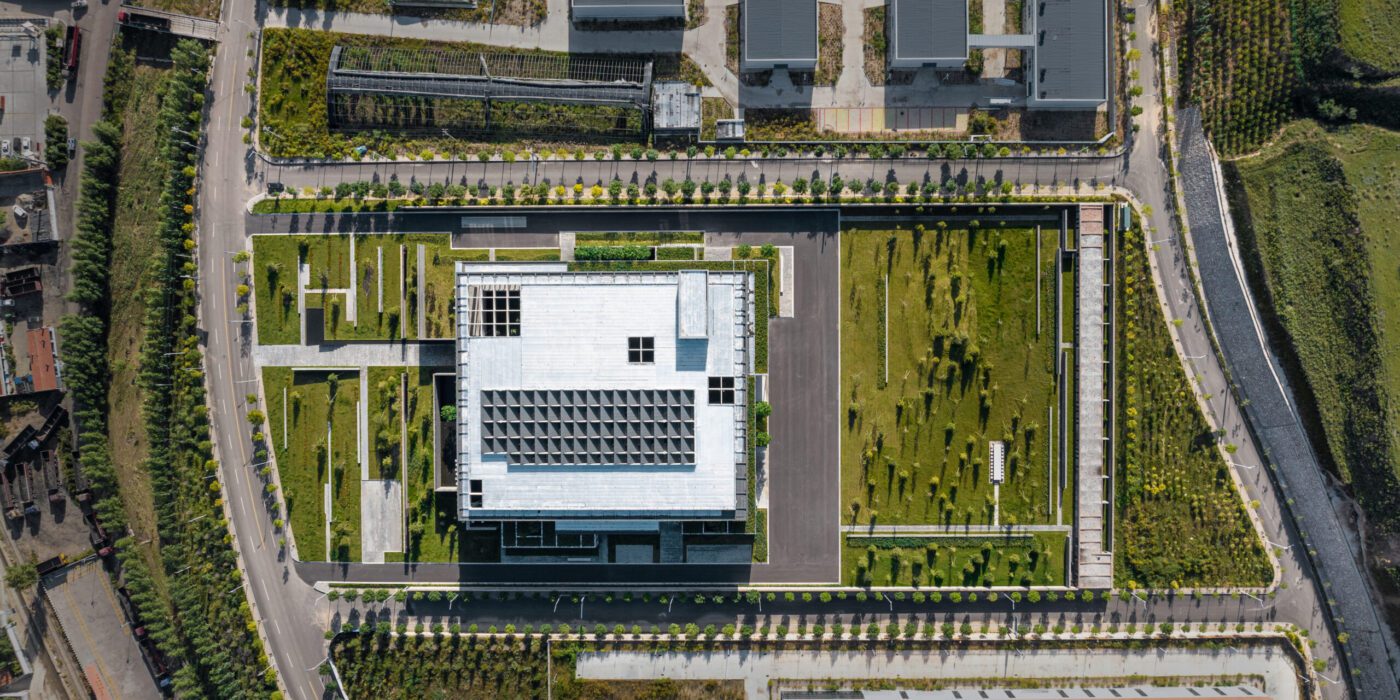
The Oatmeal Factory in Ningwu, Shanxi province by JSPA Design.
This question has been the topic of hot debate among architects throughout history, with contrasting perspectives among the modernists and postmodernists, among others. During the late 19th and the 20th century, particularly within the field of industrial design, architects believed that “form follows function,” as expressed by architect Louis Sullivan, which indicated that the function of the building is what generates its form and guides its design process. For Frank Lloyd Wright, that design principle has been misunderstood, because, “Form and function should be one, joined in a spiritual union.”
When studying the design of the Ningwu Oatmeal Factory in Shanxi, China, which was both the Jury Winner and won the Popular Choice vote during Architizer’s 11th Annual A+Awards, one could argue that JSPA Design was inspired by Wright’s principle. This is especially evident in the way they eloquently strike the balance between both, breeding what could be described as a spiritual union between form and function. The design shows a high level of attention to the factory’s user experience, the selection of materials and the relationship with the site. In short, JSPA Design conceived of a home for production processes that is more than just a factory; the Ningwu Oatmeal Factory is a building that produces a lot more than just oatmeal.
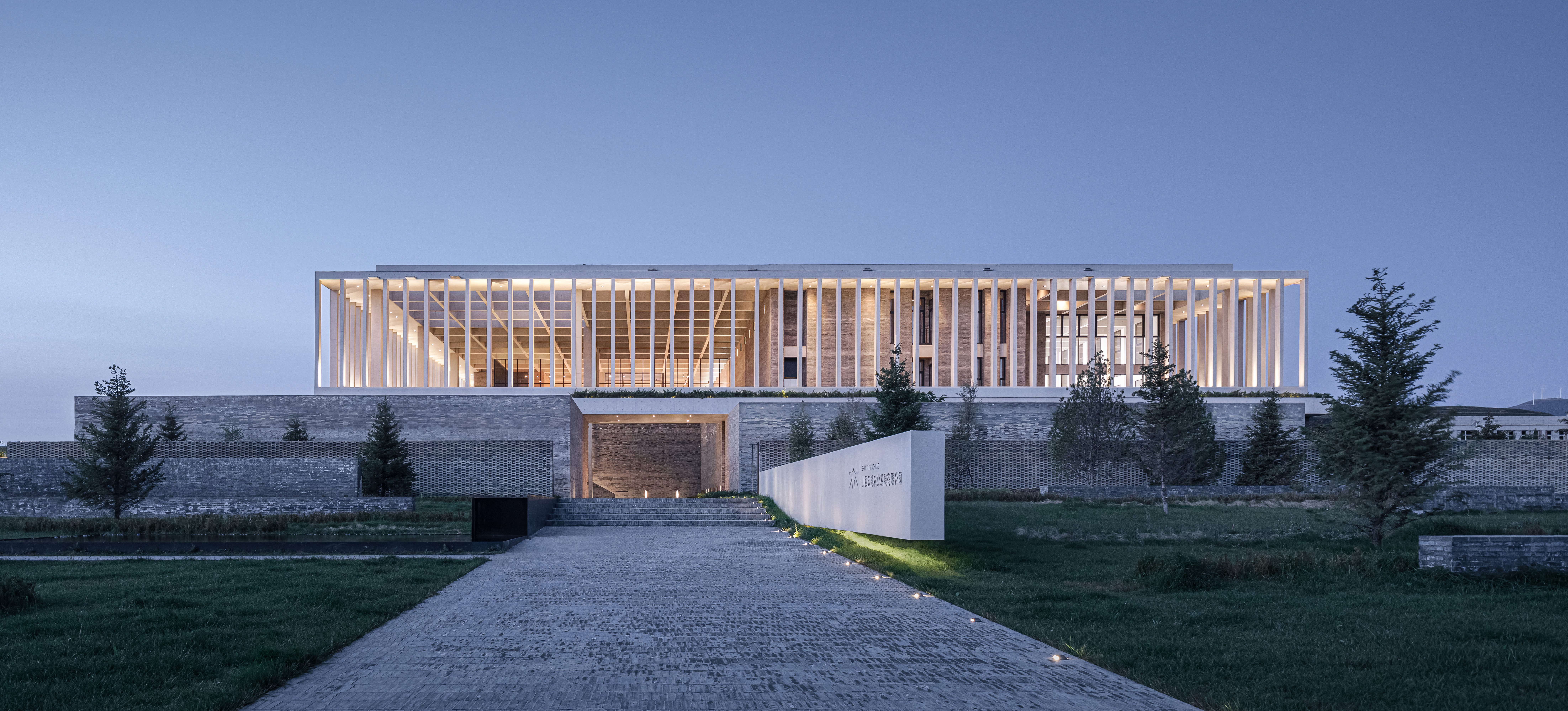
The main entrance to the factory emphasized by the use of brick walls.
The Beijing-based French design studio produced a design that strokes the right balance between the complicated functional requirements and the humanization of the work environment, juggling the different design components while also introducing an interesting user experience that invited the public into the building while redeeming the integrity of the factory’s different operations.
From the outside, the surrounding context was challenging to work with, with the factory being located within dry and arid industrial landscapes punctured with coal mines on their outskirts. In response to this context, the design team chose to orient the building inwards, introducing a variety of horizontal and vertical boundary-demarcating elements that fostered a crisp and clean indoor environment, experientially detaching the building from the outside while enhancing the user experience and orchestrating an interesting walkthrough across the complex’s different sections. Meanwhile, visitors are spatially separated from staff for safety and logistical reasons.
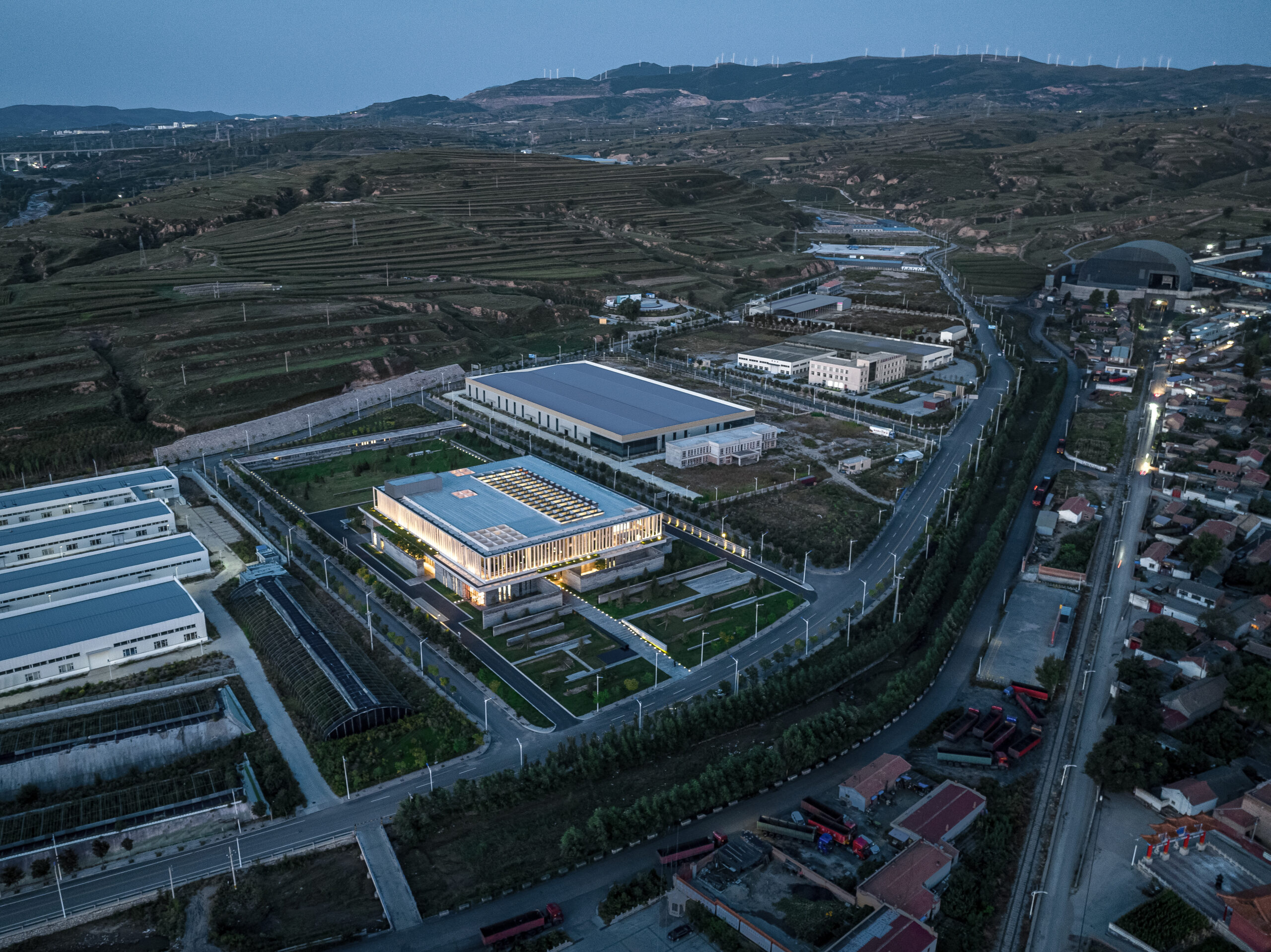
An overview of the factory’s industrial context.
From an environmental perspective, the building’s relationship with the outdoors is further regulated through a network of patios and gardens that invite sunlight to enter the factory’s various spaces. These design provisions enrich the quality of the indoor environment, allowing floods of northern light to illuminate the central production space through a sequence of skylights.

A cross section through the main production space showing the skylights and the production machinery.
By using grey bricks as the main construction material, the designers establish a more materialistic connection with the surrounding context. By harnessing local construction methods to erect a series of brick walls that became the prominent design feature, the material amplifies the building’s relationship with the site and the surrounding landscapes.
Similar to the flow of production lines that transform raw oat into flour products, a variety of brick walls organize the circulation flows through the factory, starting at the entrance and leading each user group to their designated section, while also organizing entry and exit to the building, the delivery of materials and the loading of products. For the visitors, the ground floor serves as an opaque passage, with the brick walls concealing the technical spaces from the public that are lead instead to the first floor where the public spaces are located, including a café, a shop and a garden.
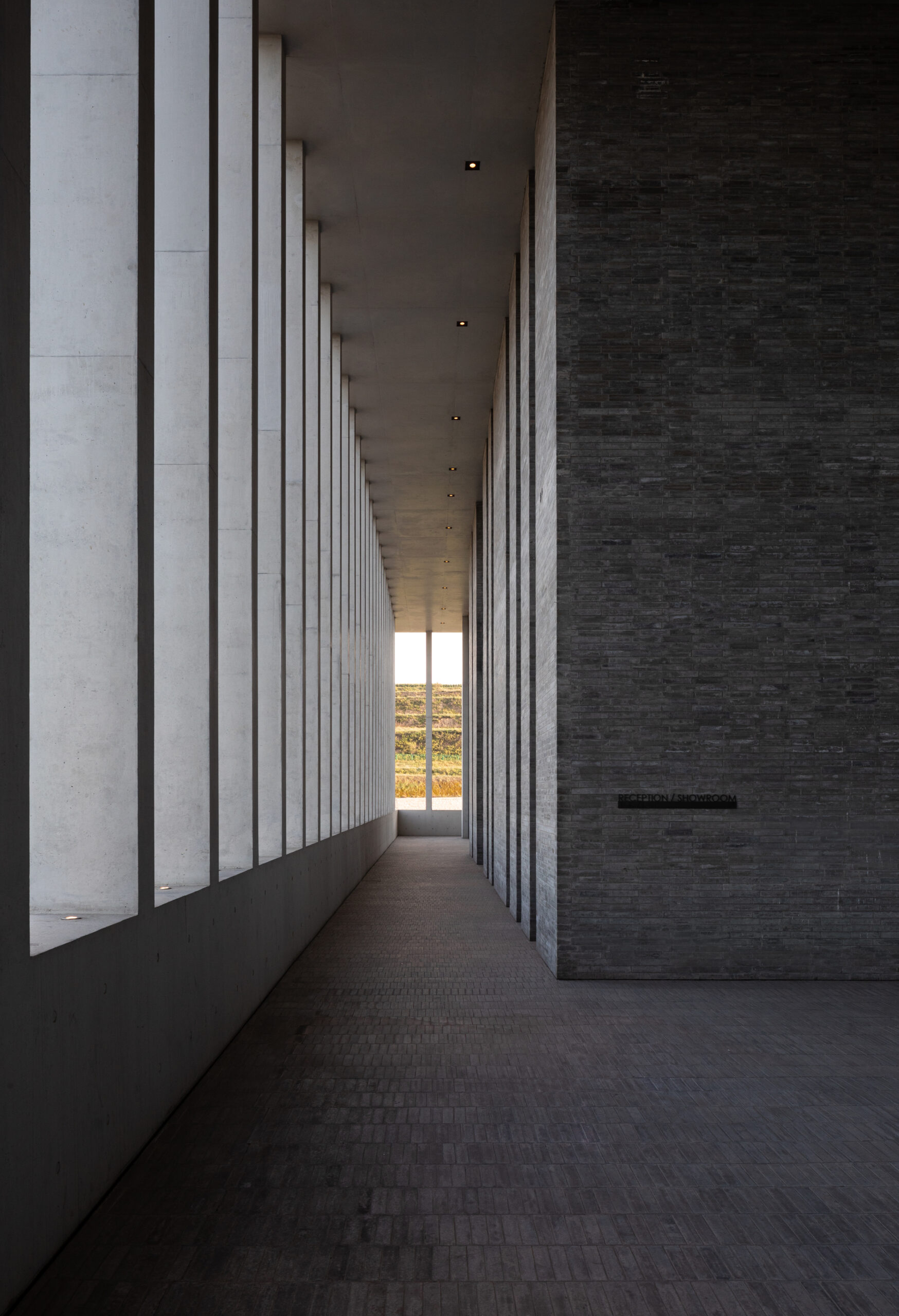
Brick walls guide the different users groups through the factory.
At the factory’s entrance, the public are greeted with a seating area and kids pools, mediating the relationship between the inside and the outside and softening the edge that separates the functional from the social sections of the factory. Brick makes a gradual and smooth appearance at the entrance, first appearing on the benches, before moving to the fences, and then extending vertically and becoming a series of walls that soon become the factory.
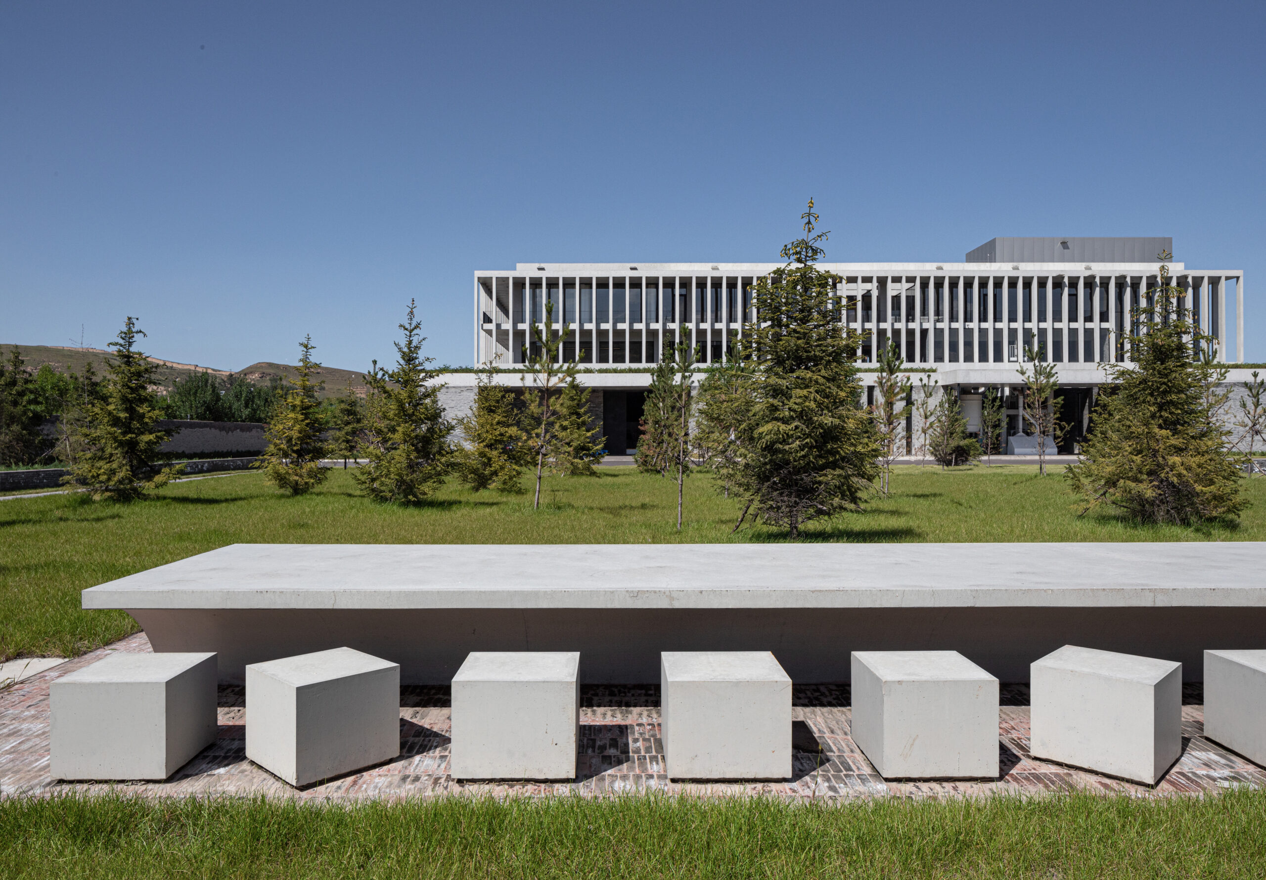
The seating area in front of the main entrance that acts as part of the public spaces of the factory.
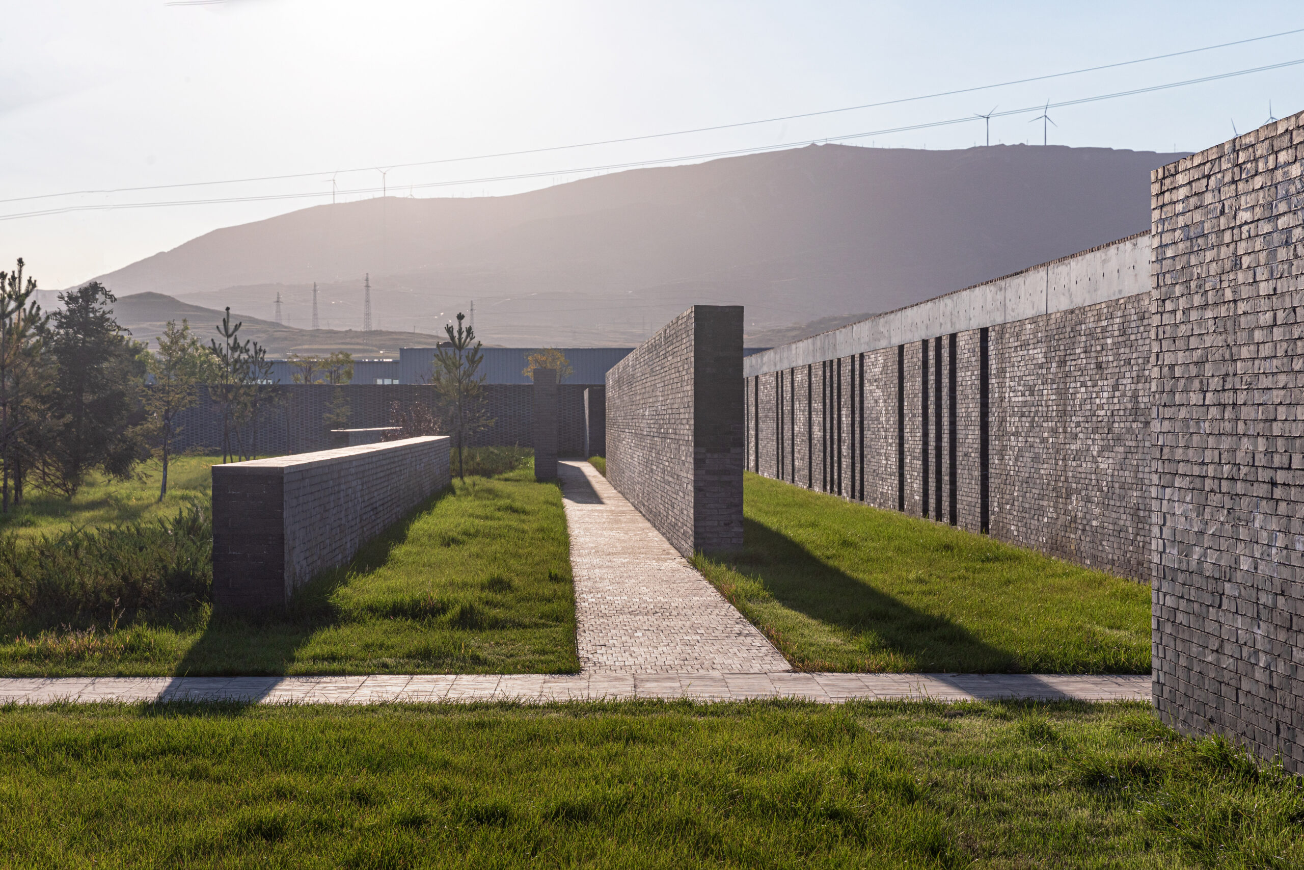
The bricks walls that organize movement through the landscape aligned with the factory walls.
Despite how the brick walls have acted as boundary demarcating elements that organized the factory’s spaces, circulation and relation with the site, this project is an excellent example of architecture that blurs the line between form and function, with each fundamentally playing a role in shaping the other, without one necessarily needing to precede the other.
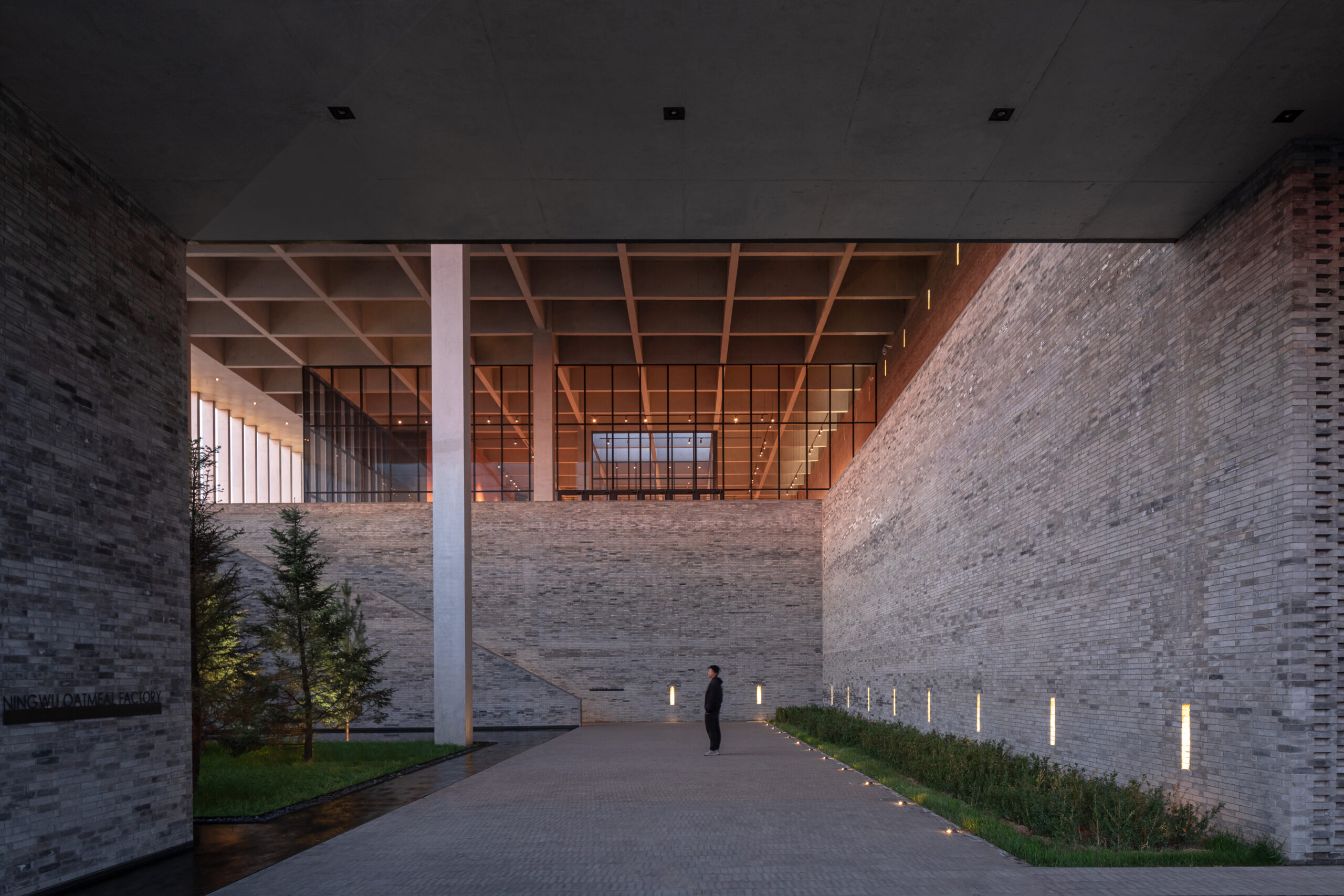
One of the interior gardens of the factory that regulate the relationship with the outside, demarcated by the brick walls .
The design team strategically chose key places to expose and conceal the factory’s different spaces, as well as varied sites where the factory is either connected or disconnected from the outside. Other binaries include rhythmic alternations between soft and hard, experiential and technical; and outward-reaching and inward-turning (click here to see plans, sections and more details from the A+Award-winning project). The sum of these complex calculations is proof that factory design need not be entirely automated. It shows that there is always a space for humans to intervene and be present within industrial sites.
Architizer is thrilled to announce the winners of the 11th Annual A+Awards! Interested in participating next season? Sign up for key information about the 12th Annual A+Awards, set to launch this fall.

