The A+Product Awards is open for entries, with a Late Entry Deadline of July 22nd. Get started on your submission today!
One thing that ties together the Sistine Chapel, The Peacock Room and The Romanian Athenaeum is their majestic ceilings. These buildings are proof that these surfaces can serve a purpose beyond just holding light fixtures. However, excessive embellishments and traditional techniques can look out of place in contemporary homes or restaurants. Below are just a few modern alternatives that ensure that the ceiling takes center stage.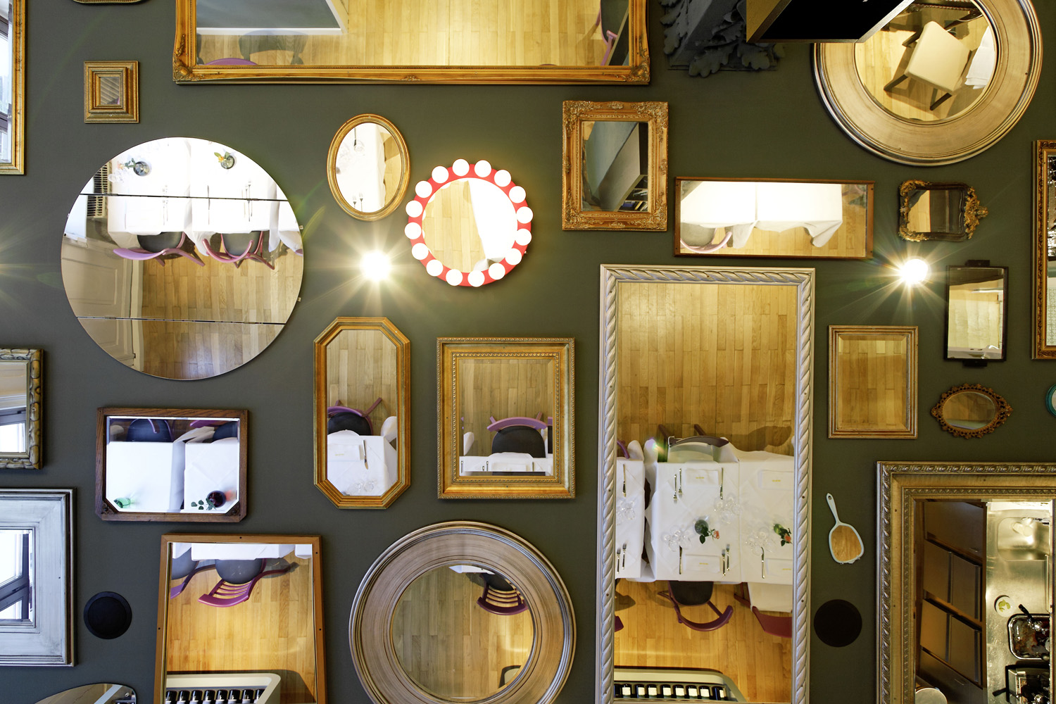
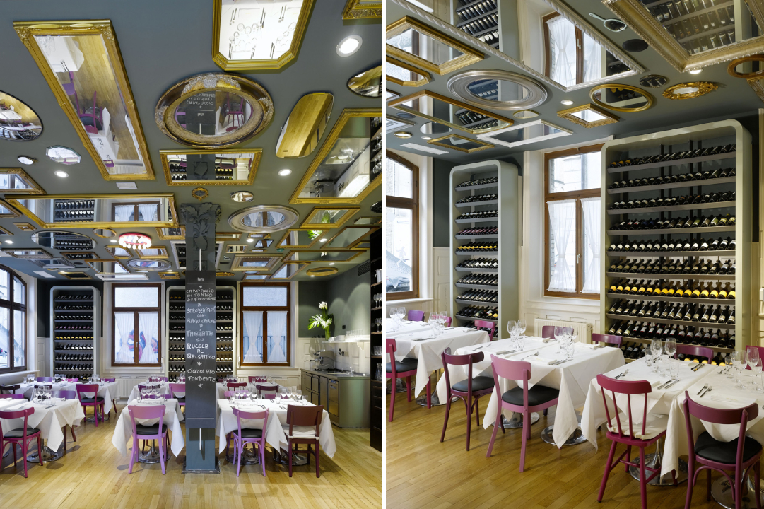
Bella Italia Weine by Ippolito Fleitz Group – Identity Architects, Stuttgart, Germany
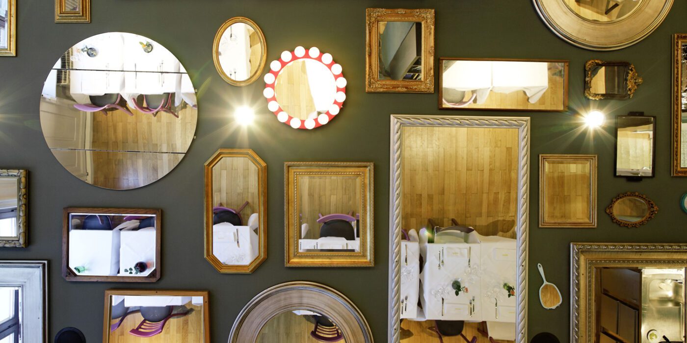
Gallery walls are a common occurrence in the Pinterest home décor search results. Another trend is creating a composition of mirrors featuring different design styles to create interest and play with the dimensions of the space. One interpretation of this trend is to adapt it to the horizontal plane or the celling of a room.
This approach is showcased in the Bella Italia Weine in Stuttgart. 90 different mirrors obtained from several rummage sales are mounted on the ceiling, ranging from large rectangular framed ones to decorative handheld mirrors. One of them even features hanging crystal lights to replicate a chandelier. They create broken reflections of the activity below and also imitate the comfort and intimacy offered by the home-style cuisine served here.
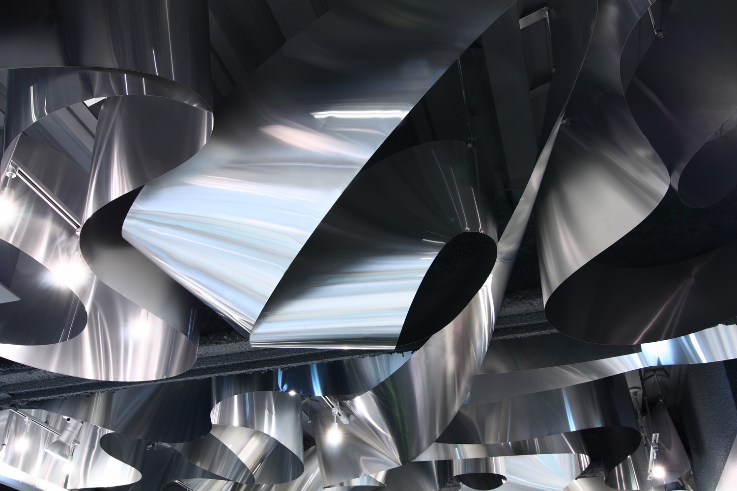
ARKHE Beauty Salon by Moriyuki Ochiai Architects, Chiba, Japan
While a sculpture can enhance the look of any space, turning an entire element of architecture into a sculpture can leave a significantly stronger impact. Using different materials, textures and forms in ceilings can create a captivating effect, reflect light in new ways and also help give dimension to an otherwise plain space. In ARKHE Beauty Salon, the firm uses strips of recycled aluminum curled and twisted over and over again on the entire surface to create almost a fluid composition. The firm wanted to replicate the movement of water and the lightness of the hair. The reflection of light on the metal’s surface also mimics the visual of light falling on the surface of the ocean.
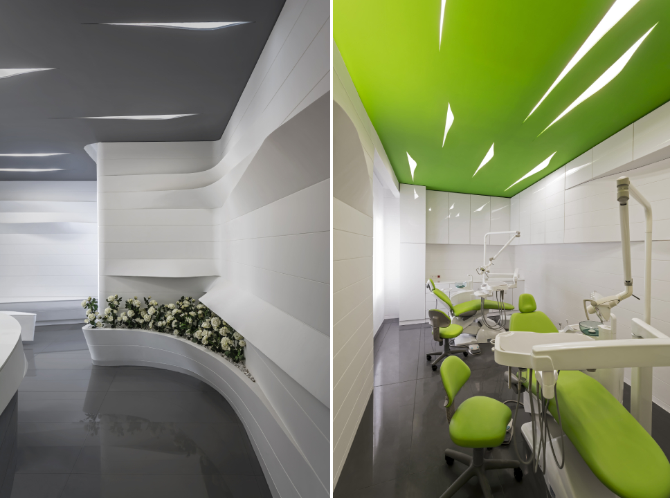
Zafar Dental Office by ReNa Design, Tehran, Iran | Images by Reza Najafian
Zafar Dental Office is a great example of how even subtle introductions in a space can make a big difference. Here, they have used small cutouts in the ceiling to hold lights, much like simple cuts in a sheet of paper. These cuts have both sharp profiles as well as sinuous curves. The form is then continued n shelves and seating throughout the space to unify the design. This proves that even small changes in lighting design and geometry can create interest in spaces where it is difficult to add color or protrusions either due to the nature of the function or lack of height.
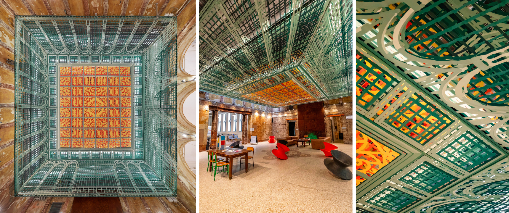
Over View by FreelandBuck, Pittsburgh, Pennsylvania
Art has been shown to be a successful way of decorating ceilings throughout history. It compels people to stop and look up, changing the way they use and perceive space. Taking this one step further, using optical illusions on the horizontal pain can not only trick people into believing there is a 3D form instead of a plane but also create movement. This helps create the perception of greater floor height as well. Over View, an installation composed of printed textile pieces, transforms the lobby of the Carnegie Library into a Renaissance-era spectacle. When seen from the center of the room, it appears to have depth and go higher. When seen from other angles, it looks as if it is protruding toward the floor.
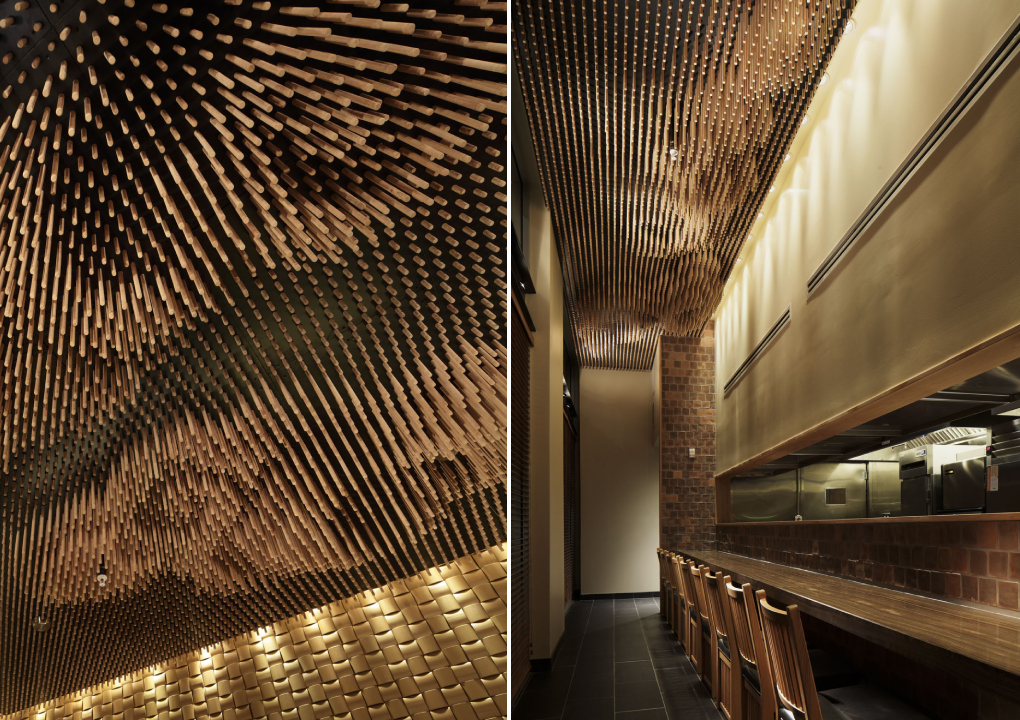
Tsujita by SWeet Co, LTD, Los Angeles, California
Being able to look at clouds when dining can make for a thoroughly enjoyable experience. But outdoor dining can also be challenging when grappling with uncertain weather. Interior decorators have often tried to bring the outdoors in by painting murals on walls and ceilings or bringing in greenery. This technique can be altered to better fit fine dining establishments by using a more abstract version of natural elements to add more whimsy. In Tsujita, 25,000 wooden sticks of different lengths are used to create the imagery of clouds. This image changes when seen from different angles due to the space between the sticks.
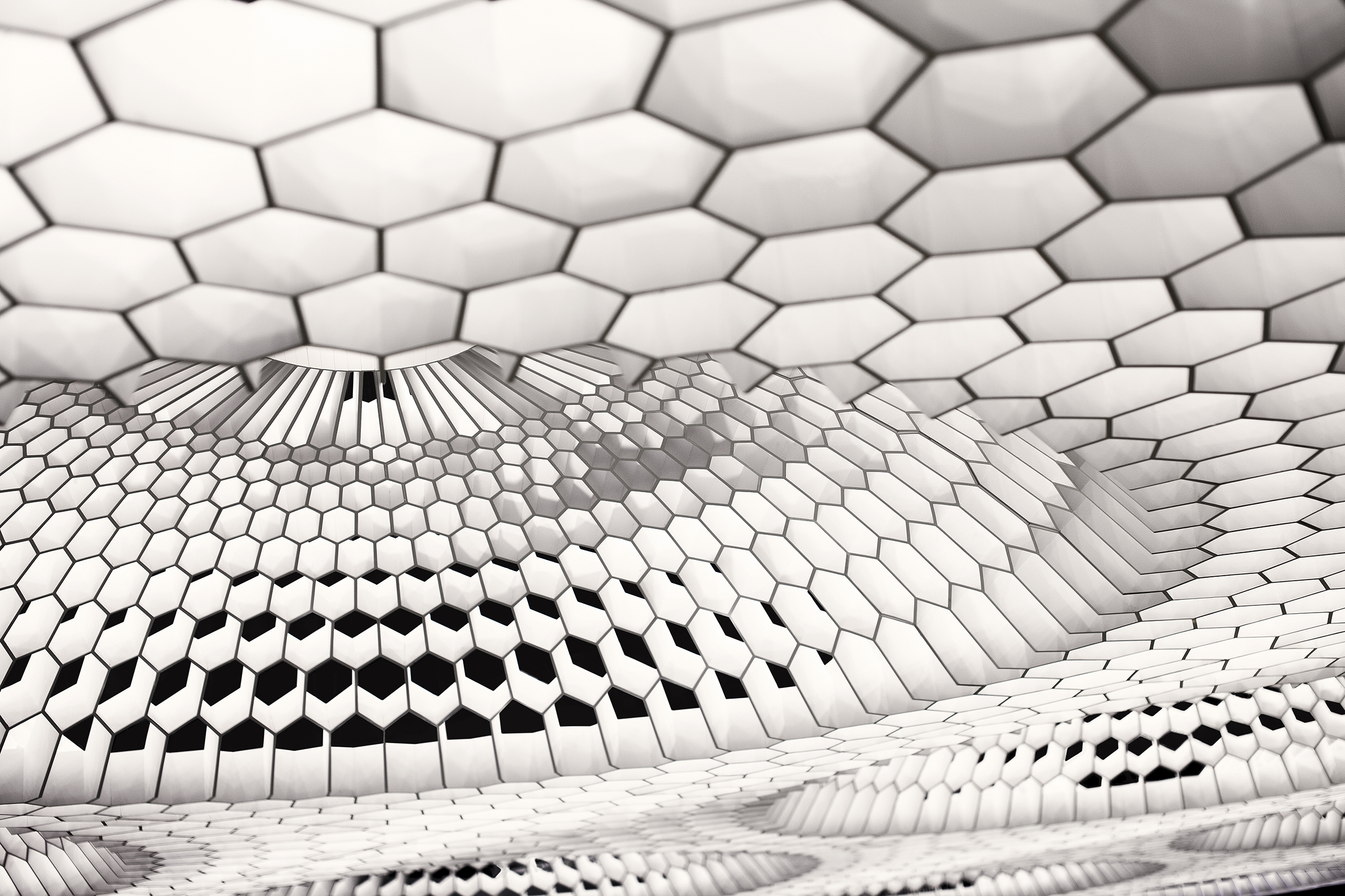
:PM Club by MODE, Sofia, Bulgaria
Vaults and domes have been significant structural elements in religious and cultural buildings throughout history. Now, we can see modern versions in interiors that are purely aesthetic. It can be done by padding beams to create vaulted tops or using wooden panels to add curves to flat surfaces. Another way to add dimension is by using hexagonal and pentagonal forms to create geometric domes as in :PM. The panels also diffuse the color-changing lights placed in this arrangement. This technique combines the charm of conventional domes with the grandeur of chandeliers.
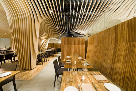
Banq by Office dA, Boston, Massachusetts
There has been an emergence of designs that allows floors, walls and ceilings to blend into one another. Pirogovka Appartment does so by allowing paint from the walls to crawl up the ceiling and floor and a bakery in Oporto continues vertical panels from the wall as swooping curves on the ceiling. Banq in Boston uses wooden slats to create a contouring canopy that continues upwards from the columns. This system also serves an additional function of concealing the old mechanical and structural systems from the previous design. The design also features a wine storage area in the center that becomes a part of this system.
The A+Product Awards is open for entries, with a Late Entry Deadline of July 22nd. Get started on your submission today!

