Architects: Want to have your project featured? Showcase your work through Architizer and sign up for our inspirational newsletter.
Architizer’s journal is fueled by the creative energy of the thousands of architects from around the world who upload and showcase their incredible work. From conceptual designs to projects under construction to completed buildings, we are proud to serve as a platform for showcasing global architectural talent and the brilliance of visualizers, engineers, manufacturers, and photographers who are crucial members of the industry. A stellar drawing, rendering or photo, as well as a detailed project description, can go a long way in making a project stand out, as does indicate the stellar contributors on a project.
Firms who upload to Architizer share their work with professionals and design enthusiasts through our Firm Directory and Projects database. They also gain exposure by having their projects shared on our Facebook, Instagram, and Twitter pages, as well as in our Journal feature articles. Indeed, through these various channels, hundreds of thousands of people in the global design community have come to rely on Architizer as their architectural reference and source of inspiration. In 2022, we’re rounding up our database’s top 10 most-viewed, user-uploaded architecture projects at the end of each month.
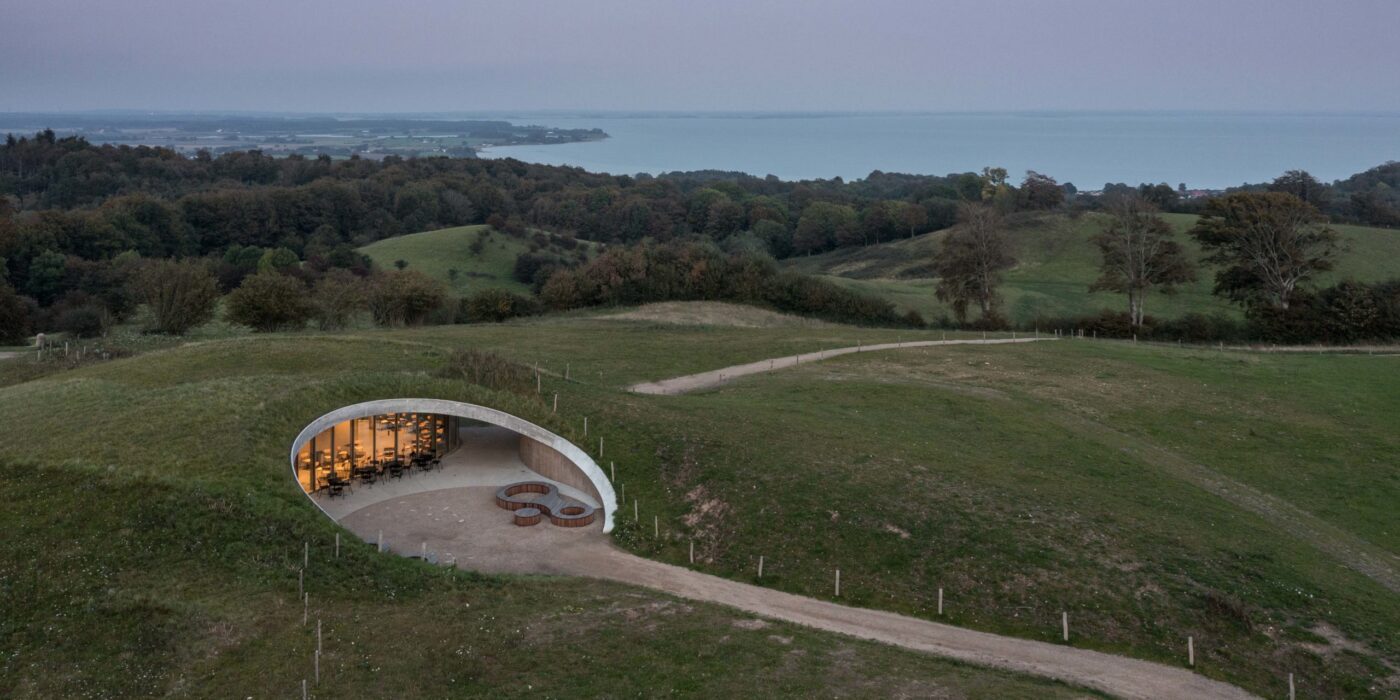
By CEBRA, Kolding, Denmark
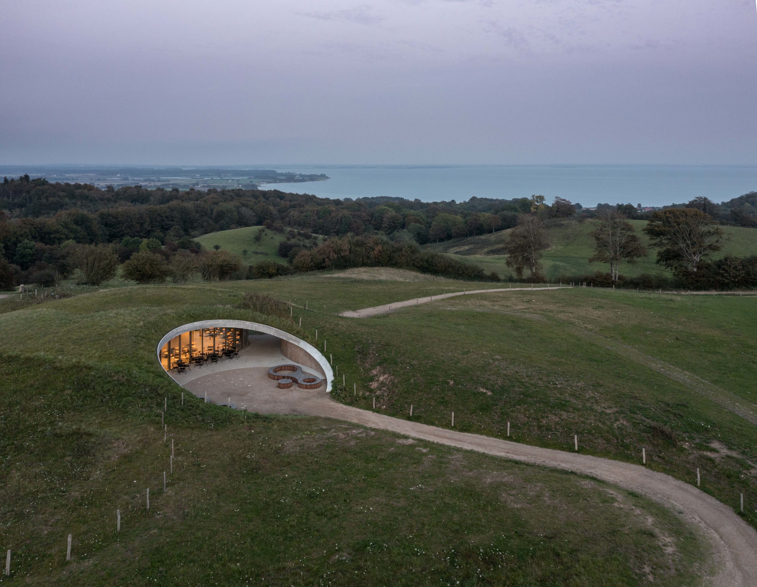
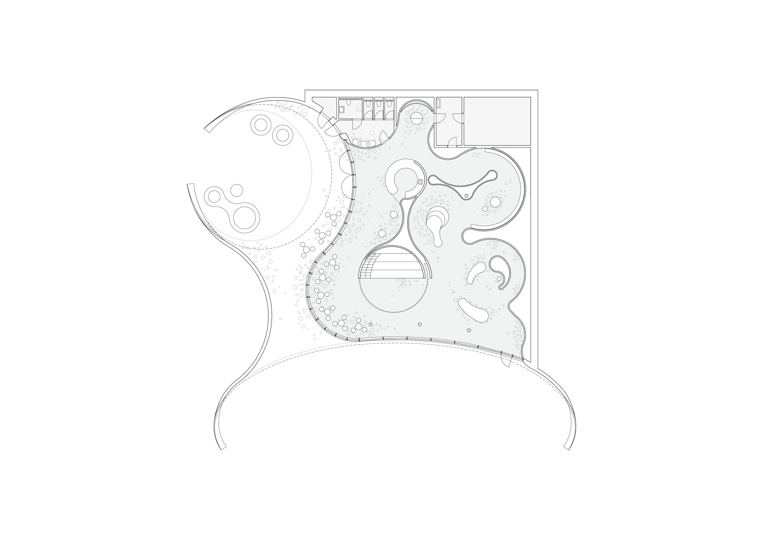
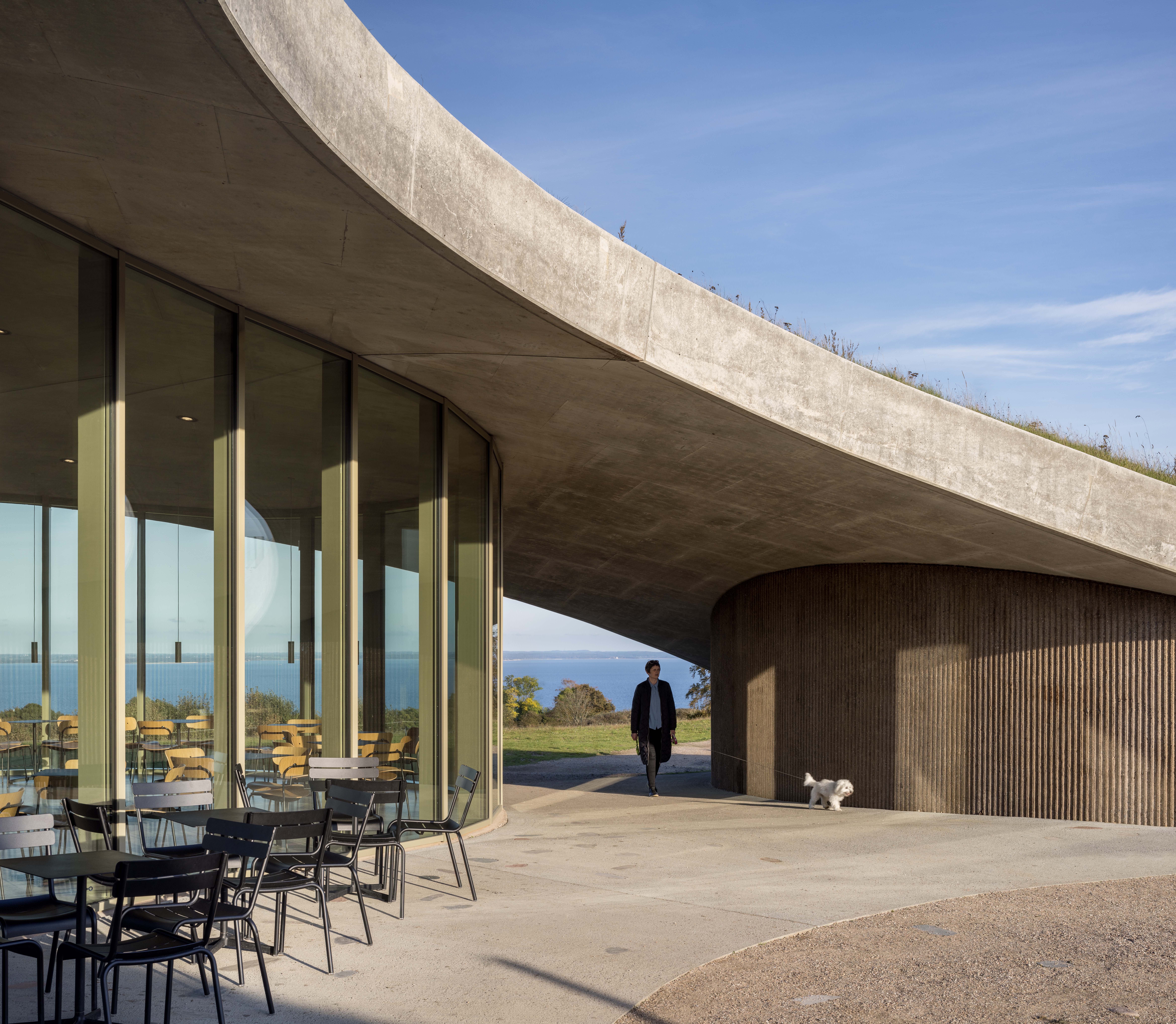 Skamlingsbanken has long been a point for gather: the protective shelter of the rolling hills seemingly invited gatherings. Now, this natural landscape’s remarkable history as a civic landscape — one that hosted debates about women’s suffrage, democracy and more — is home to an architectural landmark that will continue this legacy, with little impact on the natural landscape. Indeed, The visitor centre is an architectural interpretation of the local topography and a representation of the local history; it is seeded with native species, selected in collaboration with biologies Mette Keseler, which shows optimal conditions for the local herbs and biodiversity.
By The One (Hong Kong) Design, Guangzhou, China
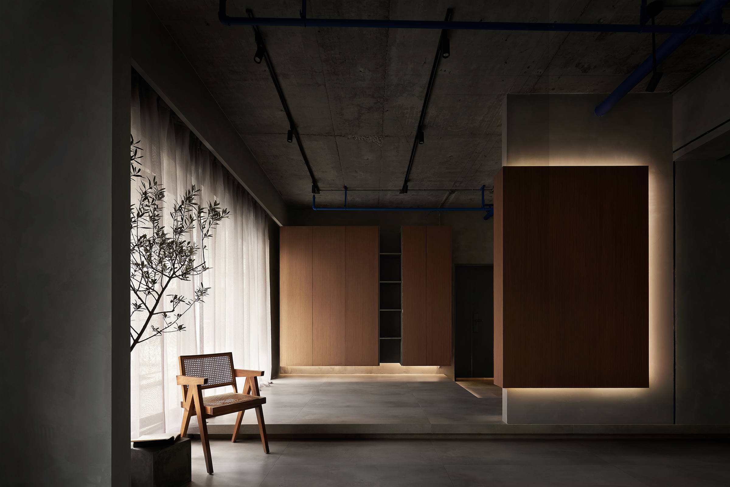
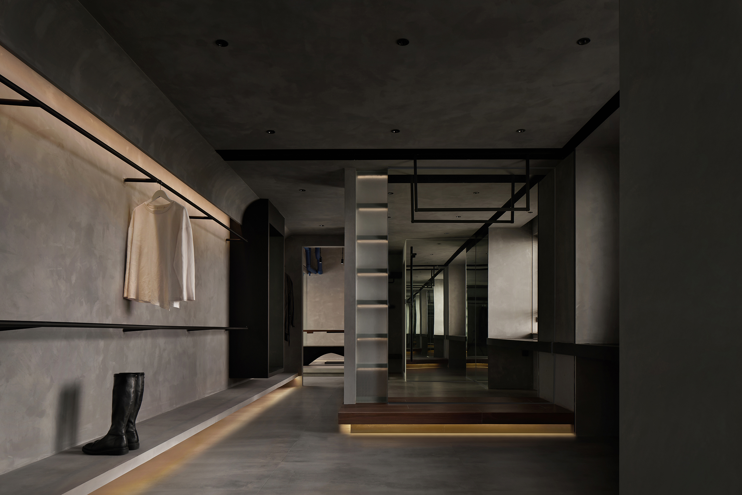 Moody lighting, textured walls and interlocking linear elements all come together to create a dynamically flowing space. Four principal moving lines are used to connect the apartment’s various zones, ensuring that the open space feels connected while its functions are differentiated. This tension between who and parts, static volumes and dynamic movement, amount a significant challenge to more traditional private homes. Based on the “unconventional” living space needs of the two owners, designers want to create a sense of privacy and closure that can break the traditional private house space for the owners.
By Signum Architecture, Paso Robles, California
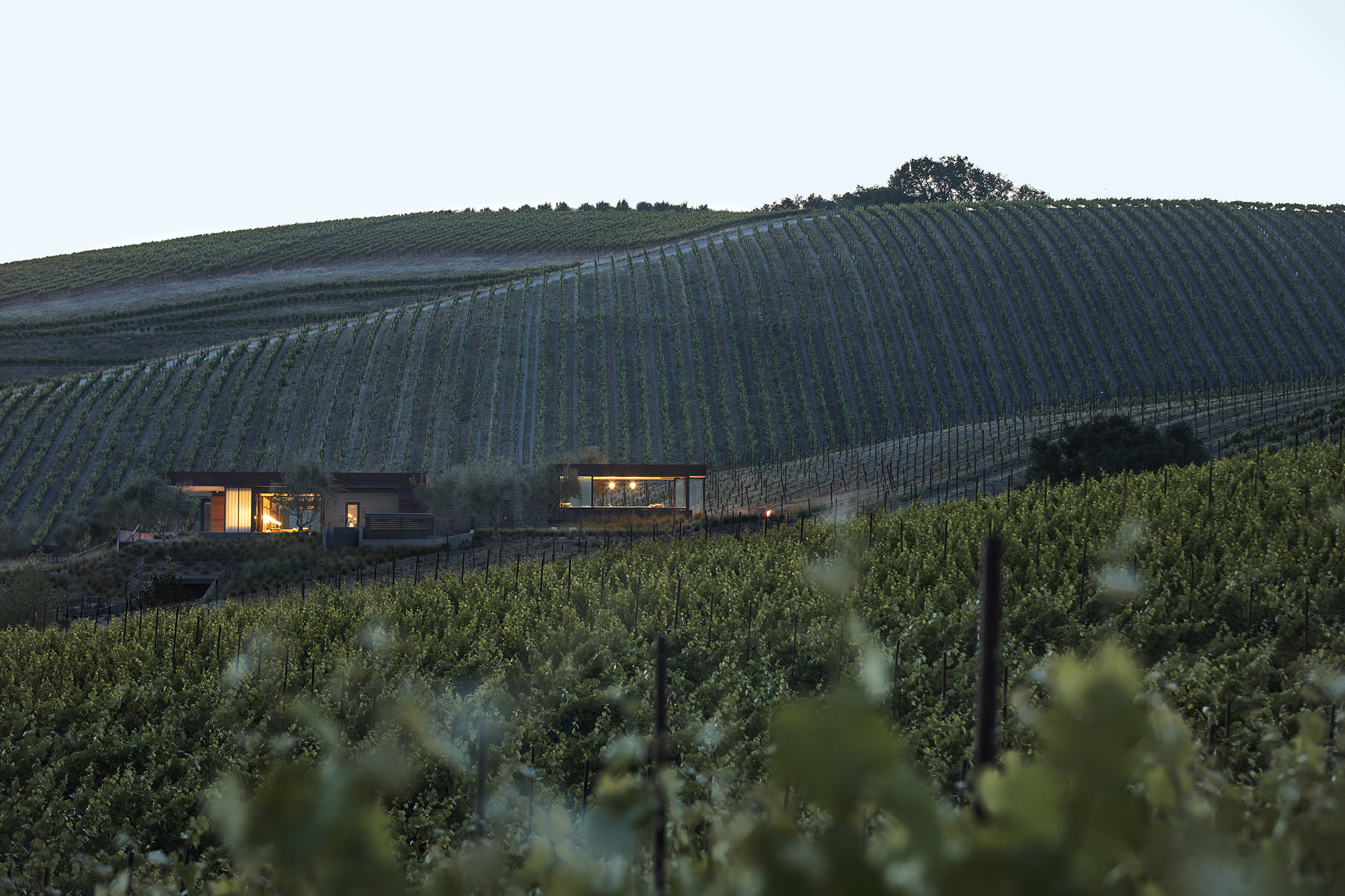
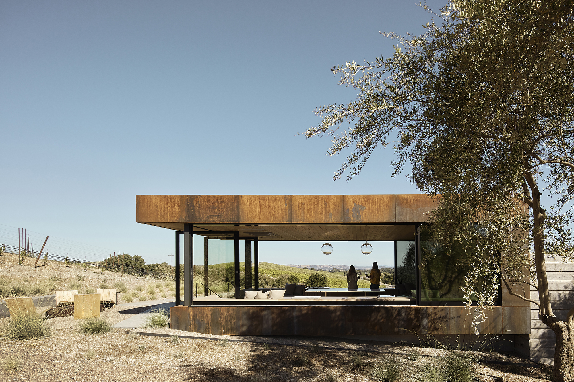
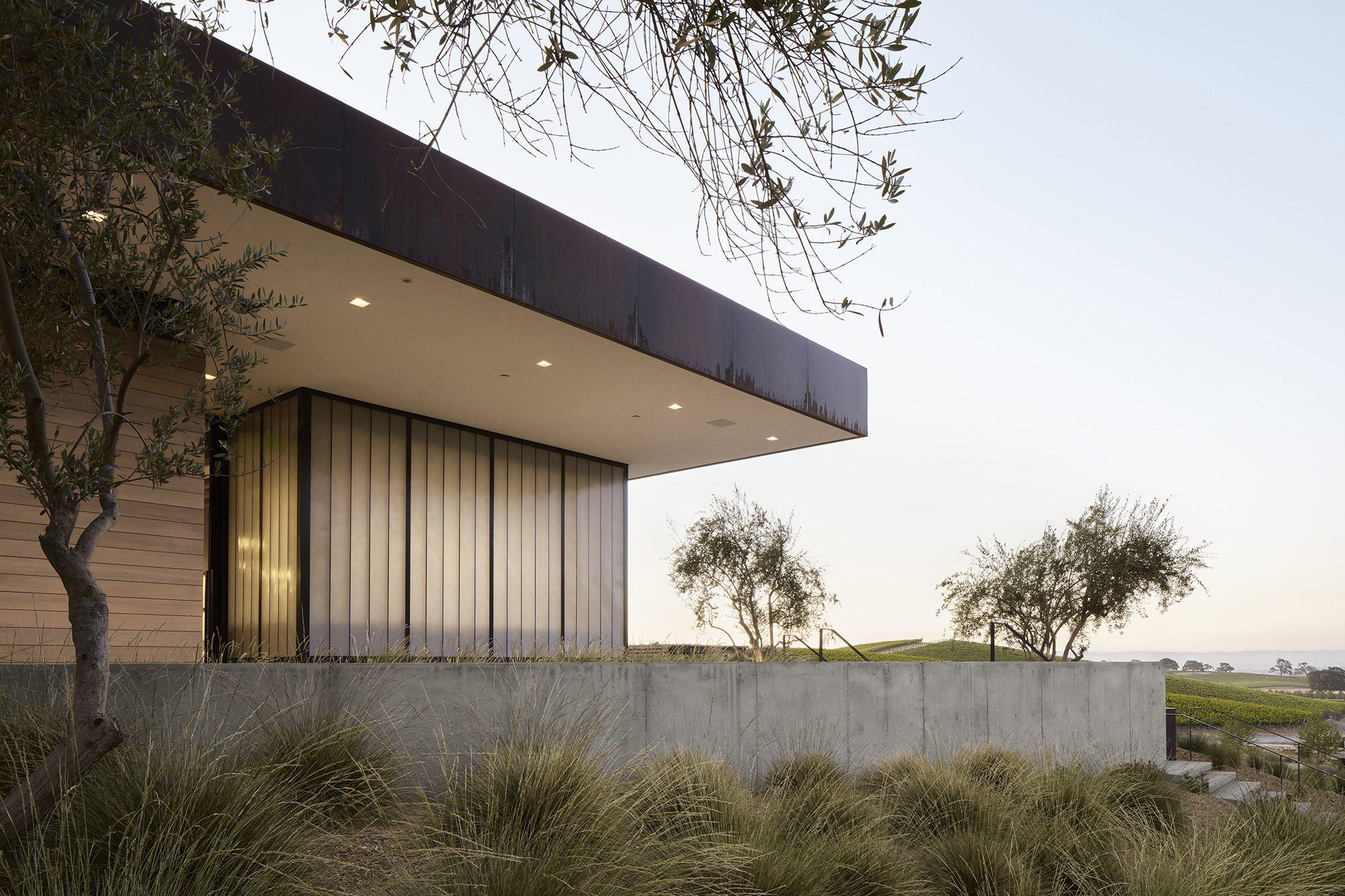 Set on a 100 acre site in Paso Robles, this the architects of this project were faced with a complex task: to design a building with a unique identity that would invite visitors without detracting from the picturesque landscape — a contention at the heart of winemaker Eric Jensen’s minimalist philosophy of interfering with the land as little as possible. Thius the architects began with a typology familiar to the place: a trellis and terrace. Next, the visible fractures in the area’s chalky limestone soil helped to make out the buildings’ walls, in direct relation to the land and views.
By AB design studio, inc., Montecito, California
Popular Choice, 10th Annual A+Awards, Private House (M 2000 – 4000 sq ft)
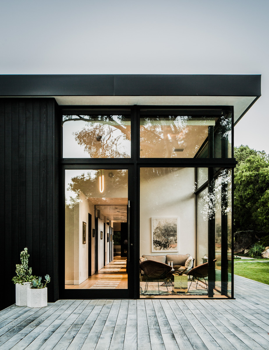
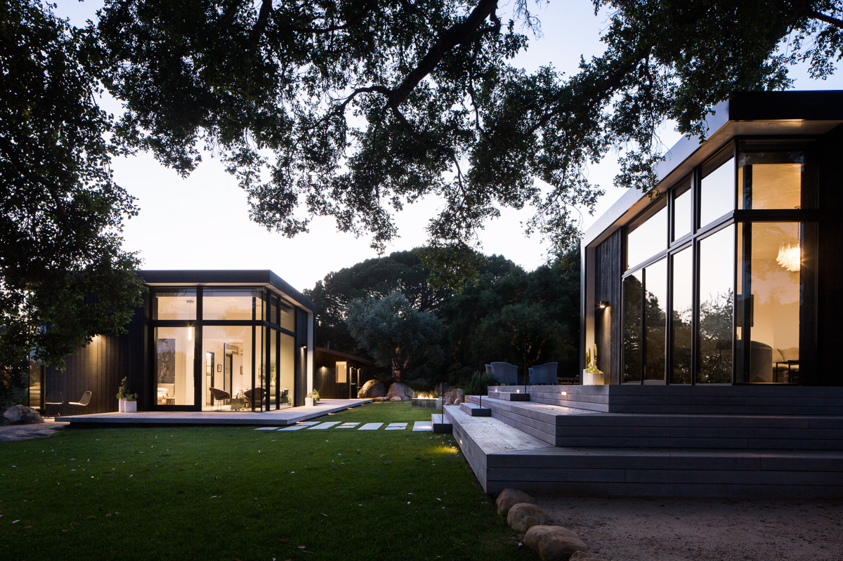 Mies van der Rohe seems a likely inspiration for this modernization project in the foothills of Santa Barbara; however, this modernize project is deeply rooted in its source material — a simple 1950s wood cabin set in a rock quarry. The single-story residence takes into account the surrounding boulders and oak forest; the design sought to maintain original elements and to reuse stone found onsite.
By Myrto Kiourti, Athens, Greece
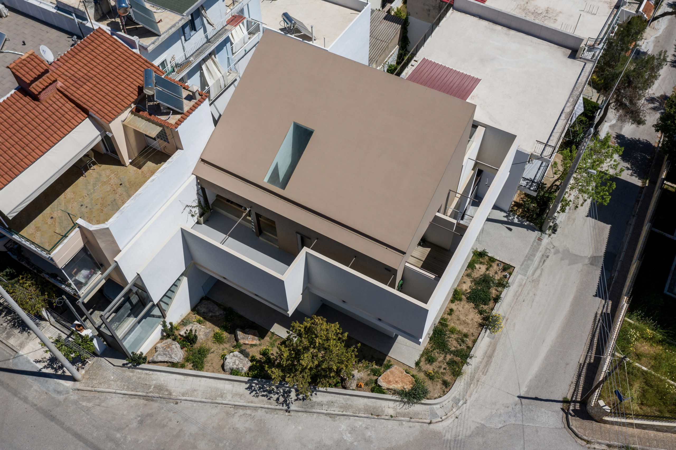
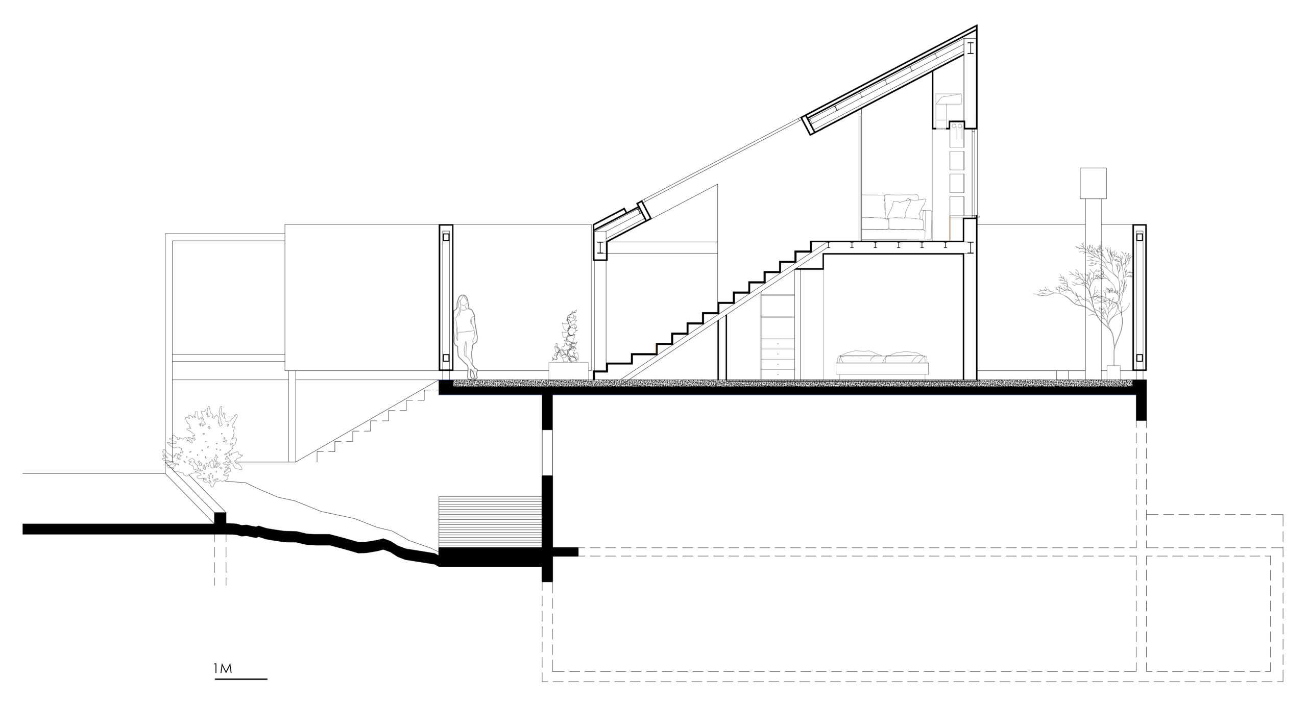
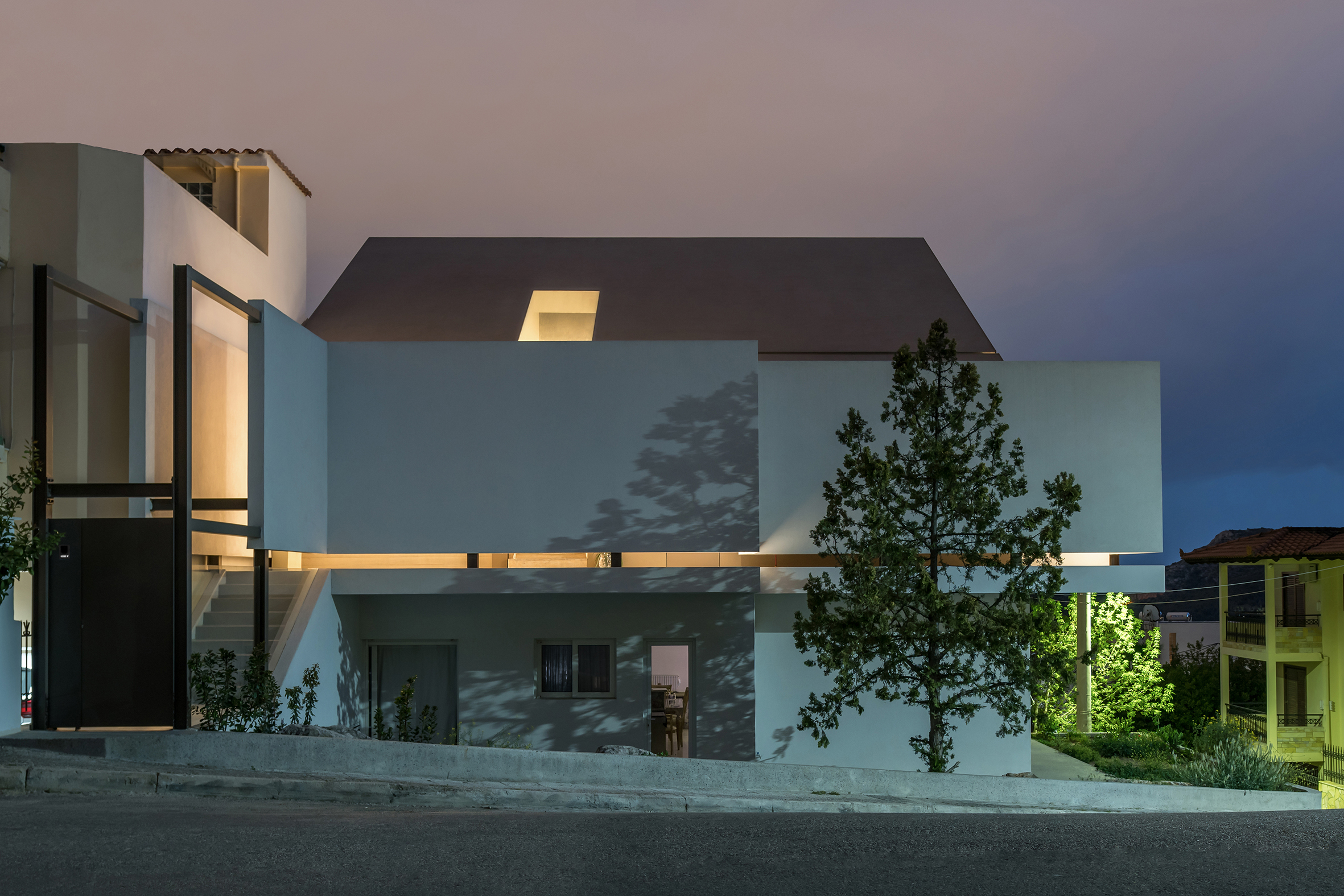 Many cities can claim hybrid identities as contemporary metropolises with ancient, historic pasts; however, Athens is one of those cities where this duality is ever-present, and the city’s legacy continues to inform designs of the present. Epitomizing this relationship to the past are those homes that Greek families literally build on top of their older residences. Known as “panosikoma,” these “upper-level extensions” are rooted in a traditional building practice that implicitly negotiates these identities. The Flying Box exemplifies this approach.
By Mario Cucinella Architects, Mormanno, Italy
Jury Winner, 10th Annual A+Awards, Religious Buildings & Memorials
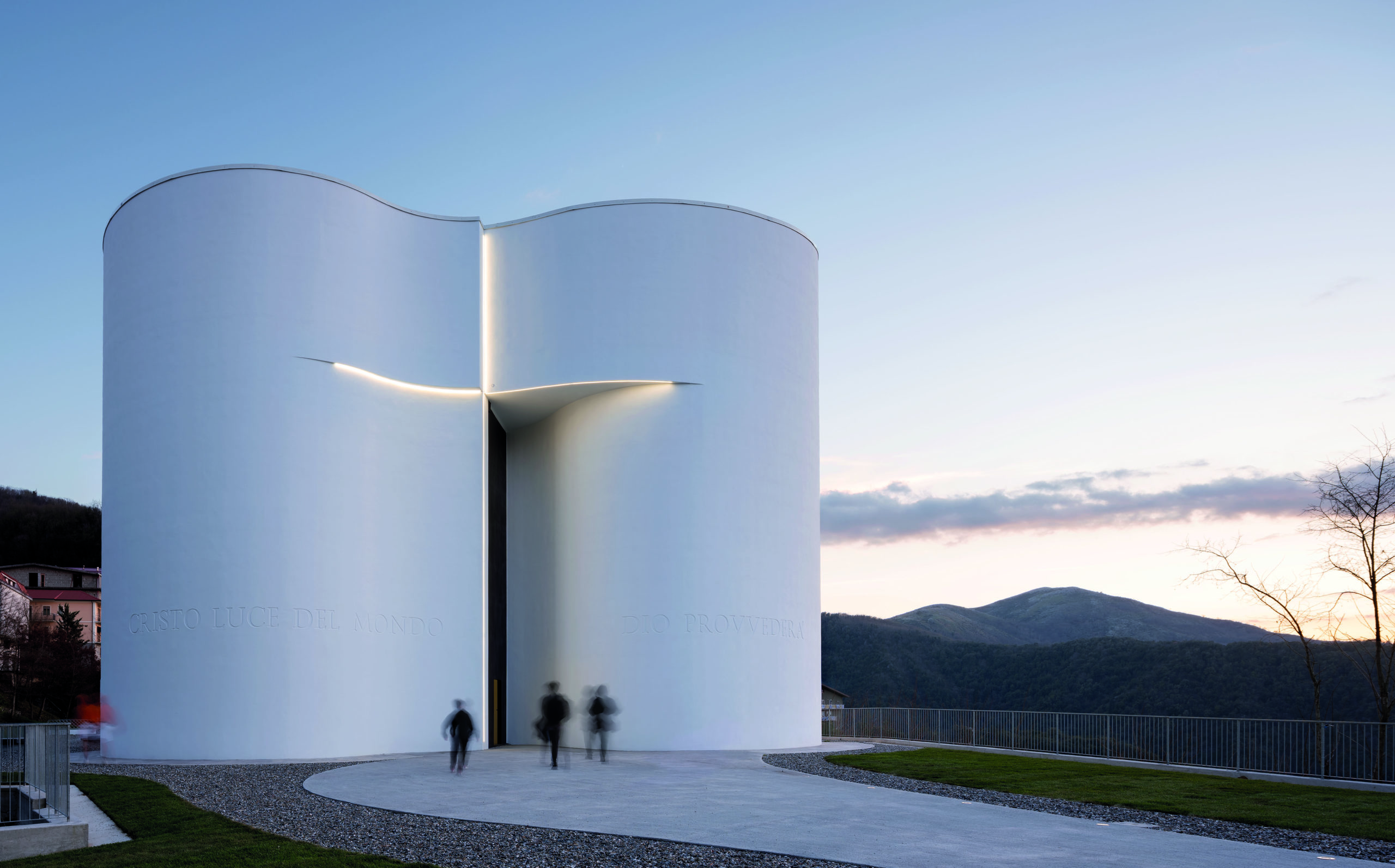
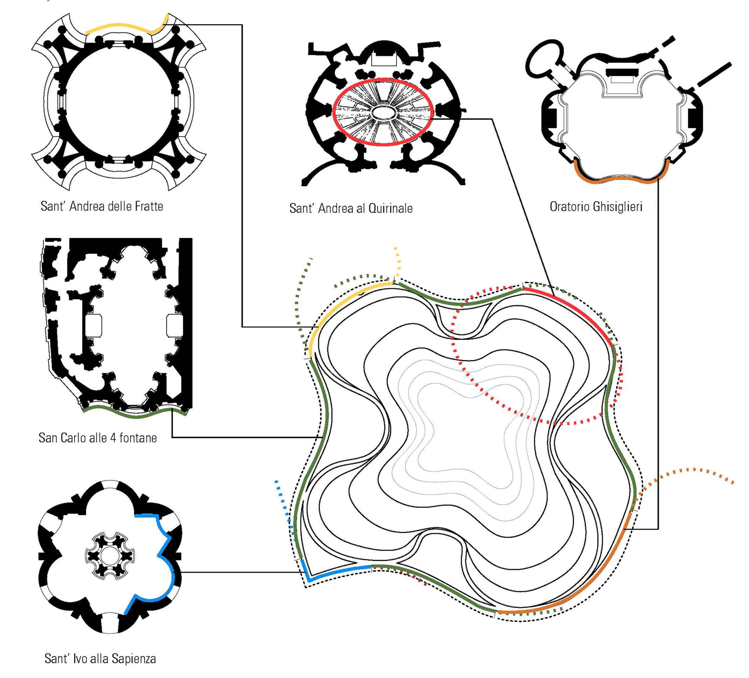
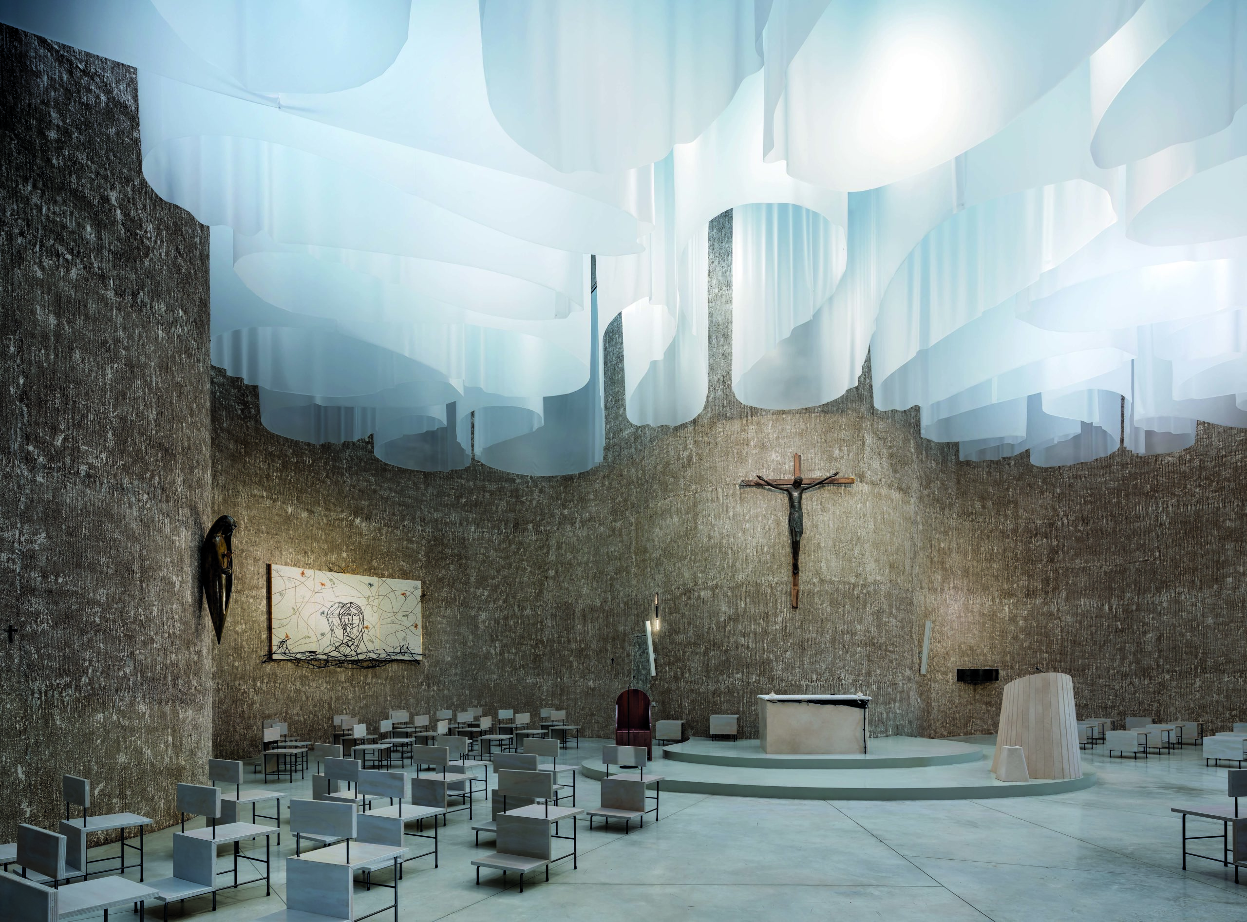 One first glance, the flowing lines of this iconic floor plan is unlike any other ecclesiastical structure (actually, it’s safe to say they’re quite distinct from any other structure, period). Yet, the organic footprint of this monumental building was inspired by the curvilinear geometries of Baroque churches in Rome. Natural light — long an important element and symbol of Christian places of worship — floods the interior space, and is filtered through a memorable canopy of translucent veils.
By Beef Architekti, Balearic Islands, Ibiza
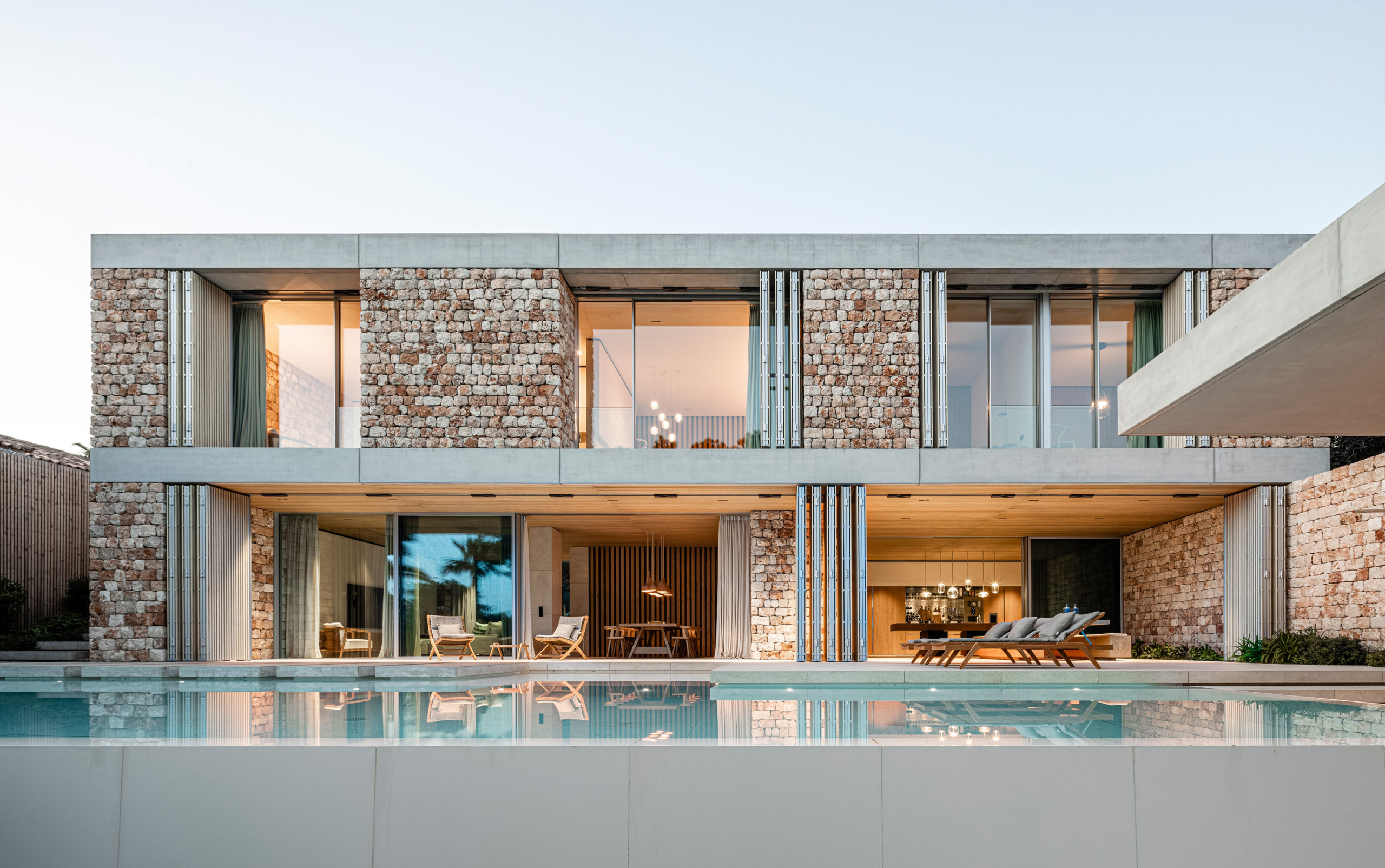
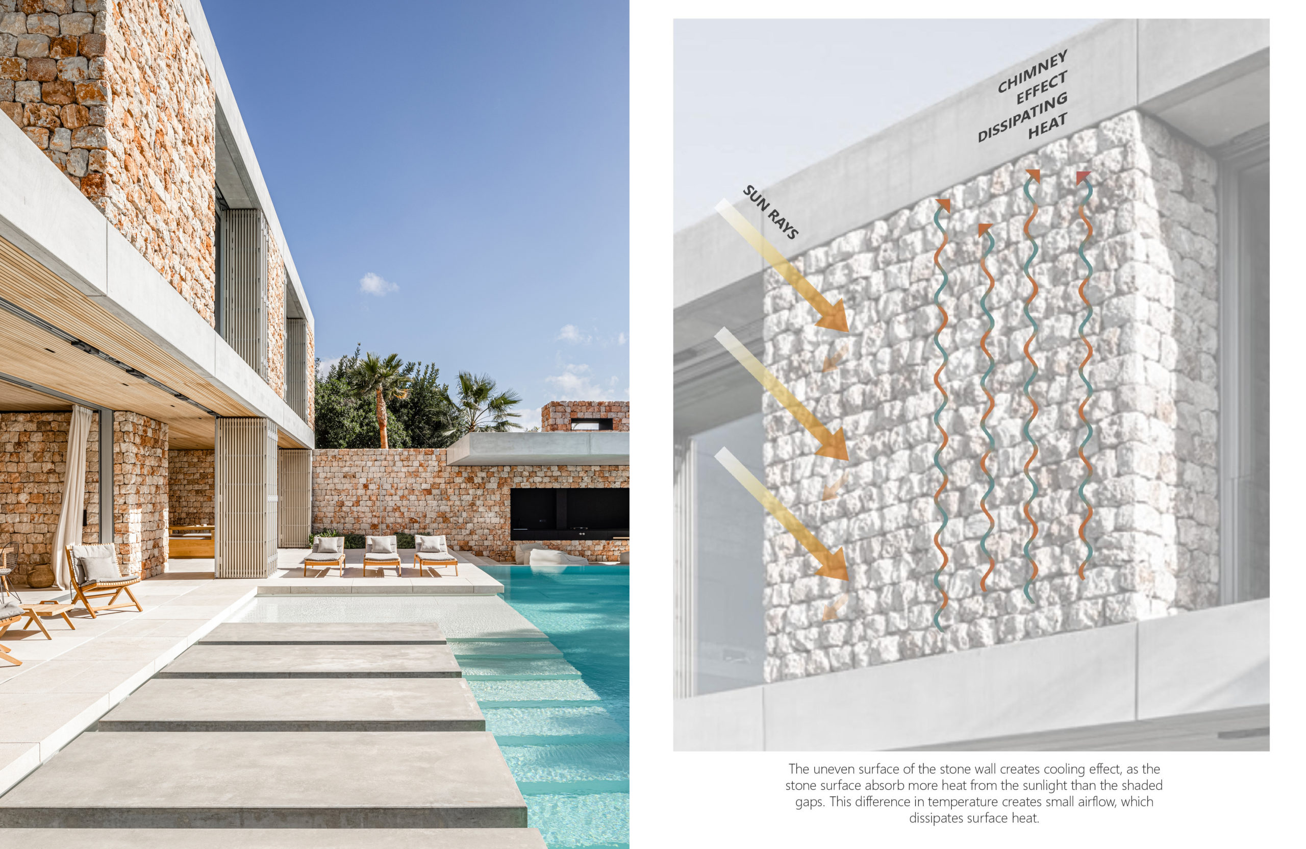
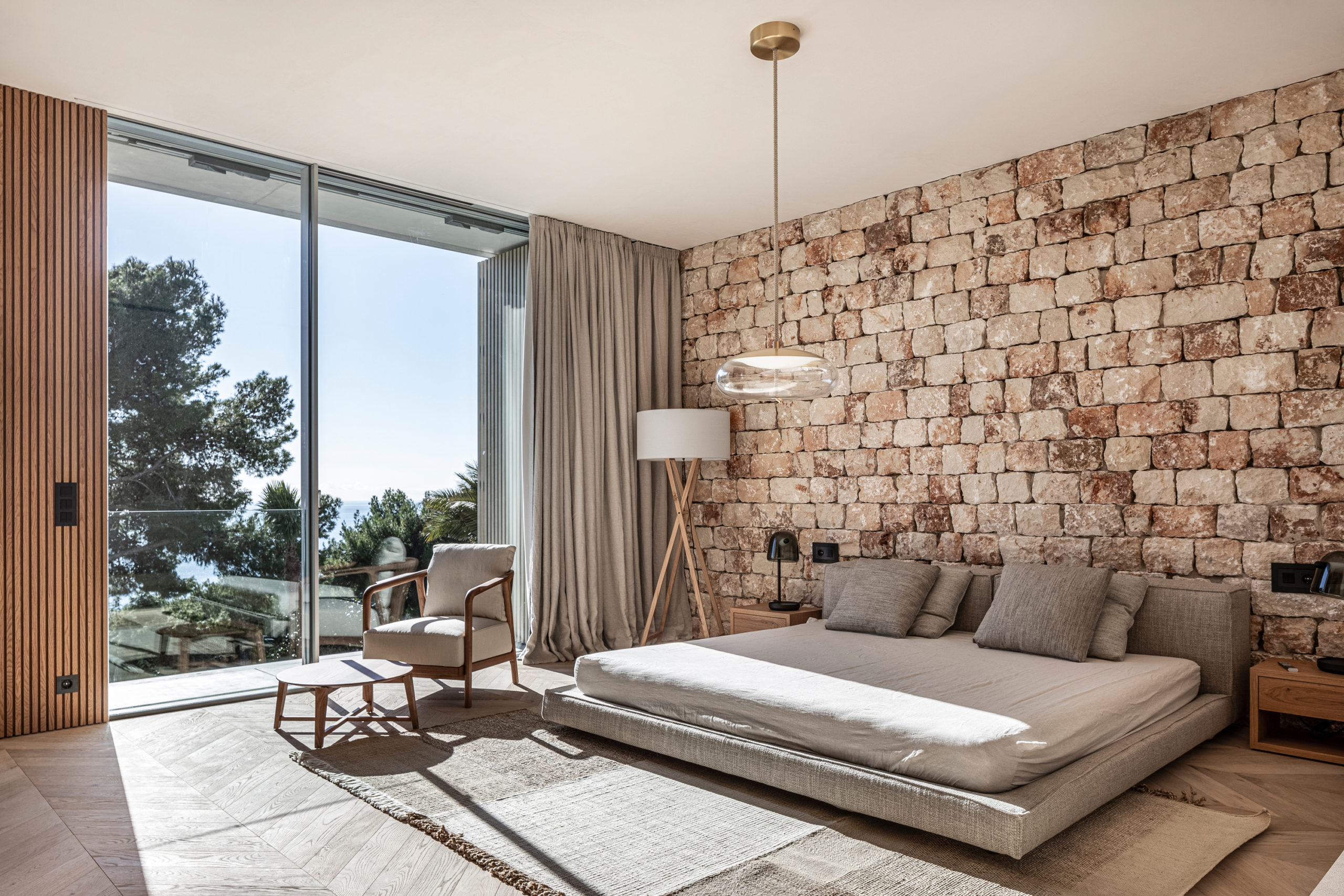 Mallorca is famous for its sapphire blue beaches and picturesque craggy cliffs; however, architects would be interested to learn more about the vernacular techniques long used in local construction on this mediterranean island. Using stones sourced from a nearby quarry, Beef Architekti pay homage to the traditional dry construction technique known as ‘pedra en sec’ used to express a typical design that can be found all over the island — one that was named an intangible Cultural Heritage of Humanity by UNESCO in 2018.
By bkp GmbH, Düsseldorf, Germany
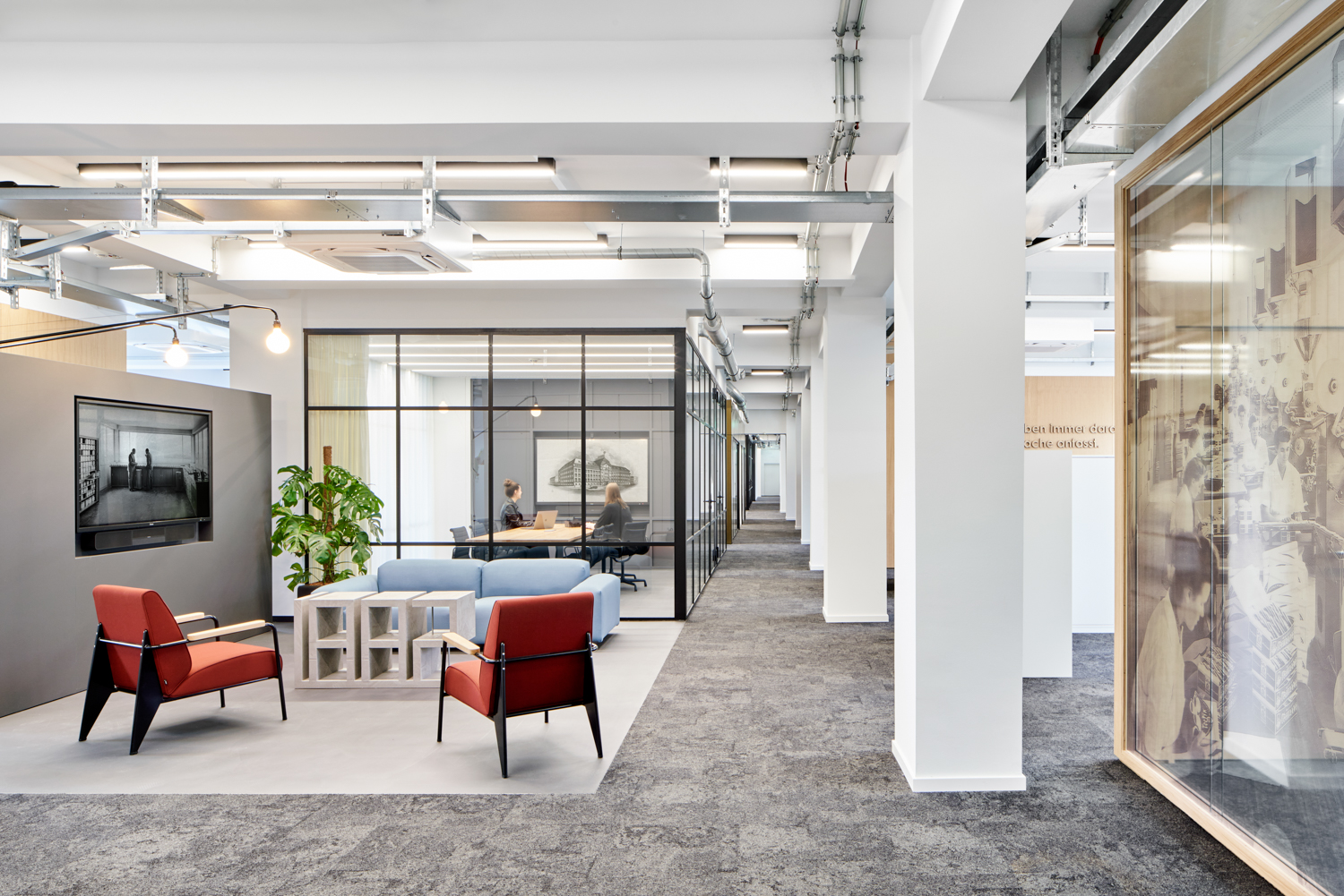
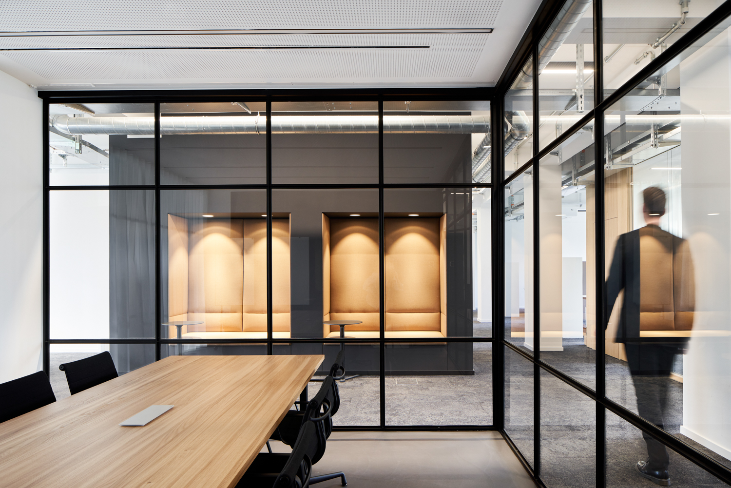 The future of office culture hangs by a thread, and architects are increasingly seen as the heroes capable of coaxing a reluctant workforce out of their homes. Charged with strengthening employee’s identification with their employer, this multispace strives to integrate their patron’s long company history and state-of-the-art production techniques with the comforts of home offices, which allow employees to retreat when needed, and therefore to be fully present when needed in the work community.
By Feldman Architecture, Los Altos Hills, California
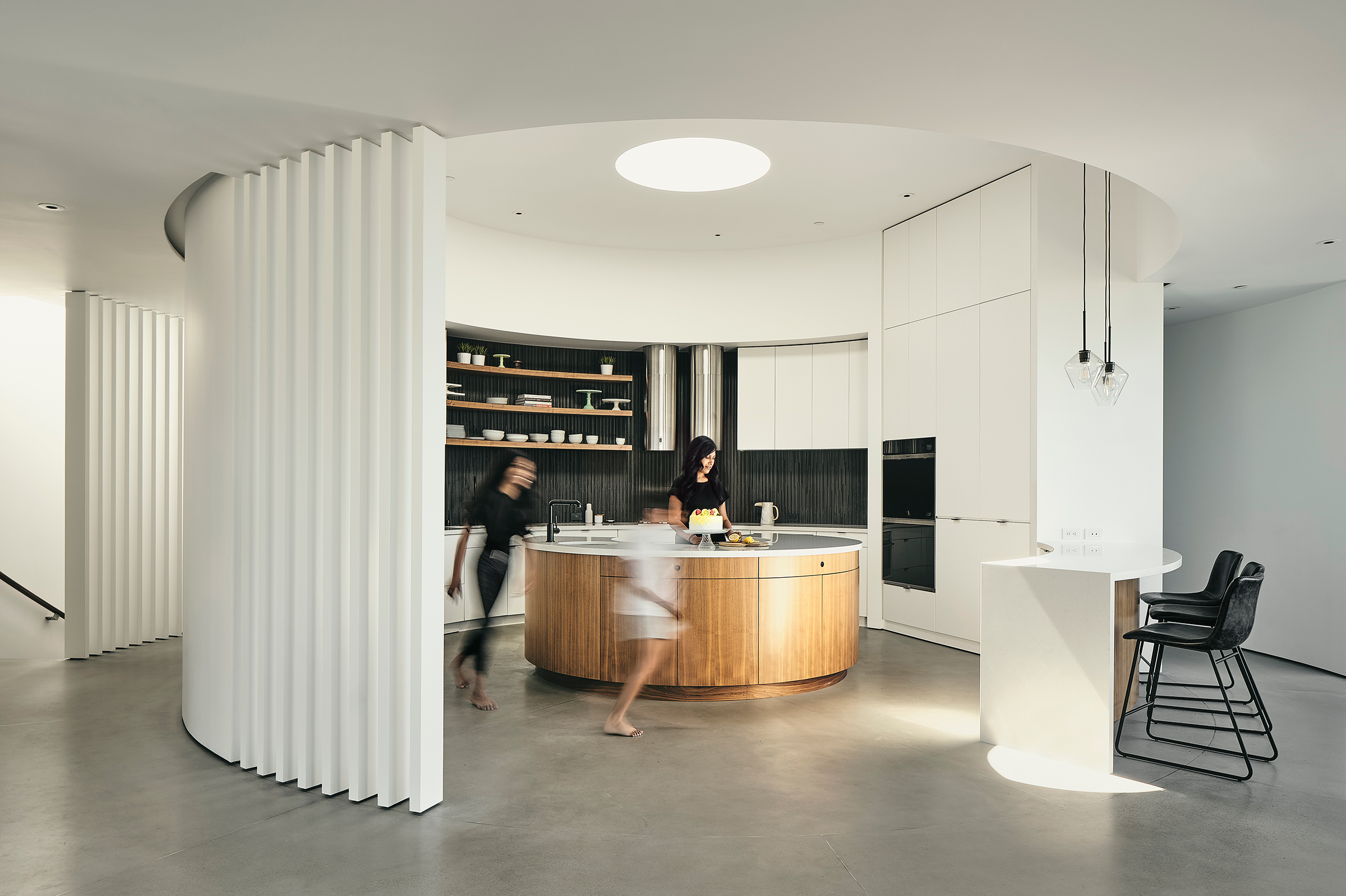
Photos by Adam Rouse
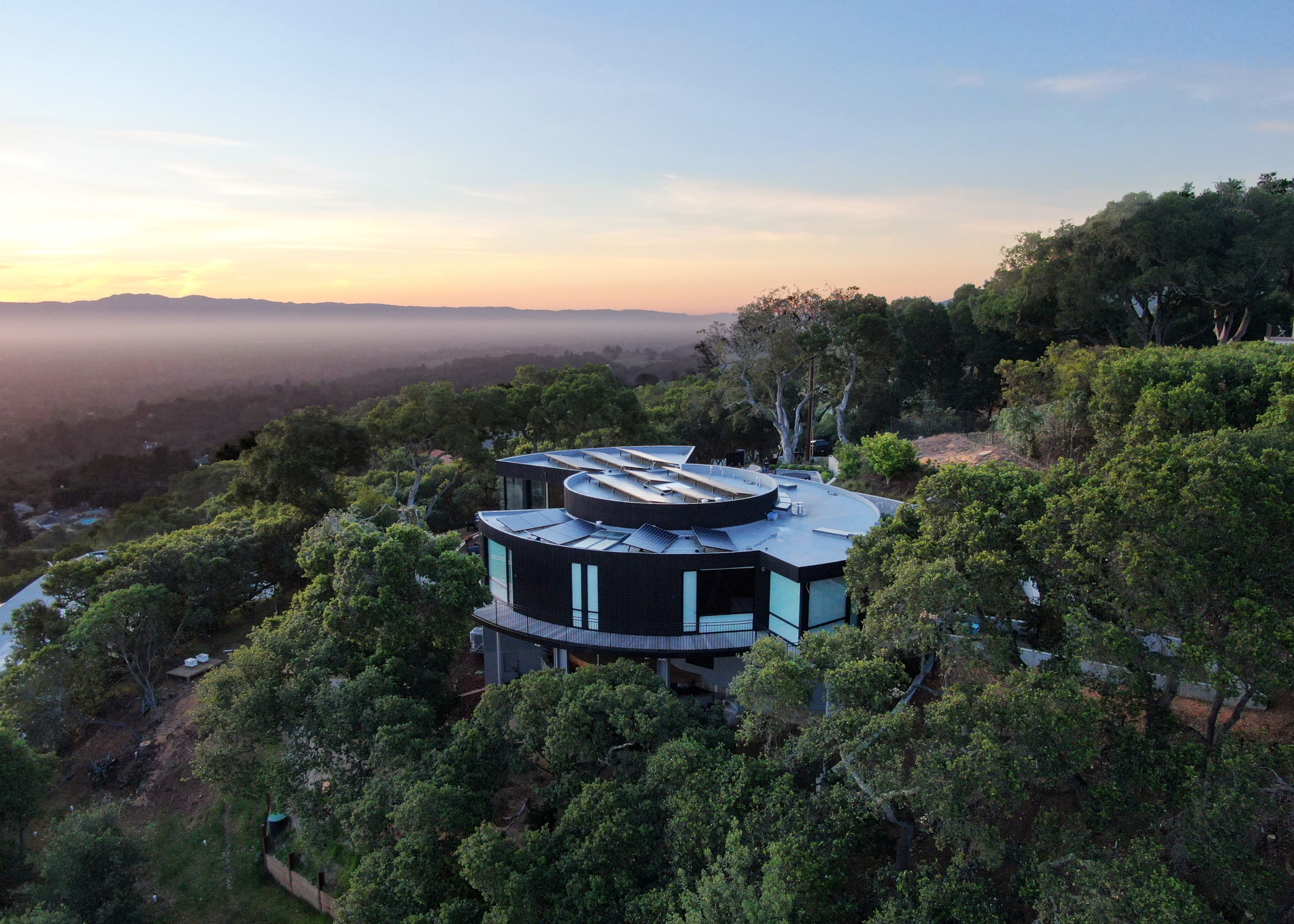
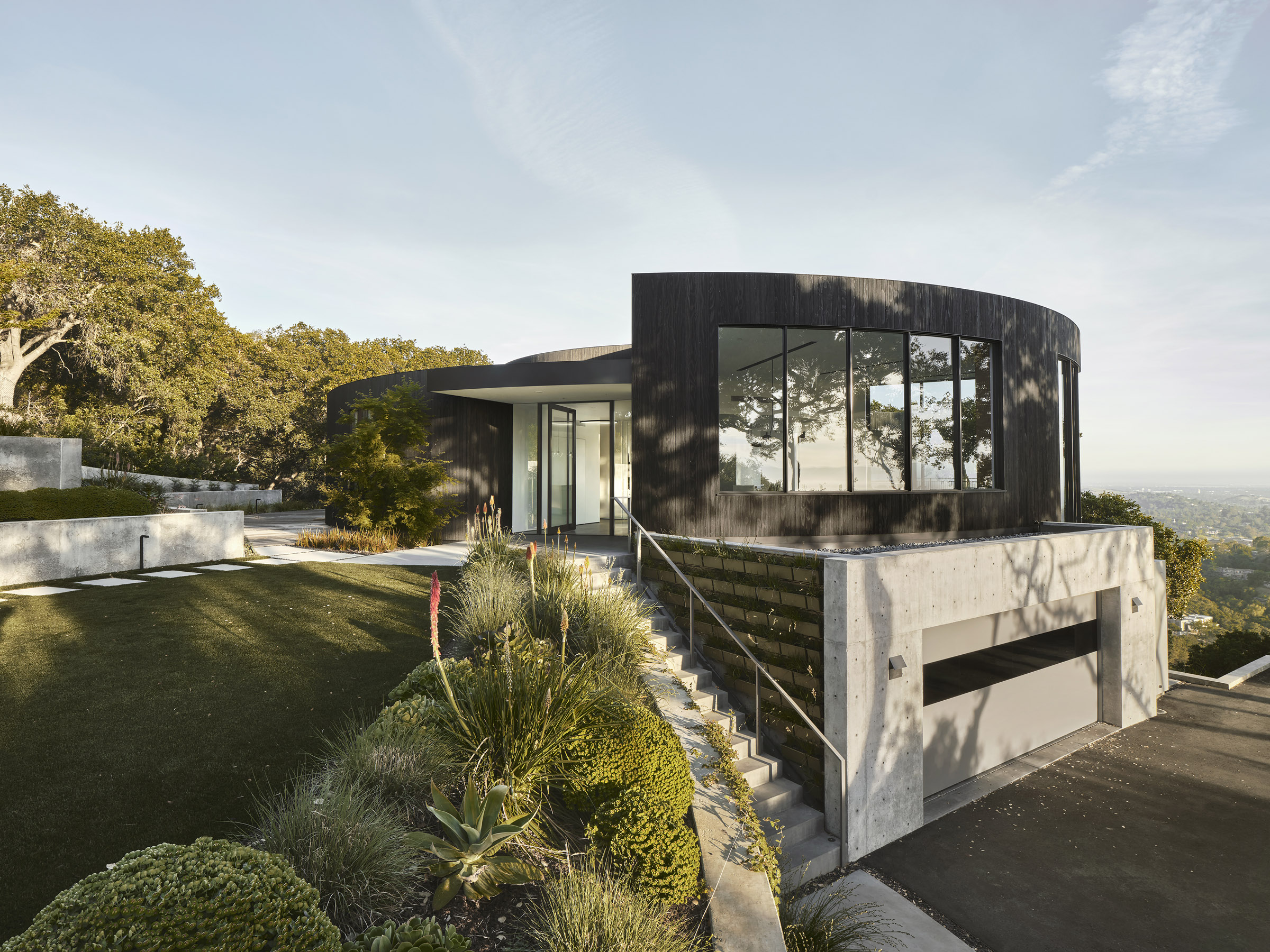
California’s leading place in avant-garde architecture of the 1960s is well established; however, homes with circular floor plans, which were experimented with during this period, remain absent from the canon of modern. Though challenging from a layout perspective, the many benefits and intrigues of designing homes with soft edges remain under explored. Feldman Architects were given the change to reconsider this residential layout in a recent commission to reimagine and modernize just such a home — and the result is truly mesmerizing.
By TYRANT Inc., Koizuka, Kumagaya, Japan
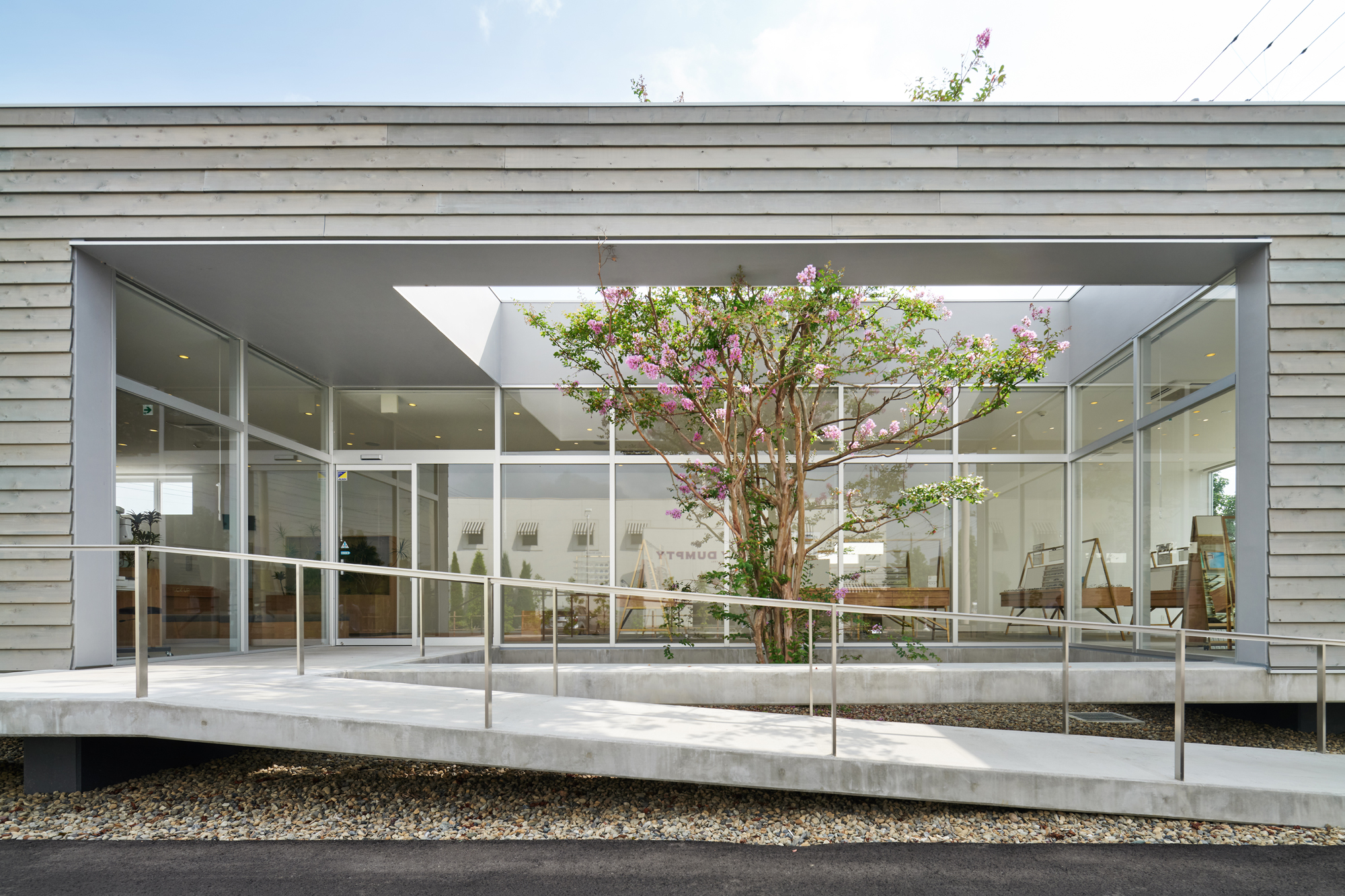
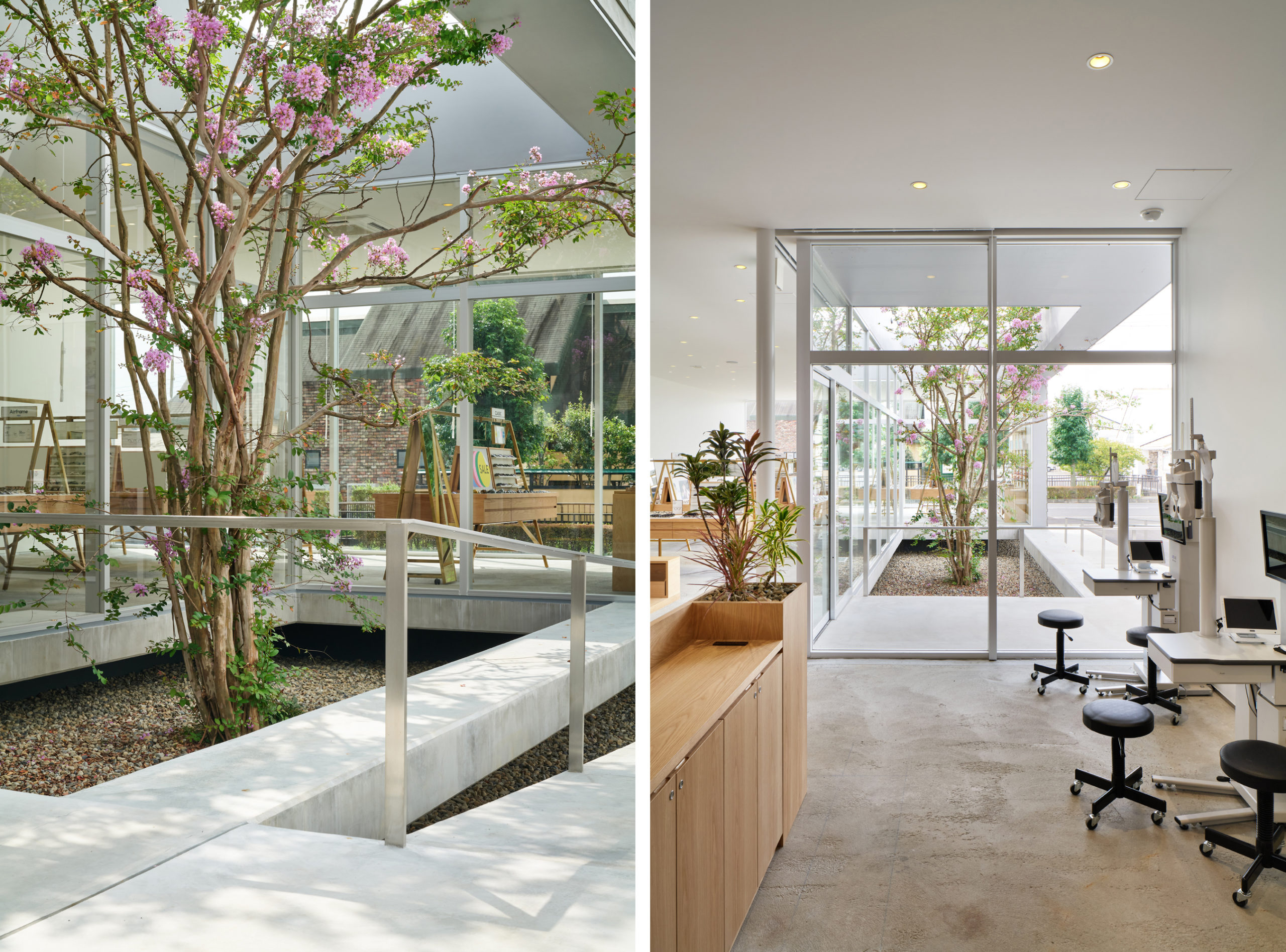 How to elevate a suburban box store into an intriguing and enjoyable space? This Japanese firm complicates the typical elongated rectangular in plan in several key way. First, the building appears to float thanks to a level difference, which helps it to stand out. Next, a small patio is carved into the front center of the building, not only enhancing the appearance from the outside, but also providing greenery on the interior, since the planted tree is visible from all sides of the commercial space. In this way a simple architectural design provides a rich presence for visitors.
Architects: Want to have your project featured? Showcase your work through Architizer and sign up for our inspirational newsletter.

