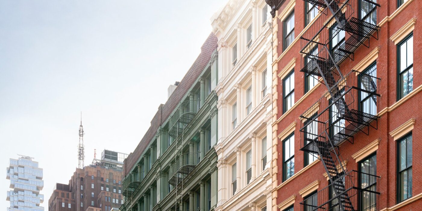
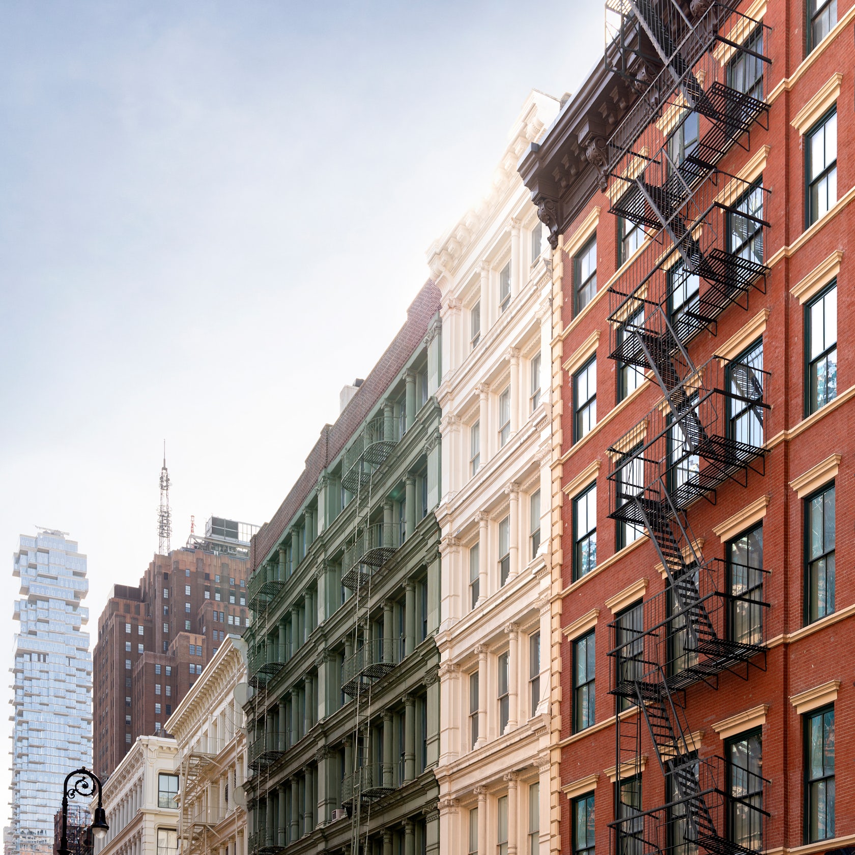
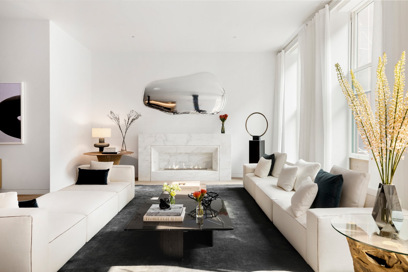
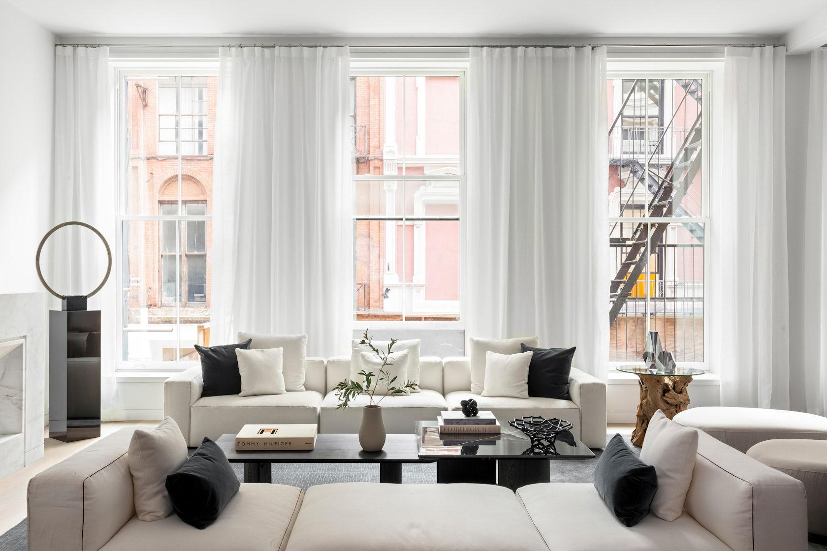
49 Greene Street – a 6-story building in NYC’s historic SoHo district, is an extant example of the mixed iron-and-masonry construction of the post-Civil War era. The client’s brief was to restore the building’s masonry façade and cast-iron storefront, and to convert the interiors into four high-end residential units. To do this, we drew inspiration from the makers and artist ls that once occupied this previously manufacturing building to create units that embrace modern concept of ‘loft living’, in which open, non-programmed flexible spaces meet highly crafted, millworked moments, adding warmth throughout with the use of woods, marbles, and ironwork.
Architizer chatted with Jordan Rogove, Co-Founder and Principal of DXA studio, to learn more about this project.
Architizer: What inspired the initial concept for your design?
Jordan Rogove: We wanted to speak to the various movements that helped form SoHo’s unique character and charm. Much like the artists who were attracted to the neighborhood’s empty lofts in the 1960’s, we too were drawn to the building’s high ceilings, abundant light, and expansive floor plates. For this reason, we are committed to leaving the spaces as open, fluid, and customizable as possible.
However, we were acutely aware that we were designing a home, so introducing a residential scale was important to make the otherwise large space comfortable and inviting. To achieve this, we lowered the ceiling in select rooms and introduced a high level of craft and tactility – our way of communicating with the by-gone manufacturing era of SoHo.
Throughout these rooms, we created a material theme of oak wood paneling, blackened steel, fluted glazing and various marbles. These materials are not only visually exquisite, but very in their tactile qualities, which we believe to be crucial adding warmth and comfort to a home.
© DXA studio
© DXA studio
© DXA studio
This project won in the 10th Annual A+Awards! What do you believe are the standout components that made your project win?
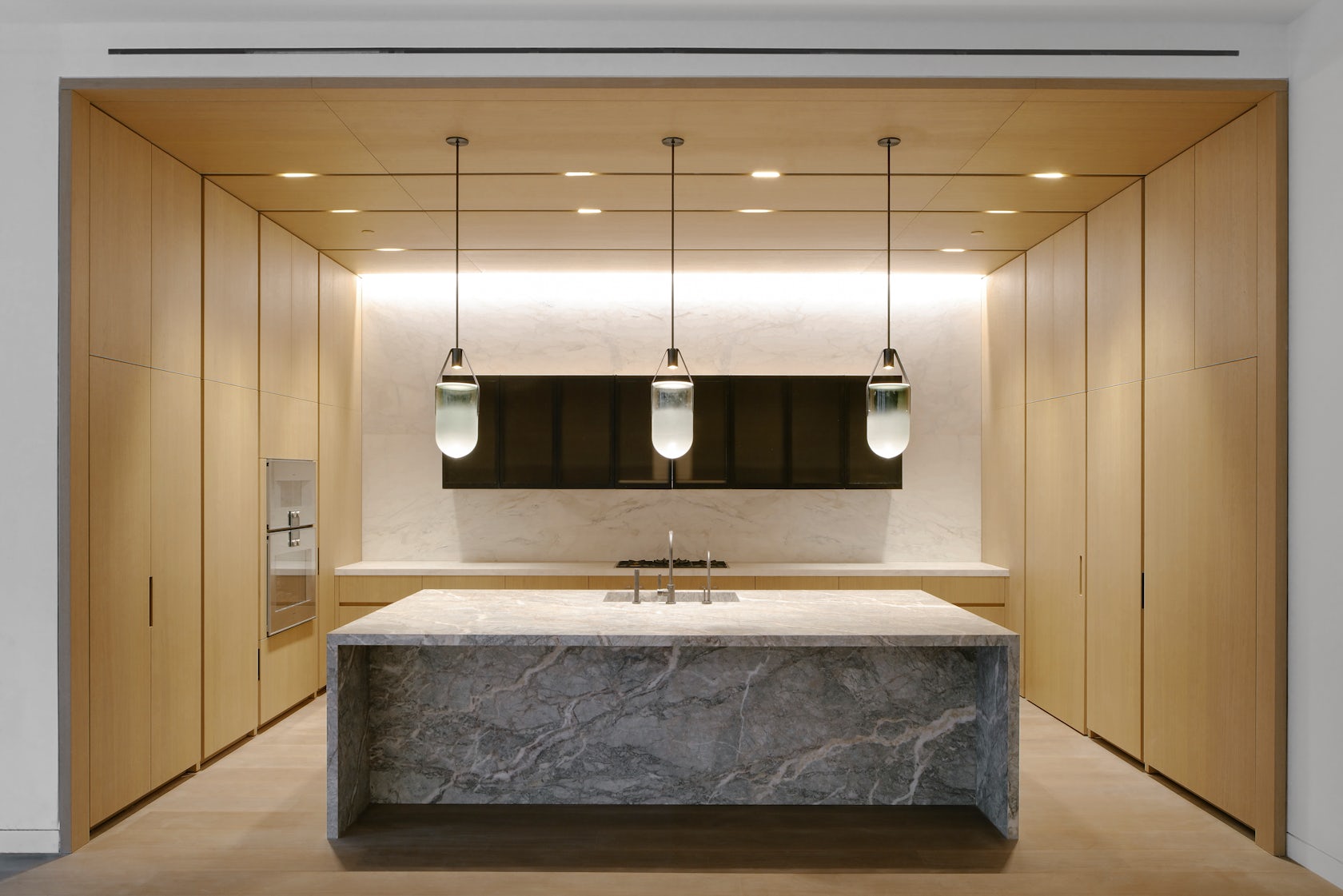
The kitchen and den–the hearth of the home–are the showpieces of each unit, as they are not only beautiful and practical, but speak to each other in their materiality and detailing.
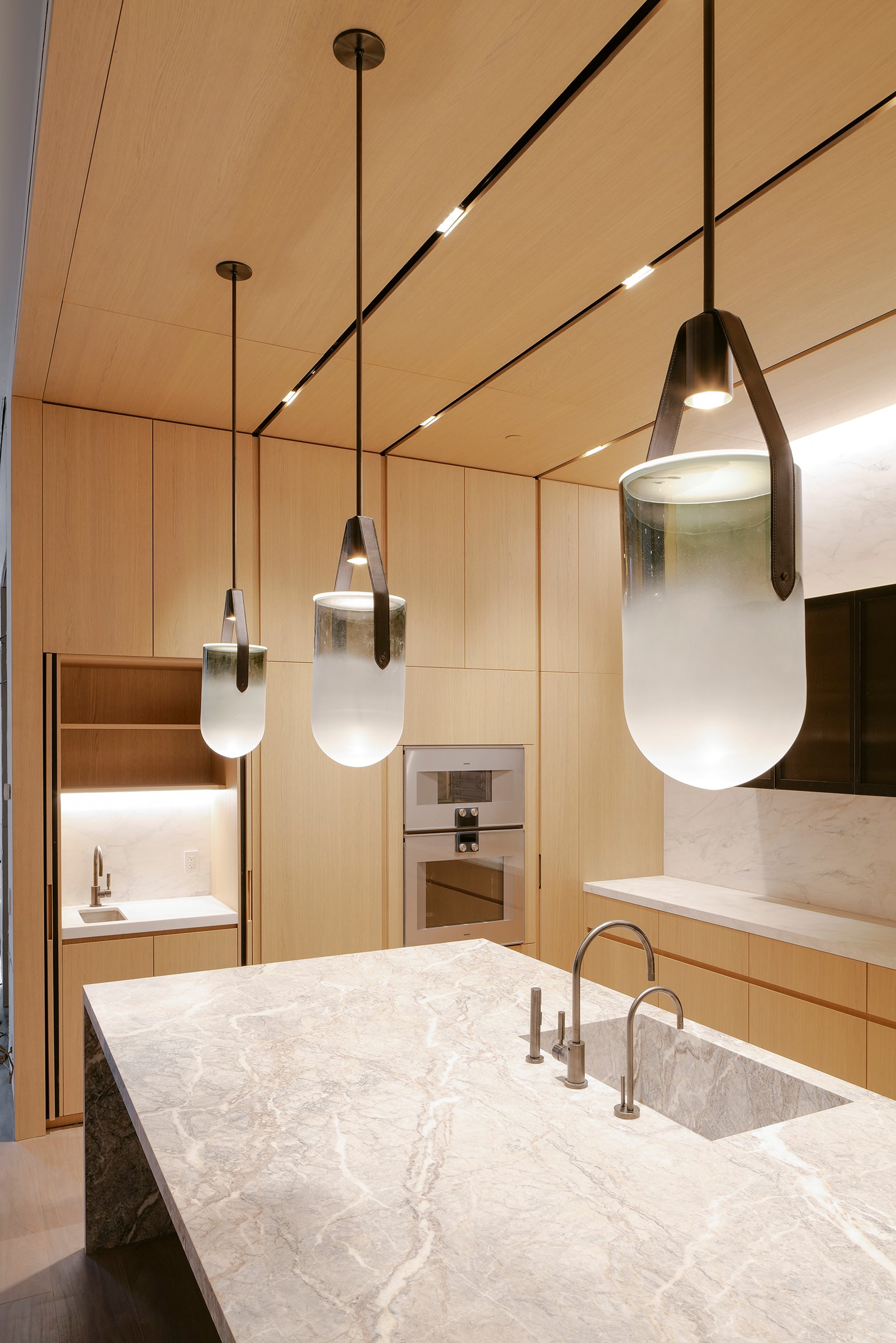
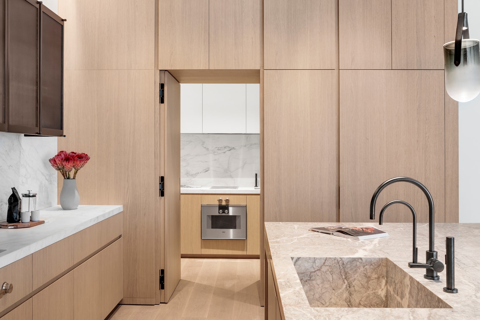
In the kitchen, the appliances, storage, and secondary scullery kitchen are all seamlessly hidden behind white oak paneling with beautifully crafted integrated pulls. This paneling wraps onto the ceiling to cleverly integrate recessed lighting and HVAC diffusers. The island is crafted out of a single slab of Fior di Pesco marble, known for its ability to add calm and serenity to a space, while the upper cabinetry is clad in blackened steel and fluted glass.
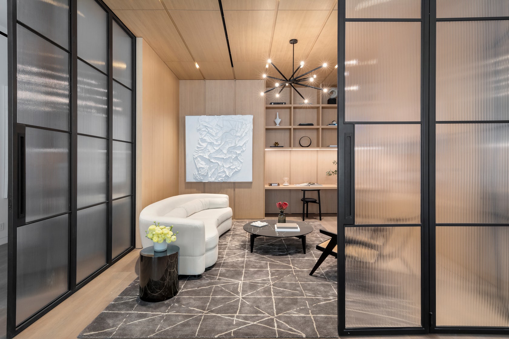
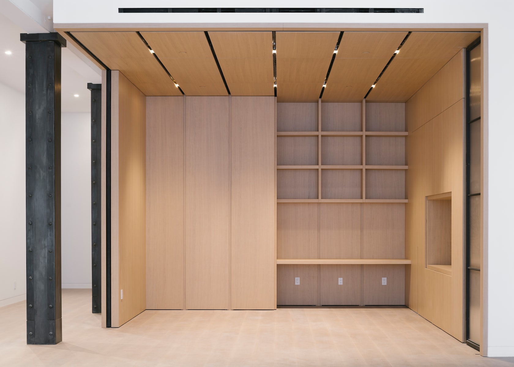
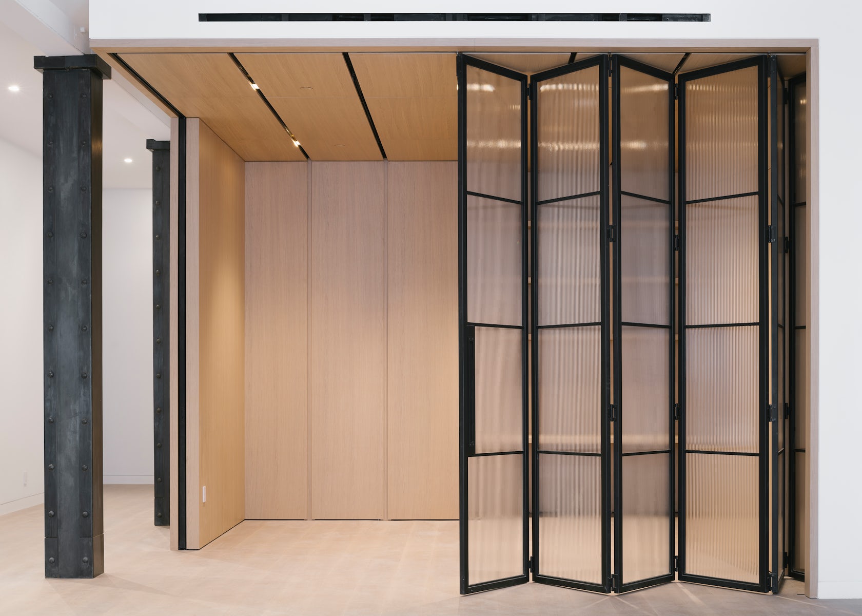
This millwork detailing continues into the den, where white oak paneling and a built-in desktop can be closed off from the main living spaces by large blackened steel and fluted glass doors. Alternatively, these doors can perfectly tuck away into the oak millwork to allow flexible space programming.
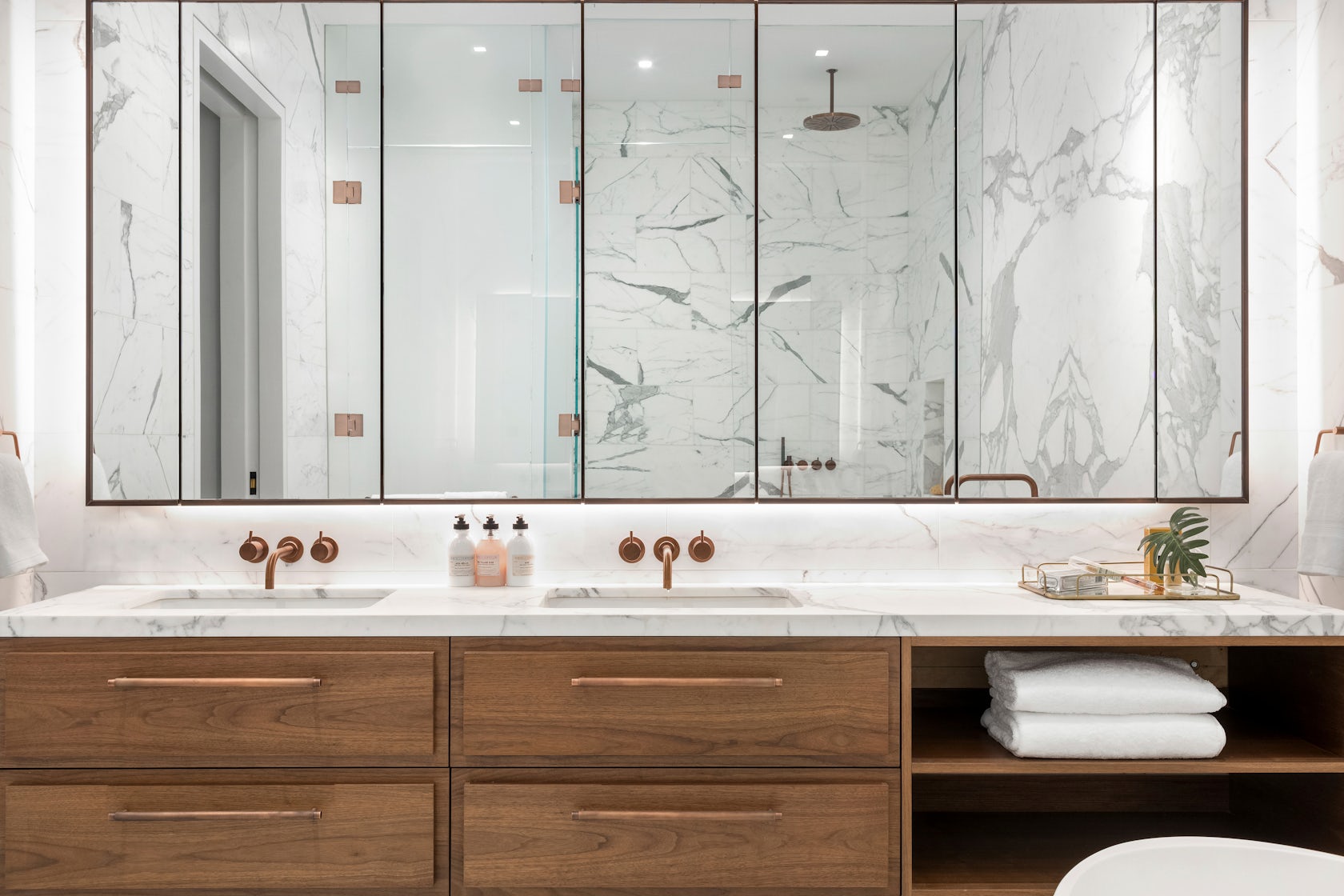
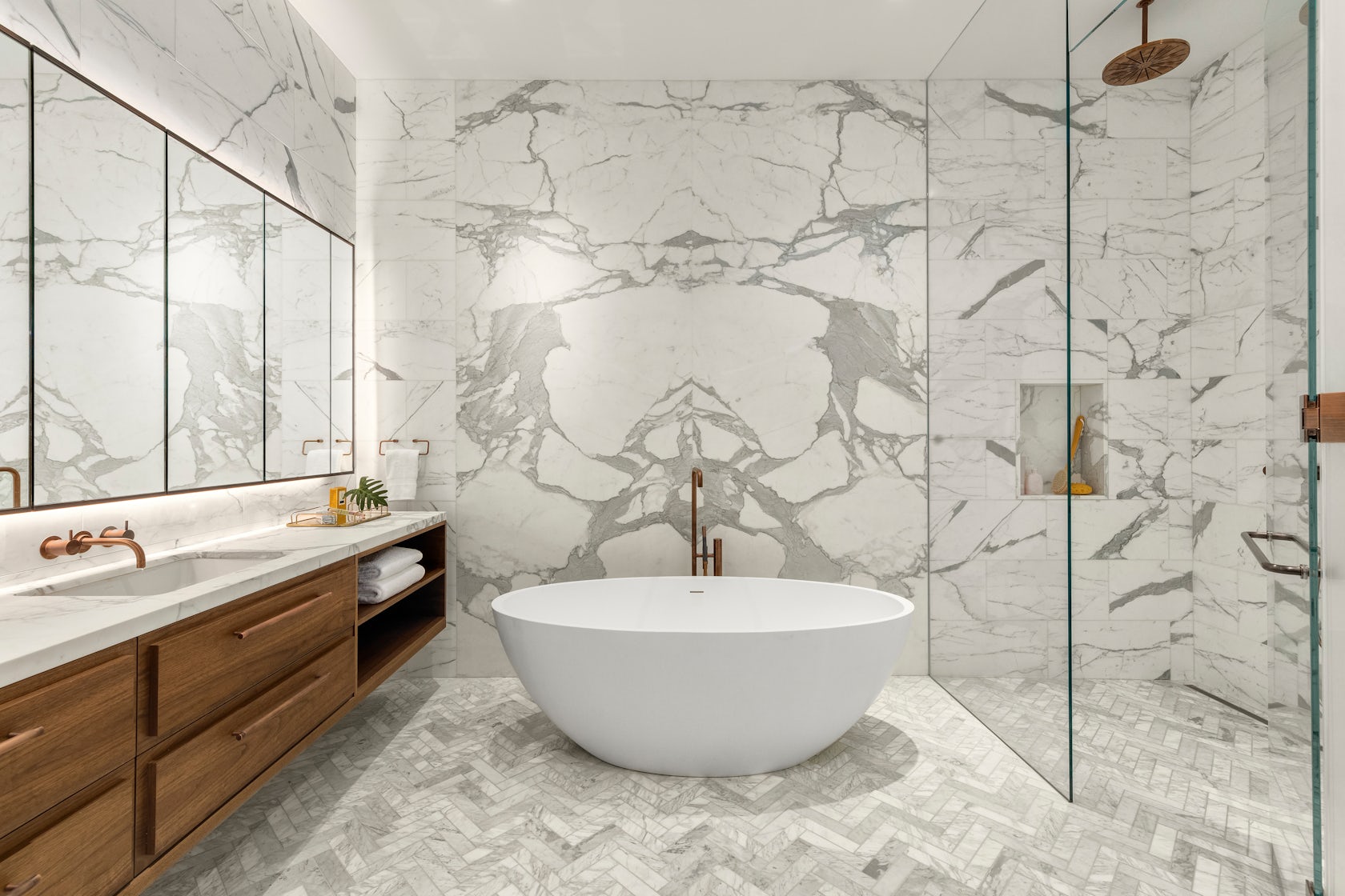
Many of these materials can be found throughout the unit, creating an overarching theme. For instance, the blackened steel of the den’s custom doors is mirrored in the steel frames of the bathroom vanities, the plumbing fixtures, and even the column cladding.
© DXA studio
© DXA studio
What was the greatest design challenge you faced during the project, and how did you navigate it?
Renovating a manufacturing building from the 1800’s was an exciting challenge, both in terms of design and coordination. On the design side, we believe that as architects, it is our duty to celebrate the area’s rich history in an authentic yet contemporary manner. This is why we wanted to keep the open nature of these spaces as much as possible. It is also why we used wood and iron in a way that is reminiscent of previous eras, while using contemporary detailing to bring these materials to the present day.
On the coordination side, working with existing buildings in NYC is always a challenge. As precisely as we survey all historic projects, we often encounter surprises during construction that require us to tweak our design on the fly–and 49 Greene was no exception. Furthermore, we had to design an entirely new roof structure, as the existing roof was significantly sloped, which meant giving the 200-year old structure upgrades to account for modern building technologies.
© DXA studio
© DXA studio
What is your favorite detail in the project and why?
Although it is one of the smallest rooms in each unit, we think the powder room really packs a punch. The vanity and sink are entirely made out of Fior di Bosco marble, which marries well with the ebony black wood veneer panels to create a dark yet calming atmosphere.
© DXA studio
© DXA studio
In what ways did you collaborate with others, and were there any team members or skills that were essential in bringing this Award winning project to life?
The nature of this project required us to closely collaborate with millworkers, iron workers, and various craftspeople to get the detailing down. We worked with Canova on all of the millwork, Manhattan Steel Door Co. on the large den doors, and with Sage Construction on the stonework and other general detailing. We had many pencil sessions and back-and-forth shop drawing reviews to better understand how to achieve the level of craftsmanship that we envisioned–and we really refined our knowledge of interior detailing along the way.
© DXA studio
© DXA studio
For more on 49 Greene Street, SoHo, please visit the in-depth project page on Architizer.
49 Greene Street, SoHo Gallery

