Architizer’s new image-heavy daily newsletter, The Plug, is easy on the eyes, giving readers a quick jolt of inspiration to supercharge their days. Plug in to the latest design discussions by subscribing.Â
It is inevitable. At some point in the school year, a student in my AP Literature class will ask the dreaded question: what is “Modernism?” Usually, this happens in the afternoon before a full moon…
I try to keep it general. In literature and the visual arts — the representational arts, let’s say — modernism was an attempt to find new forms of artistic expression to meet the needs of a rapidly changing world where old certainties and trust in institutions were falling away. Often, this meant disrupting verisimilitude and drawing attention to the constructed-ness of the art object. As the caption of Magritte’s iconic painting declares, Ceci n’est pas une pipe! A painting of a pipe is not a pipe; it’s a painting.
Even though modern art seems “weird” to casual museum-goers, there was a method to the madness. Modern artists rejected representational conventions in pursuit of honest expression. Counterintuitive as it might seem, they wanted to bring art closer to life. This meant breaking the spell of illusion that had defined Western art since the Renaissance.
What kind of truth, though, does modern art speak to? Many kinds, to be sure, but I think they can be separated into two main buckets. (Or coffins to stick with the horror theme). On the one hand, you have the analytic tradition represented by Cubism, which, especially in its early years, involved a deconstruction of the picture frame. What you see in a Cubist painting is the underlying architecture of the composition. As with Brutalist architecture, the key gesture of Cubist art is to lay bare the object’s structure and not smooth it over with surface details.

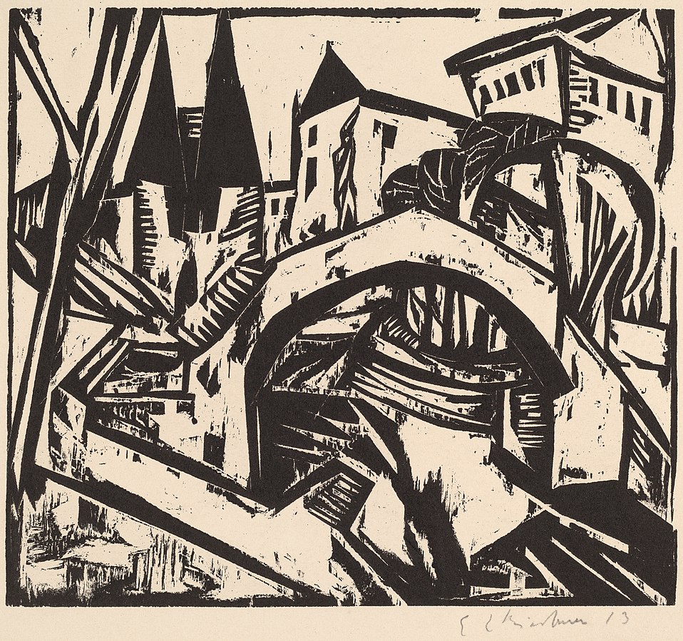
A print by German Expressionist artist Ernst Ludwig Kirchner titled “River Bank at Elisabeth, Berlin” (1912). The jagged lines and collapsed perspective anticipate the visual style of “The Cabinet of Dr. Caligari” (1920). National Gallery of Art, CC0, via Wikimedia Commons
On the other hand, there is Expressionism. Influenced by psychoanalysis, Expressionists sought to represent the irrational elements of subjective experience. Artists like Edvard Munch and Ernst Kirchner created wildly distorted landscapes, portraits, and urban street scenes that were charged with emotion. Many of these artists were especially interested in capturing the alienation and loneliness of urban life.
So how does architecture fit in? It is perhaps not surprising that the analytic vein of modernism was more readily applicable to the design of buildings than Expressionism was. In architecture, the word “modernism” is today synonymous with the rationalist utopianism of Gropius, Mies, and figures like this. However, this is not the whole story…
Modern architecture as we know it had an evil twin — one that died in childhood, but still haunts us today. In the 1920s, there was such a thing as Expressionist architecture. It never really flourished — that is, not until much later when it was picked up by contemporary architects like Daniel Liebskind — but it existed in Germany, the Netherlands, and a few other areas in Northern Europe. Distortion, fragmentation, and the expression of strong emotion were the key features of this type of architecture. Like the rationalist modernism we know and love, Expressionist architecture rejected tradition, but it did not do so in a Platonic pursuit of harmony. No — this architecture was not bound by anything but the architect’s imagination.
Let’s take an example. In Dornach, Switzerland, one can visit The Goetheanum, which is the headquarters of the anthroposophy movement. Anthroposophy is a form of mysticism, or more precisely, gnosticism. Its adherents believe that, through certain meditative techniques, people can gain direct knowledge of the spiritual world. Rudolf Steiner founded the movement in the early 20th century. Steiner also designed the headquarters, a flowing, bat-like structure made entirely of cast concrete.
The building still appears radical today, in an era when we are used to seeing sculptural architecture. But think about how it must have appeared to the citizens of Dornach when it was erected in 1928. Many of the design decisions, such as the chimney stack that seems to have been hastily molded out of clay by a gigantic hand, would have been totally incomprehensible to people used to architecture that followed programmatic conventions. The uneven windows still bother me when I look at them long enough.
Here’s another good example: the Het Schip apartment complex in the Spaarndammerbuurt neighborhood of the Netherlands. The name means “The Ship” and I guess it looks sort of like a ship. Sure. This was designed by architect Michel de Klerk and erected in 1919.
With its brick façade and tiled roof, at first blush this building doesn’t seem totally out of place with its context in Amsterdam. However, the proportions are bizarre — unsettlingly so, as if the building was designed by an alien who had read a description of Dutch architecture but had never actually seen it. Inside, the situation is even stranger. Looking up from inside the tower, one finds a riot of intersecting wooden support beams. There seems to be no regularity, symmetry, or even method to the arrangement of the beams. There isn’t even that sort of irregular fractal harmony one finds in the work of Antoni Gaudi. It just feels wrong, albeit in an interesting and stimulating way.

The madness of Het Schip is more apparent on the interior. Here is the view inside the central tower. Arjandb, Rijksmonument 3961 Huizenblok Het Schip Amsterdam 23, CC BY-SA 3.0 NL
As stand alone objects, Expressionist buildings from the 1920s are really cool. One should not interpret my description of their weirdness as a dismissal of the structures in themselves. Every city needs discussion pieces, and expressive, sculptural architecture helps give definition to otherwise homogeneous urban environments. In our century we call this the “Bilbao Effect.”
Nevertheless, in the 1920s, the emergence of Expressionist architecture must have troubled some onlookers. Was this what the future would look like? Would built environments be just as disorderly and mercurial as the human mind? What would it even feel like to live — not just in an Expressionist building — but in an Expressionist city?
These questions seem to have been taken up by the art direction team of The Cabinet of Dr. Caligari, the 1920 German silent film that Roger Ebert once called “the first true horror movie.”

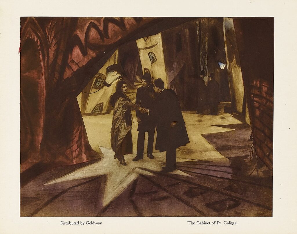
Lobby card of “The Cabinet of Dr. Caligari,” showing the twisted and distorted architectural forms of the set design. Goldwyn, Public domain, via Wikimedia Commons
The Cabinet of Dr. Caligari is one of the most studied and discussed films of all time. The film tells the story of a power-hungry hypnotist who manipulates a sleepwalker into committing a series of murders. The screenwriters, Hans Janowitz and Carl Mayer, were pacifists, like many Germans at that time. Janowitz had served as an officer in World War One, where he witnessed the nihilistic chaos and destruction of that conflict up close. The screenwriters both claimed that the film was intended as an allegory for the way authority was wielded during the Great War, with the older generation coercing the young to kill and die on their behalf.
In his landmark 1947 book From Caligari to Hitler, film theorist Siegfried Kracauer argues that the film is more complex than even its screenwriters understood. It does not just put forward a critique of irrational authority; it also shows how, in the 1920s, the German people craved this type of authority on a subconscious level. Kracauer points to the twist ending of the film, which the studio forced the screenwriters to add against their will. In the end, it turns out that Dr. Caligari was not actually a mad hypnotist, but rather the director of a mental hospital. The hypnotism and the murders never happened. They were simply a fantasy concocted by one of the inmates.

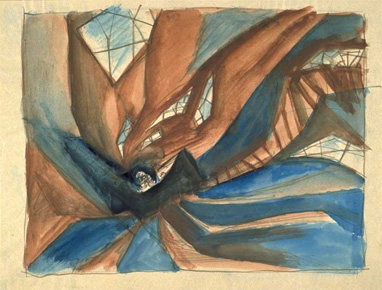
A conceptual preliminary sketch of the set design by Walter Röhrig. 1919. Note the fragmentary windows and staircase. Public domain via Wikimedia Commons
At some level, Kracauer argues, this inmate wanted to be hypnotized and ordered around by an external authority. This type of control would liberate him from the burden of his freedom. Kracauer believes this type of sentiment was widely shared among the German people in the confusing and chaotic postwar period. He argues that cinema has a special ability to reflect collective sentiments, as it is a collaborative medium with no sole author. By looking at German cinema from the 1920s until the rise of Hitler, Kracauer claims, one can observe the dreams, fears, and aspirations of a population that was in the process of rejecting democracy and embracing violent totalitarianism.
Kracauer’s reading of The Cabinet of Dr. Caligari, which emphasizes the unconscious forces at work in the narrative, is most powerfully expressed in the film’s radical set design, which was deeply influenced by the work of Expressionist painters such as Kirchner. Ebert described the world of the film as “a jagged landscape of sharp angles and tilted walls and windows, staircases climbing crazy diagonals, trees with spiky leaves, grass that looks like knives.” Black paint was used to create disorienting shadows in both the exterior and interior scenes. The proportions of everyday objects, like chairs, tables, and windows, are radically at odds with what one would expect. To use a German word, they are unheimlich: familiar yet strange and somehow sinister.

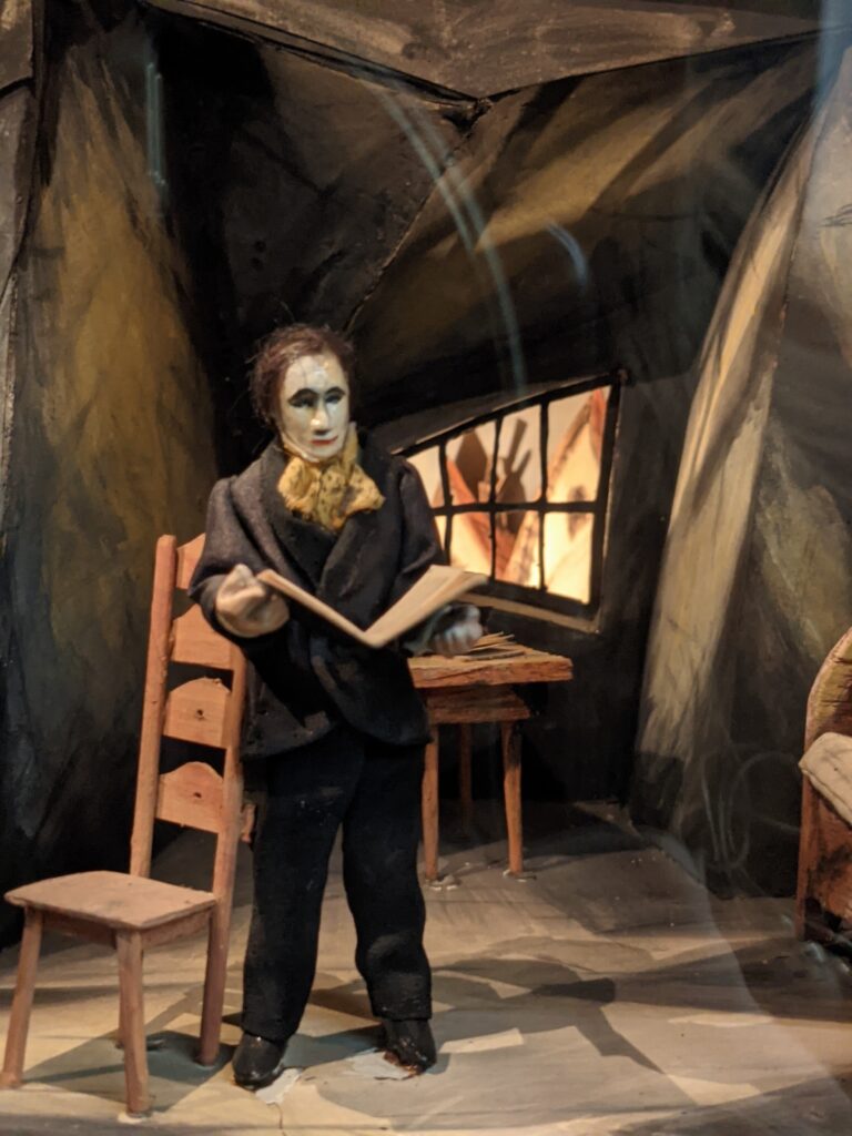
Model of The Cabinet of Dr. Caligari (1920) film set: Alan’s Living room during the scene of the murder. Reconstruction by set designer Hermann Warm. Note the exaggerated height of the back of the chair. For some reason, this has always been a creepy detail for me. Displayed at the Museum of Film and Television Berlin, Deutsche Kinemathek, SunOfErat, Filmmuseum Berlin – Caligari Model, CC BY-SA 4.0
In short, the built environment of the film represents the world of the psyche. In here, it is hard to orient oneself, and there might always be killers lurking in the shadowy corners. As in a Kirchner painting, there is powerful honesty in the film’s lack of realism. But one thing must be acknowledged: this is not a city anyone would want to live in. Perhaps our inner lives are stormy and chaotic — we are, after all, creatures of desire and habit. But this does not mean our houses, apartments, and city streets need to express this aspect of ourselves. If anything, they should be designed to nudge us out of the darkness and into the light.
Image: Still from The Cabinet of Dr. Caligari. CC BY-NC-SA via Norwegian Digital Learning Arena.
Architizer’s new image-heavy daily newsletter, The Plug, is easy on the eyes, giving readers a quick jolt of inspiration to supercharge their days. Plug in to the latest design discussions by subscribing.Â

