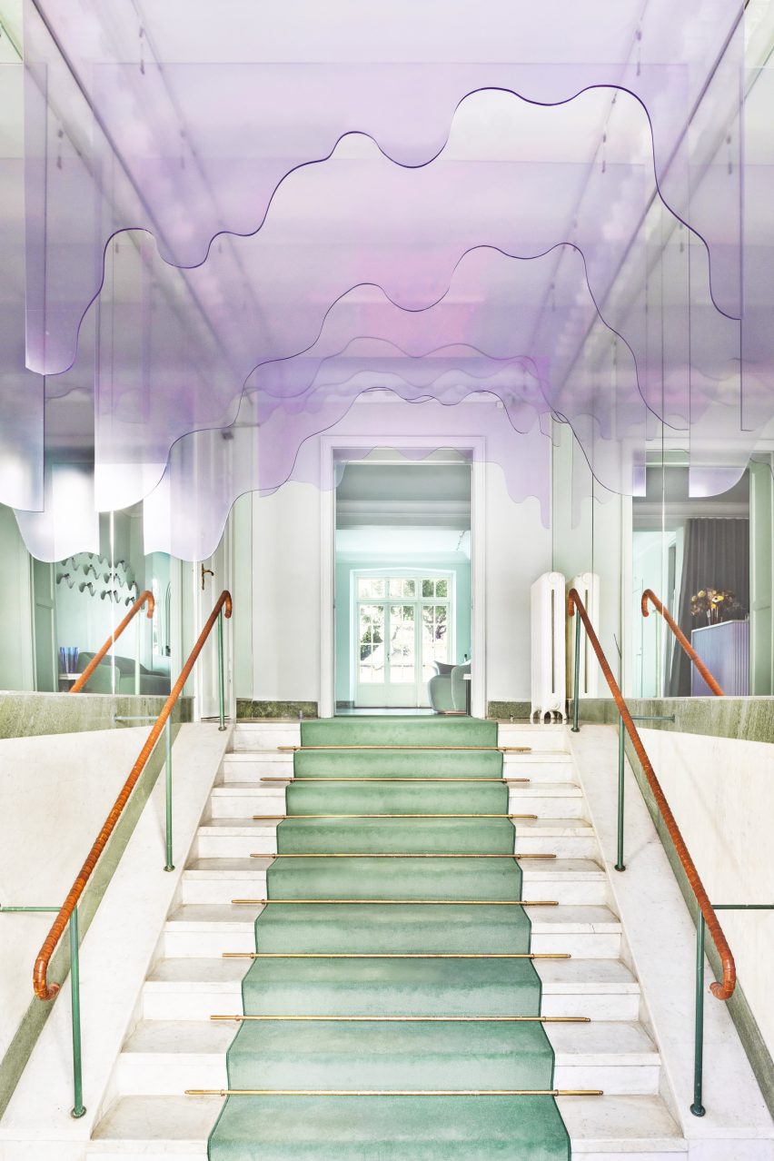
Swedish architecture studio ASKA has refurbished haircare brand Maria Nila’s headquarters and salon in Stockholm, creating an undulating ceiling installation that looks like dripping shampoo.
The Stockholm-based firm used a palette of soft pink, peach and turquoise colours that reference Maria Nila’s products to transform its headquarters in a four-storey townhouse.
“The interior space before the renovation had a very neutral, impersonal feel to it and followed a white and grey colour scheme,” ASKA co-founder Madeleine Klingspor said.
“At ASKA, to the contrary, we always strive to create strong and flavoured environments by defining and highlighting the unique essences within each project.”
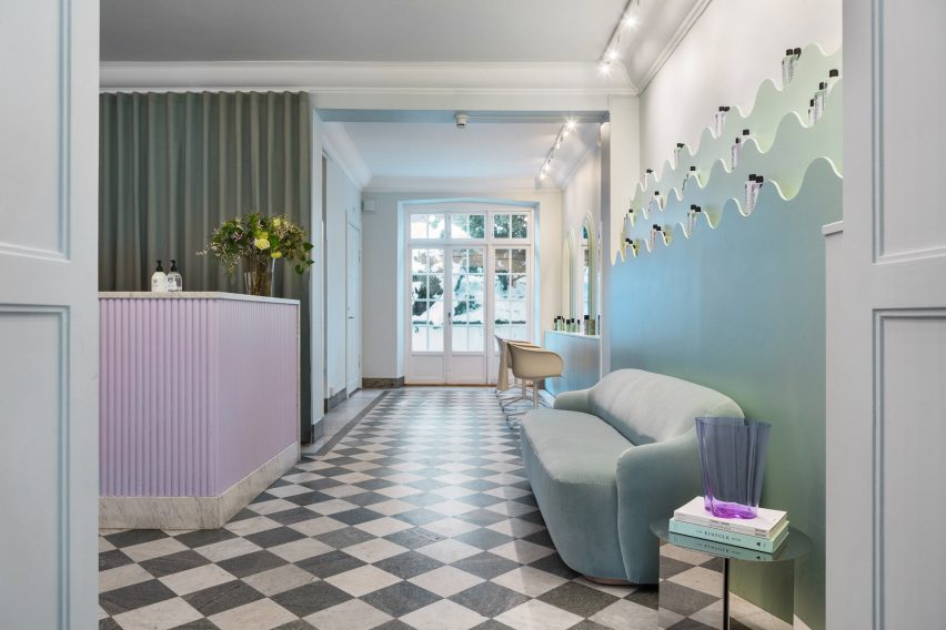
The studio preserved some of the original details in the building, including a green chequered marble floor and a wooden staircase, while the rest of the space was fully refurbished.
“To add a layer of the uniqueness of Maria Nila as a brand most other parts of the interior was changed,” Klingspor said.
“Some thinner interior walls were torn down, most surfaces were repainted, new flooring was partly added as well as all bathrooms fully renovated.”
The 650-square-metre building has 30 rooms, including five bathrooms, and houses both Maria Nila‘s public and private spaces.
Though each room has a unique look, all were designed to create a coherent relationship between the existing architecture and the new interior details.
“The program is distributed in a way where the entrance floor is the most public and then gradually the spaces become more private and workspace-oriented the higher up that you get,” ASKA co-founder Polina Sandström said.
“The reception, salon, beauty bar, conference and meeting areas make up the first floor while the second floor is well adjusted for larger gatherings and events including a kitchenette, a viewing room and a bigger break-out space,” she added.
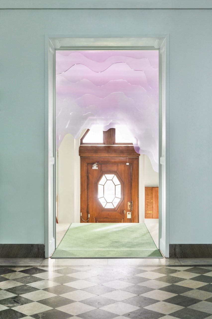
At the entrance, ASKA installed a pale-pink art installation made from form-cut plexiglass designed to resemble shampoo dripping from the ceiling.
Much of the furniture was specially designed for the project, including product shelves, sofas and a beauty bar made from wood and MDF.
“Besides that, we chose to bring in products from companies that use sustainable materials, for example, a custom-made tabletop from Smile Plastic, a company that only uses waste materials in their products,” Klingspor said.
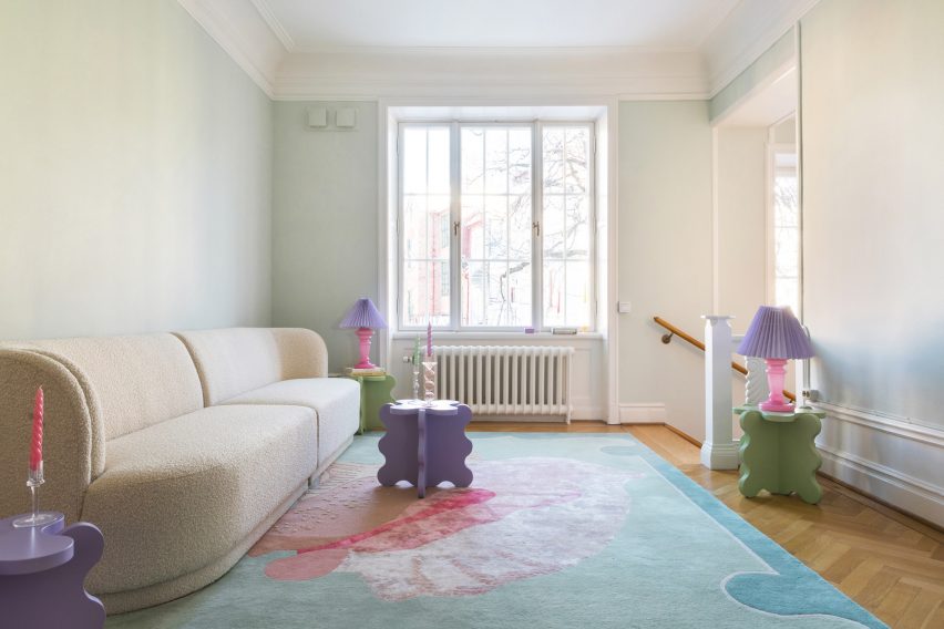
The new interior design was informed by the haircare brand’s own products, an influence that is most notable in the pastel colour palette.
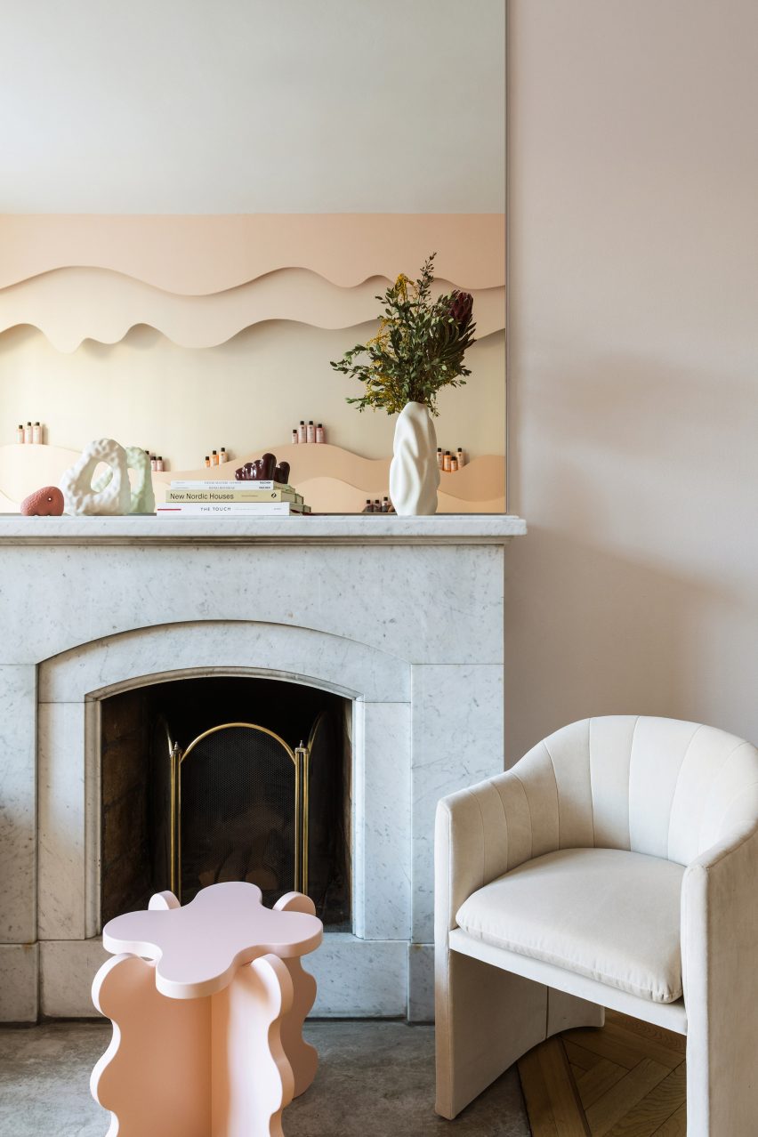
“The colour scheme chosen for the different spaces throughout the building refers to the different haircare lines of Maria Nila,” Sandström said.
“These pastel colours are one of the main identities of the brand and we decided early on that this was one of the unique essences that were important to bring to the surface through our design.”
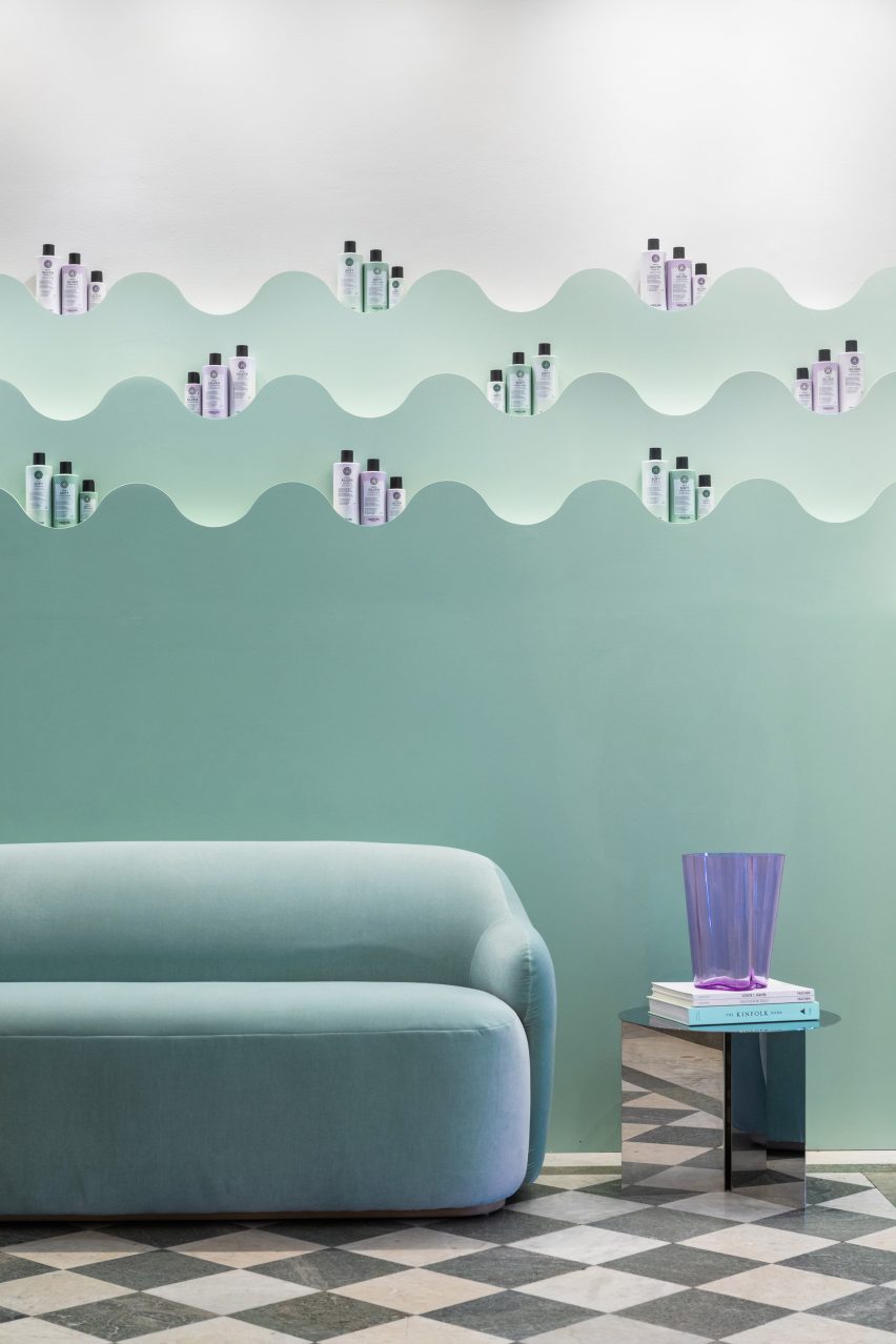
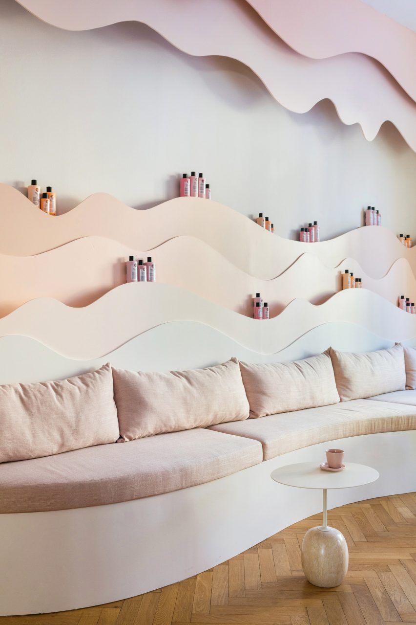
ASKA also designed numerous undulating wall shelves to hold haircare products. Painted in matching gradient hues, these were informed by nature.
“The organic shapes are inspired by elements found in nature such as the forest, ocean, coral reefs and caves,” Sandström said.
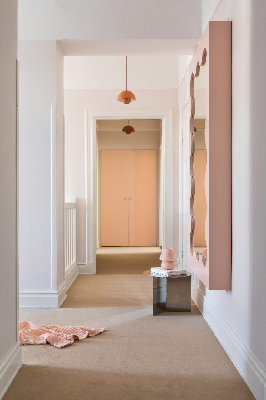
“This soft and playful architectural language together with the pastel colours gives the interiors a unique visual identity,” she added.
Other playful hair salon interiors include Studio Roslyn’s design for a salon that is the “lovechild of art deco and Cyndi Lauper” and an avocado-green Beijing salon informed by space-age design.
Photography is by Mikael Lundblad.

