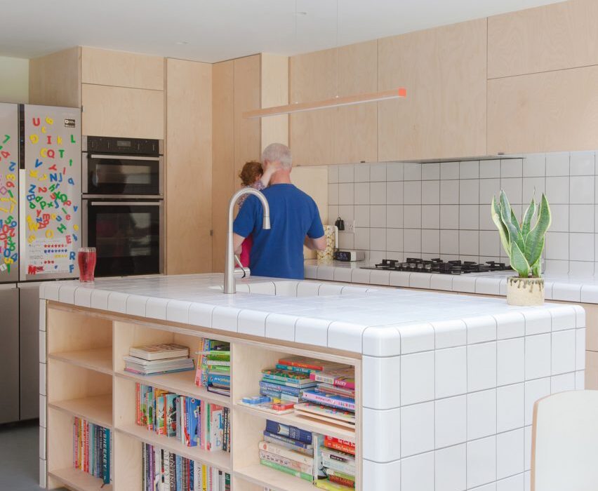
A kitchen with a statement oxblood-colour island and another with curved child-friendly counters feature in our latest lookbook, which spotlights eight worktops that are covered in tiles.
Tiled worktops can be a functional yet attractive addition to a kitchen, able to withstand hot pots and food stains while also creating an opportunity for decoration.
The examples in this lookbook range from tiled worktops designed as focal points to more utilitarian counters that blend in with surrounding walls, illustrating the potential of tiles in a kitchen and proving they are not limited to just splashbacks and flooring.
This is the latest in Dezeen’s lookbooks series, which provides visual inspiration from our archive. Other recent editions showcase wine storage solutions, bedrooms with desk spaces and interiors that draw on Mediterranean living.
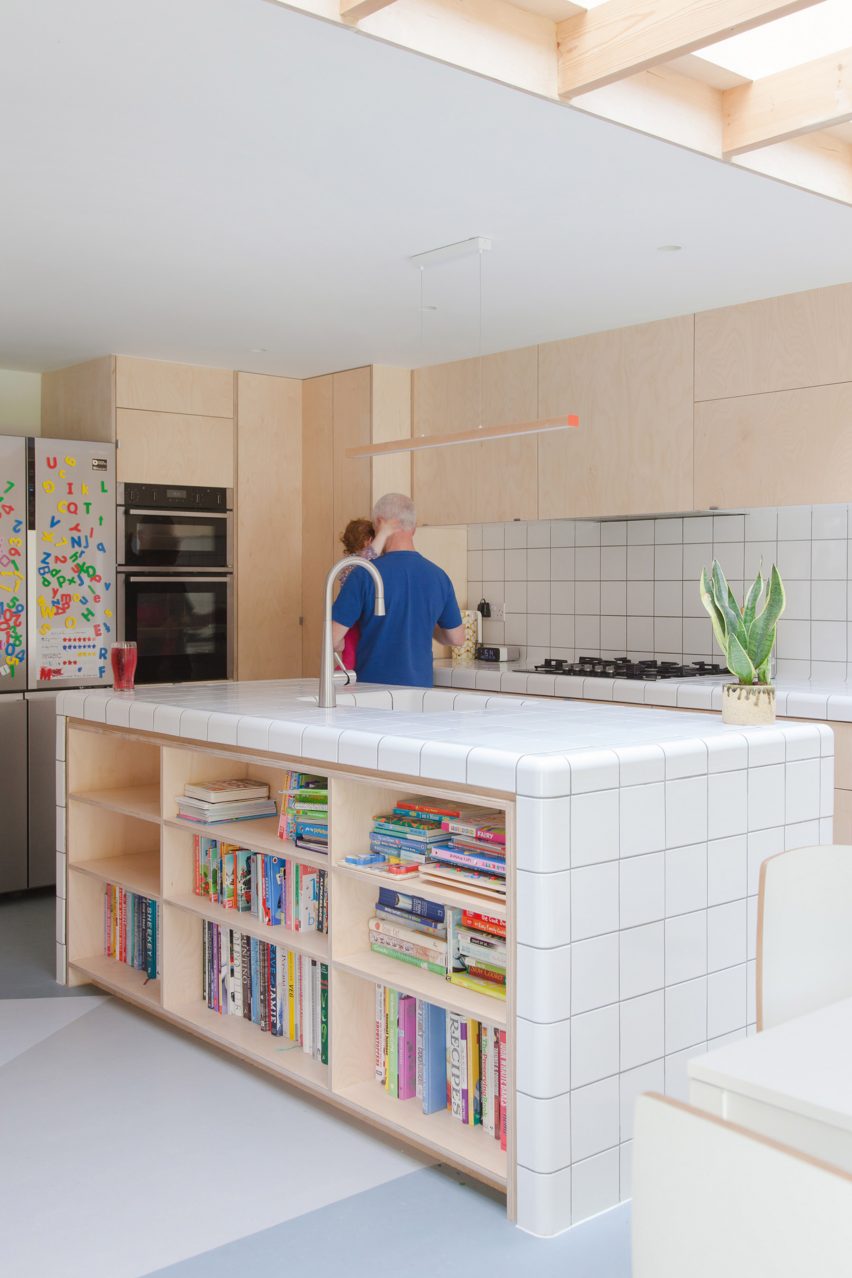
Fruit Box, UK, by Nimtim Architects
London studio Nimtim Architects opted for bright white tiles to cover the worktops of this kitchen and teamed them with plywood cupboards, shelves and drawers for a deliberately simple look.
Some tiles have curved edges, helping to create seamless transitions between the counters and splashback while also eradicating sharp corners so the space is safer for the client’s children.
Find out more about Fruit Box ›
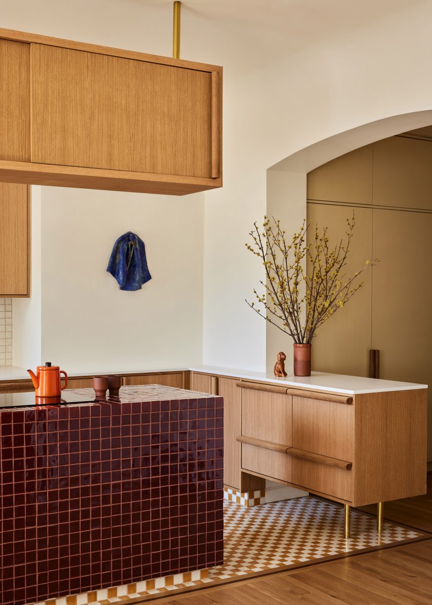
East Village Apartment, USA, by GRT Architects
The focal point of this kitchen in an East Village apartment is an island covered in oxblood-coloured tiles, which stand out against a backdrop of white-oak cabinetry with oversized handles.
This rich, jewel-toned finish was complemented by chequerboard mosaic tiling across the floor and shiny brass legs for the end kitchen counters.
Find out more about East Village Apartment ›
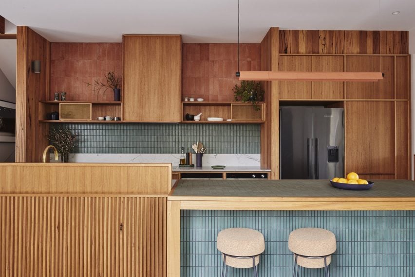
West Bend House, Australia, by Brave New Eco
Duck-egg blue tiles adorn the surfaces of this galley kitchen, which studio Brave New Eco created in West Bend House in Melbourne.
This includes an island running through its centre, where square tiles are used on the worktop and the sides are lined with long, slender versions. They are teamed with wooden joinery and slender bar stools.
Find out more about West Bend House ›
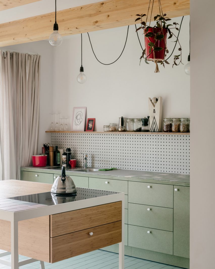
De Sijs, Belgium, by Officeu Architects
Officeu Architects combined a mix of pastel-hued square tiles to decorate the worktops in this kitchen, which features in the De Sijs co-housing project in Leuven.
The dusky colours of the surfaces are complemented by a mix of fern-green and wooden cabinets and help draw attention to playful furnishings and fixtures, including hanging lights and bright red pots.
Find out more about De Sijs ›
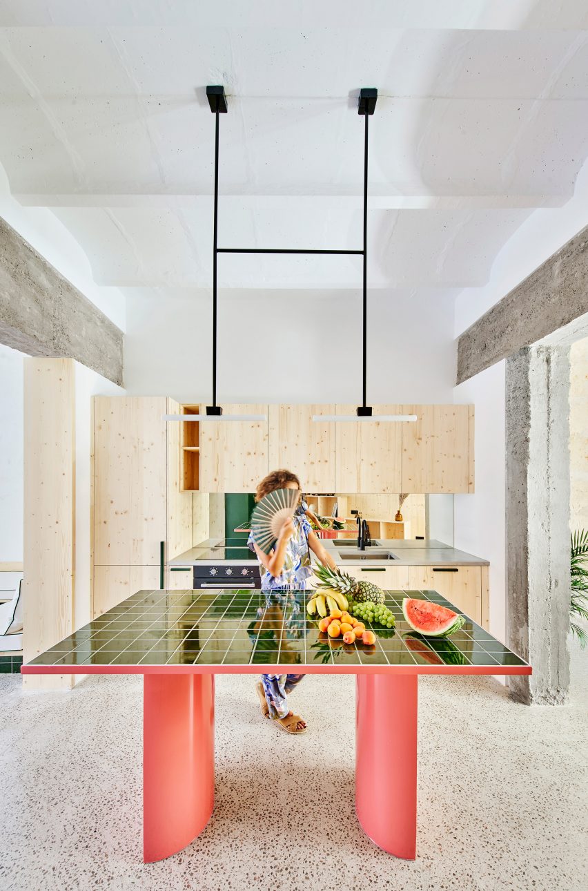
Palma Hideaway, Spain, by Mariana de Delás
Green tiles are used to create focal points throughout this lofty apartment, which architect Mariana de Delás has hidden in a former motorcycle workshop in Palma de Mallorca.
This includes the kitchen, where the tiles crown a statement island supported by chunky pink legs. This watermelon-like colour combination pops against a concrete floor and wooden cabinets.
Find out more about Palma Hideaway ›
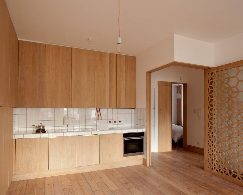
Screen House, UK, by Studio Ben Allen
This pared-back kitchen features inside Screen House, a north London flat that was modernised and reconfigured by Studio Ben Allen.
To align with a strict budget, the kitchen features utilitarian fixtures and combines simple wooden joinery with white-tiled surfaces. The end tiles are curved to form a smooth edge to the counter.
Find out more about Screen House ›
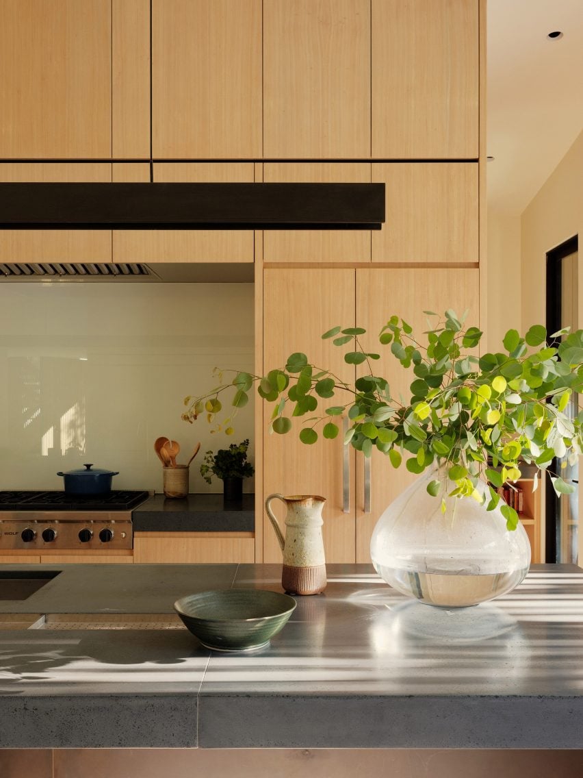
Dawnridge House, USA, by Field Architecture
Large grey tiles are used across the countertops of this wooden kitchen, which Field Architecture designed within a house in California.
They form part of the natural-looking material palette used throughout the home, for which the studio drew on the surrounding Los Altos Hills landscape that includes a creek and large oak trees.
Find out more about Dawnridge House ›
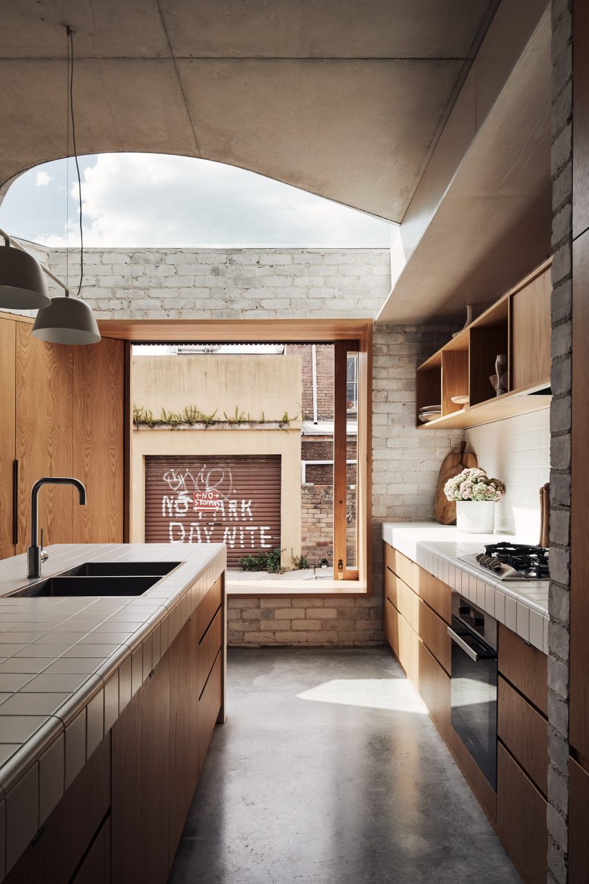
Bismarck House, Australia, by Andrew Burges Architects
At Bismarck House in Bondi, Andrew Burges Architects used a palette of what it described as “outdoor materials” across the ground floor.
Alongside exposed brick, concrete and steel elements, this utilitarian palette includes tiled kitchen worktops and is intended to blur the boundary between the inside and robust exterior of the home.
Find out more about Bismarck House ›
This is the latest in Dezeen’s lookbooks series, which provides visual inspiration from our archive. Other recent editions showcase wine storage solutions, bedrooms with desk spaces and interiors that draw on Mediterranean living.

