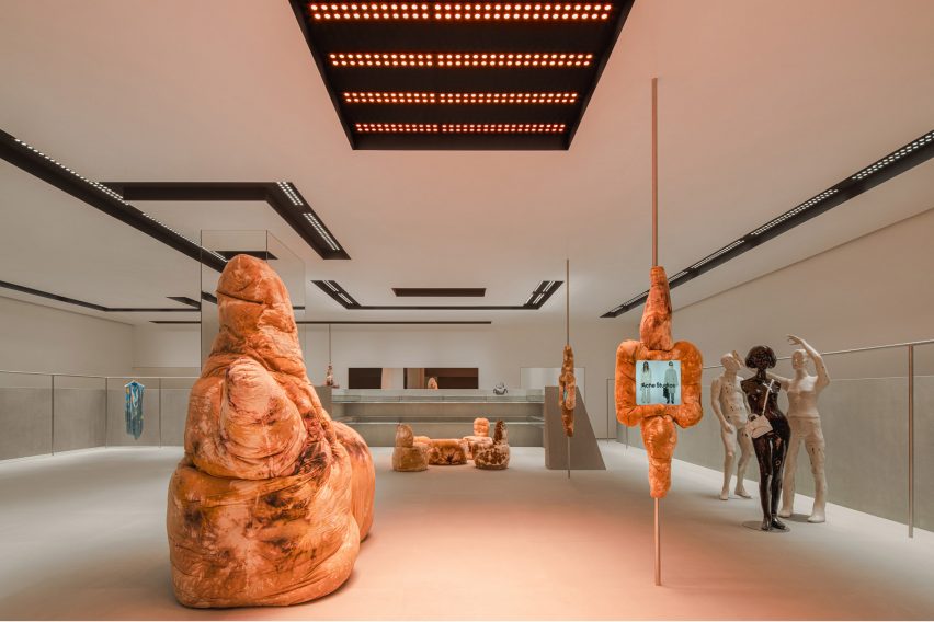
Fashion brand Acne Studios has opened its latest store in China, which was designed by Stockholm studio Halleroed and is located in the submerged SKP department store designed by Sybarite in Chengdu, China.
The 338-square-metre store has a discrete sandstone exterior marked by a red LED sign displaying the brand’s logo.
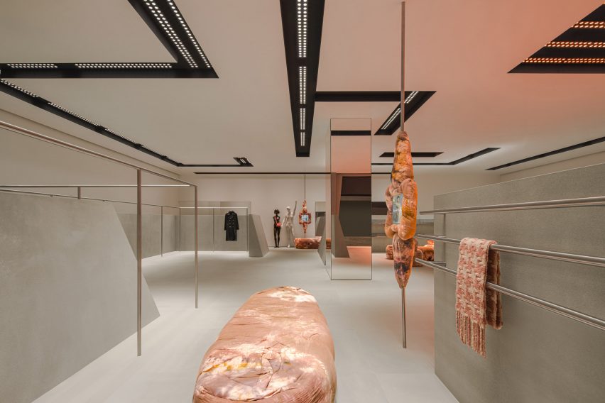
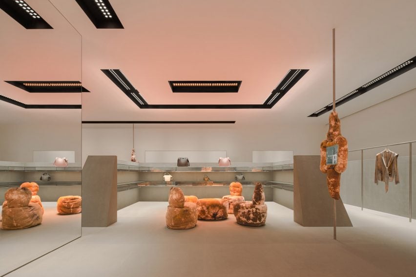
Inside, grey sandstone walls contrast against sculptural tie-dye furniture in earthy tan hues by British designer Max Lamb.

“Our inspiration was aesthetically playing with design from the 1980s and 90s, and how that period looked at the future,” Halleroed founder Christian Halleroed told Dezeen.
“The inclined stone clad walls, the futuristic lighting together with the Daniel Silver mannequins – we thought of a futuristic space/computer age feel, but in a contemporary way of putting it together,” he added.
“We clashed this with the Max Lamb sculpture-like furniture that has a more primitive, earthy feeling.”

As well as the furniture, Lamb designed four fabric-clad touchscreens that are mounted on slim poles throughout the store and provide an overview of the brand’s current collection and stock availability.
Expressive mannequins by artist Daniel Silver and a light installation by designer Benoit Lalloz help to add a futuristic feel to the space.

Halleored, which has designed a number of Acne Studios‘ stores, normally works with Lalloz on the lighting but said the Chengdu store lights have a different feel to those in other stores.
“These were done a bit differently than previous since they are recessed in the ceiling, but still has the typical look of Benoit Lalloz,” Halleroed said.
“We wanted the lighting to feel like a spaceship,” he added.
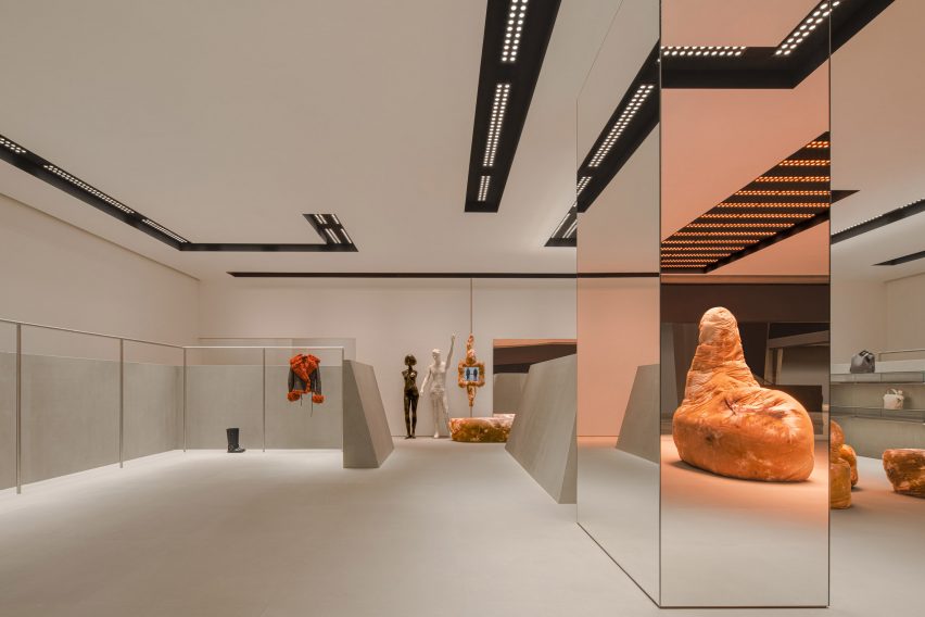
A large mirrored column in the middle of the store reflects its pared-down interior, which features a colour palette informed by the grey hues used for early computer designs.

“We used a very restrained palette with the grey, monochrome sandstone on the floor and angled walls, high gloss white walls and ceiling, the black coves in the ceiling, and for the fixtures brushed stainless steel,” Halleroed said.
“The Max Lamb and Daniel Silver pieces contrast this, with their brown batik fabric and the white with patina and silver mannequins.”
Previous Acne Studios store designs featured on Dezeen include a “monolithic” store in Paris and a pink-ceiling flagship store in Milan’s Brera district.
The photography is courtesy of Acne Studios.

