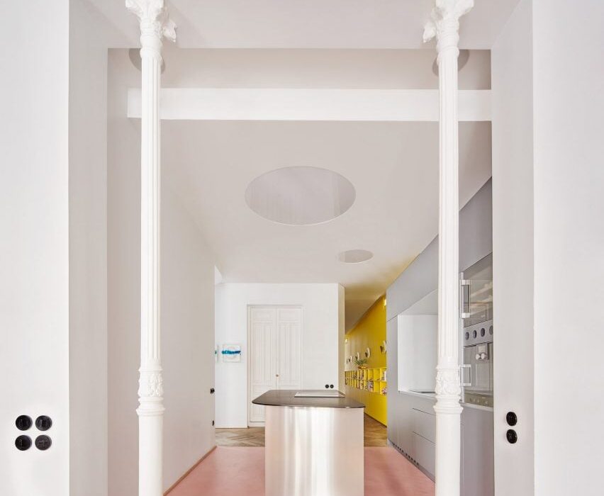
Madrid studio Lucas y Hernández-Gil has completed a family home that makes the most of every inch, with details including a yellow storage wall, a corridor kitchen and a hidden closet.
JJ16 is a three-bedroom apartment in Madrid’s Salamanca district, but until recently it had been used as an office.
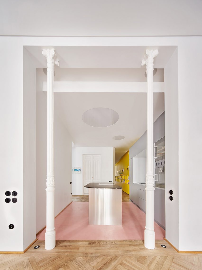
Lucas y Hernández-Gil, a specialist in interior architecture, converted the property back into a residence for a family that includes a mother, three teenage children and their dog.
The challenge was not only to make it feel like a home again but also to create space for everyone’s personality within the 165 square-metre footprint.
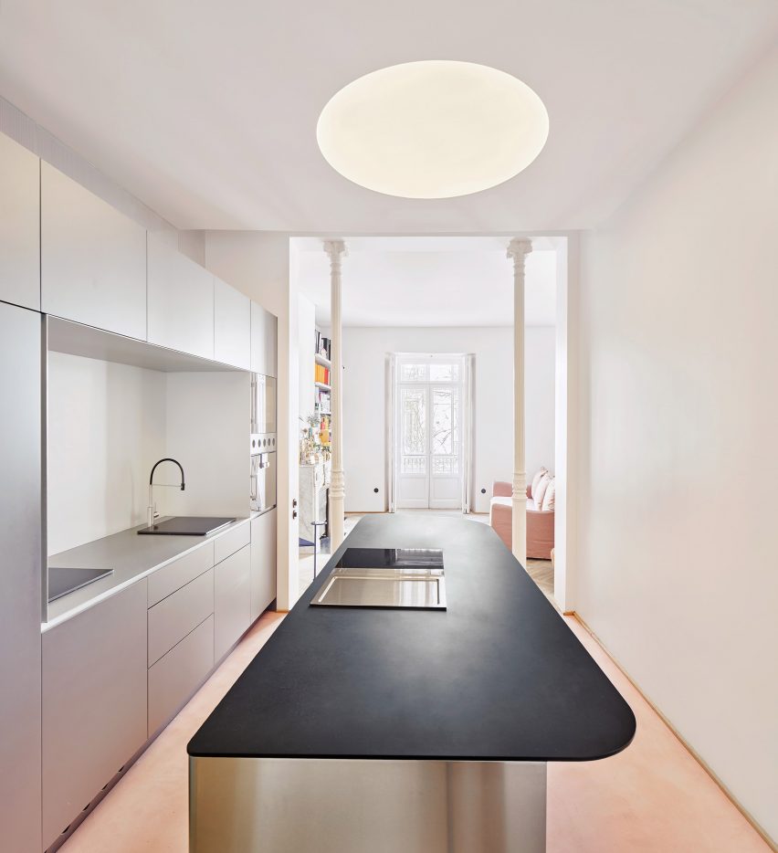
The designers achieved this by combining space-saving strategies with statement details, providing both functionality and character.
“Everyone had a clear idea of what they needed, which translated directly into the spaces,” said studio founders Cristina Domínguez Lucas and Fernando Hernández-Gil Ruano.
“Far from generating a conflict, different colours and materials give the house a richness, a harmonic heterogeneity,” they told Dezeen.
Optimising JJ16’s layout was crucial but difficult given the irregularity of the floor plan.
Lucas y Hernández-Gil’s strategy was to make every space, including the corridors, as useful as possible.
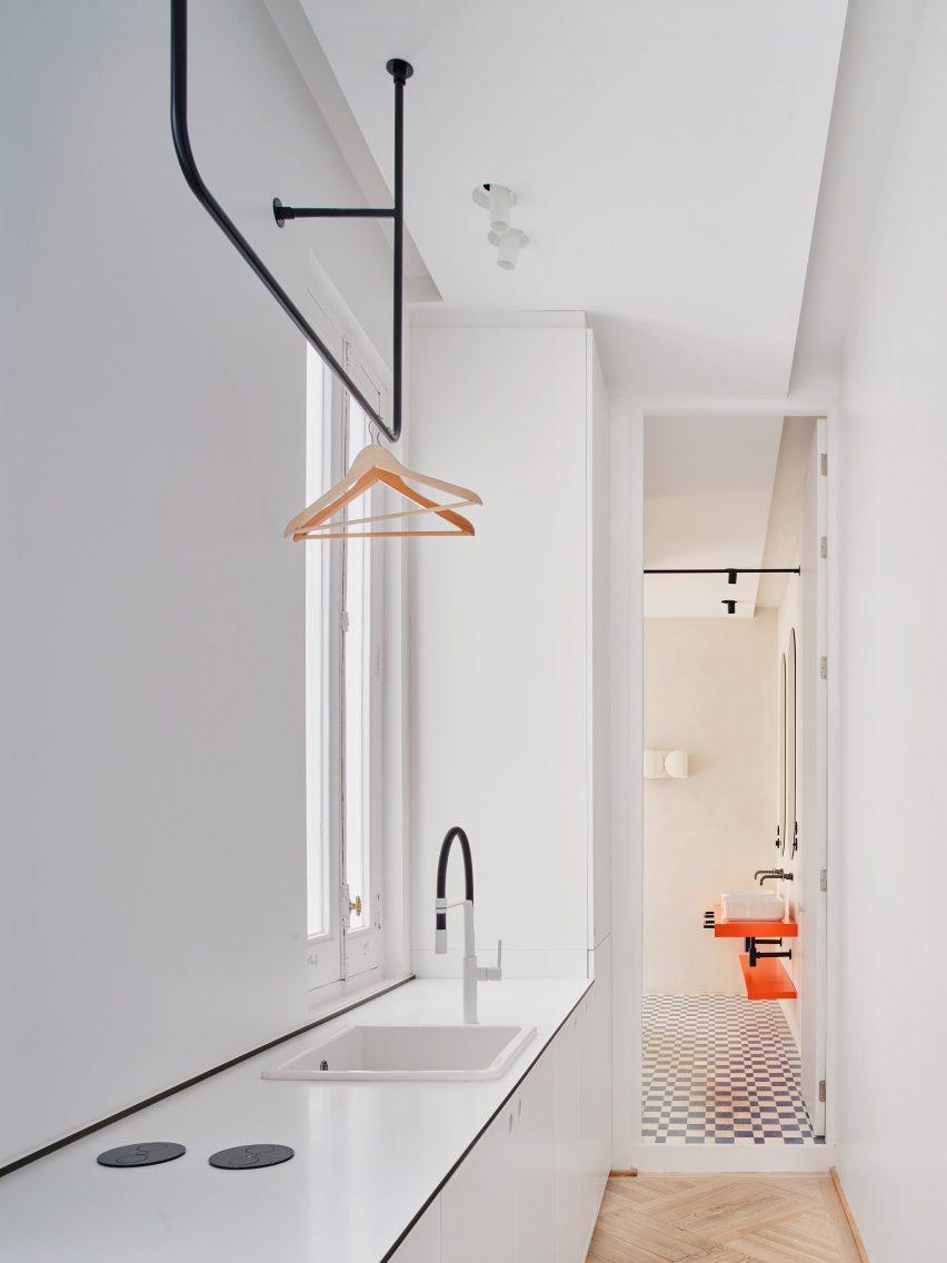
The kitchen now occupies a connecting space between the entrance lobby and the living room, freeing up space at the front of the apartment for a spacious main bedroom.
Meanwhile, the corridor leading to the main bathroom and the third bedroom incorporates a mini library and a utility area.
“The main challenge was the deep layout and long corridor,” said the architects.
“We provided circulation with content by creating spaces within it. This turned out to be one of the best design decisions of the project.”
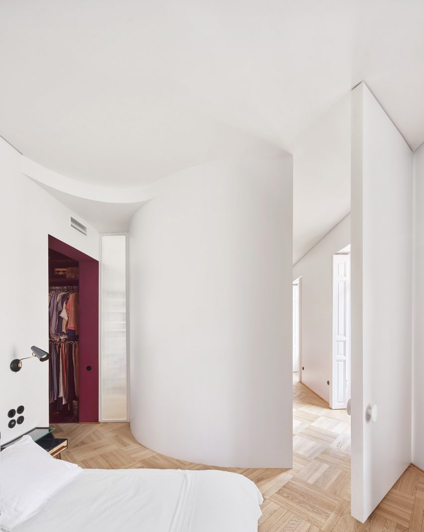
Curved partitions create variety within JJ16’s layout. The largest of these separates the living room from the main bedroom, but other curves can be found in the second bedroom and a shower room.
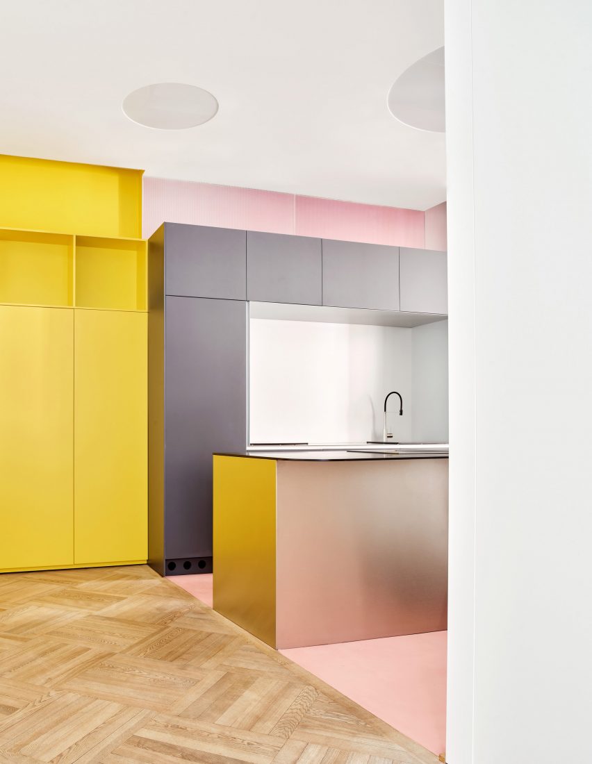
Many spaces have their own colours, which contrast with the bright white tones that otherwise dominate the interior.
The bright yellow bookshelf wall is the most striking, while the adjacent kitchen offers a two-tone effect with shades of soft pink and grey, and matt chrome finishes.
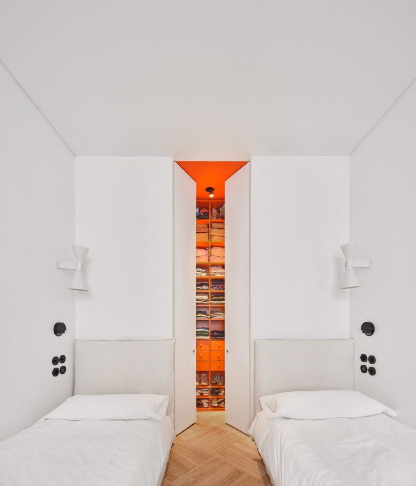
Bedrooms have a minimal feel, but they boast colourful dressing rooms and en-suites. Bright orange was chosen for the hidden walk-in closet, located in the twin third bedroom, while deep purple adds a luxury feel in the main bedroom.
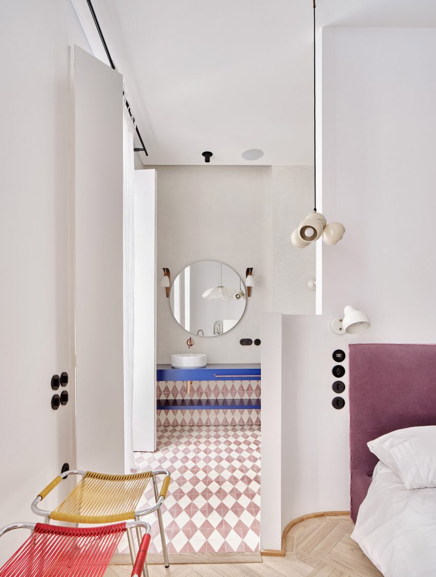
Floor surfaces provide more visual interest. Living spaces feature oak parquet, while bathrooms are all finished with patterned cement tiles.
This bold approach to colour and texture is a common feature in the work of Lucas y Hernández-Gil, whose other recent projects include the sunset-inspired Naked and Famous bar and the stylish Casa A12.
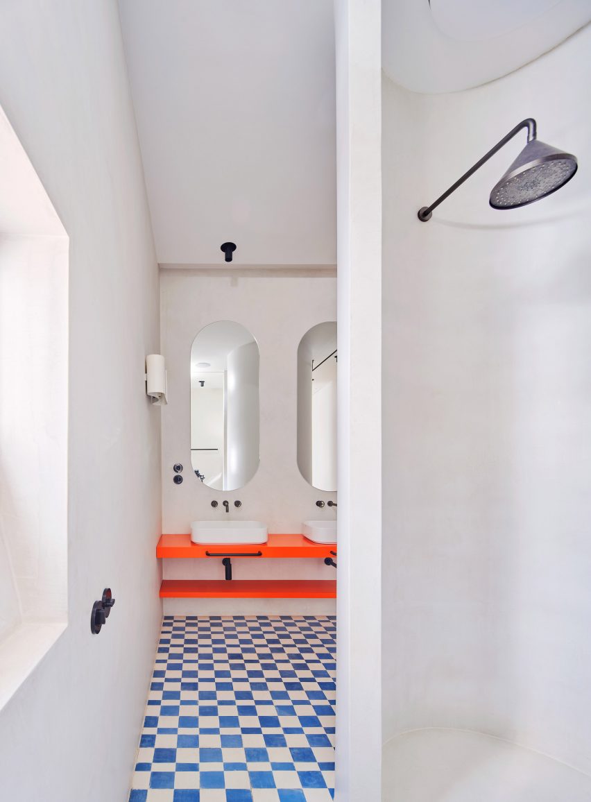
“The approach to colour is a constant in our design process,” said Lucas and Hernández-Gil Ruano.
“It is about activating spaces and achieving a warm and joyful domestic atmosphere.”
The photography is by Jose Hevia.
Project credits
Architecture: Lucas y Hernández-Gil
Collaborators: Lucía Balboa, María Domínguez, Sara Urriza

