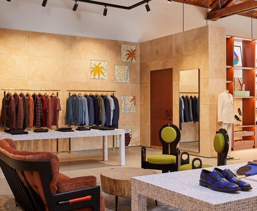
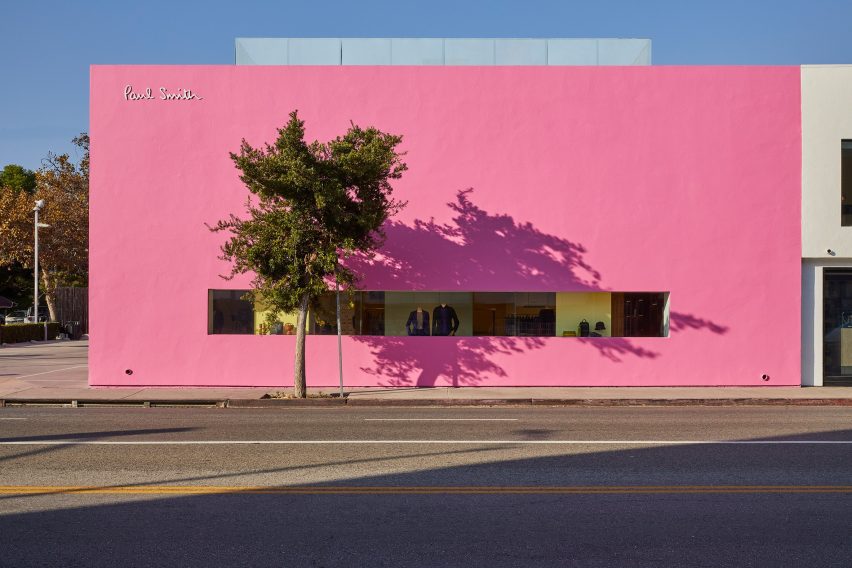
British fashion label Paul Smith’s iconic pink store in Los Angeles has received an interior makeover from Standard Architecture.
Standard Architecture collaborated with the Paul Smith design team to reimagine the 4,740-square-foot (440 square metres) store on Melrose Avenue, West Hollywood.

The studios also created a new VIP entrance patio for the building, which is notorious for its bright pink exterior that has become a pilgrimage spot for amateur photoshoots.
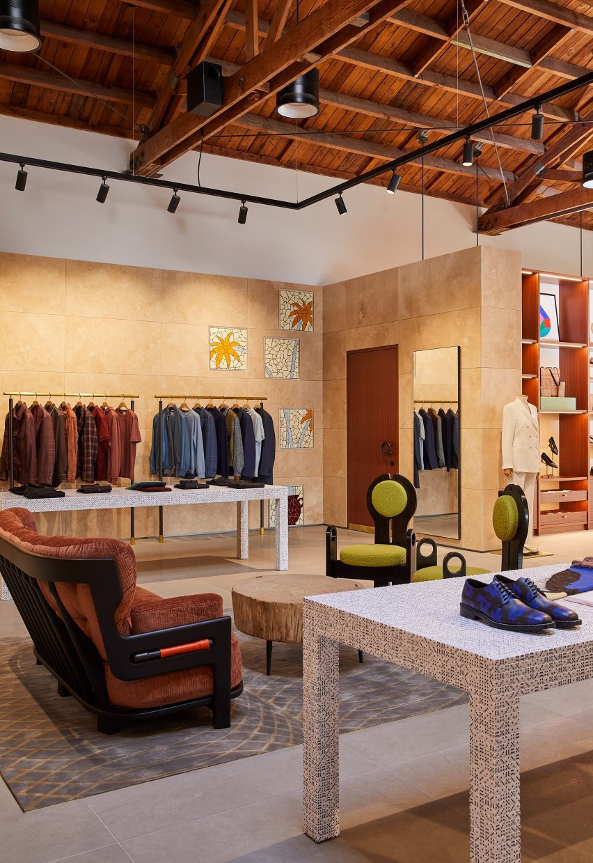
“The primary goal was to enhance the overall customer experience within the store, which was achieved by creating a more cohesive and immersive shopping environment across the different brand departments,” said Standard Architecture.

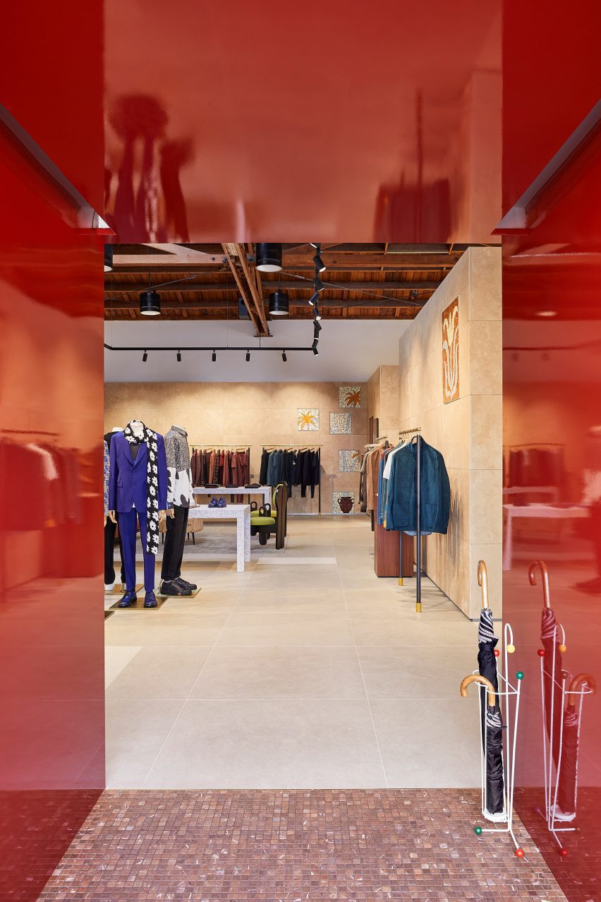
The entrance to the store – the only opening in the giant pink wall that faces the parking lot – leads shoppers through a glossy red metal vestibule into the main retail space.
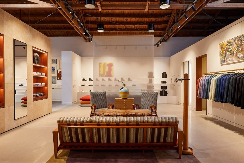
Clearly defined yet interconnected areas for the menswear, womenswear and homeware collections help with navigation around the store.

Partitions clad in dappled beige stone frame these zones, but don’t reach the exposed timber ceiling, to retain the sense of openness.
In places, the stone walls are inlaid with mosaic-style artworks depicting abstract flora, which add splashes of colour to the warm-toned surfaces.
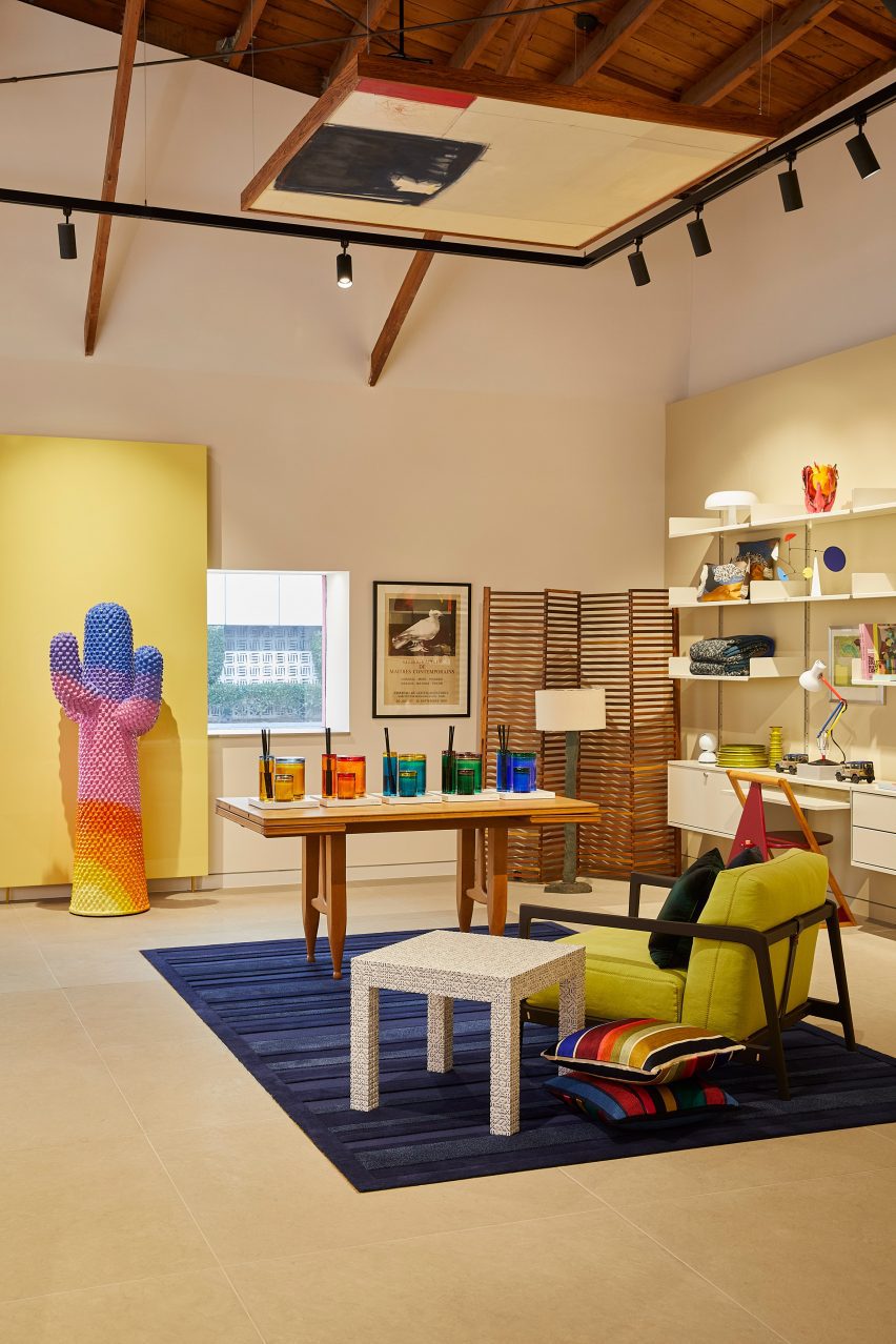

Black track lighting is suspended from the rafters, spotlighting the various clothing displays and lounge areas furnished with midcentury-style sofas and armchairs that are dotted around the store.
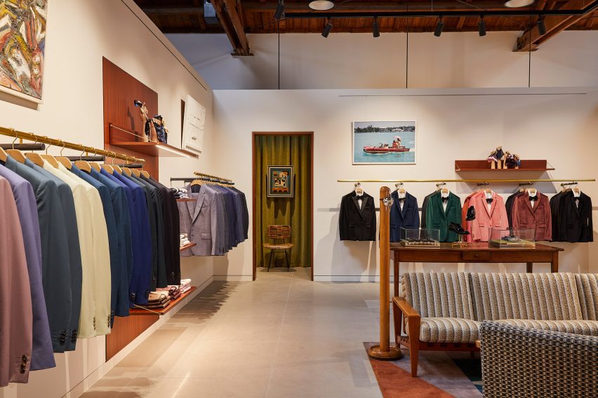
Long brass rails that appear to be suspended in midair are used to display suit jackets, which are carefully arranged by colour.
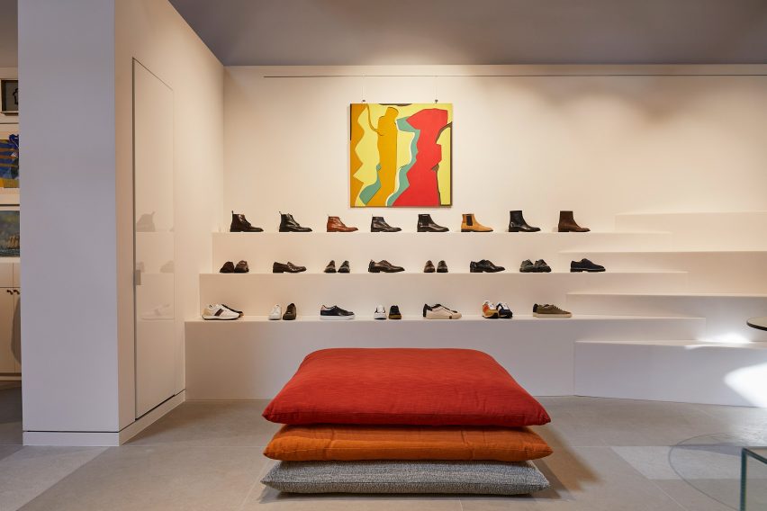

In an area dedicated to accessories, the shoes and bags are lined up on stepped white ledges that resemble bleacher seating.
Walnut is used for accents including shelving, door frames, and podiums, as well as for a large open storage system with compartments for presenting individual products and a row of sculptures by Alexander Calder.
Founded by fashion designer Paul Smith in 1970, his eponymous brand is synonymous with the brightly coloured stripes applied to many of its apparel products and other collaborations.
Many of these appear throughout the store, including a colour-tinted Anglepoise desk lamp and a striped version of Gufram’s cactus-shaped coat stand.

“Overall, the design reflects a deep understanding of the brand’s identity, which places a strong emphasis on the use of colour and attention to detail,” Standard Architecture said.
Paul Smith retail spaces around the world are equally playful. On London’s Albemarle Street, its boutique has a patterned cast-iron facade by 6a Architects, while the shop in Seoul is encased in a curving concrete shell by System Lab.

Standard Architecture was founded by Silvia Kuhle and Jeffrey Allsbrook, who discussed their work with Dezeen during our Virtual Design Festival in 2020.
Past projects by the firm include a Hollywood Hills residence with a cantilevered swimming pool and a minimal showroom for fashion brand Helmut Lang – which was located just a few blocks from the Paul Smith store before it shuttered.
The photography is by Genevieve Garruppo.

