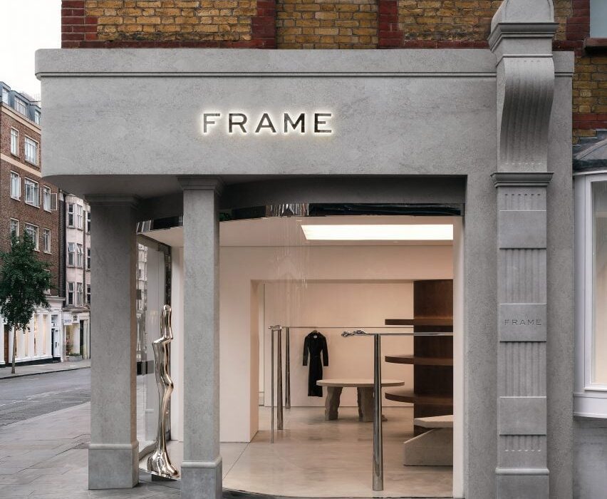
French interior design Studio FB and the co-founder of fashion brand Frame, Erik Torstensson, have designed a California-informed store for the brand in London.
The store’s concept draws from the brand’s Californian origins as well as European influences, which is reflected in the lighting, furniture and materials.
“The Californian universe with these modernist architectures with a free plan, skylights and the opening of spaces to the outside was our inspiration basis,” Studio FB told Dezeen.
“We imagined this new concept design layout as open as possible, which can be compared to a gallery.”
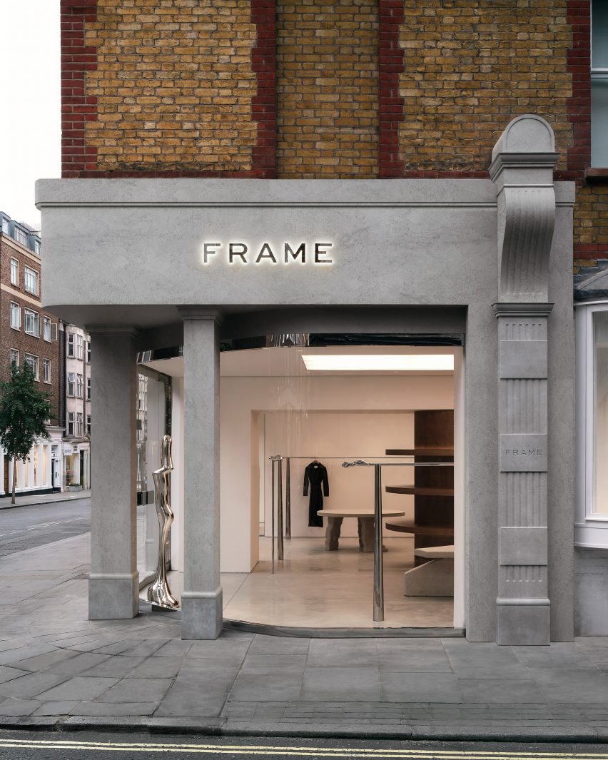
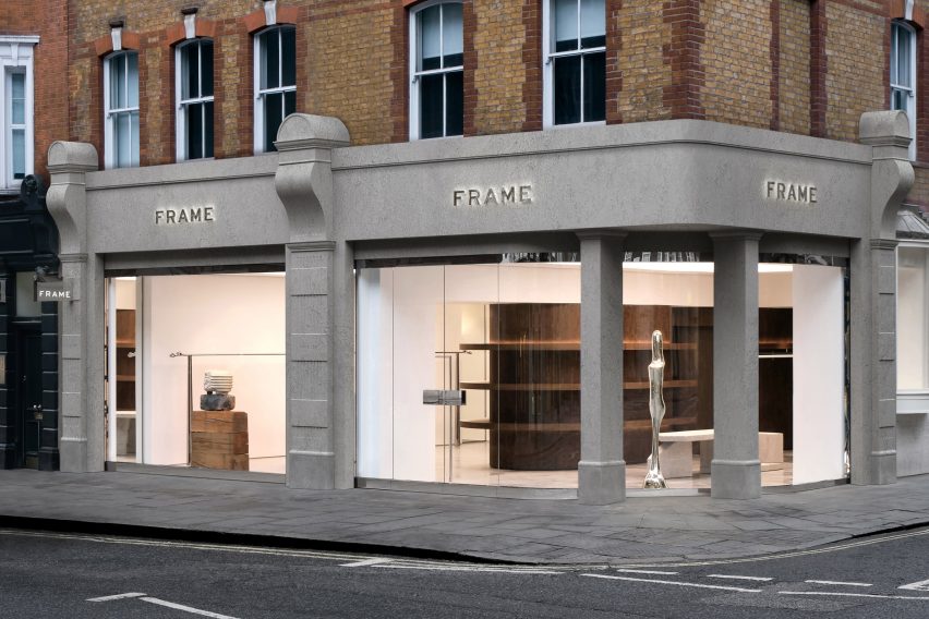
To create a greater connection with the street, the studio redesigned the facade by adding a curved, full-height glazed wall, which was set behind the original piers.
“We designed a long-curved glass like a contemporary insert which contrasts radically with the classic London pillars preserved,” said the studio.

Within the store, the studio aimed to mimic the atmosphere of an art gallery with a polished concrete floor serving as a base for a central pillar constructed from stained birch wood veneer.
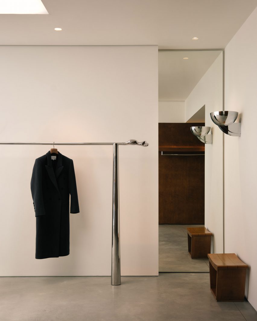
The store’s rails were custom-designed with a distinctive hand-moulded abstract-shaped end-piece serving as the highlight
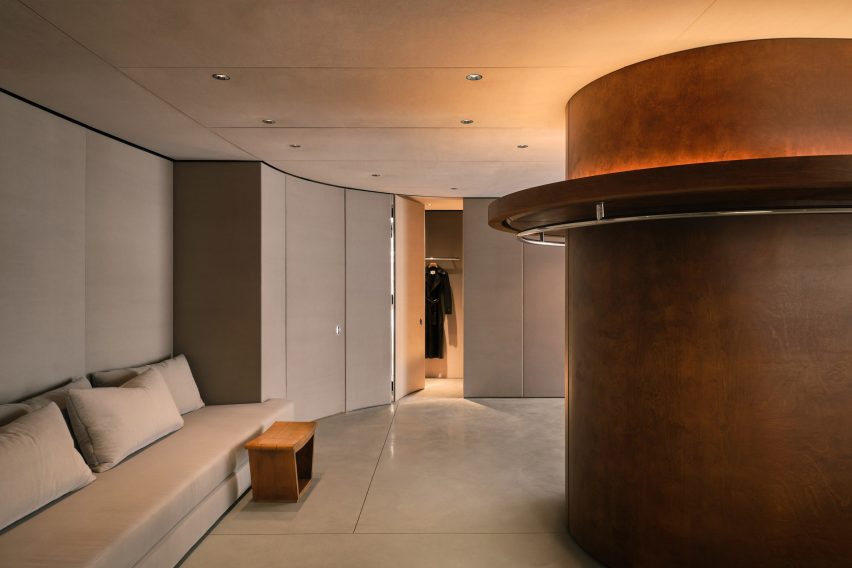
With in the fitting room, the ceiling, walls and doors were upholstered in fabric by textile company Kvadrat.
“The rounded central wooden element was designed as a sculptural object, which gives a residential feeling from the 50s,” the studio explained.
“The backspace invites the cabins and lounge area becomes more intimate all-in fabric and brings sophistication to the space. Pieces of furniture and artwork sublimate the atmosphere,” the studio continued.
“The general atmosphere is similar to an art gallery with raw materials such as concrete on the floor and white walls.”
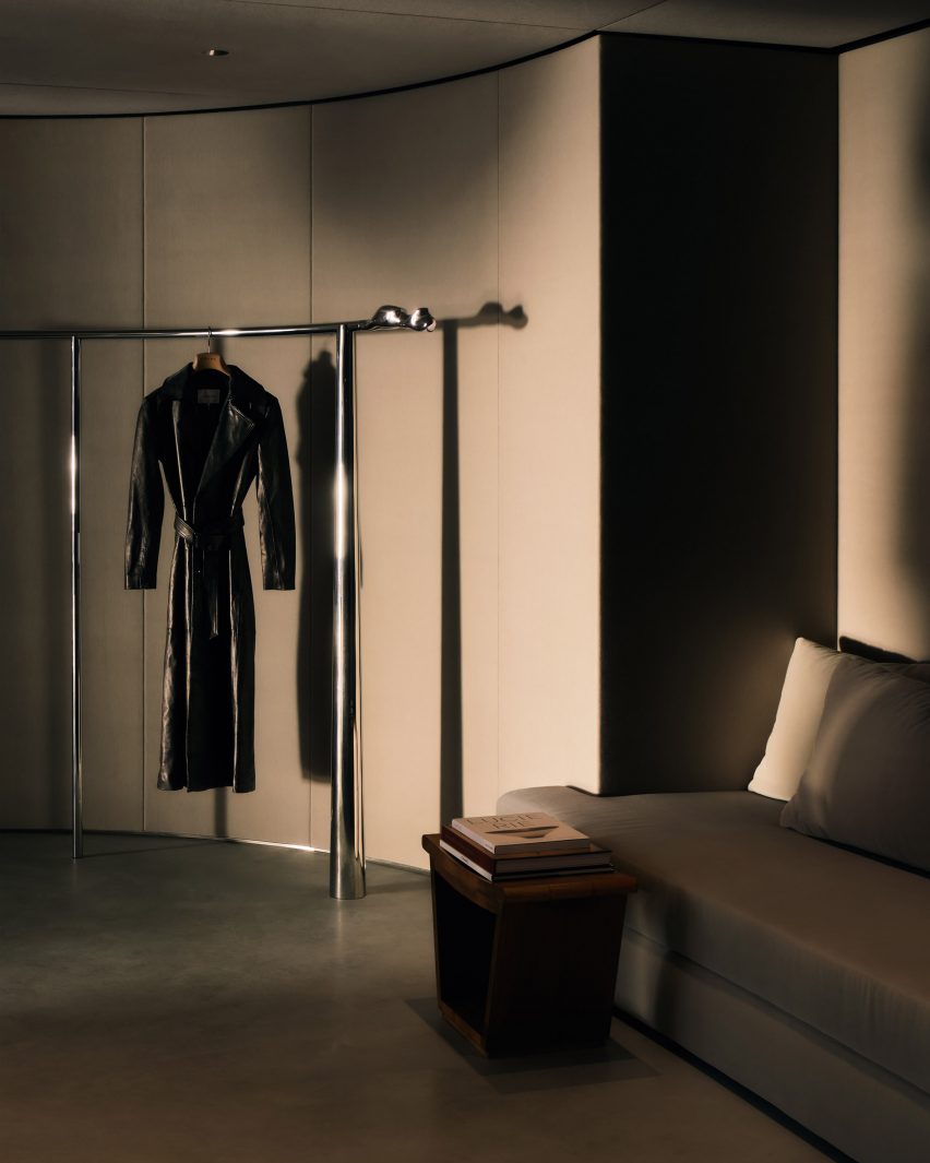
FB Architects and Torstensson worked together to acquire artwork and collectable design pieces to reinforce the gallery atmosphere.
“It was a thorough process to ensure the most unique response possible to Frame,” said the studio.
“Erik had a precise vision of his brand, so we exchanged a lot together on many artistic fields to build the brand’s architectural DNA.”
A sculpture by Serbian visual artist Bojan Šarčević crafted from wood and limestone sits in the display window. Also in the store are two original 1950s Gio Ponti stools, crafted from wood and textiles.
The store was decorated with wall-mounted fixtures designed by French lighting designer Jean Perzel, as well as geometric fixtures created by French architect Pierre Chareau, to create a soft and gentle lighting ambience.
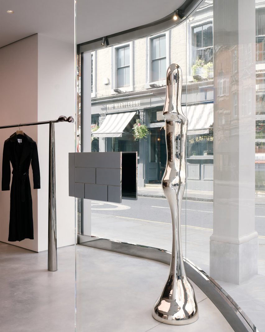
Torstensson used AI as a sketching tool to design custom objects for the space, such as large brutalist stone tables and chrome custom-made sculptures that were then realised by architecture studios including Bucktron Studio Sweden.
“I’ve been learning and expanding my skills with AI for the last year, it creates a superpower when it comes to speed, as it allowed me to generate the visual concept at a greater pace and scale,” said Torstensson.
“This creates exciting results and provides a new outlook on design. I simply use it to visualise my initial ideas in greater detail in order to bring my ideas to life.”
Other retail interiors recently featured on Dezeen include a stationery store interior made from white-oiled wood by Architecture for London and a store interior for Ms MIN in Shanghai, China, by Neri&Hu.
The photography is by Ollie Tomlinson.

