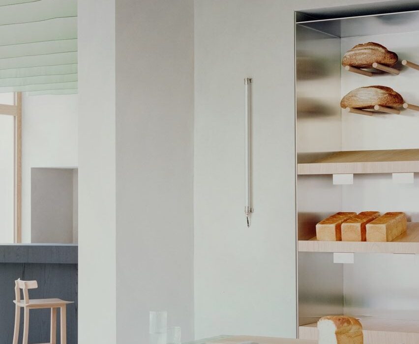
Architecture practice Studio Wok has created a matcha-green counter and Japanese-style fabric panels for bakery and wine bar Pan in Milan’s Acquabella district.
The studio created the eatery, which is led by Japanese chefs Yoji Tokuyoshi and Alice Yamada, to have an interior that would represent a meeting between Japan and Milan.
“There are references to Japanese culture, non-literal and far from stereotypes,” Studio Wok said. “The intention was for a deeper understanding, working on the concept of quality, both in materials and in details.”
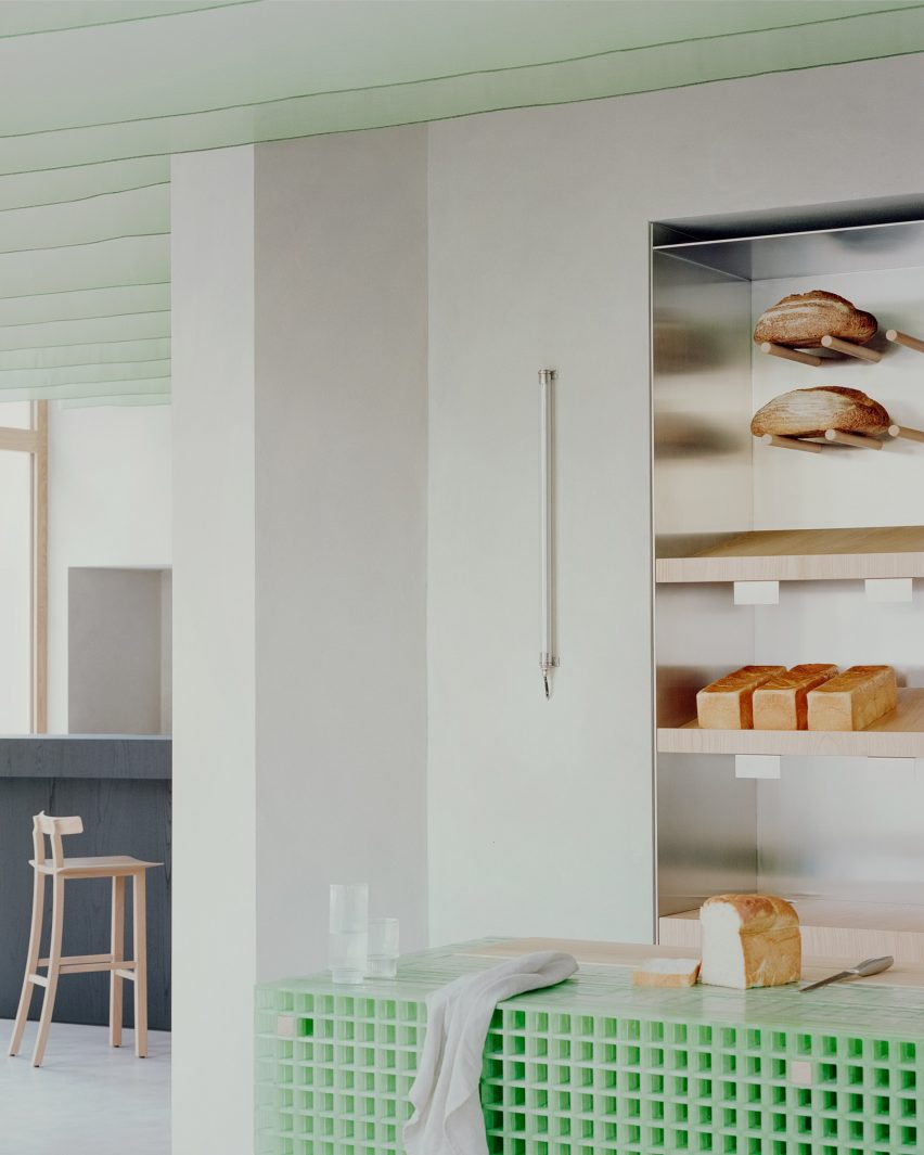
A central bread counter is the “protagonist piece” in Pan’s interior design.
The counter was constructed from panels of fibreglass grid and its eye-catching colour was informed by the vivid green of matcha, an ingredient widely used in Pan’s food, the studio said.
Fibreglass was also used to create an external bench, linking the bakery with the wider neighbourhood.
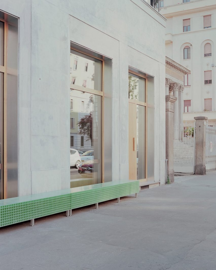
“We did a lot of research looking for a ‘poor’ material that could be ennobled by being used in an innovative way,” Studio Wok told Dezeen.
“Fiberglass grating is a material used in industry but little used in interiors and it seemed perfect to us.”
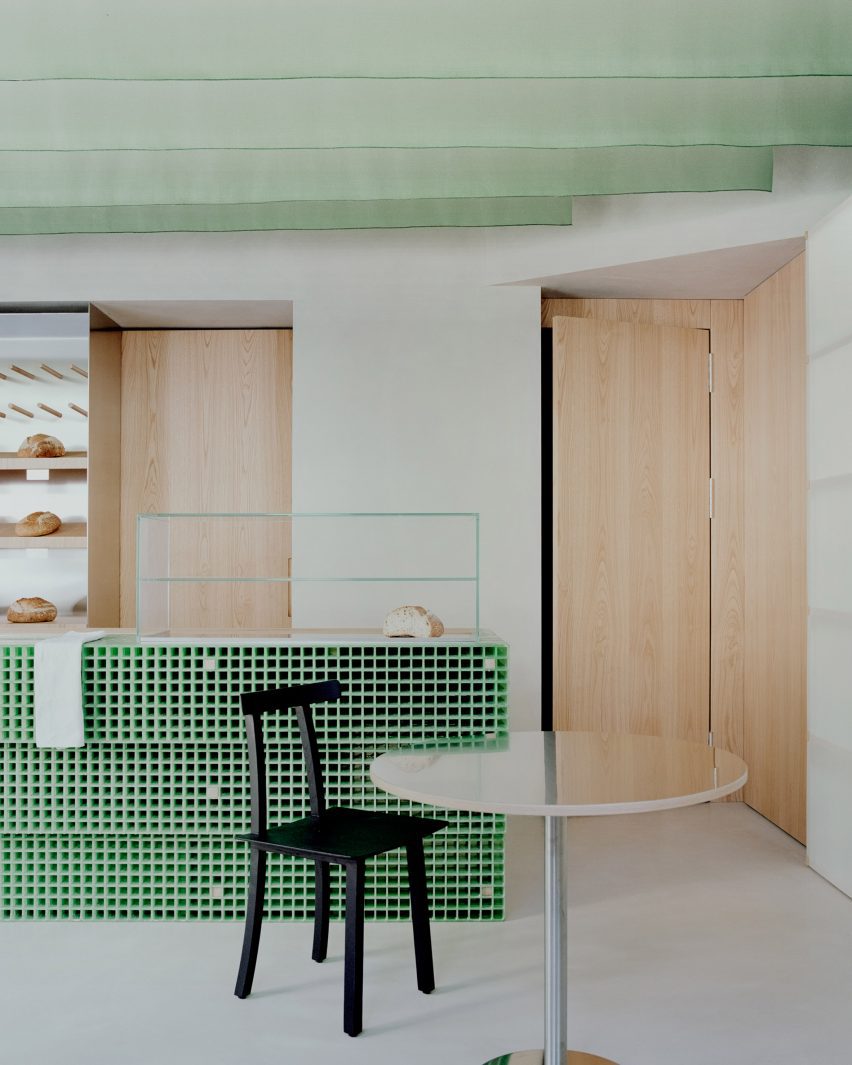
The green of the fibreglass is echoed in vertical fins of hanging fabric that define the ceiling, creating a dialogue between hard and soft elements within the space.
These suspended sheets of fabric are a contemporary update of the traditional Japanese design element of ‘noren’, meaning curtains or hanging divider panels.
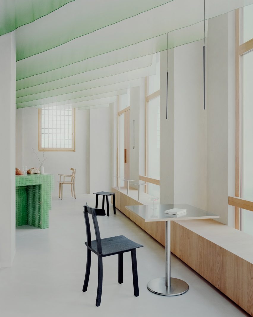
“The ceiling sheets have the main function of creating a three-dimensional covering to make the environment more welcoming and also to work from an acoustic point of view,” the studio said.
“They create a suspended three-dimensional world, both continuous and ephemeral. Furthermore, they dialogue with natural light during the day and with artificial light in the evening.”
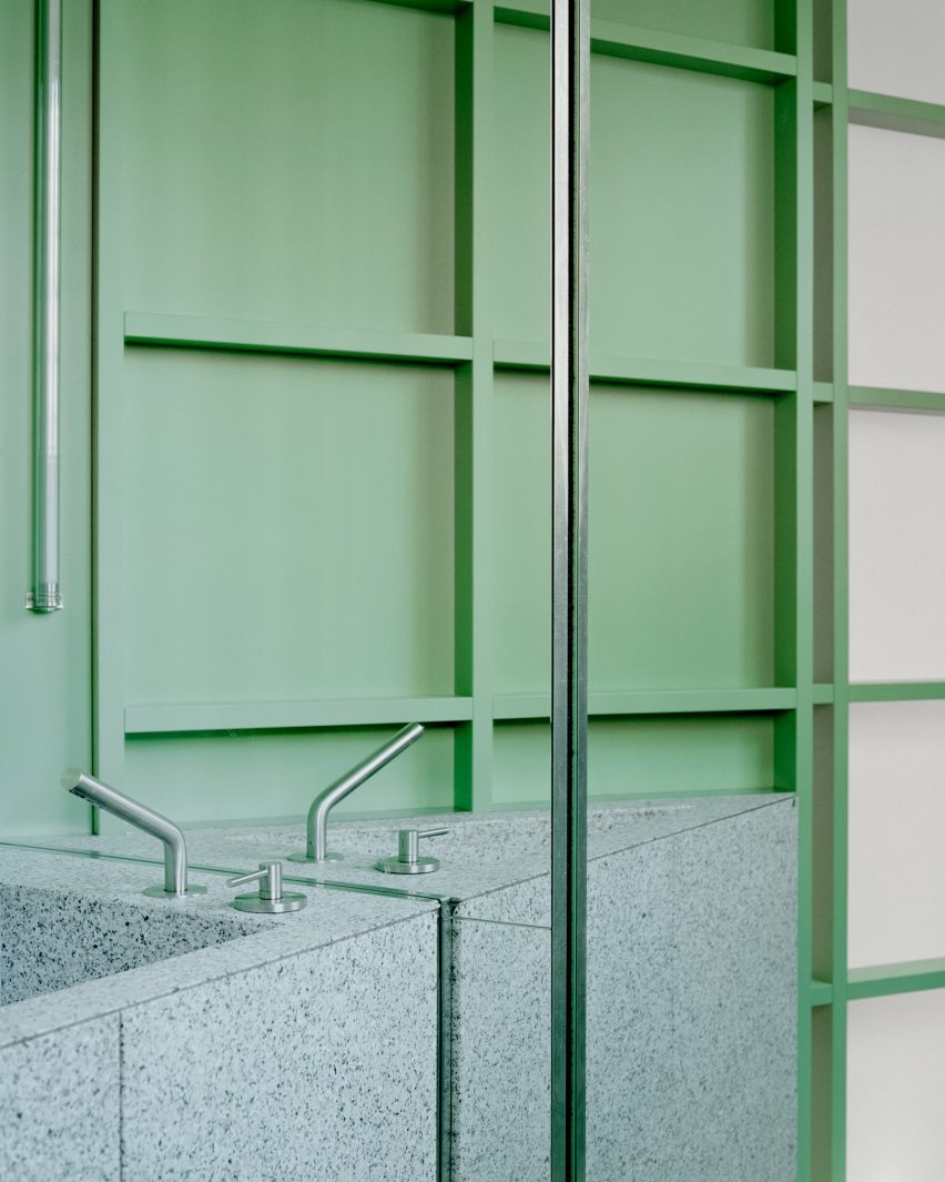
In the bathroom, the green theme continues with a wall and sliding door featuring translucent panels of pressed cellulose, which have been fixed onto a wooden grid frame.
“We were looking for a translucent material to allow natural light to pass through the anteroom. It also reminded us of the rice paper walls, typical of Japan,” Studio Wok said.
The effect of these materials is to create “a green monochromatic box from which the monolithic element of the sink emerges,” Studio Wok said.
The sink was made of a grey-tinted natural stone called Moltrasio.
In the main space, light grey walls and floors in hand-trowelled cementitious resin amplify the sense of light, while chestnut was used in both its pale natural form and stained black across integrated and freestanding furniture.
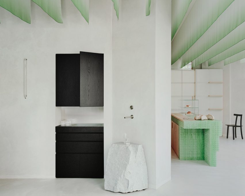
The bar area has a more serious, less playful atmosphere, informed by the black-stained chestnut wood of the counter and cabinetry.
Here, a rough-hewn natural stone boulder serves as a water counter, introducing a freeform, sculptural element to the space.
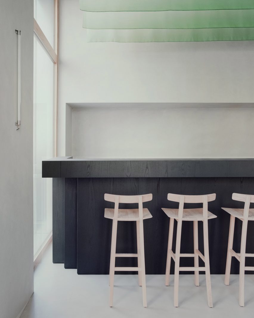
To anchor the space in the local neighbourhood, Studio Wok designed large windows with pale chestnut frames that open the bakery up towards the street.
Seating in the window areas “project the interiors of the venue outwards, creating a hybrid threshold space between the domestic and the urban,” the studio said.
“Our vision for the material palette at Pan was to seek a balance between elements with a contemporary and industrial flavour, with others that are more natural and timeless,” said Studio Wok.
“It’s a celebration of Japan and its dualism between innovation and wabi-sabi spirit.”
Studio Wok has previously designed a cavernous pizza restaurant and transformed a barn into a country home.
The photography is by Simone Bossi.

