Our latest lookbook rounds up 10 living spaces that take tiling from practical to decorative, applying it to everything from bars and fireplaces to entire statement walls.
Tiles in the modern home are often consigned to the bathroom or kitchen, where their durable finish can protect walls from water damage.
But a growing cohort of designers are using the surfacing much like they would rugs or wallpapers, as a means of bringing colours and patterns into living spaces.
Whether made from ceramic, stone or concrete, this can help to imbue an otherwise cosy interior with a much-needed sense of depth and dimension.
This is the latest in our lookbooks series, which provides visual inspiration from Dezeen’s archive. For more inspiration see previous lookbooks featuring maximalist interiors, kitchens with polished granite surfaces and brutalist interiors with a surprisingly welcoming feel.
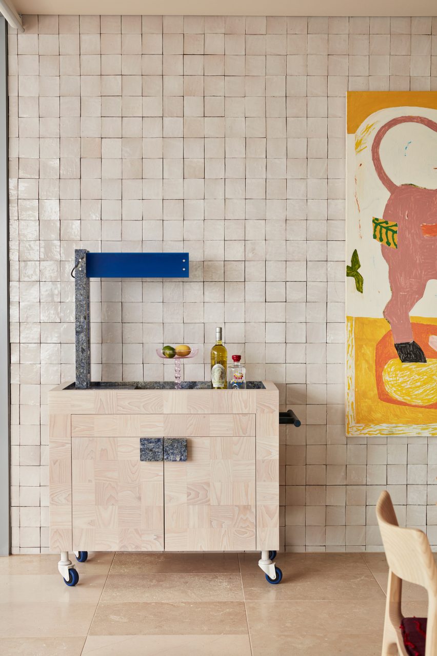
Dream Weaver penthouse, Australia, by YSG
Spanish tapas bars informed the design of this penthouse in Sydney, which belongs to a couple of empty nesters.
In the open-plan living space, this reference was translated into an entire wall of glossy off-white tiles, providing the backdrop for a custom bar trolley made from white ash and blue granite.
Find out more about Dream Weaver penthouse ›
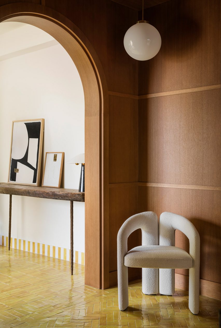
Conde Duque apartment, Spain, by Sierra + De La Higuera
Vibrantly glazed tiles help to define the different zones in this apartment in Madrid, with green used in the kitchen, red and blue in the bathrooms and yellow in the living areas.
The traditional Moroccan zellige tiles are characterised by their tonal and textural variations, with imperfect surfaces that are moulded by hand.
Find out more about Conde Duque ›
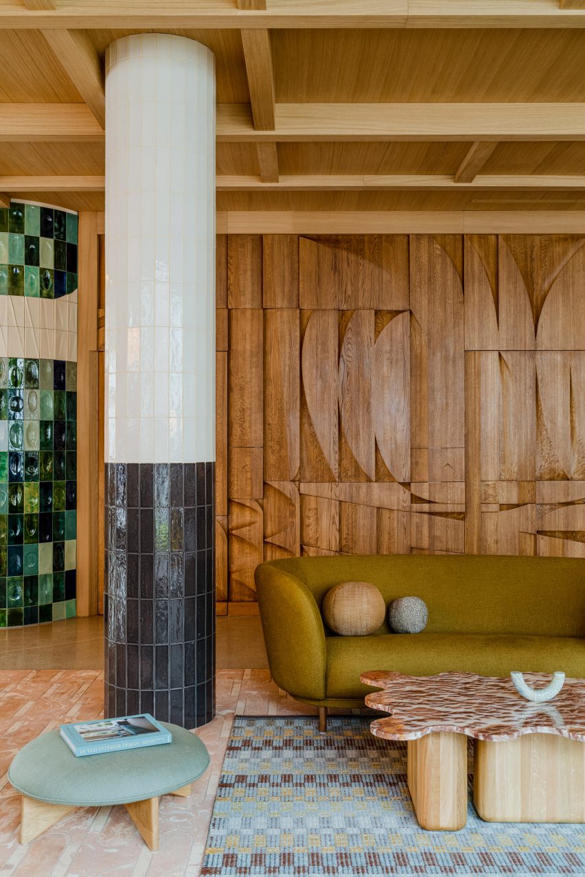
Puro Hotel Kraków, Poland, by Paradowski Studio
Polish practice Paradowski Studio mixed and matched different kinds of tiling throughout this lounge, covering everything from the floor to the columns to an entire wall, designed by artist Tomasz Opaliński based on the modernist mosaics of the 1970s.
To soften up these hard, glossy surfaces and add a sense of warmth, the studio added plenty of textiles plus a stained oak bas-relief, which a couple of doors.
Find out more about Puro Hotel Kraków ›
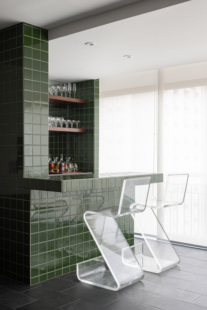
São Paulo apartment, Brazil, by Casulo
A bar clad in glossy green tiles forms the centrepiece of this living room, contrasted against the matt black slate on the floor.
Brazilian studio Casulo repeated this same material palette in the bathroom and kitchen of the São Paulo apartment, which the owners bought at a closed-door auction without seeing its interior.
Find out more about São Paulo apartment ›
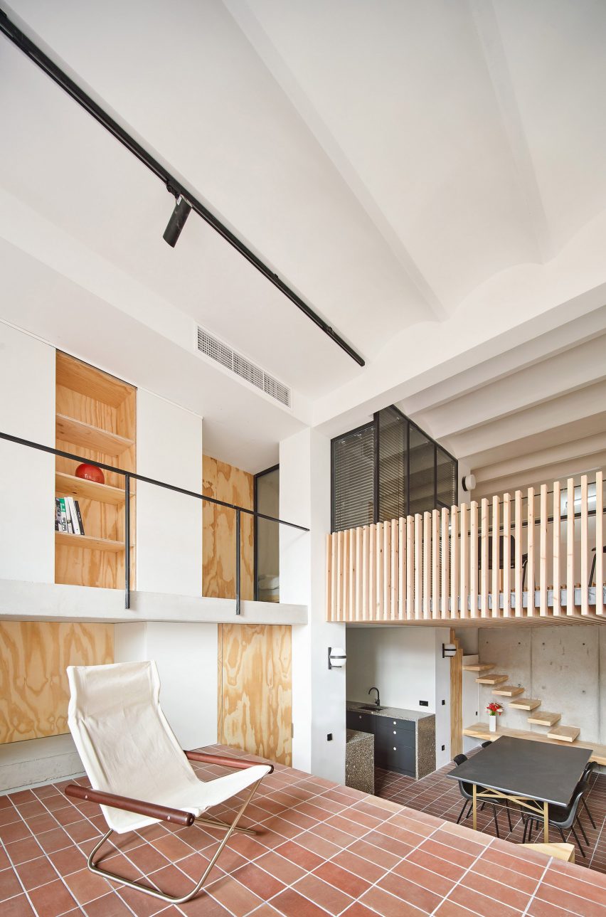
Yurikago House, Spain, by Mas-aqui
Hydraulic tiling helps to create a sense of continuity across the various different floors and half-levels of this apartment, designed by architecture studio Mas-aqui.
The natural tonal variations of the reddish-brown ceramics help to create a sense of depth and texture despite using only one material.
Find out more about Yurikago House ›
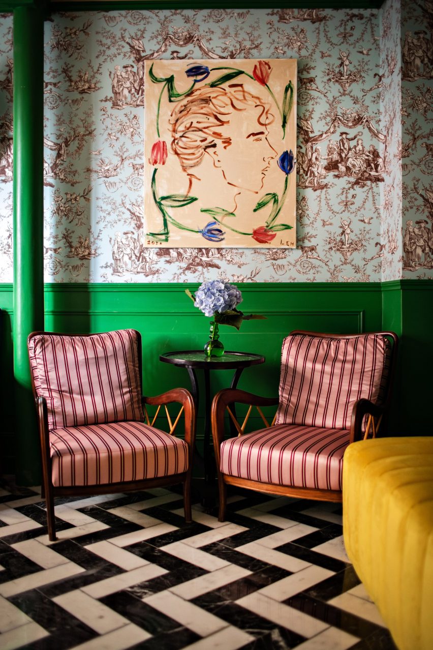
Hotel Les Deux Gares, France, by Luke Edward Hall
Chevron marble floors, striped pink-satin armchairs and chintzy duck-egg blue wallpaper create a riotous clash of patterns and colours in this lounge by British designer Luke Edward Hall.
“I really wanted this space to feel above all joyful and welcoming and alive, classic but a little bonkers at the same time,” he explained.
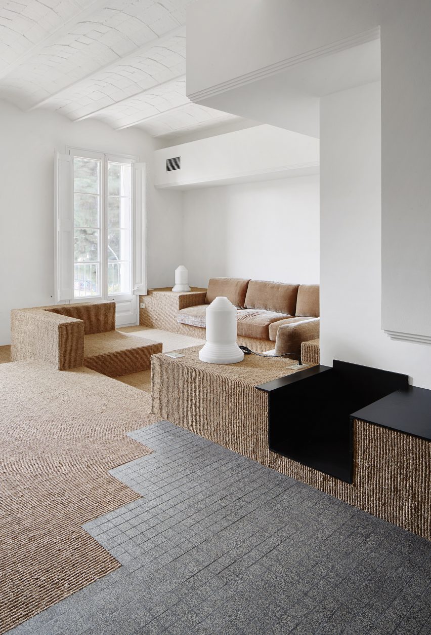
Reforma de una Vivienda en Ensanche, Spain, by Arquitectura-G
Barcelona practice Arquitectura-G removed a series of dividing walls from this apartment to let more light into the plan and relied on changing levels and flooring to denote different areas.
Here, the transition from the hallway to the lounge is signified by a zig-zagging junction between the gridded grey tiling and the neutral-toned carpet, which is made from coarse sisal plant fibres.
Find out more about Reforma de una Vivienda en Ensanche ›
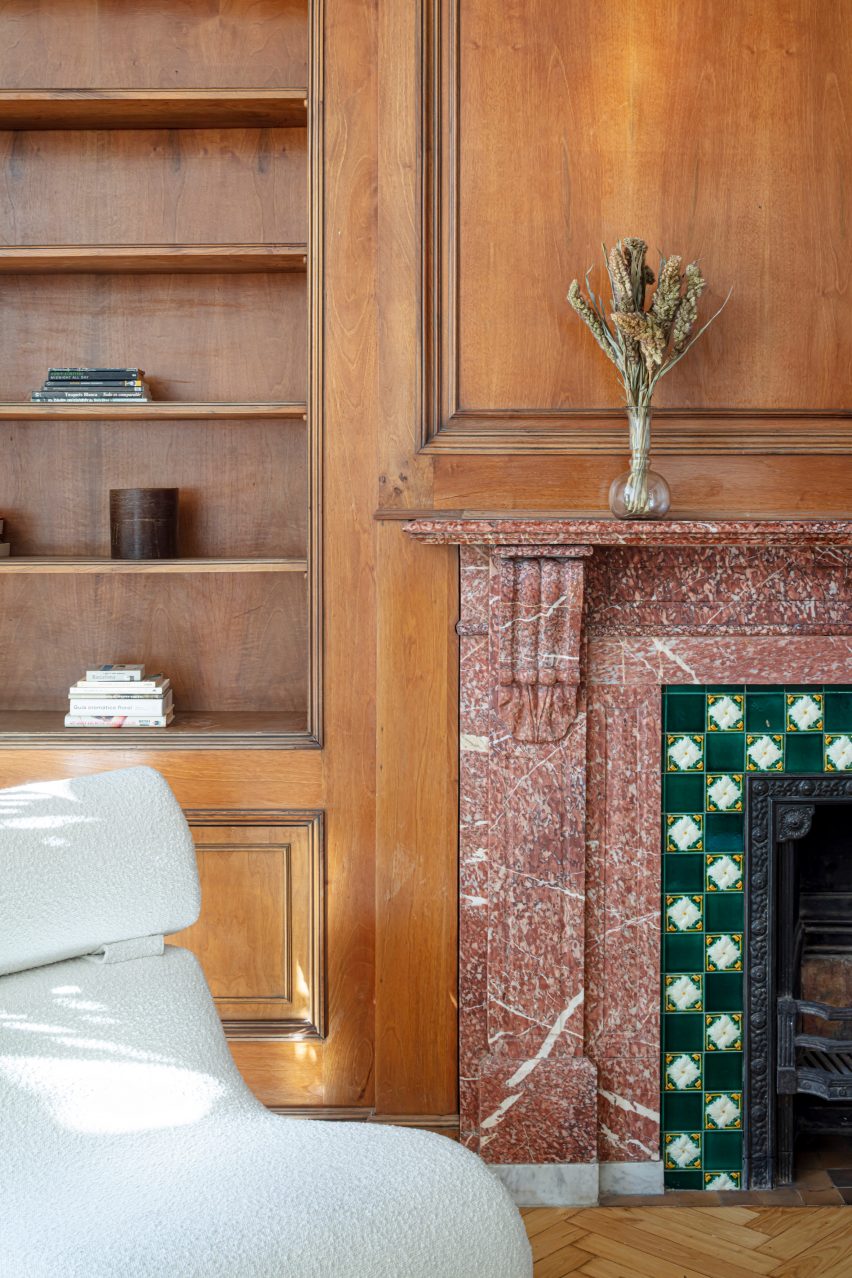
Passeig de Grácia 97, Spain, by Jeanne Schultz
A pink stone fireplace with chequered tiling served as the starting point for the renovation of this old Barcelona apartment, with doors, window frames and ceiling mouldings throughout the home painted in a matching shade of green.
Designer Jeanne Schultz also introduced minimal yet characterful modern furnishings to keep the focus on the building’s period features, which also include traditional Catalan vault ceilings and wooden parquet flooring.
Find out more about Passeig de Grácia 97 ›
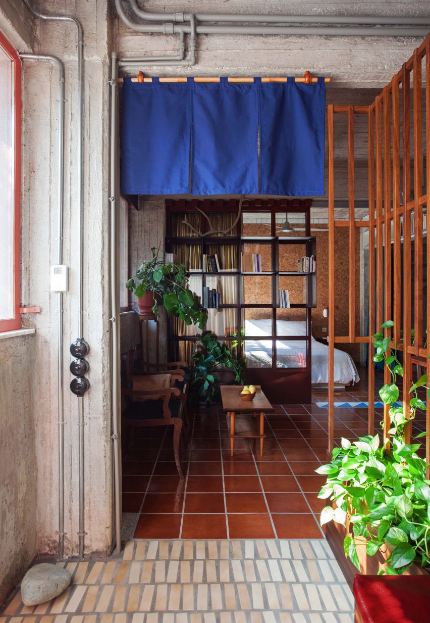
Ilioupoli apartment, Greece, by Point Supreme
Originally popular in the 1970s, when they were used to cover verandas and porticos in holiday homes throughout Greece, these glazed terracotta tiles were salvaged from storage so they could be used to cover the floor of a one-bedroom home in Athens.
Formerly a semi-basement storage space, the apartment is located at the bottom of a typical Athenian polykatoikia – a concrete residential block with tiered balconies.
Find out more about Ilioupoli apartment ›
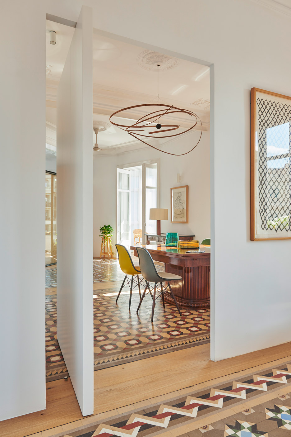
Casa AB, Spain, by Built Architecture
When Built Architecture renovated this 19th-century Barcelona apartment, the Spanish practice retained the traditional mosaic flooring laid throughout most of its rooms, including the hallway, bedroom, living and dining room.
The spaces between the tiling were filled with oak floorboards to match the custom oak cabinetry the studio installed to run longways through the apartment like a spine, dividing up the private and communal areas.
Find out more about Casa AB ›
This is the latest in our lookbooks series, which provides visual inspiration from Dezeen’s archive. For more inspiration see previous lookbooks featuring maximalist interiors, kitchens with polished granite surfaces and surprisingly welcoming brutalist interiors.

