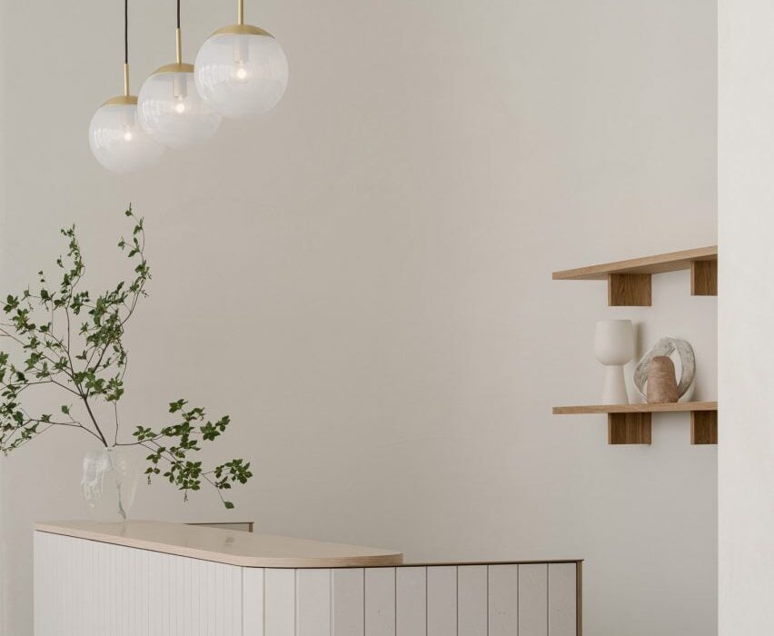
White Aloop clinic reception
CategoriesInterior Design

Keiji Ashizawa adds “residential calm” to Aloop clinic in Ginza

Japanese architect Keiji Ashizawa has created the interior for a skincare clinic in Tokyo, using textiles and custom-made furniture to make it feel more residential than medical.

The Aloop Clinic & Lab, which provides “skin cure and care”, is located in the city’s upscale Ginza area and run by Japanese beauty company POLA. Ashizawa wanted to give it an interior that would feel peaceful, while also representing the brand.
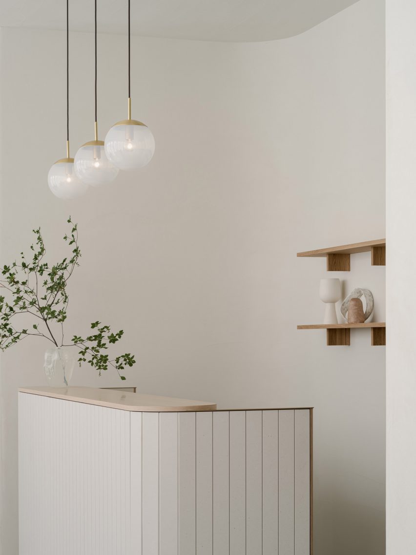
White Aloop clinic receptionWhite Aloop clinic reception
The Aloop clinic has a calm minimalist interior

“As a clinic that uses medical technology to deal with beauty, we thought that the space should have sincerity, calmness, and beauty in order to create a comfortable time for customers to feel at ease,” Ashizawa told Dezeen.

“In addition, considering that this is a completely new business for the POLA beauty brand, we felt that it was necessary to create a space that would enhance the brand.”
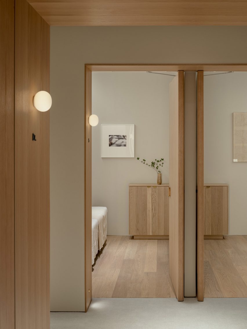
Wooden panelling inside Aloop clinicWooden panelling inside Aloop clinic
Wood was used throughout the space

To do so, Ashizawa looked at the design of the 210-square-metre clinic like he would if he were designing a residential space, giving it a calm, minimalist interior.

“Although it is a clinic, I considered the space to be similar to a hotel or a living space,” he said. “Therefore, I used materials that I use in designing living spaces and hotels.”

“The walls are plaster and the floor is a wool rug from Hotta Carpet,” he added. “The sofa and furniture at the characteristic entrance are made of Kvadrat wool textile to create a pleasant texture.”
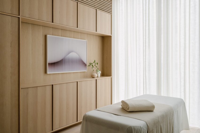
Treatment room in Japanese skincare clinicTreatment room in Japanese skincare clinic
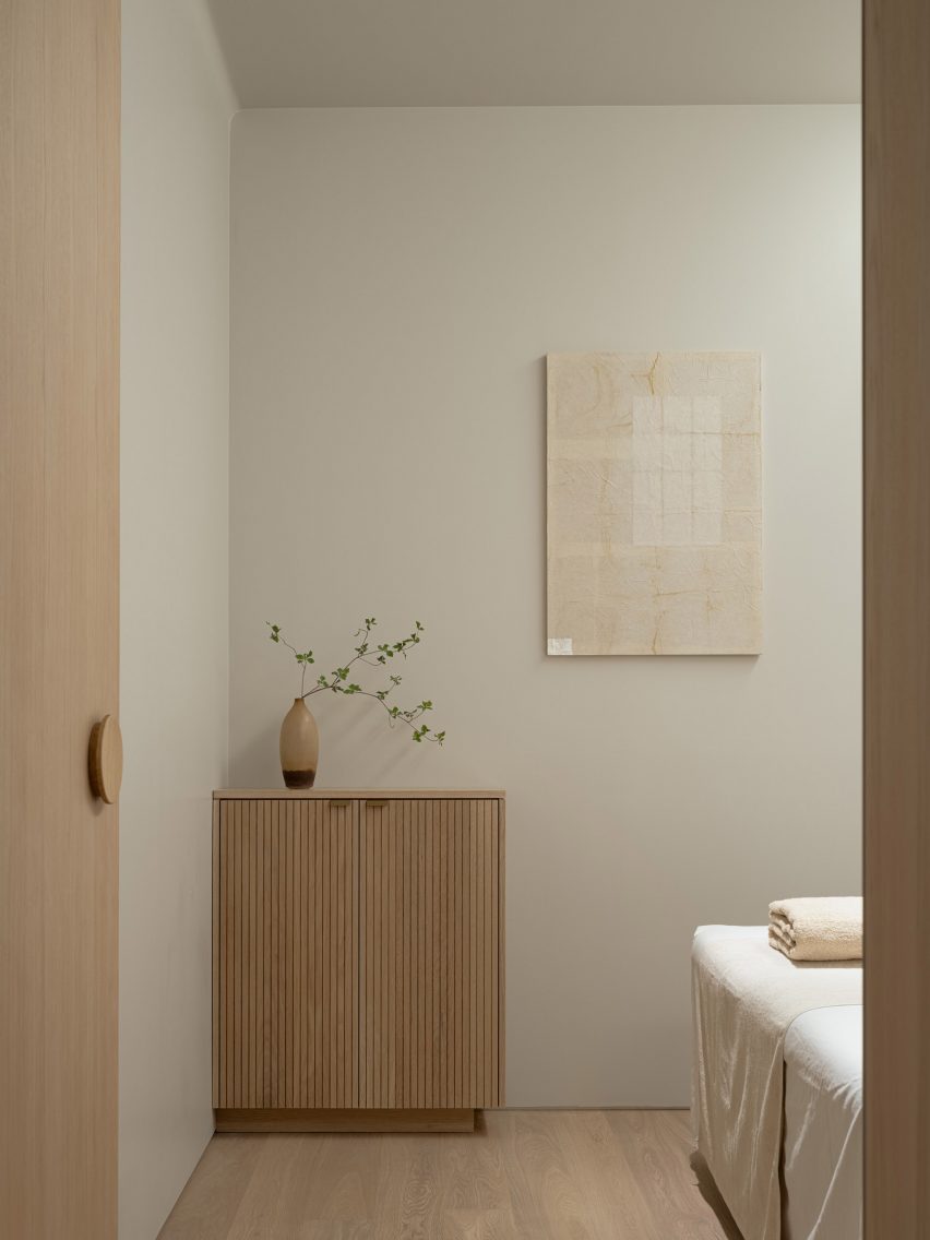
Treatment rooms were designed to have a residential feel

The architect used a clean, simple colour palette throughout the space, with white-painted walls contrasting against wooden panelling and wooden doors.

“Wood was used for doors, furniture and details because we wanted to create a residential calm rather than a clinic,” Ashizawa said. “We felt that a bright and healthy atmosphere was necessary.”

“The extensive use of wood was to create a residential atmosphere, and we wanted the space to be as far away from a typical clinic as possible,” he added.
Sofas by KarimokuSofas by Karimoku
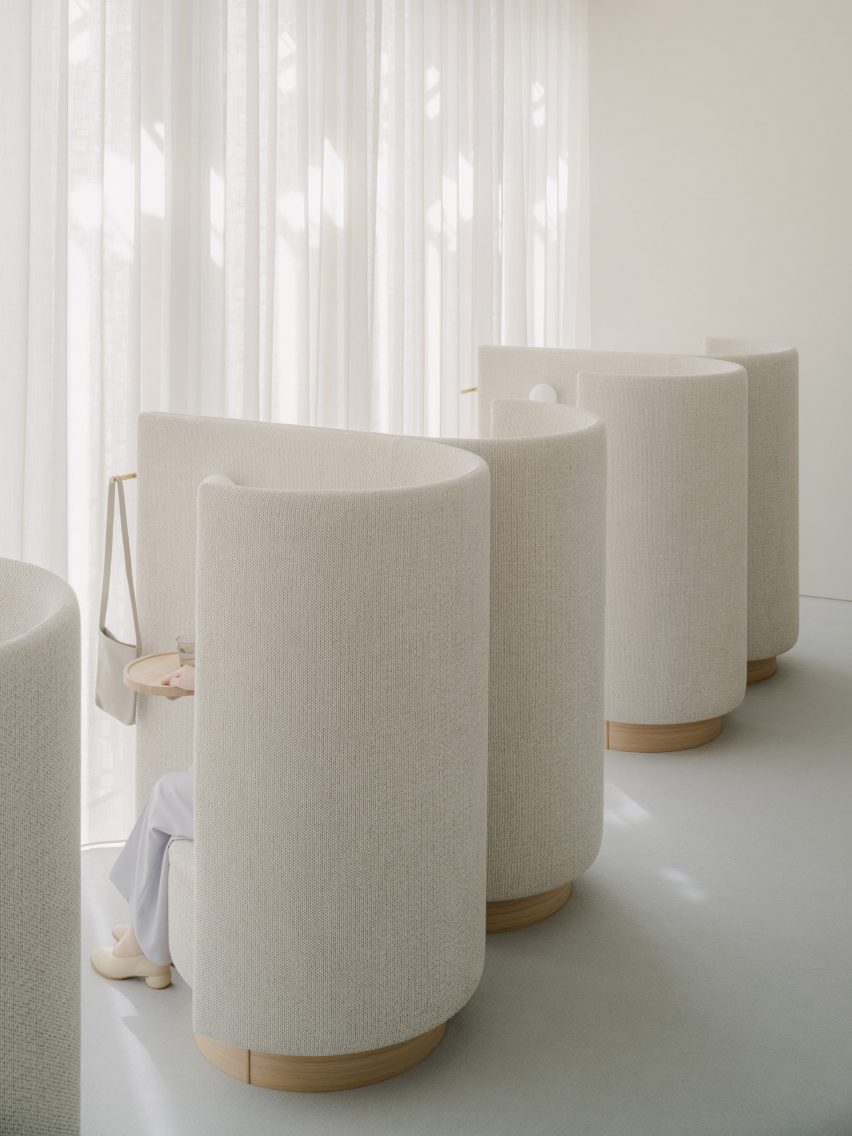
Keiji Ashizawa created custom-made sofas with furniture brand Karimoku

His studio worked together with wooden furniture brand Karimoku to design the custom-made sofas for the space, which welcome customers as they enter the clinic.

“Of particular importance to this project were the custom sofas,” Ashizawa said.

“We asked Karimoku, with whom we communicate on a daily basis for furniture development and wood projects, to work with us on the development of the furniture.”

He compared his collaboration with the brand to that of mid-century modern Finnish architect Alvar Aalto and furniture brand Artek.

“For me, Karimoku has become an indispensable partner in thinking about space, just as Aalto is for Artek,” he explained.
Calm treatment room in TokyoCalm treatment room in Tokyo
Neutral colours contrast against pale wood

By creating the sofas with rounded edges, Ashizawa aimed for them to “gently envelop” customers after their treatments.

“The mere fact that something looks hard or painful makes the body tense, so we thought it would be desirable to eliminate such things,” he said.

“However, in order to maintain a comfortable sense of tension in the room, delicate details of metal and wood were used to achieve a balance.”
Sculptures in Aloop clinicSculptures in Aloop clinic
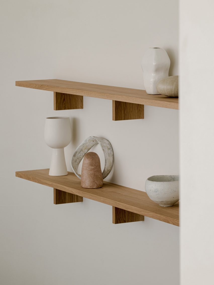
Small sculptures decorate the space

Small sculptures were dotted throughout the Aloop clinic, including in the treatment rooms.

Ashizawa has previously designed an interior with a similar colour palette for the Hiroo Residence in Tokyo, and also used plenty of wood for his and Norm Architects minimalist Trunk Hotel design.

The photography is by Tomooki Kengaku.
Reference

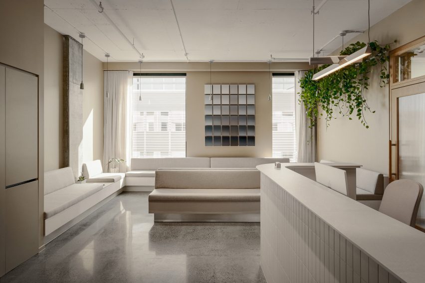
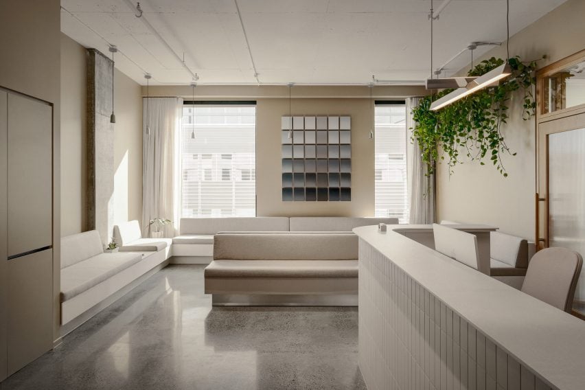
Minimalist reception area with built-in lounge seating
CategoriesInterior Design

Appareil Architecture designs Montreal dental clinic like “someone’s home”

The minimalist interior of this Montreal oral surgery clinic by local studio Appareil Architecture “adopts a residential aesthetic” to help patients and employees feel relaxed.

The Maxillo Tandem clinic in the city’s Technopôle Angus neighbourhood provides maxillofacial surgery, which deals with diseases, injuries and defects of the mouth, teeth and jaws.

Minimalist reception area with built-in lounge seating
Appareil Architecture designed the dental clinic to feel more like a home than a medical facility

The clinic’s founder, surgeon Anne-Frédérique Chouinard, gave Appareil Architecture a “carte blanche” to design the space differently to typical medical facilities.

“The clinic adopts a residential aesthetic with durable materials to create an inviting, refined space that centers on well-being,” said the studio.

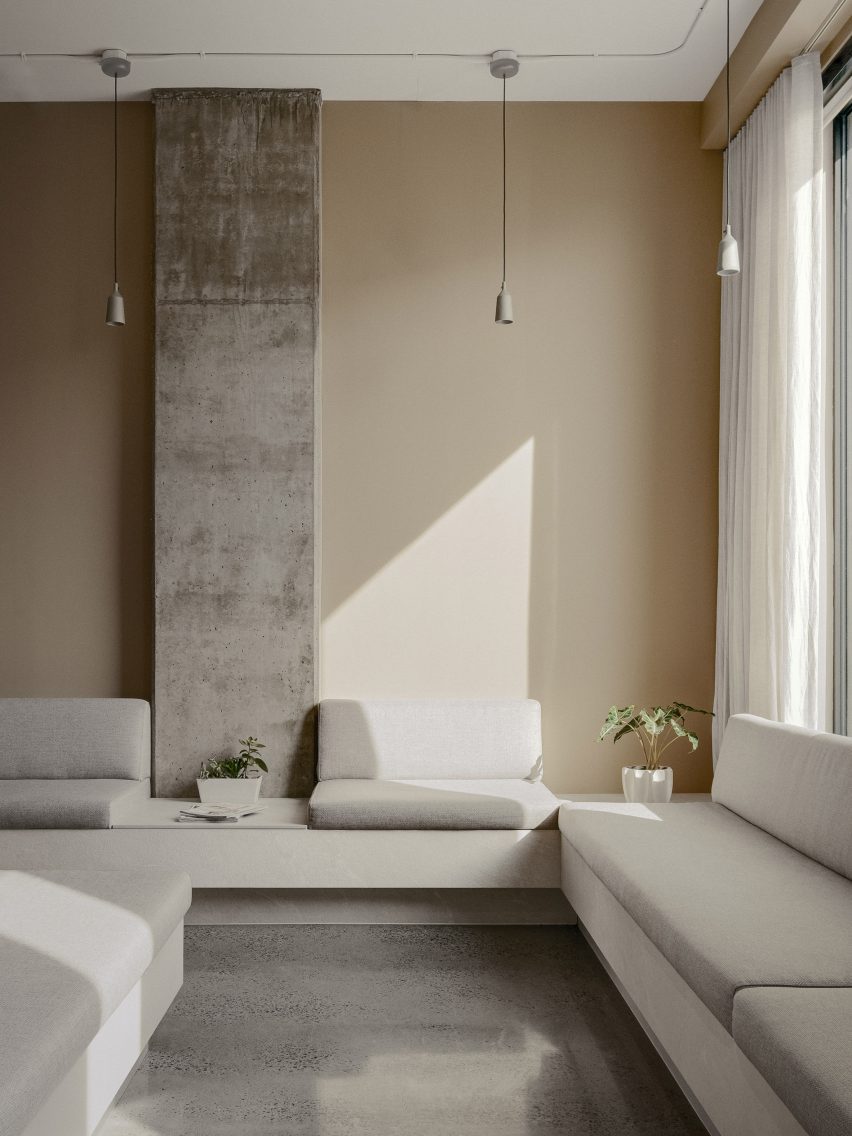
Built-in seating wraps around the perimeter of the reception area

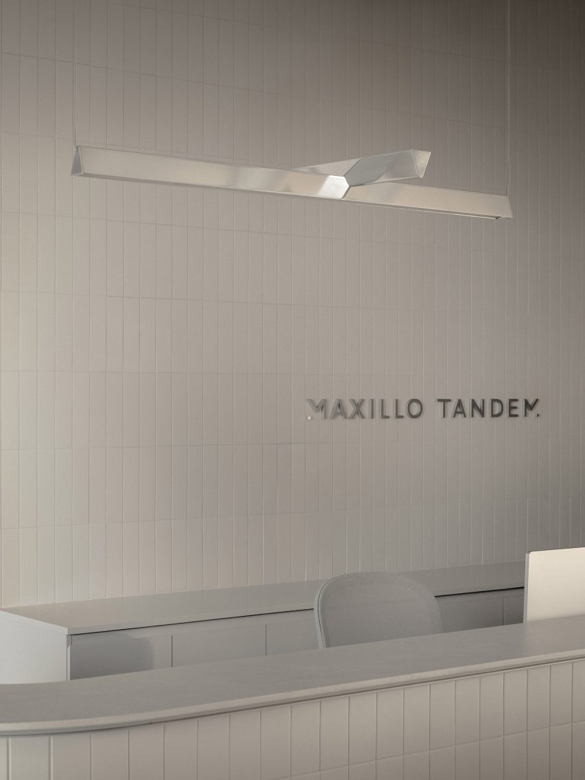
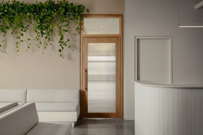
Upon entering, patients are met by a reception desk clad in vertically laid, off-white ceramic tiles that also cover the wall behind.

“Their vertical positioning adds texture and rhythm to the wall, bringing the space to life, while remaining functional and easy to maintain,” Appareil Architecture said.

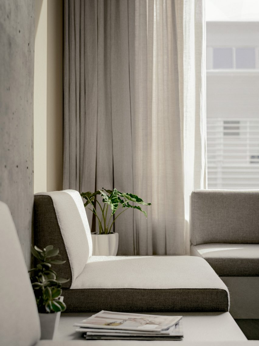
Cushioned seat in front of a linen curtain
Pale upholstery, linen curtains and beige walls all add to the serene atmosphere

The waiting area to the left is furnished with built-in seats that form a U shape around the perimeter and under a large window, while a double-sided island in the central adds additional seating.

Polished concrete flooring and beige walls complement the pale upholstery and linen curtains, together creating a serene atmosphere.

Off-white tiles behind the reception counter
Off-white tiles clad the reception counter and the wall behind, adding texture and rhythm

“All lend a reassuring character to the space,” said the architects. “In addition to a soft, peaceful colour palette, these materials contribute to the soothing, comforting ambiance.”

On either side of the symmetrical reception counter, oak-framed doors with fritted glass panes both lead through to the treatment area.

Oak-framed door with fritted glass pane
Oak-framed doors with fritted glass panes lead from reception to the treatment areas

A central block of rooms for staff – also wrapped in the off-white tiles – runs back from the reception area, dividing the clinic into two sides.

“This central structure naturally delineates the space, creating an efficient traffic flow that allows people to move easily in both directions,” the studio said.

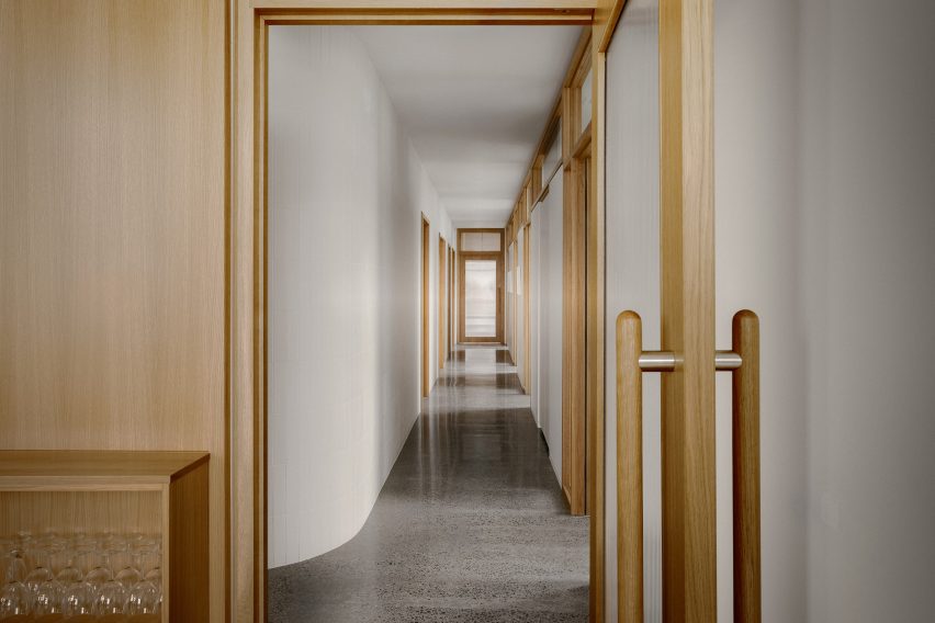
Corridor with white walls and wood-framed doors on either side
A U-shaped corridor connects the dentists’ offices, operating rooms and staff areas

The corridors continue the white and wood material palette and provide access to the dentists’ offices on the left side and operating rooms along the right.

All of these rooms are also sparsely furnished and have a clean aesthetic, and are purposefully placed away from the reception area for patient privacy.

At the back of the clinic is a space with a communal kitchen for employees to take breaks, which is oriented to enjoy afternoon light.

“In the morning, the dentist’s offices, positioned on the window side, are flooded with natural light,” said Appareil Architecture.

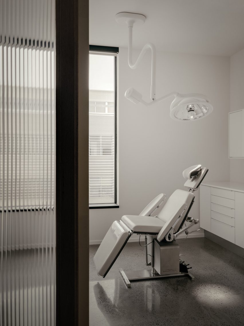
Minimally furnished room with a dentist chair in the centre
A minimalist approach was also taken in the consultation rooms

“In the afternoon, this light pours into the staff areas and illuminates the central structure,” the team added.

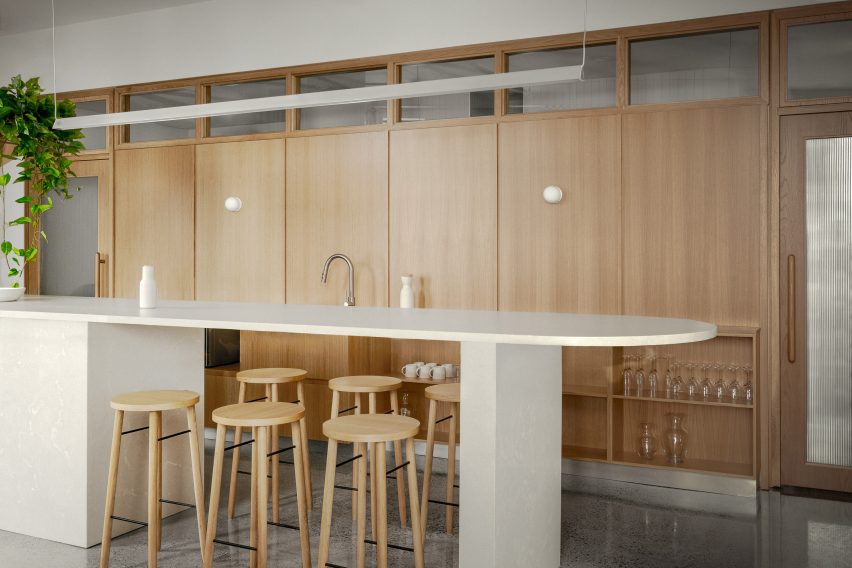
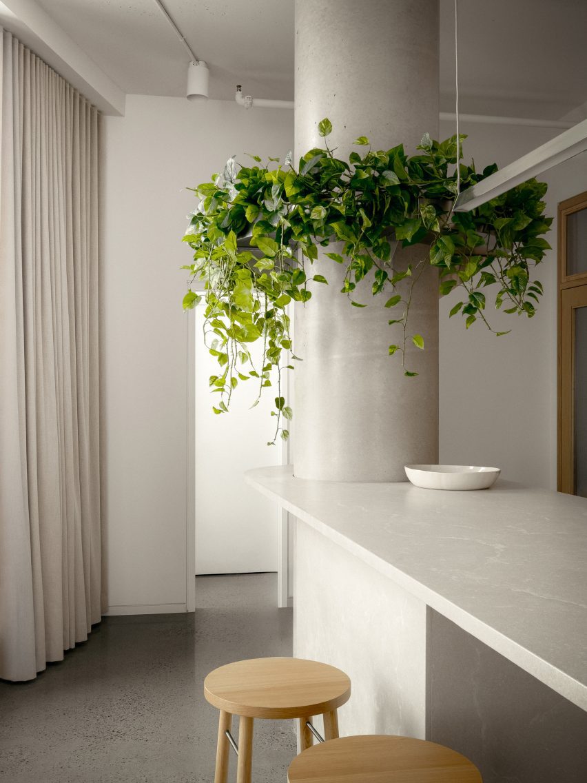
A wood-panelled wall topped with clerestory windows incorporates the staff kitchen facilities and storage, while a concrete island with rounded ends incorporates a cylindrical structural column.

Communal kitchen with wood-panelled wall and a central concrete island
A communal kitchen for staff is located behind a wood-panelled wall at the back of the clinic

Since Maxillo Tandem is part of an ecological real-estate project, the architects had to comply with strict energy efficiency targets, on top of meeting the medical operating standards.

Overall, the clinic has been well-received by both patients and staff, according to Chouinard. “The customer feedback is very positive,” she said. “They feel like they’re in someone’s home, rather than a clinic. That was my intention.”

A kitchen island with rounded ends incorporates a structural concrete column

Appareil Architecture has applied its minimalist style to many residential projects in and around Montreal, including an updated 1960s home, a stark dining extension to a city residence and a black metal cabin hidden in the forest.

The studio has also designed a handful of more colourful interiors for hospitality spaces, such as a cafe and artist workshop in the city, and a restaurant inside a former factory.

The photography is by Félix Michaud.


Project credits:

Client: Anne-Frédérique Chouinard
Contractor: Hub Construction
Woodworking: Blitz Design
Reception counter lighting: Lambert & Fils
Kitchen island: Béton Johnson

Reference

Waiting area with mirror wall in Youth Lab 3.0 clinic interior design by Nickolas Gurtler
CategoriesInterior Design

Youth Lab clinic by Nickolas Gurtler references 1970s Italian glamour

Australian designer Nickolas Gurtler has drawn from the nightclubs of 1970s Milan and Florence to create the interior for a cosmetic clinic in Perth, Australia.

It is the third interior that Gurtler has created for Youth Lab, a clinic that offers a range of non-surgical cosmetic treatments that include anti-ageing procedures, hair removal and skin rejuvenation.

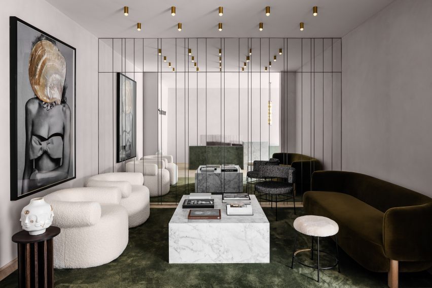
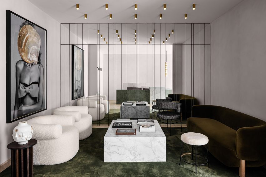
Waiting area with mirror wall in Youth Lab 3.0 clinic interior design by Nickolas Gurtler
The waiting area features a mirror wall, gold lights and a green silk carpet

Located in Joondalup, Youth Lab 3.0 is the brand’s most experimental space so far.

While the two other locations – in Claremont and West Perth – occupy heritage buildings, this one is set inside a commercial block from the 1990s. This meant Gurtler could be more daring in his approach.

Youth Lab 3.0 clinic interior design by Nickolas Gurtler
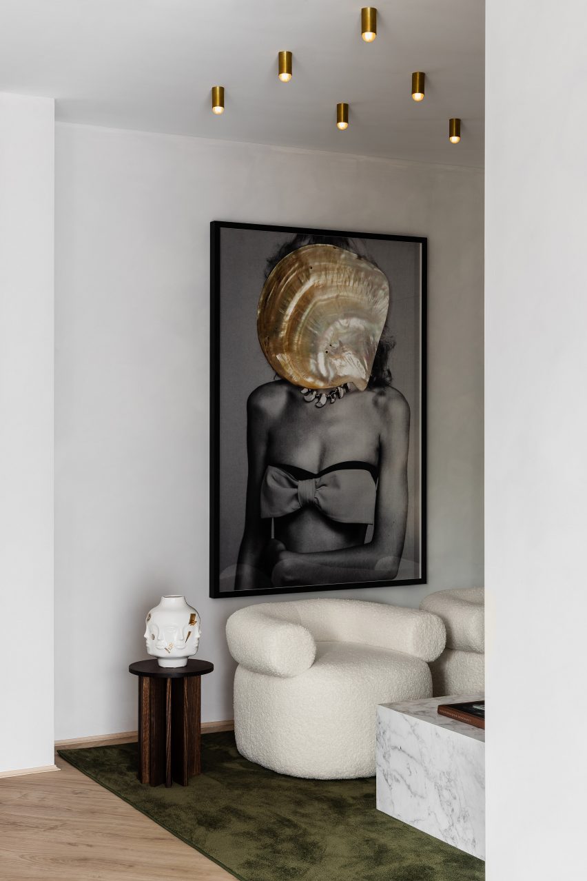
A Dina Broadhurst artwork provides a focal point

While the design was partly informed by the brand’s minimalist identity, it also features playful details that include mirror walls and a grand geometric reception desk.

“There were some really outrageous and glamorous concepts that I really responded to and had filed away for the right project,” said Gurtler.

“When Youth Lab approached us again for their third clinic, I knew that this was the right time to bring them to life.”

Marble reception desk in Youth Lab 3.0 clinic interior design by Nickolas Gurtler
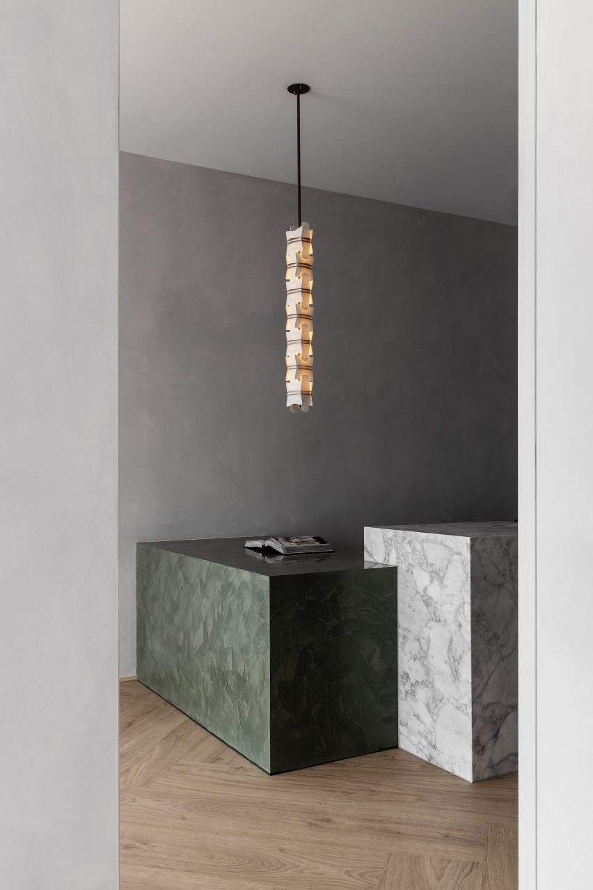
The reception desk is formed of Arabescato marble and Venetian plaster

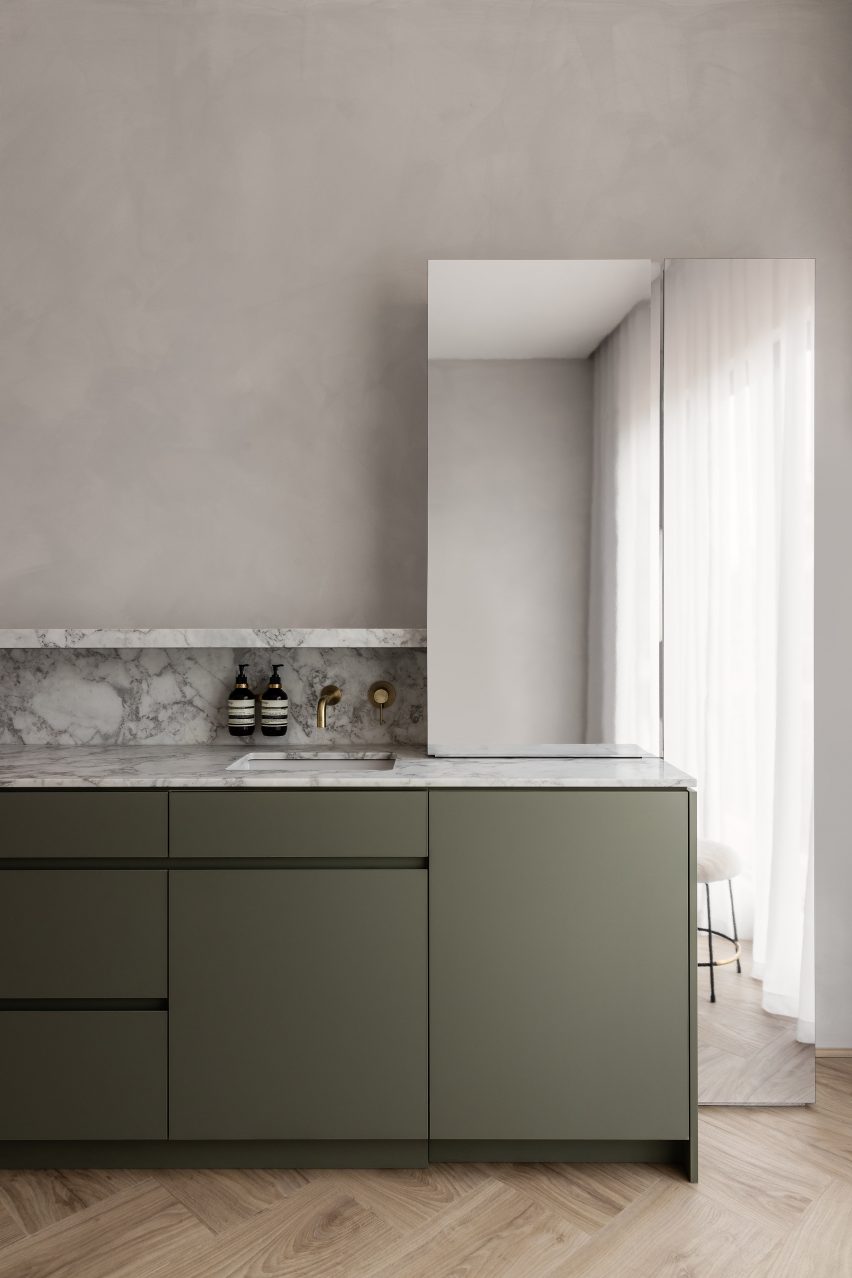
The starting point was the palette of forms and materials that Gurtler has worked with previously for the brand, which includes decorative marble, plush velvet and metal cabinetry.

While the Claremont space that Gurtler designed for the brand has a New York loft vibe, here these elements are paired with shades of olive green and gold to create a more retro Italian feel.

“This language is a kind of style guide for us on each project,” said Gurtler.

“Common elements such as mixed metals, monolithic forms, plush textures and rich colour are used in each of the clinics, but we translate these elements completely differently each time.”

Youth Lab 3.0 clinic interior design by Nickolas Gurtler
The colour palette centres around olive green and gold

Arabescato marble is combined with Venetian plaster and polished aluminium to create the cuboidal forms of the reception desk, which sits beneath a custom glass and brass lighting pendant by designer Lost Profile Studio.

A large gridded mirror installation provides the backdrop to a waiting area furnished with a green silk carpet, a blocky marble coffee table and sculptural white armchairs.

Youth Lab 3.0 clinic interior design by Nickolas Gurtler
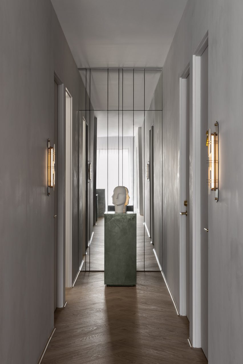
A sculpture by American potter Jonathan Adler sits in front of a second mirror wall

Rows of golden-hued ceiling lights are reflected in the mirrors, doubling their visual impact, and an artwork by Dina Broadhurst creates another focal point.

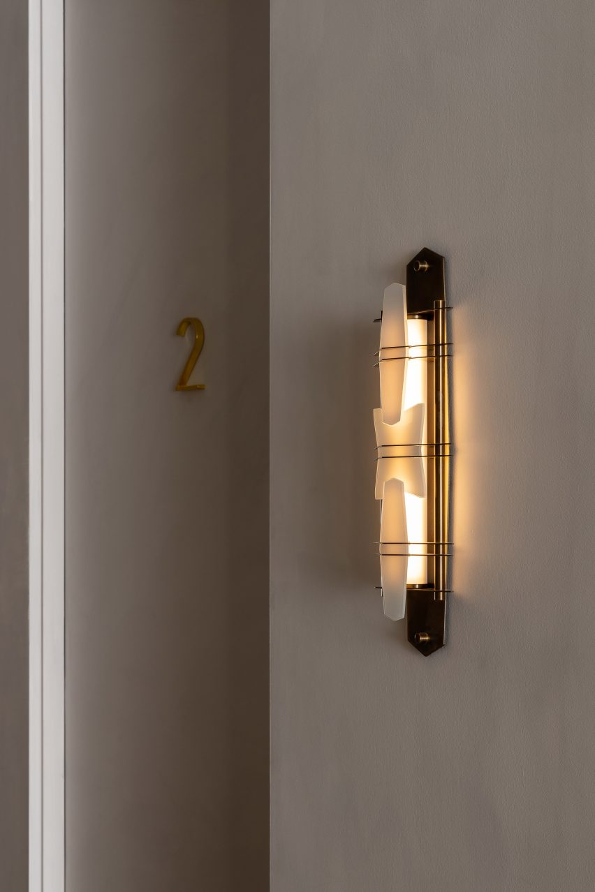
As customers are led through for treatment, they also encounter a second mirror wall, a ceramic by American potter Jonathan Adler, custom wall lights and brass door numbers.

Youth Lab 3.0 clinic interior design by Nickolas Gurtler
Custom lighting scones embellish the walls

Youth Lab 3.0 was longlisted for Dezeen Awards 2022 in the leisure and wellness interior category, along another of Gurtler’s designs, the Cole Hair Studio.

The designer hopes the space offers “an immersive and sensorial experience which is as much invigorating as it is calming”.

“The Youth Lab experience is a luxury and the interior reflects that,” he added.

The photography is by Timothy Kaye.

Reference