Brooklyn-based Home Studios has remodelled a bar and restaurant in New York’s East Village, using dark wood and velvet seating to retain a “worn-in and aged appearance”.
The Wren on the busy Bowery thoroughfare has become a neighbourhood staple since opening in 2012, but was ready for an interior revamp.
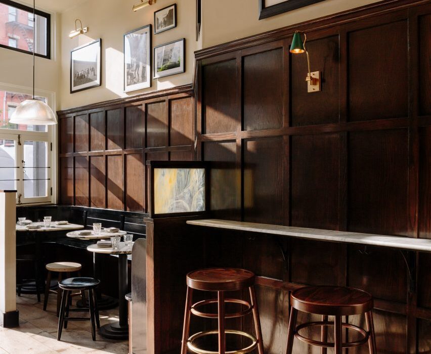
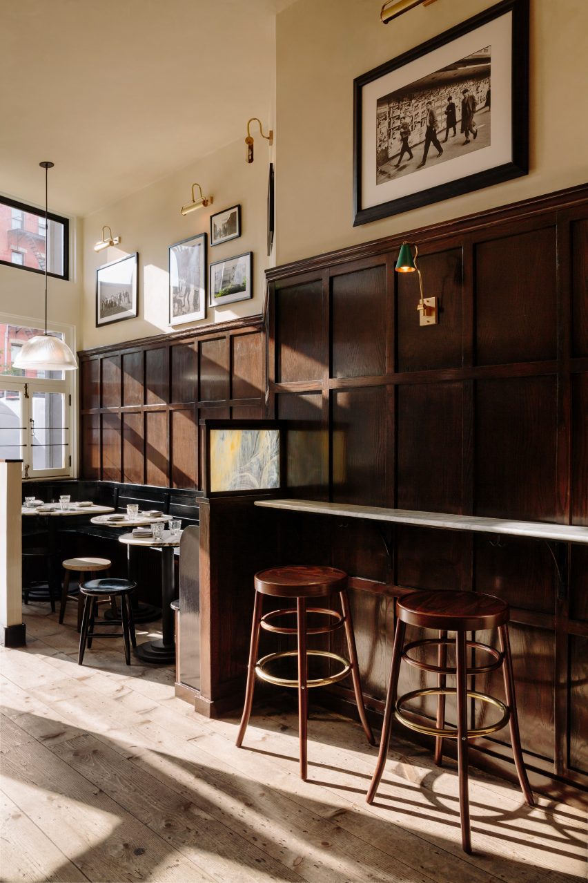
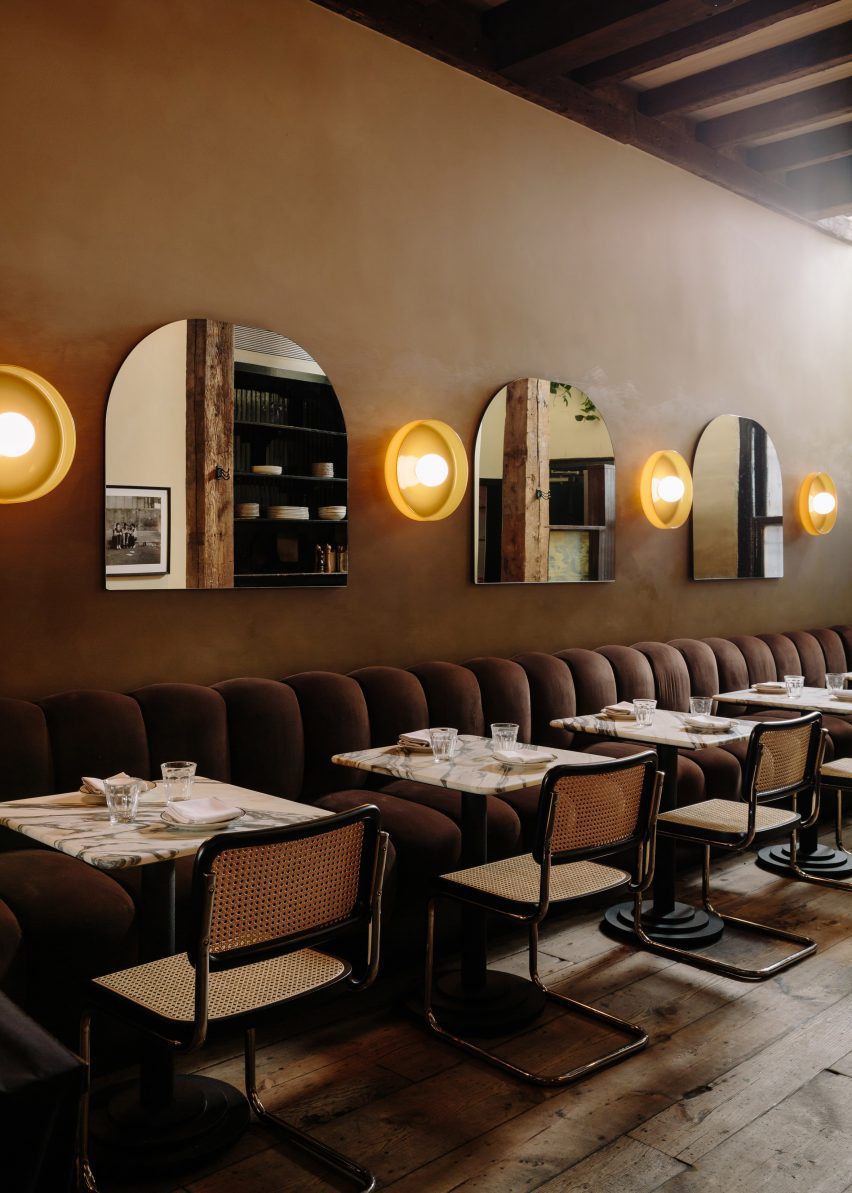
The Wren has been remodelled in a way that retains its rustic charm
Home Studios refreshed both levels of the upscale pub, including the upper-floor dining and drinking area, and private lounge downstairs.
“Despite the changes in the city and the evolution of the neighbourhood, The Wren has maintained its timeless appeal, offering visitors a glimpse into the past and an authentic pub experience,” said Home Studios, led by founder Oliver Halsegrave.
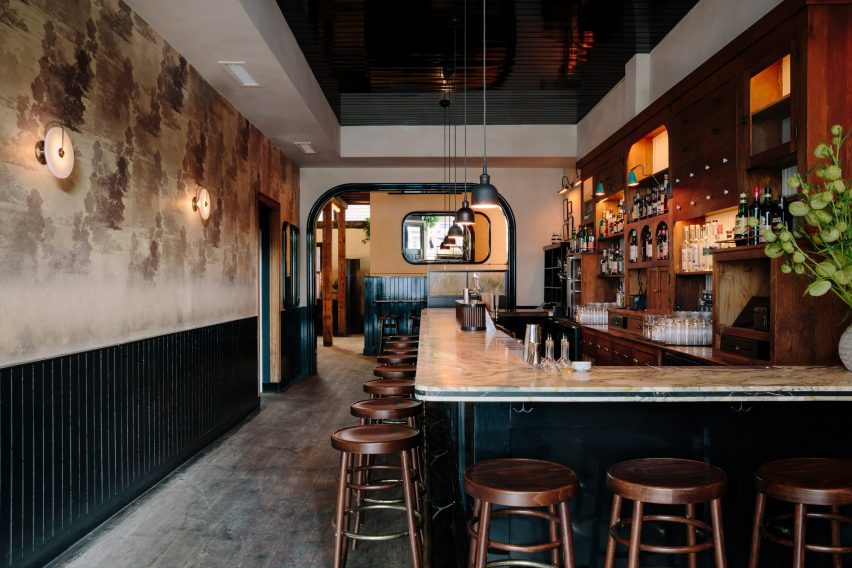
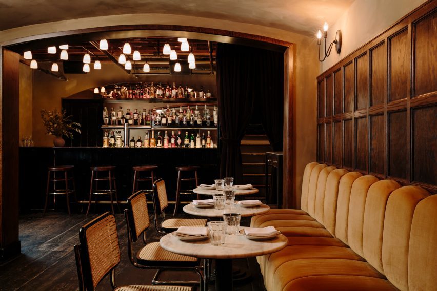
The L-shaped bar has a marble counter and is surrounded by GAR Products stools
Across the main level, dark and moody materials have been used to retain the pub-like quality of the spaces, assisted by the exposed wooden ceiling beams and columns, and hardwood floors.
Either side of the entrance, black-painted, booth-style benches are installed against the walnut wall panelling, creating cosy nooks for pairs or small groups to occupy.
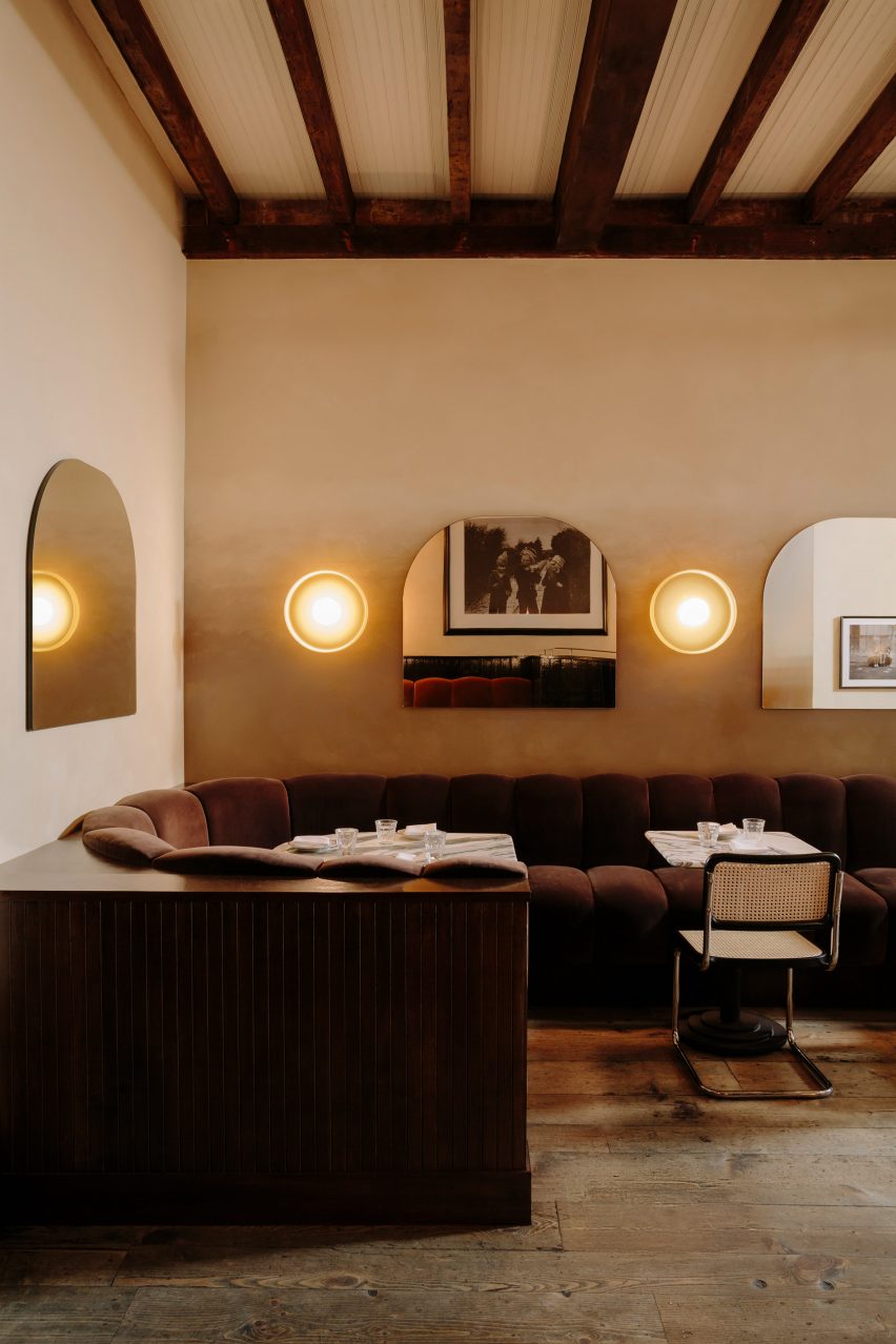
Towards the back, a chocolate-coloured velvet banquette features ribbed cushions
The bar area features an L-shaped marble counter surrounded by GAR Products stools, opposite black wainscoting that runs below vintage-looking wallpaper.
Towards the back, a long banquette is dressed in ribbed cushions that form the seating and backrests, all wrapped in brown velvet.
Custom mirrors alternate with disk-shaped sconces by In Common With
Custom arched shaped mirrors mounted on the walls alternate with disk-shaped sconces by In Common With, against a beige textured plaster backdrop.
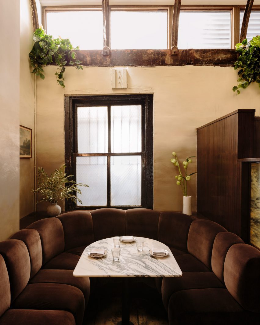
Guests can choose from a variety of booths, two-tops or standing areas
“With a worn-in and aged appearance, the space now exudes a moody winter-like atmosphere,” said Home Studios.
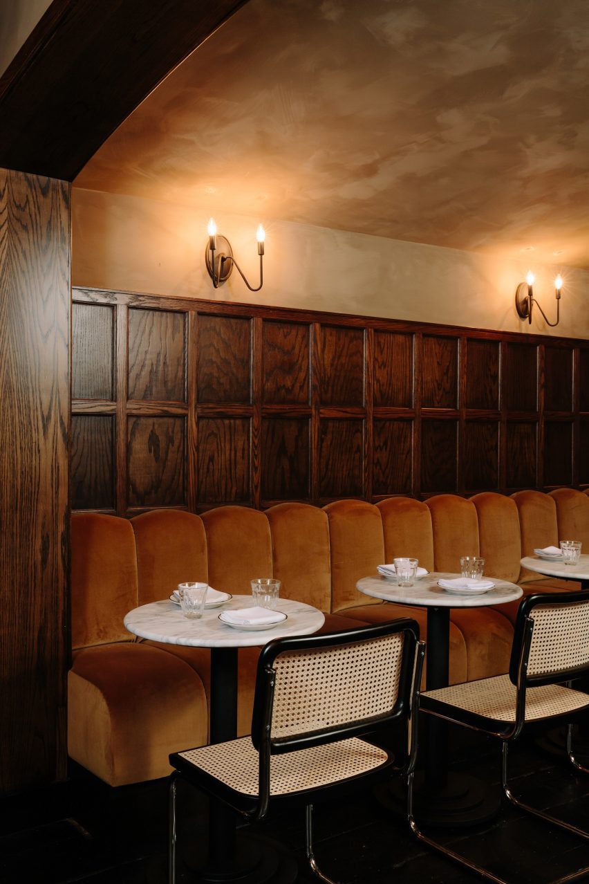
Downstairs, the mood is even more “sultry” and intimate, thanks to darker surfaces and a variety of dim, warm lighting sources.
The bar counter is made from Black Portoro marble and the wood floors are also stained black, while the banquette upholstery is a lighter tone than found on the upper level.
Between the two floors, guests can choose from a variety of seating or standing spots for enjoying their beers, cocktails and bar food.
In the private area downstairs, the mood is more sultry and the banquette upholstery is lighter in colour
“Home Studios has seamlessly blended nostalgic and rustic charm throughout The Wren’s interior, creating an inviting and distinctive ambiance that pays homage to the bar’s storied history,” said the team.
Home Studios is no stranger to refreshing beloved establishments, having completed interiors for The Bird in Montauk and The Pearl in Nantucket.
The downstairs area features dark-stained floors and a black marble bar counter
The firm also recently turned a conference centre in Northern California back into a luxury hotel, as originally intended by the property’s founder: the inventor of the radio.
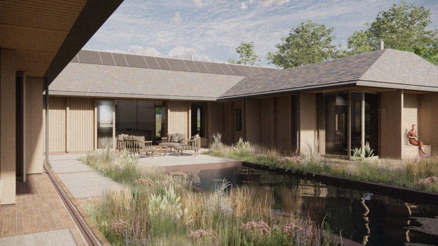
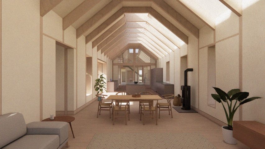
London-based practice Studio Bark has unveiled plans for Breach House, a water-powered family home located in Leicestershire, UK.
Designed to enable the owners to “live off the land”, the proposal by Studio Bark will be powered by photovoltaic (PV) panels and micro-hydro energy, creating a home capable of running off-grid.
Breach House will be powered by photovoltaic (PV) panels and micro-hydro energy
The 430-metre-square proposal will comprise the new home, along with the restoration of an existing agricultural barn and extensive landscaping.
Making use of the site’s location among a network of small brooks, streams and ponds, run-off water from the surrounding fields will be used to provide a portion of the home’s energy needs. It will also be harvested on-site and filtered for use within the house.
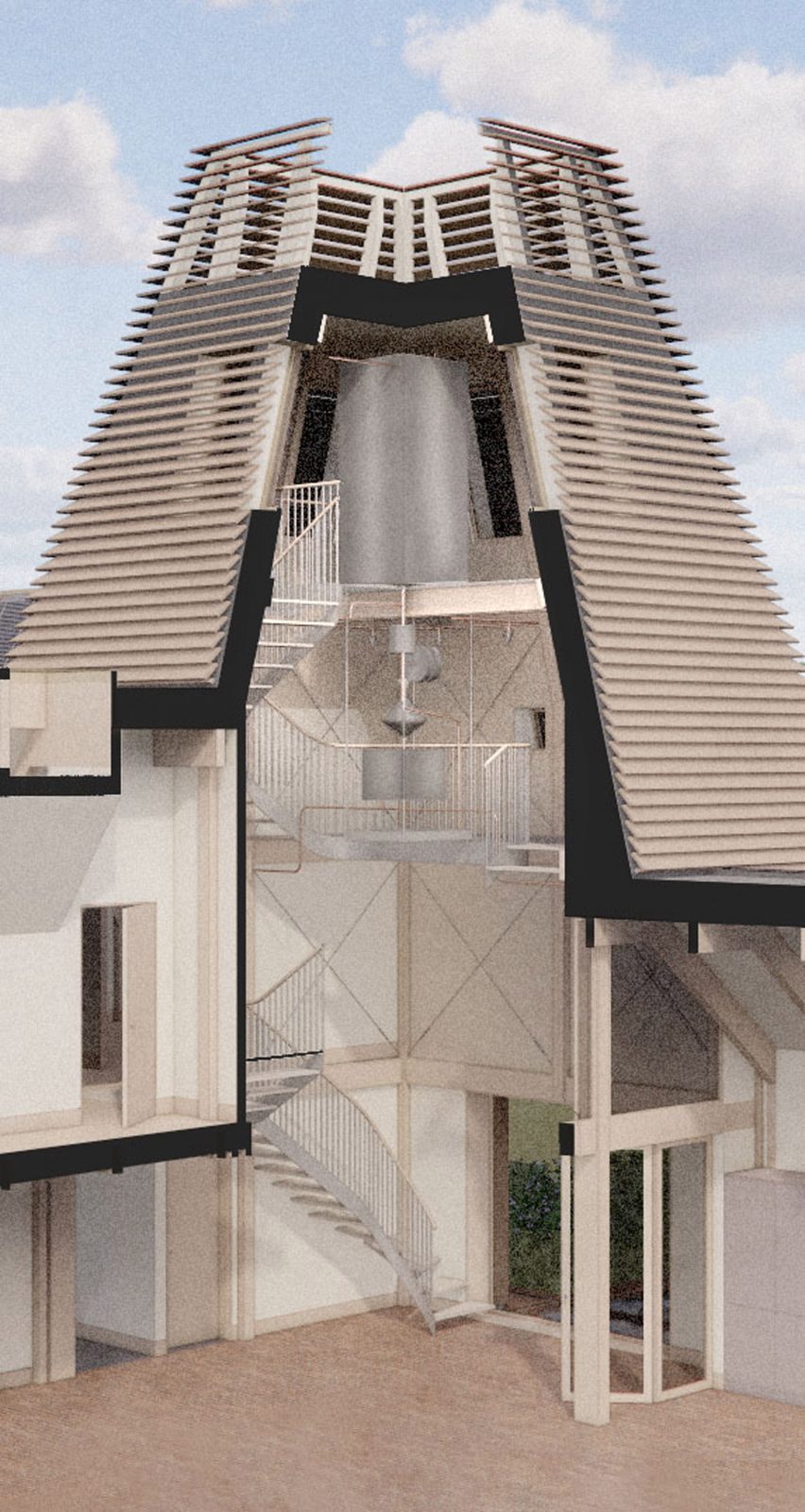
The ‘water tower’ connects the home’s two wings
“The concept is a rural home which establishes a reciprocity between ecology and human needs through water,” studio director Tom Bennett told Dezeen.
“The massing echoes the typology of a traditional farmstead, blending contextual influences to create a contemporary building which resonates subtly with its setting.”
The design references the typology of traditional farm buildings
Drawing on the local typologies, the home will be arranged in clusters complemented by courtyards and sheltered outdoor spaces formed by deep overhanging eaves.
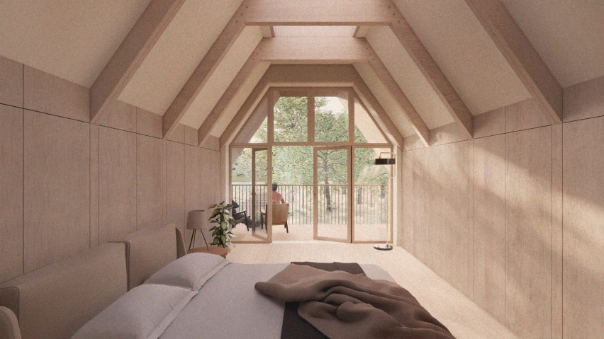
A ‘water tower’, which will sit centrally on the site, will house ventilation and circulation functions as well as water filtration.
It will also hold a staircase and corridor to connect the home’s two wings and was designed to be a visual reference to the use of water throughout the scheme.
Low carbon and natural materials suggested for the proposal include reclaimed brick, UK-sourced timber and reclaimed tiles, which were chosen in response to the character and heritage of the surrounding landscape.
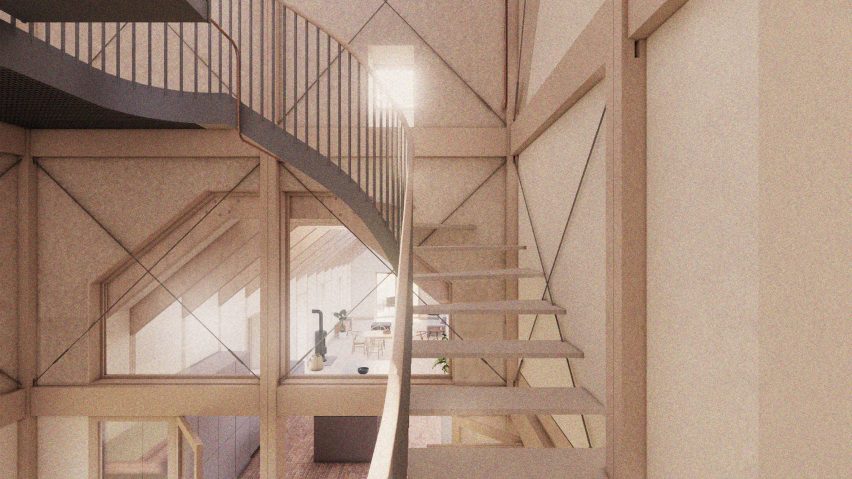
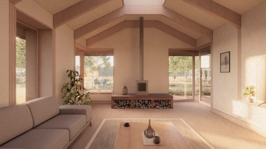
Renders of the proposal reveal a largely timber structure, with exposed beams interspersed with skylights featuring on the home’s interior.
On the exterior, trapezoidal-shaped roofs will be clad with decorative tiles and provide shelter for a balcony adjacent to the bedroom on the upper floor.
Exposed timber beams and skylights will feature on the home’s interior
According to the studio, the residual carbon impact of the building is expected to be countered by landscaping proposals – including the planting of around 200 trees – that will accelerate carbon drawdown on the site.
Calculations undertaken by the studio suggest that these landscaping proposals will sequester roughly three times the amount of carbon that will be released over the building’s lifetime.
Run-off water will be harvested and filtered for use within the home
“Proposed works include a new woodland area, wet meadow, enriched wildflower meadow, reinstated historical copse, successional tree planting, new ponds and reinstated field boundaries,” Bennett said.
“These measures will sequester carbon, greatly enhance the ecological value of the currently agricultural site, in addition to assisting with natural flood management in the locality.”
Breach House is expected to result in a 65 per cent biodiversity net gain
The proposal is anticipated to result in a 65 per cent biodiversity net gain, with additional habitat measures incorporated into the home set to include a bat attic.
Other architectural projects with a heavy focus on sustainability include the UK’s “most sustainable” and largest neighbourhood made from timber and a neighbourhood in Paris made up of limestone buildings.
The renders are courtesy of Studio Bark.
Project credits:
Architect: Studio Bark Planning consultant/agent: Studio Bark Client: Private Domestic Structural engineer: Structure Workshop Landscape architect: Studio 31 Energy consultant: Max Fordham Hydrologist: Amber Planning Ecologist: Elton Ecology Arboriculturalist: RJ Tree Services Highways: Create Consulting Engineers
Spotted: Leather is one of the most energy-inefficient and destructive textiles. In addition to animal wealfare concerns, leather production involves large amounts of energy, land, and water, alongside the use of harmful chemicals – leading to deforestation and pollution. One way to reduce the environmental impact of the textile industry is to introduce more circularity into the production process. And this is exactly what startup ALT.Leather has done.
Unlike some other alternative leathers, bio-based ALT.Leather is not made from fossil fuel-based materials like PVC. Instead, the company used agricultural waste to develop a unique fibre with a structure that mimics the 3D webbing of animal leather, which helps to make the final product durable and strong.
The company’s founder, Tina Funder, told Springwise: “Our product contains zero petroleum plastic, zero animal products and is ethically made.” The Australian company also uses 100 per cent Australian ingredients, reducing emissions from transportation.
ALT.Leather recently closed an oversubscribed seed funding round, raising AU$1.1 million (around €667,000), exceeding the initial target of AU$750,000 (around €455,000). The round was led by investment firm Wollemi Capital Group.
Springwise is spotting more and more innovators making use of bio-based materials and textiles. These include a bio-based approach to leather recycling and textiles made from pineapple waste.
This week on Dezeen, Japanese architect Riken Yamamoto was awarded the Pritzker Architecture Prize for his buildings that aim to foster community.
Yamamoto, who became the 53rd architect to be awarded the Pritzker Architecture Prize, was recognised for his work created over a five-decade career.
We rounded up Riken Yamamoto’s key projects
To celebrate Yamamoto’s win, we looked back at 15 of his most interesting projects that often use glass, terraces and balconies to encourage transparency and foster community.
Also in response to this year’s winner, Dezeen editor Tom Ravenscroft wrote an opinion piece drawing attention to the fact that Japanese men have won the prize more times than women.
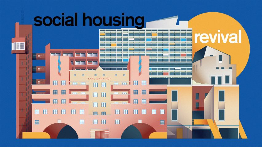
This week we launched Social Housing Revival
This week, we also kicked off our latest series – the Social Housing Revival, which will explore the current discussions on social housing and celebrate the best contemporary examples.
To kick off the series, Peter Apps called for a return to mass public house-building. “We need a major shift in the way we look at public housing”, he wrote in an opinion piece.
Dezeen compiled a list of the 50 most influential women in architecture and design
To celebrate International Women’s Day we compiled a list of the 50 most influential women in architecture and design.
In a follow-up to an article written seven years ago, where she declared “I am not a female architect. I am an architect”, Dorte Mandrup wrote an opinion piece discussing the need for gender-based lists.
“The persistent need for distinction is a symptom of inequality and prejudice,” she wrote. “It should be common practice to include women in the general architectural discourse.”
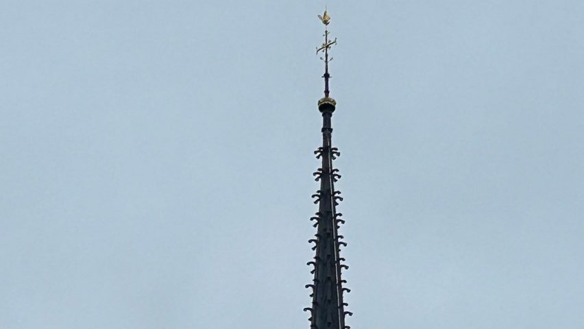
Notre-Dame’s spire was revealed
In Paris, the reconstructed spire at Notre-Dame cathedral was revealed as scaffolding was removed from the building.
The 96-metre-high spire was designed to be identical to the 1859 version designed by architect Eugène Viollet-le-Duc.
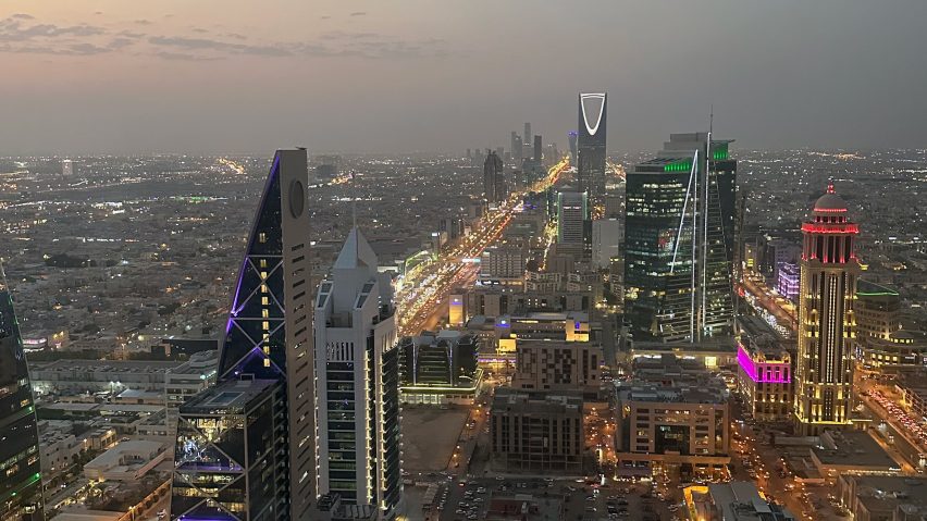
Foster + Partners is reportedly designing a two-kilometre-high skyscraper
In other architecture news, it was reported that Foster + Partners is designing a skyscraper in Saudi Arabia that, if built, would be the tallest in the world.
According to a report in UK architecture magazine Architects’ Journal, the skyscraper planned for a site north of Riyadh will be two kilometres tall.
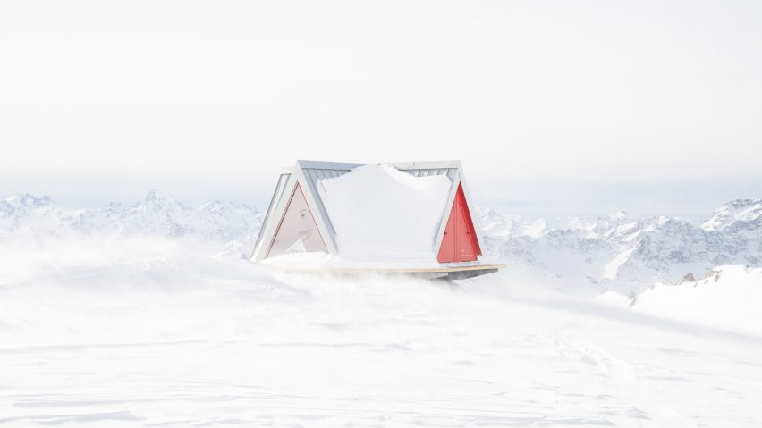
A tent-like refuge was one of this week’s most popular stories
Popular projects this week included a tent-like refuge with panoramic views of the Italian Alps, a rural retreat built in a concrete pig shed and Gensler’s own office in LA.
Our latest lookbooks featured inviting breakfast nooks for easy-going mornings and homes kept cool and bright by central courtyards.
This week on Dezeen
This week on Dezeen is our regular roundup of the week’s top news stories. Subscribe to our newsletters to be sure you don’t miss anything.
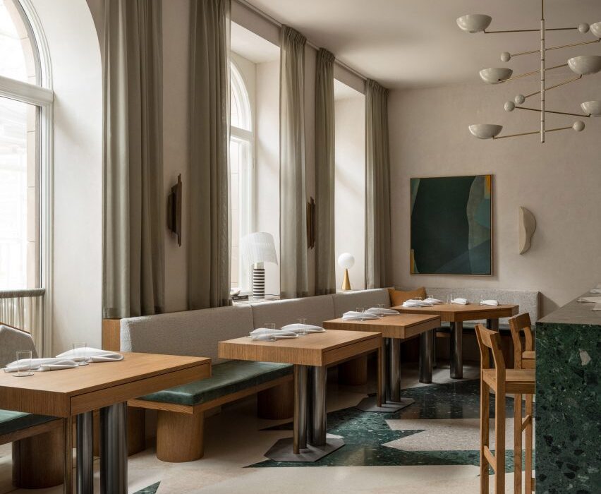
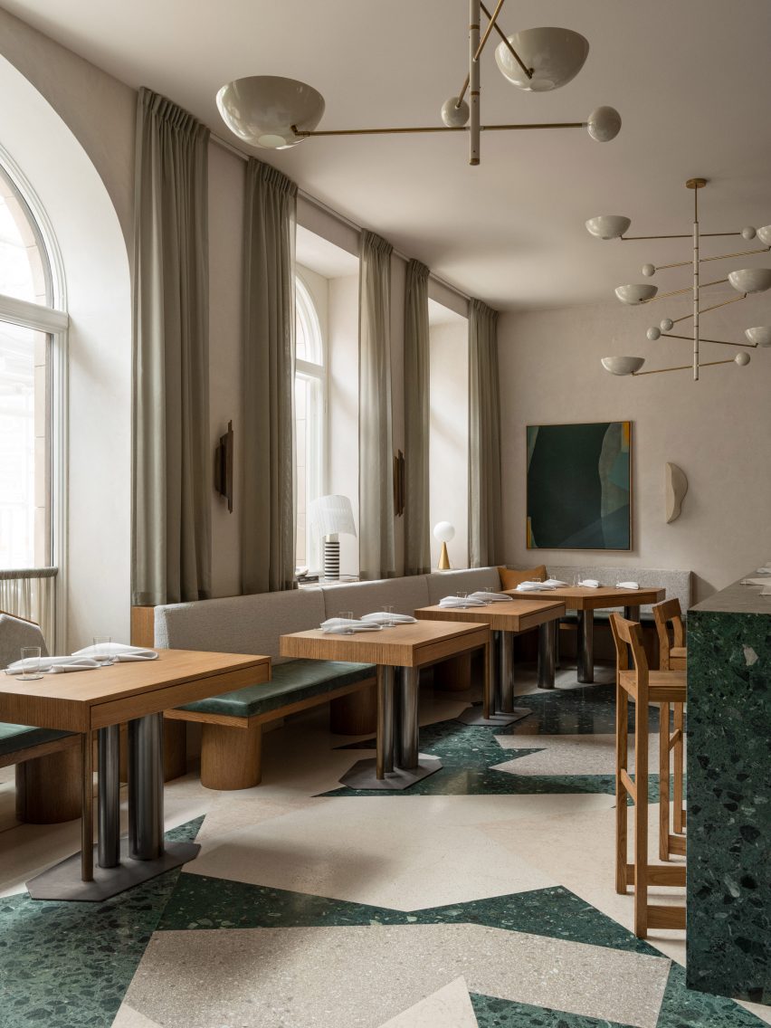
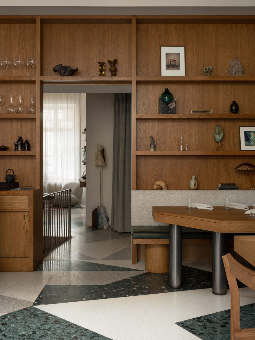
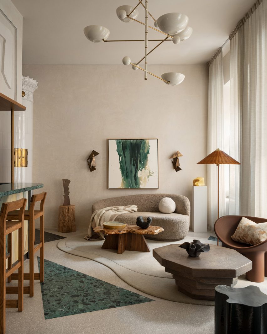
Interior designer Erik Bratsberg has created unique artwork for the interior of the Persona restaurant in Stockholm, which also features asymmetrical terrazzo and patinated brass details.
Bratsberg, who worked in finance before moving into interior design, wanted the fine dining restaurant in Stockholm’s upmarket Östermalm neighbourhood to have a warm and welcoming feel.
Persona is located in Stockholm’s Östermalm area
“The inspiration is drawn from a mix of personal experiences, subconscious imprints from admired styles, particularly mid-century Italian design, and a desire to integrate a homely warmth into a hospitality environment,” he told Dezeen.
“The design philosophy centres around creating a timeless, inviting space that enhances the dining experience while maintaining a sense of personal touch and intimacy.”
Green tones feature throughout the interior
Green hues are used throughout Persona‘s 120-square-metre interior, complementing its cream-coloured walls and numerous wooden furniture pieces and panelling.
“Green is my go-to when I want to arouse a sense of calmness and comfort,” Bratsberg explained.
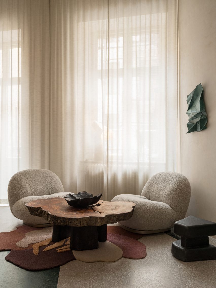
Designer Erik Bratsberg used furniture pieces with rounded and organic shapes
“It’s a tertiary colour, a mix of a cold and a warm colour, which allows it to go well with both warmer and colder hues and materials – a yin and yang of colours somehow,” he added.
“Green also brings the mind to nature and I guess my love for green relates to the joy of seeing the leaves back on the trees after a long Swedish winter.”
“Honey-tinted” oak shelving is filled with crockery and art
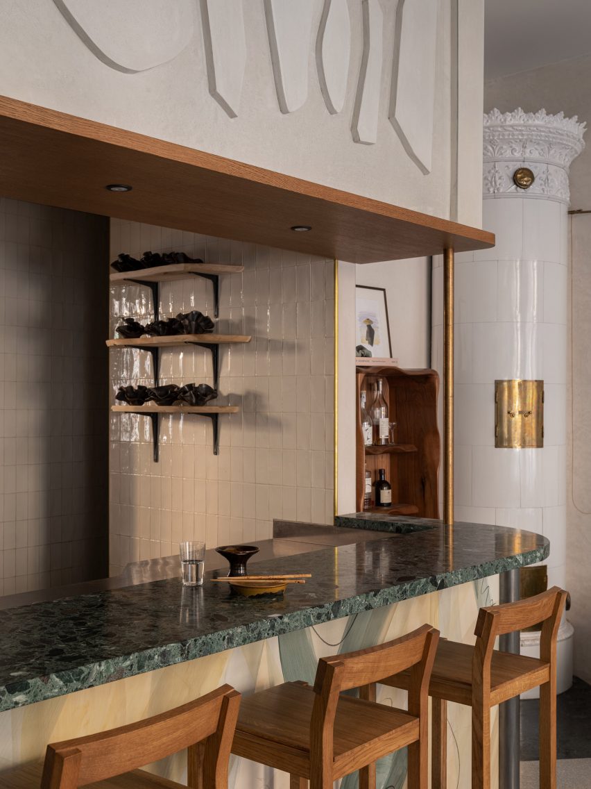
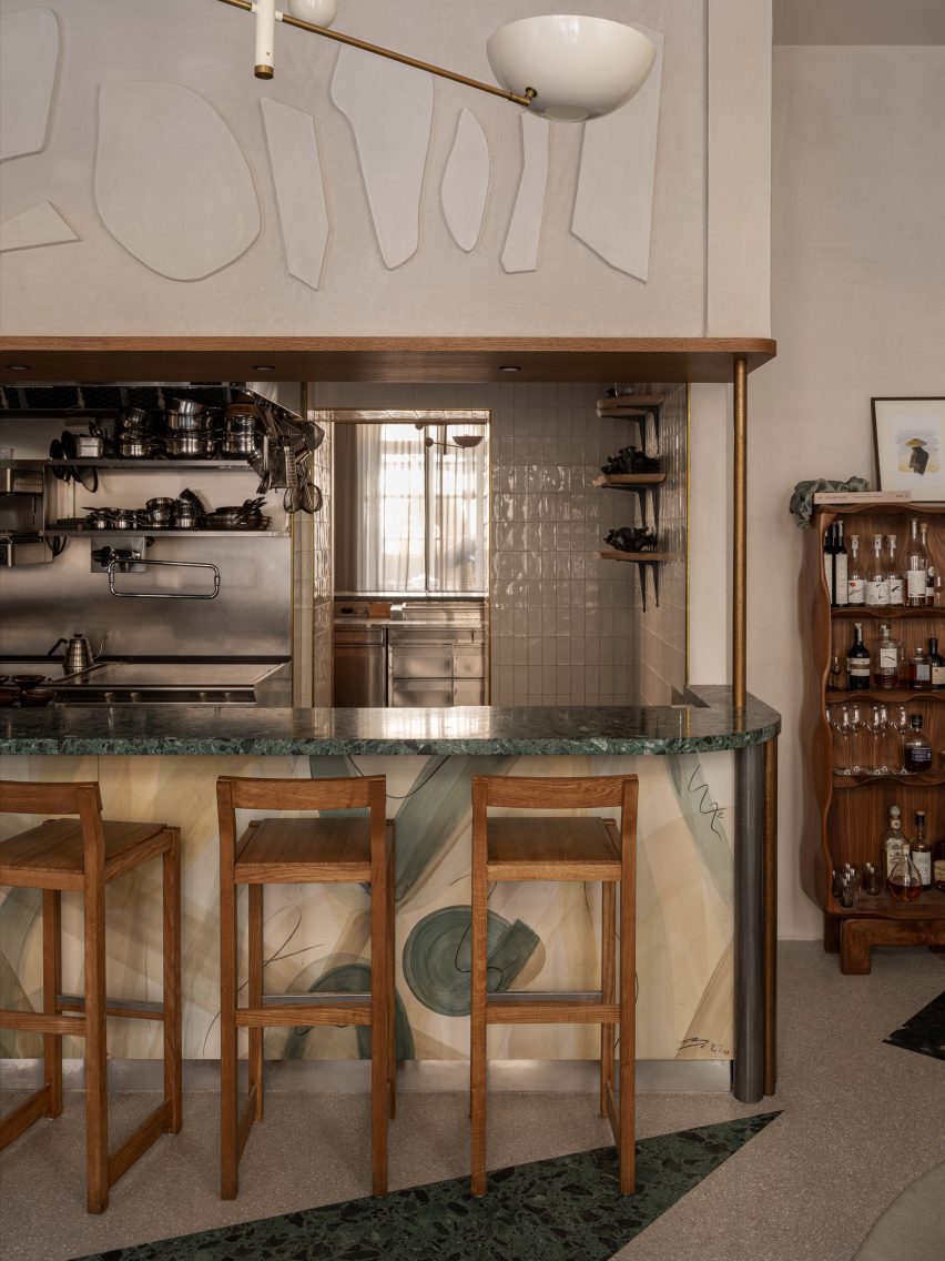
The restaurant, which feels more like a living room than an eatery in parts, also features plenty of natural materials such as stone and wood, which are interspersed with terrazzo and brass to create tactile interest.
This material mix was chosen to evoke a sense of “casual elegance”, Bratsberg said.
“For the floor I played around with the possibilities of terrazzo, using shades of green and warm greys and whites forming an asymmetrical pattern,” the designer explained.
Bratsberg clad the walls of the Persona restaurant in an off-white plaster with a mottled surface, designed to contrast the “silky honey-tinted oak” used for the wall shelving and tables.
“Patinated brass together with details in yellow ochre acts as an accent,” Bratsberg added. “Sheer curtains, patinated leather and textured textiles round it all off.”
Bratsberg created his own artworks for the restaurant
Custom-made abstract artworks also decorate the interior. Bratsberg made these himself from watercolour paintings that he had made, which were then screen-printed onto acoustic panels.
“In my multidisciplinary practice I strive to interrelate my art, design and interior work – why not make a lamp into sculpture, or a bar front as a painting, or a plain wall a relief?” Bratsberg said.
Cut-out geometric details add extra interest to the bar
Also notable in the interior is the variation of shapes, with the angular tables and counters contrasting against round and jagged lamps, cut-out geometric details and smaller tables made from organically shaped burl wood and stone.
“Perfectly straight lines and symmetry bring order and calmness for the eye, but never have I been particularly intrigued by squares and straight lines,” Bratsberg said.
“On the other hand, too much asymmetrical geometries and organic shapes can bring the feeling of disorder. But balancing the two – as with many opposites or contrasts – can create an interesting harmony,” he added.
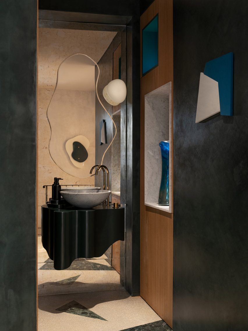
The bathroom features undulating mirrors and a mix of different shapes
In the bathroom, undulating mirrors match a wavy sink and are juxtaposed against square wall niches and angled, jagged cut-out wall decorations.
“Forms, lines, colours and materiality speak to us in mysterious ways, but an interior without any sculptural form and asymmetries is like a language without exclamation marks, gestures or emotional expression to me,” Bratsberg concluded.
Other Stockholm restaurants with interesting interiors featured on Dezeen include an “unexpected” restaurant in a historic food hall and a decadent Italian restaurant located in a former cinema.
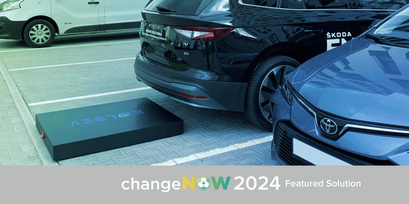
Spotted: According to a McKinsey survey, the availability of chargers is the most significant consideration of sceptical EV buyers. Hoping to tackle that is Kolbev, a Swiss-based company, which envisions a future where renewable energy seamlessly integrates into urban landscapes. The company’s innovation: an on-demand, wireless EV charging system equipped with energy storage, designed to be swiftly deployed to city locations.
Subscribing customers can use Kolbev’s app to request e-charging in specific car parks and city hotspots. The robotic charger will then autonomously locate the e-car and manoeuvre beneath the vehicle to initiate charging, offering a space-saving solution in compact city areas.
Importantly, Kolbev’s innovation removes the barrier of costly upfront investments by operating without the need for infrastructure. This approach not only ensures easy implementation but opens up the possibility for rapid scalability. Additionally, Kolbev’s solution delivers renewable energy, aiming to catalyse the widespread adoption of EVs in a more sustainable manner.
Springwise has previously spotted other innovations aimed at improving the way EVs are charged, from a new charging system that improves reliability, scalability, and cost-effectiveness to an AI-powered smart charging technology.
Architizer’s new image-heavy daily newsletter, The Plug, is easy on the eyes, giving readers a quick jolt of inspiration to supercharge their days. Plug in to the latest design discussions by subscribing.Â
It is inevitable. At some point in the school year, a student in my AP Literature class will ask the dreaded question: what is “Modernism?” Usually, this happens in the afternoon before a full moon…
I try to keep it general. In literature and the visual arts — the representational arts, let’s say — modernism was an attempt to find new forms of artistic expression to meet the needs of a rapidly changing world where old certainties and trust in institutions were falling away. Often, this meant disrupting verisimilitude and drawing attention to the constructed-ness of the art object. As the caption of Magritte’s iconic painting declares, Ceci n’est pas une pipe! A painting of a pipe is not a pipe; it’s a painting.
Even though modern art seems “weird” to casual museum-goers, there was a method to the madness. Modern artists rejected representational conventions in pursuit of honest expression. Counterintuitive as it might seem, they wanted to bring art closer to life. This meant breaking the spell of illusion that had defined Western art since the Renaissance.
What kind of truth, though, does modern art speak to? Many kinds, to be sure, but I think they can be separated into two main buckets. (Or coffins to stick with the horror theme). On the one hand, you have the analytic tradition represented by Cubism, which, especially in its early years, involved a deconstruction of the picture frame. What you see in a Cubist painting is the underlying architecture of the composition. As with Brutalist architecture, the key gesture of Cubist art is to lay bare the object’s structure and not smooth it over with surface details.
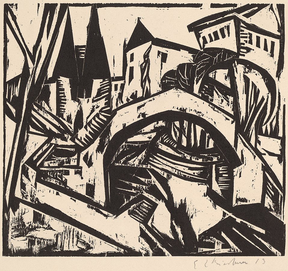
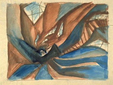
A print by German Expressionist artist Ernst Ludwig Kirchner titled “River Bank at Elisabeth, Berlin” (1912). The jagged lines and collapsed perspective anticipate the visual style of “The Cabinet of Dr. Caligari” (1920). National Gallery of Art, CC0, via Wikimedia Commons
On the other hand, there is Expressionism. Influenced by psychoanalysis, Expressionists sought to represent the irrational elements of subjective experience. Artists like Edvard Munch and Ernst Kirchner created wildly distorted landscapes, portraits, and urban street scenes that were charged with emotion. Many of these artists were especially interested in capturing the alienation and loneliness of urban life.
So how does architecture fit in? It is perhaps not surprising that the analytic vein of modernism was more readily applicable to the design of buildings than Expressionism was. In architecture, the word “modernism” is today synonymous with the rationalist utopianism of Gropius, Mies, and figures like this. However, this is not the whole story…
Modern architecture as we know it had an evil twin — one that died in childhood, but still haunts us today. In the 1920s, there was such a thing as Expressionist architecture. It never really flourished — that is, not until much later when it was picked up by contemporary architects like Daniel Liebskind — but it existed in Germany, the Netherlands, and a few other areas in Northern Europe. Distortion, fragmentation, and the expression of strong emotion were the key features of this type of architecture. Like the rationalist modernism we know and love, Expressionist architecture rejected tradition, but it did not do so in a Platonic pursuit of harmony. No — this architecture was not bound by anything but the architect’s imagination.
Let’s take an example. In Dornach, Switzerland, one can visit The Goetheanum, which is the headquarters of the anthroposophy movement. Anthroposophy is a form of mysticism, or more precisely, gnosticism. Its adherents believe that, through certain meditative techniques, people can gain direct knowledge of the spiritual world. Rudolf Steiner founded the movement in the early 20th century. Steiner also designed the headquarters, a flowing, bat-like structure made entirely of cast concrete.
The building still appears radical today, in an era when we are used to seeing sculptural architecture. But think about how it must have appeared to the citizens of Dornach when it was erected in 1928. Many of the design decisions, such as the chimney stack that seems to have been hastily molded out of clay by a gigantic hand, would have been totally incomprehensible to people used to architecture that followed programmatic conventions. The uneven windows still bother me when I look at them long enough.
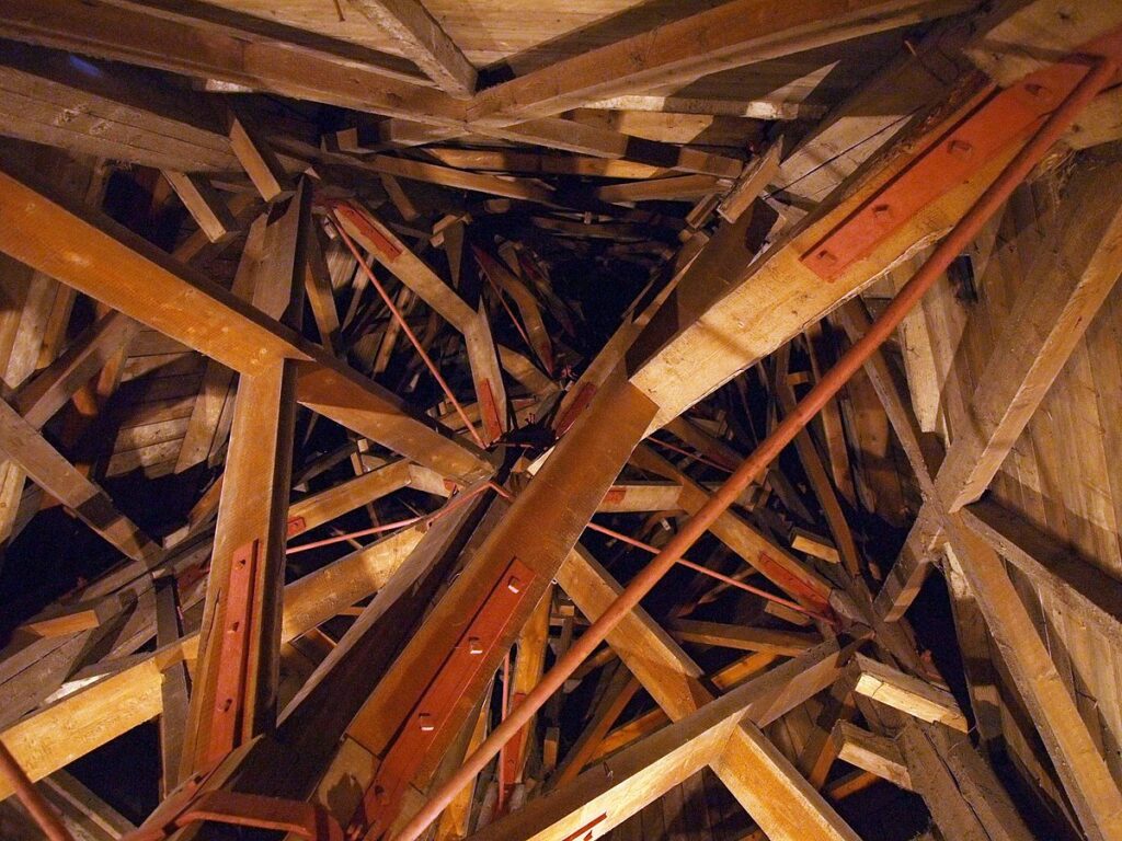
Here’s another good example: the Het Schip apartment complex in the Spaarndammerbuurt neighborhood of the Netherlands. The name means “The Ship” and I guess it looks sort of like a ship. Sure. This was designed by architect Michel de Klerk and erected in 1919.
With its brick façade and tiled roof, at first blush this building doesn’t seem totally out of place with its context in Amsterdam. However, the proportions are bizarre — unsettlingly so, as if the building was designed by an alien who had read a description of Dutch architecture but had never actually seen it. Inside, the situation is even stranger. Looking up from inside the tower, one finds a riot of intersecting wooden support beams. There seems to be no regularity, symmetry, or even method to the arrangement of the beams. There isn’t even that sort of irregular fractal harmony one finds in the work of Antoni Gaudi. It just feels wrong, albeit in an interesting and stimulating way.
As stand alone objects, Expressionist buildings from the 1920s are really cool. One should not interpret my description of their weirdness as a dismissal of the structures in themselves. Every city needs discussion pieces, and expressive, sculptural architecture helps give definition to otherwise homogeneous urban environments. In our century we call this the “Bilbao Effect.”
Nevertheless, in the 1920s, the emergence of Expressionist architecture must have troubled some onlookers. Was this what the future would look like? Would built environments be just as disorderly and mercurial as the human mind? What would it even feel like to live — not just in an Expressionist building — but in an Expressionist city?
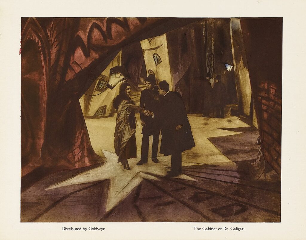
These questions seem to have been taken up by the art direction team of The Cabinet of Dr. Caligari, the 1920 German silent film that Roger Ebert once called “the first true horror movie.”
Lobby card of “The Cabinet of Dr. Caligari,” showing the twisted and distorted architectural forms of the set design. Goldwyn, Public domain, via Wikimedia Commons
The Cabinet of Dr. Caligari is one of the most studied and discussed films of all time. The film tells the story of a power-hungry hypnotist who manipulates a sleepwalker into committing a series of murders. The screenwriters, Hans Janowitz and Carl Mayer, were pacifists, like many Germans at that time. Janowitz had served as an officer in World War One, where he witnessed the nihilistic chaos and destruction of that conflict up close. The screenwriters both claimed that the film was intended as an allegory for the way authority was wielded during the Great War, with the older generation coercing the young to kill and die on their behalf.
In his landmark 1947 book From Caligari to Hitler, film theorist Siegfried Kracauer argues that the film is more complex than even its screenwriters understood. It does not just put forward a critique of irrational authority; it also shows how, in the 1920s, the German people craved this type of authority on a subconscious level. Kracauer points to the twist ending of the film, which the studio forced the screenwriters to add against their will. In the end, it turns out that Dr. Caligari was not actually a mad hypnotist, but rather the director of a mental hospital. The hypnotism and the murders never happened. They were simply a fantasy concocted by one of the inmates.
A conceptual preliminary sketch of the set design by Walter Röhrig. 1919. Note the fragmentary windows and staircase. Public domain via Wikimedia Commons
At some level, Kracauer argues, this inmate wanted to be hypnotized and ordered around by an external authority. This type of control would liberate him from the burden of his freedom. Kracauer believes this type of sentiment was widely shared among the German people in the confusing and chaotic postwar period. He argues that cinema has a special ability to reflect collective sentiments, as it is a collaborative medium with no sole author. By looking at German cinema from the 1920s until the rise of Hitler, Kracauer claims, one can observe the dreams, fears, and aspirations of a population that was in the process of rejecting democracy and embracing violent totalitarianism.
Kracauer’s reading of The Cabinet of Dr. Caligari, which emphasizes the unconscious forces at work in the narrative, is most powerfully expressed in the film’s radical set design, which was deeply influenced by the work of Expressionist painters such as Kirchner. Ebert described the world of the film as “a jagged landscape of sharp angles and tilted walls and windows, staircases climbing crazy diagonals, trees with spiky leaves, grass that looks like knives.” Black paint was used to create disorienting shadows in both the exterior and interior scenes. The proportions of everyday objects, like chairs, tables, and windows, are radically at odds with what one would expect. To use a German word, they are unheimlich: familiar yet strange and somehow sinister.
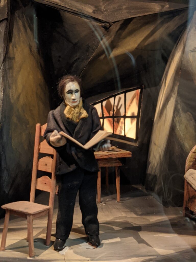
Model of The Cabinet of Dr. Caligari (1920) film set: Alan’s Living room during the scene of the murder. Reconstruction by set designer Hermann Warm. Note the exaggerated height of the back of the chair. For some reason, this has always been a creepy detail for me. Displayed at the Museum of Film and Television Berlin, Deutsche Kinemathek, SunOfErat, Filmmuseum Berlin – Caligari Model, CC BY-SA 4.0
In short, the built environment of the film represents the world of the psyche. In here, it is hard to orient oneself, and there might always be killers lurking in the shadowy corners. As in a Kirchner painting, there is powerful honesty in the film’s lack of realism. But one thing must be acknowledged: this is not a city anyone would want to live in. Perhaps our inner lives are stormy and chaotic — we are, after all, creatures of desire and habit. But this does not mean our houses, apartments, and city streets need to express this aspect of ourselves. If anything, they should be designed to nudge us out of the darkness and into the light.
Architizer’s new image-heavy daily newsletter, The Plug, is easy on the eyes, giving readers a quick jolt of inspiration to supercharge their days. Plug in to the latest design discussions by subscribing.Â
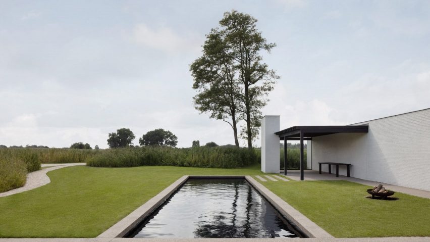
Geneva-based architect Stef Claes looked to mid-century and local architecture to create the low-lying home in Belgium. The residence, named House in the Fields, features white-painted walls and black accents.
Readers discussed the project, with one commending the architects for achieving “such a clean result” and another agreeing, claiming that they “could quite happily live there”.
“Forty-one per cent of architects now using AI” says RIBA report
Other stories in this week’s newsletter that fired up the comments section included the findings of a report by the Royal Insitute of British Architects which found that close to half of UK architects are now using AI for their projects, the announcement that Foster + Partners is designing a two-kilometre-high skyscraper in Saudi Arabia and an opinion piece by Catherine Slessor about architects working into their older years.
Dezeen Debate
Dezeen Debate is sent every Thursday and features a selection of the best reader comments and most talked-about stories. Read the latest edition of Dezeen Debate or subscribe here.
You can also subscribe to our other newsletters; Dezeen Agenda is sent every Tuesday containing a selection of the most important news highlights from the week, Dezeen Daily is our daily bulletin that contains every story published in the preceding 24 hours and Dezeen In Depth is sent on the last Friday of every month and delves deeper into the major stories shaping architecture and design.
Swiss furniture brand Vitra will prioritise reducing the environmental impact of its existing lines through material innovation, CEO Nora Fehlbaum tells Dezeen in this interview.
One of the industry’s best known and most influential manufacturers, Vitra‘s collections include iconic pieces such as Eames plastic shell chairs and Panton chairs.
Like its peers, the brand is under increasing pressure to reduce the ecological footprint of its operations in the face of worsening climate change.
Nora Fehlbaum spoke to Dezeen at the Vitra Campus in Weil Am Rhein
Speaking to Dezeen at the Vitra Campus in Weil Am Rhein, Germany, Fehlbaum suggested that the company’s heritage as a high-end, design-focused furniture brand is inherently aligned with sustainability.
“Vitra’s greatest contribution to sustainability is its products with an above-average service life, which omit everything superfluous,” she told Dezeen.
“Our roots in modern design would allow nothing else.”
However, she claimed Vitra is “doing everything we can with all the means we have” to become more sustainable.
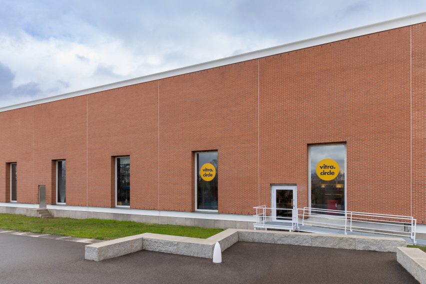
The Álvaro Siza-designed Factory at the Vitra Campus has been partially converted to accommodate a new Vitra Circle store (also top)
“Everybody at Vitra has understood our environmental mission,” she said. “We don’t have a sustainability officer – everybody has taken it as their own.”
Vitra’s stated goal is to be “a net-positive company based on all the indicators of its ecological footprint by 2030”.
It has a long way to go, with the company’s most recent sustainability report published in 2022 stating that its total emissions for the year were equivalent to nearly 141,000 tonnes of CO2.
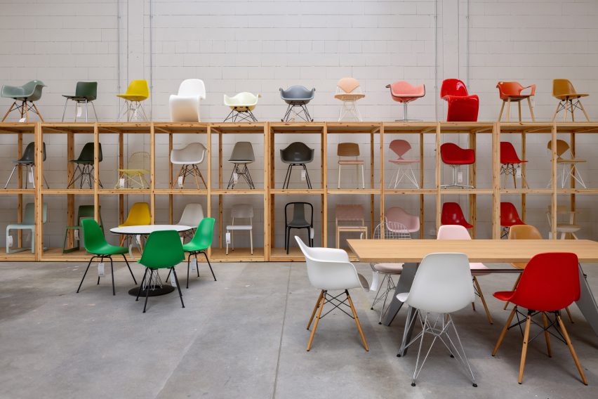
Eames shell chairs now made from recycled plastic
The brand’s sustainability strategy is chiefly focused on its popular existing products, Fehlbaum said.
“We have the biggest impact if we change the products that we sell the most of already, rather than inventing one single sustainable product,” she argued.
“At Vitra, a product is never final, but continues to evolve.”
The Vitra Circle store refurbishes and sells second hand Vitra products
As of January this year, the shells of the Eames plastic chairs manufactured by Vitra are now made exclusively from recycled post-consumer plastic.
“[The Eames shell chair] is probably the most iconic, most copied chair out there – and it won’t be available in virgin material,” said Fehlbaum.
The switch means the shells have a speckled finish that differs from the originals, but Fehlbaum is satisfied with this “recycled aesthetic”.
“It’s a different aesthetic, and of course we hope the consumer gets used to – and maybe even comes to love – this new aesthetic,” she said.
“That’s a risk that we’re taking and that we’re willing to take.”
The RE plastic shells are noticeably more speckled (on the right) than the original plastic shell (on the left)
It follows earlier switches of products and parts from virgin to recycled plastic, starting with Barber Osgerby’s Tip Ton chair in 2020.
A number of accessories like Arik Levy’s Toolbox and Konstantin Grcic’s Locker Box have since followed. The entire HAL chair family, designed by Jasper Morrison, now also have their shells manufactured using recycled plastic.
The recycled plastic is taken from household recycling obtained through the German garbage collection programme Gelber Sack (Yellow Bag).
“Utilising this raw material instead of petroleum-based primary plastics generates fewer climate-damaging emissions and less primary energy consumption,” Fehlbaum claimed.
The role of recycling in solving the world’s plastic pollution crisis is contested among designers.
Some, including designer Richard Hutten and Belgian curator Jan Boelen, argue that big brands are using recycling to create an illusion of change while continuing to use virgin plastics.
Others, among them the CEO of the Ellen MacArthur Foundation Andrew Morlet, argue that durable, recyclable plastics can form part of a circular economy.
Many recycled plastic products involve the use of some virgin plastic or additive substances that then complicate or inhibit their own recyclability.
Vitra said its RE product, used for the Eames shells, does not contain any virgin plastic and can be fully recycled at the end of the product’s life thanks to the use of technical fillers, like glass fibres, rather than any additives that prevent onwards recycling.
Vitra products are available to purchase at discounted rates at the new Circle Store
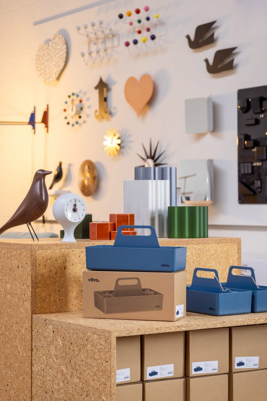
Another sustainability initiative is Vitra’s Circle Stores, which sell used furniture and accessories by Vitra and Artek, such as sample products and exhibition pieces, with prices depending on the condition of the products.
All products are tested for functionality and repaired if necessary so that a renewed product warranty can be granted.
The first Circle Store opened in Amsterdam in 2017 in response to questions from customers about second-hand Vitra products, with a second in Brussels.
A third recently “moved” from Frankfurt and opened in an adapted space at the Álvaro Siza-designed Vitra Campus factory building, with a service and repair area where customers can bring their products to receive a new lease of life.
“With the Circle Store, we can offer our environmentally conscious clients an even more environmentally conscious choice: namely that of a second-hand product,” said Fehlbaum.
Absence in Milan “really wasn’t such a huge deal”
The brand has also taken steps to rewild parts of the Vitra Campus. The Piet Oudolf garden was completed in 2020 and Vitra is working with Belgian landscape architect Bas Smets on a masterplan plan for fewer roads and more native trees on the site.
Fehlbaum acknowledges that some may be sceptical about the sustainability work it is doing within the context of widespread greenwashing.
“It’s impossible to get through this jungle of messaging,” she said.
“How do we talk about it to make sure that it is clear how thoroughly and authentically we’re really tackling this?”
Some other furniture brands have also reduced their presence at design fairs amid concerns about the significant emissions associated with shipping products around the world for temporary showstands.
Vitra has historically had a significant presence in Milan during the Italian city’s annual design week in April, but was noticeably absent in 2023.
However, Fehlbaum said that although she was asked about this a lot “it really wasn’t such a huge deal”.
“For us, it makes a lot of sense to use what we already have,” she said.
“We have the Vitra Campus and it’s not so far from Milan. We prefer to use and invest in something that can be around for five or 10 years rather than spending a lot of energy and resources on something that after five days we’re going to have to break down.”
It is yet to be seen if the brand will return to Milan design week this year.
“The way we think about it [showing at design fairs like Milan] is never black or white,” Fehlbaum explained.
“There might be a moment where we say Milan is exactly the right place at the right moment to talk about something, and then maybe we’ll be there.”
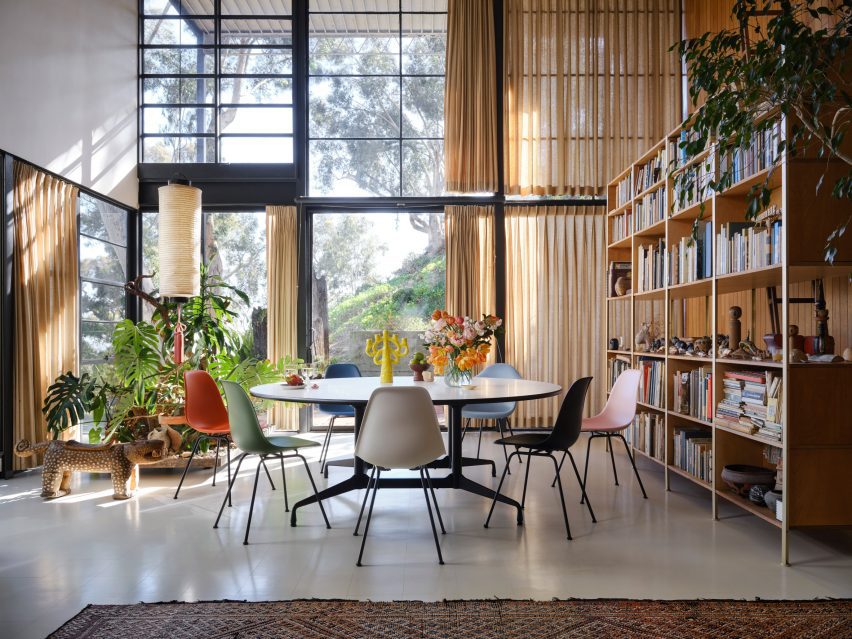
The Eames Plastic Chair RE was photographed at the Eames house, Pacific Palisades, California. Photo by the Eames Foundation
Vitra was founded in 1950 by Nora Fehlbaum’s grandparents Willi and Erika Fehlbaum and has since grown to become one of the industry’s leading names.
Nora Fehlbaum succeeded her uncle, Rolf Fehlbaum, as CEO in 2016 and identifies improving the brand’s sustainability as her key mission.
“There is still a long way to go before reaching our environmental goals,” she acknowledged. “Things need to be tested, mistakes must be made, and in the process the company might sometimes overlook an important aspect or underestimate the impact of an activity.”
This is now a central part of the brand’s function as an industry leader, Fehlbaum suggests.
“The designer landscape has changed. In the past, it was a lot about iconic design and breaking the mould, building your own brand and your studio – new things – and now, the students that are graduating come with their own environmental mission,” she said.
“I see our role, together with these people and with the right suppliers and innovative companies, to find solutions that are, for lack of a better term, sustainable in the longer term.”
Other interviews recently published on Dezeen include the Kvadrat CEO saying sustainability is “not making our lives easier” and Iittala creative director Janni Vepsäläinen sharing her goal to help the brand “remain culturally relevant for another 100 years”.
The photography is courtesy of Vitra unless otherwise stated.
Dezeen In Depth If you enjoy reading Dezeen’s interviews, opinions and features, subscribe to Dezeen In Depth. Sent on the last Friday of each month, this newsletter provides a single place to read about the design and architecture stories behind the headlines.
Spotted: While we like to think that any waste placed in a recycling bin is recycled into new products, the reality is that in some places, the refuse is either incinerated or exported to landfills elsewhere. This was the situation faced by Singaporean Oh Chu Xian. In response, Oh and her sister founded Magorium, a deep tech firm that develops sustainable solutions for plastic waste.
Oh’s family had been in the road construction and asphalt manufacturing business for almost five decades, so this was a logical place for Magorium to start. The company’s product, NEWBitumen, is a replacement for bitumen, the liquid binder used to hold asphalt together. Where traditional bitumen is produced using crude oil, NEWBitumen is made from plastic waste that would have otherwise been considered non-recyclable and destined for the landfill.
Contaminated plastic waste is put through a multi-step process, which breaks down the long chains of polymers in the plastic, and then reformulates the materials to create a substance with similar characteristics to bitumen. By-products, such as synthetic gas, are captured, cleaned, and used as a heating source to power the process. Organic contaminants are converted to biochar and used as filler.
At the 2023 CapitaLand Sustainability X Challenge, Magorium won the Emerging Startup Award and received S$150,000 (around €103,000) as a result. In future, the startup hopes to take NEWBitumen beyond Singapore and help stimulate circular economies in other countries around the world.
Coping with plastic waste is the goal of a growing number of innovations spotted by Springwise. These include the recycling of plastic waste into chemicals and rentable packaging made from recycled plastic.