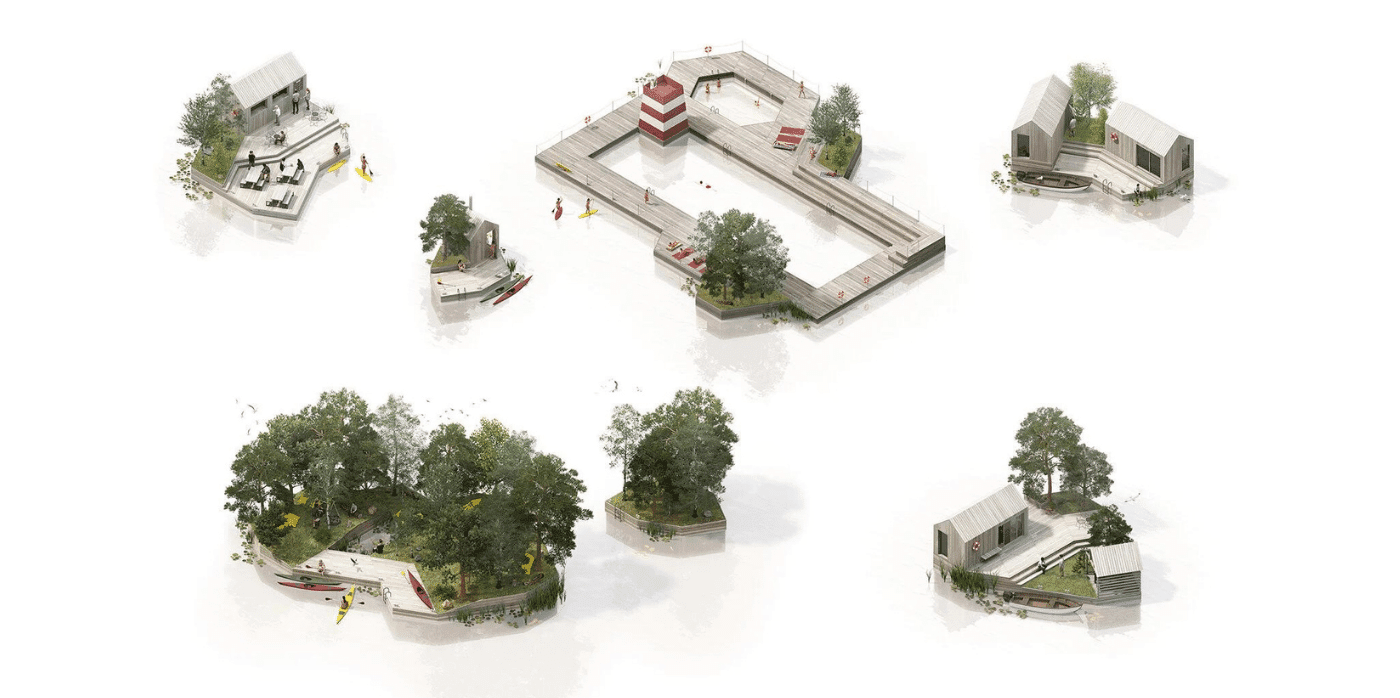
Spotted: Floating homes are increasingly seen as a viable housing option. Copenhagen-based MAST architecture studio’s concept of modular structures makes the idea sustainable by building with recycled materials and incorporating marine-friendly shapes into the design.
Called Land on Water, the studio’s concept uses flat-packed modules made from recycled plastic to create the floating base. Designed to be easy to ship and assemble, the system is customisable. Once the bases are built, they can be connected in a variety of configurations, providing everything from a floating pool to homes and recreation space. More or less support can be added as needed as a community develops and changes.
MAST uses gabion construction for the bases, which is a series of mesh cages filled with flotation supports. In this case, the studio recommends locally sourced, recycled materials. Sea creatures can live safely in, on, and around the cages, and the studio explicitly eliminates harmful chemicals and other materials from the design in order to better support and live in partnership with marine life.
Currently working on a prototype, the studio seeks partners interested in developing the concept for a range of projects.
As well as floating homes, Springwise has spotted floating work pods and floating solar farms taking advantage of the flexibility of working with water, rather than against it.
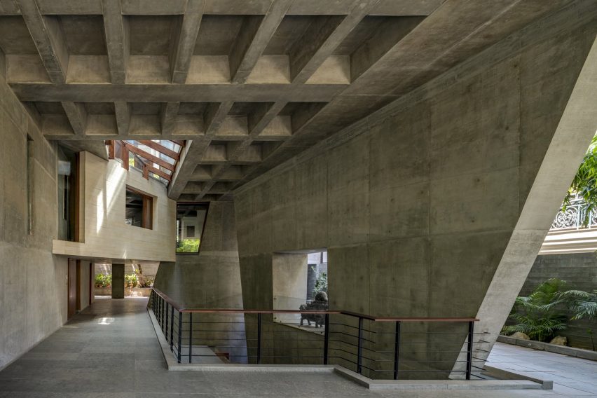
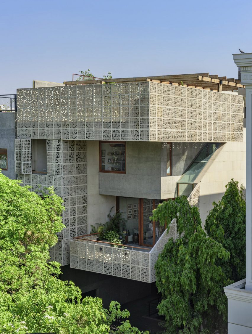
A series of openings that let in natural light penetrate a residential building in Delhi named House of Voids, created by Indian architecture studio Malik Architecture.
The Indian house is on a dense urban site, which led Malik Architecture to design skylights and openings between floor levels to maximise natural light entering the home.
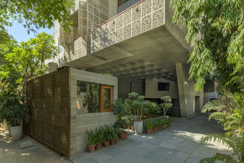
The living spaces on the first floor are supported by a large stilt
The structure was made from reinforced cement concrete with exterior walls clad in Gwalior mint sandstone.
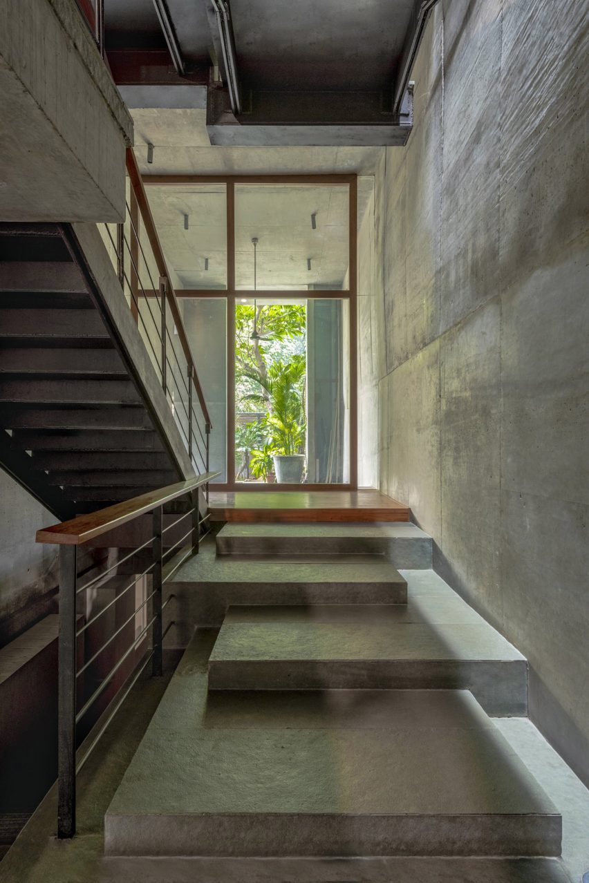
Malik Architecture separated the house’s circulation from the main living and office areas with the stairwell situated on the east side of the home, where there is little opportunity to gain natural light as the site shares a wall with the adjoining plot.
Skylights and voids increase natural lighting in the house
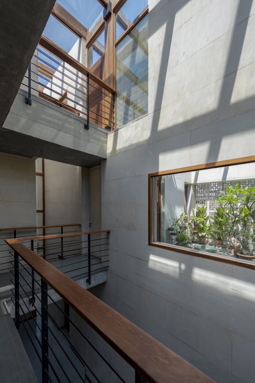
The western facade of the house is set back six metres from the neighbouring building.
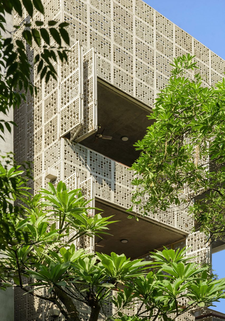
Malik Architecture created openings, screens and characteristic voids that penetrate multiple floor levels to flood the living spaces on this side of the home with sunlight.
An opening in the ground floor lets sunlight into the offices in the basement
Office spaces were located in the basement and mezzanine level above the ground floor while the main living spaces begin from the first floor, which is cantilevered six metres above a ground-level courtyard.
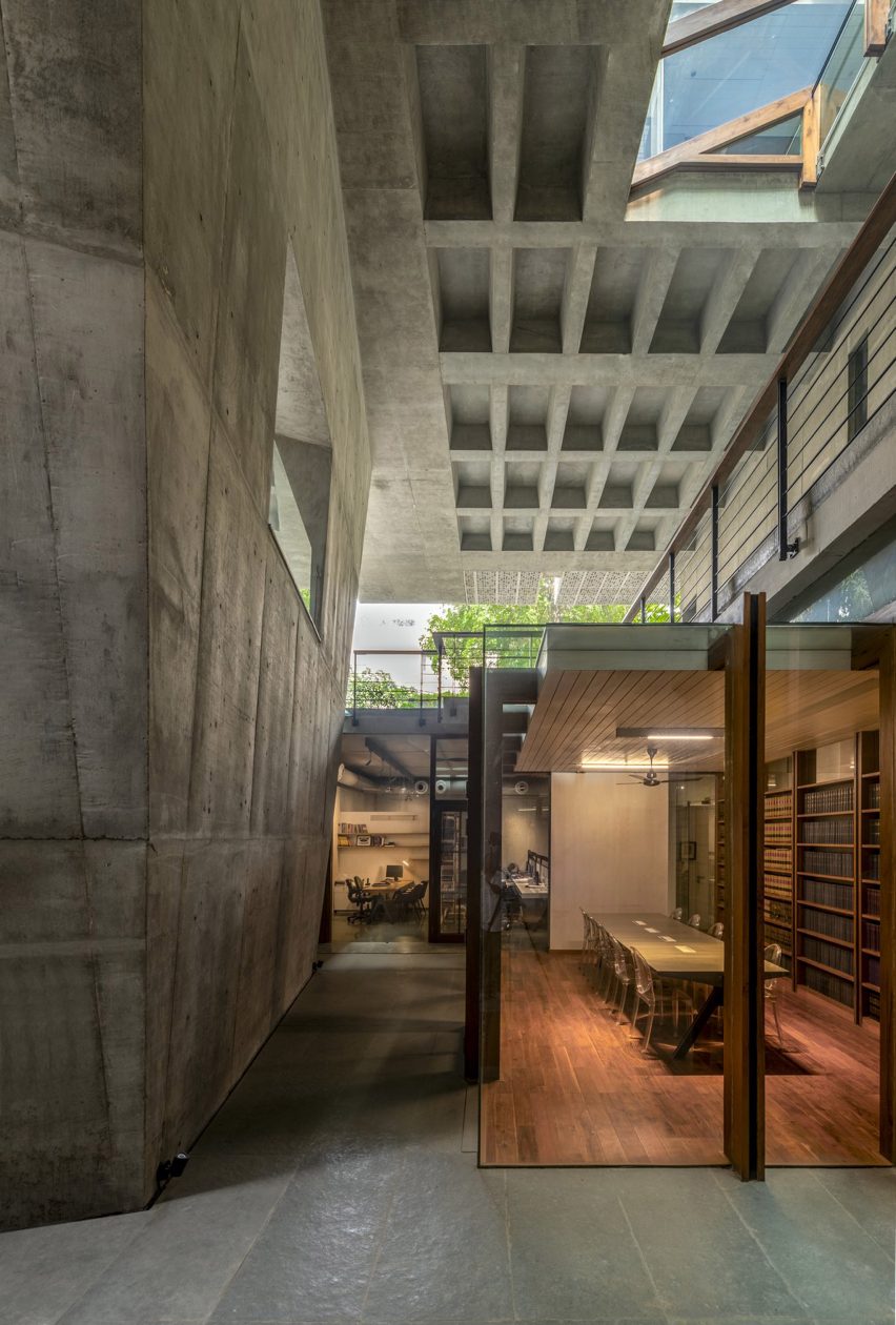
The living room on the first floor opens onto a terrace that is surrounded by the foliage of the ground-floor trees.
The living room on the first floor leads to an outdoor terrace
“The excisions are very deliberate; for example, the angular slice at the northwest corner, where the living room opens into the veranda deck, is made to maximise the experience of large trees within the plot and beyond,” Malik Architecture told Dezeen. “This same slice turns into a north light for the living room.”
“The slices, voids and excisions are the protagonists for the spatial and structural frameworks of the house – connecting people to light and the trees,” the architecture studio continued.
According to Malik Architecture, Delhi’s neighbourhoods have traditionally been characterised by two-storey houses with front gardens that separate the buildings from tree-lined roads.
Malik Architecture designed House of Voids with green spaces and openings that let in light and restore thermal balance in ways that are indicative of the traditional Delhi building typology.
The upper floors of the house cantilever over the courtyard to provide shade
“This proposal re-evaluates the typology of the building form as prescribed by the current guidelines and adapts it to re-establish the sensation of the pre-existing urban condition by introducing a network of labyrinthine voids running through the house, catching light and restoring thermal balance, expressed as a combination of green spaces, deep fissures and skylights,” said Malik Architecture.
“A gigantic structural pylon is the load-bearing pivot for the cantilevered superstructure, creating shaded ground and resonating the language of Delhi’s monumental institutions.”
The circulation is separated from the rest of the home
Malik Architecture created fixed and operable sandstone screens for the exterior of the house to provide shading and privacy, which were cut by hand and water jet techniques.
The design of the screens references traditional Indian jaali – perforated stone or lattice screens with ornamental patterns.
Perforated screens shade the house
“We resisted the urge to use intricate or ornamental patterns for the screens, choosing instead to focus on the sense of the heavy stone mass dissolving into abstract compositions of light and shadow,” said Malik Architecture.
“A few panels with traditional patterns were randomly inserted into the overall composition.”
House of Voids has been shortlisted in the urban house category of Dezeen Awards 2022, alongside a compact family home in Tokyo where the staircase is designed as a relaxing social space and a house in Melbourne that makes the most of its narrow plot with eight courtyards and gardens.
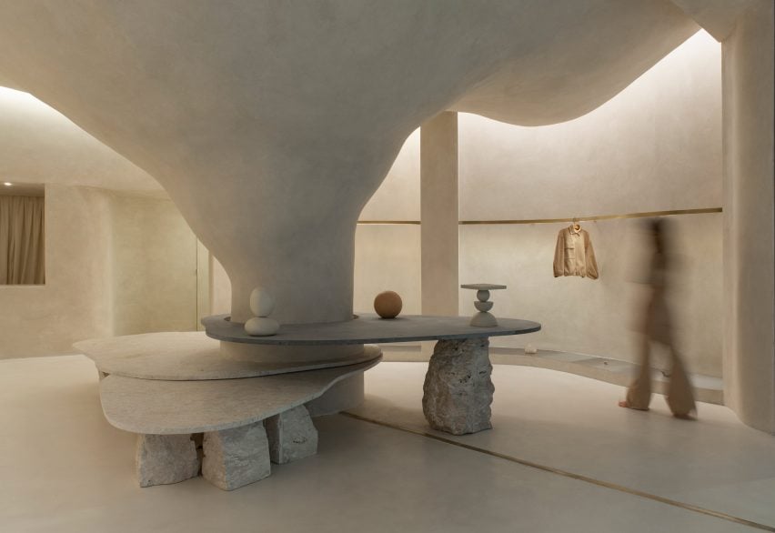
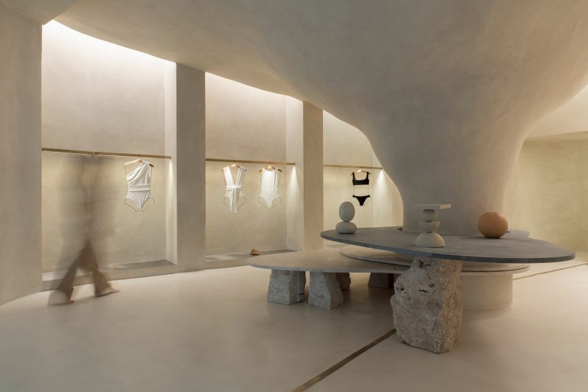
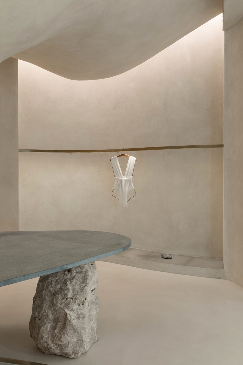
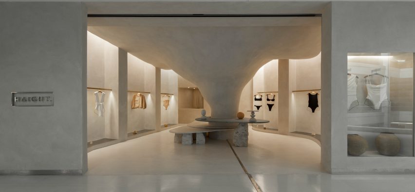
Organic shapes and stone-like surfaces characterise the interior of the Haight clothing store in Rio de Janeiro, which was designed by interior and landscaping design practice AIA Estúdio.
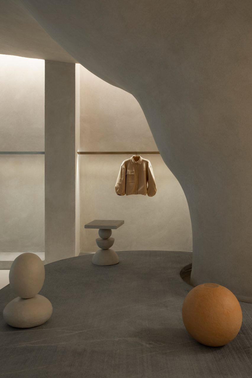
A large pillar with a rough, textured surface dominates the 110-square-metre shop interior, expanding as it ascends before merging into the ceiling to create a cave-like space.
A pillar transforms into a cave-like structure
“Its height starts small and in the back part it ends higher in a nonlinear form, just like a cave,” AIA Estúdio founder Alice Tepedino told Dezeen.
“The infinite and diverse processes of erosion that form cliffs, caves, stalactites, sands, stones and the movements of water with its tracks and shapes led to our creative process being part of the concept developed for the store’s spatiality.”
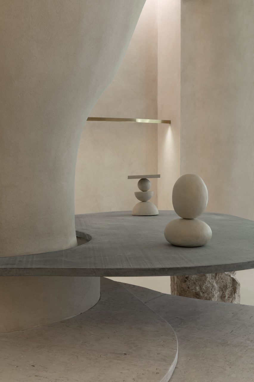
Stone slabs around the pillar are used to display objects
Rather than being a cumbersome obstacle, the pillar helps organise the shop’s circulation and movement of shoppers, according to the studio.
“It is from the occupation around the pillar that the space fluidity is achieved. This disposition is enhanced by curved lines that define the path inside the store,” said Tepedino.
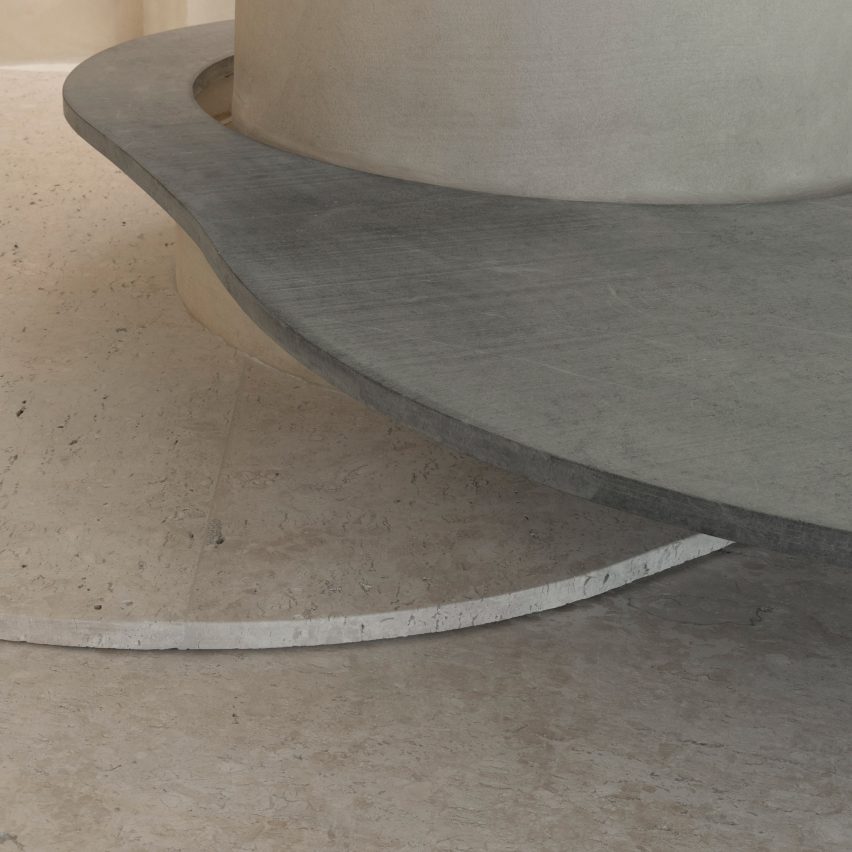
Curved stone plates balance on rocks
Slabs of soapstone and Bahia beige marble encircle the pillar at different heights and are propped up by Bahia beige marble rocks that create a display surface and a place for shoppers to sit.
On the perimeter walls, niches with stainless steel bases display Haight’s clothing on brushed-brass rails.
The metallic surfaces and straight edges of the niches contrast with the organic shapes and materials in the centre of the shop, which is located in the Shopping Leblon retail centre.
Tepedino used indirect lighting in the niches to illuminate the space, mimicking cracks in cave walls where sunlight can seep through.
Clothing is displayed on brushed-brass rails
“The exhibition interspace was thought of as a cut in the walls, an operation emphasised by the transition of materiality,” said Tepedino.
“Inside, there are exhibition racks in brushed brass, which, with their more solar aspect, contribute to subtly warming up the store’s ambience, together with the soapstone and its greyer tone.”
The bottoms of wall niches are lined with steel
Tepedino’s design is the first of Haight‘s stores to be located inside a shopping centre, which prompted the designer to approach the project in a different way.
The entrance to the shop is a large opening that provides open access from the shopping centre to the nature-inspired shop interior.
It is the first Haight store to be located in a mall
“The design adopted a contrasting strategy between the store and mall, which, despite the rigid and controlled environment, offers opportunities such as the possibility of not having a door,” said Tepedino.
“The brand’s conceptual basis is related to natural landscapes but when you are inside the mall, you find a language that is the opposite of Haight’s conceptual basis, with artificial elements and cold materiality.”
Natural materials and surfaces were used throughout the shop interior
“Once you’re inside the store you get disconnected from the artificial atmosphere of the rest of the building,” Tepedino continued.
The project has been shortlisted in the small retail interiors category of Dezeen Awards 2022, alongside a surfaces showroom in Helsinki with colourful terrazzo-like walls and an oxblood red shop interior with walls decorated with Victorian-style balusters.
Reflecting our global Springwise readership, we explore the innovation landscape and freshest thinking from a new country each week. This week we are heading to Morocco…
Climate targets: A 45.5 per cent reduction in greenhouse gas emissions by 2030 – 18.3 per cent of this target is unconditional with the remaining 27.2 per cent conditional on international assistance
Sustainability issues
Water scarcity– Morocco is extremely vulnerable to drought and water scarcity. Development strains, increased demand for irrigation, and population growth are causing a decline in renewable water resources. Water-stressed farms, in turn, require greater irrigation, further reducing available water in a vicious circle.
Phosphate production– Morocco plays a crucial role in the global food system. The country possesses over 70 per cent of the world’s phosphate rock deposits from which the phosphorous used in fertiliser is derived. Phosphate extraction and fertiliser production both have a major environmental impact as they are highly energy- and water-intensive.
Coastal erosion– Rising sea levels and climate-change-exacerbated coastal erosion are threatening the livelihoods of many coastal Moroccans working in sectors such as fisheries and tourism. In fact, according to the World Bank, coastal erosion threatens to swamp entire beaches in the MENA region.
For farmers in Africa and the Middle East, reliance on an increasingly volatile climate is making it more and more difficult to achieve a stable, predictable income. And, according to The Carnegie Endowment for International Peace, aridity in parts of the Middle East/North Africa (MENA) region will increase in the next century, shrinking arable lands and disrupting agricultural patterns. This worrying trend inspired the foundation of Jodoor, a Rabat-based startup that designs, builds, and installs hi-tech connected greenhouses for farmers. Read more
The world loses almost six million hectares of forest each year to deforestation. That’s like losing an area the size of Portugal every two years. And around three-quarters of this deforestation is directly attributable to agriculture. To respond to this problem, From Sand to Green (FSG) has developed a nature-based solution for transforming deserts into farmland. Read more
A century ago, a growing population pushed farmers to grow crops faster than nitrogen-fixing bacteria in the soil could keep up, and supplies of natural nitrates began to run out. In response, Fritz Haber and Carl Bosch developed a process to react hydrogen and atmospheric nitrogen under pressure to make ammonia for use as fertiliser. But in solving one problem, they caused another one – making ammonia in this way takes a lot of energy. Now, a new process for making green ammonia may once again come to the rescue. Read more
Words: Matthew Hempstead
To keep up with the latest innovations, sign up to our free newsletters or email info@springwise.com to get in touch.
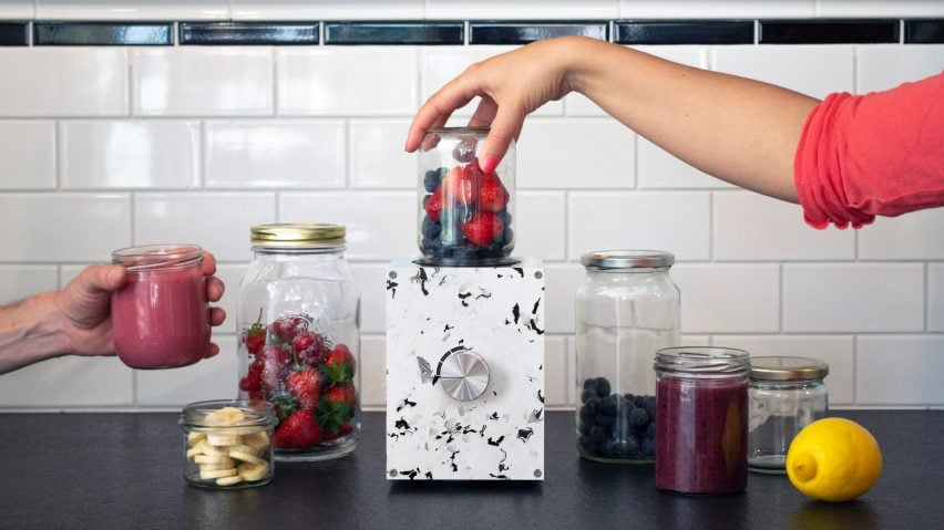
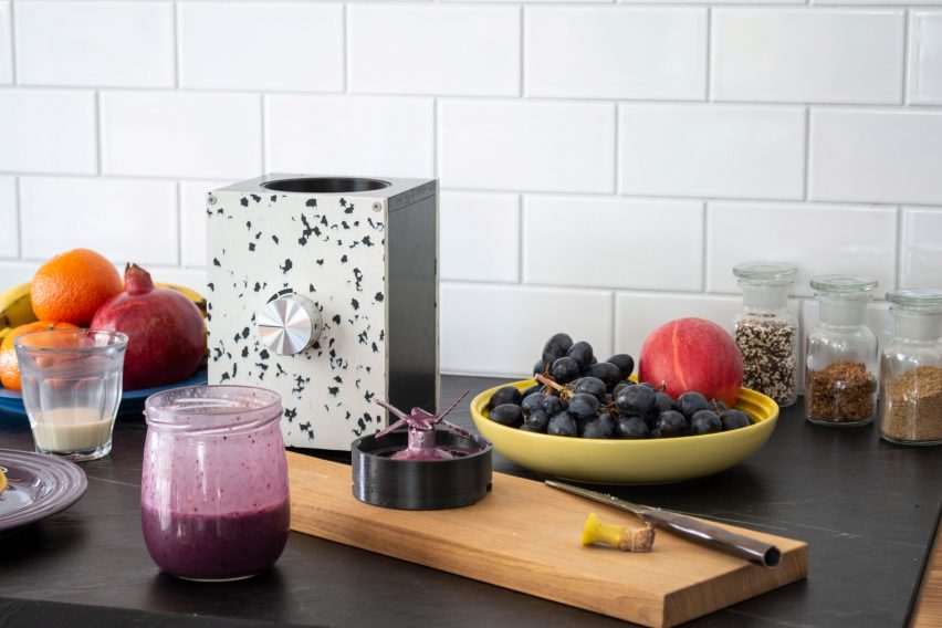
German tech company Open Funk has developed a more sustainable version of a food processor, which is repairable, upgradable and compatible with glass jars that people already have in their homes.
Shortlisted in the sustainable design category of the 2022 Dezeen Awards, the Re:Mix blender works with standard canning jars of any shape or volume, such as those used to hold jams and pickles, as long as they have an 82-millimetre twist-off lid.
Open Funk’s aim was to create a new approach to designing kitchen appliances by stripping back unnecessary components, open-sourcing the design and allowing people to utilise everyday items they already have in their cupboards.
The Re:Mix blender is designed to be compatible with common canning jars
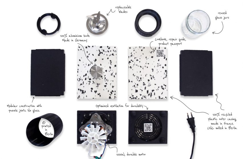
Re:Mix is constructed from recycled and recyclable materials, with speckled panels of reclaimed waste plastic used to wrap the cuboid base, which holds the motor of the food processor.
Much like a Nutribullet, the gadget has a separate blade head designed to be screwed onto the jar containing the food. This is then slotted on top of the motor and controlled via an aluminium knob mounted on the front.
To extend its lifespan, the product was designed to be easily repaired and upgraded – either in Open Funk‘s Berlin workshop or at home with the help of open-source design plans.
Its separate blade head is designed to be screwed onto the jars
The company also developed a closed-loop business model for the blender, which will involve buying back and refurbishing used Re:Mix models.
“The world’s obsession with competition, globalisation and patents got us to the point where the way we make things is causing tremendous harm to our environment,” said Open Funk. “We believe Re:Mix is proof that another way is possible.”
The base of the food processor has a modular design and is held together without adhesives, allowing it to be disassembled with common tools. Its puzzle-like joints have a simplified design that is sturdy and durable, according to Open Funk.
The design is open-source so that anyone can make their version of the product
The speckled panels surrounding the base of the food processor are made in France by melting and pressing waste plastics, before the resulting slabs are CNC milled in Berlin.
Open Funk says it chose to make Re:Mix compatible with 82-millimetre jars as these are widely available across Europe, as well as being large enough to accommodate the blades and to fit most people’s hands for rinsing.
A QR code on the back of the blender’s base leads to a repair guide, video tutorials and a product passport that helps users to repair and upgrade the product themselves.
Open Funk only ships to the European Union, which the company says was an intentional decision to guarantee repairability, lower the ecological footprint from shipping and bypass the work of having to engineer the product for international standards.
Instead, the company hopes to inspire designers around the world to adapt its product for their own markets.
“We hope to see other hackers, makers and entrepreneurs take the open-source blueprints of Re:Mix and build their own local versions in their own regions,” Open Funk co-founder Paul Anca told Dezeen.
It has a modular design that is easy to take apart for repairs and upgrades
“Not only would this create a platform for decentralised production with low emissions but the end products will be reflections of local customs, taste and materials,” he continued.
“That’s a much more creative expression than the current one-size-fits-all approach we see in the industry.”
Re:Mix is shortlisted in the sustainable design category of the 2022 Dezeen Awards, where it is up again projects including the K-BriqTM – a brick made entirely of construction waste – and a bespoke furniture collection made from firehoses by Local Works Studio.
Architizer Journal is reader-supported. When you buy through links on our site, we may earn an affiliate commission. Learn more.
Is virtual reality (VR) necessary in my design practice? Many architects — not only those with established careers and years under their belts but also recent grads weary of technological trends — question if there is any need to pivot and incorporate VR into their practices. Some see it as futile, others resist the digital era, but most designers reluctant to VR implementation are simply unfamiliar with this virtual world. Yet, there is a new paradigm for architectural visualization that is being shaped by virtual reality, along with its cousins, augmented reality (AR) and mixed reality (MR). Utilizing virtual reality as a visualization tool has become increasingly popular amongst designers as it offers a space for endless exploration and development. As the potentialities of VR continue evolving, here are a few reasons architects should consider investing in quality VR sets like the Meta Quest Pro to enhance their practice.
Whether it be to develop a design, contextualize a project or win over a client, the metaverse is making its mark in the architecture community. One of VR’s biggest advantages is providing a comprehensive understanding of space. When it comes to appreciating the detailed particularities of a site, 2D drawings and built models can only go so far. The beauty of VR is that it takes architectural visualization one step further and allows architects to deeply conceptualize and experience an environment. Through 360-degree views, VR can be incorporated at any stage of the design process. Whether it be to simply make sense of a space and its massing or to create a hyperreal experience with detailed elements, the possibilities are endless.
Top-of-the-line VR sets, like the newly-released Meta Quest Pro, are great gateways into the digital world. The Meta Quest Pro is packed with new and improved features which expand the possibilities of VR for architecture and ensure a comfortable and uncomplicated user experience. VR sets like the Meta Quest Pro are designed for collaboration. The device comes with a resizable screen that allows designers to organize their work however they please while simultaneously communicating with other users. Moreover, the Meta Quest Pro is especially handy for architects as they can collaborate in real-time while working with modeling software such as Akrio and Gravity Sketch.
Compared to older models, this device boasts a wide color gamut, an expanded dimming range and an increased contrast ratio. Whether the designer is adding light features or sun studies into their design, the viewing experience will feel ultra-realistic and help accurately conceptualize a space. Equally, the controllers on this device have been upgraded to capture a greater range of motion and more precise operations. Designers can therefore replicate writing and hand-sketching directly in the virtual world! For designers who plan to stay immersed for longer periods of time, The Meta Quest Pro has been engineered to be more ergonomic and ensure long-lasting comfort.
VR lets architects visualize and experience a design long before it’s been built. However, it can also be used to strengthen client relations. Architects can share their ultra-realistic and immersive designs with clients to help strengthen relationships and solidify deals. Therefore, investing in VR is not only an investment in better design but an investment in a flourishing practice. Architectural approaches, practices and standards are constantly evolving and it is up to the architect to pivot when they feel fit. Nevertheless, VR sets like the Meta Quest Pro are tools not to overlook.
For more ways to supercharge your workflow, check out more articles in our Tech for Architects series, which includes our recommendations of Top Laptops for Architects and Designers.
As the days get darker in the northern hemisphere, our latest lookbook spotlights 10 living rooms rendered in warm yet discrete colour palettes, proving that neutrals don’t have to feel clinical.
Mixing tactile natural materials with toasty shades of chocolate brown, creamy beige and blush pink can help to create a sense of homeliness in a room without being overbearing.
From a São Paulo apartment filled with Brazilian modernist design to a converted biscuit factory in Los Angeles, here are 10 American homes that show how it’s done.
This is the latest in our lookbooks series, which provides visual inspiration from Dezeen’s archive. For more inspiration see previous lookbooks featuring bathrooms with statement sinks, homes with Eames chairs and contemporary living rooms in Victorian and Georgian houses.
Photo is by Joe Fletcher
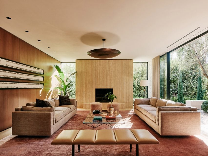
Twentieth, USA, by Woods +Dangaran
This Santa Monica home features two separate living areas – a family room (top image) and a formal living room (above) – which flank a central courtyard housing a decades-old olive tree.
Despite being framed by glazing, the rooms maintain a homely atmosphere with the help of an earthy material palette ranging from the travertine fireplace to a rose-gold cashmere rug and club chairs finished in tactile chocolate-brown corduroy.
Find out more about Twentieth ›
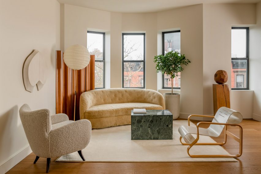
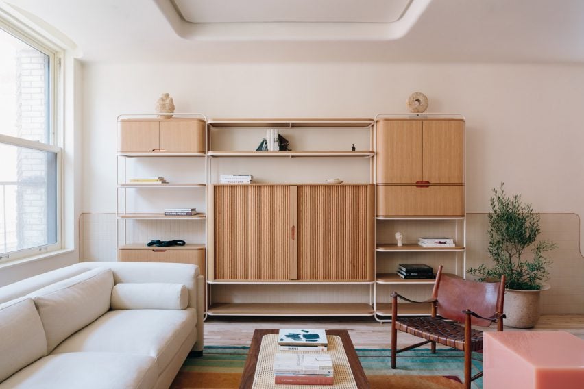
Photo is by Sean Davidson
Amity Street Residence, USA, by Selma Akkari and Rawan Muqaddas
Architectural designers Selma Akkari and Rawan Muqaddas used warm oak floors and cream-hued walls, contrasted against dark stone and stained-wood bookshelves, to enliven this “neglected” apartment in a 20th-century building in Brooklyn.
“A dialogue of opposites was the main theme behind the creation; minimal but warm, understated yet rich,” Muqaddas told Dezeen.
Find out more about Amity Street Residence ›
Photo is by Denilson Machado of MCA Estúdio
Hygge Studio, Brazil, by Melina Romano
A black fireplace is suspended from the ceiling in this living room to contrast with the otherwise soft colour scheme of the interior, reflected in everything from the cream sofa and woven rug to the cobogó block screen that acts as a room divider.
Walls and floor throughout the São Paulo apartment are covered in terracotta tiles, chosen by local designer Melina Romano to strike a balance between “modern and bucolic”.
Find out more about Hygge Studio ›
Photo is by Nicole Franzen
East Village Apartment, USA, by GRT Architects
New York-based GRT Architects used warm tones and materials to modernise this renovated East Village apartment – set in a Beaux-Arts building on Second Avenue – while “preserving its turn-of-the-century disposition”.
In the lounge, this was achieved by adding a storage wall backed with sienna-coloured panels and complementing it with a geometric, art deco-style rug rendered in muted shades of sage green and dusty rose.
Find out more about this East Village Apartment ›
Photo is by The Ingalls and Matthieu Salvaing
Santa Monica Proper, USA, by Kelly Wearstler
Although not technically a living room, the lounge of the Santa Monica Proper hotel features all the trappings of a cosy den – timber bookshelves, creamy-white Soriana lounge chairs and a Coulmier limestone coffee table with three orbs for legs.
Interior designer Kelly Wearstler used natural materials and neutral colours throughout the hotel to reference its seaside setting.
“Organic materials, neutral colour stories, everything has a texture,” Wearstler told Dezeen. “There’s a patina, there’s a hand, there’s something that feels very warm.”
Find out more about Santa Monica Proper ›
Photo is by Sean Davidson
West Village apartment, USA, by Olivier Garcé
American interior designer Olivier Garcé found a creative outlet during last year’s coronavirus lockdown by working remotely with friends and colleagues to transform his West Village home into a show space for contemporary art and design.
His lounge now houses a vintage Axel Einar Hjorth rocking chair, paired with a lava-stone coffee table and side chair upholstered in alpaca wool by New York designer Ian Felton, complementing the terracotta-coloured tiling on the building’s original fireplace surround.
Find out more about this West Village apartment ›
Photo is by Brian Ferry
20 Bond apartment, USA, by Home Studios
Curves feature liberally throughout this family apartment in New York’s NoHo neighbourhood, from its copper-edged skirting to the rounded oak-and-brass shelving unit in the living room, which was made bespoke by interior practice Home Studios.
The muted tones of the timber are complemented by a set of antique Danish armchairs with woven leather seats and a blush-coloured version of designer Sabine Marcelis’s Candy Cube side tables.
Find out more about 20 Bond apartment ›
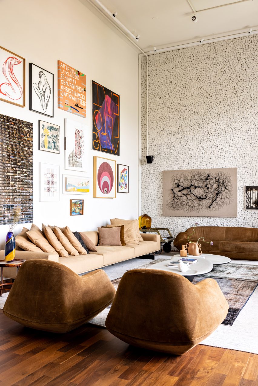
Photo is by Fran Parente
Gale Apartment, Brazil, by Memola Estudio
Furnishings are coloured in grounding, earthy hues inside this lounge flanked by two double-height statement walls – one housing the owners’ art collection and the other clad in a broken-edge stone mosaic.
“Furniture has been reupholstered to match the new colour palette, inspired by the autumn and the sunset colours found in the horizon,” said design practice Memola Estudio, which was responsible for renovating the São Paulo apartment.
Find out more about Gale Apartment ›
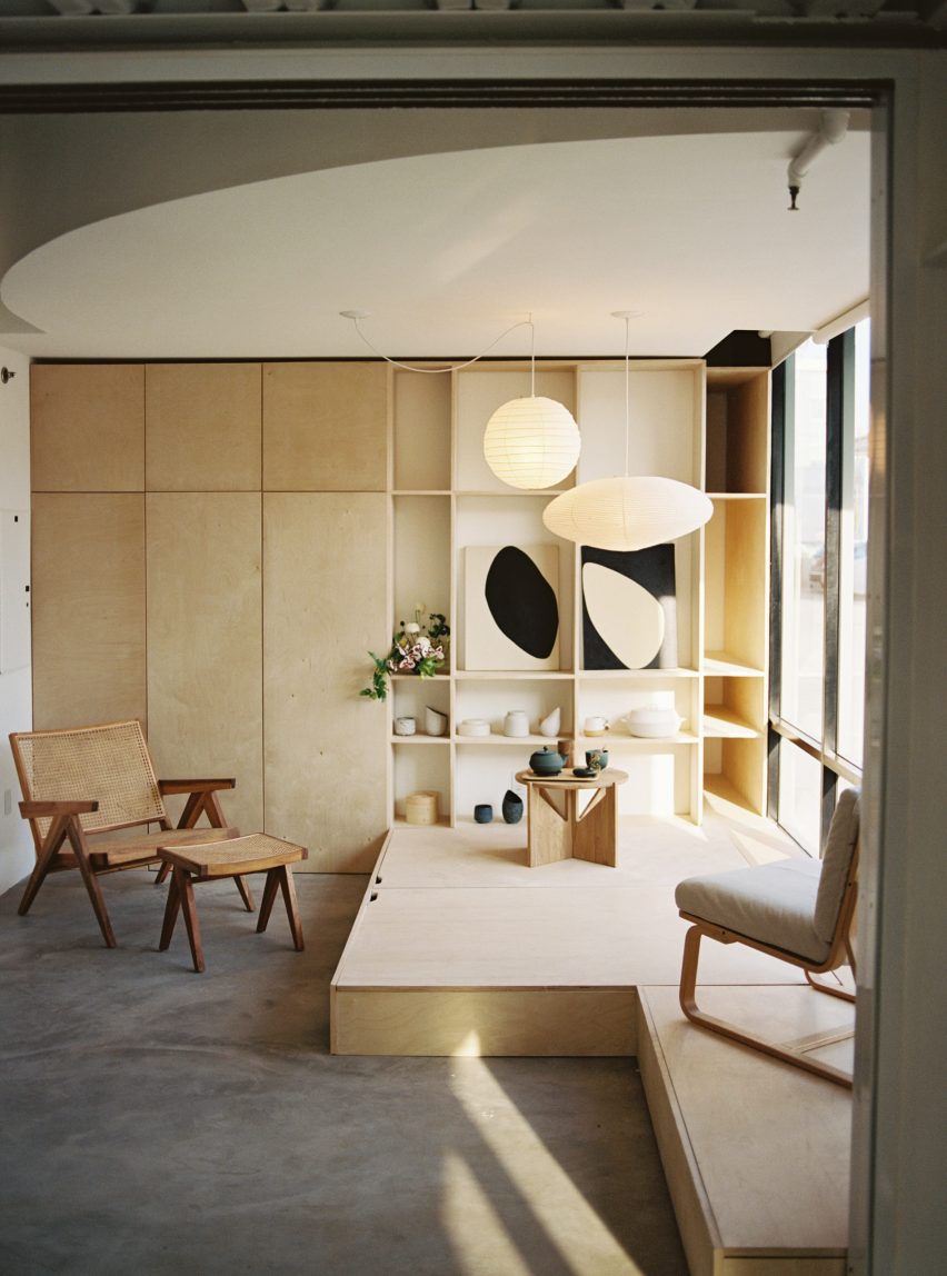
Photo is by Justin Chung
Biscuit Loft, USA, by OWIU Studio
Japanese design informed this apartment in a converted 1920s biscuit factory in Downtown Los Angeles, with a guest room modelled on a traditional Ryokan inn that also functions as a space for hosting gatherings and tea ceremonies.
Local practice OWIU Studio added Noguchi pendant lights to bathe the room in a warm glow, while a convertible platform made from pale wood conceals extra storage and functions as a base for a futon when guests are staying over.
Find out more about Biscuit Loft ›
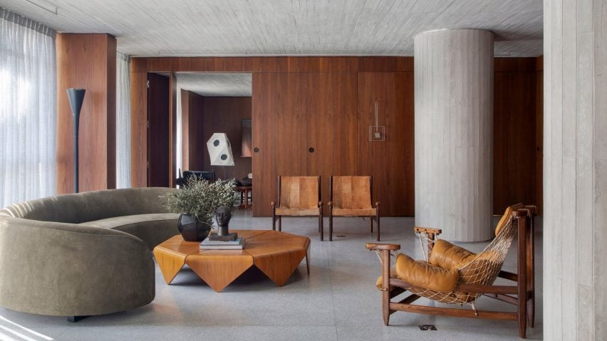
Photo is by Denilson Machado
DN Apartment, Brazil, by BC Arquitetos
Walnut wood panelling and soft furnishings upholstered in caramel-coloured leather help to temper the chunky concrete columns of this apartment, housed in a 1970s building in São Paulo’s traditional Jardins neighbourhood.
Local practice BC Arquitetos describes the home as a “gallery apartment” as it houses an extensive collection of mid-20th century Brazilian art and design, ranging from the net-backed Janguada armchair by Jean Gillon to Jader Almeida’s Verde Corvo sofa, which is finished in a faded olive green.
Find out more about DN Apartment ›
This is the latest in our lookbooks series, which provides visual inspiration from Dezeen’s archive. For more inspiration see previous lookbooks featuring bathrooms with statement sinks, homes with Eames chairs and contemporary living rooms in Victorian and Georgian houses.
Spotted: A century ago, a growing population pushed farmers to grow crops faster than nitrogen-fixing bacteria in the soil could keep up, and supplies of natural nitrates began to run out. In response, Fritz Haber and Carl Bosch developed a process to react hydrogen and atmospheric nitrogen under pressure to make ammonia for use as fertiliser. But in solving one problem, they caused another one – making ammonia in this way takes a lot of energy. Now, a new process for making green ammonia may once again come to the rescue.
Dutch company Proton Ventures, the Institute Research Energy Solar et Energy Nouvelles (IRESEN), and Morocco’s Mohammed VI Polytechnic University (UM6P) have signed an agreement to build a demonstration-sized green ammonia facility at the OCP Group chemical complex in Jorf Lasfar, Morocco. The plant will be capable of producing 4 tonnes of ammonia per day, powered using an electrical load emulator that simulates the profiles of wind and solar generation at different geographical sites.
The partners say the facility will act as a ‘world reference unit’ and the trial results will be used to develop large-scale industrial projects that use renewable energy to generate ammonia. The partner organisations hope that the project will allow them to develop expertise, conduct training, and acquire data covering a range of scenarios and operation and maintenance configurations. The hope is that this will enable future green molecule production plants.
Mohammed Bousseta, Director of Innovate for Industry at UM6P explains that the plant will “constitute a living laboratory available to UM6P Researchers, Doctoral Students and Professors for research and education in the fields of hydrogen and green ammonia [as well as] a pilot for training and feasibility studies for a large industrial unit of Green Ammonia.”
The promise of ammonia as a future green fuel can be seen in the variety of recent innovations covered by Springwise. These include a generator that runs on both hydrogen and ammonia fuel and a zero-emission ammonia fuel used to power heavy machinery.
Architizer is thrilled to announce that the 11th Annual A+Awards is open for entries! With an Early Entry Deadline of November 4th, 2022, the clock is ticking — get started on your submission today.
With the plethora of materials available today, architectural frames have become increasingly complex, moving further and further away from the simple cast iron and concrete examples of the past. A confluence of factors influences the design of a frame, which in turn shapes the building’s height, shape and interior spaces. As architects push the limits of creative possibility, the skeletons of some of the world’s most beautiful buildings have evolved into evermore intricate and visually exciting structures. Using modern building techniques and innovative materials, building frames have become webs of beams, posts, knuckles and joints that, in the past, may have been hidden behind stone and drywall.
There’s a widely known expression that suggests a magician never shares his secrets; however, when it comes to architects and the craft of structural design, this seems to be less and less the case. Gazing through the gallery of the 10th Annual A+Awards-winners, we noticed an increased number of buildings expressively flaunting their structures for all to see. Could a renewed appreciation for the masterful art of structural design be why we are seeing more projects with exposed frames? Or are there other reasons — including transparency about sustainable material choices or even representing the program within — motivating architectural firms to reveal their buildings’ skeletons?
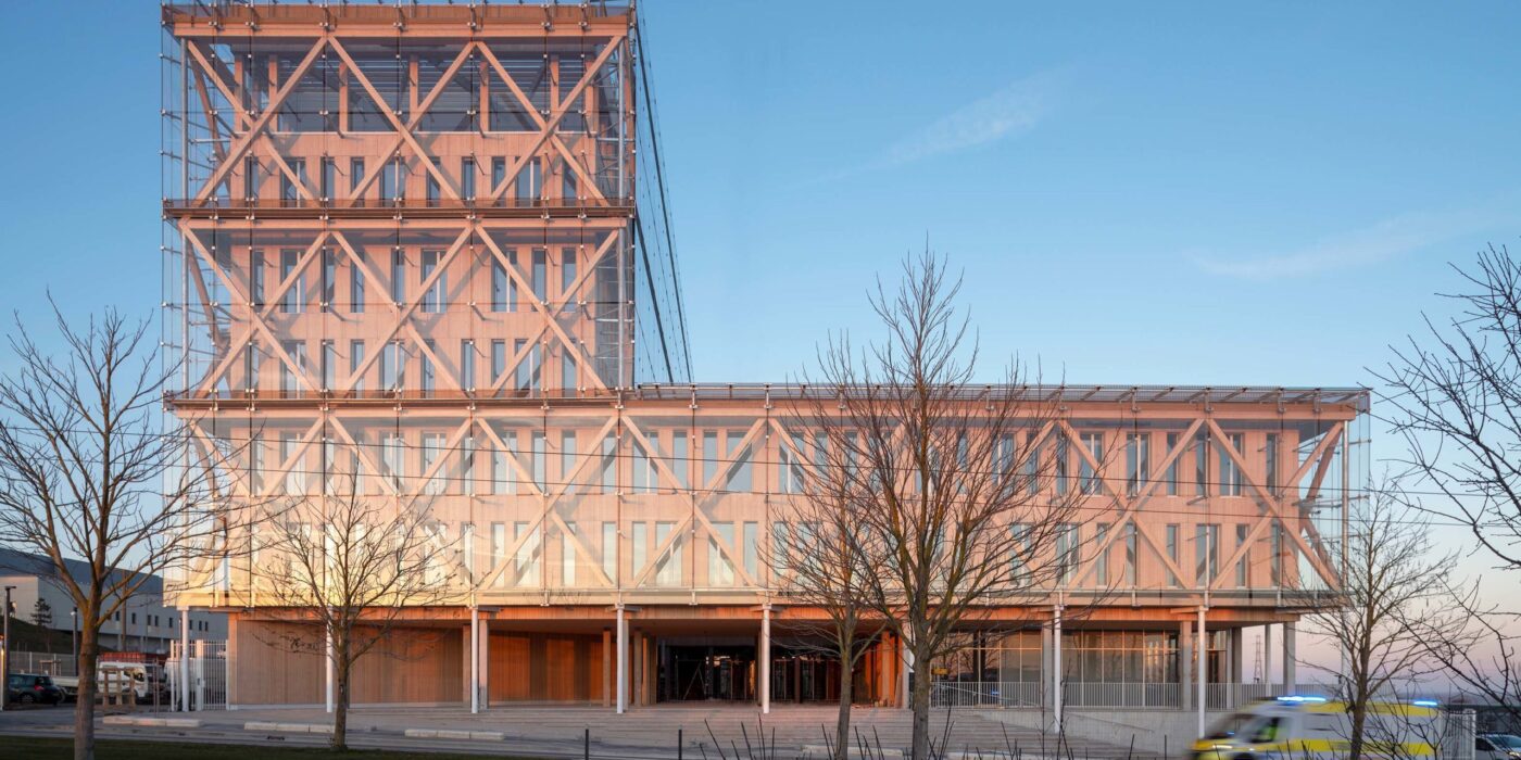
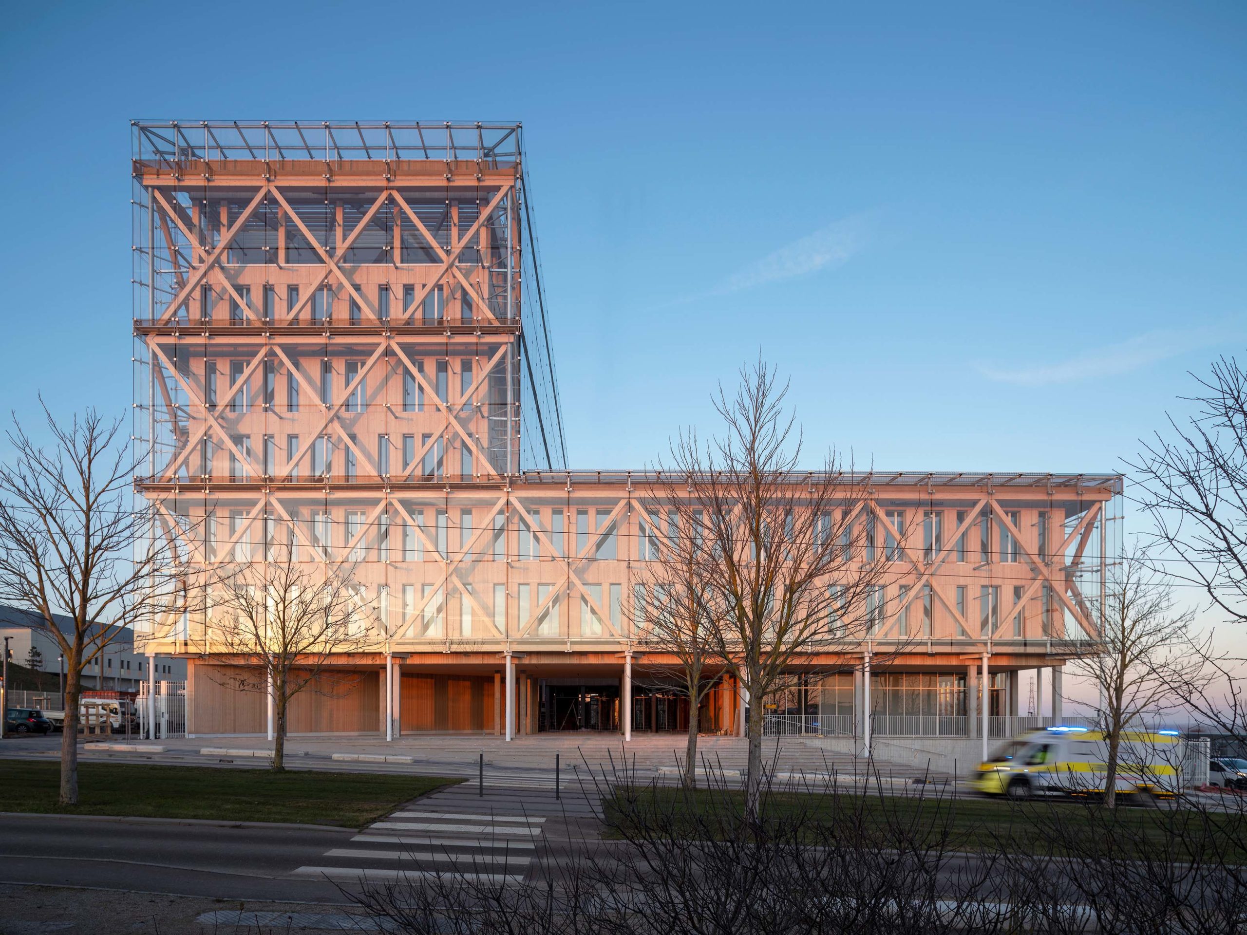
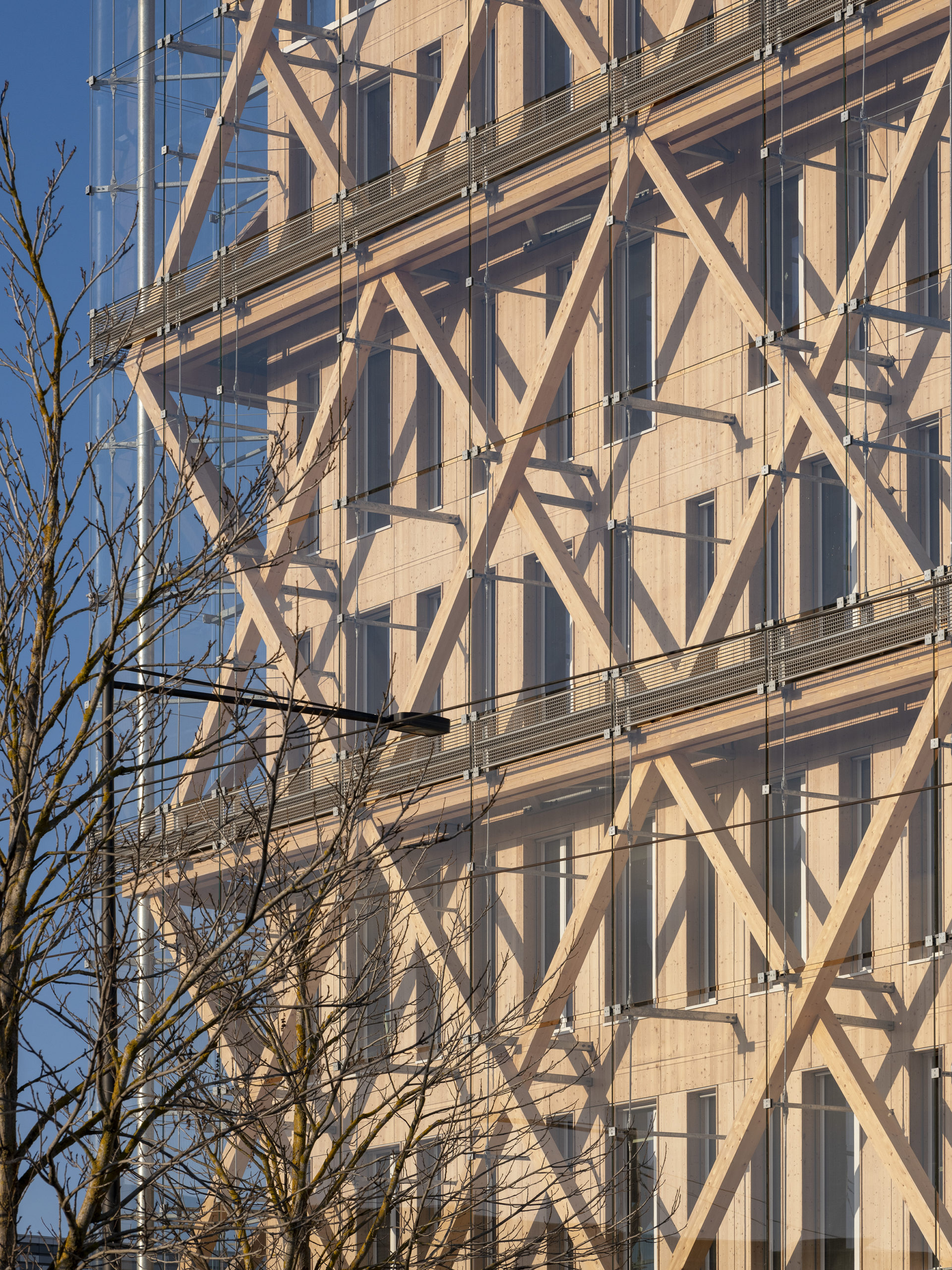
Banking group Caisse d’Epargne has a new head office designed by GRAAM. An intelligent seven-story modular building, the headquarters is designed with a prefabricated concrete floor and exo-wooden structure covered with a glazed double skin. The goal was to design a building that reached Passivhaus standards while providing a flexible work environment. Local materials were expertly implemented to create the stunning structure whose timber frame and glazed façade assist in heating and cooling, while the cleverly placed timber columns are ideal for partitioning work areas.
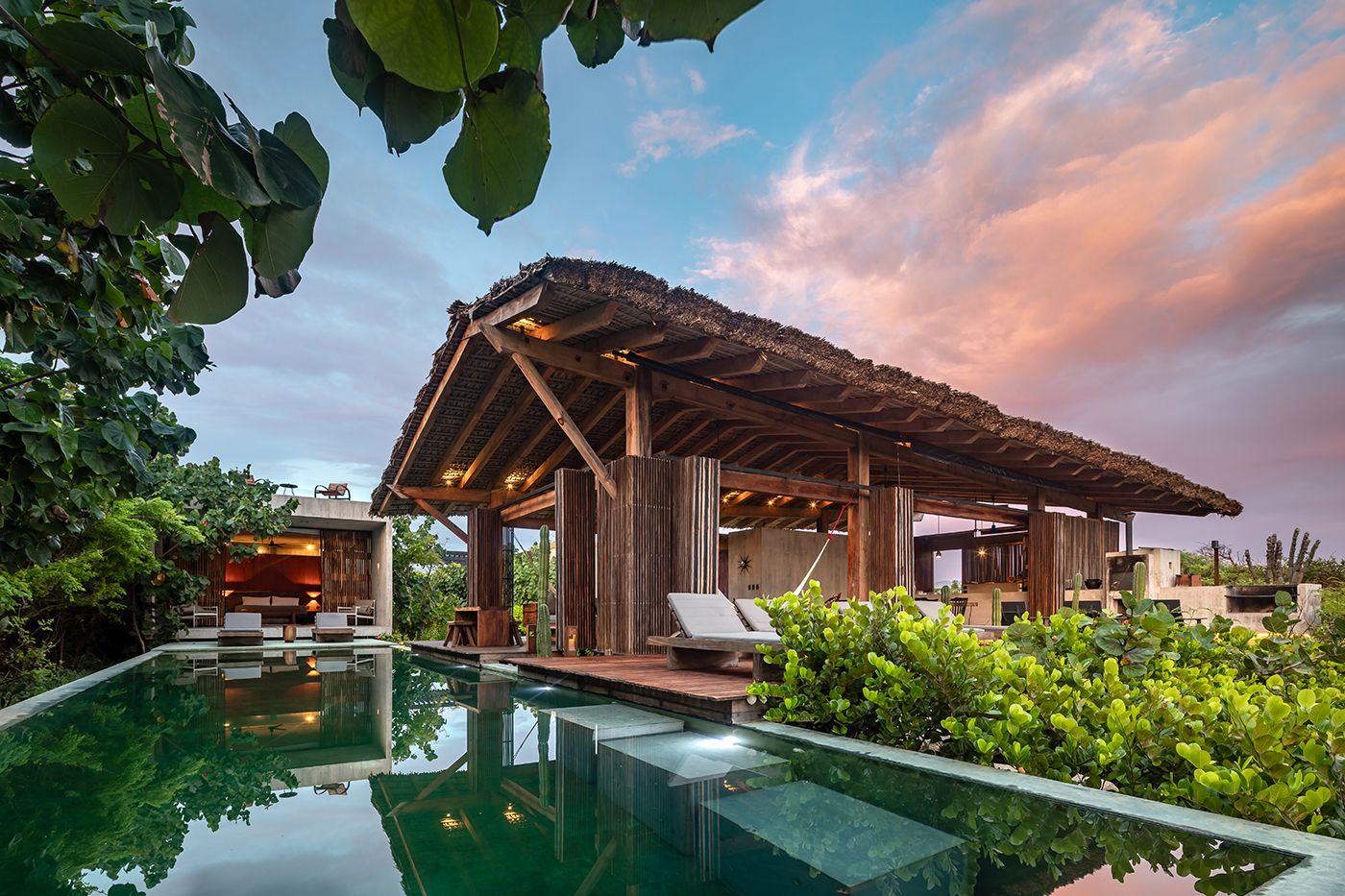
Casa Malandra
By TAC, Puerto Escondido, Mexico
Popular Winner, 10th Annual A+Awards, Private House (XS <1000 sq ft)
Photographs by Onnis Luque
Casa Malandra was conceived by the Mexican firm Taller Alberto Calleja amid the lush fields of Puerto Escondido in Mexico. The design creates many juxtapositions. While the concrete frame that forms the private domain of the dwelling emerges as a contemporary cuboid structure, it contrasts to the open wooden build that borders (next to the private pool), which draws inspiration from the Mexican Palapa — a traditional shelter roofed by palm leaves or branches whose timber frame is in keeping with the uncultivated surroundings. The exposed structure in both instances aim to increase the volume of space throughout while simultaneously connecting the various vernacular voids and implementing visual appeal.
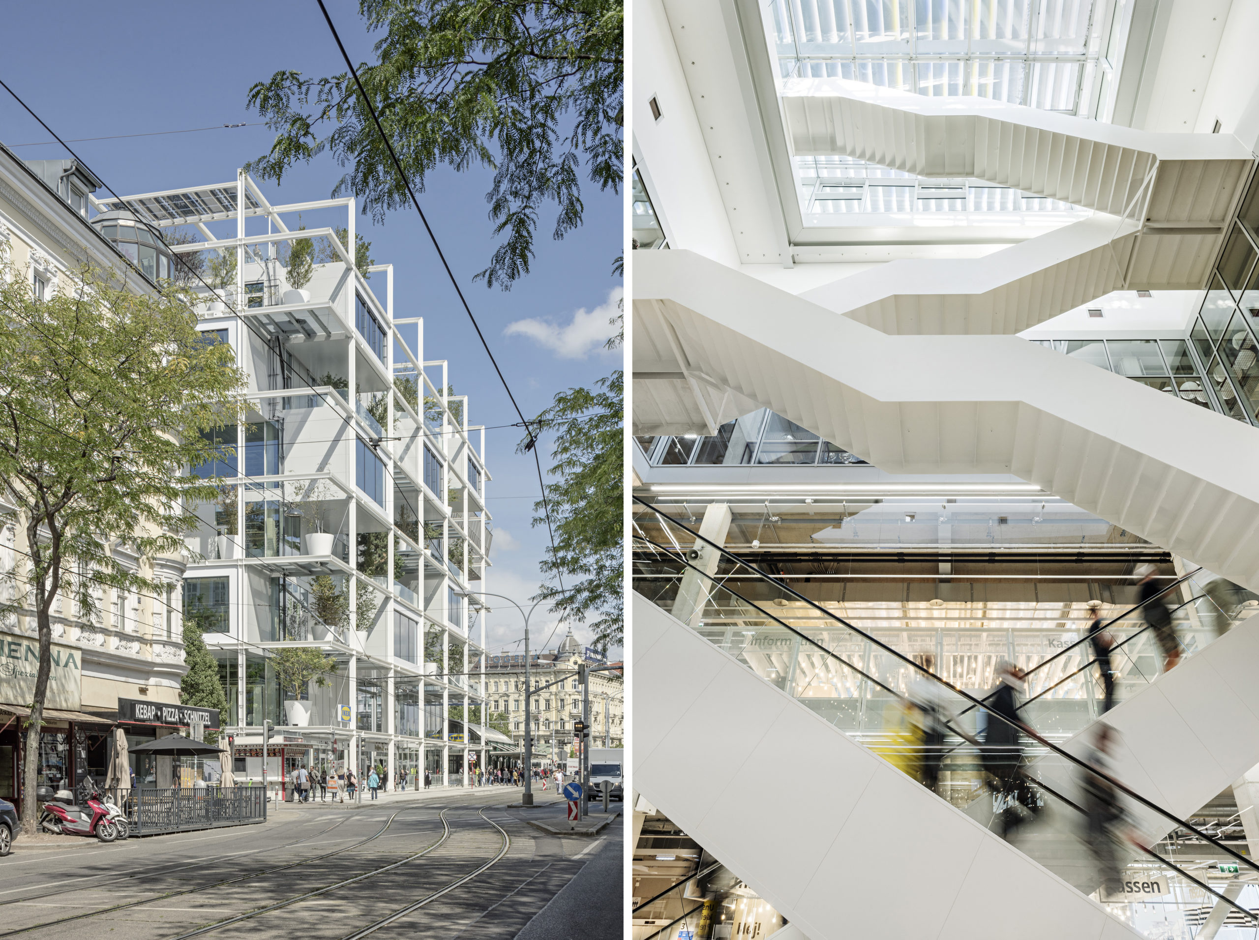
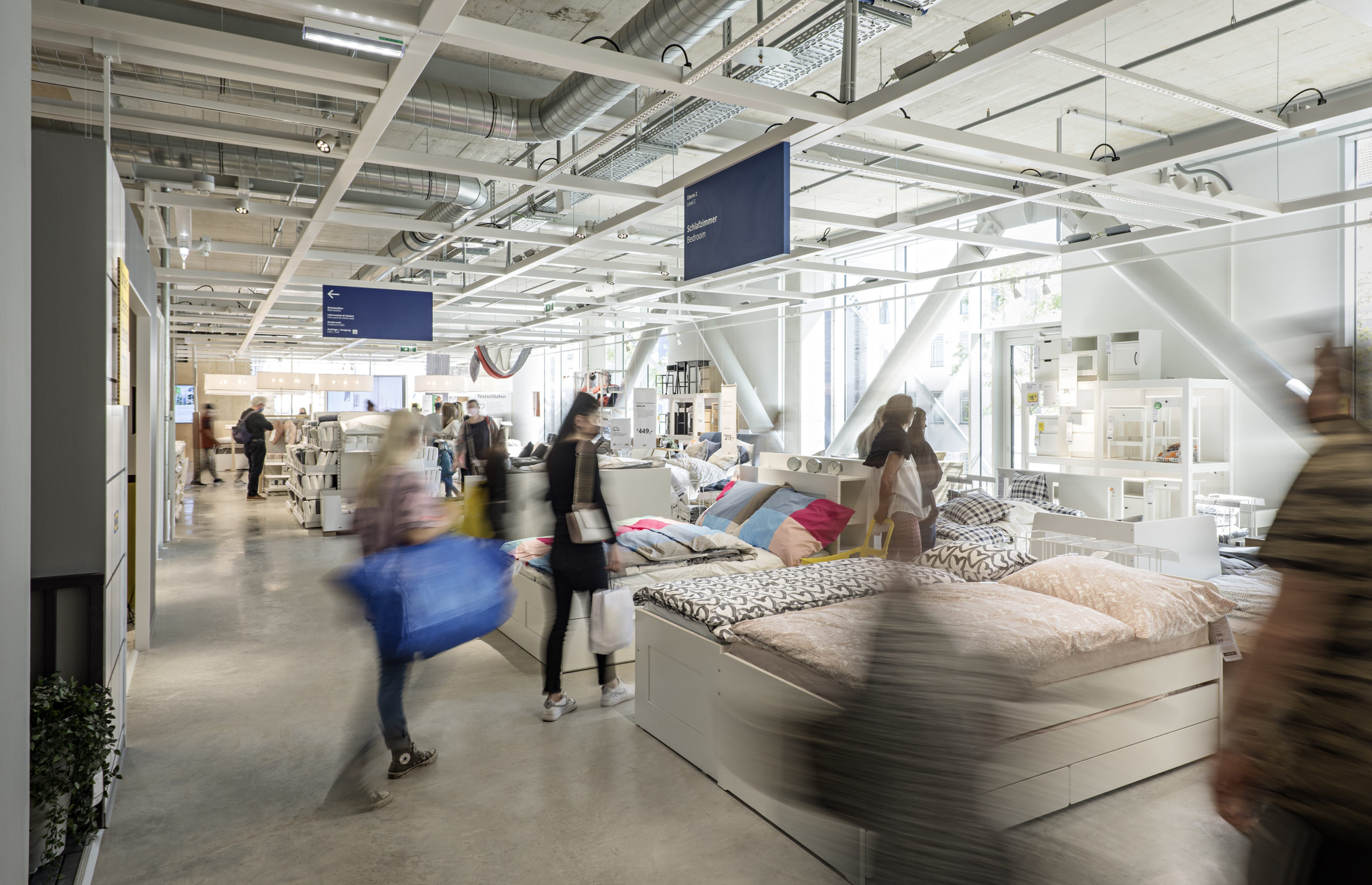
IKEA – the good neighbour
By querkraft architekten zt gmbh, Vienna, Austria
Jury Winner, 10th Annual A+Awards, Retail
Photographs by Christina Häusler – Querkraft Architekten
In Austria’s capital, Vienna, Querkraft Architekten constructed the first IKEA store unsuitable for cars and parking. Designed to be “a good neighbor,” the community conscious building is the essence of its origin. The exposed framework of the no-frills building showcases how the structure is assembled, much like the renowned furniture pieces within. By exposing the infrastructure, the perceptible height of the spaces is increased dramatically, and the continuous void in the interior of the building allows visual contact between the different floors.
Additionally, the prefabricated reinforced concrete columns are set on a grid of around ten by ten meters, which guarantees considerable flexibility in the design and use of the spaces within. To ensure the efficient conditioning of the building, all of the services are based on a simple principle: short distances and direct access, which is helped by the lack of internal cladding. Like the beloved Kallax for apartments worldwide, Querkraft Architekten’s The Good Neighbor could well be a city center staple of the future.
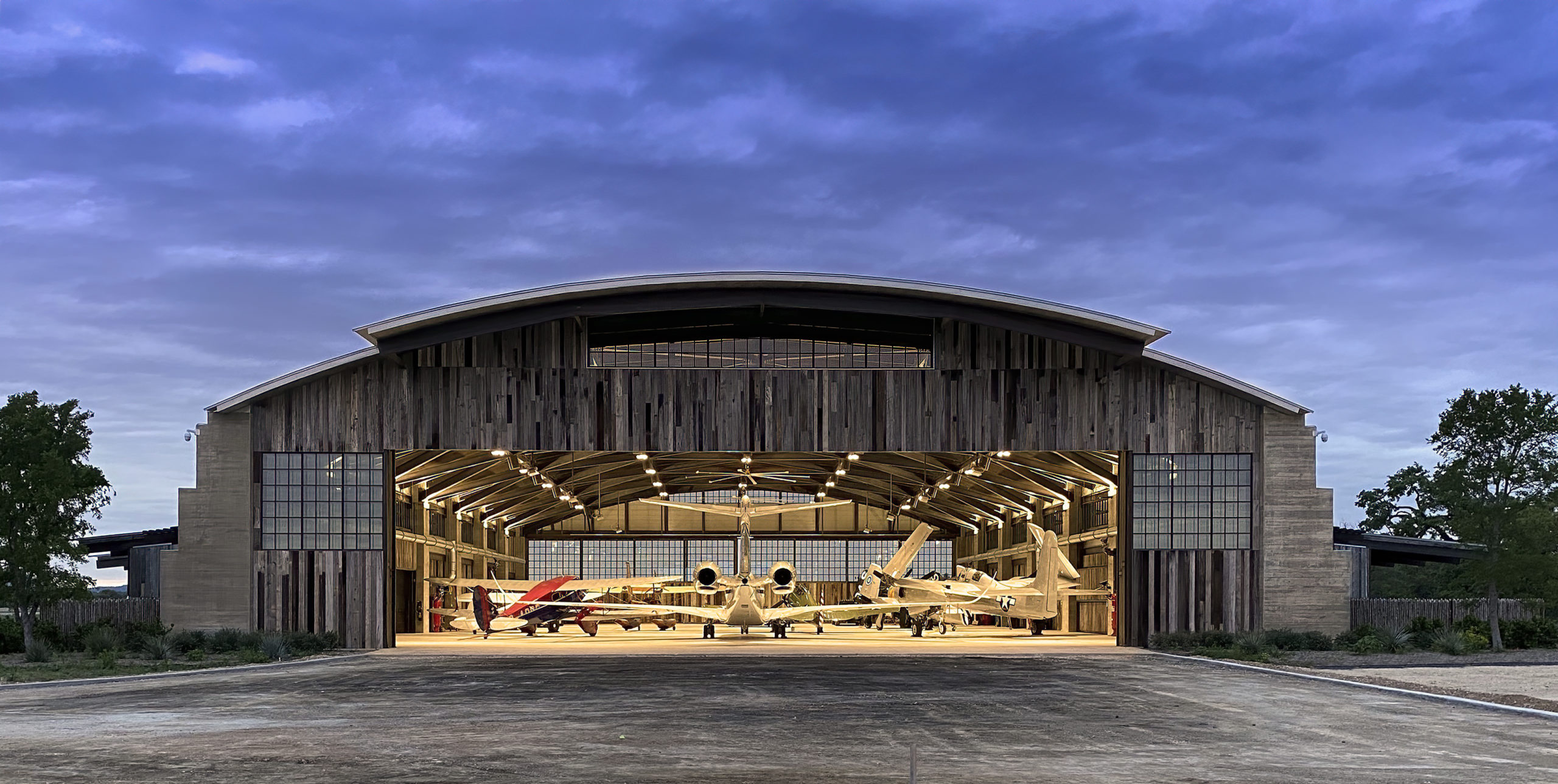
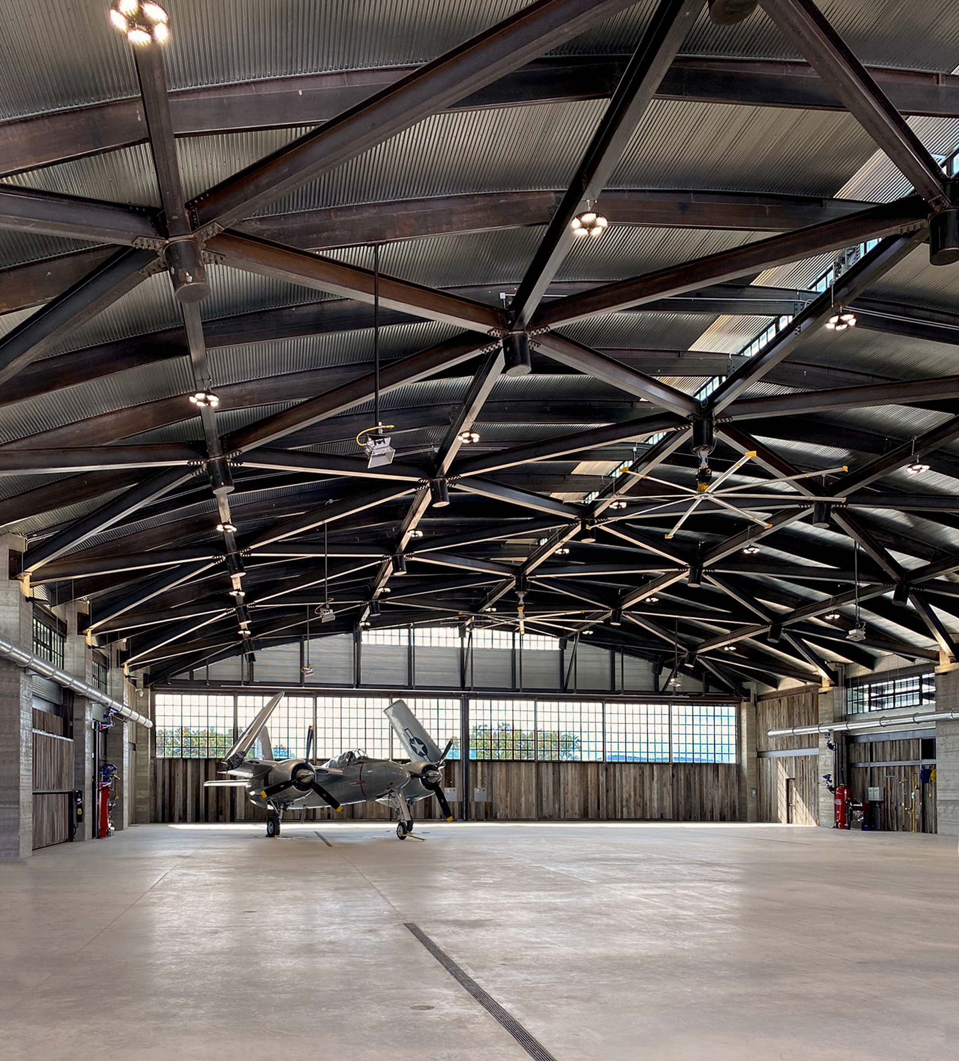
Ghost Hangar
By John Grable Architects, TX, United States
Popular Winner, 10th Annual A+Awards, Showroom
Photographs by John Grable Architects
Ghost Hangar was designed exclusively to house a living collection of Vintage WWII-era aircraft. The 32,000-square-foot structure sits on a remote site in Texas Hill Country, Texas. With their traditionally inspired design proposal, John Grable Architects aspired to ensure a minimal visual impact on the surrounding landscape. Drawing inspiration from the historical shape and form of the Quonset hut developed during WWII, a rigid frame was selected using a triangulated wide-flange barrel-vault structural system connected through a series of knuckles. This composition enables the building to achieve longer spans suited to aircraft housing. The unconventional steel roof structure and board-formed concrete buttresses provide unquestioned durability. At the same time, reclaimed barn wood siding was specified pre-weathered to tolerate the surrounding climate while blending harmoniously with the territory.
The passive light shelves, deep roof overhangs and cupola openings work in conjunction with the Thermasteel envelope to render the hangar volume a shaded refuge throughout the warm summers. The building is not only aesthetically era-appropriate but it also achieves sustainable properties through the use of age-old principles.
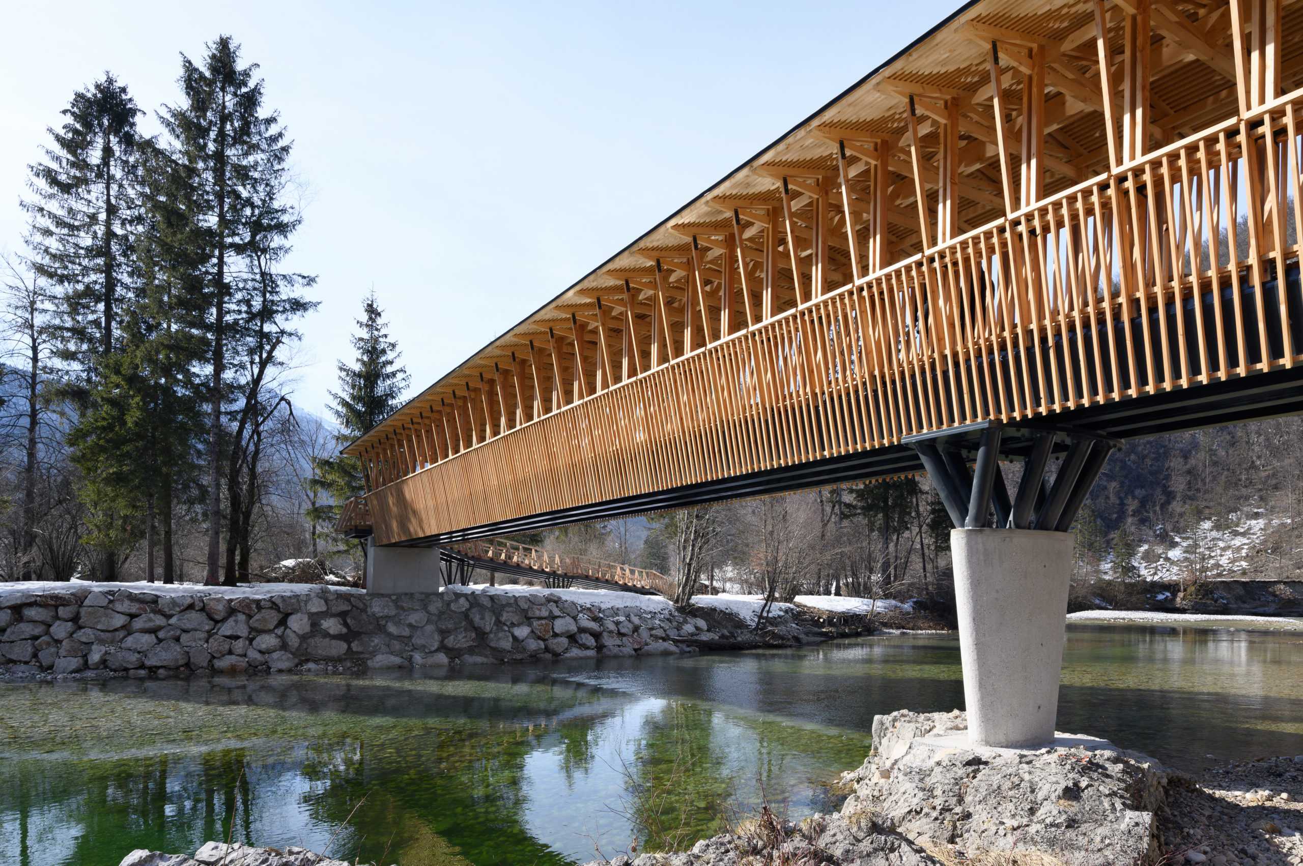
Cycling and Pedestrian Bridge in Bohinj Slovenia
By Atelje Ostan Pavlin, Municipality of Bohinj, Radovljica, Slovenia
The intricate footbridge on the Bohinj Cycle Route connects the upper and lower banks of the Sava Bohinjka River. The central volume of the bridge is supported at three points, and the load-bearing structure consists of four steel beams running the length of the bridge. The intermediate ellipsoid concrete pillar rests on the river bed and carries steel “branches” to support the beams. The architects aimed to evoke the sense of a “rural wooden temple” with their bridge reflecting the form of a traditional hayrack. The main construction, pillar rhythms, wooden details, ties, eaves and roof are all built from local larch wood to ensure harmonious integration with the natural landscape.
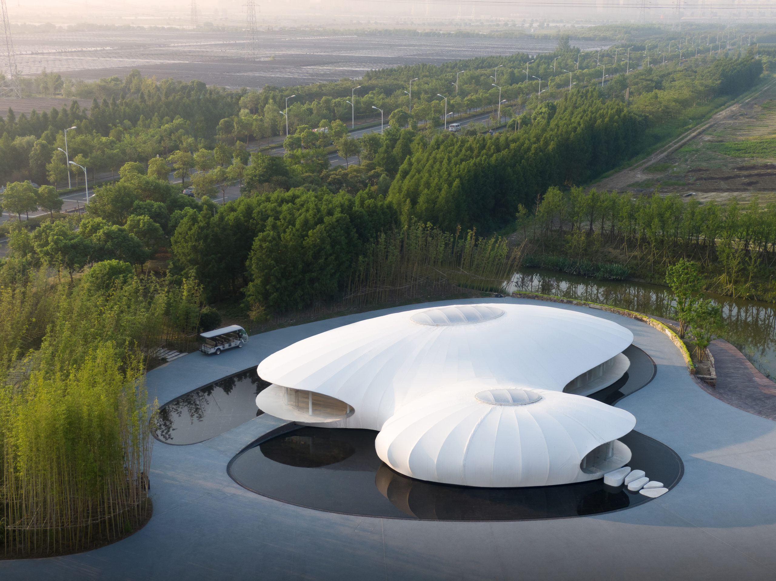
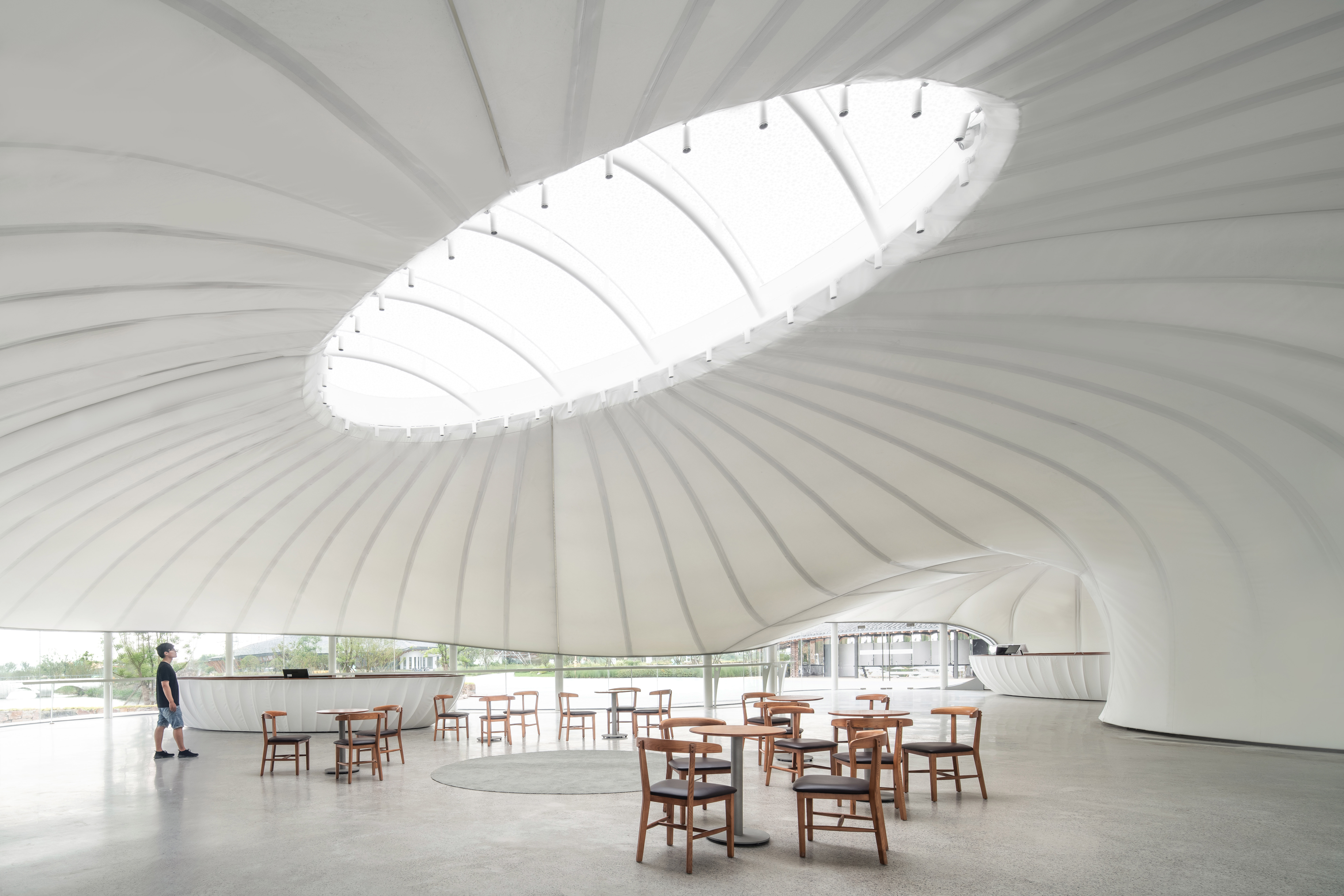
Experimental architectural practice Z-ONE Tech has designed several distinct buildings for Nontong Urban Agricultural Park. The Rural Living Room Exhibition Centre is a contemporary building in form and construction. The white tent-like structure has a membrane segmented by the structural lines that shape its two ovoid figures with their sky-lights while vertical columns hold the perimeter glazing that captures the raw vistas beyond.
Architizer is thrilled to announce that the 11th Annual A+Awards is open for entries! With an Early Entry Deadline of November 4th, 2022, the clock is ticking — get started on your submission today.
This lookbook rounds up 10 bedrooms where architects have designed discreet built-in wardrobes to conceal clothing and clutter, creating the illusion of a seamless wall.
Built-in wardrobe walls are an efficient way to supersize storage and utilise every centimetre of space in a bedroom, unlike freestanding units that often leave dead spaces around their edges.
When finished with a minimalist design, they can also blend into the background, helping to create spacious and serene interiors that are suitable for sleep.
This is the latest in our lookbooks series, which provides visual inspiration from Dezeen’s archive. For more inspiration see previous lookbooks featuring interiors with arched openings, bathrooms with statement sinks and living rooms in Victorian and Georgian-era homes.
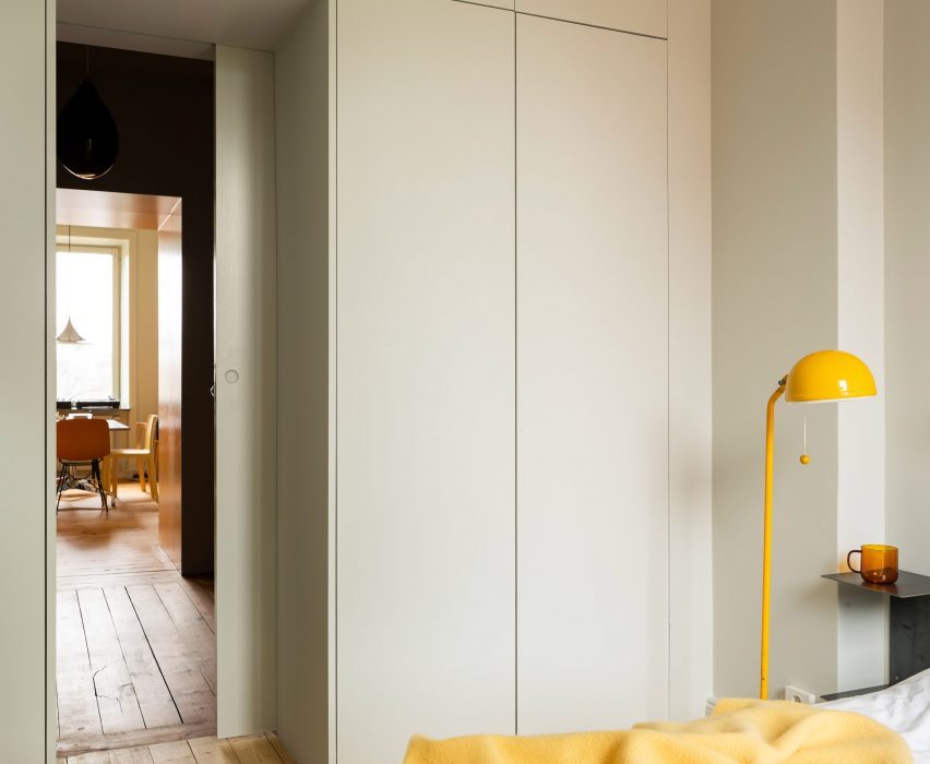
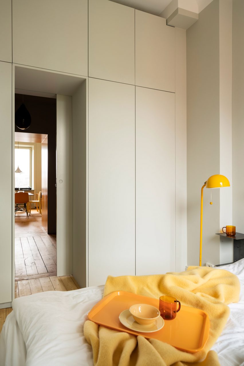
Photo is by Mattias Hamrén with styling by Hanna Tunemar
Function Walls, Sweden, by Lookofsky Architecture
This wall of storage surrounds the doorway of a bedroom in the Function Walls apartment, which was recently renovated by Lookofsky Architecture in Stockholm.
The pale grey units contain a mix of different-sized cupboards without handles, forming a neutral backdrop to bright yellow bedroom furnishings including a 1970s IKEA floor lamp.
Find out more about Function Walls ›
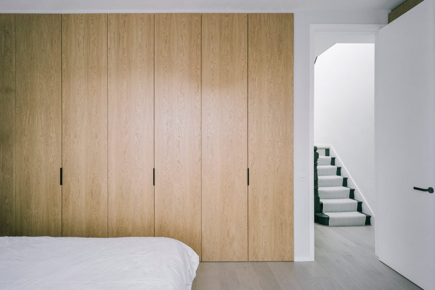
Photo is by Lorenzo Zandri
Wakehurst Road, UK, by Matthew Giles Architects
Matthew Giles Architects designed a series of white-oak storage units for the Wakehurst Road house in London, including this pared-back wardrobe wall in one of the bedrooms.
Its deliberately simple design ties in with a calming colour and material palette of stone, concrete and brick that runs through the updated Victorian residence.
Find out more about Wakehurst Road ›
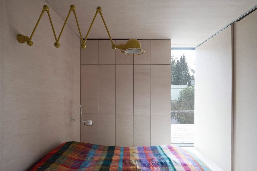
House at the Pond, Austria, by Hammerschmid Pachl Seebacher Architekten
The compact bedroom in House at the Pond is lined with wooden walls – two of which double as storage.
Disguising the wardrobes helps keeps the interior details to a minimum, which in turn retains focus on the large window and prevents the small space from feeling cramped.
Find out more about House at the Pond ›
Photo is by Ben Blossom
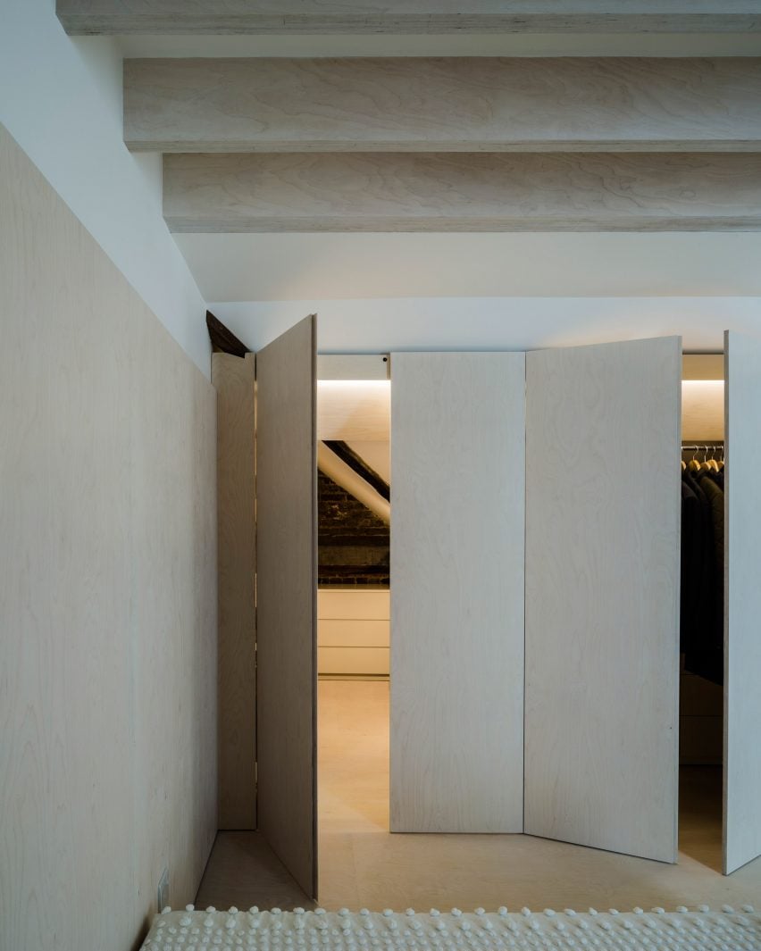
Bavaria Road Studio, UK, by West Architecture
Plywood panels are used as fronts for both the tall wardrobes and the doorway of the bedroom at Bavaria Road Studio, helping them to blend in with the rest of the space, which is lined with the same material.
According to designer West Architecture, the goal was for them to “read as a single wall of flush panelling, effectively disappearing and allowing the room to be read as one seamless, minimalist environment”.
Find out more about Bavaria Road Studio ›
Photo is by Richard Chivers
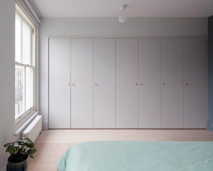
Maison Pour Dodo, UK, by Studio Merlin
Designed to minimise clutter and visual noise, these understated built-in wardrobes are part of the “spectrum of storage” that Studio Merlin created for this flat in London.
The seven wardrobe doors blend in seamlessly with the grey-hued walls of the main bedroom, while their wooden knobs complement the pale Douglas fir floorboards that run throughout.
Find out more about Maison Pour Dodo ›
Photo is by Yiorgos Kordakis with styling by Anestis Michalis
Xerolithi, Greece, by Sinas Architects
White grooved doors line the built-in wardrobe wall in this bedroom, which Sinas Architects created at the Xerolithi house on the Greek island of Serifos.
Aligned with a door to an ensuite bathroom, the wardrobes create a unpretentious backdrop to the space, drawing the occupant’s attention to the uninterrupted view of the sea outside.
Find out more about Xerolithi ›
Photo is by Mariell Lind Hansen
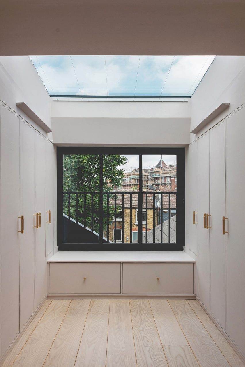
Narford Road, UK, by Emil Eve Architects
Emil Eve Architects lined the nook of this monochromatic loft extension in London with bespoke wardrobes, which appear to extend up to meet a skylight overhead.
Finished with wooden handles with brass caps, the units are complemented by a matching window seat with two in-built drawers and pale wood floors that help them blend into the background.
Find out more about Narford Road ›
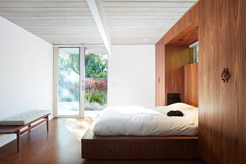
Photo is by Mariko Reed
Mountain View Double Gable Eichler Remodel, USA, by Klopf Architecture
A pair of built-in wardrobes have been incorporated within a walnut wall unit in a bedroom of this 1960s residence in Silicon Valley, recently remodelled by Klopf Architecture.
The same wood has been used for the headboard and plinth for the bed, helping them to read as a single piece. The wardrobes are only distinguishable by two subtle leather handles placed on the front of each one.
Find out more about Mountain View Double Gable Eichler Remodel ›
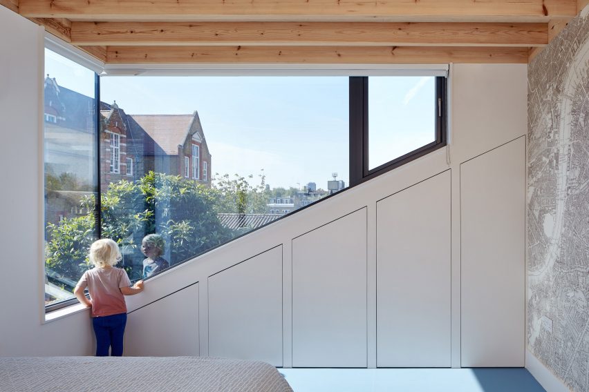
Photo is by Andy Stagg
Kennington House, UK, by R2 Studio
These bedroom cupboards follow the sloped edge of a giant corner window, introduced to Kennington House in London as part of a renovation and loft extension project.
Designed by R2 Studio as one of many storage facilities for the house, they help residents keep the room clutter free and have white-coloured fronts that are disguised as part of the wall.
Find out more about Kennington House ›
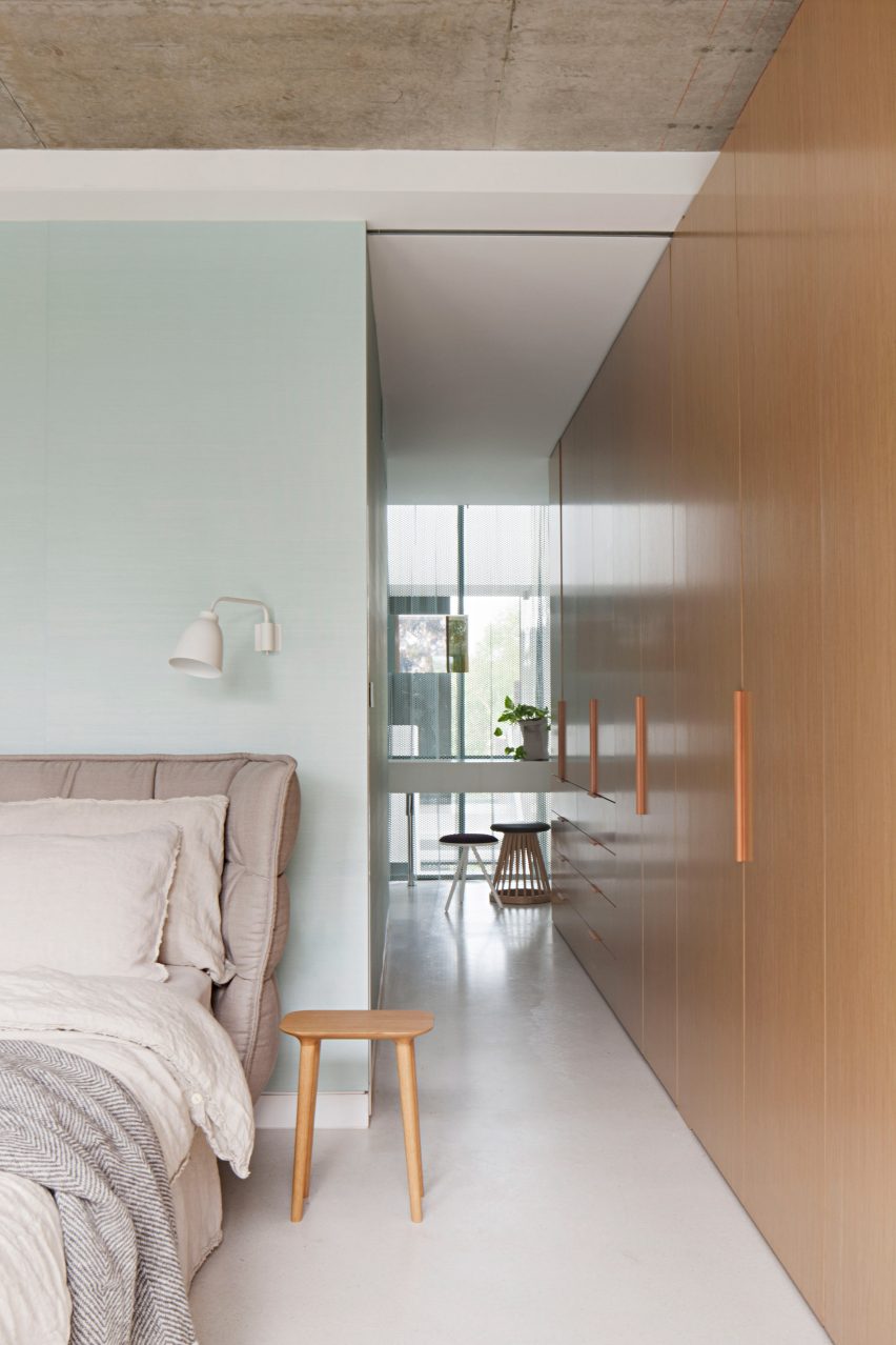
Photo is courtesy of Matt Gibson
Wellington St Mixed Use, Australia, by Matt Gibson
Drawers and full-height wardrobes are incorporated into this floor-to-ceiling storage unit, which runs the length of a bedroom in the Wellington St Mixed Use house in Melbourne.
Its design means it doubles as a tactile wooden wall for the room, which forms a part of a large multi-generational home by architect Matt Gibson. The other bedrooms have similar wardrobe layouts, ensuring plenty of storage for inhabitants.
Find out more about Wellington St Mixed Use ›
This is the latest in our lookbooks series, which provides visual inspiration from Dezeen’s archive. For more inspiration see previous lookbooks featuring interiors with arched openings, bathrooms with statement sinks and living rooms in Victorian and Georgian-era homes.