Walk-Up Avenue colourful timber batten
CategoriesArchitecture

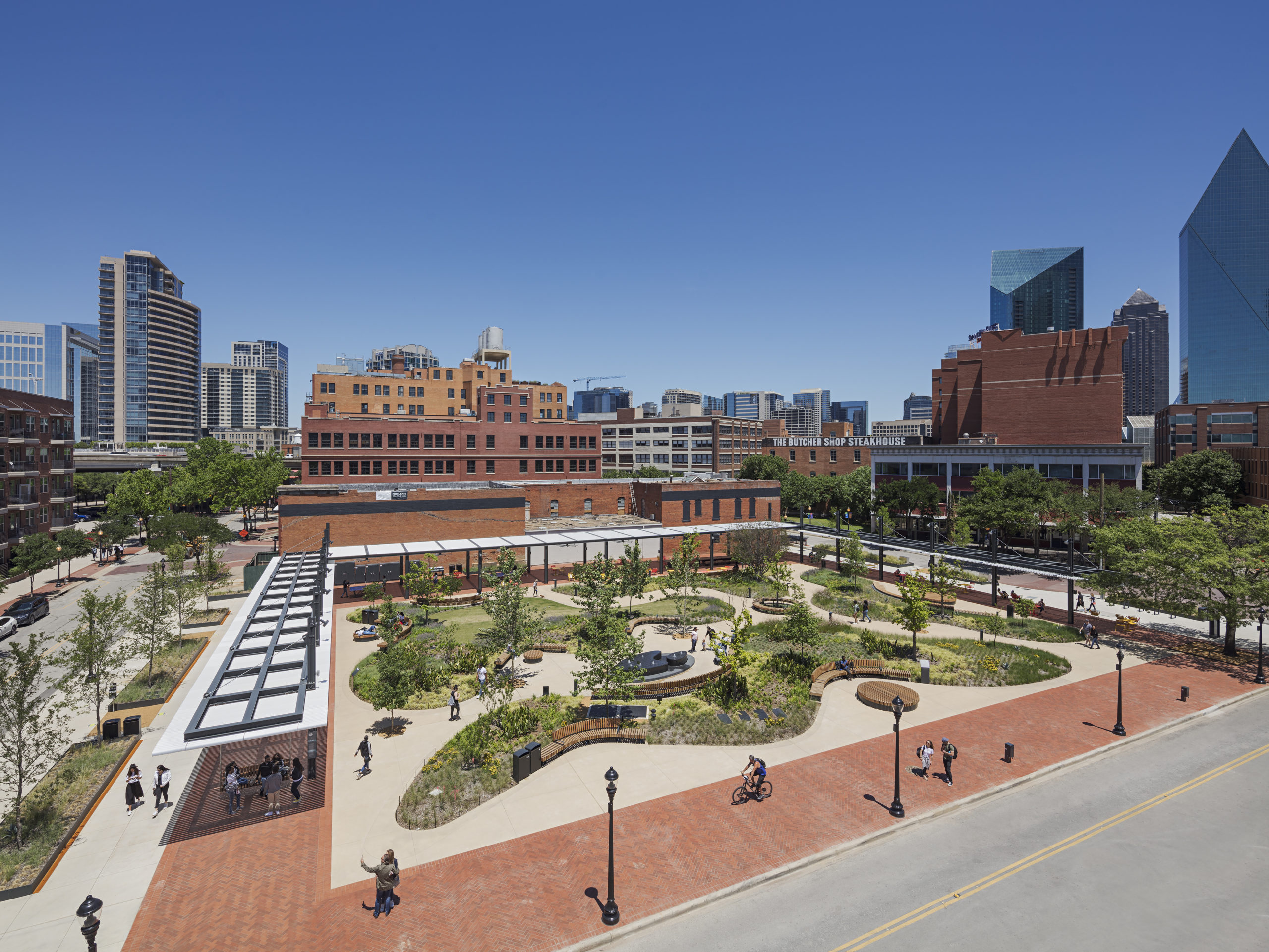
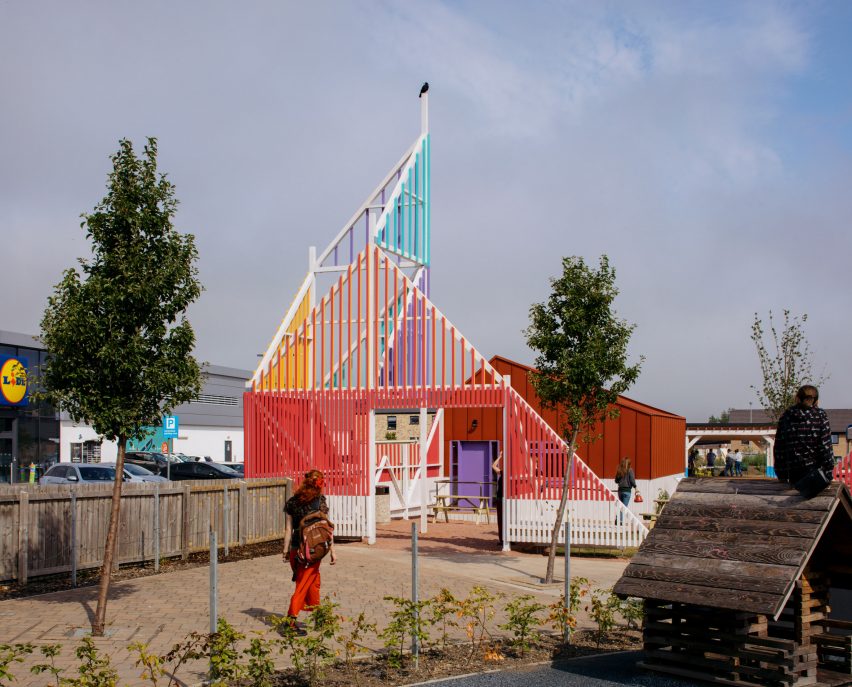
Walk-Up Avenue is a public space for locals ​in Edinburgh by New Practice

Architecture studio New Practice has transformed an unused site in the town centre of Craigmillar, Edinburgh, into a multi-purpose public space for the local community.

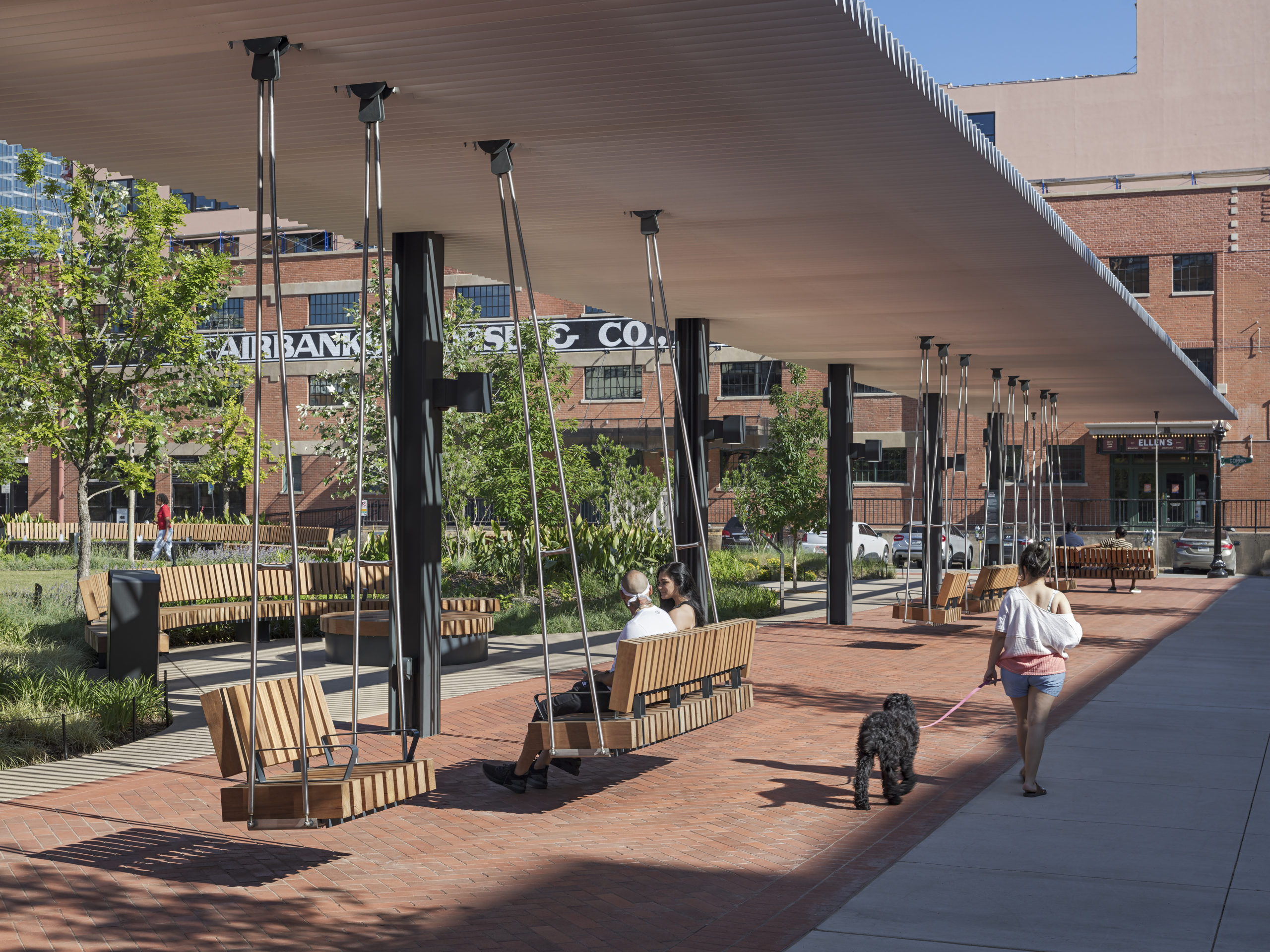
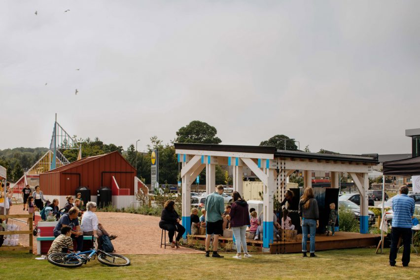
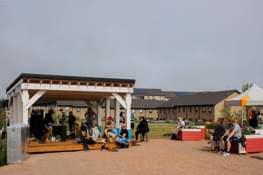
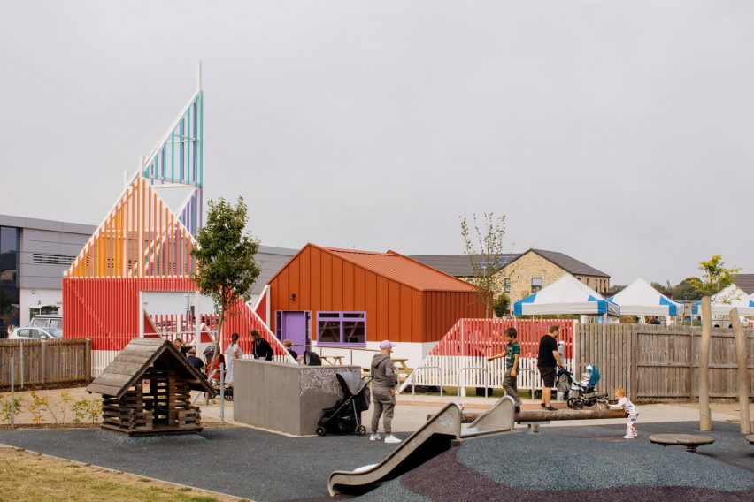
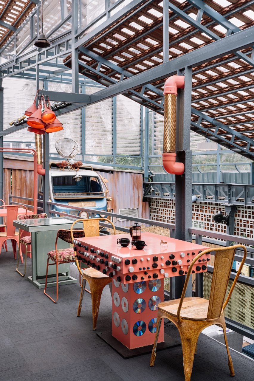
Named Walk-Up Avenue, the site comprises a flexible events space, green-roofed stage, communal garden, cafe and play areas that residents and community groups can use freely.

Walk-Up Avenue colourful timber batten
A tall timber structure marks the entrance

The space was constructed for the City of Edinburgh Council to support small businesses and become a recognisable meeting point in the area.

“Walk Up Avenue aims to create a welcoming and colourful space for the local community to come together and take ownership of for many years to come,” said New Practice.

Green-roof stage and event plaza in Craigmillar
Walk-Up Avenue includes a stage and events space for locals to use

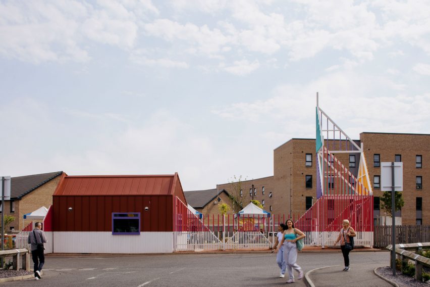
The site of Walk-Up Avenue is located next to a retail park, set back from the main road behind an existing play area.

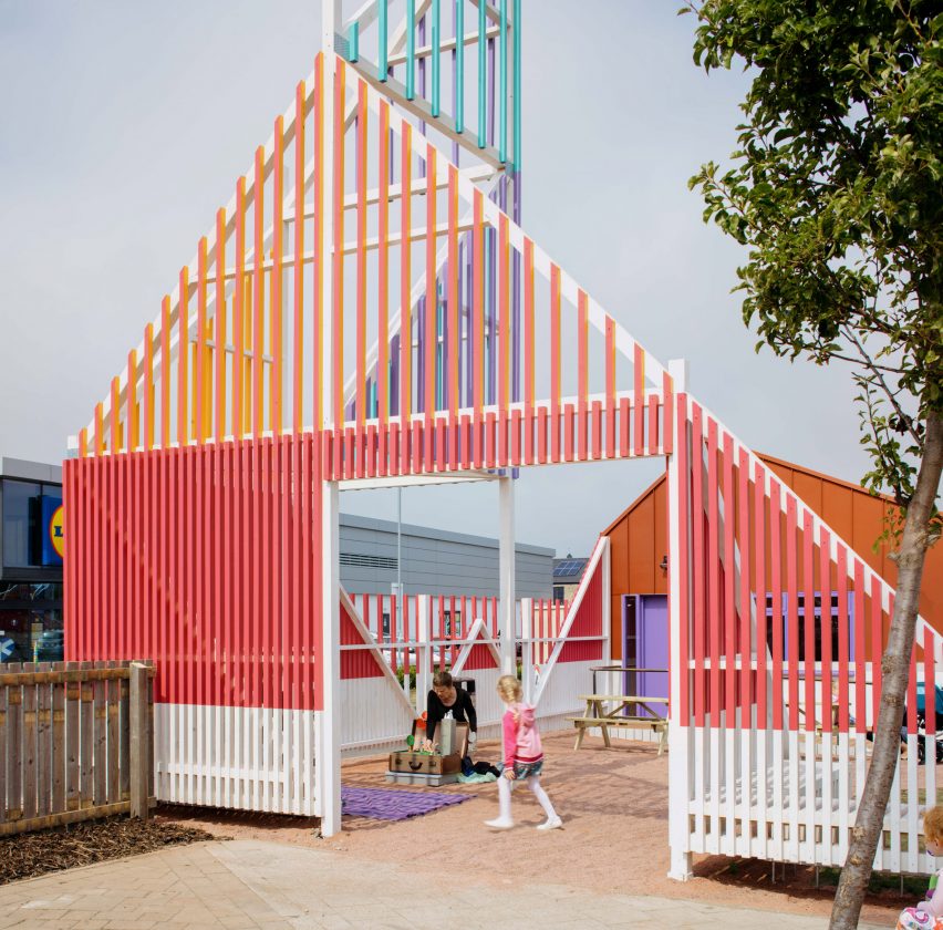
Its entrance connects the plot to the playpark and guides visitors away from the road towards a planted area with picnic tables.

Colourful entrance structure made from timber battens
The “beacon” entrance is made from timber battens

According to New Practice associate Maeve Dolan, Craigmillar’s high street had become disjointed with stretches of inactive frontage.

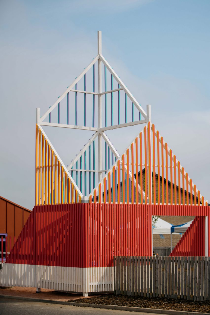
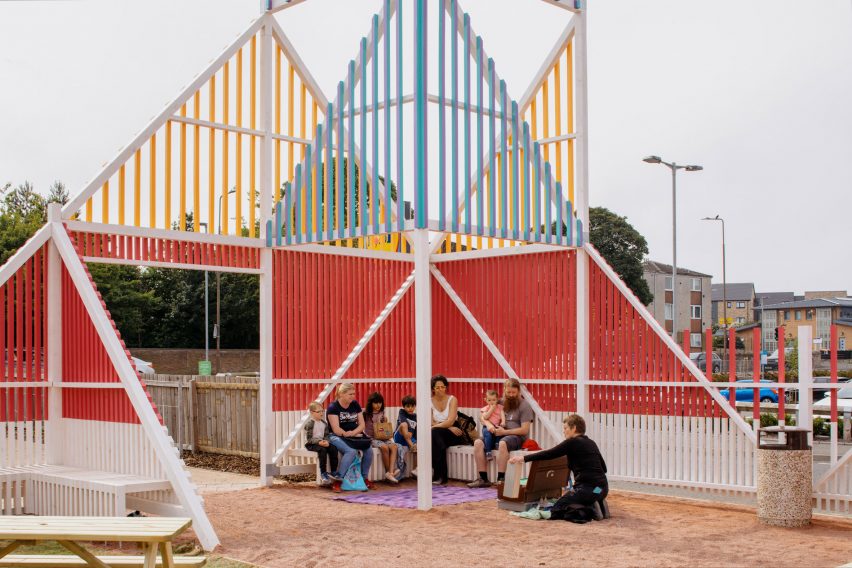
To remedy this, the studio designed a brightly-coloured nine-metre-tall “beacon” made from timber battens to mark the entrance to Walk-Up Avenue.

Entrance structure and steel-clad cafe of Walk-Up Avenue by New Practice
A steel-clad commercial unit was added to help activate the high street

“We needed something big, bright and intriguing which clearly signalled a community use,” Dolan told Dezeen.

“It’s been labelled as the ‘beacon’ on our drawings since the beginning because that’s what we wanted it to act as to passersby, both those on-foot and moving at speed on the busy main road.”

Stage and events space designed by New Practice
The plaza includes seating and box planters

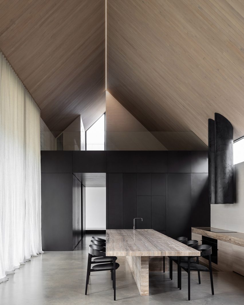
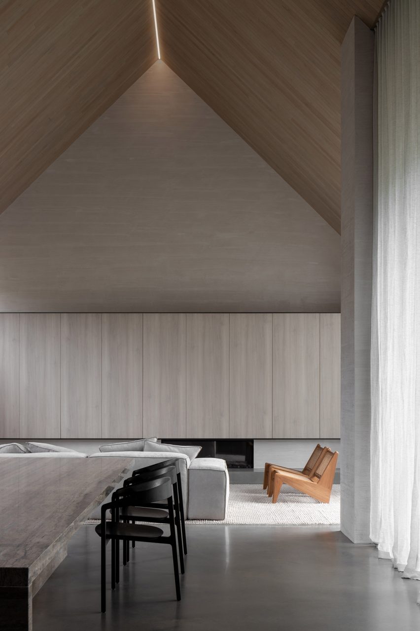
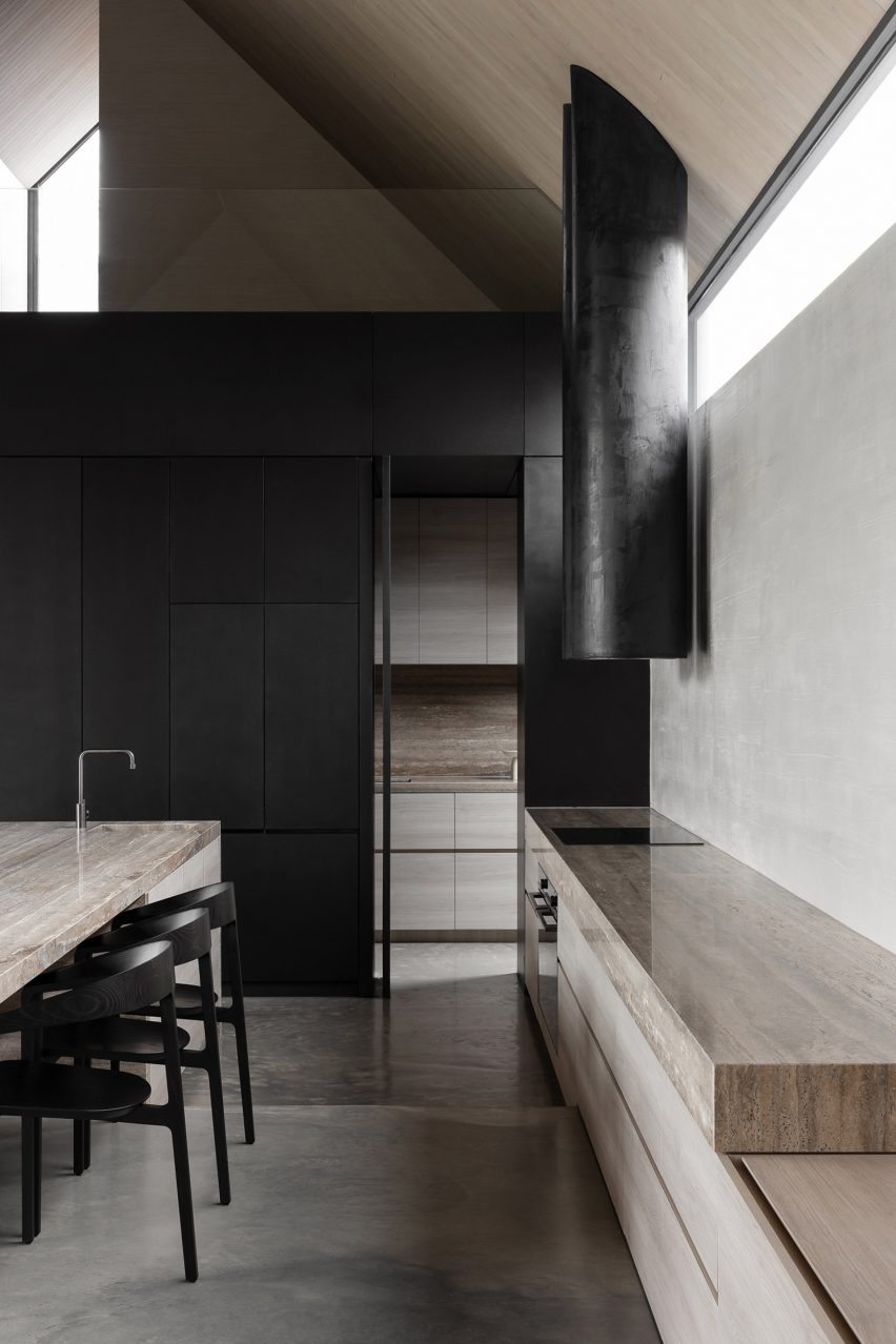
Also at the newly transformed site is a steel-clad structure with a flexible interior and cafe amenities, which New Practice designed for local businesses to help increase activity on the high street.

The building is leased to the Trade Unions in Communities (TUIDC), which intends to run the cafe and use the space to organise educational and employment programmes.

Further into the plot are a green-roofed stage and a plaza with box planters and seating, which neighbourhood groups are encouraged to use to organise their own events.

“Walk-Up Avenue is about creating a lively town-centre gathering place,” said Dolan.

“It is not a prescriptive space but instead provides the foundational infrastructure that invites the community to make use of it as they require, whether that be for rest, socialising, play, exercise, performance, small-scale retail or growing and gardening,” she continued.

Beacon timber entrance at Walk-Up Avenue by New Practice
The project was designed for the local Craigmillar community and visitors

With funding from the government agency NatureScot, infrastructure that helps to create wildlife habitats and prevent flooding was incorporated into the landscaping, including rain gardens, swales, sustainable drainage systems and deep gutters that double as a drinking source for animals.

“The blue-green infrastructure was funded by NatureScot with the aim to produce an educational space where people could see all of these items working together and understand their benefits,” said Dolan.

View of play area in Craigmillar
The entryway connects Walk-Up Avenue with the neighbouring playpark

While offering a public space for local businesses and community groups to flourish, the space is hoped to support the wider regeneration of the Craigmillar area.

It also contributes to Edinburgh’s 20-minute neighbourhood strategy, a scheme that aims to provide all local residents with access to amenities within a short walk or cycle from their homes.

Colourful timber batten structure with seating by New Practice
Seating is added throughout the project

The opening of Walk-Up Avenue coincided with the Craigmillar and Niddrie Community Festival, which saw the plot being used for music and theatre performances and a craft market.

“During this day the most interesting thing was watching how local residents accessed the site, coming through both the formal entrance under the beacon but also filtering in via the soft boundary to back lanes and their private back gardens,” said Dolan.

Another project recently completed by New Practice is the renovation of Kinning Park Complex, a former school building in Glasgow that was saved from demolition.

The photography is by Will Scott.


Project credits:

Architect: New Practice
Landscape architect: Liz Thomas
Construction contractor: Bridgewater building solutions
Quantity surveyor: Currie & Brown
Structural engineer: Will Rudd
Building services engineer: Max Fordham

Reference

Supermarket-style shelves holding books in Deja Vu Recycle Store in Shanghai by Offhand Practice
CategoriesInterior Design

Ten bookshop interiors designed to enhance the browsing experience

A second-hand bookstore styled like a greengrocer and an outlet modelled on old libraries are among the projects collected in our latest lookbook, which explores bookshop interior designs.

Architects and designers across the globe have created bookstores with striking interiors that offer more than just a place to buy things.

From a hall of zigzagged staircases in China to a yellow-hued grotto in east London, here are 10 bookshop interiors that provide immersive and unusual browsing experiences.

This is the latest in our lookbooks series, which provides visual inspiration from Dezeen’s archive. For more inspiration see previous lookbooks featuring brutalist interiors, light-filled atriums and walk-in wardrobes.


Supermarket-style shelves holding books in Deja Vu Recycle Store in Shanghai by Offhand Practice
Photo is by Hu Yanyun

Deja Vu Recycle Store, China, by Offhand Practice

Chinese architecture studio Offhand Practice designed a second-hand bookshop in Shanghai to mimic the interior of a greengrocer by displaying items in familiar supermarket-style crates.

Created to counter the “shabby” image commonly associated with second-hand retailers, Deja Vu Recycle Store features a light interior defined by stone off-cut mosaic tiles and natural pine.

“[The project] breaks the stereotypical image of a second-hand store and erases the ritualistic impression of a traditional bookstore full of full-height bookshelves,” said Offhand Practice.

Find out more about Deja Vu Recycle Store ›


Stone sculpture in wood-panelled bookstore
Photo is by Jonas Bjerre-Poulsen

New Mags, Denmark, by Norm Architects

Coffee table book distributor New Mags commissioned Norm Architects to design the interior of its flagship store in Copenhagen, which nods to the serenity of old libraries.

Natural oak panels were used to create towering display walls for books. Various publications are also presented on stone plinths that echo a looming, organically shaped stone sculpture by local artist Josefine Winding.

Find out more about New Mags ›


Chongqing Zhongshuge Bookstore by X+Living
Photo is by Shao Feng

Chongqing Zhongshuge Bookstore, China, by X+Living

A maze of intricate staircases, amplified by a mirrored ceiling, forms a dramatic backdrop for this bookshop in Chongqing by Shanghai-based studio X+Living.

Thanks to their wide treads, the stairs double as reading nooks for customers, while the overall stepped outline created in the central space intends to reference Chongqing’s urban skyline.

Find out more about Chongqing Zhongshuge Bookstore ›


Bookshop in Italy
Photo is by Žiga Lovšin

Book Centre Trieste, Italy, by SoNo Arhitekti

Another store interior that takes cues from its setting, this Trieste bookshop features boxy shelving that was informed by the diamond brick patterns of the nearby Trieste National Hall.

Slovenian studio SoNo Arhitekti repeated this motif on the shop’s two sofas, which have grid-patterned upholstery. It also reserved space for chunky display podiums and a children’s reading corner.

Find out more about Book Centre Trieste ›


Interiors of They Said Books shop, designed by Lado Lomitashvili
Photo is by Nakanimamasakhlisi

They Said Books, Georgia, by Lado Lomitashvili

They Said Books is a bookshop-cum-cafe in Tbilisi with an interior characterised by Tetris cube-style shelving, yellowed terrazzo tiles and bubble-shaped reflective wall sculptures.

Georgian designer Lado Lomitashvili created the store, which is housed inside a 1930s building, to support the “cultural development” of the country’s capital city.

Find out more about They Said Books ›


Pulse On cinema and lobby
Photo is courtesy of Pulse On

SFC Shangying Cinema Luxe, China, by Pulse On

Hong Kong-based firm Pulse On was informed by the strings of musical instruments when designing the delicate interior of this Shanghai bookshop, which is also the lobby of a cinema.

Thin metal slats extend vertically from floor to ceiling to create bookshelves, while integrated lighting bathes various seating areas in a soft glow.

“We wanted to create a zen resting space for the guests through the mix of ‘strings’ and ‘books’,” explained the designers. “All of this boils down to simplicity and purity of lines – no highly-contrasting colours are used.”

Find out more about SFC Shangying Cinema Luxe ›


Libreria bookshop
Photo is courtesy of SelgasCano

Libreria, UK, by SelgasCano

Author Jorge Luis Borges’ 1940s tale The Library of Babel informed the winding, cavernous interior of Libreria, a London bookshop designed by Spanish studio SelgasCano.

Handmade shelves were crafted in irregular shapes by artists from the Slade School of Fine Art using unfinished recycled wood. They house the store’s many books, which are arranged thematically rather than categorised traditionally, in order to encourage “chance encounters while browsing”.

Find out more about Libreria ›


Wutopia Lab Books in Clouds
Photo is by CreatAR Images

Duoyun Bookstore, China, by Wutopia Lab and Office ZHU

Five different colours delineate the zones inside this Huangyan bookstore, which includes reproductions of rare books exhibited in a tall, wood-panelled stairwell.

Duoyun Bookstore was designed by Wutopia Lab and Office ZHU to feature layers of perforated metal on its facade – a move that saw two disused buildings renovated to create the shop.

Find out more about Duoyun Bookstore ›


MUDA Architects bookshop
Photo is by Arch-Exist

Xinglong Lake Citic Bookstore, China, by MUDA Architects

Chinese studio MUDA Architects topped a lakeside bookstore in Chengdu with a roof shaped like an upturned book that creates a sweeping ceiling on the interior.

Large rectilinear windows are positioned at the edge of the lake to offer views of the surrounding scenery, while the glass extends beneath the waterline to create a peaceful and immersive setting for reading.

Find out more about Xinglong Lake Citic Bookstore ›


Sao Paulo bookshop
Photo is by Fernando Guerra

Livraria Cultura, Brazil, by Studio MK27

The Livraria Cultura – or Culture Bookshop – was designed by Studio MK27 in Brazil’s São Paulo to be “a bookstore of the 21st century” that encourages social interactions.

A vast double-height room is defined by wooden bleachers that span the 21-metre width of the space, where customers are invited to stay and read or meet up even after they have bought their books.

Find out more about Livraria Cultura ›

This is the latest in our lookbooks series, which provides visual inspiration from Dezeen’s archive. For more inspiration see previous lookbooks featuring colourful living rooms, decorative ceilings and deliberately unfinished interiors.

Reference

A platform verifies nature-based solutions for carbon offsetting
CategoriesSustainable News

A platform verifies nature-based solutions for carbon offsetting

Spotted: The number of organisations committing to climate targets and offsetting has been growing rapidly. However, this growth also represents a major challenge, because the voluntary carbon market is still in its infancy, meaning there is a lack of credible emission reduction programmes and questionable investments in carbon projects with no actual reductions.

Climate-tech startup Goodcarbon is working to change this by focusing on nature-based solutions (NbS), such as the conservation and restoration of forests or oceans. Through their platform, Goodcarbon connects NbS projects to capital, giving projects a stream of income and allowing organisations to offset their emissions with verified high-quality NbS projects. Project developers can also use the platform to sell Forward Credit contracts and auction ownership shares in their projects.

All projects listed on Goodcarbon are subject to a stringent verification process. The platform works together with existing verification and standardisation bodies such as Verra and Gold Standard, and also applies its own impact assessment scheme to ensure the platform only hosts the highest quality projects. The advantage for businesses is that not only can they invest, secure in the knowledge they are not greenwashing, but they can also use the platform to turn carbon offsetting into an investment opportunity.

According to many, the voluntary carbon market is largely non-transparent and is swamped with low-quality NbS projects that do not actually work. As Jerome Cochet, Co-Founder And Managing Director Of Goodcarbon, points out, “We have a major supply problem as project developers face significant challenges. They have high upfront costs, but a lack of funding, little appreciation of co-benefits such as biodiversity protection, and a high dependence on brokers. We are here to solve these challenges by converting natural capital into financial products.”

As of September 2022, thousands of organisations, representing $38 trillion, have committed to emission reduction targets approved by the Science Based Targets initiative (SBTi). So it is no wonder that we are seeing a number of innovations aimed at offsetting. These include a platform that makes it easier for farmers to sell carbon credits, and a blockchain infrastructure for trading in forward carbon credits.

Written By: Lisa Magloff

Reference

Multitude of Sins restaurant
CategoriesSustainable News

The Circus Canteen restaurant interior is “collage of unwanted items”

Local studio Multitude of Sins has created an eclectic restaurant interior in Bangalore out of a mishmash of reclaimed materials, including discarded bicycle bells and cassette tape boxes.

Officially called Big Top but known as The Circus Canteen, the restaurant is shortlisted in the sustainable interior category for a 2022 Dezeen Award.

Multitude of Sins restaurant
The Circus Canteen interior is made of almost all reclaimed materials

Multitude of Sins sourced the components that make up the interior from a city-wide waste donation drive held over several weeks.

The materials were then painstakingly curated into distinct categories, ranging from home appliances to toy cars, and used to design an eclectic interior featuring mismatched furniture and flooring.

Scrap metal archways
Visitors enter through a series of scrap metal archways

Less than 10 per cent of the materials used to create the interior were sourced as new, according to the studio.

“The Circus Canteen [was informed by] the concept of creating a collage of unwanted items with a curatorial spirit,” Multitude of Sins founder Smita Thomas told Dezeen.

Abandoned sofas in restaurant
Multitude of Sins created booths out of mismatched objects

Visitors enter the restaurant through a bold scarlet door decorated with unwanted bicycle bells and humourous hand horns, which is accessed via a series of labyrinthine archways made from teal-hued scrap metal.

The archways are illuminated by alternative chandeliers composed of dismantled bicycle chains and old vehicle headlights.

The Circus Canteen
Some of the restaurant tables are decorated with old CDs

Inside, the two-level dining area is made up of custom tables and seating that double as a set of striking installations.

Salvaged objects used to create these booths include abandoned sofas, obsolete bathroom ventilators and colourful coffee tables created from old oil barrels sliced in half and topped with glass surfaces.

“One man’s trash is another man’s treasure,” acknowledged Thomas. “We have seen and felt this phrase come to life as we pieced together The Circus Canteen.”

The restaurant’s flooring is a jigsaw puzzle-style mosaic of sample tiles sourced from ceramics stores, while a kitchen serving hatch is framed by a colourful collection of outdated cassette tape boxes.

Restaurant interior
A serving hatch is framed by cassette tape boxes

Prompted by the desire to create an eatery interior with a minimal carbon footprint, Multitude of Sins’ project responds to many designers’ growing concerns about the wastefulness of their industry.

“The creation of each element – from custom lighting and flooring to art installations and furniture – was attributed to the mercy of the waste donation drive,” said Thomas.

“It reminds us of adapting skillfully, to reinvent with agility.”

The Circus Canteen tables
The Circus Canteen intends to address wastefulness in the design industry

The Circus Canteen is part of Bangalore Creative Circus – a project formed by artists, scientists and other “changemakers” who host various community-focussed events in the Indian city.

Other eateries that feature reclaimed materials include a restaurant in Spain with elements made from upcycled junk and site construction waste and a cafe in Slovenia defined by recycled components that create a mix of patterns and textures.

The photography is by Ishita Sitwala.


Reference

LG's UltraFine Display Ergo Boasts Color Precision and Ergonomic Comfort
CategoriesArchitecture

LG’s UltraFine Display Ergo Boasts Color Precision and Ergonomic Comfort

Architizer Journal is reader-supported. When you buy through links on our site, we may earn an affiliate commission. Learn more.

The LG 32UN880-B UltraFine Display Ergo monitor is designed to move with and adjust to architects’ needs. Taking ergonomic functions and visual display into deep consideration, this device has exceptional image quality, convenient flexibility and surprising portability.

This monitor was engineered to best serve architects and designs and has received countless awards, including the iF Design Talent Award a few years back. The UHD 4K IPS Display makes for an incredibly lifelike and realistic resolution, which creates a crisp and clear image display that designers can trust. The UHD IPS display enhances contrast, clarity and wide-angle details, all while exhibiting true color representation. Such visual accuracy puts trust in architects that their work is displayed accurately and will closely reflect their real-life design.

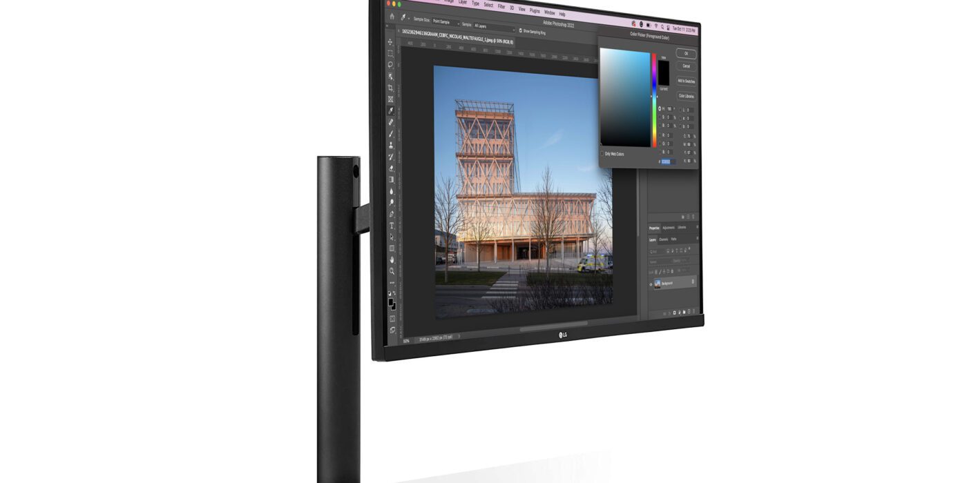
The UltraFine Display Ergo monitor has an extremely flexible and ergonomic desktop setup. This monitor can be secured on any surface and in seconds thanks to its One Click Mount and C-Clamp. It can then be adjusted to fit the user’s preferred height and tilt angle, making it a great device for designers meticulously working on renderings and edits. The monitor is equally ideal for collaborative environments; designers can pivot the screen during meetings and easily share images with clients and coworkers.

Designers who have leveraged standing desks can equally take advantage of this device by adjusting the height of their monitor depending on their current work setup — whether it be seated or standing. The monitor can swivel up to 280°, pivot 90° and tilt up to 25°. This truly allows for bespoke and personalized working environments that speak to the individual’s posture preferences and work needs. 

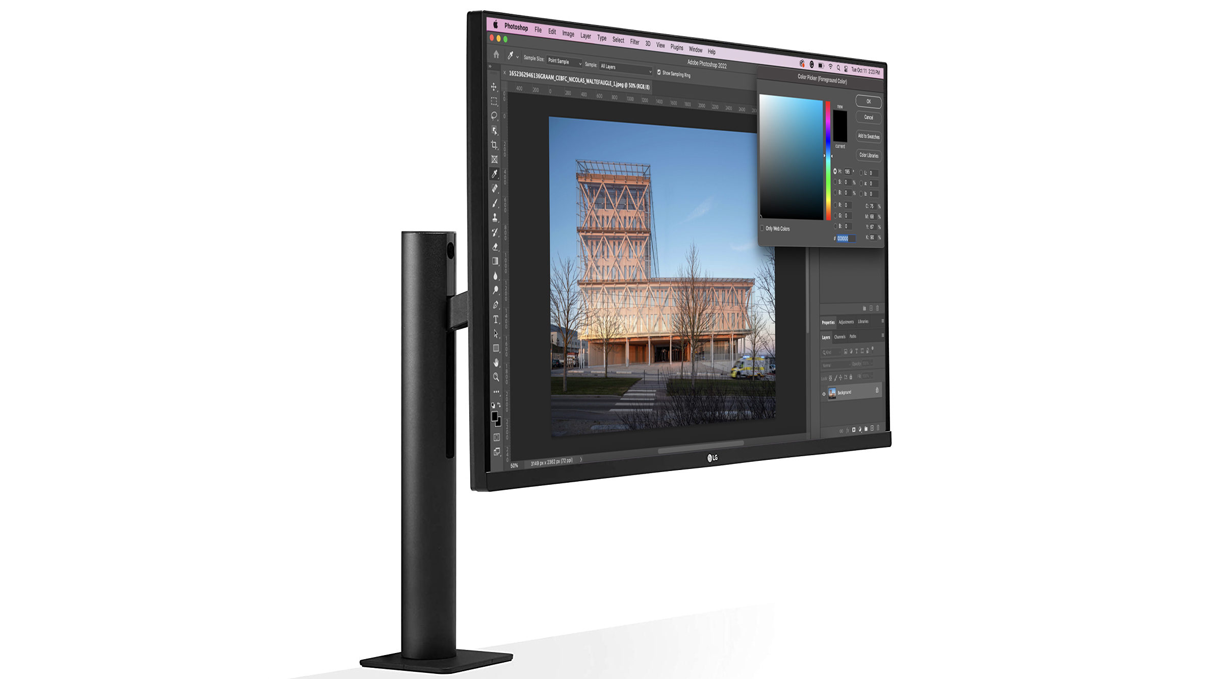
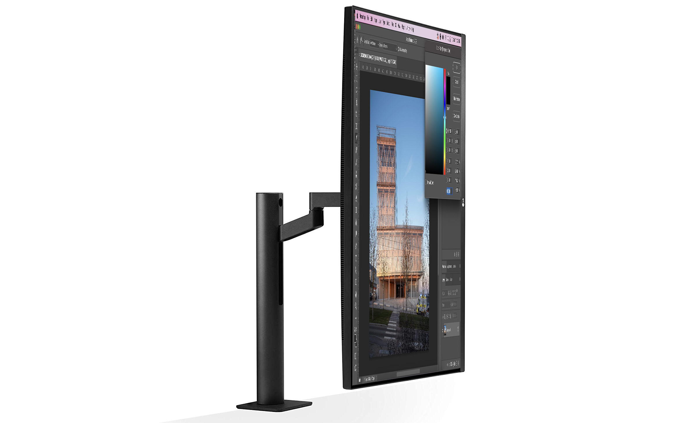
This device is a great fit for designers working in small studio settings as its clutter-free design takes up little desk space. The monitor comes with a USB-C cable, which ensures fast data transfer and fast charging. The USB-C cable improves the device’s efficiency, capability and declutters the desk space.

The LG 32UN880-B UltraFine Display Ergo is ideal for individuals looking to maximize comfort, productiveness and increase visual accuracy in their designs. The monitor is equally suitable for designers working in collaborative environments as the screen can mount on any surface and can be adjusted to fit the ergonomic needs of the user. For that reason, this monitor is a great tool for designers working individually and collaboratively.

For more laptops and workstation recommendations for architects, checkout 15 Top Laptops for Architects and Designers. For more ways to supercharge your workflow, check out more articles in our Tech for Architects series.

Reference

"Maximalism is a manifestation of a desire for a different world"
CategoriesInterior Design

“Maximalism is a manifestation of a desire for a different world”

A return to the frivolous aesthetics of the British Empire tells us that all is not right in the world, writes Samuel Johnson-Schlee, author of the book Living Rooms.


In a moment where climate breakdown, economic uncertainty, geopolitical crisis, and many other things threaten to destroy the things that the middle classes take for granted, there appears to be a renewed interest in the extravagant, the ornate, and the rococo.

For instance, Lulu Lytle, whose design studio Soane Britain – named presumably after the influential architect John Soane – is remarkably upfront in its use of an imperial aesthetic; it even has a range called Egyptomania.

It makes sense that Boris Johnson chose this designer for his controversial Downing Street flat refurbishment, given that they share a nostalgia for an era of British power and colonial plunder. Why though, in a moment where it feels like there is more awareness than ever of the violence and injustice wrought by the British Empire, are we returning to such an aesthetic?

We return to the ornate for some of the same things that were sought from similar aesthetics in the past

On 15 October, the Leighton House Museum re-opened in Holland Park after a major refit. Previously something of a secret, the museum’s publicity machine is now in full swing. The house of a neo-classical Victorian painter, Frederic Leighton, was designed to reflect his enthusiasm for that generically foreign Victorian obsession, The Orient.

The most magnificent room in the house is the so-called Arab Hall. This room was an extension to the house built between 1877 and 1881, designed to display textiles and ceramics gathered from Leighton’s trips to Turkey, Egypt, and Syria.

Some of these objects were purchased, others were “procured” by a friend in the East India Company. A wild array of tiles cover the walls and beneath the golden-domed ceiling, a small fountain burbles. This should not be mistaken for a simple marker of admiration for different cultures – as the great critic of orientalism Edward Said puts it: “European culture gained in strength and identity by setting itself off against the Orient”.

Why are we drawn back to this aesthetic? It is too simple to attribute it to nostalgia alone and should be seen in the broader context of the trend for maximalism. We return to the ornate for some of the same things that were sought from similar aesthetics in the past.

If you scroll through Instagram you will find many of the elements of the bourgeois home of the nineteenth century. Pot plants, gallery walls, velvet, wallpaper, lace: the basic language of the fashionable urban middle classes from the early decades of industrialised capitalism are making a comeback. Perhaps we are doing something akin to the Orientalists, setting modern life off against an impossibly distant other in order to better come to terms with the world we live in.

The designers House of Hackney are purveyors of a pattern-clashing William Morris redux; it is as if Dennis Severs’ house had been processed through a succession of lurid Instagram filters. However, they do not tend to dwell on their obvious historical influences.

On their website, their Wallpaper Plantasia, a multi-coloured riff on the landscapes of French Toile du Jouy, is described as: “our vision of an idyllic landscape, completely untouched by man”. Instead of claiming authenticity via craftsmanship or historical detail, they are reproducing the back-to-nature fantasies of people like philosopher Jean Jacques Rousseau who, reeling at the alienation of the coming Industrial Age, idealised the life of the pre-cultural ‘savage’ [sic].

There is also an element of the surreal in the current trend for maximalism

This untethered enthusiasm for an imagined naturalness recalls bourgeois Victorian crazes for natural history, such as the vogue for ferns known as pteridomania, which launched dozens of designs, including the decoration on a custard cream biscuit. The House of Hackney designers wear their romanticism on their sleeves, their expensive products offer a way of introducing a reconstructed pastoral life within the confines of an East London home.

There is also an element of the surreal in the current trend for maximalism. In a recent article on this site, the live-in premises of Studio Job present what the designer Job Smeets refers to as a ‘visual assault’.

In the Design Museum, the exhibition Objects of Desire draws our attention to the history of surrealism and interior design. Particularly striking are the dream-like interiors that Salvador Dalí helped design for Edward James’ Sussex home Monkton House. Plush colour-clashing rooms include chairs with hands, telephones with Lobsters on top, and Mae West’s lips transformed into a sofa.

One of the best objects in the exhibition is a green carpet decorated with the footprints of James’ wife after leaving the bath. The effect of such extravagance is to create a kind of dream world, a space where it seems that the rules of reality are suspended and that all of your wishes might be fulfilled.

We create a space in which we can retreat from all the terror outside

We are looking for the same things in this aesthetic as the bourgeois did in their nineteenth-century apartments. The philosopher Walter Benjamin compared the homes of wealthy city-dwellers in the nineteenth century to the inside of a compass case, the body held in place by folds of violet velour. He described the wildly busy world of knickknacks, doilies, chintz and velvet as if it were the manifestation of a kind of religion, calling these objects ‘fallen household deities’ arranged to protect the householder from the violence and cruelty of the world outside. The same world that these people were profiting from.

By cultivating somewhere to live that is dream-like, natural, or utterly different from our everyday lives, we create a space in which we can retreat from all the terror outside. And just as was the case in the nineteenth century, the more money you spend the more protected you can become, hidden amongst your excessive home décor.

I’m not making a judgment, I am as susceptible to a brightly coloured wall and a clashing floral pattern as the next person, but it is important to recognise that even the most apparently frivolous design is shaped by the present moment. In contrast to the optimism that accompanied the slick minimalism of the nineties, the terrifying situation that we live in today has conjured a desire for the wealthy to hide themselves away.

But it is more than simple escape that drives this trend – I think unconsciously we are reaching for something. Maximalism is a manifestation of a desire for a different world, and if we can reflect critically on the kinds of things we are reaching for, we might also be able to find greater impetus to act to prevent the coming of the world that is so frightening.

Sam Johnson-Schlee is an academic and writer living by the sea in North Essex. He teaches Town Planning at London South Bank University. His first book, Living Rooms, is published by Peninsula Press on 10 November this year.

Reference

Moss wall biofilters clean and cool city air
CategoriesSustainable News

Moss wall biofilters clean and cool city air

Spotted: Moss is a highly efficient, natural air filter, attracting tiny dust particles to its fine, dense leaves. The plant biodegrades, stores, and eats airborne particles such as soot, ammonium salts, carbon dioxide, and pollen, all of which are harmful to human health. Moss also absorbs warm air, producing a local cooling effect as heat evaporates.  

Greencity Solutions tested 16,000 species of moss to find the most effective ones for use in moss wall biofilters. Living walls are becoming more common architectural features, and with the new moss version, cities have an improved ability to bring the fresh smell and clean air of a forest to crowded, busy locations. After removing the pollution and decreasing the temperature of the air, the moss releases cleaned, cooled air. The effects can be measured up to one and a half metres away from the wall.

Greencity’s three solutions are the CityTree, CityBreeze, and WallBreeze. All three designs use internet of things (IoT) technology to track local conditions and footfall and are connected to a proprietary, cloud-based data platform that automates irrigation and tracks plant growth and health.

The CityTree is a freestanding pillar with a bench that cleans air from all angles. The pillar includes space for an LED screen or poster, allowing owners to customise and change messaging. The CityBreeze is a slimmer design created for high-traffic areas such as train platforms, shopping centres, and car parks. One side is a moss wall and one side is a 75-inch LED screen for high-resolution communication. The WallBreeze is fitted onto a wall, and up to 25 panels can be connected for management by a single account on the data platform.

Springwise has spotted a range of green wall innovations, with some more experimental and in early stages, such as 3D printing with soil, and others that are well-developed, policy-focused solutions seeking immediate, permanent change. That latter includes an organisation in Spain working with local governments to expand the numbers of green roofs.  

Written By: Keely Khoury

Reference

Rammed concrete building
CategoriesSustainable News

Six material innovations aimed at slashing concrete’s carbon footprint

After Seratech’s carbon-neutral cement won the 2022 Obel Award, Dezeen has rounded up six ways in which researchers are working to decarbonise concrete – the single most polluting building material in the world.

Currently, concrete’s key ingredient cement is responsible for around eight per cent of global emissions, surpassing all other materials except oil, gas and coal.

But as the world – and the Global Cement and Concrete Association (GCCA) – race to reach net-zero emissions by 2050 to avoid the worst effects of climate change, a growing number of material innovations are emerging to tackle concrete’s carbon footprint.

Mostly, these focus on finding low-carbon substitutes for cement, making use of everything from algae-grown limestone to olivine – an abundant mineral that can absorb its own mass in carbon dioxide.

But none of these alternatives is currently available at the necessary scale to reach net-zero emissions by mid-century, according to Cambridge University engineering professor Julian Allwood.

“Despite the enormous range of innovations in cement that are being publicised, there are no substitutes with all the same performance characteristics and scale as Portland cement,” Allwood said in a speech at the Built Environment Summit.

To help buy the construction industry time to scale up viable alternatives, other researchers are looking at slashing the embodied carbon footprint of buildings by developing clever construction techniques to reduce the amount of concrete needed in their construction.

Below, we’ve rounded up six of the most innovative projects across both approaches:


Seratech carbon-neutral concrete wins Obel Award 2022
Photo is by Helene Sandberg

Seratech by Sam Draper and Barney Shanks

London start-up Seratech has developed a way of creating carbon-neutral concrete, which involves replacing up to 40 per cent of its cement content with a type of silica made from captured industrial emissions and the carbon-absorbing mineral olivine.

All of the emissions associated with the remaining cement are offset by the CO2 that is sequestered by the silica, the company claims, which would make the material overall carbon neutral.

The cement substitute is both low-cost and easy to scale, Seratech says, because it can be integrated seamlessly into existing production processes and because olivine is an abundant material – unlike other cement substitutes like ground granulated blast-furnace slag (GGBS).

Find out more about Seratech ›


Cube of concrete made with algae-grown limestone
Photo courtesy of Glenn Asakawa and the University of Colorado

Biogenic Limestone by Minus Materials

Taking a more experimental approach, researchers from the University of Colorado in Boulder have found a way to make cement using limestone that was grown by algae through photosynthesis, rather than limestone that was mined from the earth.

When this “biogenic limestone” is burned to make cement, it will only emit as much carbon as the microalgae drew down from the atmosphere during its growth, which researchers say makes the process carbon neutral.

If the ground limestone, which is typically added to the cement mixture as a filler, is also replaced with the algae-grown alternative the material could even be carbon negative, as the carbon stored in the aggregate would be sequestered instead of burned.

Supported by a $3.2 million (£2.7 million) grant from the US Department of Energy, the researchers are now working to scale up their manufacturing capabilities, while lowing the price of the material by also using the coccolithophores microalgae to make more expensive items like cosmetics, biofuels and food.

Find out more about Biogenic Limestone ›


Paul Shepherd stands atop the ACORN vaulted concrete floor prototype at the University of Cambridge
Photo courtesy of ACORN

Concrete vaulted flooring by ACORN

As part of the ACORN project, researchers from the universities of Bath, Cambridge and Dundee have developed a thin-shell vaulted flooring system, which can be used to replace traditional solid floor slabs while using 75 per cent less concrete to carry the same load.

This resulted in an estimated 60 per cent reduction in carbon emissions for the team’s first full-scale demo project, built inside Cambridge University’s Civil Engineering Department.

“Since concrete is the world’s most widely consumed material after water […] the easiest way for construction to begin its journey to net-zero is to use less concrete,” said ACORN principal investigator Paul Shepherd from Bath’s Department of Architecture and Civil Engineering.

Made using an automated manufacturing system and a six-axis robot, the flooring also functions completely without reinforcements, eliminating the need for emissions-intensive steel rebar.

Find out more about concrete vaulted floors ›


Concrete masonry unit by Carbicrete
Photo courtesy of Carbicrete

Carbicrete by McGill University

Montreal-based Carbicrete is among a number of companies making use of waste slag from the steel industry to completely eliminate the need for cement in the concrete production process.

Instead of the water used in traditional concrete production, this cement substitute is then cured with captured CO2 from factory flues, which is sequestered in the material to make it carbon neutral.

However, this process can so far only be used to make precast panels and concrete masonry units. And due to the limited amount of steel slag produced every year – around 250 million tonnes compared to four billion tons of cement – Carbicrete could only be used to meet a fraction of the demand.

Find out more about Carbicrete ›


Sea Stone by Newtab-22
Photo courtesy of Newtab-22

Sea Stone by Newtab-22

On a smaller scale, London design studio Newtab-22 has developed a concrete-like material made using waste seashells from the food industry, which are ground up and combined with a patent-pending mix of natural binders such as agar.

Called Sea Stone, the resulting material looks strikingly similar to real concrete since the oyster and mussel shells it contains are made from calcium carbonate, otherwise known as limestone – a key ingredient in cement.

But as the material is not fired, it lacks the strength and durability of real concrete and is restricted to non-structural applications, including surfaces such as tabletop and tiles as well as plinths and vases.

Find out more about Sea Stone ›


Close up of precast concrete slab with hollow cells created using 3D-printed FoamWork by ETH Zurich
Photo is by Patrick Bedarf

FoamWork by ETH Zurich

Another technique for using less concrete comes from researchers at ETH Zurich, who have developed a system of 3D-printed formwork elements. Made from recyclable mineral foam, these can be placed inside the moulds used to make pre-cast concrete panels, creating a pattern of hollow cells throughout the slab.

The formwork creates an internal geometry, which was optimised to reinforce the panel along its principal stress lines and provides the necessary strength to create everything from walls to entire roofs, while drastically reducing the amount of concrete needed in the process.

This creates panels that are lighter and use 70 per cent less material. And after curing, the mineral foam can either be left in place to provide insulation or endlessly recycled to create new formwork elements, which ETH Zurich says makes the process potentially zero waste.

Find out more about FoamWork ›

Reference

Five Fundamental Takeaways From Architizer's Future Fest
CategoriesArchitecture

Five Fundamental Takeaways From Architizer’s Future Fest

Architizer is thrilled to announce that the 11th Annual A+Awards is open for entries! With an Early Entry Deadline of November 4th, 2022, the clock is ticking — get started on your submission today.

Architizer’s global Future Fest was a truly epic event: comprising a series of fifteen motivating, refreshing and awe-inspiring talks, there was a whole lot jam-packed into its three-week span. Led by the industry’s leaders and A+Awards-winning architects, Future Fest left everyone with plenty to think about and reflect upon. For those unable to attend or who want a little refresher, here are five key themes that resurfaced across speakers’ talks. 

1. Architecture Must Be Democratized 

One of the main themes that undergird the talks from Future Fest is that democratizing architecture is paramount — both in terms of the spaces built as well as the ideas used. Democratic architecture begins in the conceptual stage, and as building techniques and technological innovations continue to evolve, these advancements must be accessible to all.

Tiny Victories by Michael Hsu Office of Architecture, Austin, TX, United States, 2020. Finalist, 2021 Annual A+Awards, Architecture +Living Small

Tiny Victories by Michael Hsu Office of Architecture, Austin, TX, United States, 2020. Finalist, 2021A+Awards,  Architecture +Living Small

Tiny Victories by Michael Hsu Office of Architecture in collaboration with EQUITONE perfectly exemplifies this point. This project sought to create a house typology for displaced homeless folks which could easily be operated and maintained. The design team came up with an insular, inward-focused dwelling built with durable materials. This design was a breakthrough in small home typologies, and Michael Hsu’s office reminds us that such breakthroughs should be repeated, and repeated by many. What good does a breakthrough design do if it’s not shared?  

Watch Michael Hsu & Equitone’s (Free) Live Talk

Not only should access to building techniques and typologies be equitable, but so should the very way we utilize space. As Fokke Moerel, partner at MVRDV, explained in her talk, Places For All, art and architecture can and should be used as a tool for inclusivity, no matter the location, scale or budget. Take for example Concordia Design Wroclaw, a private co-working space. Despite the fact that the center is privately owned, the design team encouraged its clients to erect a rooftop garden that can be enjoyed by the public. This project demonstrates that no matter location, scale or budget, architecture can always serve as a tool for inclusivity and equity.

Watch  Fokke’s (Free) Live Talk

Shajay Bhoosham sums it up precisely, we need a “global best practice,” an ideological switch where designers think beyond the request of the client, but for the community at-large.

Al Hosn Masterplan and Landscape Design by CEBRA, Abu Dhabi, United Arab Emirates, 2019. Popular Choice Winner, 10th Annual A+Awards, Urban and Masterplan

2. The Proof Is In The Past 

Designers should not simply respect the architecture of the past, but should also leverage the knowledge of the past. Various Future Fest speakers emphasized that adapting old-age techniques and reinterpreting them to the modern context is oftentimes the most sustainable and practical building solution. Vernacular craft can sometimes pose simple solutions to complex problems.

Mikkel Frost, co-founder of CEBRA, shares his firm’s masterplan and preservation of the Cultural Foundation building. In order to preserve one of Abu Dhabi’s most historically-significant structures, a series of installations were mounted in the building’s library. These installations fostered a dynamic exchange while still respecting the original edifice. The installations are not fixed and can therefore be transported anywhere and removed at anytime.

Watch Mikkel’s (Free) Live Talk

When it comes to interpreting history, designers must find that sweet spot between preserving the past while not being limited by it. Shajay Bhoosan also shared how Zaha Hadid Architects blend ancient principles and geometries with modern-day technology to build structures that pose less harm to the environment. The design industry is overwhelmed by new materials and technologies to choose from, but many of our Future Fest speakers remind us to look backwards to existing precedents and to utilize the incredible knowledge of the past .

3. Engage The Community At The Conceptual Stage 

An overarching theme seen throughout Future Fest was community engagement. Andre Brumfield, design director at Gensler, shares how community engagement is intrinsic to his firm’s design process. When remodeling affordable housing neighborhoods, one of the most important parts of the process is leveraging the ideas and opinions of the very residents that inhabit the space.

Watch Andre’s (Free) Live Talk

Community members are often the very folks who best understand the building site in question, and utilizing their input as a guiding principle is immensely beneficial. Mikkel Frost puts it simply, the most important part of a public space is the people, and public meetings and outreach efforts help architects better understand the needs of the community. Moreover, utilizing the public vote can often serve as a gateway to realize a project. Utilizing the voices of the public is sometimes all it takes for a project to come to fruition.

West End Square by James Corner Field Operations, Dallas, TX, United States, 2021. Popular Choice Winner, 10th Annual A+Awards, Public Parks & Green Spaces

4. Good Architecture Is Adaptable 

When we think about architecture, we often think of permanent, long-lasting and static structures. However, many of the Future Fest speakers encouraged us to think differently. Sometimes the most successful designs are not the structures that last the longest, but the structures that can transform. Adaptive reuse has become such an integral part of our built environment, as repurposing what already exists is an essential part of creating a sustainable future. When building new structures, designers must think less about permanence and more about malleability. When designing for the public realm, Rob Rogers, partner at ROGERS PARTNERS, shares how critical it is to design for flexible use; because, when you over-program, you are limiting the space’s use, and thus doing a disservice to the community.

Watch Rob’s (Free) Live Talk

West End Square by James Corner Field Operations is a prime example of a project designed for versatility. West End Square is an adaptive reuse design that turns an old parking lot into a vibrant public park. Principal Isabel Castilla explains how the site was designed to facilitate a variety of programs, such as farmer’s markets and salsa classes. The site was conceived as a ‘smart park’ in order to accommodate the fast-paced technological advancements that often move faster than architecture. A trellis was built and serves as a technology armature that can be easily accessed and updated over time. The West End Square thus serves as a community anchor that pivots alongside society and adapts to whatever occasion.

Watch Isabel’s (Free) Live Talk

5. Architecture Must Heal 

Wandile Mthiyane, director of the Ubuntu Design Group, predicts that the future of architecture will be much more centered around helping communities heal. Today’s strong cultural and socio-political shifts will lead to a future generation of architects that prioritize mental and emotional health. Architecture has been (and still is) often used to separate and differentiate groups and communities, and it is a designer’s responsibility to undo the division present in our built environment. Wandile reminds us to think of architecture with increased concern for the emotional wellbeing of people. Architecture is a powerful vessel that can help remedy socio-economic disparities, heal racial wounds and mitigate mental health crises. Through conscious and deliberate material choices and clear objectives, architecture can help society heal.

Watch The Future Fest Finale (Free)

Are you interested in taking part in an event like Future Fest, and sharing your ideas about architecture with Architzer’s global community? Consider entering the the 11th Annual A+Awards. With an Early Entry Deadline of November 4th, 2022, the clock is ticking — get started on your submission today.  

Reference

Black Australian cottage
CategoriesInterior Design

Material and spatial contrasts define Barwon Heads House

Australian studio Adam Kane Architects has renovated a cottage on a quiet coastal street in Barwon Heads and connected it to a barn-like extension by a glazed link.

Named Barwon Heads House, the project was designed by Melbourne studio Adam Kane Architects as a contemporary dwelling that embodied a “relaxed, coastal lifestyle”.

Black Australian cottage
Adam Kane Architects extended and renovated a cottage in Barwon Heads

Prior to Adam Kane Architects‘ renovation and extension, the neglected weatherboarded cottage was known locally as “the dump”.

Its transformation led it to be shortlisted house interior of the year in the Dezeen Awards 2022 and win the public vote for the same category.

Exterior image of Barwon Heads House by Adam Kane Architects
Barwon Heads House is clad in wood

Adopting a minimal palette of monochrome contrasts, the studio painted the existing cottage’s exterior entirely black, pairing it with a lighter extension clad in silvery-grey weathered wooden planks.

Beneath steeply pitched black metal roofs, this play of contrasts continues to the interiors, creating a spatial journey of “compression and release” that begins in the more compartmentalised cottage containing three bedrooms and a bathroom.

Interior image of the dining and kitchen area of Australian house
Contrasting colours and materials feature throughout

Moving through the existing cottage into the small glazed link and a dark corridor, Barwon Heads House’s extension opens up into a large living and dining space, overlooked by the main bedroom on a mezzanine above.

Full-height windows look out to Barwon Heads House’s garden to the north, while a narrow clerestory-level window opposite draws in light above its kitchen.

“Access to the extension is via an enclosed corridor, lined with black mottled joinery panels on walls and ceilings, and is used to conceal doorways into the rumpus, laundry and storage areas,” said Adam Kane Architects.

“The ‘journey’ through this dark corridor with a lower ceiling creates a sense of compression before a sense of release when walking towards the living room, where the gable opens up into the main space,” it continued.

Living area of Australian cottage extension
The extension has a deliberately simple finish

Existing features were retained in the cottage, while the extension has a deliberately simple interior finished with oak panelling and exposed concrete. Slabs of travertine marble are used as countertops, coffee tables and a large dining table.

“Heritage features are maintained through the use of the original lining board ceilings, as well as period skirting and architraves, which fit perfectly with the renewed tones,” said the studio.

“The timber lining helps blur the threshold between inside and out, delineating zones, making spaces feel more generous and contributing to the relaxed feel of the home.”

Black kitchen with stone worktops
It is designed as a spatial journey of “compression and release”

Adam Kane Architects was founded in 2015, and its previous projects include a bridal boutique in Melbourne with minimal finishes of concrete and marble.

Alongside Barwon Heads House, other projects shortlisted in the house interior category of Dezeen Awards 2022 include a home in Melbourne with a palette of “organic” materials by Brave New Eco and the renovation of a 120-year-old townhouse in Kyoto by Td-Atelier and Endo Shojiro Design.

The photography is by Timothy Kaye.

Reference