The world’s first virtual reality company for social good
CategoriesSustainable News

The world’s first virtual reality company for social good

Spotted: When most people think of virtual reality (VR), they think of entertainment. But Dutch startup Enliven has a different idea. The company is using VR to create a more understanding and empathetic society. Started by Iranian refugee Alex Tavassoli, who arrived in the Netherlands as a young child, the company is developing VR tech that allows users to see and feel the world from the point of view of those experiencing bullying, discrimination, inequality, and sexual harassment. 

Enliven has developed software to run on VR headsets, such as the Oculus Quest. Enliven only sells the software, but does work closely with hardware manufacturers and distributors. The target audience for its platform is companies conducting employee training sessions, but the company has also developed software on the themes of domestic violence and mild mental disability together with the Dutch Ministry of Justice and the Dutch Probabation Service.

According to Enliven, the approach of putting oneself into the virtual shoes of those experiencing crisis has been demonstrated to increase awareness of the emotional and mental impact of destructive behaviour. It claims the experience also improves the chances that users will recognise and adapt their own behaviour.

In addition to providing software, Enliven provides companies with training in how to use it and can also develop bespoke VR to address specific situations. Tavassoli is clear, however, that his biggest motivation is to increase compassion, saying that, “every time someone experiences our content, they are exponentially more likely to act against domestic violence, bullying, or discrimination.”

At Springwise, we have seen VR used in a number of innovative ways, including to test cognitive skills and in the treatment of phobias. This is the first application we have seen that aims to increase empathy and compassion. However, Enliven is keen to point out that the platform is no panacea, saying, “The VR simulation must always be part of a training or course. After the virtual reality experience made its impact, it is up to you as trainer or teacher to turn this into effective (behavioural) change.” 

Written By: Lisa Magloff

Reference

British-made Ecovado offers low-impact alternative to avocado
CategoriesSustainable News

British-made Ecovado offers low-impact alternative to avocado

Central Saint Martins graduate Arina Shokouhi has invented an avocado alternative called Ecovado, which is meant to wean people off the resource-intensive imported fruit.

The Ecovado contains a pale green, creamy foodstuff made from a combination of ingredients local to its country and packaged in a fake avocado skin fashioned from wax.

Shokouhi, who is a recent graduate of London school Central Saint Martins’ masters in Material Futures, created the product to help people reduce the amount of avocado they eat while still indulging their cravings for its flesh.
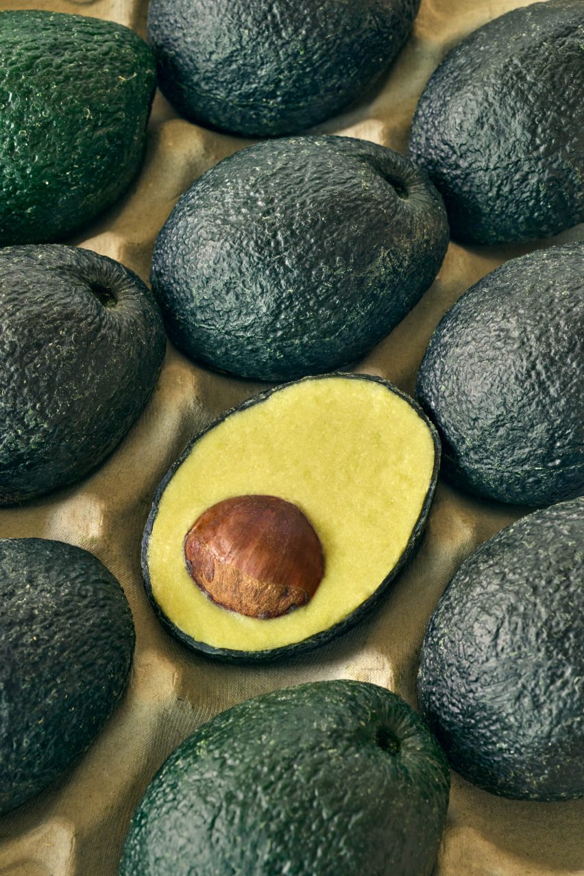
Close-up photo of a sliced-open Ecovado
The Ecovado is an avocado alternative made from local ingredients

“The avocado has become a modern-day cultural icon synonymous with hipster cafes and trendy Instagram posts,” said Shokouhi.

“However, avocado production is energy-intensive and resource-intensive: each avocado requires 320 litres of water to grow and harvest internationally.”

“Avocados are one of the most unsustainable crops to export because of their delicate, easy-to-bruise nature, and the plantation-style monoculture farms required to meet the global demand for avocados are driving the deforestation of some of the most diverse landscapes in the world.”
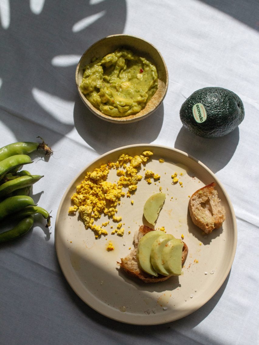
Photo of Ecovado sliced on toast on a plate surrounded by green dip and broad beans
The British version is made primarily with broad beans

To come up with the Evocado recipe, Shokouhi worked with food scientist Jack Wallman from the University of Nottingham’s Food Innovation Centre. He helped her identify the chemical and molecular composition of avocados and showed her how to go about finding suitable replacements.

The Ecovado she made for her final-year project is designed for the British market and employs primarily broad beans, hazelnut, apple and rapeseed oil.

Shokouhi says approximating the flavour and texture of avocado with only local, natural, low-impact ingredients was a huge challenge.

“The flavour of avocado is quite subtle and, overall, is most often described as ‘creamy’,” Shokouhi told Dezeen. “On the other hand, broad beans can contain quite a lot of bitter compounds called tannins and can have a beany flavour caused by lipoxygenase.”

“To reduce the bitterness, we reduced the amount of broad beans in the recipe,” she continued. “The flavour of avocado has been described as ‘nutty’. So we used creamed hazelnuts which would bring a good amount of fat, adding to the creaminess.”
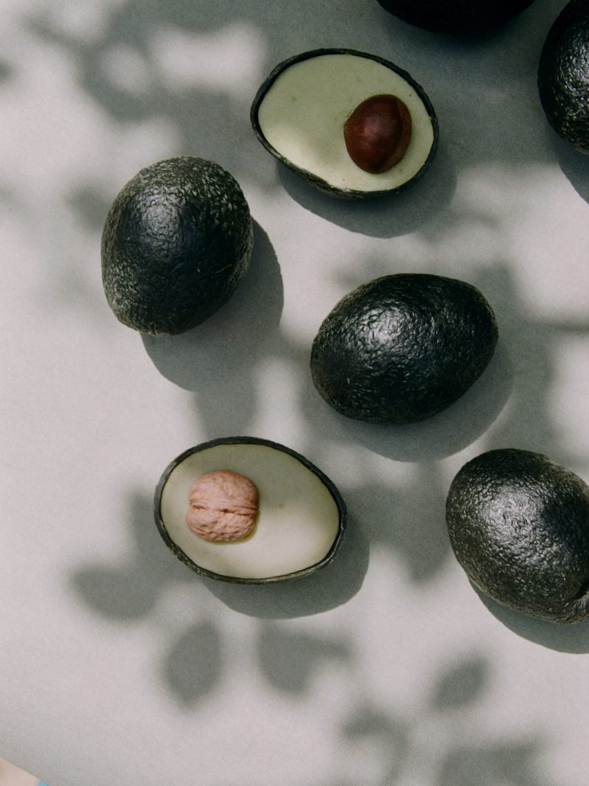
Photo of Ecovados lying on a sun-dappled table
At the centre is a whole nut in place of the stone

Sometimes seemingly ideal substitute ingredients – such as olive oil, which is similar to avocado fat – could not be used because they came from too far away.

“Instead, cold-pressed rapeseed oil was selected due to the wide availability of UK-grown products and the similarity of its fatty acid profile to avocado,” said Shokouhi.

Shokouhi’s finessed recipe is encased in a realistic faux avocado skin made from wax and coloured with food colouring. The packaging is biodegradable and compostable, and can also be upcycled into a candle should the consumer choose to get crafty.

Photo of a tray of Ecovados in a supermarket trolley
The goal with the product is to reduce avocado consumption in countries where the fruit isn’t grown

The Ecovado also contains what looks like an avocado stone. Shokouhi experimented with many options for this, including a wooden ball, which was ruled out for being a waste of material, and a recycled-paper “seed ball” that could be thrown into the garden to sprout wildflowers.

However, she decided the most “uncomplicated” option was best and so the Ecovado features a whole nut – either a walnut, chestnut or hazelnut – at its centre.

Other innovations in food design that have come from design students include Holly Grounds’ dissolvable flavoured ramen packaging that wraps around the noodles and Annie Larkins’ unusually shaped alternative to chicken eggs.


Reference

Hariri Pontarini rethinks cold medical interiors at BARLO MS Centre
CategoriesInterior Design

Hariri Pontarini rethinks cold medical interiors at BARLO MS Centre

Canadian architecture studio Hariri Pontarini has completed a clinic in Toronto for multiple sclerosis patients that features warm wood tones and spaces designed to feel like “first-class airplane lounges”.

The Barlo MS Centre is Canada’s largest clinic dedicated to those with MS, a complex autoimmune disease that affects the central nervous system.

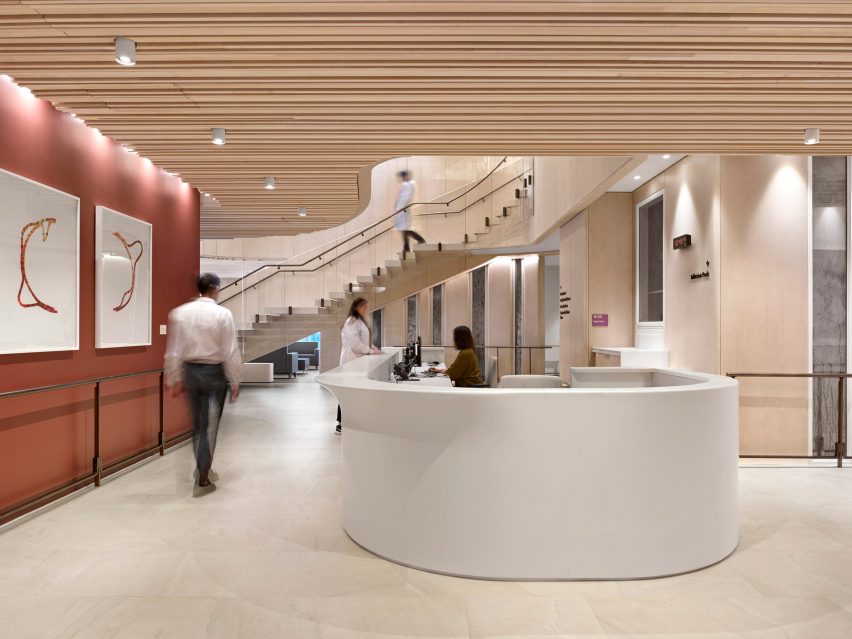
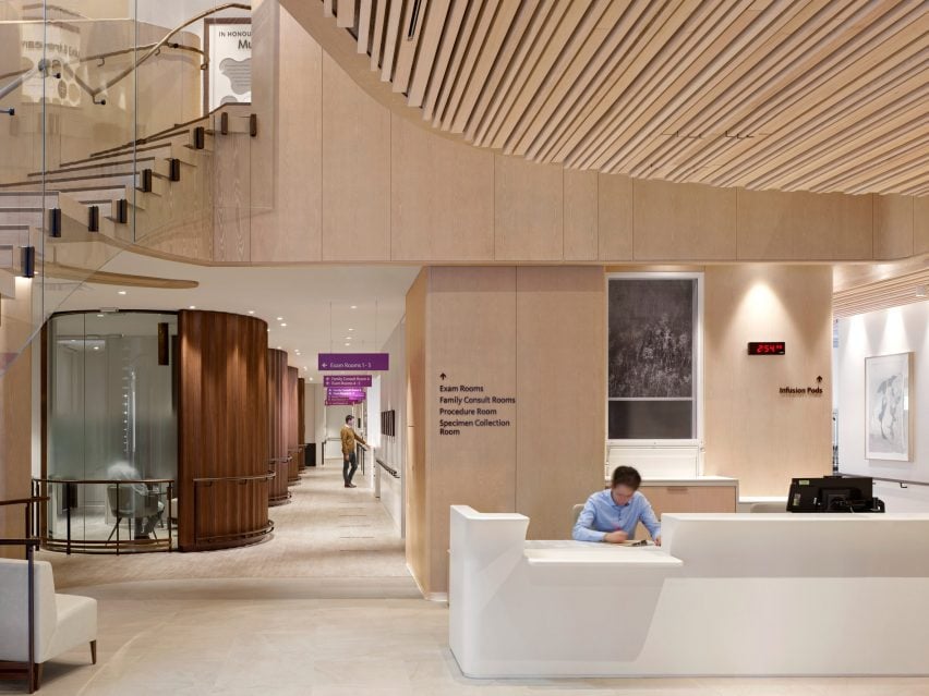
Entrance with curved reception desk
The BARLO MS Centre was designed with atypical colours, materials, textures and lighting

Named after its two biggest donors, the Barford and Love families, the centre occupies the top two floors of a new 17-storey tower at St Michael’s Hospital in Downtown Toronto.

The 30,000-square-foot (2,790-square-metre) facility was designed by local studio Hariri Pontarini Architects, which aimed to rethink sterile-looking healthcare spaces and focus on patient wellbeing through the use of atypical colours, materials, textures and lighting.

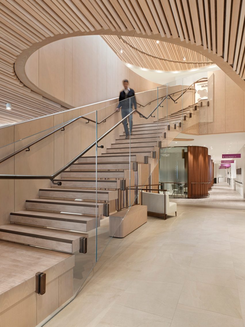
Feature staircase in the atrium
The clinic’s two storeys are connected by a staircase that rises through an atrium

“Canadians are particularly prone to MS for reasons that are unclear,” said the studio.

“This hospital’s mission is nothing less than to transform MS care and become the world’s leading MS centre through research and clinical treatment.”

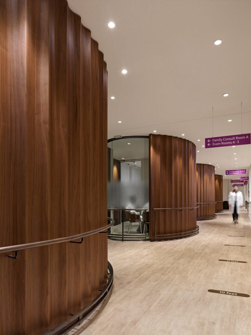
Walnut cladding around consultation rooms
Circular consultation rooms are partially clad in walnut

Taking cues from the hospitality industry, the team aimed to create a “comfortable and welcoming environment” by filling the spaces with daylight and offering views of the skyline.

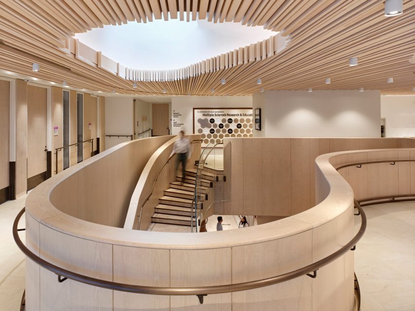
The two floors are connected by a double-height atrium, topped with an oculus that allows more natural light in from above.

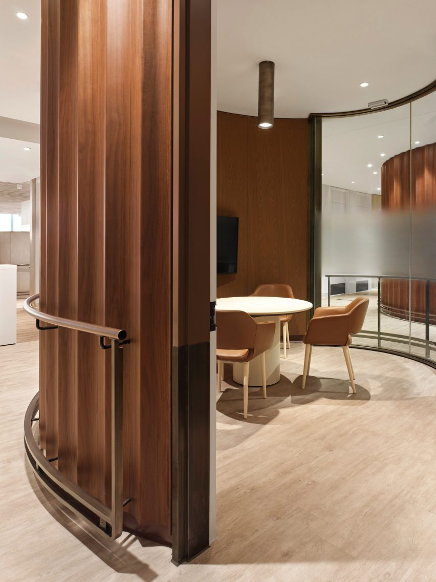
Inside a consultation room
The wavy panels conceal the rooms from the main circulation corridor

A staircase rises up through the atrium, curving towards the top with a glass balustrade to follow the shape of the opening.

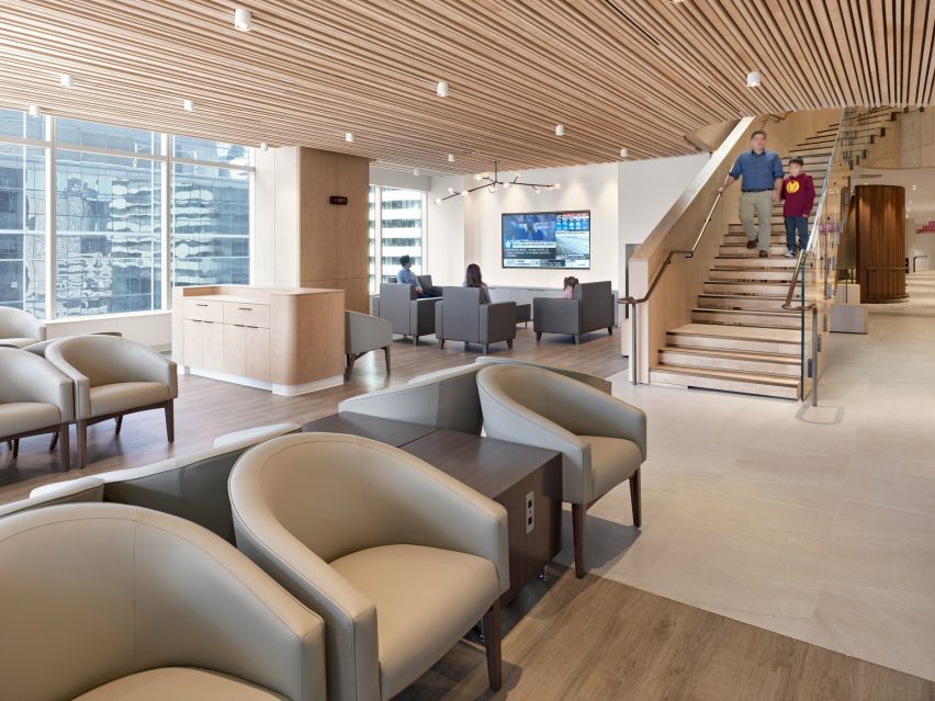
Downstairs, the atrium connects to a lounge at the corner of the building and a reception area anchored by a curved white counter.

Infusion pods
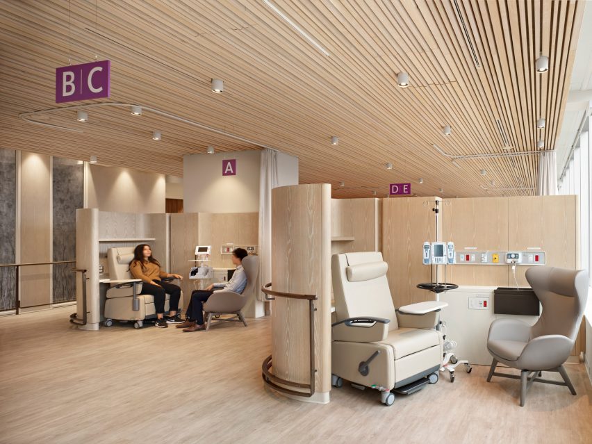
Infusion pods are given privacy by pale wood screens

A wide corridor leads past a series of cylindrical consultation rooms that are partially glazed, but screened where they face the circulation area by wavy walnut panels.

On the other side of the floor plan, smaller and more open consultation booths named infusion pods are still offered privacy with curved pale wood screens.

Reception area
Different varieties of wood give the interiors a warm tone

“The infusion pods where patients may sit for up to eight hours are modelled to resemble a first-class airplane lounge and provide complete control over their environment,” the Hariri Pontarini team said.

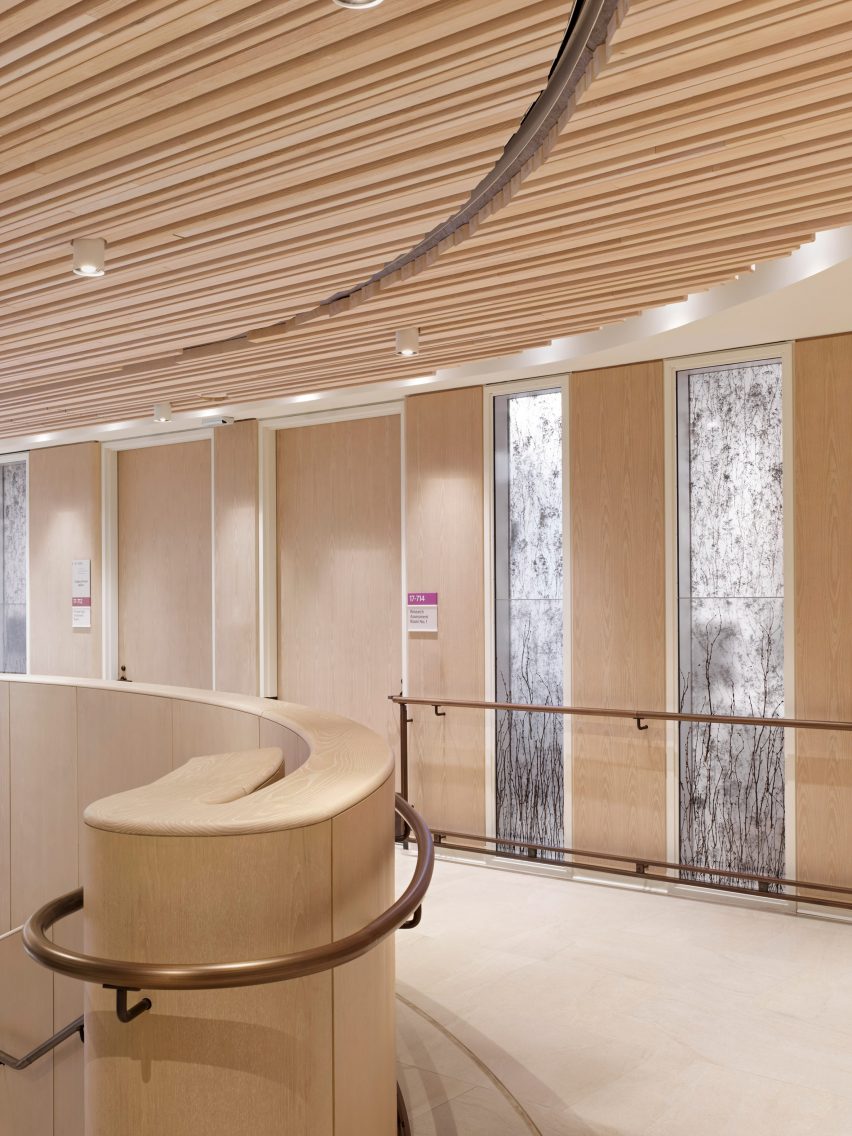
Various light-toned woods are used for wall panels and balustrades, as well as thin slats that extend across the ceilings.

Lounge area
The atrium connects to a lounge and waiting area

All spaces were designed with durability and accessibility in mind, considering that some MS patients have vision and cognitive loss, fatigue and impaired coordination.

Bronze-coloured handrails were installed along the majority of walls and partitions, while anti-slip porcelain tiles cover the floors to aid patient mobility.

The centre also includes a gym, a mock apartment adapted for MS patients, and rooms for meetings, research and administration.

Together, it provides patients with a space to see a dedicated healthcare team in one location and clinicians the state-of-the-art resources to offer the best possible treatment.

Upper level lit by oculus
An oculus above the atrium brings daylight into the centre of the building

Hariri Pontarini Architects was founded by Siamak Hariri and David Pontarini in 1994.

One of the studio’s most recognisable buildings is the Bahá’í temple in Chile, featuring torqued wings made of steel and glass, while its work closer to home includes the glass-wrapped Tom Patterson Theatre in Stratford, Ontario.

Upper level corridor
Handrails are provided throughout the clinic to aid patient mobility

The Bar MS Centre is one of five projects shortlisted in the Leisure and Wellness Interior category of the Dezeen Awards 2022, along with a Shenzhen cinema and a spa in the Maldives.

See the full Interiors shortlist and vote now for your favourites.

The photography is by A-Frame.

Reference

A nature-based solution for water recycling 
CategoriesSustainable News

A nature-based solution for water recycling 

Spotted: Wastewater, such as that containing sewage and agricultural runoff, generally contains an overabundance of phosphorus. This can lead to increased growth of algae and large aquatic plants, which can produce toxins and result in decreased levels of dissolved oxygen in the water, a process called eutrophication. Traditional methods for reducing phosphorus in wastewater generally involve chemicals, which are energy inefficient and can themselves cause problems. Now, a nature-based process for removing phosphorus, developed by start-up I-Phyc (‘Industrial Phycology’) is gaining traction. 

I-Phyc’s solution is a circular process that uses algae to remove phosphorus, ammonia, and other harmful contaminants, including steroids, and insecticides. At the same time, the growing algae locks away carbon and produces biomass from which sustainable products can be created. Algae thrive in water containing an excess of nutrients. I-Phyc’s process deliberately applies algae to wastewater treatment in a controlled way, allowing the algae to do its work before the final, cleaned effluent is discharged to the watercourse.

The company claims that it is able to consistently remove between 50 and 99 per cent of pollutants without the use of chemicals. In addition, the biomass produced by the algae contains a number of compounds that can be used commercially. I-Phyc helps wastewater treatment operators to harvest the algae and transform it into useful products, including fertiliser, poultry feed, sustainable feed stock, biogas and specialist oils and lubricants. The entire process is carbon negative.

I-Phyc has recently raised £2.3 million (around €2.6 million) in an investment round led by Mercia water and Mellby Gård AB. In a press release, Kiran Mehta, Investment Manager at Mercia, said, “Our previous investments helped I-Phyc to develop and roll out its technology and it is now attracting huge interest within the industry. With water companies trying to meet ever increasing water quality standards and challenging carbon emission goals, new technologies will have a key role to play. This new funding will help position I-Phyc as a leader in sustainable water treatment solutions.”

Wastewater treatment can be an energy-intensive process, so it is no surprise that we here at Springwise have seen a number of innovations aimed at developing more sustainable treatment methods. Some recent projects includes an easy-to-use device that disinfects water using sunshine and a solar catalyst that can treat wastewater in a manner similar to photosynthesis. 

Written By: Lisa Magloff

Reference

Alexandra Daisy Ginsberg creates “interspecies artwork” in London
CategoriesSustainable News

Alexandra Daisy Ginsberg creates “interspecies artwork” in London

Artist Alexandra Daisy Ginsberg has created a digital AI tool named Pollinator Pathmaker to design the best possible gardens for bees and other insects to enjoy.

The Pollinator Pathmaker project has opened its third public edition in the gardens around London’s Serpentine Galleries, following commissions by Cornwall’s Eden Project and Berlin’s Light Art Space.

At the same time, people are invited to participate in their private gardens, by using the Pollinator Pathmaker online tool to create a planting plan tailored to their plot.

Pollinator Pathmaker installation at Kensington Gardens, Hyde Park
Hyde Park’s Kensington Gardens are home to a new edition of Pollinator Pathmaker

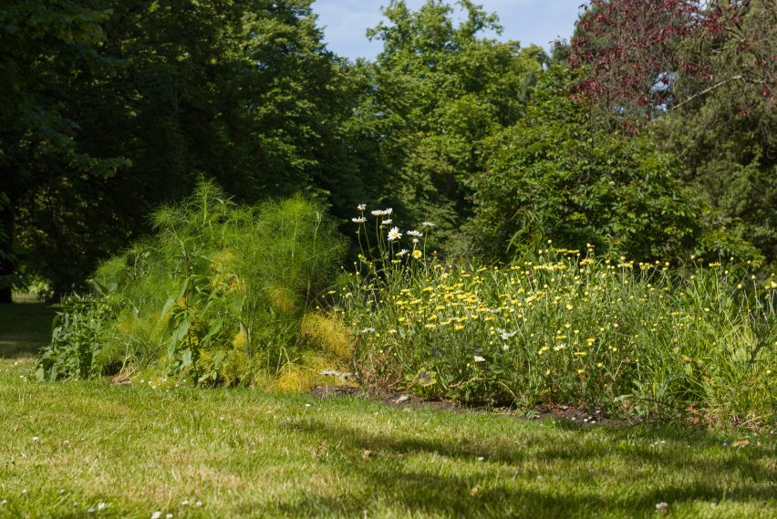
The work is intended to raise awareness about the decline in pollinators, which as well as bees includes butterflies, moths, wasps, beetles and other species that are essential for plant reproduction and ecosystem survival.

At the same time, Ginsberg aims for the project to build empathy with other species.

“I wanted to make art for pollinators, not about them,” said Ginsberg. “Pollinator Pathmaker is an ambitious art-led campaign to make living artworks for other species to enjoy.”

Close-up on tall purple flowers in the Pollinator Pathmaker installation
The garden is designed by an AI and optimised to attract the most pollinator species

“Modern humans have reshaped the planet for our own benefit, while forgetting that other
species and their needs are essential to our own survival,” she told Dezeen.

“Decentring ourselves is a powerful way to think about other species: encouraging us to see the world as they do, to have empathy for them, and most importantly to inspire humans to care for them.”

Ginsberg sees Pollinator Pathmaker as encoding empathy into an algorithm, in this case by defining empathy as a design that would support as many pollinator species as possible.

She worked with horticulturalists at the Eden Project, which first commissioned the project, along with pollinator experts and Google Arts & Culture to develop the digital tool.

It asks the user to input information about the size and conditions of their plot, and then play with the “empathy” sliders to choose whether they want more or fewer plant species, a bold or intricate pattern, and a flight path or patches.

Some pollinators, such as bees, learn and memorise an efficient route for themselves, so they would be drawn to the flight path, while other insects explore more randomly.

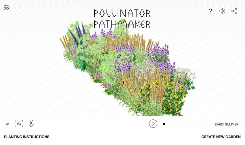
Screenshot of the Pollinator Pathmaker online tool showing a 3D visualisation of a garden of painted flowers
Anyone can use the online tool to make their own garden planting plan

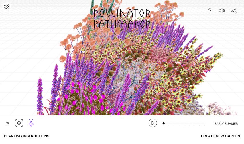
The algorithm generates a different garden design each time, which users can see as a 3D visualisation composed of Ginsberg’s digital plant paintings. They can also see how it will change from season to season and what it looks like in “pollinator vision”.

To realise the garden design, they download planting instructions, which come complete with a certificate of authenticity for their editioned artwork.

The Serpentine’s version of the artwork fills a 227-metre-long area in Hyde Park’s Kensington Gardens with more than 60 species of plants. It is part of the institution’s newly opened Back to Earth programme, themed around the environmental emergency.

Screenshot of the Pollinator Pathmaker platform showing the 3D garden visualised in
One of the features of the tool is that it lets you see your garden in “pollinator vision”

The garden is intended to be in place for two years, during which time the artist hopes to open further editions worldwide, using each commission as an opportunity to develop a new regional “plant palette” so the tool can be used in more locations.

“The aim is to make the world’s largest climate positive artwork,” said Ginsberg. “Each time a large Edition Garden, like the two we’ve planted in the UK, is commissioned, we create a new plant palette for the region and donate this back to www.pollinator.art to encourage local visitors to join in and plant their own artworks.”

“Gardens are not isolated entities; they are interconnected in the landscape. Your flourishing garden supports the flourishing of your neighbour’s, so we need as many pollinator-friendly gardens as possible to be planted.”

Ginsberg’s art focuses on technological and environmental themes. Her past work has included Machine Auguries, which artificially recreates the dawn chorus of birds, and The Wilding of Mars, which explores what would happen if the red planet were colonised by plants and not humans.

Reference

GRAAM Architecture wraps Burgundy office building in timber exoskeleton and “glass veil”
CategoriesArchitecture

GRAAM Architecture wraps Burgundy office building in timber exoskeleton and “glass veil”

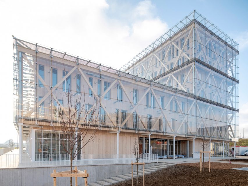
A glazed skin hangs from a timber exoskeleton at this office building in France by French studio GRAAM Architecture, which has been shortlisted in the business building category of Dezeen Awards 2022.

Completed for banking group Caisse d’Epargne in Dijon, Burgundy, the seven-storey building was designed to provide airy, flexible and naturally-lit workspaces that meet the Passivhaus requirements of using no more than 15 kWh/m2 per year.

Raised above its sloping site on a concrete podium containing garage space, GRAAM Architecture‘s design was informed by a desire to use materials and companies local to the area.

Exterior image of the Caisse d'Epargne Bourgogne Franche Comté Headquarters
The Burgundy office building was designed by GRAAM Architecture

“Located on the heights of Dijon in Burgundy, a few metres from the tramway stop, the building is built of seven levels, allowing it to be seen from a distance from the city’s expressway,” said the practice.

“Its wooden structure echoes the local resources of the Burgundy region, whose reputation for hardwood and softwood forests is well known,” it continued.

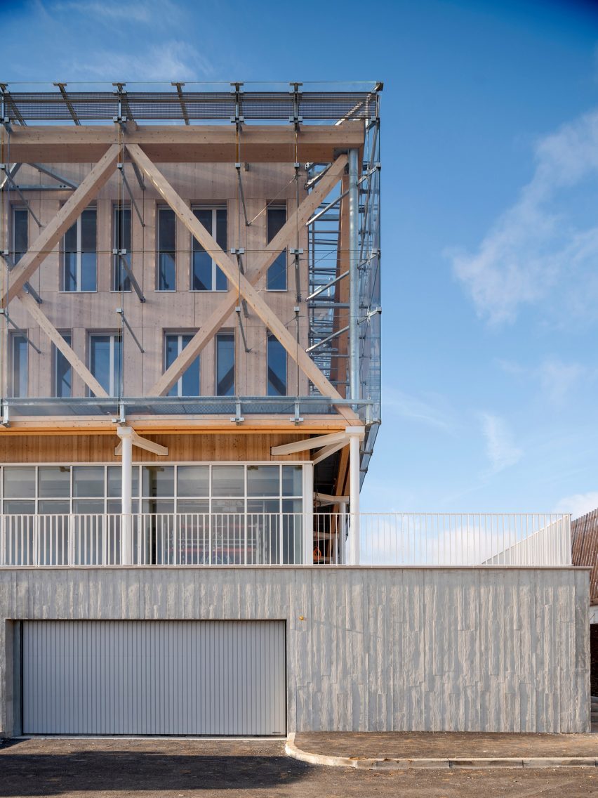
The timber structure of the building prioritises the use of traditional beam and joist techniques, only using concrete and cross-laminated timber (CLT) where necessary, such as for the floors and stair and lift cores.

Exterior detail image of the street facing entrances at Caisse d'Epargne Bourgogne Franche Comté Headquarters
The building incorporates a timber exoskeleton

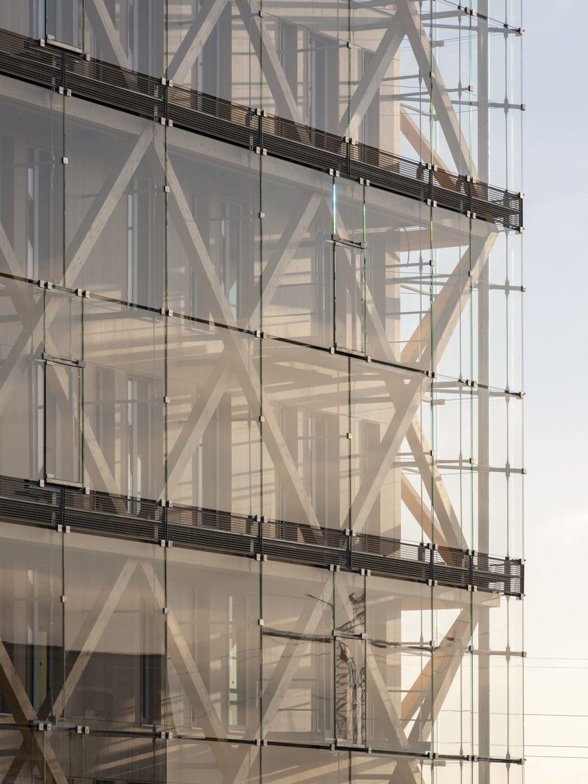
Helping to free up the interiors, the structure is supported by an exoskeleton of timber bracing, the upper beams of which are used to hang the external “glass veil” envelope, supported by secondary steel elements.

The choice of materials means the structure could be entirely dry-process built, with the concrete elements prefabricated before being brought to the site.

“The project responds to a desire for exemplarity, modularity and intelligence,” said the practice.

“[It is] designed with a wooden structural skeleton, prefabricated concrete floors, and a wooden exo-structure covered with a glass double skin,” it continued.

“The building allows the bank to play a part in environmental issues, displaying its exemplary and unique nature without ostentation.”

Exterior image of Caisse d'Epargne Bourgogne Franche Comté Headquarters glass facade
The exterior is clad in a double glass skin

At the base of the structure, thin white steel columns support the building’s outer structure, creating a small sheltered area around the building’s perimeter that extends onto a terrace created by the concrete base and lined by a metal balustrade.

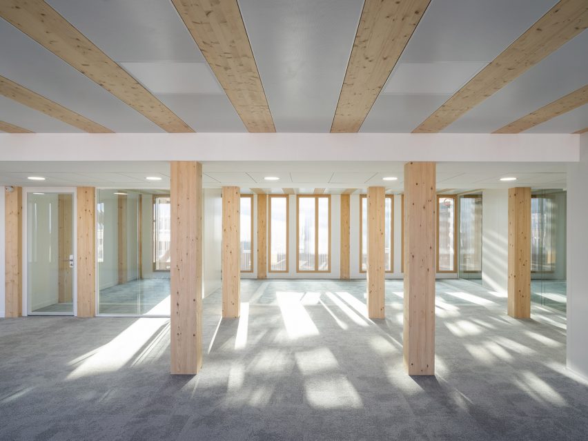
Inside, thin, almost full-height windows on each floor flood the office spaces with natural light, and the spacing of wooden columns allows for the easy addition of partition walls.

Interior image of a timber column-lined space at the office in France
The interior was developed to be divided and organised to best suit its users

“The space can be subdivided to create working areas for specific departments, or rented out to another firm if needed,” said the practice.

Among the other buildings shortlisted in the business building category of Dezeen awards 2022 is the Sanand Factory in India by Studio Saar, which aims to elevate otherwise typical factory structures with thoughtful details.

Photography is by Nicolas Waltefaugle.

Reference

Ten beautiful brutalist interiors with a surprisingly welcoming feel
CategoriesInterior Design

Ten beautiful brutalist interiors with a surprisingly welcoming feel

For our latest lookbook, we’ve collected 10 brutalist interiors from the UK to Brazil and Indonesia that show how textiles, plants and colours can be used to soften monolithic concrete spaces and create a cosy atmosphere.

Brutalism as an architectural style often makes use of concrete to create large, sculptural buildings. These interiors in brutalist buildings feature plenty of concrete and hard angles but still manage to feel both warm and welcoming.

Colourful tiling, wooden details and tactile textiles as well as an abundance of green plants were used to create inviting living rooms, bathrooms and even workspaces in these brutalist buildings, which include the Barbican in London and Riverside Tower in Antwerp.

This is the latest in our lookbooks series, which provides visual inspiration from Dezeen’s archive. For more inspiration see previous lookbooks featuring granite kitchens, terrazzo eateries and atriums that brighten up residential spaces.


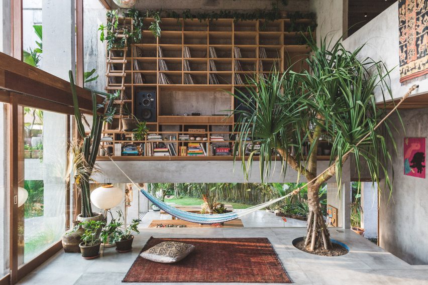
A Brutalist Tropical Home in Bali by Patisandhika and Daniel Mitchell
Photo is by Tommaso Riva

A Brutalist Tropical Home, Indonesia, by Patisandhika and Dan Mitchell

Designer Dan Mitchell worked with architecture studio Patisandhika to create this brutalist home in Bali, which features a double-height living room filled with books, records and green plants.

The house has a split-level design that was modelled on modernist architect Ray Kappe’s Kappe Residence. Inside, colourful objects, textiles and furniture draw on the work of Clifford Still, Ellsworth Kelly and the Bauhaus movement to make the house feel homely.

Find out more about A Brutalist Tropical Home ›


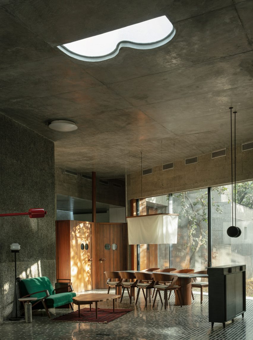
Large living room with concrete ceiling
Photo is by Niveditaa Gupta

House of Concrete Experiments, India, by Samira Rathod

As the name suggests, House of Concrete Experiments features sculptural concrete walls. Warm wood detailing offsets the grey hues, while the concrete floor has been inlaid with black stones to create an interesting pattern.

Large windows and geometric skylights help make the room feel bright and inviting.

Find out more about House of Concrete Experiments ›


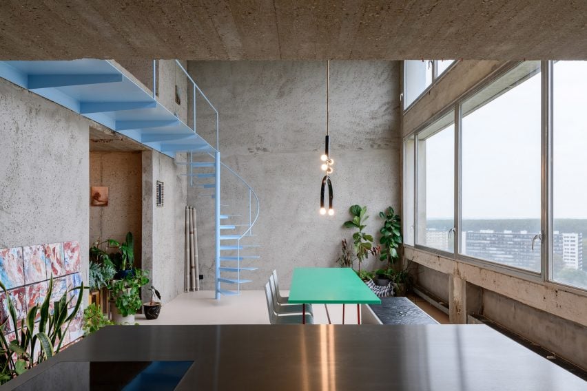
Turquoise table in room with concrete walls
Photo is by Olmo Peeters

Riverside Tower Apartment, Belgium, by Studio Okami Architecten

Studio Okami Architecten stripped the walls of this flat in Antwerp’s Riverside Tower to let its original structure take centre stage.

Colourful details such as a turquoise table and baby-blue spiral staircase and a playful, sculptural lamp make the home feel contemporary, while plenty of green plants give more life to the otherwise grey interior.

Find out more about Riverside Tower Apartment ›


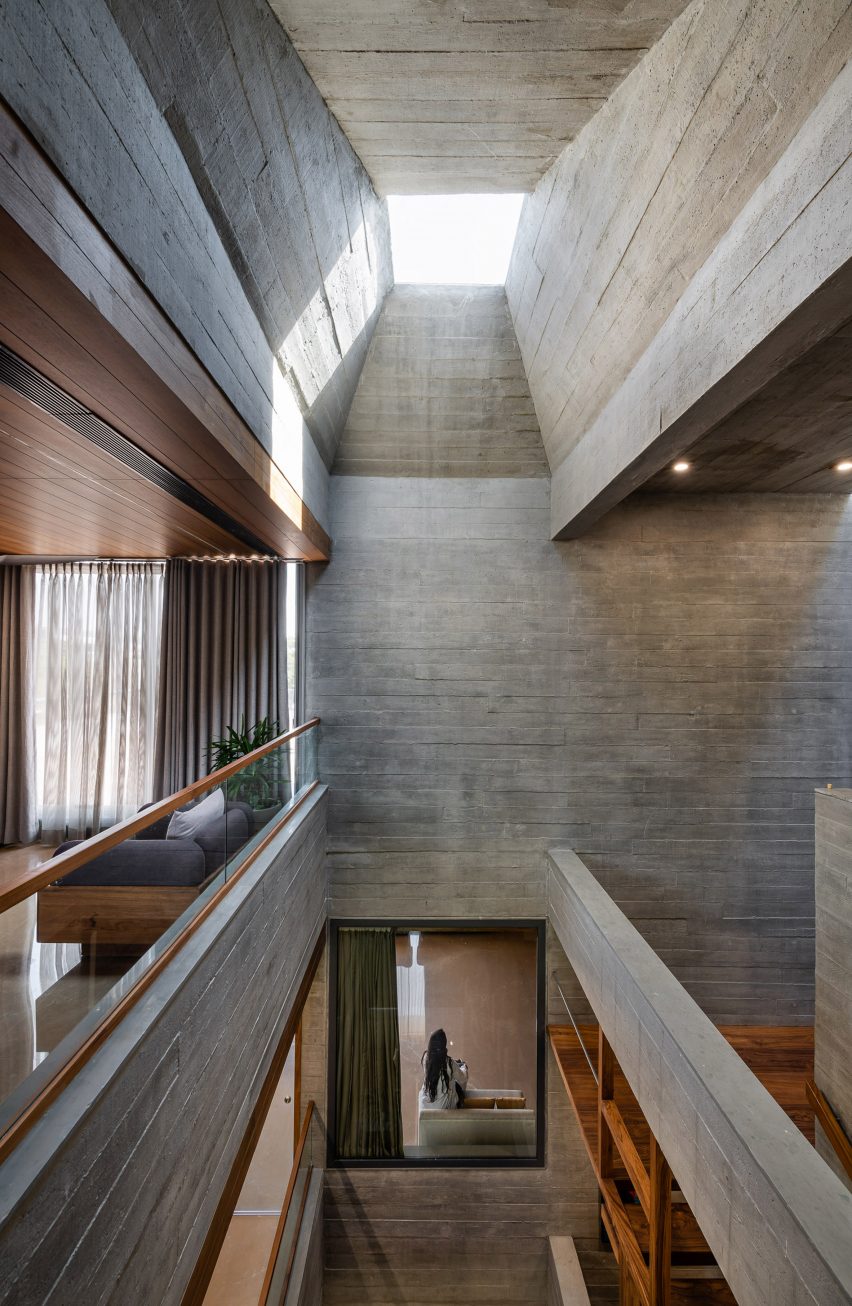
Light-filled atrium in brutalist home
Photo is by Photographix

Beton Brut, India, by The Grid Architects

Designed as a “neo-brutalist” house, Beton Brut in India has a number of dramatic features, including a skylit atrium that extends through the home.

The Grid Architects described the home as “typified by bare concrete, geometric shapes, a monochrome palette and a monolithic appearance”. Wooden flooring and furniture and plenty of textiles soften the house’s brutalist interior and potentially stern appearance.

Find out more about Beton Brut ›


Shakespeare Tower apartment by Takero Shimazaki Architects
Photo is by Anton Gorlenko

Barbican flat, UK, by Takero Shimakazi Architects

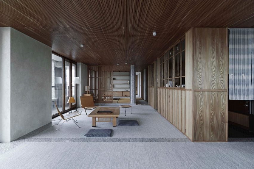
This flat in the Shakespeare Tower of London’s brutalist Barbican estate was overhauled by Takero Shimakazi Architects in a nod to the client’s strong ties to Japan.

Details such as gridded timber panels and timber joinery were added throughout the flat, which also features Japan-informed details including an area lined with tatami mats.

Find out more about the Barbican flat ›


Debaixo do Bloco Arquitetura
Photo is by Joana França

Concrete home, Brazil, by Debaixo do Bloco Arquitetura

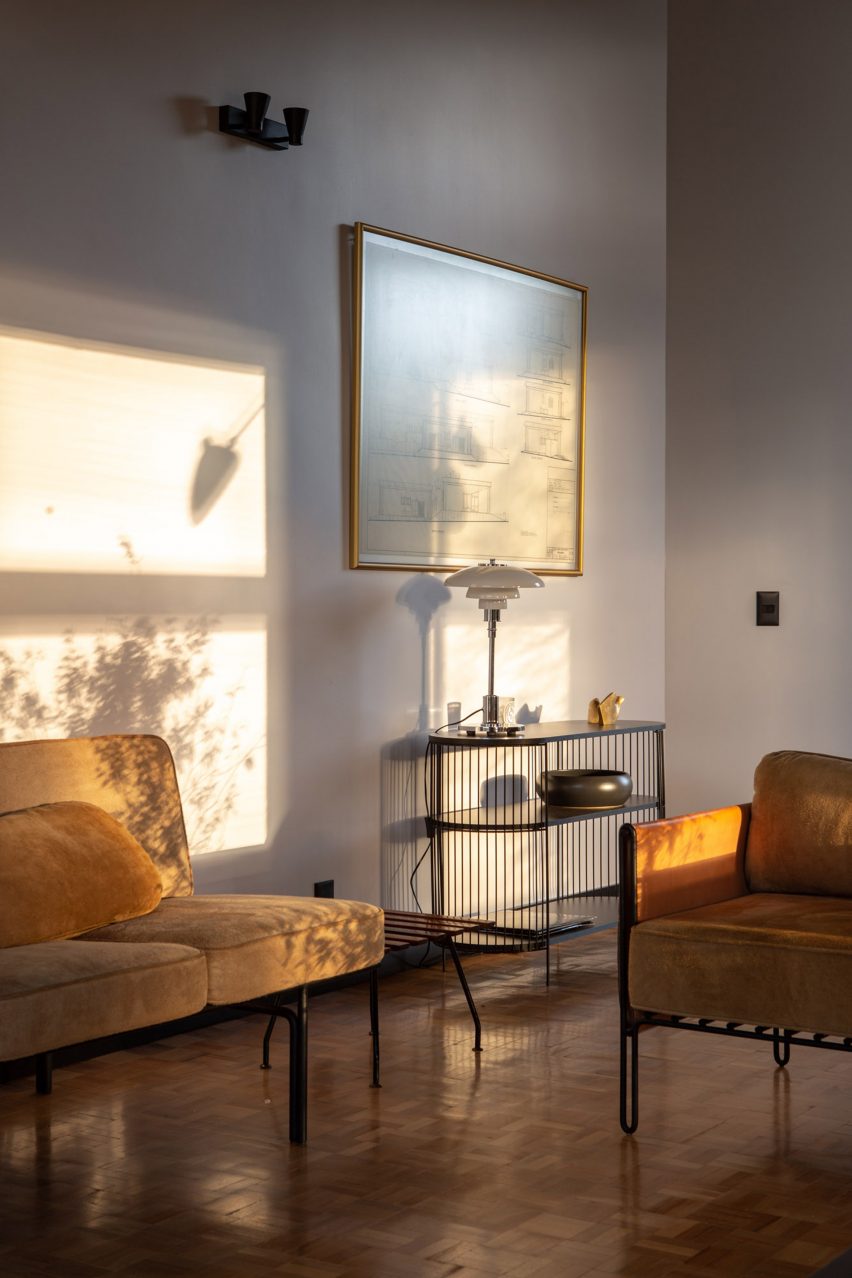
Debaixo do Bloco’s design for this sculptural house in Brazil is divided into three sections to provide a clear distinction between the various programmes.

Inside, the interior has a mid-century modern feel, with gleaming wood parquet flooring and a glass PH table lamp by Danish designer Louis Poulsen decorating a side table.

Find out more about the concrete home ›


An office table and chairs inside the office
Photo is by Lorenzo Zandri

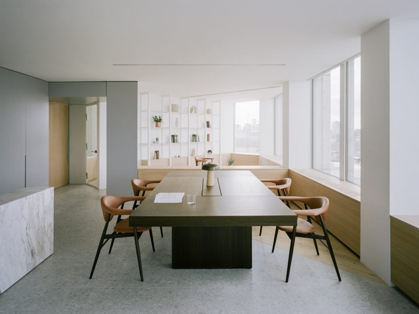
Smithson Tower office, UK, by ConForm

The brutalist Smithson Tower in Mayfair is the location for this “homely” office designed by ConForm Architects. The studio split the space into eight zones defined by the strong structural grid of the existing building, and added low-level joinery.

The result is a design that softens the stark office spaces and makes the rooms feel more intimate.

Find out more about the Smithson Tower office ›


The Standard hotel in London by Shawn Hausman Design
Photo is courtesy of The Standard

The Standard London, UK, by Shawn Hausman

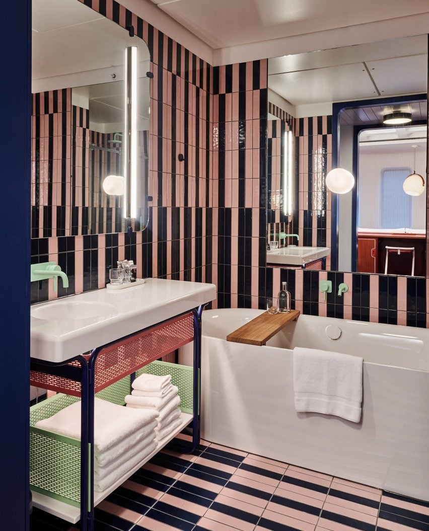
Designer Shawn Hausman created the colour-drenched interior of hotel The Standard in London, which is located in a brutalist building, to contrast “the greyness of London”.

“I would say with this property we were a bit more colourful than usual, and I think part of that is acting in contrast to the brutalist building that the hotel’s in,” explained Hausman.

In the bathrooms, stripy pink-and-black tiled walls and pops of pale mint green give the room a fun, playful feel.

Find out more about The Standard London ›


The Preston Hollow by Specht Architects
Photo is by Casey Dunn

Preston Hollow, US, by Specht Architects

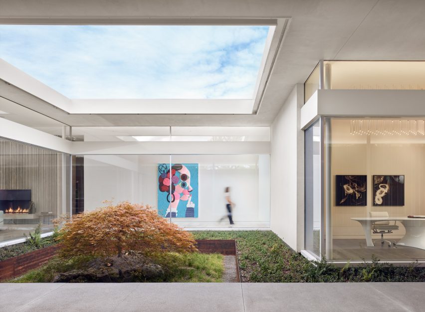
The long corrugated concrete volumes of Preston Hollow in Dallas were designed to reference brutalist Texan architecture from the 1950s and 60s, but the house was built to wrap around courtyards, creating a lively, open impression.

Inside the low-slung buildings, mid-century modern-style furniture nods to the home’s architectural references but the interior is brought up-to-date with the addition of modern art.

Find out more about Preston Hollow ›


Barbican apartment designed by John Pawson
Photo is by Gilbert McCarragher

Barbican apartment, UK, by John Pawson

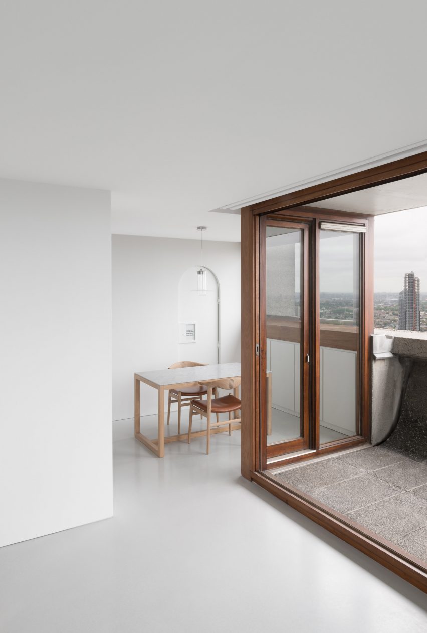
British architect John Pawson created this flat in London’s Barbican building using his signature minimalist aesthetic.

The flat, which overlooks central London and has a small concrete balcony, has been kept almost empty with just a smattering of furnishings and pale wooden surfaces. Three artworks, a Buddha sculpture and a grandfather clock are the only decorative elements in the space.

Find out more about the Barbican apartment ›

This is the latest in our lookbooks series, which provides visual inspiration from Dezeen’s archive. For more inspiration see previous lookbooks featuring granite kitchens, terrazzo eateries and atriums that brighten up residential spaces.

Reference

Analysing marine sulphur emissions – Springwise
CategoriesSustainable News

Analysing marine sulphur emissions – Springwise

Spotted: In January 2020, the UN International Maritime Organisation introduced new regulations to limit vessels from using fuels with a sulphur content above 0.5 per cent (or 0.1 per cent in some areas). However, it is difficult for governments and regulatory authorities to enforce the new sulphur limit because current sulphur monitoring relies on expensive and time-consuming manual processing and emissions tests that can take up to one day per ship. In fact, fewer than 10 per cent of vessels are checked each year. Now, startup Marine Hound may have an answer. 

Marine Hound has developed a “sulphur emission sniffer system”. It consists of low-power gas analysers located in smart buoys and ground stations around harbours. These continuously patrol emissions from ships in the area. When high sulphur emissions are detected, the relevant authorities are alerted and a drone is activated to collect emissions samples from the suspect vessels.

The company then analyses the samples and provides actionable data to enforcers. This helps enforcement agencies develop more efficient and effective monitoring and reporting, making it easier for authorities to move the shipping industry towards full sulphur cap compliance. 

The Malta-based startup is still in development, but they have recently secured €100,000 in funding to help them progress to the next phase in the Blue Economy Acceleration Programme. Founder Nicholas Borg Calleja has announced that over the next six months, the company will be “accelerating key milestones, working with our strategic partners from Finland and Estonia to integrate novel gas analyser and drone technologies, and consolidate the hardware and software solution in Malta.”

The new IMO emissions standards are not the only reason many vessels are switching to low-sulphur fuel and systems. Many shipping companies are also motivated by a commitment to sustainability. Luckily, a number of innovations are making this easier. Some recently covered by Springwise include a low-carbon biofuel designed for ships and the use of smaller, electric ships. 

Written By: Lisa Magloff

Reference

Evolution Music creates “ecologically sound” bioplastic 12-inch vinyl
CategoriesSustainable News

Evolution Music creates “ecologically sound” bioplastic 12-inch vinyl

Music and sustainability collective Evolution Music has designed a 12-inch vinyl made of bioplastic using existing record pressing machinery, which features tracks by artists Beatie Wolfe and Michael Stipe.

Hailed as the world’s first commercially available bioplastic 12-inch vinyl by Evolution Music, the product is made from specially designed bioplastic instead of traditional, carbon-intensive PVC.

Evolution Music 12-inch vinyl
The 12-inch vinyl is made from bioplastic created by Evolution Music

The bioplastic 12-inch vinyl looks and functions like a standard vinyl, comprised of a black disc illustrated with a central graphic design.

It was manufactured using existing record pressing machinery and production processes.

Record pressing machinery
It is manufactured using existing record pressing machinery

Its A-side features the track Future, If Future by American musician Stipe, while Oh My Heart by British-American artist Wolfe can be played on its B-side.

The bioplastic 12-inch vinyl’s creators said that they were prompted to design the material and the product themselves after struggling to find “sustainable solutions for physical media”.

“It is a robust, ecologically secure compostable material created specifically to act and sound the same as PVC-derived vinyl,” Evolution Music CEO Marc Carey told Dezeen.

Vinyl sticker
Tracks by Michael Stipe and Beatie Wolfe feature on the record

To create the bioplastic, a four-year development process involved identifying a base polymer that acts in the same way as traditional PVC, without producing harmful substances, according to Carey.

After this, the team sourced bio-organic fillers and co-created a solid additive used for plastics called a bio masterbatch.

Evolution Music’s aim was “to create a biopolymer that is authentic, truly sustainable and ecologically sound,” explained Carey.

“We’ve never developed traditional plastic vinyl – I guess you should ask the PVC manufacturers why they didn’t [create bioplastic vinyl],” he said.

Bioplastic vinyl
Evolution Music aimed to create a “sustainable” product

Five hundred copies of the bioplastic 12-inch vinyl were initially sold when it was released earlier this year, with the proceeds donated to the charity EarthPercent.

Founded by musician Brian Eno, EarthPercent invites artists to pledge a portion of their income to the charity, which is then donated to organisations that tackle climate change.

The release of the bioplastic 12-inch vinyl forms part of a Bandcamp project by EarthPercent that includes over 100 tracks by artists including Hot Chip, Peter Gabriel and Nile Rogers.

“It took three passionate, independent music lovers from the UK to develop this product out of necessity,” concluded Carey.

“The fact that ‘big’ players did not do this in the first place raises interesting questions about the petrol, chemical, oil and plastics industry… just saying!”

Other recent bioplastic designs include a clingfilm alternative made from waste potato peels and a polystyrene substitute created from plastic-eating mealworms.

The images are courtesy of Evolution Music. 

Reference

CategoriesArchitecture

When Mass Timber Meets Pre-Fab Design: Affordable and Sustainable Housing

Fueled by the emergence of mass timber construction techniques, the wood structures that we once thought would be relegated to an antiquated past are instead pointing the way to the future. The material is poised to revolutionize the architecture field as businesses and communities realize that timber is an affordable, low-carbon alternative to steel and concrete.

Like its name suggests, oWOW Design is not content with following conventional architectural practices and seeks to design creative solutions to combat the high-cost of housing in the United States. To do so, the vertically-integrated firm is intent on doing away with the status quo, starting with which materials are being used and how the buildings themselves are constructed. By combining mass plywood floor panels that are point-supported on mass plywood columns, the team creates lightweight and environmentally friendly structures that can be erected at record speed, bringing down the cost for the end-user.

If you are an architect looking to continue your career in this emerging field, we have the right job for you. oWOW Design is leading the charge for building affordable and sustainable homes in the United States. The Oakland, California-based firm is looking for a Project Architect with experience in mass timber, prefabrication and systems thinking who is motivated to break the traditional mold with creative solutions and new materials.

Apply Now

316 12th Street by oWOW Design, Oakland, CA

oWOW Design is not a firm simply bent on meeting a deadline or merely satisfying the strict requirements of a project; they value the broader importance of their work, both in how their design coheres with the rest of the neighborhood and how it addresses pressing social and economic inequities within an urban environment.

Take for instance their current development at 316 12th Street in downtown Oakland. This retrofit to an existing property adds five stories of mass timber construction behind an existing historic façade. Not only does the project help preserve the historic character of the neighborhood, it also adds sensible density to the downtown core with twenty-seven new multifamily units on the upper floors of the building.

For one, the point-supported mass timber structure designed by the firm conveys a warmth that doesn’t overshadow the architectural details of the pre-existing below — something much harder to accomplish with concrete or steel. The use of timber throughout also ensures significant cost savings (on average between 20% and 30% for most of the firm’s projects) during the construction phase, meaning more affordable unit prices down the line. In the end, this retrofit will bring new life to the historic street and with it, new business opportunities for the neighborhood.

1510 Webster by oWOW Design, Oakland, CA

In addition, all of oWOW Design’s use the same standard kit of parts in order to reduce costs and timelines across all stages of the project — from design through construction — helping achieve consistent high-quality construction, reduce engineering costs and streamline supply chains. Bringing it all together is the firm’s adoption of new construction delivery technologies, helping improve coordination between design team, consultants and subcontractors.

Apply Now

Another ongoing project is 1510 Webster in the heart of downtown Oakland: an 18-story mixed-use tower which, once completed, will be one of the tallest mass timber structures in the United States. Besides that impressive architectural feat, oWOW Design is using this project among others to push the boundaries of mass timber construction technology. The firm is using factory-built, prefabricated components (including façades and structural brace frames) wherever possible to reduce site labor costs and construction time.

Prefabricated construction by oWOW Design in Oakland, CA; images by oWOW Design

These innovations are helping distinguish oWOW Design as one of the architectural leaders of emerging technologies and materials in the United States. The firm’s rapidly growing portfolio showcase projects adapted to the pressing needs of the present, affordability and ecological sustainability among them, and a determination to provide a template for the future of architecture.

What is more, oWOW defines itself as “a Team of passionate people who share a common goal of making a real difference.” It’s a statement they don’t make lightly since all members of the team share equity in the firm — and are thus held accountable for their contribution.


If this firm seems like the right fit for you, don’t miss your chance: apply to join the team as a Project Architect today:

Apply Now

Reference