Architects: Want to have your project featured? Showcase your work through Architizer and sign up for our inspirational newsletter.
Architizer’s journal is fueled by the creative energy of the thousands of architects from around the world who upload and showcase their incredible work. From conceptual designs to projects under construction to completed buildings, we are proud to serve as a platform for showcasing global architectural talent and the brilliance of visualizers, engineers, manufacturers, and photographers who are crucial members of the industry. A stellar drawing, rendering or photo, as well as a detailed project description, can go a long way in making a project stand out, as does indicate the stellar contributors on a project.
Firms who upload to Architizer share their work with professionals and design enthusiasts through our Firm Directory and Projects database. They also gain exposure by having their projects shared on our Facebook, Instagram, and Twitter pages, as well as in our Journal feature articles. Indeed, through these various channels, hundreds of thousands of people in the global design community have come to rely on Architizer as their architectural reference and source of inspiration. In 2022, we’re rounding up our database’s top 10 most-viewed, user-uploaded architecture projects at the end of each month.
10. Monarch Village
By Studio 804 in Lawrence, KS, United States
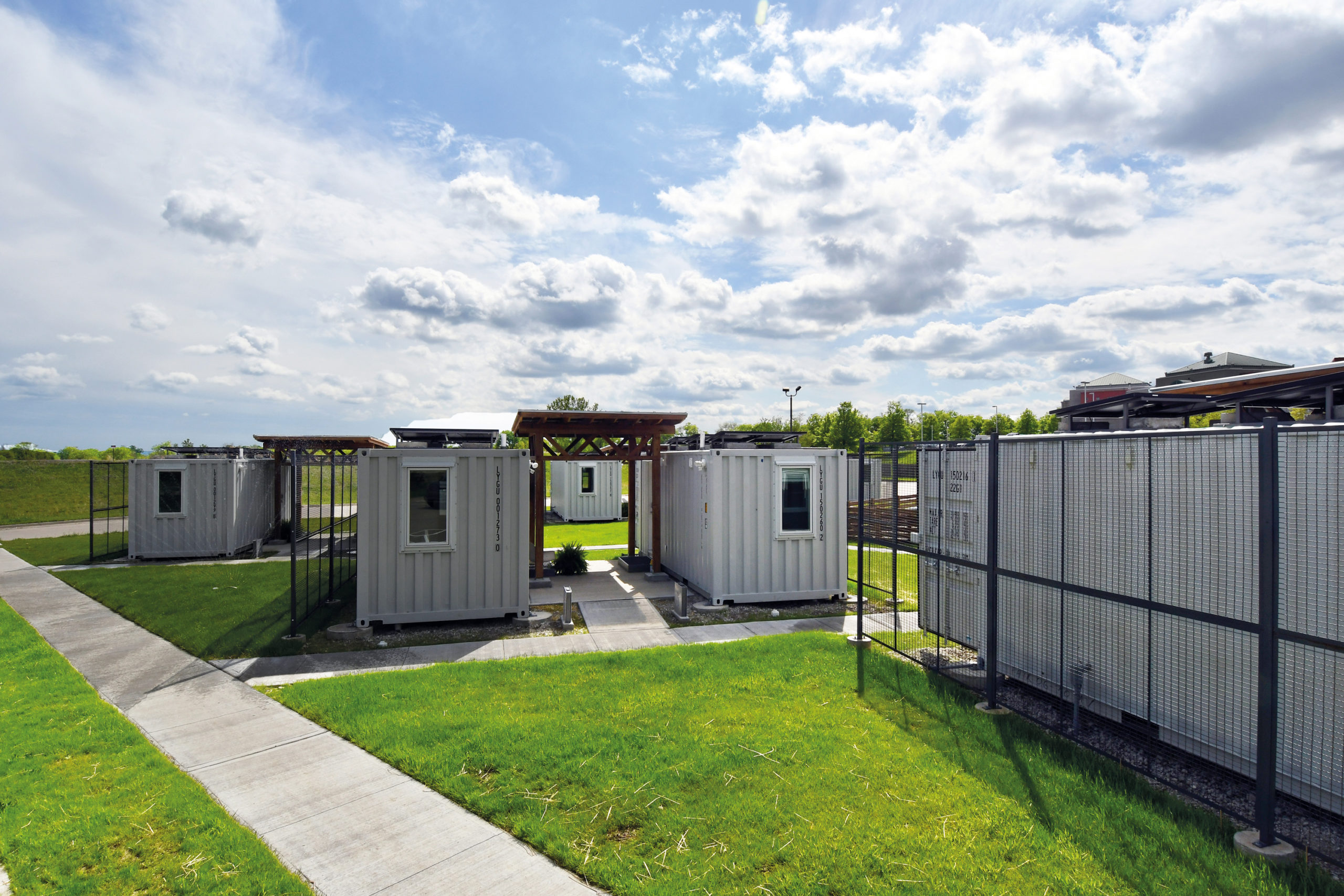
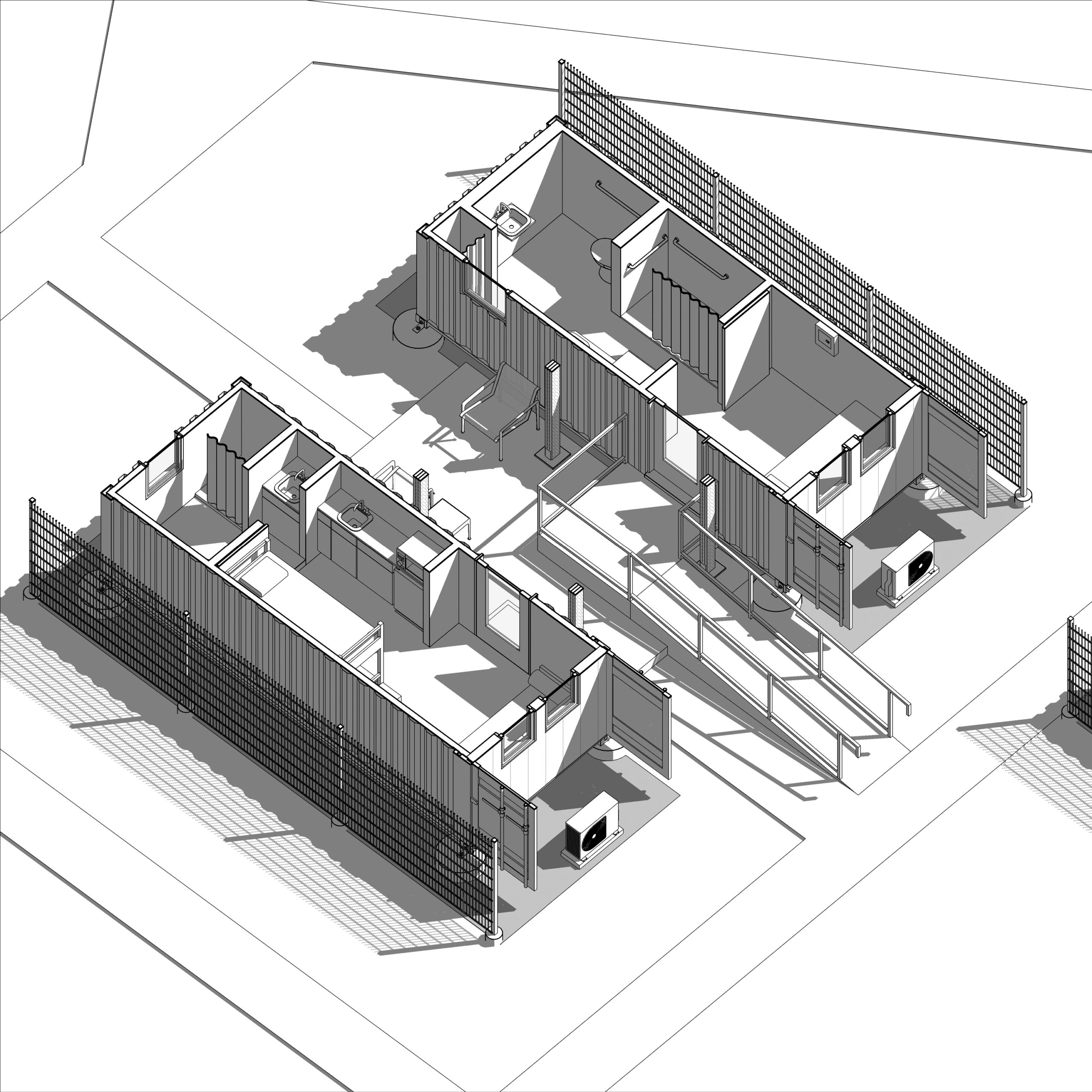
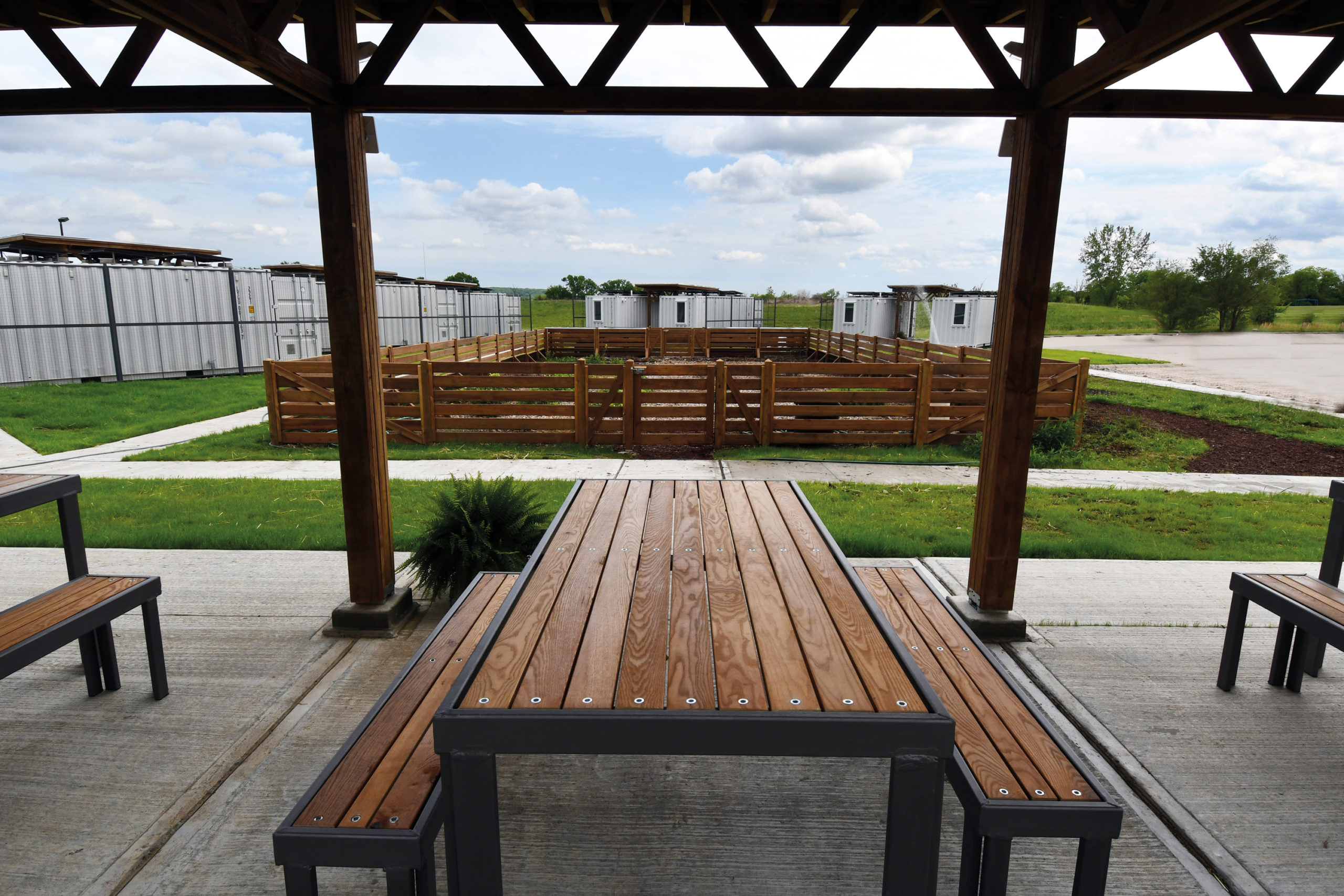 At the University of Kansas School of Architecture, graduate students have the option to enroll in Studio 804, which recently received a donation of a dozen shipping containers. The students worked to convert this gift into tiny homes for families who needed isolate during the pandemic. (The alternative was congregate housing.) Three solar collectors were placed on top of each unit to provide some electricity for inhabitants on the four beds inside.
9. THE EARTH | Pazhou Poly Sport Park Service Center
By TEAM_BLDG in Guangzhou, China
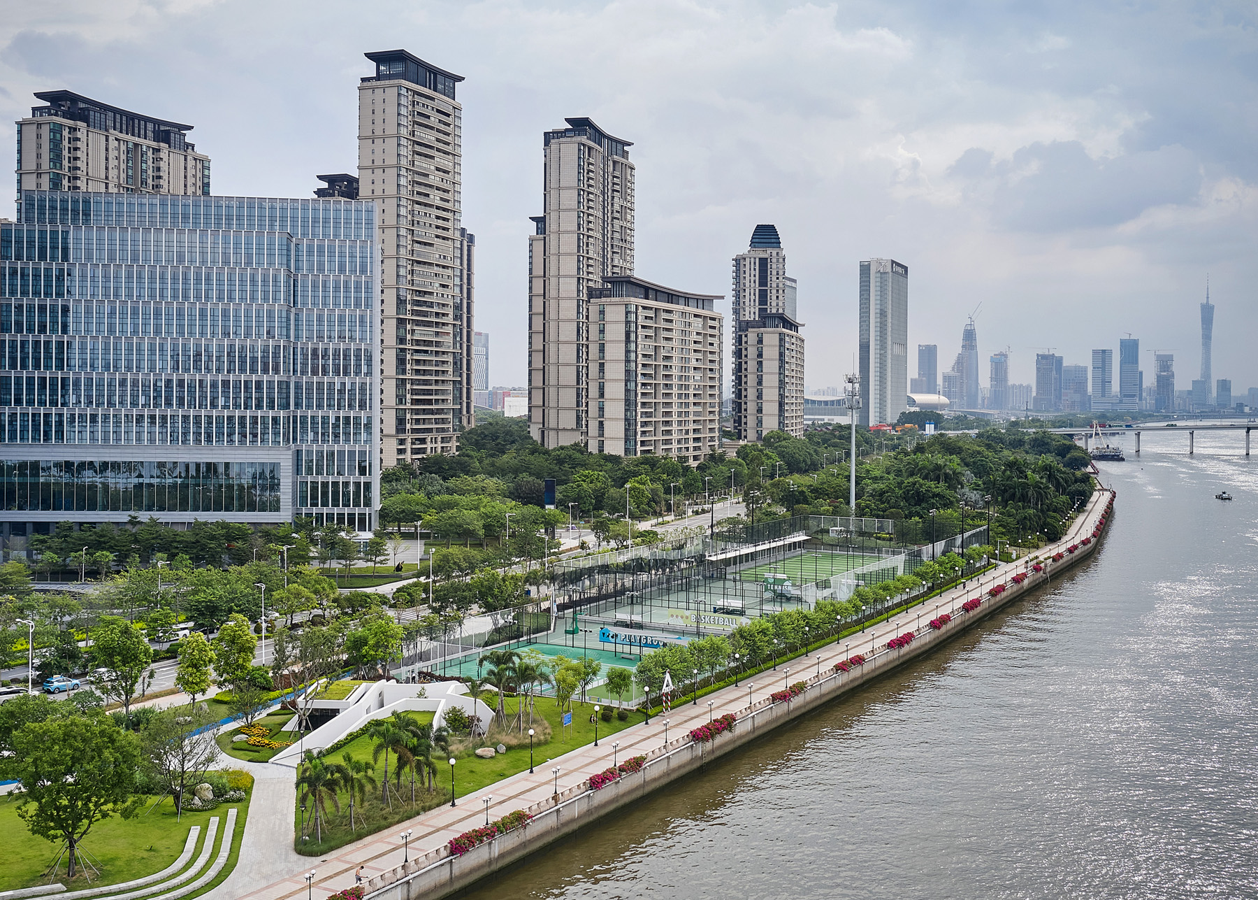
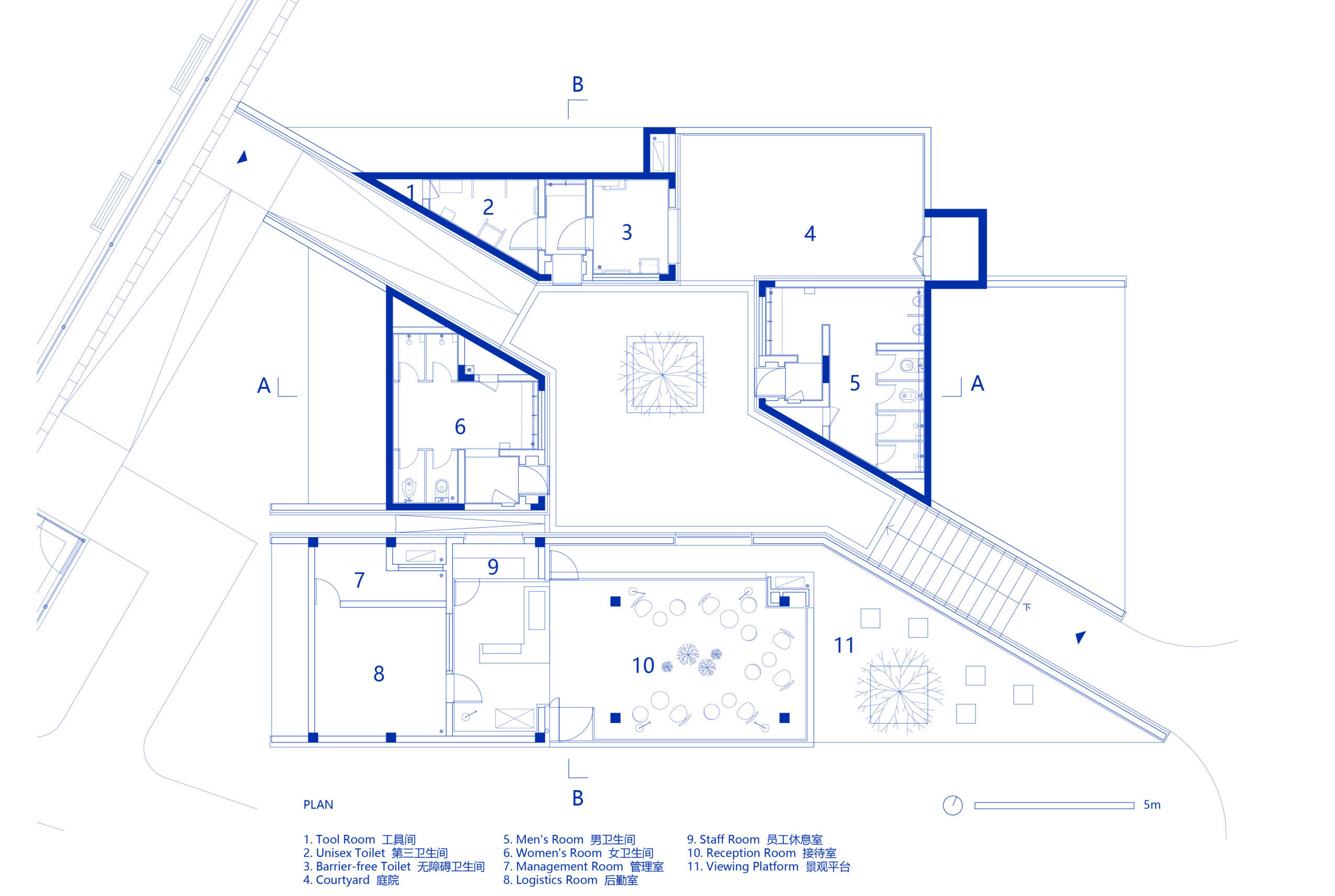
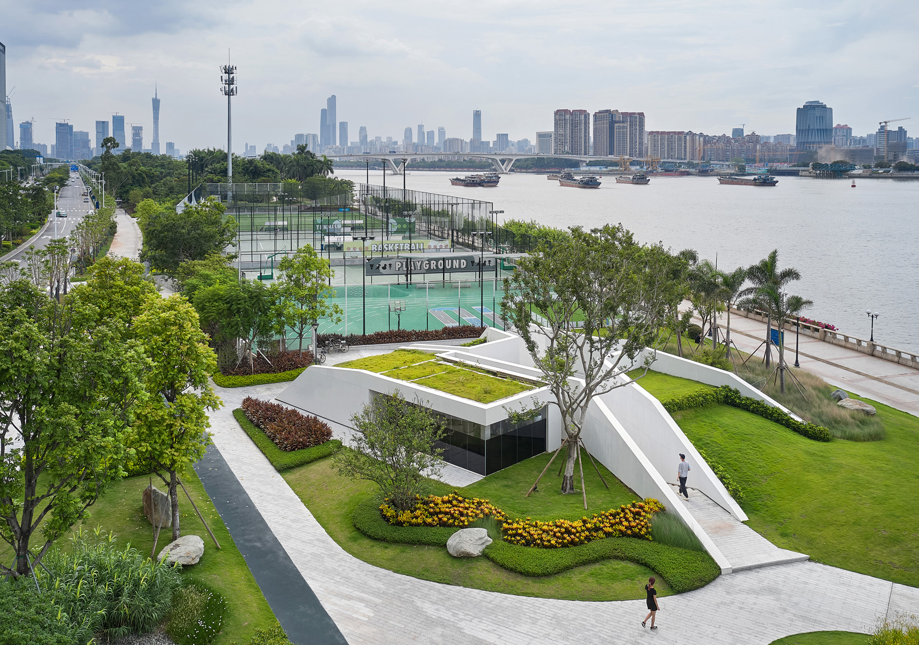 This project joins a growing movement towards architecture that blends in rather than standing out by acting as an extension of the existing landscape. Following the natural movement of the site, this design responds to crowds moving by through and around the building by raising up the green space of the original landscape and incising it with terrazzo paths.
8. Fort 137
By Daniel Joseph Chenin in Las Vegas, NV, United States
Jury Winner, 10th Annual A+Awards, Private House (XL > 6000 sq ft)
Popular Choice, 10th Annual A+Awards, Residential Interiors (>3000 sq ft)
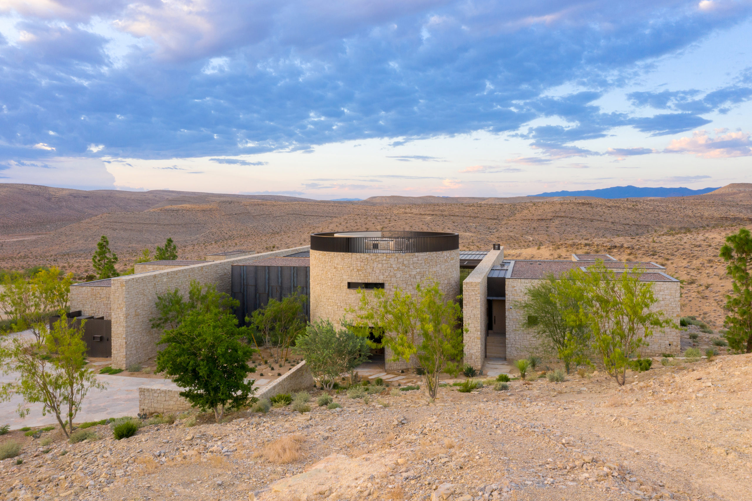
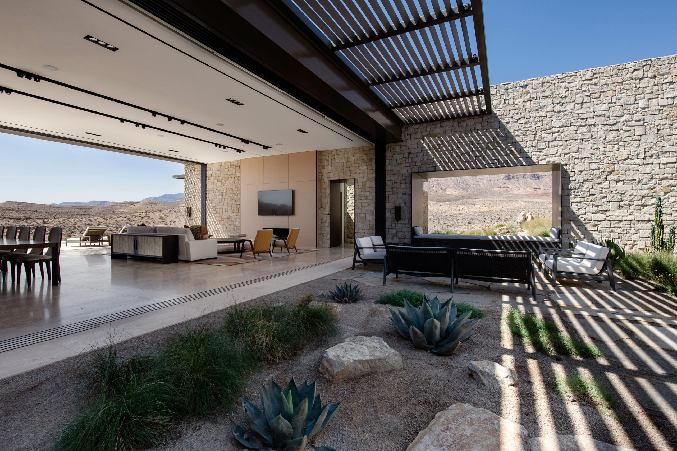 Perched on the most remote edge of the Las Vegas Valley, this scheme aims to immerse the client in the isolated landscape while maximizing unobstructed views of the surrounding desert and canyons. Like a stronghold in the desert, the site also inspired the design and materiality, which pays homage to the historic forts, hand forged from site-sourced materials, that dotted the fringes of the Southwest frontier.
7. Stanford Residence
By Jensen Architects in Stanford, CA, United States
Popular Choice, 10th Annual A+Awards, Residential Additions
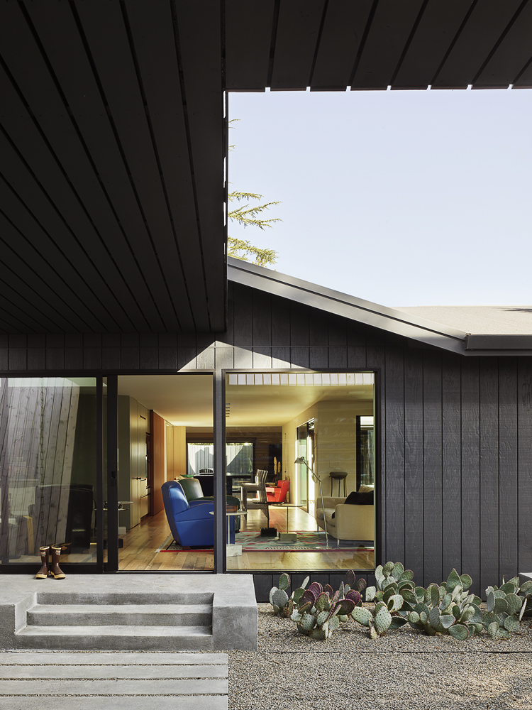
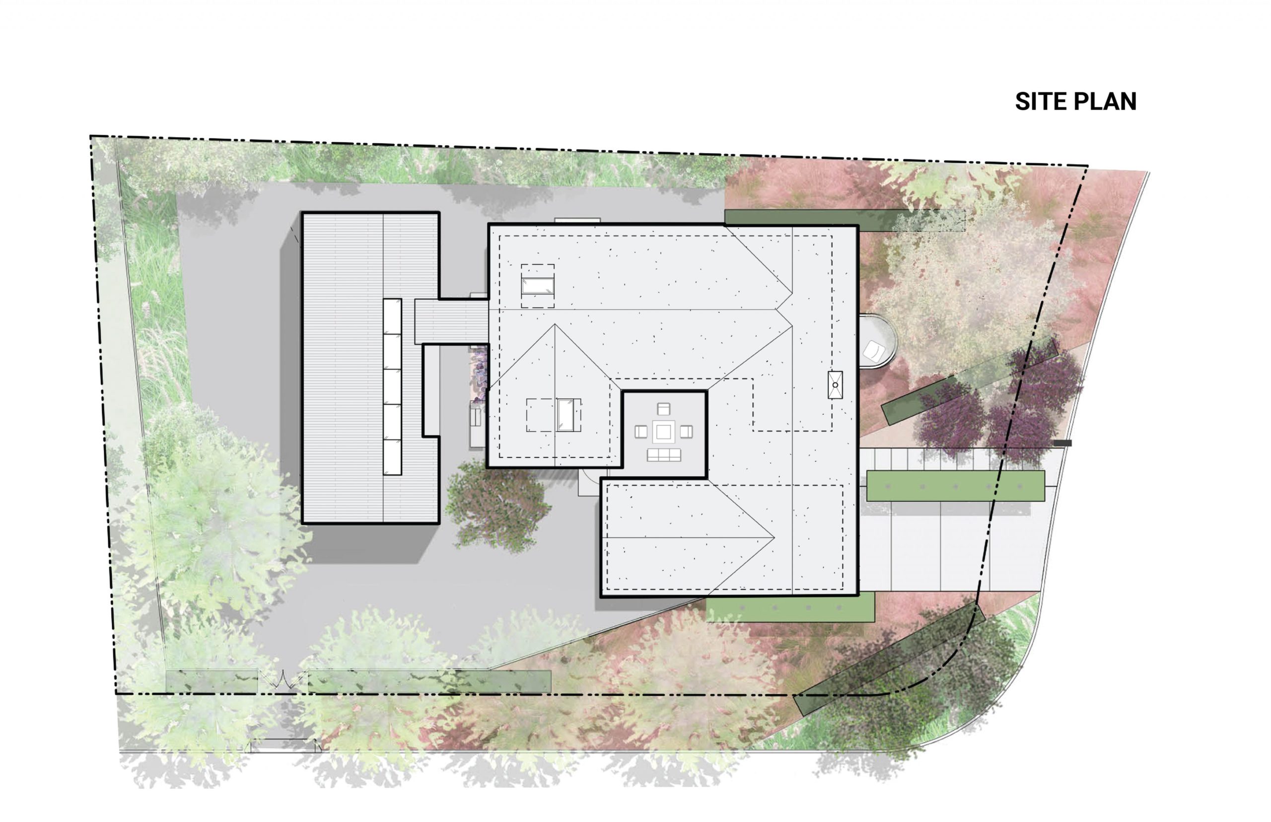
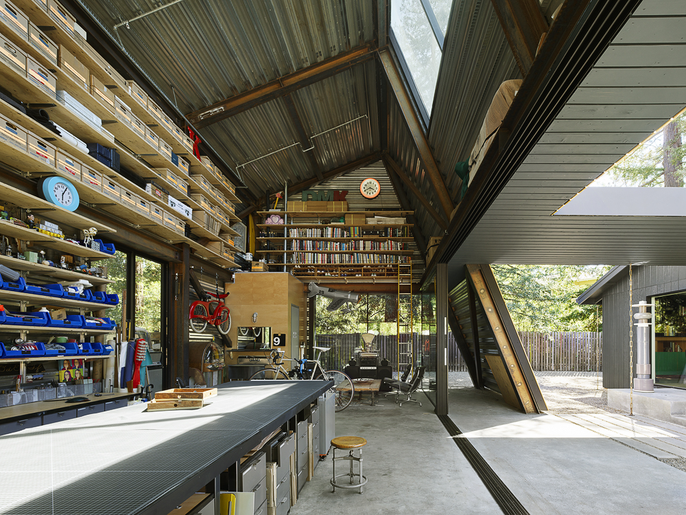 Reworking and remodeling this 1960’s house also involved integrating a new and unconventional workshop for the owner, a university professor. Yet, as the architects explain, “inherent in [the] work was a questioning of the suburban vernacular,” which manifested as a raw and tough space that is ready for anything. While an angled industrial frame, wrapped in wood and glass, offers a clever reply to local pitched-roof mandates, the connecting breezeway emphasizes a parti about flow, both creative and spatial.
6. Casa Pattaya
By makeAscene in Pattaya City, Thailand
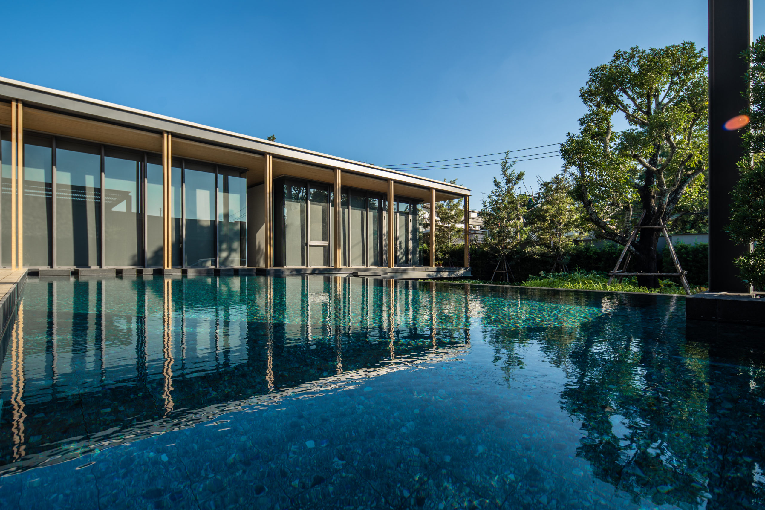
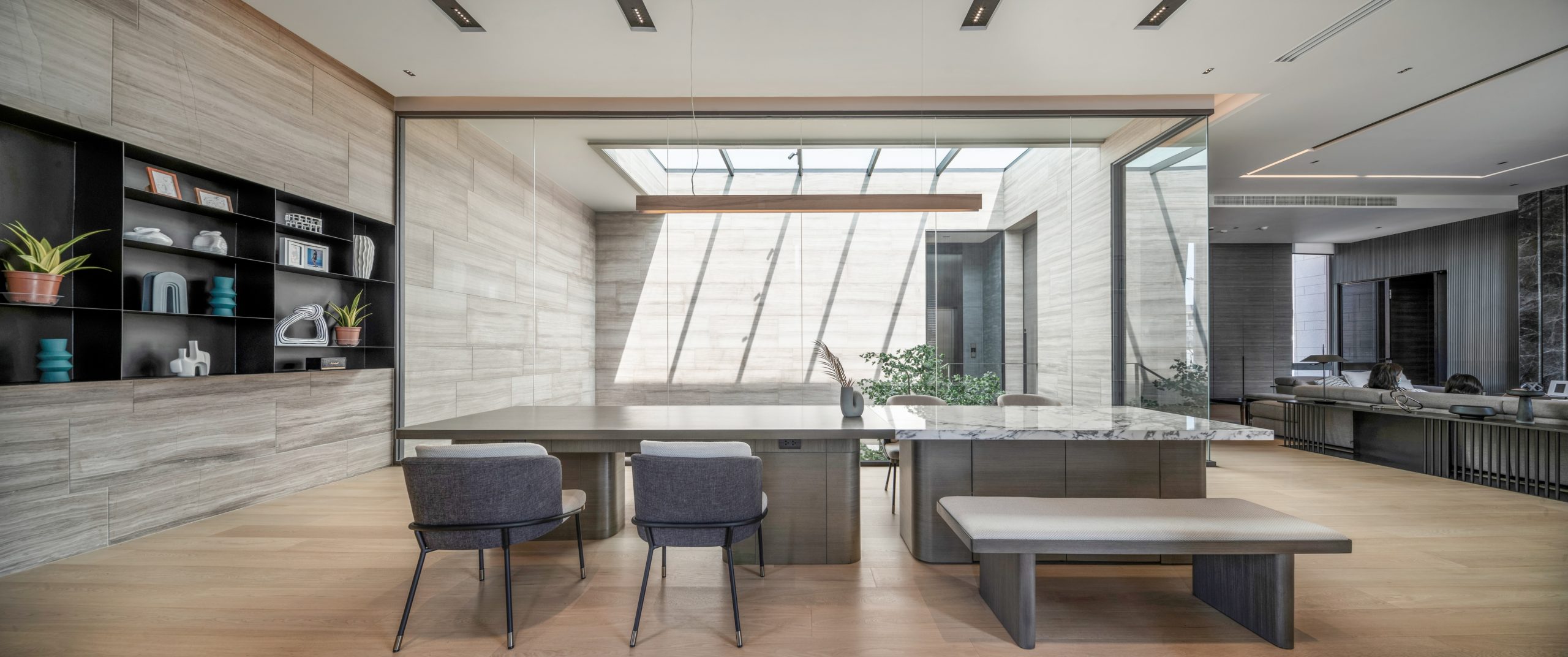
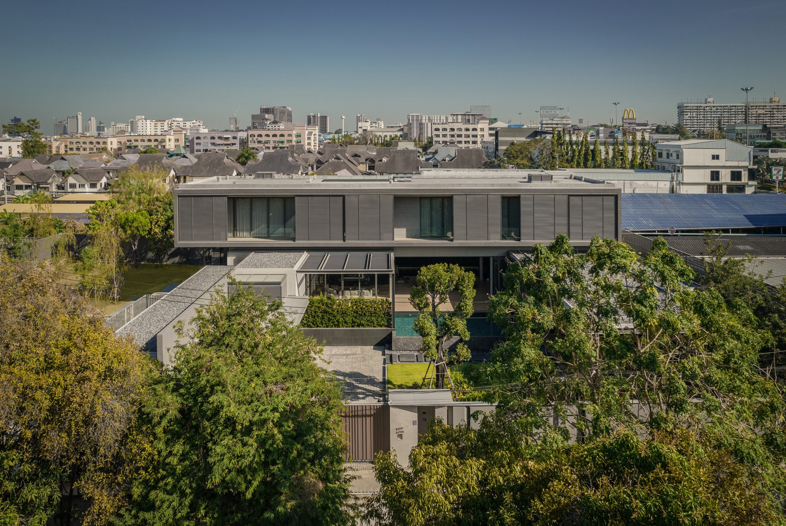 On one aspect the house seeks to express the laid-back nature of the seaside town; yet, because the surroundings are quite cramped, the architect had to carefully study the massing placement. This resulted in a sort of inside-out house, with an arrival courtyard penetrating to the central living deck that creates an in-between area that is convertible to be either indoor or outdoor living area.
5. Villa LP
By Nghia-Architect in Ba Vì, Hanoi, Vietnam
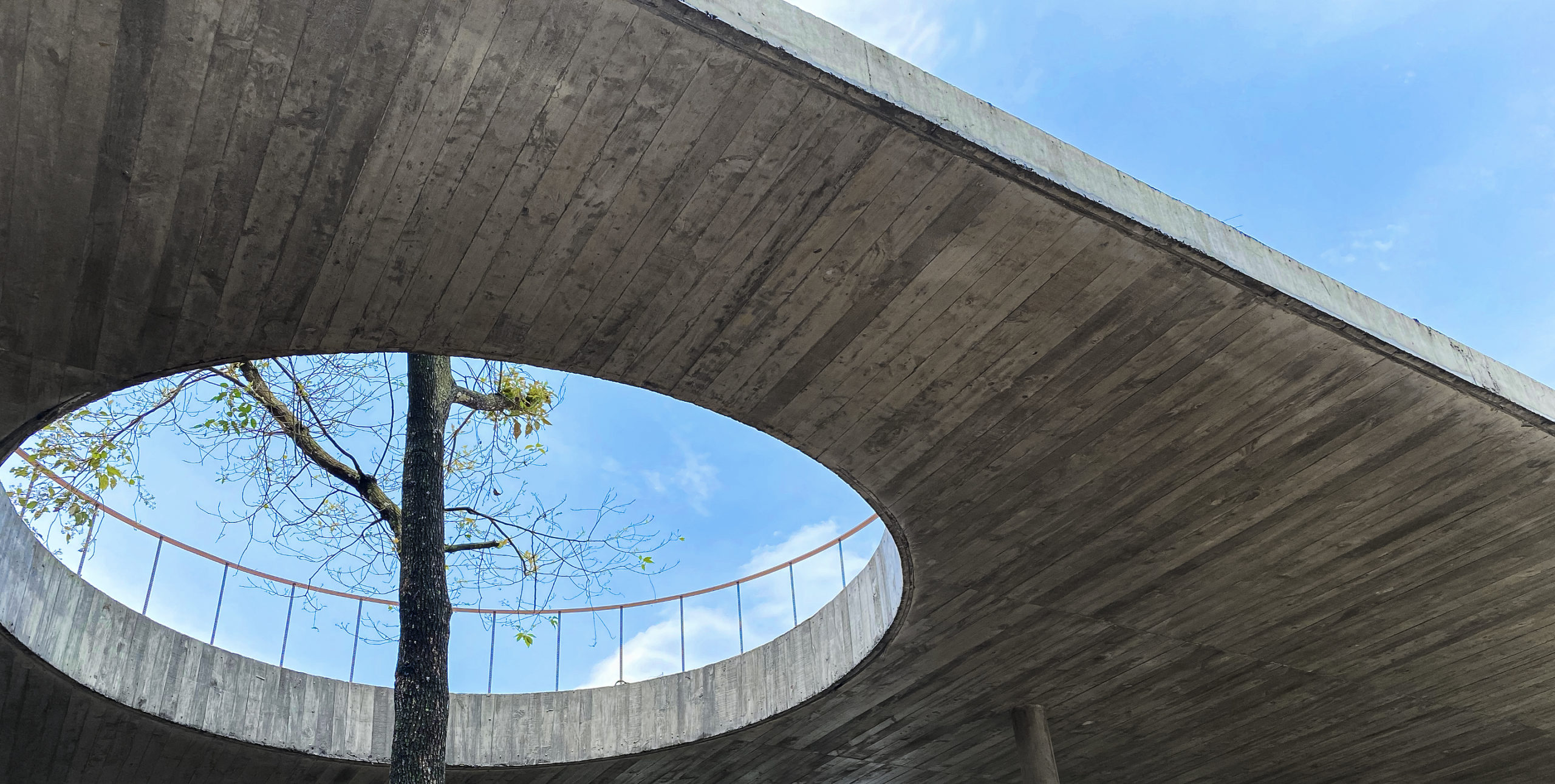
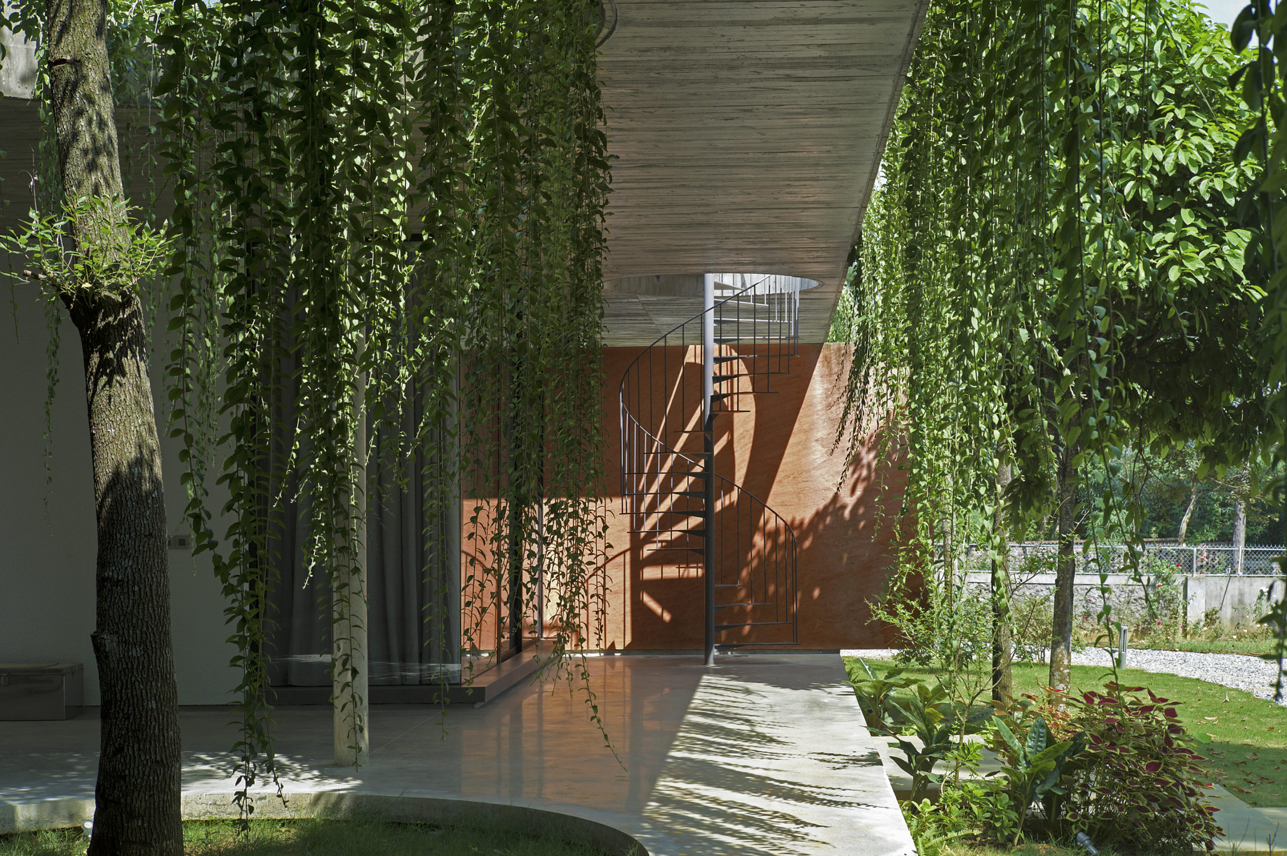
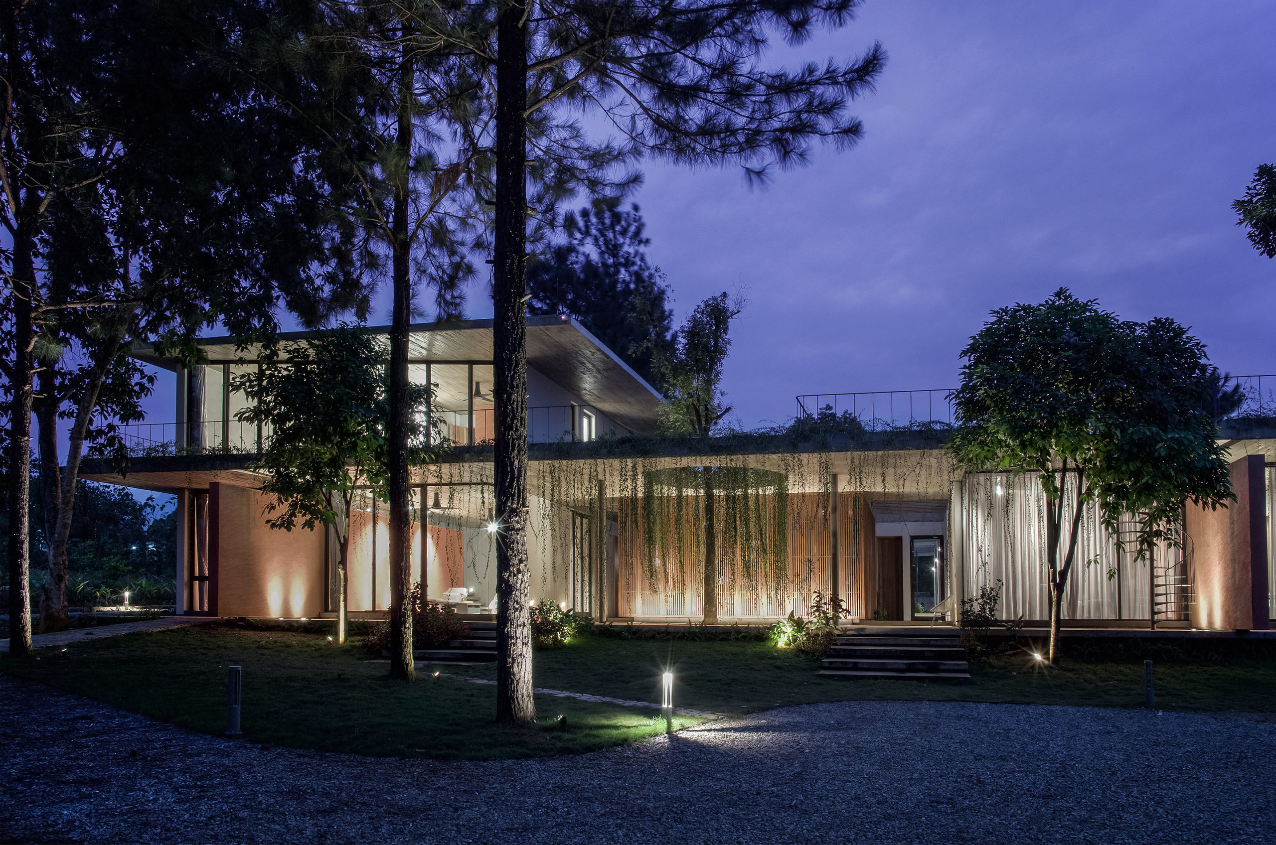 This house is home to family members across generations, meaning that it requires spaces that accomodate differences in family members’ lifestyles, ages and personal needs. While the grandparents are used to the traditional Vietnamese lifestyle, the married couple and their children are familiar with the modern way of living in foreign countries. Faced with designing a massive structure, the architects needed to find a way to ensure that it blended in well with its surroundings.
4. HARMAY OōEli
By AIM Architecture in Hangzhou, China
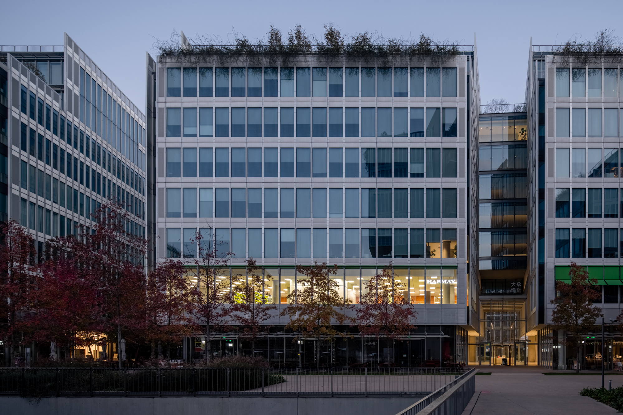
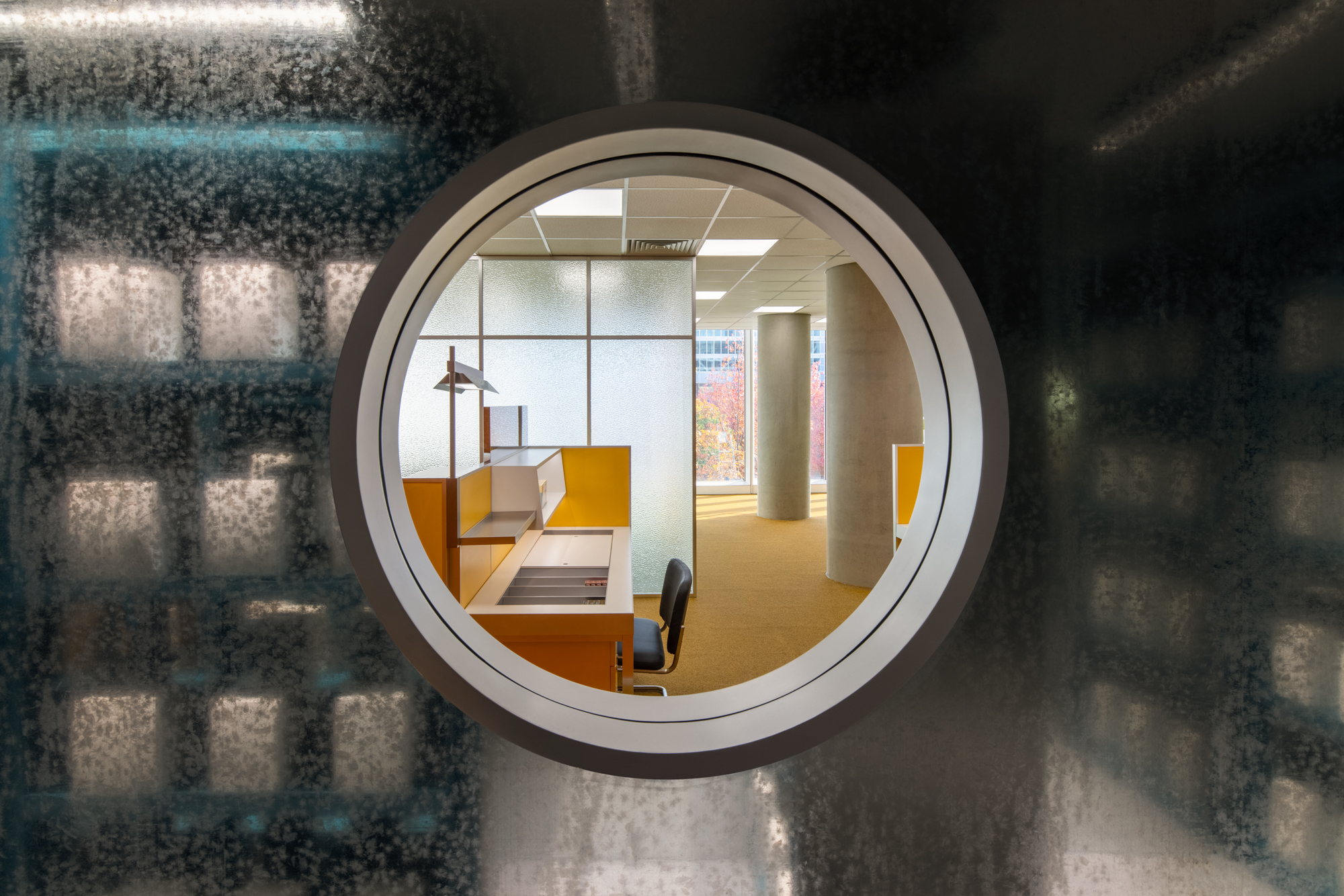
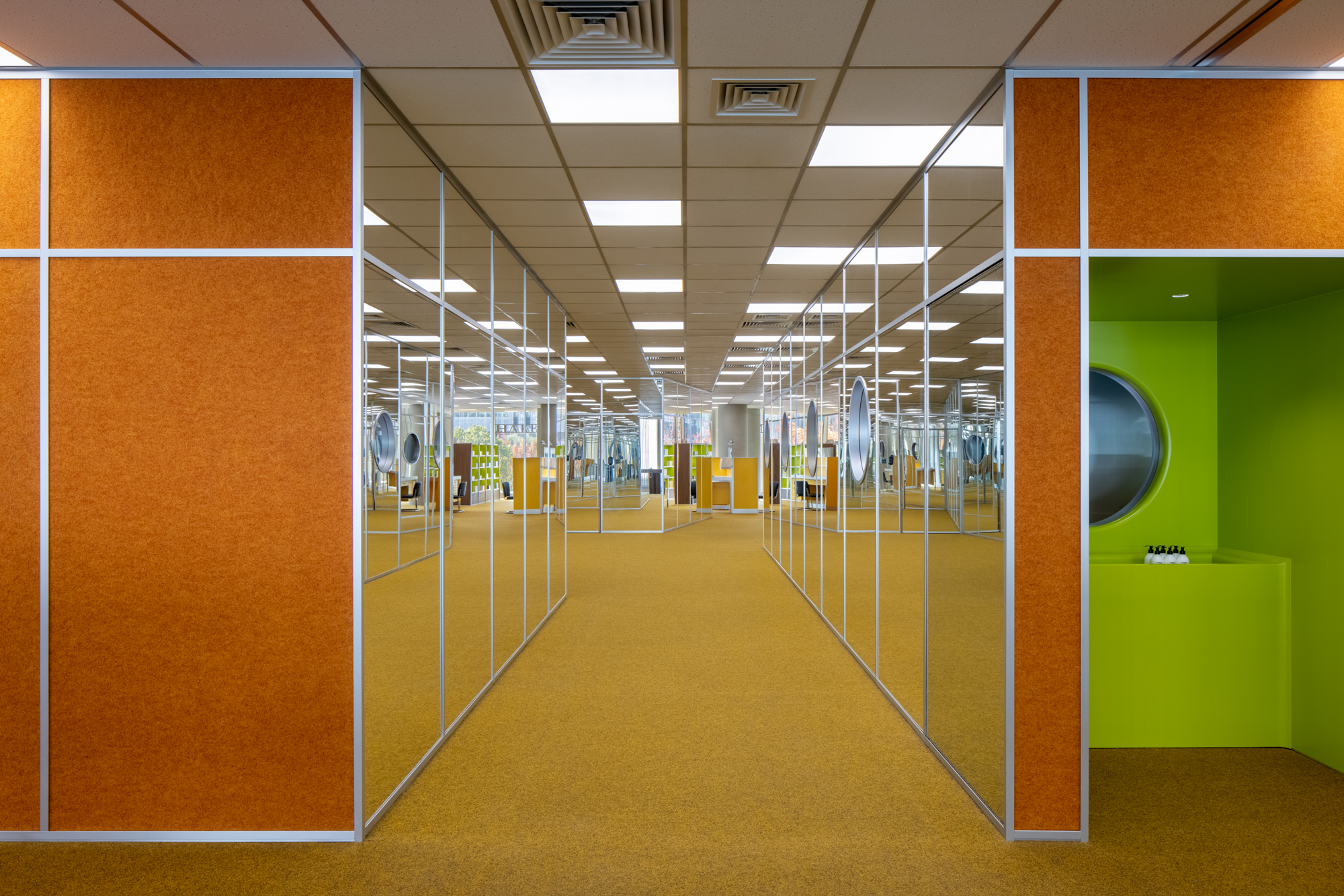 Set on the second floor of a building in a mixed-use office park designed by Renzo Piano Building Workshop in 2020, this store is inspired by its immediate surroundings. The space with floor to ceiling high curtain wall windows and an enclosed center core is the perfect platform to explore a place closely related to our day-to-day environment, the office. Representing a 70’s romanticized image of what an office life looks like, consumers experience this illusion of time wandering between the past and present. Working with bright color tones, soft carpets, and different textures creates a mood of future positivism.
3. “Muranow” Cinema
By Piotr Hardecki Architekt in Warsaw, Poland
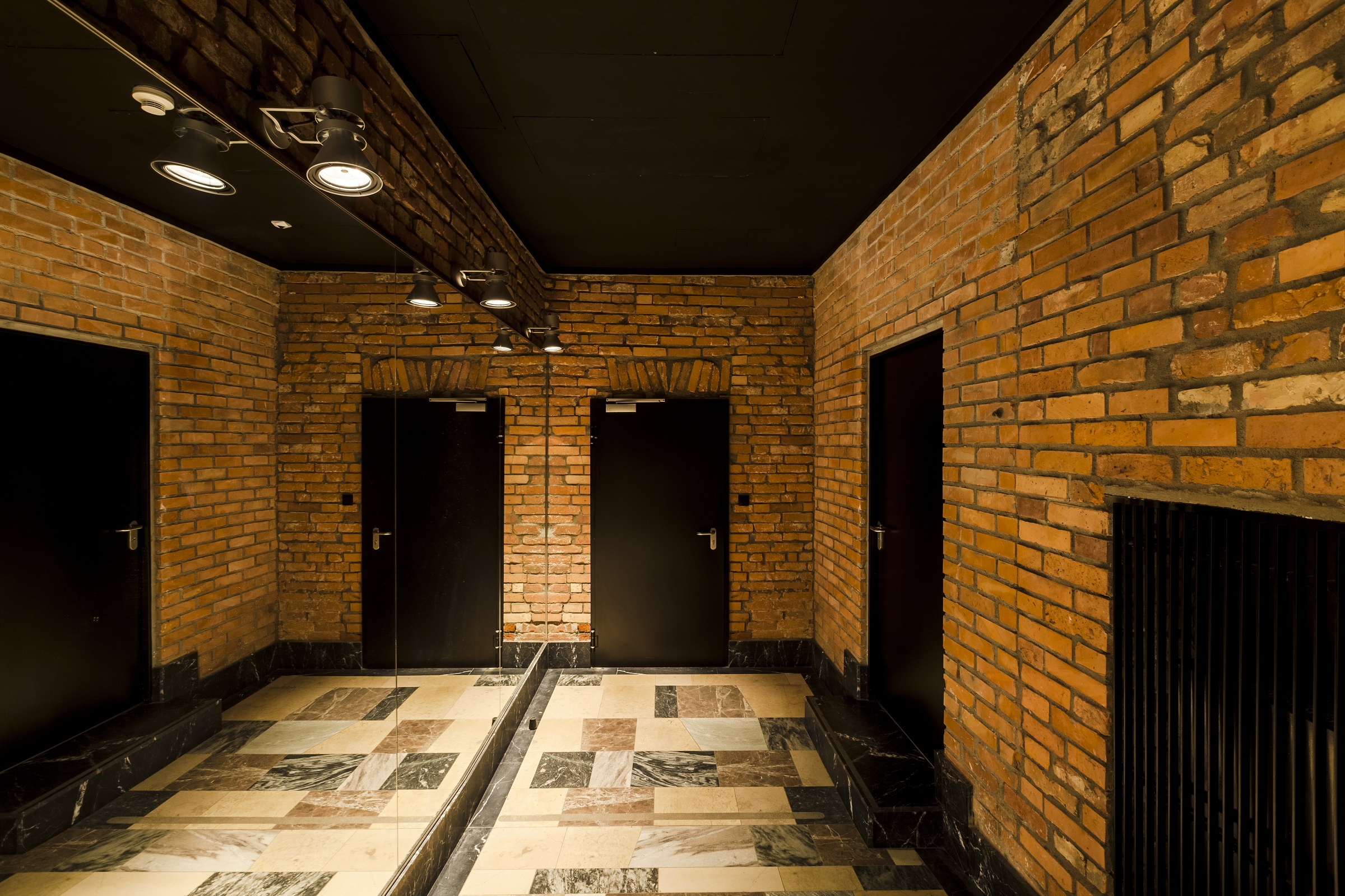
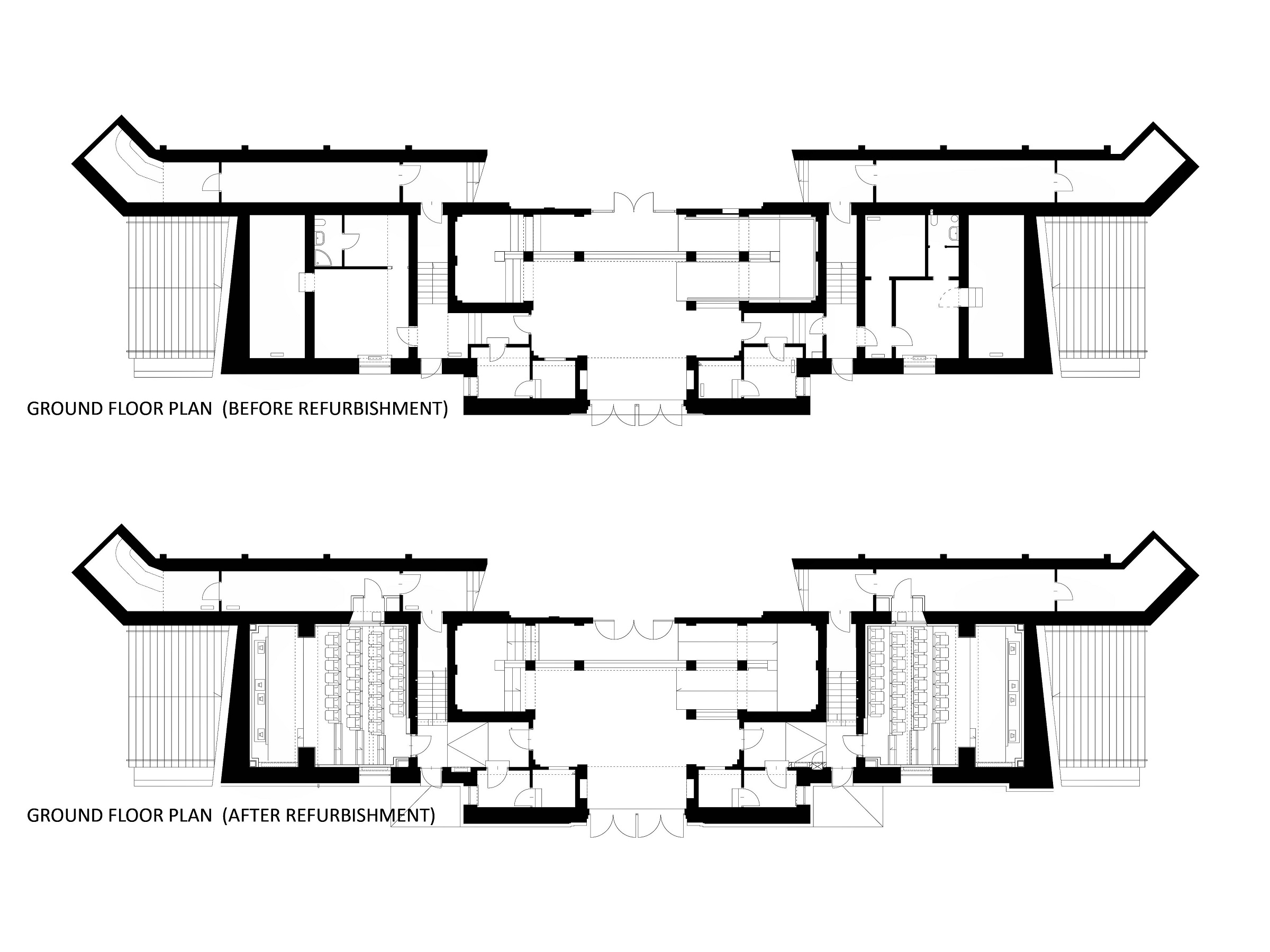
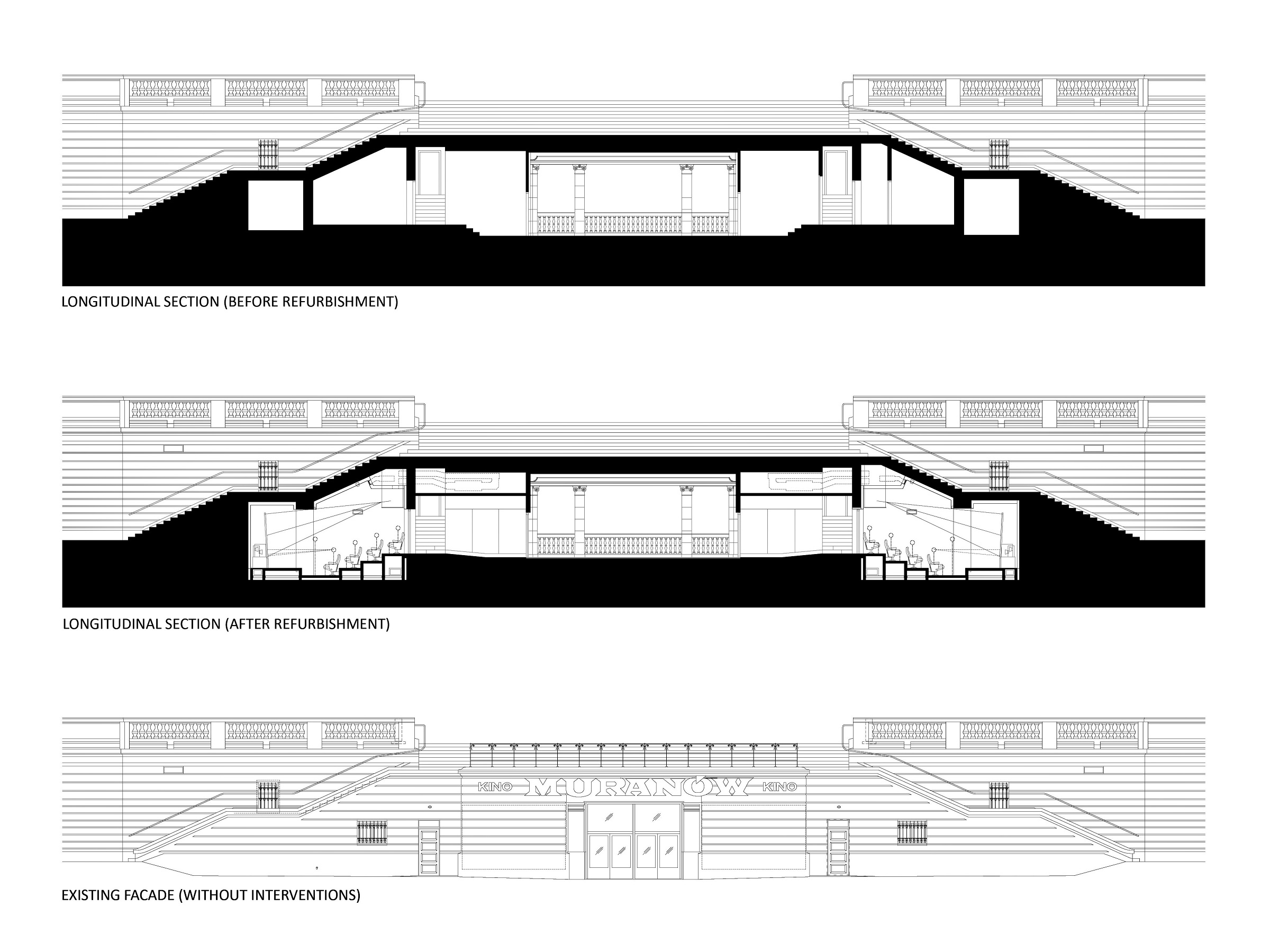 The cinema is located in the area of a former Jewish quarter destroyed by the Nazis during the WWII. In the aftermath, the area was rebuilt using rubble from the former buildings. The designer of the cinema, the excellent pre-war architect Bohdan Lachert, faced a choice: either to design in the socialist realist style or not to design at all. It was only decades later that his ideas were appreciated. Seventy years later, these stories from the past had a strong influence on Piotr Hardecki Architekt’s refurbishment project.
2. CAP Riells i Viabrea
By Comas-Pont arquitectes in Riells i Viabrea, Spain
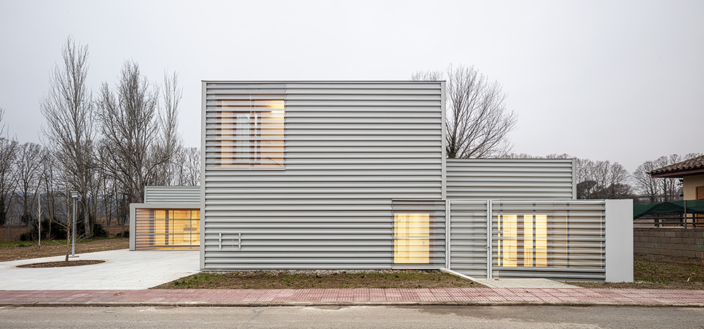
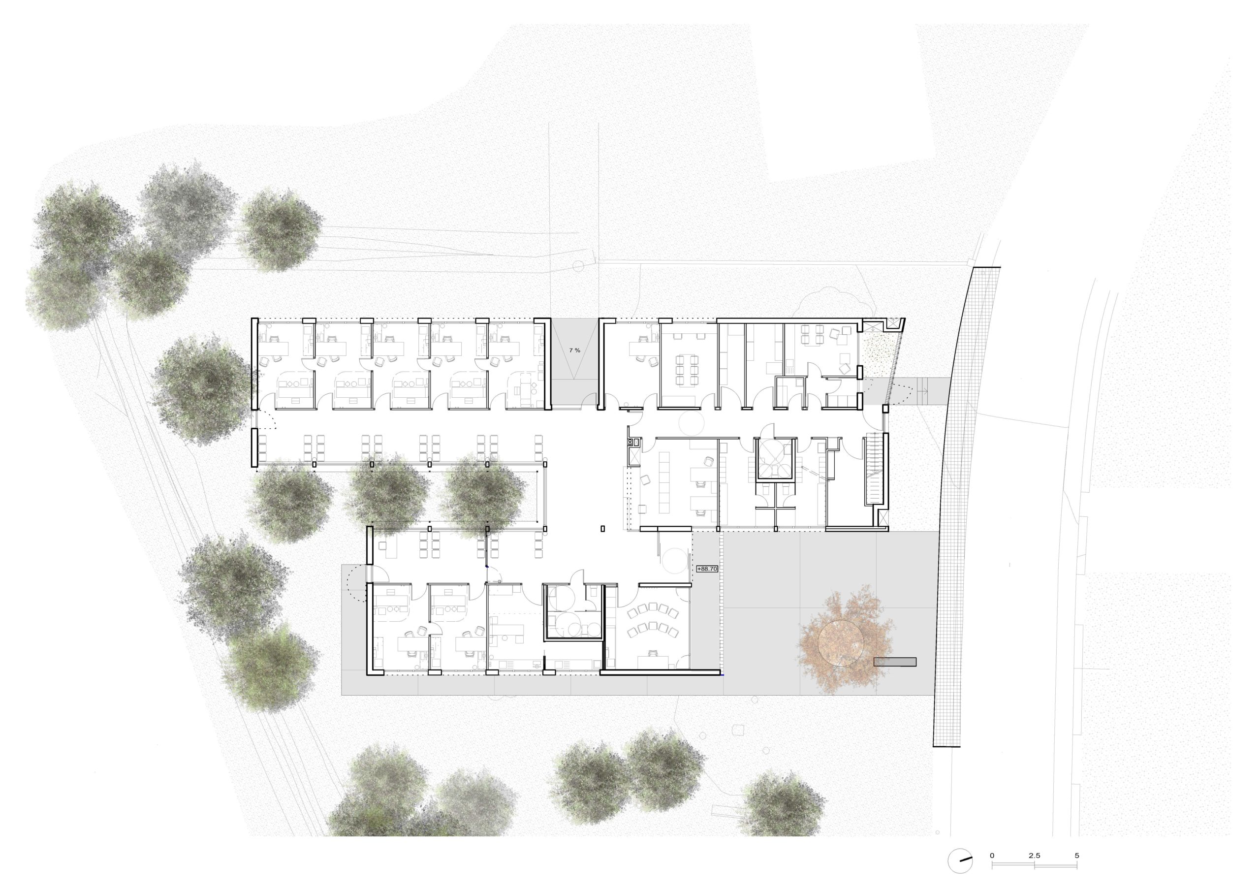 A Primary Care Center (CAP) is an ideal public facility to consider the health of people from the construction itself, minimizing the generation of CO2 in the life cycle of materials and ensuring a healthy environment in the interior. This project introduces the surrounding landscape inside the building through a linear courtyard related to the waiting rooms. The use of the structure with microlaminated wood (CLT) for the first time in a CAP in Catalonia, generates a conceptual dialogue with the forests of Montseny (biosphere reserve) visible from the building, reduces the execution deadlines and waste and allows to achieve the highest energy rating A.
1. Fincas Blanco Real Estate Office
By Sincro in Cornellà de Llobregat, Spain
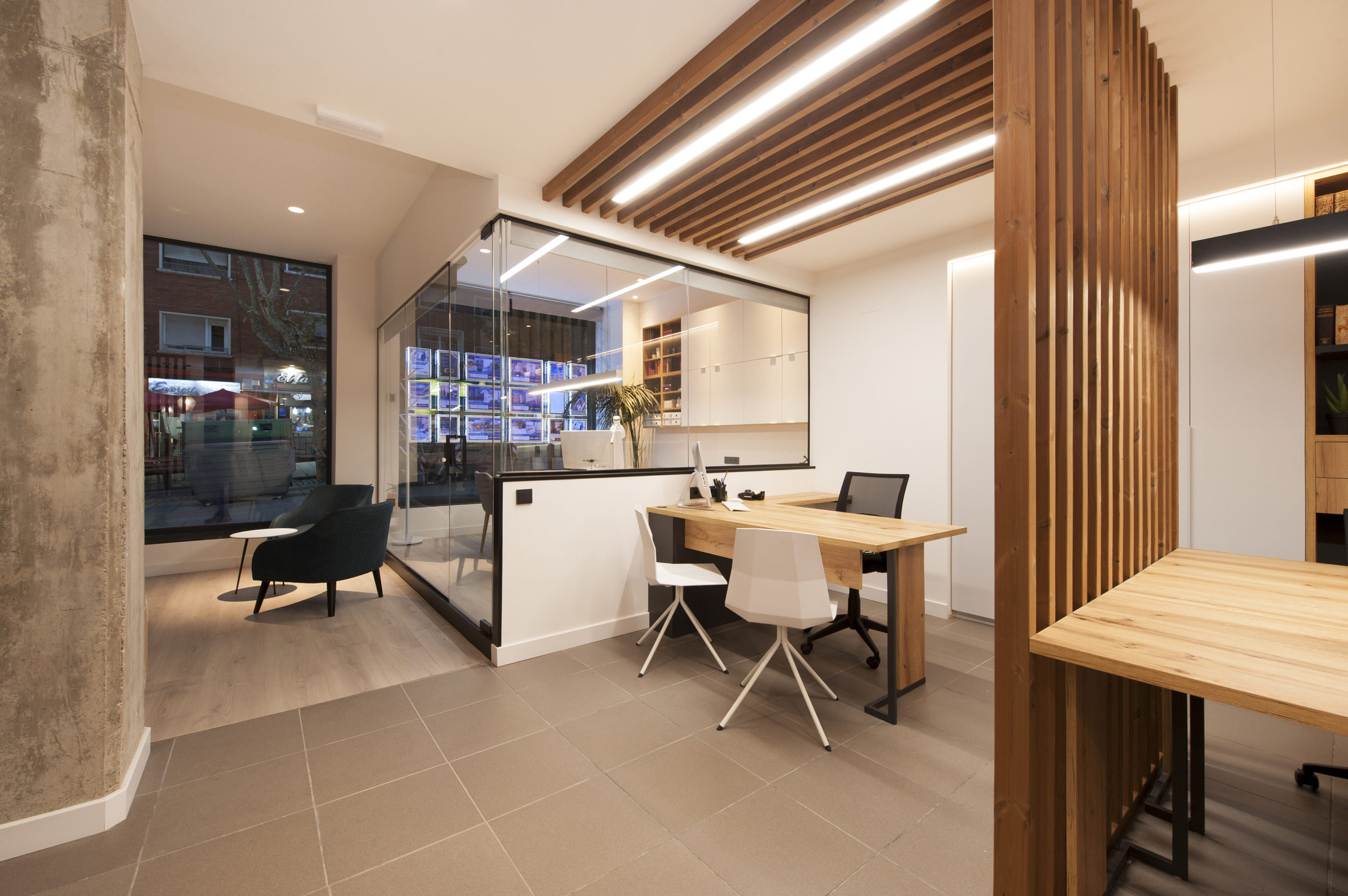
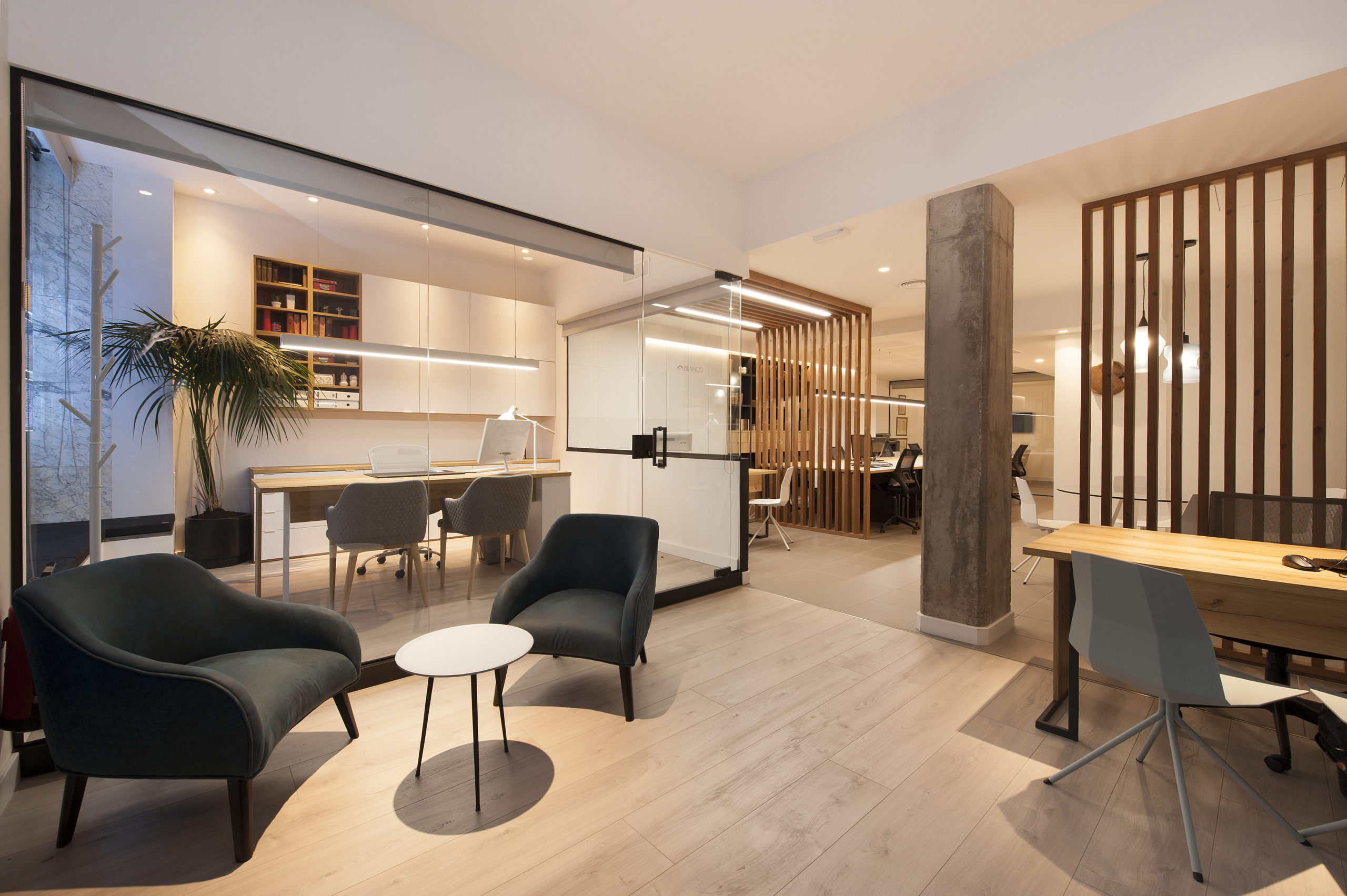 The complete redesign of the corporate image of the 15-year-old offices of a real estate company in Barcelona. The interior has been designed in a Nordic style, expressed through the use of wood that brings warmth, along with the minimalism of white. The structures made with wooden slats also function as spatial divides that simultaneously imbue the space with character and personality.
Architects: Want to have your project featured? Showcase your work through Architizer and sign up for our inspirational newsletter.


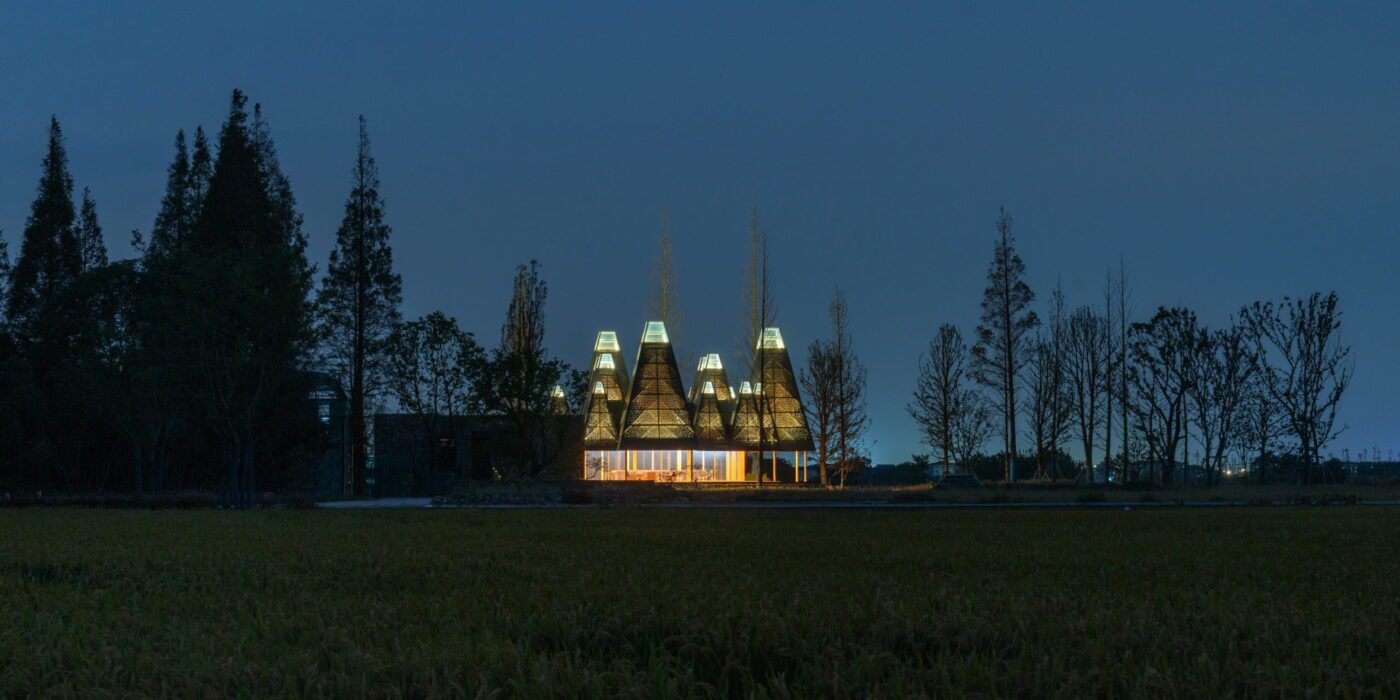
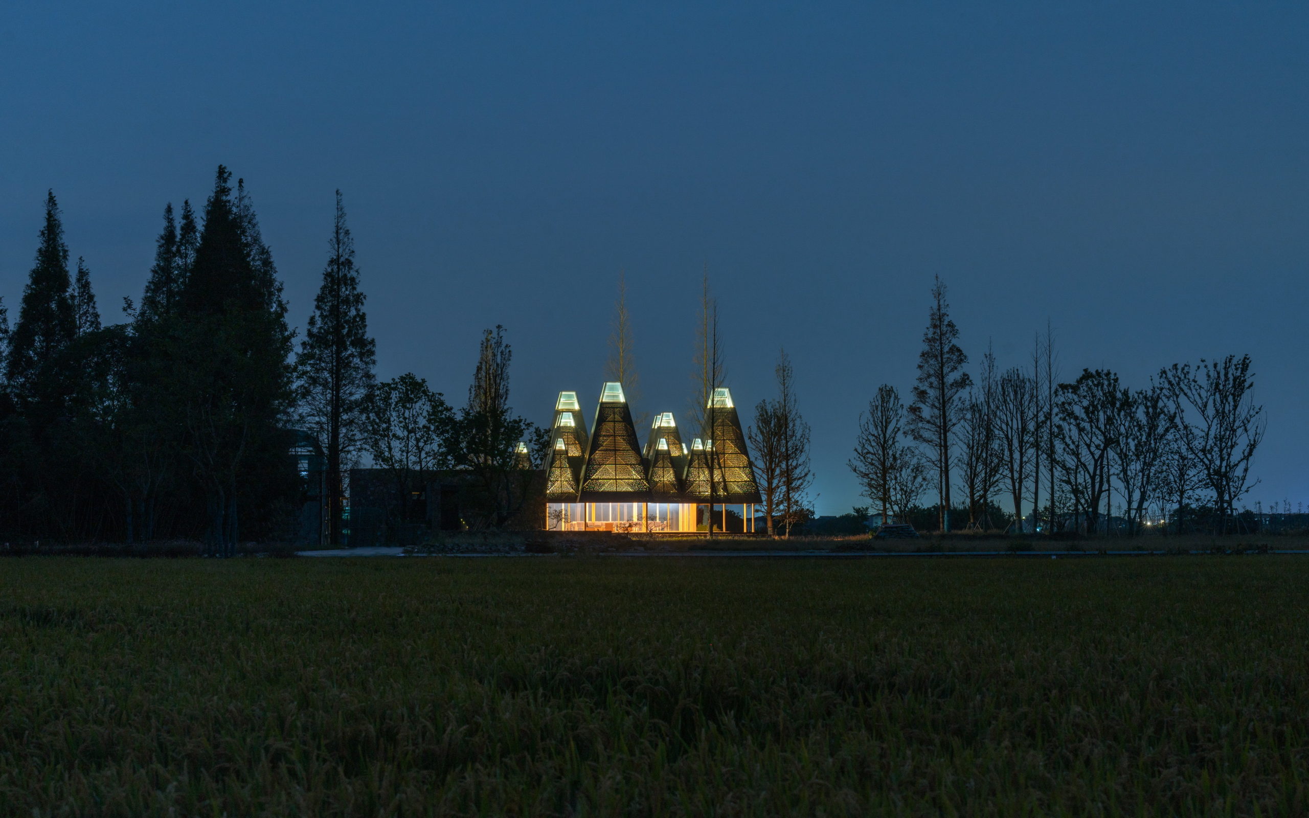
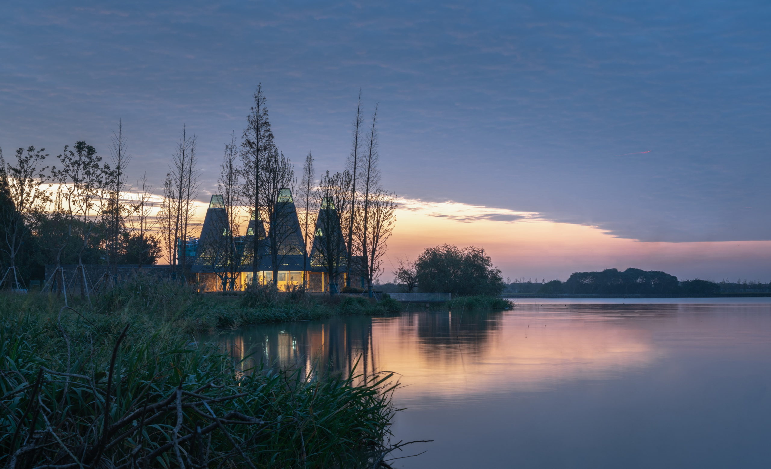
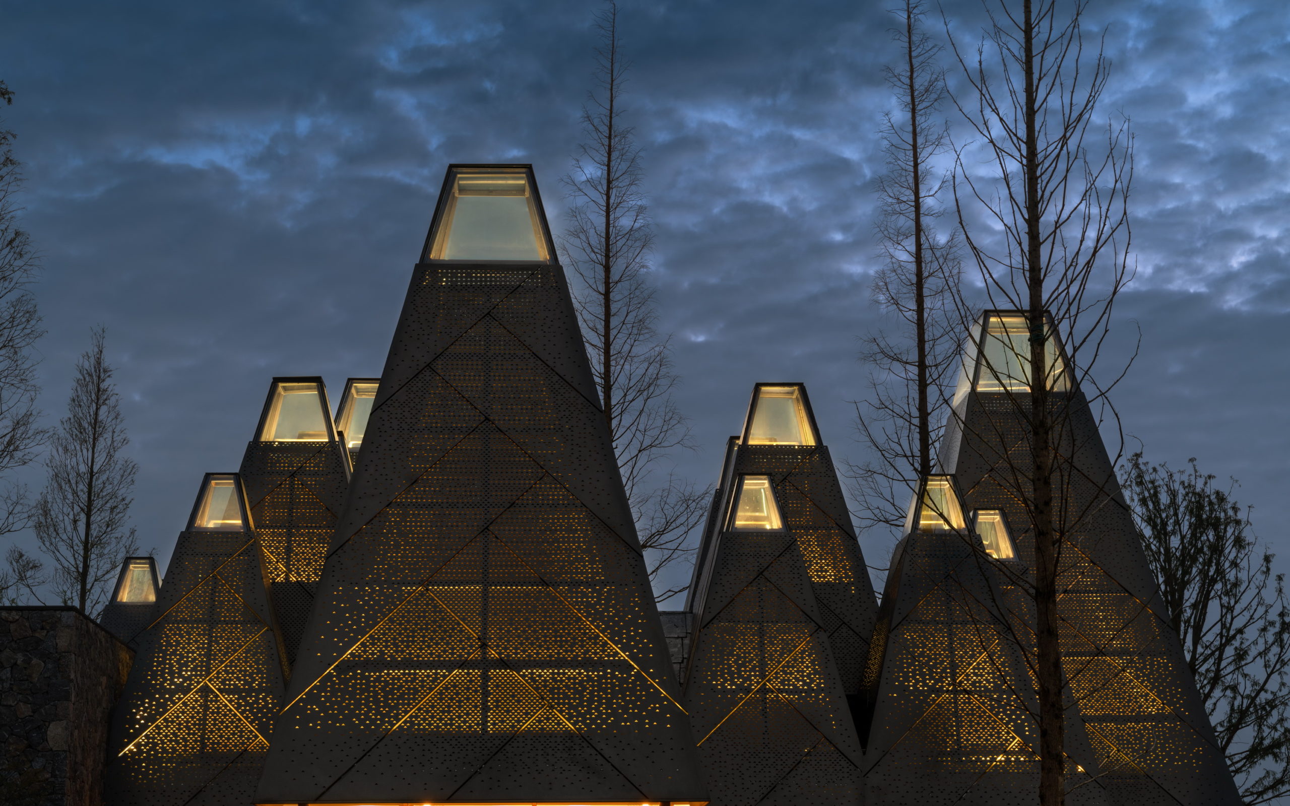
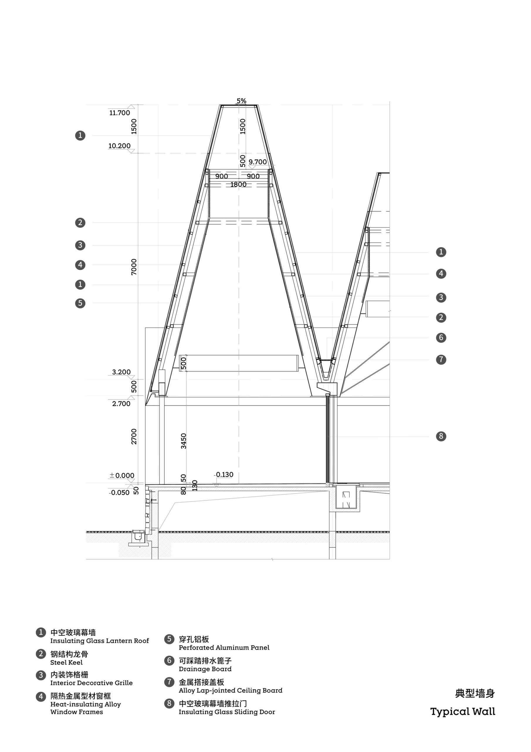
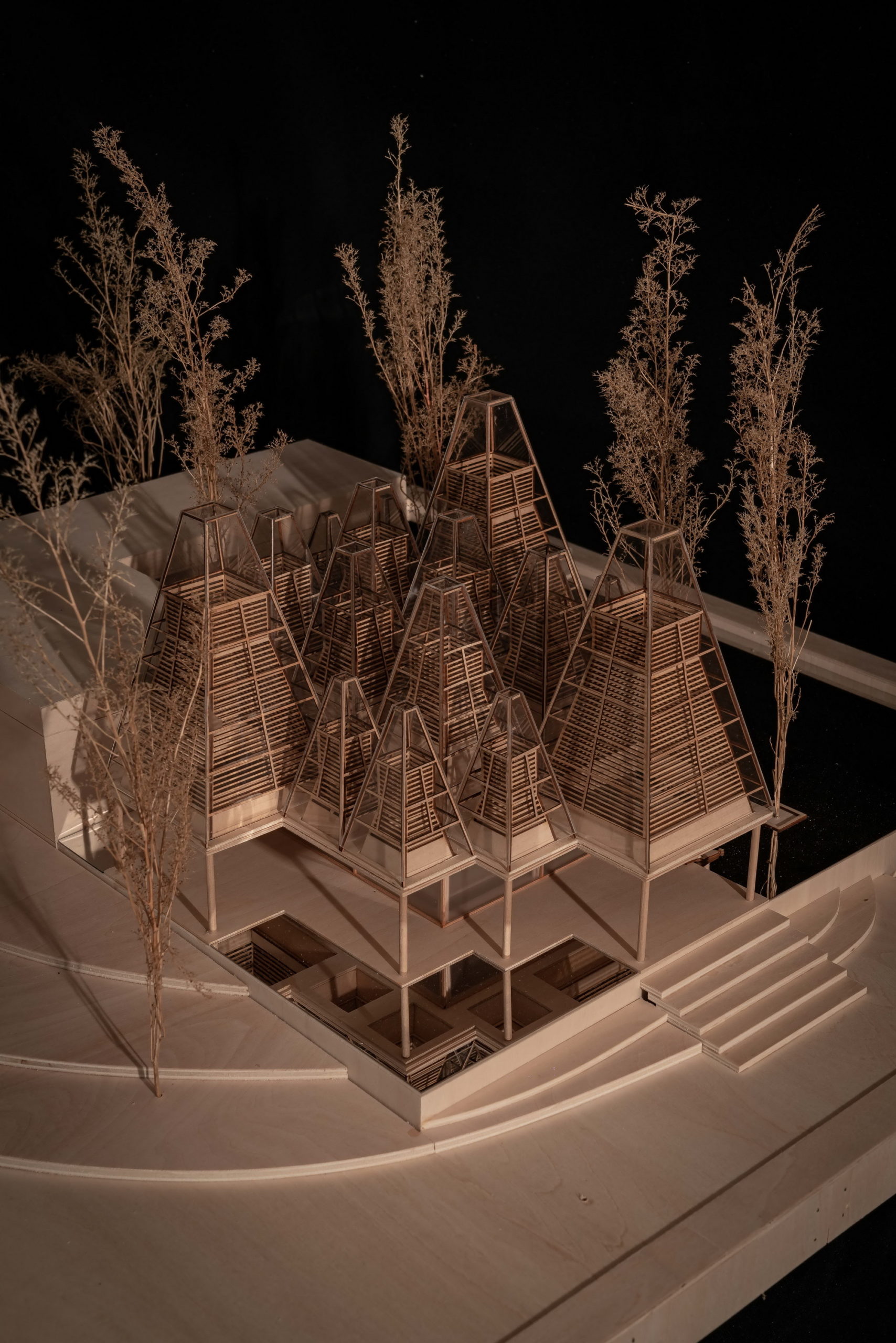
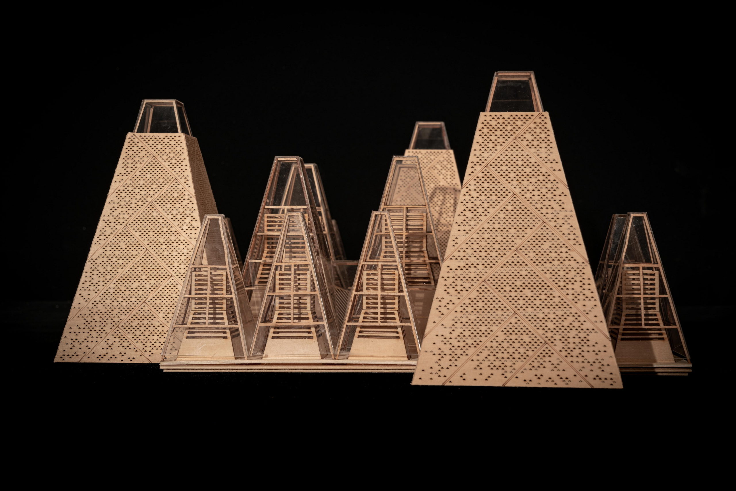 Despite the different heights on top, the lower end of the roof is evenly lowered by about nine feet to create a crisp frame of the view around. “Standing under the eaves and looking out, the vastness and tranquility of the plain wetlands seem to be included in the picture scroll,” GOA explained. The underside of the roof is also free of vents, which are in turn placed at the ground level along the glass windows, to create a disruption-free experience.
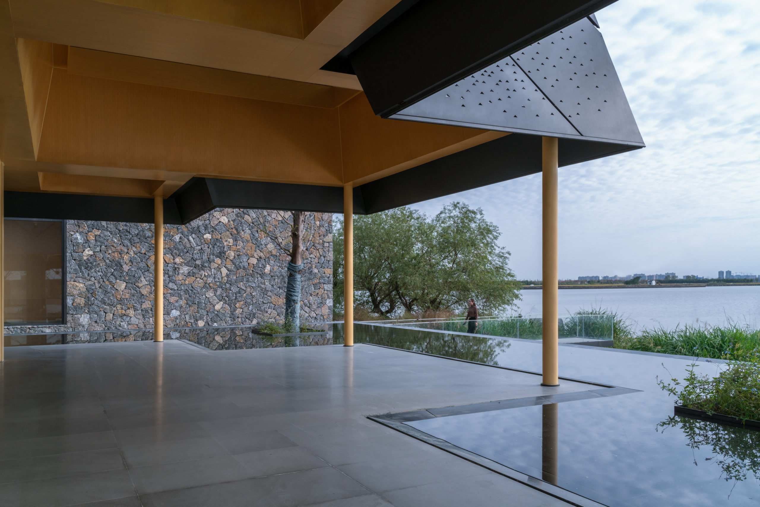
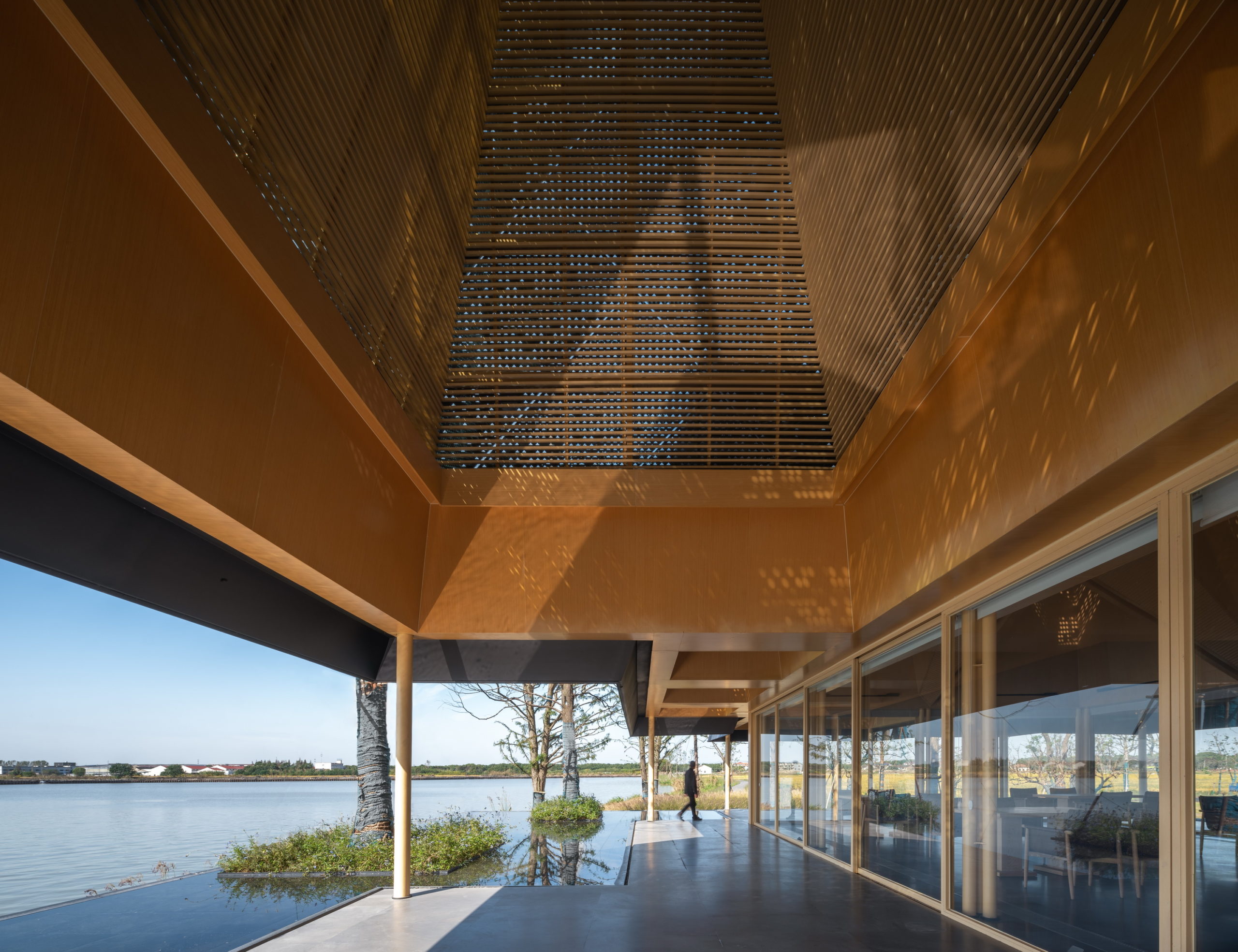
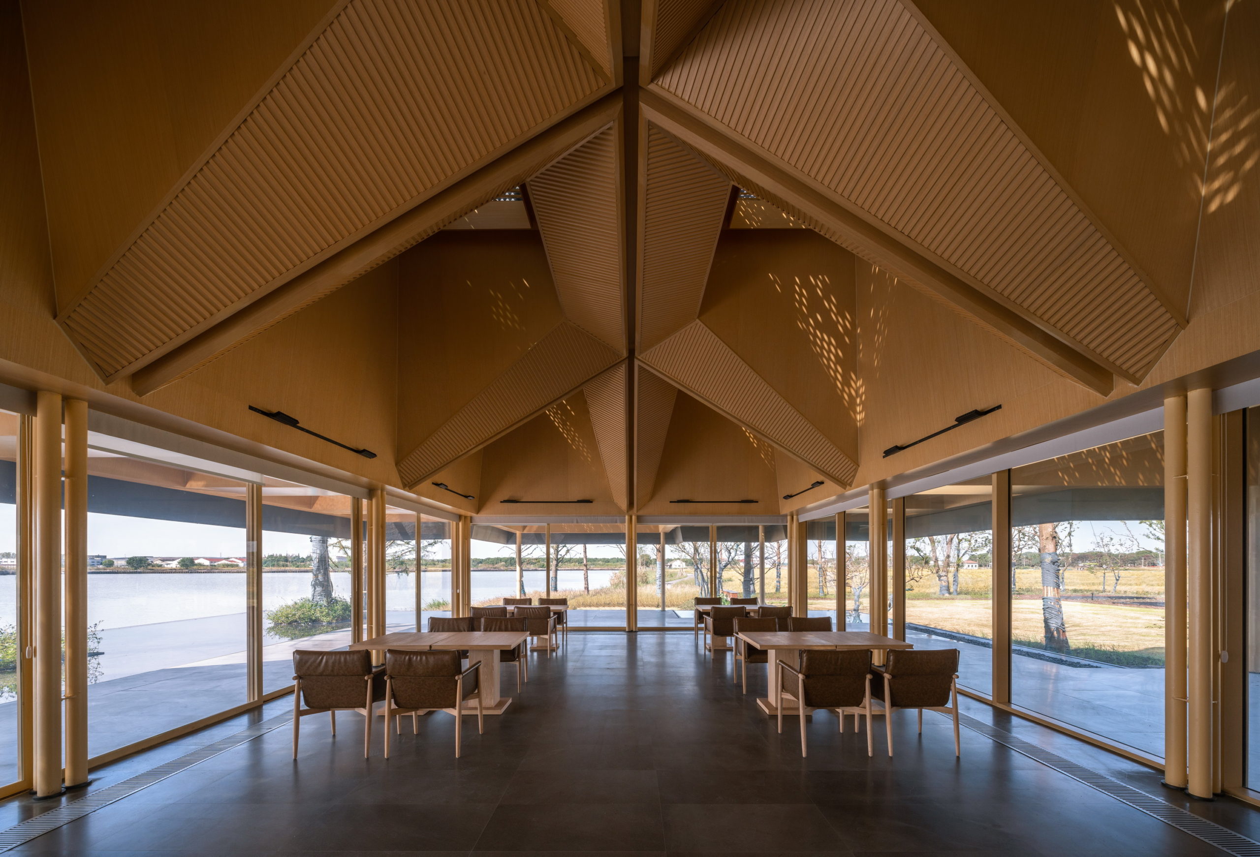 In addition to eliminating partition devices, the team has further blurred the boundaries between the structure and site around by using the same paving materials within the restaurant and the terrace that extends outwards. The terrace also includes a planned water body, closer to the natural water body, which creates a continuous line of vision when sitting inside.
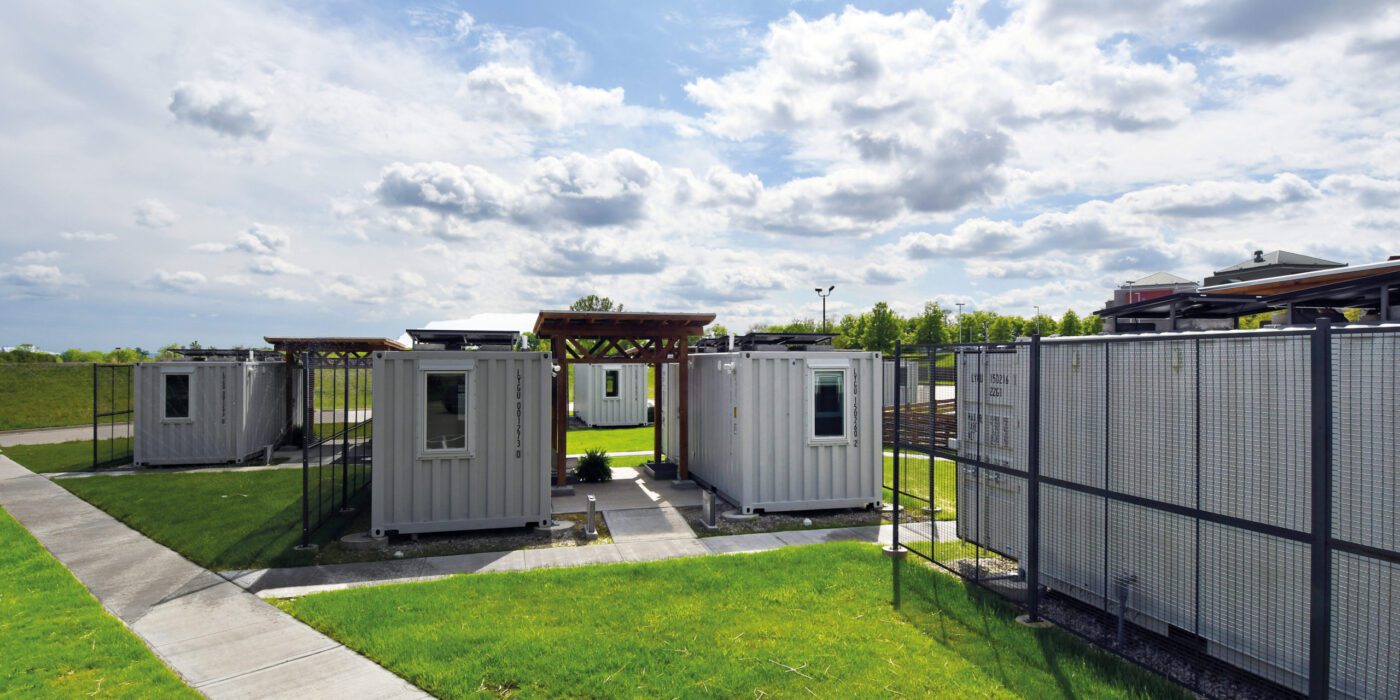


 At the University of Kansas School of Architecture, graduate students have the option to enroll in Studio 804, which recently received a donation of a dozen shipping containers. The students worked to convert this gift into tiny homes for families who needed isolate during the pandemic. (The alternative was congregate housing.) Three solar collectors were placed on top of each unit to provide some electricity for inhabitants on the four beds inside.

 This project joins a growing movement towards architecture that blends in rather than standing out by acting as an extension of the existing landscape. Following the natural movement of the site, this design responds to crowds moving by through and around the building by raising up the green space of the original landscape and incising it with terrazzo paths.
 Perched on the most remote edge of the Las Vegas Valley, this scheme aims to immerse the client in the isolated landscape while maximizing unobstructed views of the surrounding desert and canyons. Like a stronghold in the desert, the site also inspired the design and materiality, which pays homage to the historic forts, hand forged from site-sourced materials, that dotted the fringes of the Southwest frontier.

 Reworking and remodeling this 1960’s house also involved integrating a new and unconventional workshop for the owner, a university professor. Yet, as the architects explain, “inherent in [the] work was a questioning of the suburban vernacular,” which manifested as a raw and tough space that is ready for anything. While an angled industrial frame, wrapped in wood and glass, offers a clever reply to local pitched-roof mandates, the connecting breezeway emphasizes a parti about flow, both creative and spatial.

 On one aspect the house seeks to express the laid-back nature of the seaside town; yet, because the surroundings are quite cramped, the architect had to carefully study the massing placement. This resulted in a sort of inside-out house, with an arrival courtyard penetrating to the central living deck that creates an in-between area that is convertible to be either indoor or outdoor living area.

 This house is home to family members across generations, meaning that it requires spaces that accomodate differences in family members’ lifestyles, ages and personal needs. While the grandparents are used to the traditional Vietnamese lifestyle, the married couple and their children are familiar with the modern way of living in foreign countries. Faced with designing a massive structure, the architects needed to find a way to ensure that it blended in well with its surroundings.

 Set on the second floor of a building in a mixed-use office park designed by Renzo Piano Building Workshop in 2020, this store is inspired by its immediate surroundings. The space with floor to ceiling high curtain wall windows and an enclosed center core is the perfect platform to explore a place closely related to our day-to-day environment, the office. Representing a 70’s romanticized image of what an office life looks like, consumers experience this illusion of time wandering between the past and present. Working with bright color tones, soft carpets, and different textures creates a mood of future positivism.

 The cinema is located in the area of a former Jewish quarter destroyed by the Nazis during the WWII. In the aftermath, the area was rebuilt using rubble from the former buildings. The designer of the cinema, the excellent pre-war architect Bohdan Lachert, faced a choice: either to design in the socialist realist style or not to design at all. It was only decades later that his ideas were appreciated. Seventy years later, these stories from the past had a strong influence on Piotr Hardecki Architekt’s refurbishment project.
 A Primary Care Center (CAP) is an ideal public facility to consider the health of people from the construction itself, minimizing the generation of CO2 in the life cycle of materials and ensuring a healthy environment in the interior. This project introduces the surrounding landscape inside the building through a linear courtyard related to the waiting rooms. The use of the structure with microlaminated wood (CLT) for the first time in a CAP in Catalonia, generates a conceptual dialogue with the forests of Montseny (biosphere reserve) visible from the building, reduces the execution deadlines and waste and allows to achieve the highest energy rating A.
 The complete redesign of the corporate image of the 15-year-old offices of a real estate company in Barcelona. The interior has been designed in a Nordic style, expressed through the use of wood that brings warmth, along with the minimalism of white. The structures made with wooden slats also function as spatial divides that simultaneously imbue the space with character and personality.

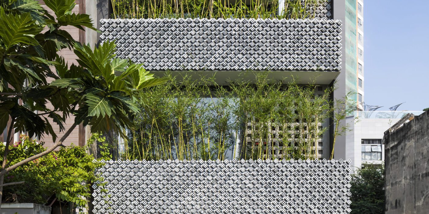
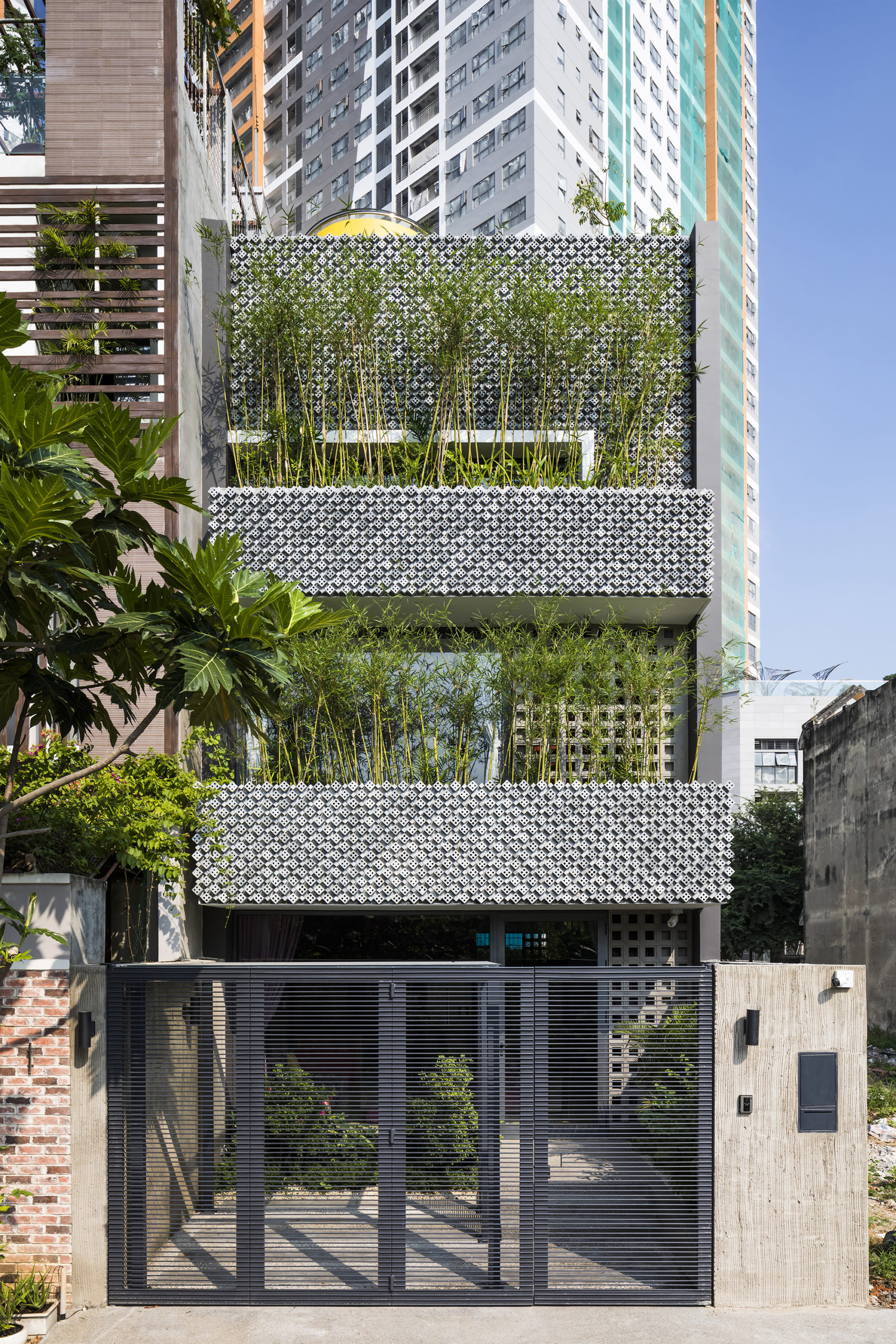
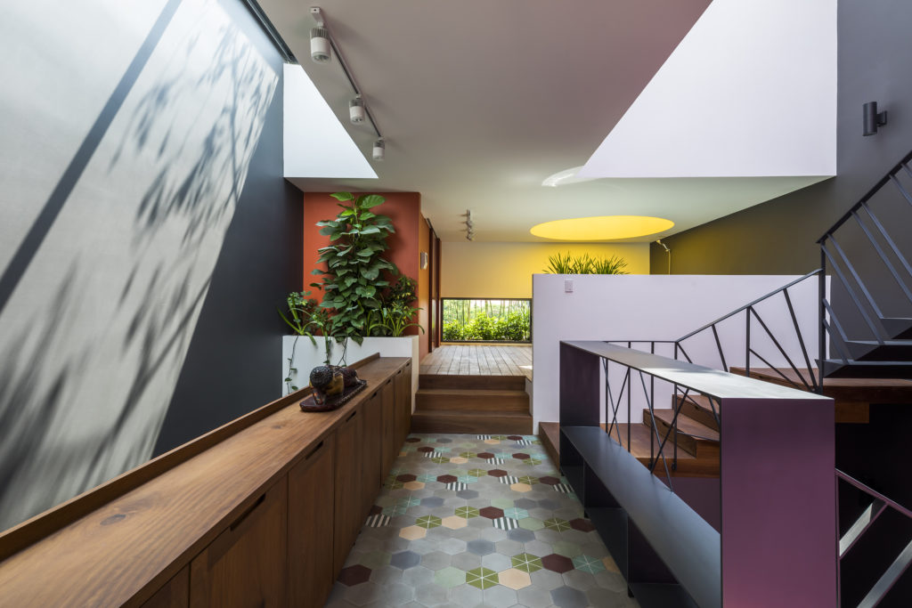
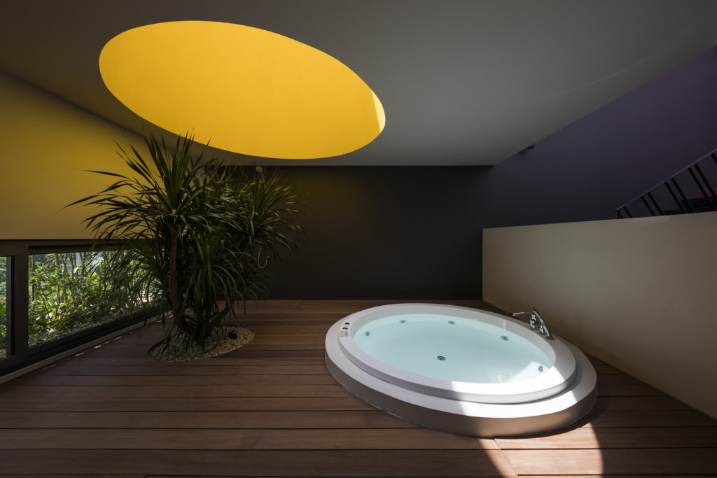 This modernist construction in Ho Chi Minh combats the perception that shophouse-style buildings suffer from a lack of natural light because of the inherent narrowness of their lot. The designers do so with a textured combination of cement breeze blocks and brick patterned walls, letting sunlight gently diffuse inside. Bamboo trees, meanwhile, create their own natural screen to filter the direct sunlight coming through the street-facing windows.
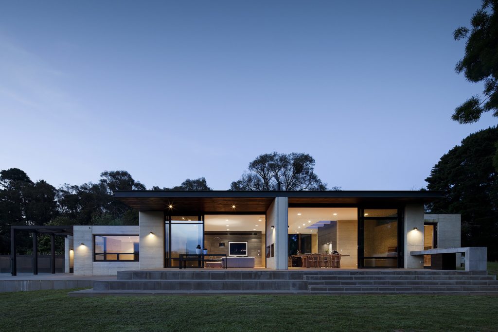
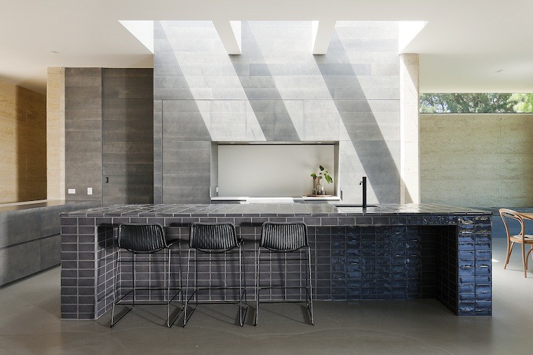
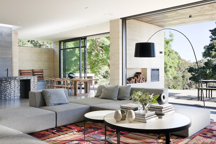 The family commissioning this rural home near Melbourne wanted to ensure plenty of natural light within the living space, but without the harsh direct northern and western sun. To resolve this issue, Robson Rak Architects designed large eaves to shade thin long high-level windows around the house, creating an evenly glowing living room and dining room. In similar fashion, the architects added two wall-like beams underneath the kitchen’s skylight, parsing out the strong sunlight into milder segments.
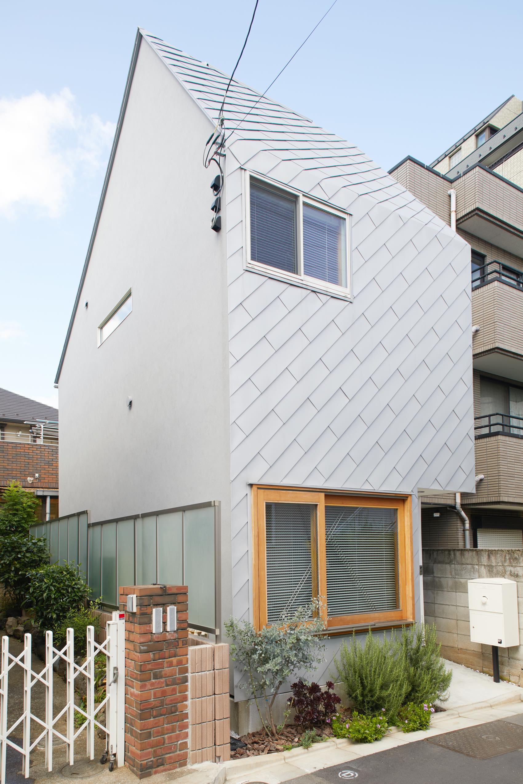
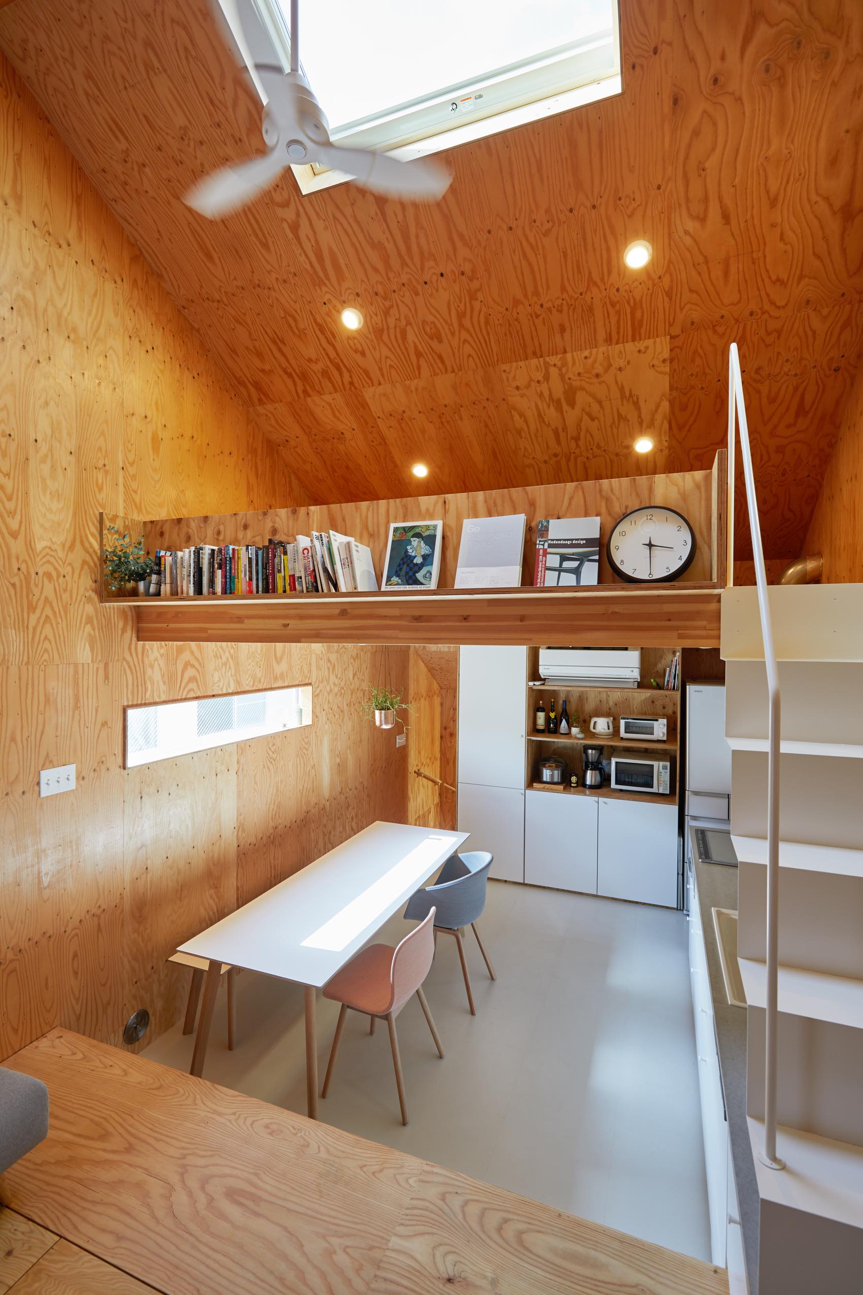
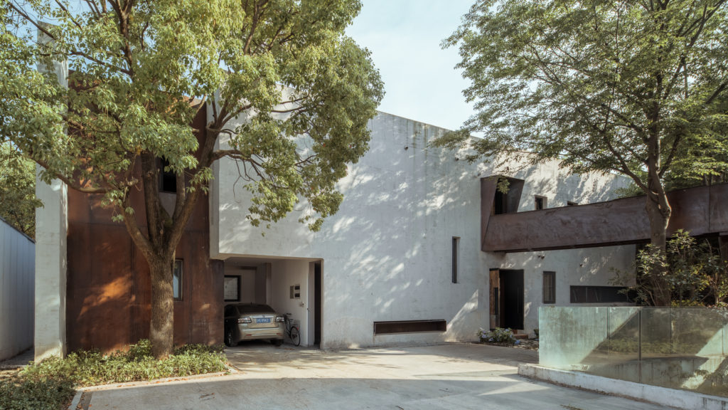
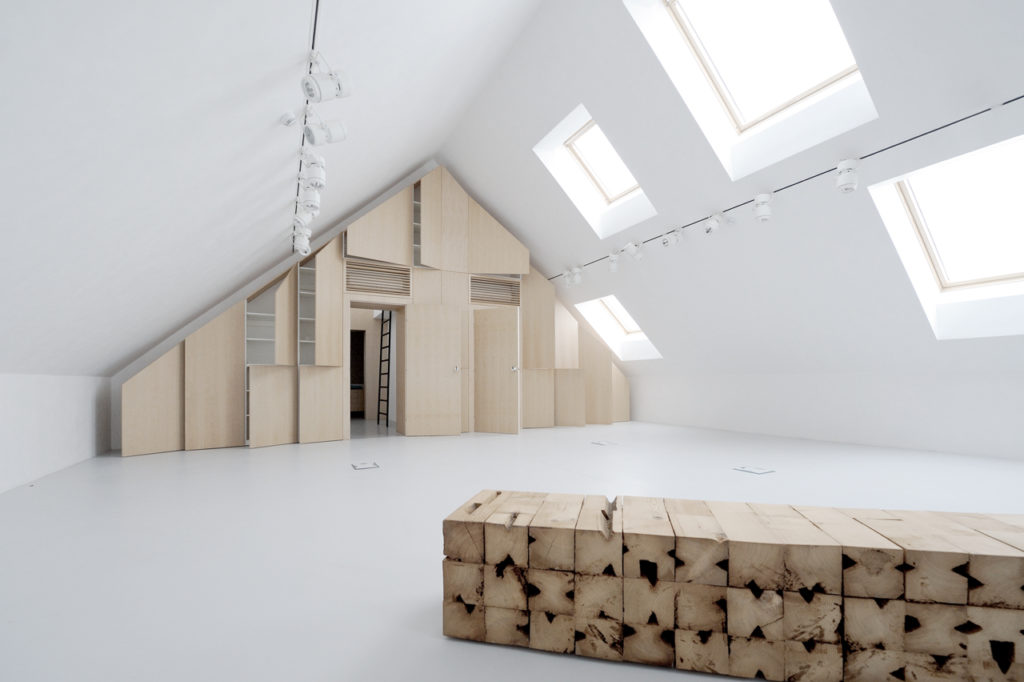
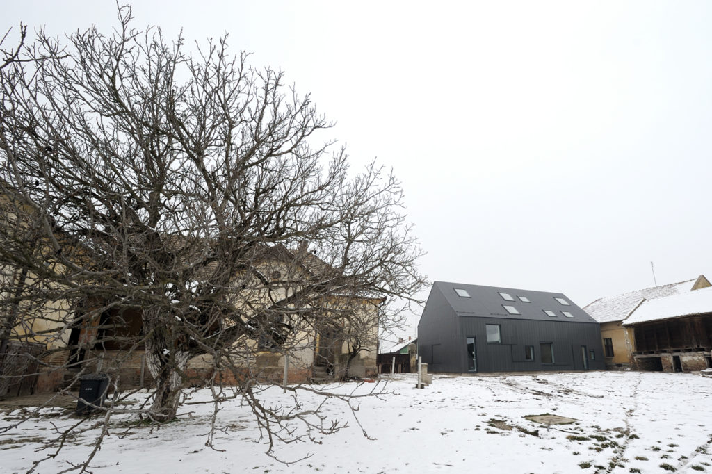 Rejecting the idea of the theatrical space as a necessarily dark and solemn place, this new estate espouses a more open (and bright) setting for its cultural projects thanks to a series of large skylights. From the outside, the playfully random assortment of skylights and windows healthily counterbalances the more serious dark-grey exterior.