Five innovations helping charities – Springwise
CategoriesSustainable News

Five innovations helping charities – Springwise

In the popular imagination, innovation can sometimes be conflated with the world of Silicon Valley, while charity is associated with second-hand clothes shops and bake sales. But this is far from the reality. Charities and non-profit organisations have a huge incentive to innovate to make the best use of their donors’ funds. And many startups work closely with the charitable sector, either as partners or suppliers.

Ahead of the International Day of Charity on the 5th of September, we take a look at how innovation is disrupting the world of giving. From methods of fundraising that tap into web 3.0 to new ways of measuring the services charities provide, here are five of the most innovative solutions helping charities and non-profits thrive in the modern world.

Photo source Pulse for Good

KIOSKS ENCOURAGE VULNERABLE PEOPLE TO PROVIDE FEEDBACK ON SERVICES

It is a sad reality that the most vulnerable in society are also the least likely to provide feedback on the services they receive. Those needing support from mental and behavioural health facilities, refugee resettlement agencies, affordable housing units, and homelessness charities are particularly unlikely to express their views. Pulse for Good is a US-based company on a mission to overcome this challenge – ensuring everyone gets a say on the services they use. Its solution is to install physical kiosks within facilities that provide a discrete, simple, and consistent way for clients to express their views. Read more

Photo source Roxanne Desgagnes on Unsplash

A DECENTRALISED NFT MARKETPLACE FOR GOOD CAUSES

The technologies underpinning Web 3.0—the much talked about concept of a decentralised third iteration of the internet—are seen, and talked about, everywhere today. And with them come many opportunities to do good. One organisation that is determined to demonstrate the positive benefits of Web 3.0 is charity NFT marketplace Maxity. In essence, the Maxity platform is an intuitive interface for charities to generate and sell NFTs to support their activities. For example, one NFT launched on Maxity represents ownership of a black walnut tree planted by Queen Elizabeth II on Magna Carta Island, London. The NFT sale will raise money for The Magna Carta World Peace and Sustainability Foundation – an organisation that promotes national and international conflict resolution. Read more

Photo source Ask.Moe

NONPROFIT SEARCH ENGINE DONATES 80 PER CENT OF PROFITS TO OTHER NONPROFITS

European non-profit search engine, Ask.Moe, donates 80 per cent of its profits to other non-profit organisations with a proven track record. The company currently uses Google’s Programmable Search Engine, and is working on functionality to give users a vote on where the donations are directed. Ultimately, Ask.Moe claims that by using its platform, users can turn their 20 daily Google searches into €7.50 monthly donations to charities. Read more

Photo source Unify Giving

APP CONNECTS DONORS TO THE HOMELESS THROUGH DIGITAL DONATIONS

London-based social startup Unify Giving is developing an app that will allow people to make digital contactless donations to the homeless community. For those wishing to make a donation, it will be as simple as tapping the homeless person’s RFID wristband on the street or by using the ‘Unify Sofa-Giving’ function in the app. People in emergency refuge situations or substandard housing can also receive donations through Unify, which will be stored safely on an individual profile linked to that recipient. Read more

Photo source Eleni Afiontzi on Unsplash

A DIGITAL ADVERTISING PLATFORM THAT PAYS PEOPLE TO WATCH ADS

Advertising agency WeAre8 has come up with a plan to disrupt the digital ad industry through a platform that donates to charity and pays people to watch ads. The platform works via an app. People who want to participate download the app and can sign up to be notified when there is an ad they might be interested in. Users watch the ad, answer questions, and within 30 days anywhere from 5p-20p is deposited into their WeAre8 wallet. The money can then be used to pay a mobile phone bill, sent to a PayPal account, or donated to any of the more than 50 charities set up on the app. The agency uses a ‘sustainable ad buying engine’ and promises that 55 per cent of every pound advertisers spend will be shared with users and charities. Read more

Curated by: Matthew Hempstead

To keep up with the latest sustainable innovations, sign up to our free newsletters or email info@springwise.com to get in touch.

Reference

Innovation and SDG 16: Peace, justice, and strong institutions
CategoriesSustainable News

Innovation and SDG 16: Peace, justice, and strong institutions

John Lennon famously called for the world to give peace a chance. But, in 2022, is that chance being given? It is hard to argue that it is. The world today is witnessing the largest number of violent conflicts since 1946, with a quarter of the world’s population living in conflict-affected countries. This has been underlined perhaps most starkly by widespread coverage of the first major European conflict since the second world war: Russia’s invasion of Ukraine. But wars are raging across the globe, with ongoing major conflicts (defined as those that have caused more than 10,000 deaths in the past year) in Yemen, Afghanistan, Myanmar, Mexico, and East Africa – in addition to Ukraine.

Elsewhere, progress is more evident. For example, the global homicide rate fell 5.2 per cent between 2015 and 2020. Despite this, many people around the world remain at risk of violence, with women particularly vulnerable. 

And there remains work to be done in other areas covered by SDG 16, which calls for peace, justice, and strong institutions. Corruption continues to exist in every region on earth, costing developing countries $1.26 trillion each year. Access to legal representation is also far from universal, with a majority of the world’s population unable to gain meaningful access to justice. 

In the face of these entrenched problems, it can sometimes be difficult to see how innovation can make a difference. But innovators across the globe are supporting the necessary institutional changes with solutions that improve transparency, security, and collaboration.

Ending violence

According to the World Economic Forum, the total cost of conflict and violence is more than $14 trillion per year. This includes violence within societies that are at peace, as well as those that are engaged in armed conflict. Women, in particular, are at risk, with almost one in three women suffering physical or sexual violence at least once in their life. In response, innovators are coming up with new ways to prevent and report crime. In the UK, a platform is making it easier to report sexual harassment on London’s public transport network. Meanwhile, a Danish startup has developed connected jewellery that sends an alert to all nearby users of the company’s app if the wearer feels unsafe.

Combatting corruption and money laundering

One of the most effective ways to combat issues like child trafficking, modern slavery, and terrorism is to cut off the financing of these activities. This funding can be substantial with the United Nations Office on Drugs and Crime estimating that the amount of money laundered each year is equivalent to between two and five per cent of global GDP. This money is used to fund a whole range of nefarious activities. 

This is one area where technologies like artificial intelligence (AI) can make a significant contribution. For example, software company Lucinity has developed a suite of tools that use AI to help companies improve their anti-money laundering compliance. The company uses a ‘Human AI’ approach, which combines AI with human insights and expertise. Beyond technology, however, social enterprises have a role to play through investigative and policy work. For example, The Sentry conducts in-depth investigations to ensure that war crimes don’t pay. The organisation’s recent reports have exposed cases of corruption in Congo, Zimbabwe, and Sudan among many others.

Tackling misinformation

Strong democratic institutions require a healthy public discourse as well as widespread access to information. And innovators are working to prevent repressive regimes from restricting access to information and communication services. For example, Bridgefy’s messaging app, which doesn’t require Wi Fi or data, was downloaded over a million times during the 2021 military coup in Myanmar when internet services were disrupted.

Misinformation, which can be used to undermine faith in democratic institutions, is also an increasingly pervasive threat. Here too, innovators are playing their part. Social media tools developed by Indiana University’s Observatory on Social Media, help journalists, researchers and the public understand viral social media posts, including the role played by bots. Meanwhile an app, called the Newsroom, is hoping to counter fake news and disinformation by explaining how different publishers are covering the same event.

Access to justice

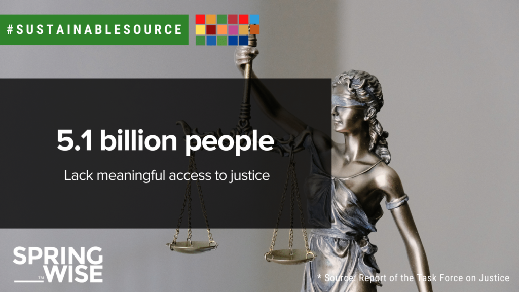
Legal equality is a foundational principle of liberal democracy and is considered a fundamental right in most countries around the world. However, access to legal representation in practice fails to live up to this ideal. For example, a 2019 study by the Task Force on Justice—a multi-stakeholder partnership bringing together UN member states, international organisations, and civil society—found that 5.1 billion people have no meaningful access to justice. 

Although legal systems can seem bureaucratic, innovation can make it easier for everyone in society to access justice. For example, simple visual aids that explain judicial processes can help non-experts to understand the legal system. Meanwhile, legal tech can be used to help people find affordable legal advice. Estonian startup HUGO has developed a platform that matches users to legal assistance they can afford. And, in the UK crowdfunding platform CrowdJustice makes it easier for individuals and organisations to raise funds for expensive legal action.
Words: Matthew Hempstead

Looking for inspiration on sustainability? Why not visit our SDG hub page for more articles on green innovation that matters.

Reference

Architecture Mood Board: Mies van der Rohe’s Barcelona Pavilion
CategoriesArchitecture

Architecture Mood Board: Mies van der Rohe’s Barcelona Pavilion

There are few buildings in the world with a more distinctive aesthetic than the Barcelona Pavilion, designed by Mies van der Rohe and Lilly Riech. Originally constructed as the German Pavilion for the Barcelona International Exhibition in 1929, and rebuilt in 1986, this iconic building bears all the characteristics of the Modernist principles that Mies is famed for. The pavilion’s emphatic horizontality, open-plan layout and minimalist detailing are renowned, but the project’s use of materials are arguably its most defining quality.

Sumptuous yet cool, rich yet understated, the pavilion’s material palette celebrates the art of contrast. Monumental slabs of marble work in harmony with slender glass partitions and reflecting pools to create a serene space, worlds away from the hustle and bustle of the nearby city.

Here, we take a closer look at some of those iconic materials, revealing the ingredients behind one of the purest manifestations of Modernist architecture. To the right of each image, you can find a selection of samples inspired by each material — visit Material Bank to start curating your own board.


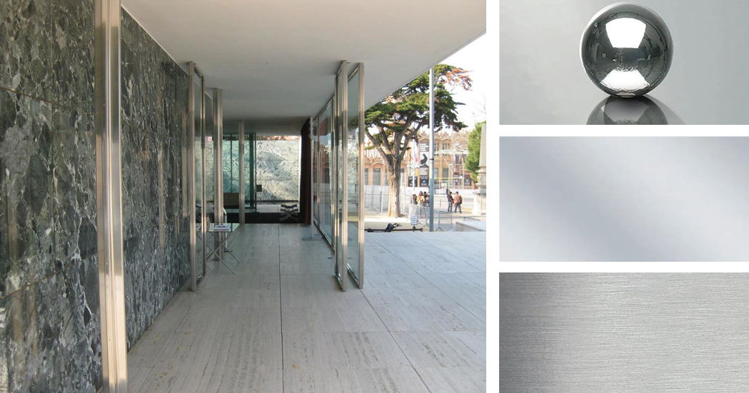
Travertine (floor and exterior walls)

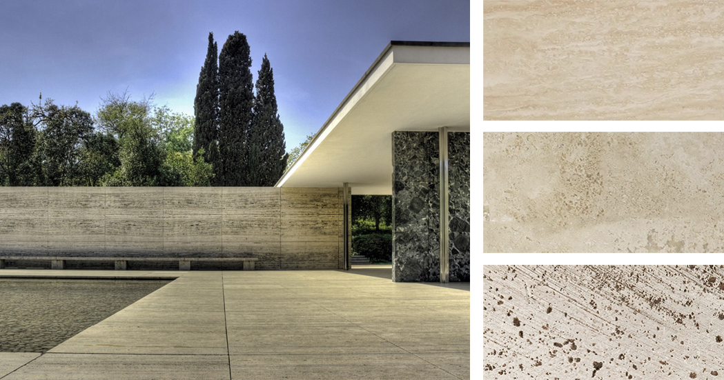
Left: The Barcelona Pavilion; image by Wojtek Gurak. Right: Materials inspired by the pavilion’s travertine surfaces; samples via Material Bank

The most prominent material used throughout the Pavilion is Roman travertine, a luxurious yet hard-wearing material that anchors the projects. Travertine forms the plinth upon which the building sits, as well as the surrounding walls, which enclose the reflecting pool and provide a sense of separation from the outside world. Its color, a soft, yellowish hue, acts as a perfect backdrop for the bold materials placed throughout the building.

Featured Material Samples


Golden Onyx (interior freestanding wall)

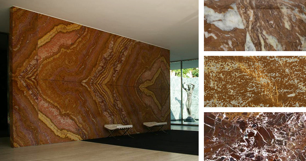
Left: Barcelona Pavilion interior; image by Martin D. Right: Materials inspired by the pavilion’s onyx wall; samples via Material Bank

At the heart of the building is a freestanding wall of golden onyx, sourced from the Atlas Mountains in Northern Africa. The uniquely patterned surface of this slab was revealed by a splitting process called broaching, enabling a symmetrical marbled pattern to be displayed across the wall’s entire expanse. In terms of color, amber hues transition into oranges and deep reds, providing a rich and complex finish that forms a focal point within the building’s interior. Interestingly, Carsten Krohn, author of Mies Van Der Rohe: The Built Work, states that “the honey-yellow onyx wall of the original is much redder in the modern reconstruction.”

Featured Material Samples


Green Marble (walls)

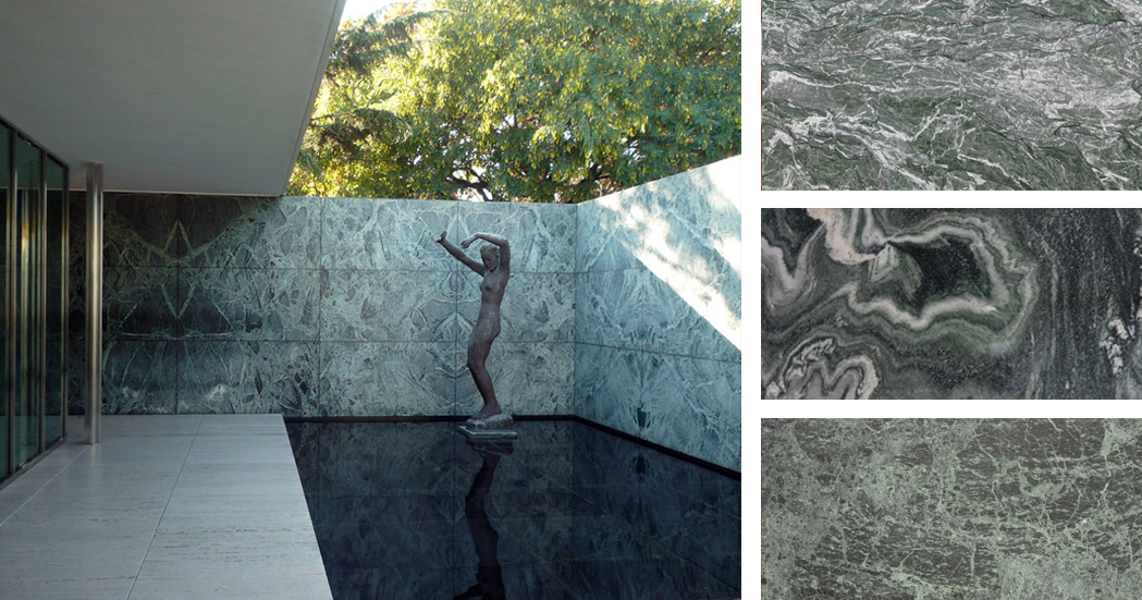
Left: Barcelona Pavilion exterior; image by Steven Zucker. Right: Materials inspired by the pavilion’s green marble walls; samples via Material Bank

Two types of marble with a green hue can be found in the Barcelona Pavilion: Polished green Tinian marble and “vert antique” marble, quarried in the French Alps. The hues of these walls range from deep green to gray-blue, contrasting with the lighter shades of travertine below and the pure white plane of the ceiling above.

Featured Material Samples


Glass (walls)

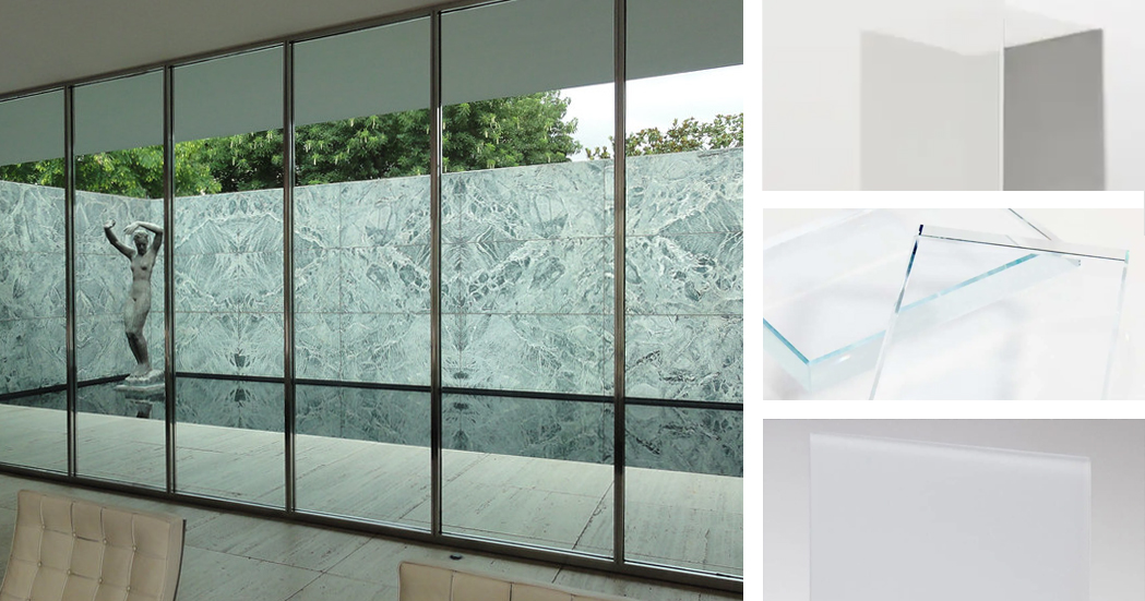
Left: Barcelona Pavilion glazing; image by Kent Wang. Right: Materials inspired by the pavilion’s glazing; samples via Material Bank

Mies employed a variety of glass materials throughout the pavilion, controlling the level of transparency, varying the sense of enclosure and framing specific views. According to Krohn, “an entire repertoire of materials have been employed: in addition to transparent glass, the building makes use of green and gray glass, frosted glass as well as black opaque glass for the table tops.” Together with the marble partitions, the glass panels of Mies’ pavilion challenge the conventional function of walls — rather than enclosing space, they act as devices to guide people through the building, channeling their path and blurring the boundaries between inside and out.

Featured Material Samples


Stainless Steel (loading-bearing columns)

Left: Barcelona Pavilion interior; image by Rory Hyde. Right: Materials inspired by the stainless steel columns; samples via Material Bank

Key to Mies van der Rohe’s design was a set of eight polished steel columns that support the roof. As Krohn explains, “the columns form a structural unit that represents a separate architectonic element independent of the non-loadbearing partitioning walls.” Their cruciform shape provides the necessary structural rigidity, while their polished finish reflects light and flashes of color from the surrounding marble. It also echoes the reflective quality of the pools on the exterior or the building.

Featured Material Samples


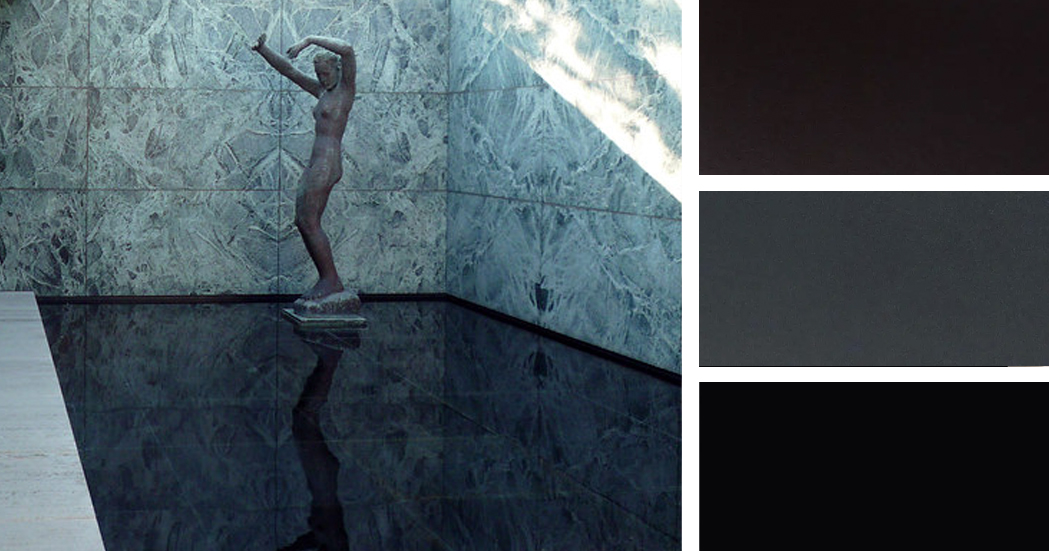
Black Glass (reflecting pool)

Left: Barcelona Pavilion exterior; image by Steven Zucker. Right: Materials inspired by the black glass of the reflecting pool; samples via Material Bank

Black glass was used to line the smaller of the two pools within the Barcelona pavilion, designed to heighten the reflective quality of the water and dramatize the solitary ornament within the building: a bronze reproduction of Georg Kolbe’s sculptural figure, entitled “Dawn”. Both the sculpture and the patterned marble walls behind it are perfectly reflected in the water, their curves contrasting with the perfectly straight lines that define the space.

Featured Material Samples


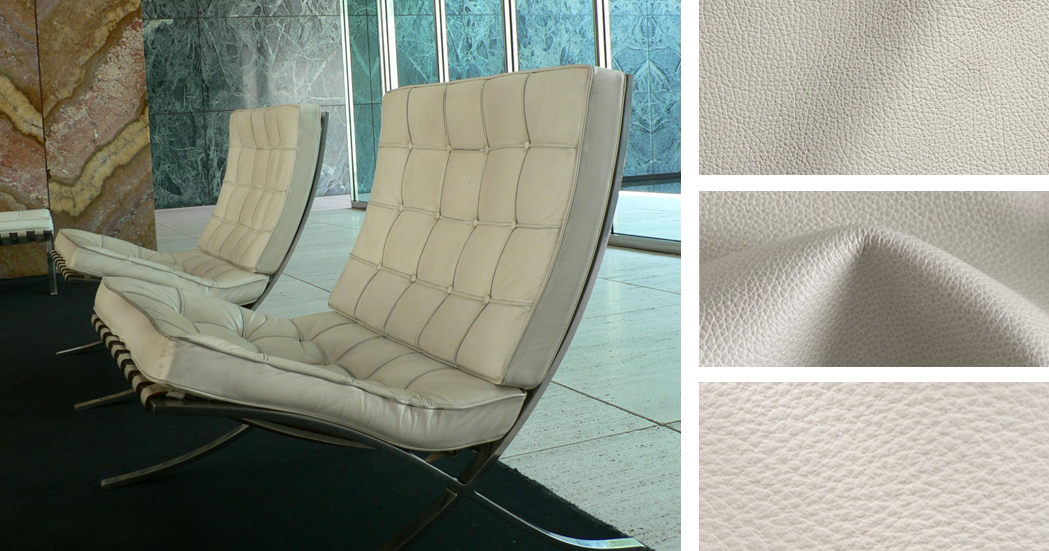
Ivory Leather (Barcelona Chairs)

Left: Interior featuring the Barcelona Chair; image by Yuichi. Right: Materials inspired by the Barcelona Chair; samples via Material Bank

Designed by Mies van der Rohe himself, the Barcelona Chair is an icon of modern design, to such an extent that faithful reproductions are still produced and sold today. The structure of the chair is polished stainless steel, echoing the cruciform columns of the pavilion. The back and cantilevered seat are upholstered with off-white kid leather, with welt and button details. MoMA sums it up best: “The Barcelona Chair achieves the serenity of line and the refinement of proportions and materials characteristic of Mies van der Rohe’s highly disciplined architecture.”

Featured Material Samples


Inspired by Mies? We invite you to create your own material mood boards using iconic architecture as your muse! Share your creations with editorial@architizer.com and we’ll publish a selection of the best on Architizer.

Top image: The Barcelona Pavilion via Wikimedia

Reference

A new way to produce sustainable fertiliser on site
CategoriesSustainable News

A new way to produce sustainable fertiliser on site

Spotted: Most farms use fertiliser. However, not only is fertiliser a major expense for farmers, its use can also be harmful to the environment. Ammonia, a main ingredient in commercial fertilisers takes a lot of energy to manufacture, most of which comes from burning fossil fuels. Fertilisers also release the potent greenhouse gas nitrous oxide into the atmospherewhen they are broken down by microbes. Biofertilisers are a more sustainable option. These contain living microorganisms that fix atmospheric nitrogen directly.

To help farmers make greater use of biofertilisers, Nitroterra technology has developed a system that allows farmers to make their own biofertilisers on site, tailoring the microorganisms to suit their precise needs. By continuously monitoring a farm’s soil properties, Nitroterra can also adjust the blends for different seasons, crop resiliency, nutrient density, and yield improvement goals.

Nitroterra first analyses each farms’ soil and uses the data to develop a customised biofertiliser recipe. This biofertiliser is then produced on-site using the company’s proprietary production unit. The modular design of the production unit allows multiple strains of microbes to be produced simultaneously. A single unit can also produce customised biofertilisers for different farms from a single site.

According to the company, biofertilisers are an important step in reversing the damage caused by the use of synthetic fertilisers. “A dramatic and urgent change in farming is needed to protect our soil system. Systematic overuse of synthetic fertilisers driven by the decades-long race for constant yield improvements pollutes soil, waterways, and air with toxic compounds and greenhouse gases, and intensifies effects of droughts and other adverse weather-driven hazards. Soil is losing its natural ability to recuperate and transfer nutrients to plants.”

Nitroterra is not the only company concerned about the environmental cost of synthetic fertiliser use. At Springwise, we have covered a number of innovations aimed at farming more sustainably. These include planting in a grid pattern to improve yields while using less herbicide, and using aquatic plants for food additives to reduce the need for plants that require fertiliser. 

Written By: Lisa Magloff

Website: nitroterratechnology.com

Contact: nitroterratechnology.com/contact-us

Reference

Rejecting the Ribbon Window: 7 Architectural Experimentations With Fenestration
CategoriesArchitecture

Rejecting the Ribbon Window: 7 Architectural Experimentations With Fenestration

Architizer is thrilled to announce the winners of the 10th Annual A+Awards. Want to earn global recognition for your projects? Sign up to be notified when the 11th Annual A+Awards program launches. 

In his 1927 manifesto, Five Points of Architecture, Le Corbusier made horizontal windows a core concept of his architectural philosophy. These long narrow windows which could wrap around the façade’s length like a ribbon, he argued, were the best way to offer evenly light spaces throughout a building without compromising privacy. Le Corbusier’s ‘ribbon window’ (highlighted in emblematic projects like his Villa Savoye) quickly became a staple of modernist architecture. From schools to office buildings and apartment blocks, the ribbon window became somewhat omnipresent.

One hundred years later, in a step that follows a similar logic yet moves away from Le Corbusier’s iconic signature, architects continue playing with new configurations for fenestration. Whether by de-emphasizing the horizontal nature of windows or experimenting with different shapes, sizes and compositions, architects are moving towards more tailored and idiosyncratic approaches to fenestration design.


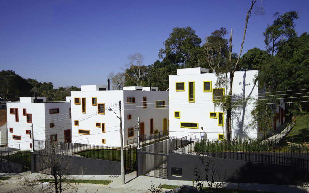
Casas Cubo

By Aleph Zero, Curitiba, Brazil

Photos by Felipe Gomes

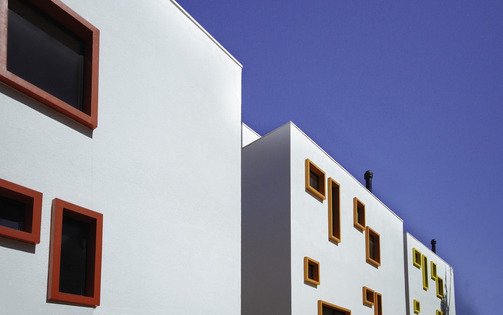
The architects of this new project in a remote neighborhood north of Curitiba wanted to create a sense of distinction between the three complexes and nearby houses. They do so by treating the exterior façades as a canvas onto which narrow windows are etched in seemingly whimsical fashion – though their order strategically aligns with the layout and functions of the rooms inside. The colorful composition of square and rectangular frames on the white plaster exterior is a clever homage to Piet Mondrian’s neo-plasticist masterpieces.


The Snail Apartments

By archimatika, New York City, NY

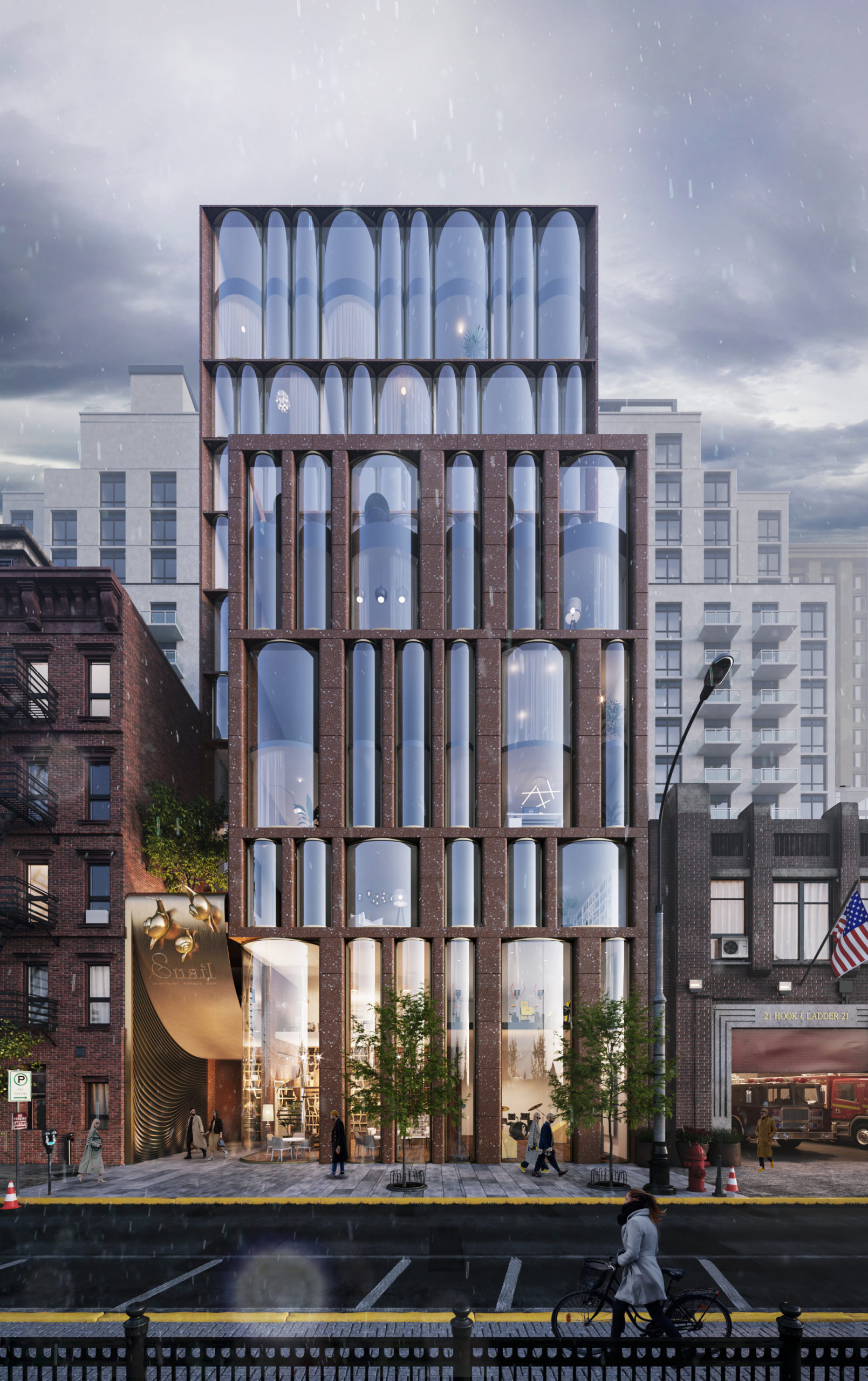
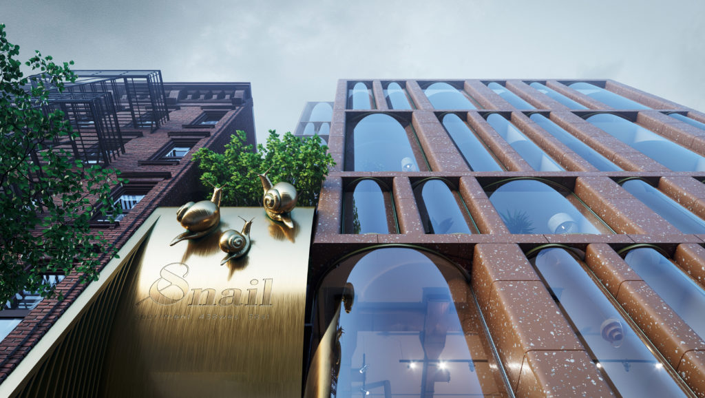
The design concept for this residential project in Chelsea, New York combines features from two different eras of the city’s architectural history: 19th and 20th century brick housing and contemporary glass skyscrapers. Yet, neither inspiration can account for the arrangement of floor to ceiling cylindrical-shaped windows which give the façade a lively character. It’s ironic that the project’s emblem is a snail because the design leaps towards an exciting vision of the future.

House in S.Abbondio

By wespi de meuron romeo architects, Locarno, Switzerland

Photos by Hannes Henz

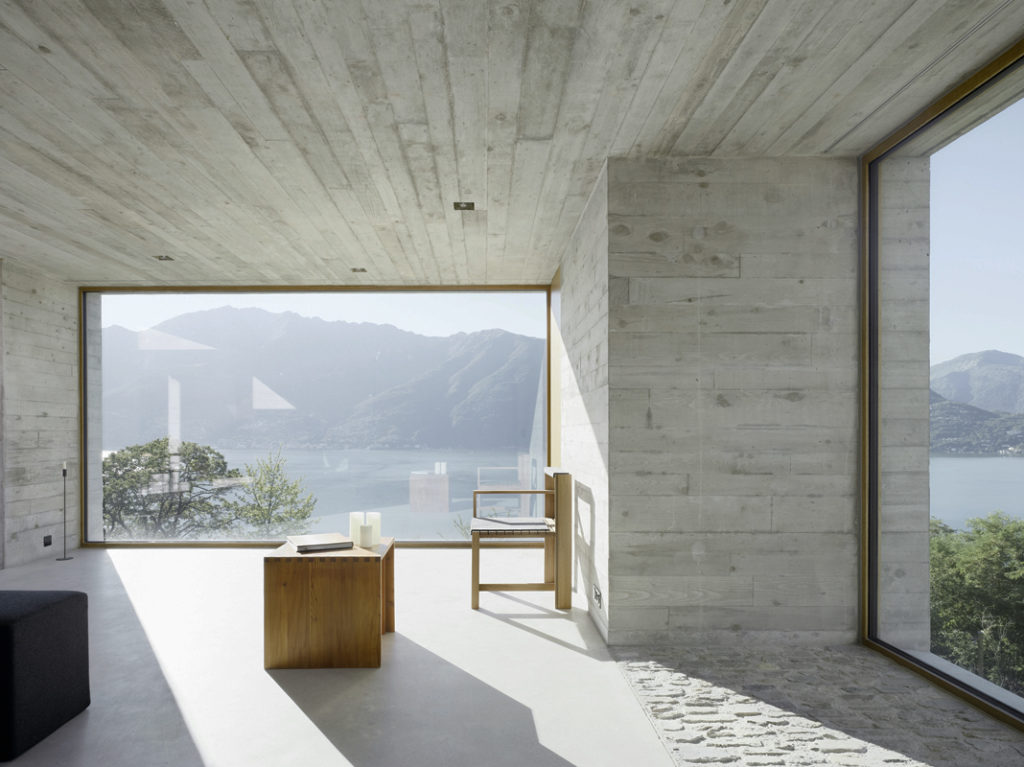
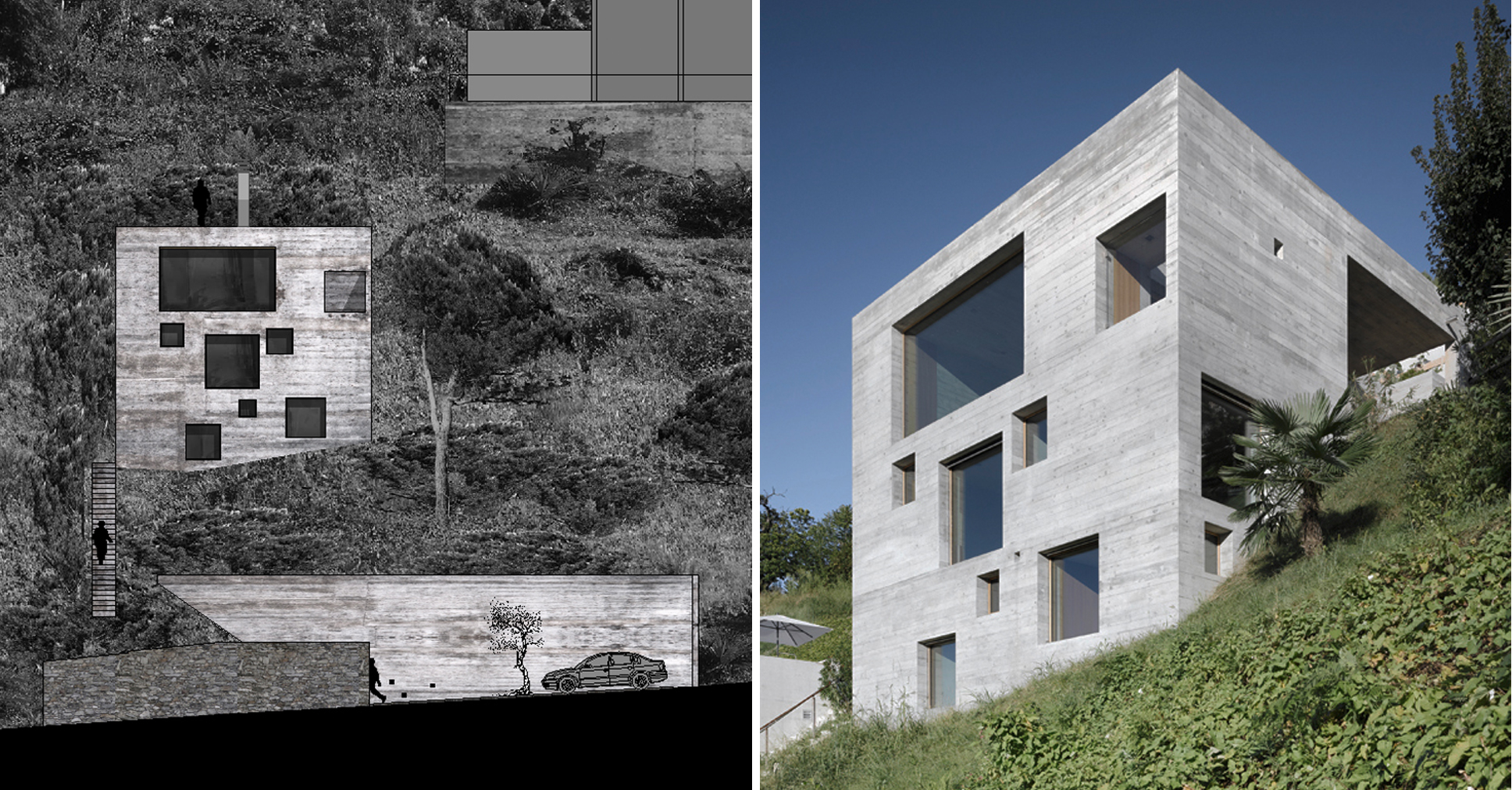
Standing on a steep slope near Lake Maggiore in the Swiss Alps, this new house keeps things simple with a cubic shaped structure and wood panel cast concrete walls. The irregularly placed large square and rectangular windows breaks with the monolithic façades and ensures no view of the stunning lake goes unseen.

House Au Yeung

By Tribe Studio, Sydney, Australia

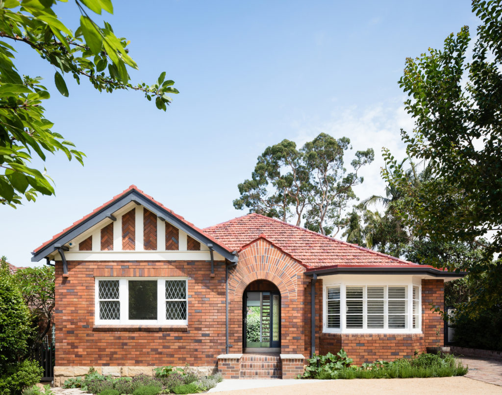
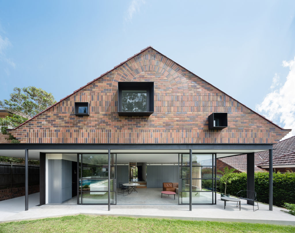
The rear extension to this modest 1930s bungalow in a leafy Sydney suburb reproduces many of the sensible design choices of the original house: herringbone brick gables, a brick sunburst and some Tudor detailing among other details. However, three deep-set square windows bring a pop of modernity to the rear façade, matching the design ethos of the new living room on the floor below.
Jazz Loft

By T2.a Architects, Budapest, Hungary

Photos by Zsolt Batar

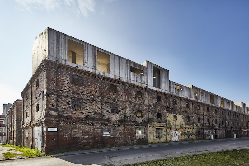
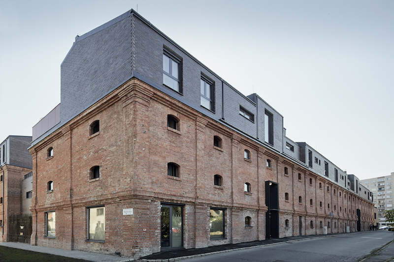
This residential building is the culmination of a fifteen year-long meticulous renovation and restoration project of an abandoned 19th century mill on the outskirts of Budapest. The decaying façade was refurbished and reinforced but maintained almost identically to its original configuration. Not only does this give a fresh face to the old building, it also helps reinterpret the industrial design elements for the new residential purpose.

Most notably, the row of windows on the top floor is now highlighted by a dark-grey brick cladding and draws attention to their random assortment of shapes and sizes; what were once functional windows designed for the mill now give an improvisational dynamism to the building, making it fit for the name “Jazz Loft”.


House A&J

By CKX architects, Eindhoven, Netherlands

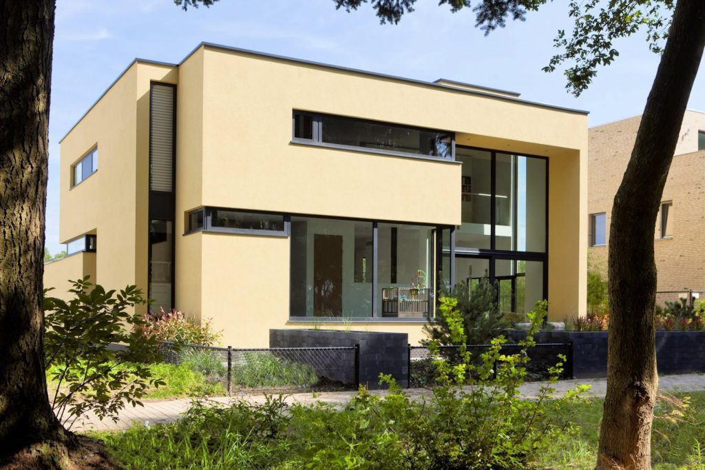
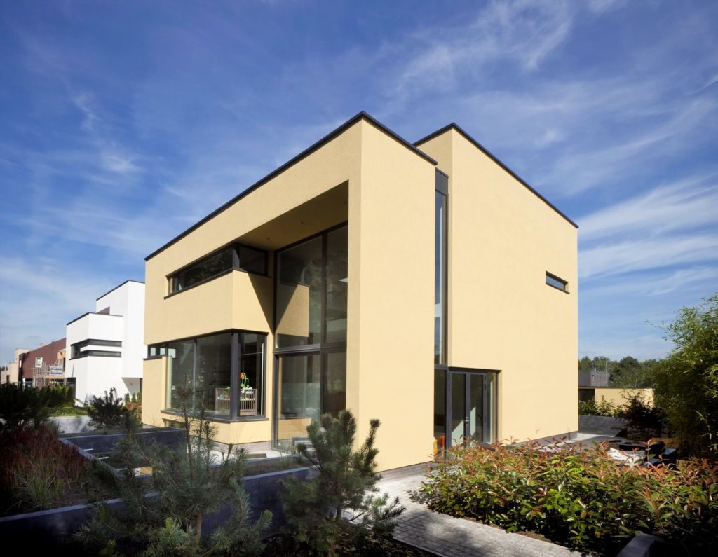
This new residence in Eindhoven is a playful remix on Le Corbusier’s ribbon window. The architects add a vertical dimension to the horizontal windows, ensuring one continuous flow of glass over two floors carved within the yellow cubic volumes. These offer generous vertical views of the nearby forestry while maintaining enough privacy for the second-floor bedrooms.
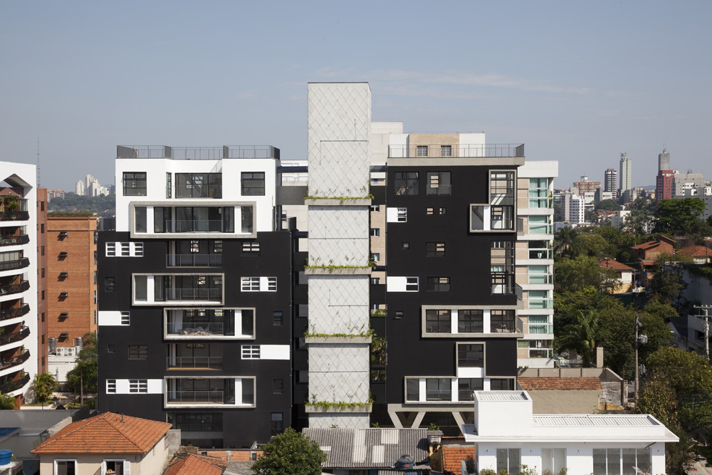

Fidalga_727

By Triptyque Architecture, São Paulo, Brazil

This new high rise apartment block in a middle-class neighborhood of São Paulo references the Paulista School — one of the major 20th century movements in Brazilian Brutalist architecture — with an elevated concrete structure and a building body fragmented into three parts. Somewhat ironically, it’s the Bauhaus-inspired window pattern (reminiscent of Walter Gropius’s Bauhaus Dessau) that takes the building into the 21st century.

Architizer is thrilled to announce the winners of the 10th Annual A+Awards. Want to earn global recognition for your projects? Sign up to be notified when the 11th Annual A+Awards program launches. 

Reference

Earbuds that diagnose ear problems
CategoriesSustainable News

Earbuds that diagnose ear problems

Spotted: Ear infections are caused by bacteria and fungi that become trapped in the ear canal. This can happen for a number of reasons and earbuds can exacerbate the problem, especially when they aren’t consistently cleaned. However, instead of causing infection, what if earbuds could detect early signs of infection? Researchers from University at Buffalo have found a way to make this possibility a reality.

The system is called EarHealth and it functions by sending a chirp through a healthy user via bluetooth earbuds. EarHealth then records how the chirp reverberates throughout the ear canals and creates a unique profile of each user’s ear. Geometries arising from subsequent chirps can be compared to the original profile to detect whether the ear canal’s geometry has changed.

In a study, which was published in June by the Association for Computing Machinery, the researchers reported that the AI-backed earbud system was 82.6 per cent accurate in spotting common ear infections caused by earwax blockage, ruptured ear drums, and otitis media. 

Each of these three causes of ear infection have a unique audio signature that the EarHealth system can detect with fairly accurate results. Thus, the system is also capable of detecting the specific type of infection. The technology could be especially beneficial for children, who are more susceptible to ear infections than adults.

Springwise has spotted a number of innovations focused on using tech to detect health issues. These include  AI-powered tools that can screen for chronic kidney disease using retina photos and a browser-based solution that provides more than 30 different health measurements by analysing selfie clips. 

Written By: Katrina Lane

Email: cmnealon@buffalo.edu

Website: buffalo.edu

Reference

Biosynthetic indigo dye for denim is chemical and petroleum-free
CategoriesSustainable News

Biosynthetic indigo dye for denim is chemical and petroleum-free

Spotted: Denim is the most commonly used fabric in the world, so fundamentally altering the production footprint of the industry is a massive step in improving global environmental health. California-based Huue replicates naturally occurring colour creation processes to build synthetic and sustainable versions for industrial use. Indigo is the company’s first colour due to its widespread use. And its first target is the denim industry.

Huue’s colours are built with sugar rather than toxic chemicals such as cyanide and formaldehyde. The company’s proprietary bioengineering process creates microbes that, when consuming sugar, make the desired colour.

Capable of being used as a direct replacement for the traditional dyes already found in production processes, Huue’s colours also reduce fossil fuel consumption. With 75 kilogrammes of petroleum required to produce a single kilogramme of traditional indigo dye, the use of Huue’s colours greatly reduces pollution. The lack of toxins in the new dyes also lessens water pollution as no chemical reducing agents are needed to dilute the liquids before releasing the waste.

Having recently raised more than $14 million in Series A funding, the company plans to expand its commercial production capabilities, seek out fashion industry partners, and explore additional opportunities in industries including cosmetics and food.

Other healthier, more sustainable colour innovations spotted by Springwise include a t-shirt cooloured using black algae that absorbs carbon, and a blue food colouring made from red cabbage that is suitable for use in food and drink.  

Written by: Keely Khoury

Website: huue.bio

Contact: huue.bio/contact

Reference

Tech for Architects: Is This the Perfect Mobile Workstation For Designers?
CategoriesArchitecture

Tech for Architects: Is This the Perfect Mobile Workstation For Designers?

Architizer Journal is reader-supported. When you buy through links on our site, we may earn an affiliate commission. Learn more.

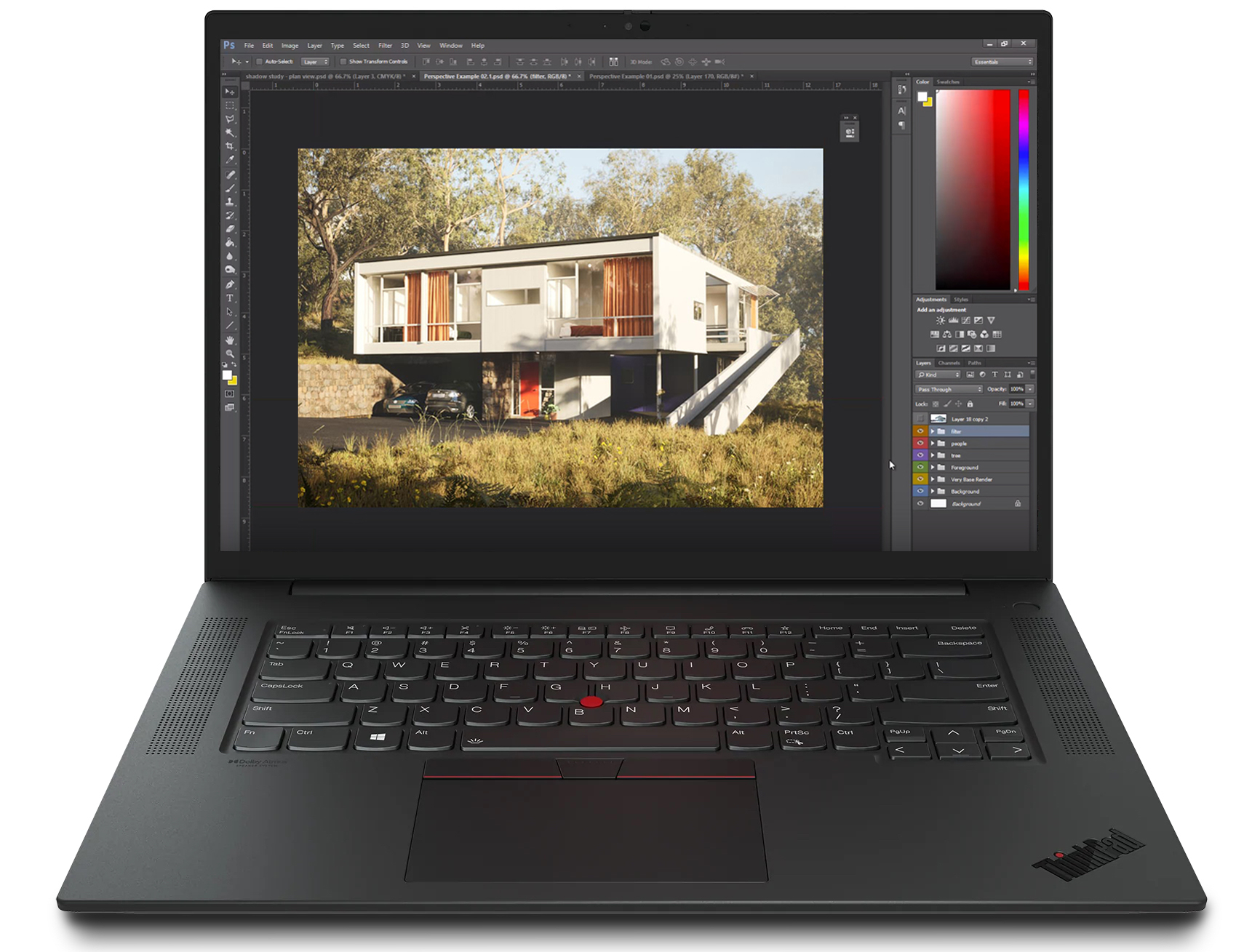
Lenovo’s ThinkPad P Series Mobile Workstations have been a huge hit amongst architects, designers and other industry professionals. Through their compact design, robust performance abilities and reliability, these devices embody everything it means to be a designer in the 21st century, merging old-school design principles with modern-day technology. Just last month Lenovo introduced the new ThinkPad P1 Gen 5 16” Mobile Workstation.

The latest in the Thinkpad series boasts the portability of its predecessors with some new and improved features that make for a relaxed and smooth work experience. Despite its sleek appearance, this device is powerful and offers the best of the latest Intel vPro® platform, Core™ H Series processors and NVIDIA® graphics, meaning it can easily handle the demands of rendering and real-time visualization.

The device is made of a liquid metal thermal design which ensures that it stays cool, while its Carbon-Fiber weave cover is sleek in appearance, making it discreet and professional for meetings and presentations. The 16’’ touchscreen is anti-glare and produces an advanced color quality through its X-Rite Factory Colour Calibration. By correcting the RGB color, designers can confidently edit designs and communicate rendering changes. Additionally, the backlit keyboard provides clear visibility for designers working on their computer for long periods of time. Meanwhile, the 12th Generation Intel Core i7-12700H Processor ensures a smooth and efficient work experience. 

Since its release, reviews have been broadly positive, with one user Amazon user declaring that “the screen looks great, clear and crisp, very bright and also has a night mode. Speakers have a clear sound and are loud.” They also tout the workstation’s security options as a plus point: “You can login by using your fingerprint, face recognition, or use a pin instead.”

This new model can be categorized by its pronounced comfort and reliability. Designers spend a great deal of time in front of their screen and to help avoid eye strain and maximize comfort, the ThinkPad P1 Gen 5 comes with a low blue light. Additionally, with its rapid battery charge of up to 80% in 60 minutes, this computer supports on-the-go designers who require a speedy device ready to use throughout the workday. The computer comes preloaded with the ThinkShield security suite, a fingerprint reader, encryption capabilities and a self-healing BIOS, which allows designers to safely store their drawings.

Since the mobile workstation is portable, the Lenovo ThinkPad P1 Gen 5 is made to withstand any environment. Whether it be at a construction site, on the train or in the studio, Lenovo’s integrated US Department of Defense’s MIL-STD 810H standards ensures that the device can withstand virtually any climate or condition. 

The ThinkPad P1 Gen 5 16” Mobile Workstation is now available for purchase and is a great device for architects looking to increase comfort while prioritizing quality design.

For more laptops and workstation recommendations for architects, checkout 15 Top Laptops for Architects and Designers, and watch out for more in our Tech for Architects series, coming soon.

Images courtesy of Lenovo, with sample screenshots added.

Reference

Using magnets to make oxygen for astronauts
CategoriesSustainable News

Using magnets to make oxygen for astronauts

Spotted: Generating oxygen in the unique environment of space is a resource-intensive challenge. Astronauts aboard the International Space Station (ISS) need a steady supply of this vital element to breathe, but it’s not easy to come by in low gravity environments.

The current go-to method for oxygen generation involves running an electric current through water—which is made up of hydrogen and oxygen atoms—using an electrolyser. This process separates the hydrogen and oxygen causing bubbles of gas to form in the liquid. So far, so good, but the oxygen must then be extracted from the system. This is challenging in space where there is no buoyancy. On earth, gases bubble to the top of a liquid, but in zero-gravity, they remain suspended. NASA tackles this problem by using centrifuges to force the gas out, but these require so much mass and power that it wouldn’t make sense to use them on longer journeys such as a Mars mission.

Now, an international team of scientists from the University of Warwick in the United Kingdom, the University of Colorado Boulder, and Freie Universität Berlin in Germany has proposed a new way to generate oxygen using magnetism. The process they’ve developed could be a more efficient way to create oxygen for astronauts on long-term space missions.

Magnets are the key to the new technique, with the researchers showing that they can perform the same role as centrifuges in some cases. Their study, published in the journal Microgravity, demonstrated that gas bubbles can be ‘attracted to’ and ‘repelled from’ a simple neodymium magnet in microgravity. This can be achieved by immersing the magnet in different types of aqueous solution.

To demonstrate the technology in microgravity conditions on earth, the team conducted experiments at the Bremen Drop Tower in Germany. At the tower, a capsule containing the objects of an experiment is dropped 146 metres. This creates microgravity conditions for just under 5 seconds.

Other space-related innovations spotted by Springwise include robot factories that manufacture materials in space, a solar panel factory designed for use on Mars, and a new technique that allows for 3D printing in space.

Written By: Katrina Lane

Email: alvaro.romerocalvo@colorado.edu

Website: nature.com/articles/

Reference

Contemporary Vaults: 6 Modern Iterations of a Age-Old Architectural Classic
CategoriesArchitecture

Contemporary Vaults: 6 Modern Iterations of a Age-Old Architectural Classic

Architects: Want to have your project featured? Showcase your work through Architizer and sign up for our inspirational newsletter. 

Vaults have existed in architecture for thousands of years. Essentially an extrusion of an arch along an axis, the structural value of the self-supporting form has made it a popular motif across typologies and around the world: from the construction of homes, religious buildings and more. Additionally, arches can be created using a variety of materials such as stone, brick, timber and even bamboo. Some examples of traditional vault forms include smooth barrel vaults, complex groin vaults, pointed arch vaults and decorative rib vaults, among others. These systems not only act as a structural framework but also help elevate plain ceilings. With each innovation in arch-building technology came new aesthetic styles and forms of architectural expression.

Yet, despite their versatility, vaults and domes remain widely associated with more traditional design styles or religious architecture. The projects below break away from the stereotype and show how these time-tested forms can be adapted to suit modern homes and public spaces.


Waffled Spaces

Bean to Bar Chocolatier by STUDIO TOGGLE, Salmiya, Kuwait

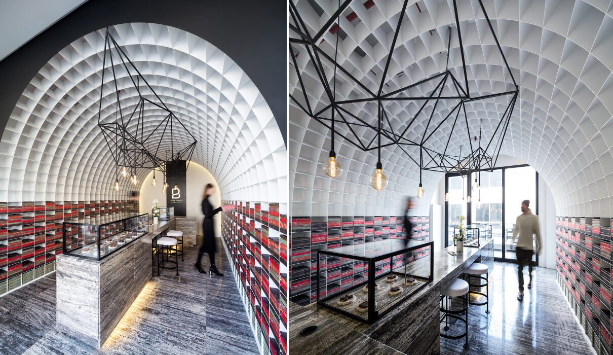
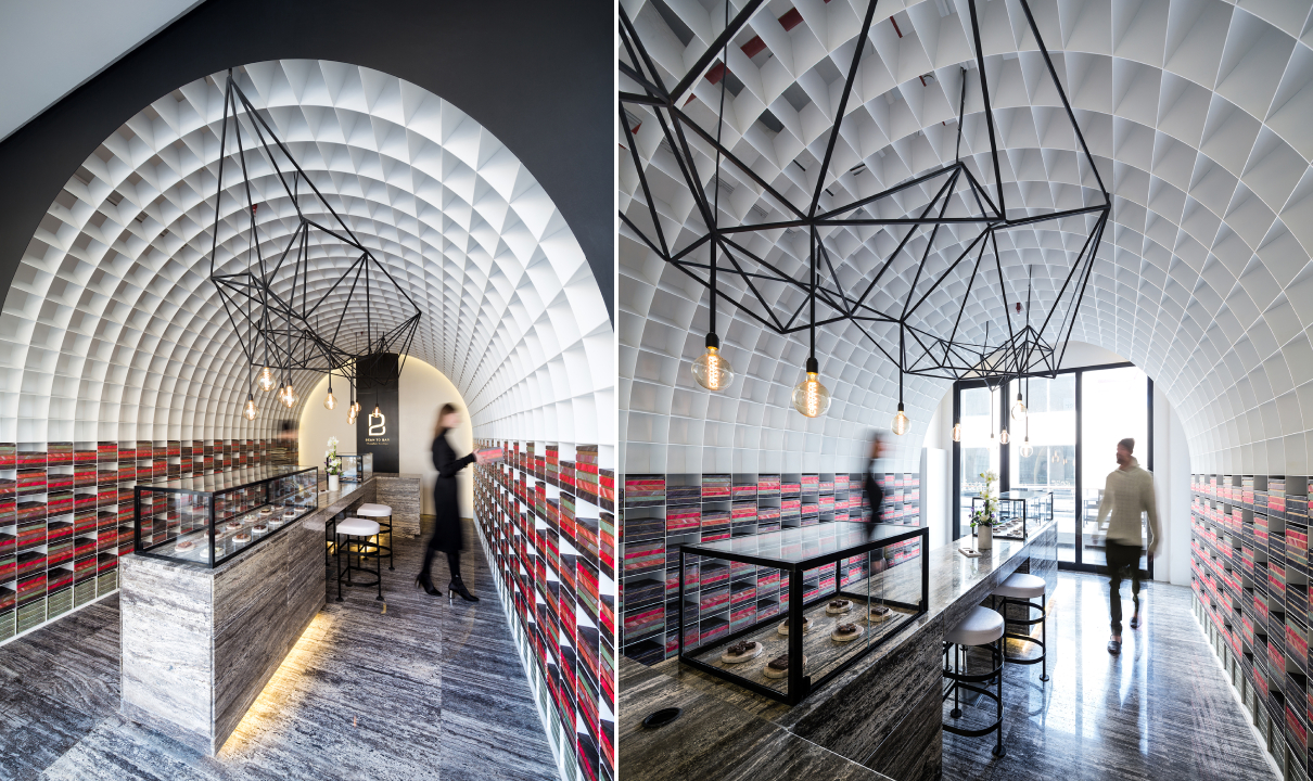
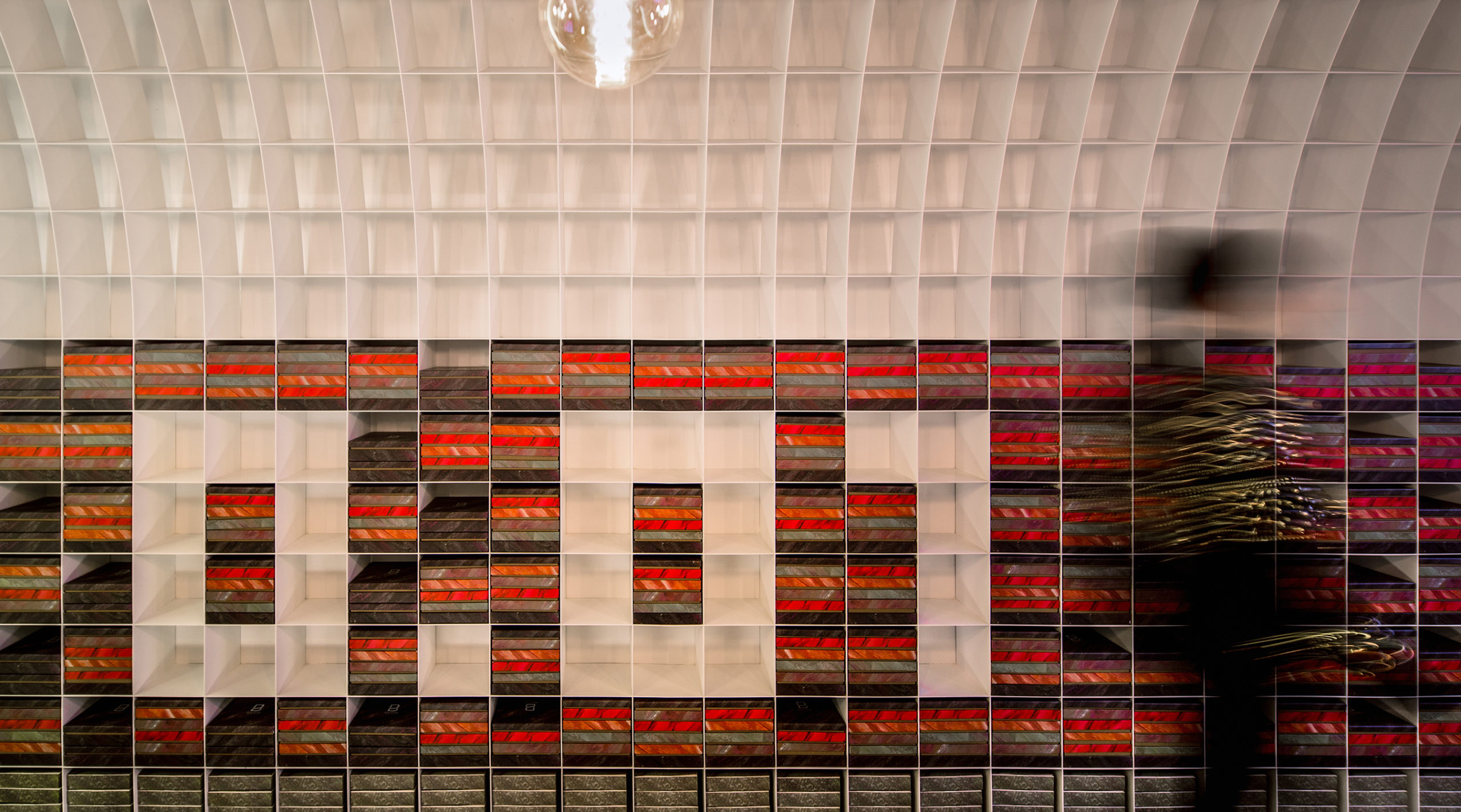
It was tricky to create brightness, storage and openness in a narrow, enclosed site. One solution, as showcased in the Bean to Bar Chocolatier store, introduces a waffle vault throughout the length of the space. A waffle vault can add dimension and interest to the ceiling without reducing the height in the way a false ceiling would. In this case, it can also extend to the floors and create room for display shelves. These pixels, which were sized based on the dimensions of the chocolate packaging, can be changed to create different patterns as and when needed. In other cases, waffle vaults such as this one can also be used to conceal lighting fixtures.


Organic Forms

Guyim Vault House by Nextoffice, Concept

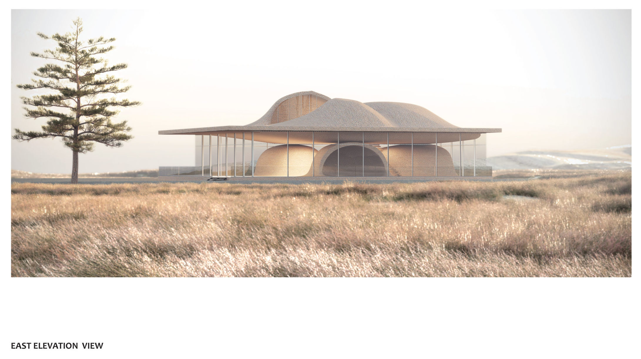
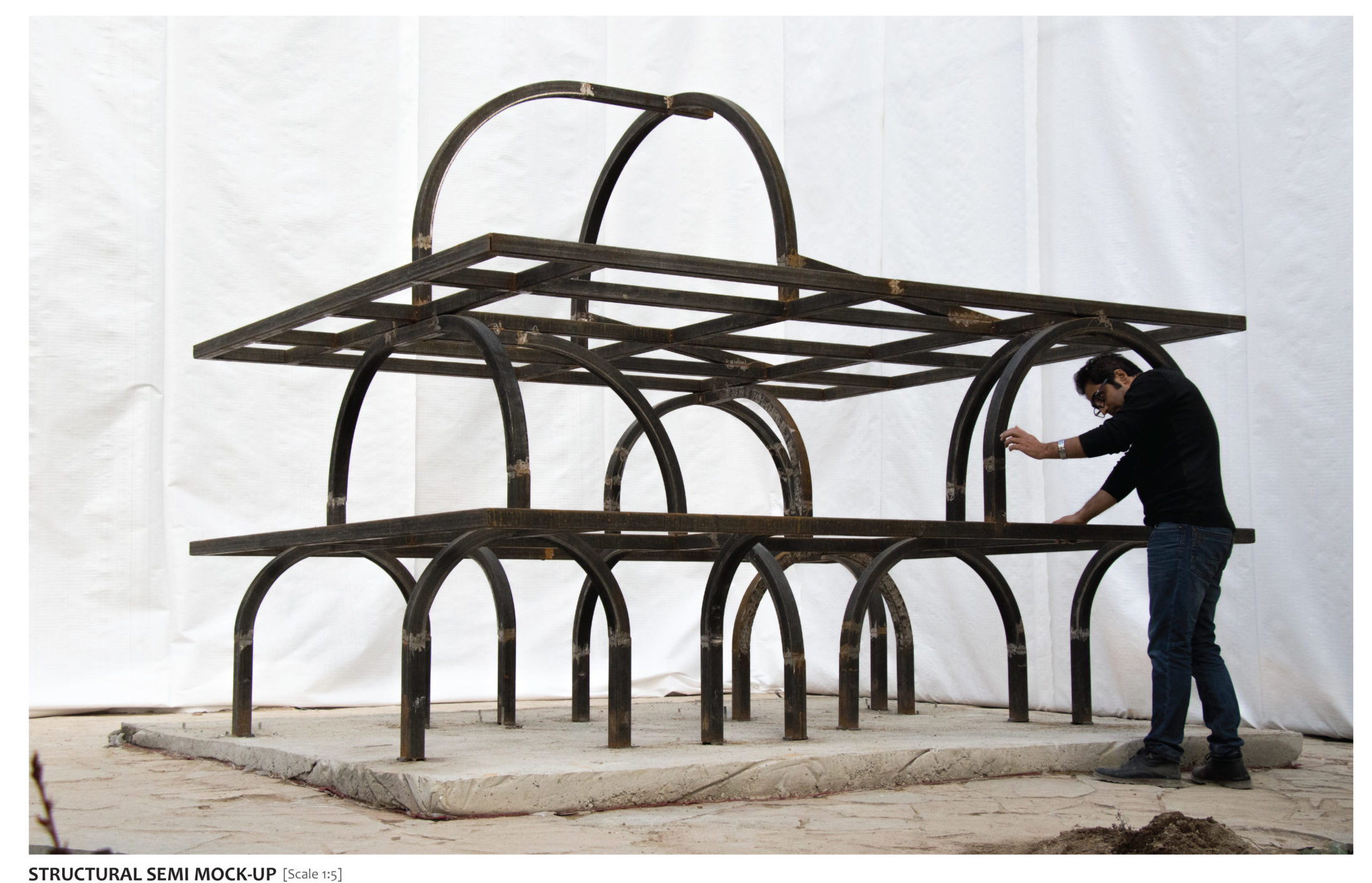
While vaults are traditionally elements that prominently enhance the interiors, they can also be used to redefine form on the outside. Using vaults in a skeletal cuboidal framework restrains the geometry while also creating a contoured form that clearly defines spaces and gives the structure a strong identity. In Guyim Vault House, Nextoffice uses semi-vaulted structural elements to create mounds in the different levels of the home. The system creates a very unique structural network that makes way for unique spatial blocks inside. These vaulted forms intersect with each other to create both public and private zones. For example, three domes face each other on the first floor to create a semi-private quadrangle. Taking this a step further, the forms on the upper level open up to allow light to enter the home.


Pointed Patterns

New Preston Mosque by AIDIA STUDIO

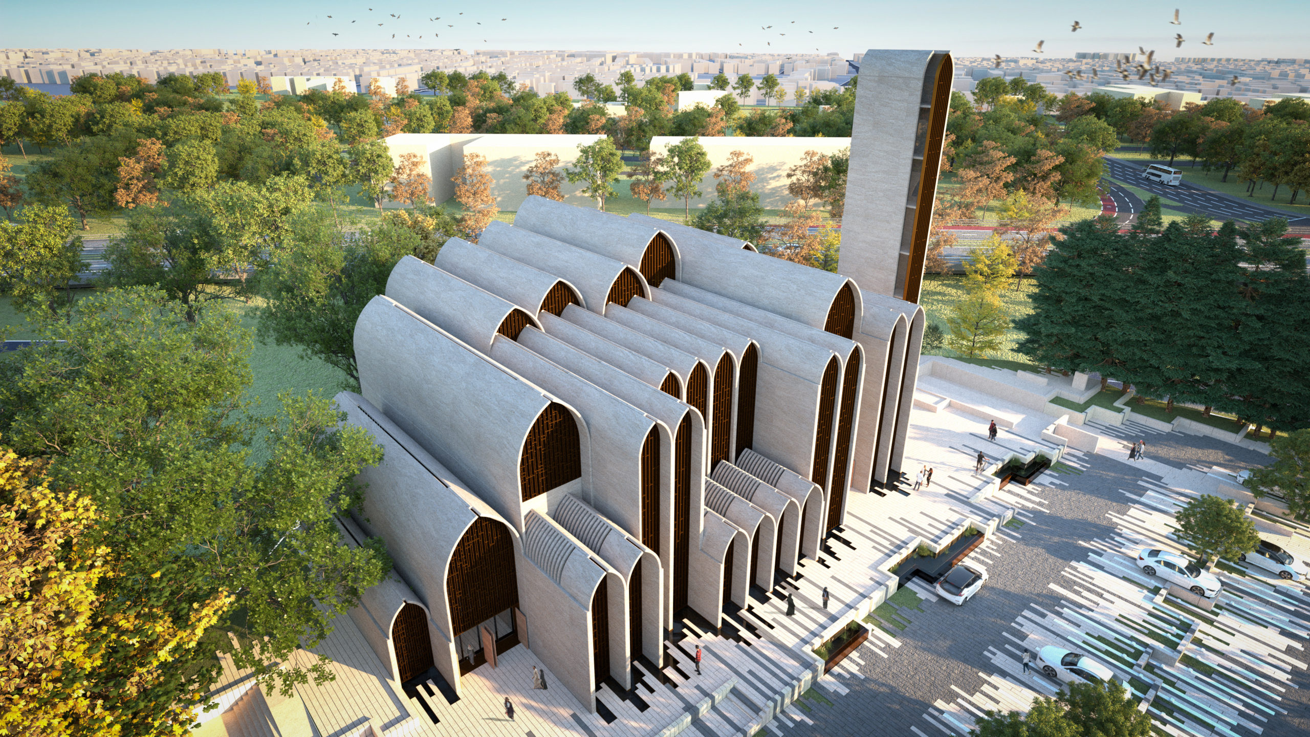
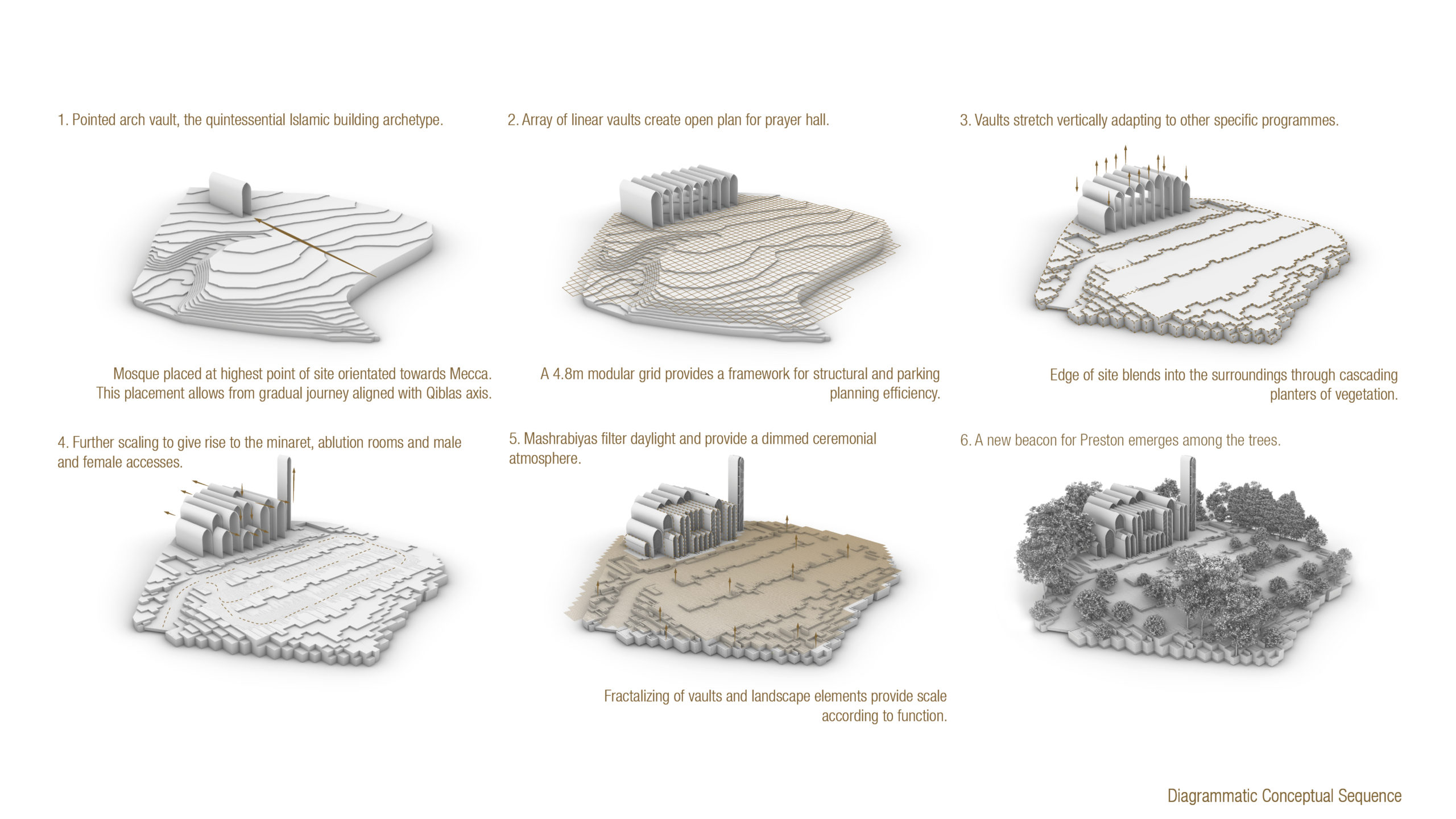
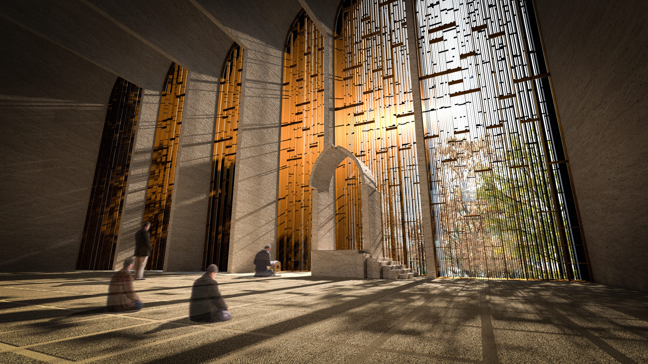
The pointed arch, which is commonly associated with Gothic architecture, found its origins in Islamic and Indian architecture. These arches were used to create doorways and ornate windows in religious or important structures. The team at AIDIA STUDIO used this historical reference and gave it a contemporary twist to create this conceptual mosque. Using a pointed arch form to create a vault allows the form to span more considerable lengths with more stability. It also allows for bigger column-free floor spans. Here, the studio turned this element into a fractal pattern that gets repeated across different levels and scales throughout the mosque.


Geometric Ceilings

Vaulted House by vPPR Architects, London, United Kingdom

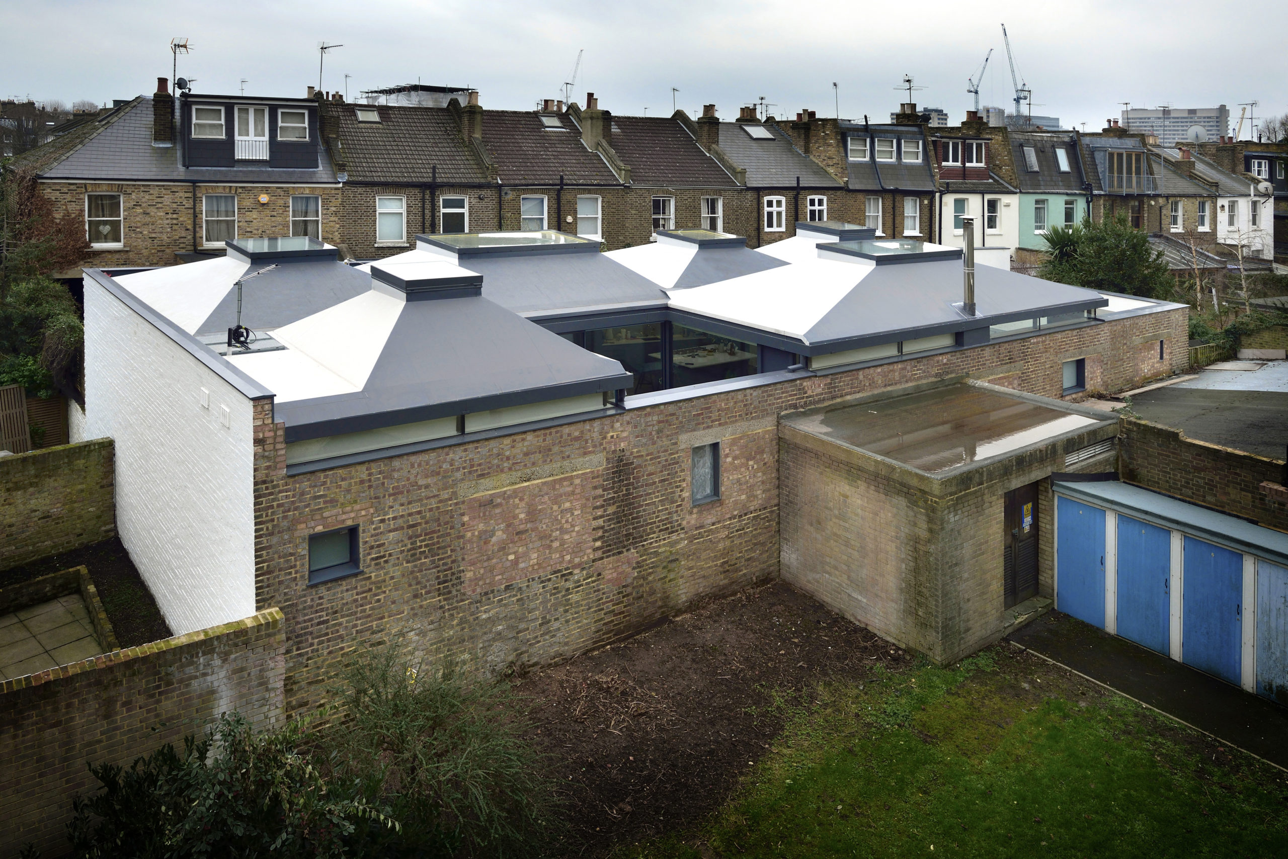
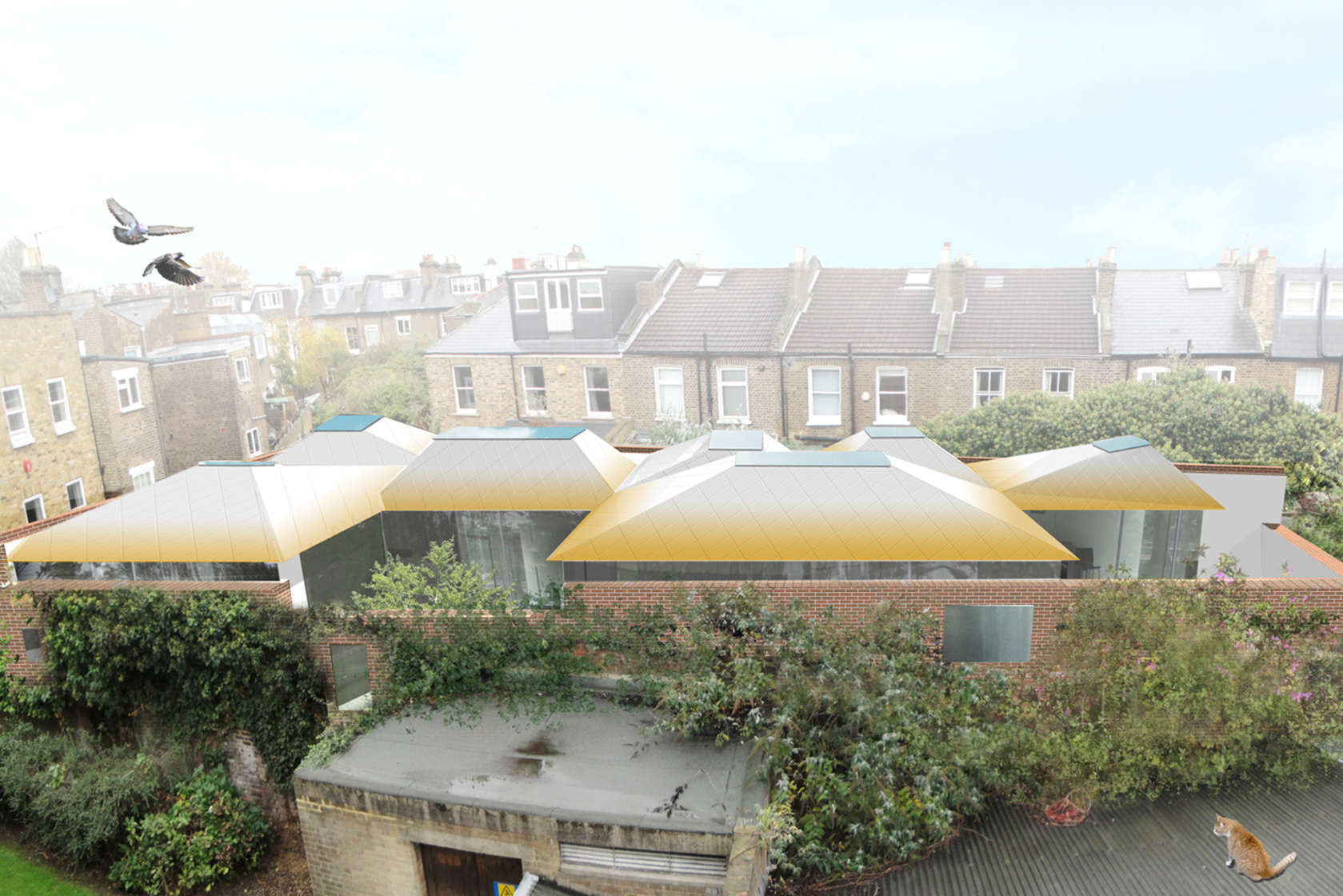
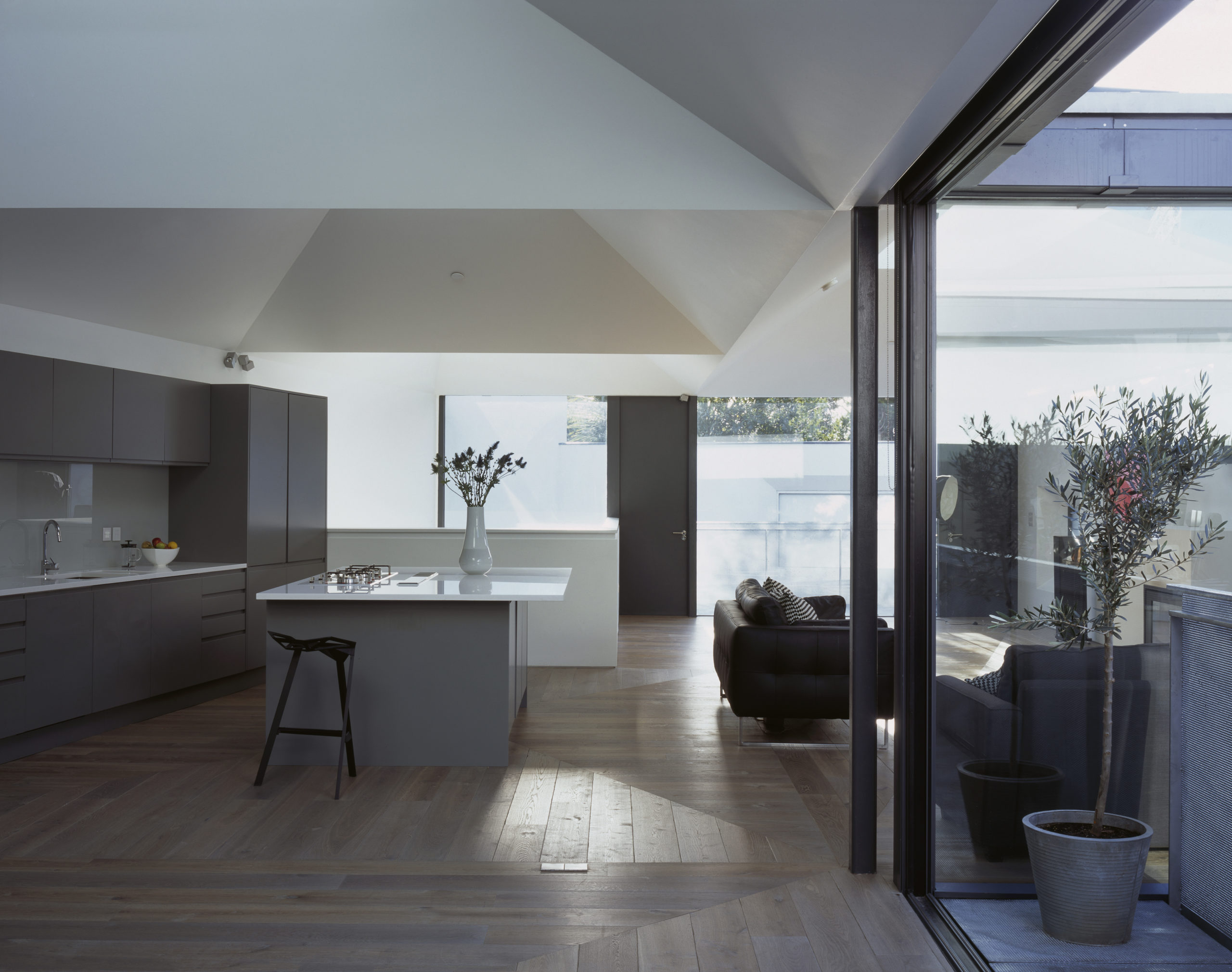
When curved ceilings don’t work with the overall design scheme, there is always an option to turn them into geometric arrangements that create a similar experience. This can be seen in Vaulted House by vPPR Architects. The roof of the entire home is divided into geometric vaults that coincide with the spatial distribution within the home. These sharp inclines completely mask the huge steel beams that are used to hold them up. The vaults are also capped with skylights to maximize the amount of natural light entering the home. To broaden the scope of this design, this trapezoidal geometry is further expanded to multiple objects around the house including the fireplace, windows, floors and the entrance.


Bamboo Lattice

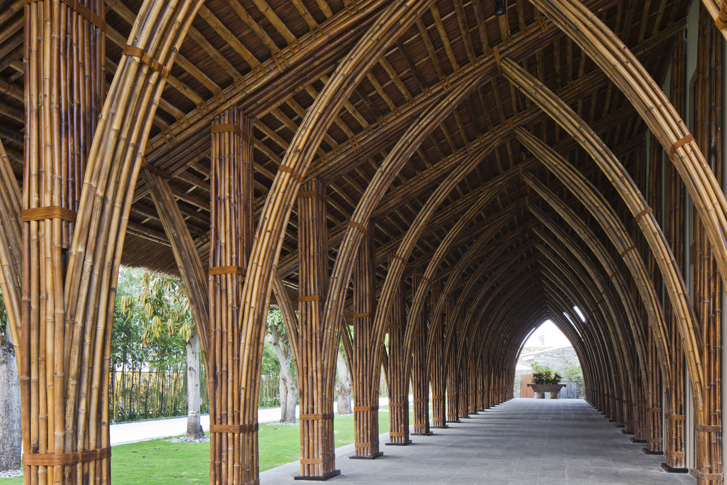
Naman Retreat Conference Hall by Vo Trong Nghia Architects, Ngũ Hành Sơn, Vietnam | Images by Hiroyuki Oki

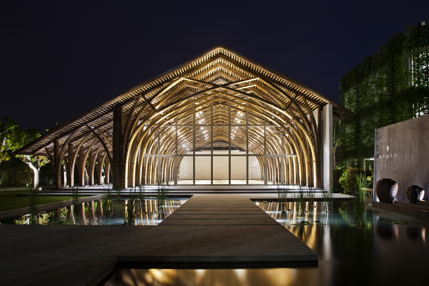
A way of adapting the vault form for tropical regions is constructing it using locally-acquired materials such as bamboo. The flexibility of bamboo stems allows them to be bent and bundled together to create a sturdy framework that can hold up a large column-free roof. In Naman Retreat Conference Hall, two types of bamboo are used to create the central hall and an adjoining vaulted corridor. The enclosed hall spans about 44 feet and goes as high as 31 feet. A large glass plane is placed three arches in to create an arched canopy outside. These curved frames are prefabricated on ground to ensure quick and easy assembly, while being very affordable and offering more control.


Asymmetrical Systems

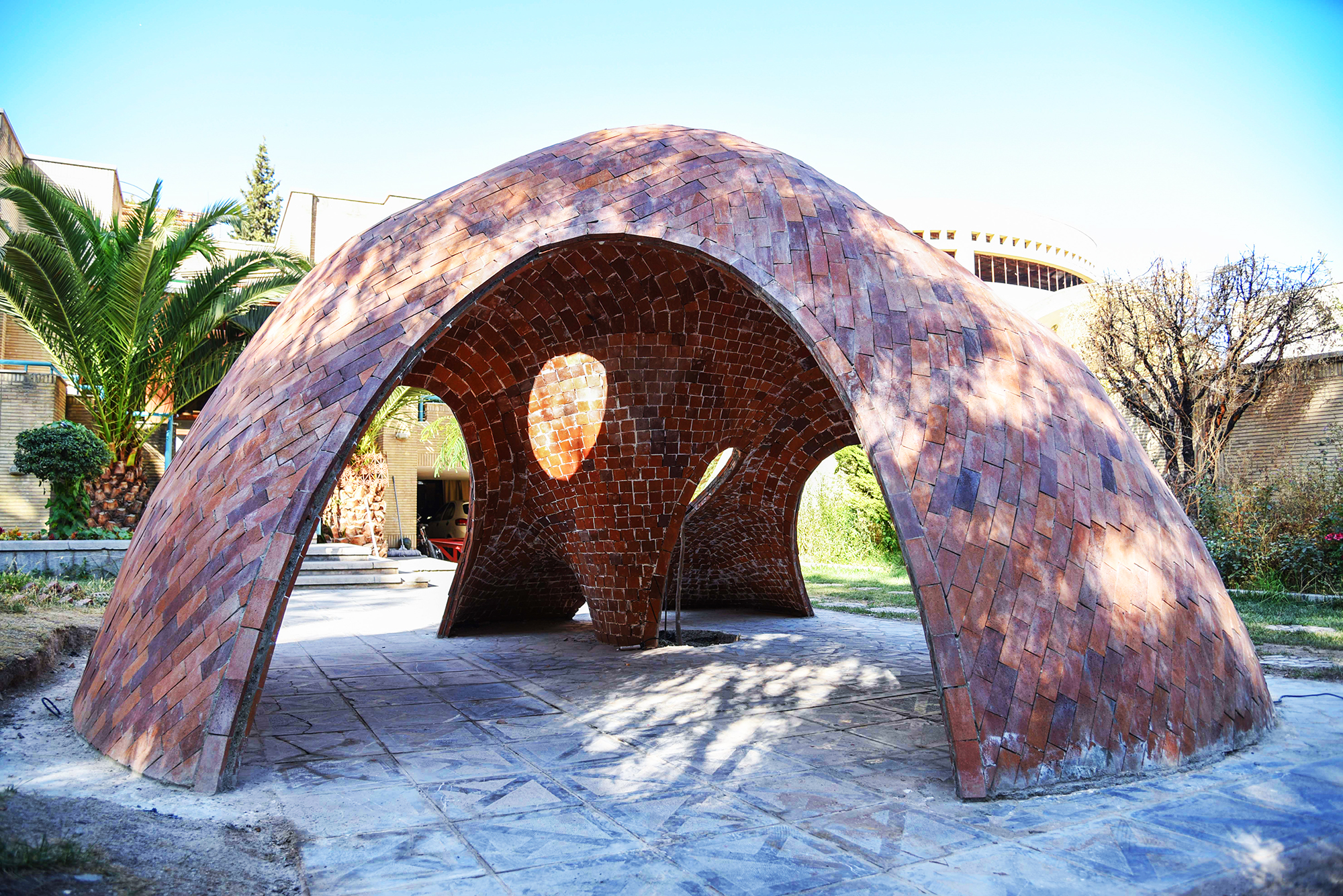
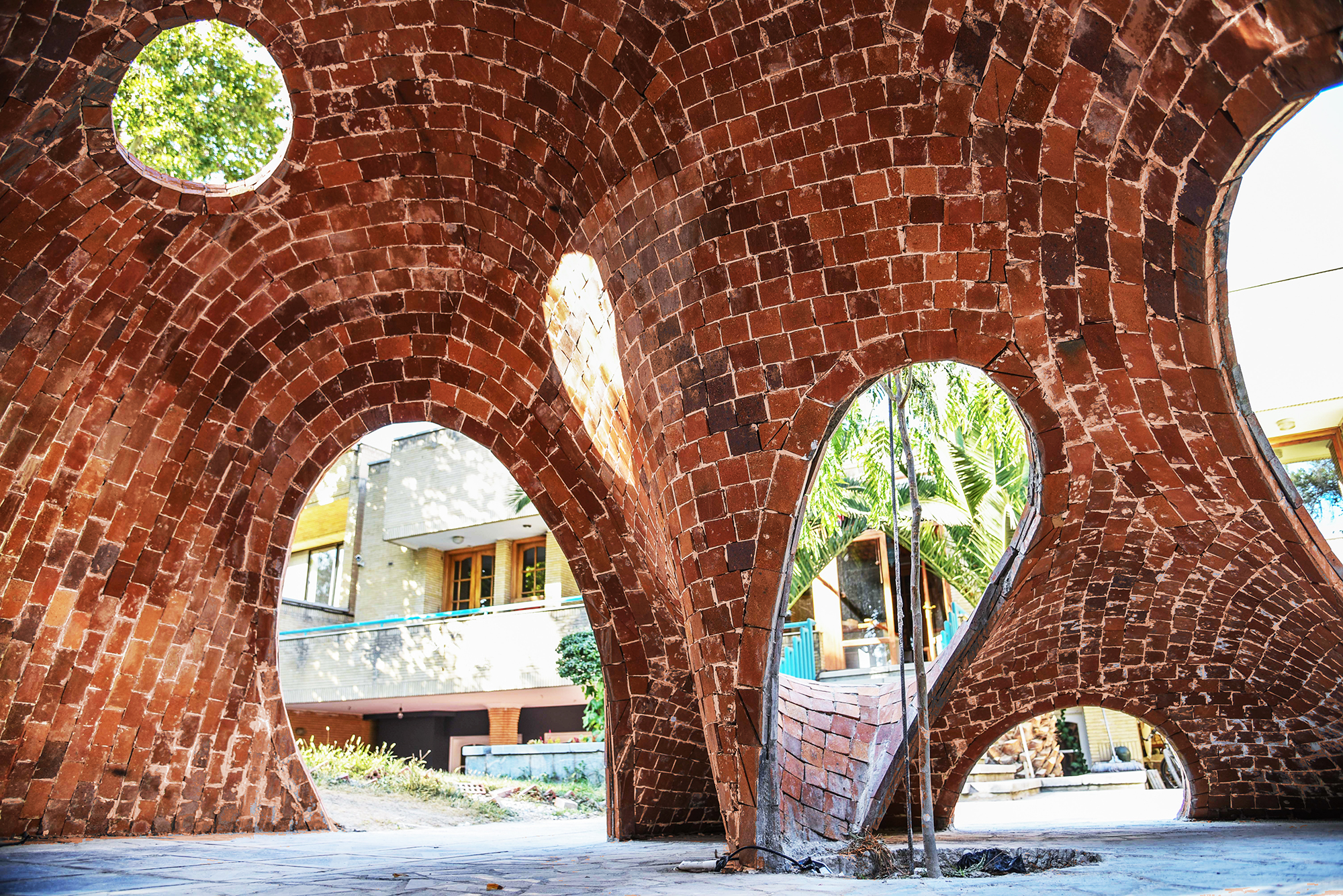
FaBRICKate by ADAPt, Isfahan, Iran | Images by Soroosh

Modern fabrication methods and materials have expanded the possibilities of buildable forms and architectures. And so, while it was often taken as a given that vaults were symmetrical structures in the past, architects are now exploring new ways of looking at them by using manual and digital technologies. FaBRICKate is an experimental free-form compression-only vault system that reverses the mechanism used by the tension-dependent catenary form. Using different 3D modeling plugins, the team devised this asymmetrical form and used a waffle structure combining a grid mesh and steel rods to construct it. This reinterpretation of the classic vault opens up new ways of carving spaces that are transcendental and unique.

Architects: Want to have your project featured? Showcase your work through Architizer and sign up for our inspirational newsletter. 

Reference