Urban flyover converted into playful community gathering space
CategoriesSustainable News

Urban flyover converted into playful community gathering space

Spotted: Unlit, unused, dirty, and often unsafe locations are almost always easy to find in a city. Imagine, instead, how much beauty could be brought into the world if those underutilised spaces were multi-use community hubs. Mumbai architects StudioPOD, along with Dutch designers MVRDV, turned that idea into reality with the One Green Mile development directly below the Senapati Bapat Marg flyover in Mumbai.

The two studios were tasked with transforming 1,800 metres of the 11-kilometre-long space into a communal hub for recreation, meeting, reading, and performing. Now well lit, painted a bright white, and entwined with greenery, 3D shapes, and public art, the One Green Mile project provides a blueprint for making exceptional use of deserted urban areas.

Screens and archways of plants throughout the space help lower surrounding temperatures, reduce noise from traffic, and improve air quality for local residents. With bike paths, outdoor gyms, and places to gather and sit, the reinvigorated concrete barriers and roof have become a beautiful addition to the city, rather than an eyesore, bringing accessible fun into everyday urban living.

Developers are increasingly incorporating multi-use spaces into their plans, with Springwise spotting projects that range from entire neighbourhood updates to a garden footbridge that provides renewable energy and growing space for local restaurants.  

Written by: Keely Khoury

Email: office@mvrdv.com

Website: mvrdv.com

Reference

This Firm is Putting Amazing Architecture at the Service of Communities
CategoriesArchitecture

This Firm is Putting Amazing Architecture at the Service of Communities

Browse the Architizer Jobs Board and apply for architecture and design positions at some of the world’s best firms. Click here to sign up for our Jobs Newsletter. 

Questions abound when architecture firms choose to undertake a project intended for community use. How can a building fulfill multiple client purposes in ever-more diverse communities? How will architects respect and contribute to a sense of identity for the people intending to use the place? How will a building incorporate sustainable design and technology given budgetary limitations? These questions constantly challenge architects because they require a different answer for every new context. Moreover, such projects require teams of architects and designers who have a rigorous understanding of the multi-faceted needs of a community but who are still willing to make bold architectural statements.

KSS Architects is one of those firms that regularly handle a high level of coordination between design teams, client interests and the built environment. It’s why for this week’s jobs newsletter, we want to highlight KSS, the award-winning firm designing new and adaptive reuse community-oriented projects across the United States.

The award-winning full-service architecture, planning, and interior design firm has offices in New York, Philadelphia, and Princeton. Founded in 1983, KSS has grown to a team of 80 design professionals, building a reputation for design projects that stimulate the intersections of learning, commerce, and community.

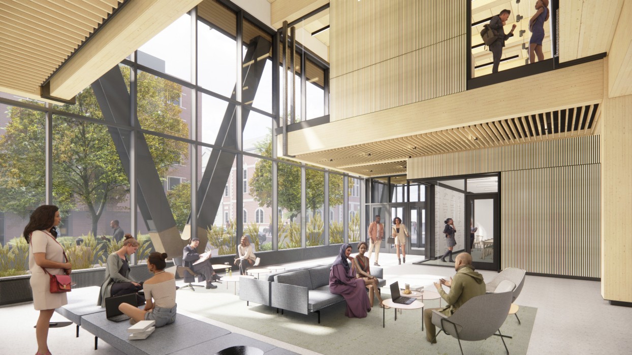
When completed, the Amy Gutmann Hall by KSS Architects will be Philadelphia’s tallest timber building; image by KSS Architects

KSS’s architects takes pride in the firm’s comprehensive design approach – a quality apparent in the dozens of projects the firm has developed over the past few years. Take for instance the Amy Gutmann Hall, the University of Pennsylvania’s future data science building. The university wanted a building that would bring the digital and natural worlds together but was unsure how this vision could materialize. After extensive consultation with the administration, members of faculty, students and other community groups, KSS developed a plan to achieve just that: their final design is not only the first mass timber project for UPenn, but also the first six-story mass timber building in the city of Philadelphia. The timber structure reduces the building’s carbon footprint by 52% relative to concrete and 41% relative to steel. The project, which is slated for completion in 2024, is bound to herald a new era for sustainable architecture at the university and beyond. It will also provide a new spacious, warm and tactile environment welcoming to students, instructors and visitors alike.

The Amy Gutmann Hall project illustrates well the design approach and work culture undertaken at KSS. The firm pairs extensive community research with deft consensus-building in which every member of the team has a voice — and a stake — in the collective success of the project. Thanks to its collaborative and transparent design process, KSS builds strong relationships of trust with clients, allowing the firm to make boldly imaginative designs to address the unique goals of clients and the environmental challenges of today.

The Foundation Collegiate Academy in Newark, NJ, is one of many renovation projects KSS Architects has undertaken on charter schools in underserved communities; photo by KSS Architects


Interested in working for one of the most dynamic architectural firms in the United States focusing on community and sustainability? Consider applying to KSS Architects through Architizer’s jobs board.

The firm is currently for eight new positions for their Philadelphia offices: including Project Architects with levels of experience ranging from 3 to 10 years for QA/QC and Industrial Markets, as well as Architectural Designers with 3-5 years’ experience.

Browse the Architizer Jobs Board and apply for architecture and design positions at some of the world’s best firms. Click here to sign up for our Jobs Newsletter. 

Reference

Eco-friendly sound-proofing made from seaweed
CategoriesSustainable News

Eco-friendly sound-proofing made from seaweed

Spotted: Most of the acoustic materials that can cancel out sound are made from plastic foams that aren’t easily recycled or degraded. This is a significant environmental issue, as plastic can take centuries to decompose if they enter the environment. Moreover, current alternative options are made from plant fibres that don’t effectively dampen noise in the most useful range of sound frequencies, or are too thick or unwieldy to fabricate.

Now, researchers reporting in ACS Sustainable Chemistry & Engineering have created a biodegradable seaweed-derived film that effectively absorbs sounds in the useful frequency range. The new material could provide a more sustainable way to reduce noise pollution.

The team started with agar, a gel derived from seaweed that is often used as a culture medium for bacteria or as a thickener in food. They mixed the agar with glycerine as a plasticiser and cellulose nanofibres to create a flexible film. When tested, the film was found to effectively absorb sounds in the frequency range of human speech, which is typically between 500 Hertz and 2000 Hertz.

The team is now working on optimising the film’s sound-absorbing properties, while exploring further properties such as flame resistance. They are also considering the use of other plant-based materials. Funding for the project came from the Science and Engineering Research Board, India, and the Indian Institute of Technology Kanpur.

Springwise has spotted other innovations looking at the use of seaweed. Norway’s material science company B’ZEOS is working with global corporations to replace single-use plastics with seaweed-based alternatives. And UK-based Notpla is making seaweed packaging in partnership with well-known brands such as Just Eat.  

Written By: Katrina Lane

Email: hindamc@iitk.ac.in

Website: iitk.ac.in

Reference

EEBA Launches Free Online Database of Sustainable Building Products for Your Home
CategoriesSustainable News Zero Energy Homes

EEBA Launches Free Online Database of Sustainable Building Products for Your Home

The Energy & Environmental Building Alliance (EEBA) and ecomedes have compiled a trove of eco-friendly building products for your home: the EEBA & ecomedes sustainable building products database. This free online tool is designed to help you find the green materials you need in a snap. Users can select products by sustainability attributes, labels, and certifications; casting a wide net or narrowing it to just a few choices that meet specific needs.

This comprehensive tool continues EEBA’s commitment to residential sustainability. Making the resource free will likely expand the market penetration of environmentally preferable building products. Supplying per-product data and automating product performance calculations will serve building professionals that specify products and help customers achieve their sustainability goals.

eeba.ecomendes.com lets you search and compare home building products by category, brand, certifications, ecolabels, and performance criteria. Users choose a product and then can calculate the materials’ environmental impacts and evaluate how they help meet different green rating system standards, including the USGBC’s LEED programs, the International Living Future Institute’s Living Building Challenge, the Department of Energy’s Zero Energy Ready Homes program, and more. Important ecolabels, listed in the tool include Declare, GreenCircle, Life Cycle Assessment, WaterSense Certified, and Environmental Product Disclosures (EPDs). 


The green-home players

For over 35 years, EEBA has advanced building science information and education in the construction industry. EEBA members and supporters build resource-efficient, healthy, and resilient homes, working together as a community of thought leaders and early adopters from all facets of the home building industry. EEBA resources, educational programs, and events engage the next generation of sustainable construction professionals, and reach thousands of key decision makers and other important industry players in the space.

Partnering with ecomedes was a key step, according to EEBA CEO and President Aaron Smith. ecomedes, Inc. connects buyers and sellers through cloud-based software, specifically serving the eco construction market. Clients include AEC firms and building owners, brands and distributors, plus some of the ecolabels and rating systems included in the EEBA database. This lends expertise in vetting critical sustainability factors including energy, water, human health, circularity, and social factors.

Whether you’re a residential design and construction pro or a homeowner seeking guidance, this free sustainable products database could save you time and money. We’re eager to see how it might propel the market share of verified sustainable building products, improving our quality of life and protecting the planet and its resources for future generations.


Reference

Charcoal-free incense made from waste flowers
CategoriesSustainable News

Charcoal-free incense made from waste flowers

Spotted: Waste is probably not the first thing you think of when you hear the word ‘temple’, but each year, millions of tonnes of flowers are left as offerings at Indian temples. For religious reasons, these offerings can’t be thrown into landfills, so they end up in rivers. The flowers are often covered in pesticides, toxic metals, and insecticides, and once they reach the water, the chemicals wash off, creating toxic compounds that suppress oxygen levels and threaten marine life. Sitting by the Ganges one day, watching as colourful flowers were dumped in the river, Ankit Agarwal got the idea for Phool (the Hindi for ‘flower’).

The startup employs around 1,200 women, many of whom do not have access to traditional employment, to collect more than 13 tonnes of floral waste from temples in Uttar Pradesh each day. The petals are removed from the flowers and sorted by colour, while the stems are used to create a compost that is sold as a separate product. The petals are dried, then ground and mixed with water and essential oils to create a clay, which is rolled into incense sticks. All of this work is done by hand.

In addition to reducing waste and providing much-needed jobs, the incense sticks are also charcoal-free, so they release fewer harmful chemicals than traditional incense sticks. While, at first, Phool had to convince temples to give them their flower waste, today, temple authorities want to be part of the project, realising that it helps both the environment and people. The company also makes essential oils and other fragrance products.

Phool is also working to develop methods for turning the flowers into products such as a vegan leather and a biodegradable alternative to Styrofoam. The company explains that they, “have invested ourselves heavily into our R&D to invent methods to convert temple-waste into biodegradable packaging and bio-leathers. We are also constantly trying to enhance our impact on empowering the women who are employed with us. It has been our earnest effort to turn this pious waste collection into a full-blown social enterprise which now spans three cities.”

Springwise has highlighted a number of organisations that combine innovation with job opportunities. These include a social enterprise that promotes affordable menstrual hygiene and a coffee chain that provides employment for employees with disabilities.

Written By: Lisa Magloff

Website: phool.co

Contact: phool.co/pages/contact-us

Reference

The Relic Shelter | Fuzhou Teahouse // Neri & Hu
CategoriesSustainable News

The Relic Shelter | Fuzhou Teahouse // Neri & Hu

Text description provided by the architects.

The project draws inspiration from imagery uniquely associated with Fuzhou: the Jinshan Temple. This is a rare example of a temple structure built in the middle of a river in China. John Thomson was one of the first photographers ever to travel to the country and provided Western audiences with some of the first glimpses into the Far East.

© Neri & Hu

© Neri & Hu

In the album Foochow and the River Min, which documented his legendary journey up the Min River, Thomson captured the ancient structure in its original state resting serenely above a floating rock in 1871. This would become a lasting image unmistakably identified with the city of Fuzhou.
Conceived as an urban artefact and drawing from the historical roots of the city of Fuzhou, the Relic Shelter internalizes a piece of distinct heritage at a time when rapid new development has eroded traditional culture and identity.

© Neri & Hu

© Neri & Hu

The client’s brief posed the unique challenge of creating an enclosure for a Chinese artefact – the wooden structure of a high-ranking Qing dynasty official’s residence, replete with ornamental carvings and intricate joinery. Relocated from Anhui to its new home in Fuzhou, the Hui-style structure is enshrined as the inhabitable centrepiece of a new teahouse.
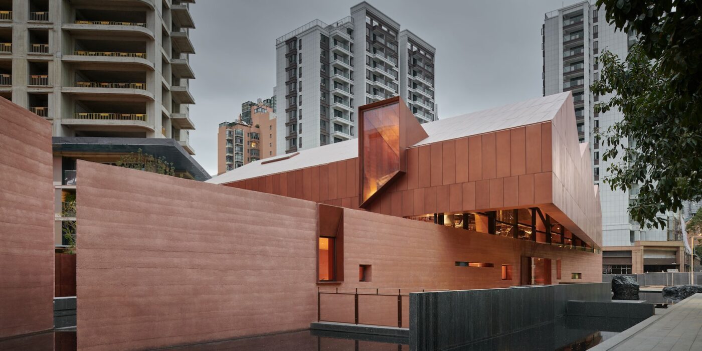
Envisioned as a house atop a rock, the teahouse is elevated above a rammed concrete base, while its sweeping copper roof echoes the roofline of the enclosed architectural relic.

© Neri & Hu

© Neri & Hu

Its core material, rammed concrete, is a modern homage to the traditional earthen dwellings of the region, emphasizing a raw monumentality. Visitors are presented with two images of the building upon approach: the upright silhouette of the form, and its mirrored reflection duplicated in the surrounding pool of water.
A series of contrasts plays out among elements that are bright and dark, light and heavy, coarse and refined, as visitors enter the grand hall where the structure of the ancient residence is situated.

© Neri & Hu

© Neri & Hu

Sky wells penetrate the roof, bringing natural light into the depths of the enclosure and illuminating the priceless artefact on display. Only upon reaching the mezzanine does the structural configuration of the building begin to reveal itself. The hovering metal roof is lifted 50 cm off the solid base by copper-clad trusses to introduce a sliver of continuous illumination around its periphery.

© Neri & Hu

© Neri & Hu

Wrapping itself around the historical wooden structure, the mezzanine space allows visitors to appreciate intricate carpentry details at eye level.
The basement level includes a secondary arrival lobby housing a rotunda, a sunken courtyard and tasting rooms. At the top of the rotunda, a carved oculus capped by glass is submerged beneath the pool in the courtyard above.

© Neri & Hu

© Neri & Hu

It filters the sun through a thin film of water, creating a mesmerizing play of reflections..

© Neri & Hu

© Neri & Hu

The Relic Shelter | Fuzhou Teahouse Gallery

Reference

100 Photos That Tell Powerful Stories About Architecture in 2022
CategoriesArchitecture

100 Photos That Tell Powerful Stories About Architecture in 2022

One of the most exciting moments of Architizer’s year is upon us again — we are thrilled to reveal the 100 amazing Finalists for the 3rd Annual One Photo Challenge, architecture’s biggest photography competition! Including unique architectural images from around the world, this year’s vibrant exhibition is full of unusual perspectives and bold juxtapositions of form and void. Each photograph tells its own unique story about buildings, people and our world in 2022, demonstrating how architecture can be viewed as a landscape, an artwork, a stage, a refuge and a home.

The final judging process is officially underway, with our stellar line up of expert jurors reviewing each image in minute detail and reading the stories behind them. They will be judging the photographs based on the competition criteria to come up with their top entries. The jurors’ rankings will be converted into scores, which will then give us our two Top Winners and 10 Runners-up.

The 2 Top Winners — 1 student and 1 non-student — will win themselves $2,500, an exclusive interview with Architizer Editors about their image, and a spot on next season’s prestigious competition jury! If this sounds like a challenge you’d like to have a go at, you can register for next season’s One Photo Challenge by signing up here.

Without further ado, explore the 100 Finalists below (published across 4 posts and in no particular order), accompanied by their stories, written by the entrants. Tell us which is your favorite on Instagram and Twitter with the hashtag #OnePhotoChallenge! Below, “Part 1” presents the first 25 architectural photographs — you can jump to parts 2, 3 and 4 using these buttons:

Part 2     Part 3     Part 4


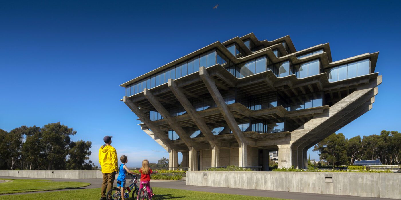
“Family” by Jeff Durkin

Breadtruck Films
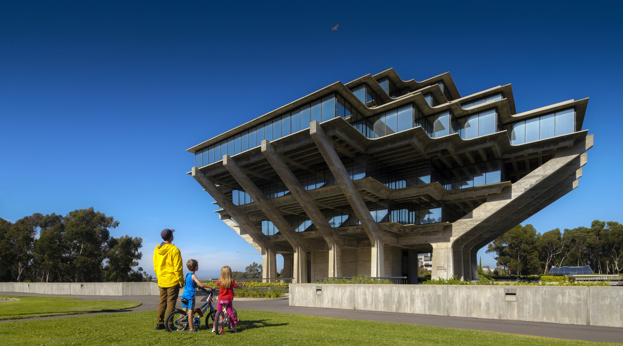
“This was taken at the University of California San Diego’s world famous Geisel library by William Pereira. This was taken on a hot summer day when school is out and the campus becomes a playground for families and children in the area of La Jolla. I’ve spent many days at this library, but this day was special because many families where on campus to see the “Cat in the Hat” statue that is just out of frame.

Theodore Geisel a.k.a. children’s book author Dr. Seuss had lived in the area and his wife had donated his work and trust to the library, in his honor, so it’s a big place for kids. I snapped several photos that day, but this family in primary colors captivated by the inverted pyramid represents and idealistic childhood in the mid-century.”

Camera: Canon


“Urban Mountains” by Katharina Klopfer
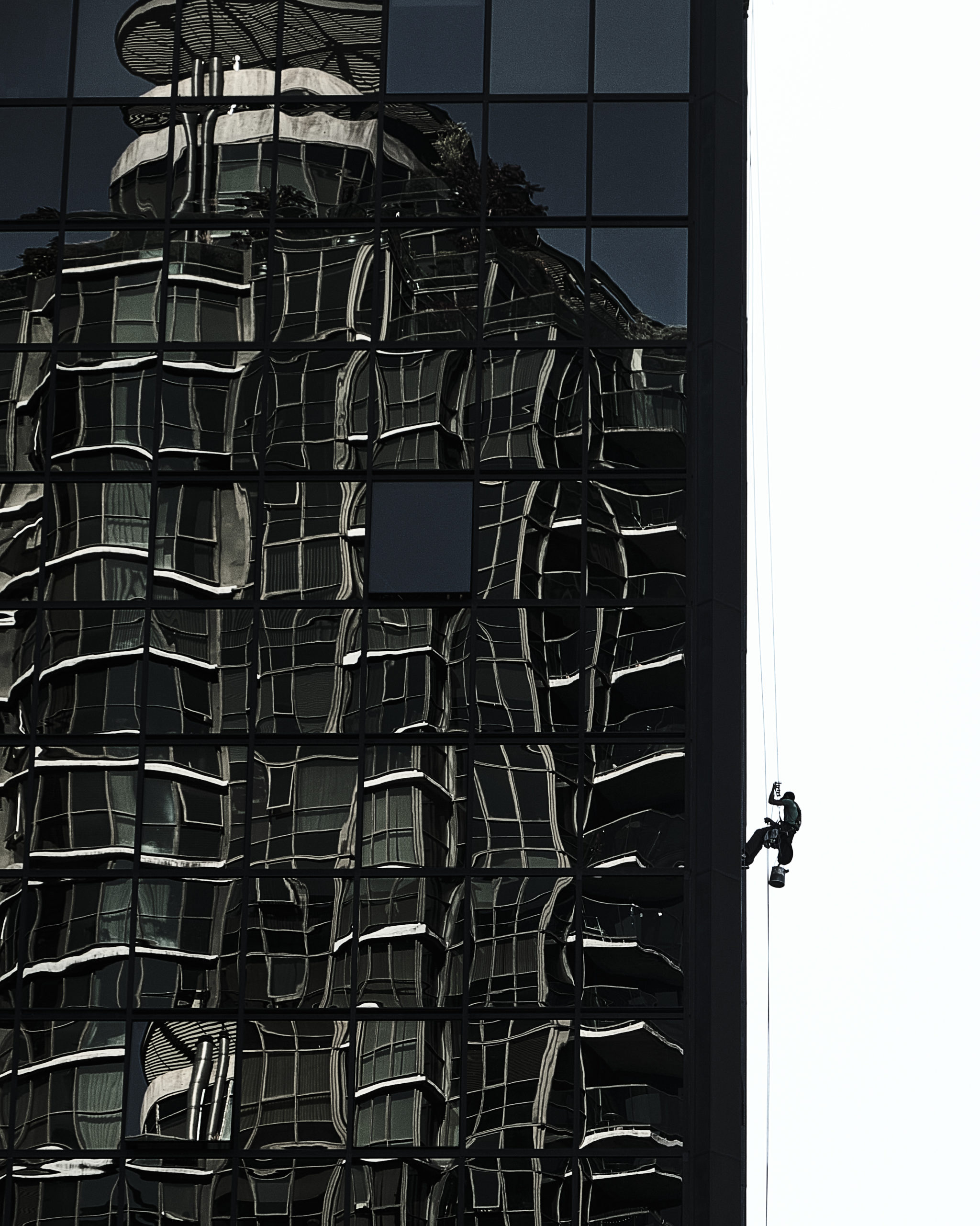
“When walking through downtown I am constantly fascinated by highrise buildings and the impact they leave on us. Do we feel small and overwhelmed by this kind of architecture? Or is it similar to what we feel when we climb mountains or get lost in dark valleys? We certainly do enjoy the view when we reach the peak or rooftop. This urban landscape seems to be a reinterpretion of the white-top mountains that surround us and can be spotted vaguely in the distance.

While I was watching the facade workers doing their job the image of an alpine scenery was recalled. An urban mountain landscape waiting to be conquered by humans. Mysterious, frightening, but also loved. Excactly like pristine nature appears to us.”

Camera: Fujifilm SLR


“POPCourts!” by Shelby Kroeger, Alan Barker, Max Komnenich, Anezka Gocova, Vanessa Stokes & Missy Perkins

Lamar Johnson Collaborative

“POPCourts!, a 7,000 SF community plaza in the Austin neighborhood on Chicago’s West Side, was born from the pandemic and civil unrest and developed in concert with Mayor Lightfoot’s INVEST South/West initiative. The goal was to provide a safe community space that residents could enjoy outdoors during the pandemic while also creating a visible presence along Chicago Avenue.

The entire design team transformed this empty city lot into three-zone “Courts,” each serving a variety of community functions, allowing activities to “Pop” up and transform over time. The basketball court doubles as a community plaza. The gravel drive hosts food trucks, farmer’s markets, and other seasonal vendors, and the shaded lawn functions as a Food Court with casual seating. Local artists painted murals on the adjacent building walls, depicting figures such as Malcolm X, Harriet Tubman, and Maya Angelou.”

Camera: Canon


“‘Undersea Adventure’ on the Roof of Opus” by Wujingting Zeng

Politecnico di Milano
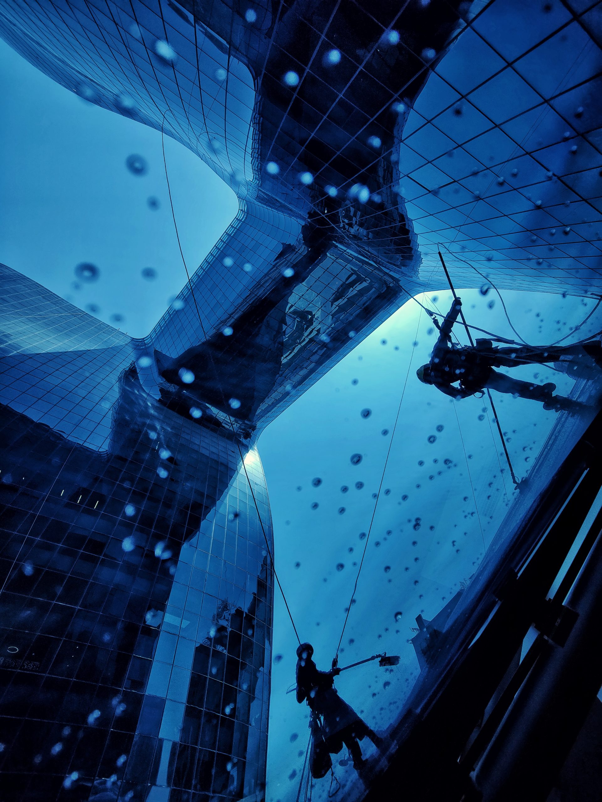
“One morning, I looked up at Zaha’s Opus and saw workers scrubbing the roof of the atrium. Then I walked to the top floor of the atrium and took this photo under the feet of the workers.

The sky bridge blocks the sun, and people lose the reference to identify themselves as on land.The glass makes the outside world a blue like the under the sea . The curved building shape makes people feel like they are at the bottom of a coral reef. “Divers“ are holding ”probes“ to find the lost treasures. Falling water droplets became the bubbles they exhaled.

In a city like Dubai, where the desert meets the ocean, the workers who clean the dust from the desert look like divers under the sea in the contrast of the building, which endows the picture with a mysterious poetry.”

Camera: Other


“Here’s looking at you, kid!” by Paul Ott

paul ott photografiert
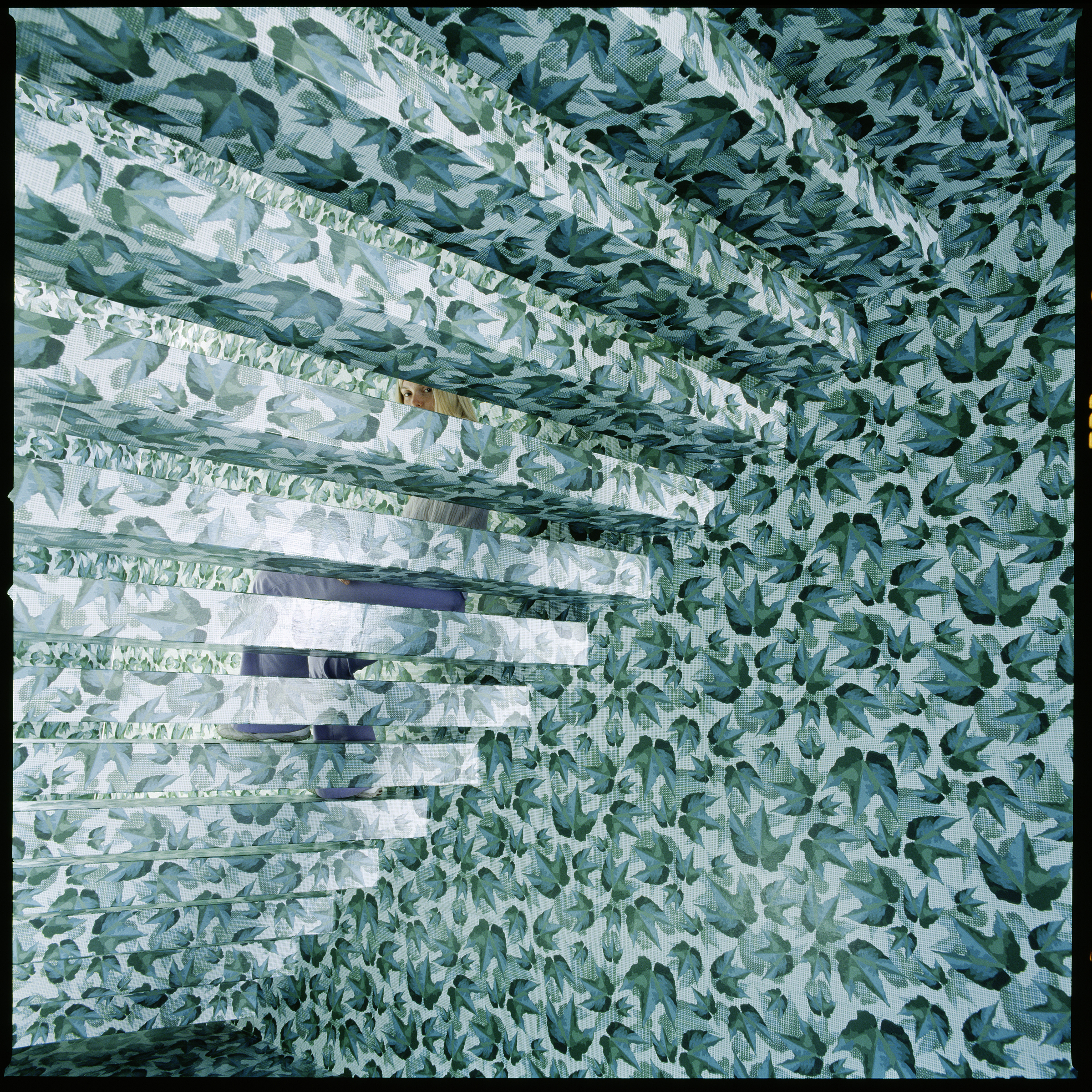
“This image is my photographic translation of a space-dissolving surface design of a stairwell interior. Its design is part of the conversion of a bourgeois house from the 1900 into an apartment building.

The woman’s steady gaze questions the observer: What is the substance of this image? Is it real or imaginary?

“Here’s looking at you, kid!” – Humphrey Bogart, Casablanca.”

Camera: Hasselblad 500 C/M


“Steps” by Manuel Mergal

“The “steps” are of the National Gallery of Art in Washington DC. The hard shadows on the photo serve to decontextualize it, thereby engaging the viewer with what he or she has in front as a photo itself, and not necessarily the fact that it is recognizable as the National Gallery of Art in DC. The sharp divide between the left and the right is a comment on the human condition: the decision that we are all confronted with and the fact that it is only in the light of knowledge (light which produces the hard shadows) that we see the right choice.”

Camera: iPhone


“Self-revealing.” by 易暹 李

YHLAA
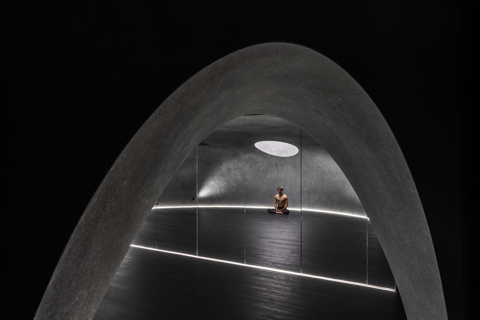
“This is a chamber for yoga master to give lecture and practice.
The design concept is to build a cave for the master to hide himself from the noisy world.
It is hidden in the busiest area in Taipei City.
Outside the chamber is extremely busy and loud, but inside is totally different.
This place gives people a huge sense of tranquility, Where people can discover themself via yoga training.”

Camera: Sony


“Fountain of Youth” by Sean Wolanyk

McGill University

“Walking through the streets of Chefchaouen, one notices the distinct lack of authentic life. With vendors catering to groups of tourists, finding people genuinely living their lives is a rare sight.

However, upon turning around a corner, I saw a young girl sitting on the edge of a water fountain, filling a small bottle. I was fascinated by this sight, as not only was it a resident living their life, but a child on her own in the street. This seems distinctly foreign to me, having grown up in suburban North America. Perhaps this is an example of bad parenting, but maybe it is emblematic of an older way of life that has died in my world, but lives on here in Morocco.”

Camera: Canon


“Reflect” by Kim Smith

Kim Smith Photo
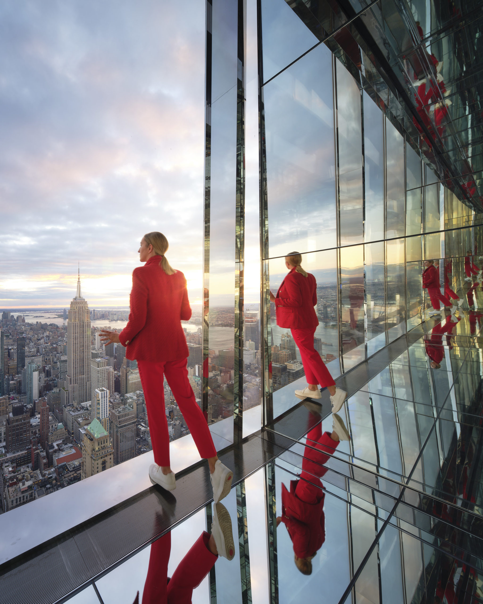
“In one still moment, our viewer inhabits the past, present and multiple futures. From her perch, she feels the power of the timeless.

Set in the context of bustling, time-worn Manhattan, our viewer reflects – literally and figuratively. Amongst iconic architecture of a classic era, she discovers the present moment. Comfortable, curious and captured, her future lies unwritten among infinite reflections.”

Camera: Fujifilm SLR


“Reflektor” by Adrian Aguilar H
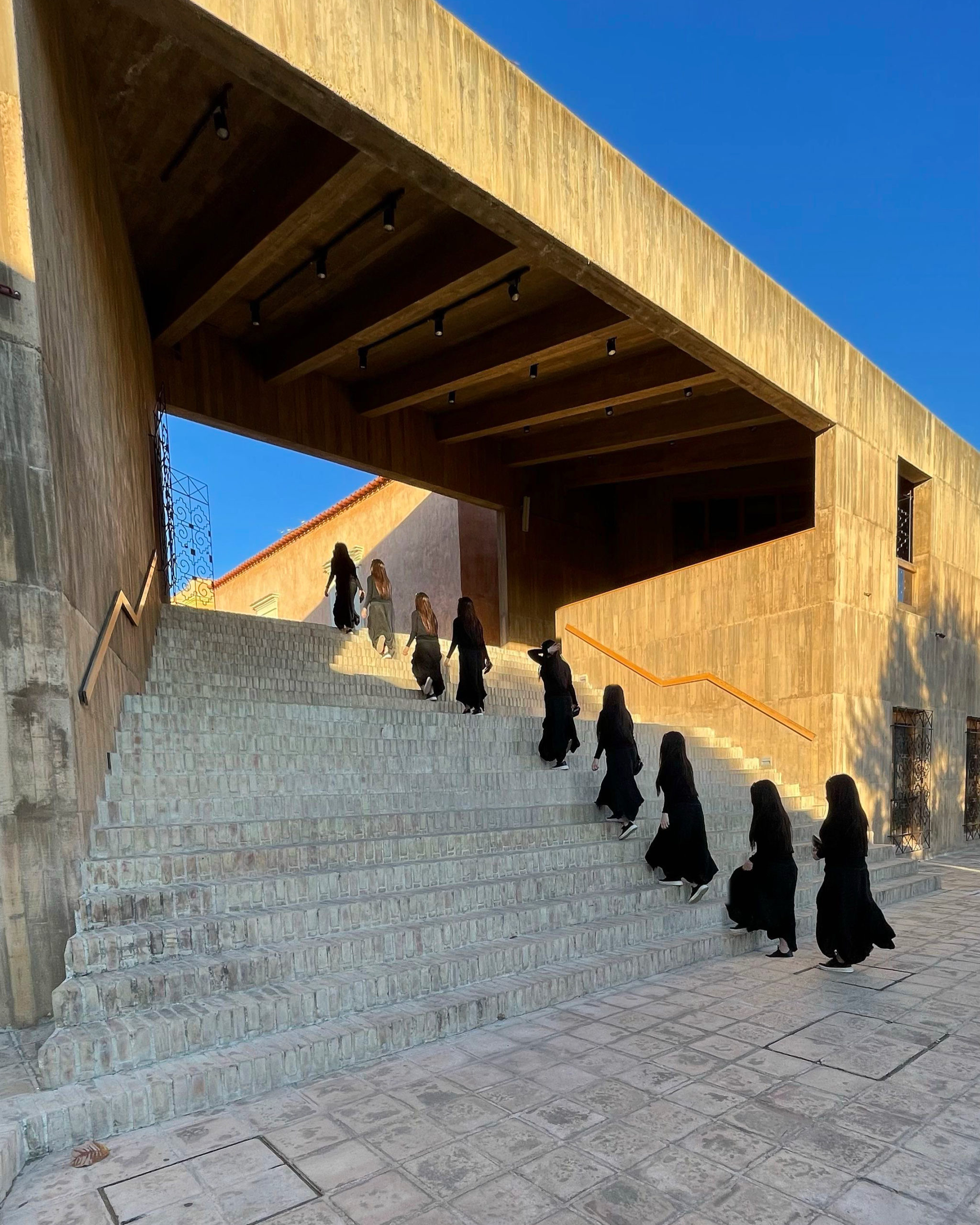
“The cultural center Teotitlan Del Valle in Oaxaca Mexico, is a cultural center located in a community where the main income is art crafted textiles, this center not only allows small artisans to show and promote their work, the center also hosts various artistic activities for the development of young people, these activities are: music, painting, dance and theater.

The stairs that can be seen in the photograph, are the connection between 2 important levels that communicate to a main square where the artisans are located and the second level connects to the halls to practice the cultural activities, this portal is the daily crossroads of the community. The photo wants to reflect the important connection between the economic development of the community and the importance of cultural and artistic development in the society. The architecture becomes protagonist and spectator of the development of a community proud of its roots.”

Camera: iPhone


“Solitude” by Robin Quarrelle

Robin Quarrelle Photography
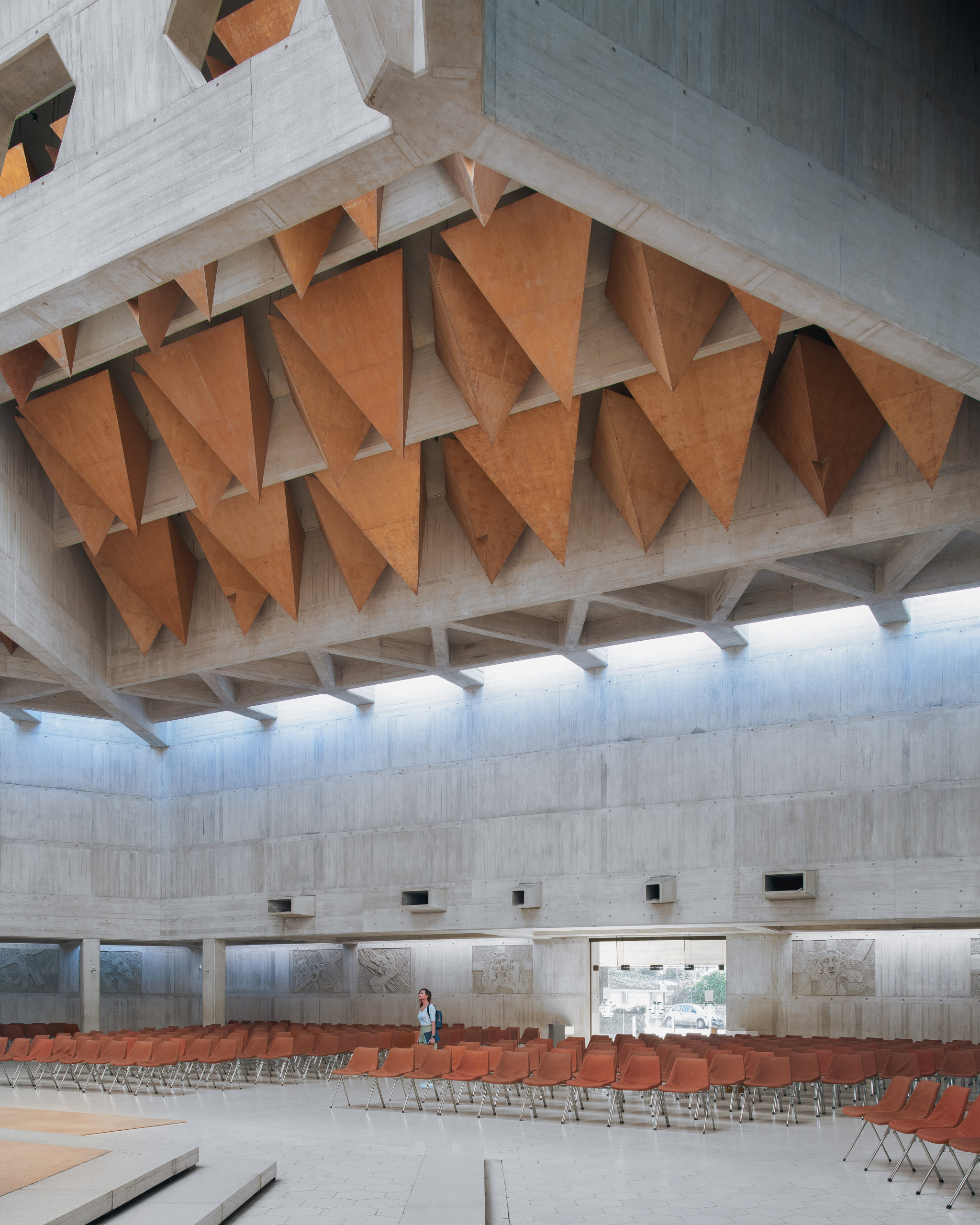
“Early 2022, when the Omicron Covid variant was ripping through the UK, it was hard to find a safe place where one could find comfort away from home. This is Clifton Cathedral, in Bristol, UK. A building i’ve walked past many times without realising what an architectural treasure the interior was. I’m not a religious man, but I do find these spaces incredibly peaceful. I was alone for an hour whilst taking some pictures of this space, except for a short few minutes when a student popped her head in to seek some peace, solitude, and perhaps comfort during an unsettling and difficult time for the country.”

Camera: Sony


“A Glimpse of Heaven” by Jean Claude Ardila

Jean Claude Photography
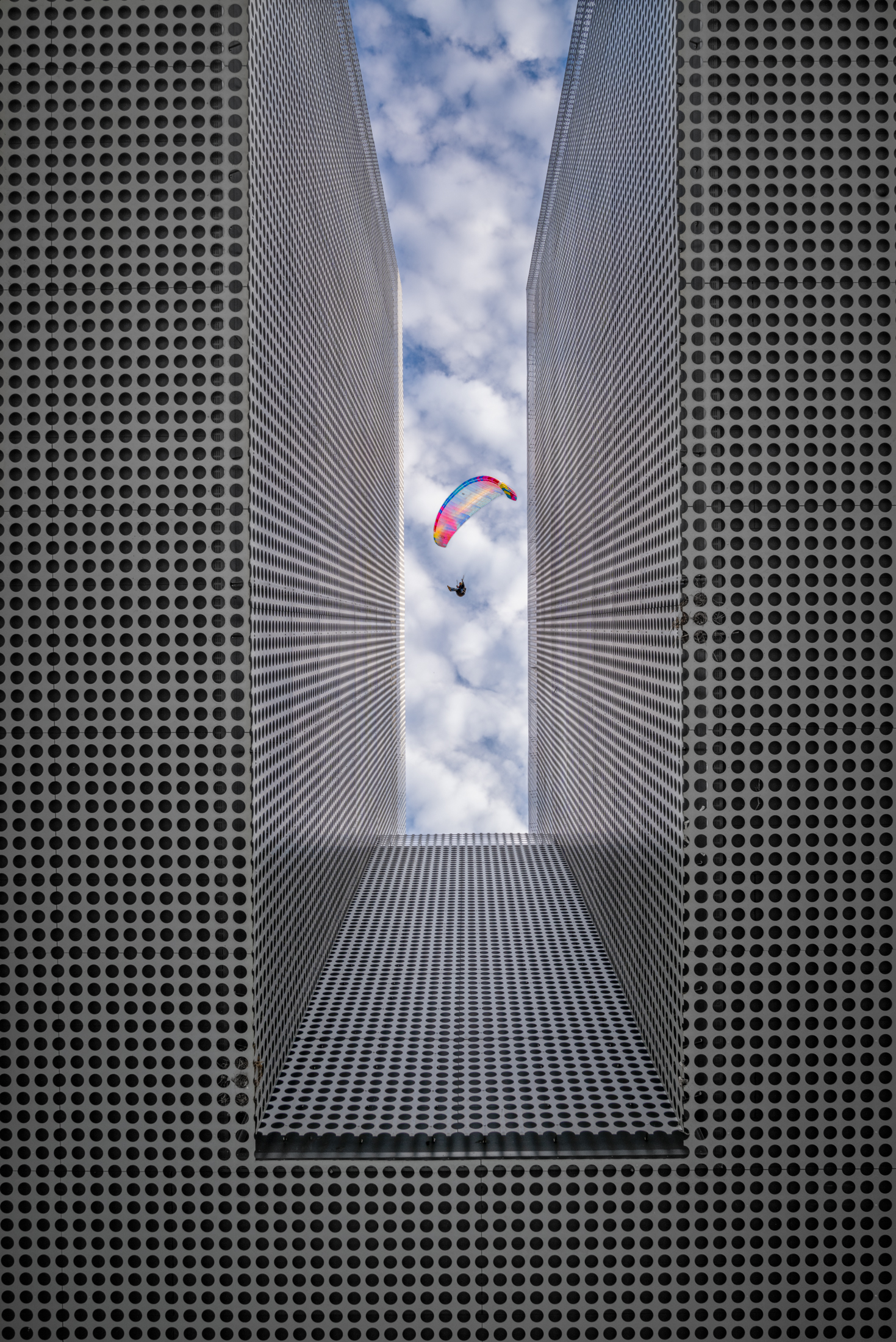
“This image was taken at the Tampa Museum of Art. There is an opening on the building guiding your eyes towards the sky. I laid there with my camera on my face to avoid shake and trying to capture the best angle using the lines in the structure towards the clouds. I noticed there were paragliders in the area and I waited patiently for one to appear in my frame. I am glad I did.”

Camera: Sony


“Arachnophobia” by Tiffany Liem

Brookfield Properties
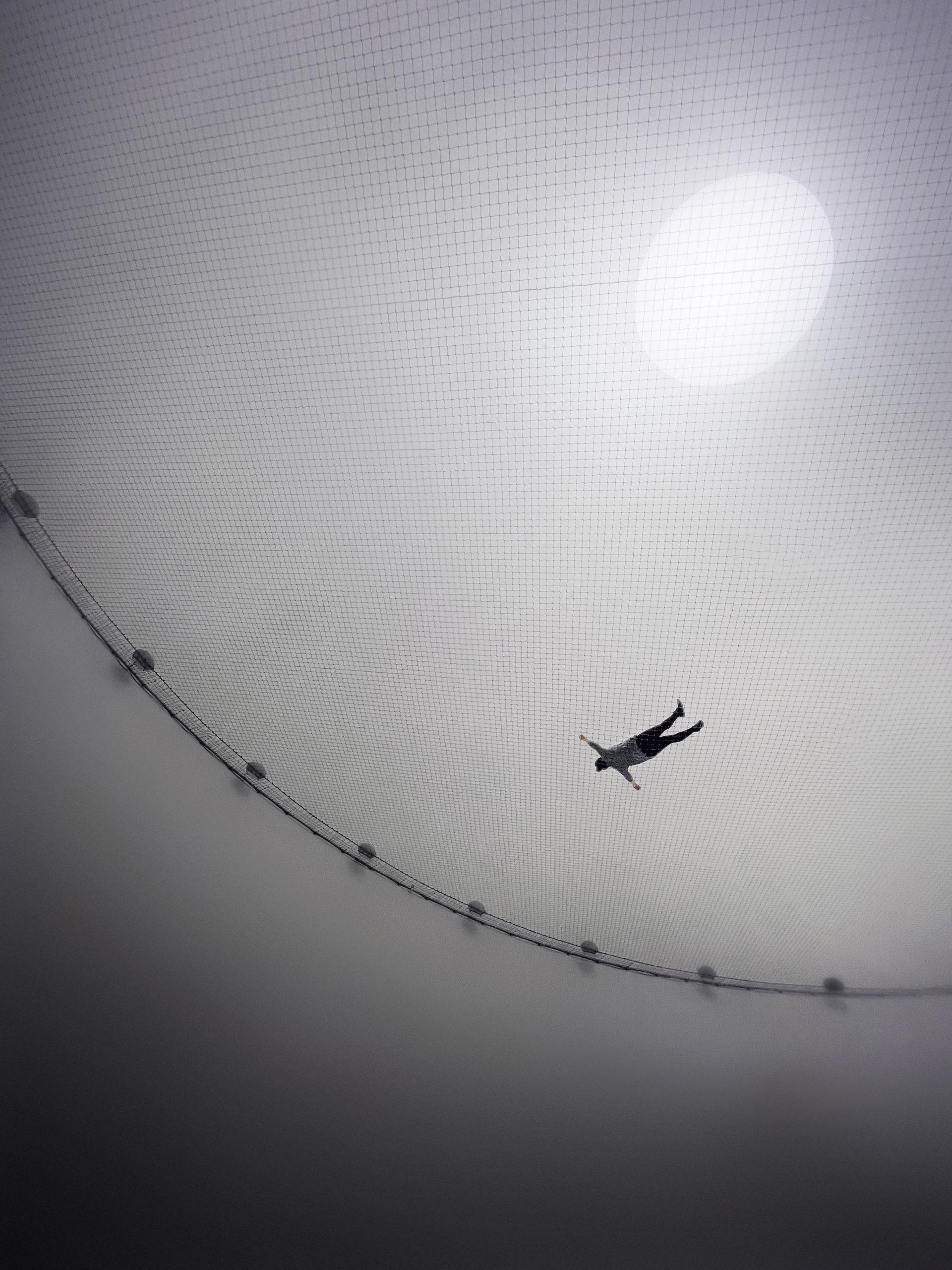
“Suspended 40ft in the air, a woman floats on a web-like net.

The scale of the human form to the net equates to a spider and its web. The artist, Tomás Saraceno, transports the user to a sensory experience in which we become the arachnid. The sun-like sphere fades into black and we are transported to a universe where we feel every vibration of the web and our ears consume all of the frequencies echoing in the darkness.

It’s a subtle reminder of how small and isolating we can feel in a vast and expanding universe.

Photo from Tomás Saraceno’s exhibition Particular Matter(s): Free the Air: How to hear the universe in a spider/web exhibited at The Shed.”

Camera: iPhone


“Art Jameel” by Shoayb Khattab

Shoayb Khattab Photography
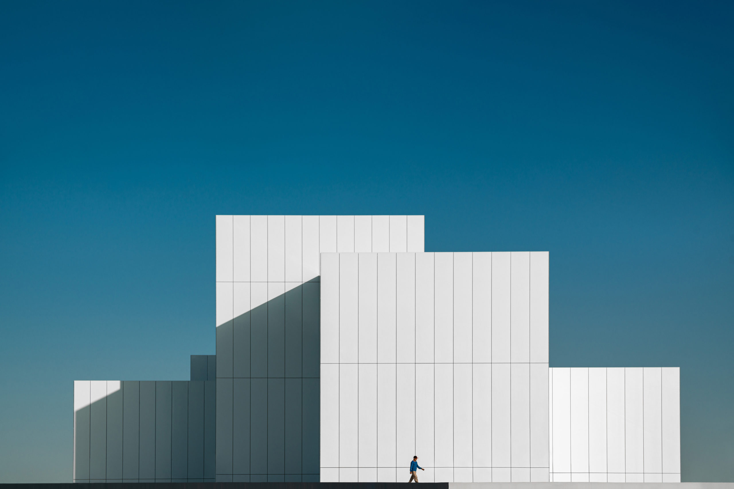
“My intention from this project was to reduce the minimalist architecture design of Jameel Arts Centre to a single frame and presents its white façade and clean lines in the simplest way possible. What made the capture more interesting is the passing mechanical guy which was a happy accident that contributed a human element to the otherwise too pure of a picture.”

Camera: Canon


“Fun in the Sun” by Daniel Francis

Dan Francis Photography
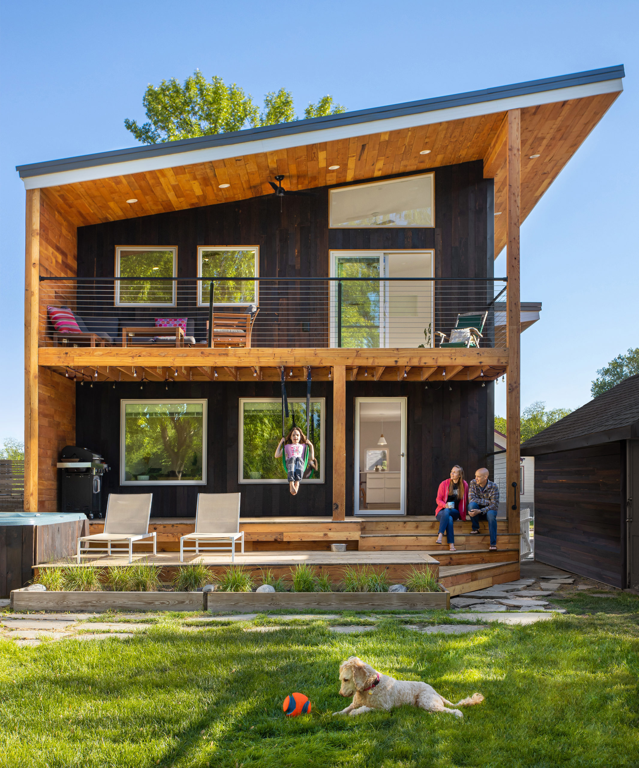
“In the year 2020, the world as we knew it changed.

Adults who spent hours at the office are now finding themselves at home a lot more than usual.

Work and home life has merged. The new addition of the house for this active family was completed in 2021 to bring some relaxation and to enjoy the outdoors with the ones that matter most.

The exterior finish of the home was a technique called Shou Sugi Ban and the deck brought the goal to have the backyard be an extension to their home.”

Camera: Canon


“Cadets” by Brad Feinknopf

feinknopf
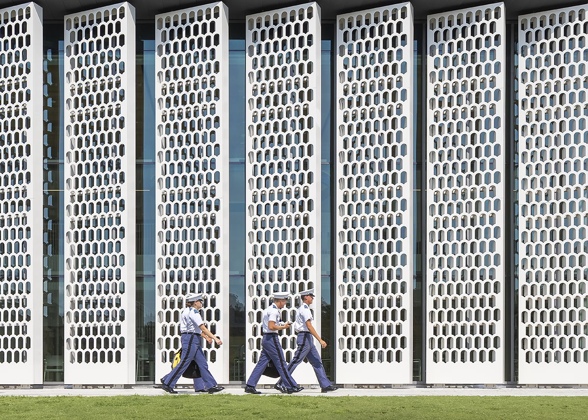
“We had been hired by Ikon 5 to photograph Bastin Hall at The Citadel. The Citadel is a U.S. Military College in Charleston, SC. Bastin Hall had a beautiful screen that allowed dappled light into the atrium. It also created a beautiful backdrop for the Cadets heading to and from drills. This is a brief moment of relaxation on the way to drills in a rather structured environment.”

Camera: Canon


“Dancers” by Brad Feinknopf

feinknopf
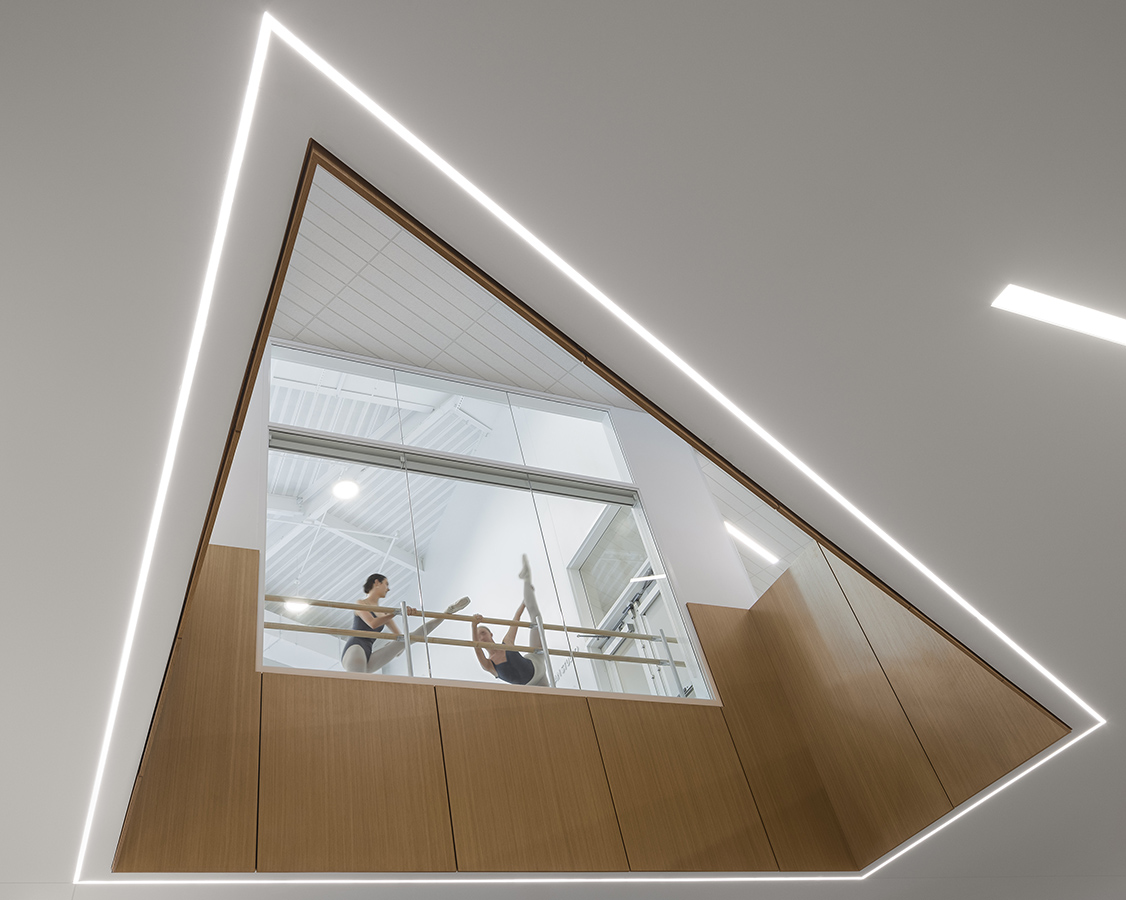
“We were hired to shoot the new Cincinnati Ballet’s new home. If the lobby is a ceiling cut, people can look up into the studios above. A beautiful window into their great artistry.”

Camera: Canon


“Kites” by Lim yu heng
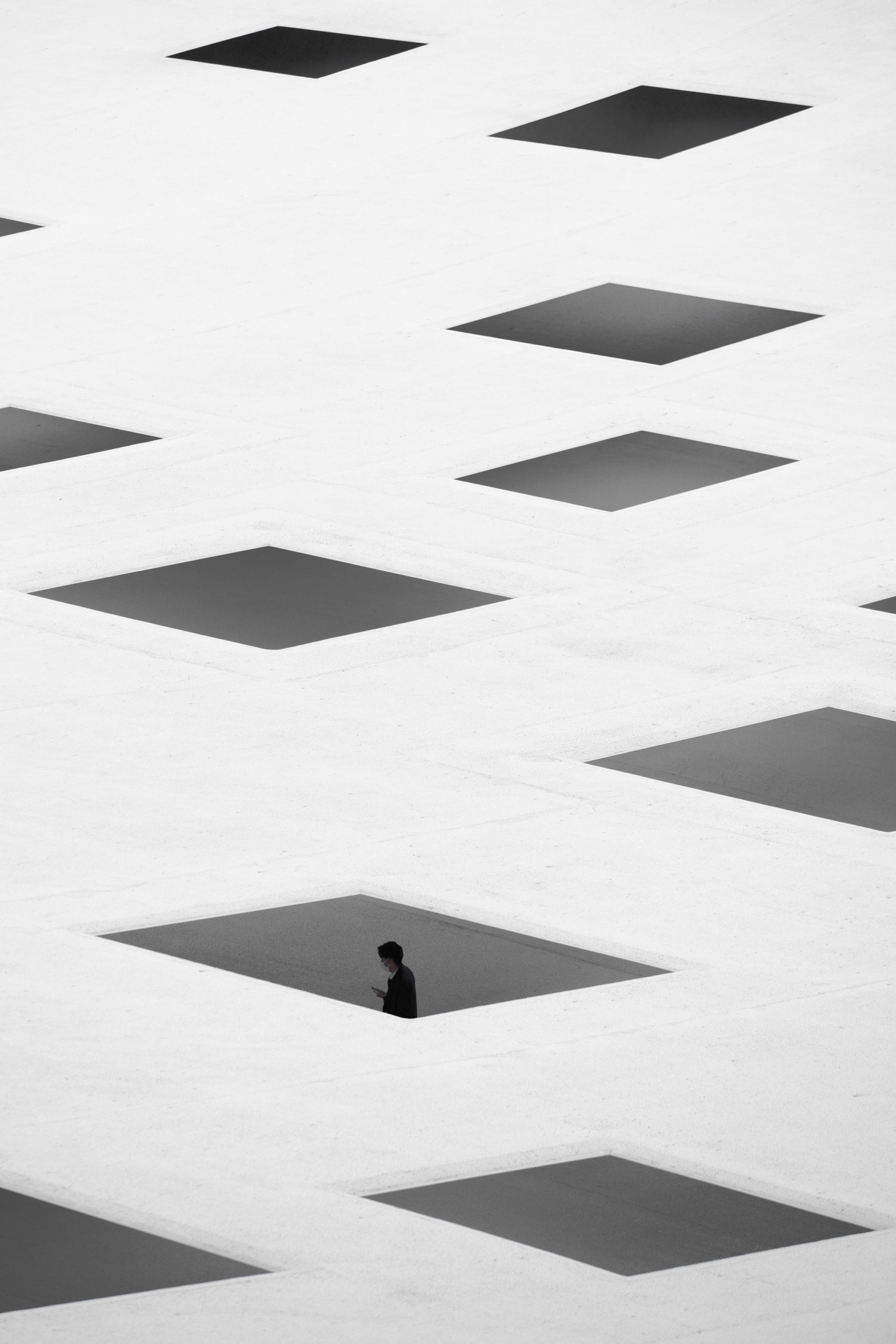
“This photograph was taken at the plaza of Kanagawa Institute of Technology in Japan designed by Ishigami Junya.

The photograph is titled Kites as the square openings on the thin metal roof distorts when viewed from above. At different seasons of the year, the metal roof expands and contracts according to the changing temperature. Thus, different shadows are casted on the plaza space below.

I intently waited until a passerby walk by underneath the roof in order to give the audience a notion of the sense of human scale as well as the feeling of vastness through architecture.

The negative white space is used as a metaphorical reference to the sky and the openings to be the kites floating in the wind. Through this expression, the photograph intends to evoke a feeling of isolation and to question our existence as mankind and the vastness of the space we inhibit.”

Camera: Sony


“Voyage” by Yin Tse Tseng
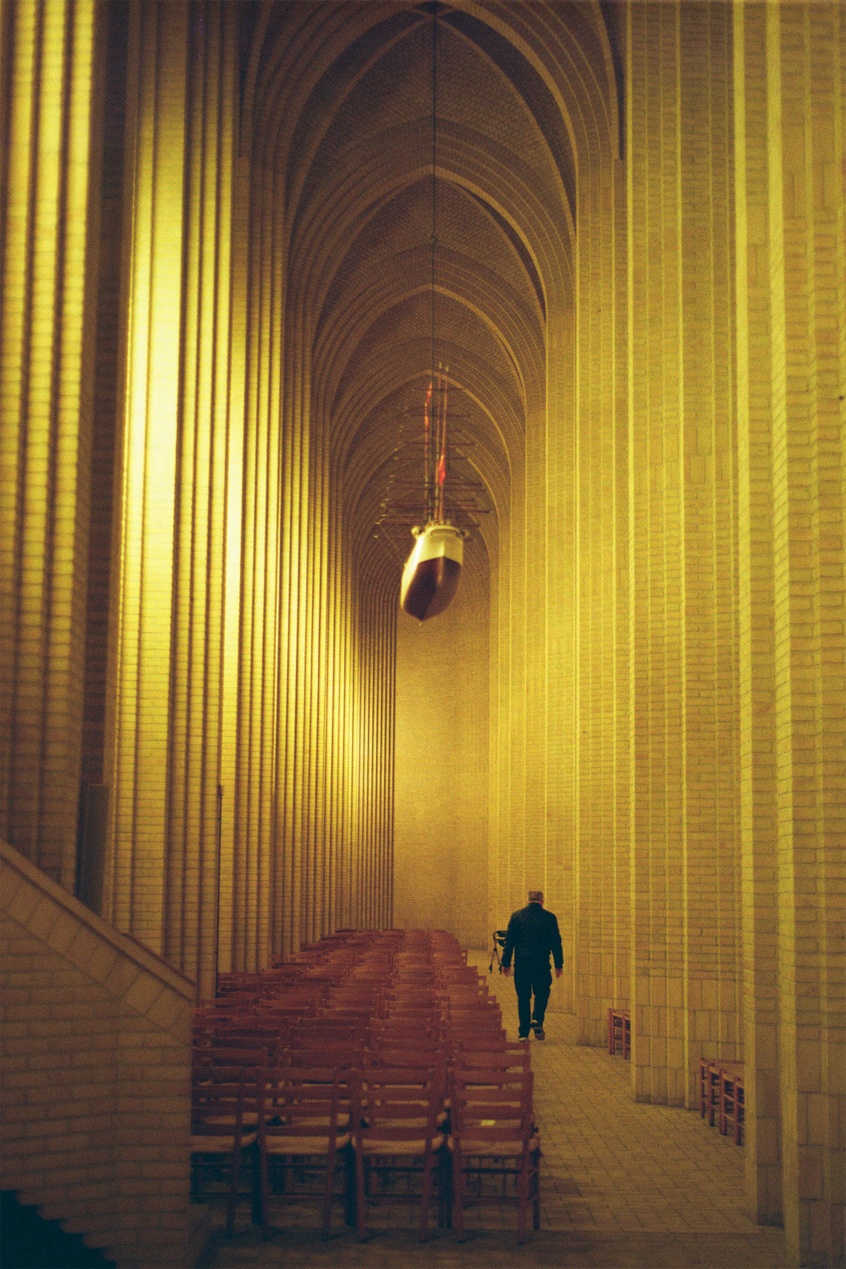
“I visited this expressionist Gothic church with vertical and minimal modern aesthetic. I captured a breathtaking moment on the first day of 2022. I experienced serene golden light sprinkling through the aisle while surrounded by pleasant music. To be a moment’s ornament, I am voyaging through the pulse of light.”

Camera: Nikon


“Down the Rabbit Hole” by Melissa Teo
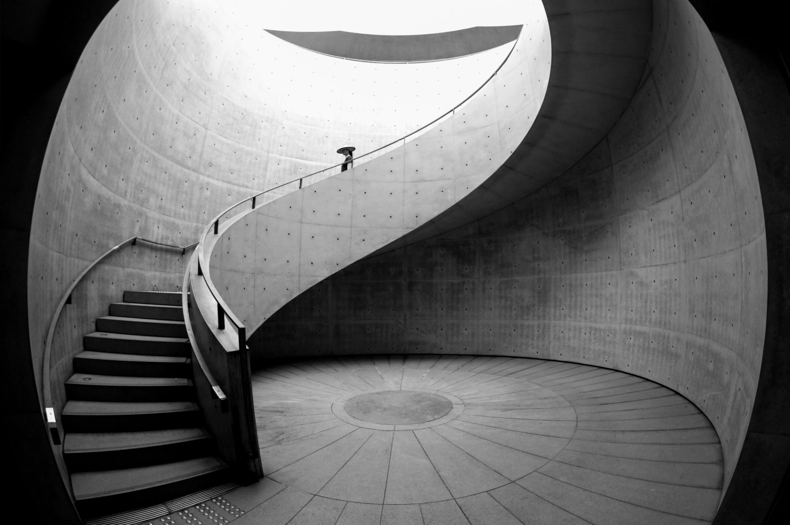
“I stumbled upon Hyogo Prefectural Museum of Art, designed by Tadao Ando, during my mission to photograph minimalism in Kobe, Japan.

I was drawn to the maze-like staircase at the centre of the museum which connects the basement floor to to the outdoor space. This particular scene reminds me of the author, Lewis Carroll, who introduced the term “Down the rabbit hole” in Alice’s Adventures in Wonderland.

I wanted to photograph the use colors, contrast of the concrete walls, space and natural light which heightens visitors’ curiosity to escape into the designed “rabbit holes” of the museum. It conveys a sense of time spent in transit where one could drift into a reverie.

This invites us to move forward, urging us to keep becoming, as Alice would say, “curiouser and curiouser” and experiencing delight with architecture, in a multi-layered and synergistic fashion.”

Camera: Canon


“The Atlas Building” by Michelle Aarlaht

“The confident Atlas Building being wrapped in by the London clouds. This residential and office tower, by Make Architects, was completed in 2019, and is easily spotted when walking around East London as it is one of the tallest buildings in the area. To watch this bold construction disappear in the clouds was quite a humbling experience, broadening the personality spectrum of the structure – showing for a brief moment that it also has an introverted side – before it fully revealed itself through the clouds again.”

Camera: Canon


“From the inside to the outside in one jump” by Ivo Tavares studio Architectural Photographer

Ivo Tavares Studio
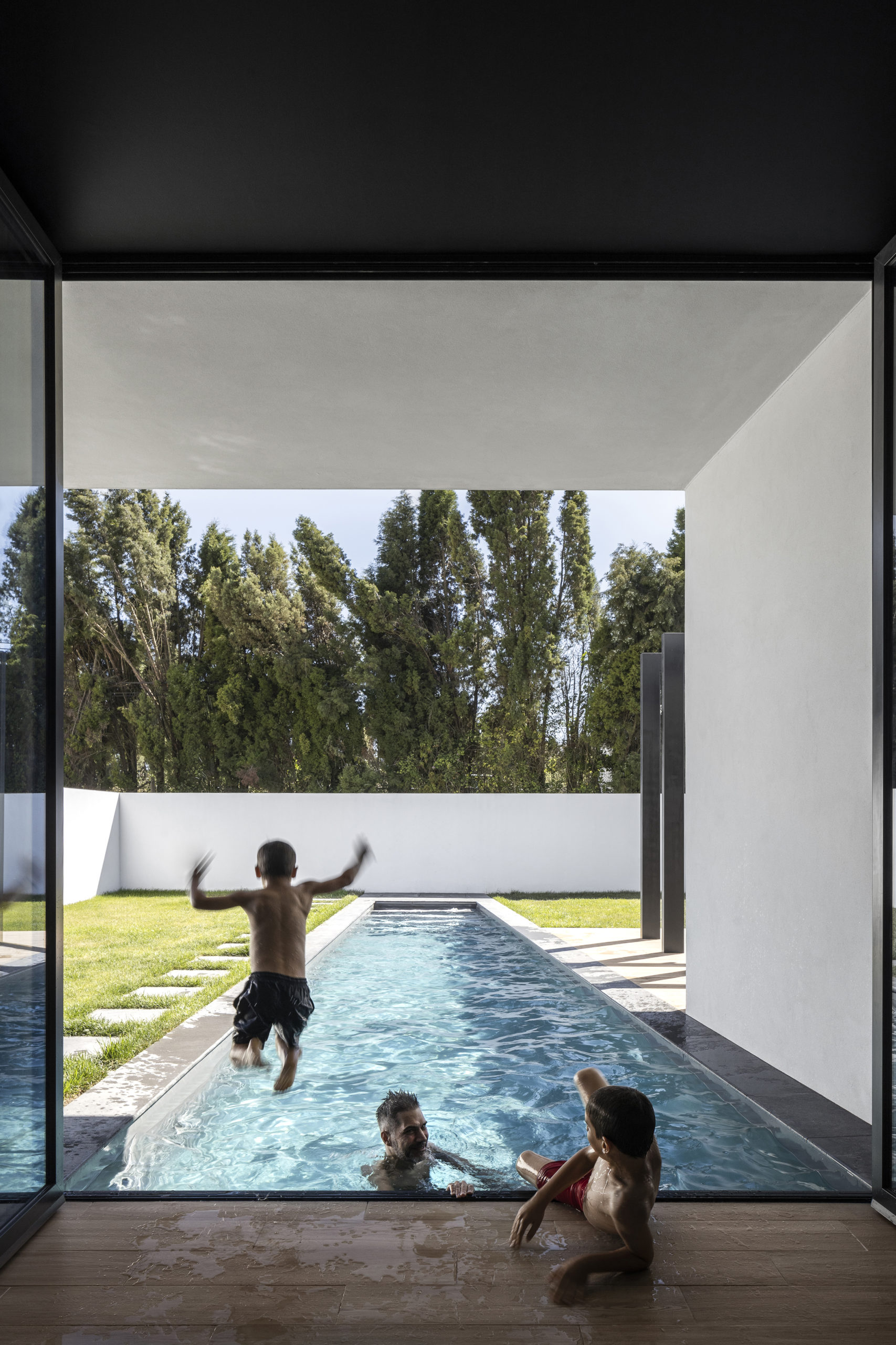
“The pandemic has created a new way for people to relate to their home.
The house is a symbol of security and outside of it we tried to complement it with experiences and being ourselves.
As we spent more time inside our homes, we had to bring these moments of pleasure and fun, and it is here that architecture gained a new perception.

The architecture created by the Frari atelier allowed this family, in a single jump, to connect the security of the interior of the house, to the exterior and to their fun.”

Camera: Canon


“WALKING FOR THE PACHINKO” by Otto Lizst

G+C
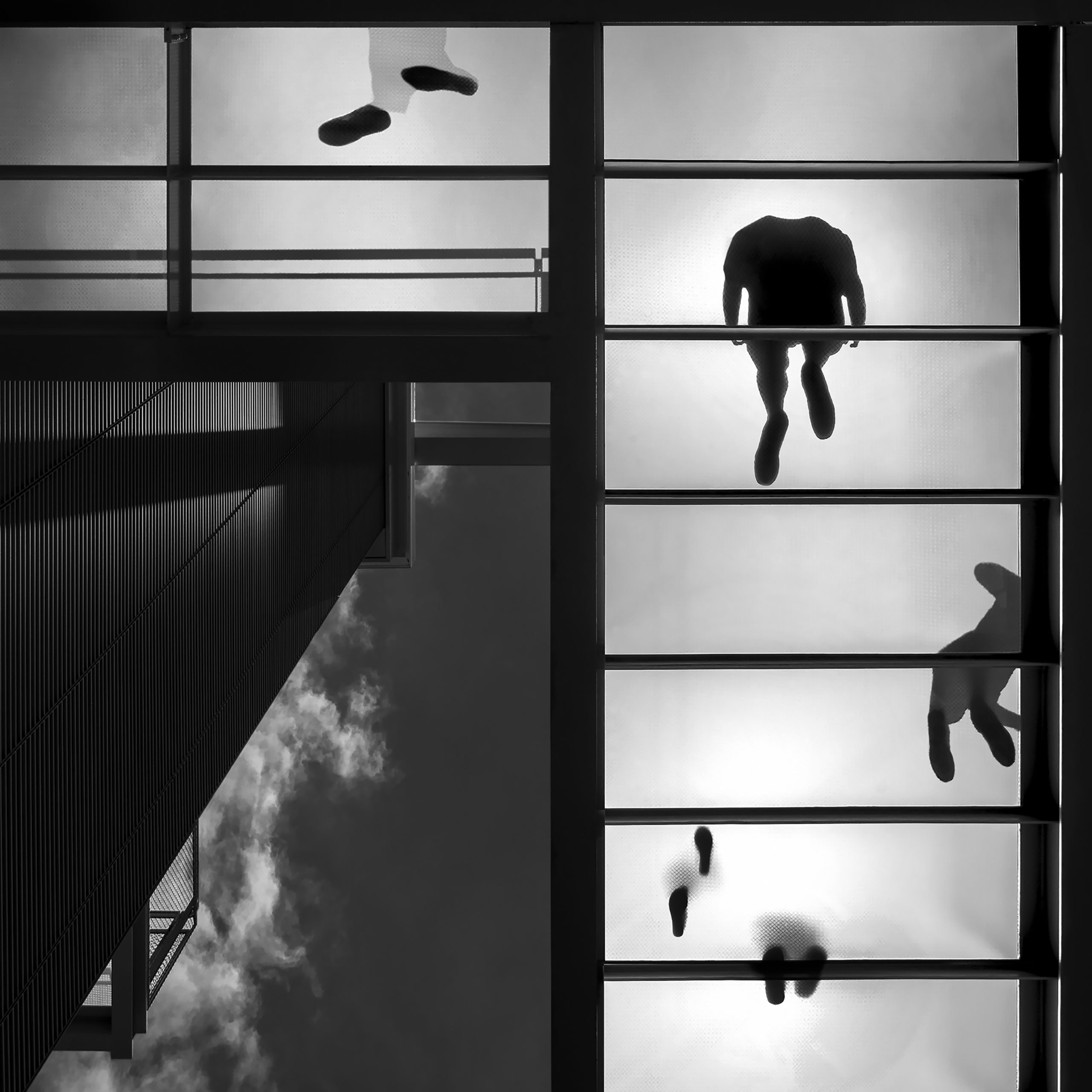
“The Botín Center, new art contemporary center in Santander, is made up of two volumes linked by an element made up of steel and glass walkways and stairs whose function is to connect both volumes called Pachunko, which owes its name to a Japanese pinball machine. It is a structure of squares and steel and glass walkways, which is seven meters high and whose function is to connect the east and west volumes, distributing the flow of visitors to the building. In addition, a nine meter long trampoline flies over the cliff, cantilevering over the sea, and allows the public to contemplate the bay in a unique and special way.

With this descriptive work of Renzo Piano’s architecture, I also emphasize the juxtapositions that the building gives off, lightness – solidity, transparency – opacity, minimalist spaces versus cumbersome spaces in their perception, not in their function.”

Camera: Nikon


“waiting time” by Ivo Tavares studio Architectural Photographer

Ivo Tavares Studio
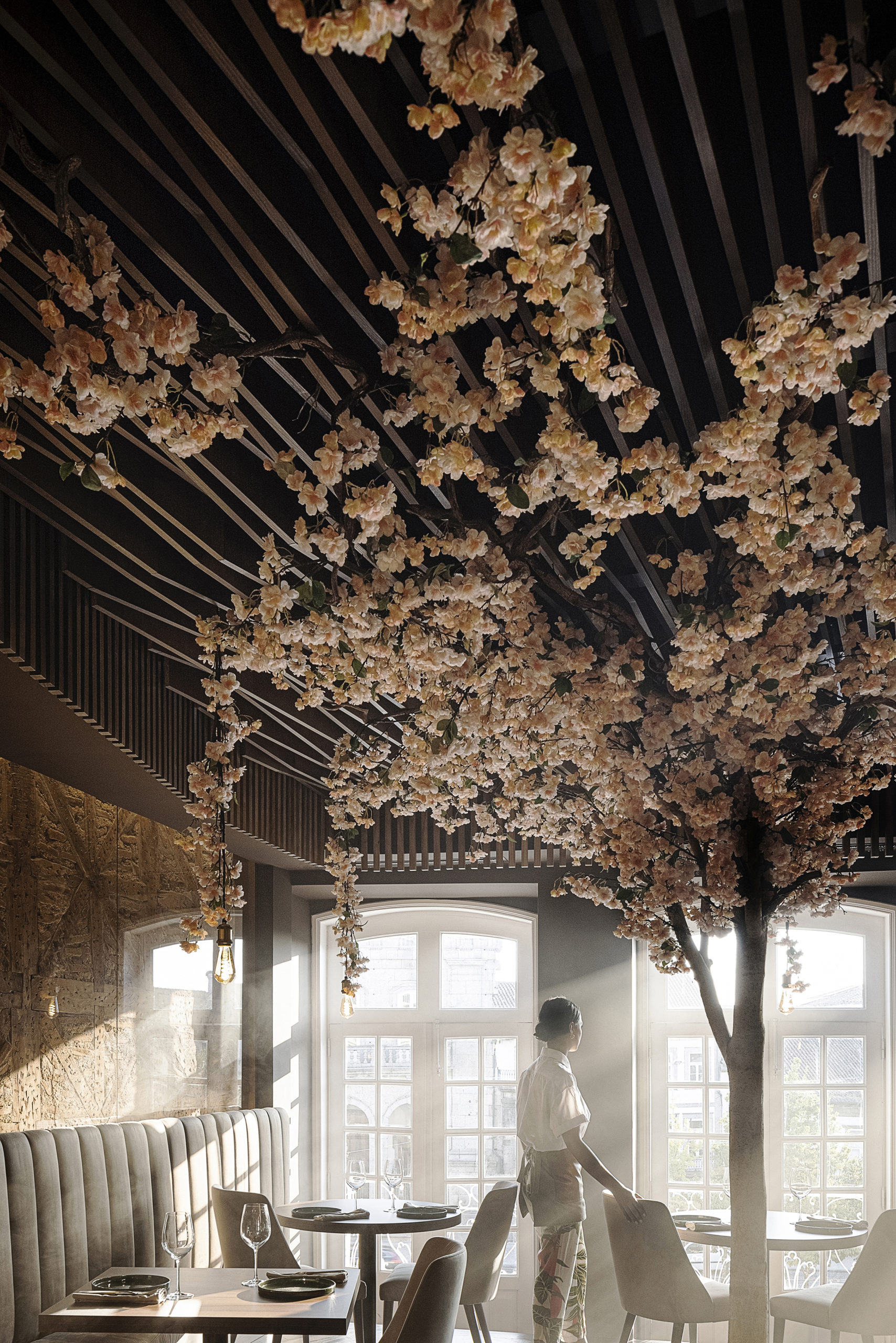
Restaurante 34 em Guimarães com Arquitectura REM’A e fotografias de Ivo Tavares Studio

“After months in confinement caused by covid, many restaurants waited closed for better days, this image represents this moment of anxiety, calm and hope for better days.
Restaurant 34 in Guimarães created by atelier REM’A was inspired by nature and its elements, the image represents that awakening of nature where the morning fog does not allow us to clearly see the past or the future.”

Camera: Canon


“relationships” by Jeff Durkin

Breadtruck Films
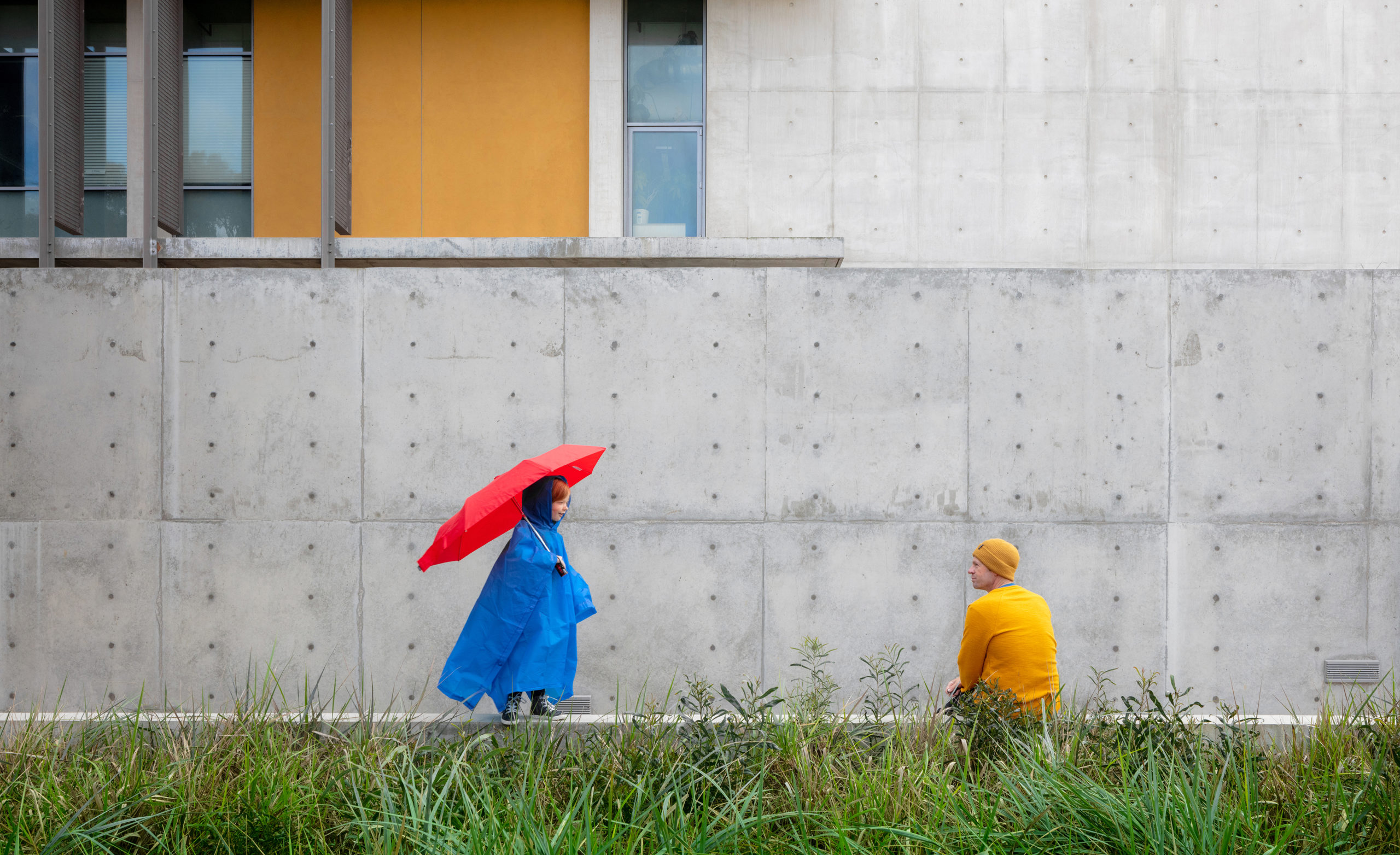
“For me architecture is all about relationships. So when when my daughter wanted to do a photoshoot on her birthday when it was raining I cooperated. We grabbed our rain gear and stopped by the new Miller Hull Engineering building at the University of California San Diego’s campus which is across from our house and sat for a few shots with my camera on a timer. I just love the relationship between the primary colors against the monotone concrete framed by the bright green grass below. She turned 7 that day, and we have this stunning photo to remember the moment.”

Camera: Canon

Next 25 Photos →
Reference

Home Energy Scores: If Ireland Has Them, Why Not the US?
CategoriesSustainable News Zero Energy Homes

Home Energy Scores: If Ireland Has Them, Why Not the US?

Wherever I travel, I enjoy a little window shopping for homes at real estate agencies. I like to compare prices and features in different places. On a recent trip to Ireland, I was surprised to see that every home listing included a home energy score: a BER or Building Energy Rating! The BER shows the home’s energy efficiency on a clear color-coded scale of A to G.

Building Energy Ratings in Ireland

Ireland has required these ratings since 2006. They cost about €150 to €300, and real estate agents must display them on listings of homes or apartments for sale, whether new construction or existing homes. 

The beauty of these ratings is that they show whether buyers are considering a home that is an energy hog and carbon polluter or a highly energy-efficient one. It gives homebuyers vital information regarding the home’s energy costs, so they can make a wise purchase. These ratings can motivate sellers to upgrade the energy efficiency of their homes themselves. While these ratings are not always consistent depending on the energy assessor or region, Ireland is working to remedy these discrepancies.

Home Energy Scores and upgrades in the US

So, where are we in the US regarding energy efficiency ratings? The US Department of Energy created a system of Home Energy Scores that cities and states can use to set up their own energy rating systems. In 2018, Portland, OR, was the first city to require these scores, mandating that every home for sale has a Home Energy Score report. This report estimates the energy use of the home, the energy costs, and the cost-effective energy upgrades proposed to improve the home’s energy efficiency and carbon footprint. 

So, how is it going in Portland? Currently, close to 92% of homes for sale in Portland have Home Energy Scores. Portland has trained its real estate agents and energy assessors to provide consistent results. They also work to make the process as easy as possible for sellers. Home energy assessors are available to homeowners in need of rating services. In Oregon, the cost of an energy rating by a licensed home energy assessor ranges from $150 to  $300. 

The goal is to support sellers in making energy upgrades before they sell: to offer a more appealing property, and for buyers to save money on their home heating and cooling costs while reducing carbon emissions. But few cities, or states, have followed Portland’s example. To date, Oregon is a leader with Portland, Milwaukee, and Hillsboro requiring Home Energy Scores. The city of Bend is actively considering passing one by December 2022. Other cities requiring Home Energy Scores include Austin, TX; Berkeley, CA; and Minneapolis, MN. Overall, adoption of Home Energy Scores by cities and states is way too slow to impact climate change.


Thermal Image of Heat Leak thru Windows

Take Action Now!

Yes, it would be helpful to have local, state, and national governments require energy ratings and proposed upgrades as part of full disclosure on the sale of a home. But it’s happening too slowly. Instead, you can work with your local government to develop a home energy score requirement.

For your own home, you can search for a home energy rater or energy assessor to help you obtain a home energy rating and suggest the most cost-effective ways to upgrade your home’s energy efficiency. Then, you can enjoy the benefits of a more energy-efficient, more comfortable home and sell it for a higher price. 

I advise homebuyers to insist on an energy rating in the closing agreement as part of the home inspection, and ask the seller to make the needed energy upgrades. If the seller does not agree, buyers can engage an experienced contractor to undertake a complete energy evaluation and immediately implement upgrades, before move-in. That way buyers can enjoy a healthier, more comfortable, energy-efficient home from day one. Lower utility costs and reduced emissions to help prevent global warming will continue for years. 


Reference

Instead Of Stairs, A Spiraling Ramp Was Designed For This Office Building
CategoriesInterior Design

Instead Of Stairs, A Spiraling Ramp Was Designed For This Office Building

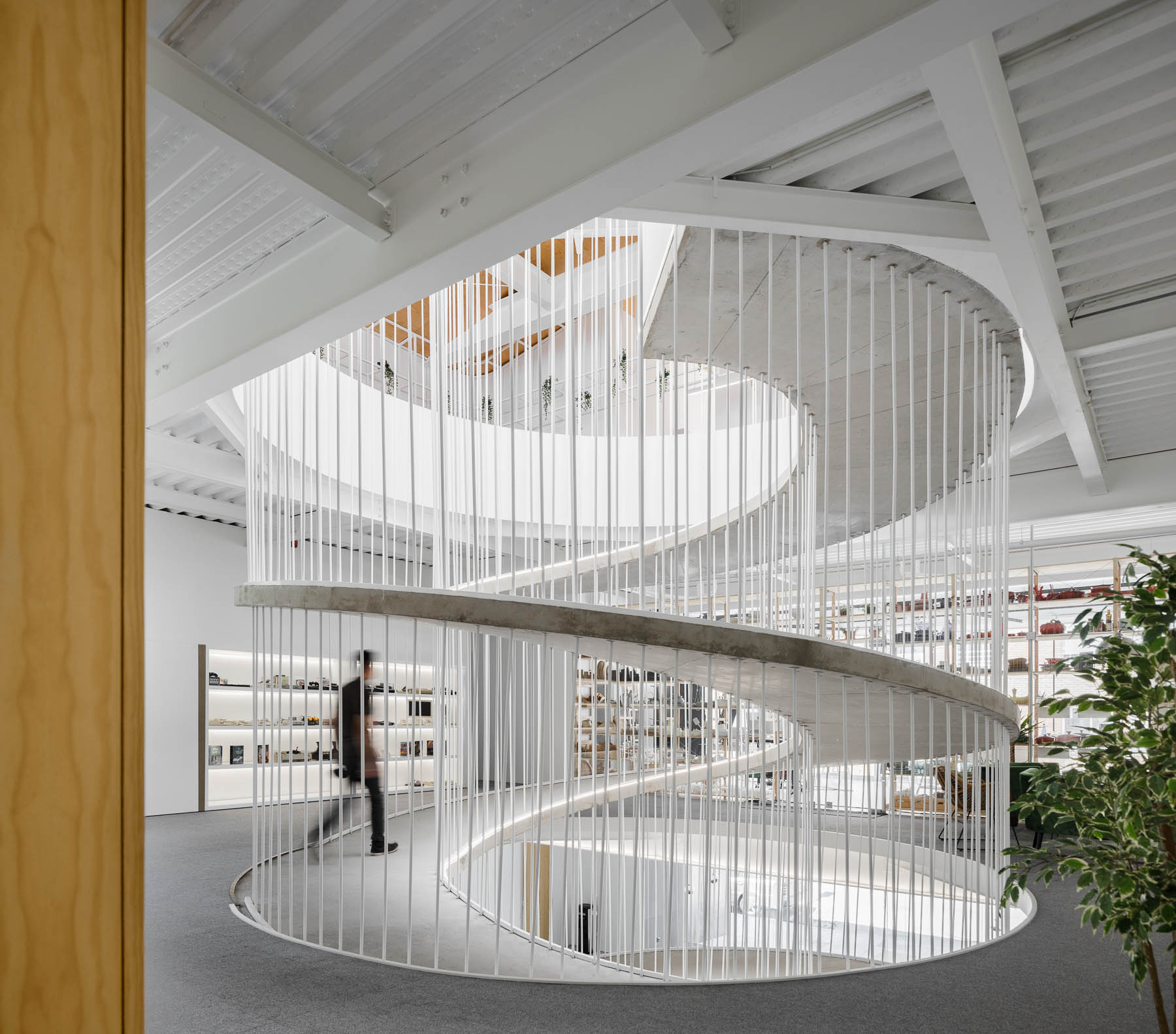
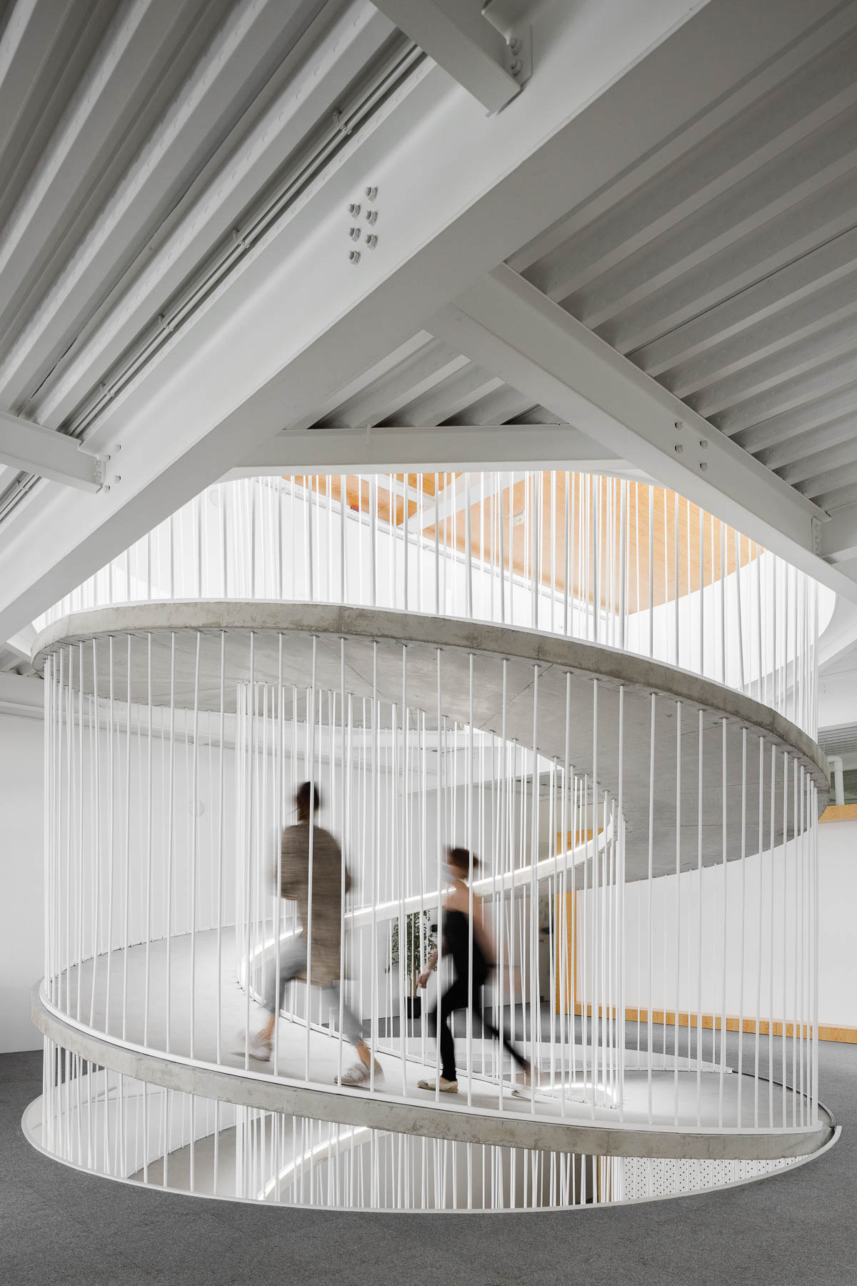
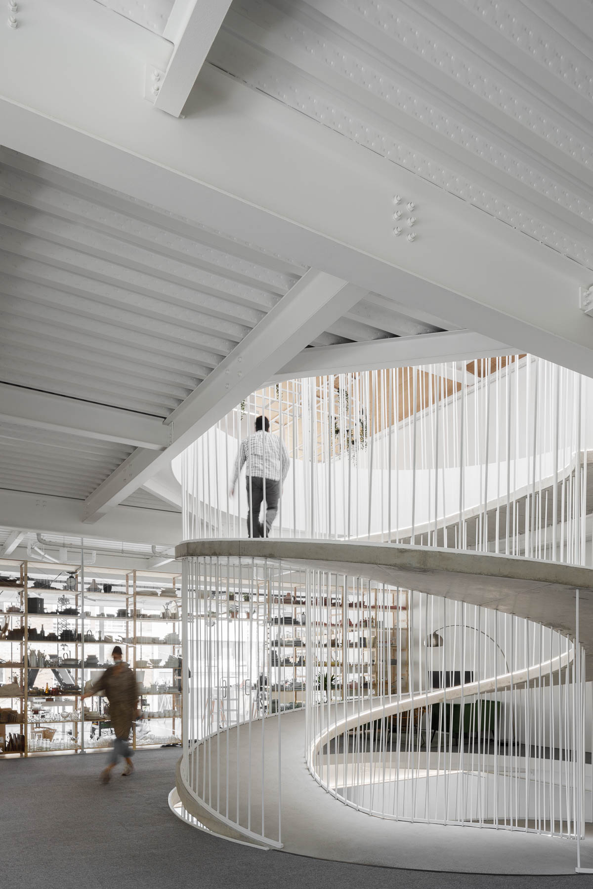
A spiraling ramp replaces the need for stairs in this modern office and adds a sculptural element.

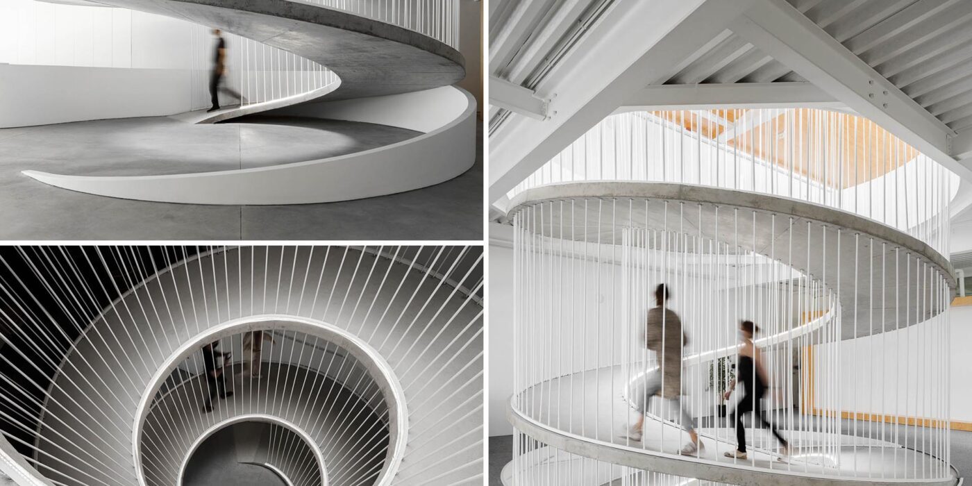
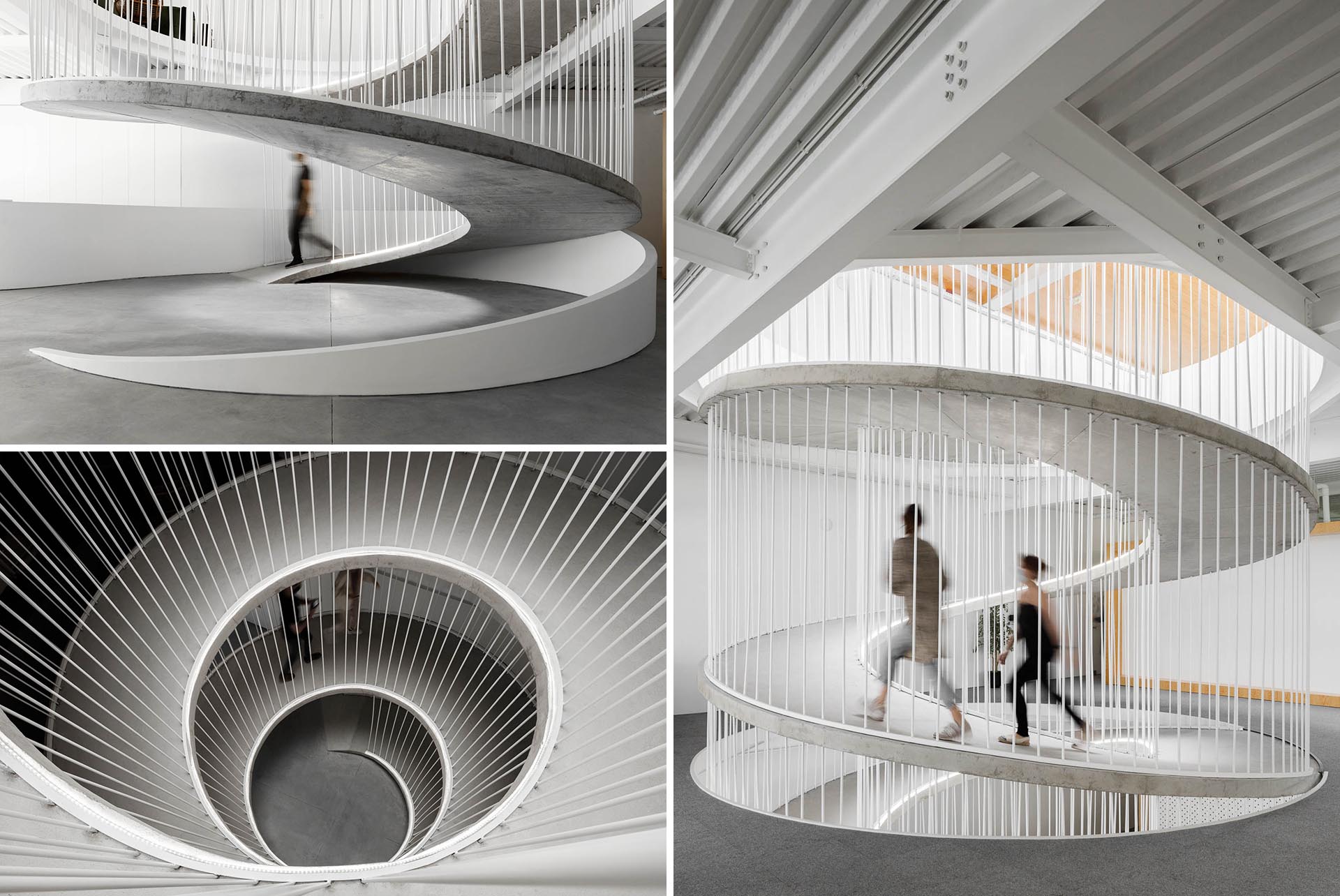
PAULO MERLINI architects has designed the offices of E-GOI & CLAVEL´S KITCHEN in Portugal, and one of the main design features central to the interior is a spiraling ramp.

A spiraling ramp replaces the need for stairs in this modern office and adds a sculptural element.

The former warehouse, which has now been transformed into offices that span multiple floors, includes a ramp that replaces the need for a staircase.

A spiraling ramp replaces the need for stairs in this modern office and adds a sculptural element.

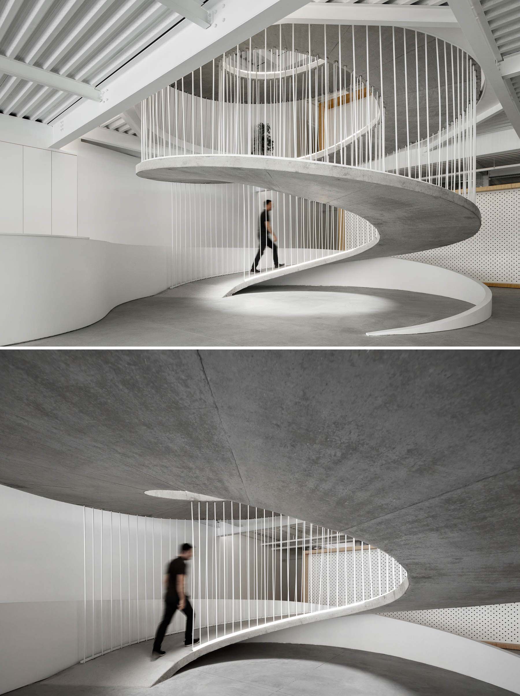
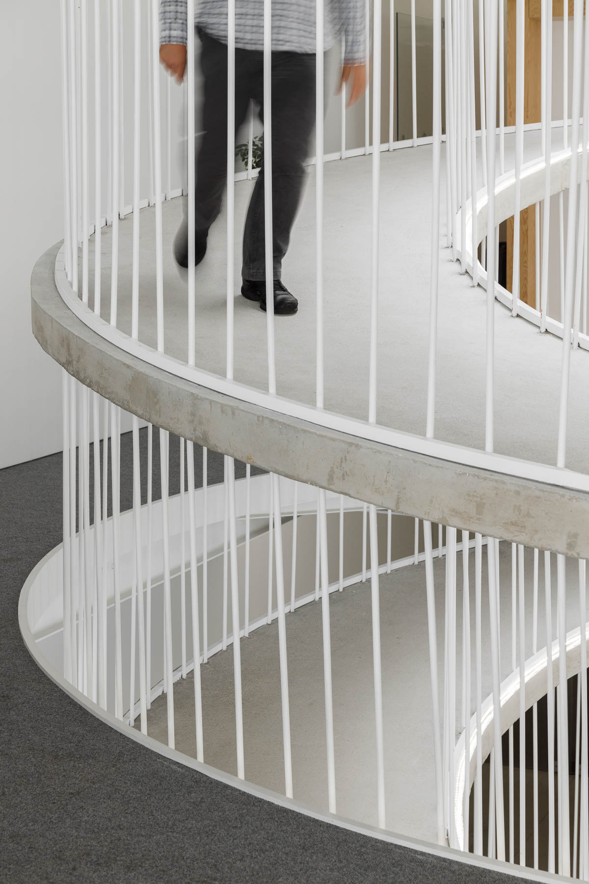
The elegantly curves of the concrete form is accentuated by the use of white bars and edges.

A spiraling ramp replaces the need for stairs in this modern office and adds a sculptural element.

The circling ramp connects the floors of the office and adds a sculptural element that doesn’t block the light from traveling throughout the interior.

A spiraling ramp replaces the need for stairs in this modern office and adds a sculptural element.
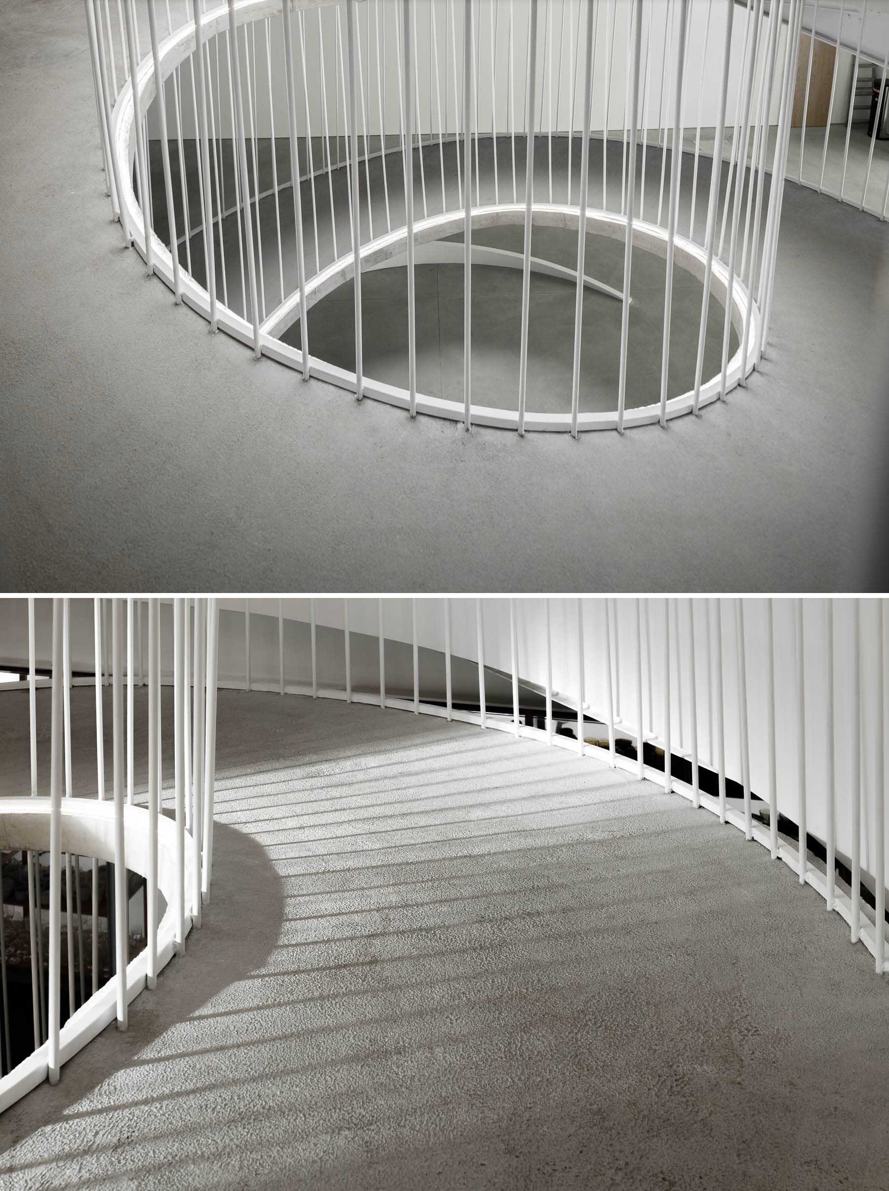
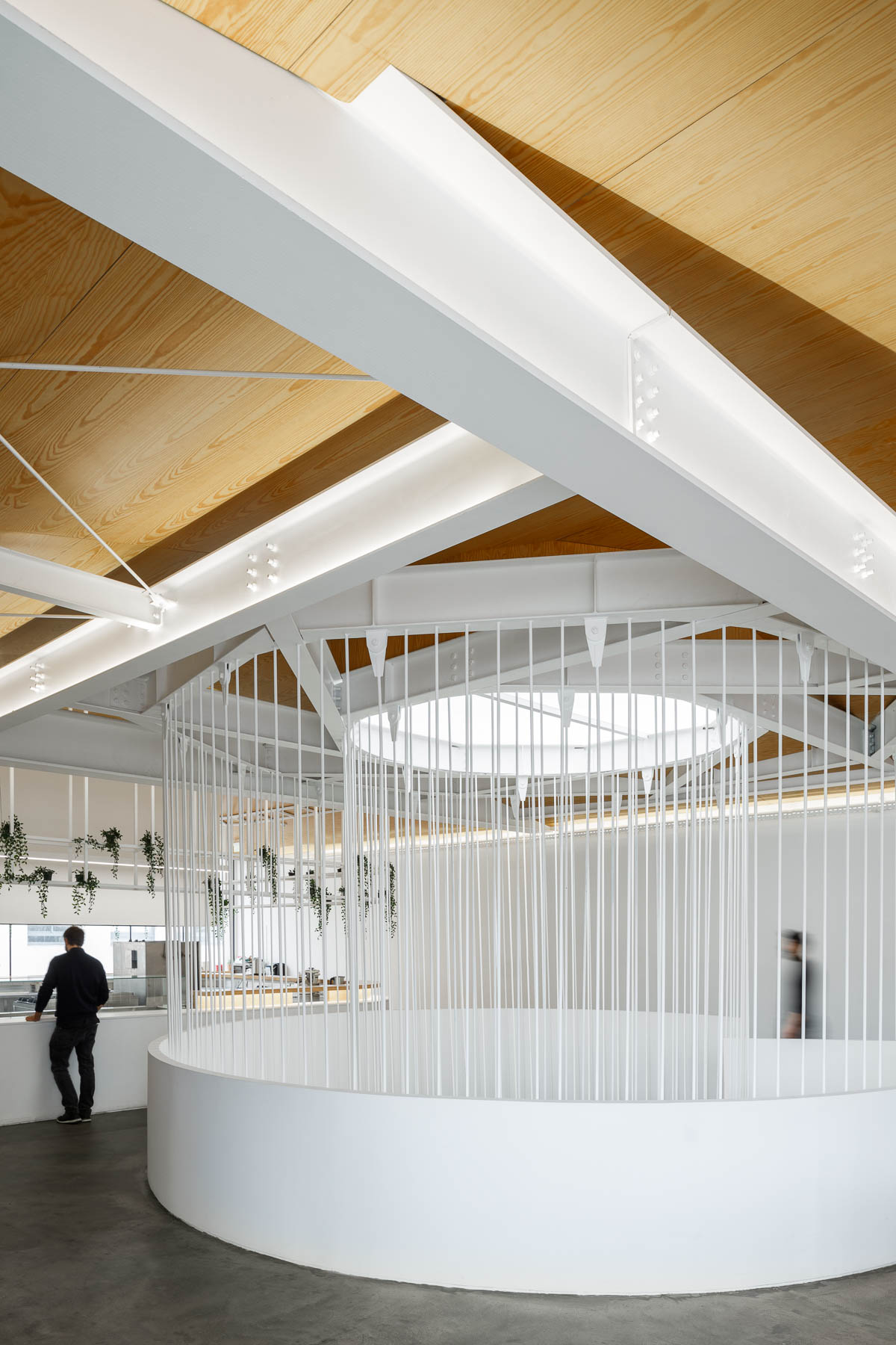
A white frame and supports connect the top of a spiraling ramp with the ceiling.

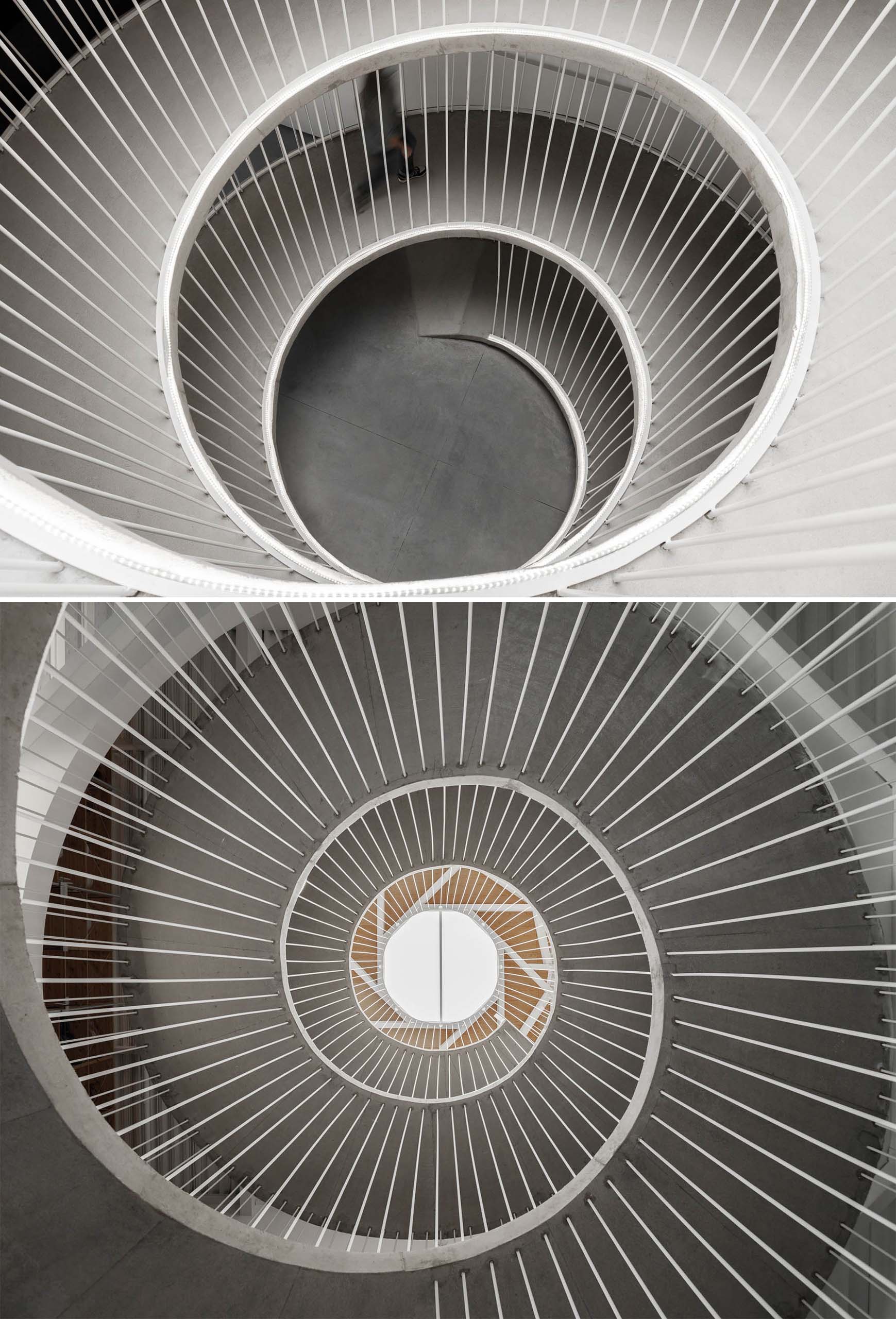
Here’s a glimpse of the ramp looking down from the top floor, and up from the ground.

A spiraling ramp replaces the need for stairs in this modern office.

Let’s take a look at the rest of the office…

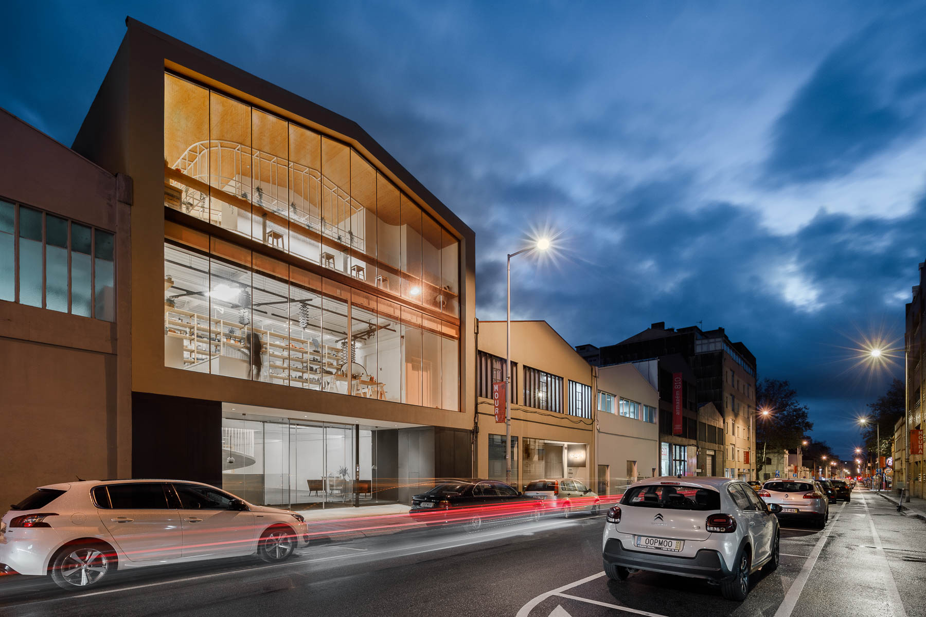
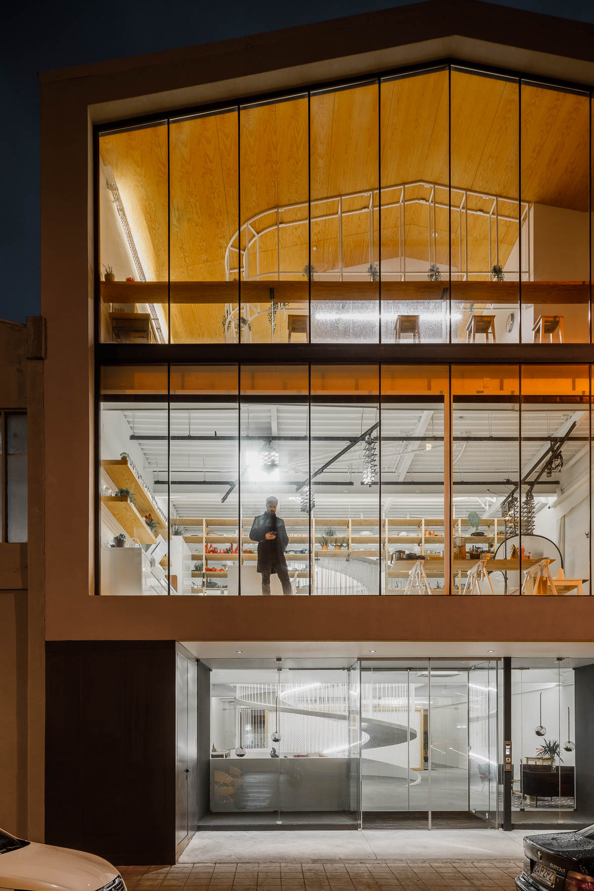
The exterior of the office has walls of glass providing a glimpse of the interior for the pedestrians on the street.

The exterior of this modern office has walls of glass providing a glimpse of the interior for the pedestrians on the street.

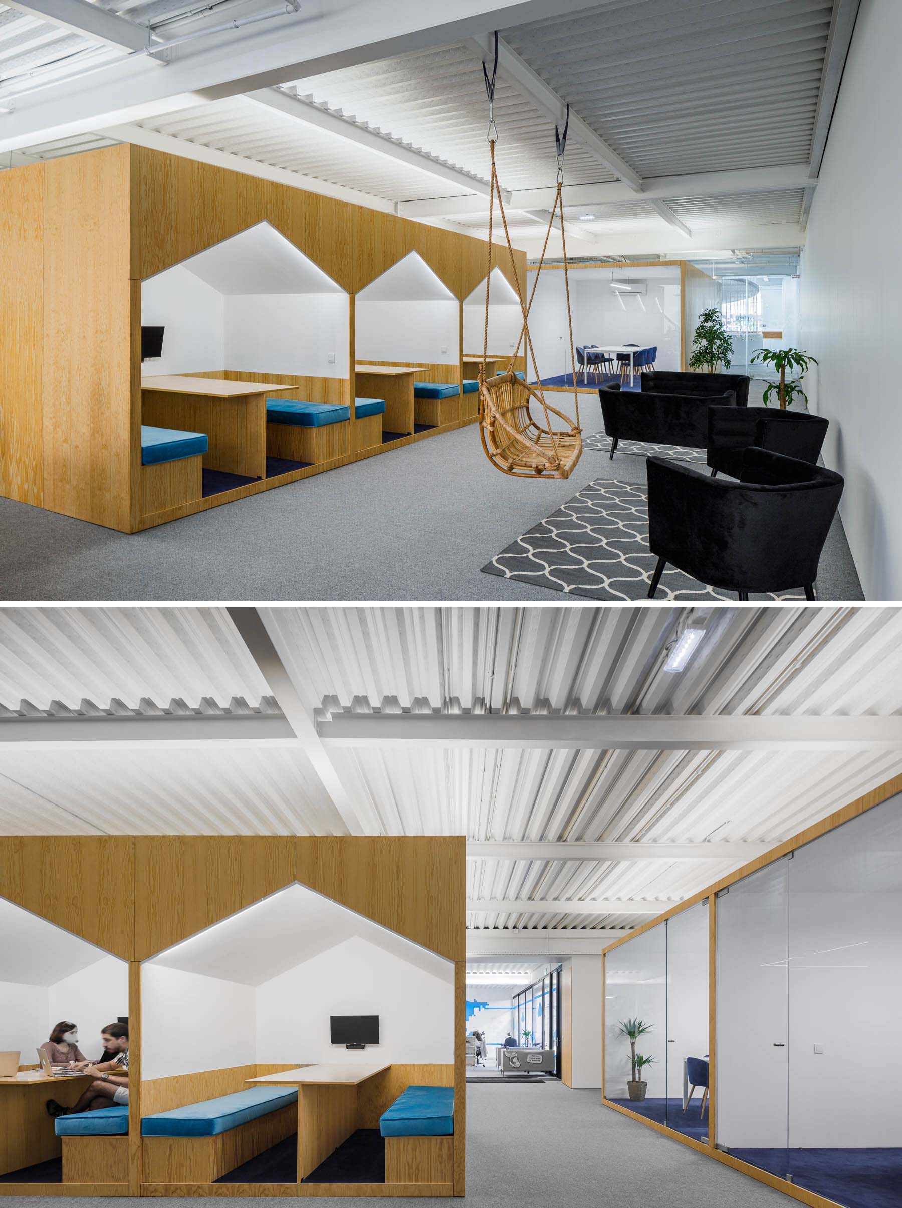
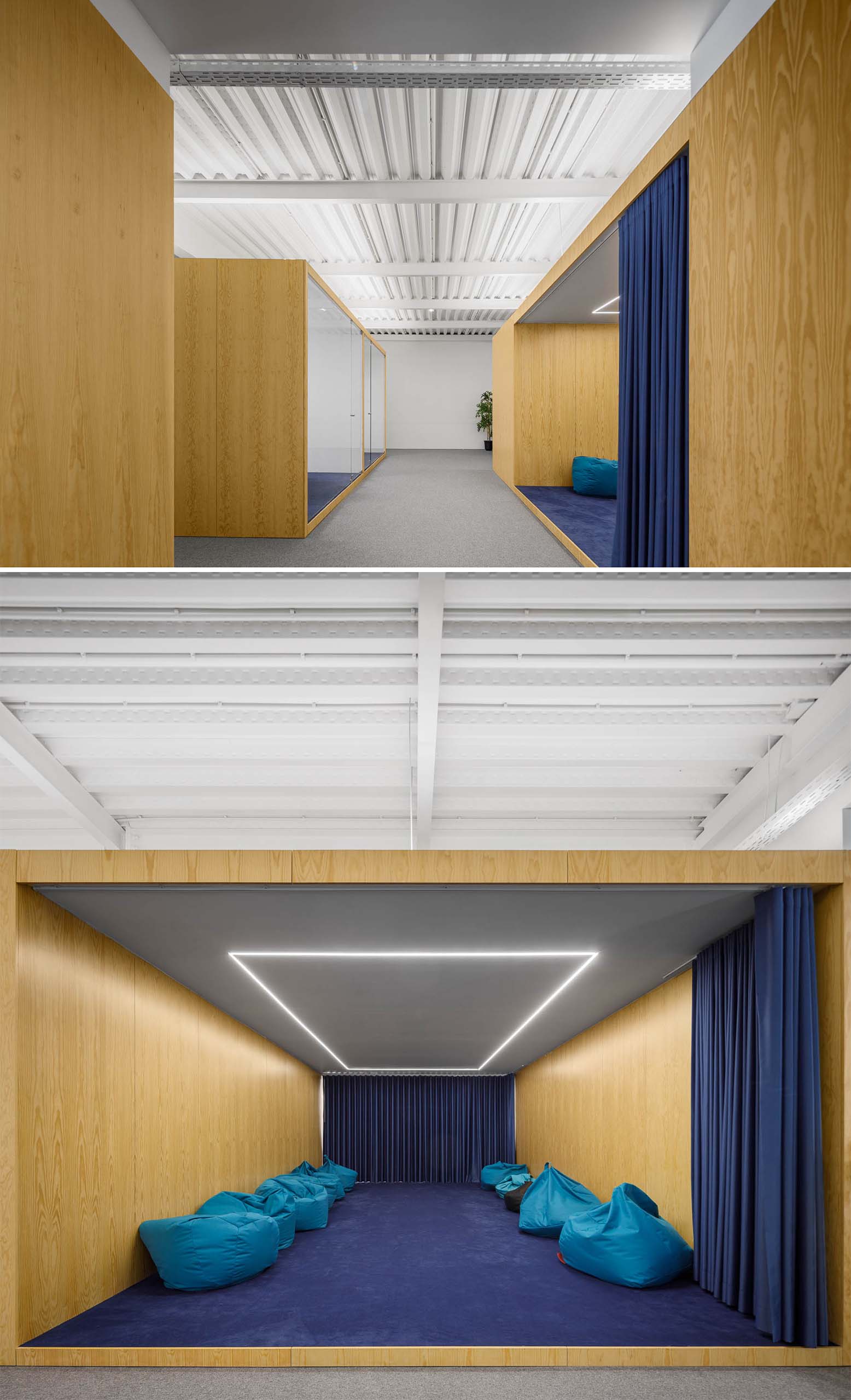
There’s a variety of different seating areas in the office interior, including spaces for casual meetings in house-shaped alcoves.

There's a variety of different seating areas in this modern office interior, including spaces for casual meetings in house-shaped alcoves.

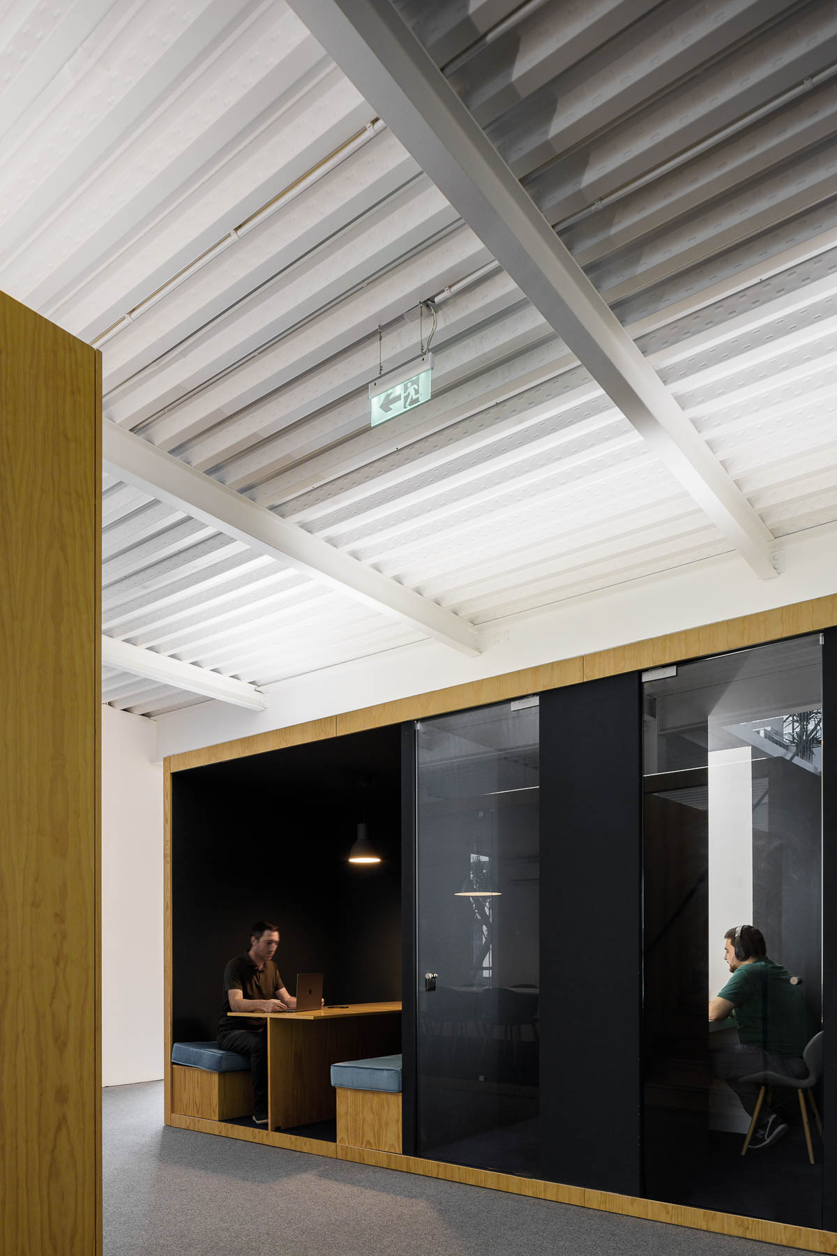
More private work rooms with glass walls that keep the sound in or out.

A modern office interior with a variety of work areas.

A larger meeting room with a blue curtain that’s filled with beanbags and has LED lighting in the ceiling.

A large meeting room with a blue curtain that's filled with beanbags and has LED lighting in the ceiling.

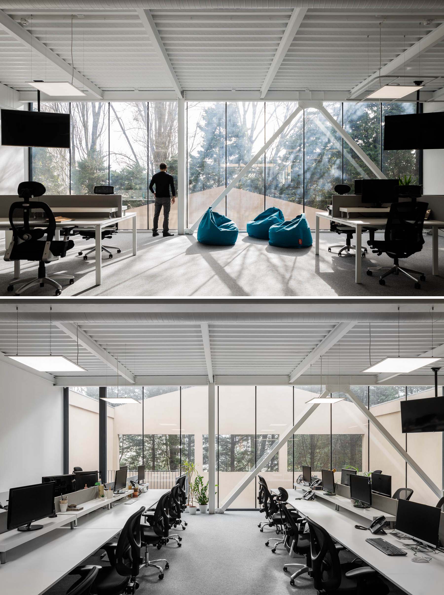
Other more traditional work spaces exist too, with desks that include multiple work stations.

A modern office with floor-to-ceiling windows.

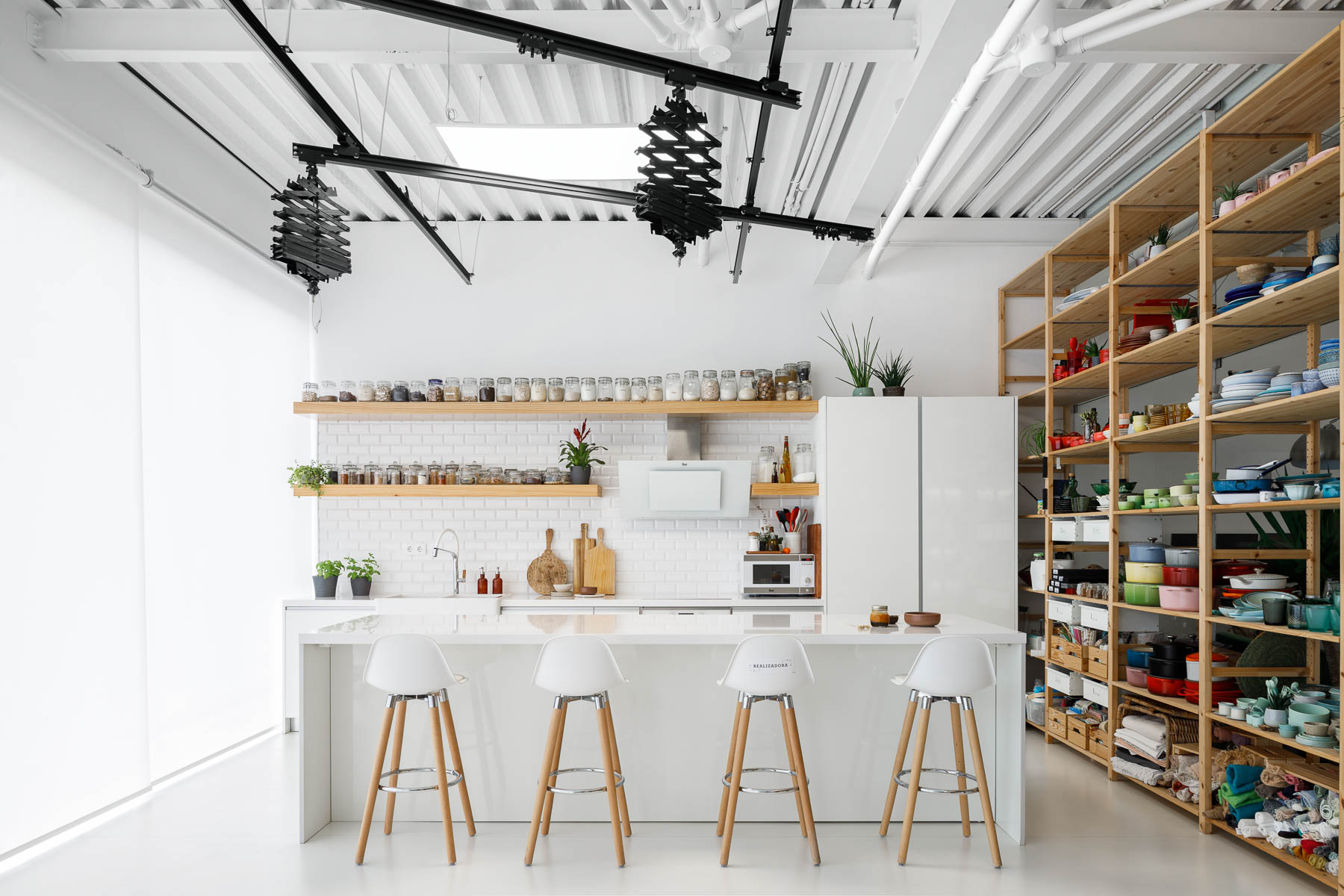
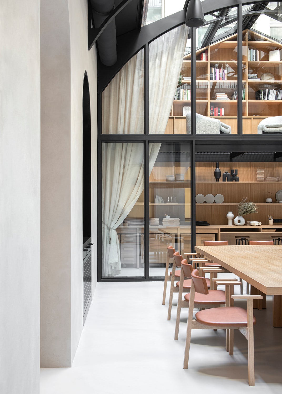
There’s also a photo studio with a minimalist white kitchen with floating wood shelves. Adjacent to the kitchen are tall wood shelves filled with photography props and kitchen equipment.

A modern office has a photo studio with a minimalist white kitchen with floating wood shelves. Adjacent to the kitchen are tall wood shelves filled with photography props and kitchen equipment.
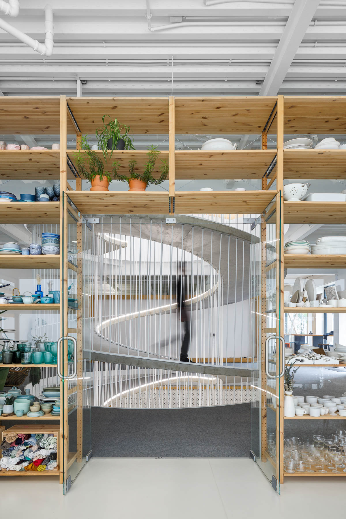
Wood shelves frame a spiraling ramp in the center of this modern office.

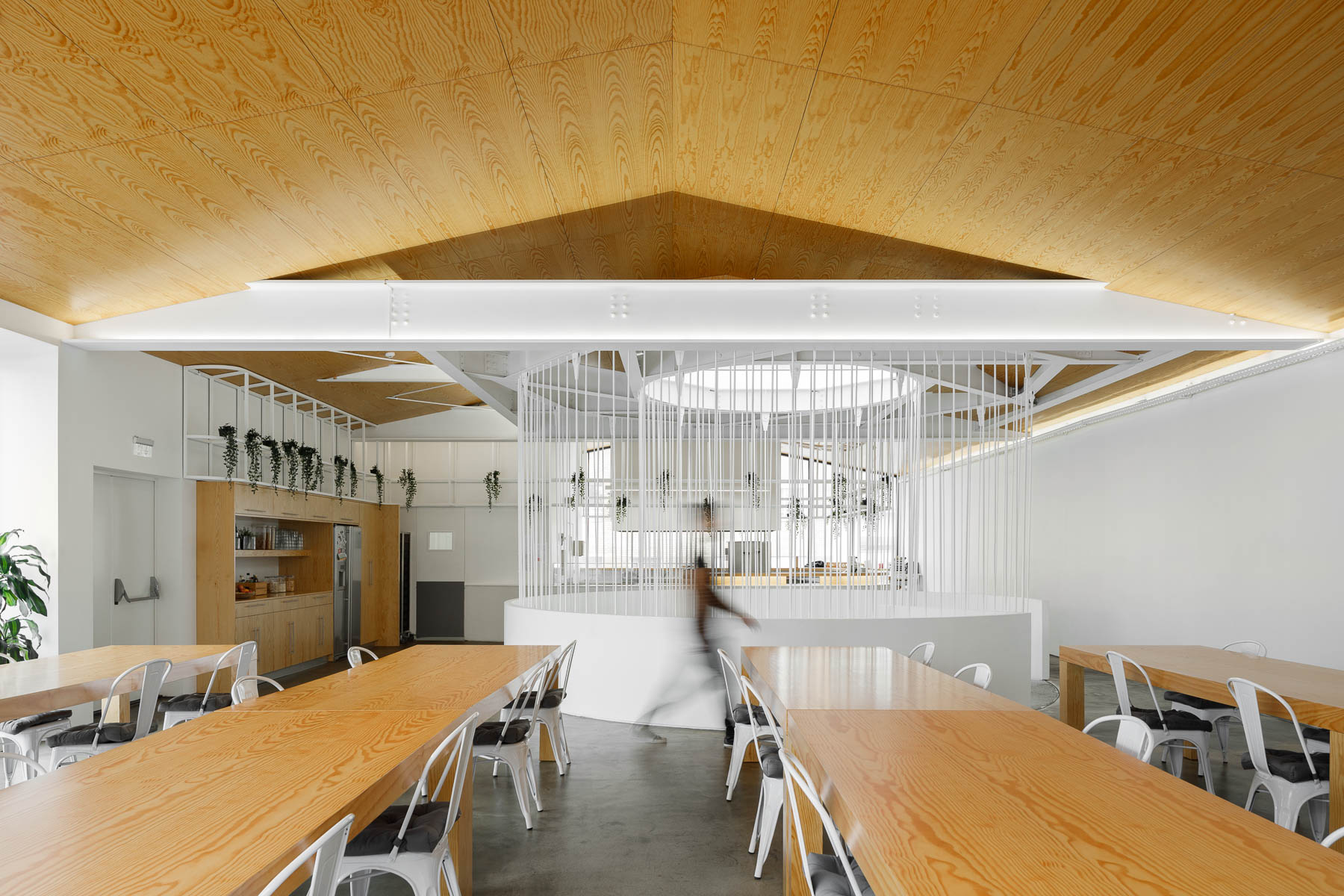
When it’s time to take a break from working, there’s a communal area with long wood tables, a kitchenette, seating by the windows, and an outdoor space.

A modern office with a communal break room.
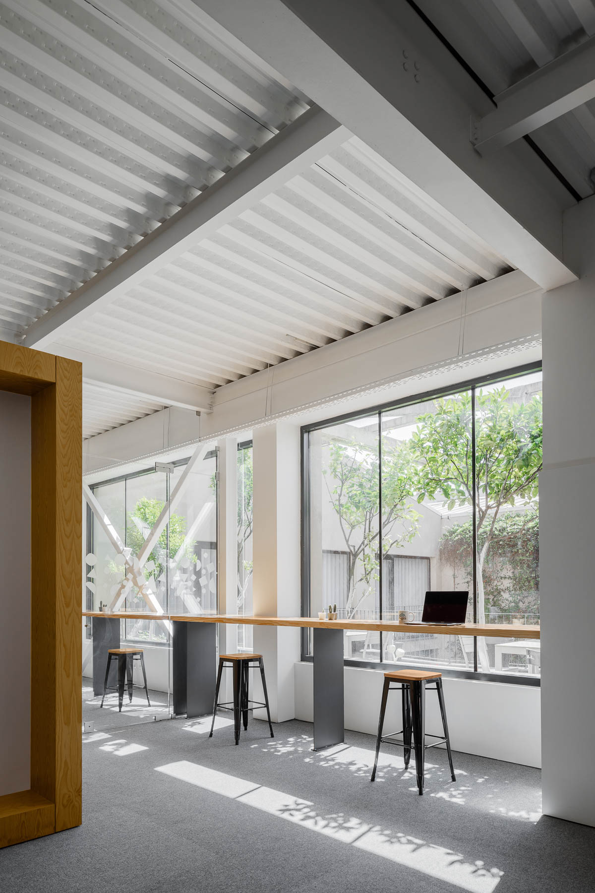
A modern office with seating by the windows that take advantage of the natural light.
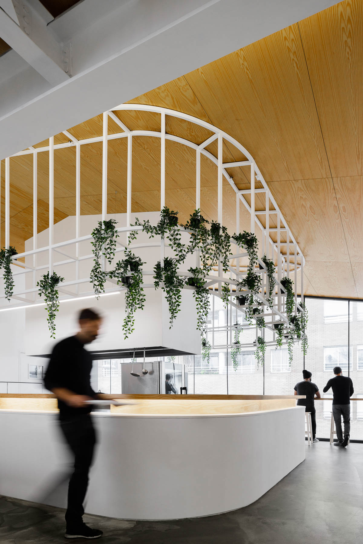
A modern office with plants that hang from a metal detail.
Photography by Ivo Tavares Studio | Architecture Office: PAULO MERLINI architects | Main Architects: Paulo Merlini/ André Santos Silva

A telecom recycles smartphones to improve accessibility and reduce e-waste
CategoriesSustainable News

A telecom recycles smartphones to improve accessibility and reduce e-waste

Spotted: As just about everyone is aware, owning a smartphone is now a necessity. Smartphones are vital not only for communication, but for conducting business, farming, shopping, and banking. Yet new smartphones can be expensive, pushing them out of reach for many. According to some reports, the global average cost of a smartphone is around 26 per cent of the average monthly income, and in some regions, the average person would have to spend over half of their monthly income to buy a smartphone.

South African telecomms company Vodacom is hoping to make smartphones accessible to everyone with their ‘Good as New’ programme. Good as New offers used Apple iphones for sale at a fraction of the cost of a new model. The phones come complete with a standard 12-month warranty, and the devices are approved for resale. The programme involves the refurbishment and recycling of 200,000 phones by 2025, reducing e-waste as well as cost.

Vodacom also plans to expand the number and type of phones it revamps and resells, bringing in additional pre-owned products at lower price points. The company points out that the COVID-19 pandemic forced individuals to find creative ways to continue working and learning, making affordable access to smartphones even more vital. Digital access is also a particularly important issue in South Africa, which has some of the least affordable mobile phone prices in the world.

Smartphones are a lifeline for many – especially those in regions that are poorly served by land-based communications. Springwise has seen some exciting innovations in the use of mobile technology, including an app that lets micro-merchants turn their phone into a point-of-sale system, and a platform that connects smallholder farmers with the marketplace, helping them earn more. 

Written By: Lisa Magloff

Website: vodacom.co.za

Contact: vodacom.co.za/ContactUs

Reference