The largest exhibition of architectural renderings in 2022 is officially here! We are thrilled to reveal the 100 Finalists for the 3rd Annual One Rendering Challenge, each one telling a unique story about architecture’s role in the shaping of modern society. Below, you’ll find every amazing image that made the Top 100, forming an extraordinary showcase of architectural visualization and narrative-driven design.
Our stellar line up of expert jurors are now reviewing each of these images in minute detail, and their decisions will revealed with the publication of the Official Winners’ Announcement towards the end of April. The renderings will be judged according to the competition criteria. For the One Rendering Challenge, jurors’ rankings are converted into scores, which then give us our two Top Winners and 10 Commended Entries.
You can explore those 100 renderings below (published across 4 posts and in no particular order), accompanied by their stories. Tell us which is your favorite on Instagram and Twitter with the hashtag #OneRenderingChallenge! Below, “Part 1” presents the first 25 architectural visualizations — you can jump to part 2, 3 and 4 using these buttons:
Part 2 Part 3 Part 4
“Kaiserwagen” by Zana Bamarni
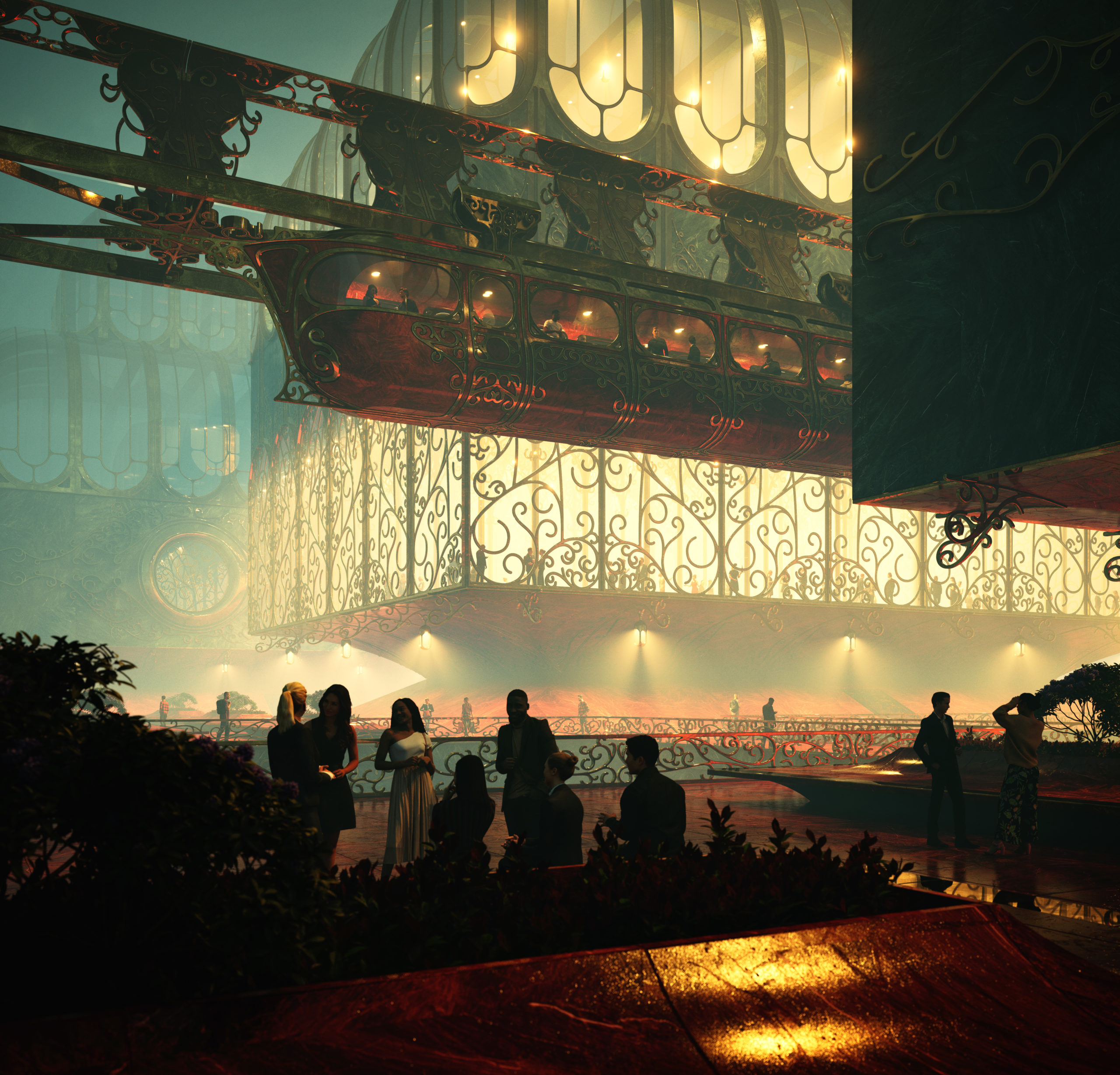 “Depicted in this image is my hometown Wuppertal. The world famous Schwebebahn, which was build over one hundred years ago as a result of advancements in steel production and metal fabrication, still remains to awe visitors when it meanders through narrow streets above the river Wupper. Shown here is a speculative redesign of the city in the spirit of the early Schwebebahn designs and its historic “Kaiserwagen”.
A lot of motivs were drawn from historic Schwebebahn Stations and the Art-Nouveau movement. A combination that is very fitting in a historical context. Both were made possible due to the progress in metal fabrication and could have been natural evolutions of each other. This image celebrates the joyful mingling of architecture and craftsmanship and carries this spirit into the scenery itself. People mingling.”
Software used: V-Ray, Rhino
“REMEMBRANCE” by Zoe Russian Moreno
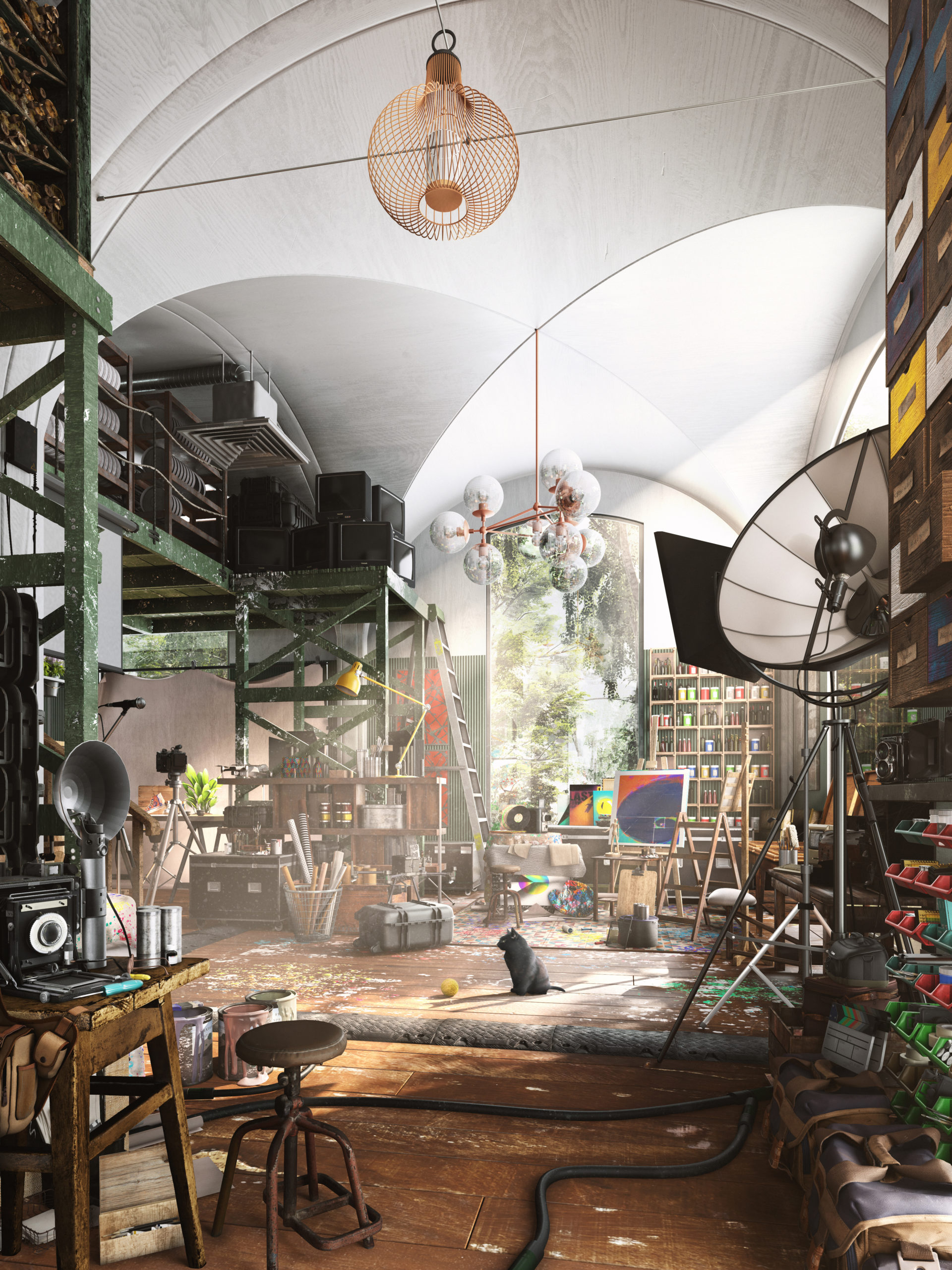 “Memories and dreams sometimes go hand in hand. The combination of reality and fantasy is an intrinsic force that supplies the creative portfolio of an artistic mind with endless possibilities. Nevertheless, even with all the infinite pieces put together sometimes one can’t help but look into triggers of certain spaces that take you back into specific moments of life. This particular studio is a combination of said moments in time; clutter in respective areas, materiality, scale, objects and the conglomeration of mechanical pieces grounds the imagery, which brings a sense of character that many people resonate with. It’s a sense of remembering a space that does not exist. A remembrance.”
Software used: V-Ray, 3ds Max, Photoshop
“The Lantern” by Evan Mott
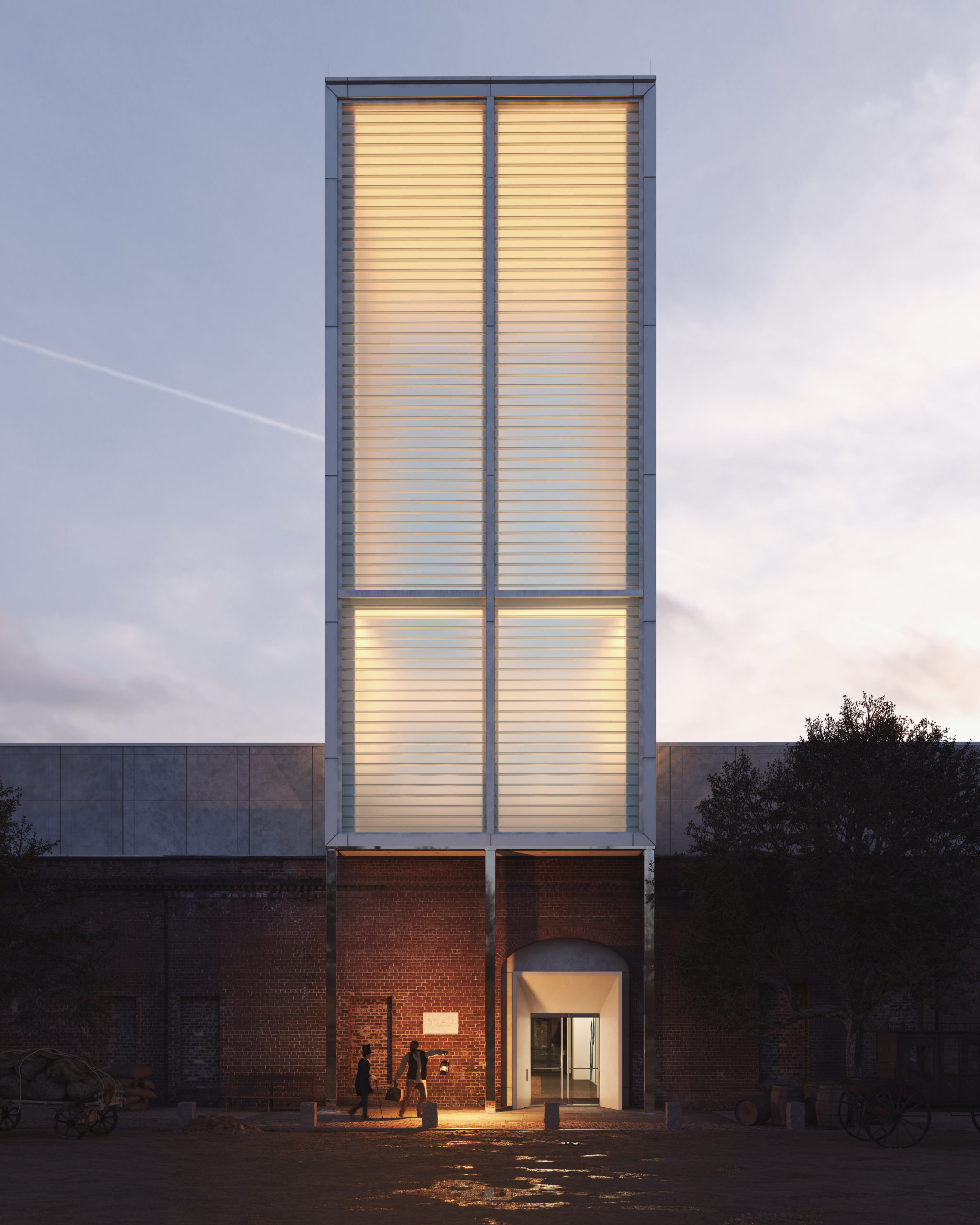 “On December 21, 1848, a white plantation owner, traveling with his enslaved servant, passed through the Central of Georgia Railroad terminal in Savannah, seeking medical care in Boston.
Or so it seemed.
In actuality, the pair were Ellen and William Craft. Enslaved since birth, the married couple devised an artful plan of escape in which fair-skinned Ellen disguised herself as William’s white owner. Four terrifying days and 1,000 miles later, they successfully carried their lantern to freedom. They would devote their lives to exposing the dark brutalities of slavery, lighting the way to liberty for others.
Today the same railroad terminal, reimagined as the SCAD Museum of Art, carries its own lantern. The glow of the 85-foot glass tower reminds us that Craft-like creativity and courage are essential in building and protecting the delicacy of equity and freedom.
Thank you, SCAD, for telling this story.”
Software used: V-Ray, 3ds Max, Photoshop, Other
“Up In The Air” by Vittorio Bonapace
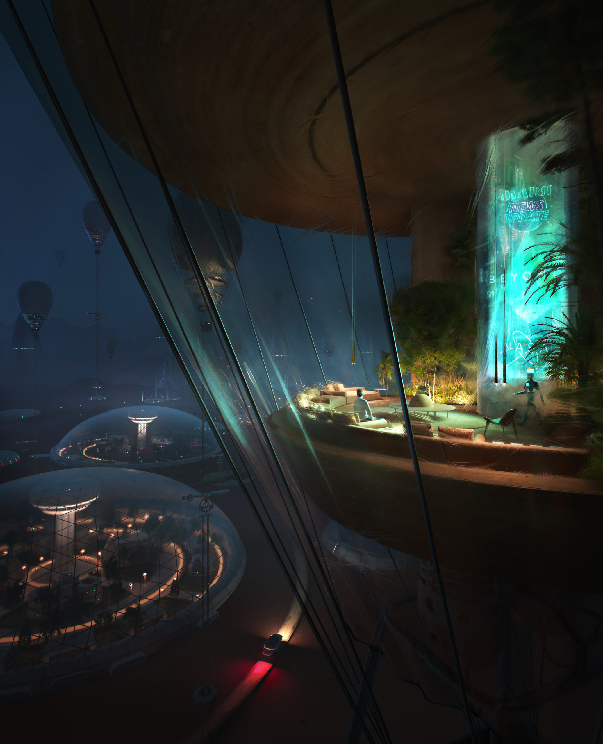 “The First Settlement on Mars.
The author imagined the first Colony – not so far in the future – inhabiting the sky into high-altitude balloons, leaving Mars’s surface for laboratories, roads, research and science experiments. “Up In The Air ” is part of a set of three illustrations. It’s not about the first epic human’s landing on the planet; the whole concept is about the confidence of living there, enjoying home.”
Software used: 3ds Max, Corona Renderer, Photoshop, Other
“Halo Funeral Center” by Pablo Emilio Vázquez Ramos
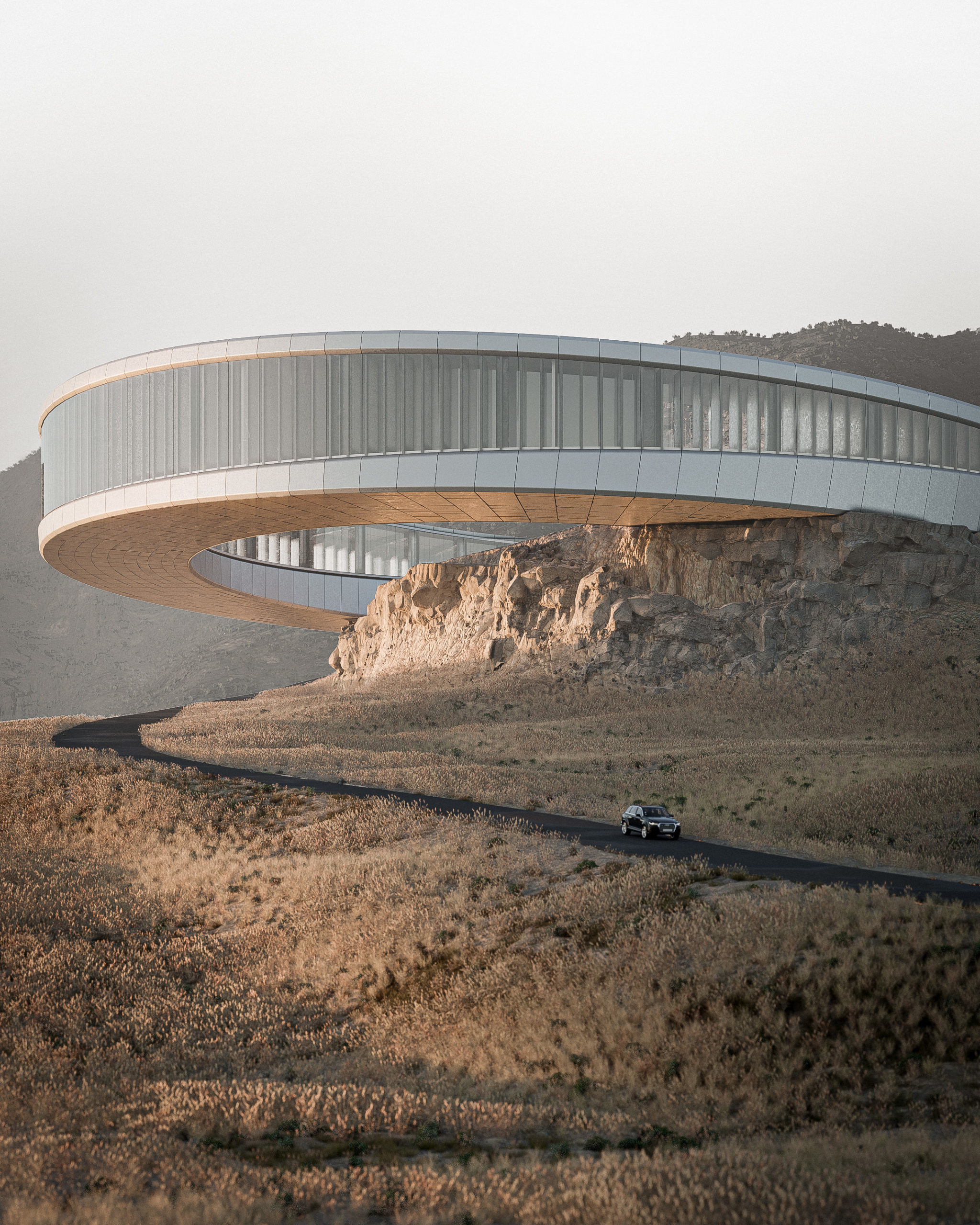 “Located near a highway between two major cities in the north of Mexico, Monterrey and Saltillo, the site generates from the hillside of the mountain chain. A ring with an inner radius of 47m, a section of 18m and an outer radius of 65m. Embedded in the ground giving the appearance of rising or detaching from it. The intention of the project is to guide the farewell process of a loved one through the natural and architectural environment. HALO Funeral Center stands out for its morphology and relationship with the context that generates a farewell process for both the bereaved and the deceased. In this way achieving a liberation and a healthy duel.”
Software used: Blender
“About Storeys and Stories” by Guilherme Marcondes
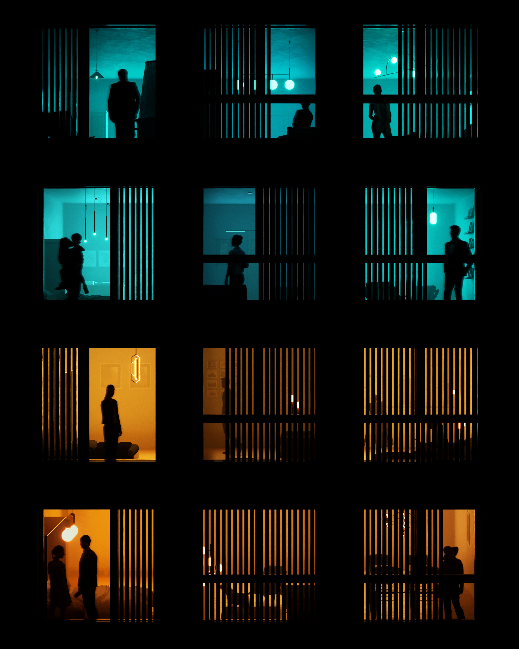 “People is what gives architecture life. With all their different lights and colors, they make the spaces alive. When designing a façade, a lot of effort is put into the relation with the exterior environment. With this rendering I wanted to focus on the role that the interior spaces play in a façade. Each of these windows have a story to tell, a feeling to show, a thought going on.
Home can have a lot of meanings: it’s where we come after work, rest, see our loved ones. It’s where we process the thing that happened outside, where we plan the things we want to do outside. Most importantly, it’s where we can show our true colors: sometimes bright, strong and warm. Sometimes soft, cold and blue. Through the day and the night the façade is where we see not just the city, but also the people’s light.”
Software used: 3ds Max, Corona Renderer, Photoshop
“Layers of the Underworld” by Keyhan Khaki
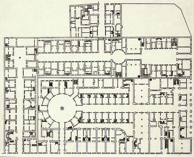
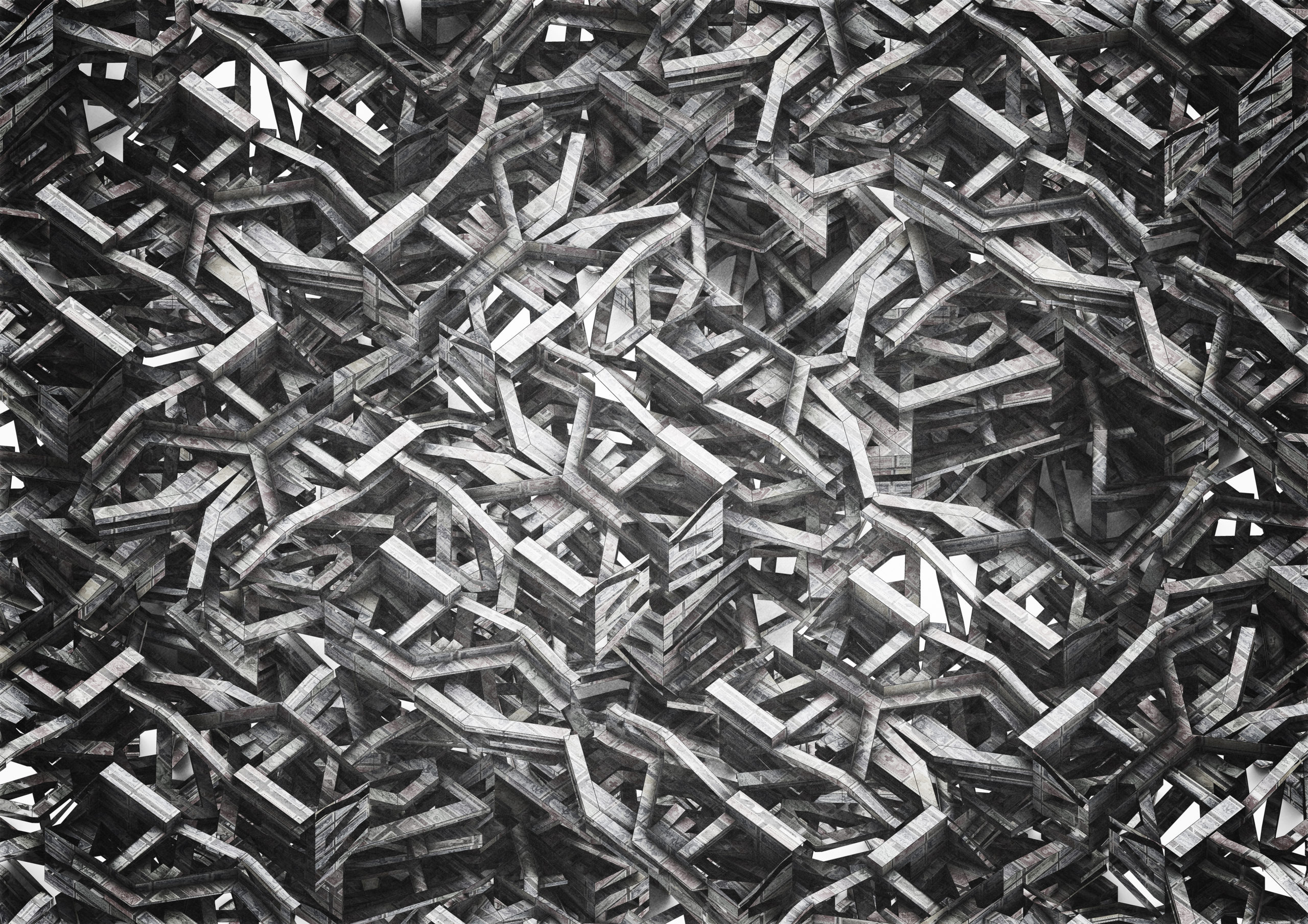 “A boundless generative study for a spatial understanding of an infinite archive dedicated to letters and stamps in the context of Campo Marzio. Inspired by “The Library of Babel” by Jorge Luis Borgestry, the drawing tries to incorporate the idea of sauntering and browsing through ramps. It explores the layers beneath the Campo Marzio in relation to the accumulation of historical letters and records. This is a result of moving upward and downward into the layers of Campo Marzio imagined by Giovanni Battista Piranesi (1720- 1778).”
Software used: Rhino, Lumion, Photoshop
“Foot of The Hill” by qiantailong Shi
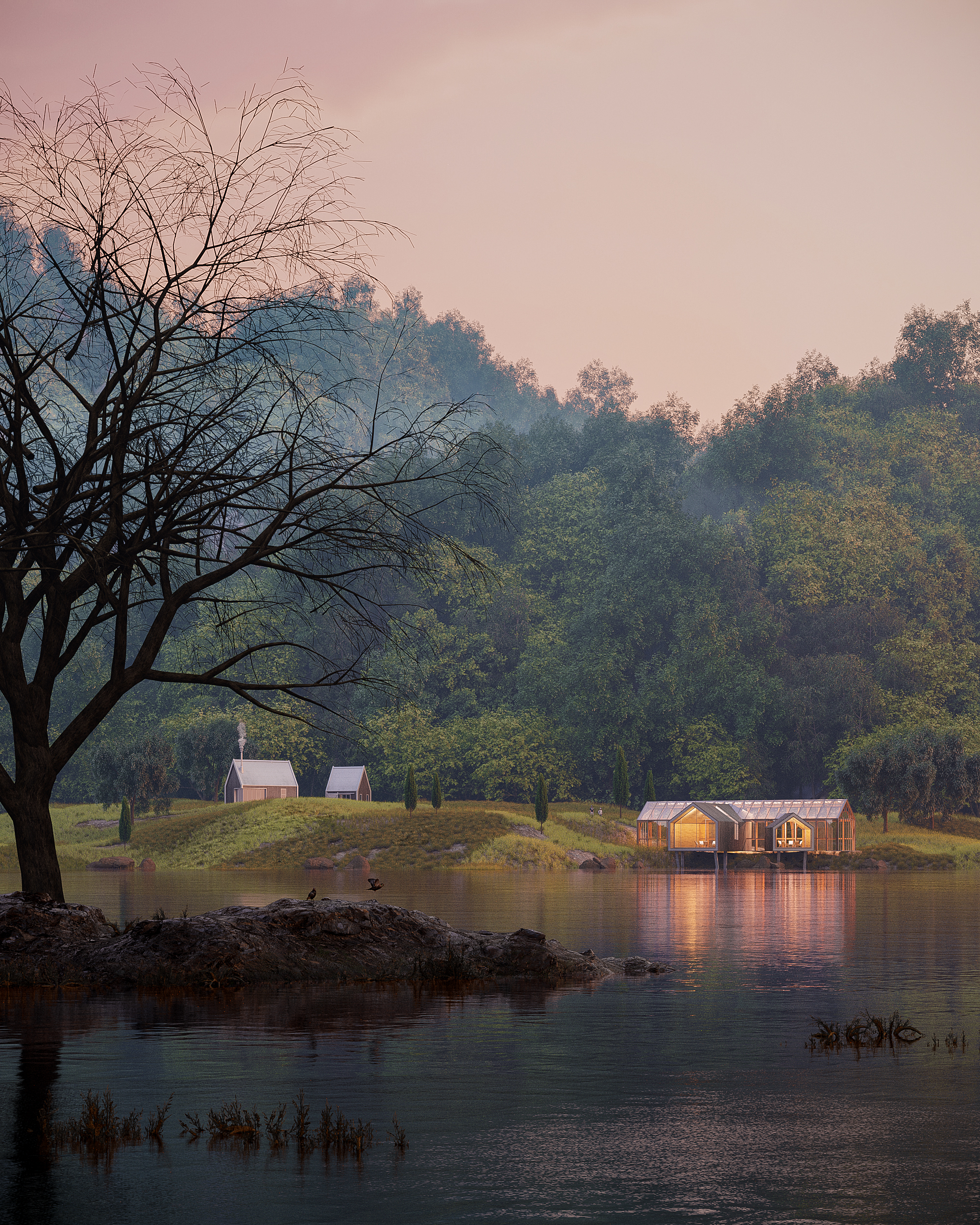 “Overlooking the sky, the water,the mountains and the small houses, they form a long picture that is deeply touching. The combination of a long time and strong strength reveals a solemn scene and makes people linger and forget to return. I suddenly had a strong desire and shouted at the mountain opposite. Bursts of pleasant echoes reverberated in my young heart, and my heart suddenly gushed a kind of magnanimity I had never had before. I felt that I had melted into the mountain.”
Software used: 3ds Max, SketchUp, Corona Renderer
“Gravity” by jingwei li
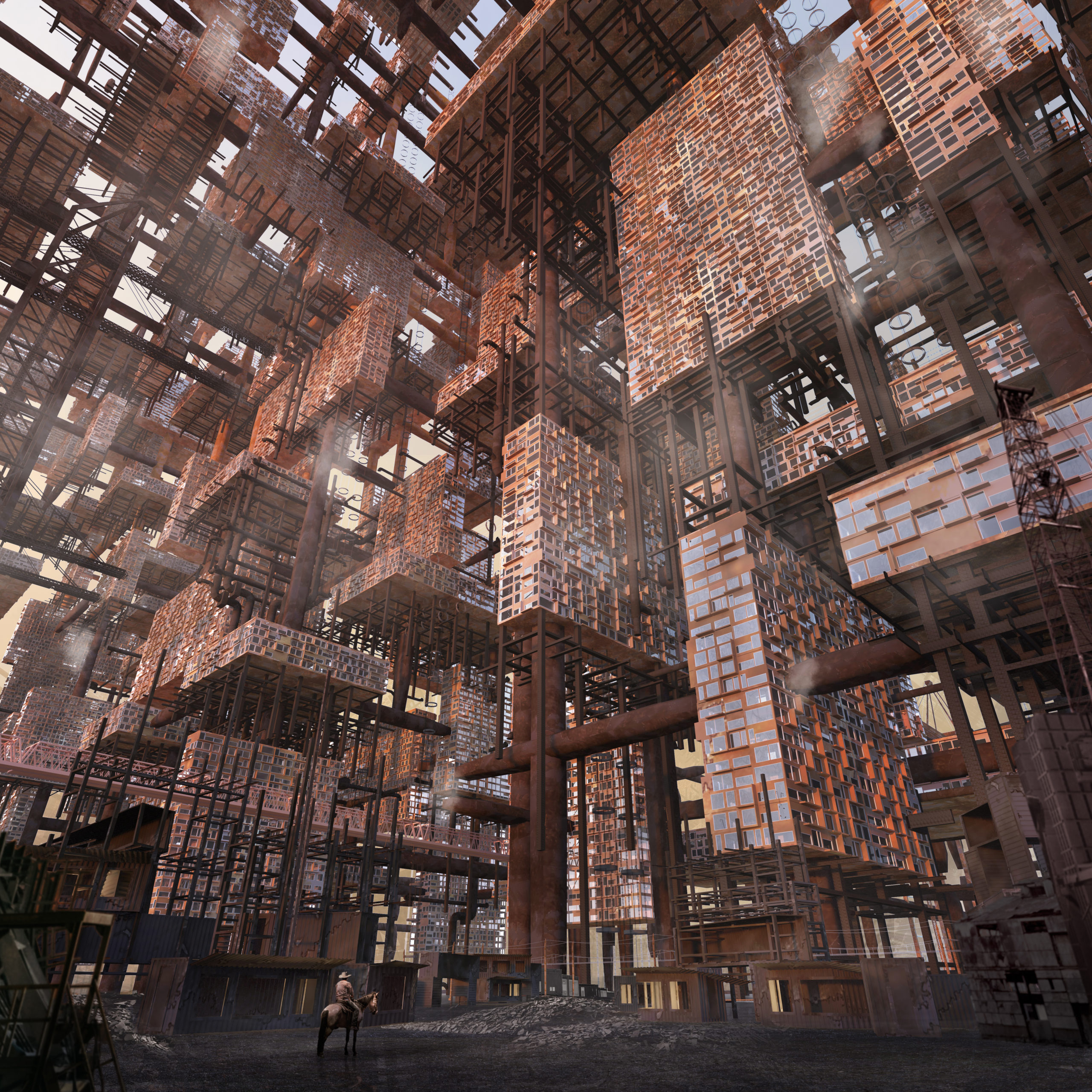 “The illustration explores a future in which architectural forms grasp to reach beyond Earth’s gravity. Density and population lead some to choose a nomadic life-style, free to roam the open plains below…”
Software used: V-Ray, 3ds Max, Photoshop
“Museum of Memories” by Hristo Rizov and Arthur Panov
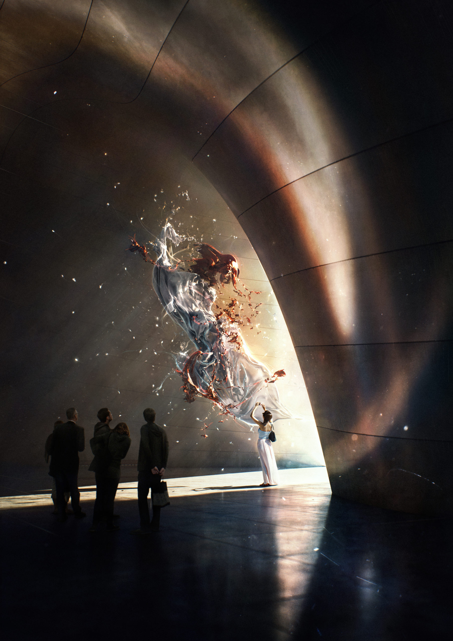 “What are memories if not frozen fragments of time?
Locked there in the museum.
Screaming for attention.
Wrestling to keep you restless.
Some full of sorrow and unrealized dreams.
Some… of uncried tears.”
Software used: V-Ray, 3ds Max, Photoshop
“Fainted Hope” by Dennis Grimm and Renato Aguilar
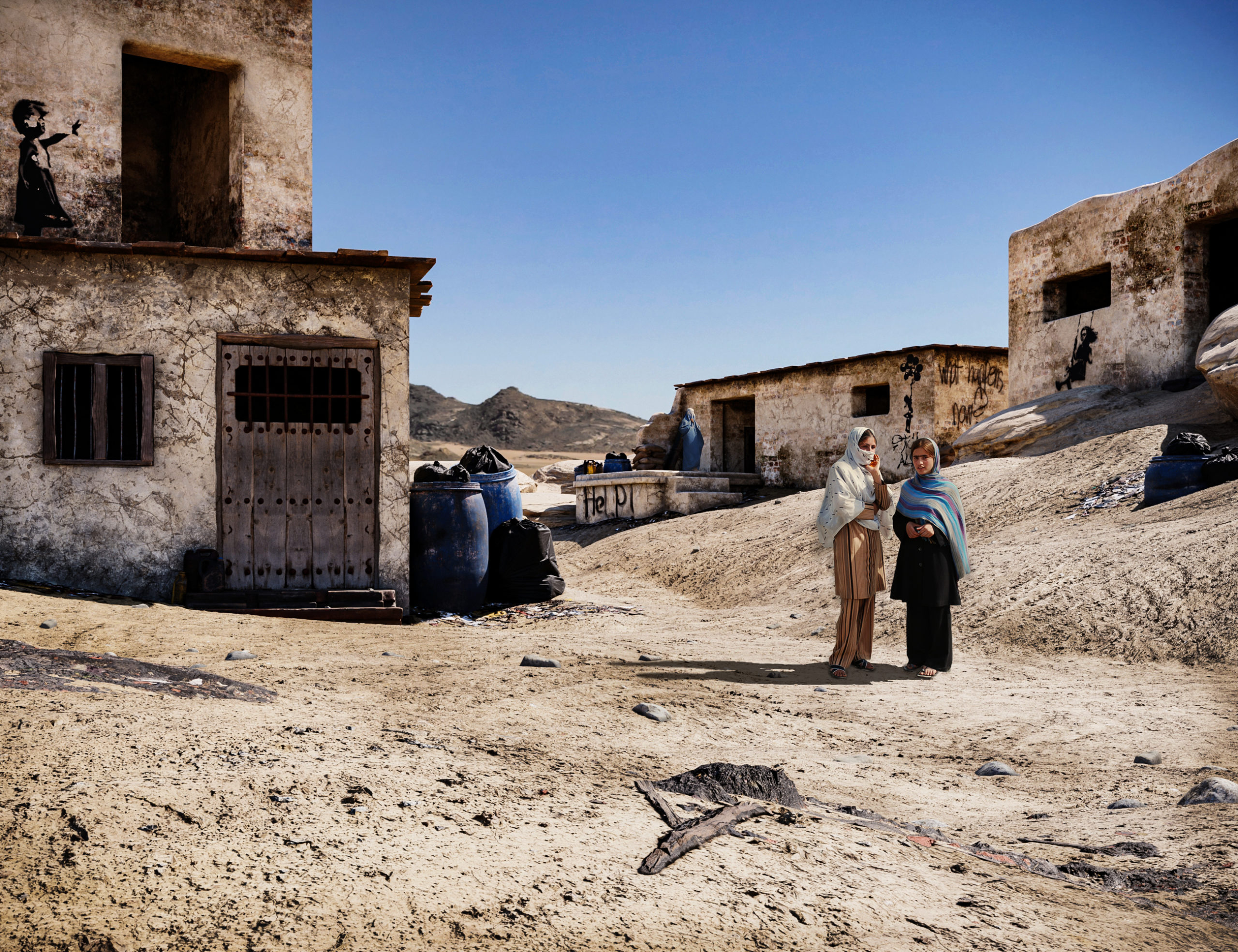 “Faced with the cruel reality everybody witnessed on TV in 2021, we were moved and felt responsible to act.
The image was to grab the viewers’ attention, evoke a feeling of affectedness, and make them reflect on the situation. The ambiance was inspired by several images we found of Afghan habitations. We aimed for realism, so we tried our best to capture the arid and vast landscapes we saw in these references and model authentic regional architecture. Finally, the young women are the focal point of the entire scene, they are quite literally in the middle of everything.
The environment, the architecture, and especially the characters – everything had to look and feel as real and convincing as possible. The women’s postures and facial expressions are crucial in conveying this feeling of uncertainty and helplessness, so we put a lot of effort into their appearance.”
Software used: 3ds Max, Corona Renderer, Photoshop
“Sunset Love” by Mark Eszlari
 “Churches are sacred spaces where people unite spiritually with a higher power. We enter churches when faced by pure and meaningful emotions like true love. Churches are therefore unique types of architecture where humans can express their deepest feelings through prayers influencing their psychology, philosophy and lifestyle. Love at first sight usually culminates in a church during the wedding ceremony.
The illustrated couple expresses their love for one another, sharing a kiss at sunset, before climbing the stairs to enter this sacred space while the priest looks after them with his prayers, binding the souls together to be one. The design of the church is inspired by praying hands pointing towards heaven, the location by Greek islands. The elements such as the red roses, symbol of love, the sunset and staircase to the church contribute to the romantic emotions adding warmth to the image, a metaphor for hearts in love.”
Software used: 3ds Max, Corona Renderer, Photoshop
“Shanty Stack” by Arnaud Imobersteg
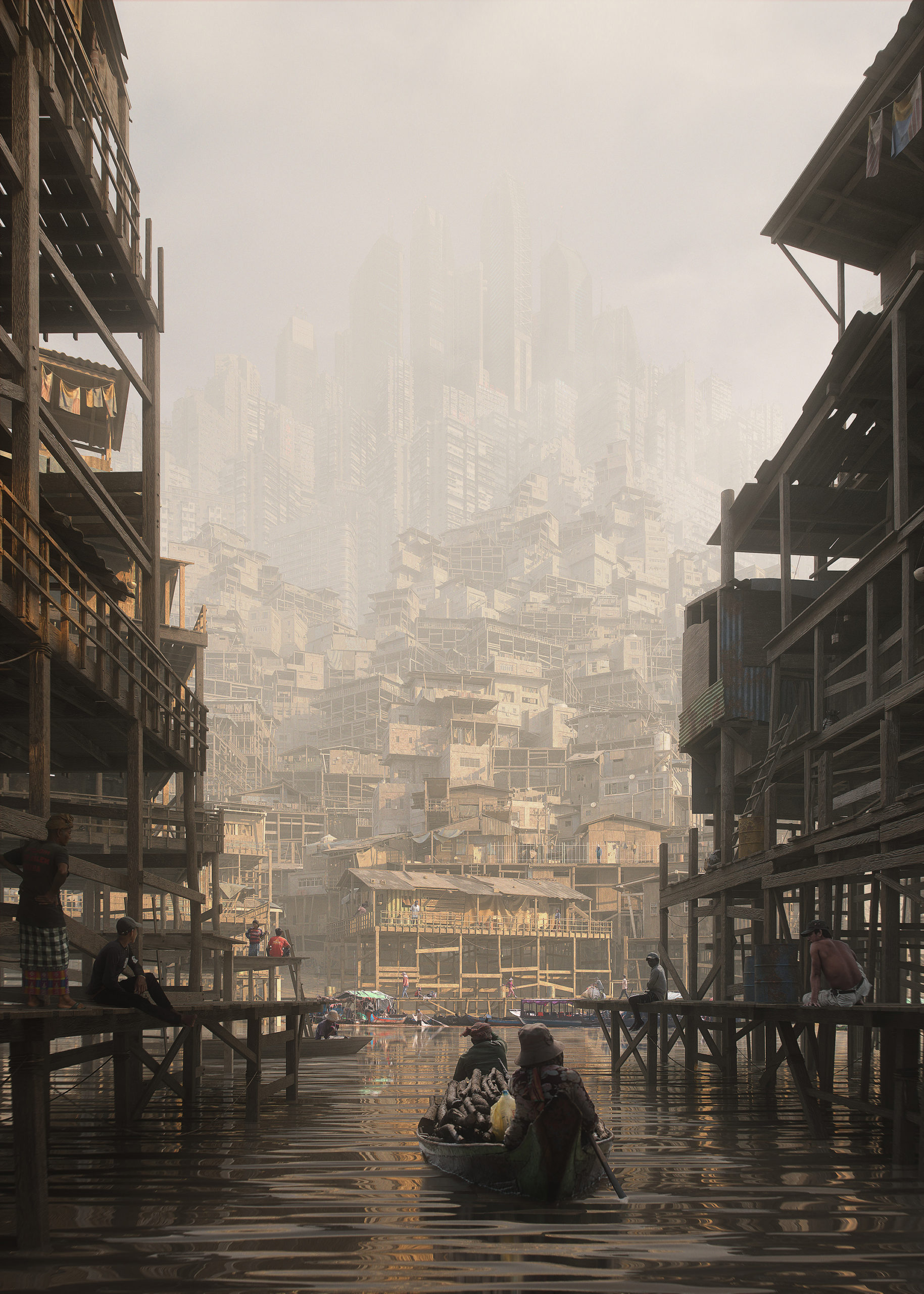 “The sun is warming the air as the market is closing now. My shirt is already sticking to my skin. They advised to avoid going out, but I feel good, I’m only coughing. Uncle Alisha is saying he got sick because it’s not air anymore, he says that before we used to see the sky and it was blue. But I don’t know; maybe he’s just getting old, he’s already 37. The Stack is constantly growing as new people are moving in. Are they coming from Above?”
Software used: Blender
“Cheese Factory” by Artem LT and Mykola Mondich
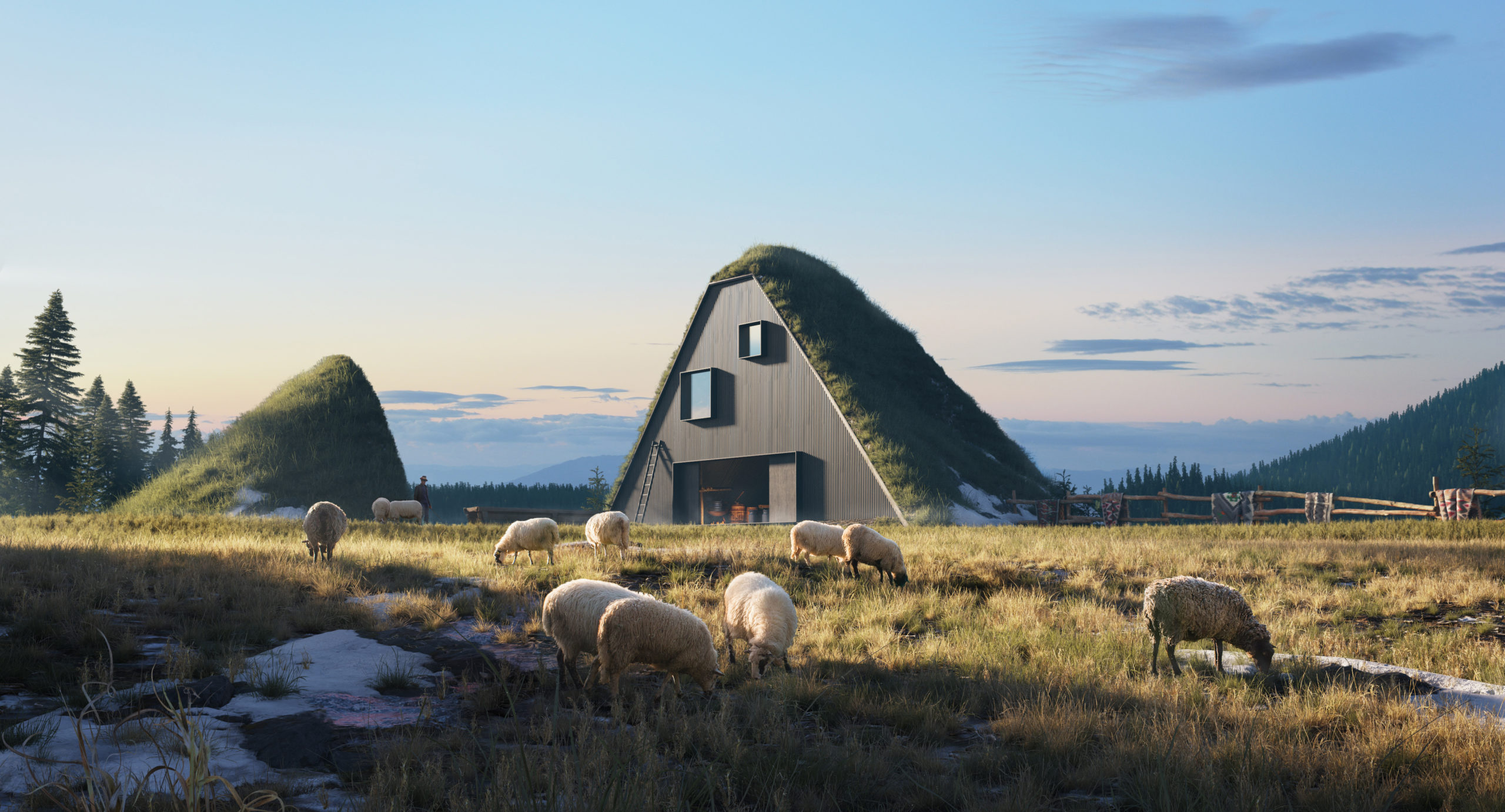 “Cheese factory. A place that is sure to please guests, especially fans of healthy eating preservation of national traditions, local cuisine. The landscapes there are also quite beautiful – the peaks of the Carpathians are clearly visible. Shepherds work here from spring to autumn. During this time, many sheep can be seen on the slopes. Various cheeses, Budz, Bryndza, Vurda are prepared on the fire. You can see with your own eyes a difficult but pleasant process, the preparation of Hutsul cheeses.
Architecture is organically integrated into the environment. Polonyna is a forestless area of the upper belt of the Ukrainian Carpathians, which is used as pasture and hayfield. Hutsul cheese becomes first Ukrainian product with protected geographical indication. Hutsul Bryndza is made of mountain sheep milk in accordance with traditions dating back to the 15th century on the summer high mountain pastures of the Carpathians.”
Software used: 3ds Max, Corona Renderer, Photoshop
“SHINE” by Alexis Bossé
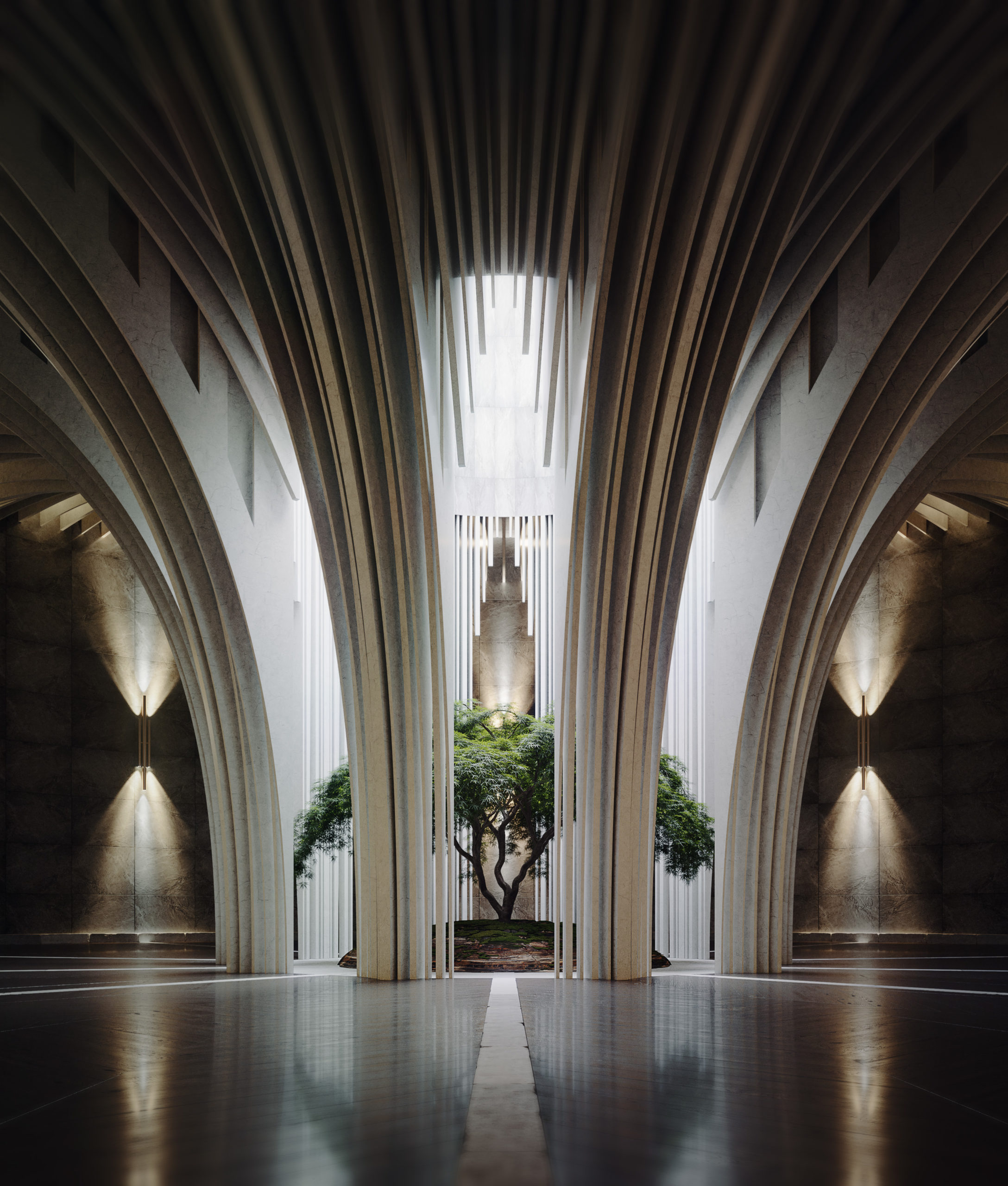 “I dreamed of a circle room with countless thin arkd who fall in the center. At first, I tried to make a subtile natural light like a overcast sky. I worked shaders of walls and arks with dressed stone for remind stuctures like abbayes and churchs. After that I really wanted to make a old dark wood floor with a lot of wear but in the same time I want to make it elegant with strong reflections. I choose a dark Floor because this helped me contrast the image, the room is globally dark except for the center of the image. I placed a tree with a soft shape to stay close to the arks shape. After that I added few artificial lights with warm color to have more reflections on the floor. I tried to make a place which is perceived like sacred and silent.”
Software used: V-Ray, 3ds Max, Photoshop
“Victory St” by Dániel Ócsai
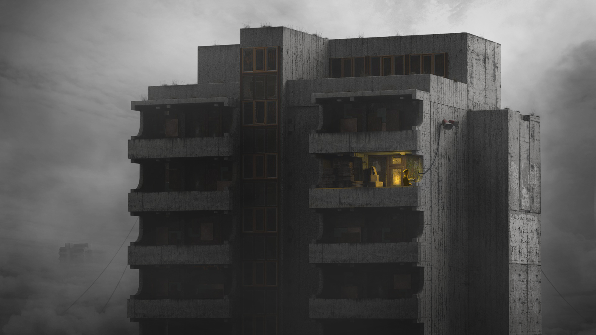 “My story depicts a dystopia that is mostly driven by the cold and insensitive brutalism of Orwell’s 1984 novel and the post-soviet era in Middle-Eastern Europe. These types of buildings are called “panel houses” in Hungary, which means houses made of reinforced concrete blocks. Most of these were built right after World War II, when suddenly many people had to be accommodated.
I love the negative charm of these monsters that makes them look like they will stand forever and beyond. On my image the inhabitants have either left the building or taken them away – who could tell. The man in the cap can be a propagandist or some kind of servant who is a faceless, impersonal part of the omnipresent, yet intangible system. Life is unknown down there, but presumably everyone is doing an automated, meaningless job. I think less information says more here.”
Software used: Cinema 4D, Photoshop, Other
“The Remnant” by Sai Lam Ma
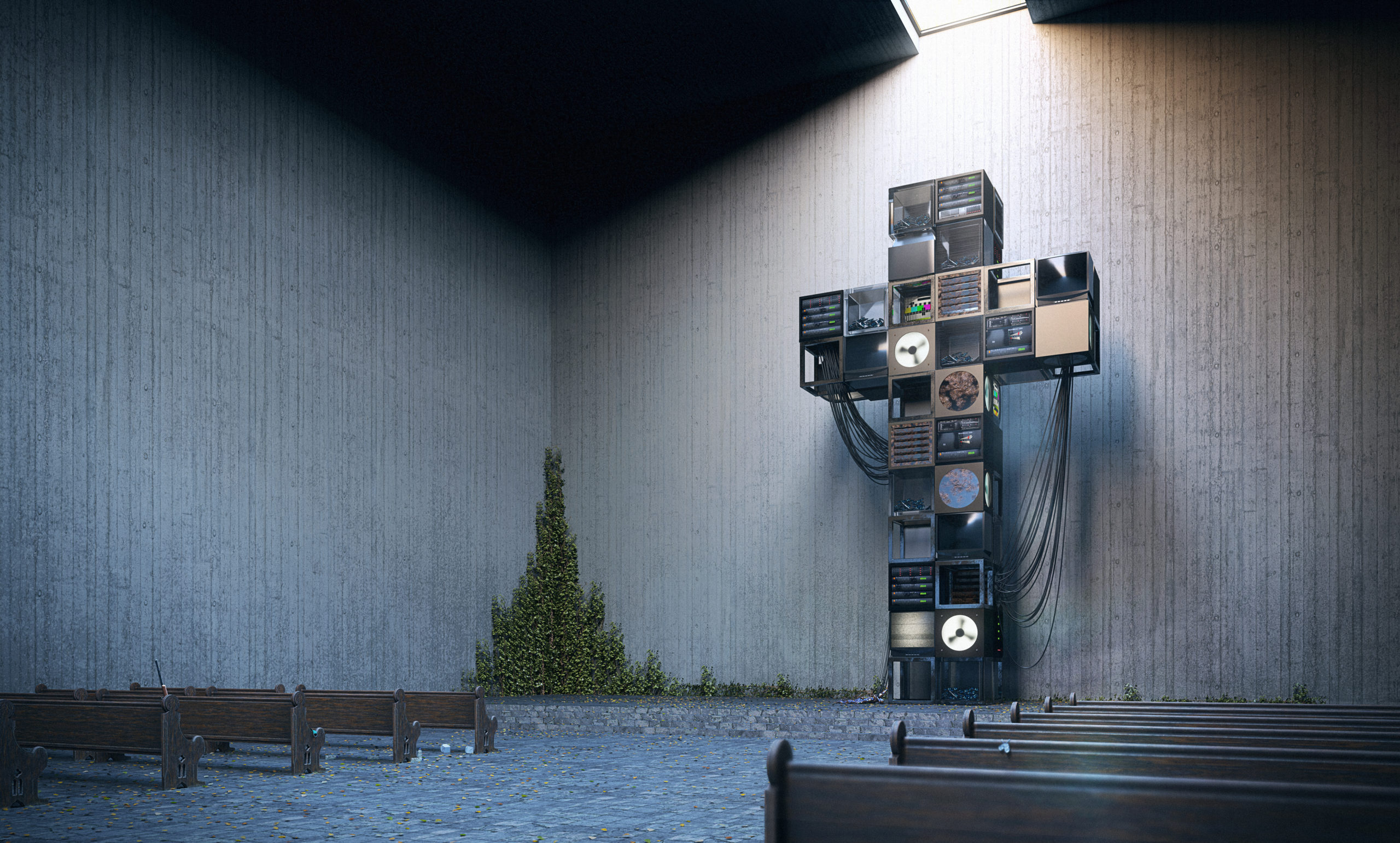 “Day 1947
This is it, the tales are true. I’ve found the remnant of human civilization from all those years ago.
It was said people used to turn to technology for all their problems, almost worshiping it as if it was the solution to everything. But only if they would look closer, they would have noticed all the pollution, inequality, conflict and harm they were causing. Instead of going to the roots of these problems, they slowly trapped themselves in this concrete tomb scrambling for some miraculous device to save them all. Maybe only then, when it all come crashing down would they realize how they should have treasured it all. Maybe only then, would they start to let nature heal.
They could have left us with so much more than a monument of regrets…”
Software used: V-Ray, Rhino, Photoshop
“THE SECRET LIFE OF A DAM” by Dominic Maslik
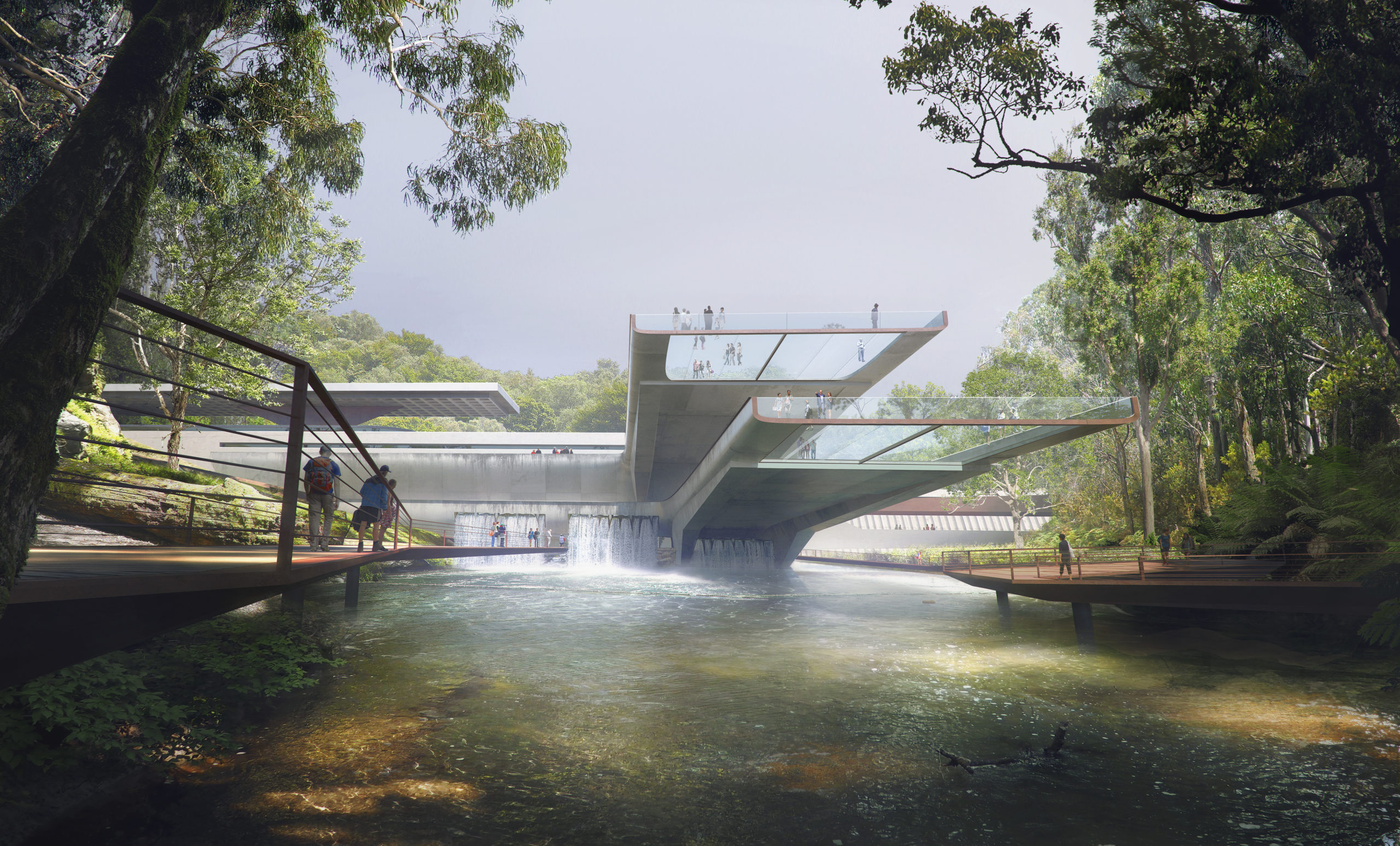 “This is the story of an old industrial building with a new form of life. One idea was popping in my mind to take the most industrial function and to make it not only a practical source of energy, but also architecturally and publicly friendly. Looking over different dams around the world I realized that’s the perfect ground for the imagination. Brutalist aesthetics, and the almost military look of the dams, made me overthink their use.
What if it can be used by the public, attract tourists? When I realized It can be redesigned also as a garden, lookout, integrated into nature as a beautiful architectural element there was no hesitation where it potentially could be. I took as a location lush Australian forest with its amber rivers coming from the mountains. My inspiration for the scene and color-grading were coming from Austrian landscape painters such as John Wilson, John McCartin, Frederick McCubbin.”
Software used: V-Ray, 3ds Max, Photoshop
“Tokyo Rift” by Felix Manibhandu
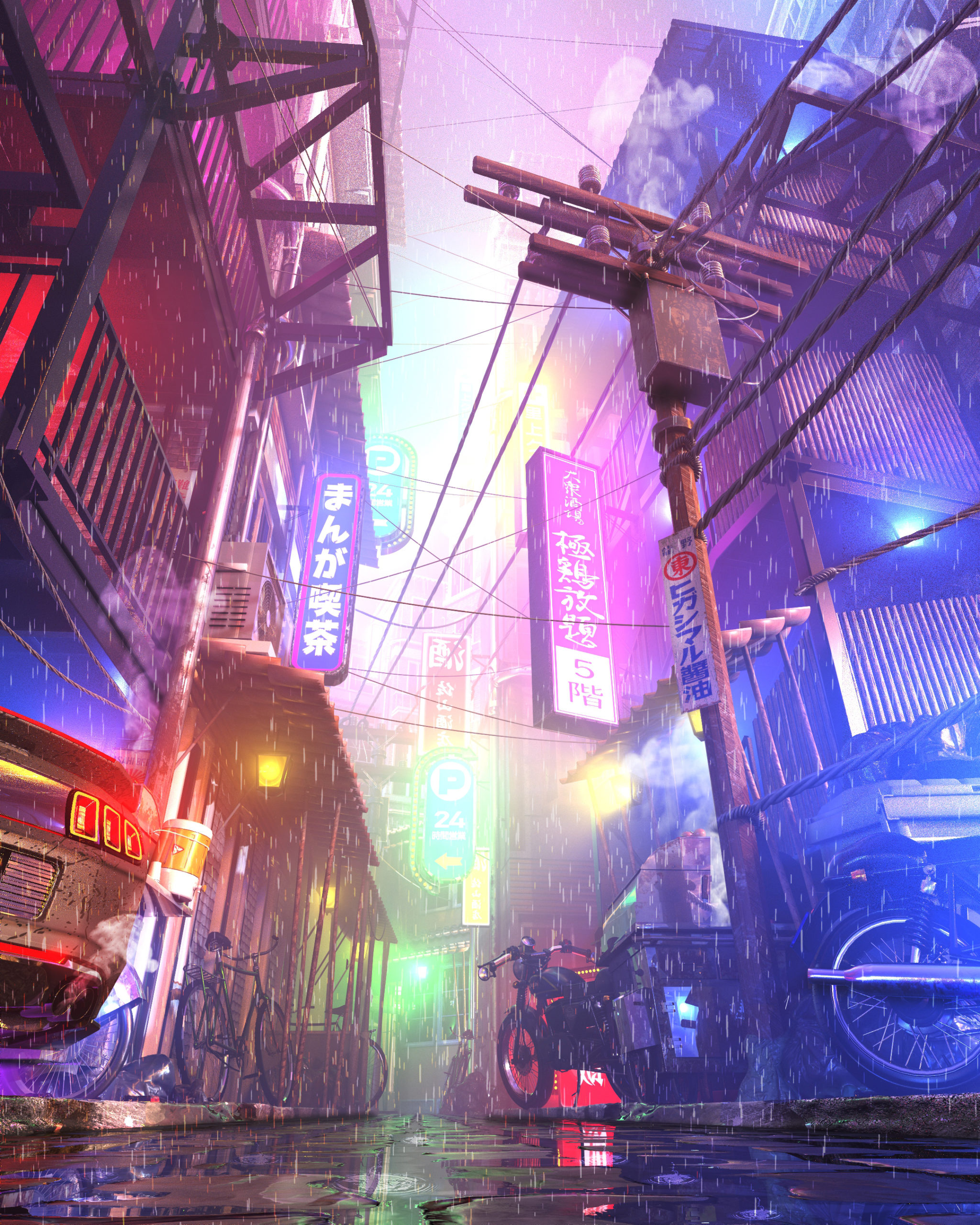 “Growing up in urban South-East Asia, I’ve found there’s nothing in comparison to the chaotically beautiful sensory overload.
The typical high-rise modular architecture above provides enclosure to the sprawling hustle and bustle of micro communities below, night time transforms high density spaces to a fluorescent techno-visual feast.
This work in progress it to develop in to an environment camera pan shot. The first frame is a reimagining of what could be the sights, sounds and smells of a city I’ve never visited, referencing heavily on past experiences and emotions.”
Software used: Photoshop, Other
“The Meditation Temple” by Fatimah Ishmael
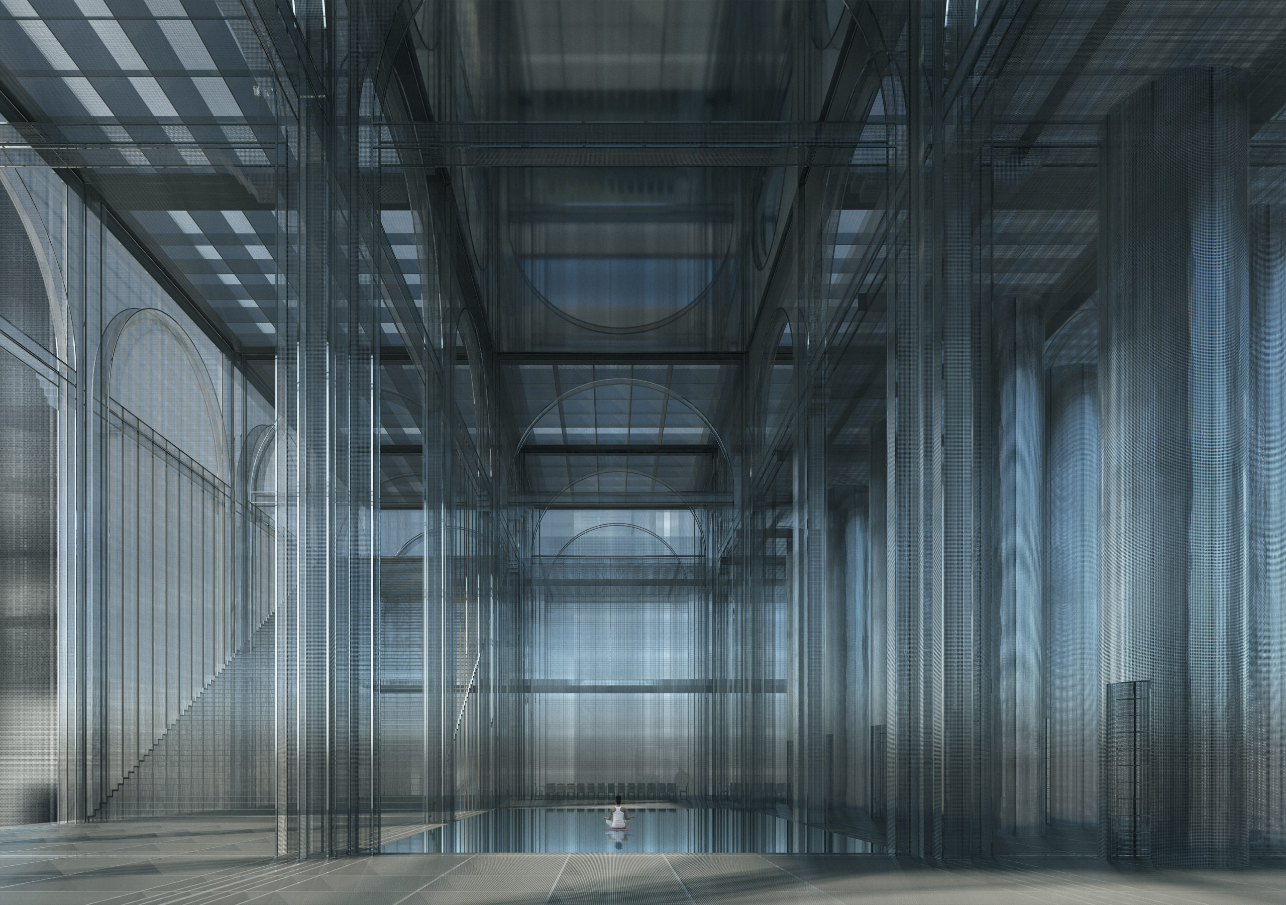 “The project is an anti-surveillance monastery in the mountains of China named the ‘Blind Spot’. Located more specifically in Fengdu ghost city, Chongqing, the Blind Spot is a retreat/sanctuary where you can escape the pressures of a heavily surveilled society. It is temporary living off the grid and houses sleeping chambers, meditation rooms, learning centres, and is influenced by the design of Buddhist monasteries.
The Meditation Room is constructed by metal mesh (influenced by a Faraday cage) and is a retreat within a retreat. It conveys a peaceful yet eerie feeling; though the cage-like construction stops the electromagnetic fields (WiFi, etc), the exposed and semi-transparent walls and floors still give the feeling of being watched.”
Software used: V-Ray, Other
“Celadon City (Saigon, Vietnam)” by Nhi Hoang (Producer), Lucien Bolliger (Executive Producer), Trinh Thai (Art Director & Visualizer) Quynh Luong (Model), Ng Lee (Model), Thanh Ho (Model photographer), Gamuda Land (Developer), Soyon (Creative agency), and createdby.ma (Architecture Visualization Agency)
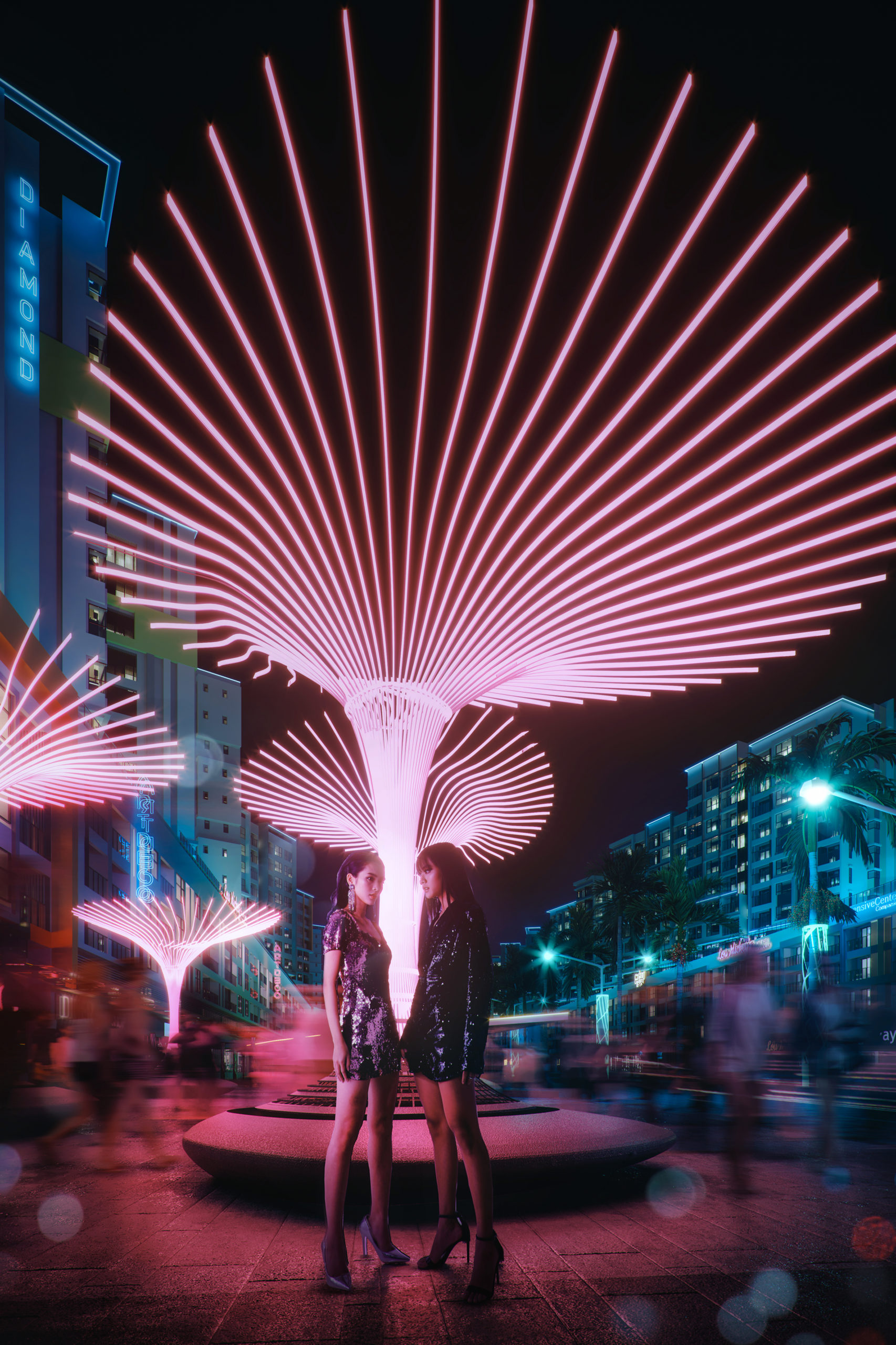 “Saigon has evolved from the ’70s-nowhere else in Vietnam can one experience the quickly changing cultural and economic shift that takes place before our eyes. The 10+ million inhabitants seem to be constantly moving…Locals and foreigners, looks, sounds, smells, tastes all mix, and create something so eclectic and excitingly new that is impossible to capture in words. The city’s constantly buzzing. Moving. People yearn to break the shackles of the past, the shackles of society’s expectations. Poverty, traditional values, and collectivism are quickly shifting to consumerism and individualism.
Our CGI aims to captures the hustle, bustle and buzz one can feel in Saigon. The two models embody the modern people of Saigon, whereas the rest of the city moves around them at lighting speed. We used a neo-noir, cyberpunk-inspired mood to imply how this place isn’t stuck in the past, but very much representing the future.”
Software used: 3ds Max, Corona Renderer, Photoshop
“Group Therapy” by Gourav Neogi
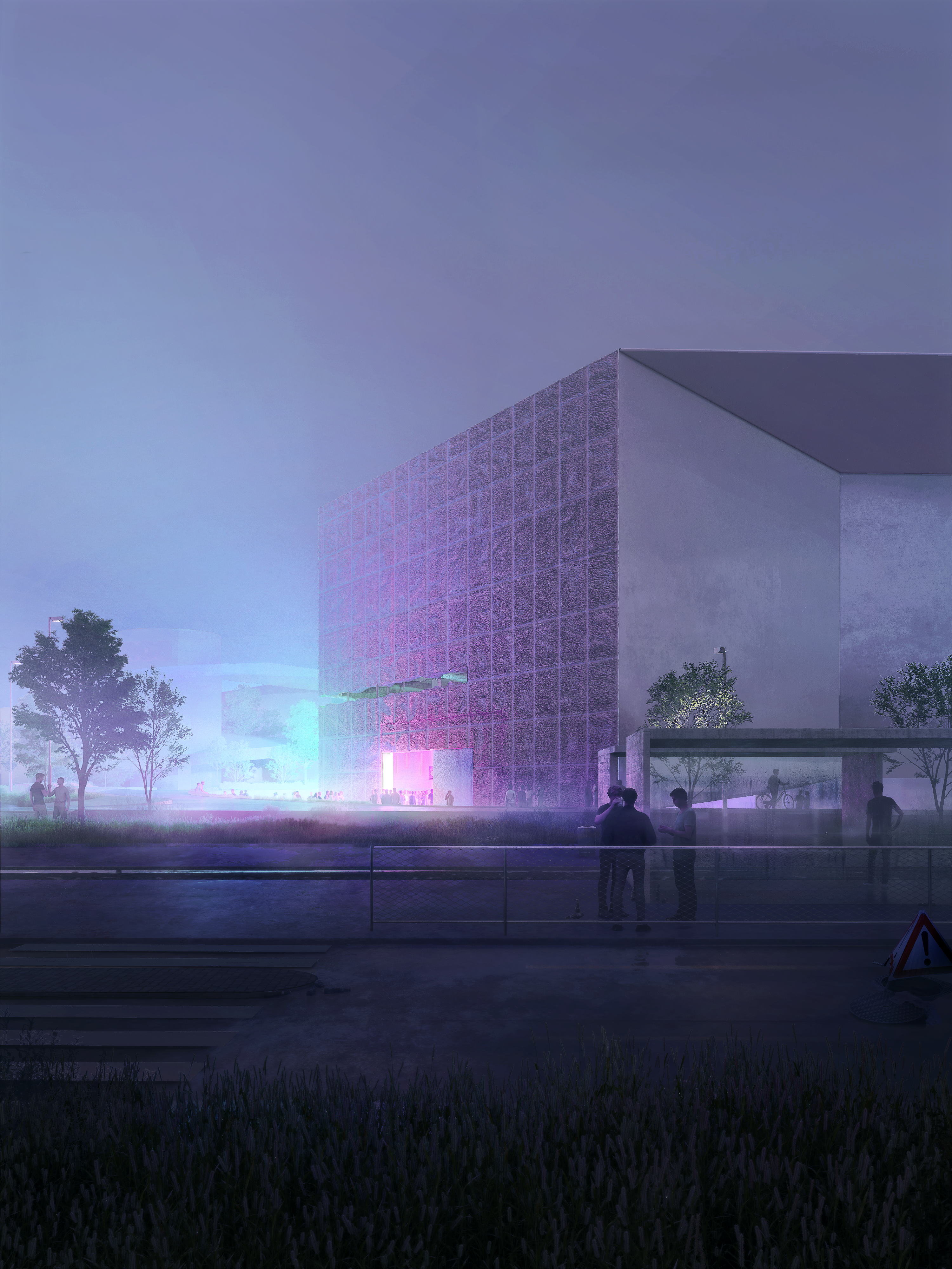 “We heard the thump of music. A door swung open, LED lights bleeding into the night. The space was packed but it felt familiar, like being reunited for the first time with people you didn’t really know. Some whose first names you know but whose numbers are not in your phone. You have no idea what they do for a living, or where they are from, or how old they are. You see them on the dance floor, where you have been hanging out for years.
This images captures a moment from the future as the pandemic restrictions are lifted. This ordinary corner of the Schaulager museum designed by the Swiss firm Herzog & De Meuron, becomes the destination for an underground techno party in Basel.”
Software used: V-Ray, 3ds Max, Rhino, Photoshop
“Cabins in the Woods” by Behzad Keramatih and Hizir Kaya
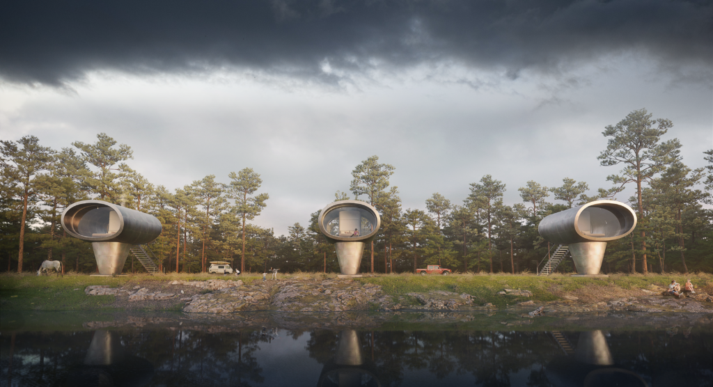 “City life can be vibrant, diverse, and dynamic. But it can also be crowded, polluted, and noisy; It is overstimulating which can make people feel stressed and overwhelmed. So the question is what’s the antidote to modern life stress? That is why we in the DD Studio decided to design a cabin in the woods in our style with minimum interference with nature as a building and maximum view. In this image, we are trying to show the communication between nature and humans and how the cabin sits in context.”
Software used: 3ds Max, Corona Renderer, Photoshop
“Reclaim the Air – AirKeepers” by Minsung Kim
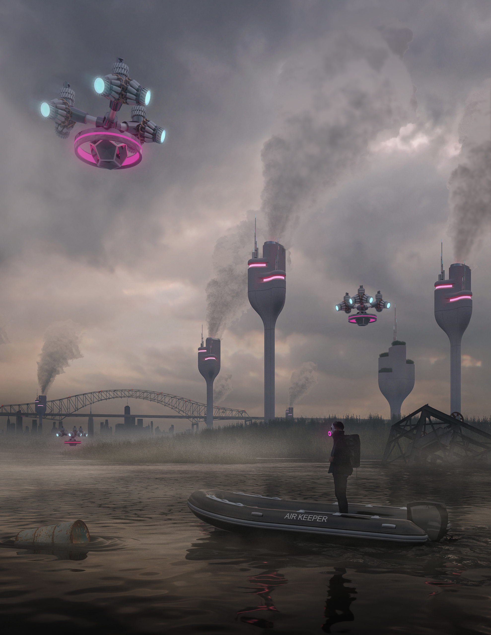 “Along the Passaic River from Port Newark through Jersey Turnpike, air pollution caused by toxic factories and transportation leads to increased health concerns and affects families’ health and vulnerable communities in Newark and the entire New York Metropolitan area.
The rendering shows AirKeepers’ interventions to combat air pollution along the Passaic River. The Mist Towers emit mist to capture toxic chemicals and particulate matter and drop them down to the ground. Then, Hyper-accumulating plants absorb the fallen pollutants and keep them away from the river. Additionally, Drones monitor the air quality and alert polluted air by emitting lights, helping people avoid being exposed to the pollutants.
While the scale of pollution is far greater than the Newark area alone, AirKeepers view these design interventions as a framework that can be used in the future to guide design efforts for combating pollution around the region and creating a healthier environment.”
Software used: V-Ray, Rhino, Photoshop
“The Construction of the Mihama Nuclear Shrine” by Sabina Blasiotti
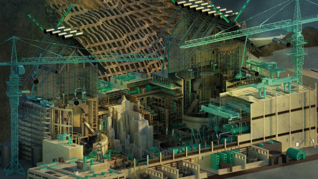 “In 2012, Japanese architect Katsuhiro Miyamoto made the extraordinary proposition to erect giant Shrine-style roofs over the ruined reactors of the Fukushima Daiichi Nuclear Power Plant after the 2011 nuclear disaster. The conceptual idea of using the roofs to signify the presence of a powerful force on site extends to a workable proposition, based on the Japanese culture where shrines are rebuilt every 20 years to ensure that traditional building techniques are passed on generations. Likewise, the upkeep of the reactors’ decommissioning will extend in centuries, therefore the construction of these roofs is chosen as a form of preservation, to transmit the knowledge of Nuclear Waste management to future generations.
This drawing retells the story of Miyamoto, the construction of the Nuclear Shrine further influences the regeneration of the surrounding abandoned coastal landscape, repurposed as a sanctuary integrating ceremonial and commercial activities such as fishing and rice farming.”
Software used: V-Ray, Rhino, Photoshop
Next 25 Renderings →

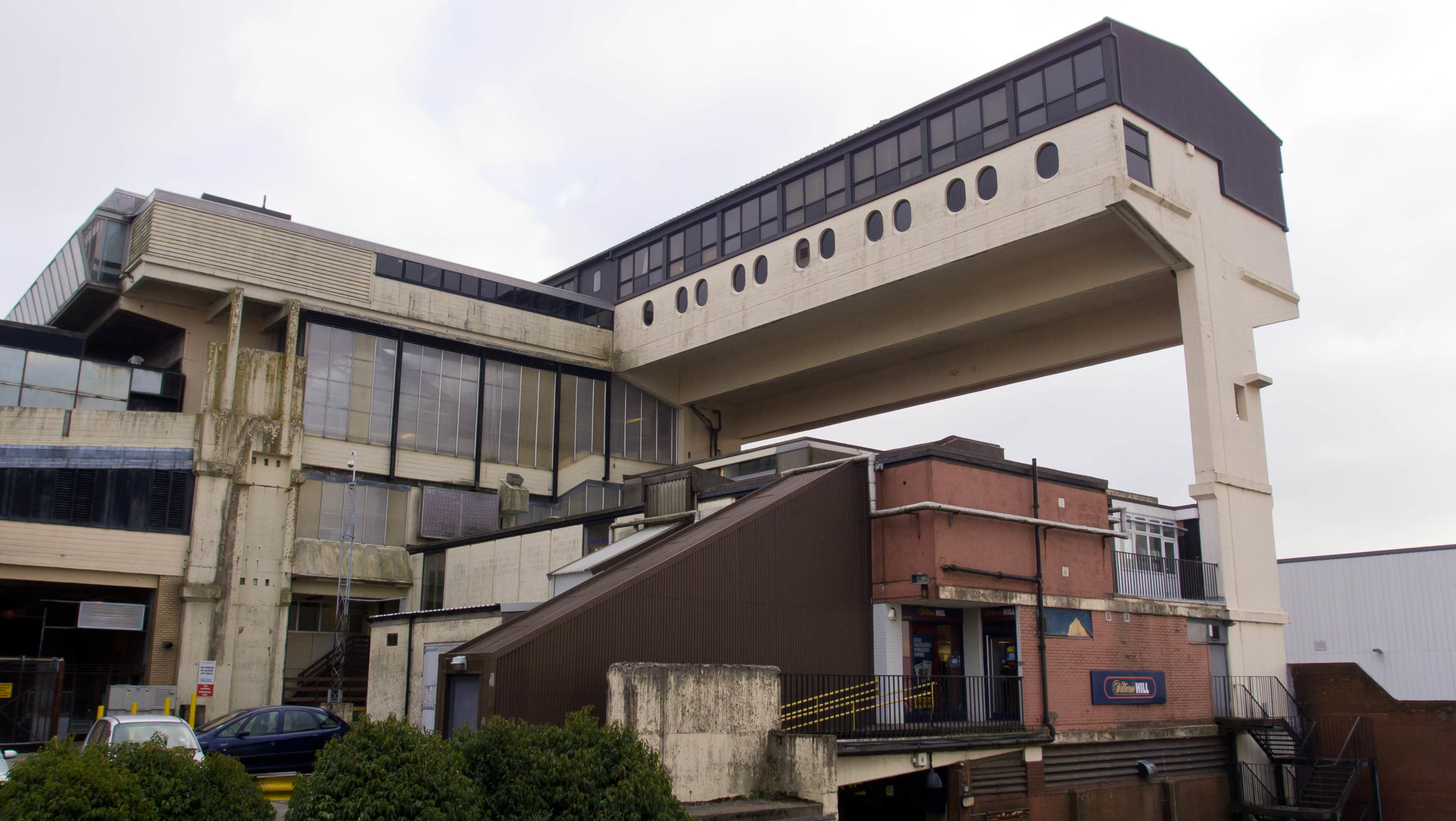
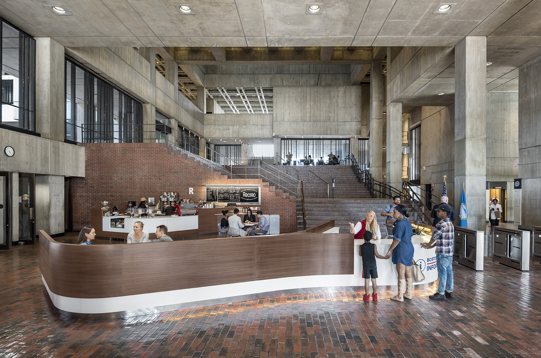
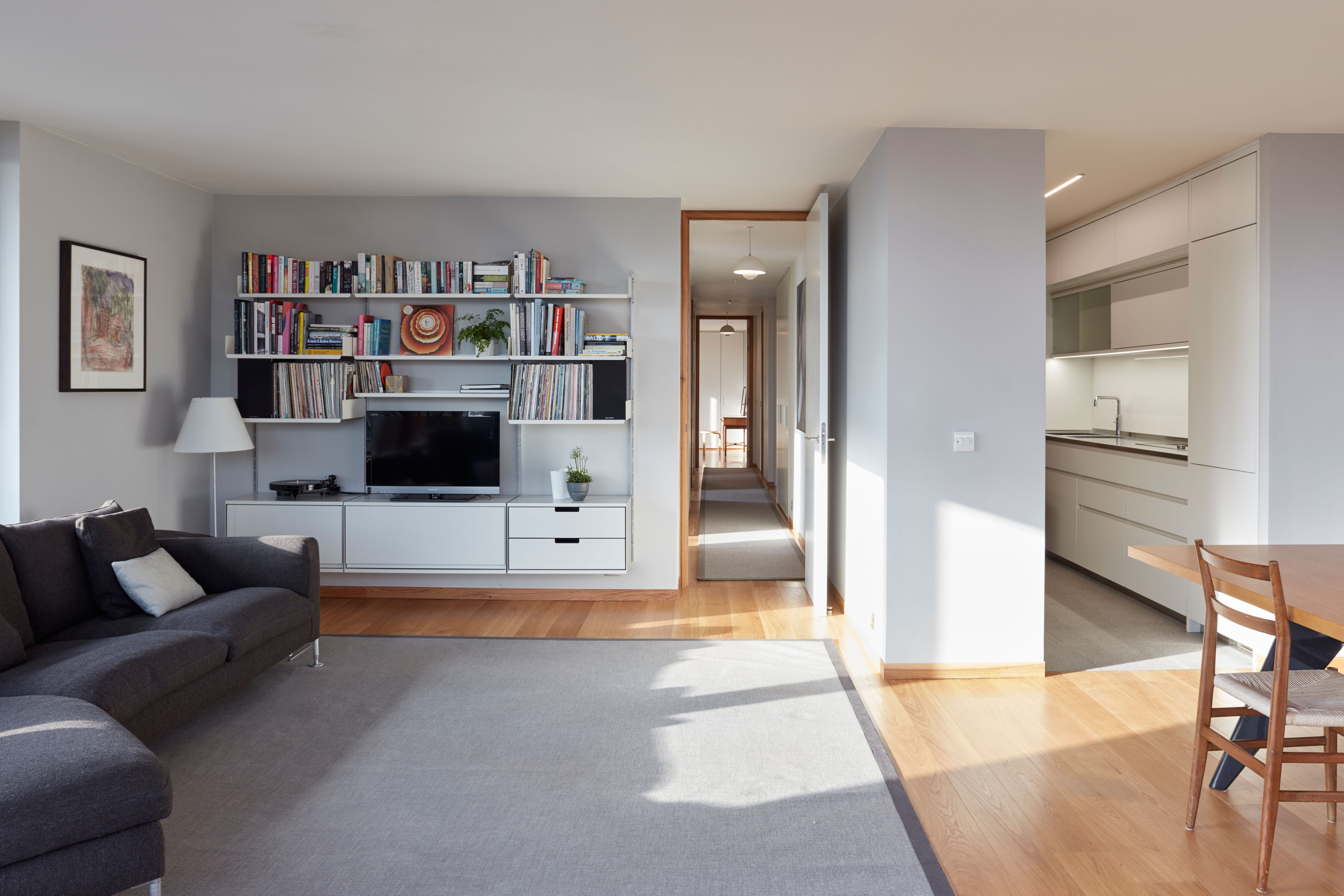
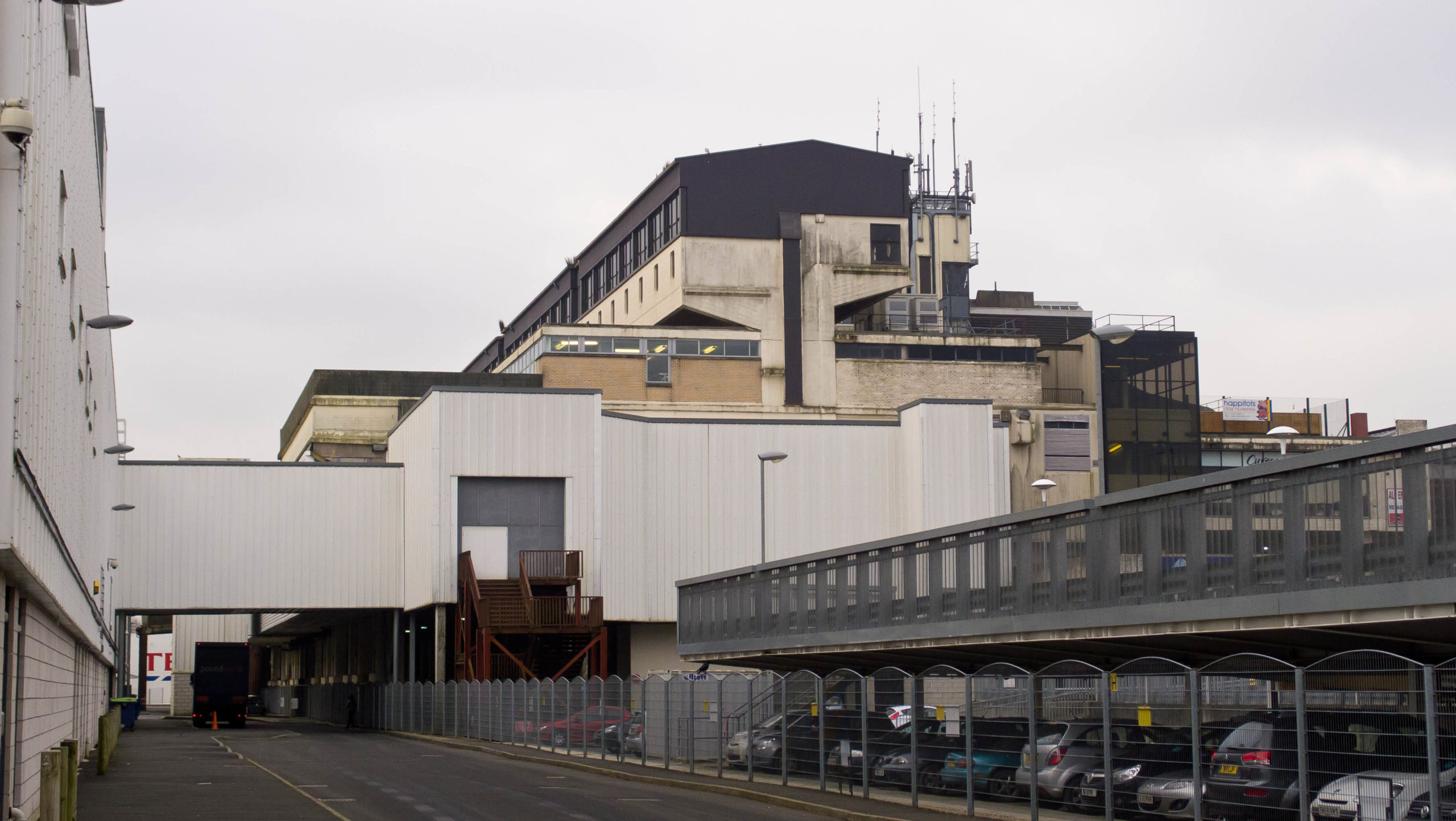 Compared to its successful contemporaries, the refurbishments of Cumbernauld Town Centre were not critical enough for it to catch up with nowadays standards, either functionally or aesthetically. As one of a few megastructures ever built, is there a historical argument to be made for restoring this rare building? After all, the Cumbernauld Town Centre represents more than just brutalist aesthetics; it is a concrete implementation of innovative urban design concepts from the post-war period. (This is not to mention the environmental argument: it is a waste to demolish the massive concrete structure, which consumed a considerable amount of resources to build. One can only hope that it will be recycled into secondary materials.)

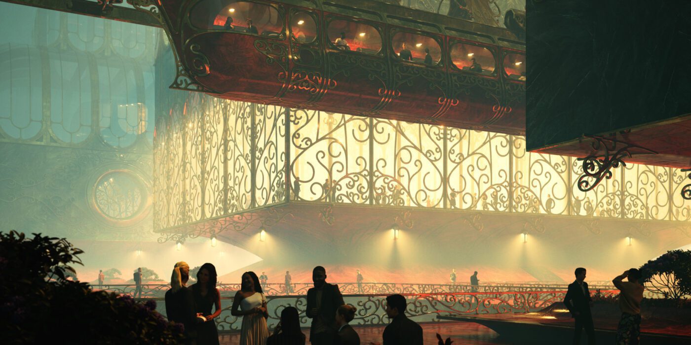
 “Depicted in this image is my hometown Wuppertal. The world famous Schwebebahn, which was build over one hundred years ago as a result of advancements in steel production and metal fabrication, still remains to awe visitors when it meanders through narrow streets above the river Wupper. Shown here is a speculative redesign of the city in the spirit of the early Schwebebahn designs and its historic “Kaiserwagen”.
 “Memories and dreams sometimes go hand in hand. The combination of reality and fantasy is an intrinsic force that supplies the creative portfolio of an artistic mind with endless possibilities. Nevertheless, even with all the infinite pieces put together sometimes one can’t help but look into triggers of certain spaces that take you back into specific moments of life. This particular studio is a combination of said moments in time; clutter in respective areas, materiality, scale, objects and the conglomeration of mechanical pieces grounds the imagery, which brings a sense of character that many people resonate with. It’s a sense of remembering a space that does not exist. A remembrance.”
 “On December 21, 1848, a white plantation owner, traveling with his enslaved servant, passed through the Central of Georgia Railroad terminal in Savannah, seeking medical care in Boston.
 “The First Settlement on Mars.
 “Located near a highway between two major cities in the north of Mexico, Monterrey and Saltillo, the site generates from the hillside of the mountain chain. A ring with an inner radius of 47m, a section of 18m and an outer radius of 65m. Embedded in the ground giving the appearance of rising or detaching from it. The intention of the project is to guide the farewell process of a loved one through the natural and architectural environment. HALO Funeral Center stands out for its morphology and relationship with the context that generates a farewell process for both the bereaved and the deceased. In this way achieving a liberation and a healthy duel.”
 “People is what gives architecture life. With all their different lights and colors, they make the spaces alive. When designing a façade, a lot of effort is put into the relation with the exterior environment. With this rendering I wanted to focus on the role that the interior spaces play in a façade. Each of these windows have a story to tell, a feeling to show, a thought going on.
 “A boundless generative study for a spatial understanding of an infinite archive dedicated to letters and stamps in the context of Campo Marzio. Inspired by “The Library of Babel” by Jorge Luis Borgestry, the drawing tries to incorporate the idea of sauntering and browsing through ramps. It explores the layers beneath the Campo Marzio in relation to the accumulation of historical letters and records. This is a result of moving upward and downward into the layers of Campo Marzio imagined by Giovanni Battista Piranesi (1720- 1778).”
 “Overlooking the sky, the water,the mountains and the small houses, they form a long picture that is deeply touching. The combination of a long time and strong strength reveals a solemn scene and makes people linger and forget to return. I suddenly had a strong desire and shouted at the mountain opposite. Bursts of pleasant echoes reverberated in my young heart, and my heart suddenly gushed a kind of magnanimity I had never had before. I felt that I had melted into the mountain.”
 “The illustration explores a future in which architectural forms grasp to reach beyond Earth’s gravity. Density and population lead some to choose a nomadic life-style, free to roam the open plains below…”
 “What are memories if not frozen fragments of time?
 “Faced with the cruel reality everybody witnessed on TV in 2021, we were moved and felt responsible to act.
 “Churches are sacred spaces where people unite spiritually with a higher power. We enter churches when faced by pure and meaningful emotions like true love. Churches are therefore unique types of architecture where humans can express their deepest feelings through prayers influencing their psychology, philosophy and lifestyle. Love at first sight usually culminates in a church during the wedding ceremony.
 “The sun is warming the air as the market is closing now. My shirt is already sticking to my skin. They advised to avoid going out, but I feel good, I’m only coughing. Uncle Alisha is saying he got sick because it’s not air anymore, he says that before we used to see the sky and it was blue. But I don’t know; maybe he’s just getting old, he’s already 37. The Stack is constantly growing as new people are moving in. Are they coming from Above?”
 “Cheese factory. A place that is sure to please guests, especially fans of healthy eating preservation of national traditions, local cuisine. The landscapes there are also quite beautiful – the peaks of the Carpathians are clearly visible. Shepherds work here from spring to autumn. During this time, many sheep can be seen on the slopes. Various cheeses, Budz, Bryndza, Vurda are prepared on the fire. You can see with your own eyes a difficult but pleasant process, the preparation of Hutsul cheeses.
 “I dreamed of a circle room with countless thin arkd who fall in the center. At first, I tried to make a subtile natural light like a overcast sky. I worked shaders of walls and arks with dressed stone for remind stuctures like abbayes and churchs. After that I really wanted to make a old dark wood floor with a lot of wear but in the same time I want to make it elegant with strong reflections. I choose a dark Floor because this helped me contrast the image, the room is globally dark except for the center of the image. I placed a tree with a soft shape to stay close to the arks shape. After that I added few artificial lights with warm color to have more reflections on the floor. I tried to make a place which is perceived like sacred and silent.”
 “My story depicts a dystopia that is mostly driven by the cold and insensitive brutalism of Orwell’s 1984 novel and the post-soviet era in Middle-Eastern Europe. These types of buildings are called “panel houses” in Hungary, which means houses made of reinforced concrete blocks. Most of these were built right after World War II, when suddenly many people had to be accommodated.
 “Day 1947
 “This is the story of an old industrial building with a new form of life. One idea was popping in my mind to take the most industrial function and to make it not only a practical source of energy, but also architecturally and publicly friendly. Looking over different dams around the world I realized that’s the perfect ground for the imagination. Brutalist aesthetics, and the almost military look of the dams, made me overthink their use.
 “Growing up in urban South-East Asia, I’ve found there’s nothing in comparison to the chaotically beautiful sensory overload.
 “The project is an anti-surveillance monastery in the mountains of China named the ‘Blind Spot’. Located more specifically in Fengdu ghost city, Chongqing, the Blind Spot is a retreat/sanctuary where you can escape the pressures of a heavily surveilled society. It is temporary living off the grid and houses sleeping chambers, meditation rooms, learning centres, and is influenced by the design of Buddhist monasteries.
 “Saigon has evolved from the ’70s-nowhere else in Vietnam can one experience the quickly changing cultural and economic shift that takes place before our eyes. The 10+ million inhabitants seem to be constantly moving…Locals and foreigners, looks, sounds, smells, tastes all mix, and create something so eclectic and excitingly new that is impossible to capture in words. The city’s constantly buzzing. Moving. People yearn to break the shackles of the past, the shackles of society’s expectations. Poverty, traditional values, and collectivism are quickly shifting to consumerism and individualism.
 “We heard the thump of music. A door swung open, LED lights bleeding into the night. The space was packed but it felt familiar, like being reunited for the first time with people you didn’t really know. Some whose first names you know but whose numbers are not in your phone. You have no idea what they do for a living, or where they are from, or how old they are. You see them on the dance floor, where you have been hanging out for years.
 “City life can be vibrant, diverse, and dynamic. But it can also be crowded, polluted, and noisy; It is overstimulating which can make people feel stressed and overwhelmed. So the question is what’s the antidote to modern life stress? That is why we in the DD Studio decided to design a cabin in the woods in our style with minimum interference with nature as a building and maximum view. In this image, we are trying to show the communication between nature and humans and how the cabin sits in context.”
 “Along the Passaic River from Port Newark through Jersey Turnpike, air pollution caused by toxic factories and transportation leads to increased health concerns and affects families’ health and vulnerable communities in Newark and the entire New York Metropolitan area.
 “In 2012, Japanese architect Katsuhiro Miyamoto made the extraordinary proposition to erect giant Shrine-style roofs over the ruined reactors of the Fukushima Daiichi Nuclear Power Plant after the 2011 nuclear disaster. The conceptual idea of using the roofs to signify the presence of a powerful force on site extends to a workable proposition, based on the Japanese culture where shrines are rebuilt every 20 years to ensure that traditional building techniques are passed on generations. Likewise, the upkeep of the reactors’ decommissioning will extend in centuries, therefore the construction of these roofs is chosen as a form of preservation, to transmit the knowledge of Nuclear Waste management to future generations.