The 10th Annual A+Awards is still accepting entries! New this season, firms can gain recognition for their entire portfolio of work thanks to the addition of the new Best Firm categories celebrating practices of all sizes, geographies and specializations. Start your entry today.
Images tell powerful stories of people and place. For Kéré Architecture, renderings provide a way to showcase design and relate to larger contexts. Founded by Francis Kéré in 2005, with a dual focus on design and social commitment, the studio’s scope encompasses building, design and knowledge sharing. Known for its use of structure and materials, the practice’s portfolio spans a wide spectrum of projects from civic infrastructure to temporary installations, from concept to execution and across diverse geographies.
Kéré’s architectural reputation is strongly tied to the work’s built realization, and rarely is the process of a project’s creation explored through working images and visualizations. The following article examines a range of Kéré Architecture’s work through rendering, and it does so across different approaches and scales. A common thread emerges that is grounded in the renowned Burkinabè architect’s pioneering approach to sustainable modes of construction and context. The result is a portfolio that centers process and vision as the heart of design.

Inspired by the particularities of each project’s locality and its social tapestry, Kéré and his team work on projects across multiple continents. At the intersection of utopia and pragmatism, the team creates contemporary architecture that feeds the imagination with an Afrofuturist vision. Informed by tradition, the practice explores new modes of construction for which the foundations have long been laid.
Innovative uses of local resources and participatory design methods allow them to work beyond the boundaries of most established design practices and shed dominant norms. Exploring the many crossroads of the architectural realm and other disciplines, from art to technology, they expand their design practice through a deeper understanding of the relationship between rendering, illustration and built work.

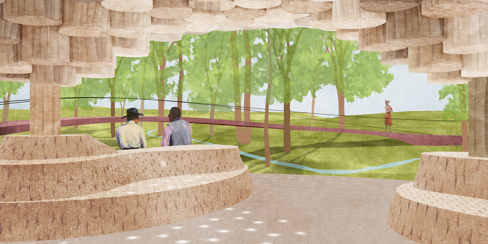
Interior of Thomas Sankara Memorial. Render by Kéré Architecture
Interiors: Thomas Sankara Memorial
The Memorial Thomas Sankara is a project to honor and commemorate the memory of the seminal 20th-century Burkinabè thinker, former president and change-maker Thomas Sankara. The design proposal for the memorial reflects the genesis of revolution. The aim is the integration of a structure into an existing landscape that places innovation at its fore. In this rendering, the studio visualizes the interior of the memorial tower, an 285 feet (87 meters) high urban landmark for the Burkinabè capital, a design that stands on the site of the 1987 assassination of Sankara and his comrades.
Visitors are invited to climb the structure using a helicoidal ramp. The path is purposefully long and demanding, emulating the call not to fear the challenging road to change. Tackling the winding route is rewarded with stunning views across the city from a unique vantage point, which also features a restaurant shaped as the contour of Burkina Faso. A suspended funicular cabin provides access to the summit for older people and other abled. This rendering view is used to emphasize materials, light and circulation — all central elements of the design.
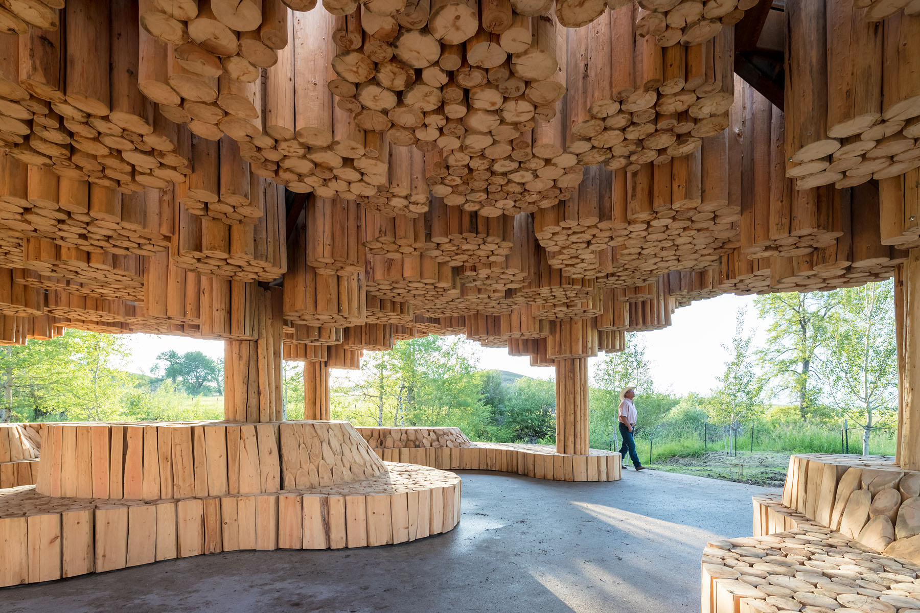
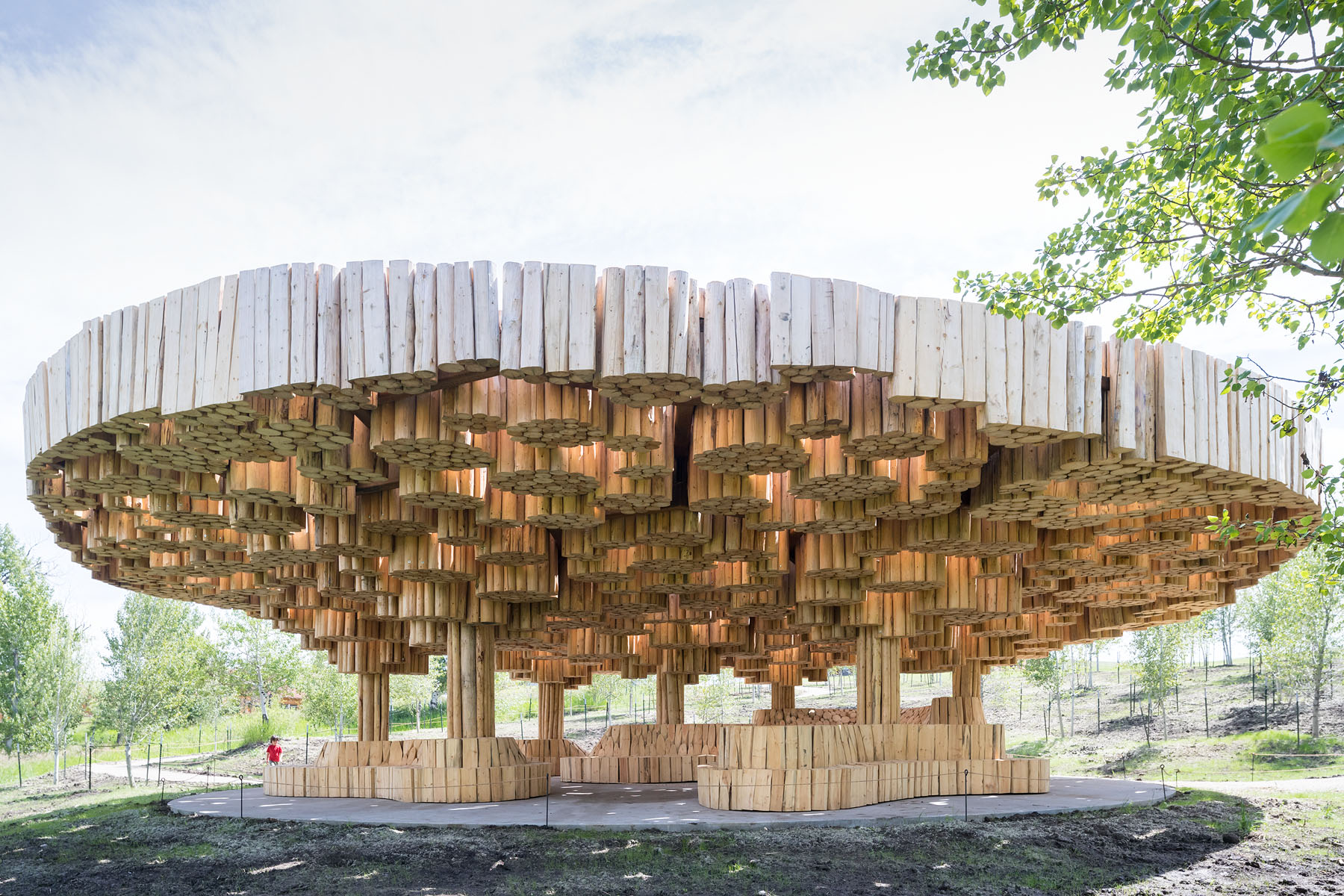
Xylem, Render by Kéré Architecture, photograph by Iwan Baan.
Early Concepts & Materials: Xylem
Kéré Architecture designed Xylem, the gathering pavilion for the Tippet Rise Art Centre, as a quiet, protective shelter. Named to evoke the vital internal layers of a tree’s living structure, Xylem is a place where visitors of this vast outdoor art space can gather to converse or sit and contemplate in solitude. Early renderings for the project show a much more playful and artistic interpretation of the finished design. Favoring illustration over realism, the renderings evoke layering that is much more conceptual than later renderings.
The logs of Xylem’s canopy are grouped in circular bundles within a modular hexagonal structure in weathering steel, supported by seven steel columns. The upper surface of the canopy is carved sinuously to blend into the surrounding hills. Simultaneously massive yet light, the roof is inspired by the tuguna, the sacred gathering space of many small Burkinabè communities. These low-level wood and straw shelters offer protection from the sun while allowing for ventilation.
Inside the pavilion, sunlight filters through the vertical logs, creating a soft play of light and shadow on the curvilinear seating and polished concrete circular platform below. The spatial complexity of the carved wooden seating elements encourages visitors to explore different views of the surrounding landscape.
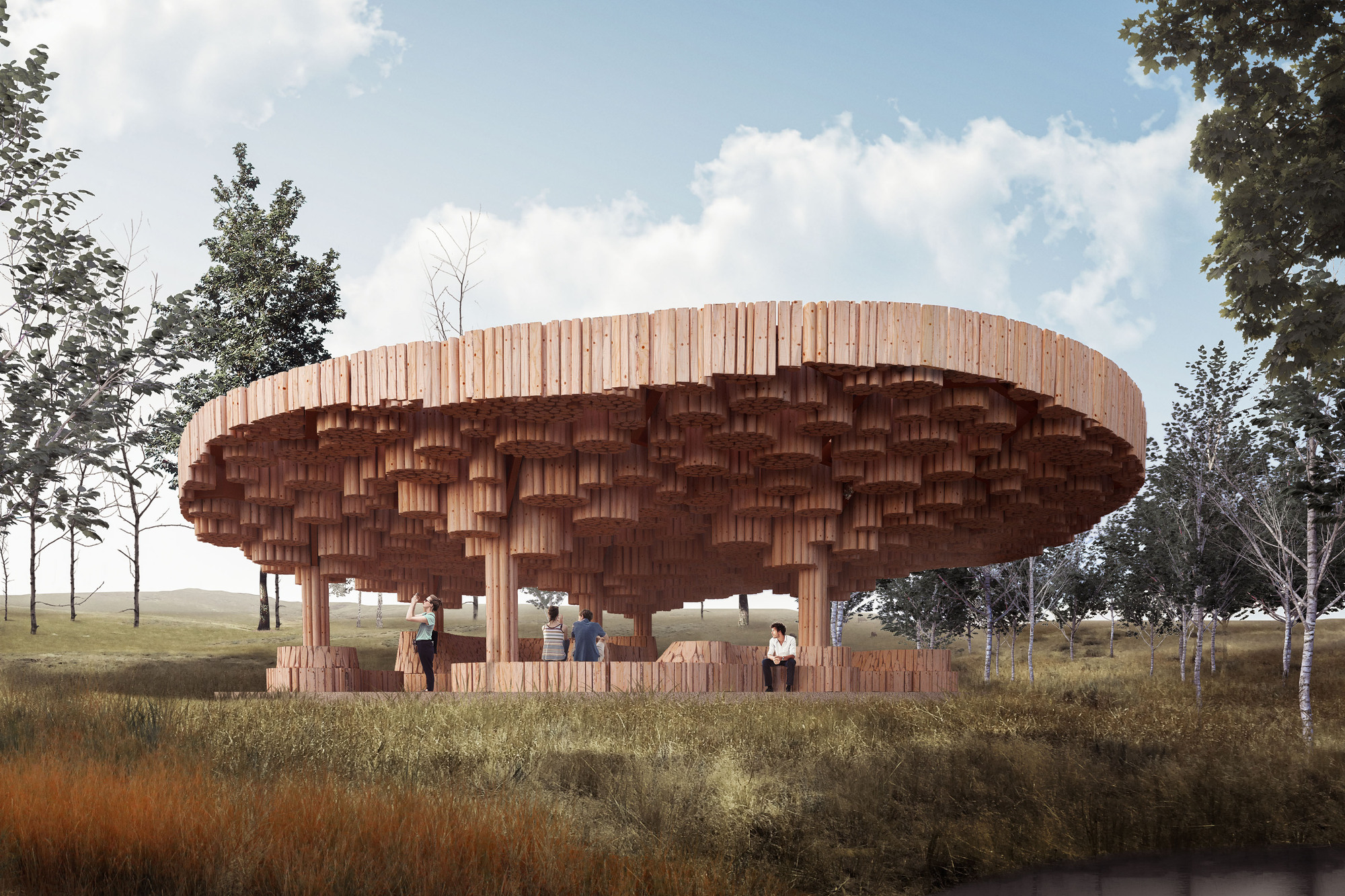
Xylem, Render by Kéré Architecture, photograph by Iwan Baan.
Design Development & Scale: Xylem
Later in the design process you can see how Kéré Architecture’s renderings evolve to a more realistic approach. This brings in scale, sky and photo-realism as an entirely different approach to illustration. Located in a slightly sunken landform between the main facilities of the art center and the start of the hiking tracks, the pavilion nestles in a clearing surrounded by aspen trees, facing a small creek. Entirely carved in wooden logs, the pavilion invites visitors into the heart of the trees. The sustainable pinewood used for the entire pavilion, locally sourced from a natural pruning process that saves forests from parasitic bugs, is used in its raw state.
For Kéré Architecture, the definition of local resources has many layers, all of which are tightly interwoven. The studio believes that to build in a particular location means to engage actively with all aspects of the building practices of that place. Perhaps the most significant local resource is the existing built heritage, which teaches us how to adapt to our given context. In the work of Xylem and the render process, you can see how the studio strongly believes that a comprehensive understanding of local resources grounds each of their projects in its specific site and context.

Waterfront of the Niamey Nyala Masterplan. Render by Kéré Architecture.
Masterplans: Niamey Nyala Masterplan
Not only does Kéré Architecture work at the scale of architecture and pavilions, but also masterplans. The Niamey Nyala Masterplan puts forward a new vision, based on the premise of transforming the city by harnessing the hugely untapped potential of its riverbanks. The plan intends to create a network of public spaces along the Gounti Yéna (a tributary of the Niger River flowing through the city from south to north) and the Yantala Corniche on the left of the river, promoting Niamey’s biodiversity. The studio’s rendering for the masterplan combines an aerial view of the river and city superimposed with textures, architecture and infrastructure for the new project vision.
Along the Yantala Corniche, the existing tree nurseries and market gardens are reorganized to integrate recreational areas. In turn, the illustration shows how housing is planned along the riverside to slow the city’s expansion into the desert, as well as water transport to improve the connection between various points along the banks. The promenade planned along the Gounti Yéna waterway is combined with a series of waste stabilization ponds that filter the water through plants and sand. At the heart of the masterplan, a pedestrian bridge connects the two main promenades and spans the ring road, offering Niamey’s citizens a new vantage point over their city and its river.

Façade of the TUM Tower. Render by Kéré Architecture.
Large-Scale Landmarks: TUM Tower
At the start of 2019, Kéré Architecture was commissioned to design a multi-use civic centre at the heart of the Technical University of Munich’s Garching research campus. Complementing the science facilities, this new central hub aims to promote cross-pollination between the public, faculty, alumni, students and researchers of various disciplines. The rendering especially showcases how each terrace is brought to life by the green façade, which serves as the building’s natural climatization system.
The design explores the organic and flexible possibilities of geometric forms, starting from the simple square. The TUM Tower includes a 360° view of the campus, made possible by the 22.5° rotation of a squared plan around its core axis. Acting as a landmark visible from afar, the TUM Tower brings the form of the campus’s functional architecture to new light. It playfully evokes both the essence and shape of the Bavarian maypole or Maibaum tradition – an annual celebration of communal gathering around a soaring tree-like structure.
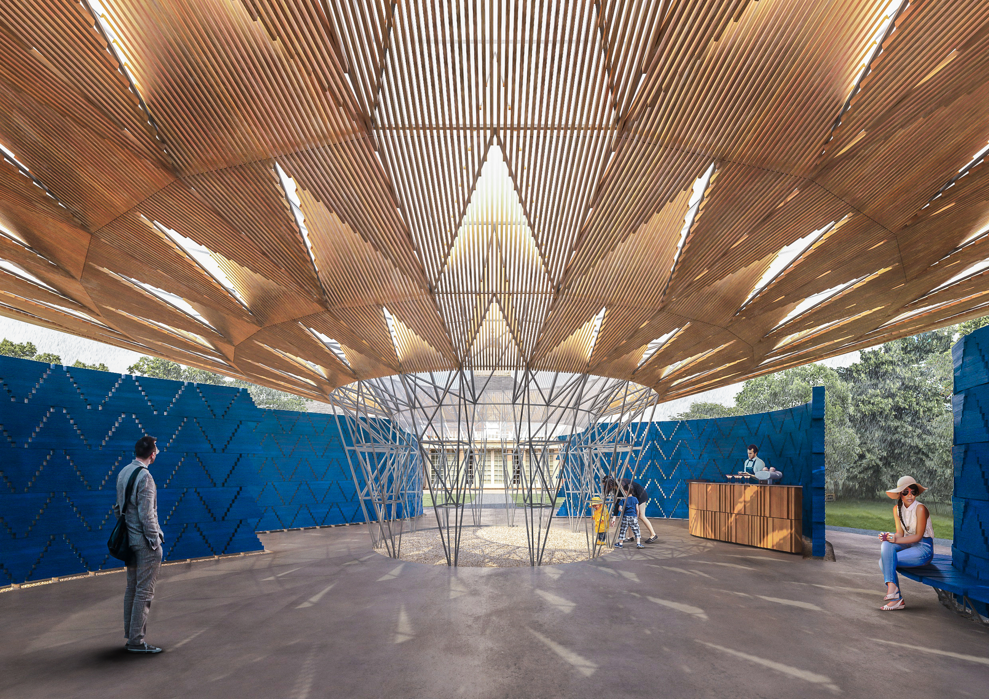

Interior of the Serpentine Pavilion. Render by Kéré Architecture, photo by Iwan Baan.
Pavilions & Light: Serpentine Pavilion
Since 2000, the Serpentine Galleries annually commission an international architecture practice to design the Serpentine Pavilion in Kensington Gardens, London. In 2017, they chose Francis Kéré. Taking inspiration from the great tree in his hometown of Gando, under which members of the community meet to reflect on the day, Kéré’s design is based on creating this sense of community while connecting people with nature. A great overhanging roof canopy made of steel and a transparent skin covers the entire footprint of Kéré’s Serpentine Pavilion, allowing sunlight to enter the space while also protecting it from the rain.
Not only does this rendering showcase the materials and vision for natural light, but it also points to a larger approach to pavilion design. The project is defined by wooden shading elements that line the underside of the roof, creating a dynamic shadow effect that changes with the movement of the sun and clouds. The wall system is made of prefabricated wooden blocks assembled into triangular modules with slight apertures, giving a lightness and transparency to the building enclosure. The curved walls are split into four fragments, allowing four unique access points to Kéré’s Serpentine Pavilion. Completely detached from the roof canopy, these elements allow both the air and visitors to freely circulate.


Façade of the Benin National Assembly. Render by Kéré Architecture.
Architecture & Facades: Benin National Assembly
Having outgrown its current building, which dates back to the colonial era of its past, the parliament of the Republic of Benin has entrusted Kéré Architecture to design a new national assembly that will embody the values of democracy and the cultural identity of its citizens. The project takes inspiration from the palaver tree, the age-old West African tradition of meeting under a tree to make consensual decisions in the interest of a community. Here, an approach to rendering not only accentuates the conceptual idea and brings it to life, but also tells a story of structure and the building façade.
The assembly hall is defined by the dynamic reach of the structure. The crown is comprised of offices and auxiliary functions, set back from the deep façade, which filters the sunlight. The trunk is hollow, creating a central courtyard that allows circulation spaces to be naturally ventilated and indirect light to penetrate the plan. A spiral staircase in its center connects the assembly hall on the ground floor to the offices above. In the southeast corner of the site, a public square marks the civic façade of the building, across from the former national assembly where Benin’s independence was historically declared.
The 10th Annual A+Awards is still accepting entries! New this season, firms can gain recognition for their entire portfolio of work thanks to the addition of the new Best Firm categories celebrating practices of all sizes, geographies and specializations. Start your entry today.


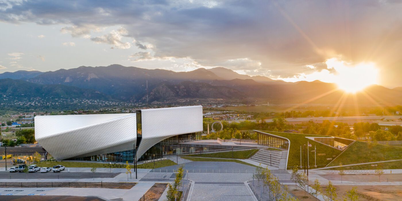
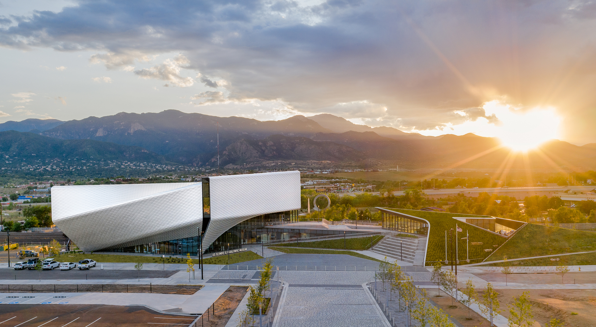
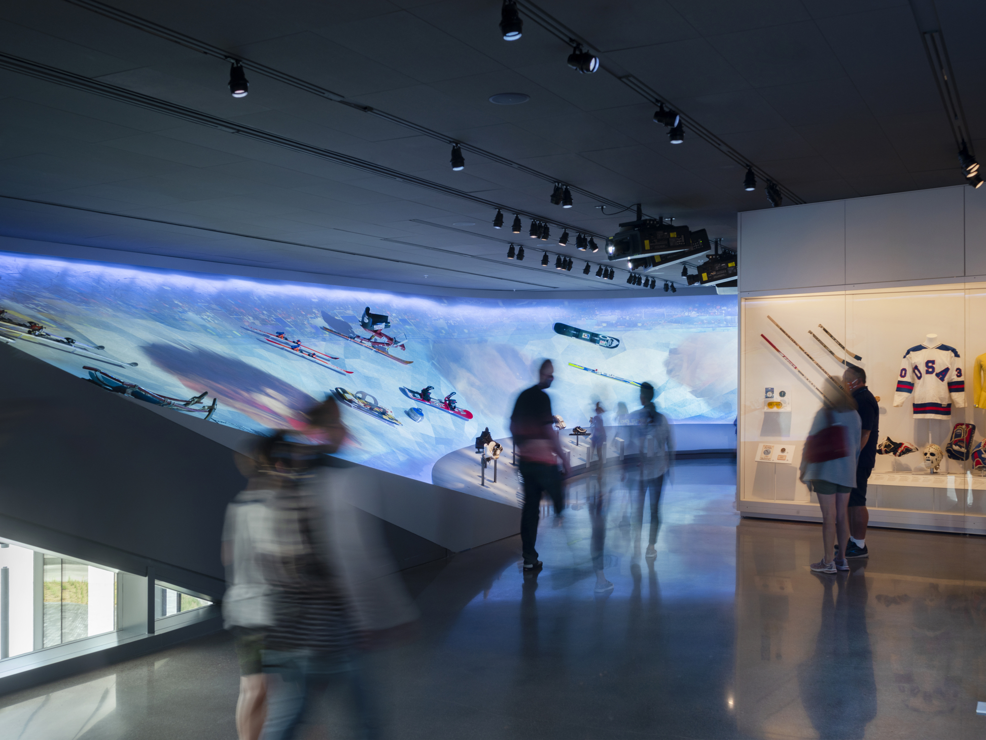
 Ten years in the making, the United States Olympic and Paralympic Museum (USOPM) opened in 2020 as the first building of its kind to pay tribute to Olympic and Paralympic movements. The 60,000 square foot design features galleries, a state-of-the-art theater, event space and café, and was inspired by the energy and grace of Team USA athletes and the organization’s inclusive values.
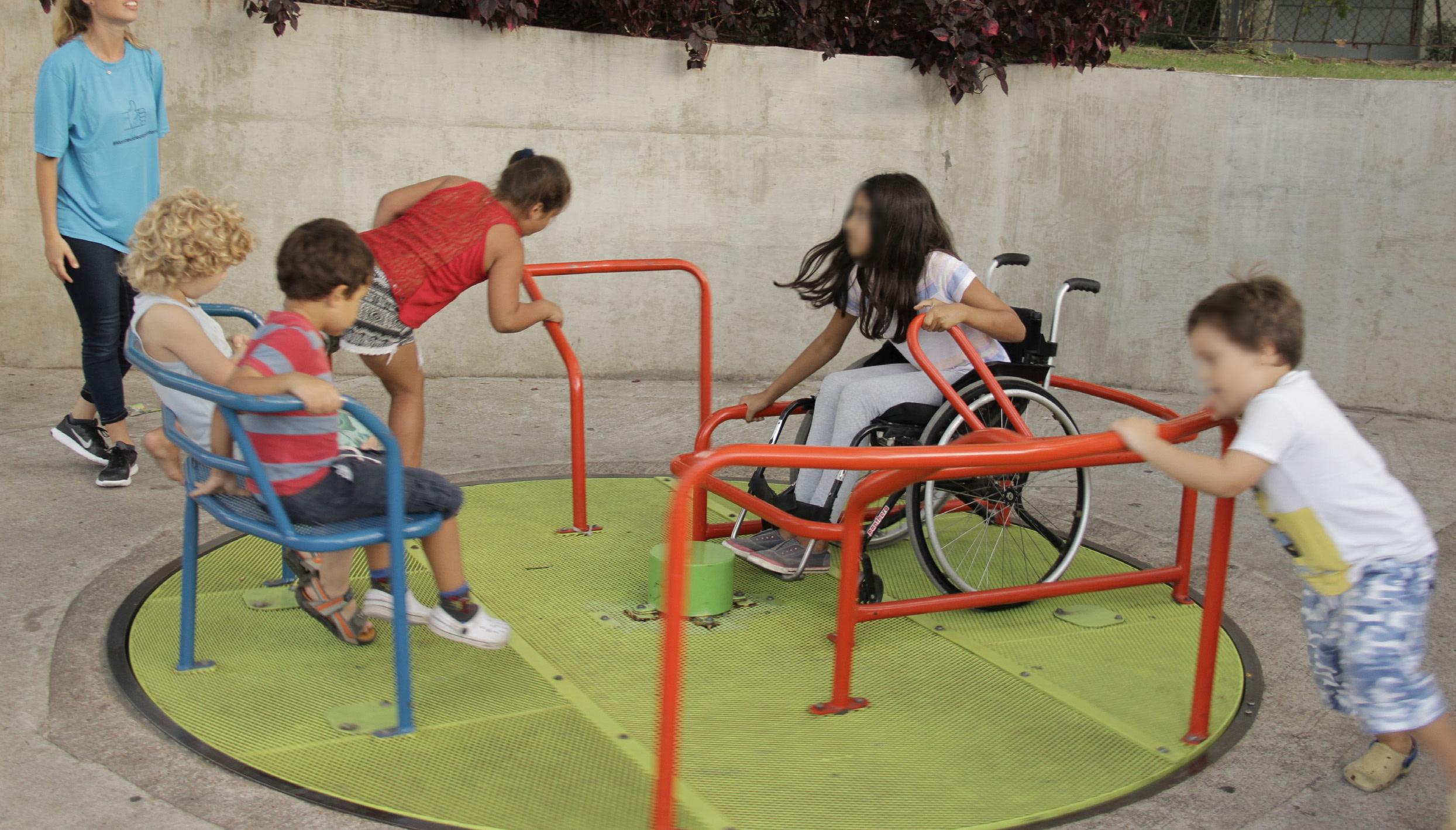
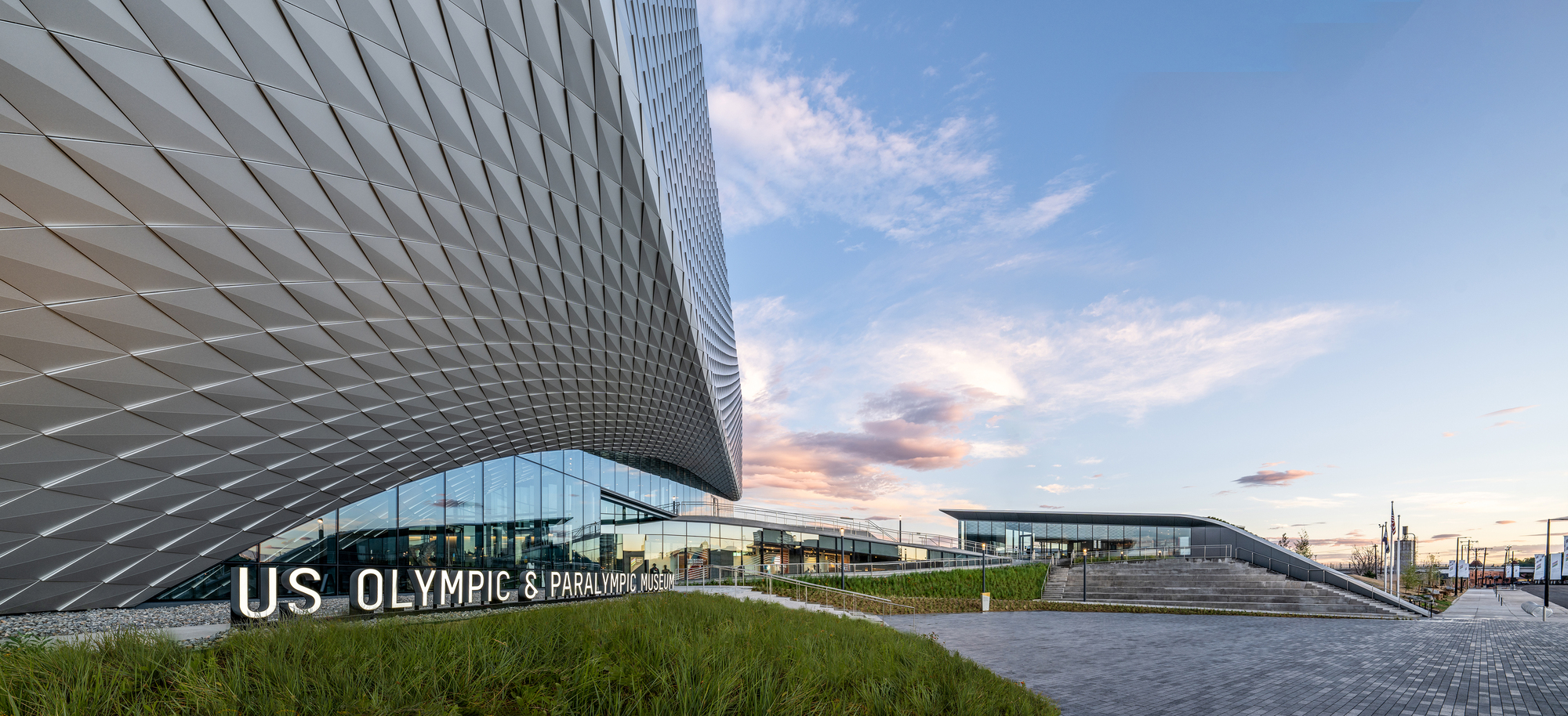
 From the earliest stages of design, the team consulted Team USA athletes, including Paralympic athletes and persons with disabilities, to ensure the most authentic and inclusive experience. Ramps guide visitors down a gentle-grade downhill circulation path that enables easier movement. These ramps have been widened to 6 feet to accommodate the side-by-side movement of two visitors including a wheelchair.
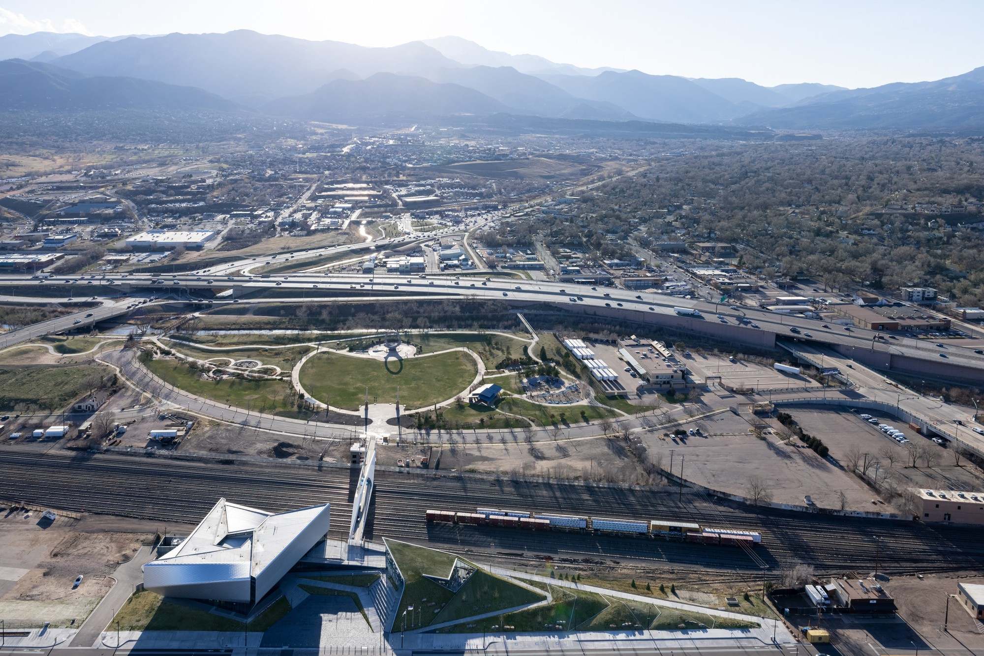
 Outside, a terraced hardscape plaza is at the heart of the museum complex, with the museum building to the south and the café to the north. In addition, the Park Union Bridge is a 250-foot curved steel structure that floats above an active railyard. Two interlocked loops, stretching from either side of the railyard, connect the museum and America the Beautiful Park.
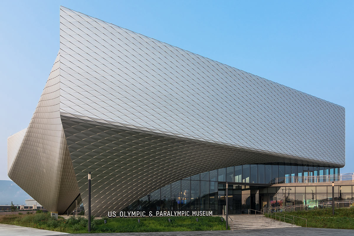
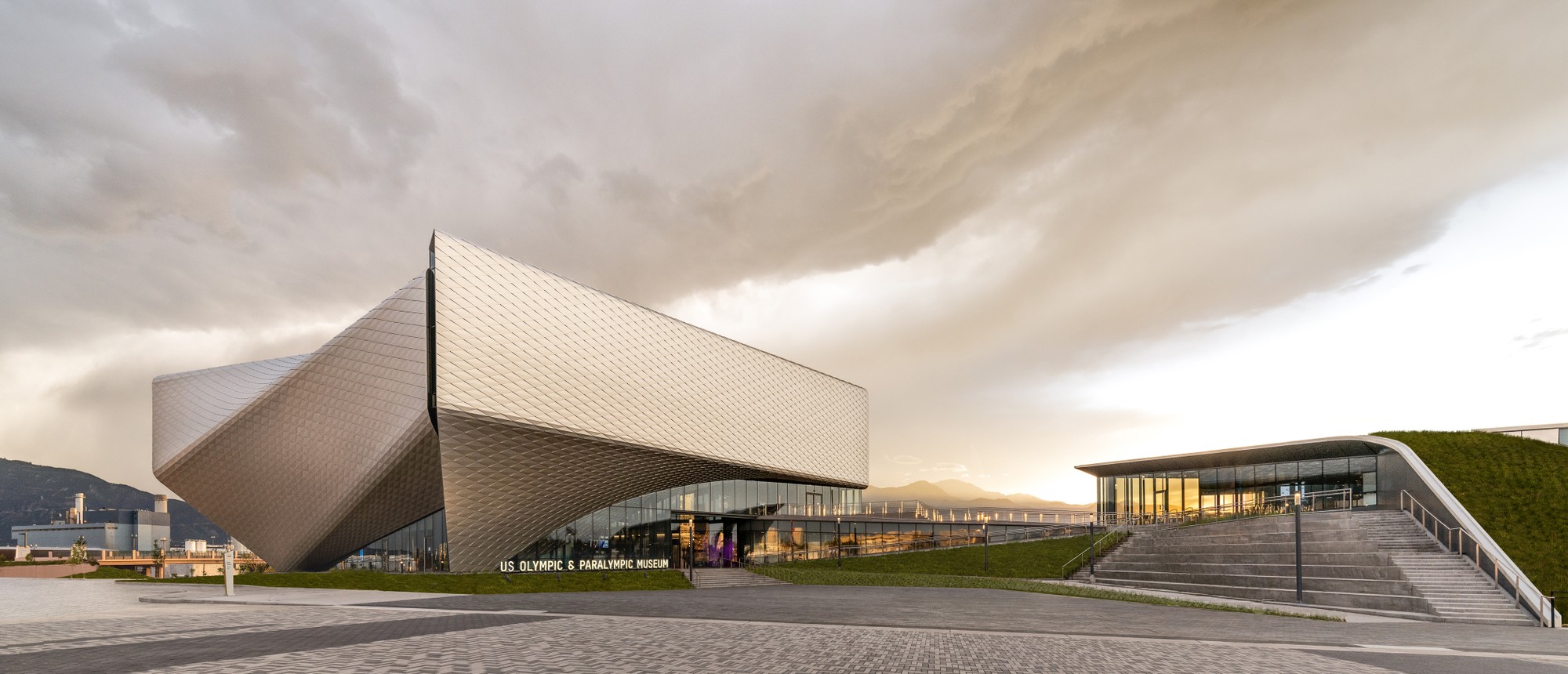
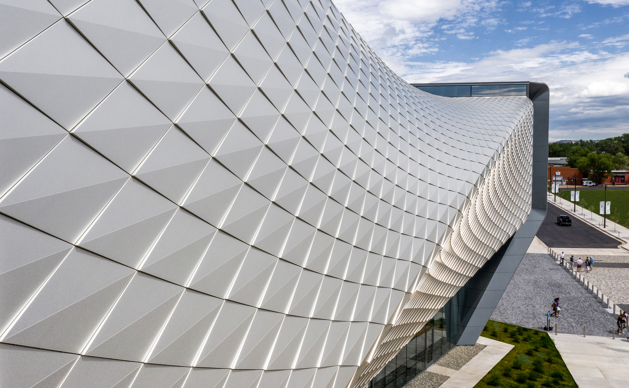 Diller Scofidio + Renfro worked with Lorin Industries on the aluminum panels, as well as MG McGrath and Oldcastle BuildingEnvelope on the curtain walls. Bringing the vision of the building’s exterior to life, the teams wanted to create a building structure and overall exterior visual effect that encapsulated the passion, dedication, and endurance of an Olympic athlete. To achieve this, a system of custom metal panels with integrated gutters wrap the double-curved geometry of the façade.
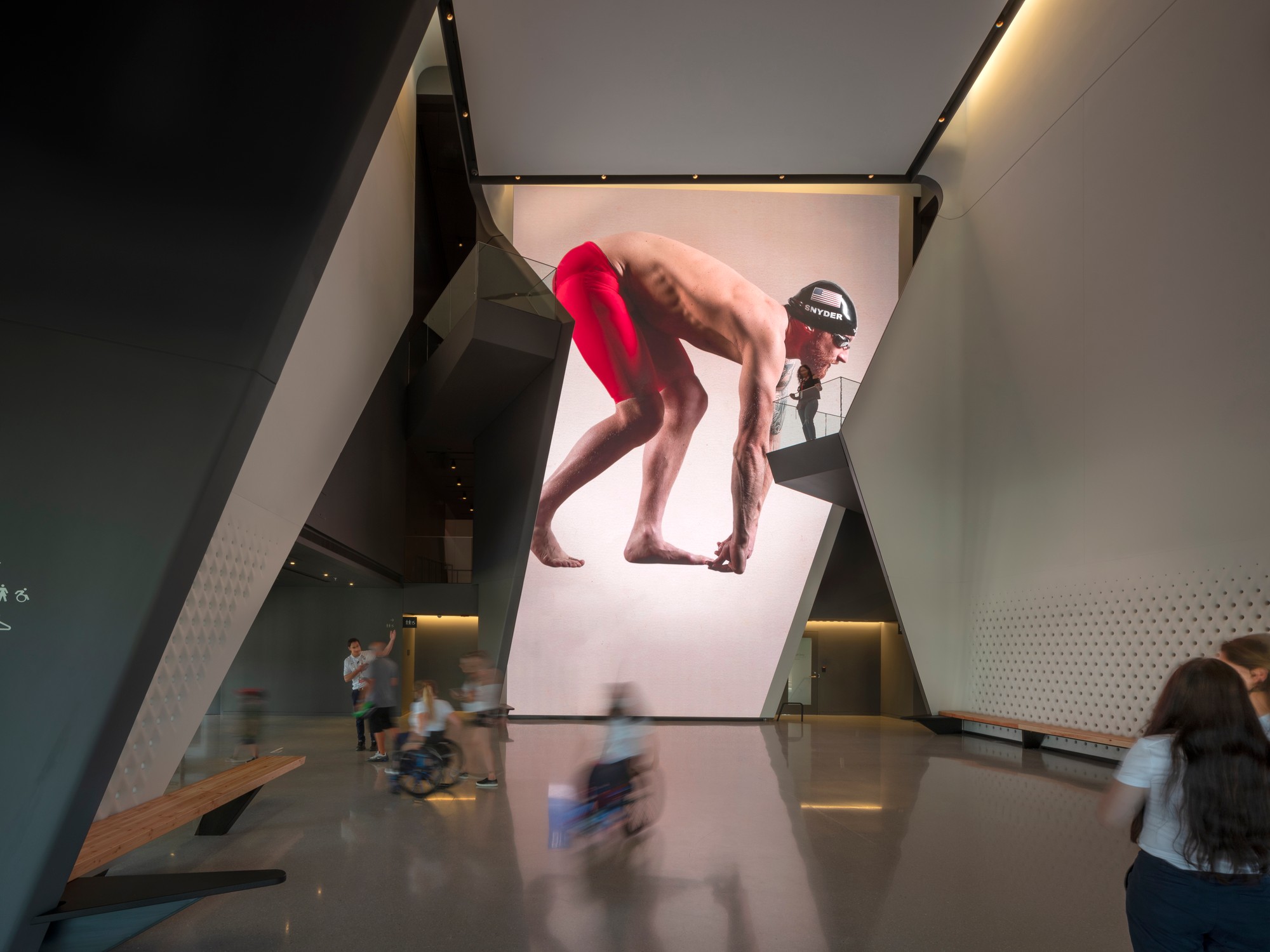
 Lorin pioneered the coil anodizing process, which protects the aluminum while also improving its aesthetic properties and durability. The panels are 100% recyclable helping to meet the project’s LEED requirements. Lorin’s anodized stainless finish is created by an electro-chemical process that builds an anodic layer from the aluminum, molecularly bonding it to the surface. It protects aluminum from oxidation, scratching, and other hazards far better than natural oxidizing, and it requires minimal upkeep while resisting scratches and finger prints. Even with its light weight, coil anodized aluminum has an exterior surface hardness second only to diamond and is therefore unmatched in abrasion resistance and durability.
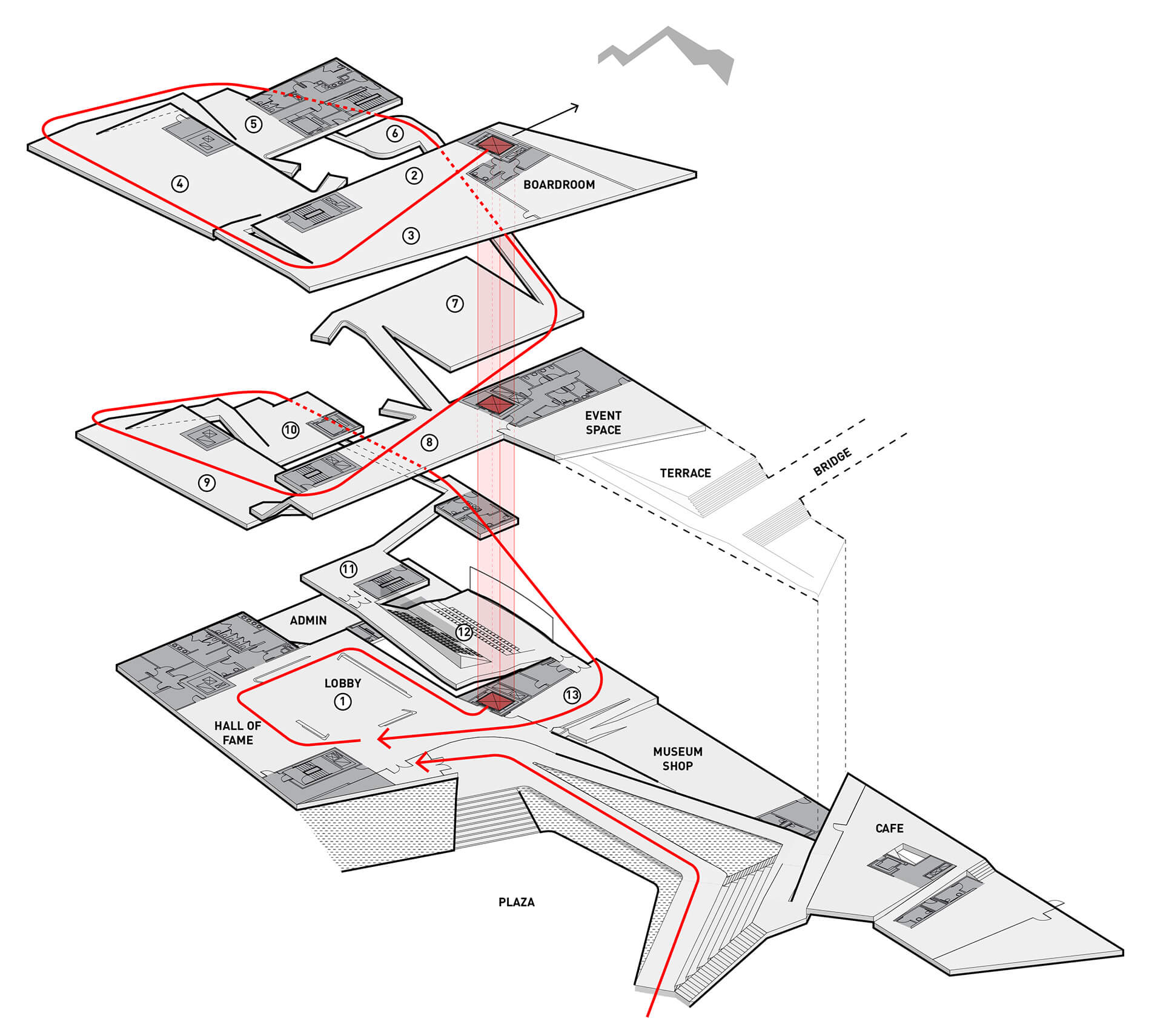
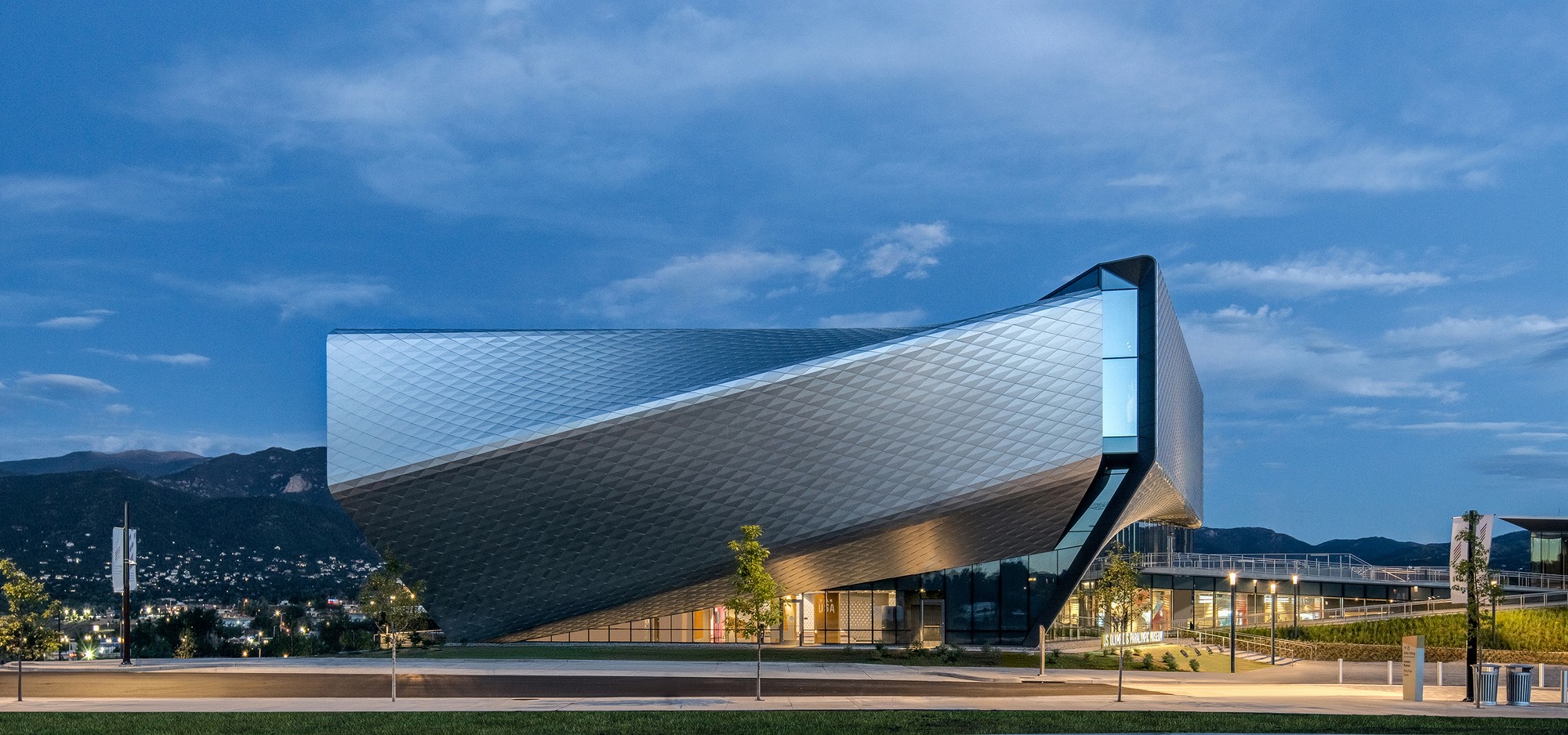 Putting Team USA athletes at the center of the museum experience, the design team created a museum that’s as functional and accessible as it is beautiful. The design rises with the primary structural systems consisting of a steel frame superstructure, drilled shaft caisson foundations, and cast-in-place concrete lateral cores. From this, the exterior shell further accentuates the dynamism of the building concept and purpose, with each metallic panel animated by the extraordinary light quality in Colorado Springs, producing gradients of color and shade that give the building another sense of motion. If great architecture reflects a common purpose and creates rich experiences, this is certainly the case in DS+R’s United States Olympic and Paralympic Museum.
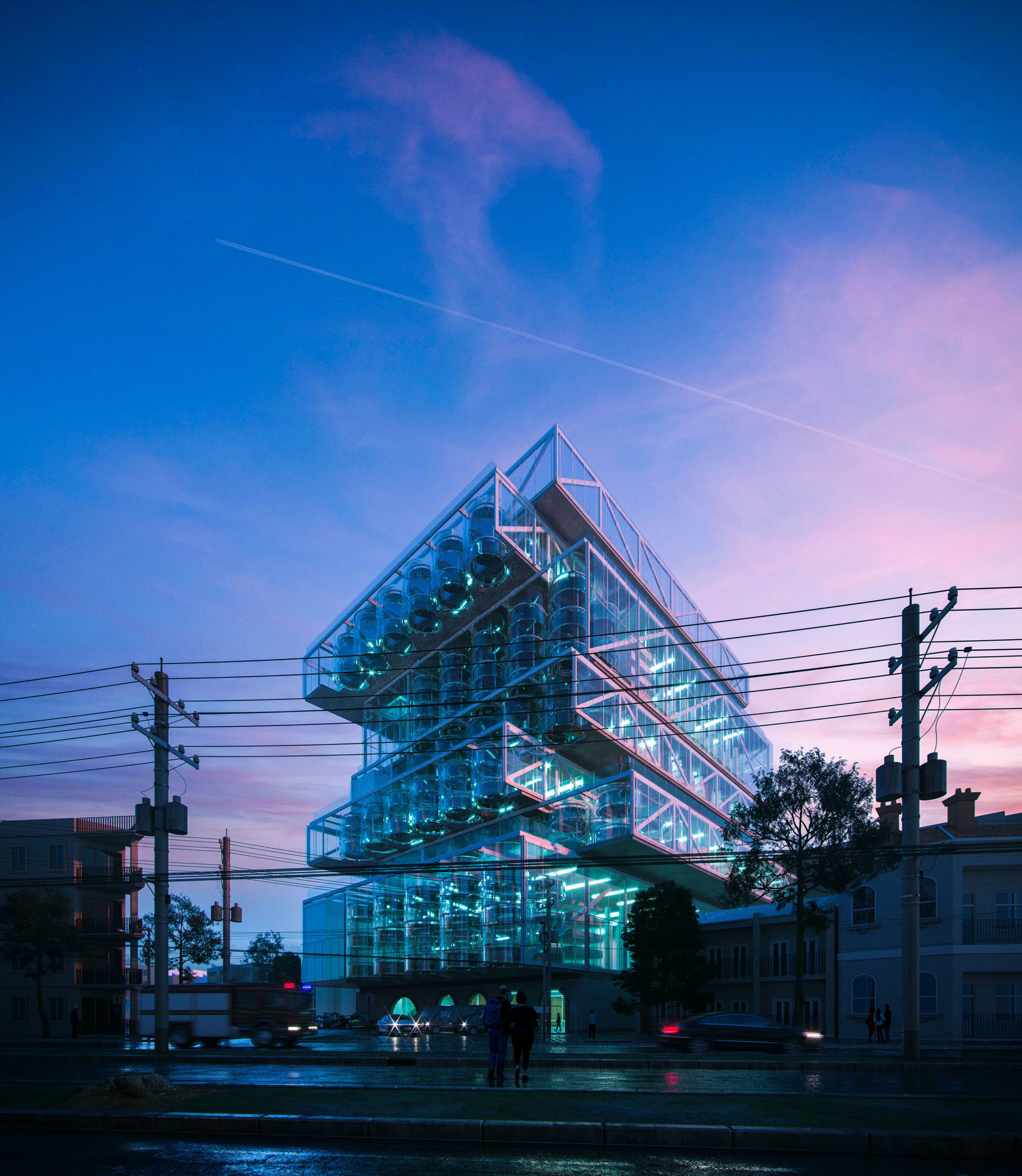
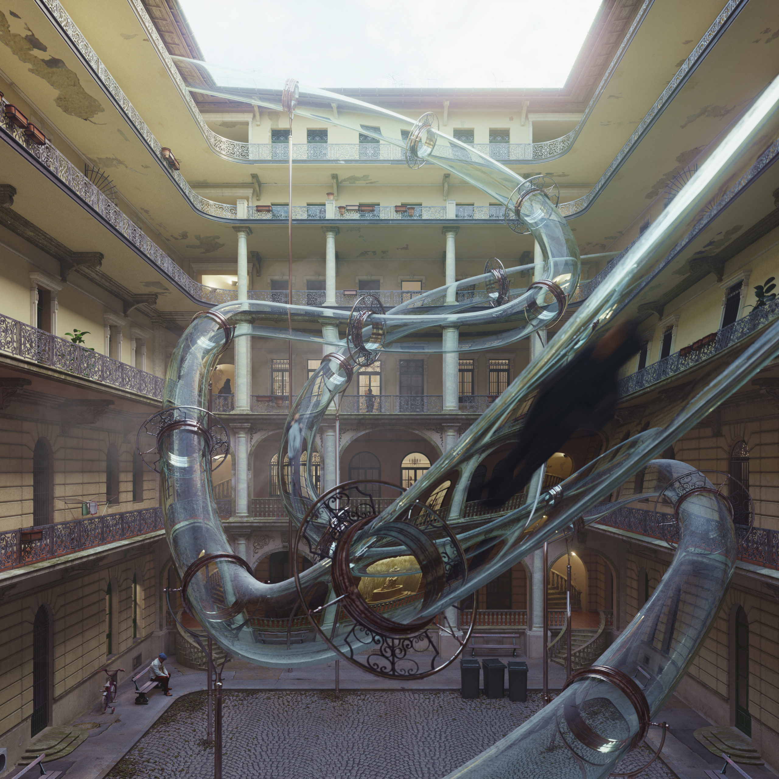
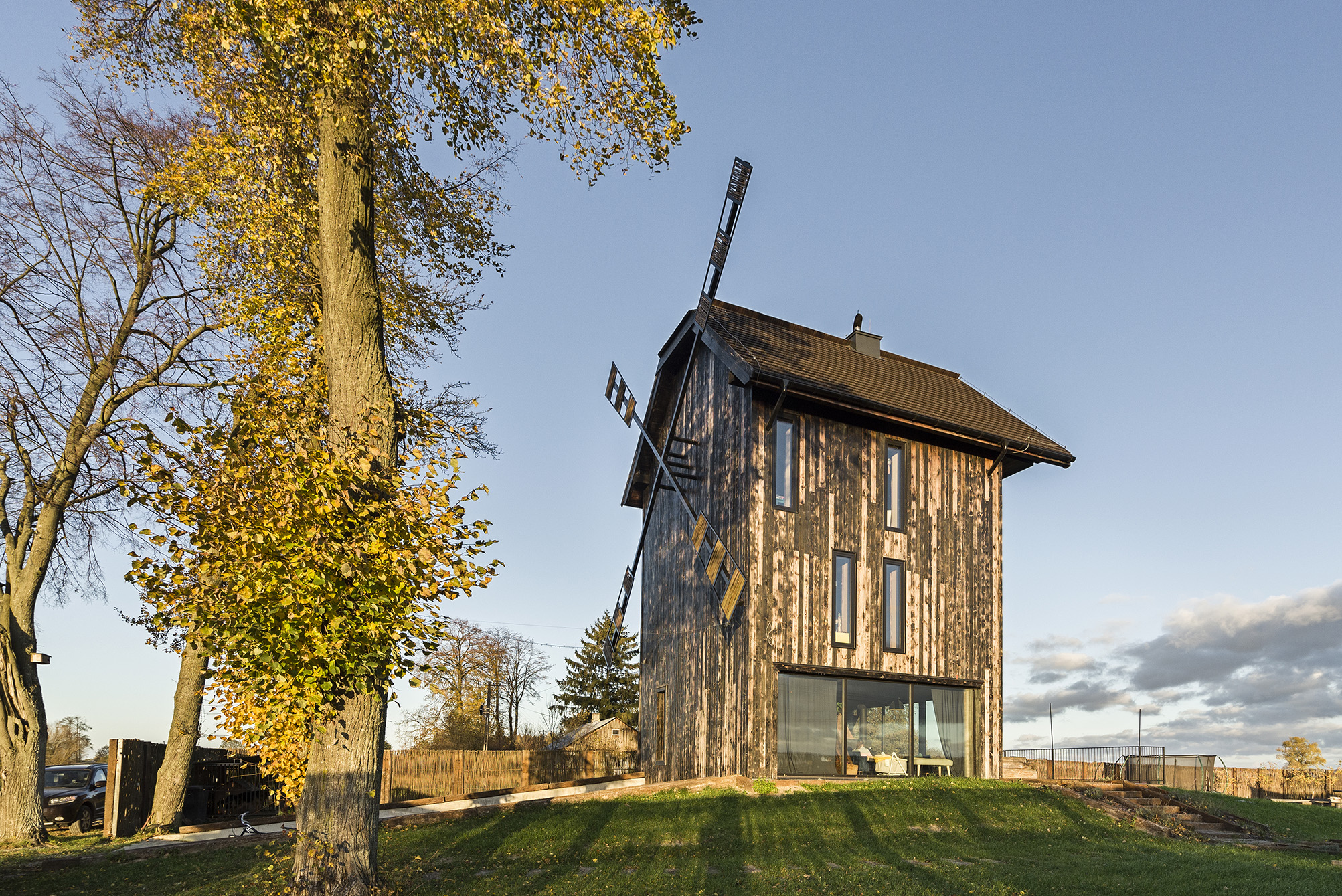
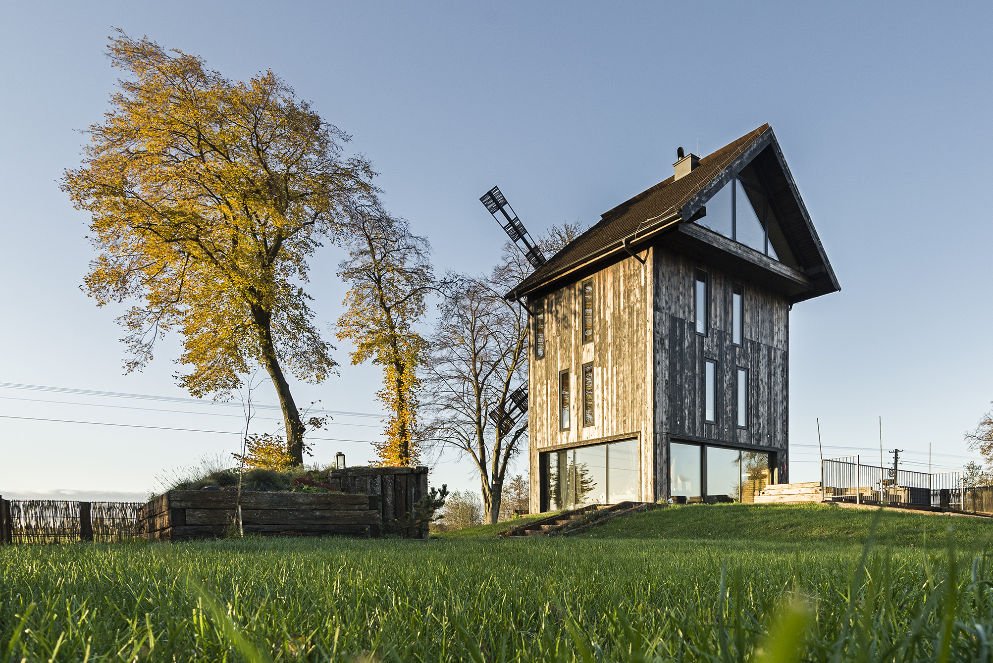
 Floating Vestiges by Timlok Li
 The House of the Rising Sun
 Joint Structures
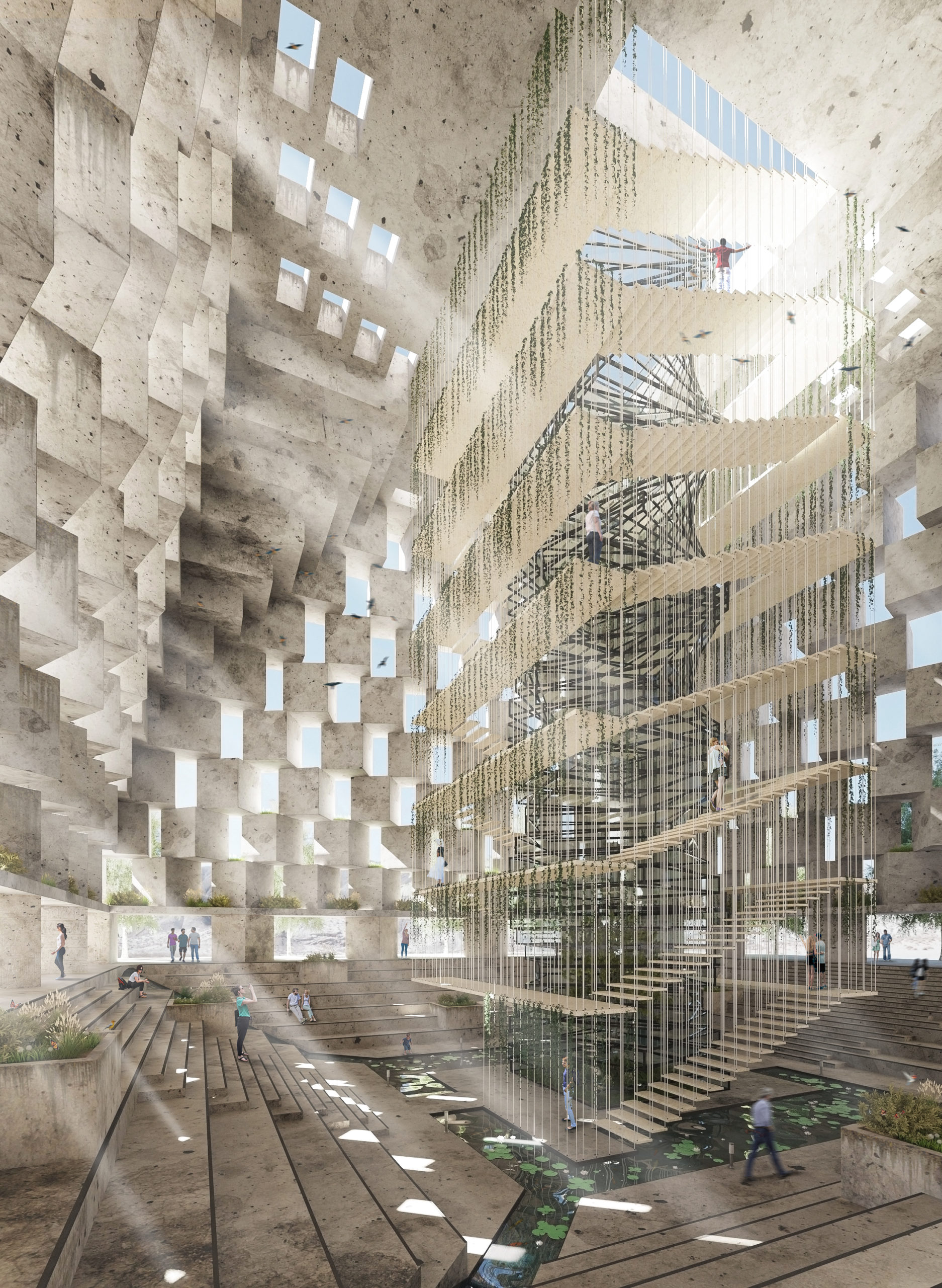 The Oasis
 ISAURA, A city that moves entirely upward
 The Crevasse
 Enter the Garden
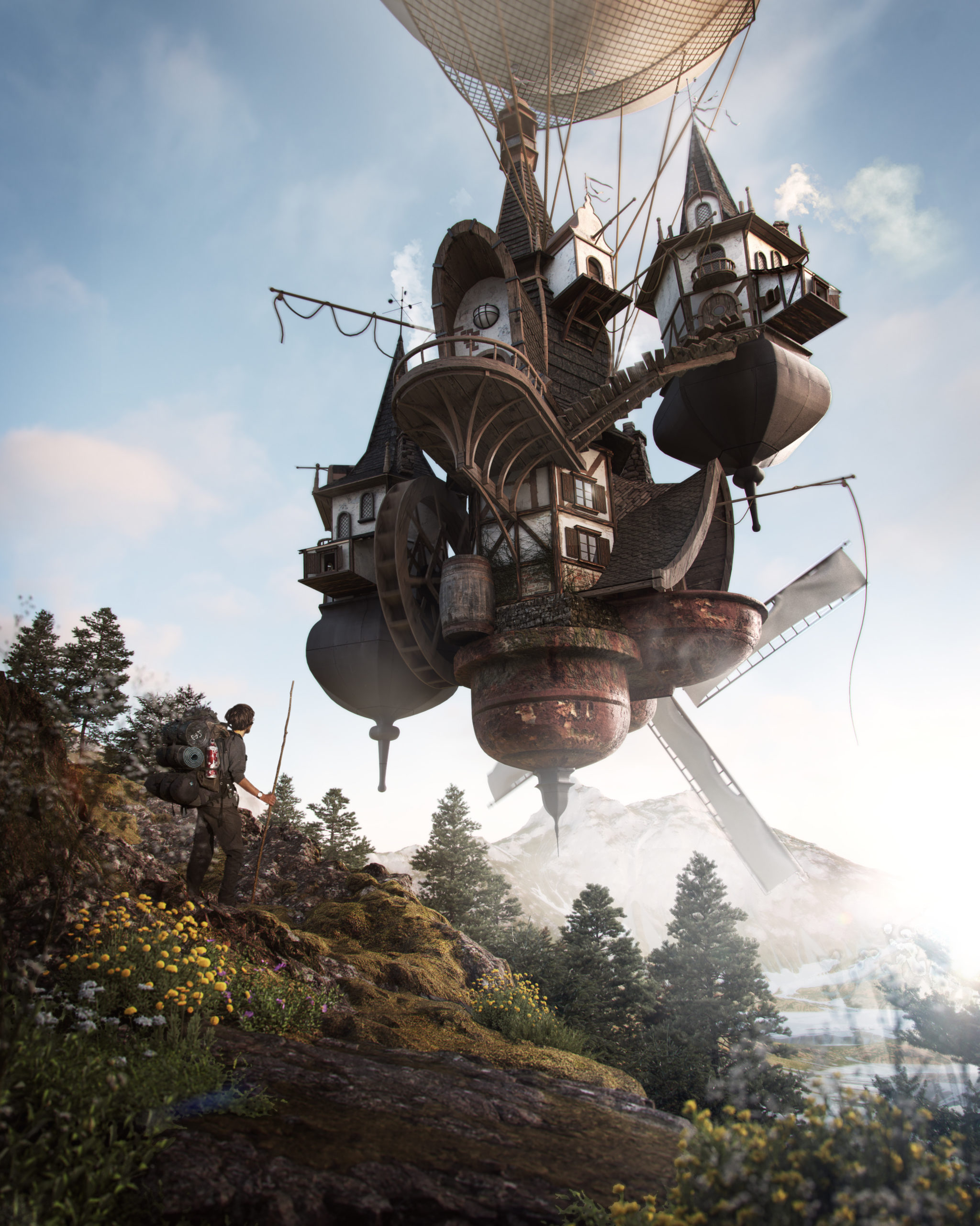 Solivagant No More