Multifunctional plywood structures that create spaces for sleeping, storage and drinking tea feature in this compact apartment in Beijing designed by Rooi.
Rooi aimed to create a unique apartment in the block of thirty-six identical units that was built in 1950 to provide accommodation for the families of workers employed at a nearby research institution.
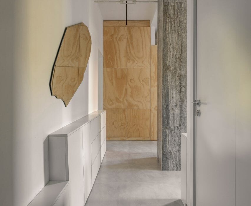
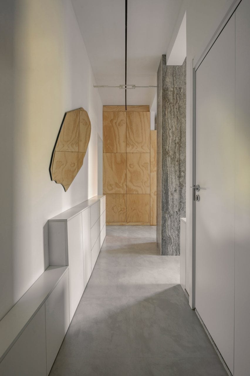
Top: the apartment is located in a 1950s housing block. Above: one of its original columns was clad in stone and turned into a feature
At the time the apartment was built, China faced an influx of people moving to its cities, meaning that living spaces were often tight.
“There was no living room, no dining room or shower in each household,” Rooi explained.
“This type of layout represents the standard post-war Chinese apartment.”
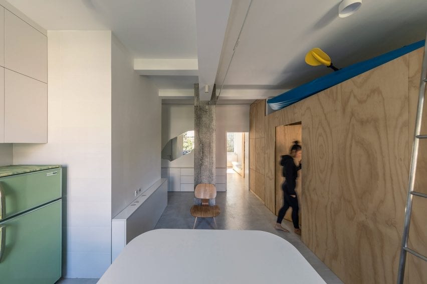
Rooi created an open-plan area for cooking and dining with a work table at its centre
As the cost of tearing down old buildings is so high in Beijing, Rooi was tasked with coming up with a modern but economical apartment concept, called T101, that could be replicated in each of the 36 units to make them more private, functional and livable.
“The project’s core was to find a way to adjust the old collective residence into modern city life and retain its previous structure, recovering the degraded green areas,” said ROOI.
“The budget was limited to ¥150,000 [£16,800] per apartment and T101 would be the first experimental renovation example.”
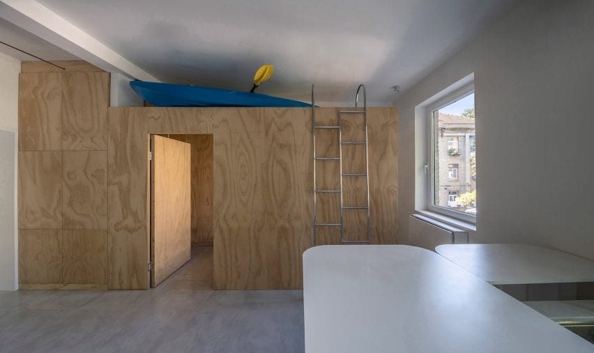
A modular birch plywood unit can act as a reception, tea room or temporary guest room
Rooi came up with a floor plan that incorporates a bedroom, living room, kitchen, dining room and bathroom all within the unit’s tight 50-square-metre footprint.
Designed to appeal to the city’s college students and white-collar workers, the layout features an open-plan area for cooking and dining with a work table at its centre.
This area provides enough space for residents to receive guests, work from home, relax in an armchair or exercise.
Bulk items such as sports equipment can be stored on top of the plywood module
An original column is positioned in the centre of the space and has been clad in stone to protect it and turn it into a design feature.
Running along one side of this flexible space, an enclosed north-facing structure made from birch plywood serves as a reception, tea room or temporary guest room.
Above the wooden enclosure, a large storage area can hold suitcases, outdoor sports equipment and other bulky items. A small toilet and a shower room are located on the opposite side of the space next to the apartment’s entrance.
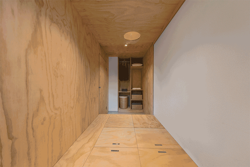
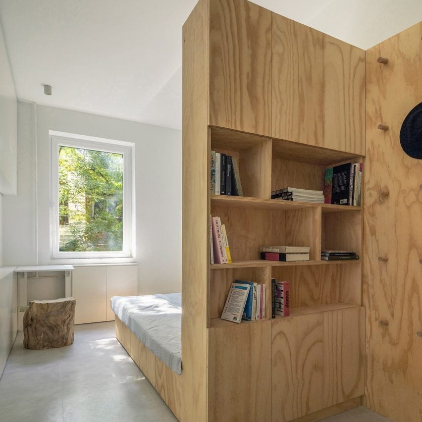
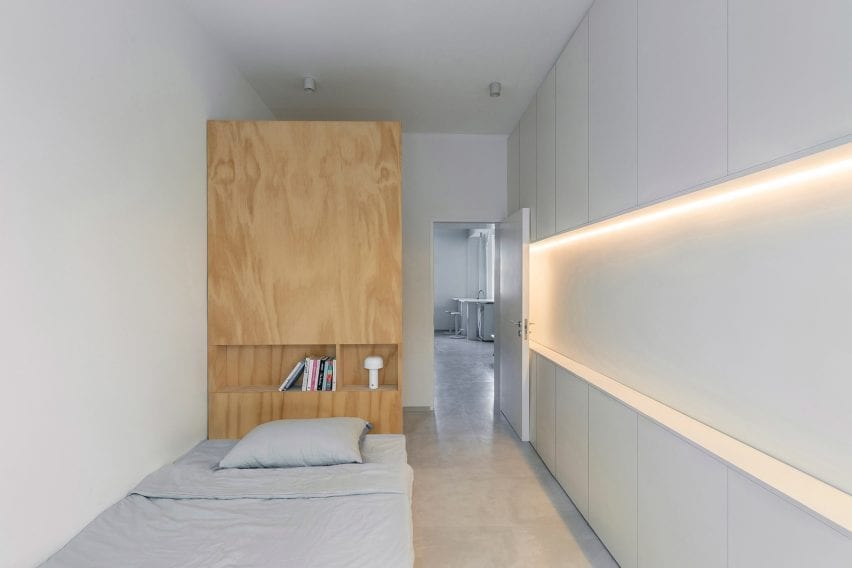
The bedroom is separated from the rest of the apartment and features a custom plywood bed with shelving built into its tall headboard, while a compact desk is located next to the window. The walls are lined with slim cabinets for additional storage.
Neutral colours and materials were chosen throughout so that the owners can put their own stamp on the interior.
A bookcase is integrated into the head of the bed
“The apartment was designed as open as possible and functionally very compacted,” the architecture studio told Dezeen.
“Natural materials and colour have been used throughout the design to create a comfortable and peaceful feel in contrast with contemporary city life.”
The bedroom is separated from the rest of the flat
Elsewhere, design studio I IN has created concept apartment in Tokyo to reframe the way that Japanese homeowners perceive renovated apartments.
Design studio Daytrip looked to Margate’s dramatic beach landscape when designing this shop for the Turner Contemporary gallery, which sits perched on the town’s seafront.
The David Chipperfield-designed gallery, distinguished by its opaque glass shell and expansive ocean views, recently reopened after a renovation project that included the shop along with a new cafe and common areas.
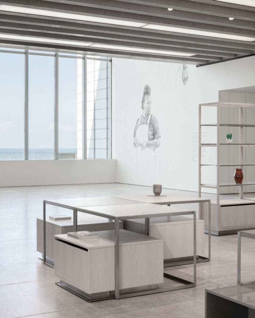
The revamped Turner Contemporary store looks out over Margate beach (top and above)
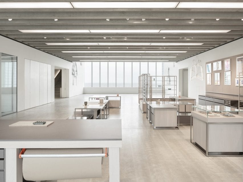
Located in the lobby, the shop’s existing retail shell was designed to be highly flexible and to reflect the building’s gallery spaces, with poured screed flooring, linear glazing and a prominent ribbed concrete ceiling.
Daytrip designed a new fit-out for the store that reflects both the building’s architecture and the lifelong admiration that the gallery’s namesake, landscape painter JMW Turner, held for Margate and its surrounding landscape in southern England.
Pigment-dyed timber panels were inspired by Margate beach
“As we began putting materials together for the scheme, we wanted to capture the light and patterning of the beach,” Daytrip studio co-founder Iwan Halstead told Dezeen.
“Margate beach and its seafront changes dramatically from season to season. As the tide pushes out, the beaches transform into radical landscapes of striation and patterning,” he added.
“On a sunny day, the rippled beaches are captured with shadows and glistening pools of water. We also noticed the effect of the salt spray and rainwater on the metal architectural elements – a dappled weathering effect that adds natural patina and cloudy lustre to the exterior.”
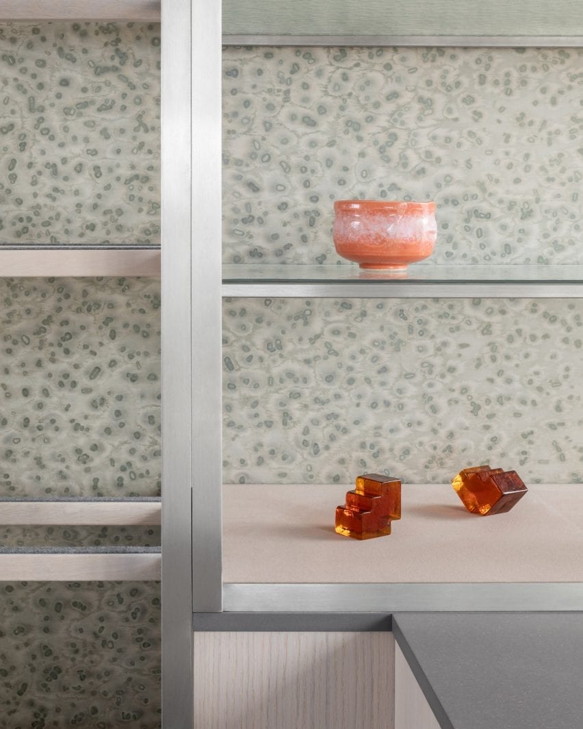
Display stands are backed with clear, textured fibreglass
This natural texture is referenced in the mottled grey veneer panels that line a portion of the walls.
Their unique, painterly pattern was created using a method developed by Berlin studio Llot llov, which involves covering pigment-dyed timber with salt crystals that absorb a portion of the colour.
“It felt naturally appropriate and subtle enough to line the display wall of the gallery and a number of the tables’ surfaces,” said Halstead.
“We paired this with textured cathedral glass shelving, chosen for its fluid, water-like appearance that allows light to transfer dappled shadowing on the veneered surfaces and the existing Chipperfield concrete floor.”
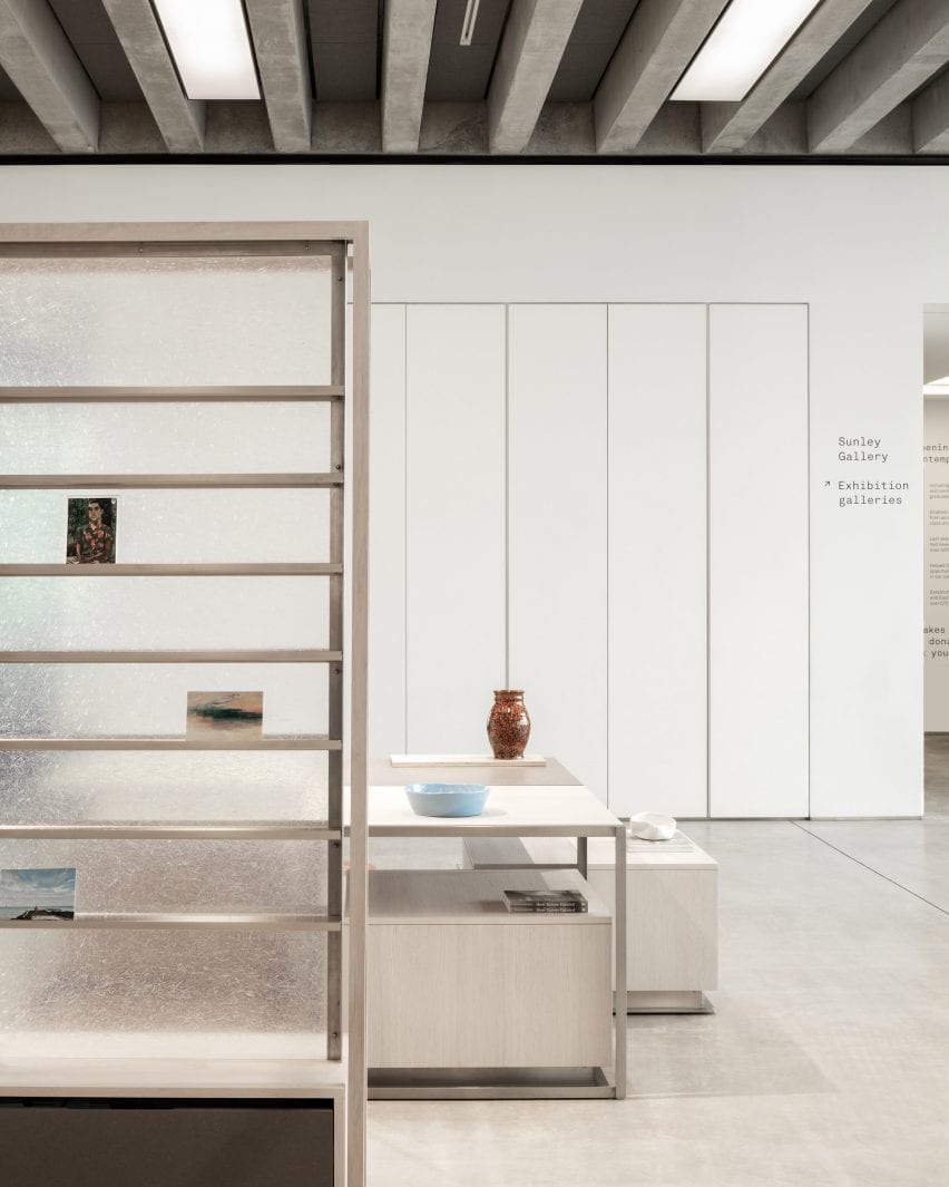
All of the elements in the store can be moved to make space for events
A vertical shelving system, which showcases artworks, prints and posters, is backed with a translucent layer of fibreglass.
“Its inherent gossamer nature when illuminated by the sunlight creates beautiful patterning and highlights its fibrous textures – cloudy and ethereal – like many of JMW Turner’s artworks,” Halstead explained.
The store’s furniture was constructed from “humble” materials such as grey Valchromat – a wood fibreboard that is treated with several coats of lacquer to create a high, reflective sheen. This is paired with matt, white-oiled oak, which the studio chose for its sandy hue.
Rippled glass shelves reflect the light streaming in through the panoramic windows
Daytrip’s renovation also includes the creation of a merchandising system based on the approach of a magazine editorial.
The display tables and plinths can be organised into formations that create narratives with and around the products, linking back to Margate’s wider creative community and its makers.
The building’s ribbed concrete ceiling is left exposed
The display system also includes a workbench that is used for group discussions and workshops and invites visitors to congregate. All of the fixtures can be moved to accommodate large-scale events and talks.
Previously, Daytrip has created an eclectic office for a media company in London’s Clerkenwell and renovated a five-storey townhouse in Clapton.
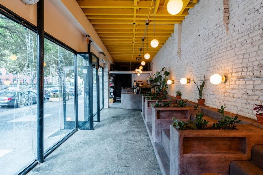
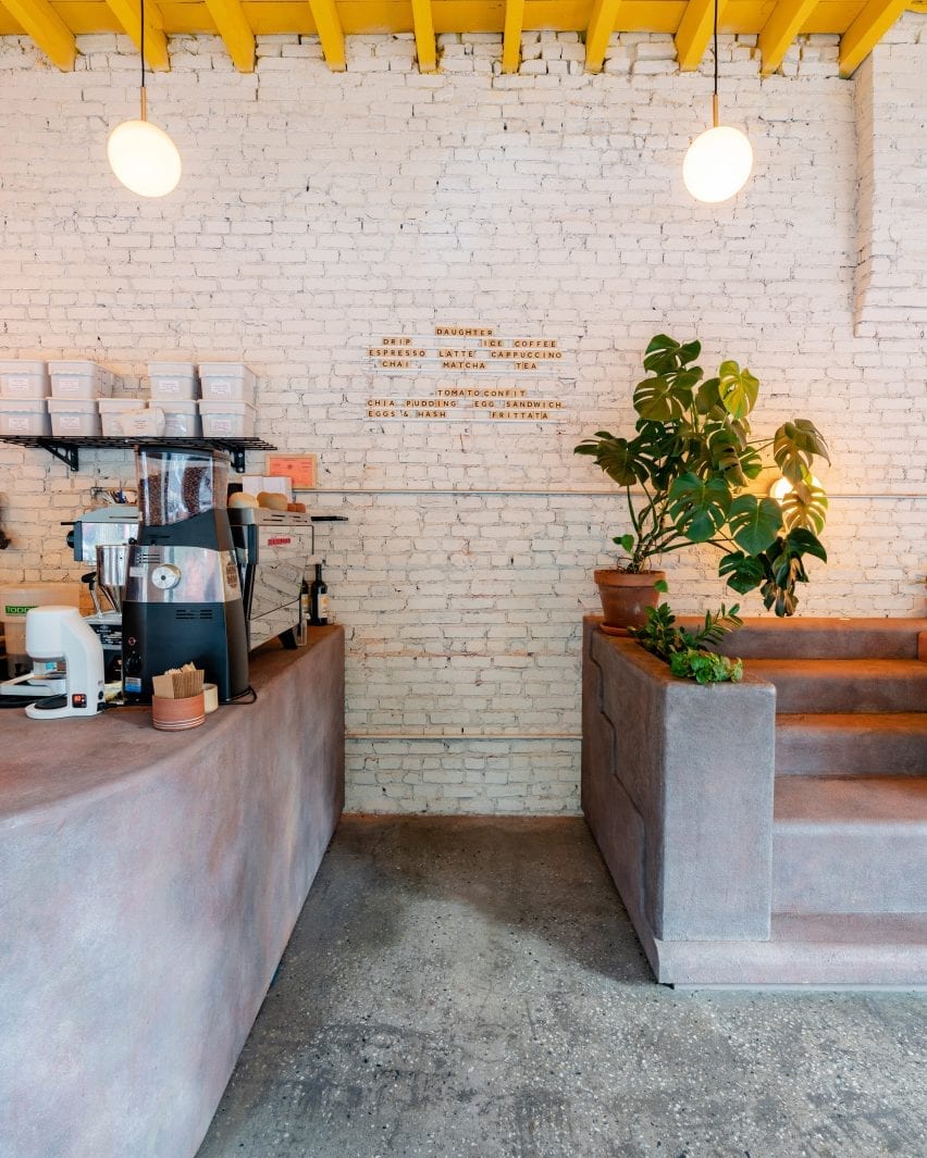
Designer Christopher Al-Jumah has created Daughter, a community-oriented cafe in Brooklyn’s Crown Heights with interiors informed by the staircases of local brownstone buildings.
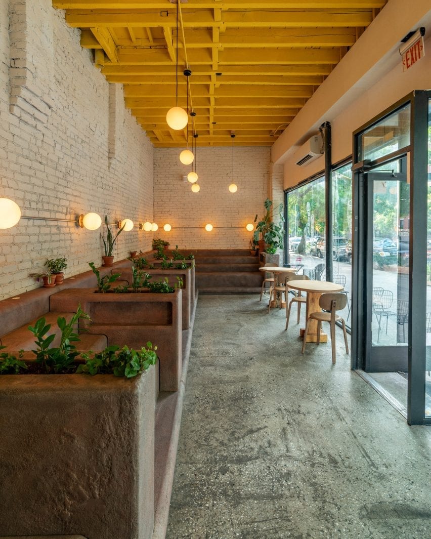
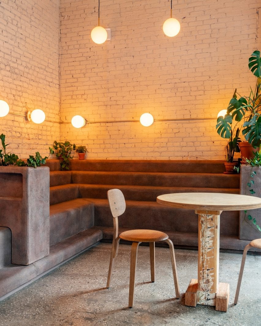
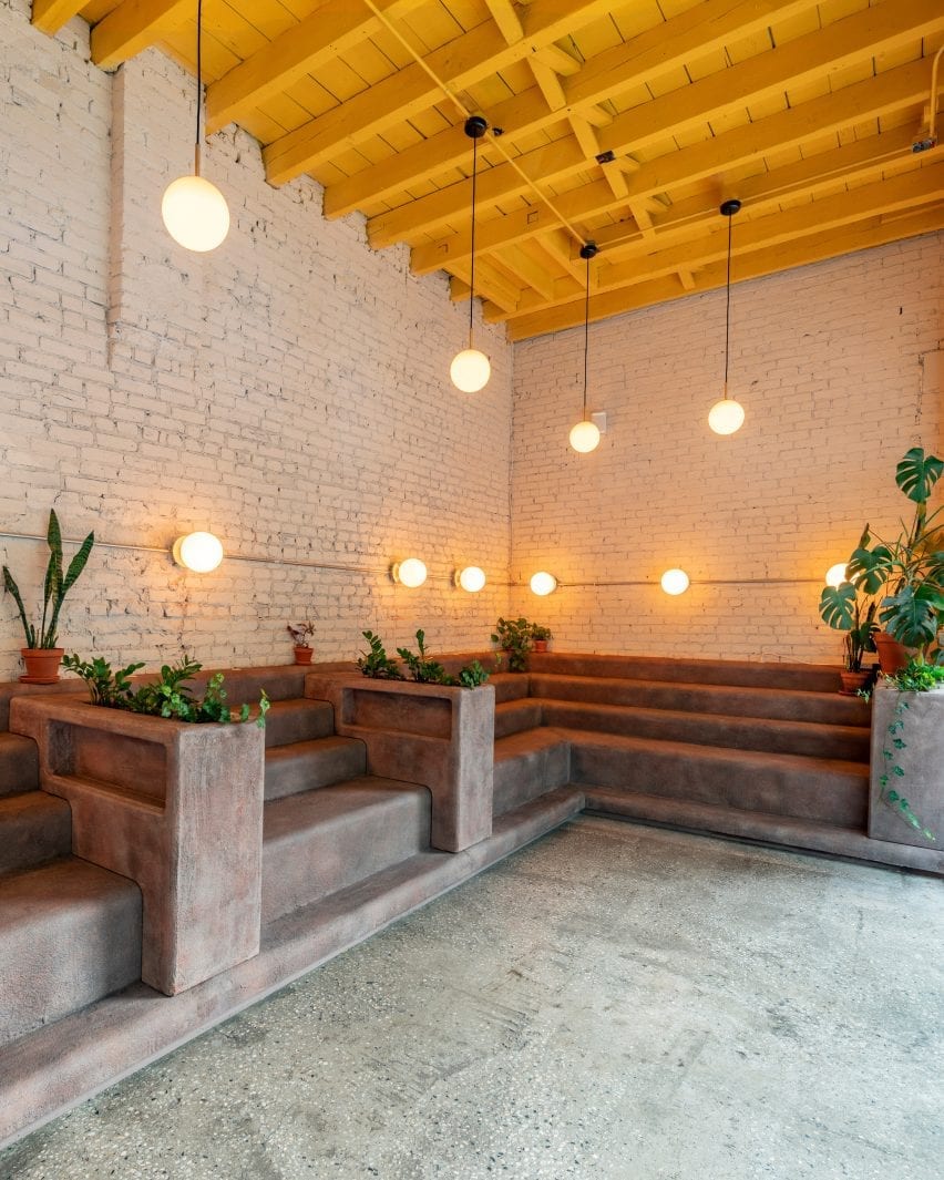
Daughter is a long and narrow space defined by an L-shaped block of brown seating that can be seen from the street through the cafe’s large windows.
The cafe is in Brooklyn’s Crown Heights neighbourhood
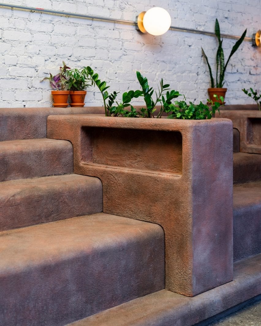
Interior designer Christopher Al-Jumah said that the seating, which was informed by the stoops – small staircases – of local brownstone buildings, is Daughter’s standout design feature.
The indoor stoops are made from a plywood base that was given a coating of concrete and sand with a top resin coat for durability.
“We spent months researching and testing different combinations of concrete, sand, plaster and resin to get the right look, feel and durability,” Al-Jumah told Dezeen.
Planters divide the step-like seating
Interspersed with planters, the casual seating aims to invite people into the cafe and also influenced the rest of the project’s design decisions.
“Everything started from the brownstone stoop. Once a representative brownstone colour was selected, everything else in the space was designed around it to complement,” explained Al-Jumah.
A curved bar sits next to the stoops
Custom-made tables with chairs by Danish brand Menu are placed opposite the stoops, next to the cafe’s large windows that feature playful illustrations.
A curved bar designed in the same brown material as the stoops is tucked into a corner, while orb-like lights, also from Menu, glow above the stepped seating.
The furniture is positioned against exposed brick walls that are painted white in contrast to the cafe’s bright yellow ceiling.
With their rough texture and appearance, the stoops are juxtaposed against smoother elements throughout the space.
“The walls have a soft white, tan colour to soften the space. Natural wood furniture and plants work as an organic complement to the stoop,” said Al-Jumah.
A bright yellow roof contrasts with neutral walls
The designer explained how the vernacular architecture of the Crown Heights area informed Daughter’s interior, which was designed to create an inviting community atmosphere.
“Daughter is partly black-owned and is situated in a historically black neighbourhood, so it was important to capture the local culture and ethos and implement it into the cafe,” explained Al-Jumah.
Custom chairs are positioned across from the stepped seating
“Stooping, or sitting on the large steps in front of the local brownstone buildings, is a staple outdoor activity for the local community,” he added.
“With ‘community’ and ‘gathering’ being central to the ethos of Daughter, we decided to bring the idea of stooped seating into the cafe itself.”
In line with its aim to include the local community in its culture, Daughter plans to donate 10 per cent of its quarterly profits to various organisations including Ancient Song Doula, a group that seeks to eliminate infant mortality rates in the black community.
Lighting from Menu illuminates the space
Christopher Al-Jumah is a New York-based architect and designer.
Other cafe designs include a doughnut-themed cafe in Russia with walls that look almost edible and a cafe in Tokyo with brick-like tiles made from volcanic ash by design duo Formafantasma.
A gender-inclusive hair salon and a cafe that aims to help break down mental health barriers are included in Dezeen’s latest school show from students at the University of Huddersfield.
Also included is a project that aims to revolutionise up-cycling in the retail industry and an adventure and learning centre designed for the elderly.
“We are proud to present a selection of ten pieces of award-winning work that aim to demonstrate the range and scope of projects students undertake in their final year of study. Throughout each project, they selected a site and developed their project brief. Through in-depth research and explorative processes, projects are designed and developed, becoming realised through technical and visual communication.
“Here at Huddersfield, we think that interior design transforms ideas into experiences. We allow students to create entirely new experiences and relationships between people and the places they spend time in. The emphasis is on creativity as we explore and extend current design thinking, pushing boundaries to innovate, providing new ways of looking at human and spatial interactions in response to our changing world.
“This group of students has had to cope with unprecedented circumstances during the Covid-19 outbreak and are a credit to themselves and the course in producing exciting projects that help us to glimpse the future. They are on the cusp of new approaches and changing parameters in design, able to adapt and offer reflexive approaches to future projects. To view the university’s virtual showcase click here and to view its Instagram, visit its profile.”
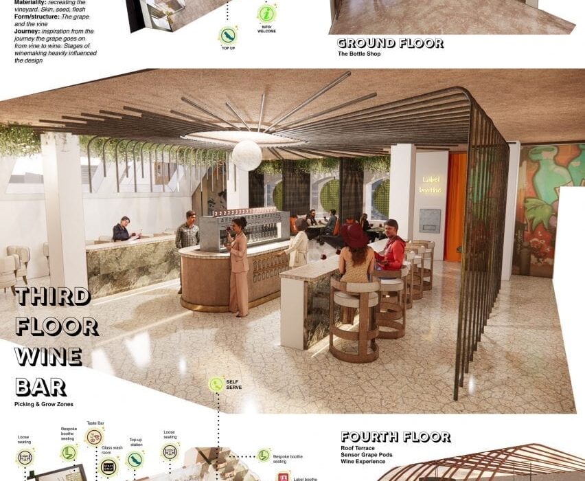
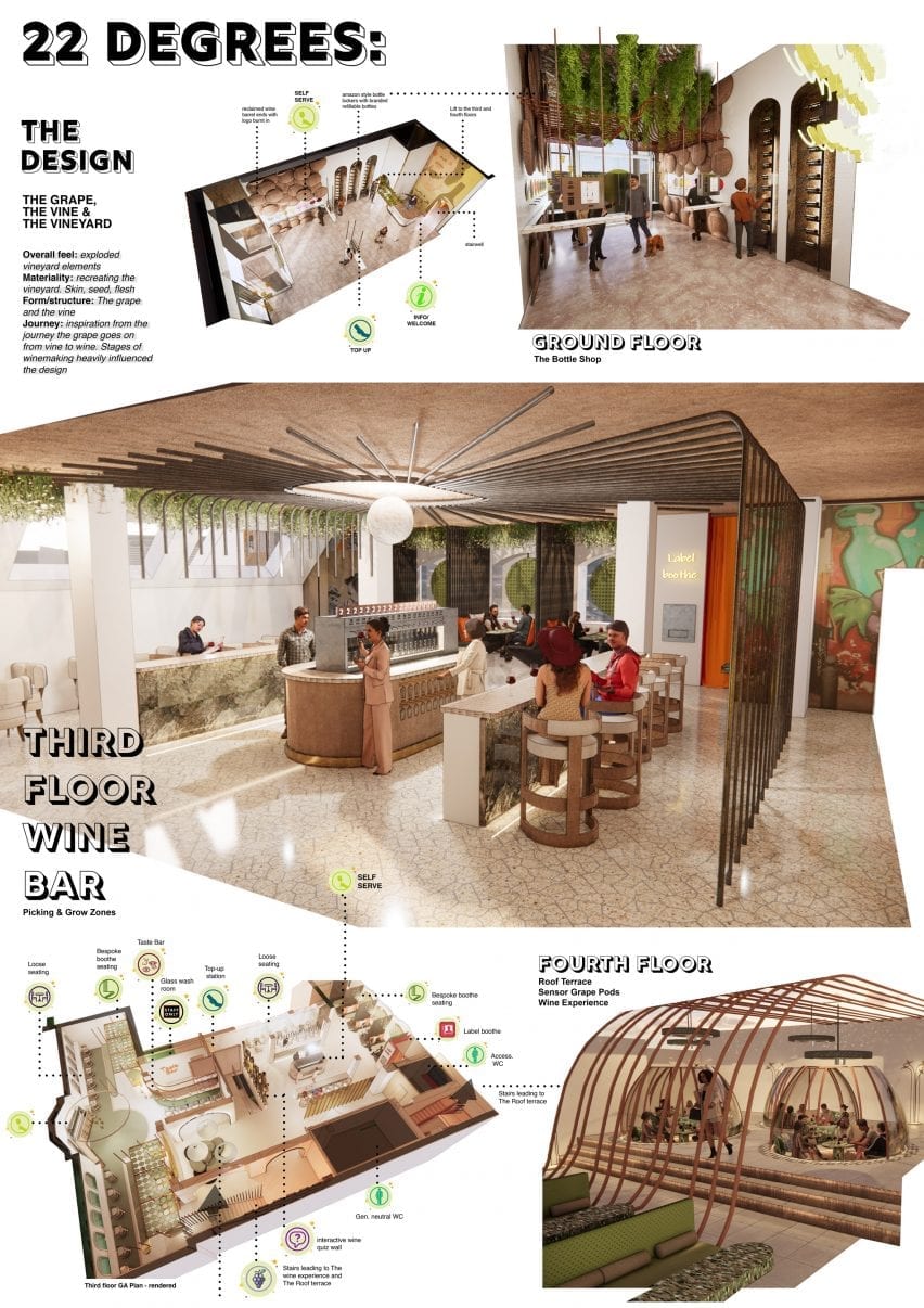
22 Degrees by Paccelli Sowerby
“This project aims to democratise wine tasting for the younger consumer. It seeks to mix up the traditional wine bar, reintroducing wine to the younger consumer in a fun, informal environment that focuses on learning through experience.
“The project intends to create a reactive space with a hands-on approach to wine tasting, bringing people closer to natural wine by echoing the hand-crafted winemaking process through design elements.
“The space gives people the tools and info to embark on their own journey of wine discovery whilst learning about the making process and being inspired by the urban vineyard environment.
“22 Degrees offers more than just a huge variety of natural wines – it also hosts a selfie label-booth, interactive wine quiz, contact-free bottle shop, self serve wine bar, sensory wine experience and roof terrace with sensory grape pods. This project has a full technical pack and feasibility study, both of which are available for download on my website.”
Student: Paccelli Sowerby Award: Best Visual Communication Tutors: Penny Sykes, Jen Leach and Natasha Crowe
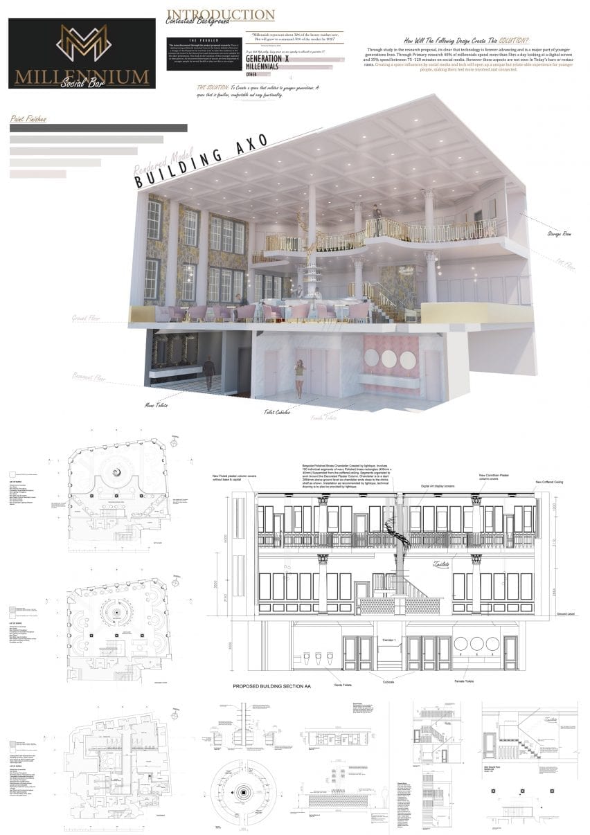
Millennium by Adam Kendall
“Today, millennials represent about 32 per cent of the luxury market but will grow to command 50 per cent of the market by 2025. It is clear that technology is advancing and is a significant part of younger generations lives. Through primary research, 48 per cent of millennials spend more than five hours a day looking at a digital screen, and 35 per cent spend between 75 -120 minutes on social media.
“Millennium is a space influenced by social media, and tech aims to create a unique but relatable experience for younger people, making them feel more involved and connected. The issue discovered through the project research is that there is a growing millennial customer base in the luxury industry.
“However, a change or development has not been seen to suit this audience in the commercial sector. In fact, luxury bars and restaurants are more suitable for the older generations. This leads to the isolation of their younger audience, who are digitally savvy and constantly connected. I propose a solution – to create a space that relates to younger generations. A space that is familiar, comfortable and digitally enhanced.”
Student: Adam Kendall Award: Best Technical Detailing Tutors: Penny Sykes, Jen leach and Natasha Crowe
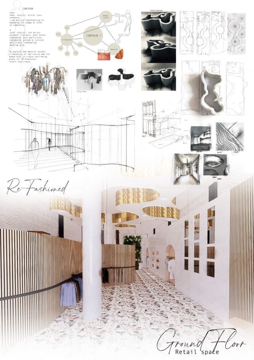
Re-Fashioned by Heather Martin
“This is a project that aims to revolutionise up-cycling in the retail industry through the manipulation of contemporary retail and technology. Often the clothing industry does not recycle materials it cannot sell.
“This means an increasing amount of materials are being thrown away instead of being recycled and reused which, further contributes to the global environmental crisis.
“The solution seems obvious: employ artists who love up-cycling and using material which usually gets discarded to craft new items people will love to wear! Research showed that many people feel pessimistic about purchasing pre-owned items. Re-Fashioned places a luxurious twist on up-cycled clothing to encourage more people to do more to save the environment and to look good doing it!
“The concept was developed by the silhouettes and shapes inspired by the human body – seen in the lighting features. Materials within the space were also essential to consider as it needed to be luxury as well as sustainable and natural.”
Student: Heather Martin Award: Best Creative Process Tutors: Penny Sykes, Jen Leach and Natasha Crowe
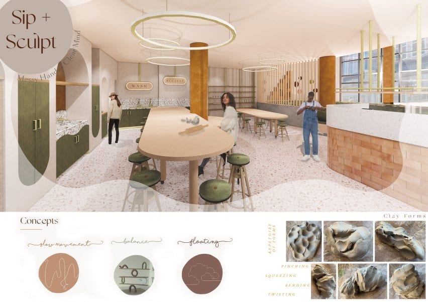
Sip + Sculpt by Alyssia Hanson
“Sip + Sculpt is designed to allow its customers to unwind in a space where they can work through their stress and break down barriers around mental health. It aims to facilitate connection, inspire imagination and create an oasis of positivity and comfort.
“The project’s concept was influenced by the ‘slow living movement’ alongside the keywords, balance’ and ‘floating’. Customers are encouraged to lock away their devices, distancing themselves from the use of social media, allowing themselves to embrace their creativity and get messy with clay.”
Student: Alyssia Hanson Award: Best Conceptual Approach Tutors: Penny Sykes, Jen Leach and Natasha Crowe
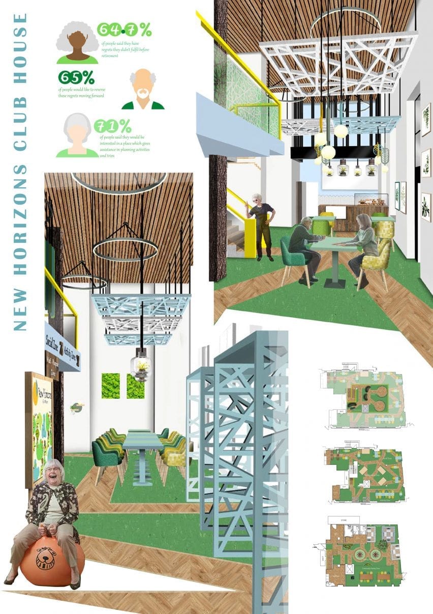
New Horizons Cub House by Amy Rigby
“New Horizons is an experiential adventure and event planning space including digital booking hubs and learning zones. It has been created for the retired generation to create a place to counteract any regrets they have through life.
“Through research, I found that retired people have many regrets about things they have missed out on during their working lives but don’t have anywhere to explore and resolve them.
“The space has been created to encourage and support a second life with access to fun and exciting activities. Activities include participating in new experiences by trying them out in the VR zone, booking experiences, learning about the digital world and improving skills, or just socialising and meeting new people of similar ages and interests.
“The concept is based around ‘a walk in the park’ which makes entering the clubhouse an experience in itself, as the concept can be seen in the layout and other features.”
Student: Amy Rigby Award: Best Use of Materiality Tutors: Penny Sykes, Jen Leach and Natasha Crowe
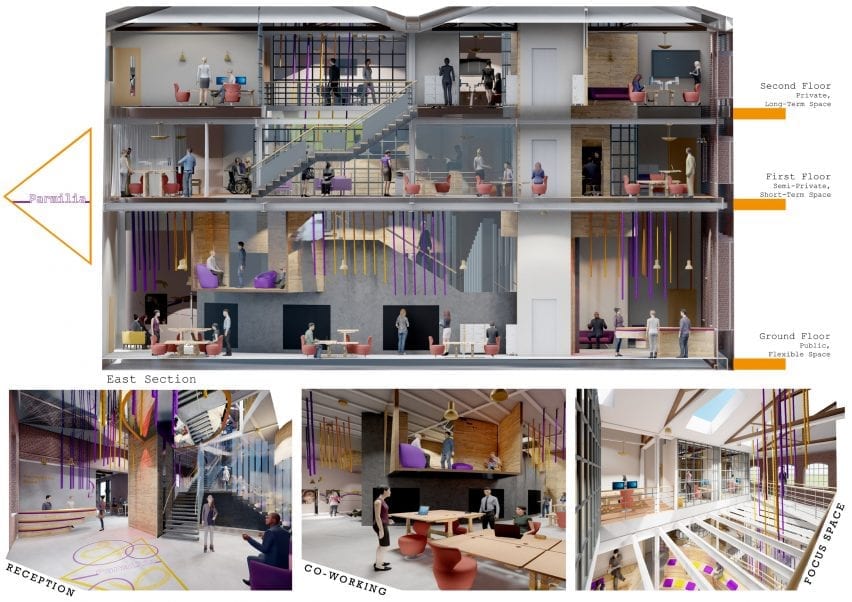
Parmilla by Luke Pierce
“Parmilla is dedicated to the people of Huddersfield and is a creative community workplace and social hub, driven by the concept of perspective. The centre celebrates the creative culture the town has to offer and provide co-working spaces and meeting hubs for hire.
“With the ground floor open to the public, it offers the opportunity for exhibitions and offers space for creative events and performances, to provide new experiences and introduce people to new cultural arts.
“It also has a kitchen space located on the ground floor that features a local guest chef every Friday to offer new food experiences to its guests and give the restaurants the chefs are representing more exposure.
“Parmilia will also send out lengths of fabric to local schools, care homes and stands in the streets of Huddersfield to have people tie knots in the fabric. This fabric will then be exhibited from the ceilings throughout the space. Serving mainly as wayfinding, it also highlights essential areas in Parmilla and represents the people of Huddersfield and celebrates individuality.”
Student: Luke Pierce Award: Best Spatial Exploration Tutors: Penny Sykes, Jen Leach and Natasha Crowe
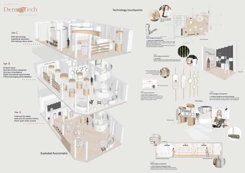
Derma-Tech by Rhiana-Dean Robinson-Hine
“Derma-Tech is a multi-functional, fully immersive retail experience that provides information on skincare knowledge. Consumers are given access to current dermatology technology and DNA driven retailing.
“Developing a forward-thinking ‘go-to’ space for all things skincare by providing numerous experiences for consumers. With technology at the forefront of the design, it harnesses artificial intelligence teledermatology and implements smart technologies throughout each step of the customer journey.”
Student: Rhiana-Dean Robinson-Hine Award: Best Future Focussed Project Tutors: Penny Sykes, Jen Leach and Natasha Crowe
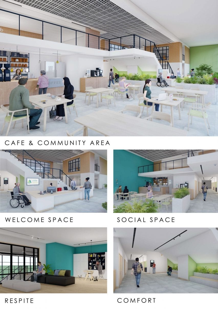
Unite Wellness by Jordan Marzetti
“The Wellness and Respite Centre focuses on delivering a new experience to both dependants and carers. It is a new brand that combines leisure with respite, tackling the disadvantages adults with learning disabilities face and addressing the mental and physical wellbeing of both the dependant and carer.
“It is a purpose-built space located within a residential area, but placed conveniently with other complimenting businesses, providing on-site support through counselling and information. Design is purposely minimal to aid adults with learning disabilities, corridors are direct in layout, and all essential rooms can be found on main corridors.
“There are no curves, or complicated shapes, no distracting patterns, or textures and information points on each main corridor aid navigation acting as way-finding. It includes a new staircase with handrails spaced to be held on either side, including an emergency evacuation slide. Automatic doors into all changing and restroom entrances and two new extra-large lifts have been added to the site.”
Student: Jordan Marzetti Award: Best Socially Focused Project Tutors: Penny Sykes, Jen Leach and Natasha Crowe
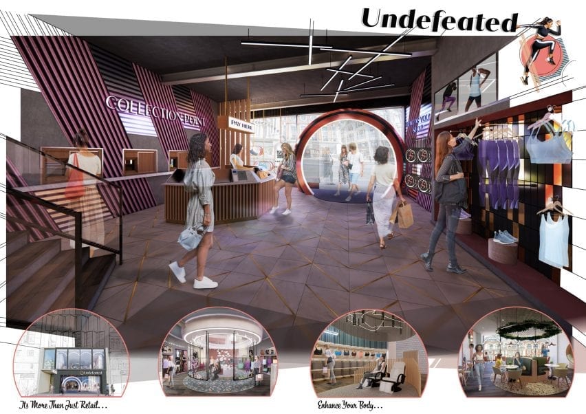
Undefeated by Sarah Parkes
“Research has shown that an overwhelming number of females are faced with physical, mental and social barriers when participating in physical activities. Therefore, a key objective of the design proposal was to challenge and support the journeys women face by offering a personalised and unique fitting service within a female-only sportswear store.
“The building is split into three key areas: physical, mental and social. Physical is on the ground floor and is focused on enhancing the body through high-performance sportswear. This zone also includes RFID technology self-checkout, collection points, beacon technology touchscreens and AR smart mirrors.
“The mental section is on the basement floor and is concentrated on re-energising the customer’s mind and body by creating a multi-sensory experience. This includes a relaxation massage pod that indulges all the customer senses and helps them to escape from the busy retail stores on Oxford Street.
“Social is on the first floor and is focused on maintaining customer’s wellbeing by encouraging social interaction within the environment of a nutrition cafe. The material palette includes fresh and light materials that correspond with nutrition and healthy eating.”
Student: Sarah Parkes Award: Best Commercially Focussed Project Tutors: Penny Sykes, Jen Leach and Natasha Crowe
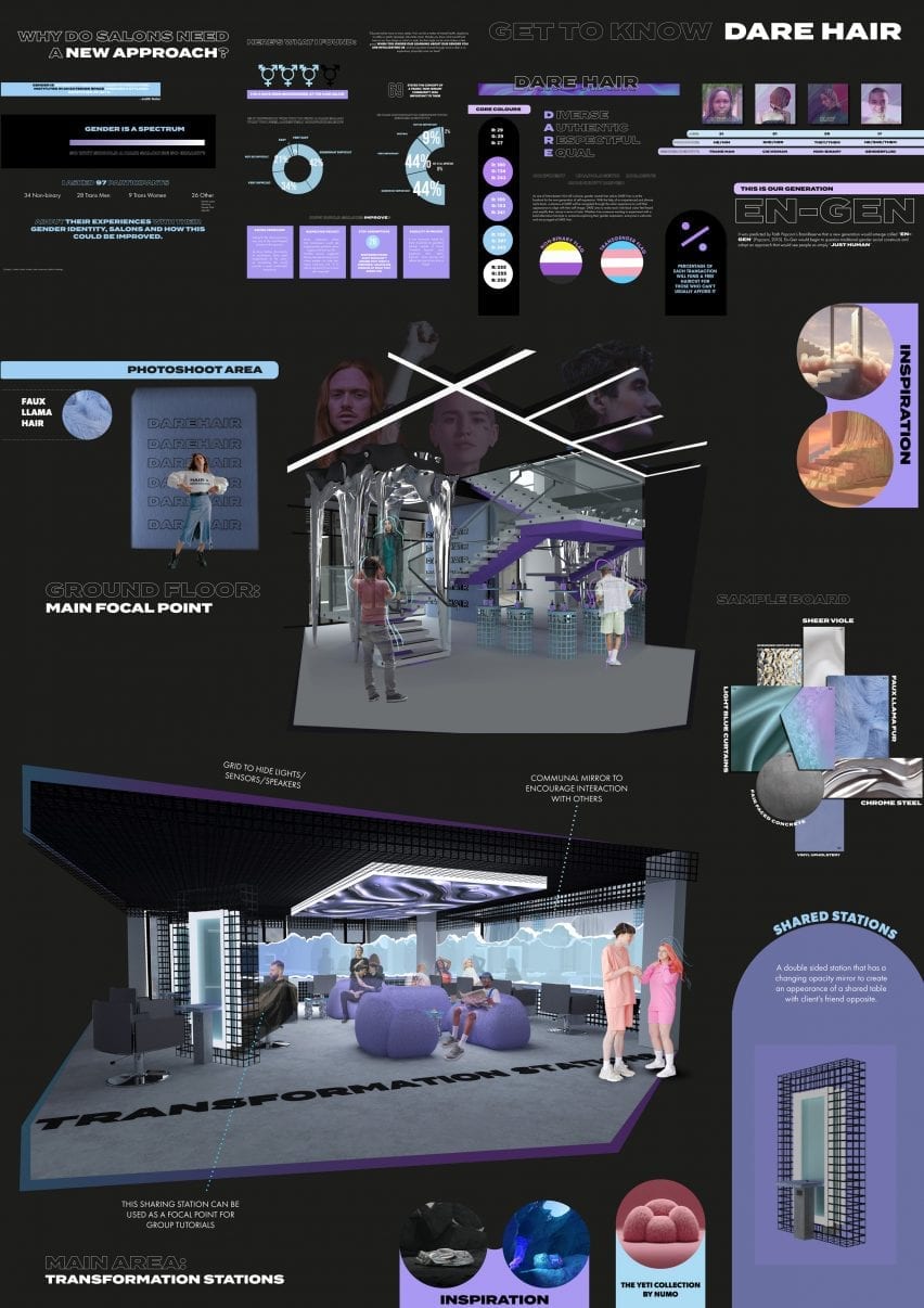
Dare Hair by Jasmin Hardy
“Dare is a non-binary, gender-inclusive hair salon that looks towards the new generation of gender-inclusive hairstyling salons. After researching the importance of hair in gender/self-identity it became apparent that the hair industry needed a new approach to its mainly binary format.
“Using the concept of fluidity, which was also inspired by the limitless creativity of the metaverse, Dare Hair aims to create a gender-inclusive environment for people to experiment with their appearance aided by the integration of smart technology.
“Whether it be someone wanting to experiment with a bold alternative hairstyle or someone exploring their gender expression, everyone is welcome and encouraged at Dare Hair.
“Throughout my time at university, my projects have been driven with the edges of society in mind, so being able to create Dare Hair with the concentration being on the LGBTQ+ community has pushed me to create a thorough, well researched final design. I am thankful to those who are part of the community who were willing to share their experiences with me and I dedicate this project to them.”
Student: Jasmin Hardy Award: Best Overall Project Tutors: Penny Sykes, Jen Leach and Natasha Crowe
Partnership content
This school show is a partnership between Dezeen and the University of Huddersfield. Find out more about Dezeen partnership content here.
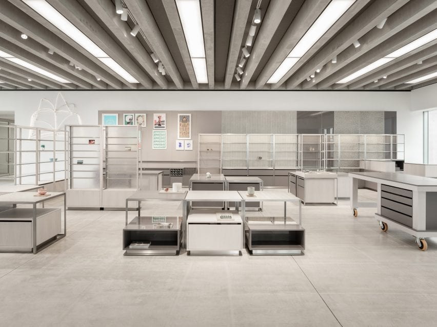
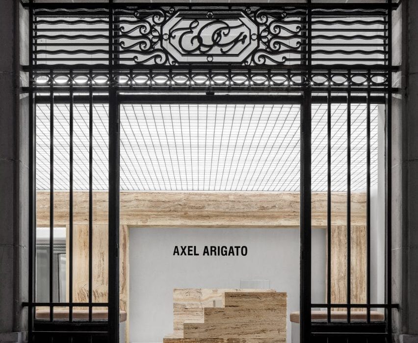
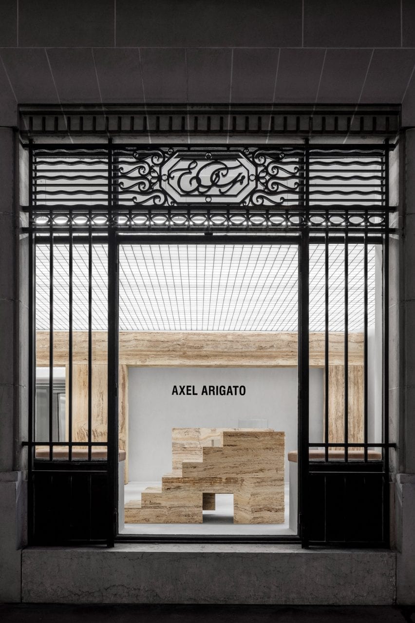
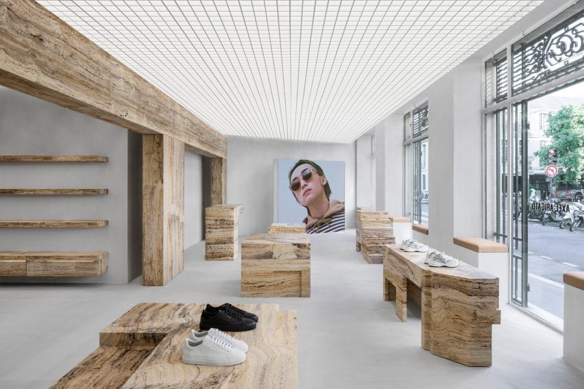
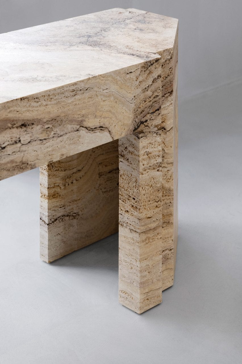
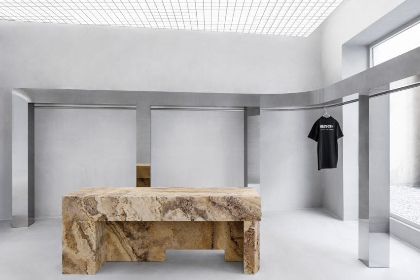
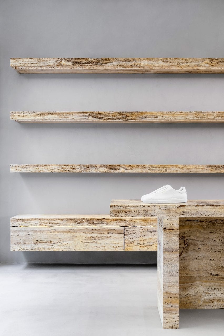
Design studio Halleroed has used travertine podiums to display sneakers like sculptures in the Paris store of streetwear label Axel Arigato.
Located in the Marais district on Rue Vieille du Temple, the boutique stocks the brand’s full range of footwear, clothing and accessories, in addition to a curated selection of design objects.
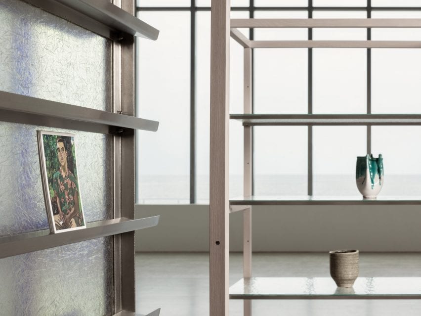
Axel Arigato’s Paris store is dotted with travertine display plinths
The store occupies two rooms divided by a freestanding wall of light-yellow travertine, which references the columns and beams found in classical architecture.
Walls and floors are finished in raw concrete while overhead, a punctured grid ceiling conceals the store’s lighting system.
A series of sculptural display plinths made from honed, bush-hammered or raw travertine stone help to create a “grandiose” entrance, designed to emulate the feeling of stepping into an art gallery.
A freestanding travertine wall divides the space into two
“The normal model for a sneaker brand is to cover every centimetre of the back walls in products from floor to ceiling,” Axel Arigato‘s co-founder and creative director Max Svärdh told Dezeen.
“We do the opposite by displaying our product on podiums in the centre of the room instead, like a piece of sculpture.”
The stone was hammered, honed or left raw
Travertine was also used to form a series of shelves in the rear of the store and custom chairs in the dressing room.
According to Svärdh, the stone has been a key element in all of Axel Arigato’s retail locations so far.
A mirrored steel clothes rail wraps the back of the store
“Our brand colour is a pale yellow so we were naturally drawn to the light yellow travertine,” he explained.
“We worked with different finishes to bring out its characteristics and more specifically highlight its impurities, which in itself makes it more beautiful.”
To contrast with the travertine, Halleroed wrapped an upholstered bench seat around one of the columns and introduced a chunky, stainless steel clothes rail.
This lines the store’s back wall and extends out into a courtyard filled with white gravel.
An upholstered bench is wrapped around a central column
Axel Arigato was launched in 2014 as an online store for luxury streetwear. It opened its first brick-and-mortar space in London’s Soho in 2016 and has since expanded into four standalone spaces.
“We always look to the neighbourhood and the specific building that we are in [when designing a store],” Svärdh said.
“Paris is the home of luxury and the use of rich travertine stone really embodies that. All standalone stores have a gallery-esque feeling to them with mutual design codes but offer completely unique experiences.”
The displays are designed to exhibit trainers as if they were sculptures
A large freestanding LED screen is used for displaying creative content in the Paris store.
The brand has previously worked with Halleroed – founded in 1998 by Christian and Ruxandra Halleroed – on its London, Stockholm and Copenhagen flagship stores, which all feature monochromatic colour palettes and concrete surfaces.
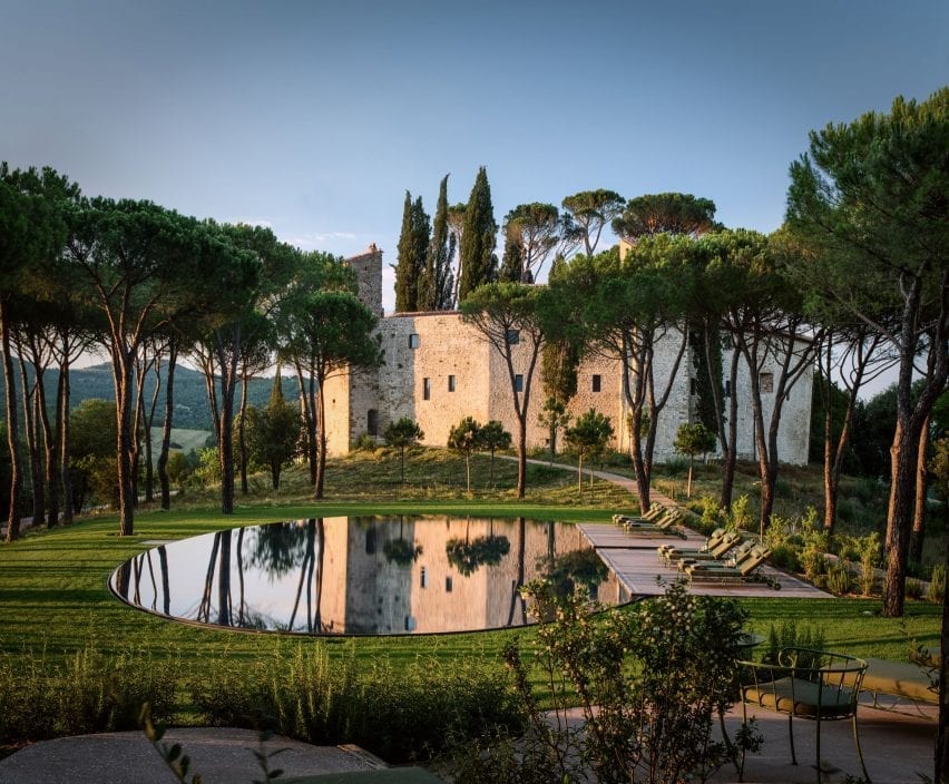
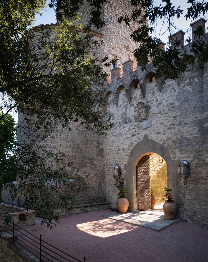
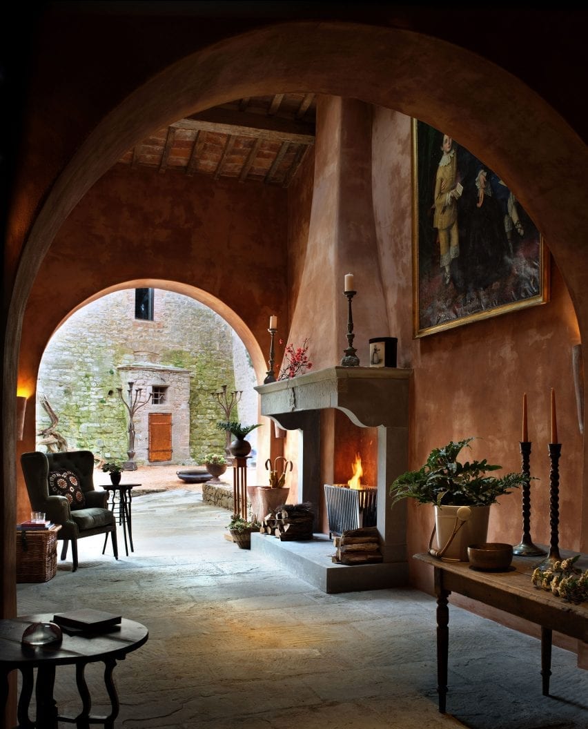
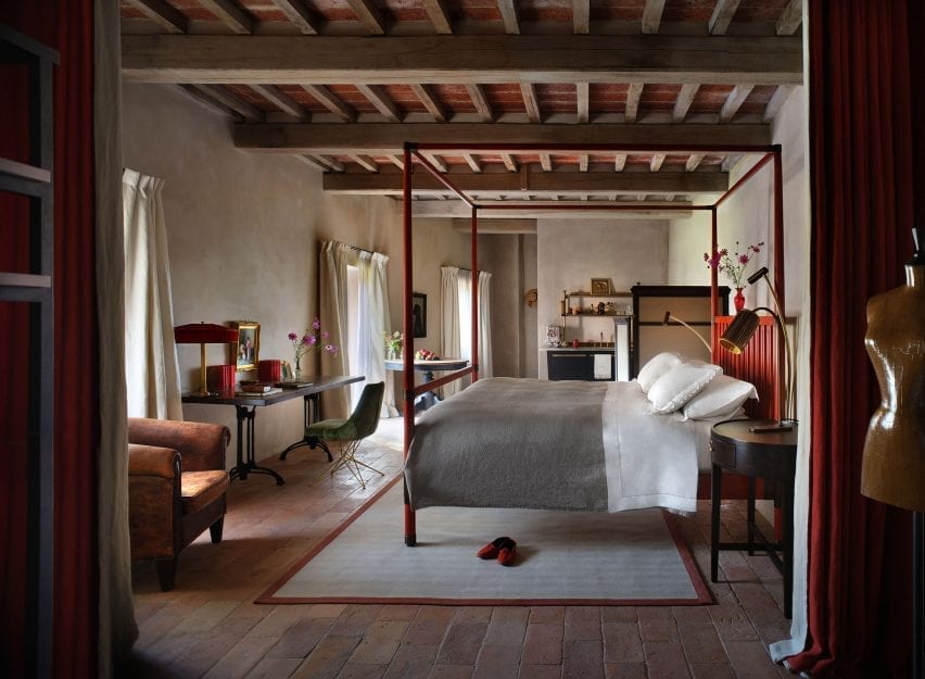
A 10th-century castle in the Umbrian hills has been restored and transformed into a hotel by Count Benedikt Bolza and his family, who created custom furniture for its 36 suites, restaurant and spa.
Welcoming its first guests in spring 2021, Hotel Castello di Reschio comprises 30 suites within the historic castle.
Hotel Castello di Reschio sits on a 3,700-acre estate in the Umbrian countryside
The hotel sits within the sprawling Reschio estate, which was acquired by Count Antonio Bolza in 1994, lies on the border between Umbria and Tuscany and is dotted with farmhouses.
The crumbling buildings were slowly restored into private homes by his son Benedikt and daughter-in-law Donna, before they turned their attention to the site’s impressive 1,000-year-old castle and surrounding structures.
The 10th-century building was restored by Count Benedikt Bolza and his family
The family lived in the stone “castello” for a decade while they worked to protect and restore the architecture, then create interiors that respect the ancient building while offering modern comforts.
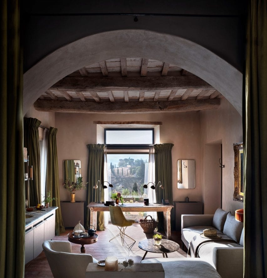
In total 30 suites were built within the castle itself, with some rooms having views of the central courtyard garden, while others look out over the rolling hills.
A further six suites were built next to the parish church.
Original features were retained, like the stone fireplace in the mud room
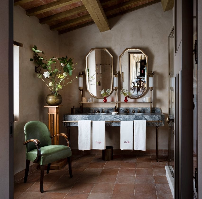
All of the rooms were decorated with terracotta-brick or wooden floors, hand-stitched linen curtains, Italian fabrics, and locally crafted marble and brass vanities.
Benedikt Bolza also designed and crafted bespoke beds and lighting for the hotel via his own furniture brand, BB for Reschio. These are mixed with portraits, photos and other curios sourced from local antique markets.
Bolza designed beds and lighting for the rooms
“Benedikt has embraced an organic approach to the design, championing local craftsmanship and creating thoughtful, whimsical spaces that are filled with comfort and wit, while artfully nodding to the fascinating characters who once resided within the castle walls,” said the family.
The Tower Suite, which is entered over the castle’s gateway and spread over five levels, boasts two bedrooms, a living room, study, and roof garden with an open-air bathtub.
Local materials were used to create the bathroom vanities
Dining options for guests include the Ristorante Al Castello, located in the castle’s western ramparts and serving Italian dishes made with produce grown on the estate.
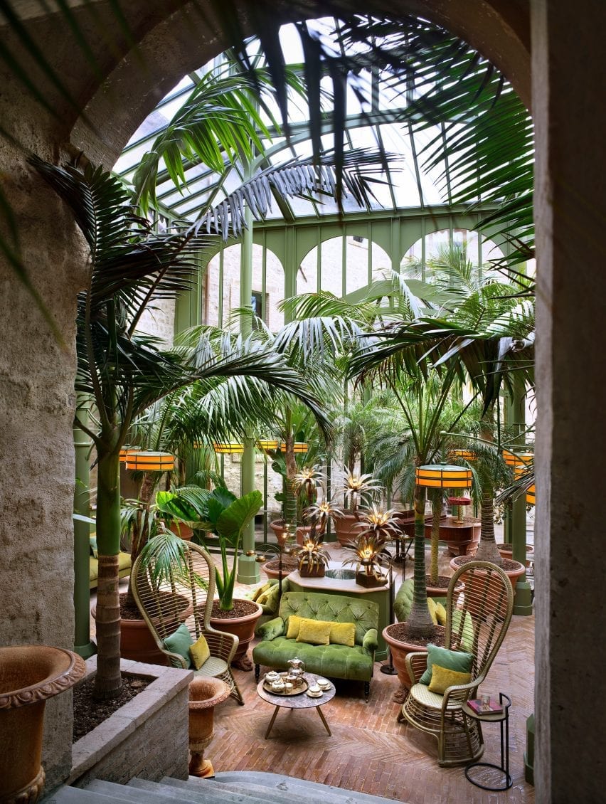
The verdant Palm Court is a new structural addition modelled on iron-and-glass Victorian conservatories, which is intended as a space for reading, conversation or enjoying cakes and cocktails from the adjacent bar.
Hotel Castello di Reschio’s 36 rooms have views of the castle courtyard or the Italian hills
Another alternative is Il Torrino, the converted watchtower that serves light fare and drinks, and overlooks an oval swimming pool.
The hotel spa is situated in the vaulted stone cellar, where hammams, saunas and plunge pools are atmospherically lit by shards of sunlight through the arrow slits and windows.
The Palm Court, a new addition, is modelled after Victorian conservatories
Guests seeking a more active experience can explore the estate on foot or bicycle, or take horse-riding lessons at the Equestrian Centre.
Many of the region’s historic towns and cities are also a short drive away, for those who wish to explore further afield.
Guests can watch the sunset from the Ristorante Al Castello
Castles and ancient buildings across Italy have been converted into guest accommodation while maintaining their original charm and character.
Another example, also in Umbria, is a 12th-century watchtower that was reconstructed and turned into a holiday retreat.
Our latest lookbook shines a light on residential loft conversions from Dezeen’s archive, including rooftop extensions on existing dwellings and apartments built in underused attics.
Opening up the volume beneath the roof is a popular way of squeezing more space out of a dwelling or building. The new spaces often feature unusual geometries, which a skilled architect can exploit to create dramatic and characterful new rooms.
This is the latest roundup in our Dezeen Lookbooks series providing visual inspiration for the home. Previous articles in the series feature plant-filled interiors, colourful kitchens and stylish home-working spaces.
West Heath Drive, UK, Alexander Martin
London architect Alexander Martin converted the disused loft of an Arts and Crafts-style house in Hampstead to create this pared-back and light-filled guest room and study.
It has a T-shaped plan and was therefore divided into three rooms – one of which is hidden behind a moving wall that is disguised as an integrated bookcase. The guest room is finished with white walls, a dark wooden floor and a vintage Greaves and Thomas teak sofabed.
Find out more about West Heath Drive ›
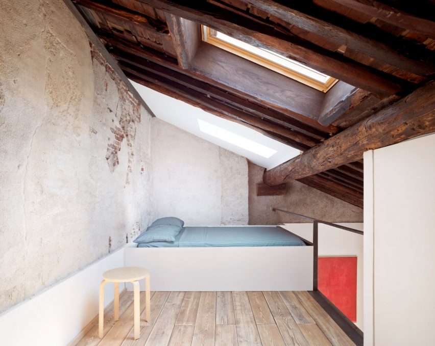
House for a Sea Dog, Italy, by Dodi Moss
While renovating the loft of a 17th-century apartment block in Genoa, architecture and engineering studio Dodi Moss inserted a mezzanine floor that serves as a bed deck to maximise usable floor space under the eaves.
It has a rustic finish, characterised by an exposed wooden roof structure, unvarnished wooden floors and a rough plaster wall, and is furnished with a simple IKEA stool for use as a bedside table.
Find out more about House for a Sea Dog ›
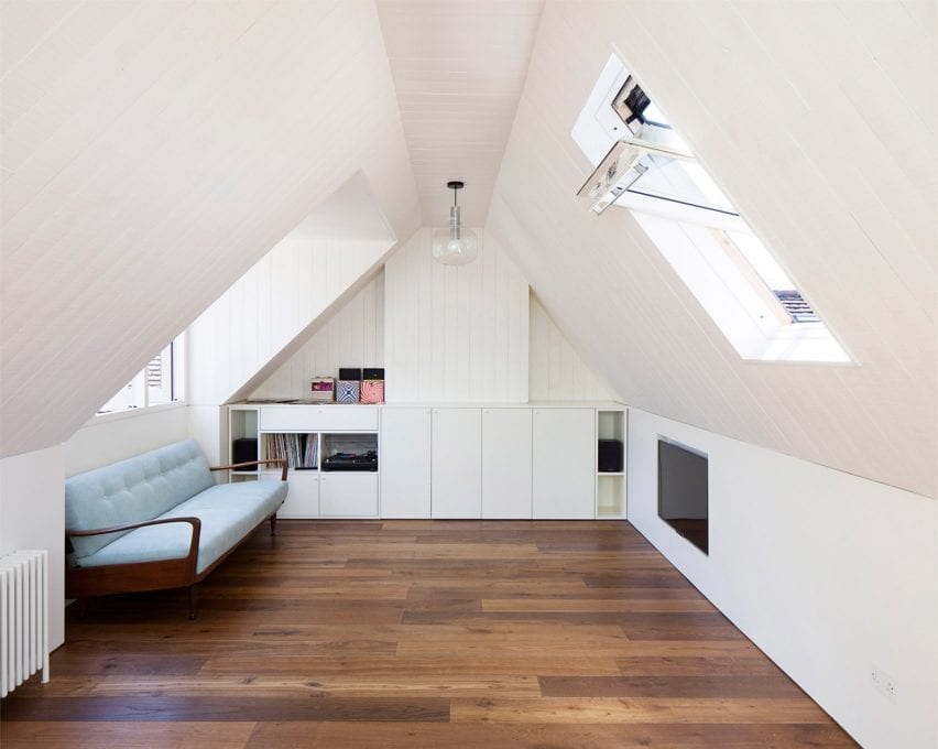
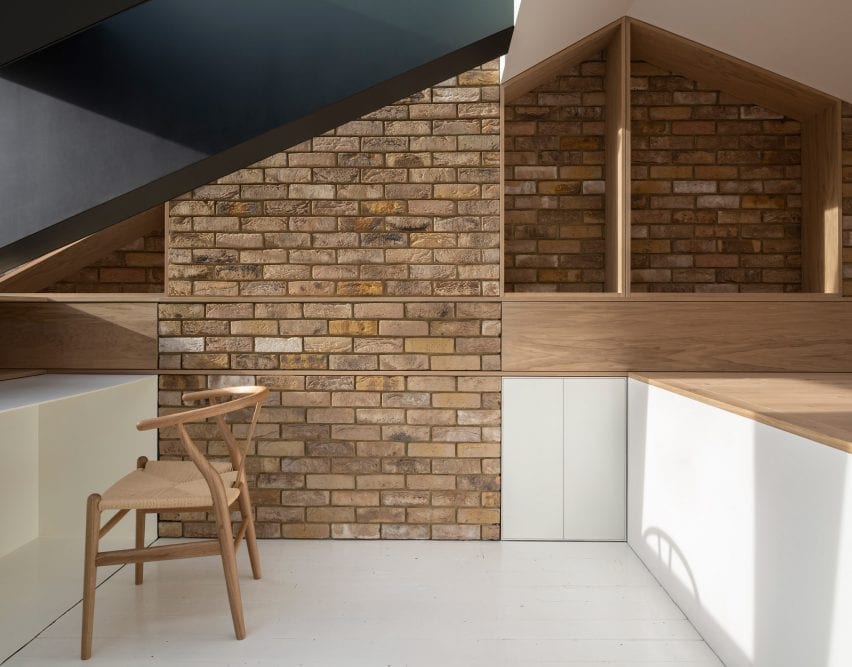
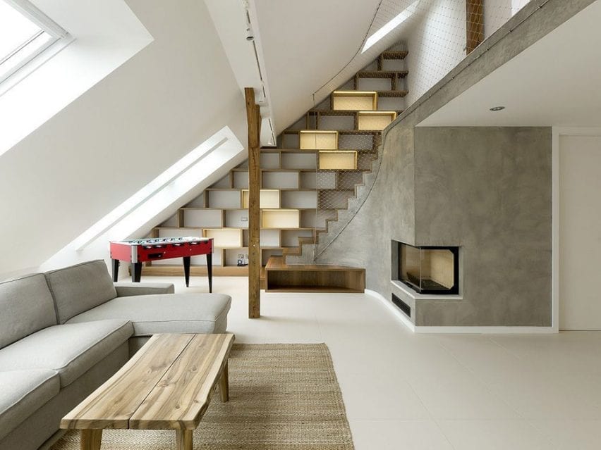
Dormore, UK, by Con Form Architects
Dormore is a bright home office nestled within the small attic of a house in London, which was converted for a client who needed a space to work from home. A large slice was cut out of the original roof and filled with glazing and a large dormer window to bring light inside.
It is accessed by a compact folded steel staircase and finished with oak joinery and a whitewashed floor, alongside exposed brick walls and a Hans Wegner Wishbone Chair.
Find out more about Dormore ›
Rounded Loft, Czech Republic, by A1 Architects
Czech studio A1 Architects built a two-storey apartment within the attic of an apartment block in Prague. Its living room, which occupies the lower level, is lit by windows slotted within the attic’s sloping roof and finished with tactile wooden furnishings and grey plaster walls.
The lower level also contains bedrooms and is linked to a guest suite on the small upper floor by a staircase lined with wooden bookshelves and a steel net that takes the place of a bannister.
Find out more about Rounded Loft ›
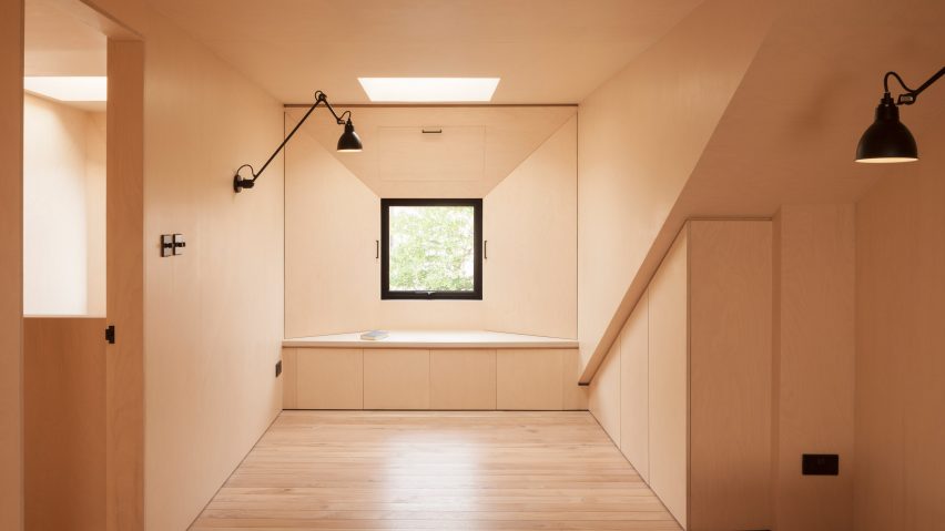
Maynard Road, UK, by Widger Architecture
A pair of minimalist bedrooms lined with plywood occupy the old attic of this first-floor flat in Hackney, which was converted by London studio Widger Architecture.
As the attic had a sloped roof with limited head height, the architect introduced a flat roof dormer that spans the entire width of the property. While maximising headroom, it also allowed the studio to introduce more windows to invite more light inside.
Find out more about Maynard Road ›
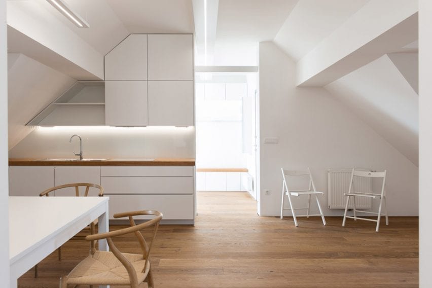
Alpine Apartment, Slovenia, by Architektura d.o.o.
This loft space was converted into a two-bedroom apartment by Slovenian studio Architektura d.o.o. for the client to use as a family holiday home in the lakeside town of Bled.
At the centre is a kitchen, flanked by two bedrooms, a living room and an entrance hall. As the kitchen has no exposure to natural light the living room entrance has no door, in order to help illuminate the space.
The home is complete with white custom-built furniture that aligns with the irregularly shaped attic ceiling, while pale wooden floorboards nod to the home’s Alpine setting. These finishes are complemented by wooden Wishbone Chairs by Hans Wegner and white folding chairs from IKEA.
Find out more about Alpine Apartment ›
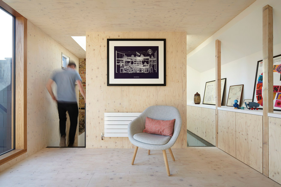
Gallery House, UK, by Studio Octopi
London architect Studio Octopi renovated and extended the dead space below the pitched roof of this terraced Victorian house in Battersea to create a separate reading room and study.
The two rooms are unified by a perforated black steel staircase and their matching spruce plywood walls and floors. Pared-back furnishings are dotted throughout, including a pair of About A Lounge Chairs by Hay in the reading room.
Find out more about Gallery House ›
Attic conversion in Antwerp, Belgium, by Van Staeyen Interieur Architecten
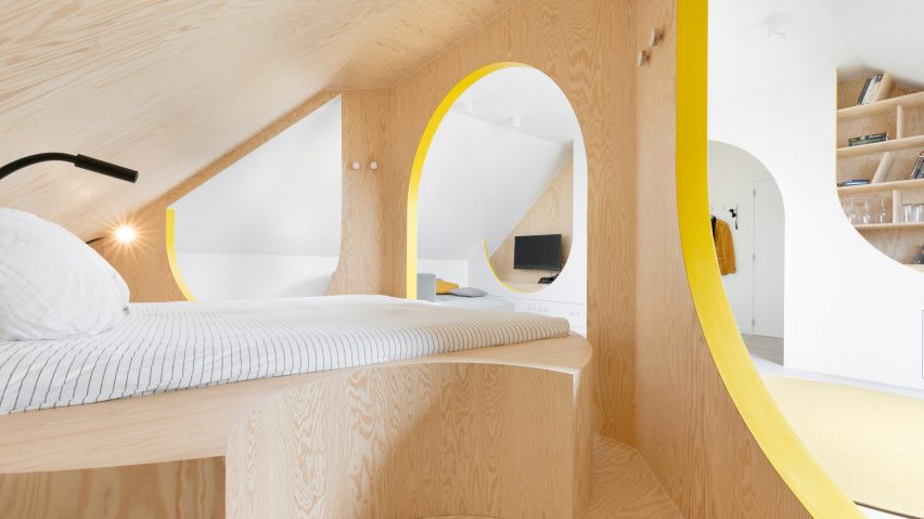
A dark attic that was used for storage was converted into this bright multi-functional room at a house in Antwerp. It contains a bed, seating area and bathroom defined by spruce-clad partitions with arched portals, curved seating and yellow detailing.
It was designed by Van Staeyen Interieur Architecten for the clients to use as a guest room and a social space for their daughters to spend time with their friends as they get older.
Find out more about Attic conversion in Antwerp ›
Project Escape (to the Roof), UK, by A Small Studio
Architecture practice A Small Studio created a reading room, bedroom, dressing room and bathroom for a family within the loft of their Victorian home in south-east London.
Between the bathroom and reading room, there is also a new free-standing solid oak stair that helps bring light into the lower levels of the home. Three large dormer windows on one side of the loft frame views of the back garden.
The conversion’s focal point is its reading room, which is complete with a Plastic Armchair RAR by Charles and Ray Eames and a black DLM side table by Hay.
Find out more about Project Escape (to the Roof) ›
Attic conversion, France, by F+F Architects
This spacious light-filled apartment was built by Parisian studio f+f architects by converting the attic of an art nouveau building in Strasbourg. Over two levels, it comprises bedrooms, bathrooms and an office, alongside an open-plan living space with a kitchen, dining area and terrace.
The attic’s original pine flooring was preserved and treated with lye, an alkali used to lighten wood, while existing trusses have been painted white and left exposed throughout.
Find out more about this attic conversion ›
This is the latest in our series of lookbooks providing curated visual inspiration from Dezeen’s image archive. For more inspiration see previous lookbooks showcasing colourful interiors, calm living rooms and colourful kitchens.
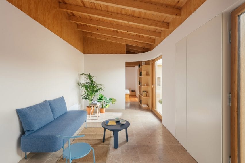
REDO Architects had stage sets in mind when redesigning the interiors for a pair of houses in the former Puppeteers’ Quarter in Sintra, Portugal.
The two homes, now known as Puppeteers House, are part of a series of buildings that were originally built for a local puppeteer’s family, but had more recently been used as storage for farming tools.
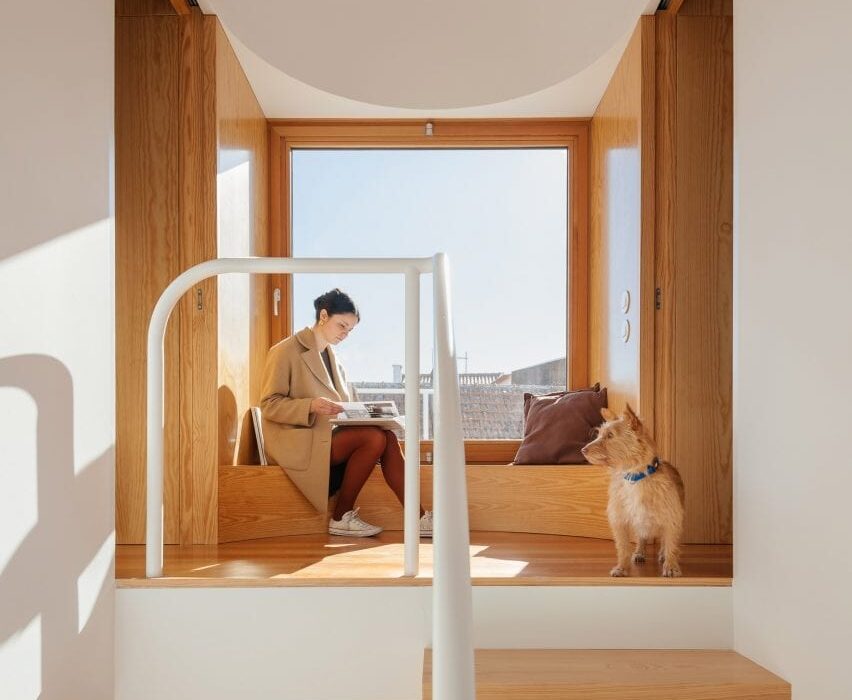
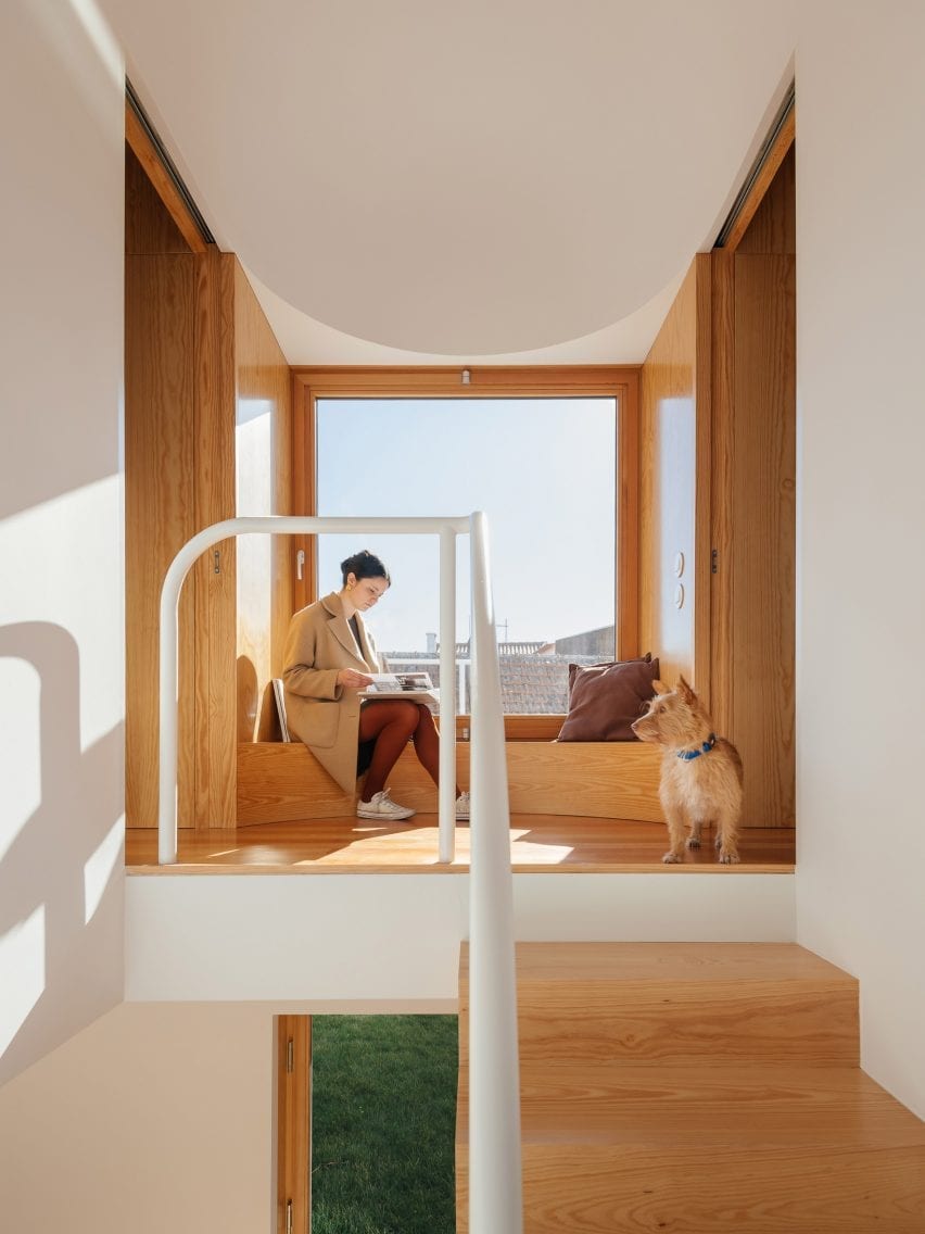
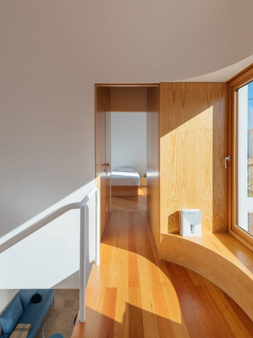
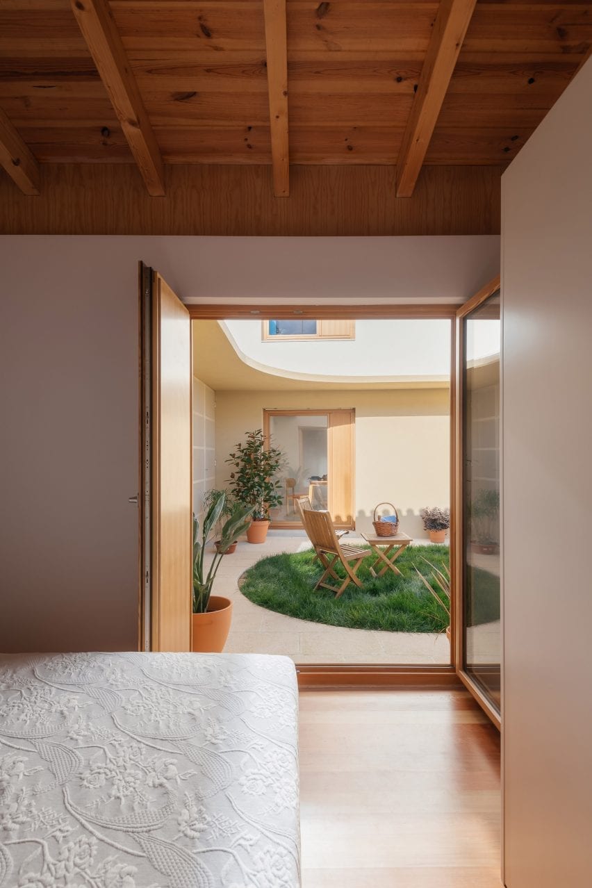
A curved wooden bench creates a window seat on the first-floor landing
With its renovation, Lisbon-based REDO Architects has brought the buildings back into residential use as homes for two of the puppeteer’s great grandchildren.
The revamped buildings are designed to capture the spirit of their heritage, with lightweight wooden joinery constructions that evoke theatrical scenography and circular details that suggest a playful character.
Bathrooms are concealed within the wooden joinery
An all-new interior layout was needed, so this was designed to reinforce the theatrical feel.
Elements like the staircase and first-floor window seat have a stage-like quality, while secondary spaces like bathrooms are concealed within the walls.
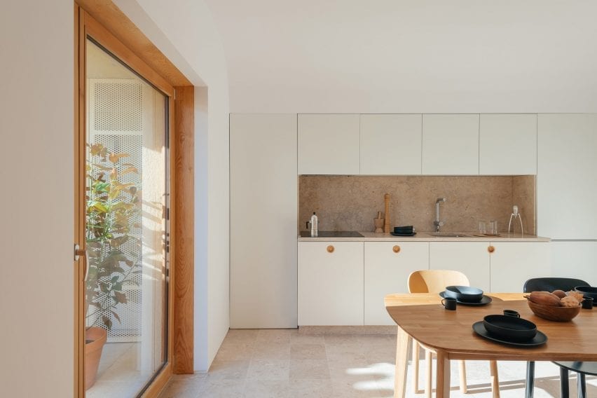
The larger house contains a dedicated kitchen and dining space
“The relation between the existing external walls and the new interior walls – two different skins – was explored and dramatised throughout the project on different scales,” explained studio founder Diogo Figueiredo.
“This friction generated misalignments, which are expressed in the windows as opaque panels,” he told Dezeen, “and it also created in-between spaces for built-in furniture and bathrooms, like a back-of-stage area.”
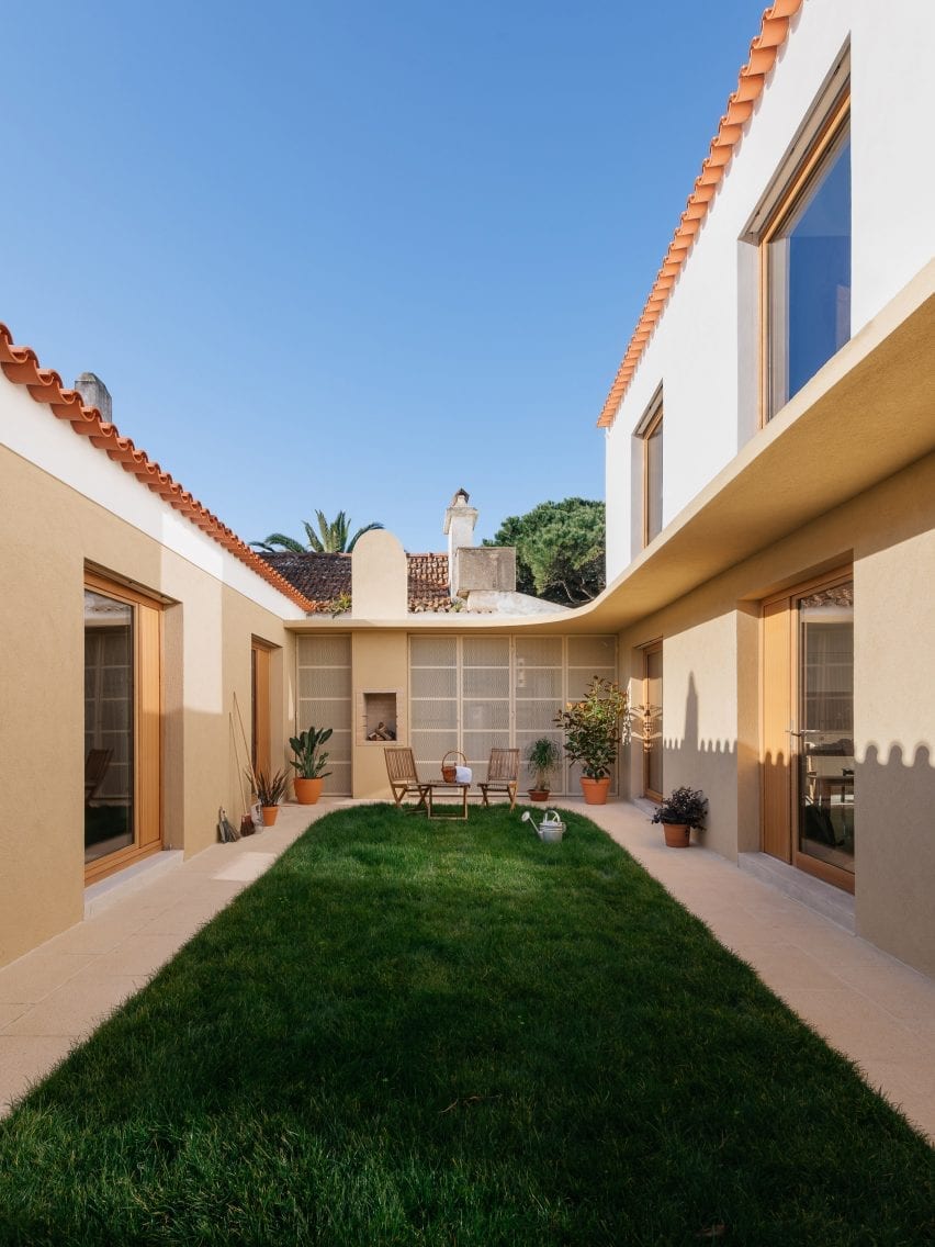
The homes sit on opposite sides of a garden courtyard
One of the houses is single-storey, the other is double-storey, and they are located either side of a private courtyard.
The buildings are designed to function as self-contained properties, but they are also very open to one another, with large windows fronting the shared courtyard garden.
The smaller property contains one bedroom on the ground floor
The smaller of the two homes contains a living space with a kitchenette, a separate bedroom and a bathroom.
The other home has a similar layout, with a living room and a separate kitchen and dining space on the ground floor, and two en-suite bedrooms upstairs.
Living spaces feature lioz stone flooring
A consistent materials palette features throughout. An ivory-toned regional stone known as lioz was used flooring in the main living spaces and surfaces for the kitchen and bathrooms.
Flooring in the bedrooms is wood, matching the doors, furniture and shelving that feature throughout the two homes.
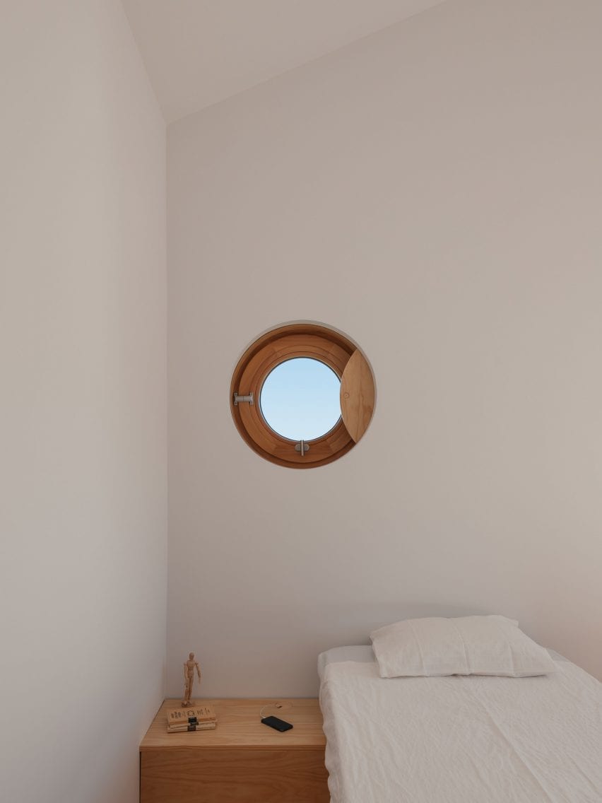
Circular details feature throughout the interiors, at a range of scales. Some are full circles, like the porthole window and cabinet handles, while others are large curves, like the window seat or the rounded wall partitions.
“We used a precise quarter of a circle as a tool – like a compass – in different radii, orientations, combinations and materialities,” explained Figueiredo.
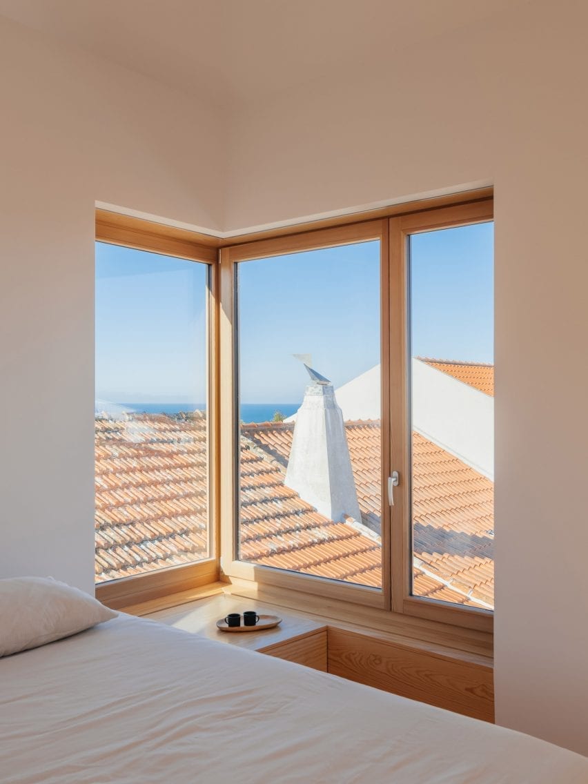
The main first-floor bedroom features a corner window
“It was explored in different moments of the project: to differentiate and disconnect the new internal layer from the existing walls, to connect different rooms, and to create smooth circulation routes,” he said.
Many of these curves are mirrored in ceiling details directly overhead, which contrast with the linearity of the exposed roof beams.
The second first-floor bedroom features a porthole window
Other recent examples of house renovations in Portugal include House in Fontaínhas, a home with candy-coloured details, and Rural House in Portugal, a house created in an old granite community oven.
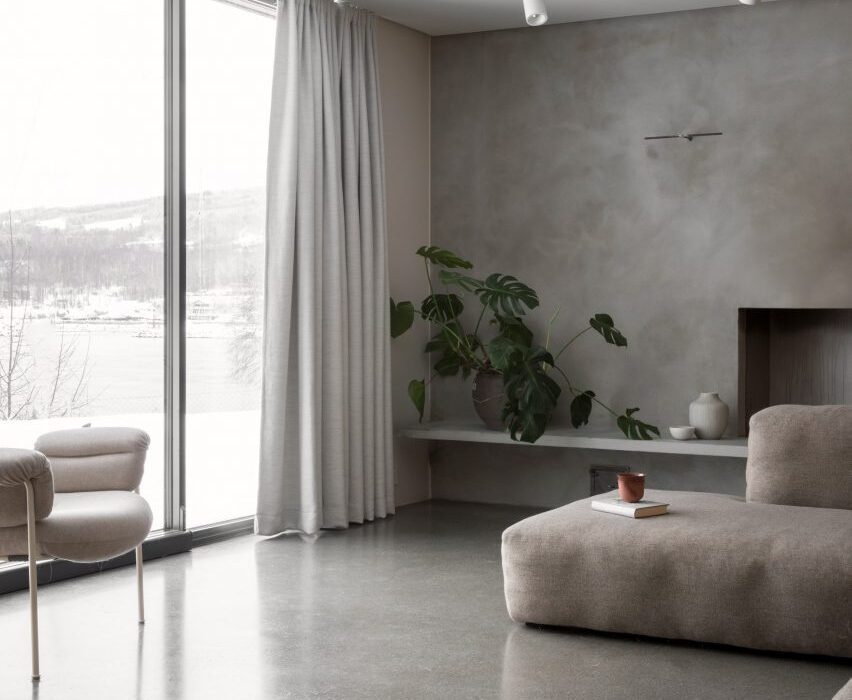
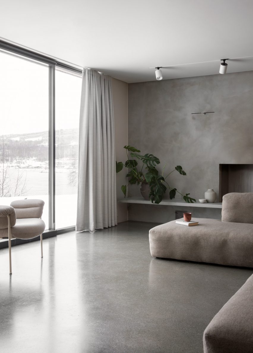
For this week’s lookbook, we have picked ten Scandi-style living rooms from the Dezeen archive that play with textures and showcase natural materials, elegant accessories and muted colours.
Scandi style is a term used to describe designs from the three Scandinavian countries – Sweden, Denmark and Norway – but has also become a catchphrase that denotes minimalist interior design that uses plenty of natural materials, especially wood.
Wooden floors are traditional in Scandinavian homes, where they are often matched with wood details such as panelling and classic mid-century modern furniture.
Scandi living rooms often feature white or pale walls, which are common in the Nordic countries where the long, dark winter months mean people tend to choose light colours for their interiors.
Many of the ten interiors below also play with textures, adding fluffy throws to simple sofas, tactile rugs to wooden floors and rattan and leather seating.
This is the latest roundup in our Dezeen Lookbooks series providing visual inspiration for the home. Previous roundups include L-shaped kitchens, interiors that use internal glazing and inviting courtyards.
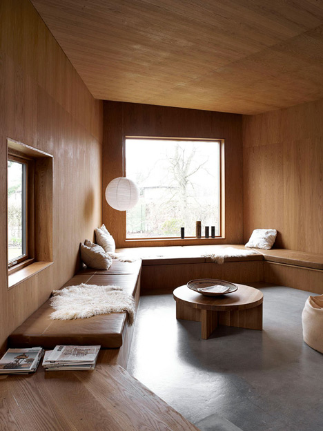
Gjøvik House, Norway, by Norm Architects
Located an hour outside of Oslo, Gjøvik House comprises six interconnected blocks with interiors featuring mottled grey walls, earthen textiles and warm wooden panelling.
Pale grey hues were used for the living room, which has a soft Bollo chair designed by Andreas Engesvik for Foglia and a modular sofa in a neutral grey tone.
According to the architect, the spaces were designed to have a “cosy and inviting feel, where you can truly hibernate while taking shelter from the frigid days of Nordic winter.”
Find out more about Gjøvik House ›
TypeO Loft, Sweden, by TypeO
The living room area of creative studio TypeO’s guest loft in southern Sweden features floor-to-ceiling glazing that opens up onto a large balcony.
A coffee table by Isamu Noguchi for Vitra matches the wooden floor and beams and is complemented by Ligne Roset’s Togo armchairs in black leather. Sculptural decorative details add an art gallery-like feel to the bright living space.
Find out more about TypeO Loft ›
20 Bond Apartment, US, by Home Studios
Design firm Home Studios filled the 20 Bond Apartment in New York with bespoke furniture and vintage finds, including a leather Safari chair by Danish designer Kai Winding.
An entire wall is taken up by a bespoke shelving unit that the studio made from oak wood and brass, adding another Scandinavian-style feature to the room. A rattan table and a pink resin side table by Sabine Marcelis add a tactile touch.
Find out more about 20 Bond Apartment ›
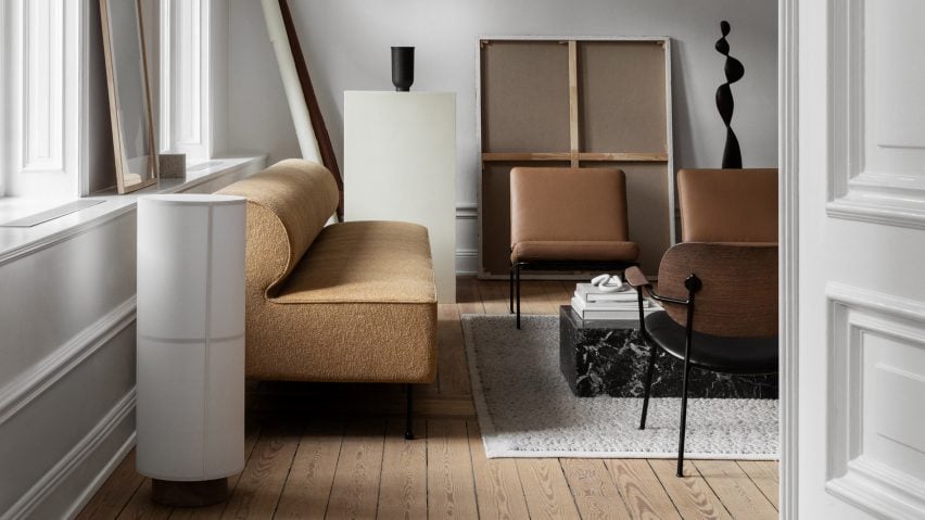
Sculptor’s Residence, Sweden, by Norm Architects, Menu and Dux
Norm Architects, Menu and Dux collaborated on this installation that was designed to resemble the “eclectic living quarters of a creative.” Muted brown and beige hues lend the interiors an earthy, organic feel, which is contrasted by the elegance of the black marble table and black sculptures.
Menu’s Hashira floor lamp adds a subtle nod to Japanese interiors, and its sleek surface offsets the knobbly texture of the brand’s Eave Dining Sofa Bench.
Find out more about Sculptor’s Residence ›
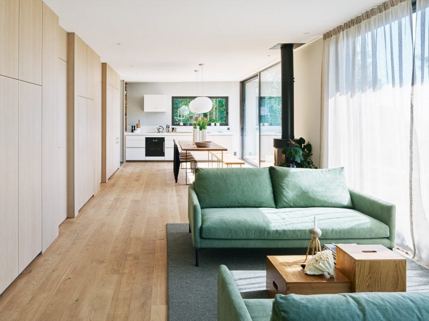
Villa Weinberg, Denmark, by Mette and Martin Weinberg
Wienberg Architects collaborated with fellow Danish architects Friis & Moltke to overhaul the 1940s Villa Weinberg. The result is a warm, inviting home lined with oil-treated oak walls.
The wood-clad living room also has a simple wooden coffee table and poufs for lounging on, as well as a built-in leather-clad bench. A rice lamp and sheepskin throw add texture to the wooden interior.
Find out more about Villa Weinberg ›
Solviken, Sweden, by Johan Sundberg
Scandi living rooms tend to have very neutral colours, but in this space in a Swedish holiday home, two comfy sofas in a calming seafoam green create a bright focal point in the room. The hue is picked up by a painting at the end of the large, open-plan kitchen and living room.
Small unpainted wooden coffee tables match the floor and the wooden storage cabinets alongside one wall.
Find out more about Solviken ›
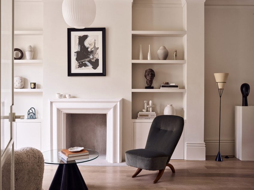
London townhouse, UK, by Daytrip
Design studio Daytrip’s renovation and expansion of an east London townhouse includes a living room with white walls, a wooden floor and furniture in muted colours.
A textured “Banana” sofa designed by Danish Cabinetmaker, contrasts with the glass Trebol side table by Oscar Tusquets Blanca.
Numerous ceramics and sculptures surround the open fireplace and add life and interest to the sleek white interior.
Find out more about London townhouse ›
Lyceum Apartments, Sweden, by Andreas Martin-Löf Arkitekter
The Lyceum Apartments in Stockholm are located in the Old Technical College’s Pharmaceutical Institute and feature light-filled rooms with clean designs and historical details.
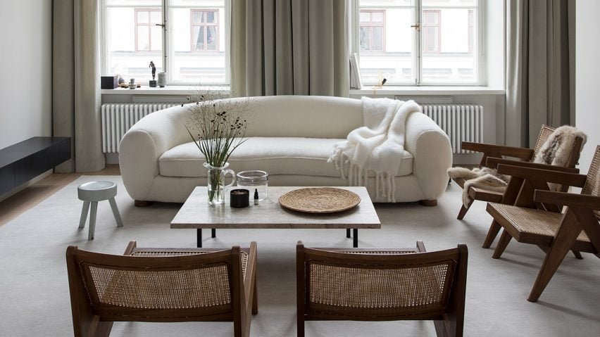
In the living room, a curved white sofa contrasts against the angular shapes of Pierre Jeanneret’s wood and cane Easy Chairs, Soft beige curtains match the neutral hues of the rest of the room.
Find out more about Lyceum Apartments ›
Sommarhus T, Sweden, by Johan Sundberg
This summer house by Johan Sundberg features a green sofa and a matching armchair. Both are from Danish brand &tradition and match the verdant greenery outside the large glass windows.
A practical wooden table holds globe-shaped glass vases matching the slightly uneven glass lamps in the ceiling. The entire room is clad in pale wood, including the spruce floors, creating a calm, peaceful interior. The fixed furniture in the home was made from oak.
Find out more about Sommarhus T ›
Birkedal, Denmark, by Jan Henrik Jansen
A circular holiday home on the island of Møn in Denmark features a playful living room with white-panelled walls and a floor covered in small white pebbles collected from the beach.
A built-in curved sofa has brown leather seats that have been made cosier with added throws and pillows, and a small circular side table provides space for books, magazines and snacks.
Find out more about Birkedal ›
This is the latest in our series of lookbooks providing curated visual inspiration from Dezeen’s image archive. For more inspiration see previous lookbooks showcasing colourful interiors, calm living rooms and colourful kitchens.