Seven Japandi interiors that blend Japanese and Scandinavian design
CategoriesInterior Design

Seven Japandi interiors that blend Japanese and Scandinavian design

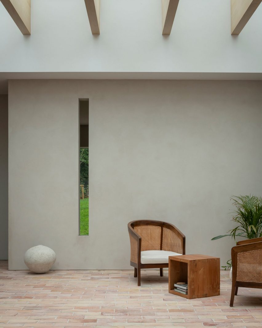
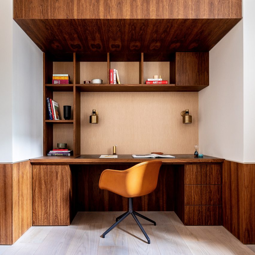
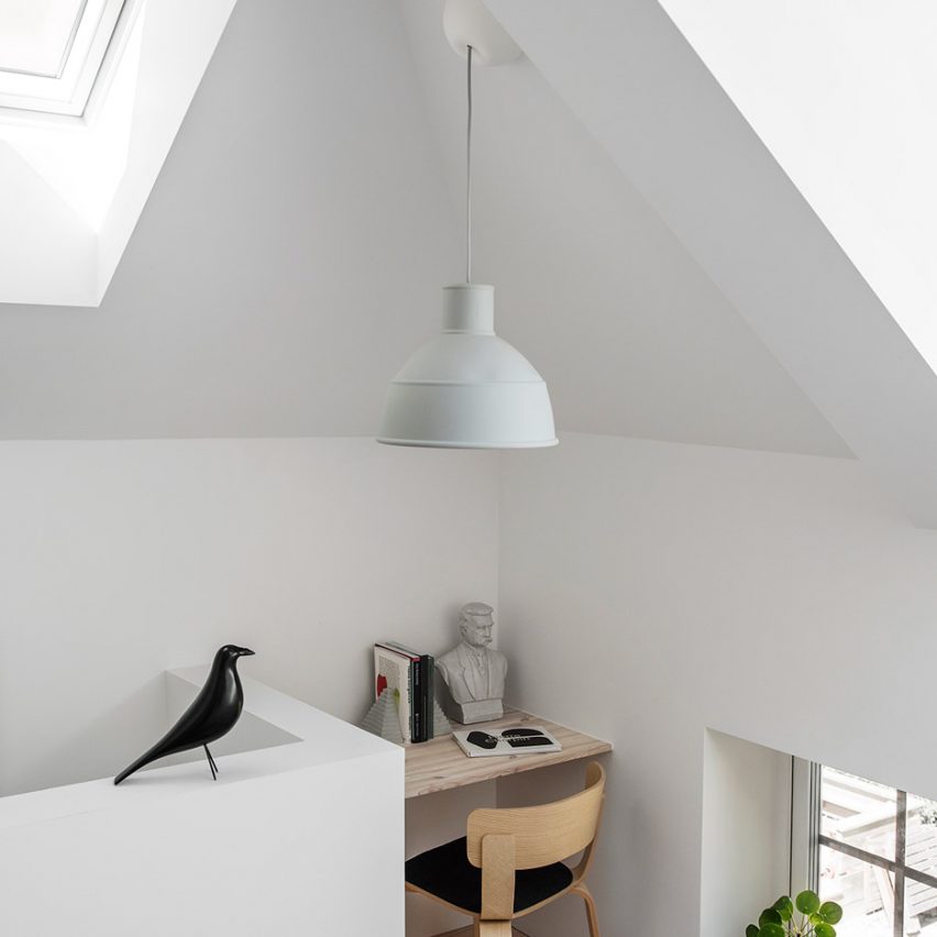
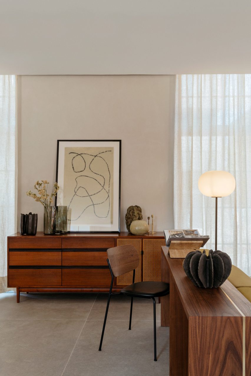
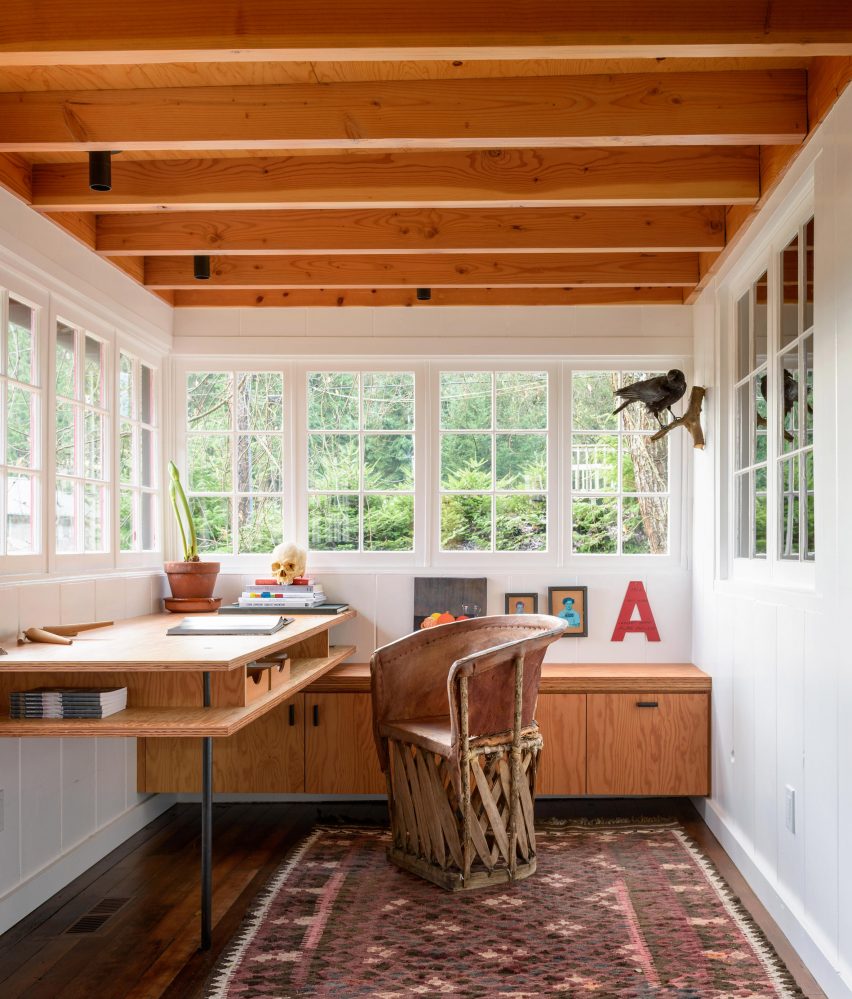
This Dezeen Lookbook presents seven interiors that combine design influences from Japan and Scandinavia in a style that has become known as “Japandi”.


A hybrid of east and west, the style is increasingly popular as a way to create interiors that are minimal without being cold. Japandi makes clever use of craftsmanship and tactile materials, such as textured wood and handmade ceramics, to add comfort and warmth.

It features pared-back styling, precise craft and natural materials – qualities that have long been central to the design traditions of Japan, and the Nordic countries, particularly Denmark and Sweden.

This is the latest lookbook in a series providing visual inspiration for interior designers and design lovers. Previous lookbooks in the series have showcased bathrooms with views, calm living rooms and peaceful bedrooms.


Living room in Archipelago House, Sweden

Archipelago House, Sweden, by Norm Architects

Norm Architects’ Archipelago House is a pine-clad holiday home that was designed to embody Swedish and Japanese aesthetics, a theme that comes through most clearly in the double-height living room.

Here, the owners can lounge on furniture that Norm Architects designed together with Karimoku Case Study – the sister brand of Japanese manufacturer Karimoku.

Creamy white and pale grey hues complement the light wood furniture in the room, where the main light source is a bespoke cone-shaped lantern. This was designed in washi paper by Japan’s Kojima Shouten, which has been making lanterns for over 230 years.

Find out more about Archipelago House ›


Ariake collection at Stockholm Design Week

A Quiet Reflection show, Sweden, by Ariake

An exhibition by Japanese furniture producer Ariake at Stockholm Design Week showcased the label’s wooden furniture, which was designed in collaboration with a number of designers from all over the world (above and top).

Set in the dilapidated former Mexican embassy in Stockholm, the clean lines of the furniture stood out against the crumbling walls and stuccoed ceilings, creating a mix of texture and colour and an appreciation for older craftsmanship that perfectly embodies Japandi.

Find out more about A Quiet Reflection ›


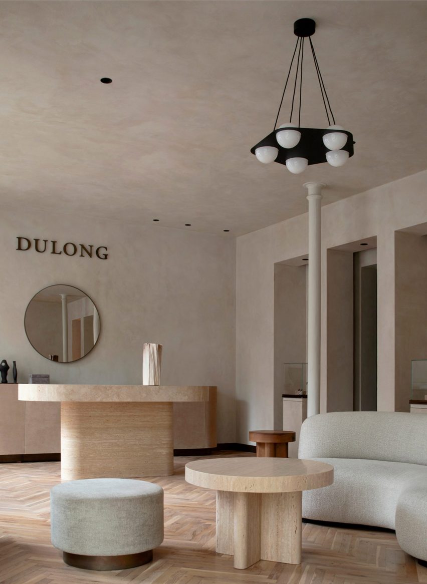
Interior of Pantechnicon store, London

Pantechnicon, UK, by Farrells

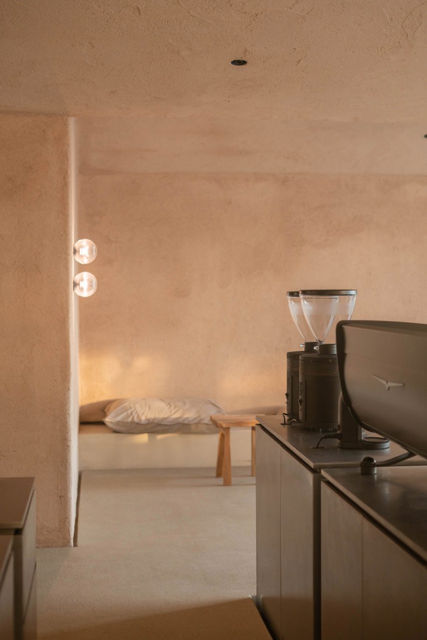
Pantechnicon, located in a 19th-century building in London’s Belgravia neighbourhood, is home to both shops and restaurants that focus on Japanese and Nordic culture. Tenants include a cafe by French-Japanese cult record label Kitsuné and a Nordic restaurant called Eldr.

While Pantechnicon’s interiors are pared-down, plenty of wood detailing gives the space an inviting feel, and lantern-like lights and green plants have been added to soften the minimalist aesthetic.

Find out more about Pantechnicon ›


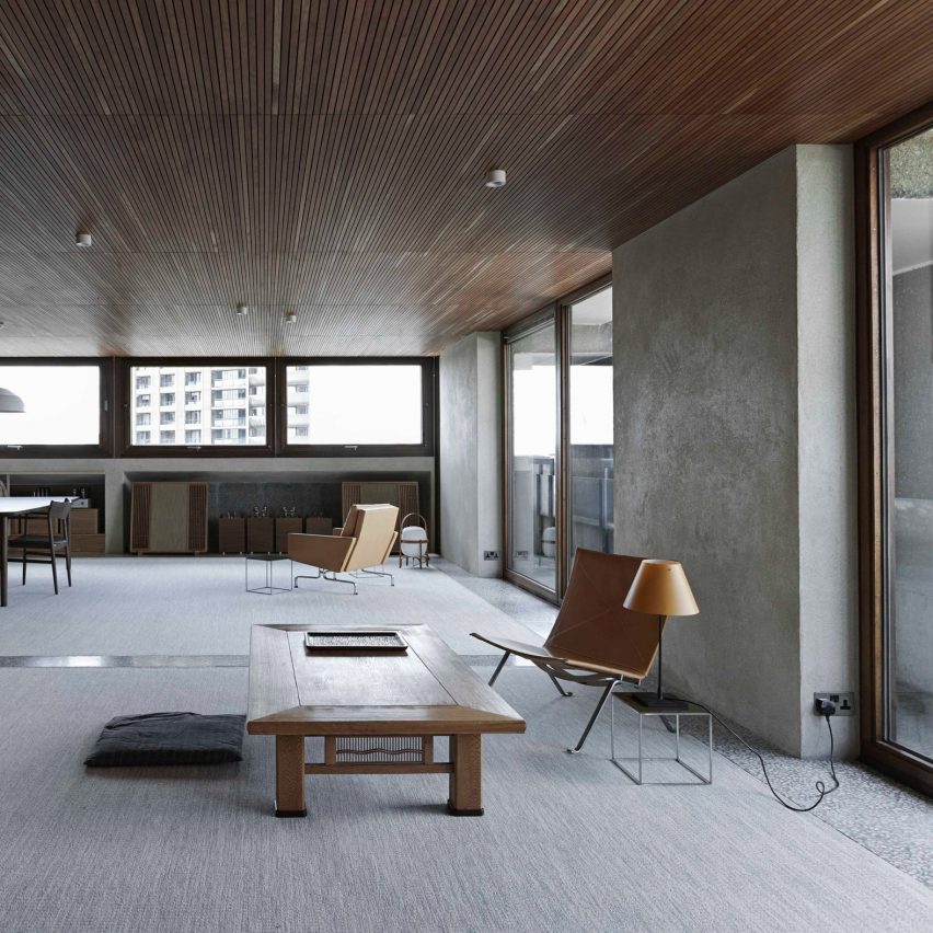
Japandi interior in Hudson Woods house

Upstate New York Home, US, by Magdalena Keck

A family with Japanese and American heritage live in this home in the Catskill Mountains, which has an interior that draws on both their backgrounds and adds plenty of Scandinavian style.

In the open-plan living room, dining room and kitchen, a table and chairs by Danish designer Finn Juhl share the spotlight with Japanese pottery and woven mats sourced from Tokyo. Mid-century design and American crafts also feature in the house, balancing out the Japanese minimalism.

Find out more about Upstate New York Home ›


Copenhagen restaurant with Japanese-style interior

Izumi, Denmark, by Pan-Projects and Mok Architects

A Japanese restaurant in Copenhagen is the perfect setting for an interior style that mixes the two cultures.

Izumi, in the city’s Charlottenlund suburb, draws on both Japanese restaurant interiors, with translucent screens that reference traditional paper sliding doors, and Scandinavian design. This can be seen in the curving oak panels that surround the open kitchen.

“Japan and the Nordic countries have a rich history of cultural interactions,” explained Pan-Projects’ founders Yurioko Yaga and Kazumasa Takada. “Especially in the field of design, there are many examples that are rooted originally in Japanese culture yet developed uniquely in the land of the Nordic region.”

Find out more about Izumi ›


Claesson Koivisto Rune Tokyo hotel

K5 Tokyo Hotel, Japan, by Claesson Koivisto Rune

A converted bank building in Tokyo, bombed during world war two, was turned into a boutique hotel by Swedish studio Claesson Koivisto Rune. The studio created a warmer interior style than is usually associated with Japandi, using tactile details and saturated hues.

Thin blue ombre curtains evoke the traditional craft of Japanese indigo-dyeing, or aizome, while sturdy wooden room dividers nod to Scandinavian mid-century modern design. The studio based K5’s interior around the Japanese notion of “aimai”, which is used to describe things that are ambiguous or unclear.

Find out more about K5 Tokyo Hotel ›


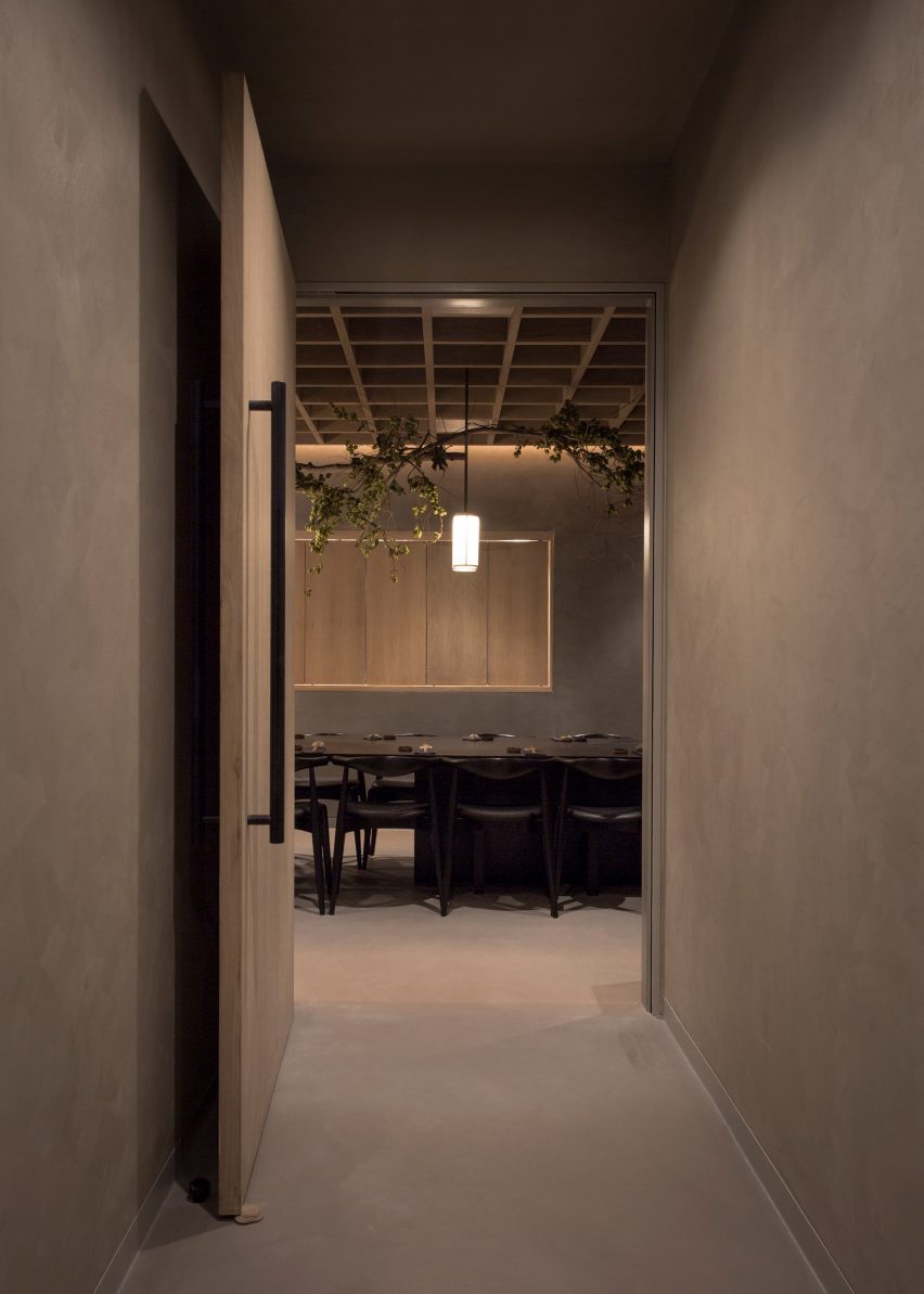
Japandi-style interior, London

Powerscroft Road townhouse, UK, by Daytrip

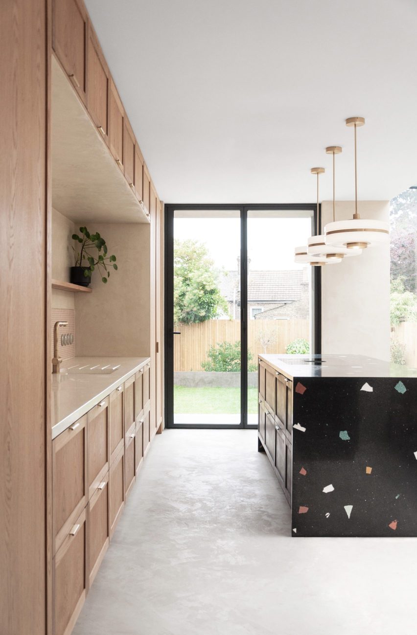
As part of the renovation and expansion of this London townhouse, London-based Daytrip loosely lime-washed the walls and added polished concrete floors to create a “calm and serene home”.

The Scandinavian influence can be seen in the warm wood details used throughout the flat – as in this dining room, where a dark-wood chair complements a dainty table underneath the window – while elegant lighting fixtures add an East Asian feel.

A Japanese paper lamp from designer Isamu Noguchi’s Akari range stands on a wood-burning stove stacked with logs, Scandinavian-style.

Find out more about Powerscroft Road townhouse ›


This is the latest in our series of lookbooks providing curated visual inspiration from Dezeen’s image archive. For more inspiration see previous lookbooks showcasing peaceful bedrooms, calm living rooms and colourful kitchens.

Reference

Ten welcoming living rooms where the fireplace takes centre stage
CategoriesInterior Design

Ten welcoming living rooms where the fireplace takes centre stage

With spring still a few months away in the northern hemisphere, this is the season to snuggle up in front of an open fire. For our latest lookbook, we’ve rounded up ten cosy living rooms where the fireplace is at the heart of the interior design.


This is the latest roundup in our Dezeen Lookbook series providing visual inspiration for the home. Previous articles in the series showcased living rooms with calm interiors, peaceful bedrooms, Japandi interiors and domestic bathrooms designed by architects.


White living room with black fireplace

116 Sorauren and 118 Sorauren, Canada, by Ancerl Studio

The living room of 116 Sorauren Street in Toronto, one of a pair of twin townhouses designed by Ancerl Studio, has been made cosy through the use of natural materials and plenty of textiles.

A black steel fireplace sits on a cast concrete plinth against the back wall. The plinth extends to create a comfortable nook has where the owners or their guests can warm themselves.

Find out more about 116 and 118 Sorauren ›


Pale brick fireplace in modern living room

Three Chimney House, US, by T W Ryan Architecture

This modernist white-brick house in Virginia (above and top image) has three white chimneys that define its external form. Inside, one of them opens up into this starkly elegant, brick-clad fireplace in the living room.

Here, tall white walls and ceilings create a contrast with the more traditional upholstered furniture. Warm colours ranging from pale aubergine purple to a mustard yellow were used on the seating by the fireplace, which is practical during cold winter months as well as being a decorative feature all year round.

Find out more about Three Chimney House ›


Living space with Japanese informed fireplace

Pound Ridge House, US, by Tsao & McKown

Tsao & McKown drew on Japanese architectural principles when designing Pound Ridge House. The influence that can be seen in the pared-back fireplace built onto a square stone hearth that sits between the living room and the dining room.

The design references an irori, a traditional Japanese sunken hearth which is often square in form and set in the middle of a room.

Smoke is extracted by a bronze flue in the form of a truncated pyramid that hangs from the ceiling of the lounge, which is filled with wood detailing and cream-coloured textiles. A generous skylight lets the light in during the daytime.

Find out more about Pound Ridge House ›


US home with large black fireplace

Teton House, US, by Olson Kundig

With views like the ones from Teton House (above and top) in the mountainous terrain of Jackson Hole, Wyoming, you don’t need art on the walls. Olson Kundig used floor-to-ceiling windows to take advantage of the vistas. But the view is almost upstaged by a substantial black fireplace in the centre of the glazing.

The simple form of the fireplace is complemented by leather chairs in warm brown hues as well as wood surfaces and woven textiles, creating an inviting, relaxing atmosphere.

Find out more about Teton House ›


California farmhouse with white brick fireplace

House for Grandparents, US, by Dash Marshall

The renovation of this California farmhouse was informed by the state’s Spanish missions, and its geometric forms and spartan material use reference these religious structures. But there is nothing ascetic about the house’s comfortable living room, where a broad brick fireplace sits on one wall.

A colourful painting and rug add vibrancy to the room, while two cylindrical metal coffee tables pick up the warm glow of the fire.

Find out more about House for Grandparents ›


Massive stone fireplace

Smith Residence, Canada, by MacKay-Lyons Sweetapple

Inside this holiday home on the Nova Scotia peninsula, a massive fireplace keeps the living room toasty. Made from granite that was sourced from a nearby quarry, the fireplace features one aperture for the fire and one for storing logs.

Its sits underneath the black steel trusses that support the exposed roof. In front of the fire, a soft high-pile rug and two brown leather sofas complete the design of the living room.

Find out more about Smith Residence ›


Library room with statement fireplace

Wasatch House, US, by Olson Kundig

An enormous bronze flue dominates the library in this Utah home by Olson Kundig, which has the feel of a living room thanks to a wide leather sofa and two cognac-coloured leather chairs. These sit in front of the unusual portrait-shaped fireplace, which is set in the monolithic flue and fronted by double doors.

A colour palette of dark browns and greys create a pleasantly laid-back atmosphere in the capacious room while ceiling-height bookcases flank the fireplace.

Find out more about Wasatch House ›


Concrete and red brick fireplace in Brussels rooftop extension

Lincoln, Belgium, by Notan Office

Modernist architect and designer Alvar Aalto inspired the design for this fireplace, set in a rooftop extension in Brussels by Notan Office.

It wraps around a corner and was built from concrete and ceramic construction blocks in warm orange and pale grey hues. “A fireplace is a kind of artifactual element in a house,” architect Frédéric Karam told Dezeen. “I wanted to express a sense of organic and rough feeling for such a function,”

Find out more about Lincoln ›


Slim fireplace in Little Peek by Berman Horn Studio

Little Peek, US, by Berman Horn Studio

Little Peek is a holiday home in Vinalhaven off the coast of Maine, designed by the Berman Horn Studio founders for themselves.

Designed to be used in all seasons, the house nevertheless has a summer feel thanks to its light interior and many generous windows, as well as an enclosed patio.

But in the open-plan kitchen and living room, a built-in fireplace set in a narrow stonework flue helps keep the room warm during cold New England winters.

Find out more about Little Peek ›


Contemporary freestanding fireplace in Italy

Casa Prè de Sura, Italy, by Casati

A freestanding fireplace in the form of a trapezoidal prism decorates this living room in Italy, set in a gabled house by Austrian architects Casati that has rough limestone interior walls.

The white fireplace functions as a decorative piece as well as a heat source. It has been cleverly designed with a side ledge on which the owners can stack wood. Beige and cream hues were used for the colour palette, matching both the fireplace and the limestone walls.

Find out more about Casa Prè de Sura ›


This is the latest in our series of lookbooks providing curated visual inspiration from Dezeen’s image archive. For more inspiration see previous lookbooks showcasing peaceful bedrooms, calm living rooms and colourful kitchens.

Reference

Ten designer bathrooms with freestanding baths
CategoriesInterior Design

Ten designer bathrooms with freestanding baths

For our latest lookbook, we’ve rounded up 10 dream bathrooms with statement baths ideal for luxurious bathing, including tubs made from teak, clay, concrete and porcelain.


This is the latest roundup in our Dezeen Lookbook series providing visual inspiration for the home. Previous articles in the series showcased peaceful bedrooms, colourful kitchens and living rooms with calm interiors.

Below are ten bathroom interiors from the Dezeen archives featuring standalone baths that sit in the middle of the room or away from the walls.


Black-tiled bathroom with freestanding bath

Screen House, Sydney, Australia, by Carter Williamson Architects

The bathroom of Screen House by architecture studio Carter Williamson is covered from floor to ceiling with tactile black tiles to create a spa-like setting for its owners.

A freestanding bathtub was placed under a bubble-like pendant light that is suspended from the asymmetric pitched roof.

Find out more about Screen House ›


Metal bath in tiled bathroom

Chimney House, Sydney, Australia, by Atelier Dau

As part of an extension and refurbishment of a heritage-listed building in Sydney, architecture studio Atelier Dau added a ground floor bathroom.

The bathroom is defined by porcelain floor tiles designed by Patricia Urquiola and a statement roll-top bath alongside a narrow window with views to the home’s internal courtyard.

Find out more about Chimney House ›


Bath made from sands, unfired clays, pigments and minerals

Highgate house, London, UK, by House of Grey

This London home designed by interiors studio House of Grey incorporates a range of natural materials and finishes.

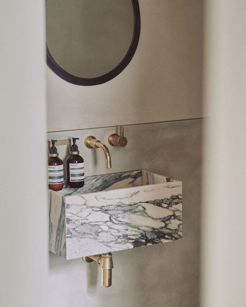
In the bathroom (above and top), the walls are coated with a lime-based plaster surface called Tadelakt, which is waterproofed using a soap solution. The bath and sink were made from a combination of sands, unfired clays, pigments and minerals.

Find out more about Highgate house ›


Concrete, freestanding bath with views of Costa Rican jungle

Art Villa, Costa Rica, by Formafatal and Refuel Works

Czech studios Formafatal and Refuel Works left the concrete structure exposed throughout this villa nestled into the jungle in Costa Rica.

In the master bedroom, a concrete tub is set alongside a pair of glass doors that allow the space to be opened up to the surrounding jungle.

Find out more about Art Villa ›


Bath in bathroom with glass walls

Mountain cabin, Italy, by Modostudio

The bathroom of this secluded mountain cabin designed by Modostudio has spectacular views over Italy’s Adige Valley.

Set at the centre of the room the freestanding bath was positioned to take the best advantage of these views through full-height windows.

Find out more about Mountain cabin ›


Freestanding jet-black tub

Tsubo House, London, UK, by Fraher & Findlay

Architecture practice Fraher & Findlay focused the renovation and extension of this home in east London on a small courtyard.

All of the house’s bathrooms feature graphic monochromatic tiled floors, while the master bathroom has its own fireplace and a freestanding jet-black tub.

Find out more about Tsubo House ›


Freestanding bathtub

House V, Slovakia, by Martin Skoček

The dramatic en-suite bathroom of the master bedroom of this gabled house near Bratislava, designed by architect Martin Skoček, is lined with salvaged bricks.

Its centrepiece, aligned with the apex of the pitched ceiling, is an oval, freestanding bathtub.

Find out more about House V ›


Bath room with colourful cement tiles from Nicaragua

Atelier Villa, Costa Rica, by Formafatal

The bathrooms within this perforated-aluminium clad villa in Costa Rica are defined by floors made with cement tiles from Nicaragua.

One of the bedroom suites has a freestanding bath that is lit by mottled light coming through the cladding perforations.

Find out more about Atelier Villa ›


Teak bath with London views

Leaf House, London, UK, by Szczepaniak Astridge

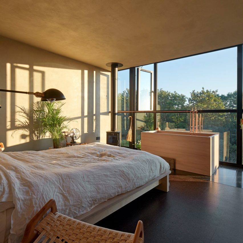
The focal point of the rooftop extension to architectural photographer Edmund Sumner and writer Yuki Sumner’s London home by Szczepaniak Astridge is a Japanese-style wooden bath.

Positioned against a large window that has views across London, the bath was made from waxed teak by furniture maker William Garvey.

Find out more about Leaf House ›


Copper bathtub

The Boathouse, Devon, UK, by Adams+Collingwood Architects 

London studio Adams+Collingwood Architects designed this house overlooking Salcombe Estuary so that its first-floor living spaces could take advantage of views across the Area of Outstanding Natural Beauty.

On the ground, which is embedded into the hillside, there are four bedrooms and three bathrooms, including the master en-suite that features a copper bathtub.

Find out more about The Boathouse ›

Photography is by Jim Stephenson, Brett Boardman, Edmund Sumner, BoysPlayNice, Adam Scott, Laura Egger, Tom Ferguson, Michael Sinclair and Matej Hakár.


This is the latest in our series of lookbooks providing curated visual inspiration from Dezeen’s image archive. For more inspiration see previous lookbooks showcasing peaceful bedrooms, calm living rooms and colourful kitchens.

Reference

FOG Architecture creates “modern cave” for ToSummer’s Beijing store
CategoriesInterior Design

FOG Architecture creates “modern cave” for ToSummer’s Beijing store

Chinese studio FOG Architecture has added curved walls, mirrored surfaces and faux stone to the interiors of aromatherapy brand ToSummer’s flagship store in Beijing.


Located in Beijing’s Taikoo Li Sanlitun shopping village, FOG Architecture designed the 170-square-metre ToSummer store to recall the atmosphere of a cave.

ToSummer Living Room has faux stone walls
Top: a mirrored screen was placed at the entrance to the store. Above: the exterior of the store is covered in a textured faux stone

“The brand’s concrete requirement for this space design was a modern cave,” said FOG Architecture.

“We chose not to directly create the natural appearance of caves but, instead, presents the characteristic elements of material textures to inspire the sensory experience.”

Mirrored surfaces were used throughout ToSummer Living Room
The mirrored screen reflects passers-by and the interior of the store

The entrance to the store is marked by a large faux-stone wall and a mirrored screen, which leads visitors into the store.

The studio explained that the large mirrored screen was designed to draw passers-by into the store while referencing screens typically used in homes and domestic spaces.

A togo sofa is placed beside undulating walls at ToSummer Living Room
Curving walls were used along the perimeter of the store

“The curiosity of what is behind attracts the beholders to walk inside,” FOG Architecture co-founder Zheng Yu told Dezeen. “The surface of the screen is usually decorated with an illustration of natural scenery.”

“It is a metaphor of the space hidden behind. And this is the reason we placed a scaled up, mirror polished screen as the central spatial element. It illustrates beauty in a restrained manner.”

Mirrored furniture was used in the retail space at ToSummer Living Room
The store was divided into multiple zones

Natural-toned, undulating walls envelop the interior of the store and are illuminated by strip lighting set within the ceiling.

The interior was divided and zoned into a collection of small sections each with its own functions, housing retail space, exhibition space and installation areas.

A cream Togo by Michel Ducaroy for Ligne Roset, an off-white Playdough chair and coffee table by Karstudio as well as amorphous mirrors were placed throughout the store suggesting the idea of domestic space.

“The aim of the furniture is to convey a sense of the domestic,” said Yu. “That’s why we named this space a ‘Living Room’. A space that gives people a place to breathe in a busy and fast-moving shopping mall.”

The walls of the ToSummer Living Room were finished with white
A long metal island contrats with the softness of the store

Custom “timber rotten” chairs designed by British designer Max Lamb were also placed across the store and in niches formed by its curved walls.

“In a way, Max Lamb was also our main inspiration during the project,” Yu explained.

“The [chairs] lacquering was smooth, shiny and colourful while the foam is tortured, torn, scarred – combined the materiality itself gives me an illusion of heaviness similar to a piece of timber rotten through time, but it is lightweight and smooth and newly made.”

Light reflects of the metal surfaces
Shelves were built within the curving walls

An exhibition and retail space at the rear of the store has a series of shelves organised around a long reflective metal island that contrasts to the curving walls it is surrounded by.

Rectangular metal shelves were suspended along the undulating walls, drawing attention to the irregularity of the space while displaying products like artworks.

Shelves house the stores product at ToSummer Living Room
Two chairs designed by Max Lamb occupy the space

A metal cashier’s table was tucked behind a curving volume and mimics the shape of its walls, forming a rounded counter space that becomes an extension of the walls.

“[The store] transforms the original cave concept into spatial language, integrating it into this realistic space full of modern oriental feeling to present a delicate balance between commercial and art, domestic and public realm, natural and artificial,” said the studio.

Fragrance is pictured on a metal shelf
The display areas were designed to showcase product like artwork

FOG Architecture is a studio with offices in London, Shanghai and Chongqing founded by Yu and Zhan Di.

Other Beijing projects with curved walls include this avocado-green space age informed hair salon and this kindergarten with a rooftop playground by MAD Architects.

Photography is by Inspace.


Project credits:

Design principle: Zheng Yu, Zhan Di
Design team: Hou Shaokai, Zhou Chuyang, Xiong Aijie, Vince Choi and Fu Shidi
Lighting design: School of Architecture, Tsinghua University and One Lighting Associates Beijing
Furniture and installation design: DEFRONT and F.O.G.
Construction drawing: SU PIN
Construction team: Youlong Jinsheng Decoration Ltd.

Reference

Ten living rooms with practical and beautiful built-in storage
CategoriesInterior Design

Ten living rooms with practical and beautiful built-in storage

For our latest lookbook, we’ve rounded up ten living rooms that have solved the storage dilemma with bespoke shelving that define the room.


This is the latest roundup in our Dezeen Lookbook series providing visual inspiration for the home. Previous articles in the series showcased designer bathrooms, colourful kitchens and living rooms with calm interiors.

Whether they’re used as room dividers, to show off the owners’ book collection or as a hiding place for shy pets, built-in or custom-made shelves create a design statement.

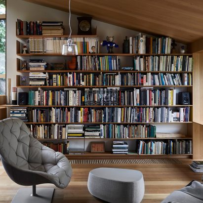
Read on for our round up of the ten best from Dezeen’s archives (plus a bonus eleventh one, above, which features the spectacular floor-to-ceiling bookcases at Olson Kundig’s Wasatch House in Salt Lake City):
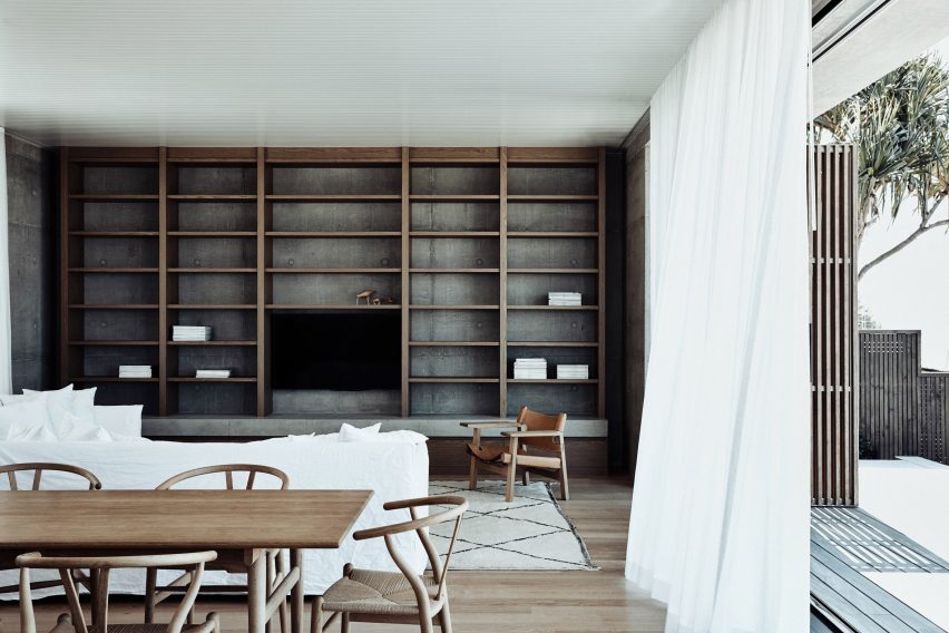

Mermaid Beach Residence by B.E. Architecture

Mermaid Beach Residence, Australia, by B.E. Architecture

The living room of Mermaid Beach Residence in Queensland’s Gold Coast region is a study in clever material use, with its concrete surfaces and timber flooring.

The monolithic built-in wooden shelving that fills one wall creates a decorative grid-effect on top of the concrete. It rests on a stone slab above wooden storage units at floor level.

Find out more about Mermaid Beach Residence ›
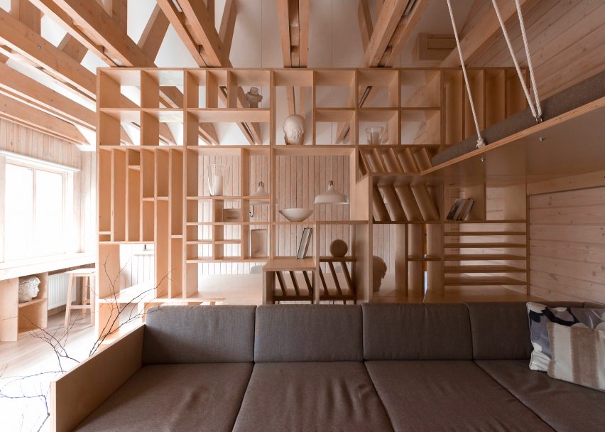

Artist's studio with large plywood partition

Artist’s studio, Russia, by Ruetemple

Architecture studio Ruetemple looked to “drawing and architecture” when designing this artist’s studio in Moscow, which is dominated by a large plywood partition that incorporates both furniture and shelving.

As well as separating the lounge area from a workspace, the partition works as both storage space and furniture. It has a built-in sofa, shelving, and a set of steps that lead up to a suspended sleeping platform.

Find out more about Artist’s studio ›
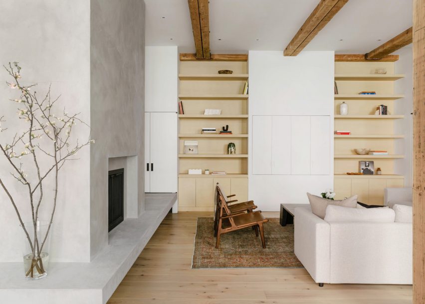

Pastel yellow built-in shelves in living room with concrete-style fireplace

Spear Building Loft, US, by Ravi Raj and Evan Watts

This former factory in New York was renovated to create a bright, open living space. In the living room, simple built-in shelves were painted in a creamy pastel-yellow hue that harmonises with the white storage units and the fireplace.

Rather than building the shelves into a separate wall panel, they have been attached to the white wall on one side, which creates an airy feel and helps open up the room.

Find out more about Spear Building Loft ›
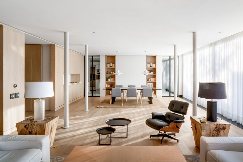

Sierra Negra by Hemaa

Sierra Negra, Mexico, by Hemaa

Two built-in shelves with wooden panelling serve a decorative function in this Mexico City living room, which has matching wooden floorboards and wood-clad walls.

Its minimalist interior and simple colour palette, which blends beige, brown and grey hues, means the books in the shelves stand out as a splash of colour. The shelves also hold speakers and picture frames, helping to keep the rest of the room free from clutter.

Find out more about Sierra Negra ›

Sausalito Outlook by Feldman Architecture

Sausalito Outlook, USA, by Feldman Architecture

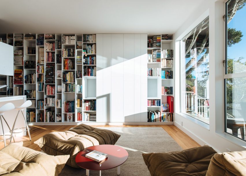
In the living room of this hillside home in Sausalito, California, Feldman Architecture added plenty of storage space for the owners’ book collection, while the white panelling in the middle hides the TV from sight.

The walls and kitchen space next to the storage wall have been painted a matching glossy white, complemented by more natural hues such as a beige rug and brown Ligne Roset Togo seating.

Find out more about Sausalito Outlook ›

Built-in wooden panelling in white open-plan living room

Mayfair apartment, UK, by MWAI

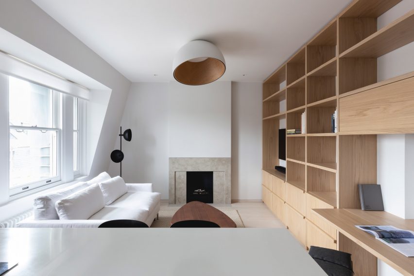
In small apartments, built-in shelving can be the perfect space-saving solution. For MWAI’s design of a 37-square-metre home in London’s Mayfair area, it covered one wall of the open-plan kitchen and living area in a pale-wood storage unit that also includes a desk.

Colours were kept neutral to reinforce the studio’s idea to look at the design as that of a hotel room where “all functions are carefully and discreetly planned to provide a functional response.”

Find out more about Mayfair apartment ›

Study lined with wood in Kew Residence by John Wardle Architects in Melbourne, Australia

Kew Residence, Australia, by John Wardle

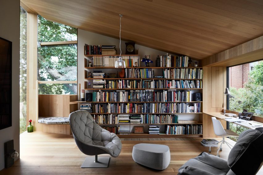
Architect John Wardle renovated his own Kew Residence home to make its wood-lined first-floor study the focal point of the house. Built-in shelves hold books and bric-a-brac on one side of the room and the architect’s art collection on another.

Neutral wood colours were used for the shelves and the built-in reading nook in the room, where the architect said he spends “just about all his daylight hours.”

Find out more about Kew Residence ›

White shelves with a staircase for cats and colourful furniture

House for Booklovers and Cats, USA, by BFDO Architects

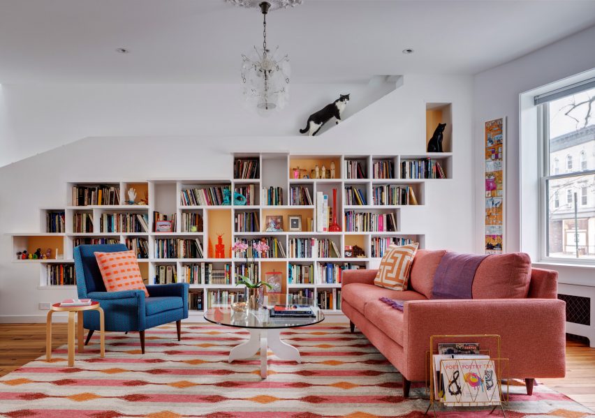
The built-in storage in this colourful home lives up to the project name – it doesn’t just have space for books and art, but also for the owners’ two cats to hide away from visitors.

The custom-made shelf has dozens of cubby holes while projecting shelves form a staircase for the cats to ascend to the ledge at the top, where they can sit and observe the goings-on below.

Find out more about House for Booklovers and Cats ›

Walnut reading nook and white bookshelf in Frank Gehry house

The Hide Out, US, by Dan Brunn Architecture

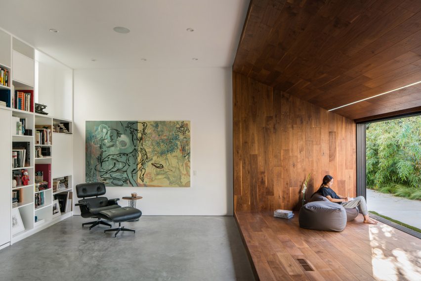
Dan Brunn Architecture renovated The Hide Out, which was originally designed by Frank Gehry in the 1970s, to pay homage to its initial simple material palette.

In this living room and bedroom overlooking a meditation garden, the lush walnut seating nook is complemented by a built-in white bookshelf that also hides a fold-out bed.

Find out more about The Hide Out ›

Roksanda Ilincic renovation by RA Projects

Fin House, UK, by RA Projects

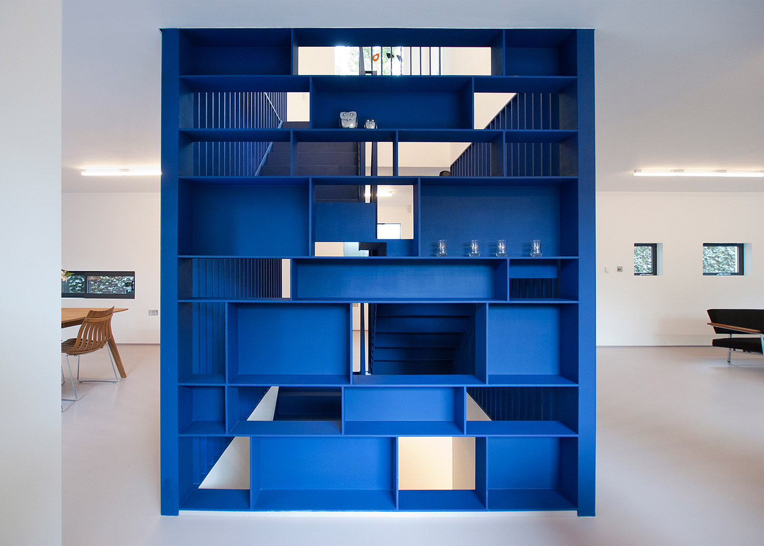
The blue steel staircase in the middle of the living space in this home designed for fashion designer Roksanda Ilincic was designed to look “like a sculpture in a gallery.”

As well as a staircase, the piece functions as a shelving system with multiple shelves in different sizes. Its back wall is broken up rather than solid, which lets light pass through and stops the colourful piece from feeling too solid.

Find out more about Fin House ›


This is the latest in our series of lookbooks providing curated visual inspiration from Dezeen’s image archive. For more inspiration see previous lookbooks showcasing peaceful bedrooms, calm living rooms and colourful kitchens.

Reference

Ten calming green kitchens that bring natural tones into the home
CategoriesInterior Design

Ten calming green kitchens that bring natural tones into the home

For our latest lookbook, we’ve rounded up ten fresh and airy kitchens that use shades of green to give a hint of the natural world.


From soft sage to bright emerald, green is this year’s kitchen colour trend, often paired with natural local materials.

Perhaps inspired by our craving for nature during the pandemic, calming sea greens, grassy hues and mossy tones are popular choices for kitchen cabinetry, walls or tiles.

This is the latest roundup in our Dezeen Lookbook series providing visual inspiration for the home. Previous articles in the series showcased living rooms with statement shelving, peaceful bedrooms and designer bathrooms.


Kitchen with murky green cabinets

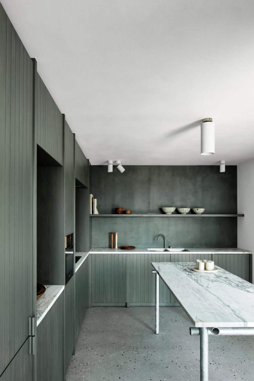
Belgium Apartment, Belgium, by Carmine Van Der Linden and Thomas Geldof

Local architects Carmine Van Der Linden and Thomas Geldof designed this duplex for a coastal location surrounded by sand dunes on the Belgian coast.

To contrast the marble-topped counters, the architects choose to colour the splashback, shelving and panelled birch-wood cabinets in a shade of green that recalls seaweed and beach grasses.

“The colour choice of the wood subtly brings in the seaweed colour from the adjacent sea and the marram grasses in the surrounding dunes,” the architects explained.

Find out more about Belgium Apartment ›


Kitchen with countertops of terrazzo flecked with orange stone

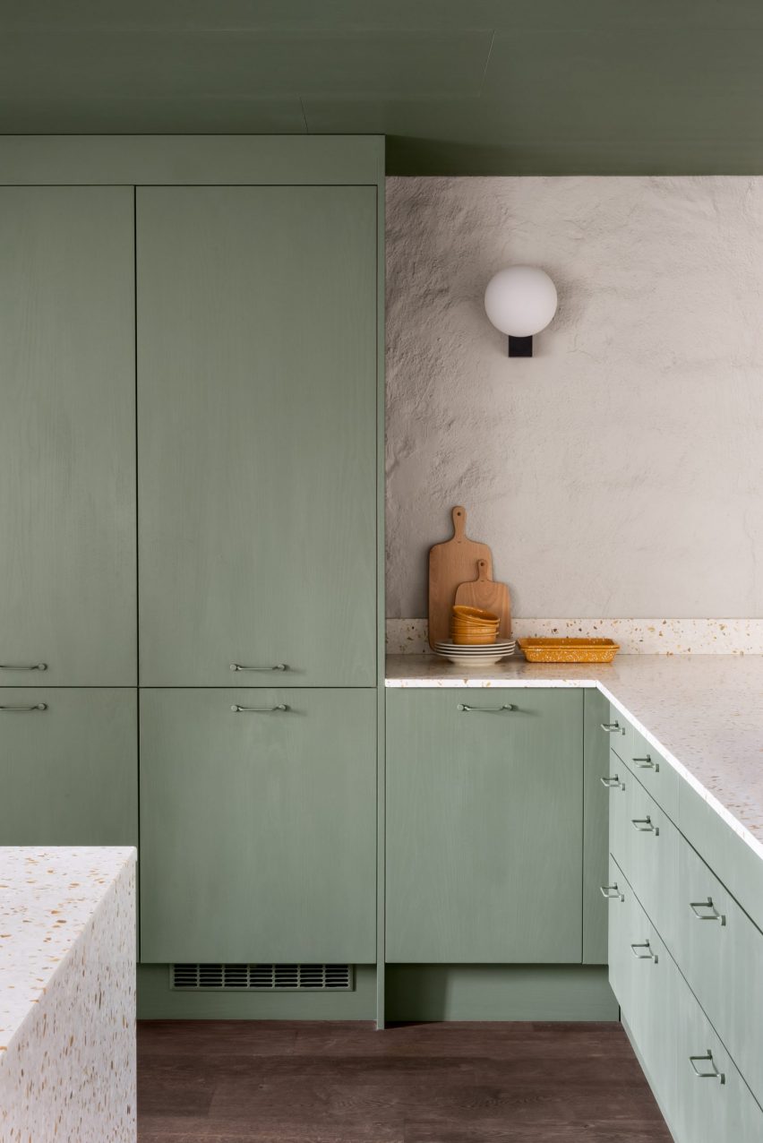
The Mantelpiece Loft, Stockholm, Sweden, by Note Design Studio

Note Design Studio painted furniture in green and pink throughout The Mantelpiece Loft to stand out against its white walls.

Sage green was used for one of the staircases and a bedroom, as well as the kitchen cabinets that were paired with contrasting countertops of terrazzo flecked with orange stone.

Find out more about The Mantelpiece Loft ›


Green kitchen in Lyon apartment

Apartment XVII, Lyon, France, by Studio Razavi

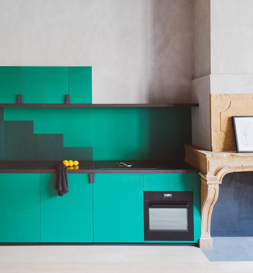
Studio Razavi combined pale-grey plaster, a light wooden floor and sea-green cabinets in this renovation of an apartment in a Renaissance-era building in the historic Vieux Lyon neighbourhood of Lyon in France.

The green kitchen cabinetry has a matching splashback with a stepped silhouette.

Find out more about Apartment XVII ›


Kitchen with sea-green cabinetry

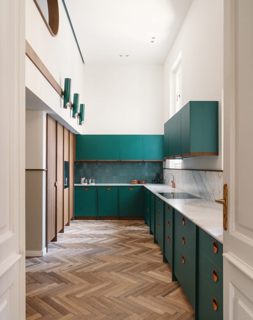
Casa Mille apartment, Turin, Italy, by Fabio Fantolino

Italian architect Fabio Fantolino used pops of green and petrol blue throughout the interior of this apartment in Turin that he designed for himself.

In the herringbone-floored kitchen, sea-green cabinetry is paired with copper handles.

Find out more about Casa Mille ›


Stained-green kitchen cabinets

House extension, Sheffield, UK, by From Works

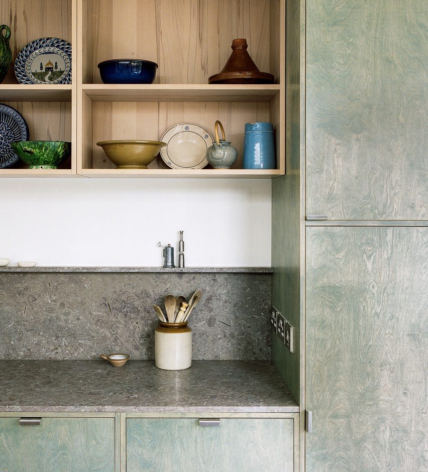
The bespoke kitchen of this house in Sheffield was designed to incorporate the materials and colours of moss-covered rocks found in the nearby Peak District.

It combines green-stained plywood with grey fossil limestone worktops and splashback sourced from a Derbyshire quarry.

Find out more about Sheffield house extension ›


Green kitchen

Waterfront Nikis Apartment, Thessaloniki, Greece, by Stamatios Giannikis

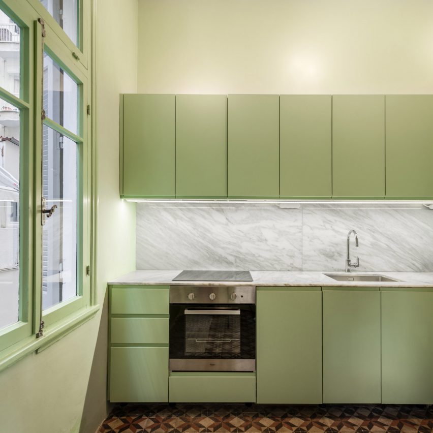
Architect Stamatios Giannikis used colour-blocked walls painted in flamingo pink, azure blue and pastel green to define the different rooms in this seaside apartment in Greece.

The green chosen for the kitchen cabinets and walls was designed to be in sharp contrast with the apartment’s original geometric red and black cement-tile flooring.

Find out more about Waterfront Nikis Apartment ›


Apartment with a mint-green floor

Apartment on a Mint Floor, Porto, Portugal, Fala Atelier

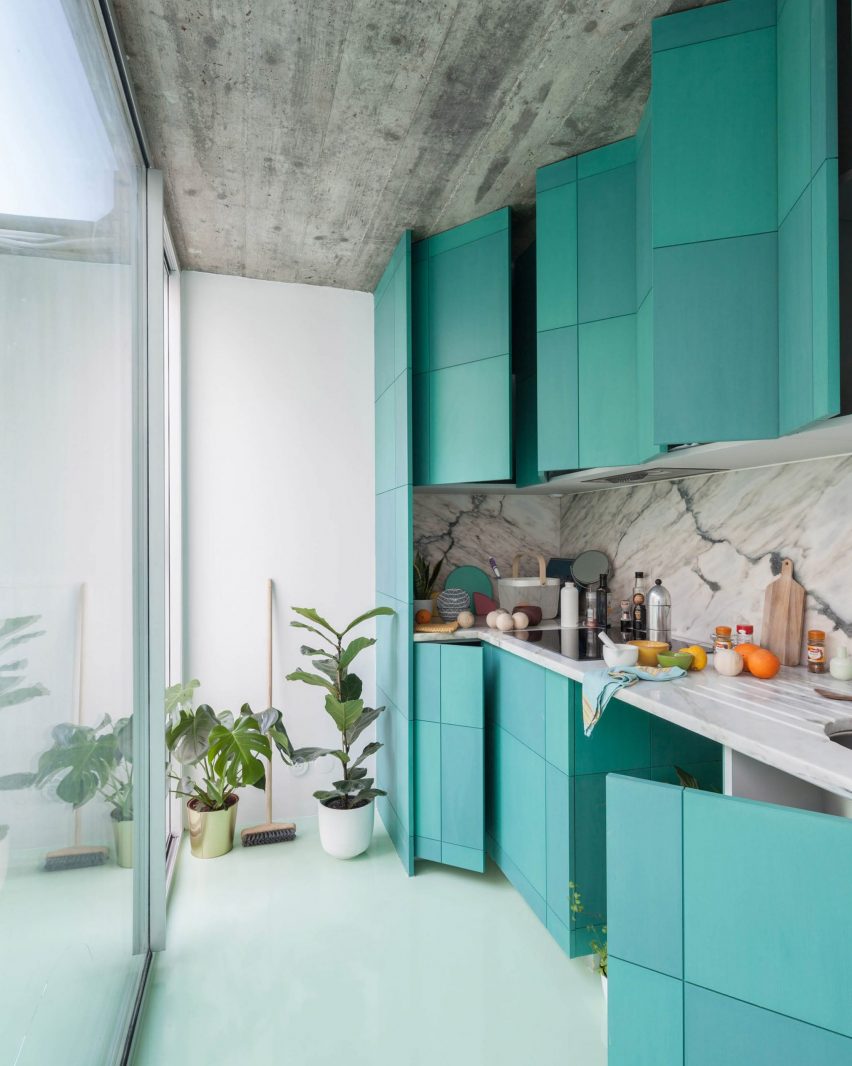
As the name suggests, Fala Atelier created a mint-green floor from epoxy resin throughout this two-bedroom apartment in Porto, Portugal.

To complement the floor, the apartment’s kitchen unit doors were coloured two subtly different shades of turquoise.

Find out more about Apartment on a Mint Floor ›


Green kitchen in Paris apartment

Parisian apartment, Paris, France, by Atelier Sagitta

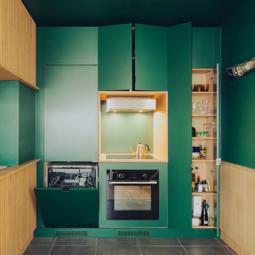
French practice Atelier Sagitta added an almost entirely green kitchen to this previously characterless apartment in Paris.

The emerald-green walls and cabinets, combined with grooved oak cupboards made by a local cabinet maker, make the kitchen the focal point of the apartment.

Find out more about Paris Apartment ›


Plum-purple kitchen walls

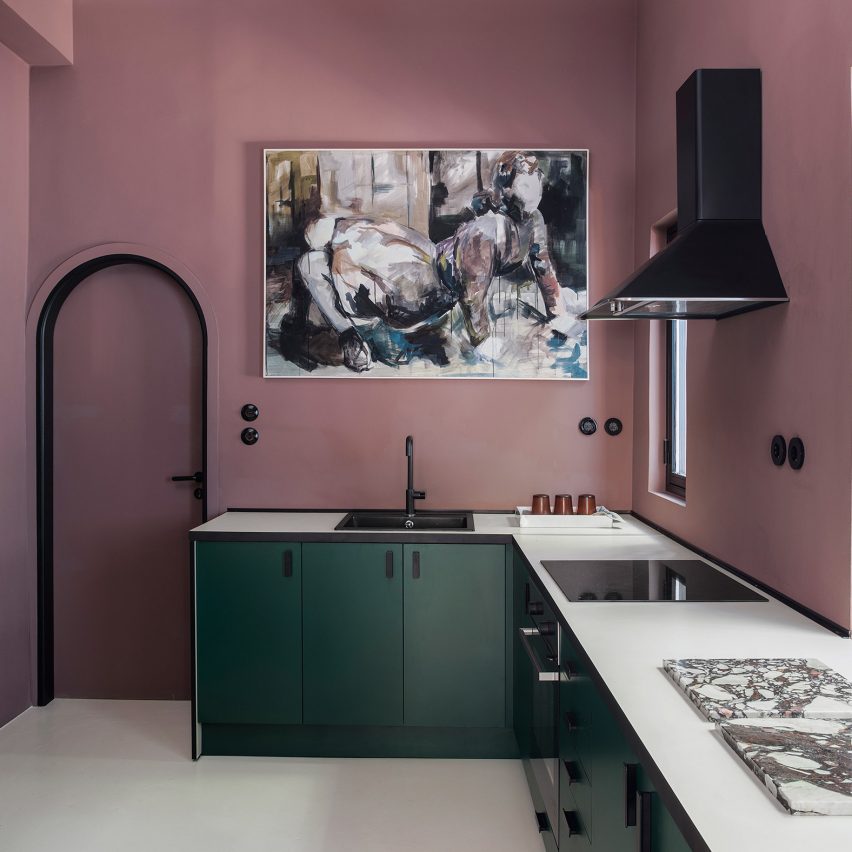
Esperinos guesthouse, Athens, Greece, by Stamos Michael

The kitchen of this guesthouse in Athens was painted a plum-purple hue to contrast with the rest of the largely moss-green interiors.

Green was also introduced in the kitchen where dark emerald cabinetry was matched with black, industrial-style shelves that display crockery.

Find out more about Esperinos guesthouse ›


Dark green kitchen cabinets

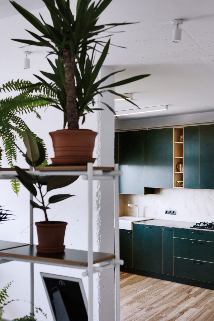
Apartment #149, Lviv, Ukraine, by Roman Shpelyk

Interior designer Roman Shpelyk designed this apartment in the Ukrainian city of Lviv to have largely simple white interiors.

Colour was added with a plant-filled shelving unit and the forest-green laminated-plywood cabinetry in the kitchen.

Find out more about Apartment #149 ›


This is the latest in our series of lookbooks providing curated visual inspiration from Dezeen’s image archive. For more inspiration see previous lookbooks showcasing peaceful bedrooms, calm living rooms and colourful kitchens.

Reference

Ten students from the School of Visual Arts present their final year projects
CategoriesInterior Design

Ten students from the School of Visual Arts present their final year projects

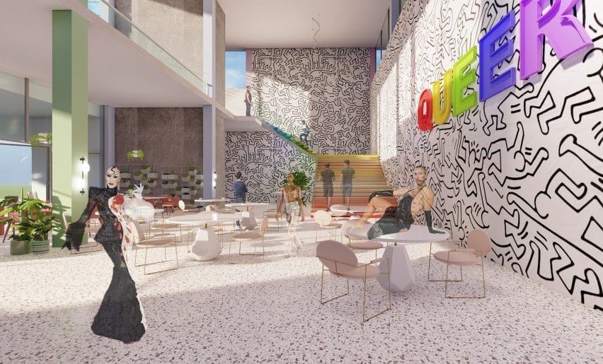
An LGBT+ community centre that caters to Seattle’s queer population and a peace centre in Homs, Syria, are included in Dezeen’s latest school show by students at the School of Visual Arts.


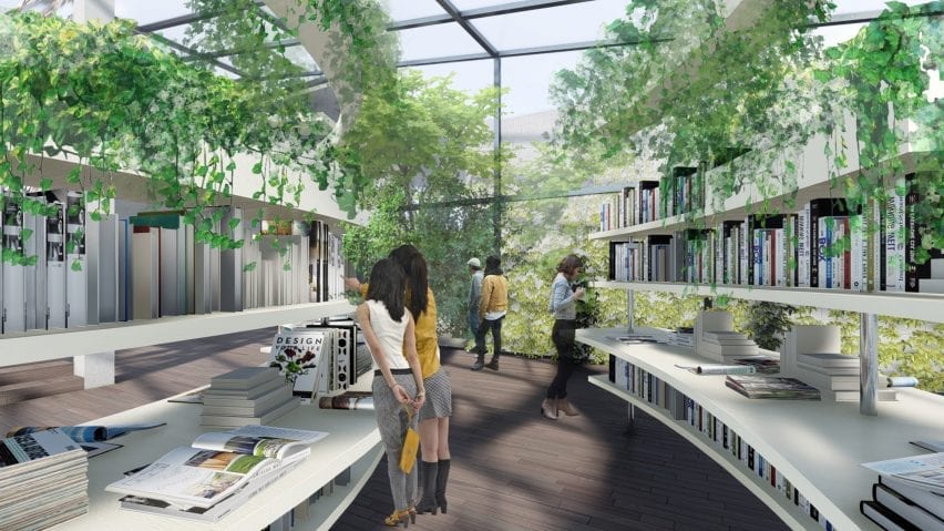
Also included is a fermentation centre that explores the world of microflora and its relationship to our wellbeing and a design for a new bookstore in China that marries biophilic principles with traditional Chinese architecture.


School: School of Visual Arts, BFA Interior Design: Built Environments
Courses: Senior thesis
Tutors:
Anthony Lee and Gita Nandan

School statement:

“The interior design senior thesis year at the School of Visual Arts Interior Design: Built Environments department is the culmination of a year-long self-directed exploration. Each student has driven and developed an adaptive-reuse project from site selection through concept development, interior design, programming and furnishings.

“Every project is unique and tackles real-world issues such as a residence for the Harbor School on Governors Island and a centre for philosophers in Homs Syria.”


School of Visual Arts school show

Oryzae Village by Chloe Hyun Jung Park

“Fermentation is an under-appreciated metabolic process that humans have embraced for thousands of years. It is responsible for a wide range of items we consume including beer, yoghurt, kimchi and penicillin. In this project, Oryzae Village is a fermentation centre that explores the world of microflora and its relationship to our health and wellbeing.

“It consists of farms, shops, residences and various engaging workshop areas. Fermentation experts and artisans lead the centre to create an environment for teaching, learning, sharing while creating products items using fermentation.

“Oryzae Village aims to revitalise the local communities by encouraging foraging, growing, investigating, and learning about microbial processes – helping people achieve healthier lives and wellbeing.”

Student: Chloe Hyun Jung Park
Course:
Senior thesis
Email:
chloehyun021@gmail.com


School for Visual Arts school show

Harbor Residence by Iris Junhong Lin

“Being a high school student in New York’s award-winning Harbor School often means having to endure extremely long commutes from various corners of the five boroughs. Located on Governors Island, the school is accessible only by ferry. Harbor Residence is a student dormitory for these dedicated pre-college students committed to maritime studies, research and careers.

“In this project, Harbor Residence aims to be much more than just a place to live – it will be a continuation of the school’s maritime culture. Students will to able to live, socialise, learn, work at the residence – becoming a centre for the Harbor School Community.”

Student: Iris Junhong Lin
Course:
Senior thesis
Email:
jlin28@sva.edu


School for Visual Arts school show

Cove by Stella Hanbyul Suk

“The pandemic has forced us to rethink travel. Urban dwellers with limited access to natural environments have been unable to travel long distances to connect with nature. Local travel may be the new normal in our post-pandemic tourism landscape.

“Cove is a wellness and activity centre that provides a tranquil and restful place in a natural setting within a relatively short distance from the major urban centres of South Korea. It is designed for people to unplug and reset their daily lives, improving both mental and physical wellness through high sensory involvement in a setting that connects back to nature.”

Student: Stella Hanbyul Suk
Course:
Senior thesis
Email:
st3lla.id@gmail.com


School of Visual Arts school show

Alive Books by Difan Yang

“Alive Books is a new bookstore design in China. More than just a place to buy books, it is a gathering place where people can learn, communicate and exchange ideas.

“Marrying biophilic principles with traditional Chinese architecture, Alive Books aims to become the future of book retailers that will co-exist and survive the online bookselling landscape.”

Student: Difan Yang
Course:
Senior thesis
Email:
yang_difan@163.com


School for Visual Arts school show

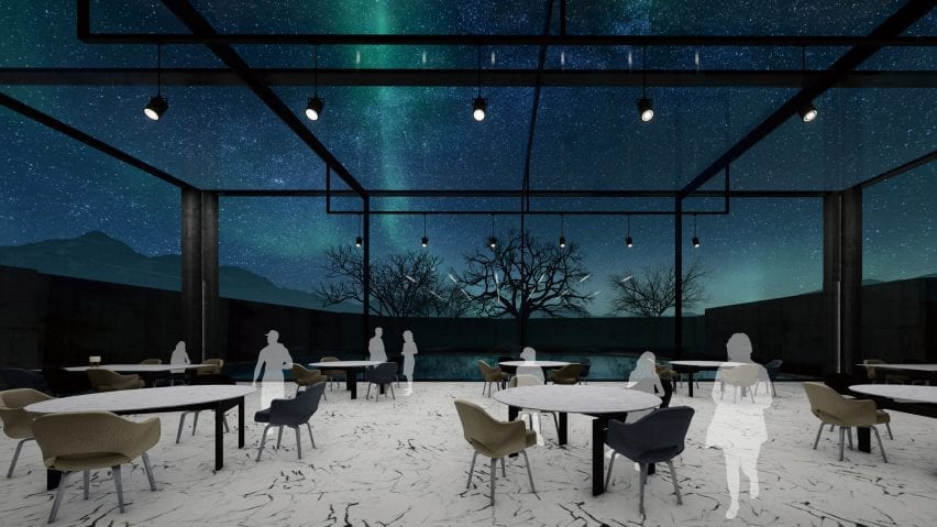
The Aurora by Ramey Yixuan Chen

“The Aurora is a hotel designed to maximize experiences of the Aurora Borealis, also known as the Northern Lights. Auroras result from disturbances in the magnetosphere caused by solar winds – resulting in otherworldly displays of atmospheric lights of varying colour and complexities.

“Located in Oblast, Russia, the Aurora Hotel is situated in the Arctic Circle with a relatively mild climate (due to the warm ocean currents crossing this seaside town).

“Because of its extreme northern location, visitors will be able to experience the ‘Polar Nights’ – when the night sky extends for periods longer than 24 hours – giving them unparalleled access to seeing the Aurora Borealis. The design of the hotel will focus on maximising the beauty of this atmospheric phenomenon while connecting visitors to nature.”

Student: Ramey Yixuan Chen
Course:
Senior thesis
Email:
ychencyx@gmail.com


School for Visual Arts school show

Queer Community Centre by Yearin ‘Rin’ Park

“Queer is the new LGBTQ+ centre in greater Seattle. Located adjacent to the University of Washington, Queer will cater to the vulnerable LGBTQ+ population and reflect core values of diversity, inclusivity and freedom of identity.

“Constantly under pressure and attack, the LGBTQ+ community needs a place to gather, grow, organise, support, heal, defend and celebrate queer experiences and identities. Now, more than ever, with trans people being ostracised, and the legality of gay marriage being questioned, Queer will be a welcoming and open centre for the entire Seattle community.”

Student: Yearin ‘Rin’ Park
Course:
Senior thesis
Email:
rinparkinterior@gmail.com


School of Visual Arts school show

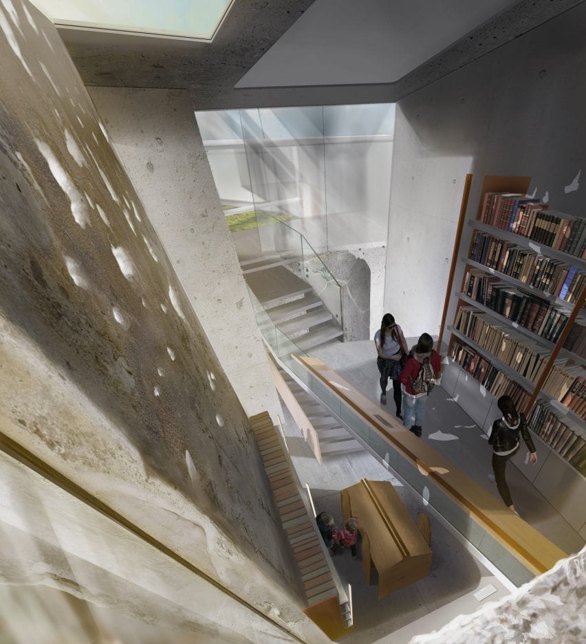
Bayt Al Kul Philosophy Centre by Fuad Khazam

“Bayt al-Kul (house of the all) is a philosophy and peace centre in Homs, Syria that aims to play a major role in healing a divided society by challenging beliefs through discussions and conceptual analysis. After a ten-year war that divided the Syrian people, Bayt al-Kul will give the people of Homs a chance to listen and share one another’s views through philosophical debate.

“For centuries, Homs was a cradle for philosophical education and the birthplace of many historical philosophers who contributed to the world today. By re-discovering the ‘world of ideas’ Bayt al-Kul aims to help rebuild the unity and cultural commonality among the Syrian people.”

Student: Fuad Khazam
Course:
Senior thesis
Email:
fkhazam@sva.edu


School of Visual Arts school show

Al-station by Eason Yixuan Du

“Al-station is a live and work community dedicated to art school students marrying art studios with living space. Students from the New York City (NYC) area art institutions will be able to use Al-station as a place to live, study, work, create, show, play and gather.

“The space will serve as a hub for creative university students – nurturing the next artists and designers who are so important to the continued growth and vitality of NYC.”

Student: Eason Yixuan Du
Course:
Senior thesis
Email:
easondu09@gmail.com


Social Commune by Yangkai Lin school show

Social Commune by Yangkai Lin

“Over the past 30 years, the China Government has instituted a programme of poverty alleviation that relocated millions of scattered families living in rural areas, moving them closer to cities to provide social services such as healthcare and education. This caused thousands of villages across China to become empty, creating a landscape of forgotten places. Many of these abandoned villages – dating back thousands of years – should be preserved, reimagined and reused.

“Social Commune is an experimental design project that focuses on adaptive reuse of these forgotten places: transforming originally residential buildings into a series of public buildings that celebrate the unique characteristics of the local village and community.

“Through a mixture of preservation and modern design, Social Commune will breathe new life into these underutilised structures and will become a model for rehabilitating rural areas throughout China.”

Student: Yangkai Lin
Course:
Senior thesis
Email:
ykstv21@gmail.com


School of Visual Arts school show

Noah by Ekko Tianjuan Zheng

“Covid-19 has changed the world. Wuhan China – with a population of over 10 million – is thought to be the epicentre of the virus. With its own virus spread quickly under control, Wuhan is in a position to become a centre for viral studies – to help prevent such an epidemic in the future.

“Noah is an institute of virology in Wuhan. Located in an abandoned factory, an extensive renovation will transform it into a high-tech, unique, state-of-the-art research facility. Incorporating biophilic elements and principles, Noah will be an environment where science and nature come together, creating a laboratory and science centre for the 21st century.”

Student: Ekko Tianjuan Zheng
Course: Senior thesis
Email:
zhengtianyuan99@gmail.com


Partnership content

This school show is a partnership between Dezeen and the School of Visual Arts. Find out more about Dezeen partnership content here.

Reference

Ten inspiring outdoor dining spaces for spring
CategoriesInterior Design

Ten inspiring outdoor dining spaces for spring

As spring approaches in the northern hemisphere, it’s time to start preparing for sunnier days and warmer evenings. For this lookbook, we’ve rounded up ten inviting spaces featuring outdoor furniture for relaxed al-fresco dining and socialising.


Getting together in public spaces may still be restricted in much of the world over the coming months due to the coronavirus pandemic.

Domestic gardens, courtyards and patios could well be the best place for sharing quality time with friends and family this spring and summer. Read on for 10 inspiring ideas from the Dezeen archives.

This is the latest roundup in our Dezeen Lookbook series providing visual inspiration for the home. Previous articles in the series showcased living rooms with statement shelving, green kitchen interiors, peaceful bedrooms and designer bathrooms.


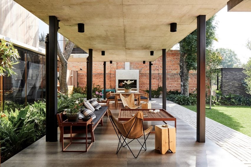
Mexican home with outdoor lounge area

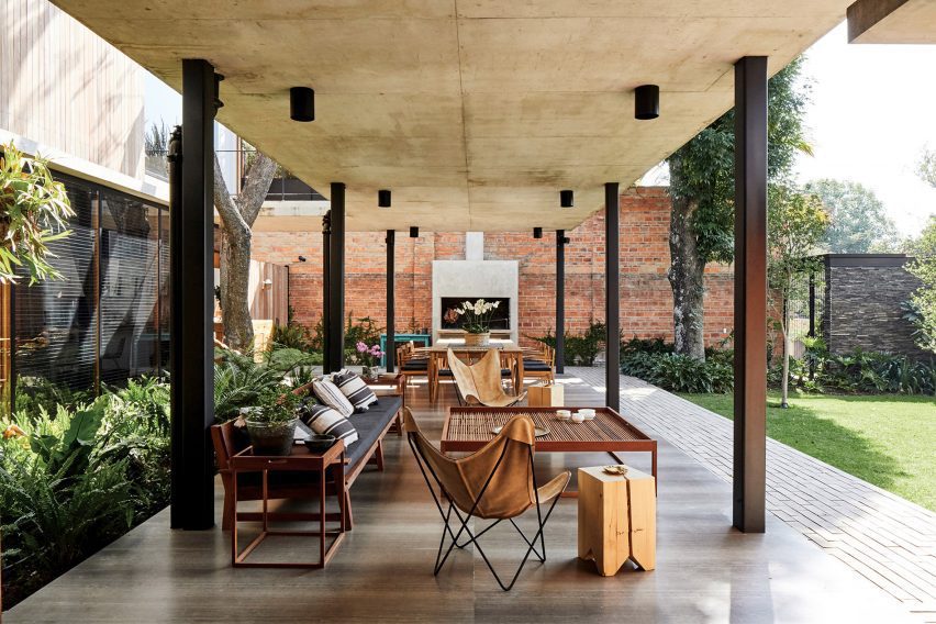
Guadalajara House, Mexico, by Alejandro Sticotti

This house in Guadalajara, Mexico makes the most of the benign climate with an L-shaped, open-sided gallery that extends from the home to provide a cool space for dining and relaxing.

The gallery, which is paved in polished stone, features two zones. The dining area features a twelve-seater wooden table set next to an outdoor fireplace while the lounge area consists of a cushion-strewn, timber-framed sofa, leather Butterfly Chairs and a large, square coffee table.

Find out more about Guadalajara House ›


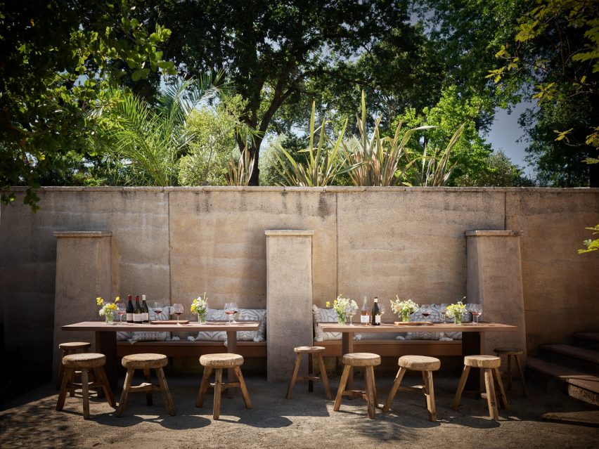
Dining tables at House of Flowers winery by Walker Warner Architects

House of Flowers, US, by Walker Warner

This plein-air dining zone is at a California winery but its rustic style could equally work in a domestic garden or courtyard. Here, visitors can enjoy a glass of wine in the sun while sitting against a warm adobe wall.

Built-in wooden benches are matched with sturdy tables and rough-hewn wooden stools. Tables are decorated with simple bouquets from the garden.

Find out more about House of Flowers ›


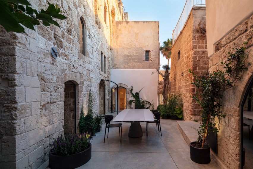
Courtyard dining spot in Old Jaffa House 4 by Pitsou Kedem

Jaffa apartment, Israel, by Pitsou Kedem

This sea-facing Jaffa apartment in a historic building has a narrow courtyard that is used for outdoor dining during the summer months. A glossy dining table is easy to wipe down and is complemented by practical plastic chairs.

The ancient stone walls and concrete floor are softened by shrubs and climbers set in oval planters.

Find out more about Jaffa apartment ›


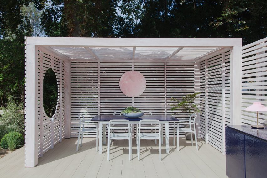
White-painted garden pavilion with dining area

Garden pavilion, UK, by 2LG Studio

British interior designers Jordan Cluroe and Russell Whitehead of 2LG Studio built themselves a white-stained pavilion in their back garden that is used as a dining space and for socialising when the weather allows.

The raised pavilion is clad in slatted timber and serves as a covered dining area. Wide timber decking adds a touch of the seaside boardwalk to the ensemble.

Find out more about Garden pavilion ›


Outdoor dining space on granite terrace

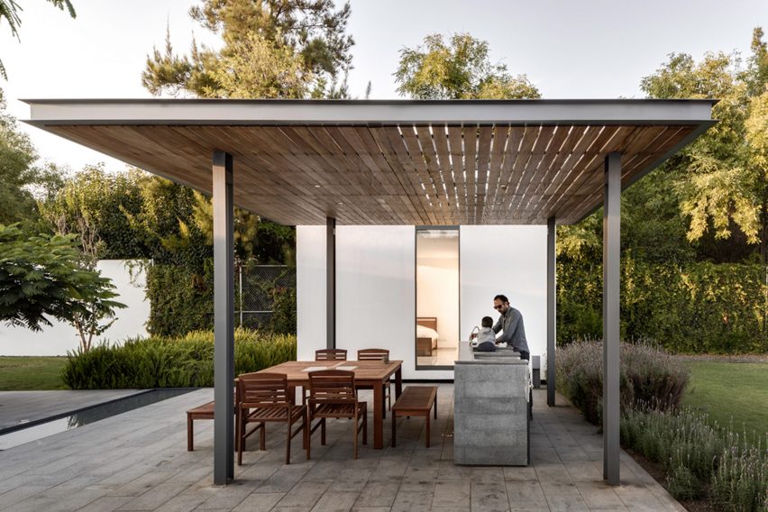
Casa 4.1.4, Mexico, by AS/D

This multigenerational weekend retreat in Mexico features four separate dwellings arranged around a courtyard that is paved in granite and bisected by a shallow rivulet.

Extending from one of the lodges is a steel pergola with a canopy of slatted timber. This creates a shady spot for family dinners that is furnished with a teak table, dining chairs and benches. An outdoor kitchen allows prep and cooking to be done outside.

Find out more about Casa 4.1.4. ›


Dining table outdoors in Greek holiday home

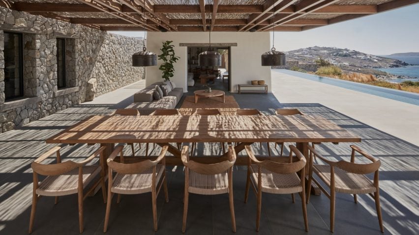
Mykonos holiday home, Greece, by K-studio

A walnut pergola covered in traditional reeds provides shade for the outdoor living space at this holiday home in Mykonos. Consisting of a lounge area and a ten-seater dining table, the generous stone terrace looks across an infinity pool towards the ocean.

“To create a house that would allow guests to enjoy being outside throughout the day we needed to filter the overwhelming intensity of the climate by providing shade and protection from the elements,” said architect K-studio.

Find out more about Mykonos holiday home ›


Outdoor dining area in Italy

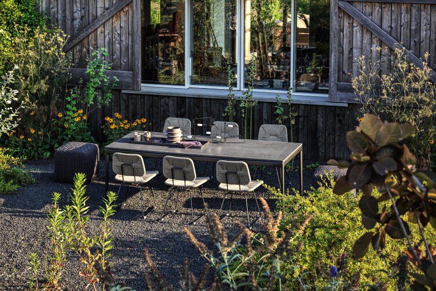
Country House, Italy, by Studio Koster

Studio Koster’s Italian Country House near Piacenza has an idyllic outdoor dining space set amid a cottage-style garden. The setting, close to a timber wall, provides shelter from breezes while lava gravel provides a rustic, low-maintenance touch.

Steel-framed chairs with rattan seats plus poufs with woven covers – both by Italian brand Flexform, which furnished the house for a photoshoot – give the space an eclectic feel.

Find out more about Country House ›


Wooden table and chairs on tiled floor surrounded by flower pots

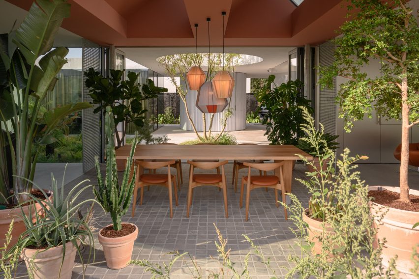
Villa Fifty-Fifty, The Netherlands, by Studioninedots

This dining space in Villa Fifty-Fifty in Eindhoven is both indoors and outdoors. Folding glass doors peel back to turn the room into a loggia that is open to a courtyard on one side and a densely planted border on the other.

Quarry tiles and statement plants in terra-cotta pots add a taste of sunnier climes while the only furniture is a chunky dining table and a set of Elbow Chairs designed by Hans J Wegner for Carl Hansen & Son.

Find out more about Villa Fifty-Fifty ›


Raised dining area on concrete terrace

House B, Austria, by Smartvoll

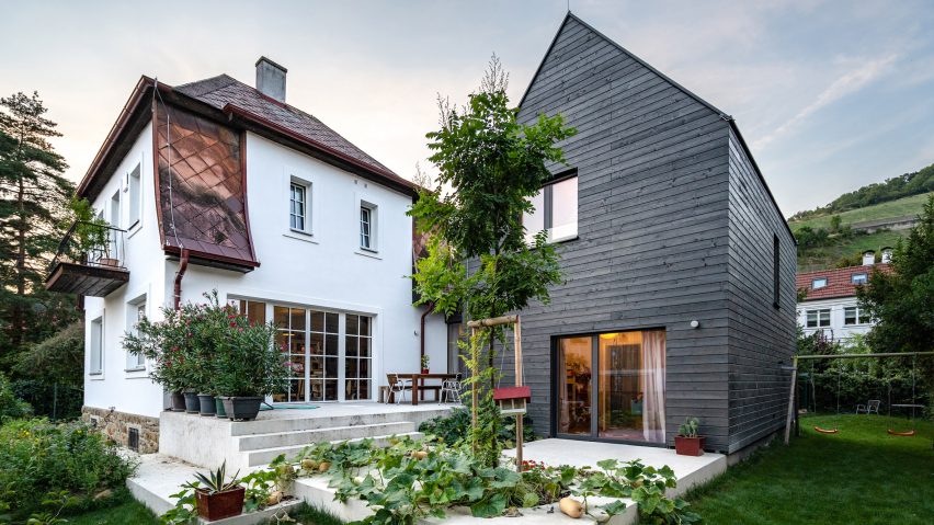
An outdoor dining area sits on a split-level concrete terrace outside this house in Austria, which was an extension and renovation of an existing building. The dining table, made of dark wood to contrast with the pale cement, is set close to the house to protect it from the elements.

Large potted oleanders protect the dining space from view on the upper level of the patio while squash vines planted in a circular void spill over the lower level.

Find out more about House B ›


Sunny dining spot in Puglia house with white walls

The White Tower, Italy, by Dos Architects

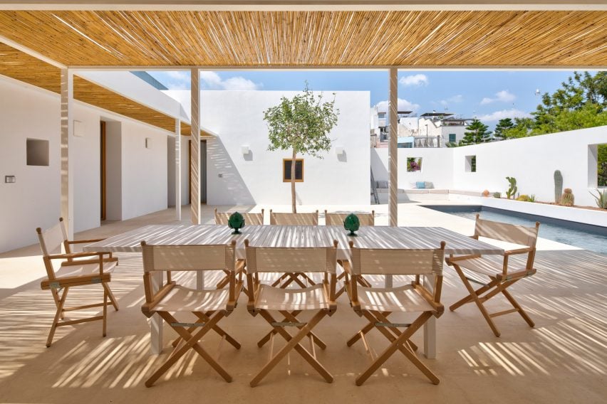
This bright white house in Puglia has an outdoor dining space with a simple, elegant design. Directors’ chairs with beige canvas seats give it an outdoorsy, camping-like feel and match the pale-wood table. A pergola made of slender steel columns is shaded with canes.

Two decorative table objects in green break up the beige colour scheme and add a simple but elegant touch.

Find out more about The White Tower ›


This is the latest in our series of lookbooks providing curated visual inspiration from Dezeen’s image archive. For more inspiration see previous lookbooks showcasing green kitchen interiors, peaceful bedrooms, calm living rooms and colourful kitchens.

Reference

Watch our lookbook video roundup of living rooms with calm interiors
CategoriesInterior Design

Watch our lookbook video roundup of living rooms with calm interiors

This one-minute video takes you on a tour of contemporary living rooms with relaxing interiors, as featured in a recent Dezeen Lookbook.


The video showcases examples of living rooms that have been designed to create a peaceful environment, including rooms with soothing colours and natural materials.

Dezeen Lookbooks is a new section featuring roundups of home interiors and decor trends to help designers and design lovers plan their projects.

Published each Saturday, each lookbook presents images of contemporary interiors selected from Dezeen’s vast archive of over 750,000 images.

Check out the lookbook to find out more about all the projects ›

Reference

Ten contemporary children’s bedrooms
CategoriesInterior Design

Ten contemporary children’s bedrooms

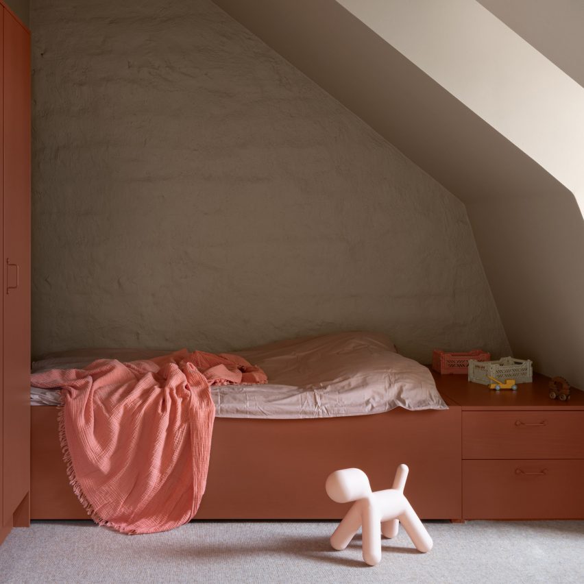
For this interior design lookbook we’ve chosen 10 stylish kids’ bedrooms featuring bunk beds, raised beds and whimsical cloud-shaped lights.


This is the latest roundup in our Dezeen Lookbooks series providing visual inspiration for the home. Previous articles in the series feature inspiring outdoor living spaces, calming green kitchens, and living rooms with beautiful statement shelving.


Calm child's bedroom

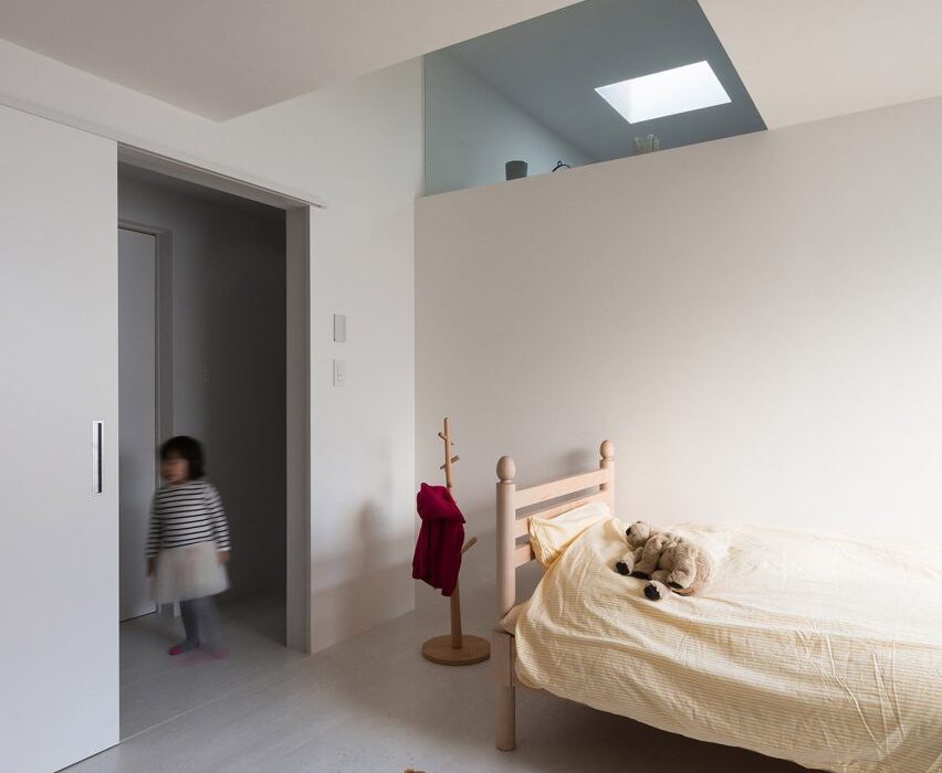
Adorable House, Japan, by Form

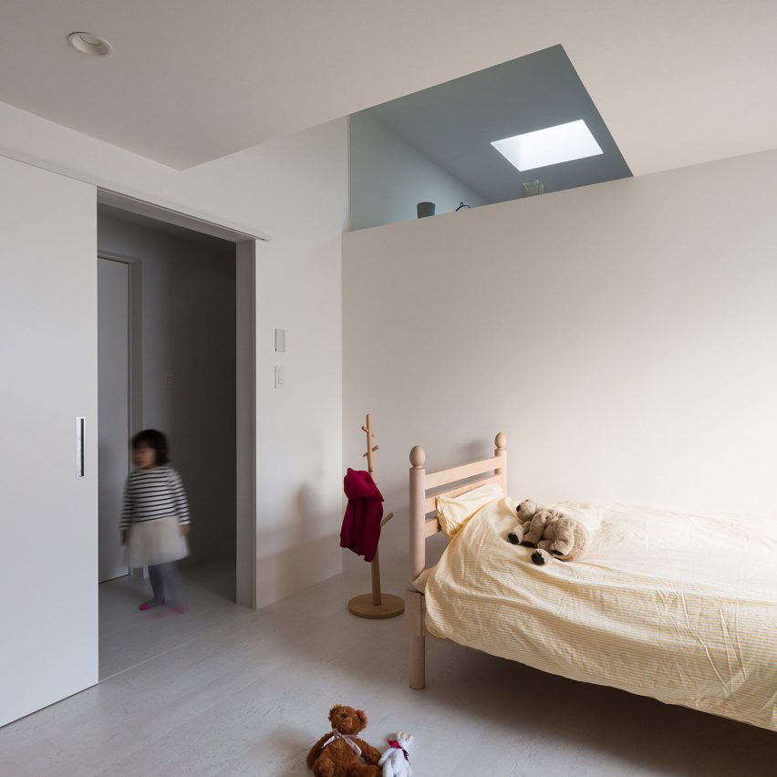
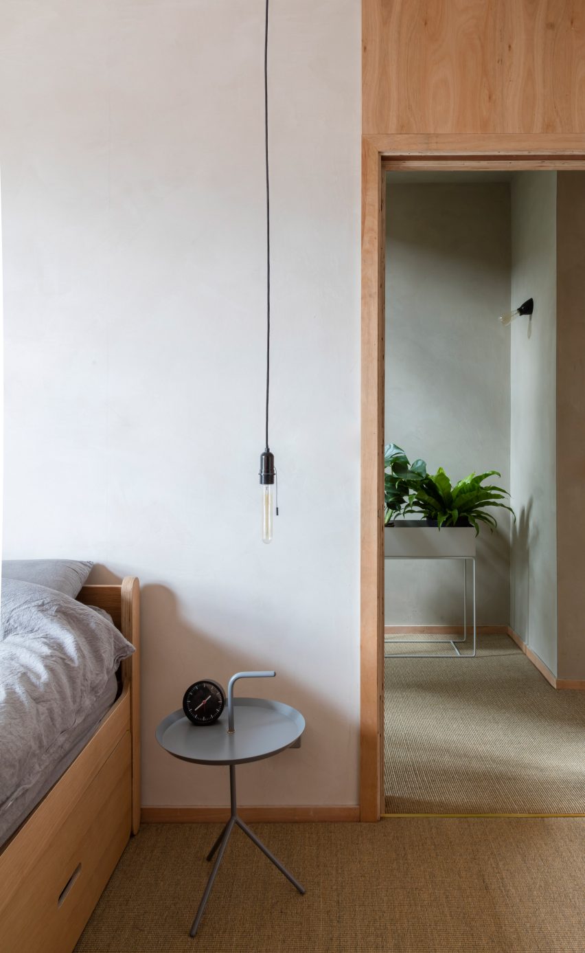
Skylights funnel daylight into this family residence in Tokyo, which has a main living space along with a bedroom on its first floor. Its pared-back children’s room features white walls and simple wooden furniture.

Find out more about Adorable House ›


Plywood bunkbed

A Room for Two, London, UK, by Studio Ben Allen

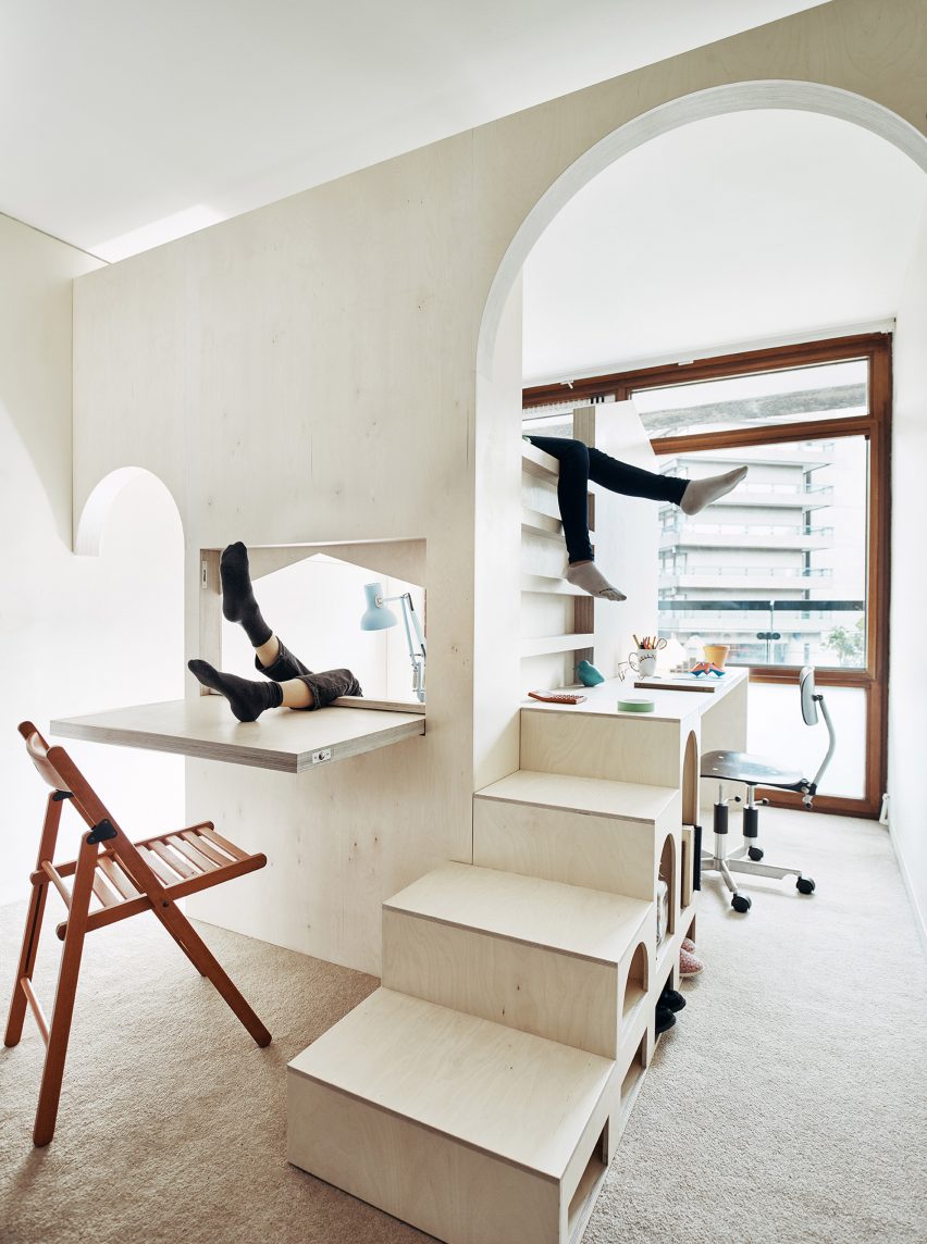
An elaborate plywood structure built inside one of the rooms of this flat in London’s Barbican Estate turns it into a bedroom for two children.

Designed by Studio Ben Allen the structure contains two beds and a desk as well as playful archways, steps and a fold-down desk.

Find out more about A Room for Two ›


Raised bed

Fahouse, Quebec, Canada, by Jean Verville

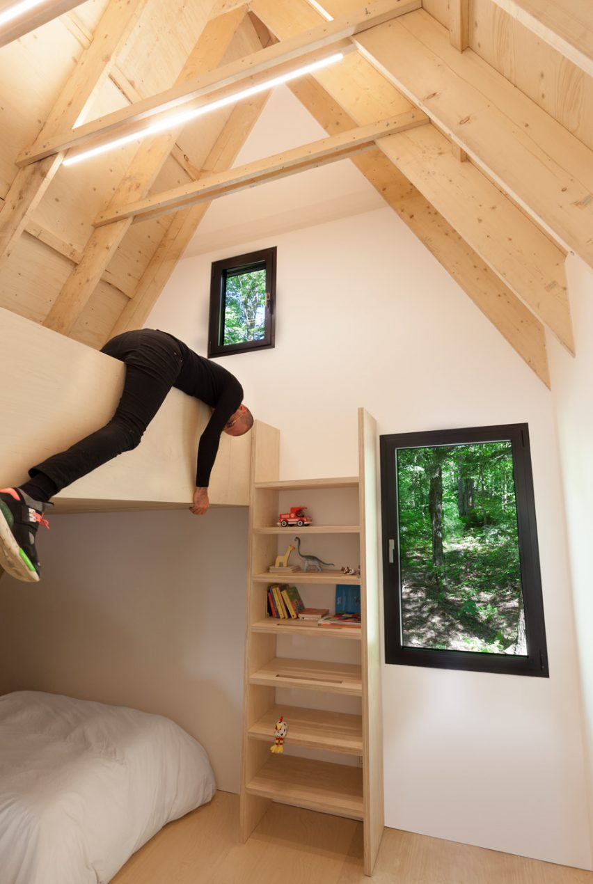
Canadian architect Jean Verville designed this holiday home on a gently sloping site in a hemlock forest in southeastern Quebec. At the back of the home, the children’s bedroom is located in the pointed roof space.

Find out more about Fahouse ›


Kid's bedroom with roll-away bed

100.60 Apartment, Bilbao, Spain, by Azab

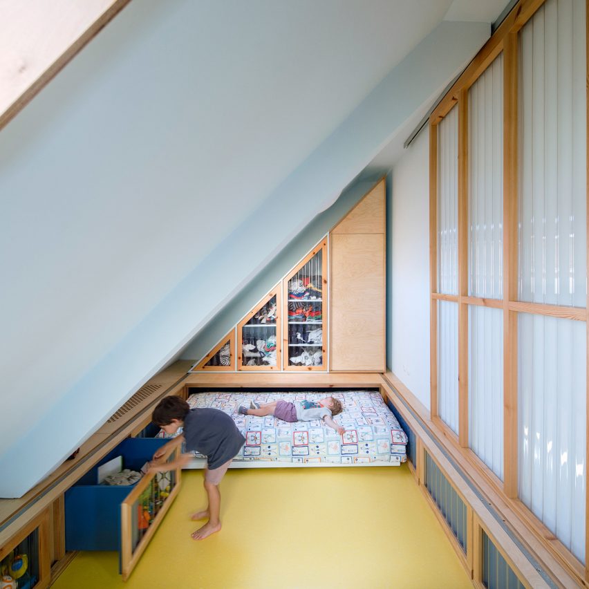
As part of the refurbishment of this apartment in Bilbao, architecture studio Azab created a pair of triangular-shaped children’s bedrooms underneath the sloping roof.

Both bedrooms have beds that can be rolled away to create more space for playing and are fronted with corrugated plastic walls.

Find out more about 100.60 Apartment ›


Blush-pink child's bedroom

The Mantelpiece Loft, Stockholm, Sweden, Note Design Studio

Stockholm-based Note Design Studio reconfigured this loft apartment so that the parents and both children could have their own room.

The children’s bedrooms are on mezzanine levels and include inbuilt wardrobes and a bed painted in blush pink.

Find out more about The Mantelpiece Loft ›


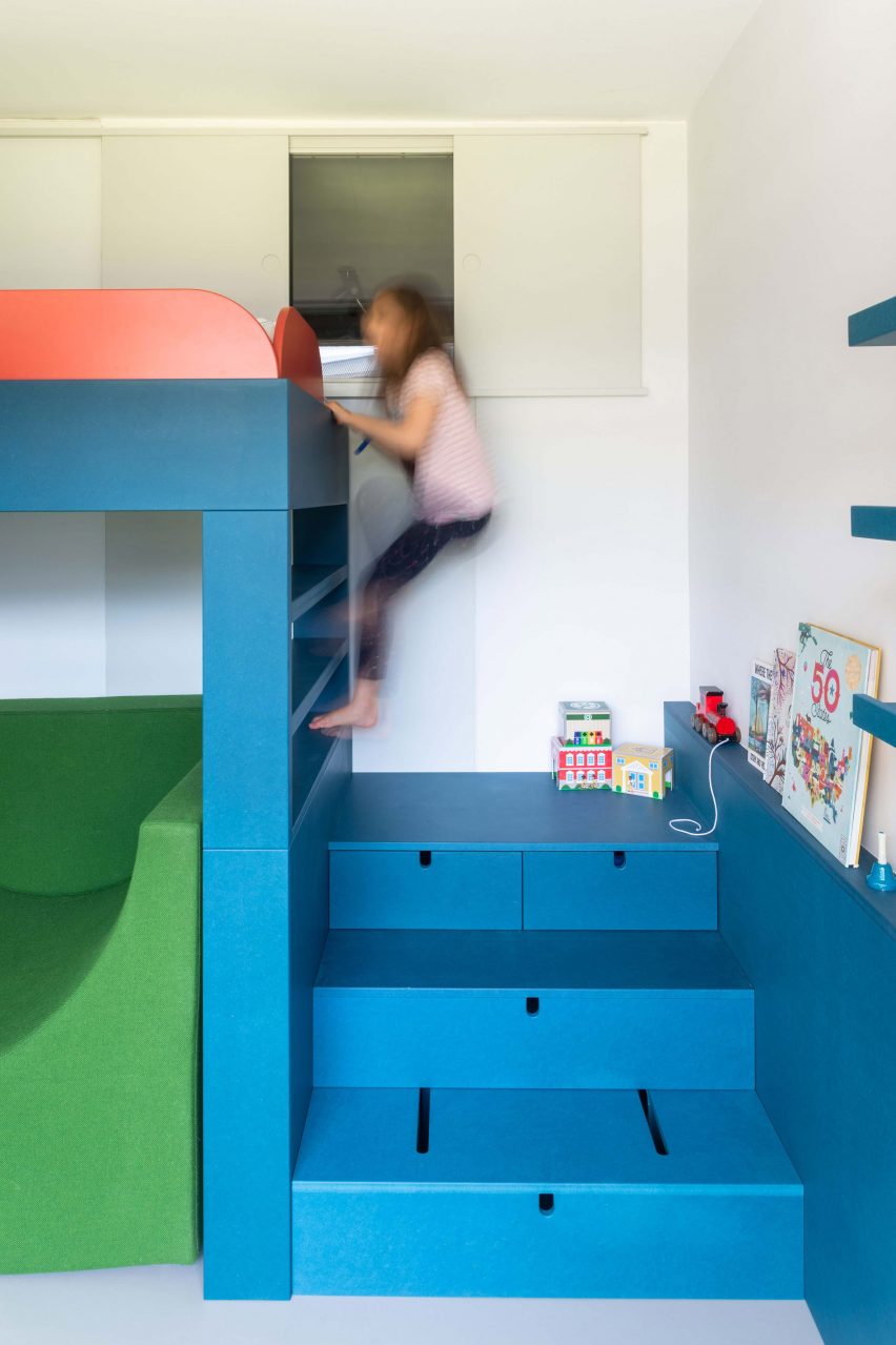
Colourful bunk bed

Room for One More, London, UK, by Studio Ben Allen

Studio Ben Allen updated this apartment in the Barbican Estate by reconfiguring it to include a child’s bedroom – a feature that lends the project its name of Room For One More.

The bedroom has a raised teal bed that is accessed by a short flight of stairs, which can be pushed in to form a small desk. A chunky armchair upholstered in grass-green fabric sits beneath the practical bed.

Find out more about Room for One More ›


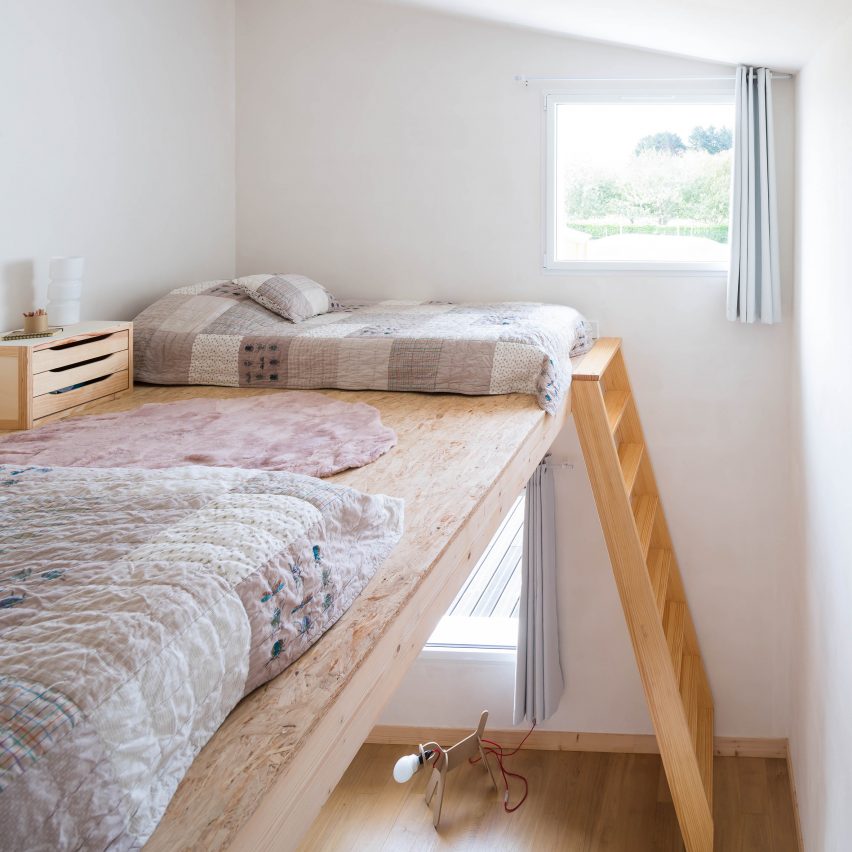
Raised beds in kids room

House for a Photographer, France, by Alireza Razavi

Paris architect Alireza Razavi designed this summer house in Brittany for a photographer.

A mezzanine level added to the attic room contains beds for two children and is connected by a ladder to the children’s play area below.

Find out more about House for a Photographer ›


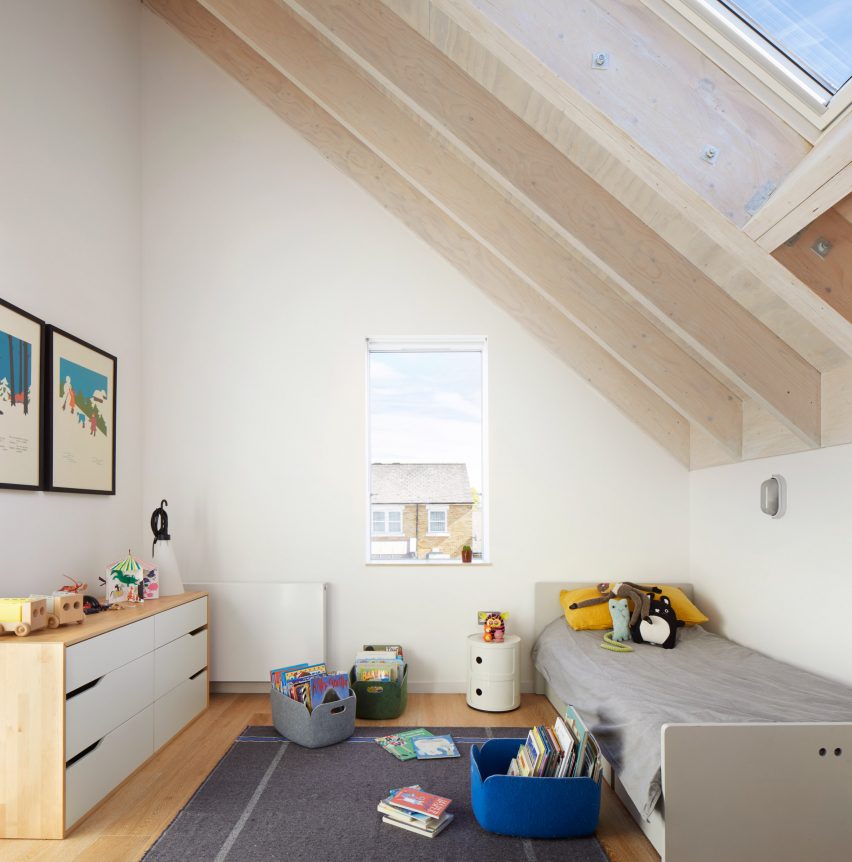
Contemporary children's bedroom in London

House-within-a-House, London, UK, by Alma-nac

Architecture studio Alma-nac has extended a 1950s property in Brockley, south London, to create a contemporary family home.

Its second floor contains three bedrooms beneath the peak of the roof, including one for a child, which the studio describes as having “cathedral-like proportions”.

Find out more about House-within-a-House ›


Bedroom with cloud-shaped lights

Budge Over Dover, Sydney, Australia, by YSG

Interior design studio YSG has revamped a house in Sydney using terracotta brick, aged brass and aubergine-hued plaster.

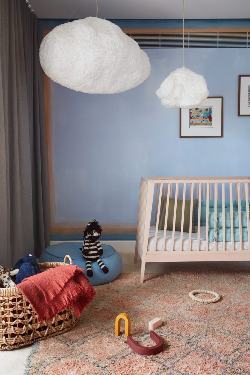
The children’s bedroom has lighter tones with sky-blue walls and whimsical cloud-shaped lamps hanging from the ceiling.

Find out more about Budge Over Dover ›


Bedroom with plywood cabin

Tel Aviv apartment, Israel, by Toledano Architects

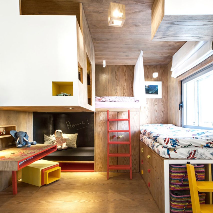
This apartment in Tel Aviv has a plywood cabin located in its children’s bedroom.

Toledano Architects designed the space, which is laid out like a playground and filled with objects that promote creativity, to be a nook for the home’s youngest residents to escape to.

Find out more about Tel Aviv apartment ›


This is the latest in our series of lookbooks providing curated visual inspiration from Dezeen’s image archive. For more inspiration see previous lookbooks showcasing peaceful bedrooms, calm living rooms and colourful kitchens.
Reference