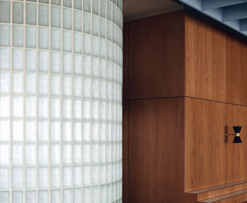
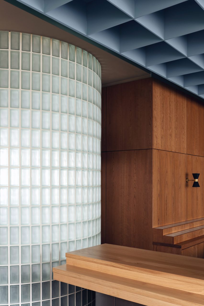
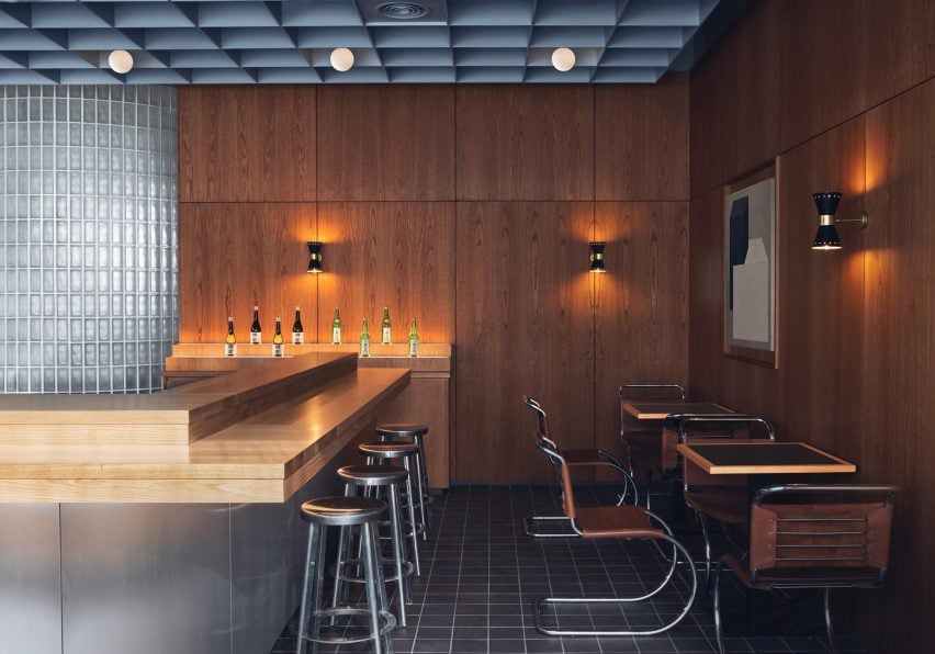
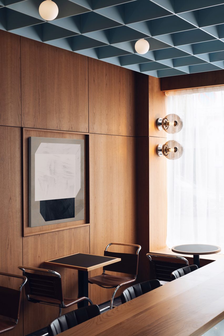
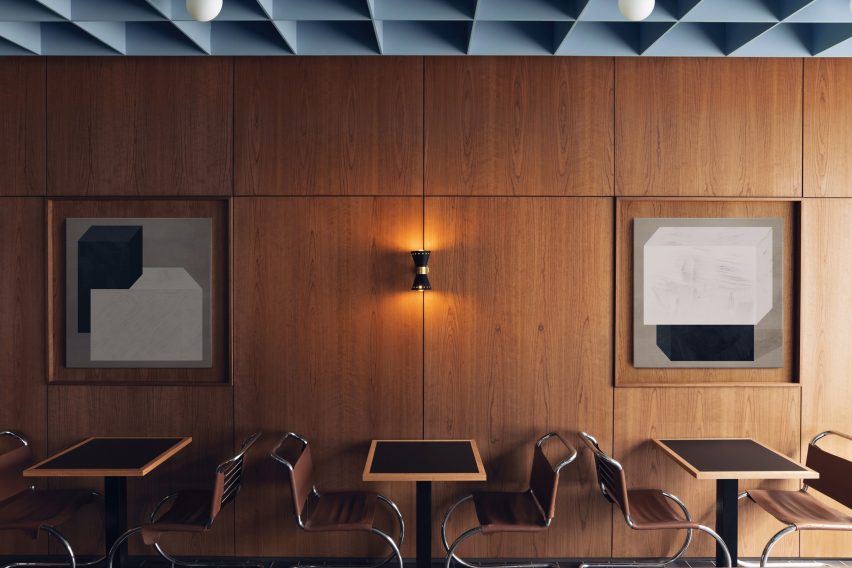
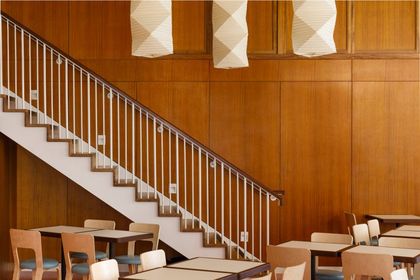
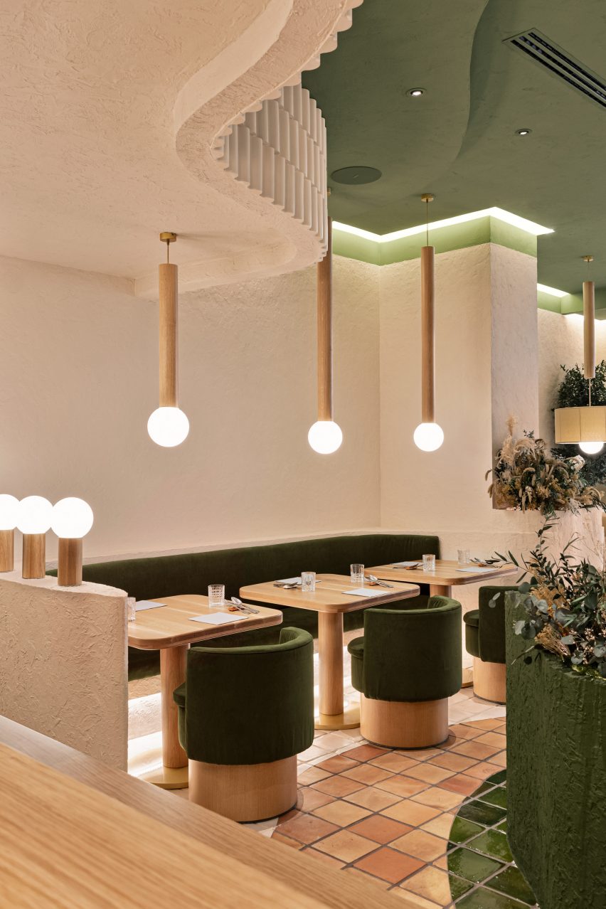
Child Studio has used a glass block wall, dark cherry wood panelling and a soft blue coffered ceiling to channel 1960s London in this sushi restaurant.
Located in a former post office, Maido is an eatery in London’s Saint John’s Wood neighbourhood with interiors designed to honour the heritage of the late modernist building.
A curved glass brick wall divides the space
“We were fascinated by the unique story of this building and aimed to capture the nostalgic atmosphere of 1960s London, paying tribute to the modernist public spaces of the era,” said Child Studio founders Alexy Kos and Che Huang.
“The design evolved around the bold geometry of this period and the juxtaposition of simple materials: wood, glass, clay and steel.”
Maido is anchored by a steel-panelled bar
The walls across the entire space are clad in cherry wood while shallow alcoves are decorated with a rotating selection of artworks.
A suspended coffered ceiling hangs overhead, its grid pattern echoed in the black quarry tiles on the floor and the semicircular glass brick wall that divides the space.
The curved partition wall also forms a generous, leather-upholstered seating booth at the back of the space.
Shallow alcoves are decorated with a rotating selection of art
The focal point of Maido’s interior is a central island bar clad in reflective curved steel panels.
Here, the sushi master prepares and serves authentic Japanese dishes while customers perch on polished aluminium bar stools by Japanese industrial designer Naoto Fukasawa.
“It was important for us to create a range of different seating scenarios and balance the convivial atmosphere with more intimate nooks and crannies,” Che explained.
To complete the space, the studio sourced a selection of classic midcentury furniture pieces. These include antique MR10 tubular steel chairs by Mies van der Rohe and moulded plywood armchairs by Norman Cherner.
Pipistrello table lamps, designed by Gae Aulenti in 1965, sit on the island bar and on a large communal dining table while antique wall sconces produced by Italian manufacturer Stilnovo create a cosy ambience.
Mies van der Rohe’s MR10 chair was used throughout the interior
Founded in 2017 by Che Huang and Alexy Kos, Child Studio has previously completed a 1950s-style interior for a vegan pizzeria in west London, which was shortlisted in the 2019 Dezeen Awards.
All photographs are by Felix Speller and Child Studio.
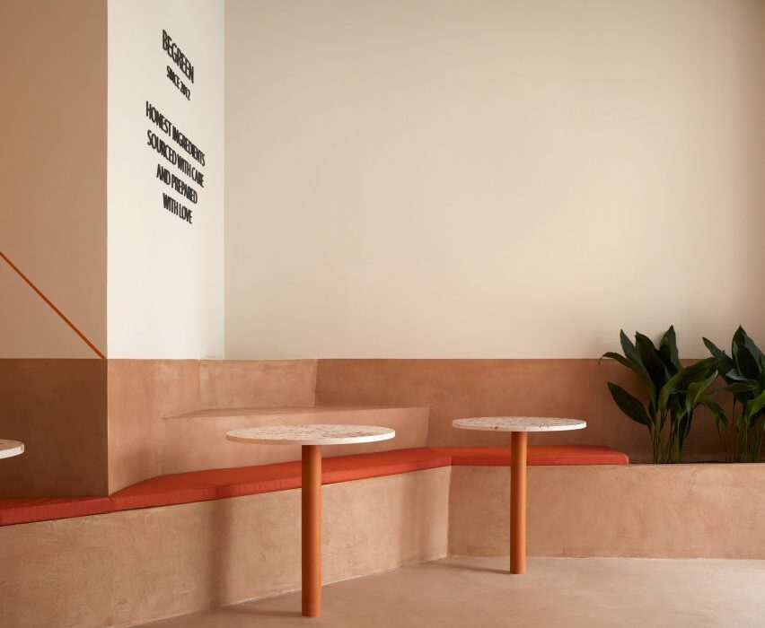
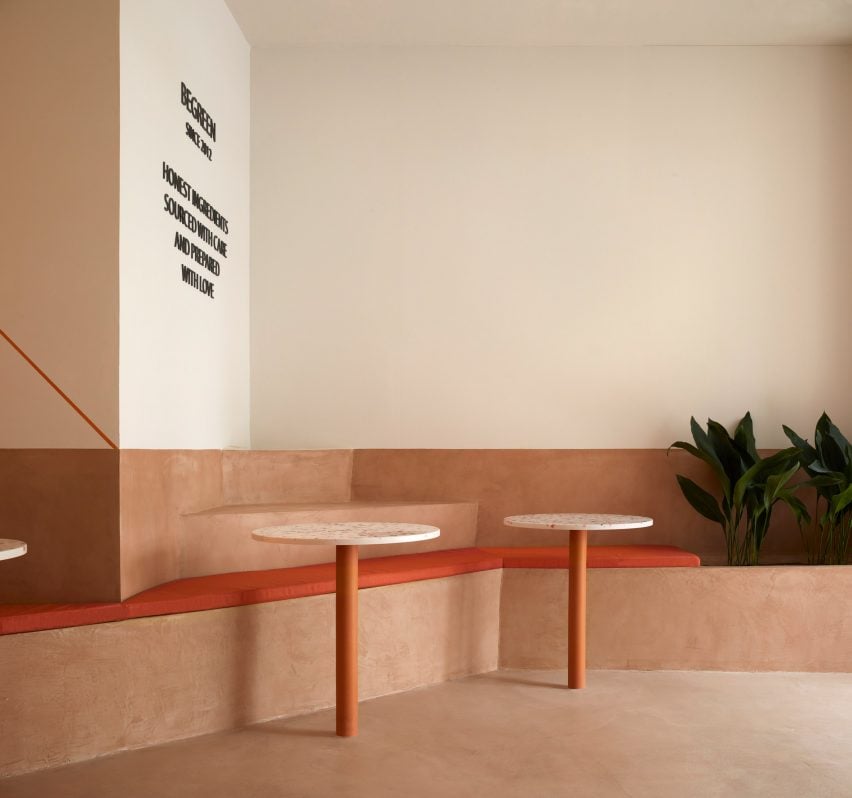
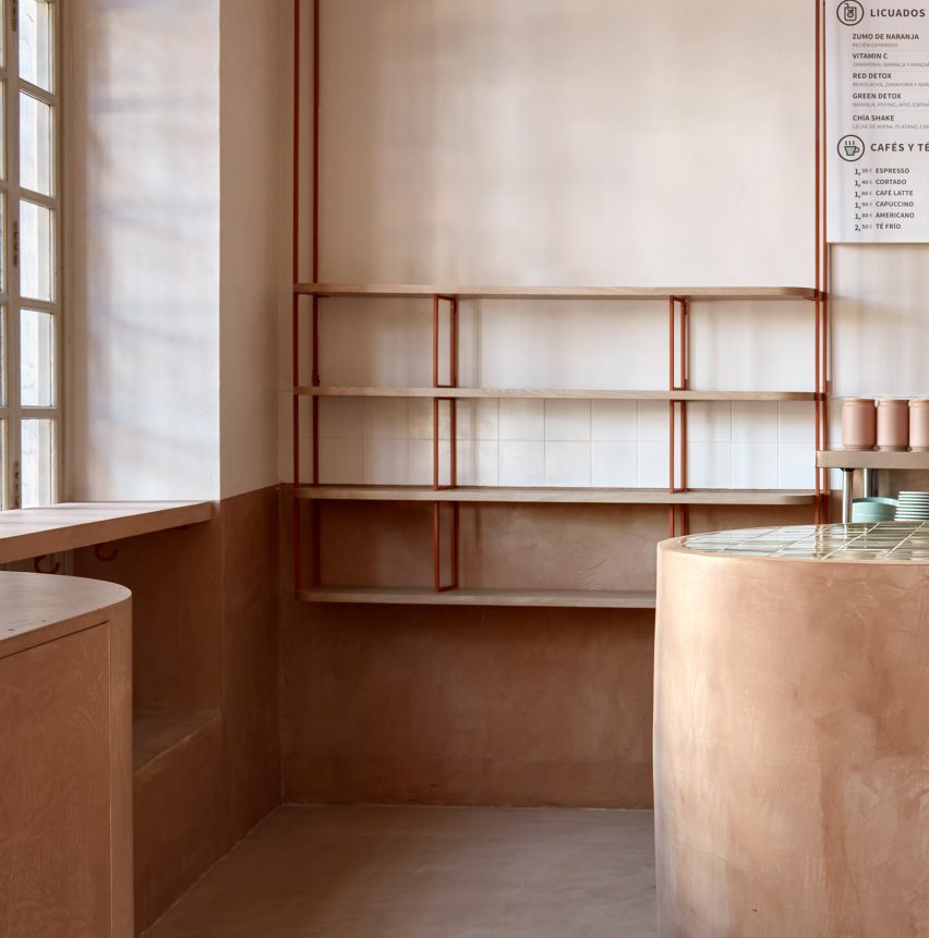
A zigzagging plinth that accommodates seating, steps and planters weaves its way through this terracotta-coloured salad bar in Valencia by local design practice Horma Studio.
Located in a protected heritage building in the city’s L’Eixample district, the 140-square-metre space belongs to the BeGreen Salad Company.
For its interior, the brand wanted a non-prescriptive layout that could be used in a multitude of different ways.
A zigzagging plinth integrates planters and seating
“They asked us to design a comfortable and singular space,” Horma Studio told Dezeen.
“It needed to be representative of BeGreen as a place that should be honest, natural and sustainable but at the same time should rethink the concept of a typical cafe and restaurant with chairs and tables. They were looking for something flexible that could be used without any rules.”
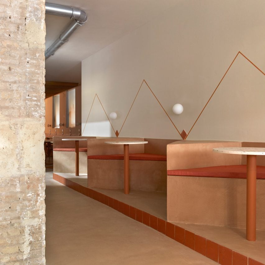
The plinth runs along one wall of the 30-metre-long space
Finished in micro cement, terracotta and timber, the interior is laid out over an awkward long and narrow floor plan.
To maximise the eatery’s small footprint, the design team inserted a simple seating “plinth” that zigzags along one wall of the 30-metre-long space.
“We realised that the angular furniture allows us to get in more seats and contributes to creating a pleasant space, making this combination the best for our design,” the studio explained.
Finished in micro-cement, the plinth is set at different levels of up to 90 centimetres in height. It divides the plan into different seating areas including booths, benches and steps for casual seating, alongside areas for planting.
The plinth is decorated with locally-produced terracotta elements such as wall tiles and integrated cylindrical table legs. Matching upholstered seat cushions were used to pad out the bench and seating.
“The project aims to be as sustainable and honest as possible, so we simplified our decisions and used as few materials as possible,” said Horma Studio.
The serving counter is finished in micro-cement
Other terracotta-hued eateries include this Mexican restaurant in Downtown Los Angeles, where Wick Architecture & Design chose materials “that could be found on a construction site”, and a cafe in Melbourne in which Australian practice Ritz & Ghougassian used the worn red brick facade as a reference point.
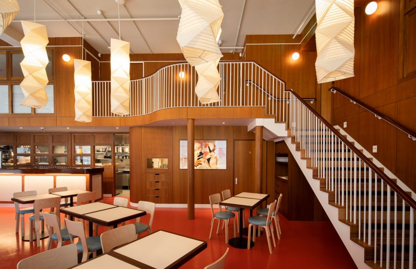
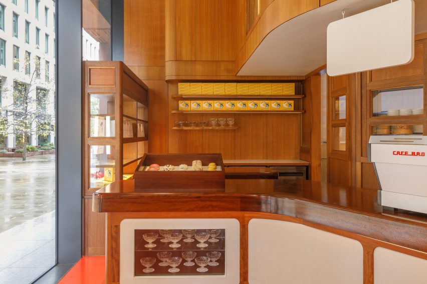
The King’s Cross outpost of London restaurant BAO features a wood-panelled interior designed by Macaulay Sinclair based on the Western-style cafes of Taiwan and Japan.
Set within a mixed-use building in Pancras Square, the 188-square-metre space includes a restaurant and bar, a baked goods counter and a workshop as well as a management head office.
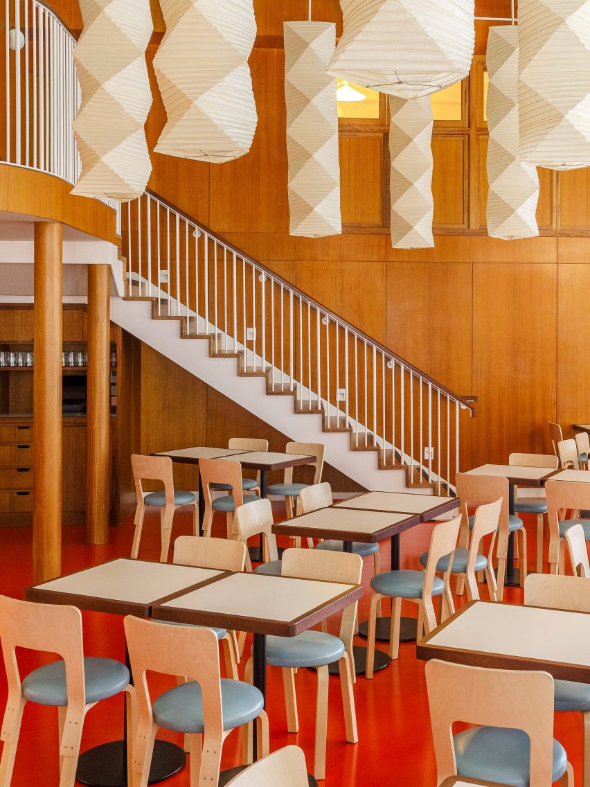
The double-height restaurant features a wood-panelled mezzanine
Its menu and interior was informed by Taiwan’s oldest Western-style cafe, Bolero, as well as Japanese kissatens, a type of tearooms that were popular in the middle of the 20th century.
Kissatens serve Yōshoku cuisine, an interpretation of western food seen through an Asian lens. Typical dishes include katsu sandwiches, omurice omelettes – made with fried rice and fried scrambled eggs – and hamburger steak.
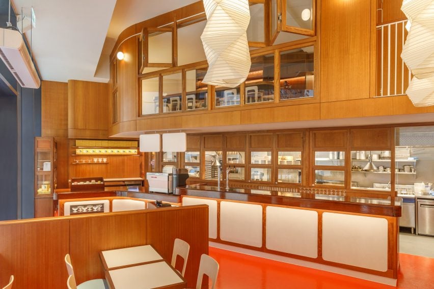
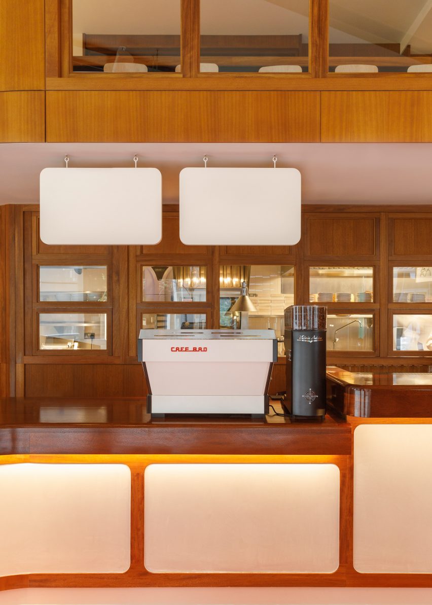
A pastry counter next to the entrance extends into a bar
“It’s the type of place that is disappearing fast, similar to the pie and mash shops in London,” BAO founder and creative director Erchen Chang told Dezeen.
“But it’s a heritage that is growing a new wave of nostalgia. The restaurant, Bolero, was the first and now oldest Western-style cafe in Taiwan and it’s got such a history to it. It feels as though time has been frozen – in a good way. I love the decor, the old waiters and mostly the old menu.”
Bespoke timber and glazed screens provide views into the kitchen
Chang and the team at BAO worked with Nottingham-based Macaulay Sinclair to create an interior that evokes the “nostalgic domesticity” of traditional Taiwanese kitchens, houses and eateries.
“All our restaurants are interpretations of culture in Taiwan,” said Chang, who founded the restaurant chain alongside Shing Tat Chung and Wai Ting Chung.
“We like to use this as a starting point and point of reference for our restaurants and whilst our aim is to create that experience that transports you, it’s not to create a direct copy of the references we take.”
Baked goods are displayed near the front of the space
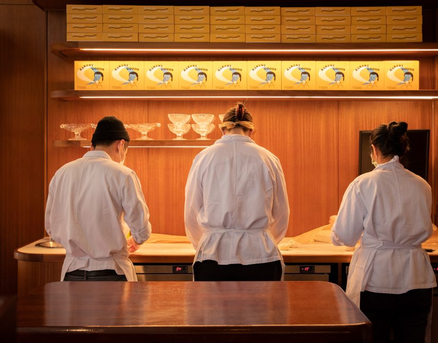
When customers enter the restaurant, they are greeted by a baked goods counter showcasing a range of handmade pastries that they can take away or enjoy in the restaurant.
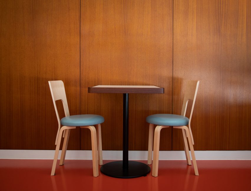
The counter extends into a bar and overlooks the dining area, which is set with simple square tables and dining chairs by Finnish brand Artek.
Light streams in through large floor-to-ceiling windows and a white-accented staircase takes diners upstairs to a mezzanine level overlooking the double-height restaurant.
On the upper level, guests can learn how to make the steamed buns that give the restaurant its name in classes led by BAO bakers.
Diners can watch the chefs at work
The double-height space is wrapped in wood panelling, polished plaster surfaces and bespoke timber screens with glazed panelling.
On the ground floor behind the bar, the screens separate the kitchen from the restaurant, while on the mezzanine level they allow diners to peek into the workshop space.
Solid and veneered iroko wood is used throughout the restaurant, finished with a mix of timber stains and lacquer sheens, while the floor is finished with red epoxy paint in a gloss finish that BAO refers to as “Bauhaus red”.
Paper lanterns by Isamu Noguchi hang in the dining area
“The bespoke timber and glazed screens are intended to be a playful yet functional barrier between kitchen and restaurant trading space,” said Mike Sinclair, who founded Macaulay Sinclair alongside John Macaulay in 2003.
“Glazing provides considered sightlines into the theatre kitchen whilst flexible, openable apertures assist operational communication.”
The floor is finished in red epoxy paint
All joinery featured throughout the restaurant and workshop space is bespoke and the paper lanterns that hang above the dining area are by Japanese designer Isamu Noguchi.
A museum-style glass display area under the staircase showcases some of the restaurant’s bao buns and restaurant merchandise.
A white-lacquered staircase leads up to the mezzanine
Macaulay Sinclair also worked on the nearby Dishoom restaurant in King’s Cross, which is located in a former railway transit shed and channels mid-20th-century Bombay.
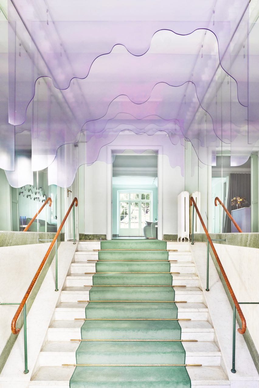
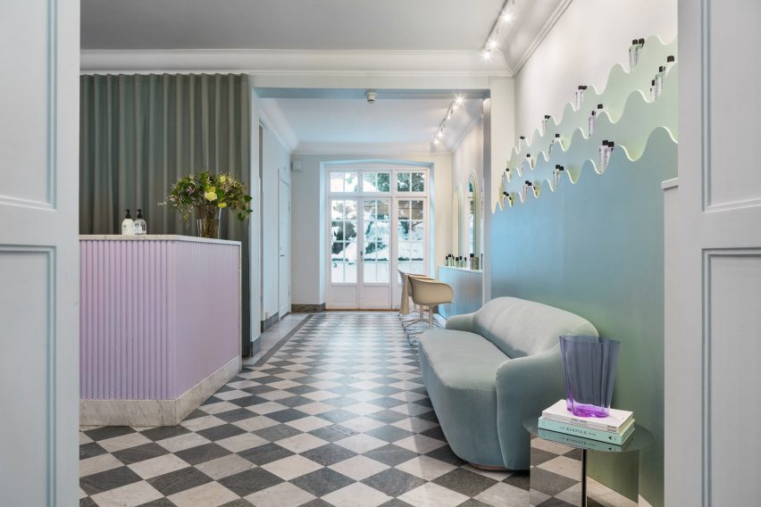
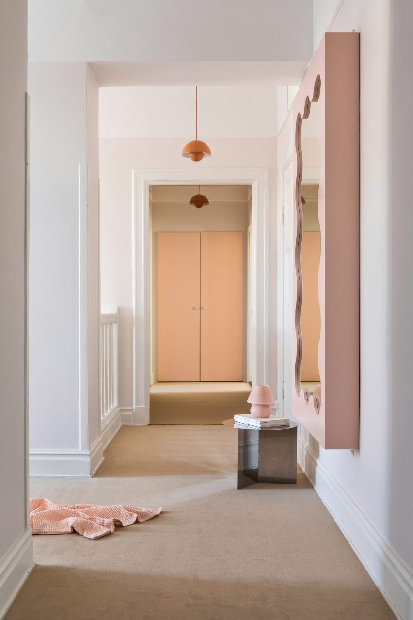
Swedish architecture studio ASKA has refurbished haircare brand Maria Nila’s headquarters and salon in Stockholm, creating an undulating ceiling installation that looks like dripping shampoo.
The Stockholm-based firm used a palette of soft pink, peach and turquoise colours that reference Maria Nila’s products to transform its headquarters in a four-storey townhouse.
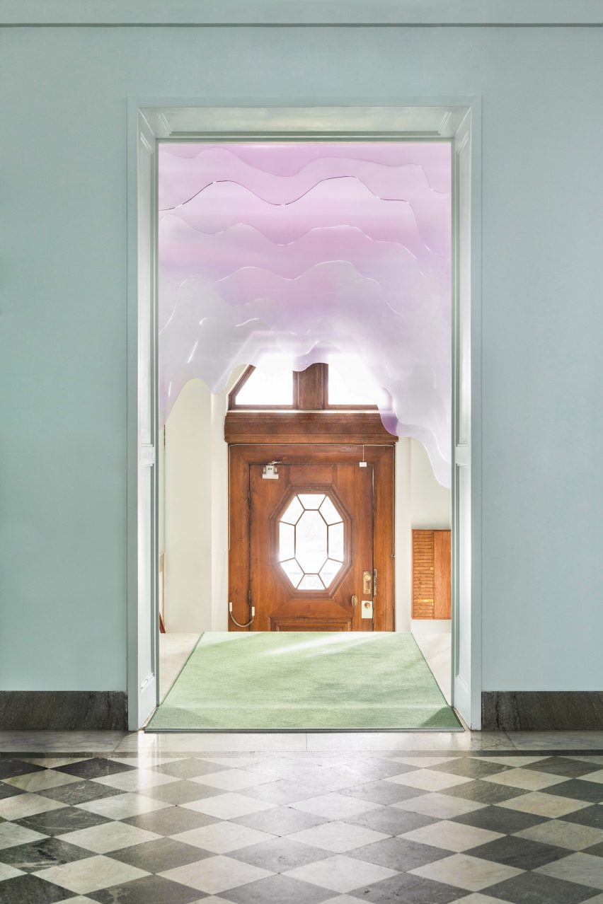
A plexiglass installation decorates the entrance
“The interior space before the renovation had a very neutral, impersonal feel to it and followed a white and grey colour scheme,” ASKA co-founder Madeleine Klingspor said.
“At ASKA, to the contrary, we always strive to create strong and flavoured environments by defining and highlighting the unique essences within each project.”
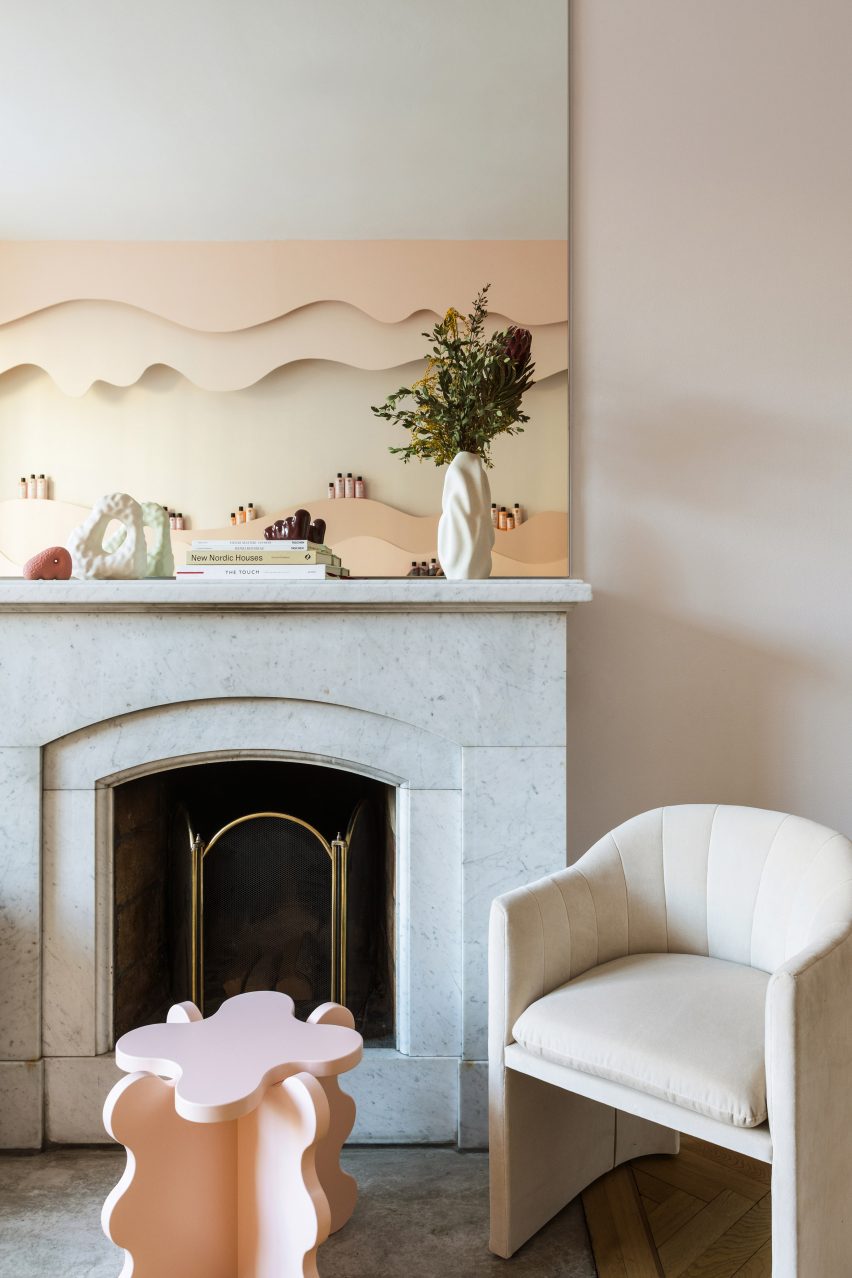
The chequered marble floor was preserved
The studio preserved some of the original details in the building, including a green chequered marble floor and a wooden staircase, while the rest of the space was fully refurbished.
“To add a layer of the uniqueness of Maria Nila as a brand most other parts of the interior was changed,” Klingspor said.
“Some thinner interior walls were torn down, most surfaces were repainted, new flooring was partly added as well as all bathrooms fully renovated.”
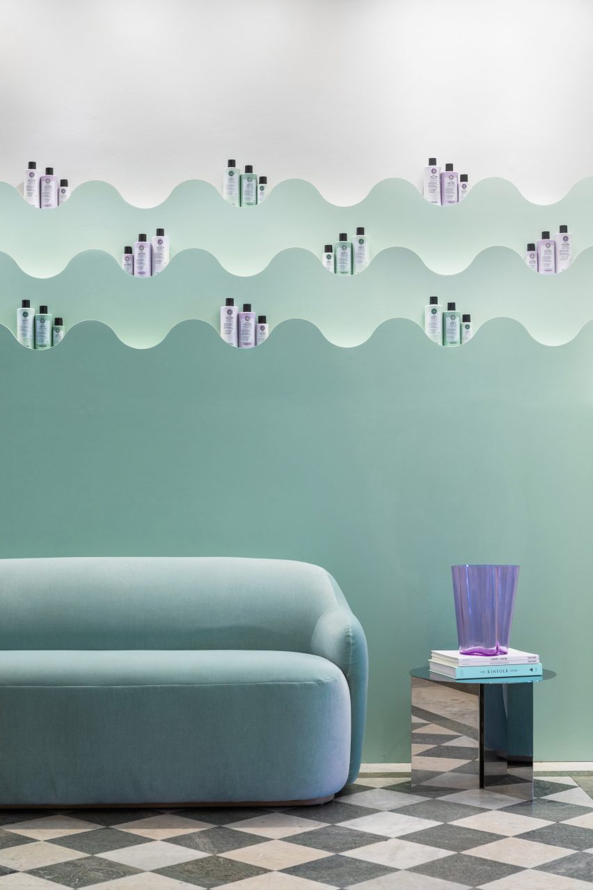
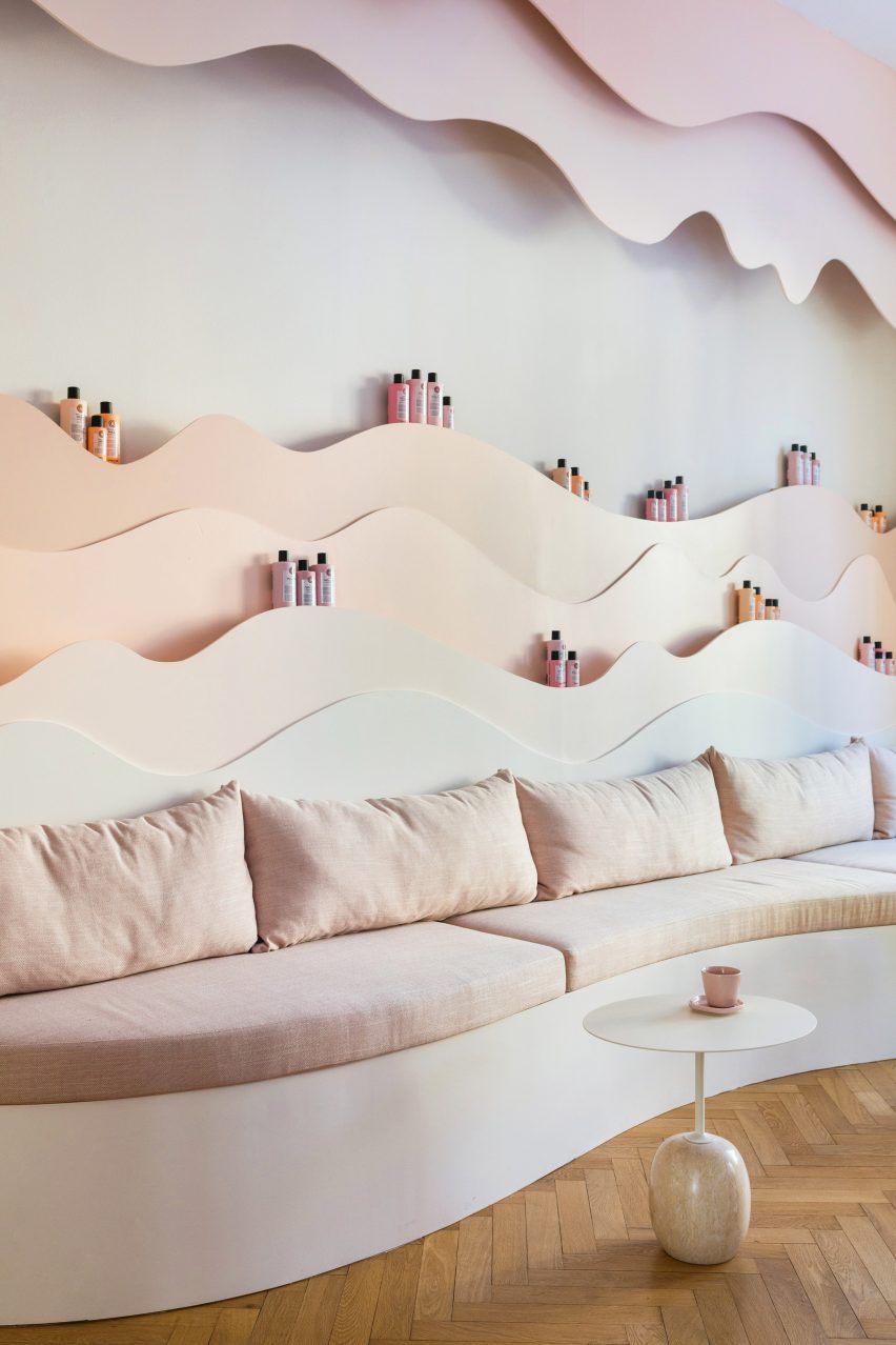
Pastel shelving with undulating shapes decorate the salon
The 650-square-metre building has 30 rooms, including five bathrooms, and houses both Maria Nila‘s public and private spaces.
Though each room has a unique look, all were designed to create a coherent relationship between the existing architecture and the new interior details.
The colour scheme was informed by the brand’s product packaging
“The program is distributed in a way where the entrance floor is the most public and then gradually the spaces become more private and workspace-oriented the higher up that you get,” ASKA co-founder Polina Sandström said.
“The reception, salon, beauty bar, conference and meeting areas make up the first floor while the second floor is well adjusted for larger gatherings and events including a kitchenette, a viewing room and a bigger break-out space,” she added.
The four-storey townhouse has 30 rooms
At the entrance, ASKA installed a pale-pink art installation made from form-cut plexiglass designed to resemble shampoo dripping from the ceiling.
Much of the furniture was specially designed for the project, including product shelves, sofas and a beauty bar made from wood and MDF.
“Besides that, we chose to bring in products from companies that use sustainable materials, for example, a custom-made tabletop from Smile Plastic, a company that only uses waste materials in their products,” Klingspor said.
The new interior design was informed by the haircare brand’s own products, an influence that is most notable in the pastel colour palette.
Existing architecture was incorporated into the design
“The colour scheme chosen for the different spaces throughout the building refers to the different haircare lines of Maria Nila,” Sandström said.
“These pastel colours are one of the main identities of the brand and we decided early on that this was one of the unique essences that were important to bring to the surface through our design.”
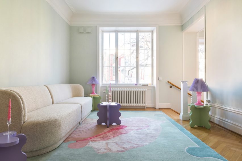
Playful tables by Gustaf Westman add a fun touch to the lounge space
ASKA also designed numerous undulating wall shelves to hold haircare products. Painted in matching gradient hues, these were informed by nature.
“The organic shapes are inspired by elements found in nature such as the forest, ocean, coral reefs and caves,” Sandström said.
An upstairs hallway has modern furniture in soft peach hues
“This soft and playful architectural language together with the pastel colours gives the interiors a unique visual identity,” she added.
Other playful hair salon interiors include Studio Roslyn’s design for a salon that is the “lovechild of art deco and Cyndi Lauper” and an avocado-green Beijing salon informed by space-age design.
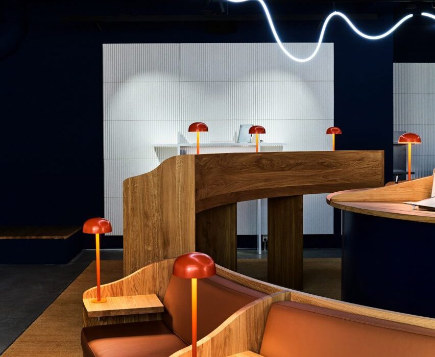
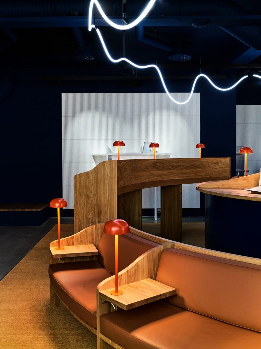
Architecture firm Snøhetta has created a library-informed respite from the digital world with A Better Place to Think, an Oslo pop-up shop for tablet brand reMarkable.
Located just off the city’s main shopping street, the temporary store was made to showcase the brand’s tablet, which has a paper-like surface.
The reMarkable pop-up store is informed by libraries
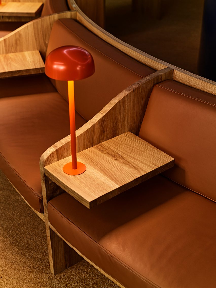
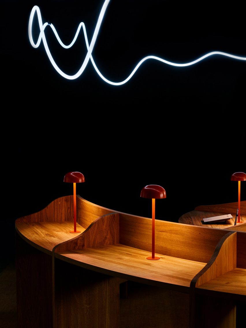
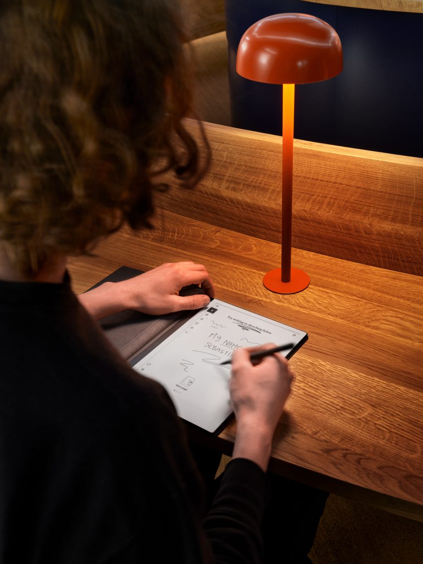
Snøhetta looked to libraries for the design, which features divided timber desks, leather banquets and small domed reading lamps.
The Norwegian studio wanted to encourage contemplation and concentration through the spatial qualities of the pop-up.
It features bespoke oak furniture in a quiet environment
“In today’s fast-paced and digitalised society, finding places for focused thinking can be a challenge,” Snøhetta founder Kjetil Trædal Thorsen told Dezeen.
“For the reMarkable pop-up store, we wanted to echo the serene environments of libraries – the clean and open spaces, somber aesthetics, tidy structures, and focused reading zones.”
The central light installation is inspired by a handwritten line
A Better Place to Think features two concentric rings of desks and seating, with the inner ring made up entirely of standing desks and the outer ring featuring blocks of seated desks, benches and sofas.
A handmade light installation overhead was inspired by the energy and movement of a line of handwriting.
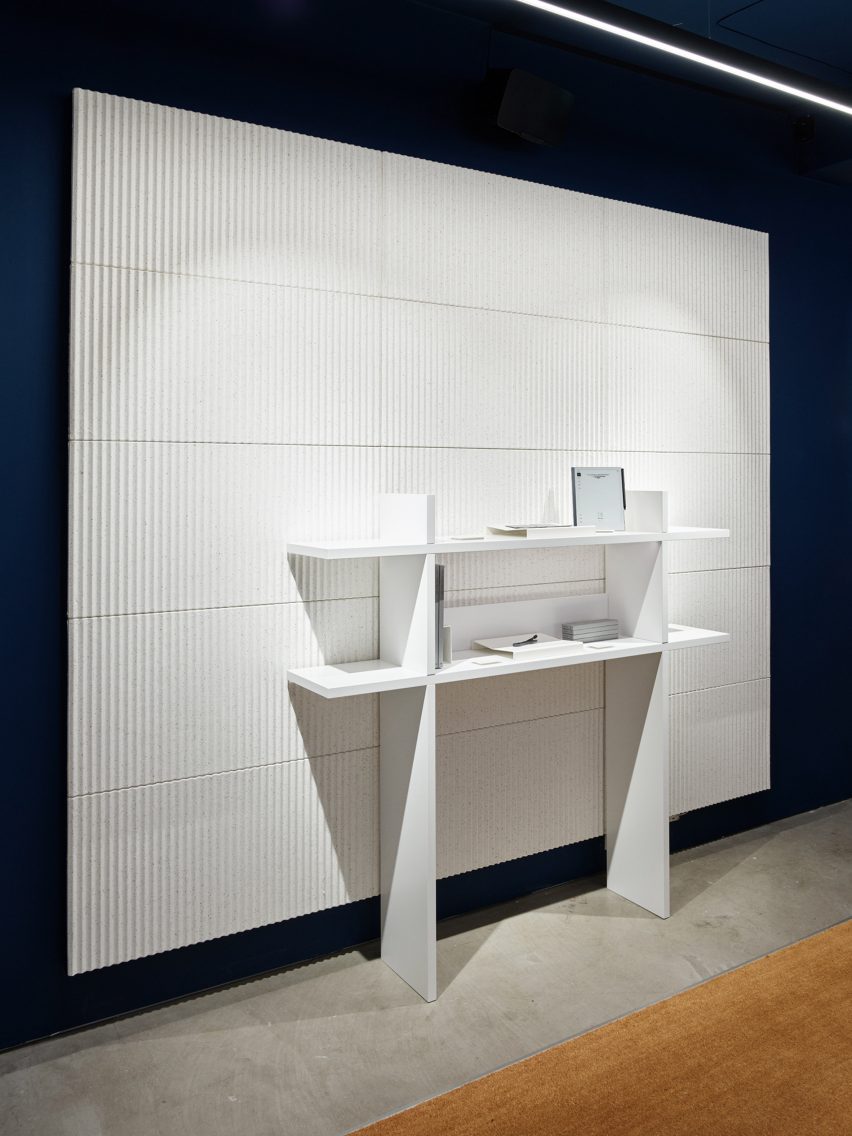
The walls and ceiling are painted in a “calm and sober” dark blue, with white acoustic panels and shelving covering most of the wall space.
The matt finishes across the walls, panels and on the bespoke oak furniture are meant to echo the material qualities of paper.
The store features matt finishes inspired by the feel of paper
The design of the pop-up aims to emphasise the enduring value of bricks-and-mortar shopping.
“Although consumers are becoming increasingly digital in their shopping habits, especially during the pandemic, we see the value of letting our customers experience that ‘wow’ moment of writing on one of our paper tablets for the very first time,” said reMarkable founder and CEO Magnus Wanberg.
White pulp acoustic panels line the walls
Founded in 1989, Snøhetta has offices around the world.
Its recently completed buildings include the shimmering Le Monde Group Headquarters in Paris and the El Paso Children’s Museum, which has a barrel-vaulted roof resembling a cloud.
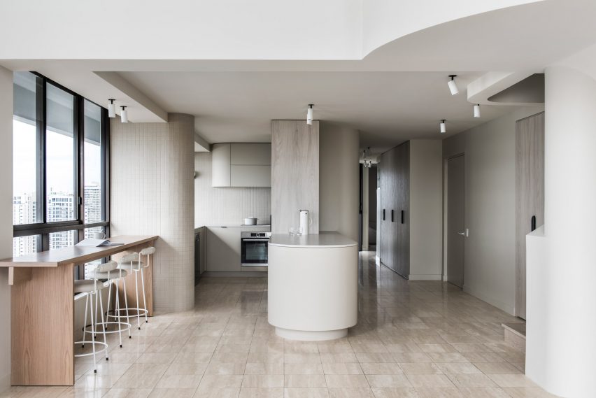
Kitchens with breakfast bars feature in today’s lookbook, which showcases ten interiors from Dezeen’s archive.
Breakfast bars are multi-functional, bar-height counters where people can perch on bar stools to socialise or dine.
An informal alternative to the dining table, they can also be used for working from home, helping to make the kitchen a multi-purpose space that can be in use all day long.
Breakfast bars often make efficient use of space, combining with kitchen islands or peninsulas to provide storage and prep space.
This Dezeen Lookbook is the latest to feature design ideas for kitchens. Others explore kitchens with islands, light-filled kitchens, terrazzo kitchens and green kitchens.
Here are 10 examples of breakfast bars selected from Dezeen’s archive.
Le Littoral, Canada, by Architecture49
The upstairs living space at this holiday rental in Québec by Architecture49 features a long, narrow galley kitchen with an island that doubles as a breakfast bar.
Backing onto a staircase, this offers guests emerging from the ground-floor bedrooms a convenient point to stop for coffee before heading to the living and dining area beyond.
The long, black island features a niche that allows stools to be partially tucked away to increase circulation space.
Find out more about Le Littoral ›
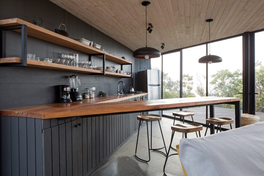
Holiday home, Chile, by 2DM Arquitectos
The open-plan kitchen of this angular home in Chile by 2DM Arquitectos features a V-shaped worktop, with the narrow peninsula serving as a breakfast bar.
The worktop is made of chunky, oiled hardwood while the bar stools have matching tractor-style hardwood seats.
Find out more about the holiday home ›
Apartment in Born, Spain, by Colombo and Serboli Architecture
Colombo and Serboli Architecture installed a playful open-plan kitchen with a round-ended peninsula as part of its conversion of an old apartment in Barcelona’s El Born district.
The terrazzo worktop overshoots the narrow rendered plinth, creating a breakfasting area furnished with two Revolver bar stools designed by Leon Ransmeier for Hay.
Find out more about Apartment in Born ›
La Nave, Spain, by Nomos
The terrazzo-topped peninsula in this open-plan kitchen in Madrid rests on a complex frame constructed from pine struts. This holds an open storage shelf – a typical feature in traditional Spanish kitchens, which often feature open shelving concealed by curtains instead of drawers and cupboards.
Two wooden artists’ stools with adjustable-height seats provide seating at the bar. The raw, open-plan apartment is in a former workshop in Madrid and was designed by Spanish architect Nomos.
Find out more about La Nave ›
Mantelpiece loft, Sweden, by Note Design Studio
Note Design Studio created this loft apartment in Stockholm, inserting a mezzanine into the double-height space beneath a soaring mansard roof.
The compact kitchen is tucked beneath a bedroom and features a breakfast bar set into a terrazzo peninsula that also features a sink, allowing a single breakfaster to wash up their crockery without leaving the Sequoia bar stools designed by Torbjørn Anderssen & Espen Voll for Magis.
Find out more about Note Design Studio ›
Penthouse M, Australia, by CJH Studio
CJH Studio’s redesign of the interior of this penthouse in Gold Coast, Australia features a breakfast bar that is placed against a window to make the most of the view.
The narrow, freestanding bar is made of wood, adding a touch of warmth to the neutral tones of the kitchen, which features beige wall tiles and travertine flooring.
Find out more about Penthouse M ›
Island Rest, UK, by Ström Architects
Island Rest, a low-slung holiday home on England’s Isle of Wight by Ström Architects, features a kitchen island deep enough for a row of bar stools to tuck underneath.
Made of white solid-surface material, the breakfast bar contrasts with the black kitchen and offers a more informal option than the huge wooden dining table behind, which is set with eight classic Wishbone chairs designed by Hans J Wegner for Carl Hansen & Søn.
Find out more about Island Rest ›
Holiday home, England, by Turner Works
Architect Turner Works converted a barn in Devon, England into a holiday home featuring an open-plan kitchen and diner overlooking a wildflower meadow.
The unusual kitchen layout features storage, prep space and appliances arranged along a wall plus a substantial island set at 90 degrees, forming a T-shape.
A shallow breakfast bar has been carved into one end of the island, which has a stainless steel counter above white storage units. The adjoining dining area features a double-length table with refectory-style seating.
Find out more about the holiday home ›
Family apartment, Canada, by Future Simple Studio
This apartment renovation in Montreal by Future Simple Studio has an asymmetrical kitchen consisting of units arranged against an angled wall plus a tongue-shaped island, which doubles as a breakfast bar.
The island is topped with polished granite and clad in white-painted cement blocks. The worktop cantilevers at one end, creating enough space for two Form bar stools designed by Simon Legald for Normann Copenhagen.
Find out more about the family apartment ›
Klinker apartment, Spain, by Colombo and Seboli Architecture
Colombo and Serboli Architecture updated this Barcelona apartment to include a compact open-plan kitchen made of russet-painted MDF.
One half of the short, broad island hosts a hob, which is ventilated by a dramatic stainless-steel extractor, with storage set below the counter.
The other, free-floating half of the island serves as a breakfast bar with room for two. It is supported by a steel column in one corner and features plenty of legroom beneath.
The apartment is too small for a dining table so the breakfast bar acts as the main eating space.
Find out more about Klinker Apartment ›
This is the latest in our series of lookbooks providing curated visual inspiration from Dezeen’s image archive. For more inspiration see previous lookbooks showcasing peaceful bedrooms, calm living rooms and colourful kitchens.
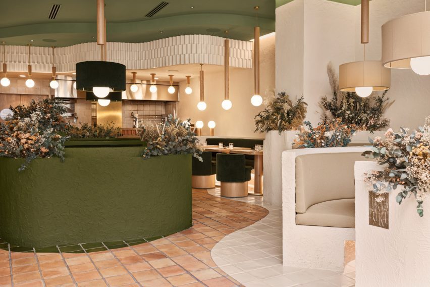
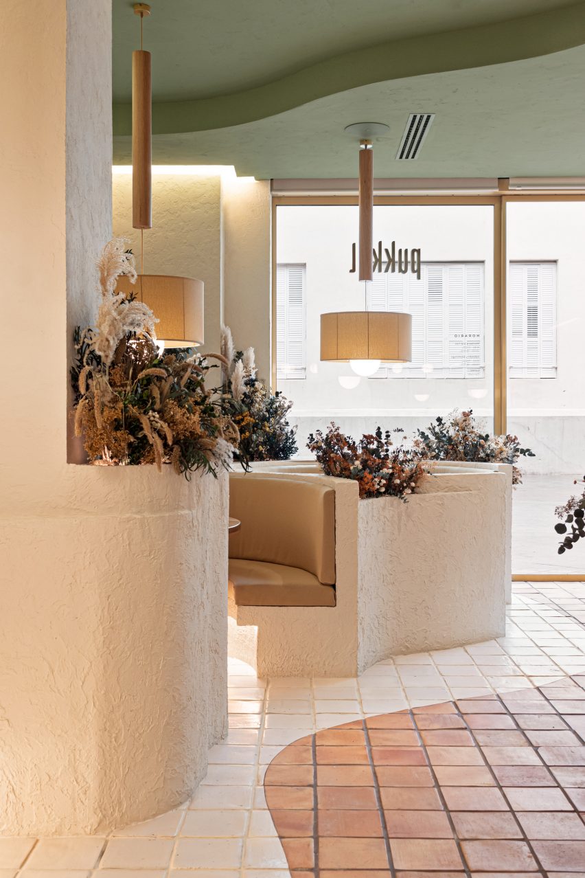
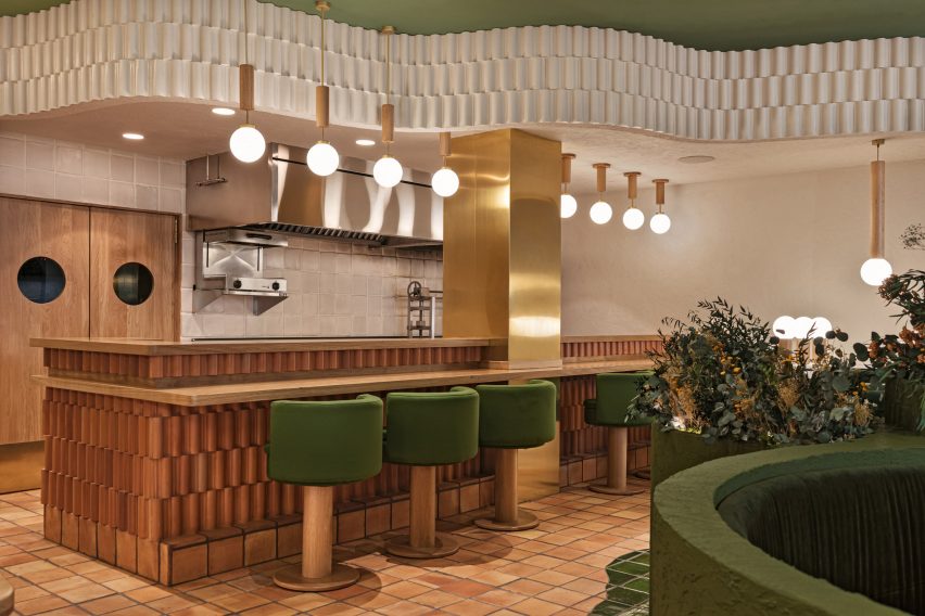
The beauty of Spain’s Aragon province informed the earthy colour palette, natural materials and curved forms used in this fine-dining restaurant interior by Valencia studio Masquespacio.
Located in the city of Huesca, Pukkel serves up a menu of healthy food and, according to the owners, aims to offer “a sensorial experience beyond the gastronomy.”
Pukkel is a fine dining restaurant
The interior uses a palette of natural materials and colours and undulating, textured forms that are intended to reflect the beauty of the nearby Pyrenees mountains and surrounding countryside.
“After doing a workshop with [Pukkel’s owners], Jorge and Mikel, we immediately proposed to work with 100 per cent natural materials and integrate nature into the space,” said Christophe Penasse, co-founder of Masquespacio.
Textured surfaces reference the nearby Pyrenees mountains
As well as the natural landscape, the designers wanted the interiors to reflect the restaurant’s healthy cuisine.
“We investigated the province of Huesca and started to discover the beauty of the mountains and parks in its surroundings,” added Masquespacio creative director Ana Hernández.
“We definitely found the reference we were looking for and that fitted perfectly with the healthy lifestyle concept from Pukkel.”
The design studio selected different tones of brown, white and green that are used alongside gold accents, which it said add a “little bit of sophistication” to the space.
The restaurant’s layout follows the curved lines and circular forms of the booth seating to create a winding pathway through the space. According to the designers, this is intended to create the feeling of walking through the forest or mountains.
Dark green is combined with lighter tones
This curved path is further highlighted by the colour of the floor tiles, which change from natural terracotta to glazed green or white in the different seating areas.
Uneven surface finishes such as rough stucco, ceramic and terracotta tiles are used to reflect the textures and forms found in nature. The terracotta tiles on the floors, bars and the undulating tiles on the walls were designed specially by Masquespacio for Pukkel.
Terracotta tiles wind through the space
The stucco seating booths feature integrated planters filled with plants and flowers that will change depending on the season.
Other restaurants designed by the studio include the Milan outpost of Italian fast-food chain Bun, where it selected a lilac and avocado-green colour scheme to create a youthful yet “sophisticated” interior, and a tropical sushi restaurant in Valencia, Spain, that mixes Japanese and Brazilian-inspired design elements.
Design and architecture agency Studiopepe references Milan’s offices and metro stations in its revamp of the fourth floor of the city’s renowned luxury department store La Rinascente.
The fourth floor, which is home to the store’s womenswear department, has been reimagined by the Milanese studio using bold graphic elements and pop colours.
The interior is dotted with colourful accents including changing rooms encircled in orange curtains (top image) and Rodolfo Bonetto’s Boomerang armchair (above)
Studiopepe, founded in Milan in 2006 by Arianna Lelli Mami and Chiara Di Pint, conceived the space as a series of zones subtly organised by functions and visual references.
1980s Milanese workplaces as well as the city’s rationalist M1 metro stations – the latter designed in 1964 by Italian architects Franco Albini and Franca Helg – were among the studio’s inspirations.
A system of curved plexiglass shelving meanders through the womenswear department
“The use of graphic elements and pop tones echoing Milan street style convey a new genderless approach to retail design,” explained the studio.
“Colour is conceived as an architectural tool – an intense emerald green, silver and black create an unusual palette animated by hints of coral and bright yellow tones.”
The department is accessed via a bright yellow staircase
The steel tubes – which are used to clad display columns and create table legs – are a direct reference to the city’s underground stations.
Materials such as satin steel, plexiglass and terrazzo are paired with experimental materials with contrasting textures such as Silipol – a material which was originally selected by Albini and Helg to cover the Metro stations’ walls; Alusion, the stabilised aluminium foam that is used to clad the city’s Fondazione Prada; and Milleform, a bio-based cotton acoustic tile.
To create a domestic feel, the space is furnished with a mix of bespoke rounded furniture and display cabinets, as well as classic design pieces like the Boomerang armchair by Rodolfo Bonetto.
Curved satin plexiglass shelving systems that display the store’s trainer offering also serve as space dividers.
The department’s distinctive circular changing rooms are enclosed in orange curtains made from structured leather – a feature that Studiopepe said nods to the textile folding doors often used by Italian architect Gio Ponti.
Studiopepe used contrasting textures throughout the interior
A previous incarnation of La Rinascente’s fourth-floor womenswear department was designed by Japanese studio Nendo. Designed in 2013, the studio drew upon architectural elements observed while exploring Milan to create a calming, neutral space.
The studio said that it was “inspired by the unexpected encounters with shop windows, courtyard gardens and public squares that come from wandering Milan’s back streets.
Mint green and burgundy are among the hues incorporated into a Montreal co-working space that Canadian firm Ivy Studio designed to “stand out from its competitors.”
The office is located on the second floor of a 743-square-metre building in Verdun, one of city’s trendiest neighbourhoods. The space formerly housed a Jiu Jitsu gym and a beauty salon.
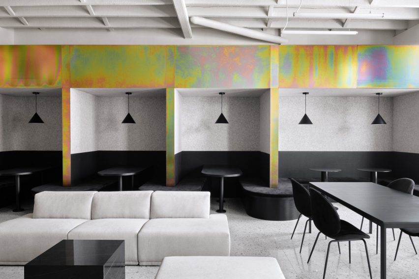
Spacial co-working office includes mint and burgundy hues
This is the first location for the new co-working brand Spacial. Local practice Ivy Studio was charged with designing a flexible work environment for up to 120 people.
“Being the first of its brand, this space had to stand out from its competitors by offering a unique vision for co-working,” the team said.
The project was designed by Ivy Studio
The team divided the rectangular space into two distinct zones.
The front portion encompasses public areas that are largely used for informal working, socialising and relaxing. In the rear, the team created a more private area with about two dozen rentable offices in varying sizes.
Throughout the space, contemporary finishes and decor are paired with original building elements, such as exposed ceiling joists and brick surfaces.
In many areas, the team coated the walls with an off-white plaster and covered the floors with light-grey terrazzo. Much of the furniture is black, although dashes of colour are sprinkled throughout.
Dashes of colour are set against monochrome walls
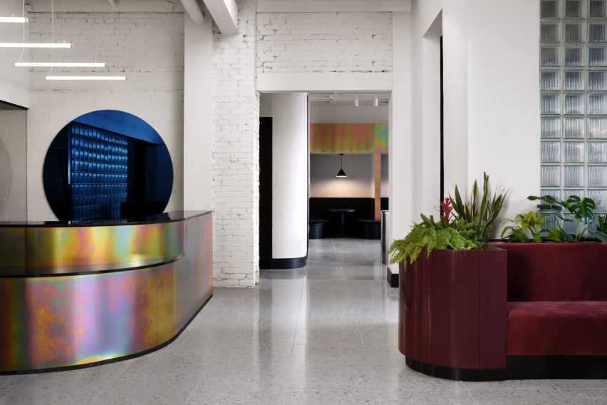
Upon entering, one encounters a rounded reception desk made of zinc with a rainbow-coloured finish. Hanging on a wall is a blue, circular mirror – one of several rounded elements in the venue.
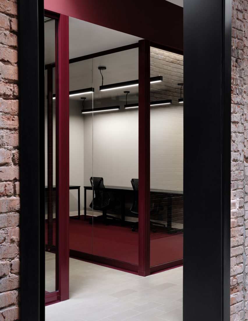
To one side of the foyer is a lounge and a trio of conference rooms, each with a wall-mounted screen.
Brick walls feature in the office
“In the conference rooms, televisions are camouflaged in front of matching, circular black mirrors, each backlit to put forward the white-washed brick wall,” the team said.
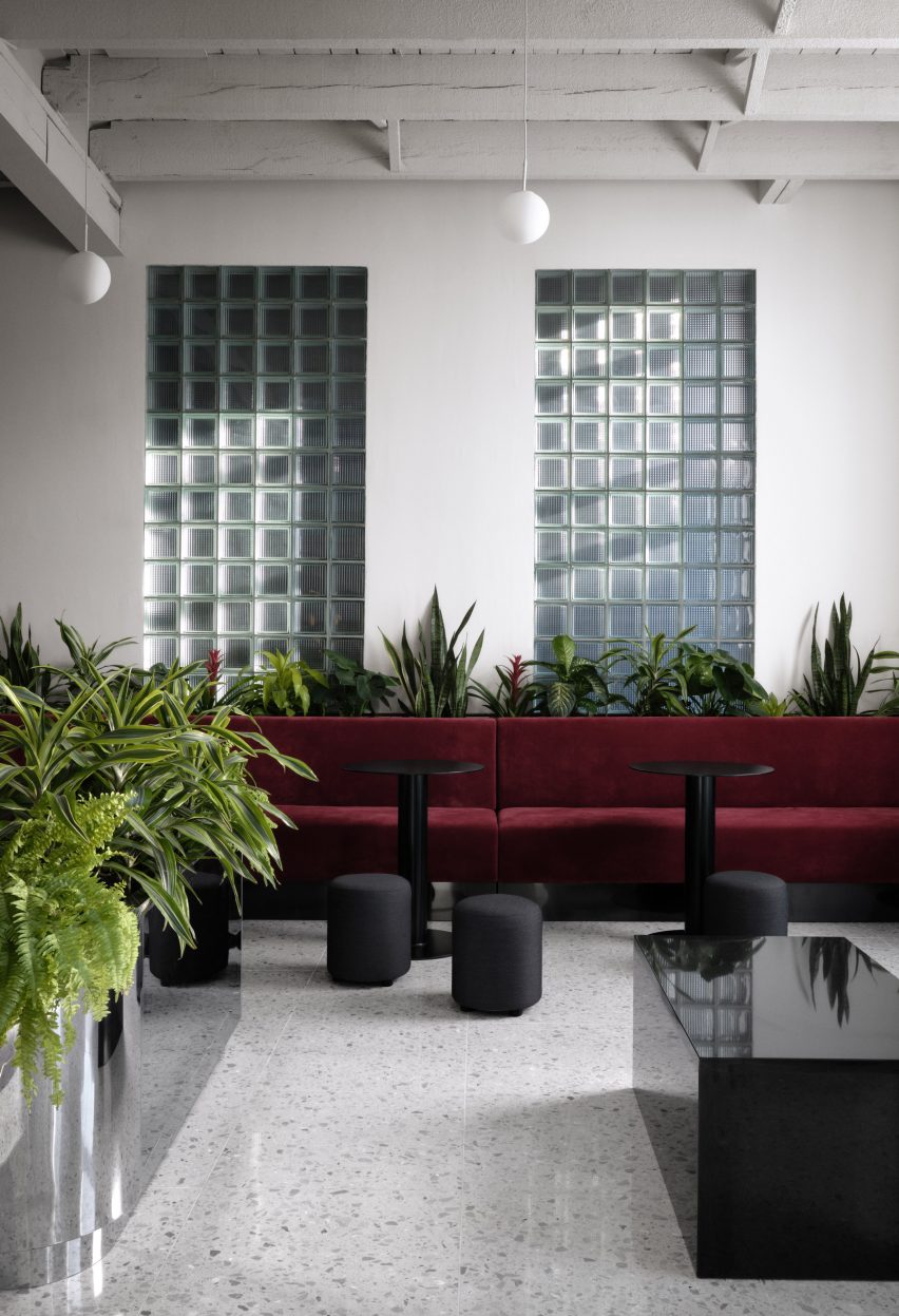
To the other side of the foyer is a second public area. This one encompasses a kitchen and dining space, including private booths that are well-suited for small groups.
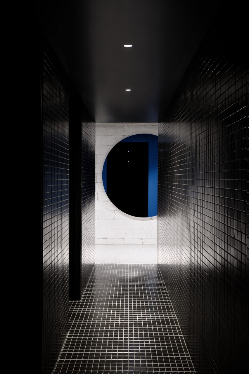
Bathrooms have black ceramic tiles
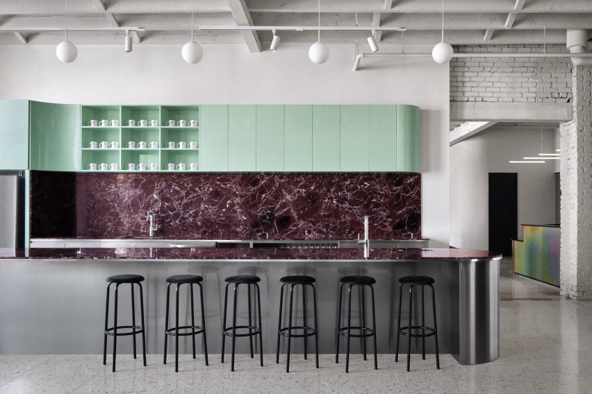
The kitchen features curved cabinetry with a glossy mint-green finish, and a backsplash and island covered with Rosso Levanto marble. The base of the island is made of stainless steel, which mimics the chrome planters found throughout the office.
Situated near the kitchen are the bathrooms, which have black ceramic tiles and matching plumbing fixtures.
The reception area has a blocky glass brick wall
Behind the reception desk is a glazed-block wall that separates the public zone from the private offices, while still enabling light to pass through.
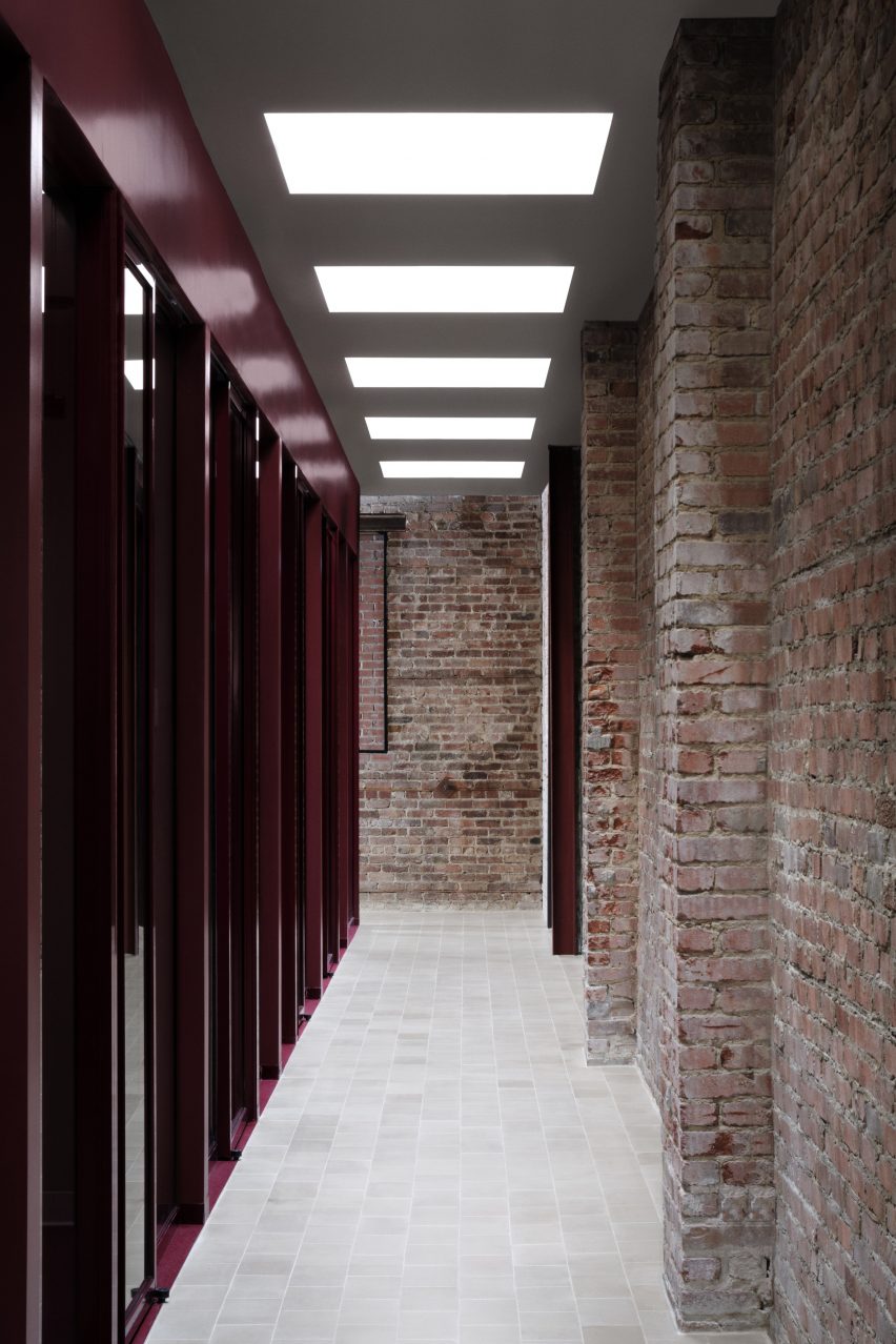
The offices are arrayed along corridors with tile flooring and brick walls. Both fixed and sliding glass panels enclose the work spaces. A dark burgundy hue was chosen for the carpeting and mullions.
Skylights bring extra light into the office’s interior
To ensure the private area felt bright and welcoming, the team installed 20 skylights above the corridors.
“With the exposed brick walls, sandstone floor tiles and abundance of natural light pouring into the hallways, the general feeling resembles that of working in an exterior courtyard,” the team said.
Other co-working spaces in Canada include an office designed by Henri Cleinge within Montreal’s old Royal Bank, and a women-only space in Toronto that was designed by MMNT Studio to feel peaceful yet playful.