Pratt Institute
CategoriesInterior Design

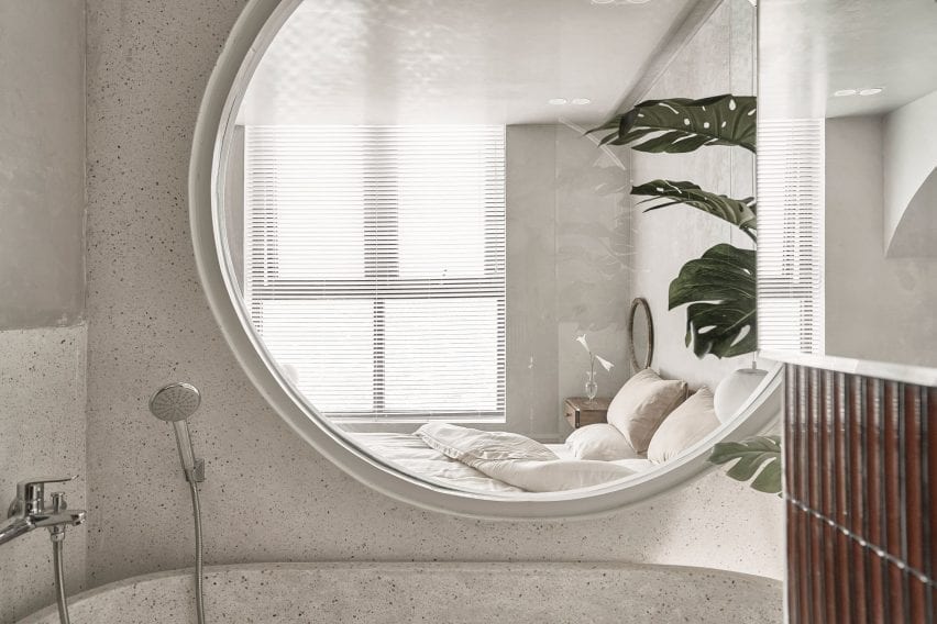
Pratt Institute interior design students showcase end-of-year projects

Twenty interior design students at New York City’s Pratt Institute present their final projects in Dezeen’s latest school show.


From a building that could purify contaminated floodwater to analysing how to improve user’s airport experiences, these projects by undergraduate and postgraduate interior design students at Pratt Institute explore how interiors affect our environment and behaviour.


School: Pratt Institute
Courses: BFA Interior Design and MFA Interior Design

School statement:

“The Bachelor of Fine Arts and Master of Fine Arts in Interior Design at Pratt Institute has consistently ranked as the top interior design programmes in the United States and are considered to be some of the most prominent and influential. The courses prepare students to engage in critical inquiry and exploration – skills that establish them as innovators having an impact on the profession, the discipline and research on the interior environment.

“The programmes are architecturally oriented with emphasis on spatial articulation. They are designed to guide students in generating creative solutions by understanding craft, light, colour, and material research. Through theoretical and applied research, the curriculum addresses emerging and innovative technologies, interdisciplinary collaboration and sustainable practices. Both degrees focus on larger issues of ethical and social responsibility, diversity, equity, and inclusion through an understanding of global cultural history and its context.”


Pratt Institute

Solitary Living and Social Interactions in Urban Community by Bingyu Hu

“With different scales, functions and degrees of transparency, interior spaces serve as containers to protect privacy, stimulating communication and participation. As a result, they respond to individual’s lives while fostering community interaction.”

Student: Bingyu Hu
Advisor: Woody Rainey
Course: 
MFA Interior Design
Email: 
bhux16@pratt.edu


Pratt Institute

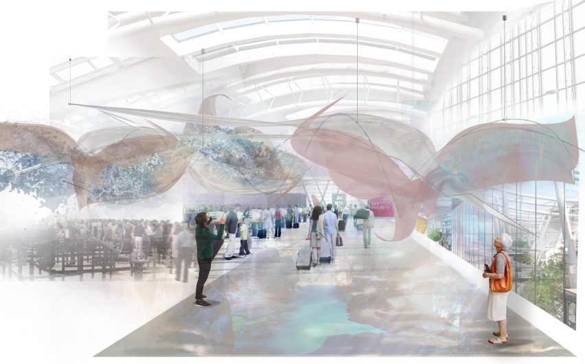
Activating Boundaries by Caitlin McMasters

“Activating Boundaries addresses the way generic airport experiences have become passive due to the overwhelming amount of stress placed on users throughout their journey. The effects of these emotions leave the user searching for entertainment from the consumerism offered post-security check.

“Based on research, the stress users undergo are elevated in periods of waiting and delays when the presence of large lines appear. Is there an opportunity to repurpose these boundaries? Can stressors be transformed into a sensory experience? How can we transition from the independent isolation of travelling to experience the journey of travelling together?

“This thesis allowed me to investigate the future of design amidst a global pandemic that has altered the way we perceive space and people. It investigates reconnecting people with each other.”

Student: Caitlin McMasters
Advisor: Dalia Hamati
Course: BFA Interior Design
Email: cmcmaste@pratt.edu


school show

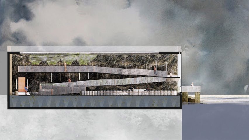
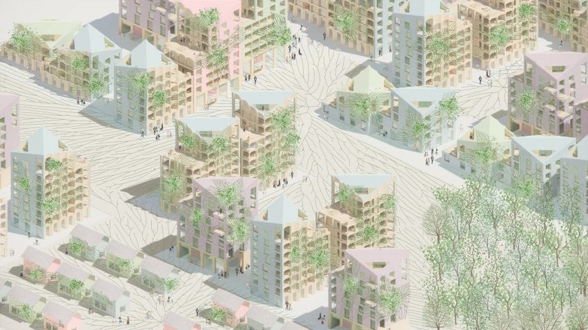
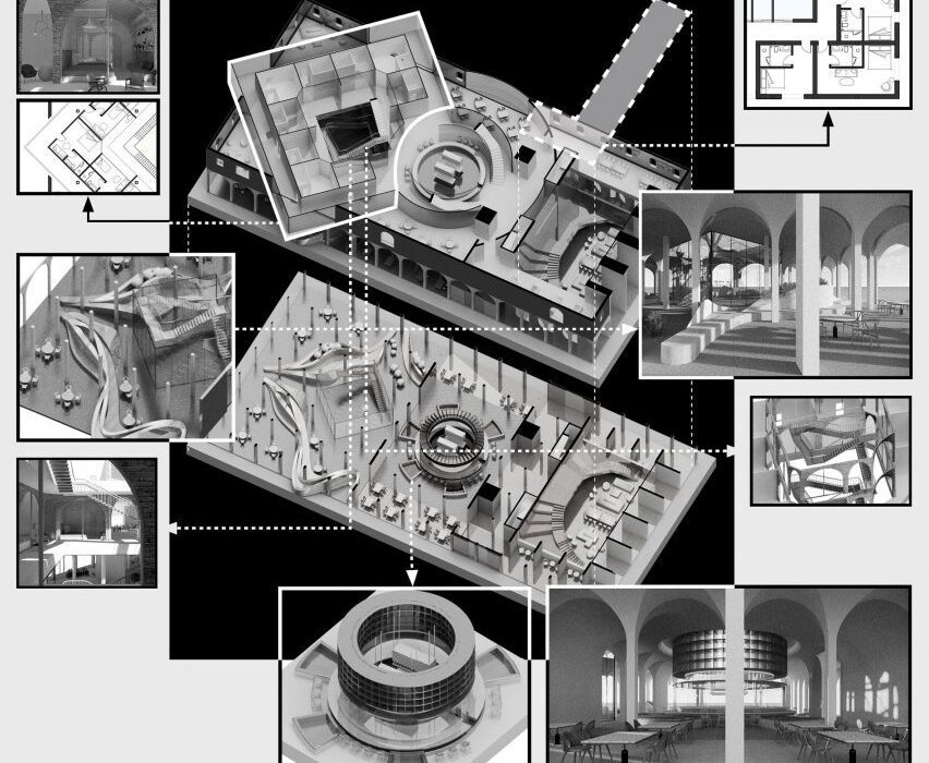
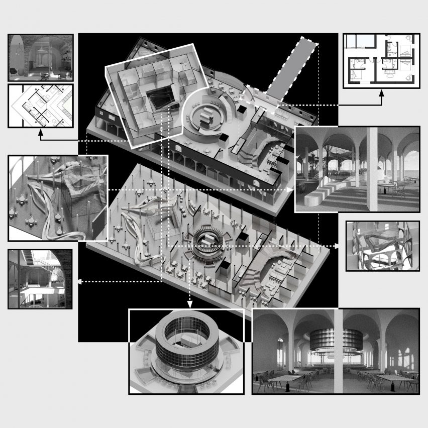
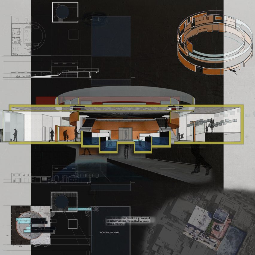
Harvesting Water: Reimagining Environmental Waters as Constructive Materials in the Resilient Coastal Interior by Kats Tamanaha

“By 2060, an estimated 13 million Americans will be displaced due to rising sea levels and coastal flooding. This thesis explores the possibilities of tidal, flood and stormwater as ‘materials’ in our built environment. Here their potential is shifted, from substances that destroy to resilient tools used to manage flooding.

“Water within the built environment is hidden, hyper-controlled through intricate plumbing systems and filtered for use. Water within the exterior is uncontrolled and often feared. Floodwater is contaminated, picking up traces of where it has been and what it has touched. As sea levels rise, areas formerly at risk for 100-year floods will soon be submerged at high tide. How can the interior adapt to embrace the new reality of water rather than avoid it?

“My project embraces the future of permanent tidal flooding. The building passively phytoremediates toxic water while creating an adaptive form of the interior. It explores possibilities of tidal, flood, and stormwater as tools for long-term, in-place resiliency in coastal communities facing an increasing risk of flooding.”

Student: Kats Tamanaha
Advisor: Irina Schneid
Course:
MFA Interior Design
Email: 
ktamanah@pratt.edu


Pratt Institute

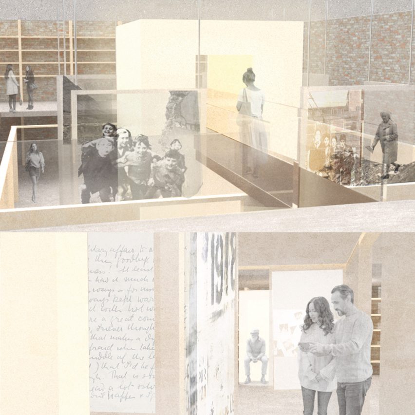
Fragment / Reconcile by Aoife McCaul

“Fragment / Reconcile addresses the complexity of living in a post-conflict, economically deprived community that struggles under the burden of the past. Following the events of the troubles and the death of a dominant industry, an entire generation is coming of age in Derry who have to navigate insurmountable unemployment rates and forge a path to peace with little to no outside support.

“To help mitigate the most pressing issue for youth in Derry, I proposed an incubator and teaching facility to build community resilience through a network of small businesses. The centre would provide the resources currently lacking to retain their workforce and make upward mobility possible within the city.

“Growth is made possible by the incubator’s interactive and reflective practices. It engages with the community on a macro scale while also encouraging individual healing on a micro scale. As the user moves through space, it transitions from a collaborative environment to a self-reflective one. An archive becomes the basis upon which to preserve and reflect the collective memory of the people it serves. By being informed by the past, they can move towards the best version of their future.”

Student: Aoife McCaul
Advisor: Melissa Cicetti
Course:
BFA Interior Design
Email: 
amccaul@pratt.edu


Pratt Institute

Inhabiting In-between Space by Tao Sun

“This project puts forward new ways to inhabit in-between space. By breaking down interior elements one by one, a layering of interior and exterior space emerges and reinvents traditional spatial constructs.”

Student: Tao Sun
Advisor:  Edwin Zawadzki
Course: MFA Interior Design
Email: tsun4@pratt.edu


Pratt Institute

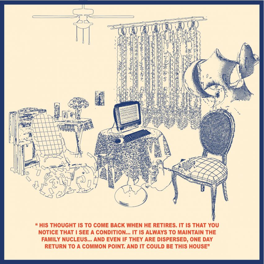
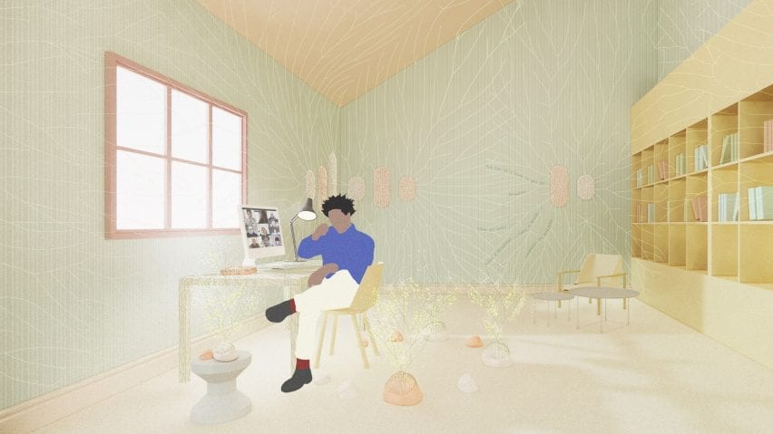
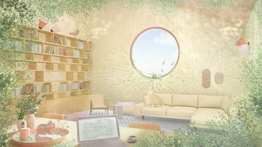
“We Learn Culture At Home” by Bridget Rodezno

“This thesis focuses on the home as a ‘central agent of change’ in response to the remittance between the Salvadoran-American transnational identity. Here, remittance signifies the value of a cultural currency by forming a multi-generational landscape of retraced rituals and reassembled emblems.

“At the beginnings of a discourse, there is an agency in how the home responds to generational, cultural, psychological and environmental issues to constantly shape, design and re-examine contemporary living.”

Student: Bridget Rodezno
Advisor: John Nafziger
Course: BFA Interior Design
Email: brodezn5@prattt.edu


Pratt Institute

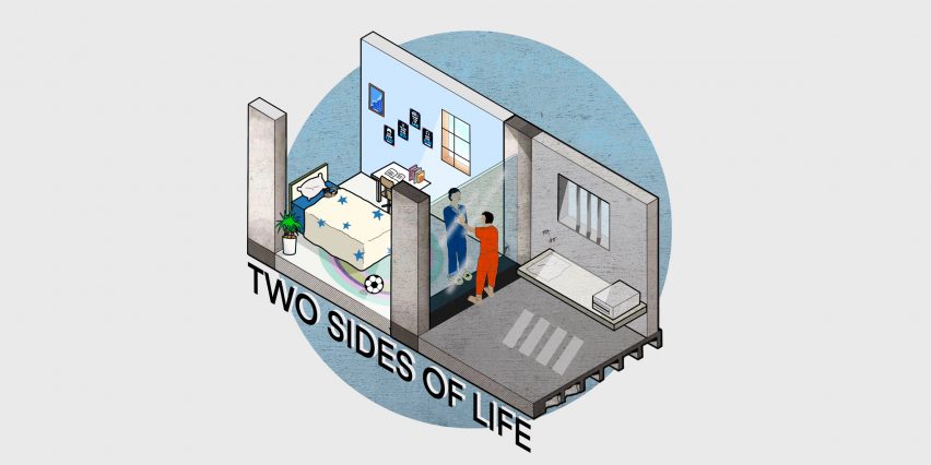
“The Nest is a didactic and prototypical full-time detention centre designed for male adolescents who have committed minor crimes. It is a critique of the current antiquated prison form in New York City. It explores educational, healing, and therapeutic spatial relationships and rethinks surveillance in order to reform negative behaviours and support mental health issues.”

Student: Chaowei Wang
Advisor: Alison Snyder
Course: MFA Interior Design
Email: cwang31@pratt.edu


Pratt Institute

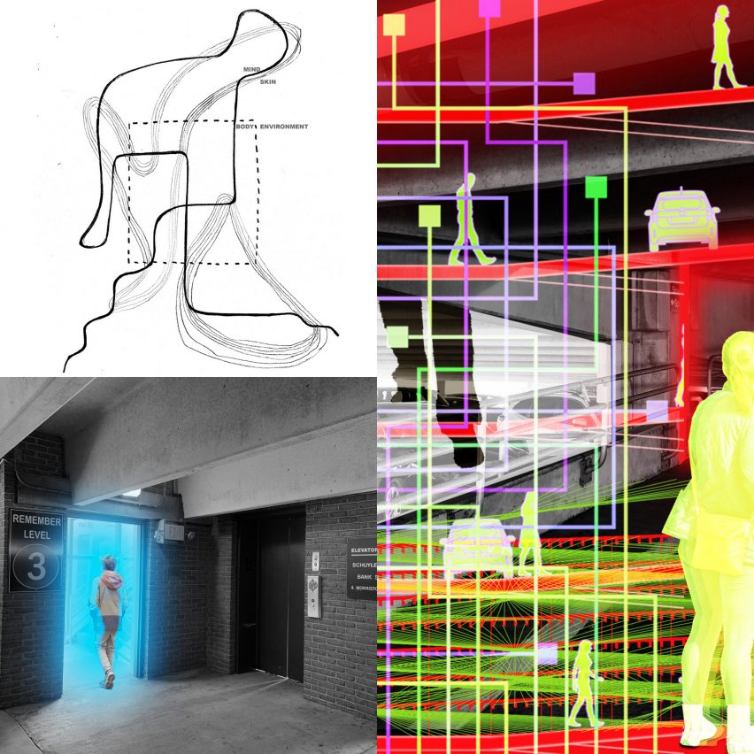
Moments of Movement by Kelli McGrath

“Moments of Movement investigates how interior space can directly affect one’s bodily awareness and interactions with the environment. Rather than habitually moving through space, space can be designed to heighten our awareness of our body and its relationship with the material world.

“The intention is to bring more awareness and appreciation to those small, everyday events that we often perform on auto-pilot. Although we tend to seek out spectacular events, life often happens in those everyday moments in-between. Rather than rushing past them, the users are prompted to slow down and experience those moments.

“The thesis proposes that the body will be part of a network where interactions and movements through thresholds directly affect the environment. By augmenting thresholds within a parking garage and adding screens, mirrors, enhanced lighting, walls and monitors, body movements will be figured as the form-making material of the project. As the body moves within and between various garage zones, it becomes part of a network and explores the relationship between the environment and agency.”

Student: Kelli McGrath
Professor: Brendan Moran
Advisor: BFA Interior Design
Email: kellimcgrath0817@gmail.com


Pratt Institute

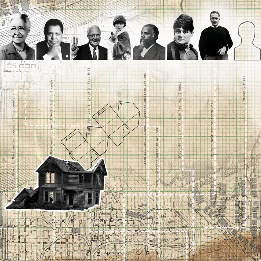
Building Within Memory: Strengthening Place Identity in Deteriorating Environments by Claire Riordan

“Place-identity is defined by a person’s cognitions about the physical world around them. At their core are a person’s environmental past, made up of places, spaces and characteristics that have shaped their biological, psychological, social, and cultural needs.

“This thesis analyzes how the changing built environment can be used as a tool to reveal layers of place-identity. The mutual experience of change over time will inform the connection between the physical body and the spatial body, resulting in a stronger sense of self-identity.”

Student: Claire Riordan
Advisor: Francine Monaco
Course: 
MFA Interior Design
Email:
 criorda3@pratt.edu


Pratt Institute

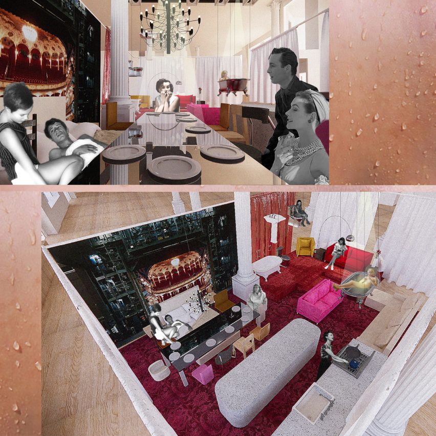
Stage Fright by Allison Margret Piccone

“Through the theory that performance exists every day, stage fright occurs in domestic, banal settings. In this project, customers in a retail furniture store become performers during their perusal of the staged vignettes by subverting social thresholds and design standards, new social and physical relationships form, alleviating the stigma of stage fright.

“Set in the theatrical and historical furniture showroom – ABC Carpet and Home – the staged sets which aim to present a home setting are critiqued as performative. Hired performers act out different domestic activities and shoppers find themselves crossing the threshold from audience to performer. In their attempt to look at the furniture, test it and imagine it in their own homes, they become part of the performance.

“An open floor plan allows for programmes to cross over, as a bed becomes a seat in a dining setting. Some toilets are for show, while others have working plumbing. The sets have spotlights, curtains and a fly system that allows for changing scenes, as furniture flies overhead, adding a theatrical quality to the performance.”

Student: Alison Margret Piccone
Advisor: Alex Schweder
Course:
BFA Interior Design
Email: 
allisonpiccone@gmail.com


Pratt Institute

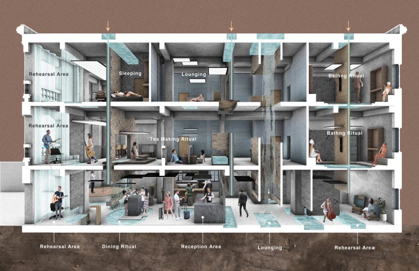
House of Harmony by Huangyu Zhang 

“This thesis explores a shared harmonic environment for residents and tourists. It uses performance rituals to create a prototypical system for cultural interaction and social harmony in creative cities of music evaluated by UNESCO.

“Spatial devices create new relationships between tourists and residents, combining with daily events such as dining or lounging, and cultivating cross-cultural understanding through the universal language of music and integrating it into the celebration of rituals such as holidays and food.

“The rituals will create a specific spatial quality by increasing culture experiences by controlling the sound transparency and visualizing the vibration of sound.”

Student: Huangya Zhang
Advisor:  Nina Freedman
Course:
MFA Interior Design
Email: 
zhanghuangyu1@gmail.com


Institute

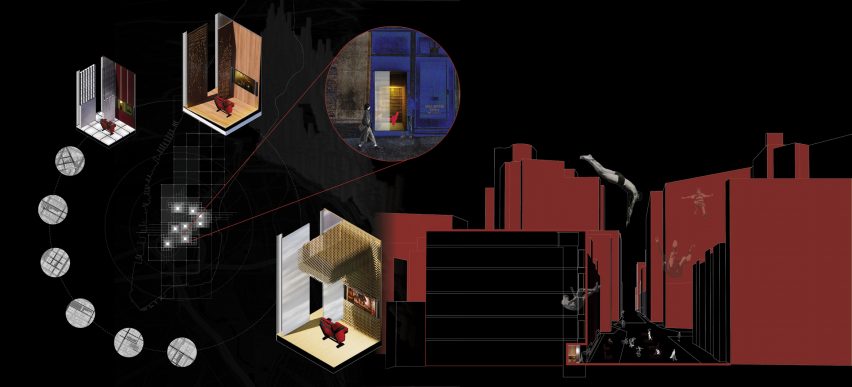
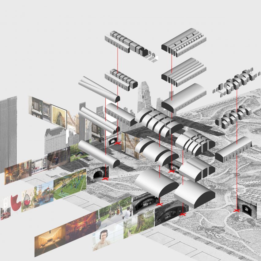
Curating Urban Wormholes by Rianna Desai

“Curating Urban Wormholes explores the city through a new lens: by inserting cinematic experiences in sidewalk freight elevators that connect invisible, disparate moments in the cityscape. The elevators function as portals to parallel universes providing a social and cultural exchange between program and user.

“The project was inspired by the loss of authentic cinematic experiences due to the pandemic and the heterotopic quality of underutilized niches in the city.

“The network of temporary cinematic installations in sidewalk freight elevators reengages the city by activating unused, ‘other’ spaces, unlocking the city’s true potential. The curated serendipity of the wormholes invites the rediscovery of the urban landscape.

“These wormholes have a nodular quality that gives them an existence of their past the time of their installation, allowing them to leave behind traces in the urban fabric that add to the layered experience of the city.”

Student: Rianna Desai
Advisor: Karin Tehve
Course:
BFA Interior Design
Email: 
riannadesai1998@gmail.com


Pratt Institute

Beneath the Surface: An Inquiry into Boundary as a Didactic Threshold to Promote Awareness by Nella Gray

“Beneath the Surface explores ways to create tension within layers of interior design to provoke awareness and empathy for evasive issues.

“This project questions the separation of people from systems of production and waste as it enables apathy towards the concealed relationship of consumption and environmental degradation.”

Student: Nella Gray
Advisor: Claudia Hernandez
Course:
MFA Interior Design
Email: 
nschools@pratt.edu


Pratt Institute

Sonic Parallax: Sensory Velocity by Nil Karaer

“Borrowing existing materials inherent to the New York City subway station, such as the 3×6 tiles, the project will manipulate the surfaces of the City Hall Station to become an interactive, acoustical field of sonic densities. This experiential-interactive installation intends to address the notion of speed by making the acoustic field and the different paces of the city visual. In other words, rendering auditory data points visible to understand the functioning of NYC.

“The exploration is towards creating an interactive instrument activated through the movement of the users and the train in relation to the parallax effect.

“City Hall Station is underneath the City Hall Park, and the entrance is through the park. It is a loop station for Train Six: The station has existing skylights to the park’s surface.

“The project will be taking a material inherent to the subway station and recreate exposed surfaces in a different function, colour, and densities of tiles to highlight the notion of speed which could be experienced visually and acoustically.”

Student: Nil Karaer
Advisor: Annie Kwon
Course:
BFA Interior Design
Email: 
nkaraer@pratt.edu
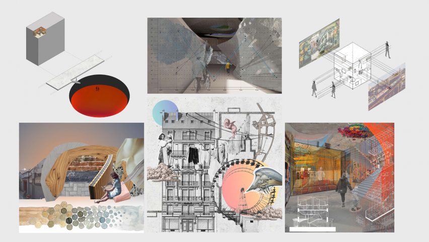

Pratt Institute

Various projects

Clockwise from top left:

Pools Under Pavement by Michael Antonio Warren (MFA Interior Design)
A Void: Rising Sea Level by Seung Heon Lee (BFA Interior Design)
Implicit Bias by Xinxiao Hui (BFA Interior Design)
Weaving Connectivity by Xiaoke Li (MFA Interior Design)
Breathing Rules by Yang Pei (MFA Interior Design)
Haptic Therapy Centre by Honghao Chen (BFA Interior Design)

The portfolio and thesis presentations of the Pratt School of Design MFA and BFA Interior Design Class of 2021 can be found on Pratt Institute’s website.


Partnership content

This school show is a partnership between Dezeen and The Pratt Institute. Find out more about Dezeen partnership content here.

Reference

Brown Box has a neutral colour palette
CategoriesInterior Design

Limdim House Studio uses curved walls and arched niches in Vietnam apartment

Architecture firm Limdim House Studio has renovated the Brown Box apartment in Vietnam adding curving walls, tiered cornices and terrazzo surfaces that aim to create a “calm” and “gentle” space. 


Limdim House Studio reorganised the previously “commercial” two-bedroom apartment by removing walls to convert it into a spacious one-bedroom home named Brown Box.

Brown Box has a neutral colour palette
Top: a curving arched wall divides the open plan living space. Above: terrazzo was used throughout the apartment

“The idea comes from the byname of the owner of the house, Ms Brown,” studio founder Tran Ngo Chi Mai told Dezeen. “Since she also loves the colour brown, our idea was to create a living space as gentle and calm as this colour itself.”

“[We] processed the space with the aim of creating a new colour, a new breath to get rid of the boredom in commercial apartments.”

A kitchen island doubles as a breakfast bar at Brown Box
The island is blanketed in terrazzo

As part of the opening up of the home, the studio removed existing walls and added curving partition walls in their place.

The curved walls were surrounded by stepped cornices as a modern take on crown mouldings that remove the harshness of corners in the open-plan kitchen diner.

Wood and stone was used throughout the apartment
The studio added new partition walls

The studio used a natural colour palette throughout, employing light browns, beige and wood tones to create a peaceful yet sophisticated look.

“We choose tones around brown and beige,” explained Chi Mai. “when designing with this colour tone, we want the apartment to be peaceful, plain and still full of sophistication.”

Sheer curtains surround a balcony at the apartment
Circular furnishings and motifs reference the design of the apartment

A rounded island at the centre of the kitchen diner was clad in pale terrazzo to provide additional counter space in the one-wall kitchen.

An arched niche frames a sink, terrazzo countertops and a row of taupe brown overhead cabinetry which was arranged in a semicircle to fit within the alcove.

Terrazzo slabs extend across the floors of the apartment and to the living space which is zoned by floor-to-ceiling Melaleuca wood cabinetry and wooden furnishings.

The ceiling above the living area has a curved design and merges into an arched wall that visually separates the living area from the kitchen diner.

Terrazzo was used in the bedroom of the apartment
The bedroom has a light and airy look

“We use terrazzo all the way from the kitchen island, like a stream going down the floor and spreading everywhere,” said Chi Mai.

“Choosing this type of material helps the colour in the house to become light and soothing.”

“Physically, Terrazzo has good hardness, just enough gloss, and more heat dissipation than wooden floors, so it creates a cool feeling, especially in tropical areas.”

Textural paint covers the walls of Brown Box apartment
An arched niche houses a mirror and a reading chair

An arched doorway leads from the open-plan living area to the bedroom space. Its walls were covered in a grey plaster-like finish providing a textural quality.

An en-suite next to the bedroom was fitted with a free-standing terrazzo bathtub below a large circular window that looks into the bedroom.

The apartment has an en-suite
Redbrick tiling was used in the en-suite

“The important thing when designing a space, in our opinion, is to create a new, sophisticated and especially to bring comfortable feeling to the owner,” said Chi Mai.

“If the owners come back after a hard days work, they don’t enjoy the life in this space, this space will forever be just a place to provide basic needs like eating, sleeping and that will be our failure in this project.”

A terrazzo bathtub was placed in the en-suite
A large circular window connects the bedroom and en-suite

Limdim House Studio is an architecture, design and interior design practice based in Vietnam.

Other Vietnamese projects include this apartment by Whale Design Lab which references the work of Louis Kahn, along with this holiday home that has a thatched roof.

Photography is by Do Sy.

Reference

HomeForest designed for cities
CategoriesInterior Design

Davidson Prize winner HomeForest recreate forest bathing with smart tech

HomeForest, an app that uses smart devices to bring the restorative effects of nature into the home, has been named as the winner of the inaugural Davidson Prize.


The contest called for ideas for how the home can adapt in response to the rise of home-working, following the Covid-19 pandemic.

Selected for the £10,000 prize ahead of two other finalists, HomeForest explores how technology can be used to bring the wellbeing effects of biophilia into the home, particularly for people who are living in cities with limited access to green space.

It aims to recreate the experience of “forest bathing”, a practice of walking in nature to restore mental wellbeing, known in Japan as “shinrin-yoku”.

HomeForest designed for cities
HomeForest offers the experience of biophilia to those living in cities

The project was developed by architects Haptic, visualisation studio Squint/Opera, sound designer Coda to Coda, bio-design specialist Yaoyao Meng and poet LionHeart.

Their concept imagines a “digital toolkit” that works with mobile and connected home devices, mapping a user’s home and their daily habits in order to create a digital twin of their living and working environment.

It then overlays sensory experiences “such as the call of birdsong, the smell of rain and projected imagery of a forest canopy” into the home, to create the feeling of a natural environment.

HomeForest uses smart devices
The system uses mobile and connected home devices to understand the user and their home

The system would integrate an air-quality monitor, ASMR-stimulating audio and gobo lighting, allowing it to follow both the natural rhythms of the day and the changing seasons.

“Inspired by research on the positive wellbeing benefits of biophilia and in particular the concept of forest bathing, HomeForest’s digital toolkit works with perception and sensory stimulation to conjure a sense of boundary-less nature in the home,” said the project team.

HomeForest recreates experience of forest bathing
It offers sensory experiences to create the feeling of a natural environment

Launched in 2020 by the Alan Davidson Foundation, the Davidson Prize is an annual award to explore different aspects of the home through the lens of design. It was set up on the wishes of its namesake, architectural visualisation pioneer Alan Davidson, before his death from motor neurone disease in 2018.

HomeForest was selected for the inaugural edition of the prize by judges included architect Alison Brooks, Narinder Sagoo of Foster + Partners, designer Thomas Heatherwick, Dezeen columnist Michelle Ogundehin and Museum of the Home director Sonia Solicari.

Brooks said the project was “like us playing music which feeds our soul”.

“HomeForest brings a more immersive, sensory connection to nature which I find super interesting,” she said.

HomeForest wins Davidson Prize
The system follows both the natural rhythms of the day and the changing seasons

According to Marie Chamillard, a representative for the Davidson Prize, the project would have resonated well with Davidson.

“He was an early adopter of all things digital, he loved trialling new things that would blend discreetly into his home and enhance the atmosphere. He would have absolutely used this,” she added.

Reference

Matthew Giles Architects designed the project
CategoriesInterior Design

Matthew Giles Architects uses beams to frame views in London house

Matthew Giles Architects used white oak joinery and different floor levels to break up the open-plan ground floor of this redesigned and upgraded six-bedroom house in Wandsworth, London.


The Victorian terraced house belongs to a young family that wanted to create a home that was more suited to entertaining and having relatives stay over.

Matthew Giles Architects designed the project
A small rear extension was added

Originally a four-bedroom house, London practice Matthew Giles Architects was asked by the owners to add two bedrooms and a basement for services and storage.

The family wanted to enhance the connection between inside and outside, as well as improve the light flow and visual connections throughout the house.

To create extra space, the architects added a side-return and a small rear extension with a Corten steel roof, a loft extension and a basement floor. These additions increased the internal floor area from 155 square metres to 216 square metres.

Matthew Giles Architects designed the London townhouse
Light and neutral tones define the home

“With a small courtyard garden at the rear, the size of the ground floor extension was designed to strike a balance between internal space gained and loss of garden,” Giles told Dezeen.

“Although modest, the ground floor extension acts as a tool for enhanced light flow throughout the ground and basement levels. The vaulted side extension provides much-needed height to create a sense of light and space.”

Matthew Giles Architects inserted a reading nook into the ground floor
A reading nook has been created on the ground floor

The interior is finished with a neutral palette of raw materials such as timber, stone, concrete, timber and brick.

On the ground floor, at the front of the house, a new parquet flooring draws the eye through the lobby towards the light from the garden at the rear. Varying floor levels have been used to divide the narrow space into three distinct zones.

Neutral tones in the kitchen
White marble surfaces were used in the kitchen

The first is an entrance area that faces onto the street, the second serves as a reading nook with white oak joinery and railings, and the third is a sunken kitchen and dining space that looks out over the garden through full-height glass doors.

The kitchen features Douglas Fir timber cranked beams, timber cabinetry, white Carrara marble surfaces and exposed London stock brickwork that covers the sidewall.

“The kitchen acts as a point around which other activities flow,” said the studio. “The exposed beams create an enhanced light quality and sense of order when looking along the length of the house towards the garden and framing views as you move through the house.”

Polished concrete floors were installed in the kitchen and dining area and on the adjoining external terrace to help blur the boundaries between inside and outside.

The design has an intimate connection with nature
Parquet flooring adds texture to interior spaces

“The design has been executed so that in all areas there is an intimate connection with nature,” explained the architects. “Seated within the lofty, vaulted dining space the view out is framed by two in-situ cast concrete columns that are filleted to broaden the view.”

The basement houses a playroom area, a new ensuite bedroom and a utility room that is brightly lit by openings in the floor above and a capping skylight. The skylight also creates a visual connection between the playroom and the kitchen.

Matthew Giles Architects kept rooms light and bright
Neutral tones also feature upstairs

“This sectional approach adds a sense of drama,” said the practice. “The shadows drift down the brickwork wall and clouds are framed in the skylight two storeys overhead.”

The restrained colour and material palette is continued in the upstairs bedrooms and bathrooms with the addition of Tadelakt polished plaster in the bathroom.

A skylight in the basement
A skylight floods the basement with natural light

Matthew Giles founded his practice in 2020 after 12 successful years in collaboration with architect Tom Pike.

As half of Giles & Pike, he completed a number of residential projects across the capital, including a stepped glass extension to a house in Putney, the conversion of a Victorian workshop into a home and a timber-clad residence designed for a tiny plot.

Photography is by Lorenzo Zandri.

Reference

Fluted panels line the bar and cashier area
CategoriesInterior Design

CUT Architecture designs sunset-hued interior for Parisian burger joint

The mid-century architecture and roadside diners of the American west informed the interior of this nostalgic hamburger restaurant in Paris designed by CUT Architectures.


Located in Paris’s Citadium – a multi-brand department store on Boulevard Hausmann that is focused on lifestyle, streetwear, and sneaker culture – PNY Citadium is the hamburger chain’s seventh opening in the city.

Fluted panels line the bar and cashier area
Top image: yellow booth seating has a mid-century look. Above: marquee lettering announces the menu

Paris studio CUT Architectures – which previously designed PNY’s first, second, third and fourth outposts – was invited back to create this location around the theme “electric tropical diner”.

The interior, which features neon tube lighting, aluminium walls and embossed stainless steel, seeks to capture the “vivid and unique” energy of America’s West Coast.

Bar tables were fitted with planters at PNY Citadium
Bar stools are paired with circular tables

In particular, the architects looked to the mid-century architecture of Venice Beach in Los Angeles, the Palm Springs’ houses of Albert Frey, and Palm Desert sunsets.

Set out over 75 square metres, the 51-seat restaurant is headed up by a curved crenellated aluminium bar that lines the back wall.

The back of the bar is clad in aluminium while overhead a retro lightbox sign that displays the menu wraps around the top.

PNY Citadium has an orange lit interior
The crenellated aluminium bar reflects light across the restaurant

“The place is conceived as an architectural parenthesis set in the Citadium; a roadside diner whose bar is clad in crenellated aluminium like a longhaul truck crossing the United States,” said CUT Architectures.

“The back bar is dressed in embossed stainless steel with a radiant pattern that increases the reflections.”

Seating is laid out over a series of classic diner booths with banquette seating, as well as a series of tall bar tables and stools.

The booths are positioned along the entrance to the department store and lined with large circular glass panels, lit by rows of warm neon tubes that fade from yellow to orange and pink.

Booth seating has an angular design
Sun-like panels were placed at the ends of tables for privacy

Designed to recall the setting sun on the Pacific Ocean, the panels provide privacy for diners and create a visual boundary between the restaurant and the rest of the department store.

“To achieve the specific hues and quality of light we wanted we used old school signage neon tubes instead of LED lights,” the studio told Dezeen.

A PNY Citadium sign is located above the bar
Sunset hues reflect off the surfaces

The bases of the taller tables are made from large steel cylinders lacquered in a faded yellow hue.

The cylinders pierce through glossy white circular tabletops to create planter centrepieces that are filled with arid vegetation native to the Californian desert.

Other sunset-informed eatery designs include designer Yota Kakuda’s sunset-hued counter installed within a Tokyo cheese tart shop.

While in a Hong Kong cafe, architecture firms Studio Etain Ho and Absence from Island pay homage to Australia’s spectacular sunsets with a terracotta colour scheme and semi-circular forms.

Photography is by Romain Laprade.

Reference

Large square window looking into house with people dining
CategoriesInterior Design

VATRAA adds pink plaster walls in south London council house renovation

Architecture studio VATRAA has won a Don’t Move, Improve! award with this London council house renovation featuring pink-toned plaster walls and an oversized window.


Called Council House Renovation, the project involved a full refurbishment and remodelling of the two-bedroom home in Bermondsey, south London.

VATRAA’s design was a joint winner in the 2021 Compact Design of the Year category for Don’t Move, Improve!

Large square window looking into house with people dining
An oversized window creates transparency from front to back in the Council House Renovation

VATRAA‘s client wanted a warm, contemporary interior that gave her more space but without an extension that would disrupt the appearance of the council estate, which was built in the 1980s.

Instead, the architects aimed to create spaciousness within the small, 76-square-metre flat by making only minimal interventions.

Council House Renovation with pink plaster walls
The architects created a warm and contemporary look

Seeing the opportunities the small seven-by-seven-metre footprint presented for enhanced front-to-back transparency, the architects swapped out an ornamental bay window for a larger clean-lined square one.

It forms a new aesthetic feature and frames views of the evergreen front garden.

Living room with pink plaster walls
Ceiling joists are exposed in the living room

Another key feature is the textured, dusky pink-coloured walls.

This effect is created with what VATRAA describes as a “banal” plaster, British Gypsum Multifinish, avoiding the cost and resources of wall paint altogether.

VATRAA applied the plaster carefully to achieve a textured and slightly reflective finish that responds well to daylight, creating different moods and effects at different times of the day.

Teamed with white ceilings and white-washed oak floors, it forms an aesthetic backdrop to the client’s collection of art and design objects.

Oak dining table with light coming through a large window
There are white-washed floors and white ceilings

For the floor plan, VATRAA were guided by the existing stairs and heating source, a pre-feed water tank that is part of a communal system.

To take advantage of its heat, they placed the laundry room around it so clothing would air-dry faster, and the bathroom directly above so the floor tiles would be warmed without additional heating.

White pantry and kitchen cabinets
An angled pantry optimises the space under the stairs

Each of the other spaces is given its own atmosphere according to function.

The architects made the entrance lobby grander by opening the ceiling to the pitched roof and incorporating the old external loggia into the interior.

Kitchen sink in Council House Renovation
The kitchen has bespoke furniture and cabinetry

In the living room, they exposed the previously concealed structural joists in the ceiling, making the 2.4-metre-high space feel loftier.

In the dining room, they created an angled pantry feature that makes the most of the awkward space underneath the stairs and added bespoke solid oak dining furniture.

Staircase with skylight
Different qualities of light create different moods in the house

Upstairs, the two bedrooms are finished in calming all-white to create a contrast to the stimulating warmth of the downstairs living areas.

“The morning transition between the night and day zones becomes an event, giving the homeowner a sensation of energy, immediately as she steps into the stairwell and descends to the ground floor,” said VATRAA.

“With thoughtful decisions fully grounded in the context we operated in, we managed to turn a nondescript ex-council house into a home with a distinctive character, now proud to tell its story through space, light and materials.”

White bedroom with roof light
The upstairs bedrooms are a contrast in clean white

VATRAA was founded in 2018 by Anamaria Pircu and Bogdan Rusu, who are based across London and Bucharest. They completed the Council House Renovation in 2020.

It was named the Don’t Move, Improve! Compact Design of the Year alongside Two and a Half Story House by B-VDS Architecture, another project in a council estate.

Photography is by Jim Stephenson

Reference

The courtyard of the Apple Via del Corso contains local trees
CategoriesInterior Design

Foster + Partners turns palazzo in Rome into Apple Store

Fosters + Partners has restored and converted the Palazzo Marignoli in Rome into an Apple Store, uncovering historic features and opening up a central courtyard.


Apple Via del Corso is the largest Apple Store in Europe and occupies the historic Palazzo Marignoli, near the Piazza Colonna, in the centre of Rome.

The courtyard of the Apple Via del Corso contains local trees
Top: the store is located in the Palazzo Marignoli. Above: a courtyard is at the centre of the building

The Apple Via del Corso building sits on a site that held a church and a convent in the 16th century.

The current Palazzo Marignoli building was constructed between 1873 and 1878 and served as a home for Marquis Filippo Marignoli. It also housed the Caffè Aragno, a famous gathering spot for artists.

Marble covers the interior of Apple Via del Corso
Original paintings were restored and placed in the ceiling

Foster + Partners wanted to celebrate its history by highlighting its grandeur and restoring its historic features.

“The idea was to celebrate different aspects and various areas of the history of the building,” said Foster + Partners partner Luis Matania.

“You have this juxtaposition of all these various areas in the building’s history, through to now, the 21st century.”

Lighting surrounds an original painting
Ettore Ballerini’s Dusk was placed between ceiling panelling

L-shaped in its plan, the building is organised around a large courtyard that the studio opened up to be used by the public and to greet visitors upon entry into the building.

Camphor trees placed across the courtyard informed by the 16th-century convent that previously existed on the site.

Grey marble frames doorways and windows at Apple Via del Corso
Wooden tables were placed within retail spaces

“The courtyard is no longer private, it becomes a democratic space that the community is invited to come through into and enjoy,” said Foster + Partners partner Stefan Behling.

“We reintroduced trees as a reference to the old convent and it allows the community to come and enjoy this beautiful space.”

Artworks were placed within the walls of Apple Via del Corso
Artworks by Afro Basaldella that were found in the building were restored

Artworks by Italian artist Afro Basaldella from the building’s art cafe days abstractly depict imagery and scenes of Italy were carefully restored and set into the walls.

Large early-1900s ceiling paintings by Fabio Cipolla and Ettore Ballerini have also restored and incorporated above the marble interiors between ceiling panelling.

“It has been a complicated building and we have discovered things along the way,” said Matania.

“It has been an evolving design process, that has amended and adapted as we found new things, new painting and new aspects of the architecture”

Decorative mouldings cover the walls and ceilings of Apple Via del Corso
The grand staircase was fitted with local marble

White marble was used throughout the interior of Apple Via del Corso, covering the floors of each room and framing large windows that provide glimpses into adjoining rooms.

To the west of the courtyard, a grand staircase with vast mouldings and a former oculus on its ceiling was restored, structurally reinforced and fitted with locally sourced Carrara marble.

The firm recreated daylight within the grand stairwell by adding LED lighting to the oculus that changes with the time of day.

The corridor has a curved ceiling
A long corridor links spaces in the store

On the first floor, a long corridor connects a forum space with a Genius Bar and three retail areas.

The forum-style space will be used for community events, occupying what used to be the Palazzo’s ballroom a central point of the first floor.

Box stools were placed around the room at Apple Via del Corso
Apple Via del Corso’s forum-style space was furnished with pale wood and leather

In the Genius Bar, conservators restored a hand-painted geometrically patterned ceiling with decorative crown mouldings.

Wooden furniture and joinery were used throughout to bring warmth to the interior spaces.

Cabinetry was constructed with a pale wood
An original hand-painted patterned ceiling covers the Genius Bar of Apple Via del Corso

Dark wood-framed doors and windows along the corridors and edge of the rooms open out onto Juliette balconies and a terrace that overlooks the courtyard below.

Camphor trees, olive trees and jasmine vines were placed across the terrace to reflect typical plant-filled Roman roof terraces.

Apple Via del Corso is one of many historic buildings the technology company has opened stores in, including the Foster + Partner designed Champs-Élysées store in Paris and the converted Washington DC library.

Reference

A wood-lined Japanese restaurant with alabaster lights
CategoriesInterior Design

The Dezeen guide to stone in architecture, interiors and design

Thinking of using stone in your project? Our latest Dezeen guide includes 15 popular types of natural rock used in architecture, interiors and design with links to hundreds of examples to inspire your own work.


A wood-lined Japanese restaurant with alabaster lights

Alabaster

Alabaster is a soft, fine-grained stone that has been used for centuries to carve elaborate forms and ornaments. However, its solubility in water means that it is best suited for indoor use.

In its pure form, alabaster is white and translucent, which makes it ideally suited to lighting design.

Studio Tack used tubular light shades made from alabaster to softly illuminate a cosy Japanese restaurant in New York (above), while lighting studio Allied Maker used the stone to create ornate totemic floor lamps.

Amarist Studio showcased the sculptural possibilities of the stone in its Aqua Fossil collection, which includes a coffee table with swooping, curved legs.

See projects featuring alabaster ›


A basalt-clad holiday home in Hawaii

Basalt

Basalt is a dark-coloured igneous rock that is formed when lava cools rapidly. It is most frequently used as an aggregate for concrete as it is low-cost and high-strength, but it is also a popular cladding and flooring material, especially when polished.

Examples of this include the facade of a small gallery in Amsterdam by Barend Koolhaas and a Hawaiian holiday home by Walker Warner Architects in which slender basalt cladding tiles are contrasted with cedar detailing (above).

Icelandic studio Innriinnri used two sculpted slabs of basalt stone to create a sculptural table that doubles as a stool or a piece of art, while South Korean artist Byung Hoon Choi polished the stone to create oversized outdoor furniture.

See projects featuring basalt ›


The Flint House exterior by Skene Catling de la Pena

Flint

Flint is a highly durable stone found in abundance as irregular-shaped nodules in sedimentary rocks such as chalk. It has been used as a construction material since the Roman era, though it is not often seen in contemporary architecture.

Flint varies in colour, but it is commonly glassy black with a white crust. In architecture, it is usually knapped – split to expose its glossy inner face – before being laid in mortar.

Skene Catling de la Peña used a combination of knapped and unknapped flint to cover a wedge-shaped house in Buckinghamshire (above), which creates a subtle colour gradient across its facade.

See projects featuring flint ›


A hotel restaurant with a gneiss bar

Gneiss

Gneiss, a robust metamorphic stone composed of alternating layers of different coloured minerals, is popular to use for flooring and worktops. Hues can range from pinks and golds to greens and dark greys.

Peter Pichler sourced grey gneiss with black-and-white bands from Passeier Valley in South Tyrol to create a large counter in the bar of an Italian Alpine hotel (above).

It can also be used as a cladding material, such as in Bernardo Bader Architekten’s ski resort office in Austria and a radio broadcasting station in Nepal by Archium.


Green granite Spun chairs by Heatherwick Studio

Granite

Granite is one of the most widely used stones in architecture and design. It forms from the slow crystallisation of magma beneath the Earth’s crust. It is used for everything from load-bearing structures to cladding, worktops and furniture.

Its popularity is down to its high compressive strength, durability and low porosity. Granite is also found in an array of colours, making it suitable for a range of spaces and styles.

Heatherwick Studio recently used green granite to make a trio of its sculptural Spun chairs (above), while Snøhetta has used a grey variety to cover almost every surface of an Aesop store to emulate a rocky coastline.

Architecture studio NOARQ tested the material’s strength by elevating a cabin on thick blocks of granite over the entrance to a stone villa in Portugal.

See projects featuring granite ›


A laterite-brick exterior of an Indian government building

Laterite

Rusty-red laterite stone is formed from the leaching of rocks and soil during alternating periods of high temperature and heavy rainfall in tropical areas. This process leaves behind a high concentration of insoluble iron oxides, which gives the rock its colour.

Laterite is typically used in construction in Africa and Asia in the form of bricks, which have excellent thermal mass and a low embodied energy. These bricks are made by cutting the rock out from below the water table when it is moist and leaving it to harden in the air.

Architect Francis Kéré used locally sourced laterite to build the walls of a school in Burkina Faso and Studio Lotus has used it to create the pedestal of a government building in India (above).


Limestone furniture by Estonian Academy of Arts students

Limestone

There are many different types of limestone, a sedimentary rock composed mainly of calcium carbonate. It is considered a good all-round building material as it is easy to cut and carve and usually has a uniform texture and colour.

Popular limestone varieties include travertine (see below) and Portland stone, which is used on notable buildings in London such as St Paul’s Cathedral and Buckingham Palace.

David Chipperfield Architects recently used limestone to clad the Kunsthaus Zurich museum extension in Switzerland and John Pawson used it to line the surfaces of a minimalist flagship store in Japan for fashion label Jil Sander.

Design projects that utilise limestone include a blocky furniture collection called Dig Where You Stand by students from the Estonian Academy of Arts (above).

See projects featuring limestone ›


A marble-clad garden room

Marble

Marble is a metamorphic rock with veins of calcite crystal. It forms from limestone that has been exposed to heat and pressure and is found in many colours. Marble is strong but easily carved and polishes well, making it suitable for numerous applications.

It is most popularly used in kitchen and bathroom designs, but it is often used as cladding too, such as in Alexander Owen Architecture’s garden room in London (above).

See projects featuring marble ›


A bar lined with colourful onyx stone

Onyx

Onyx is a translucent gemstone composed of parallel bands of quartz, found in almost every colour. It has a long history of use in sculpture and jewellery but is less commonly found in architecture and design. However, onyx is sometimes used as a facing or lighting.

Projects that use onyx include a mausoleum in Minneapolis by HGA and an office by Anne Claus Interiors where it has been used to clad a multi-coloured bar (above).

See projects featuring onyx ›


A kitchen island made from porphyry

Porphyry

Porphyry is a strong and hard-wearing igneous stone that comes in reddish-brown to purple hues. It is composed of large-grained crystals embedded in a fine-grained groundmass.

It has been used in architecture and design since antiquity, though it is rarely seen in contemporary architecture and design. Today it is mostly used as aggregate in the construction of roads in places where cars require studded winter tires.

Pedevilla Architects used a block of porphyry as a kitchen island for a cookery school in South Tyrol, while architect Claudio Silvestrin used it to line the walls of a Milanese fashion boutique.


Quartzite walls inside Vals by Peter Zumthor

Quartzite

Formed from sandstone exposed to high heat and pressure, quartzite is a very hard and durable metamorphic rock. It is usually found in white and grey shades.

Quartzite is a popular material for kitchen countertops as it is resistant to staining, but is most commonly used as a decorative cladding or flooring.

Examples of this include a dwelling in Utah by Klima Architecture, Peter Zumthor’s Therme Vals spa (above) and a monolithic Parisian library by Agence Pascale Guédot.

See projects featuring quartzite ›


A sandstone school in India

Sandstone

Sandstone is composed of fine silicate grains that have eroded from other rocks, giving it either a warm red, yellow or orange colouration.

Used for construction since prehistoric times, sandstone continues to be a popular choice in architecture and design as it is abundant, durable and easy to handle.

Recent architectural projects that use the material include a cathedral extension by Feilden Fowles, a museum by Álvaro Siza, and an oval-shaped all-girls school in India (above) that is designed to blend into its desert surroundings.

See projects featuring sandstone ›


A Lithuanian house clad in shale tiles

Shale

This grey fine-grained stone is one of the most common sedimentary rocks on earth. It is formed from the compaction of silt and mud into thin, fissile layers. In architecture and design, shale is usually crushed and processed into bricks, tiles and pottery, or heated with limestone to make cement.

Aketuri Architektai used shale tiles to clad a pointy woodland house in Lithuania (above), while Spaceworkers wrapped the stone around the basement of a Portuguese house to provide it with a raw, rugged aesthetic.

See projects featuring shale ›


An Australian clad in slate shingles

Slate

Slate is a dark fine-grained stone that is formed when a sedimentary rock, such as shale, is subjected to high pressure. It is a foliated rock, meaning it is made up of thin sedimentary layers, which allows it to be split – or riven – into thin slabs.

Slate is durable and weather- and frost-resistant, making it a popular material choice for cladding, roofing and paving.

In interior projects, the material is often also used as floor tiles, hearths and kitchen worktops. Natalie Weinmann sanded and polished the stone to create a blocky furniture collection.

TRIAS used it to clad a small writer’s retreat in a Welsh valley while Austin Maynard Architects diamond, scalloped and brick-shaped slate shingles to cover a Melbourne house (above).

See projects featuring slate ›


A museum covered in polished travertine tiles

Travertine

One of the most commonly used forms of limestone is travertine, which has been sourced from mineral springs for use as a building material for centuries. The largest building in the world made from this stone is the Colosseum in Rome.

Today, travertine is mostly processed into tiles for internal and external surface coverings, but it is also a popular material for bathroom fit-outs. As it is found with troughs on its surface, processing travertine usually involves polishing its surface.

Projects that use travertine include an extension to a German museum by Bez + Kock Architekten (above), an apartment renovation in Lithuania by 2XJ, and a furniture collection by David/Nicolas.

See projects featuring travertine ›


Recent popular stone projects on Dezeen include an inconspicuous house on the island of Serifos, a monolithic spa by Smartvoll, a collection of luxury lodges on England’s Jurassic Coast and a coffee table by Studio Twenty Seven.

The main image is of Rajkumari Ratnavati Girls’ School by Diana Kellogg Architects taken by Vinay Panjwani.


Reference

Wood covers the cabinetry at Sacha apartment by SABO project
CategoriesInterior Design

Fourteen space-efficient galley kitchens

For our latest lookbook, we’ve rounded up 14 galley designs by architects and designers that create space-saving and efficient kitchens.


A galley kitchen features two parallel rows of units separated by a passage. It is named after the food preparation area on ships, which are traditionally narrow, cramped spaces called galleys.

Galley layouts are often when space is limited since they offer a high proportion of storage and preparation surfaces compared to circulation space, or when the kitchen area is long and narrow.

They are also efficient since the cook can quickly and easily move between tasks.

They are one of the most popular kitchen layouts. The basic galley layout can be expanded by the addition of an island between the two runs of units.

This is the latest roundup in our Dezeen Lookbooks series providing visual inspiration for the home. Previous kitchen-related posts include compact kitchens, breakfast bars, terrazzo kitchens and kitchens with islands.


Wood covers the cabinetry at Sacha apartment by SABO project

Sacha, France, by SABO Project

The kitchen in this Parisian apartment is a hybrid of two popular layouts, being part galley and part one-wall.

A counter runs the length of the kitchen diner and features a galley area at one end, where a wall-mounted oven and a refrigerator are housed in full-height units. The entire kitchen features birch plywood cabinetry.

Find out more about Sacha ›


House in Red Concrete by Sanden+Hodnekvam Arkitekter

House in Red Concrete, Norway, Sanden+Hodnekvam Arkitekter

Rough concrete floors were combined with pine panelling and cabinetry in this classic galley kitchen in Norway.

Galley kitchens usually place the sink in front of a window with the hob on the windowless side but here the layout has been flipped, with spectacular mountain views proving a distraction for anyone working at the stove.

Walls are clad in pine panelling or rendered in cement to match the floor.

Find out more about House in Red Concrete ›


308 S apartment by Bloco Arquitetos

308 S Apartment, Brazil, by Bloco Arquitetos

This apartment in Brasília was built in the 1960s by architect Lucio Costa and landscape architect Burle Marx. It was remodelled with an open-plan design that exposes its concrete structure.

Its kitchen is organised at the front of the home and combines white cabinetry with granite work surfaces. The run of cupboards that faces the dining area doubles as a breakfast bar.

Find out more about 308 S Apartment ›


Barbican apartment by John Pawson

Barbican apartment, UK, by John Pawson

The minimalist overhaul of this one-bedroom apartment in the brutalist Barbican estate in London saw designer John Pawson replace the original warren-like plan with a geometric, broken-plan arrangement.

This includes a galley kitchen slotted into a passageway that leads to a small dining area.

Full-height, handless cupboards conceal appliances and belongings along one wall. The other houses a small countertop with a sink and hob, with more full-height storage to one side.

Find out more about the Barbican apartment ›


Mas-aqui inserted a kitchen below levels

Yurikago House, Spain, by Mas-aqui

A recessed kitchen on the ground floor of the multi-levelled Yurikago House sees flecked grey terrazzo countertops paired with terracotta floor tiles.

The end wall provides shelving on either side of a full-height unit that conceals a fridge-freezer.

Find out more about Yurikago House ›


Interiors by Katsutoshi Sasaki have a wood finish

Kasa House, Japan, by Katsutoshi Sasaki + Associates

This unusual cross-shaped house in Kariya, Japan by Katsutoshi Sasaki + Associates features an equally unusual kitchen.

The galley occupies one arm of the cross and consists of a stainless-steel countertop with a generous integrated sink on one side and timber cabinets on the other.

The wall behind the sink is open, providing a serving hatch for the small dining area area beyond.

Find out more about Kasa House ›


La Carmina galley kitchen by RAS Studio

La Carmina, Spain, by RÄS studio

The unusual space-saving layout of this Barcelona apartment conversion by RÄS studio features a square structure inserted into the living space that houses a bathroom and storage.

The gap between the cube and an internal wall has been used to house a compact galley kitchen that is separated from the dining area by the bathroom.

The asymmetrical kitchen has one polished granite counter, which is split in height to allow a small window to open inwards. The splashback is clad in mosaic tiles, as is the floor.

The other counter has a pine surface and splashback.

Find out more about La Carmina ›


Galley kitchen in a Valencian townhouse by DG Arquitecto

Valencian townhouse, Spain, DG Arquitecto Valencia

A narrow passageway in this Valencian townhouse is not quite wide enough even for a full galley kitchen. Instead, one run of units is shallower than usual and doubles as a breakfast bar.

Countertops are of marble while the floor is finished in mosaic tiles.

Find out more about the Valencian townhouse ›


Pale green galley kitchen by Design Eight Five Two

Flat 27A, Hong Kong, by Design Eight Five Two

Smart storage solutions, concealed cabinetry and custom-built furniture fill this kitchen in Hong Kong’s Kowloon Bay area.

A muted green colour covers the cabinetry below worksurfaces, with white cupboards on the walls and overhead spaces providing more storage.

Find out more about Flat 27A ›


Interior view by A Little Design

17.6-square-metre flat, Taiwan, by A Little Design

This former piano studio in Taipei measures just 17.6 square metres and 3.4 metres in height.

Its kitchen is tucked alongside the entrance hall, between two load-bearing walls. It packs a lot into its tiny footprint with storage reaching to the ceiling on both sides, open shelving and even a washing machine. A counter down one side juts out to accommodate a small electric hob.

Find out more about the 17.6-square-metre flat ›


Barbican flat by Takero Shimazaki Architects

Shakespeare Tower apartment, UK, by Takero Shimazaki Architects

Also located within London’s Barbican Estate, this apartment merges brutalism with elegant Japanese details.

It features a mainly wooden interior, with gridded timber panels used as screens to partially conceal the kitchen.

The concrete on the ceiling was left exposed and contrasts against the wooden cabinetry, while stainless steel was used across all work surfaces. Black glazed subway tiles decorate the floors.

Find out more about the Shakespeare Tower apartment ›


Galla House by Cavaa

Galla House, Spain, by Cavaa

Pops of colour were incorporated from other areas of the home in this kitchen designed by architecture studio Cavaa.

The studio fitted the kitchen behind a half wall with a glazed partition that stretches to the ceiling and visually connects the kitchen with the living area.

The cabinetry was finished with a light grey that links the storage solutions to its bluish-grey terrazzo floor that zones the area.

Find out more about Galla House ›


SuperLimão used bold colours throughout

RF Apartment, Brazil, by SuperLimão

Located within the modernist Saint Honoré Building in Sao Paulo, designed by Brazilian architect Artacho Jurado, this kitchen takes an industrial look and combines it with bold colours.

Large blue glazed tiles cover the floor, reflecting light across the space. Terracotta paint was applied across the ceiling and strip lighting, while the electrical wiring that wraps around concrete walls was painted a pale blue.

Find out more about RF Apartment ›


Clay tiles cover the floor of Portico House by Bloco Arquitetos

Portico House, Brazil, by Bloco Arquitetos

The open-plan kitchen of this house in Brasília by Bloco Arquitetos has a mixed palette that includes timber, terracotta and concrete.

The key design statement is the cast-concrete counter that divides the kitchen from the living and dining area and turning a supporting column into a feature.

The counter doubles as a breakfast bar and offers a limited amount of storage in low-rise cupboards.

The other side of the kitchen is more conventional, featuring a one-wall run of timber-fronted units plus a counter and splashback of speckled grey surfacing material.

Find out more about Portico House ›


This is the latest in our series of lookbooks providing curated visual inspiration from Dezeen’s image archive. For more inspiration see previous lookbooks showcasing peaceful bedrooms, wallpapered interiors and colourful kitchens.

Reference