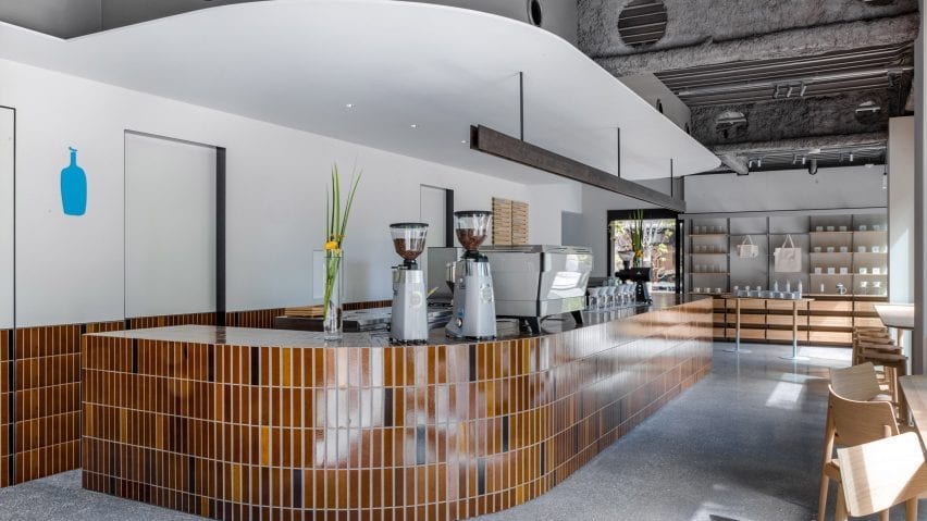
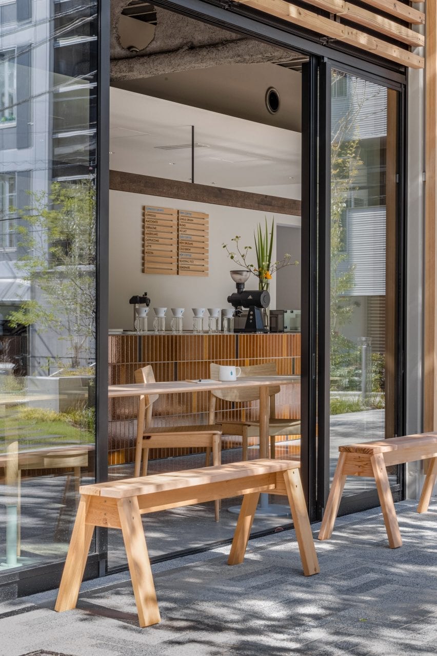
Brick-like tiles with a volcanic ash glaze created by Formafantasma and textured concrete walls feature in this coffee shop in Shibuya, Tokyo, by Japanese studio Keiji Ashizawa Design.
Located a short walk from Tokyo’s busy downtown area, this Blue Bottle Coffee outpost was conceived as an urban retreat sandwiched between two parks.
It serves coffee during the day and appetisers and natural wine in the evenings.
Brown tiles with a volcanic ash glaze feature throughout the interior of Blue Bottle Coffee Shibuya
Keiji Ashizawa Design, which also designed the coffee brand’s Yokohama outpost, wanted to create a warm and welcoming interior that brought the park surroundings into the glass-walled and concrete-floored space.
“It was a challenge to come up with a playful interior plan in this square two-storey building,” Ashizawa told Dezeen.
“The other challenge was to make links between the first and second floors, and the exterior and interior.”
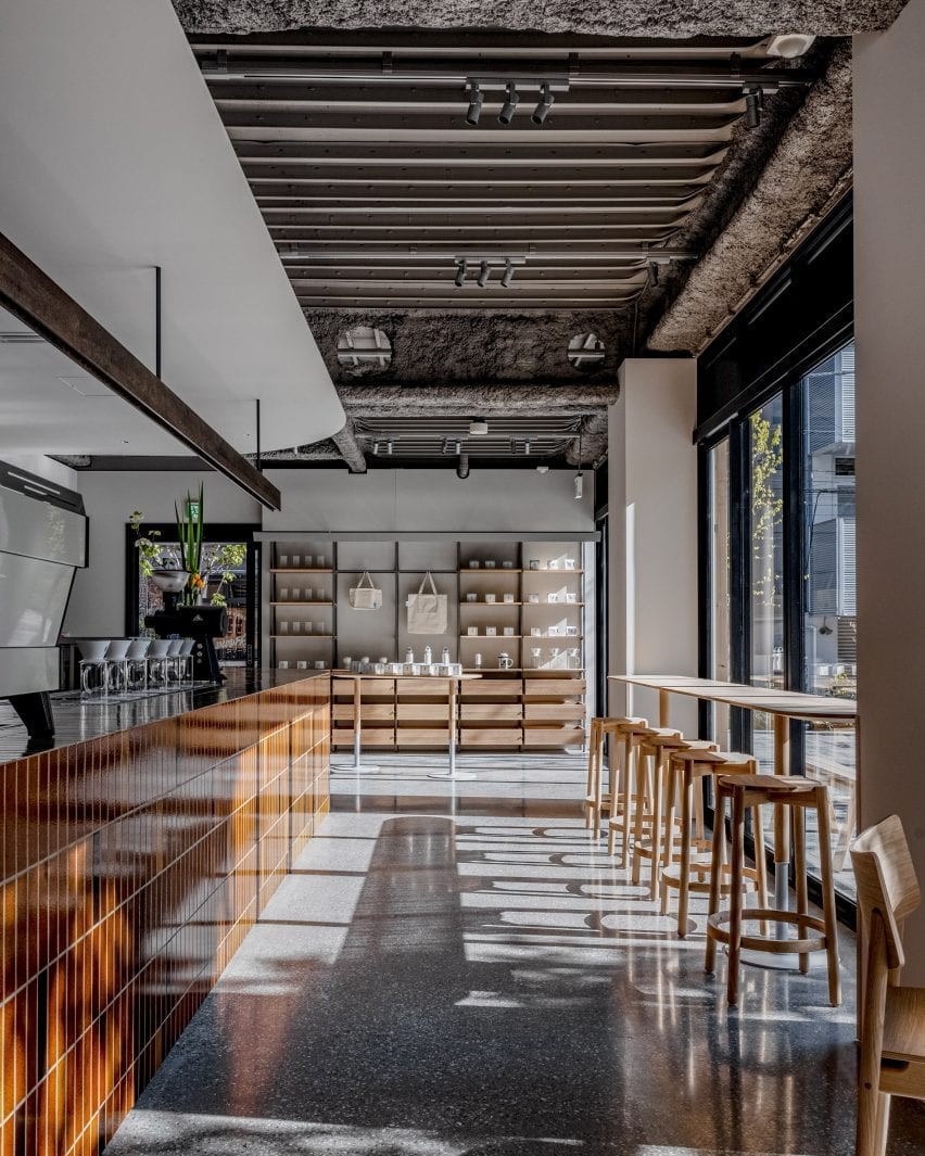
Counter seating runs along the wall of windows
To bring the outside in, the studio installed a large, curved tile counter that wraps around the cafe’s kitchen area and welcomes customers as they enter.
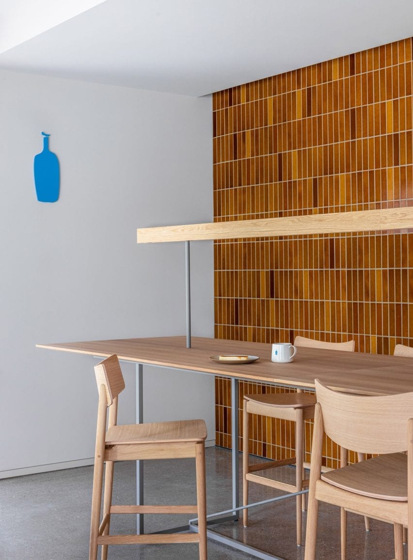
The brown tiles – developed as a collaboration between London material manufacturer Dzek, and the Amsterdam-based design studio Formafantasma – are finished with a special volcanic ash glaze.
A single artisan laid all 7,000 tiles in the interior
A single skilled artisan laid more than 7,000 of the tiles in the cafe. As well as the counter, they cover a low coffee table and a wall in the upstairs lounge area. Ashizawa said the tiles were specifically chosen to connect the interior and exterior spaces.
“We wanted a park-like item as a key material which stands out in the interior but also makes a strong connection between first and second floor, and the exterior and interior at the same time,” explained Ashizawa.
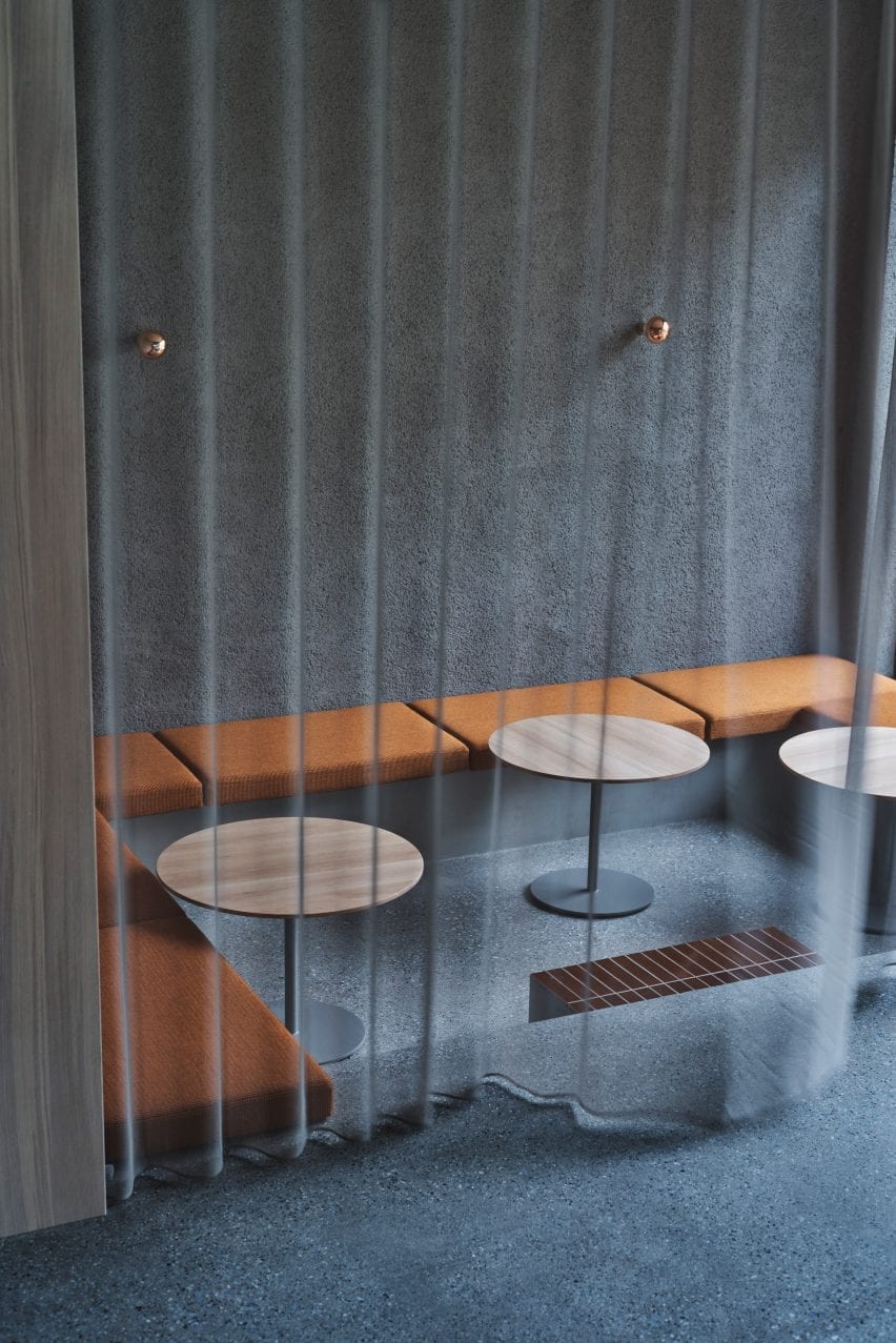
A sunken seating area is fringed in bench seating
“I thought that this tile, which has a brick-like colour, is an item reminiscent of parks in Japan,” he continued.
“Also, there is the fact that the soil from volcanic ash is a familiar material in this Kanto region, and I remember that the soil floor of the original Kitaya Park was also Kanto loam.”
In addition to the warm-coloured tiles, pink and orange textiles by Kvadrat, and wooden furniture by Karimoku, Ishinomaki Lab and Ariake add warmth to the largely glass and concrete interior.
On Blue Bottle Coffee’s ground floor, tables are set at differing heights. The high counter with stools allows customers to watch the barista preparing their coffee, while the lower table provides a good view of the park.
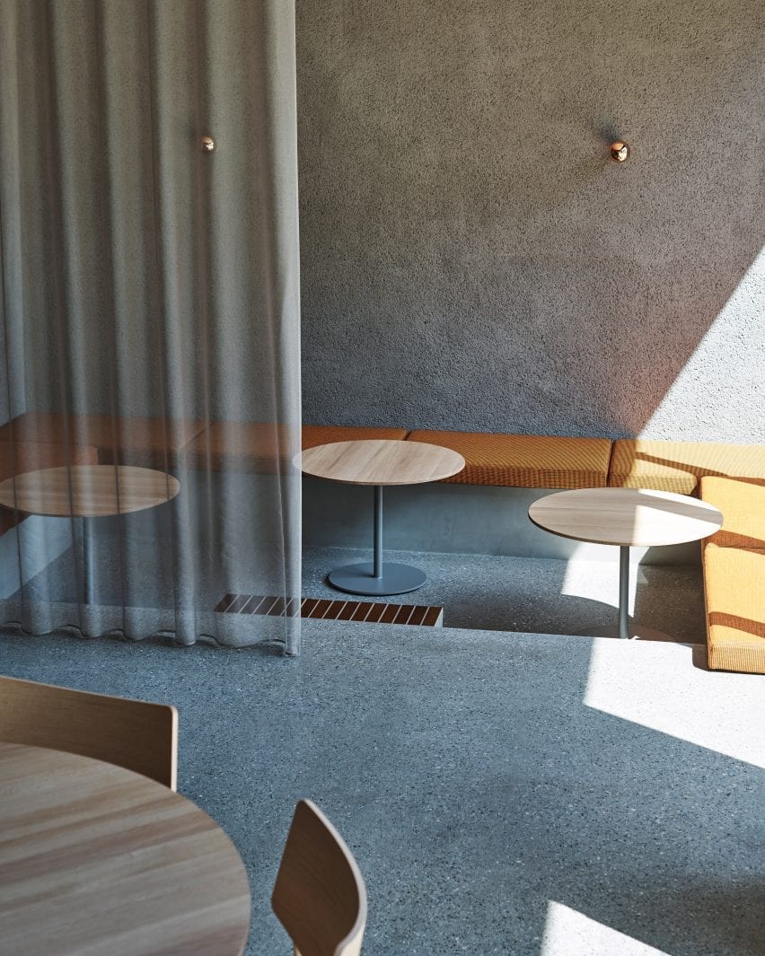
The seating area is obscured by a translucent grey curtain
More seating types are installed upstairs, including a lowered floor area with banquette seating upholstered in an autumnal orange textile. This space can be sectioned off from the main area by a grey, sheer curtain.
An oval dining table sits in the centre of the space providing a casual and communal dining option. A high counter table with a library-like light allows for quiet groups and singles to sit at the rear of the space.
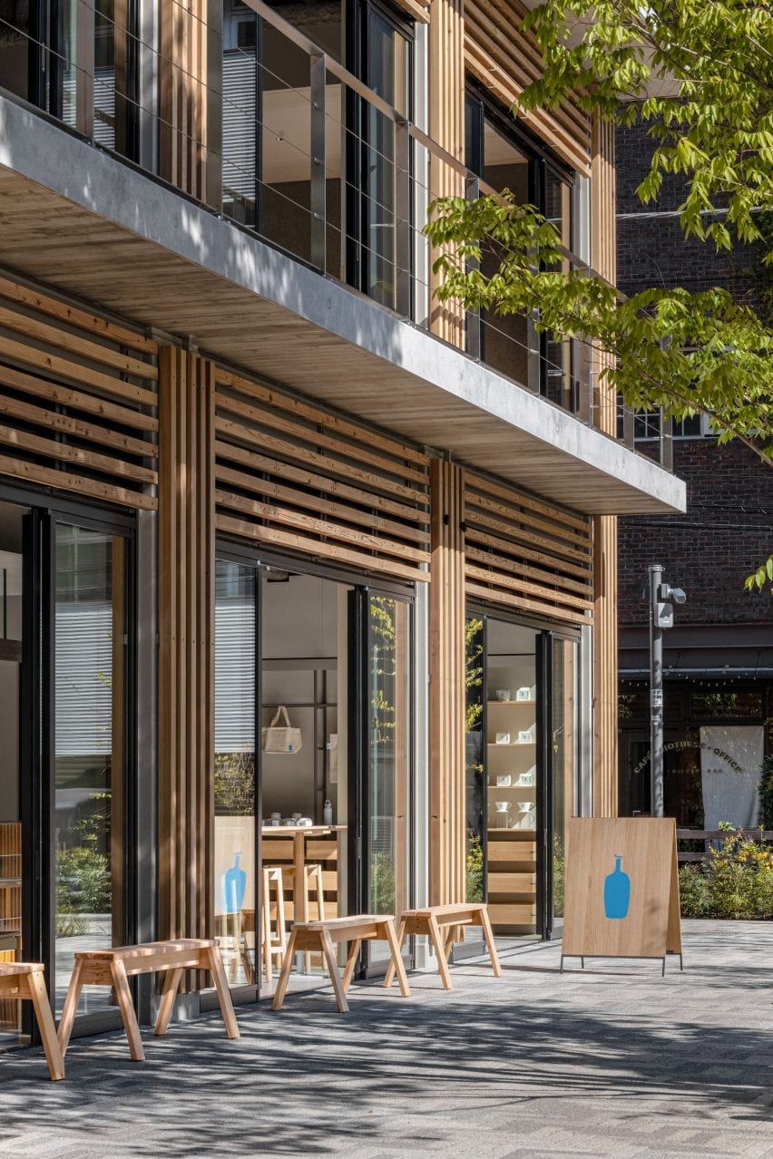
Wooden benches offer seating outside of the cafe
At the far end, a low, tiled coffee table is surrounded by comfortable lounge chairs and sofas upholstered in muted pink fabric.
A textured, brushed mortar finish has been applied to the cafe’s ceiling on the ground floor, and across a wall upstairs to help improve the acoustics in the space.
The furniture is in keeping with the buildings timber-clad facade
“When we plan cafes or restaurants, it is essential to think about acoustics,” said Ashizawa. “It is important that you can speak easily and that you can hear the music comfortably.”
“When we first saw the condition of the interior – the floor was made of concrete with glass walls. We definitely thought that we should leave the ceiling some kind of texture to promote sound absorption. At the same time, I thought that creating a feeling of touch in the space would have the effect of relaxing customers in the stressful city of Shibuya, like the greenery of a park.”
“We hope that visitors will enjoy the warm atmosphere as if they had been invited to visit the welcoming house of a close friend,” he concluded.
Dezeen Promotion: Made in Brunel: Above the Fold is an exhibition by Brunel University design graduates taking place at The Bargehouse Gallery and Oxo Tower Gallery in London from 17 to 20 June 2021.
The exhibition presents 100 design solutions to everyday problems, including an app designed to help people with diabetes control their glucose levels, a personalised asthma management system and a tool to diagnose seasonal affective disorder (SAD).
Other projects include a mindful app made to help people living with rosacea and a system to manage medication that was designed for complex medical regimes.
The Dampen headphones by Paramveer Bhachu feature replaceable water-soluble padding
“Brunel designers are well versed in turning problems on their heads to develop effective solutions,” said the organisers.
“However, this year, students have taken these problem-solving skills one step further – discovering how to conduct remote user testing when face-to-face testing was impossible and mastering the poly-jet printers when indoor workshops were inaccessible, were just a few of the adaptations to the design process introduced in 2021.”
Omni by Andrew Nagel-Smith is a modular multi-tool with a range of attachments
As part of the final year programme, the students launched the brand Above the Fold, for which they created a podcast and blog to share “essential” design-related content.
“Above the Fold stems from the newspaper terminology denoting that the information on the top of a broadsheet newspaper front page is always visible when folded,” said the organisers.
“These events and initiatives have all been exciting ways to inspire and connect Brunel designers with each other, alumni and industry experts.”
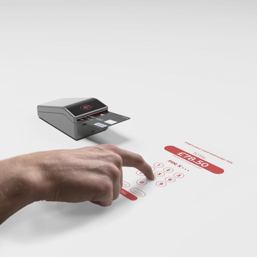
Pinteq portable card terminal by Gabriele Grigaite enables restaurant guests to make card payments safely
For their final year projects – and as part of Above the Fold – students chose their design briefs, or applied for briefs provided by external sources including the National Health Service and a range of private companies.
By being “immersed” in a range of real-life challenges, the projects aimed to enable students to develop problem-solving solutions.
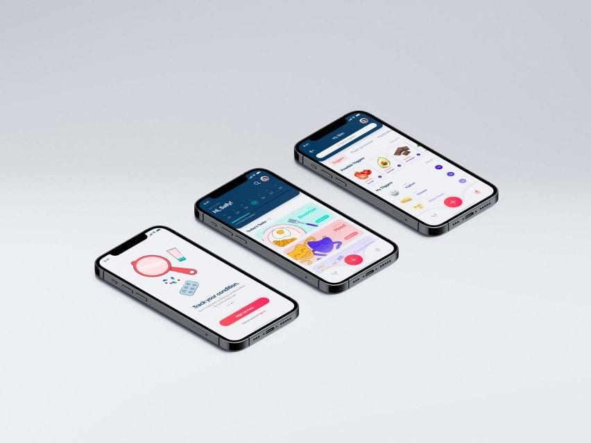
Diawise by Alex Cummings is a non-invasive glucose monitor and app
Students also studied six design modules that supported the research and development activities of their final projects. The Human Factors module required students to develop a solution to a problem using human-centred design principles.
“Solutions ranged from quieting noisy popcorn eaters in cinemas to reducing self-contamination during the removal of PPE in intensive care units,” said the university.
Viu by Alex D’Souza is a webcam that turns any flat physical surface into a shareable platform
Students who chose the Environmentally Sensitive Design module dismantled a product, conducted a life-cycle analysis on it, then redesigned it using eco-design strategies.
The lifecycle analysis of the redesign “revealed reductions in carbon emissions and energy consumption in production,” according to the organisers.
Rosette by Dani Cropley is a mindful app tailored to meet the needs of people with rosacea
In a third module, called Design and Innovation Management Processes, students designed a business model for their products and services.
“Specifying target markets and creative ways to reach them helped students understand the next steps in commercialising a product,” said the university.
Doset by Joe Ground is a smart medication management system
Students who chose the Computer-based Design Methods module were asked to “surface model a car of their choice, test its safety in Siemens Jack software and optimise the design through analysis in ANSYS“, according to the university.
For the Contextual Design module, students developed a product to solve real-world issues that might be prevalent in 10–15 years. In the Embedded Systems module, they developed projects “which used sensors and hardware components to carry out a function based on their studies of CCS C code, schematic layouts and printed circuit board design,” according to the university.
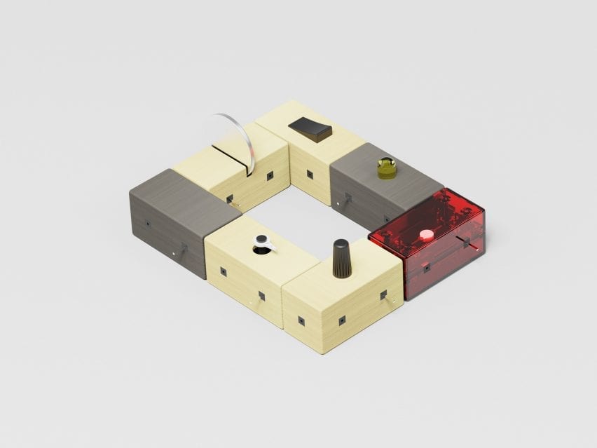
The Open-source electronics kit by Arthur Dean-Osgood aims to teach users electronics and circuit building using “intuitive” design methods
According to the organisers, the exhibition will showcase students’ response to these themes and offer an “opportunity to experience the incredible work their designers have created, fostering the next generation of innovative thinkers”.
“Something to look forward to will be the chorus of conversations throughout the gallery – we’re far too used to the silence of virtual meetings where only one person can be heard at a time,” said the organisers.
Nova Equino by Daniel Fredericks tracks mounted spotlight utilising daylight chips to create better quality lighting for indoor working spaces, to help Diagnosed Seasonal Affective Disorder
Tickets to Made in Brunel: Above the Fold are free and can be accessed on Eventbrite.
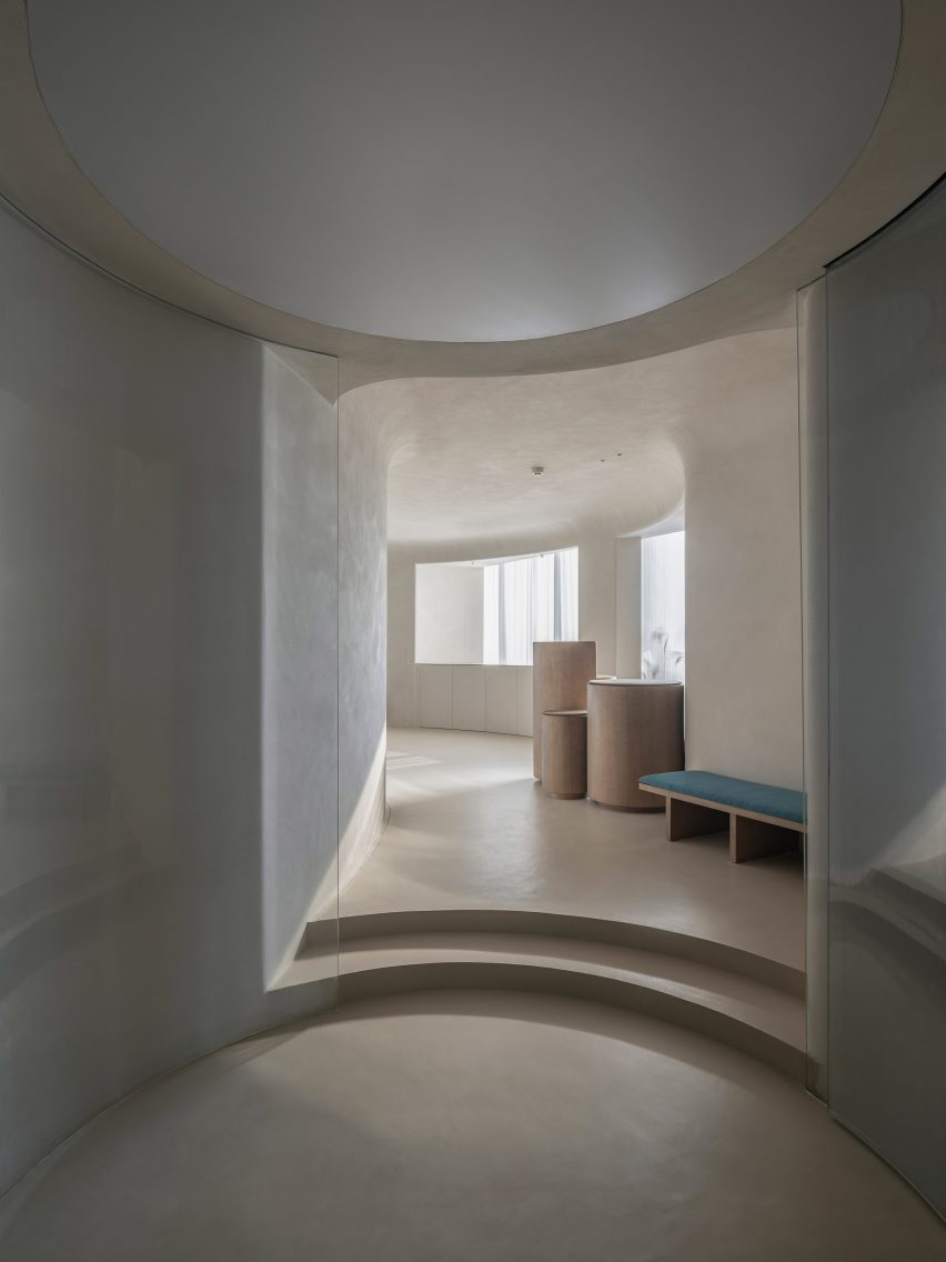
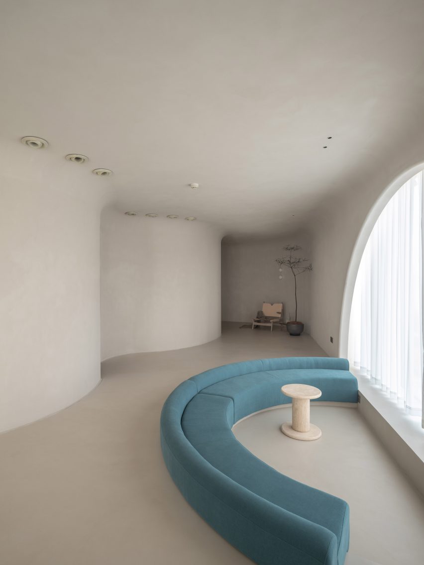
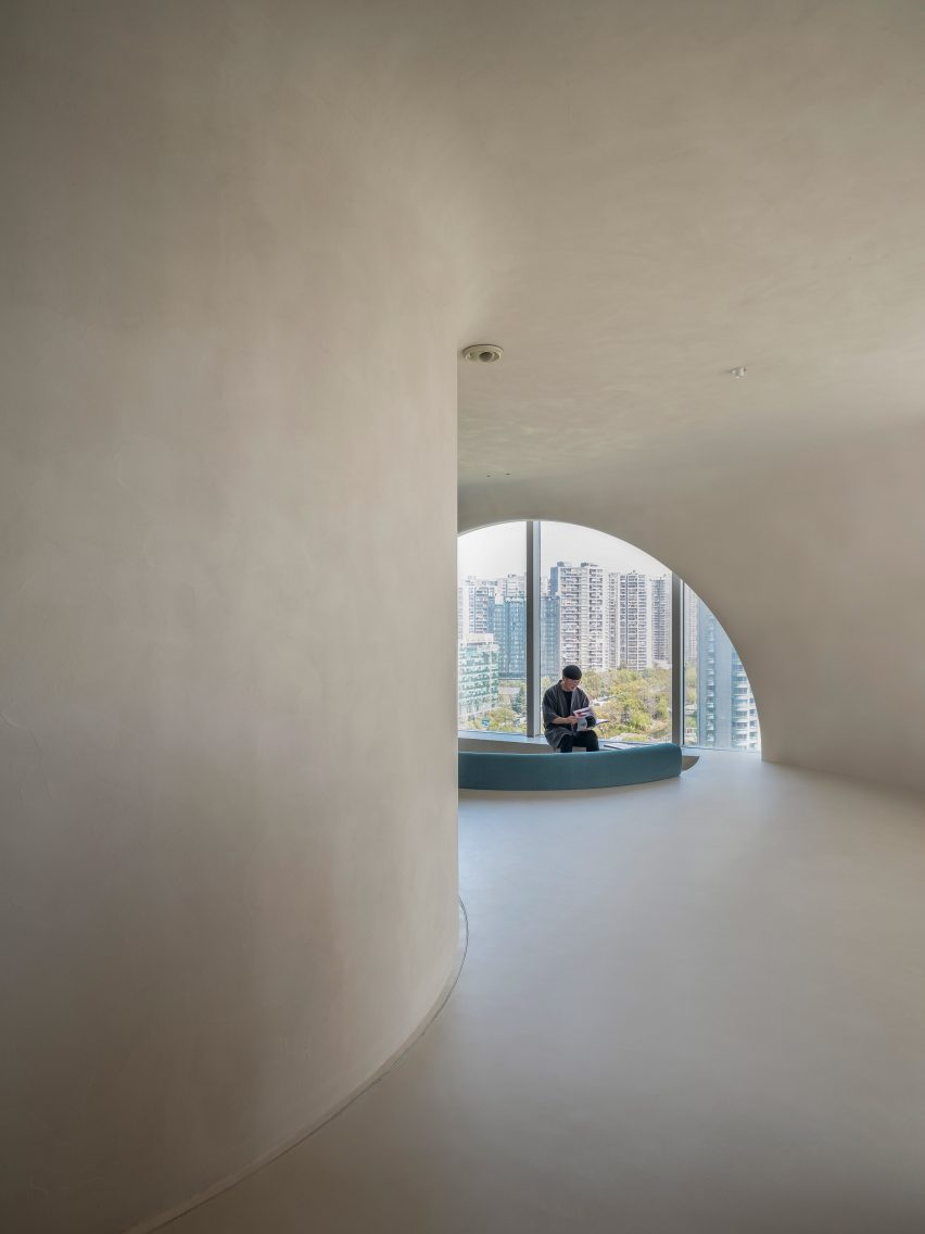
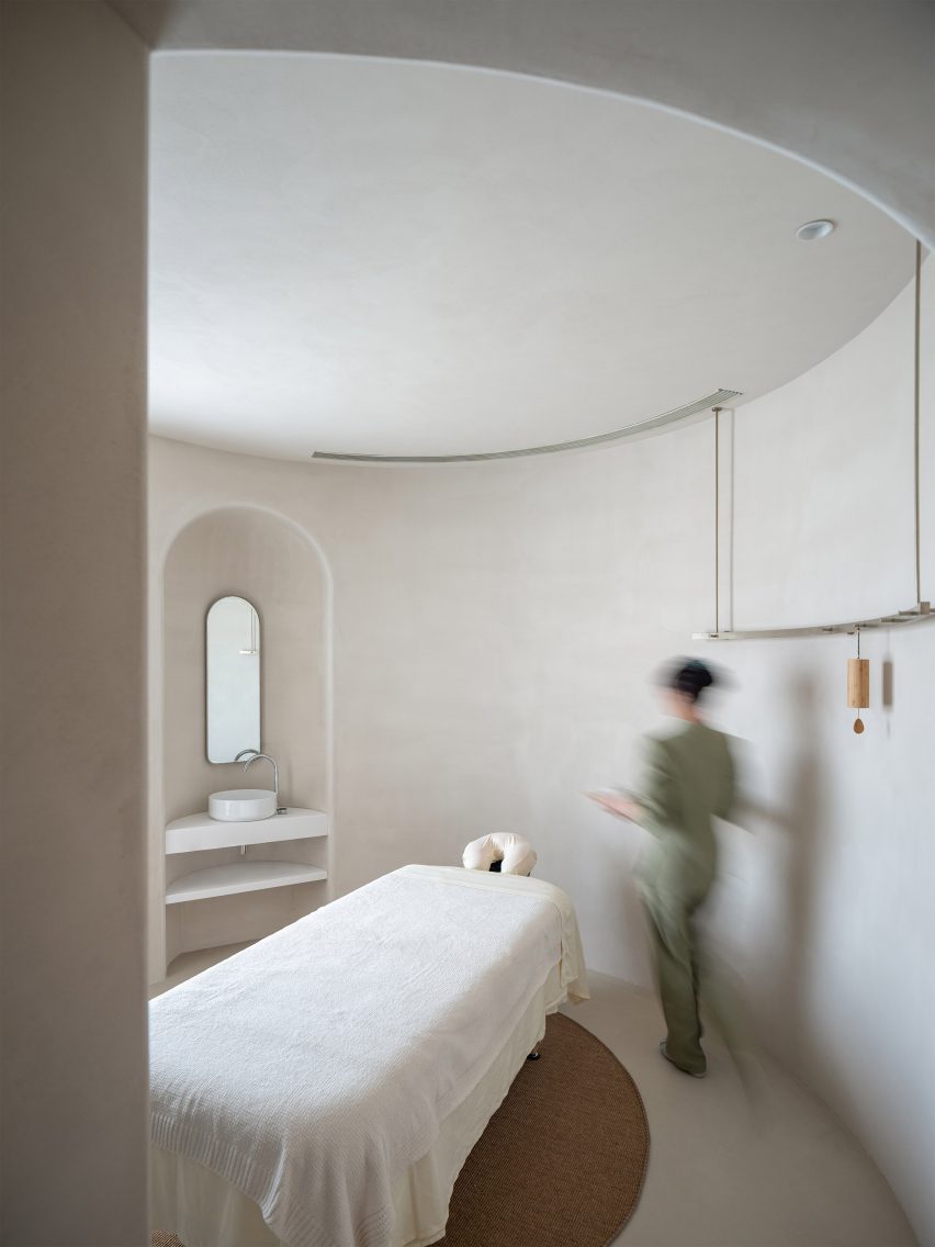
Chinese studio Atelier Right Hub created a cave-like spa in Hangzhou, China, with a network of interconnected, circular rooms and walls finished in white clay.
Located on the 13th floor of a commercial building by the Qiantang river in downtown Hangzhou, the Soul Realm Spa offers spaces for massage and meditation.
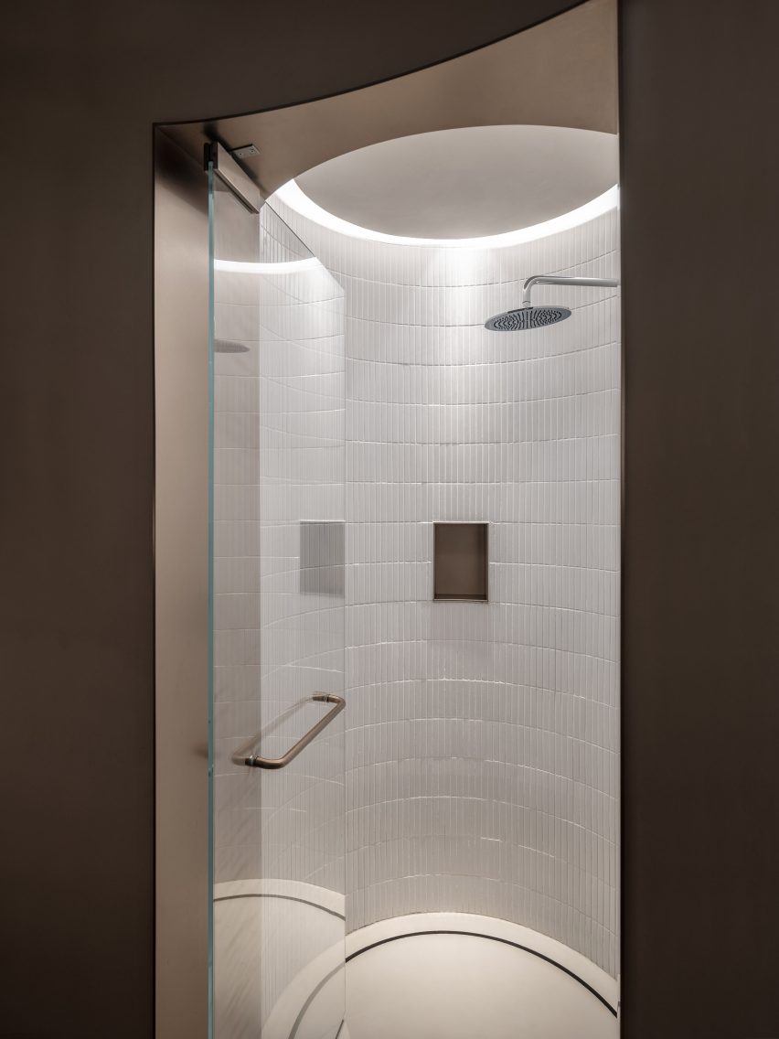
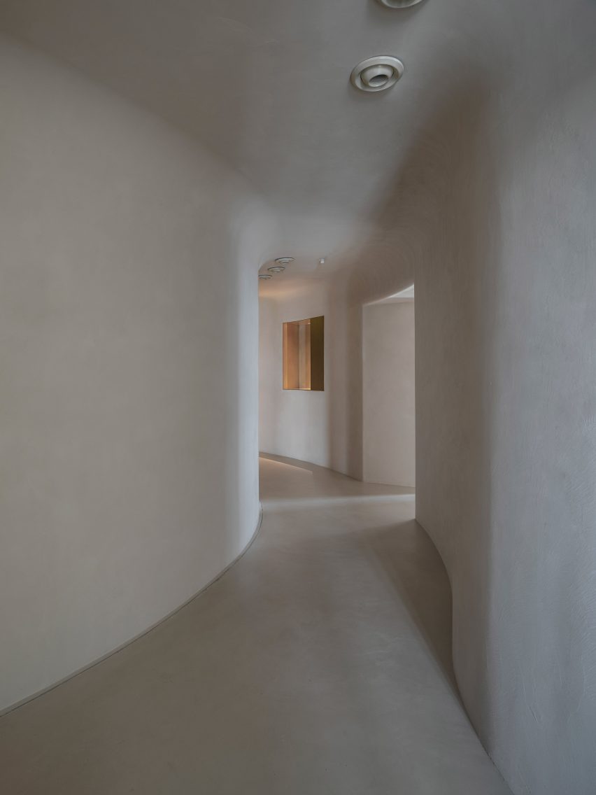
Curved walls lead visitors through the Soul Realm Spa
Local studio Atelier Right Hub was invited to create a calming interior within the building’s rectangular, 220-square-metre floorplan.
This was achieved by inserting a sequence of circular treatment rooms with curved ceilings into the centre of the plan.
A curved blue sofa faces a semi-circular window
“If we observe life carefully, we will find that straight lines are mostly found in man-made objects while natural objects are mostly curved,” the studio told Dezeen.
“Whether it is mountains or rivers and streams, they are curved and full of changes and they have more charm and vitality than straight lines.”
The walls are finished in white clay
According to Atelier Right Hub, the circular plan was informed by the shape of traditional Tibetan singing bowls – a type of inverted bell used for meditation.
The walls, ceilings and floors are made from white clay and blend seamlessly together. They have a textured finish, which the studio likens to “walking barefoot on earth”.
“China used to be a country dominated by farming culture,” Atelier Right Hub explained. “Farmers mostly farmed barefoot in the fields and children often played barefoot as well.”
“These memories are both unfamiliar and longed for in modern cities. Only when you feel the earth barefoot will you let go of your defences – this is also a way we hope spa guests could enjoy real relaxation.”
Private treatment rooms have a circular design
Each massage room features a brass garment hanger and storage tray suspended from the ceiling, where clients can store their clothing and jewellery during treatments.
Curved clay walls also wrap the perimeter of the floor plan to create a curved corridor where the studio has positioned resting areas, a lobby and the foyer.
“The interior space is similar to caves,” said the studio. “The curved ceiling, streamlined walls and the visual axes that revolve around the twists and turns form a fuzzy space-time context that is difficult to synchronize with the outside.”
Showers are fitted within a circular alcove
A series of large, geometric windows punctuate the corridor, including an arc-shaped window that illuminates a small resting area and reveals expansive views of the city’s downtown area.
Its form is echoed in the semi-circular sunken lounge with green banquette seating next to the window.
The spa was designed to have a cave-like look
Other cavernous spas around the world include the Europhia Spa by DecaArchitecture, which is carved into the base of a mountain in Greece, and a subterranean spa in Brooklyn, New York.
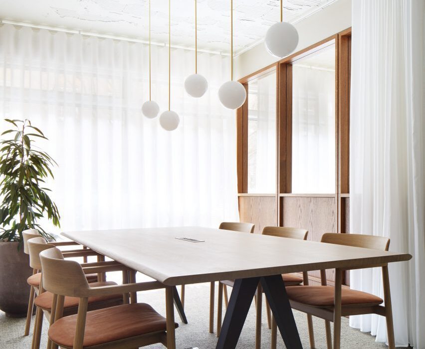
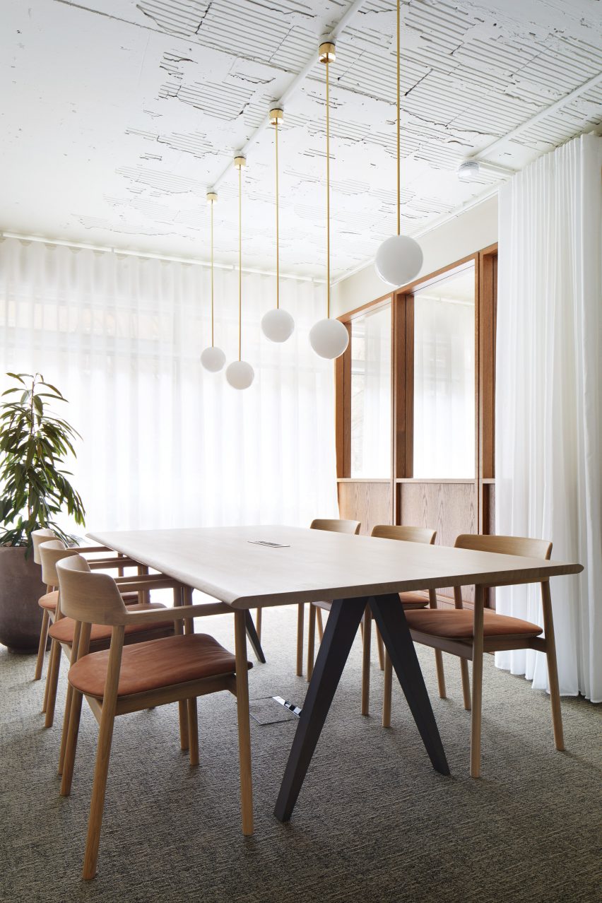
London firm dMFK Architects has transformed a mid-century medical laboratory into a flexible office space with smoked oak joinery and a restored concrete staircase.
The office is spread over 550 square metres and located on the first floor of a fully-glazed 1960s building in the city’s Fitzrovia neighbourhood.
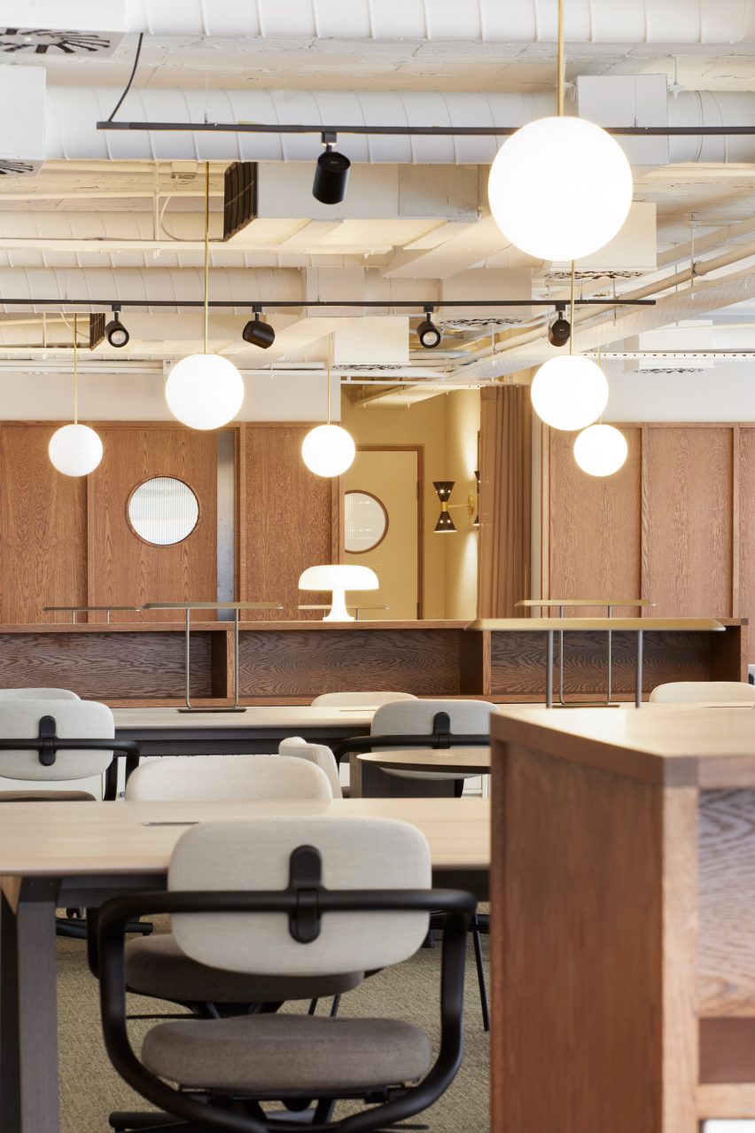
Meeting rooms are separated from the main space using smoked oak joinery
dMFK Architects was commissioned by property developers Derwent London to create an interior that was in keeping with the building’s heritage while incorporating the essential features of a modern co-working space.
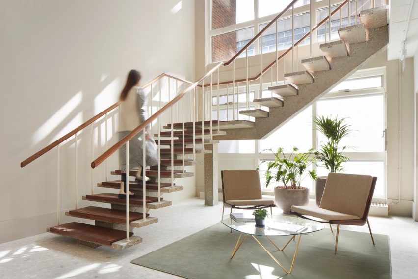
Accessed from the ground floor lobby via the building’s original restored concrete staircase, the office features smoked oak joinery and bespoke family-style tables by British furniture brand Benchmark.
Spherical pendant lights hang in the main open-plan office area
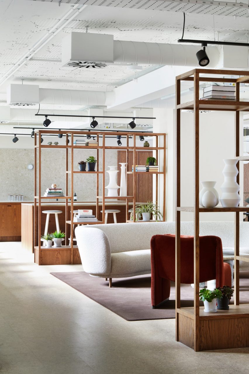
Paired with vintage lights and pieces of Swiss and Danish furniture, the overall scheme creates a homely environment that is reminiscent of the mid-century era.
The studio incorporated a wide range of spaces for different types of work including phone booths, focus booths, a choice of meeting spaces, shared flexible workbenches, a breakout area, dining spaces, showers and changing facilities.
“We aimed to design as many different workplace opportunities within one space as we could, to offer a potential tenant light and shade and a range of options,” said dMFK Architects.
“Materials were kept soft and neutral to appeal to as wide a range of tenants as we could.”
Open shelving helps to divide up the space
The architects also stressed the importance of offering different types of lighting to foster productivity.
“We wanted contrast, areas of light and shade, strong task lighting on the tables but dimmer lighting in other areas,” they explained.
“We also chose not to use linear strip lighting to create a less even quality of light, which we believe is less tiring and more interesting.”
dMFK Architects restored the building’s original concrete staircase
According to dMFK Architects, the project is representative of a growing trend for developers to create finished interiors within office spaces, rather than renting out empty shells.
The studio has previously designed 11 buildings for The Office Group and was responsible for renovating The Gaslight, a mixed-use development set within an art deco building in central London.
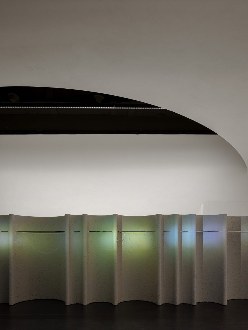
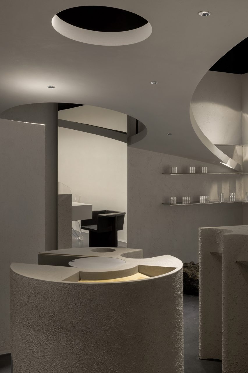
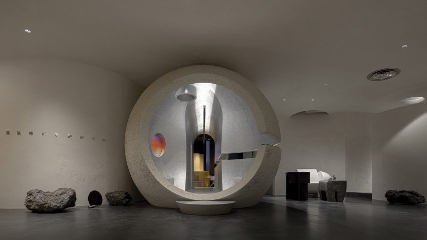
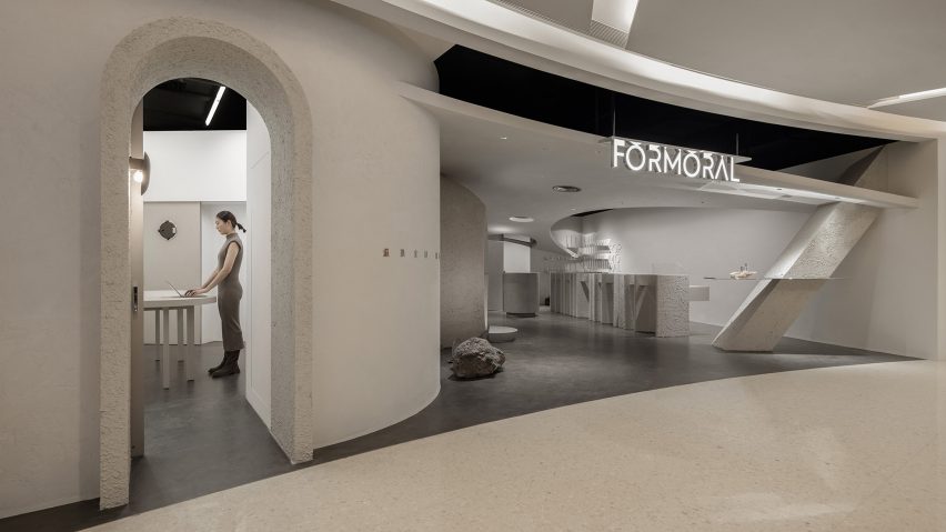
A spherical gateway and otherworldly light reflected through glass prisms feature in this skincare store in Hangzhou, China, which local interiors studio Lialawlab has designed around the theme of retro-futurism.
Created for independent skincare brand Formoral, the concept store is laid out across a 120-square-metre retail unit in the city’s GDA Plaza shopping mall.
The store is themed around the concept of retro-futurism
The store is made up of a “series of spatial scenes” based on the theme of retro-futurism – meaning the future as envisioned in the past.
“The space was decorated using no colour; only different textures in similar colours were used to highlight the space level,” Lialawlab‘s chief designer Liya Xing told Dezeen.
“It was envisioned as a contrasting yet unified whole, which breaks the homogeneity of physical retail spaces in modern cities and explores the deep relationship between nature and the artificial.”
Light reflected through glass prisms creates patches of rainbow-coloured light
The studio created the Formoral store as a desaturated space with large structures, columns and counters finished in highly textured, grey paint.
“The austere finishes echo the brand’s affinity with nature while highlighting the image of a primitive desert planet,” explained Lialawlab, which was founded by Liya Xing alongside Haifeng Luo.
Textured grey paint defines the space
The studio organised the layout to accommodate the store’s various functional areas and make a clear distinction between its public and private spaces.
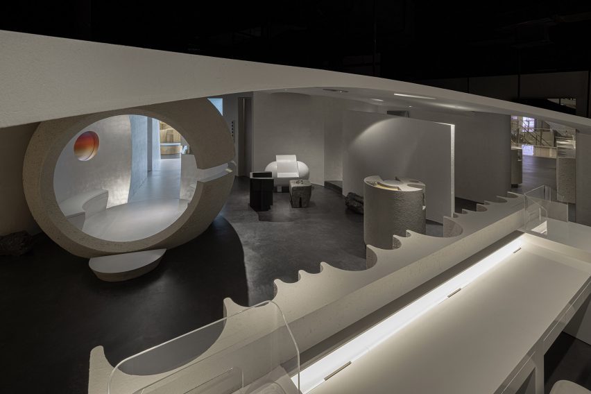
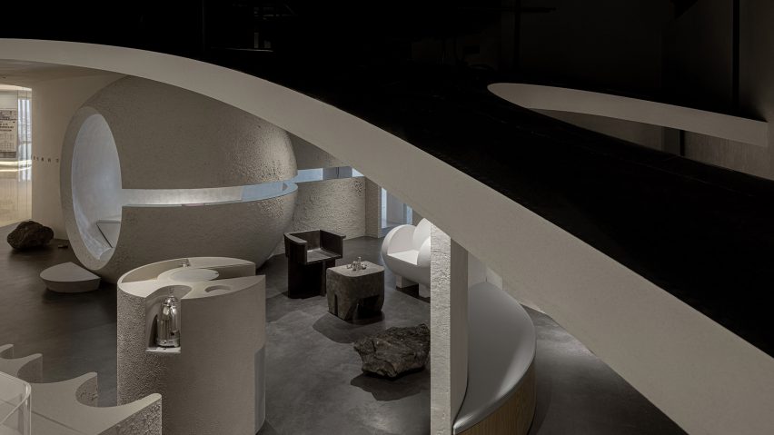
In the foyer, a sculptural service desk welcomes customers in from the shopping mall while opposite, a large spherical structure that Lialawlab refers to as a “rising planet” serves as a gateway into the private spaces of the store.
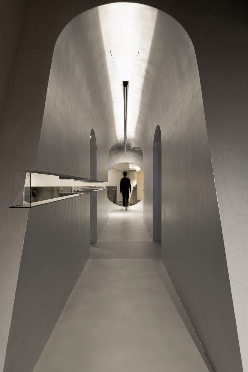
The inside of the structure is lined with bench seating and connects to a tunnel clad with matte silver foil and aluminium plates.
A spherical volume forms an entrance to the store’s more private spaces
“To trigger people’s desire to explore the space, we carved out a 200-millimetre-wide gap at the height of 1.25 meters of the massive sphere and the tunnel,” said the studio.
“The gap is complemented with mirrored material, allowing customers to stay, wonder, stare and rest.”
Two cabin doors along the tunnel lead to Formoral’s eight functional zones including product displays, spaces for skin testing, events and demonstration as well as an office and break room for employees.
A tunnel leads customers through the store
To contrast with the grey interior, the designers reflected and refracted light through prisms and gradient-index neon glass that throw patches of rainbow-coloured light onto the walls.
The studio also included coloured lamps and lanterns and a round window in the spherical structure, which is covered with a colour gradient film.
Although the store’s ceilings are 4.6 metres high, only 2.8 metres of this space is actually useable due to the mechanical, electrical and plumbing services installed on the ceiling structure.
The designers skillfully overcame this problem by creating a sloped dropped ceiling, which is 2.75 metres tall at its highest point and skims the top of the spherical structure in the foyer.
At its lowest point of 1.25 metres, it meets the wall to create a smooth, seamless transition.
The store’s sloped ceiling gives it an otherworldly feel
To avoid costly repositioning of the services, Lialawlab created an arc-shaped opening with a six-metre radius above the reception desk.
“The ceiling effectively extends the reception to the public realm, achieving a balance between functionality and form,” the studio explained.
Lialawlab designed the space to feel like another planet
Elsewhere, Irish studio Kingston Lafferty Design recently created “otherworldly” interiors within a skin clinic in Dublin, using a palette of plaster, marble, terrazzo and stainless steel.
A clothing store that imitates an art gallery and an animal hostel designed to increase adoption rates are among the interiors projects presented by undergraduate students at the Corcoran School of the Arts and Design in our latest school show.
Other designs include an indoor park, a meditation space that uses the play between shadow and light to encourage meditative moments, and a micro-hotel designed to connect visitors with Colorado’s mountainous environment.
“The undergraduate Interior Architecture (BFA) programme at the George Washington University’s Corcoran School of the Arts and Design in Washington, DC, offers students a unique opportunity to study, learn and create within a creative environment at a major research university.
“Our programme is the only Council for Interior Design Accreditation-accredited programme within DC and one of 10 interior programmes located at universities that rank in the top 70 of US News and World Report’s list of national research universities.
“Through our studio-based curriculum – the core of our programme – students learn to design three-dimensional environments through the use of dynamic concepts, cutting-edge materials, and innovative methods and techniques.”
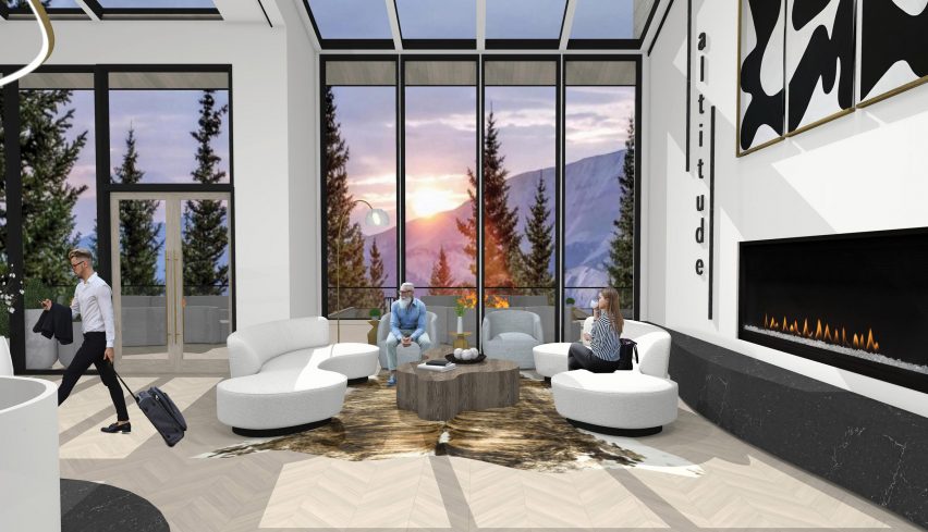
Altitude Micro Hotel by Sophia DeNezza
“Altitude Micro Hotel is a luxury ski-in, ski-out boutique micro-hotel. It is designed to create a luxurious yet practical vacation experience while connecting the interior spaces with the resort’s mountainous environment.
“Altitude will provide a comfortable stay away from the typical touristy resorts and will give guests a chance to unwind through the many accessible amenities on-site. The design revolves around the concept of altitude, which reflects the Colorado landscape and the feeling of movement while skiing.
“By utilizing the site’s existing architecture and creating a contemporary, conceptual and practical design, Altitude Micro Hotel is designed to provide guests with a luxurious and unforgettable experience.”
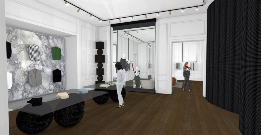
“With fast-fashion retail stores having a hold on many people’s shopping habits, in recent years the world has seen soaring amounts of textile waste generated. Clash aims to break these bad habits and offers a limited selection of curated clothing pieces that behave in the store like art does in a gallery.
“The process of creating garments is an art form. Clash aims to showcase each piece, emphasising the clothing’s construction and quality, aiming to spark conversations about consumer overconsumption through the store’s design.”
Student: Victoria Gogick Advisor: Karen Gioconda Course: Studio 5 – undergraduate Email: vgogick@gwu.edu
Ikhaya Women’s Shelter by Alexa Greig
“The Ikhaya Women’s Shelter provides a place of refuge and a support system for women and their children escaping domestic violence. The shelter aims to create an inclusive community by using an indoor/outdoor canopy that intersects with all of the 13 buildings on-site.
“The outdoor canopy provides a sense of connection between the buildings and partial shade from the hot South African sun, while the indoor canopies influence the layout and flow of the interiors.”
“Luna Meditation Hall is dedicated to creating an environment where people can come for an energetic reset. The hall is made up of a meditation hall, private meditation enclaves and classrooms. It is designed to encourage people to turn inward, either alone, in connection with others or with guidance.
“The project takes reference from phases of the moon. The space focuses on layering and the play between light and shadow to reflect the journey inward during meditative moments.”
Student: Jana Khalil Advisor: Kristin Carleton Course: Studio 5 – undergraduate Email: khaliljana99@gmail.com
Movie Theatre and Film History Museum by Caitlin MacGregor
“The Movie Theatre and Film History Museum is designed for people to see parts of film history in the museum while also viewing new movies that could be a part of that same history someday.
“The site for the project is the Car Barn in Georgetown, D.C. The aperture of a movie camera inspired the main concept. The theatres are tucked away from sunlight, like film in the exposure compartment of a camera. But they are lit up by the screens inside the theatre, similar to film when exposed to light coming through the aperture of a camera.”
“Farm Stay promotes slow food through an immersive retreat in Middleburg, Virginia. Guests learn sustainable farming practices and follow the path of produce from planting to cooking to eating. The life cycle starts in the main house, where cosy guest rooms cradle visitors as they begin their journey.
“Just as a plant grows into a seedling, the garage promotes growth and provides an opportunity for visitors to soak up new ideas. Finally, when the plant is fully grown and harvested, the guests dine at the restaurant and enjoy the feast. The life cycle continues when guests sow the seeds of knowledge with others.”
Student: Salli Mandel Advisor: Karen Gioconda Course: Studio 5 – undergraduate Email: sallismandel@gmail.com
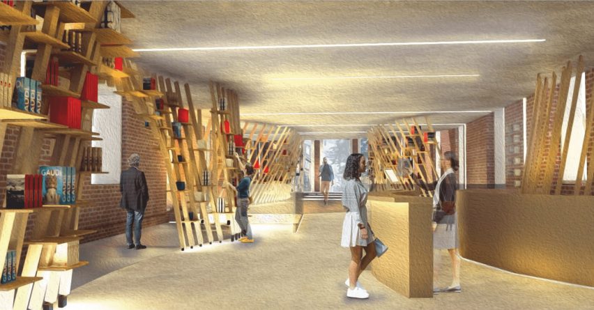
Books and Beyond by Sibyl Frances Natad
“Books and Beyond is designed for learning, socialization and a sense of community. The design is a dual concept of a bookstore, café and bar. The programme includes a writing centre for aspiring authors, a space for gatherings, and a communal work area.
“During the digital age, when information is easily accessible through the tap of a finger and people have a rapid lifestyle, it is fitting to create a space that is meant for an individual to slow down and enjoy perusing books leisurely. Books and Beyond is the best place to immerse oneself in literature and connect with others with a similar interest.”
“RE.turn aims to utilize design to initiate cultural change around death. It looks to develop an experience that allows mourners to grieve in the ways best for them, erasing the standard of a quick ceremony and moving toward a multi-day process of renewal.
“By providing the facilities for an extended stay, RE.turn creates an environment in which friends and family can gather, grieve, and extol life. It looks to answer: What power does architecture have to initiate mass culture change? Does design have the ability to diminish the long-standing stigma around death and mourning in the United States?”
“Inspired by DC’s impressive array of parks and lively street culture, 14th & U Street is a public indoor park. With bike parking, short-term lockers, restrooms, and various fixed and unfixed seats, the indoor park caters to the heavy pedestrian and cyclist traffic.
“On the first floor, the resource area situates users and directs them to the functional programme. Connected through an atrium space, the second floor doubles as a reservable community space and social seating floor. Finally, the third floor is the most removed from the energy of the streetscape, featuring tranquil plant life and patio seating.”
Student: Morgan Richmeier Advisor: Karen Gioconda Course: Studio 5 – undergraduate Email: mvrichme@me.com
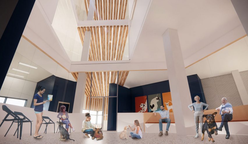
The Animal Hostel by Alaina Willard
“The Animal Hostel is a shelter focused on helping improve adoption rates by providing a safe, wellness-focused environment designed to enhance connections between the community, individuals, shelter staff and animals.
“Through the concept of unity, Animal Hostel incorporates interior and exterior design elements that encourage natural interaction between pet and potential owner and establish a connection to the neighbourhood, generating a positive outlet for residents, business owners and consumers.
“A central glass core unites the building’s verticality, providing natural light that is critical to the wellbeing of the animals and evoking a feeling of openness, freedom and transparency.”
This school show is a partnership between Dezeen and the Corcoran School of the Arts & Design at the George Washington University. Find out more about Dezeen partnership content here.
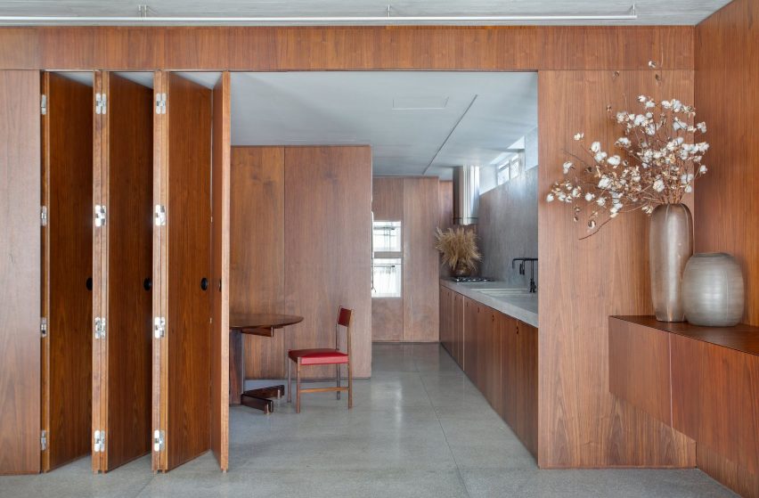
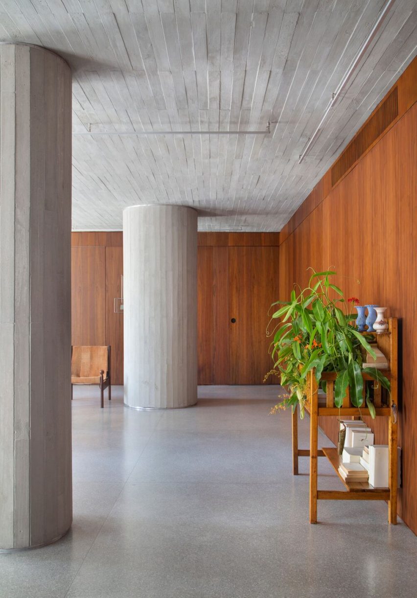
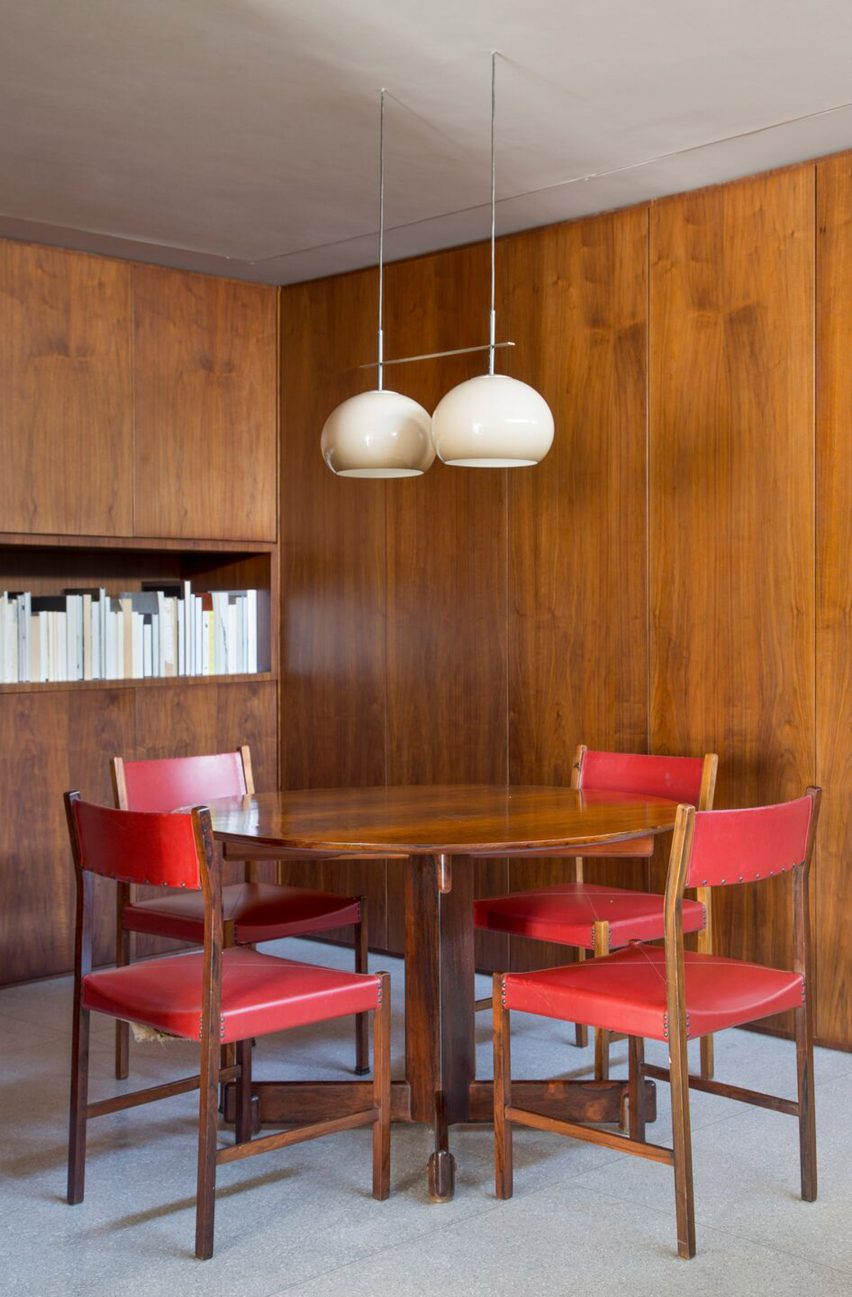
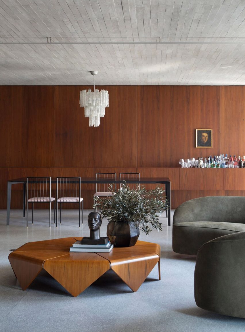
Monolithic concrete columns and walnut panelling create a backdrop for an extensive collection of mid-20th century Brazilian art and design in this 1970s São Paulo apartment renovation by BC Arquitetos.
Located in a 1970s building in the traditional Jardins neighbourhood of São Paulo, the 230-square-metre DN Apartment was created for a landscape architect client.
Walnut panelling features in the apartment
When designing the space, BC Arquitetos – led by Bruno Carvalho and Camila Avelar – was influenced by the work of Brazilian modernist and landscape architect Roberto Burle Marx.
The layout was guided by the apartment’s original faceted concrete columns, which became a feature of the open-plan living room.
Monolithic concrete columns guide the layout of the space
The monolithic columns, concrete ceiling, stone floor and granite countertops are tempered by natural walnut wood, which wraps the entire space.
“Three main pillars guided the choices for this project, which we classify as a gallery apartment,” said BC Arquitetos. “A clean, sensorial and scenographic architecture that facilities the connection between the spaces, using few elements.”
The apartment is furnished with a selection of classic furniture designs by Brazilian masters of the 1950s and 1960s. These include black gold chairs and a Petala table by Jorge Zalzupon, a Janguada armchair by Jean Gillion, mtf600 dining chairs by Geraldo de Barros, a Mole armchair by Sergio Rodrigues and a Verde Corvo sofa by Jader Almeida.
A table by Sergio Rodrigues and its original leather chairs by Jorge Zalzupin feature in the open-plan kitchen and dining room, which can be closed off from the rest of the apartment with a set of folding doors.
A table by Sergio Rodrigues features in the kitchen
Pieces of mid-19th-century furniture, as well as a glass ceiling light by revered Brazilian lighting brand Dominici, were sourced from a local antique dealer.
The interiors also feature a collection of contemporary pieces of art, such as a photograph of São Paulo by Claudio Edinger, a metal sculpture by Claudio Alvarez and a bronze head sculpture by Florian Raiss.
A glass ceiling light was sourced from an antique dealer
Other art-informed interiors include one by local studio Framework, which used sculptural furniture and French oak panelling to create a family office in Amsterdam designed to convey the “calm ambience of an art gallery.”
In London, an art dealer’s vault was transformed into a tranquil basement flat by Daab Design.
In this school show, masters students at the Corcoran School of the Arts and Design present interiors projects including a comforting dental office and a retail experience that encourages people to repurpose old clothes.
“The Interior Architecture Master of Fine Arts (MFA) at the George Washington University’s Corcoran School of the Arts & Design in Washington, DC, is the only Council for Interior Design Accreditation-accredited programme in the United States’ capital.
“It is designed for students who pursued a bachelor’s degree in a field other than interior design, interior architecture or architecture and are looking to follow a studio-based curriculum that will teach various aspects of interior design, theories and technicalities. We believe in fostering a community that encourages creativity and pushes the boundaries of design with an emphasis on conceptual thinking and the design process.”
ADHD Childcare and Community Centre by Edewede Akpesiri-Odia
“Children with attention deficit hyperactivity disorder, ADHD, often have difficulties with hyperactivity and self-control. This project aims to create order and organized activities for children with ADHD while also offering fun and wellness benefits.
“The existing building is located in a dense residential area of Arlington, Virginia. Within the building shell, a grid enables order and structure. Each programme block will have activities shifting the grid, creating movement and fluidity while maintaining its volume. Activities will encourage and strengthen neural networks in the brain and enable kids with ADHD to practise self-control.”
Student:Edewede Akpesiri-Odia Advisor: Christina Filipescu Course: Studio 5 – graduate Email: ede.odia@gmail.com
Remembrance Crematorium by Yi-Chen Chang
“Distinctive cultural responses to death inform how we process loss. Mourning rituals reflect the nature of the relationship with the deceased. As the solid stick fades to smoke, we connect to the sacred. We are reminded of the fragility of life and the importance of seizing the day.
“In this project, ruins of the McKinney homestead in Austin become a focal point for a crematorium complex. The symbolic omnipresence of death encourages us to cherish life and live deeply. References to death, burial, permanence/impermanence and the eternal are captured throughout the sequence of spaces providing quietude for reflection.”
Student:Yi-Chen Chang Advisor: Christina Filipescu Course: Studio 5 – graduate Email: changyichen@gwu.edu
U.commons: A physical place for virtual learning by Aileen Kim
“With higher education leaning deeper into digital technologies, academic satellite sites can serve commuting and online students by providing practical resources and social support, leading to student success and equity.
“The interplay of physical and virtual realities is explored through the overlap, where the context of one reality may be expressed more dominantly over the other. At times, the overlap is a threshold, encouraging users to become aware of moving in and out of spaces designed for digi-centric or physi-centric programming. These portals guide inhabitants through areas for individual focused work to spaces for collaboration and social connection.”
Student:Aileen Kim Advisor: Christina Filipescu Course: Studio 5 – graduate
Suzuki School of Music, NYC by Taylor Oosting
“Classical music education for K-12 students comes with proven developmental benefits, but unfortunately, arts education is often among the first programmes cut from a public school’s budget. This project envisions an after-school Suzuki Education Center for strings. It aims to bring accessible music education to urban communities and lower entry barriers to classical music education and enjoyment.
“Located in one of the most diverse communities in the nation, a New York City borough, this project serves as a blueprint for future accessible music institutions. Conceptually, the project is based on the practice of Kintsugi, a Japanese method of repairing broken pottery by mending the broken areas or reattaching cracked pieces with gold lacquer, embracing the damage as an opportunity to find beauty in the imperfections.”
Student: Taylor Oosting Advisor: Christina Filipescu Course: Studio 5 – graduate Email: tayloroost@gwu.edu
Peirce Mill: A Celebration of Food and Community by Brynn Jacoby Orban
“The Peirce Mill is a food-focused wellness centre featuring a garden-to-table restaurant, cooking classes, and a health and wellness coaching clinic. These facilities strive to celebrate food as a resource that nourishes the body and brings the community together.
“Inspired by the transformative process of grain’s movement through a mill, the site plan and architecture of the mill will highlight spaces of learning. With the use of the existing grids of the historic mill and barn, situated askew from each other in their idyllic forested, creekside setting, a shifted grid will be employed to highlight these transformative spaces of growth.”
Student: Brynn Jacoby Orban Advisor: Christina Filipescu Course: Studio 5 – graduate Email: jacobybrynn@gmail.com
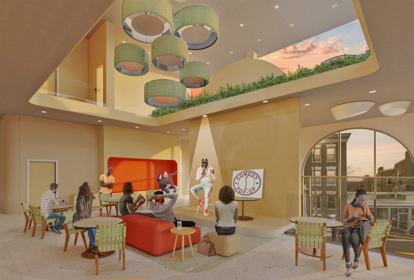
The Steady Beat Recording Studio by Hannah Shafer
“In music production and recording, women are often hindered by pay gaps, with limited mentorship and promotions opportunities while also confined to certain genres. The Steady Beat is a recording studio and artist social club in Washington DC designed with these limitations in mind – a space supportive of female excellence and collaboration.
“Inspired by sound waves, the space features undulating brass rods – a nod to musical instruments of the same material. As users cross the threshold where the historic building was once split into two, the waves become increasingly dynamic and the spaces more collaborative and creative.”
Student: Hannah Shafer Advisor: Christina Filipescu Course: Studio 5 – graduate Email: hannahcshafer@outlook.com
Dental Office by Vanessa Spencer
“It is estimated that 61 per cent of people have dentophobia, or fear of dentists, worldwide. This fear usually generates from past negative experiences or oral health concerns. To promote wellbeing, this project mimics nature’s process of protecting.
“A dental office is designed to bring comfort and a feeling of protection to the user by creating forms that are wrapped barriers of protection. These protected areas wrap around the spaces where the user might feel the most vulnerable. Biophilic tools are used throughout the design to connect the user with nature during their visit.”
Student: Vanessa Spencer Advisor: Christina Filipescu Course: Studio 5 – graduate Email: nessa31.vf3@gmail.com
Upcycling Retail Experience Store by Mengjiao Wang
“The fashion industry is the second-largest polluter in the world. Textile production requires significant natural resources, and the decomposition process produces greenhouse gas and leaches toxic chemicals into groundwater and soil.
“This project aims to increase people’s attention to this urgent environmental problem and to encourage people to participate in the process of upcycling clothing. Here, the old garments can be reinvented and start their new life. Drawing ideas from using ‘entropy increase’ to express the flow of time, the store will show the clothing’s journey and provide opportunities for customers to visit and join in.”
Student: Mengjiao Wang Advisor: Christina Filipescu Course: Studio 5 – graduate Email: mengjiaowang@gwu.edu
Education Co-op by Aidan Young
“In the current education system, undue emphasis is placed on academic content and standardized testing, leaving teachers with a substantial burden that consumes their mental bandwidth.
“To address the issue and to work toward a solution, this education centre will focus on one main reason students report dropping out of high school: a lack of positive peer and mentor relationships. The Education Co-op will provide students educational support in a space that cultivates and celebrates warmth and connection.”
Student: Aidan Young Advisor: Christina Filipescu Course: Studio 5 – graduate Email: young.aidan2015@gmail.com
Partnership content
This school show is a partnership between Dezeen and the Corcoran School of the Arts and Design. Find out more about Dezeen partnership content here.
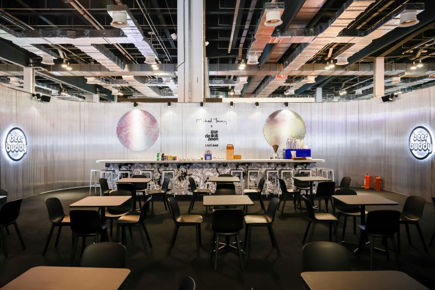
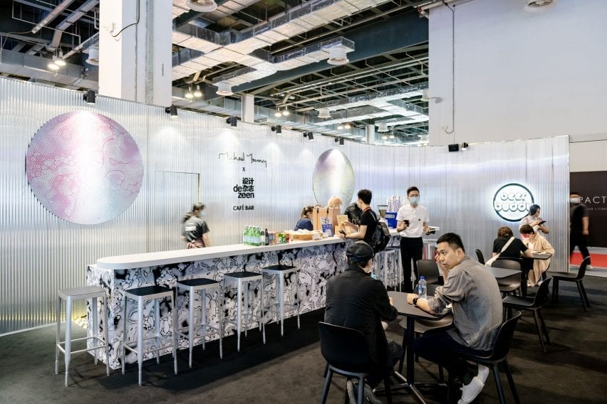
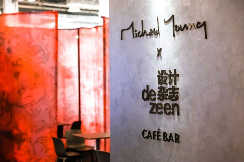
Dezeen has partnered with Design Shanghai to present a cafe and bar designed by Michael Young at the 2021 edition of the trade show, which opened in Shanghai this week.
The cafe and bar is located at booth K207 in Hall 2 at Design Shanghai 2021, which takes place at the Shanghai World Expo Exhibition and Convention Center in Shanghai, China, until 6 June.
The space features grey corrugated walls with splashes of colour and is furnished with previews of furniture pieces designed by Young that will be launched later in the year.
Dezeen has partnered with Design Shanghai to present a cafe and bar designed by Michael Young
According to Young, the concept for the space is loosely based on a bar he created last year at his office in Shekou, Shenzhen.
“I ended up with an opportunity to create a bar last year beneath our studio but with only a few weeks to build the concept I decided to throw in anything I could get hold of – samples, prototypes and things from the studio that we have collected from around the world,” the Hong Kong-based British designer told Dezeen.
“I basically scavenged the studio together like a magpie so it became a real beer shack and a place that was not designed but created organically.”
The bar features ribbed walls with splashes of colour and pattern
Citta Design has contributed pieces of Young’s new Acre Chair for the New Zealand brand, which will be launched in Auckland in September. The space is also furnished with new editions of Young’s Stool 4a for EOQ Design, which will be launched in December.
The bar is being used to launch Young’s new drinks brand Beer Buddy, which developed a new pilsner called House for the event.
The beer brand is specifically designed to connect creatives at events, trade shows and gatherings around Asia. Drinkers can scan a QR code on the beer packaging to connect with other creatives attending the event.
Young is launching his new Beer Buddy drinks brand at the bar
The dark grey exterior walls of the space are decorated with swirling patterns based on the graphics on the Beer Buddy cans and bottles.
Colourful versions of this pattern have been used to add splashes of colour to the interior walls and enclose private seating areas.
The space is co-branded with Young’s studio logo and the Chinese version of Dezeen’s logo. The walls also feature the QR code for people to follow Dezeen’s official WeChat account, which features news and features about the latest architecture, design and interiors written in Simplified Chinese.
The interior and exterior of the bar features swirling patterns based on the Beer Buddy packaging
The show presents over 400 local and international brands across eight different sections alongside a programme of installations, exhibitions and the return of its annual talks programme, which this year explores the topic of regenerative design.
Design Shanghai takes place from 3 to 6 June at the Shanghai World Expo Exhibition and Convention Center. See Dezeen Events Guide for an up-to-date list of architecture and design events taking place around the world.