Spanish design agency Masquespacio has created the interiors of Italian fast food chain Bun’s Turin branch that combines blocks of pink and green with a blue seating area designed to look like a swimming pool.
Bun Turin is a burger joint that takes its bold identity from the first Bun restaurant in Milan, which was also designed by Masquespacio.
“This restaurant’s target customer is the urban lifestyle of people born late in the Millennium and the new Generation Z,” Masquespacio co-founder Christophe Penasse told Dezeen.
The burger bar is in Turin
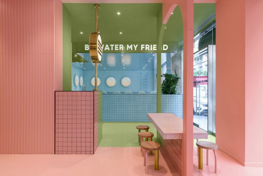
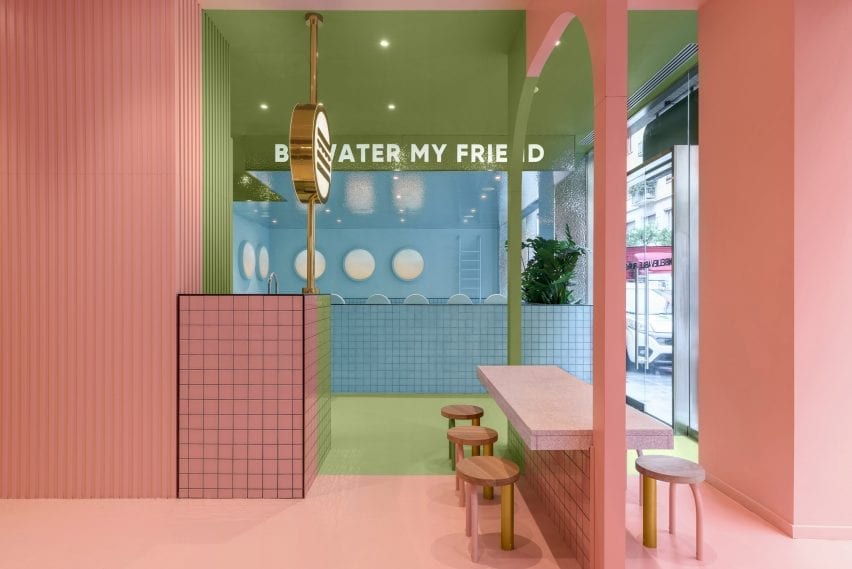
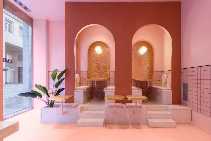
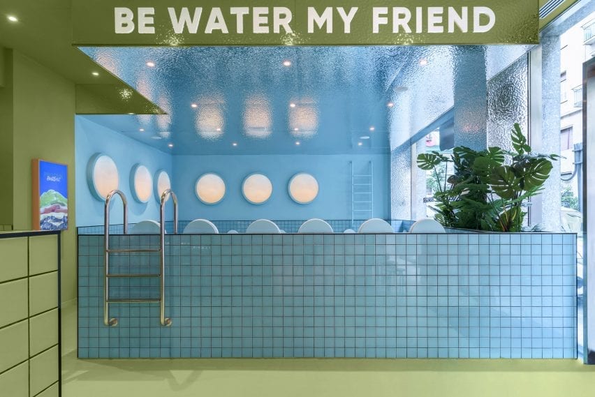
Characterised by three distinct colourful areas, the burger joint uses pink, blue and green in order to playfully carve out different spaces in the restaurant.
The sections are designed so that the restaurant’s three large windows present each colour as a separate blocked out space from the outside.
Green and pink sections feature in the restaurant
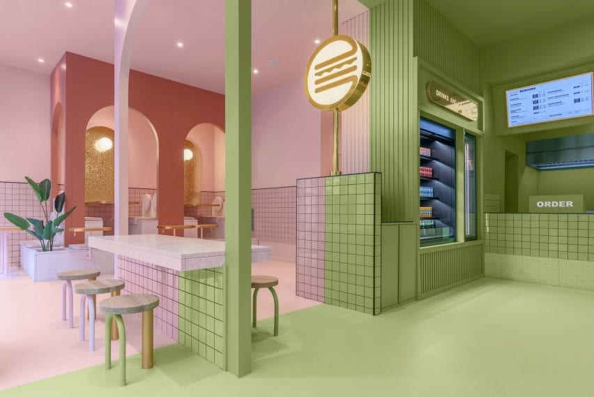
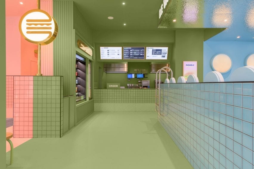
Upon entering Bun Turin, visitors are greeted with an ordering bar and drinks and ice cream fridge coloured in a dusty sage shade of the restaurant’s trademark green.
Lit-up digital menu boards with gold accents display the restaurant’s food options, while a version of the same neon burger logo found in Bun’s Milan branch glows from a nearby pillar.
A neon burger sign glows from a pillar
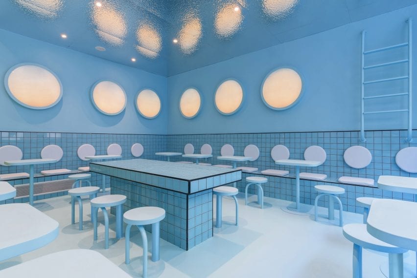
Pink and blue are used for two different seating areas both complete with built-in furniture.
In the pink area, a central table coloured partly in green straddles both the pink and green sections of the restaurant.
Sugary-pink terrazzo steps that double as a planter lead visitors to seats tucked into arched booths in the pink seating area, which also houses the burger joint’s toilets.
The pink seating area has terrazzo steps
Bun Turin’s all-blue seating area is built from pale tiles that are designed to look like a swimming pool.
The area features mock pool ladders which aim to give visitors the impression of floating in water while they eat.
“Once we defined Bun’s identity we developed the project in 3D,” said Penasse.
“At the end of the process, we do a lot of trials to reach the correct combination of colours and materials,” continued the designer.
“In this case, we had several options for colour combinations, all focussed on a younger audience.”
The blue seating area resembles a swimming pool
Apart from tiles by Complementto, all of the furniture in Bun Turin was designed by Masquespacio.
“It is important for clients that Bun spaces can be recognised wherever they are located,” explained Penasse.
“For this reason, the design will evolve and be slightly different in each space, but maintain a clear identity.”
Each section is revealed to the street by a large window
Masquespacio is a Valencia-based design agency founded in 2010 by Penasse and Ana Milena Hernández Palacios, known for its use of bright colour.
Other recent projects by the studio include colour-blocked student housing in Bilbao, and a stucco and terracotta restaurant in the Spanish town of Aragon constructed from twisting shapes informed by the nearby Pyrenees mountains.
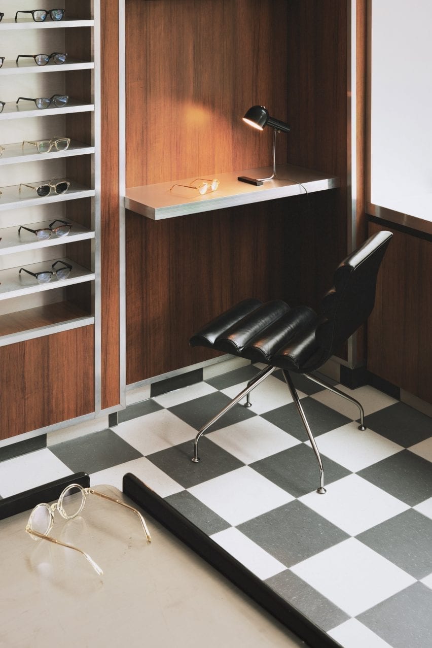
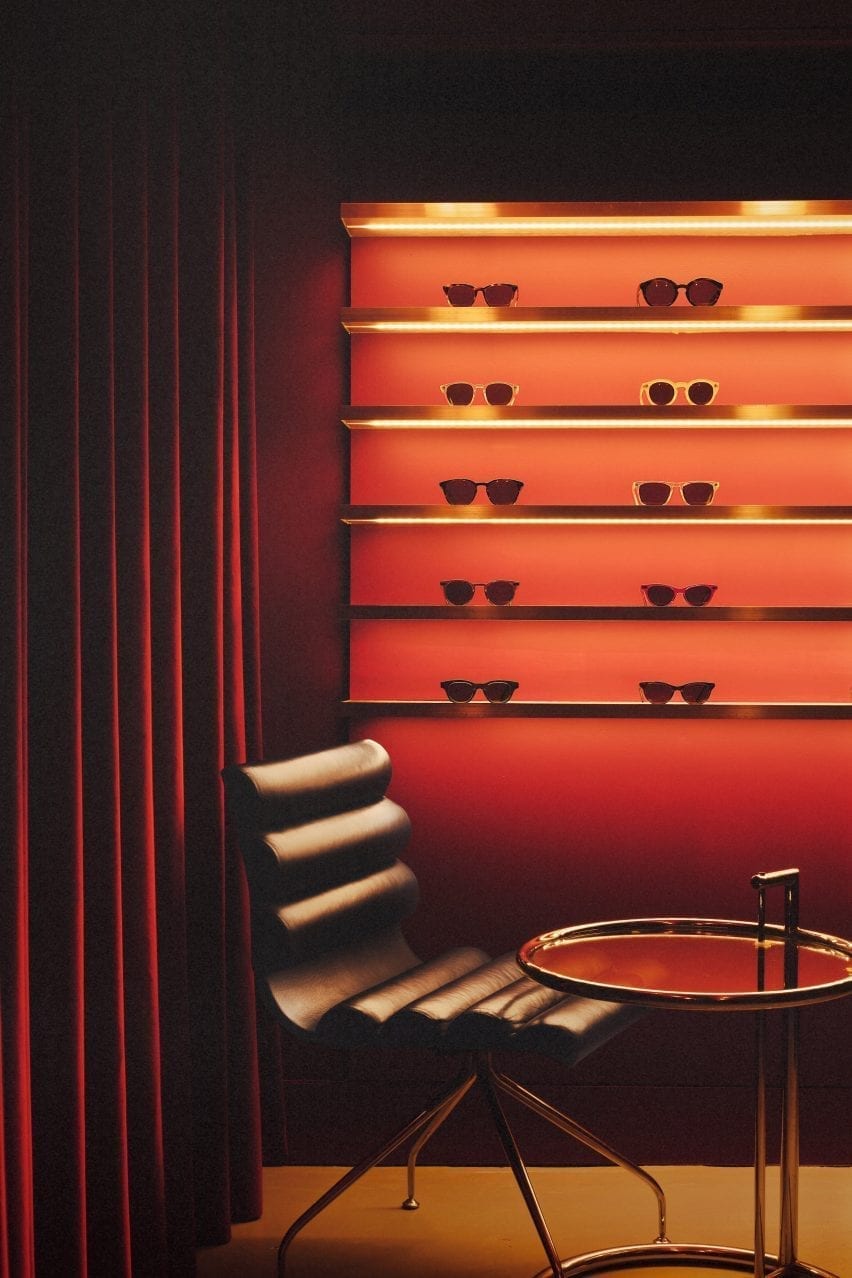
Featuring linoleum floors, Formica-clad walls and a deep red basement, Soho’s peep show booths served as inspiration for the atmospheric interior of this London eyewear store by Child Studio for spectacle-maker Cubitts.
Perched on the corner of Marshall Street in London’s Soho neighbourhood, the store occupies one of the early 19th-century buildings that form the area’s narrow streets.
Black and white checkered linoleum flooring features throughout the store
The store is spread out over a small ground floor and basement space lined by a narrow staircase.
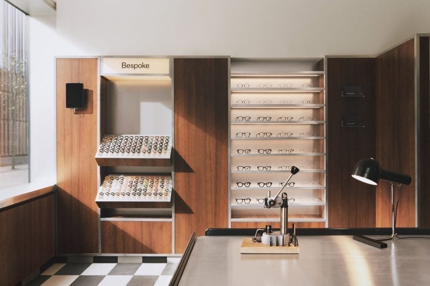
In terms of practical requirements, the store needed to incorporate a display of the 100 different coloured acetate chips that customers can choose from to create bespoke frames.
London-based Child Studio designed a space for Cubitts that aims to reflect the history of the local area and create a customer journey that would encourage people to explore the basement space.
A wall-mounted display case holds 100 different coloured acetate chips
“Cubitts wants each of its shops to have a unique design reflecting the history of the local neighbourhood,” Child Studio co-founder Alexy Kos told Dezeen.
“The brand has a strong connection to London, where its glasses are made, and to Modernism as the guiding principle to its design aesthetic.”
To design the interior, the studio drew upon Soho’s colourful history as a destination for massage parlours, adult cinemas and sex shops in the postwar era.
“Gambling, drinking, religious and political dissent, clubbing and prostitution were all, at varying times, peculiar Soho specialities,” said the studio.
“We have focussed our research on Soho’s heyday in the postwar era, looking at the interiors of the neighbourhood’s iconic venues, such as the Formica-clad Bar Italia and the legendary jazz venue 100 Club, with its all-red interiors.”
Formica laminate partitions with aluminium trims divide up the space
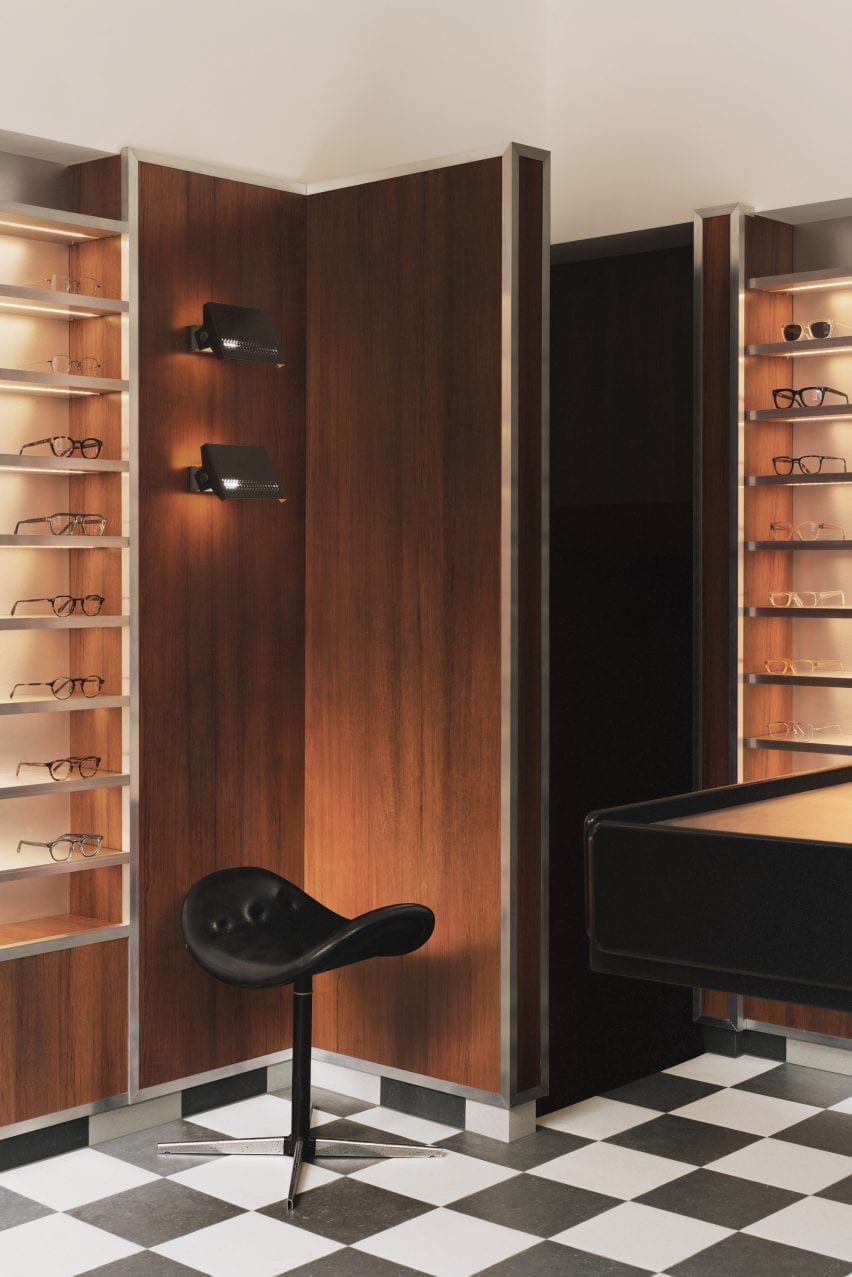
Referencing the peep show booths of Soho, the store incorporates low partitions clad in a wood-effect Formica laminate and trimmed with aluminium to form a maze-like environment.
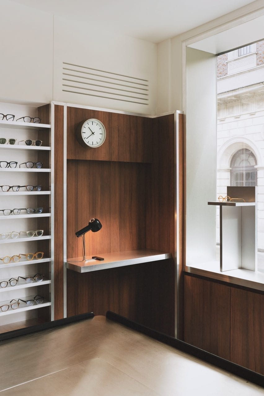
Display areas with illuminated acrylic shelving that showcase the spectacles and the colourful acetate chips are recessed into the walls. Lightbox signage integrated into the metal-trim cladding and black and white checkered linoleum flooring add to the store’s nostalgic ambience.
An antique Caori cocktail table designed by Vico Magistretti in 1961 serves as a focal point on the ground floor.
Featuring a brushed aluminium tabletop and several concealed compartments for records and magazines, the piece was specially sourced by Child Studio and adapted to include a raised podium so that it is better serves the retail environment.
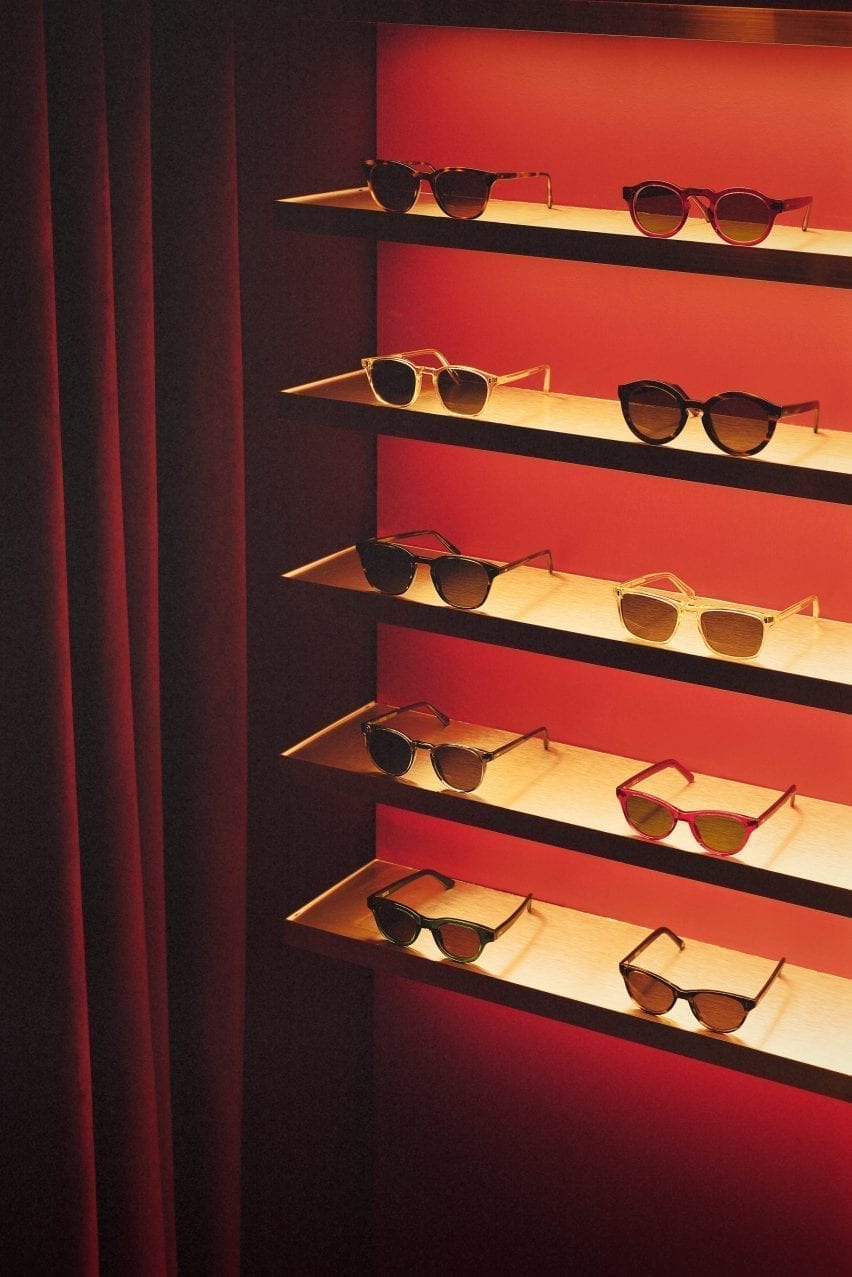
The basement is saturated with a deep red colour
“Every project tells a unique story and we always look for rare and unusual furniture pieces to add depth and authenticity to the narrative,” said the design team.
“The desk lamp is another mid-century find, created by the Czech designer Josef Hurka for the manufacturer Napako in the 1960s.”
Limited-edition sunglasses are displayed on shelves clad in aluminium-effect Formica
A narrow staircase leads to the basement, which is saturated in a deep red colour. Customers are guided to an eye examination room concealed behind a velvet curtain by neon signs.
Cubitt’s moody basement lounge area is lit by the Conelight floor lamp by the British designer Ronald Homes and furnished with chrome and leather chairs designed by Giovanna Modonutti.
A collection of limited-edition sunglasses is displayed on illuminated shelves clad in aluminium-effect Formica that create a theatrical effect in the dark red surrounds.
A neon peep show sign hangs at the entrance to the eye examination room
Previously, the studio run by Kos and Che Huang has channelled the look of a 1950s cafe inside a vegan pizza restaurant in west London and transformed a former London post office into a sushi restaurant with a 1960s interior.
“We like to use the word ‘cinematic’ to describe the spaces designed by Child Studio,” Kos told Dezeen. “With every project, we aim to capture a particular mood and atmosphere, rather than trying to recreate an interior from a specific era.”
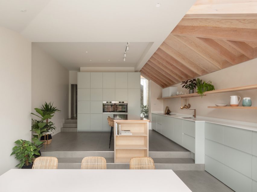
This lookbook highlights ten examples of peninsula kitchens, which have the functionality of kitchen islands but are a more space-saving solution.
Named after the geological feature, a kitchen peninsula is a spur that juts out from the wall or work surfaces, creating a three-sided surface. Peninsulas are often additionally used as breakfast bars for casual dining.
Peninsulas offer a space-saving solution for kitchens that don’t have enough floor space for a free-standing kitchen island. They are also useful in kitchens with irregular layouts since they can be asymmetrical or placed at jaunty angles.
They can also be used to create a useful staging post between the food preparation area and the dining area.
This is the latest roundup in our Dezeen Lookbooks series providing visual inspiration for the home. Previous kitchen-related roundups include kitchens with islands, galley kitchens and kitchens with breakfast bars.
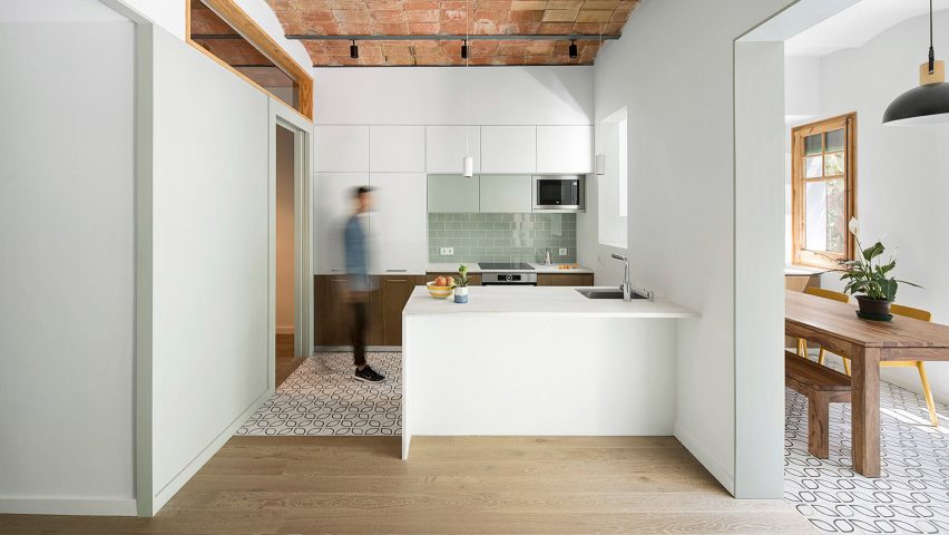
Caldrap in Barcelona, Spain, by Nook Architects
Nook Architects remodelled this 67-square-metre apartment in Barcelona to accommodate a family of three. A marble peninsula counter abuts the half-wall that divides the kitchen and the dining area.
A sink is sunk into the countertop at one end, and the marble surface overhangs to create a breakfast bar. Patterned tiles demarcate the kitchen area, which sits below a ceiling of traditional Catalonian brick vaults.
Find out more about Caldrap ›
Golden Lane flat renovation in London, UK, by Archmongers
Archmongers reinstated modernist design elements for this 1950s flat renovation in London’s Golden Lane estate. Chunky white-painted wooden frames separate the kitchen and dining areas, adding high shelving above the peninsula kitchen.
The white kitchen cabinets are topped with steel while grey terrazzo picks out the counter end and splashback.
Find out more about Golden Lane flat renovation ›
Reception House in Higashiyama in Nagoya, Japan, by Yuki Mitani and Atsumi Nonaka
Architects Yuki Mitani and Atsumi Nonaka redesigned their kitchen to create a more social space when they remodelled their own home. A peninsula kitchen counter creates extra counter space, while allowing the hosts to chat with their guests as they prepare meals.
The rental flat came with no finishes, just raw concrete walls, so the architects played up to this and clad the counter with panels of industrial-looking zinc.
Find out more about Reception House in Higashiyama ›
Botaniczna Apartment in Poznań, Poland, by Agnieszka Owsiany Studio
A bronze tap complements the creamy marble of this peninsula counter for an open-plan kitchen diner in a Polish apartment. Agnieszka Owsiany Studio designed the space to be as calming as possible for a couple with high-pressure jobs in medicine.
Wooden shelves are built into one side of the counter, which overhangs slightly so it can double as an informal breakfast bar with saddle-style bar stools ›.
Find out more about Botaniczna Apartment ›
Apartment in Born in Barcelona, Spain, by Colombo and Serboli Architecture
A curved countertop projects to form a breakfast bar in this colourful flat renovation by Colombo and Serboli Architecture for a woman working in the fashion industry.
The countertop abuts a bright coral arched volume that hides a guest bathroom. A polished metal tap curves over the sink on the kitchen side and two grey Revolver Stools from Hay can be drawn up to turn the surface into a breakfast bar.
Find out more about Apartment in Born ›
St Lawrence in Toronto, Canada, by Odami
Canadian studio Odami opened up the previously enclosed kitchen of a dated 1980s apartment in Toronto. The peninsula kitchen adds more worksurfaces while creating a line of sight with the dining area.
Matching grey marble countertops and splashback contrast with the dark wood cabinetry and a matt black sink and tap.
Find out more about St Lawrence ›
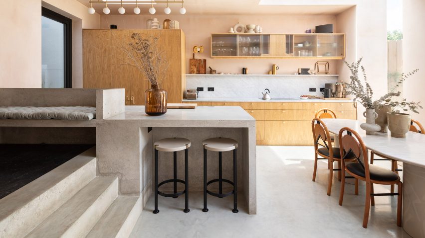
Tsubo House in London, UK, by Fraher & Findlay
Architecture practice Fraher & Findlay introduced a Japanese aesthetic during the renovation and extension of this Victorian-era house in London.
The kitchen features pink plaster walls and a peninsula-style polished concrete counter that also serves as a breakfast bar and continues up a short flight of steps to form a bench seat.
Find out more about Tsubo House ›
Cabinette in Valencia, Spain, by Masquespacio
A row of retro-futuristic stools with tiered fringing from Spanish studio Masquespacio’s Déjà-Vu collection line up below the bar of this peninsula kitchen in a co-working space in Valencia.
The studio designed the space in homage to French director Jacques Tati’s 1960s film Playtime. The kitchen area features baby-blue tiling and strips of neon underlighting.
Find out more about Cabinette ›
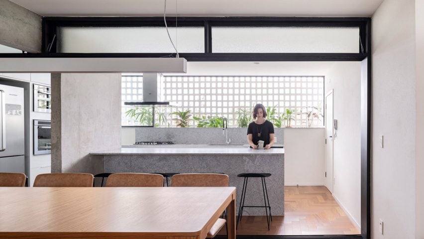
308 S apartment in Brasilia, Brazil, by Bloco Arquitetos
Bloco Arquitetos reconfigured this 1960s apartment in Brasilia, adding translucent sliding doorways that can be pulled across to separate the kitchen and the dining area.
The peninsula kitchen with its marble counter abuts a concrete divider wall and allows the kitchen and dining room to become one large entertaining space when the doors are open.
Find out more about 308 S ›
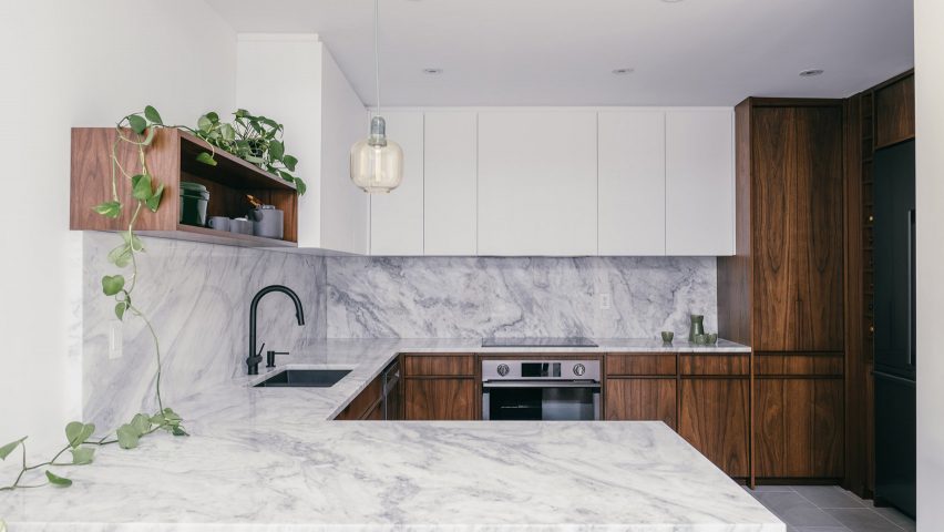
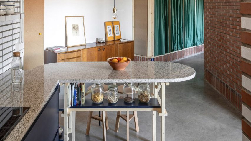
La Nave in Madrid, Spain, by Nomos
Spanish architecture studio Nomos converted an old workshop into a home for two of its partners. The original pipes and brickwork are still visible in the kitchen, which has a rounded peninsula counter supported by a wooden frame.
Nomos built the custom timber elements out of pine, including the frame and the bar stools. A blue-painted shelf under the counter doubles as a handy spot to store breakfast cereals and cookbooks.
Find out more about La Nave ›
This is the latest in our series of lookbooks providing curated visual inspiration from Dezeen’s image archive. For more inspiration see previous lookbooks showcasing peaceful bedrooms, wallpapered interiors and colourful kitchens.
For our latest lookbook, we’ve found ten projects in the Dezeen archive where kitchens and dining rooms have been combined into one practical and sociable space.
Most homes around the world traditionally had separate areas for preparing and eating food but over the last few decades, the popularity of combined kitchen dining rooms has soared.
These are more informal spaces capable of hosting a variety of activities including entertaining, home-working as well as cooking and eating.
Kitchen dining rooms can also save space in smaller homes.
The ten examples below show some of the best examples from Dezeen’s archive and feature a variety of kitchen layouts including kitchens with islands, peninsula kitchens and kitchens with breakfast bars.
This is the latest roundup in our Dezeen Lookbooks series providing visual inspiration for the home. Previous kitchen-related roundups include compact kitchens and terrazzo kitchens.
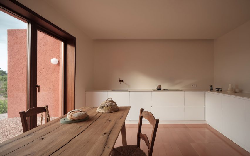
Lover’s House, Spain, by Isla Architects
Local studio Isla Architects adapted and improved this holiday home on the Spanish island of Mallorca, using a minimalist material and colour palette to “reveal the simple geometry of the building”.
In the kitchen and dining space, matte white cabinets and countertops complement the off-white walls.
A tiled floor picks up the warm terracotta hue of the house’s exterior while utilities such as the sink and hob have clean, unadorned designs that contrast against the rustic wooden dining table and chairs.
Find out more about Lover’s House ›
The Cedars, US, by Michael Yarinsky
The Cedars on Long Island, New York, has a light, open kitchen and dining area with a kitchen corner that features a tiled back wall to demarcate it from the rest of the room.
As well as the larger dining table, the kitchen nook has a breakfast bar for more informal eating that has been painted in a dark petroleum blue to match the cabinetry.
Danish furniture brand Hay’s black J1110 chairs add an eyecatching graphic touch to the room, while a playful light by Ladies & Gentlemen Studio hangs above the table.
Find out more about The Cedars ›
Marine, Australia, by David Barr Architects
Wood runs through this kitchen and dining space in an extension to a home in Perth, Australia, designed by David Barr Architects.
Wooden cabinets and a wood kitchen island covered with grey stone countertops sit next to a wood-clad wall that hides the oven and various storage spaces.
Above the sink and work areas, open shelves hold a collection of decorative ceramics, while a matching ceramic jug and bowl sit on the wooden dining table. One side of the kitchen island functions as a breakfast bar, complete with ash chairs by Mattiazzi.
Find out more about Marine ›
House for a Sea Dog, Italy, by Dodi Moss
This loft apartment inside a 300-year-old building in Genoa, Italy, was designed to feel as open and spacious as possible. In the kitchen and dining room, a one-wall kitchen in a soothing dark-grey hue sits against a red brick wall.
This leaves space for a dining table and a selection of bentwood chairs with rattan seats. The oven and fridge are hidden away in white cupboards that blend into the wall.
Find out more about House for a Sea Dog ›
Three Chimney House, US, by T W Ryan Architecture
A large kitchen island with a marble countertop sits in the middle of this kitchen and dining room in Three Chimney House in rural Virginia.
With a design that was informed by both modernism and Southern colonial style, the room has been given a striking material palette. A stone floor matches the stone splashback that runs along the kitchen workspaces, while a tiled wall sits below the angled white ceiling.
Mid-century modern Stick Back chairs by Thomas Harlev underline the sparse geometric design while Lindsey Adelman’s 15 Bulb Drop System chandelier, which hangs above the table, gives the room a sacral feel.
Find out more about Three Chimney House ›
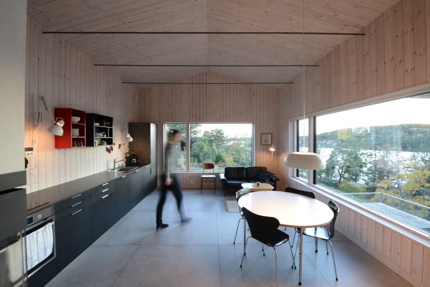
Cabin Son, Norway, by Jon Danielsen Aarhus
The rectangular kitchen in this spruce-clad holiday home in Norway has a small dining area and a sofa for lounging.
The multiuse space features a long single-wall kitchen that holds an oven and sink as well as multiple cabinets.
Colourful shelving above the countertops adds additional storage space and a vibrant touch against the pale-wood walls. A wooden table and black chairs by Danish designer Arne Jacobsen give the kitchen an elegant, modern feel.
Find out more about Cabin Son ›
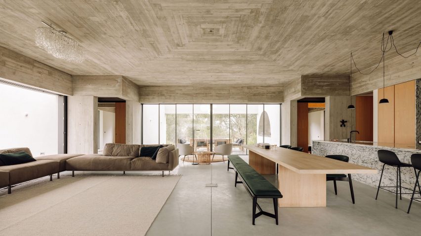
Casa Meco, Portugal, by Atelier Rua
A built-in kitchen clad in a decorative veiny marble, complete with a matching breakfast island, sits in one corner of Casa Meco’s enormous main room.
Wooden cupboards on either side of the kitchen hide the kitchen facilities. A long table made from pale wood with contrasting black chairs and a black bench can be used for large dinners, while a breakfast bar adds more seating options.
Find out more about Casa Meco ›
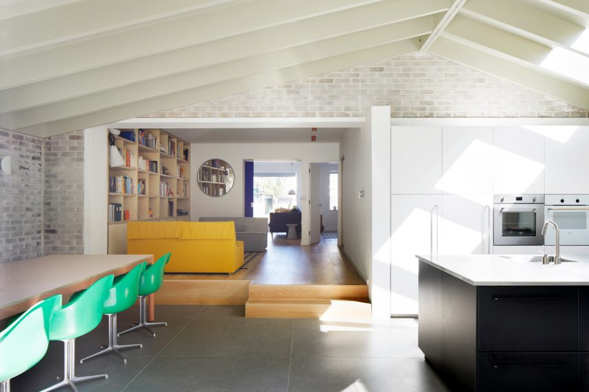
House-within-a-House, UK, by Alma-nac
Alma-nac’s joyful design for House-within-a-House in south London includes an extension that holds the kitchen and dining area. Here, simple white cabinetry and a jet-black kitchen island sit on one side and offer plenty of space for food preparation and cooking.
Opposite, a dining table is completed with vintage-style apple-green plastic chairs. Their bright colour picks up the yellow hue of a sofa in the raised lounge area next to the dining space.
Find out more about House-within-a-House ›
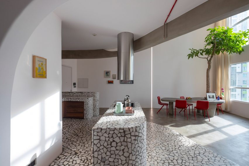
Mài Apartment, Vietnam, by Whale Design Lab
Graphic terrazzo surfaces decorate the kitchen area in this Vietnamese apartment by Whale Design Lab, which has a design informed by American architect Louis Kahn.
The splashback, countertop, breakfast island and floor were all crafted from the material. The organic, curved shapes of the kitchen island and workspaces are mirrored in the grey dining table that sits underneath a small indoor tree.
Bright red Dragonfly chairs by Einrichten Design add a splash of colour to the room.
Find out more about Mài Apartment ›
Quarter Glass House, UK, by Proctor & Shaw
Proctor & Shaw’s design Quarter Glass House is an extension to a London house that holds the kitchen and dining space and was designed to have as much height and light as possible.
The studio lowered the floor to create more space, and combined exposed timber with duck-egg cabinetry and shiny copper surfaces to fulfill a request for warm and textural materials. A kitchen island with a breakfast bar has practical shelving on one side, and long floating wall shelves add storage space.
A simple white table with rattan chairs can seat six people and overlooks the garden outside the extension.
Find out more about Quarter Glass House ›
This is the latest in our series of lookbooks providing curated visual inspiration from Dezeen’s image archive. For more inspiration see previous lookbooks showcasing peaceful bedrooms, wallpapered interiors and colourful kitchens.
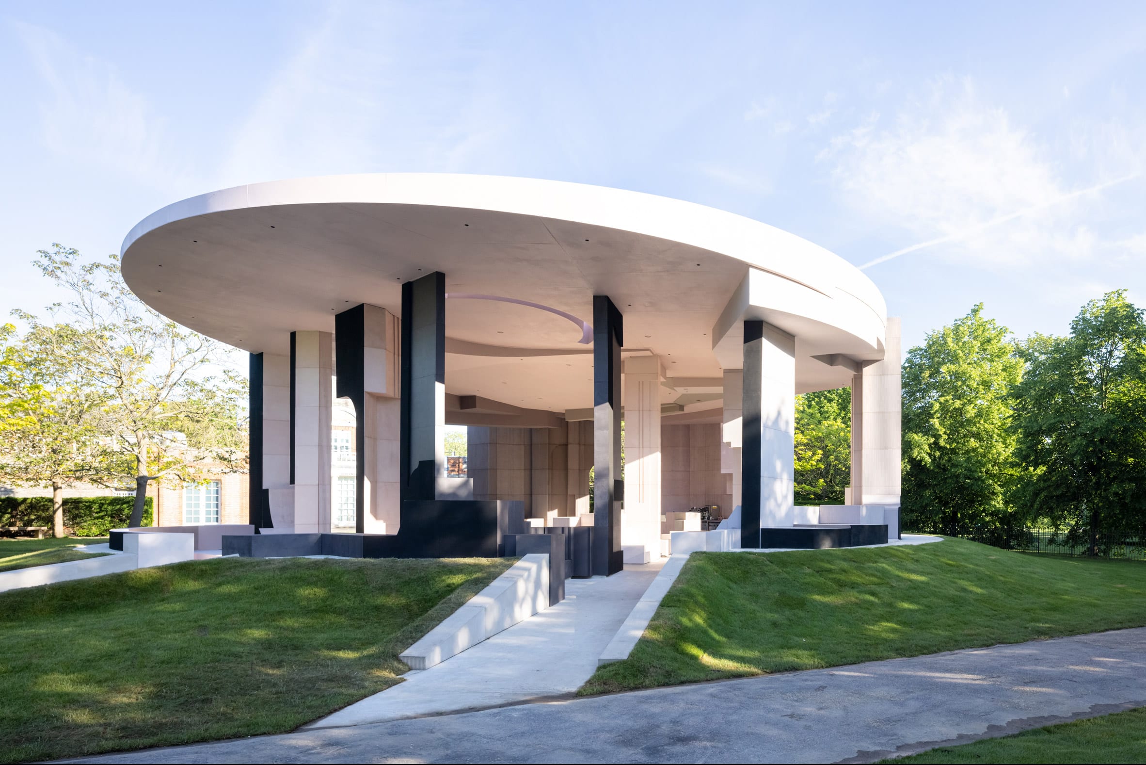
Watch a live talk with Serpentine Pavilion architect Sumayya Vally
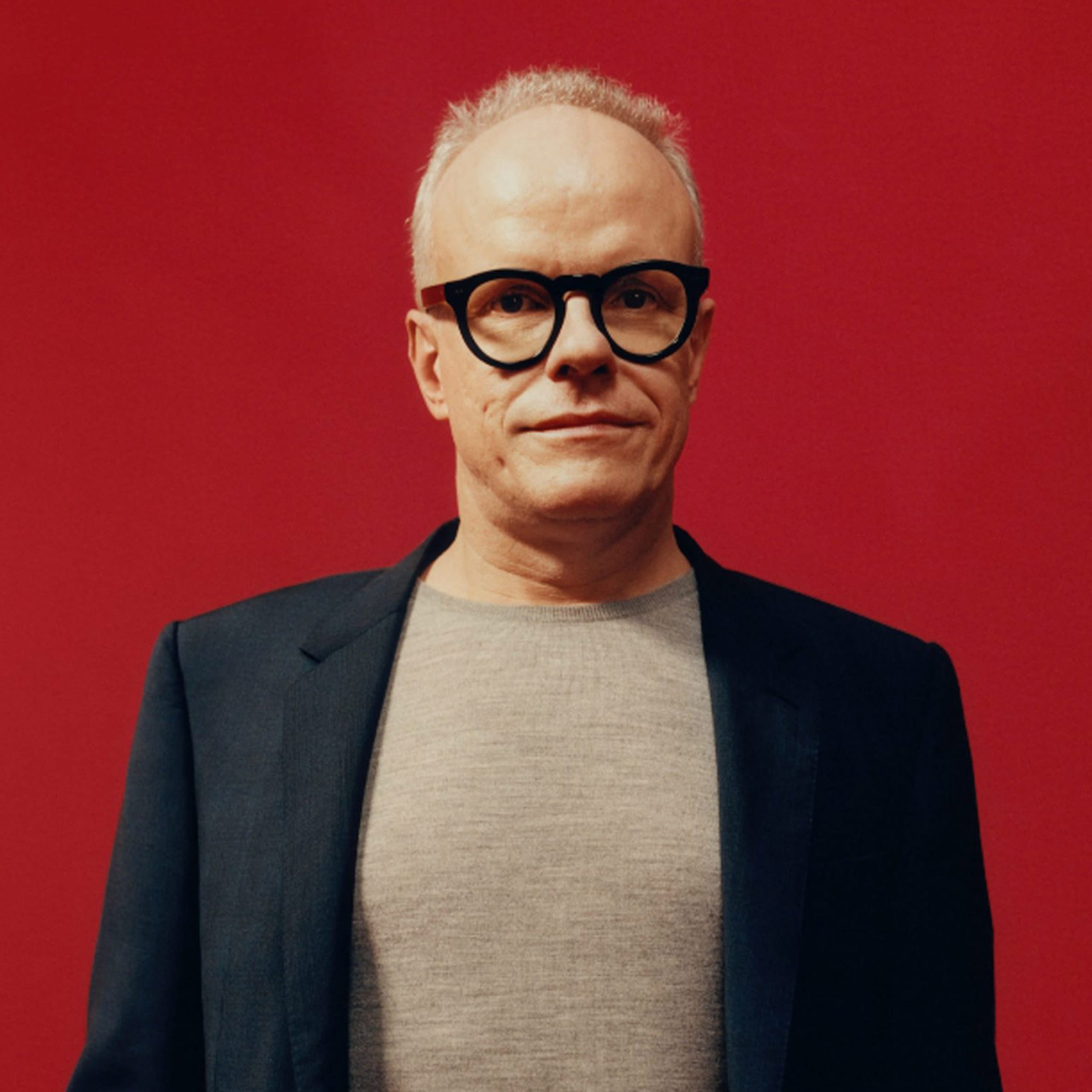
Dezeen has teamed up with the Serpentine Gallery to live stream a conversation between Hans Ulrich Obrist and architect Sumayya Vally of Counterspace about this year’s Serpentine Pavilion. Watch the talk here from 1:00pm London time.
Broadcasting live from the 20th Serpentine Pavilion in London, Vally will discuss the process and concepts behind her design with Serpentine Galleries artistic director Obrist in the talk.
The 20th Serpentine Pavilion is designed by Sumayya Vally
Vally’s Serpentine Pavilion is a circular pink-and-grey structure made from reclaimed cork and steel.
The temporary structure, which is currently located on the lawn outside the Serpentine Gallery, is one of five pavilions dispersed throughout the capital that comprise this year’s design.
Sumayya Vally is the director of Counterspace
A further four smaller pieces can be found at sites significant to London’s migrant communities, including Deptford, Barking and Dagenham, Finsbury Park and Nottinghill.
Vally gave an exclusive video interview to Dezeen in which she described the pavilion as “like a puzzle of many different elements coming together.”
Serpentine Galleries artistic director Hans Ulrich Obrist will moderate the talk
The Serpentine Pavilion is an annual commission established in 2000 by the London gallery. Each year, it is awarded to international architects who have not yet had the opportunity to build in the UK .
Vally is the youngest architect to receive the prestigious commission. The likes of Zaha Hadid, Toyo Ito and Oscar Niemeyer are among the architects to have designed previous pavilions.
The talk takes place at 1:00pm London time on 9 June 2021. The Serpentine Pavilion 2021 is open to the public in London from 11 June to 17 October 2021. See Dezeen Events Guide for an up-to-date list of architecture and design events taking place around the world.
The post Watch a live talk with Serpentine Pavilion architect Sumayya Vally appeared first on Dezeen.
The post Watch a live talk with Serpentine Pavilion architect Sumayya Vally appeared first on Source link
Pakistan’s rating on FATF recommendations gets better
ISLAMABAD: The Asia Pacific Group (APG) on Money Laundering has improved Pakistan’s rating on 21 of the 40 technical recommendations of the Financial Action Task Force (FATF) against money laundering and terror financing, but retained it on ‘Enhanced Follow-up’ for sufficient outstanding requirements.
The second Follow-Up Report (FUR) on Mutual Evaluation of Pakistan released by the APG — a regional affiliate of the Paris-based FATF — also downgraded the country on one criteria. The report said Pakistan was re-rated to ‘compliant’ status on five counts and on 15 others to ‘largely compliant’ and on yet another count to ‘partially compliant’.
Overall, Pakistan is now fully ‘compliant’ with seven recommendations and ‘largely compliant’ with 24 others. The country is ‘partially compliant’ with seven recommendations and ‘non-compliant’ with two out of total 40 recommendations. All in all, Pakistan is now compliant or largely compliant with 31 out of 40 FATF recommendations.
The reporting date for this evaluation was October 1, 2020, which means Islamabad may have made further progress since then that would be evaluated at a later stage.
Read:Being on FATF’s blacklist no longer a possibility, Hammad Azhar assures nation
“Pakistan will move from enhanced (expedited) to enhanced follow-up, and will continue to report back to the APG on progress to strengthen its implementation of anti-money laundering and combating financing terror (AML/CFT) measures,” the APG said.
Pakistan submitted its third progress report in February 2021 and is yet to be evaluated.
Islamabad now compliant or largely compliant with 31 out of 40 recommendations
“Overall, Pakistan has made notable progress in addressing the technical compliance deficiencies identified in its Mutual Evaluation Report (MER) and has been re-rated on 22 recommendations,” the APG added.
It said recommendations 14, 19, 20, 21 and 27 had been re-rated to compliant. These pertain to money or value transfer services, higher risk countries, reporting of suspicious transactions, tipping-off and confidentiality and powers of supervisors.
The APG said Pakistan was re-rated to largely compliant with 15 recommendations — 1, 6, 7, 8, 12, 17, 22, 23, 24, 25, 30, 31, 32, 35 and 40. These include assessing risk and adopting risk-based approach, targeted financial sanctions relating to terror and terror financing, targeted financial sanctions related to proliferation, non-profit organisation, politically exposed persons and reliance on third parties.
Also, re-rating was done on designated non-financial business & professions (DNFBPs) in terms of due diligence and other measures, transparency in beneficial ownership of legal persons and related legal arrangements, responsibilities of law enforcement and investigation authorities, cash couriers, sanctions and other forms of international cooperation.
Another re-rating to partially compliant status was done on recommendation 28 that pertained to regulation and supervision of DNFBPs. The two recommendations on which Pakistan was downgraded to ‘non-complaint’ were 37 and 38 due to insufficient progress and pertained to mutual legal assistance (MLA) with other countries and freezing and confiscation of assets and accounts.
Read:New rules in the works to meet FATF conditions
In the first FUR of February last year, Pakistan’s progress was largely found unchanged — non-compliant on four counts, partially compliant on 25 counts and largely compliant on nine recommendations. Since then, the government worked aggressively and improved its effectiveness on AML/CFT system.
In February, Pakistan submitted its third progress report requesting re-rating for recommendations 10, 18, 26 and 34. A review team has been formed to assess compliance with these recommendations. Pakistan has not reported on its progress rectifying deficiencies identified in R-15 or 33, the APG said.
The finance ministry and Minister for Energy Hammad Azhar, who is also head of the task force on FATF, separately welcomed the re-rating, saying the results proved the sincerity along with resolve of the government in complying with the FATF requirements.
“These results are also a manifestation of the irreversibility and sustainability of the complete process in bringing Pakistan at par with global AML/CFT standards,” the finance ministry said, adding that “an upgrade of 21 recommendations within this short period of time remains unprecedented in FATF history”.
FATF’s Mutual Evaluation Report (MER) of jurisdictions is assessed in two domains — technical compliance or legal instruments (40 FATF recommendations) and demonstration of effectiveness (11 immediate outcomes). Pakistan’s MER was adopted in October 2019 in which the country was rated compliant and largely complaint in 10 out of 40 recommendations.
After adoption of MER, Pakistan was placed under post-observation period by the FATF, which expired in February this year. During the said period, Pakistan carried out major legal reforms with the enactment of 14 federal laws and three provincial laws along with relevant rules and regulations.
The weaknesses in MLA with other countries resulted in non-compliance on two recommendations — 37 and 38. This pertained to the restrictive new condition imposed on MLA through the new requirement to inform the subject of the request.
“Having considered the nature and scope of the remaining gaps, and Pakistan’s risk and context, these gaps have been given major weight in determining the final rating on non-compliance,” the APG said.
SBP takes another step to boost investment in real estate
LAHORE/KARACHI: In what is being seen as a positive development for the real estate sector and capital markets, the State Bank of Pakistan on Wednesday reduced the risk weight of banks/DFIs from 200 per cent to 100pc on their investment in units of Real Estate Investment Trusts (REITs) for five years to facilitate development of housing finance and capital markets.
“In order to provide further support to the development of real estate sector, State Bank has amended its capital adequacy regulations by significantly lowering the applicable risk weight from 200 per cent to 100 per cent on banks and DFIs’ investments in the units of REITs,” said a SBP circular.
Besides the revision in the capital adequacy treatment for banks’ investments in REITs, the circular said, the banks’ investment (in REITs) will now be categorised in the “Banking Book” instead of “Trading Book”. However the central bank added that it “may review this revised treatment after a period of five years based on the banks’ exposure and performance of the REITs sector”.
Halving of risk weight of banks, DFIs to help REITs
According to the SBP, “With the changes in capital adequacy regulations, banks and DFIs will now be able to increase their investments in REITs without the need to allocate relatively large amount of capital.
“This will, in turn help banks to promote development of real estate sector in the country. The enhanced participation of financial institutions, backed by regulatory initiatives, would also encourage REIT Management Companies to launch new REITs, providing further boost to the Government’s agenda for development of housing and construction sectors,” it said.
‘A good move’
“This is a good move since the risk weight for banks’ investment in the real estate sector was very high. Banks will now be able to increase their investments in REITs without allocating relatively large amounts of capital. This move would facilitate investment in REITs and potential launch of new REITs,” Samir Ahmed, Knightsbridge Capital Group CEO, told Dawn.
“This change in capital adequacy treatment for banks’ investments in REITs has opened up new avenues of financing for REITs. This means REITs can now arrange financing from the banks; earlier they had to rely on their own equity. The market participation in REITs is likely to increase,” he said.
REITs are companies like closed-end mutual funds that own, operate or finance income-producing real estate. They raise funds from the general public and institutions and deploy these funds through investment in real estate properties. REITs provide an investment opportunity that makes it possible for everybody to own and benefit from real estate by allowing them to invest in portfolios of real estate assets the same way they invest in equities.
“The stockholders of a REIT earn a share of the income produced without actually having to go out and buy, manage or finance a property,” Mr Ahmed said.
REITs invest in a wide range of real estate property types, including offices, apartment buildings, warehouses, retail centres, hospitals, data centres, infrastructure and hotels. Most REITs focus on a particular property type but some hold multiple types of properties in their portfolios.
The SBP had earlier amended provisions of its existing prudential regulations to encourage enhanced participation of banks in REITs that enabled them to make higher investments in REITs to the tune of 15pc of their equity as against the previous limit of 10pc.
Moreover, the SBP has also allowed the banks to count their investments in shares, units, bonds, TFCs and Sukuks issued by the REIT management companies toward achievement of their mandatory targets for housing and construction finance.
“The amendments in SBP’s capital adequacy regulations will further incentivise banks to contribute towards a well-functioning capital market for real estate sector,” said the SBP.
Taxation challenges remain
Welcoming the development, Arif Habib Dolmen Real Estate, which owns the country’s only listed REIT, stated that REITs were a quintessential instrument for the government to document real estate and bring transparency in this sector.
Speaking from Karachi, Mohammad Ejaz, an analyst at Arif Habib Securities, said both SBP and SECP had done their part to encourage establishment of REITs in the country. “Now it is FBR’s turn to provide an enabling environment and facilitate the REIT investments by resolving the taxation challenges,” he said. Elaborating, he said some taxation anomalies such as 25pc tax on dividend income still exist.
“This should be cut to 15pc since REITs distribute 90pc of their profits and have to compete with the large, obscure and informal investors operating in the country’s real estate sector. With the government focused on encouraging construction and housing to boost the economy, REIT is one formal, documented way to promote the real estate sector that largely operates in the grey. Taxation is a major reason we don’t see much development in REITs.”
As part of the design, they included an outdoor living room and sitting area that both include a bookshelf for plants.
At night, the plant bookshelves light up, while the living rooms are furnished with outdoor sofas, armchairs, planters, and oversized lamps, the living rooms create comfortable spaces for guests to relax in.
Another design detail of the outdoor living rooms are the pebbles that have been used in place of rugs.
Let’s take a look around the rest of the hotel…
The Public Areas
The resort design has a bright white exterior, however, the lobby has been warmed up with the use of wood, and curved wood walls add a sculptural element. The hotel restaurant introduces blue accents and includes a variety of seating, as well as oversized black and white striped pendant lights.
The Courtyards
The resort has a variety of courtyards and outdoor spaces including areas with chairs arranged in a circle and surrounded by trees, paths with nearby stairs that lead to the different levels of the resort, a swimming pool with sun chaises, and outdoor king-sized beds nestled between plants and shaded by large trees.
The Spa
The spa area is defined by the use of the colors dark green and pink. The bathtub of the spa room is placed in the garden surrounded by the dark green walls, while the clear glass door brings nature into the treatment room.
The Guest Rooms
The hotel’s rooms have contemporary interiors with wood accents and outdoor spaces with private swimming pools and lounges.
ODDO architects have designed a contemporary home in Hanoi, Vietnam, that’s surrounded by taller buildings and includes rooftop courtyards.
Due to rapid urbanization and the lack of public spaces, the architects designed a home that includes outdoor spaces.
The lower level of the home has a white exterior, while the upper level consists of multiple brick volumes, some with overhanging plants, adding a greenery element to the space.
The roof area is covered by open gardens where the family may grow their own vegetable and fruits.
The rooftops also include space for relaxing in the busy city.
Outdoor lighting included in the design of the rooftops enables the space to be used at night. It also adds light to the neighborhood as it can pass through the walls and openings.
Inside the home, the interior has been kept open with glass ceilings, creating a bright living space.
The living room opens up to the kitchen and dining area, which include custom planters built into the design of the home.
Other rooms in the house have sliding doors that open to green spaces, hiding the city beyond.
Photography by Hoang Le photography | Architects: ODDO architects (Mai Lan Chi Obtulovicova, Marek Obtulovic, Nguyen Duc Trung)
Andrew Mann Architecture has completed the remodel of a home in Sonoma, California, that includes a newly designed garden with tiered planters and a covered outdoor entertaining space.
The garden pavilion, which was designed by Andrew Mann Architecture, also included the hardscape and layout of the fences, as well as the surrounding planter beds.
The dining pavilion, which can be lit up at night, acts as an outdoor entertaining space that’s surrounded by peaceful gardens completed by Christa Moné.
The raised planters, which have a simple concrete border are filled with flowering plants of different sizes.
The pavilion, which has a sloped roof, is built from dark stained wood and has a large open area dedicated to outdoor dining.
The pavilion also includes a kitchen area with fridges, a pizza oven, and firewood storage, as well as a separate space for storing garden items. This small room can be hidden from view by the large sliding barn doors.
Let’s take a look around the main house…
Architect Andrew Mann and interior designer Katie McCaffrey of Angus – McCaffrey Interior Design collaborated on the partial remodel of the house, which was originally built in 1974 by Roland Miller Associates.
Andrew focused on form making, while Katie defined a material palette different in feel and mood from their client’s city house. Exposed wood beams and a wood ceiling complement the wood floors and furniture found in the open plan living room and dining area.
Behind the dining room is the kitchen, which includes minimalist white and gray cabinets, a breakfast bar, and an island with a waterfall countertop.
Adjacent to the kitchen is a secondary smaller and more casual dining area.
In the bedrooms, there are high ceilings and walls of wood-framed windows that fill the rooms with natural light.
In the bathrooms, the color palettes have been kept neutral, with only the tile flooring providing a decorative accent.
Photography by David Wakely Photography | Architecture: Andrew Mann Architecture | Interior Design: Angus-McCaffrey Interior Design | Landscaping: Christa Moné