Paris zero-carbon neighbourhood by TVK
CategoriesSustainable News

TVK designs limestone buildings for “first zero-carbon district” in Paris

French architecture practice TVK has completed a neighbourhood in Paris made up of limestone buildings surrounding a garden and designed as a sustainable development that aims to increase biodiversity.

Located on a triangular site in Paris’s 19th arrondissement, the project is “the capital’s first zero-carbon district”, according to TVK.

Named Îlot Fertile, which translates to “fertile island” in French, it contains apartments, a youth hostel, student residences, a hotel, offices, restaurants, shops and sports facilities.

Paris zero-carbon neighbourhood by TVKParis zero-carbon neighbourhood by TVK
TVK claims Îlot Fertile is the first zero-carbon district in Paris

The four buildings that make up the neighbourhood range in height from seven to nine storeys tall, each with ground-floor levels made from low-carbon concrete and designed to achieve large, unobstructed interior spaces.

The upper levels were made from load-bearing limestone sourced mainly from the local Ile-de-France region, aiming to reduce the carbon cost of transportation.

TVK claims the 35,200-square-metre development is the largest load-bearing stone building site since Georges-Eugène Haussmann’s reconstruction of Paris in the mid-19th century.

Îlot Fertile zero carbon neighbourhood in Paris by TVKÎlot Fertile zero carbon neighbourhood in Paris by TVK
The buildings were made from load-bearing stone and concrete

“Each material is used in the right place and the right quantity,” TVK founders Pierre Alain Trévelo and Antoine Viger Kohler told Dezeen.

“We chose to use mainly limestone from the Paris region – it’s the same one used to build the Haussmann buildings.”

Public spaces, including restaurants and shops, are located on the ground floors of the buildings and open onto the central garden.

Hotel accommodations and apartments are on the upper levels, and a raised outdoor level provides additional garden spaces with an orchard, vegetable patches, insect hotels and nest boxes.

Office spaces are located in a building that sits parallel to a railway line and, aiming to work with the site’s existing topology and move as little earth as possible, TVK designed a sunken sports centre in a large hole on the site to create an interior with high ceilings.

“The biggest challenge of the project was to bring together more than a dozen programmes and turn them into a fully-fledged part of the city,” said Trévelo and Kohler.

“The shape of each building is linked to the very specific geometry of the site shaped by the railway infrastructure,” they continued. “This brings diversity to a building complex of this scale.”

Îlot Fertile zero carbon neighbourhoodÎlot Fertile zero carbon neighbourhood
It is located on a triangular site next to a railway

TVK designed Îlot Fertile to have a minimal carbon footprint in its construction and operation. It topped the buildings with photovoltaic panels and green roofs to produce energy while also aiming to increase biodiversity.

“Its proximity to public transport means that Îlot Fertile does not require any car parking, and we used a bioclimatic design to keep energy requirements to a minimum for heating, cooling and lighting,” said Trévelo and Kohler.

“For the small amount of energy that will be consumed, the project plans to compensate for it by producing green energy via bio-solar roofs.”

Tennis court in a sports centreTennis court in a sports centre
The development includes a sports centre built into an existing hole in the site’s topography

“Driven by the City of Paris’ ambition for ecological transition, zero-carbon is a long-term objective for the life of the entire operation,” added Trévelo and Kohler.

Elsewhere in Paris, Christ & Gantenbein completed a 124-metre-long steel-clad housing block, and RSHP unveiled its design for a “post-carbon” neighbourhood that will be located in the La Défense business district.

The photography is by Julien Hourcade.


Project credits:

Architect: TVK
Client: Linkcity
Landscape design: OLM
Building and civil engineering: Berim
Engineering: Carbone 4 and Amoes

Reference

Could plant-based fur be as good as the real deal?
CategoriesSustainable News

Could plant-based fur be as good as the real deal?

Spotted: While statistics illustrate that a majority of US consumers still consider it morally acceptable to wear fur, there has been a notable shift away from its use in the fashion industry. Prada, Phillip Lim, Macy’s, Chanel, Burberry, and Net-a-Porter Group have all removed real animal fur from production and sales floors.

Today, vegan alternatives are available, but many fur substitutes are made from petroleum-based synthetic fibres, which are unsustainable, even if they are animal-free. Now, New York and Paris-based bio-materials startup, BioFluff has pioneered a luxury collection based around its plant-based alternative to fur.

The collection, dubbed Savian, featured artificial fur crafted from natural plant fibres using proprietary methods. The line includes fur, shearling, and fleece-like fabrics that are vegan, GMO-free, and incorporate natural- and mineral-based dyes. The materials both look and feel natural.

Savian is the first materials brand created by BioFluff, which recently secured $2.5 million (around €2.3 million) in a seed round led by Astanor Ventures, a leading name in agrifood tech impact investing. This follows a 2022 pre-seed round that raised $500,000 (around €457,000). The company aims to expand into developing plant-based interior designs, packaging, and even toys.

Plant-based materials are slowly replacing petroleum-based products in many areas. Recent innovations spotted by Springwise include clothing made from seaweed and all-natural sneakers.

Written By: Lisa Magloff

Reference

Black-stained artist studio
CategoriesArchitecture

Hamptons artist studio by Worrell Yeung is tucked among the trees

Architectural studio Worrell Yeung has completed a two-storey, black-coloured home extension called Springs Artist Studio that is meant to offer the “experience of being perched in the trees”.

The Brooklyn-based firm was tasked with designing the 800-square-foot (74-square-metre) addition for a Long Island house belonging to a florist and a painter.

Black-stained artist studioBlack-stained artist studio
Worrell Yeung tucked a Hamptons artist studio among the trees

The couple has an extensive collection of art and special objects. Their home is located in Springs, a hamlet in East Hampton that is popular with artists.

“The hamlet of Springs has a strong history of painting,” said Max Worrell, co-founder and principal of Worrell Yeung. “We were drawn to that lineage; Jackson Pollock, Willem de Kooning, Helen Frankenthaler and Jane Freilicher all painted out here.”

Artist studio interior by Worrell YeungArtist studio interior by Worrell Yeung
It is an addition to a Long Island home

The team conceived a two-storey addition that contains a painting studio on the upper level and an exhibition space down below that doubles as a garage.

The ground floor also has a powder room.

Artist studio interior featuring a gabled roofArtist studio interior featuring a gabled roof
The building has a gabled roof

In response to strict zoning rules and environmental sensitivities, the studio created a small-footprint building that preserved existing trees and minimised the overall impact on the landscape.

Rectangular in plan, the building has a gabled roof and walls clad in pine boards that were stained black to match the main house.

Birch plywood interiorsBirch plywood interiors
Interior finishes include birch plywood

Different-sized boards were used “to create a sense of shifting, lateral scale that counters the vertical massing of the structure”.

The lower portion of the building is covered in 12-inch-wide boards (30 centimetres), while the upper areas are clad in 4-inch and 1-inch versions (10 and 2.5 centimeters).

In the power room, the birch plywood has been stained blue

“From afar the studio reads as an abstract volume,” the architects said.

“Up close, the textured wood and varied-sized planks break down the scale of the building to something more accessible and rich with detail.”

The black cladding is interrupted on the upper level by a band of ribbon windows.

The architects worked with Silman Structural Engineers to create the continuous windows, which are supported by steel-rod cross bracing and slender steel columns that match the mullions.

Within the building, the four-foot-tall (1.2-metre) ribbon windows offer immersive views of the landscape.

“Natural light streams in while unique views appear from each direction, framed by unobstructed glass corners,” the team said.

Ribbon windows in extension by Worrell Yeung Ribbon windows in extension by Worrell Yeung
These offer immersive views of the landscape

“We wanted to create this experience of being perched in the trees – a retreat for working,” added Jejon Yeung, cofounder of Worrell Yeung.

Interior finishes include birch plywood, which was used for flooring, walls and cabinetry. In the powder room, the plywood is stained a rich shade of blue.

The decor includes vintage Eames molded fibreglass chairs and a vintage chandelier by David Weeks.

Black cabin in the woodsBlack cabin in the woods
The siding was painted black to match the main house

The addition is connected to the main home by a glazed passageway that brings in the natural surroundings while “providing a moment of respite between home and the studio/work environment”.

Other projects by Worrell Yeung include a series of gabled timber buildings on a New York farm and a refresh of a cedar-clad dwelling on Long Island that was originally designed by famed US architect Charles Gwathmey.

The photography is by Naho Kubota.


Project credits:

Architecture: Worrell Yeung
Design team: Max Worrell, Jejon Yeung, Yunchao Le Structural Engineer: Silman
Contractor: Fifth and Dune

Reference

View of marble partition in Green Nest Apartment by AIM Studio in Milan
CategoriesInterior Design

Monolithic green marble carves apartment interior in Milan by AIM Studio

Italian studio AIM has designed a compact, multi-level apartment interior in Milan organised around a floor-to-ceiling Verde Alpi marble partition.

Created in collaboration with local marble artisans Bianco67, AIM Studio used the wall to divide the various functions of Green Nest, aiming to create an elegant backdrop for a dynamic domestic experience.

View of marble partition in Green Nest Apartment by AIM Studio in MilanView of marble partition in Green Nest Apartment by AIM Studio in Milan
Monolithic green marble carves apartment interior by AIM Studio in Milan

“The design challenge [for] Green Nest was to combine the compact size of the dwelling with the desire to create inviting, functional and representative spaces pleasant to live in at all times of the day,” AIM Studio told Dezeen.

“We were looking for a single gesture to characterise the apartment [and were] inspired by the idea of a majestic wall [running] through the heart of the house,” the studio continued. “This massive element, both because of its solid presence and its intrinsic beauty, is the focal point on which the entire design revolves.”

Full height glass divider in Green Nest Apartment by AIM Studio in MilanFull height glass divider in Green Nest Apartment by AIM Studio in Milan
The fluid living spaces can be divided by an operable ribbed glass door

The marble partition was constructed as a permeable threshold between the apartment’s lower level living spaces and a staircase leading to the habitable roof terrace above.

Designed as a single, fluid area, the main living room and bedroom can be separated by full-height ribbed glass doors. 

Green Nest Apartment by AIM Studio in MilanGreen Nest Apartment by AIM Studio in Milan
The studio used the marble wall system to host functional storage and compartment spaces

AIM Studio sought to meet the practical requirements of small-footprint living by using the Alpi marble to conceal a series of deep storage compartments.

“More than a monolith, the volume is an inhabited wall whose thickness is continuously perforated, crossed and interrupted to host the different functions of living,” AIM Studio said.

“[It] was designed as a precious shell but [leaves] nothing to chance in terms of containment and management of the space. Every compartment, every opening, has been designed [for utility].”

Behind the marble partition, the staircase to the rooftop terrace was completed with a central lightwell to draw natural light into the space below.

The studio also integrated large windows into the main living area to encourage an interplay of light on the reflective marble surface and to evoke a chiaroscuro-like effect.

Suspended kitchen system inside Green Nest Apartment by AIM Studio in MilanSuspended kitchen system inside Green Nest Apartment by AIM Studio in Milan
The compact kitchen was formed by suspended travertine joinery

Tucked into a corner of the living room, the kitchen was demarcated by suspended travertine joinery and an embossed mirror feature wall.

Neutral-toned fixtures and restrained furniture pieces were selected to balance the apartment’s modern aesthetic and emphasise the drama of the green marble.

Green Nest Apartment by AIM Studio in MilanGreen Nest Apartment by AIM Studio in Milan
An embossed mirror feature wall was connected to the kitchen nook

“We conceived this project as a search for authenticity; a minimal but at the same time welcoming and functional design created through natural, precious [and] timeless materials.”

“We hope that this search for authenticity will be perceived by those who will inhabit these spaces and that it will translate into family atmospheres and elegant, but convivial, environments.”

Green Nest Apartment by AIM Studio in MilanGreen Nest Apartment by AIM Studio in Milan
The studio selected a neutral material palette to emphasise the green marble gesture

Founded in 2012 by Claudio Tognacca in Milan, AIM Studio has projects spanning across architecture, interior design and product development both in Italy and internationally.

Other recently completed projects in Italy include Antonino Cardillo’s design for “a miniature palazzo” residence near Lake Garda and Humbert & Poyet’s interior conversion of a 16th-century Milanese chapel into a Beefbar restaurant.

The photography is by Simone Bossi

Reference

Could robotics and the personal touch restore rare reefs?
CategoriesSustainable News

Could robotics and the personal touch restore rare reefs?

Spotted: While coral reefs cover just 0.2 per cent of the seafloor, they support around 25 per cent of marine species and underpin the safety, coastal protection, well-being, and food and economic security of hundreds of millions of people. They are also disappearing at a rapid rate. Since 2009, around 14 per cent of the world’s corals have disappeared, and the pace is speeding up.

To support coral restoration, CHARM (Coral Husbandry Automated Raceway Machine) has created an aquaculture robot that cleans, feeds, and monitors coral grown in an industrial aquarium. The idea is to grow the coral in a controlled environment and then place it in the wild to help restore reefs. The system uses a robotic arm connected to artificial intelligence (AI) software to monitor, clean, and feed the coral.

The company has also developed a product, called Coral Charm, that helps connect individuals to the coral. When a customer buys a Coral Charm, their name and an image are engraved onto two identical coral plugs (a small, stationary platform that the coral is fixed to). One plug has a coral placed on it and grows inside the CHARM aquarium. The other plug is sent to the customer, along with a QR code.

The QR code sends Coral Charm owners to a dedicated page where they can view the growth of the coral and includes a button they can press to feed it. When the coral is moved to the ocean, users receive the GPS coordinates of the location.

The concern over the state of the world’s coral has prompted a number of recent innovations, including the use of turmeric to protect the reefs and customer-built clay reefs.

Written By: Lisa Magloff

Reference

Dense Cities, Open Homes: 8 Multifamily Housing Projects Built for Modern Life
CategoriesArchitecture

Dense Cities, Open Homes: 8 Multifamily Housing Projects Built for Modern Life

Architects: Want to have your project featured? Showcase your work through Architizer and sign up for our inspirational newsletters.

Housing is central to architecture and cities. Across generations and socio-economic backgrounds, a mix of housing options makes cities more lively, sustainable and human. Amidst global housing scarcity, the need to build more multifamily and affordable housing is widespread. Equitable housing begins with policy and planning, but it’s also tied to design. Architects worldwide are considering this idea and how to create more beautiful, integrated housing that reflects how we live today.

Multifamily housing is key to creating more equitable cities. In this type of housing, multiple separate units are contained within one or several buildings within one complex. A key benefit of multifamily in the current market is that it’s usually more affordable than single-family housing. With real estate today, it’s increasingly difficult for people to buy a home, especially for first-time buyers. In multifamily housing, less land is needed, and it helps to meet the growing demand for households of all ages and income levels. As architects consider the impact of housing, the following projects represent multifamily housing design across the world. Made for residents to either rent or own, they represent a cultural shift and underline the importance of housing in architecture today.


Timber House

MESH Architectures, Brooklyn, NY, United States

Jury Winner, 11th Annual A+Awards, Multi-Unit Residential Building

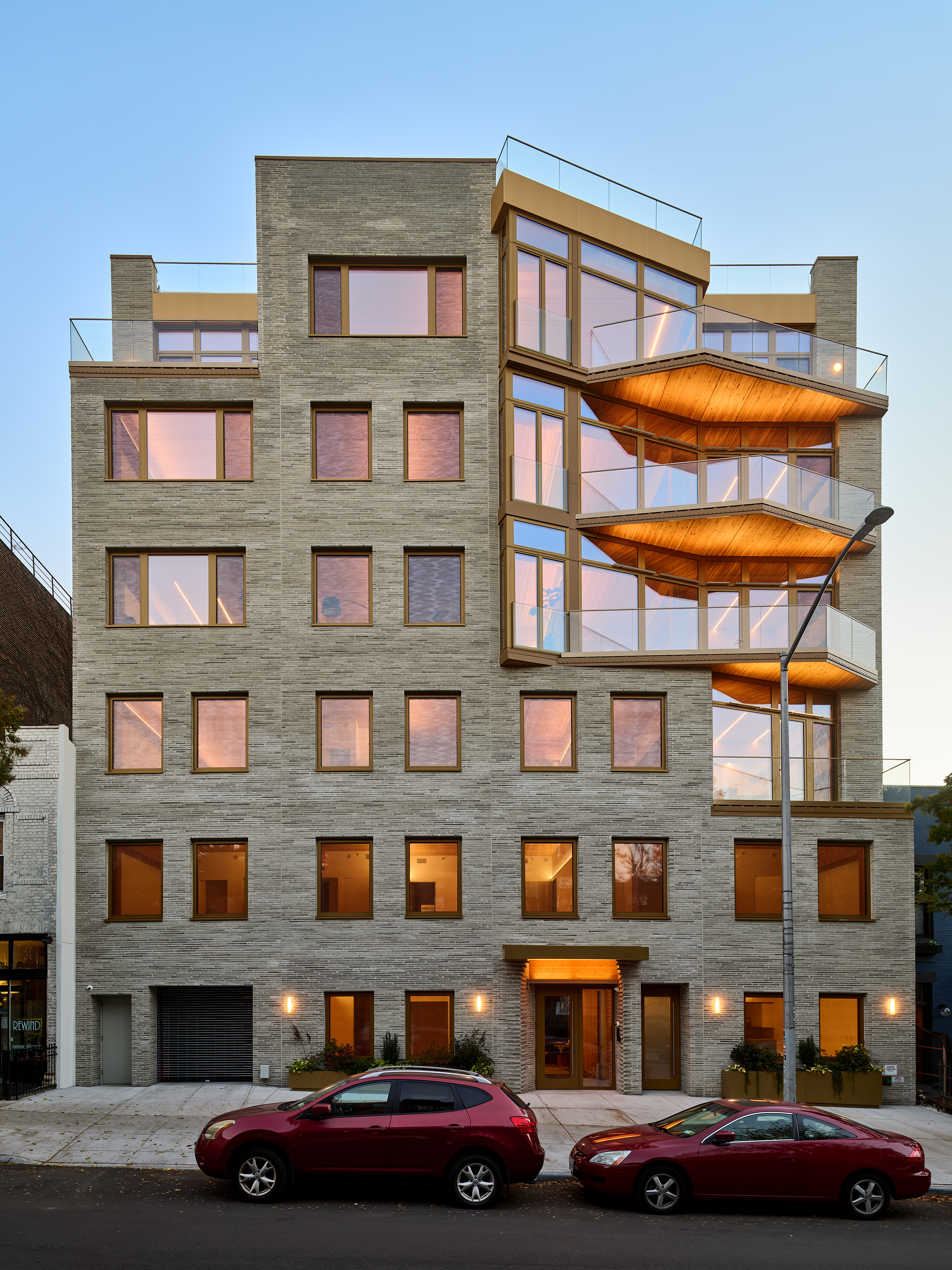
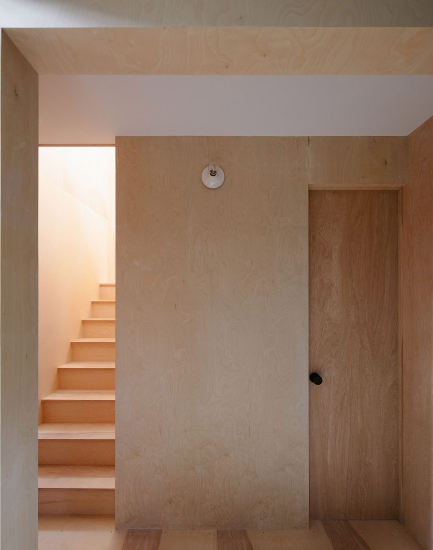
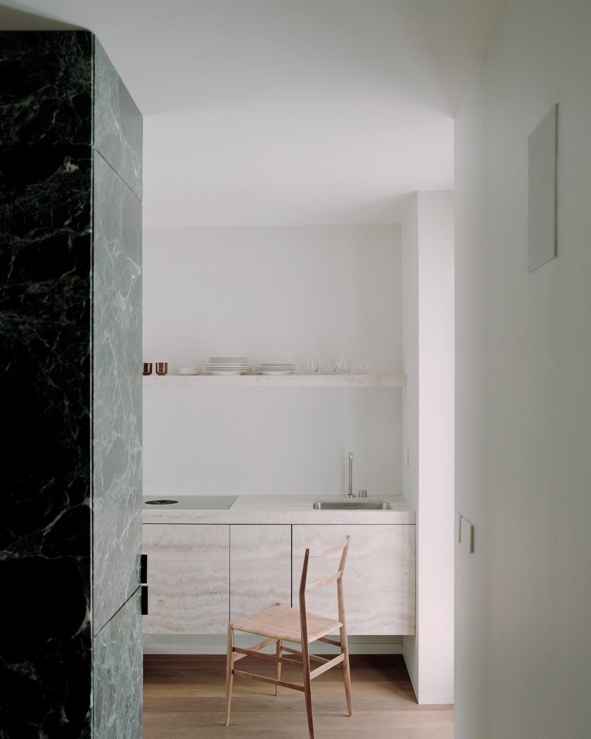
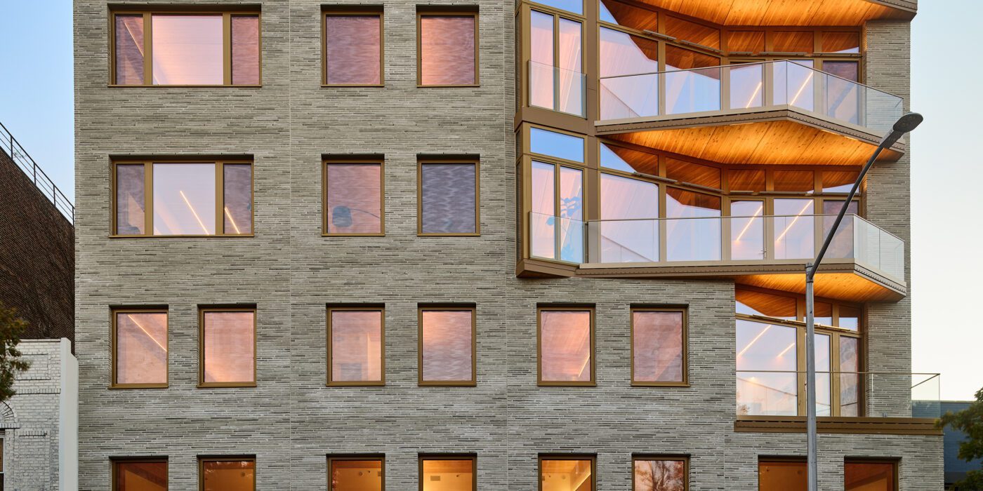
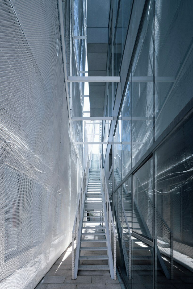
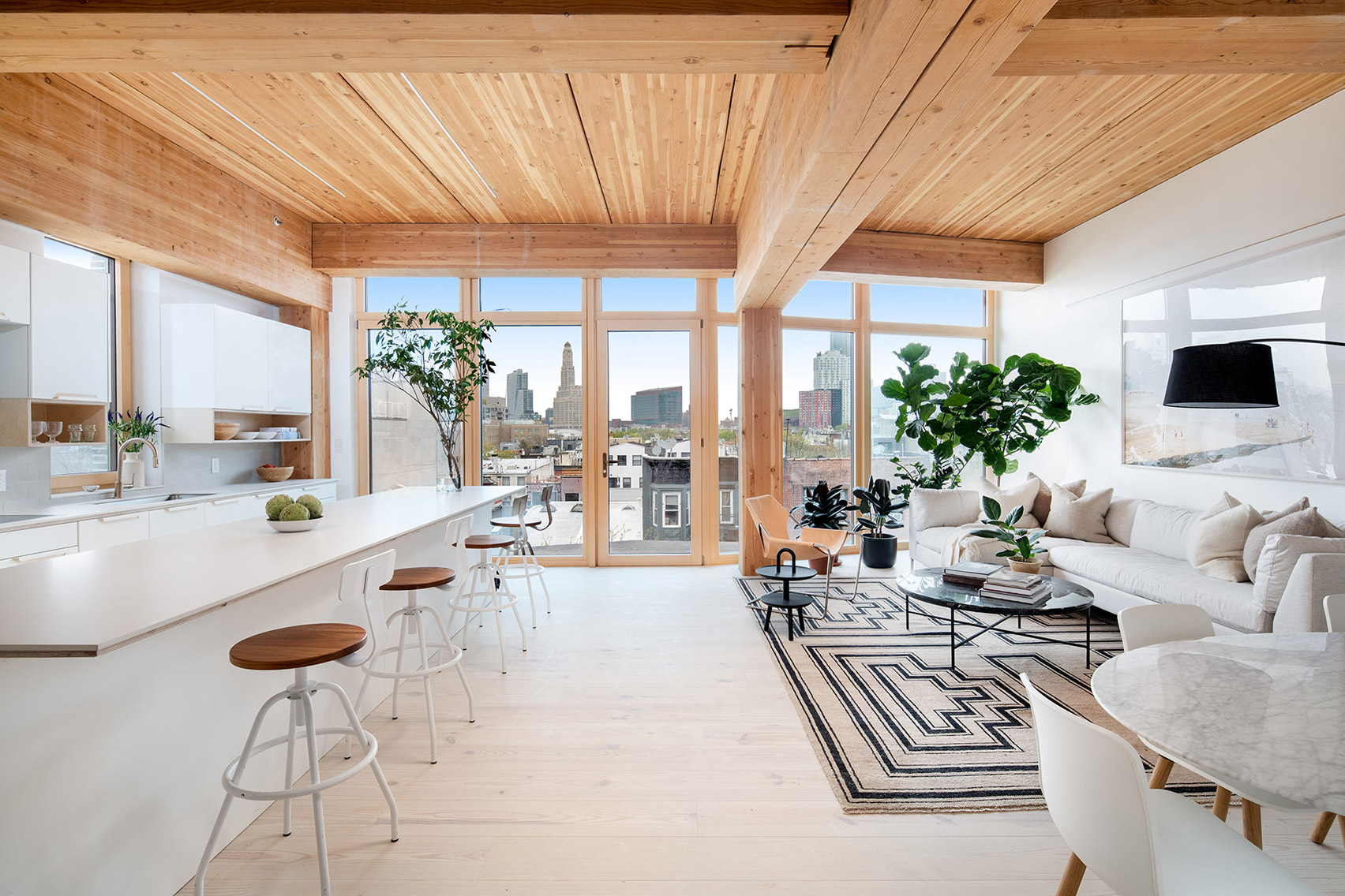
New York is a city known for housing scarcity, and a place that’s defined by reinvention. For Timber House, MESH Architectures was inspired by natural finishes and “botanical architecture.” The idea was not only to foster well-being, but create a new model for timber construction in the city. The project is the first mass-timber condominium in New York, and the structure was built with glue-laminated timber columns, beams, and floor plates. The six-story, multifamily project is comprised of fourteen homes.

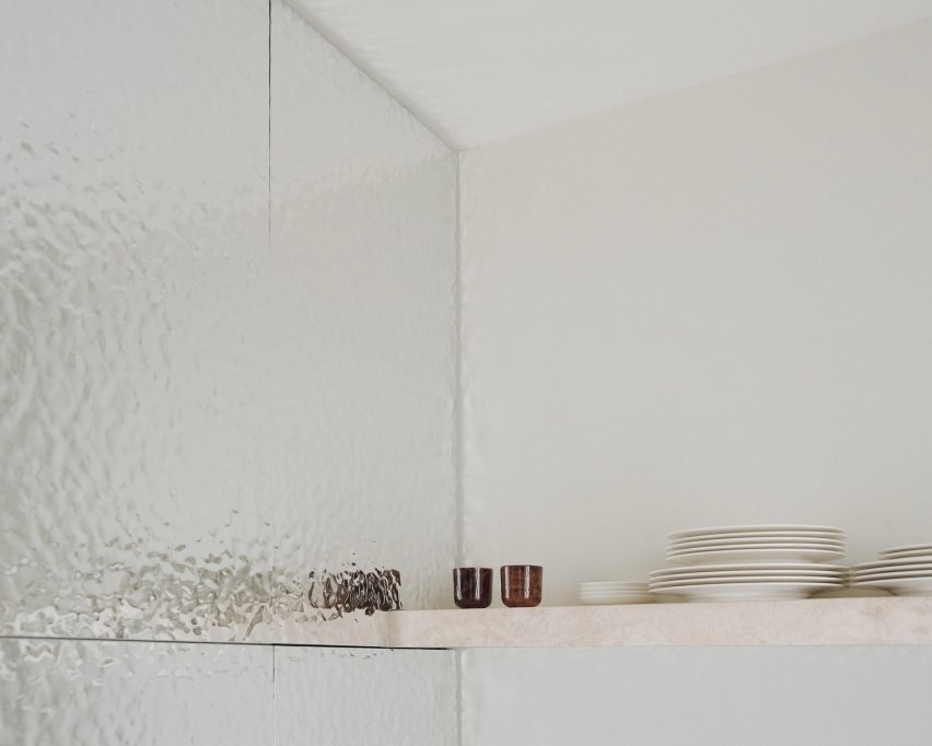
Beyond the novel material approaches to construction in Timber House, it was also a test in learning from passive-house design. Those principles informed its high-performance envelope, with “intensive insulation, smart air sealing, and triple-glazed wood windows.” Less interior finishes were required thanks to leaving the wood structure exposed, while the team also prioritized low-carbon material choices. For Timber House, MESH wanted to demonstrate that sustainable multifamily buildings can balance well-being and comfort, as well as beauty.


Valley

MVRDV, Amsterdam, Netherlands

Jury Winner, 11th Annual A+Awards, Architecture +Façades

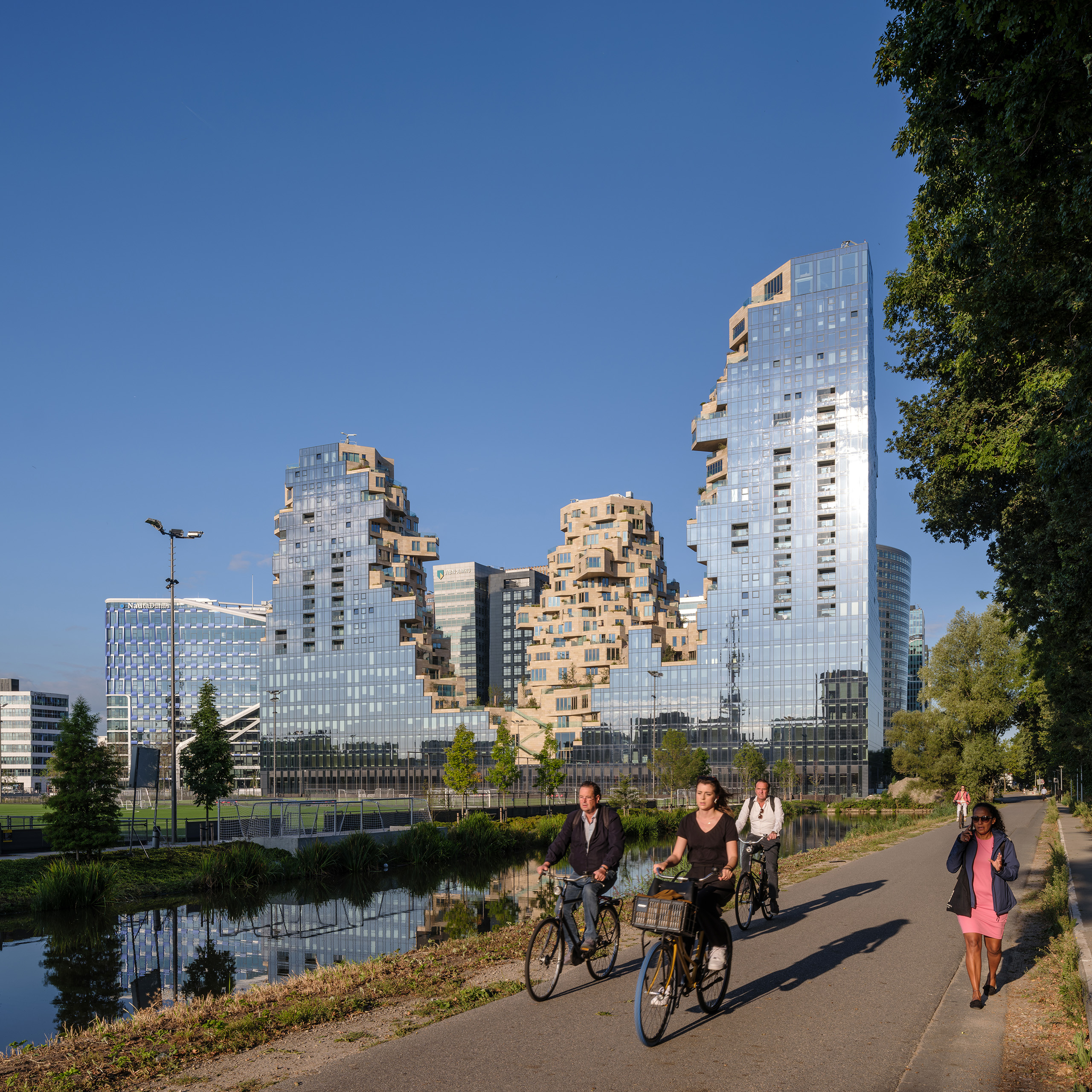
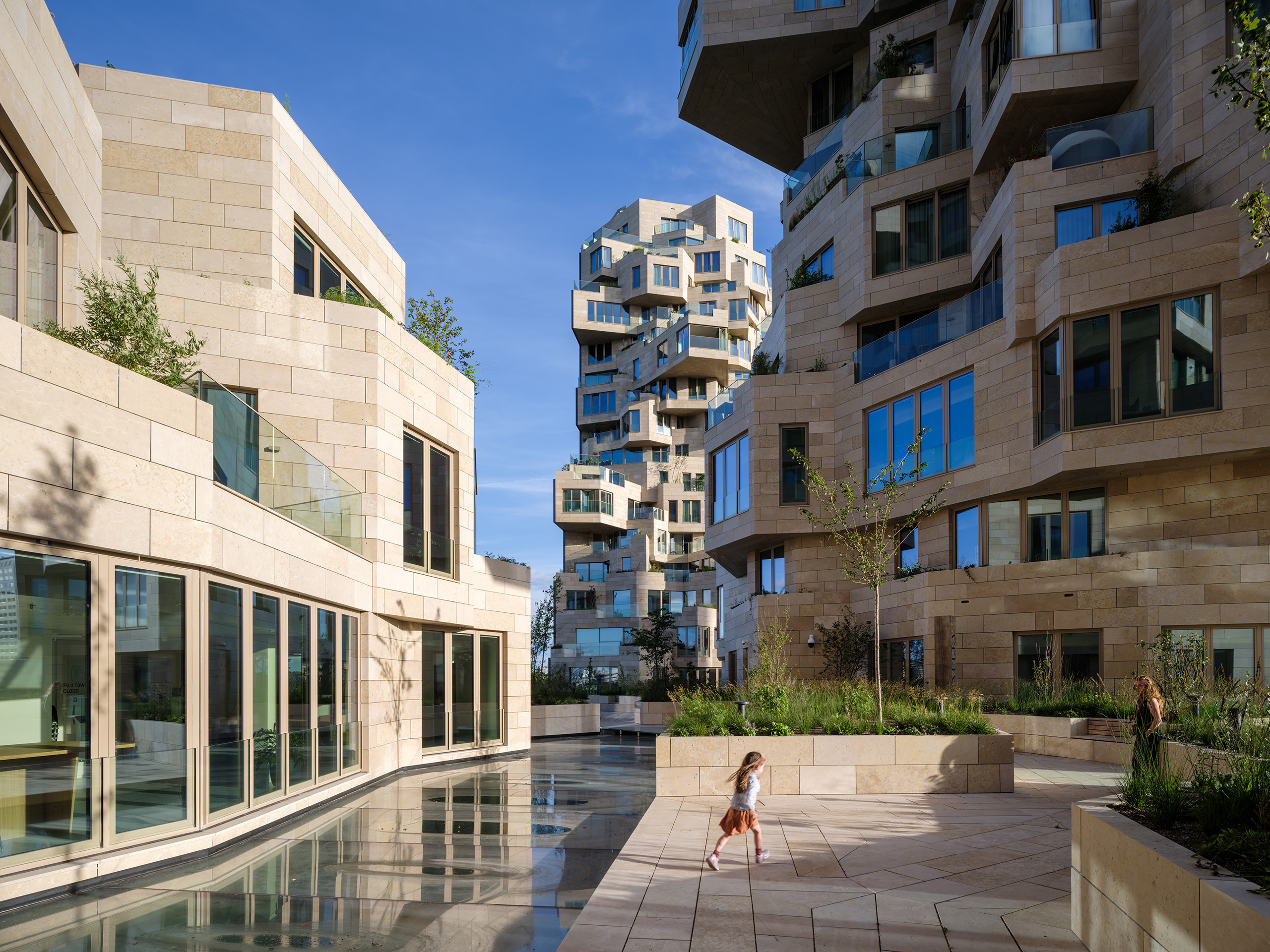
MVRDV has earned a reputation for reinvention and creating new building forms. That same approach extends to housing, where the team designed Valley with a more “green and human” touch. Built for developer Edge, the project is located in Amsterdam Zuidas. Rising to three distinct towers, the façades shift across the complex. The outer edges are mirrored glass, while the inner façades are clad with stone and swaths of greenery.

Valley was built for a mix of residents, as well as workers and visitors. Not only for multifamily housing, the project also includes offices while much of the building is open to the public. For the materials, over 40,000 stone tiles of varying sizes were used throughout the building’s façades. “Each of the 198 apartments has a unique floorplan, made possible by the interior designs by Heyligers Architects.” Outside, the team worked with landscape architect Piet Oudolf on the placement and selection of trees, shrubs and approximately 13,500 smaller plants that are in within the natural stone planters.


One Hundred

Studio Gang, St. Louis, MO, United States

Jury Winner, 9th Annual A+Awards, Multi Unit Housing High Rise (16+ Floors)

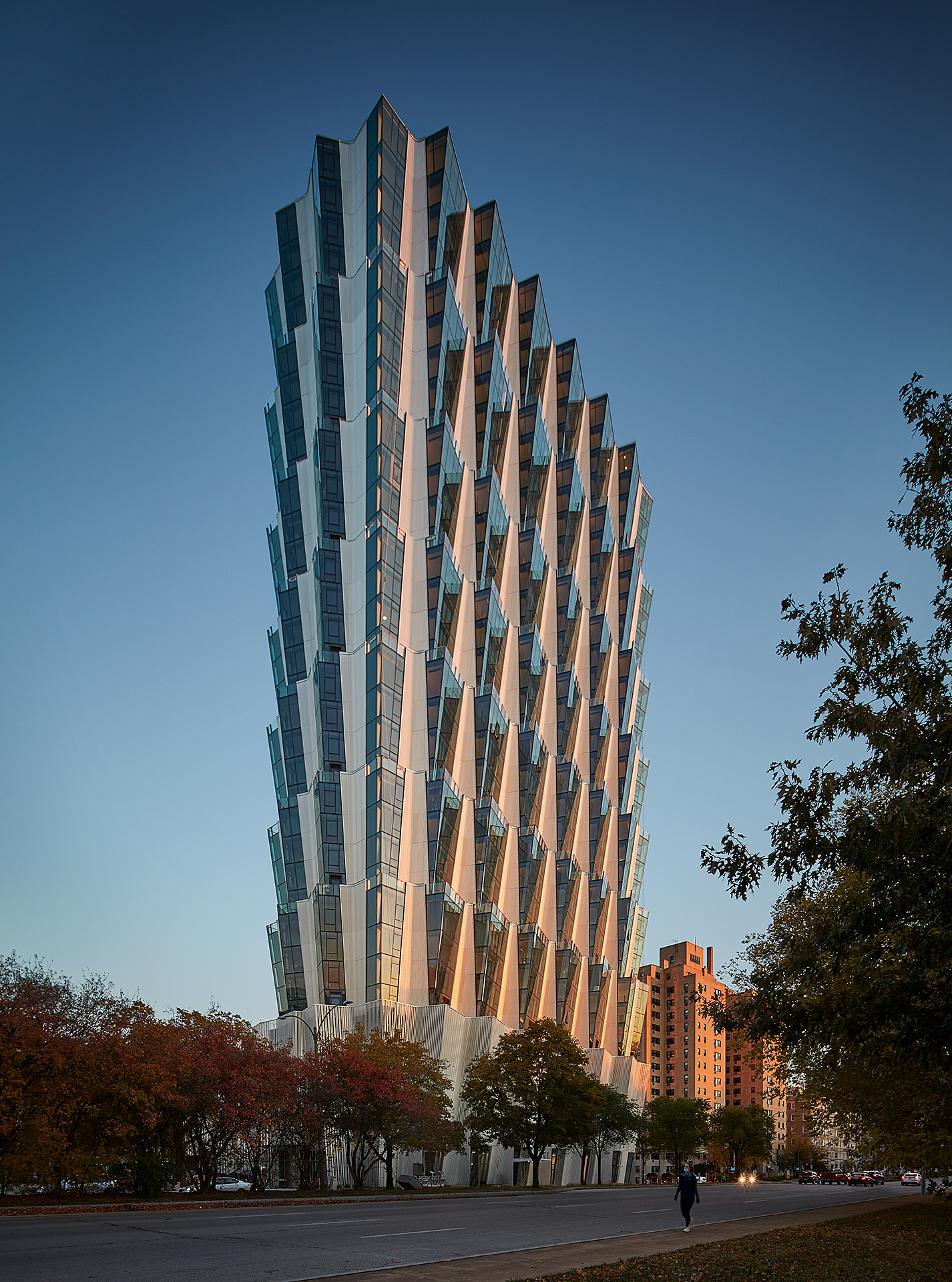
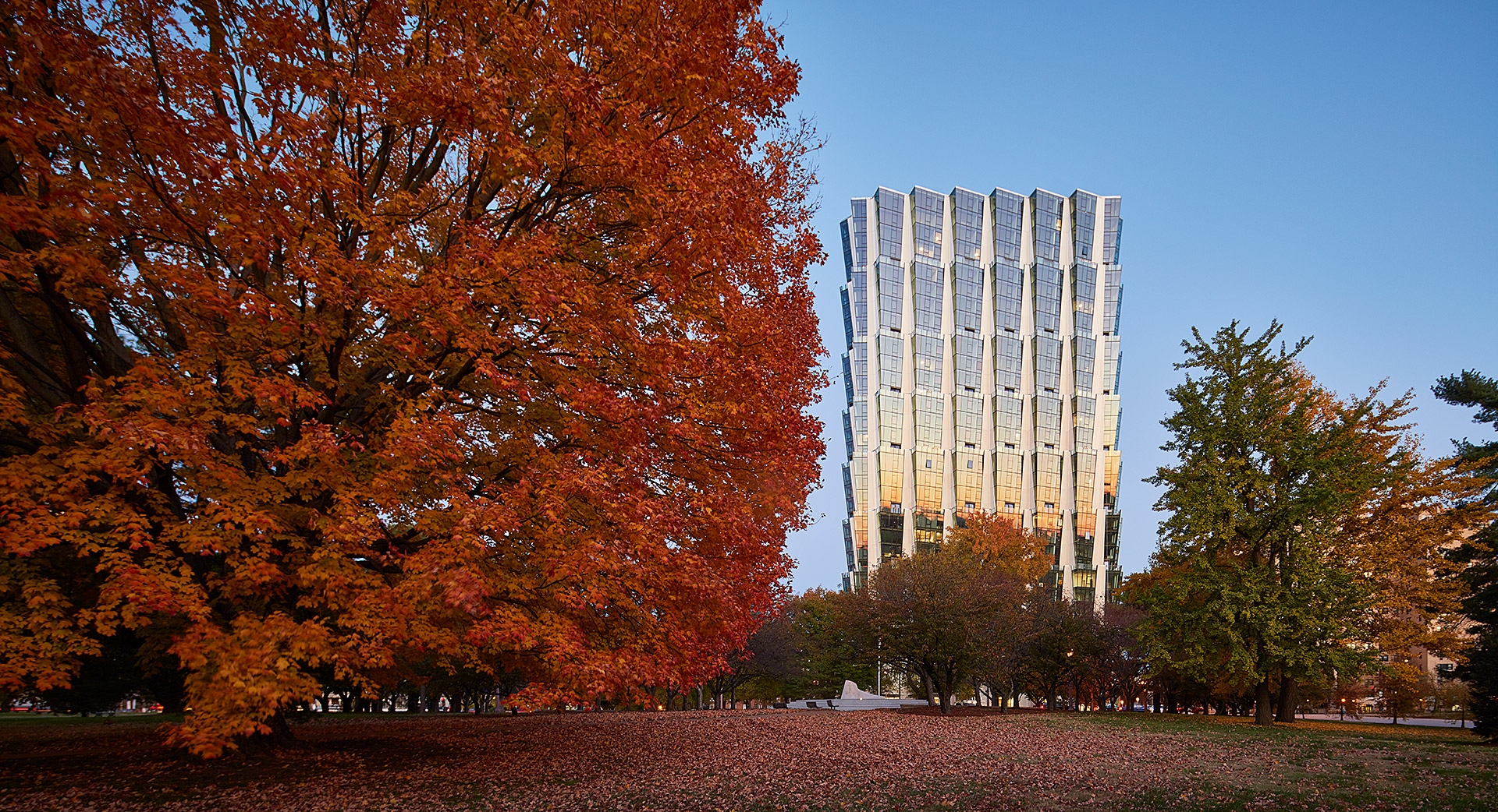
Few locations are more prominent for multifamily housing in St. Louis than Forest Park. Designed by Studio Gang, One Hundred is a residential tower overlooking the park and the studio’s first project in the city. The tower includes a mix of housing, retail and amenities on four-story stacked tiers. The apartments were designed for views of Forest Park and east to the Gateway Arch.

From a formal approach, Studio Gang designed the tower with an angled façade that creates a series of large outdoor spaces atop each tier. This move also produces outdoor space for residents atop the green roof podium. The team notes that, “each apartment features its own corner living room with double exposures that, in addition to offering panoramic views, enhance the amount and quality of daylight within the units.” The tower includes public and retail spaces at ground level adjacent to the park, while establishing a new landmark for St. Louis.


Cirqua Apartments

BKK Architects, Melbourne, Australia

Jury & Popular Choice Winner, 2018 A+Awards, Multi Unit Housing Low Rise (1-4 Floors)

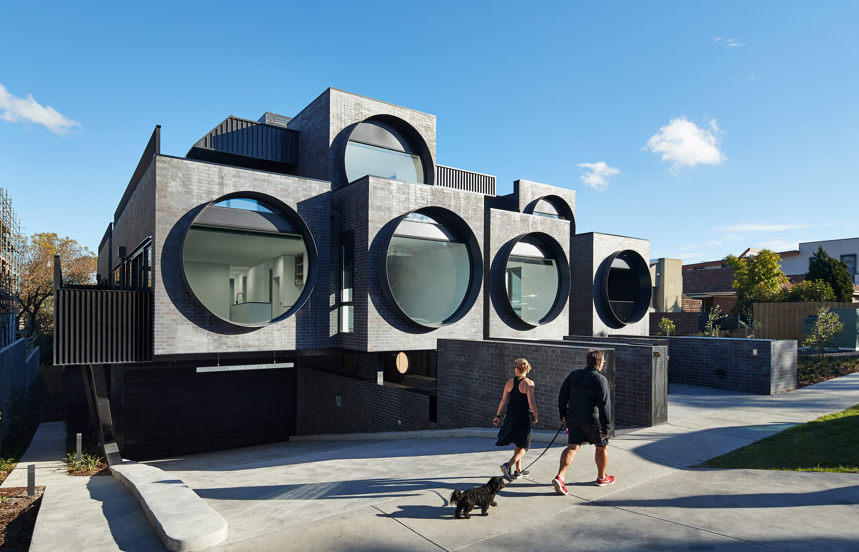
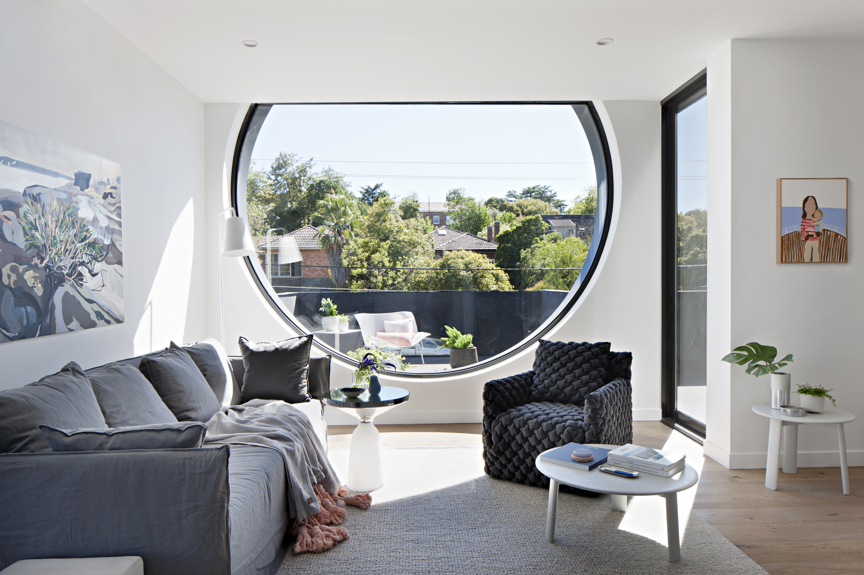
The Cirqua project by BKK gained widespread recognition for creating beautiful, inventive multifamily architecture. The project includes 38 unique unit types out of the 42 total apartments made with spacious balconies and an integrated approach to landscaping. Combining two properties into a single block, the project was formed with careful attention paid to scale and the surrounding context. Cirqua not only showcases a smart, nuanced approach to multifamily housing, but also how to design for accessibility and passive performance.

As the team noted, prospective owners are increasingly buying into the apartment market (over detached housing) as owner-occupiers. A sense of place was a key driver of the design, establishing a neighborly feel. All living areas and bedrooms have direct access to ventilation, natural light and views, while maximizing glazing created connections to the surrounding garden. From the neighborhood scale, a study in massing led to reducing the overall building volume to make the development fit seamlessly into its site.


Caterpillar

Prince Concepts, Detroit, MI, United States

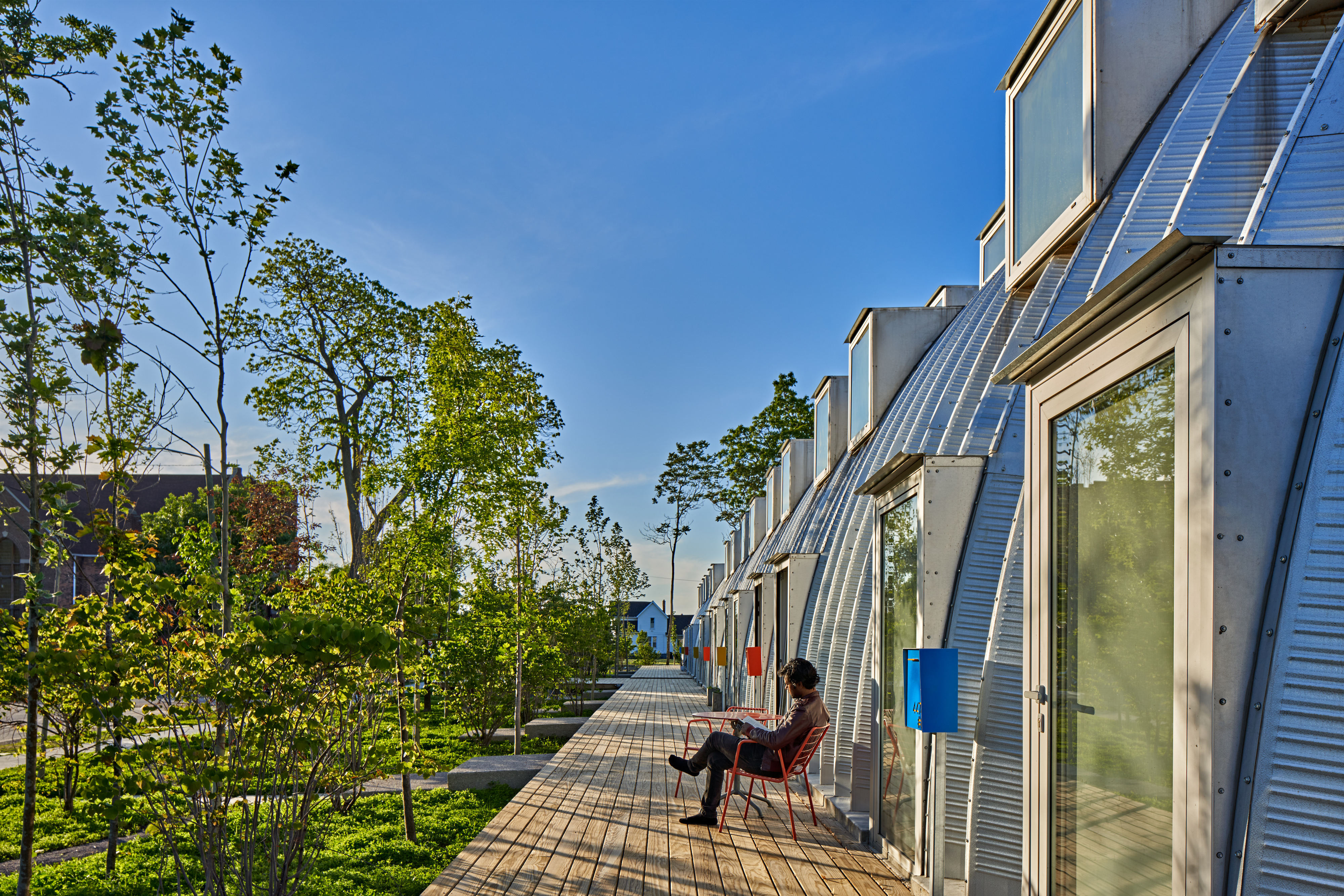
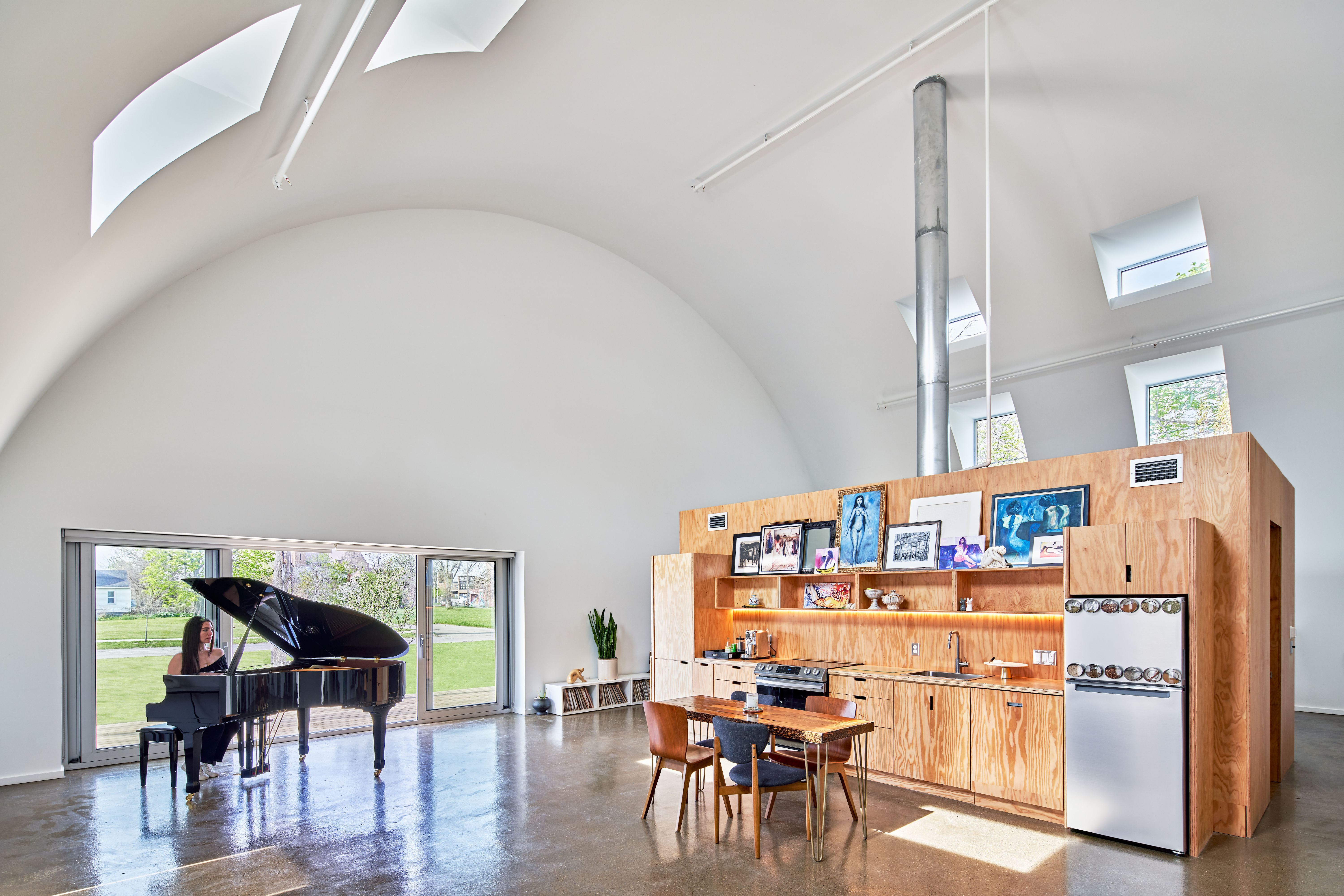
Caterpillar approaches density through a novel construction and design in Core City, Detroit. It utilizes a Quonset Hut structure that holds eight units, all entirely prefabricated. The result is an 8,000 square foot (745 square meter) residential project that prioritizes indoor and outdoor space. Prince Concepts created the project with tall ceilings that rise to 23 feet (7 meters); the units were designed to capture morning light in the bedrooms and evening sunsets in the living room.

Multifamily housing and density are charged subjects, but they also hold the potential to reimagine everyday life in cities. For Caterpillar, the team wanted to rethink the standard ratios of a multifamily project. To do so, instead of “150 apartments surrounded by eight trees with just one window per room, Caterpillar provides eight apartments surrounded by 150 trees and 12-18 windows per room.” The multifamily project built on the success of True North, completed in 2017. That Prince Concepts development was made with eight Quonset huts and ten leasable units.


Casa Jardin Escandon

CPDA ARQUITECTOS, Mexico City, Mexico

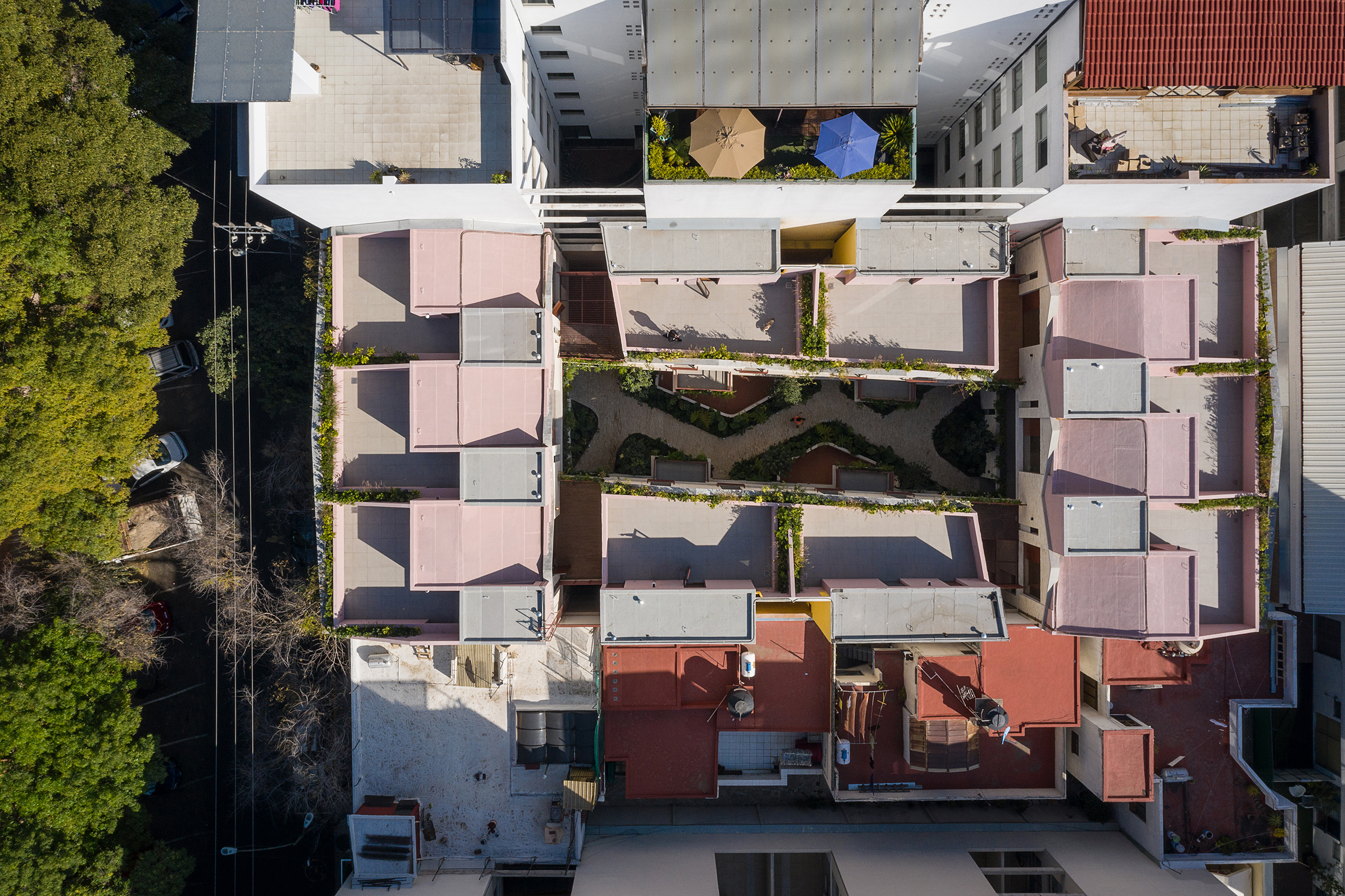
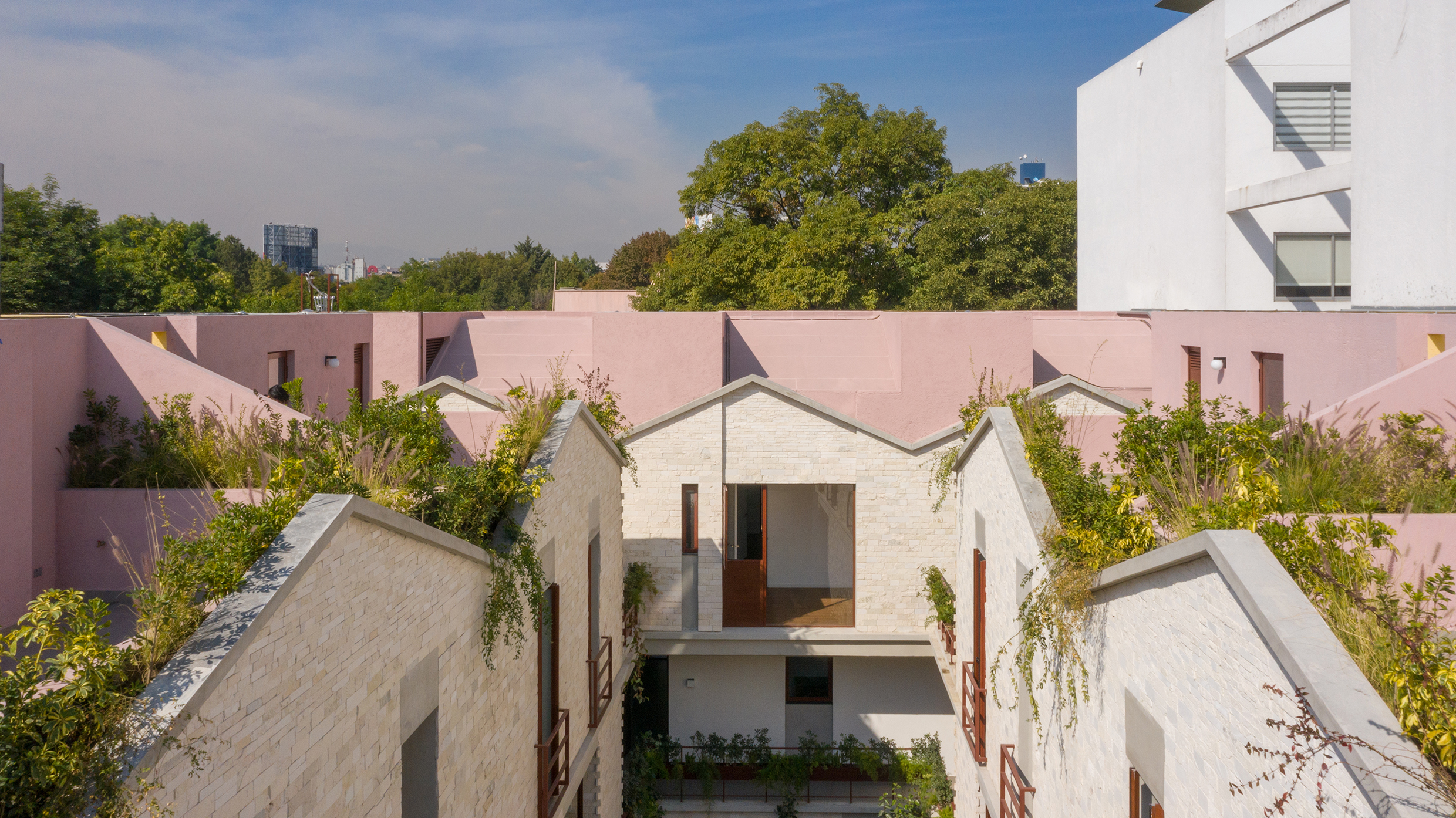
CPDA Architects designed this garden house project as a multifamily development in Mexico City. Located in the Escandón neighborhood, the project includes fourteen residential units. At its heart, a central courtyard is the connective element that defines the housing project, opening up access to natural light and cross ventilation. Ten townhouse units are set up the four ground-floor units below, all of which share a similar material relationship.

As the Escandón neighborhood has seen rapid growth, new populations moved in across age and income levels. The project provides a mix of unit types, as well as changing faces along its façade. The exterior showcases the concrete slabs that stand out and the gabled façade, while the interior has simple, seamless and integrated forms that define the inside complex. The idea was to create a “secret garden” that residents can enjoy within the city.


The SIX Veterans Housing

Brooks + Scarpa Architects, Los Angeles, CA, United States

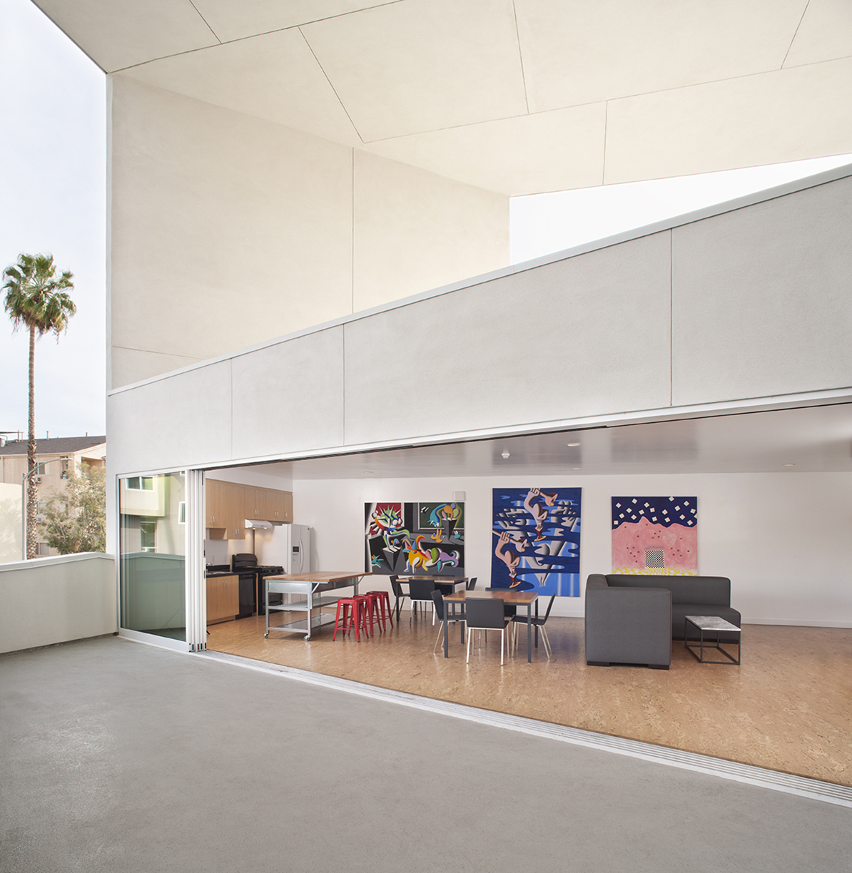
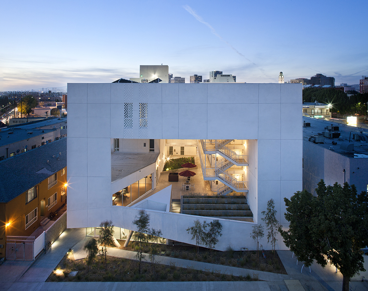
Few cities in the world are grappling with homelessness and a severe lack of housing affordability like Los Angeles. Brooks+Scarpa has built a practice addressing issues in the city and across the nation. For this multifamily residential, The SIX was designed as a 52-unit affordable housing project that “provides a home, support services and rehabilitation for previously homeless and/or disabled veterans.”

Located in the MacArthur Park area of Los Angeles, The SIX was made to break the mold of multifamily housing by creating public and private “zones” in which private space was deemphasized to create large public areas. At ground level, the program includes support spaces for veterans, as well as bike storage, parking and offices. The second level is the core of the project, with a large, public courtyard. The idea was to create a community-oriented, interactive space that opens to its surroundings.


Jinshan 9

Steffian Bradley Architects, Shenzhen, China

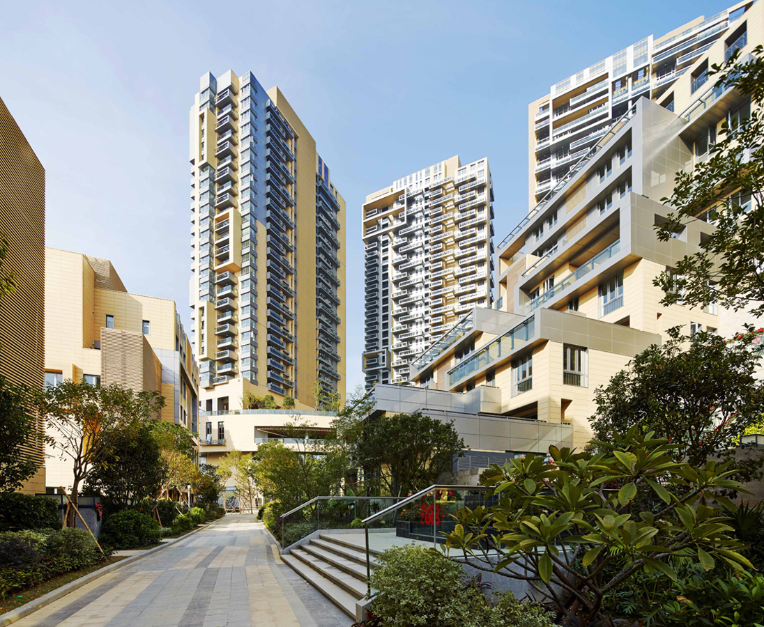
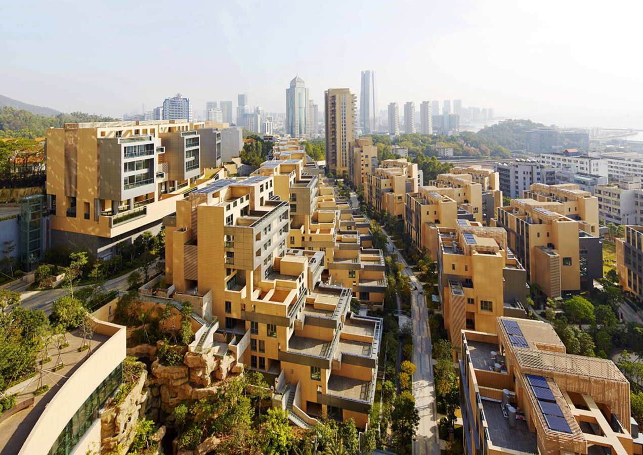
Over the last two decades, development in China has been defined by a dizzying pace and new architecture produce in-mass. For Jinshan 9, this force behind new buildings was directed into a multifamily living community. Located in China’s Shekou mixed-use district, the project looks out west to wild, forested mountains and east to Shenzhen Bay Bridge. With a range of both low-rise and high-rise structures, the development was made for diverse lifestyles and populations.

With 210 townhouse units, the project also has four residential towers rising 32 floors in height. Between integrated pedestrian paths and trails, the development comprises a network of gardens and interconnected terraces. From its material palette, Jinshan 9 includes natural-colored terracotta panels with aluminum trim on the exterior. This combines with marine-inspired imagery and forms, like balcony details echoing sailboat decks.

Architects: Want to have your project featured? Showcase your work through Architizer and sign up for our inspirational newsletters.

Reference

Colourful interior of studio for Method Architecture
CategoriesInterior Design

Method Architecture outfits own Houston studio with vibrant mural

Texas studio Method Architecture has completed an office for itself in Houston with maximalist design, vibrant colours and a mural at its centre.

The 8,612-square foot (800-square metre) studio was completed in 2023 with a reception area, open office plan, private and collaborative meeting spaces and staff lounges.

Colourful interior of studio for Method ArchitectureColourful interior of studio for Method Architecture
Method Architecture has completed its self-designed studio

Located in the mixed-use East River development, designed by architecture studio Page, the office was designed to serve as an inspiration source for the studio’s clients.

“Our approach was to pursue maximalism with the goal of creating an environment where our clients would feel safe expressing their bold and innovative ideas with us,” Ashley Bettcher, Research and Design Specialist with Method Architecture told Dezeen.

Table tennis table in Method Architecture's studioTable tennis table in Method Architecture's studio
The office was designed to serve as an inspiration source

“Creativity has no limits and great design doesn’t necessarily need to cost more. Method’s new Houston office perfectly encapsulates that mantra.”

The “ego-free” focus of the design is a nearly 50-foot multi-wall mural by local artist David Maldonado, known for creating nearly 20 pieces of public artwork throughout Houston.

Multi-wall mural by David MaldonadoMulti-wall mural by David Maldonado
David Maldonado created a multi-wall mural for the studio

With pops of magenta, cobalt, and yellow, the mural features icons from the city and state like the skyline, a rocket for Johnson Space Center, a bluebonnet as the Texas state flower, and the neighbouring Buffalo Bayou.

The artwork also slips in custom motifs representing the studio, such as Method’s rubber duck mascot.

Acoustic baffles suspended from the ceilingAcoustic baffles suspended from the ceiling
Light grey flower-like acoustic baffles hang from the ceiling

“This feature piece of artwork helps set the tone for the remainder of the office including bold colors, geometric patterns and shapes and a secondary mural designed and installed by Maldanado featuring drip paint in mirroring colorways located at the back of the office,” the team said.

The mural is complemented by a 3D-printed wall installation behind the reception desk composed of the studio’s signature “M” logo and the raw ceiling with exposed mechanical lines all painted a vibrant shade of fuchsia.

Half-arched portal at Method Architecture officeHalf-arched portal at Method Architecture office
Clients pass through a half-arched portal

Light grey flower-like acoustic baffles hang from the ceiling adding to the maximalist design. Light blue bicycles are mounted on one wall as another unique installation.

From the reception area lounge, clients pass through a half-arched portal – created with custom millwork and embedded lights – into the main office space which includes rows of desks over custom greyscale carpet.

Desks and geometric carpet in self-designed studioDesks and geometric carpet in self-designed studio
Hotel desk stations accommodate hybrid work styles

Hotel desk stations accommodate hybrid work styles for both in-office and at-home work.

“Cozy architectural work booths are nestled amid the bustling breakroom and office areas, offering a quiet refuge for more private work, private conversations or meals with coworkers,” the team said.

The workspace is flanked by six meeting rooms: a large creative conference space, three medium-sized conference rooms and two smaller huddle spaces.

The all-white conference room was left intentionally blank to showcase the client’s material selections with tunable white lights to adjust the light temperature for each project.

M-shaped window cutoutM-shaped window cutout
An M-shaped window cutout opens the conference room to the rest of the office

An M-shaped window cutout opens the conference room to the rest of the office.

In the break room, bright blue suede fabric adorns the walls to provide an unexpected texture and pale blue lamp shades – reminiscent of the shape of inverted cupcake liners – serve as a geometric juxtaposition to the rounded banquette boxes.

Bright blue-walled break roomBright blue-walled break room
Bright blue suede fabric adorns the walls in the break room

“Plush, psychedelic-inspired fabrics in meeting booths and distinctive light fixtures keep the space feeling light and fun to inspire creative design,” the studio said.

In addition to being designed for flexible workflows and teams, the space features multiple sustainable and WELL features like ample daylighting, repurposed materials and ergonomic furniture.

Other recently completed projects in Houston include Nelson Byrd Woltz’s grassed park that bridges a six-lane highway and Modu’s design for a wellness building with a self-cooling exterior.

The photography is by Ana Larranaga, Method Architecture.


Project credits:

Architecture: Method Architecture
MEP: Telios Engineering
General contractor: Burton Construction
Furniture: AGILE Interiors, MDI, OP,
Flooring: Interface, Shaw Contract
Tile: Trinity Surfaces, La Nova
Textiles: Knoll Textiles
Masonry: Upchurch Kimbrough
Demountable partitions: DIRTT
Countertops: CAMBRIA
Mural: David Maldonado
Lighting: Lighting Associates Inc.
Signage: ARIA Signs


Reference

Next-gen care: AI spots early signs of health decline
CategoriesSustainable News

Next-gen care: AI spots early signs of health decline

Spotted: An ageing population, combined with the potential growth of dementia, is contributing to the immense pressure being put on the UK’s National Health Service (NHS). Part of the challenge lies in the high numbers of vulnerable people admitted to A&E, who are then kept in hospital while a suitable care home is found, or homecare support is organised.  

Remote monitoring technologies help care teams quickly respond to emergencies and often provide a life-saving service. Physiotherapist Louise Rogerson and data scientist Jonathan Burr wanted to find a way to prevent some of those emergency admissions by deploying smart home care earlier and in more detail. The co-founders built Howz, a smart home care monitoring system that works to prevent falls and other injuries by identifying slight changes in a patient’s behaviour.  

Using artificial intelligence (AI), a motion sensor, smart plug, door sensor, and hub, Howz’s package helps carers track energy use and at-home movements. The AI quickly establishes a base routine for each patient and uses that information to identify early behavioural changes and capability that indicate a possible need for social care support. Those early alerts – such as no electric kettle use that day – help social care teams and family carers spot and react to small changes that may otherwise go unseen with current home care monitoring systems, before a more serious accident can occur.  

It takes only minutes to install the Howz system and data is available instantly via the app for individual carers and healthcare professionals. Howz provides round-the-clock monitoring and a care dashboard for those in charge of multiple patients. At the same time, privacy is an essential part of the system. No personal data is collected, and the main account holder can add or delete permissions for those using the app. Results show that the use of Howz reduces emergency admissions by 32 per cent and the risk of care home admission by 42 per cent. 

From Parkinson’s to mental health, Springwise’s library includes a variety of innovations using AI to provide customised, timely healthcare interventions.

Written By: Keely Khoury

Reference

metal mesh facade veils TAO's transient in-between pavilion in nantou ancient town
CategoriesArchitecture

metal mesh veils TAO’s transient in-between pavilion in shenzhen

tao’s translucent structure echos the urban village’s vitality


A delicately symbiotic gallery space, Trace Architecture Office’s (TAO) In-between Pavilion is an urban renewal project that tucks within a compressed urban node in Nantou Ancient Town, Shenzhen. Part of the Diverse Homology Museum complex, the space within delves into the interplay between political power and geography in the Pearl River Delta region. Along the streetfront, reflecting the active state of rapid evolution in the town, the pavilion embraces a transient approach and its architecture mirrors the urban village’s vitality, adapting to temporary and fragmented additions. A light and semi-translucent metal mesh facade, like a hazy veil, gracefully blurs the indoor-outdoor boundary, embodying ambiguity and order, openness and closure, solid and void. These evolving changes unfold throughout the day, echoing its dynamic context with a diverse and vibrant spatial experience inside and out.

metal mesh facade veils TAO's transient in-between pavilion in nantou ancient town
images by Chen Hao, TAL, Hua Li, and Mei Kejia


a transition from solid to void, openness and closure


Once a densely packed and compressed area in the north side of the town, the site sitting between two residences underwent constant renewal over time, resulting in a distinctive aesthetic of chaos and vitality. The autonomous and spontaneous construction in the urban village has resulted in a confined spatial layout and visual occlusion within the architecture. Now, it encompasses three distinct property plots that transition from private residences to a public domain. This shift prompts a proactive design response to connect with surrounding public spaces.


At street level, TAO’s architectural volume recedes from the delicate outer metal skin, creating a multifaceted space that blends the building with the street while reflecting the diversity of the urban village. A vertical street, formed between volumes and mesh skin, provides meandering access to galleries and a roof terrace, offering various perspectives of the town. When observed from the city, the moving figures strolling behind the hazy facade also inject the building with a dynamic nature.

metal mesh facade veils TAO's transient in-between pavilion in nantou ancient town


Due to spatial limitations, the architects’ design maximizes floor area utilization, projecting volumes further outwards as floors ascend, establishing a unique physical rhythm and urban gap space. Structurally, inclined columns support the volumes on the east side and west sides, with the west side’s overhanging framework exposed externally, while the middle columns remain concealed within the walls. Different forms of space thusly emerge and embody a sense of lightweight structural aesthetics.

metal mesh facade veils TAO's transient in-between pavilion in nantou ancient town

metal mesh facade veils TAO's transient in-between pavilion in nantou ancient town

Reference

a retail store in LA with large windows
CategoriesInterior Design

PlayLab Inc centres “space for conversation” in Los Angeles retail store

LA studio PlayLab Inc has created a flagship store that contains a sky blue conversation pit at its centre for local clothing brand MadHappy.

PlayLab Inc split the West Hollywood store into two distinct zones – one for retail space and the other for “intimate gathering spaces”, including a cafe and a courtyard.

a retail store in LA with large windowsa retail store in LA with large windows
PlayLab Inc has created a flagship store for LA clothing brand MadHappy

“Our collective goal with the design was to put space for conversation at the heart of the retail experience, creating a place that is equal parts for community dialogue and product,” PlayLab Inc co-founder Jeff Franklin told Dezeen.

“To do this we split the space down the middle, making one half a clear utility for shopping and the other a collection of intimate gathering spaces.”

a conversation pit made of light blue seatinga conversation pit made of light blue seating
The space was divided into separate zones for gathering and retail

Visitors enter the 2,800-square-foot (260-square-metre) store through a glass facade, which leads into a large open space with powder blue concrete flooring running throughout.

At the entrance, a blue bench emerges from a small exterior porch, while a boulder sits opposite.

a courtyard with large sliding glass doors and various stoolsa courtyard with large sliding glass doors and various stools
A cafe and courtyard were placed at the back of the store

Towards one side, the store contains a 70’s style conversation pit underneath a large skylight. Plush, sky-blue couches line the seating area, with satin aluminium side tables by Berlin-based studio New Tendency placed alongside them.

Along an adjacent limewashed wall, the studio installed built-in shelving flanked by large custom wooden speakers by New York music studio designer Danny Keith Taylor of House Under Magic.

small light green stools and tree with blue floorsmall light green stools and tree with blue floor
The courtyard was populated with a single tree and green-stained plywood stools by Waka Waka

The social area leads into a small open-air courtyard populated by a single Tree Aloe installed by Cactus Store and green-stained plywood stools by LA studio Waka Waka.

The same green plywood was used to line the takeout window of the store’s Pantry cafe, which sits in an enclosed corner and serves local and global cuisines from brands including Japanese-based café Hotel Drugs and LA bakery Courage Bagels.

a cafe space in a retail storea cafe space in a retail store
Custom signage was installed along the cafe’s takeout window

A custom lightbox and a large standing menu were installed next to the takeout window to display the cafe’s signage and goods.

In the remaining interior, PlayLab Inc created a large metallic “retail bar” that spans the shop’s length for “open views of the product”, according to Franklin. The studio also dispersed custom Lego-like benches around the space, which were covered in a candy apple red gloss.

an illuminated cube signan illuminated cube sign
The store will act as a retail space and venue

Faux-stone stools and a bench were installed throughout the space.

The store also contains a multimedia room, called the Local Optimist Space, a creative venue that will host audio and visual artwork.

“The design was inspired by the concept of conversation between things – a balance of scales, materials and textures,” said Franklin.

This is the first flagship store for the clothing brand MadHappy, which previously operated from a host of pop-up concepts and stores.

wooden speakerswooden speakers
Local designers worked on furniture and other pieces for the store

“From the beginning, physical retail has been essential to Madhappy and its success. We’ve always viewed our shops as spaces that go beyond something purely transactional – we want them to allow our community to engage with Madhappy beyond what’s possible digitally,” MadHappy co-founder Mason Spector said in a statement.

Other recent projects by PlayLab Inc also include a plexiglass skatepark for Vans and a lifesize toy racetrack set for a Louis Vuitton menswear show.

The photography is by Sean Davidson.


Reference