A new era of energy: district heating and cooling that uses CO2
CategoriesSustainable News

A new era of energy: district heating and cooling that uses CO2

Spotted: Almost 25 per cent of the energy produced worldwide is used to heat and cool homes and commercial buildings. And the process of generating this energy is a major source of greenhouse gas emissions. District heating and cooling systems are one potential solution. These generate heat centrally and distribute it across a network of buildings in the same neighbourhood, which is more efficient than heating or cooling buildings individually. Usually, such systems use water to transfer heat, but now, Swiss cleantech startup ExerGo is using CO2 as an energy transfer fluid for its closed-loop system.

The CO2 is the basis of a thermal network powered by renewable resources and waste heat. By using liquid and vapour CO2 as a working fluid, the system increases energy transport efficiency over conventional water-based systems. This greater efficiency, in turn, allows for the use of small and more flexible piping, which can save up to 60 per cent in installation costs and time, while reducing noise and air pollution. ExerGo claims that its compact network can save up to 80 per cent in primary energy consumption over comparable fossil fuel-based systems.

In October last year, ExerGo won the European Heat Pump Association‘s Heat Pump City of the Year Award for the successful implementation of its technology in Sion, Switzerland.

Springwise has spotted other technologies that are helping to decarbonise the energy-intensive cooling and heating systems used around the world, including a heat pump that is powered by sound and affordable geothermal heating and cooling systems.

Written By: Lisa Magloff

Reference

10 Best Architecture Firms in Iceland
CategoriesArchitecture

10 Best Architecture Firms in Iceland

These annual rankings were last updated on March 29th, 2024. Want to see your firm on next year’s list? Continue reading for more on how you can improve your studio’s ranking.

Land of breathtaking terrains and jarring winds, Iceland is known for its magical landscapes filled with lava fields, fjords, and verdant hills. Located south of the Arctic Circle, Iceland’s rugged landscape is firmly tied to its built environment, which is fused with a deeply functional architectural language. One of the nation’s earlier building traditions is the turf home. Covered with an exterior turf shell, they simultaneously insulate the home and camouflage into the environment.

The nation’s architecture is equally attributed to its Scandinavian neighbors. In the 18th century, Danish architects introduced gable-fronted structures and stone construction to Iceland, which led to a boom in masonry craft and stone creations. Other foreign influences, such as Classical ideas and Swiss designs, were also imported. Notwithstanding, Icelandic design remained practical. In the 30s, functionalism found its way north and found fertile soil in Iceland.

Following Iceland’s independence from Denmark, modernism began to inform the nation’s architecture. Today’s Icelandic designers admirably balance past and present. Fusing past traditions with modern innovations, contemporary Icelandic architecture remains beautiful, functional and deeply connected to its unrestrained climatic conditions.

With so many architecture firms to choose from, it’s challenging for clients to identify the industry leaders that will be an ideal fit for their project needs. Fortunately, Architizer is able to provide guidance on the top design firms in Iceland based on more than a decade of data and industry knowledge.

How are these architecture firms ranked?

The following ranking has been created according to key statistics that demonstrate each firm’s level of architectural excellence. The following metrics have been accumulated to establish each architecture firm’s ranking, in order of priority:

  • The number of A+Awards won (2013 to 2024)
  • The number of A+Awards finalists (2013 to 2024)
  • The number of projects selected as “Project of the Day” (2009 to 2024)
  • The number of projects selected as “Featured Project” (2009 to 2024)
  • The number of projects uploaded to Architizer (2009 to 2024)

Each of these metrics is explained in more detail at the foot of this article. This ranking list will be updated annually, taking into account new achievements of Iceland architecture firms throughout the year.

Without further ado, here are the 10 best architecture firms in Iceland:


10. Studio Granda
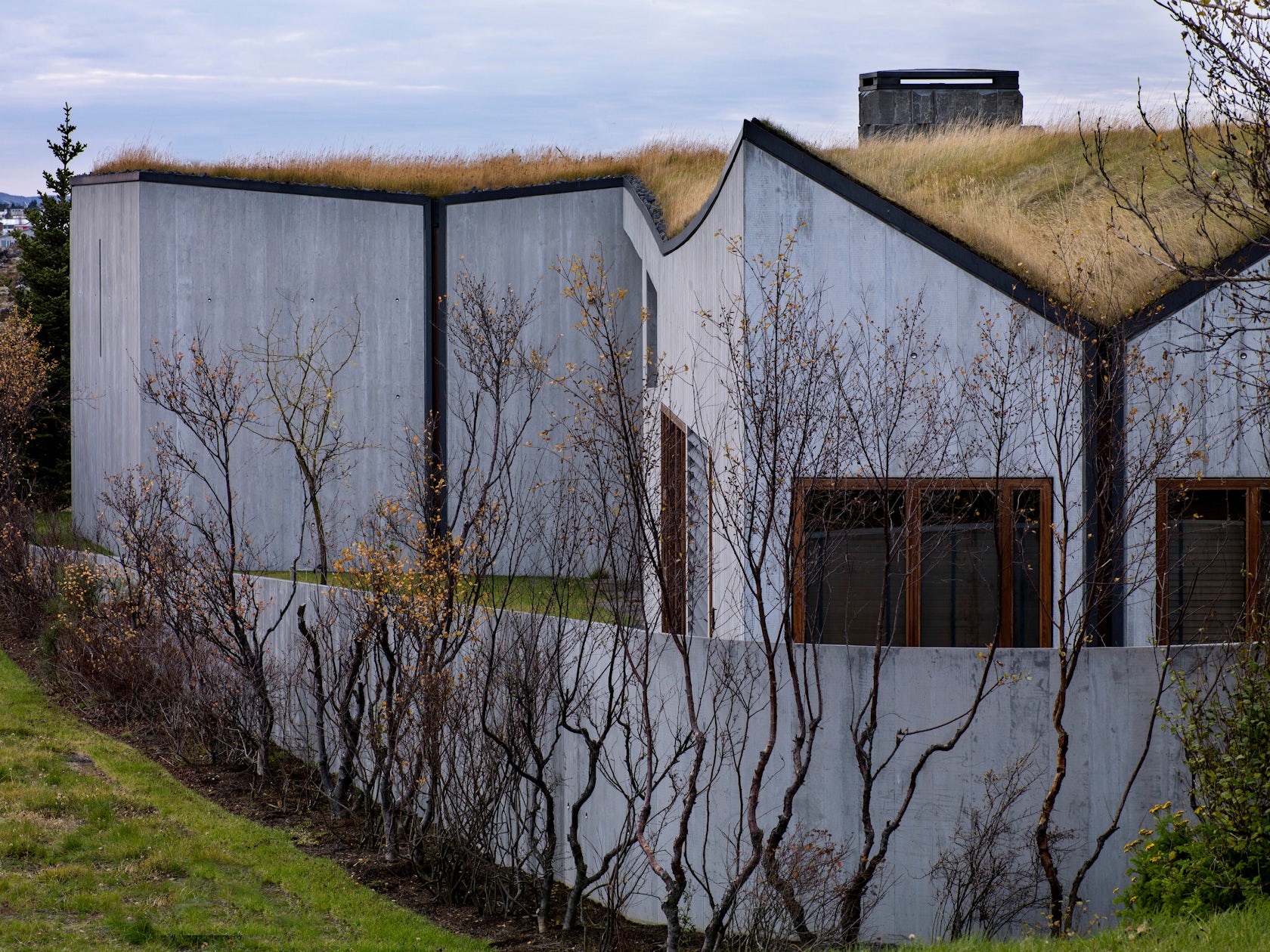
© Studio Granda

© Studio Granda

Studio Granda was established in Reykjavík by Margret Harðardóttir & Steve Christer in 1987. The practice is based in Reykjavik and works on wide range of commercial and private projects.

Some of Studio Granda’s most prominent projects include:

  • B14, Iceland
  • H71a, Hverfisgata, Reykjavík, Iceland

The following statistics helped Studio Granda achieve 10th place in the 10 Best Architecture Firms in Iceland:

Featured Projects1
Total Projects2

9. Teiknistofan Tröð

© Teiknistofan Tröð

© Teiknistofan Tröð

Beauty | Permanence | Utility are the main values of the company, which operates in the spirit of sustainable development.
Each project is one of a kind where local conditions and activities play a key role in the design process. Emphasis is placed on the architecture and technical aspects, utility and efficiency in implementation and operation.
Teiknistofan Tröð provides services and consultation on architecture and planning to public authorities, businesses and individuals.

Some of Teiknistofan Tröð’s most prominent projects include:

The following statistics helped Teiknistofan Tröð achieve 9th place in the 10 Best Architecture Firms in Iceland:

Featured Projects1
Total Projects3

8. Yrki architects

© Yrki architects

© Yrki architects

Yrki was founded in 1997 by Ásdís Helga Ágústsdóttir and Sólveig Berg after they had won the 1st prize in an invited competition for Nesstofa, a museum of medical heritage in Seltjarnarnes. Today, a cohesive team of talented designers in the fields of architecture, urban planning and landscape architecture works at Yrki architects. We put our emphasis on meeting our clients’ requests in a professional and viable manner.

Yrki architects offer a wide range of services in the fields of architecture, urban planning and landscape architecture. Our wide expertise of architecture and design reflects in a holistic approach to all our projects where the environment, context and scale shape the design. The name Yrki has a specific meaning in Icelandic.

Some of Yrki architects’s most prominent projects include:

The following statistics helped Yrki architects achieve 8th place in the 10 Best Architecture Firms in Iceland:

A+Awards Finalist1
Featured Projects1
Total Projects1

7. BASALT Architects

© Guðmundur Benediktsson

© Guðmundur Benediktsson

Basalt Architects is an architectural office established in 2009 in Reykjavik, Iceland. Led by partners Sigríður Sigþórsdóttir, Hrólfur Karl Cela and Marcos Zotes, Basalt’s dynamic team of architects and designers bring together a rich and extensive architectural design and construction experience in Iceland and abroad. Committed to architecture in concept, design and execution, Basalt provides high quality work and services on projects of different content, expression and scale.

Basalt Architects cover a broad spectrum of architectural design services including wellness, office, commercial, residential, leisure, heritage, retail, cultural, exhibition and urban design projects. Extracting what is unique in each project from an environmental, geographic, cultural and historic context is at the core of Basalt´s design approach.

Some of BASALT Architects’s most prominent projects include:

The following statistics helped BASALT Architects achieve 7th place in the 10 Best Architecture Firms in Iceland:

A+Awards Winner1
Total Projects3

6. Batteriid Archtects

© Henning Larsen, Batteriid Archtects

© Henning Larsen, Batteriid Archtects

Batteríið Architects Ltd. is a consulting architectural firm, founded in 1988, with a broad range of experience in building design and planning. The company benefits from highly trained and well educated employees that emphasize innovative ideas and creative design solutions.
The company’s expertise is a comprehensive knowledge of adjusting buildings to local environment and climate, Universal Design as well Occupational Safety & Health.

Some of Batteriid Archtects’s most prominent projects include:

The following statistics helped Batteriid Archtects achieve 6th place in the 10 Best Architecture Firms in Iceland:

A+Awards Winner1
Featured Projects1
Total Projects1

5. Okkarheima / ANNA Landscape architect
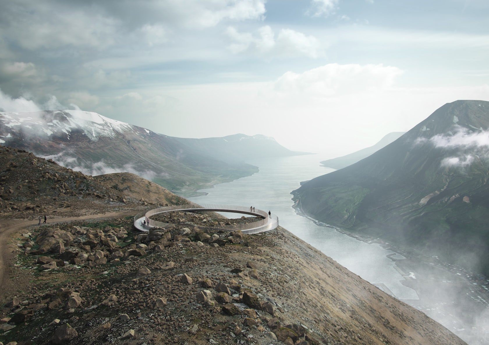
© ESJA Architecture, Arkibygg arkitektar, Okkarheima / ANNA Landscape architect, exa nordic

© ESJA Architecture, Arkibygg arkitektar, Okkarheima / ANNA Landscape architect, exa nordic

ANNA is an experienced landscape architect with demonstrated competence in project management. Anna has broad design experience from designing urban and rural spaces to master planning of larger areas. Anna has a passion for creating livable outdoor spaces that enhance public life.

Some of Okkarheima / ANNA Landscape architect’s most prominent projects include:

The following statistics helped Okkarheima / ANNA Landscape architect achieve 5th place in the 10 Best Architecture Firms in Iceland:

A+Awards Winner1
Featured Projects2
Total Projects1

4. arkibúllan arkitektar

© arkibúllan arkitektar

© arkibúllan arkitektar

Arkibüllan, which has recently changed its name to A arkitektar, was founded in 1999 by Hólmfríðar Ósmann Jónsdóttir and Hrefna Bjargar Þorsteinsdóttir. The work of A arkitekta / Arkibüllun is often shaped by nature and the surrounding environment. The work on each project begins with a search for clues in as many places as possible: in the landscape, human life and one’s own mind. The clues then become the power generator that leads the work from the first sketch to the fully formed structure.

Some of arkibúllan arkitektar’s most prominent projects include:

The following statistics helped arkibúllan arkitektar achieve 4th place in the 10 Best Architecture Firms in Iceland:

Featured Projects3
Total Projects2

3. EON architecture / Architect – Designer
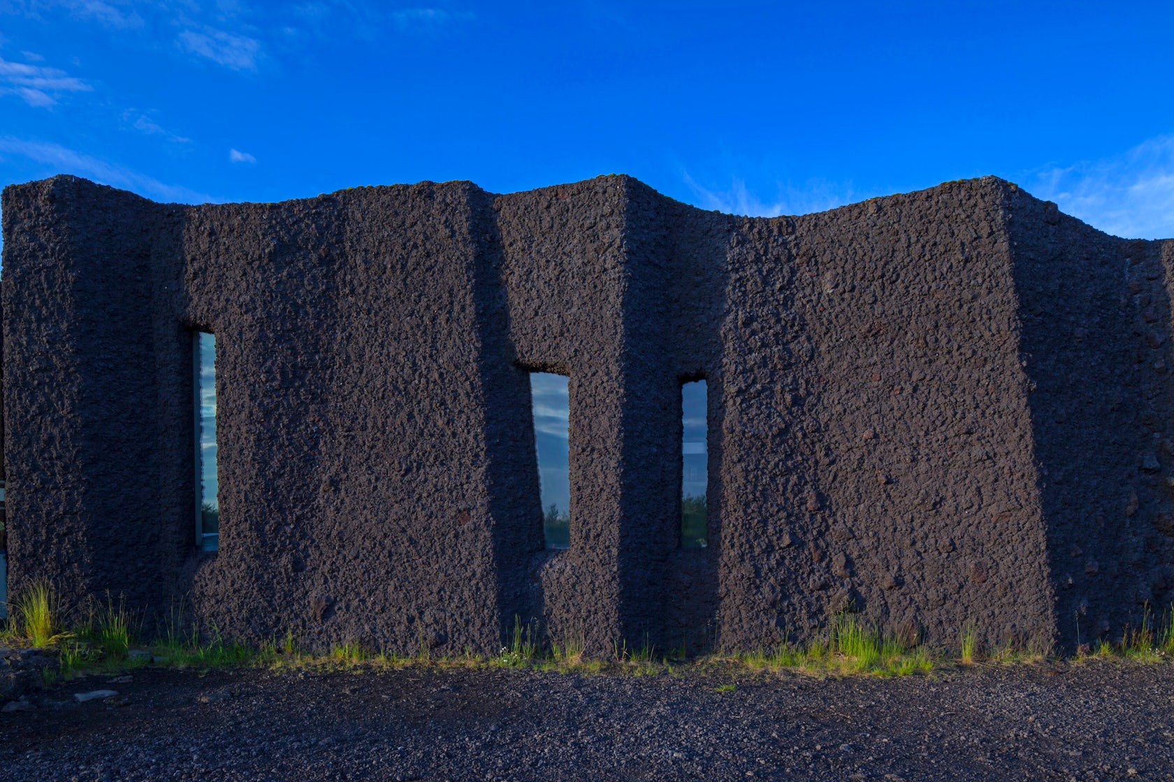
© EON architecture / Architect - Designer

© EON architecture / Architect – Designer

EON architecture is strongly related to the layers of information connected to each project we design and we build. Each project is a manifesto and a tribute to its site, to its role and to its owner/the client. EON emphasizes the important threads between architecture and environmental issues. The goal is to combine contemporary architecture with environmental issues in relation to style and history. Thus being related to the distinctions and the history in general in our projects is of great importance to us. EON architecture represent the creativity and design of fabulous spaces and built structures and intends to contribute high quality architecture worldwide.

Some of EON architecture / Architect – Designer’s most prominent projects include:

  • House of Shapes, Kopavogur, Iceland
  • Mt.Hekla Volcanic Museum, Rangárþing ytra, Iceland
  • East Street – Offices of Parliament, Reykjavík, Iceland
  • Grandagarður 8, downtown Old Harbour, Reykjavik, Iceland
  • The Pool of Vikings, Iceland

The following statistics helped EON architecture / Architect – Designer achieve 3rd place in the 10 Best Architecture Firms in Iceland:

Featured Projects3
Total Projects11

2. PK Arkitektar

© Rafael Pinho

© Rafael Pinho

PK Arkitektar is an Icelandic architecture and design studio. Its founder, architect Palmar Kristmundsson, draws his inspiration from Iceland’s stunning natural landscape and from his encounters with vernacular Japanese architecture. Over the years, they have developed an exceptional team of architects from around the world. PK’s clients and staff are committed to experimentation and the quest for exciting architectural experiences. Each of PK’s projects is designed to inspire a new sense of place through its clarity of design and unexpected details.

Some of PK Arkitektar’s most prominent projects include:

  • Árborg, Selfoss, Iceland
  • Frístundahús, Brekkuskógur, South, Iceland
  • Turninn, Reykjavík, Iceland
  • BHM, Brekkuskógur, South, Iceland
  • B25, Garðabær, Iceland

The following statistics helped PK Arkitektar achieve 2nd place in the 10 Best Architecture Firms in Iceland:

A+Awards Winner1
A+Awards Finalist2
Featured Projects3
Total Projects5

1. ARKÍS Arkitektar

© ARKÍS Arkitektar

© ARKÍS Arkitektar

ARKÍS is an awarded, progressive architecture firm that has been in operation since 1997. ARKÍS’ works and projects span all levels of architecture, planning and design. ARKÍS has extensive experience with projects in planning and architecture, and from the firm’s founding, ARKÍS has executed numerous large and complex projects, both in Iceland and internationally. That experience, in addition to cross-disciplinary specializations, international high level education and experience of the office’s employees make the firm well equipped to address all projects in architecture, planning and design.

Some of ARKÍS Arkitektar’s most prominent projects include:

The following statistics helped ARKÍS Arkitektar achieve 1st place in the 10 Best Architecture Firms in Iceland:

Featured Projects6
Total Projects7

Why Should I Trust Architizer’s Ranking?

With more than 30,000 architecture firms and over 130,000 projects within its database, Architizer is proud to host the world’s largest online community of architects and building product manufacturers. Its celebrated A+Awards program is also the largest celebration of architecture and building products, with more than 400 jurors and hundreds of thousands of public votes helping to recognize the world’s best architecture each year.

Architizer also powers firm directories for a number of AIA (American Institute of Architects) Chapters nationwide, including the official directory of architecture firms for AIA New York.
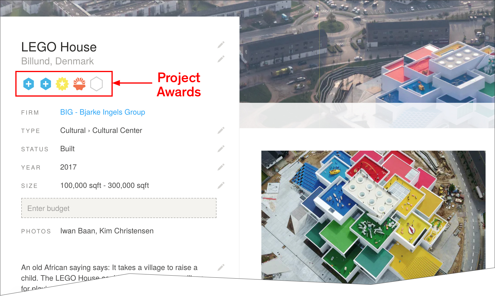
An example of a project page on Architizer with Project Award Badges highlighted

A Guide to Project Awards

The blue “+” badge denotes that a project has won a prestigious A+Award as described above. Hovering over the badge reveals details of the award, including award category, year, and whether the project won the jury or popular choice award.

The orange Project of the Day and yellow Featured Project badges are awarded by Architizer’s Editorial team, and are selected based on a number of factors. The following factors increase a project’s likelihood of being featured or awarded Project of the Day status:

  • Project completed within the last 3 years
  • A well written, concise project description of at least 3 paragraphs
  • Architectural design with a high level of both functional and aesthetic value
  • High quality, in focus photographs
  • At least 8 photographs of both the interior and exterior of the building
  • Inclusion of architectural drawings and renderings
  • Inclusion of construction photographs

There are 7 Projects of the Day each week and a further 31 Featured Projects. Each Project of the Day is published on Facebook, Twitter and Instagram Stories, while each Featured Project is published on Facebook. Each Project of the Day also features in Architizer’s Weekly Projects Newsletter and shared with 170,000 subscribers.


We’re constantly look for the world’s best architects to join our community. If you would like to understand more about this ranking list and learn how your firm can achieve a presence on it, please don’t hesitate to reach out to us at editorial@architizer.com.

Reference

Rockwell Group creates “cathedral of fried chicken” for NYC restaurant
CategoriesInterior Design

Rockwell Group creates “cathedral of fried chicken” for NYC restaurant

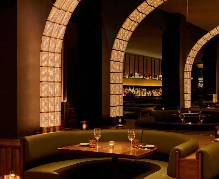
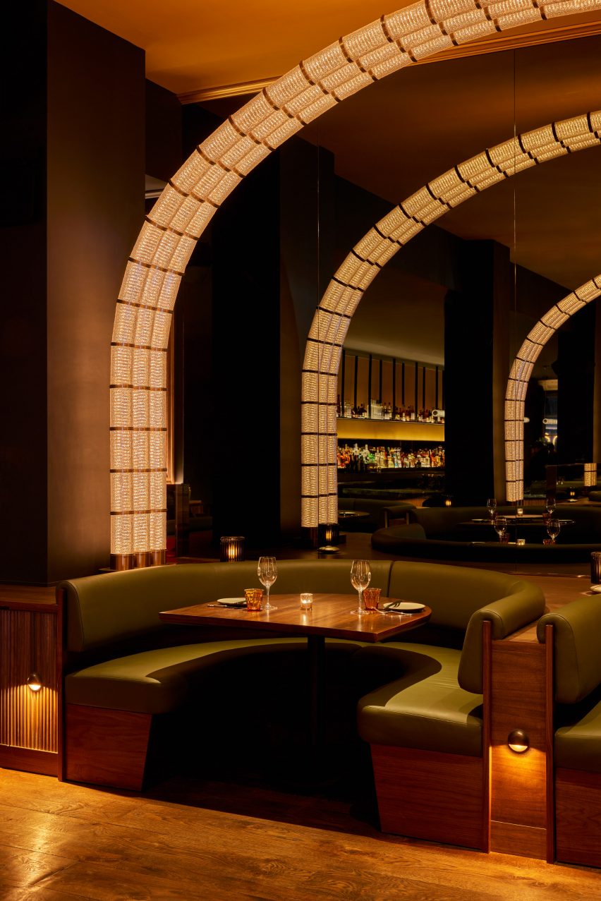
Arches of light warmly illuminate this Korean fried chicken restaurant in New York’s Flatiron district, designed by Rockwell Group.

Coqodaq is the brainchild of restauranteur Simon Kim’s Gracious Hospitality Management, the group behind the Michelin-starred and James Beard-nominated COTE Korean Steakhouse.

Glass and bronze modules form an arch of light over a dining boothGlass and bronze modules form an arch of light over a dining booth
At Cododaq, glass and bronze modules form arches of light over diners

The new restaurant offers an elevated take on traditional Korean-style fried chicken, encouraging diners to indulge in nuggets topped with caviar and to pair its “bucket” dishes with champagne.

“Designed by Rockwell Group as ‘the cathedral of fried chicken’, the restaurant design delivers a daring, yet refined dining experience that skillfully integrates Korean and American influences, placing them at the forefront of this enticing culinary adventure,” said the restaurant team.

Restaurant interior with moody material palette and warm lightingRestaurant interior with moody material palette and warm lighting
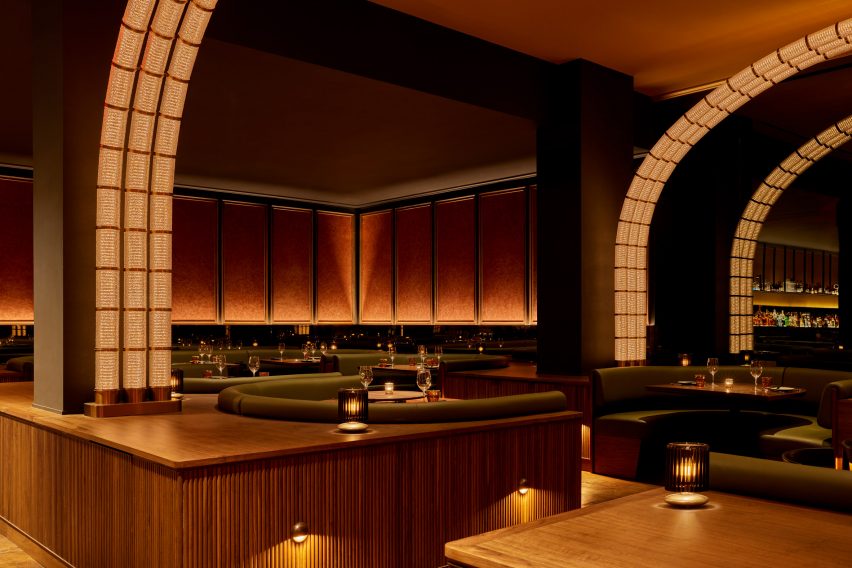
The restaurant’s moody material palette and warm lighting set the tone for an elevated take on Korean fried chicken

To create the right atmosphere for this experience, Rockwell Group opted for a dark and moody interior of rich materials and low, warm lighting.

“Our goal was to capture the essence of this unique concept and innovative approach to fried chicken and translate it into a memorable dining experience,” said founder David Rockwell.

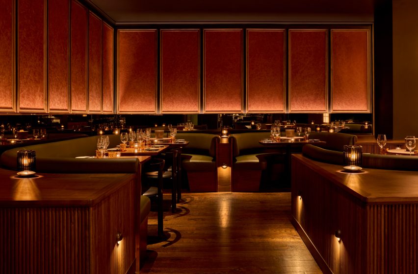
Booth seating with crackled plaster wall panels aboveBooth seating with crackled plaster wall panels above
Plaster wall panels feature a crackled effect akin to fried chicken skin

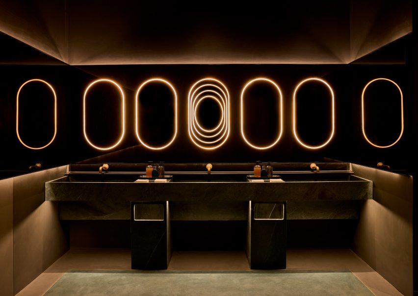
Upon entry, guests are invited to wash their hands in leathered soapstone basins, above which a row of pill-shaped light bands glow within a bronzed mirror that also wraps onto the side walls.

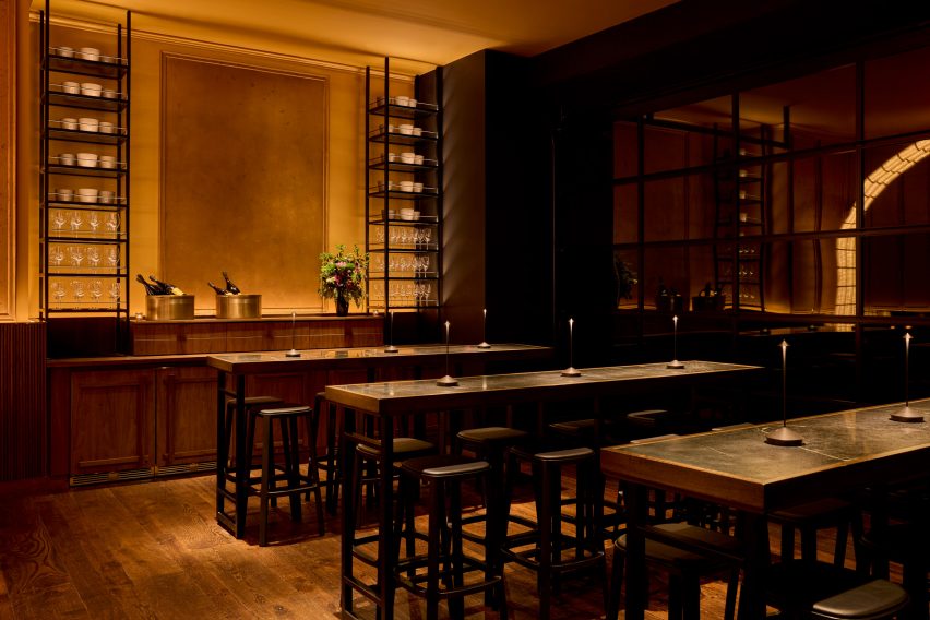
Past the host stand, an area with four high-top tables offers a space reserved for walk-ins in front of garage-style windows.

A long bar topped with black soapstone and fronted with tambour woodA long bar topped with black soapstone and fronted with tambour wood
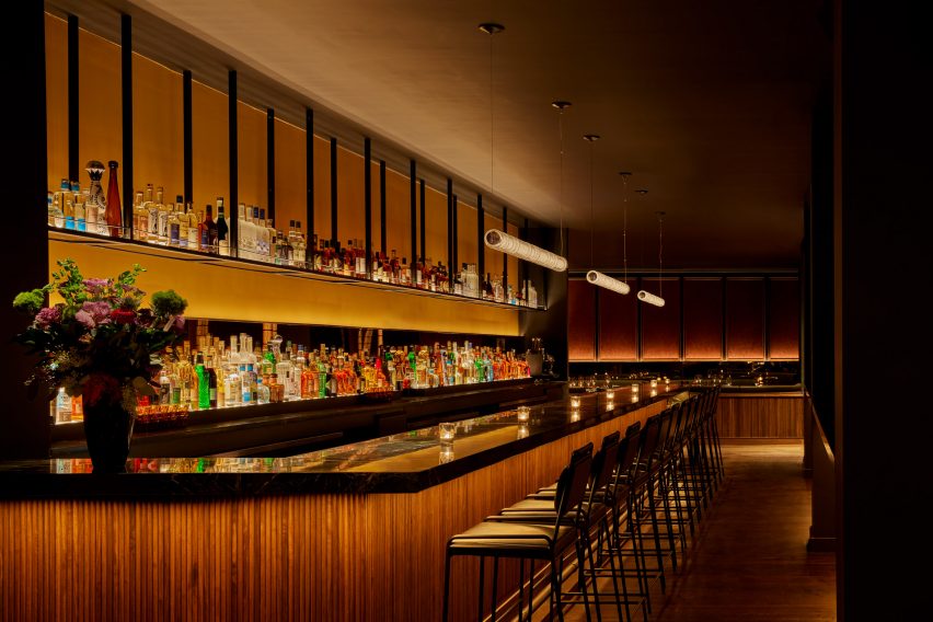
The long bar is topped with black soapstone and fronted with tambour wood

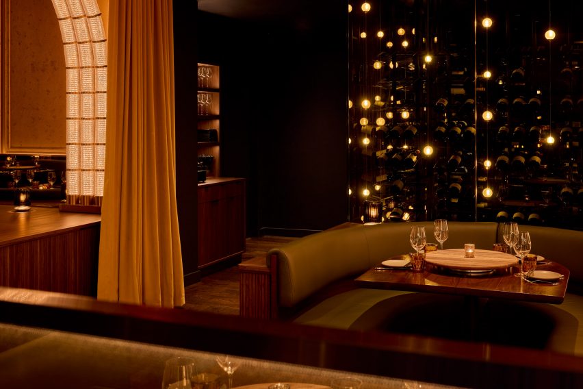
The main dining area is formed by a series of green leather and dark walnut booths on either side of a central walkway.

A series of illuminated arches soar overhead, formed from rippled glass and bronze modules that resemble bubbling oil in a deep-fat fryer.

Champagne collection displayed in glass cases with bubble-like lightingChampagne collection displayed in glass cases with bubble-like lighting
The restaurant’s extensive champagne collection is displayed in glass cases with bubble-like lighting

At the end of this procession, a mirrored wall reflects glowing arches and creates the illusion of doubled space. Meanwhile, plaster wall panels feature a crackled effect, nodding to the crispy skin of the fried chicken.

“The material palette was driven by a desire to surround diners in an envelope of warmth, creating a joyful place to be at any time,” Rockwell said.

Rockwell Group creates atmospheric interiors for Perelman Center in New York

Additional booth seating to one side is followed by the long bar, topped with black soapstone, fronted by tambour wood and backed by a luminous black liquor shelf.

The restaurant’s extensive champagne collection – which it claims is the largest in America – is displayed inside glass cabinets installed with globe-shaped lights that look like giant bubbles.

Area with high-top tables reserved for walk-in dinersArea with high-top tables reserved for walk-in diners
At the front of the restaurant is an area with high-top tables reserved for walk-in diners

“Simon and I share the belief that the most important thing about restaurants is how they ritualise coming together for a shared, celebratory experience and Coqodaq provides the perfect template for that,” said Rockwell.

Since Tony Award-winning designer founded his eponymous firm in New York 40 years ago, the studio has grown to a 250-person operation with additional offices in Los Angeles and Madrid.

Hand-washing station with leathered soapstone basins and rings of light aboveHand-washing station with leathered soapstone basins and rings of light above
Upon arrival, guests are encouraged to wash their hands in leathered soapstone basins

Among Rockwell Group’s recent hospitality projects are the Metropolis restaurant and lobby spaces at the Perelman Arts Center (PAC NYC) and Zaytina inside the Ritz-Carlton Hotel.

We’ve featured a few fried chicken restaurants recently, including a 1960s-influenced spot in Los Angeles and a neon-illuminated eatery in Calgary.

The photography is by Jason Varney.

Reference

Transforming agriculture with carbon-neutral ammonia production
CategoriesSustainable News

Transforming agriculture with carbon-neutral ammonia production

Spotted: Today, producing ammonia accounts for around 1.3 per cent of CO2 emissions from the world’s energy system, because the catalytic process requires extremely high temperatures and pressures that are normally achieved using fossil fuels. The vast majority of ammonia is used to create nitrogen fertilisers, making it a vitally important compound in global food production. Hoping to make it easier for farmers to produce ammonia cleanly is Danish startup NitroVolt.

The company has created a patent-pending “Nitrolyzer” that allows a previously carbon-producing process to become entirely carbon neutral and fossil free, with the only necessary inputs being green energy, water, and air. Within the Nitrolyzer, lithium salt is reduced to lithium metal, which then reacts with nitrogen to form nitrides. Hydrogen (which is produced by hydrolysis) can then react with nitrides to form ammonia. To make the process even more sustainable, the lithium can be reused again and again in the continuous reaction process.

Crucially, the Nitrolyzer was created to tackle the logistical challenges that farmers may face in accessing ammonia. The technology is modular and can therefore be installed wherever ammonia is needed, say on a farm or in a greenhouse. This means that farmers and growers can tailor production depending on their needs, and eliminate the costs and emissions associated with transporting fertiliser.

Recently, NitroVolt raised €750,000 in a pre-seed funding, which will be used to expand the team and help to scale the technology.

Fertilisers play an essential role in growing healthy crops and boosting food security, but currently industrial production methods are highly unsustainable. Luckily innovators are searching for alternatives, including the use of dog waste and seed coatings that reduce the need for fertilisers in the first place.

Written By: Archie Cox

Reference

mwworks hides longbranch house in the pacific northwest woods
CategoriesArchitecture

mwworks hides longbranch house in the pacific northwest woods

longbranch house: Architecture Embracing Nature


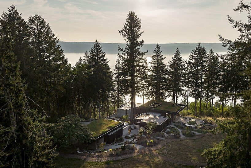
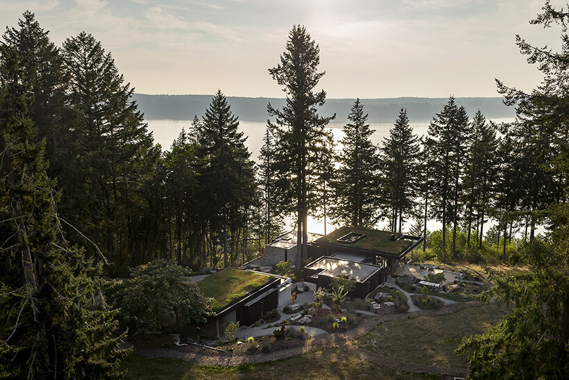
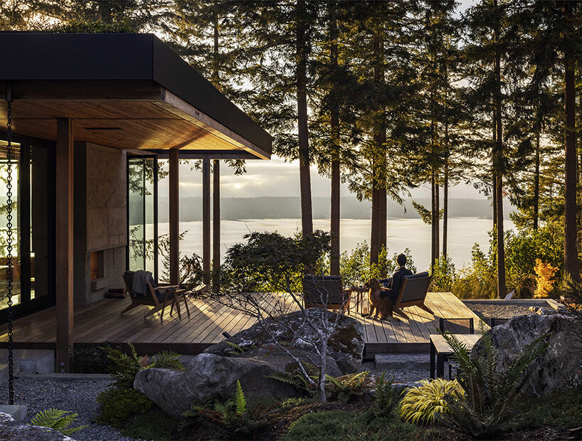
The Key Peninsula in Washington state sees a transformation on a once-neglected plot of land with this Longbranch House by architecture studio mwworks. Previously marred by a series of retaining walls and an outdated home, the site has been given a new lease on life with the clients’ long-standing love for the area. Having frequented a nearby beach cabin for thirty-five years, they dreamt of a new home that would accommodate their family, foster dogs, horses, and visiting loved ones. But their vision extended beyond simple construction — they desired a dwelling that harmonizes with the surrounding landscape.

mwworks longbranch houseimages © Andrew Pogue


mwworks opens the home onto the forest


Following this vision, mwworks created a home that is anything but ostentatious. Approaching from the road, visitors are greeted by a gravel driveway that winds past an unassuming barn. The house itself remains concealed until the very last moment. Only a glimpse of its planted roof peeks through the rolling hills, mimicking the natural meadow and creating a sense of continuity. This subtle design prioritizes the landscape, allowing the natural world to take center stage.


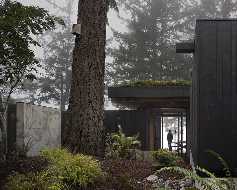
The architects took great care to ensure minimal disruption to the existing environment. Towering fir trees were incorporated into the design, acting as grand pillars at the entrance. The building itself rests on carefully positioned pin piles and grade beams, allowing the roots of these giants to flourish undisturbed. A bridge leading into the house further opens the interiors onto the forests and views beyond, emphasizing the intended harmony.

mwworks longbranch house
the Longbranch House by mwworks replaces an outdated home on a neglected plot in Key Peninsula


a contemporary frame for nature beyond


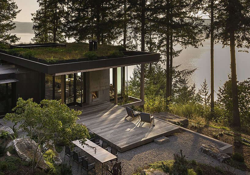
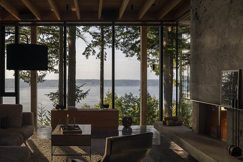
Stepping inside the Longbranch House is akin to stepping into a framed landscape vista. The open floor plan offers unobstructed views of the surrounding meadows and the Case Inlet beyond. Each room is designed to foster a unique connection with the outdoors, ranging from intimate nooks to expansive living spaces. The materials used throughout the house echo the natural surroundings. The main structure is cast from a rough concrete mix, mirroring the fluidity of the landscape. This contrasts with the dark-stained cedar cladding in private areas, while exposed Douglas Fir beams create a pavilion-like feel in the living space. Large windows are delicately framed, minimizing their visual impact and emphasizing the honest construction methods.

mwworks hides this longbranch house among the pacific northwest woods
designed for a family and their animals, the house prioritizes integration with the surrounding landscape


With the completion of the Longbranch House, the once-fragmented land has been brought back together. The forest and meadow now embrace the dwelling, creating a calming retreat in the woods. The use of natural materials and attention to detail further enhance the sense of timelessness. This way, the home exemplifies a successful relationship between built space and the beauty of the natural world.

mwworks longbranch house
a gravel driveway leads past a barn, revealing only glimpses of the house that blends with the meadow mwworks hides this longbranch house among the pacific northwest woods
towering fir trees are prominent features, with the house built around them to minimize disruption

Reference

Collcoll hides stairs in pixellated wooden structure at Pricefx office
CategoriesInterior Design

Collcoll hides stairs in pixellated wooden structure at Pricefx office

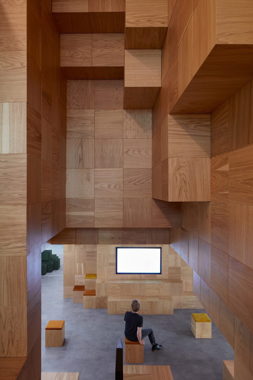
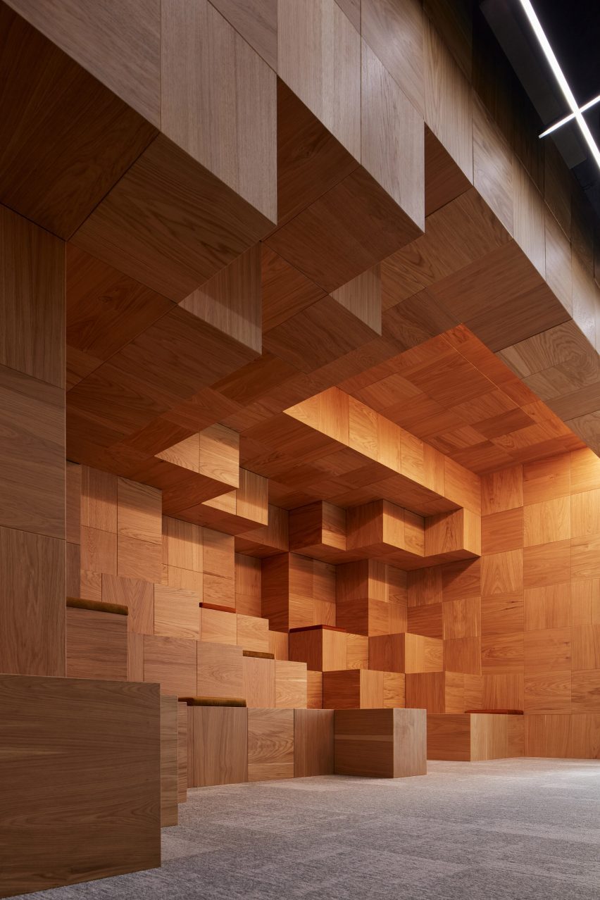
Thousands of wooden cubes inspired by the computer game Minecraft conceal utilities and create casual seating areas at this office in Prague designed by architecture studio Collcoll.

Having previously designed one floor in the Meteor Centre Office Park for pricing software company Pricefx, Collcoll was tasked with outfitting the floor below as part of the client’s commitment to flexible and creative working practices.

Pixelated wood interiors Pricefx office by Collcoll in PraguePixelated wood interiors Pricefx office by Collcoll in Prague
Collcoll has added a pixellated wooden structure to the Pricefx office in Prague

“The management and employees of Pricefx use their offices primarily for meetings that stimulate creative dialogue,” said Collcoll.

“By their very nature, they are an open space for variable use, not subject to the stereotypes of work cubicles or traditional open space.”

Minecraft interiors of Pricefx office by Collcoll in PragueMinecraft interiors of Pricefx office by Collcoll in Prague
The wooden feature was informed by the computer game Minecraft

The need to link the two levels presented an opportunity to do something interesting with the circulation and service core at the centre of the floor plan.

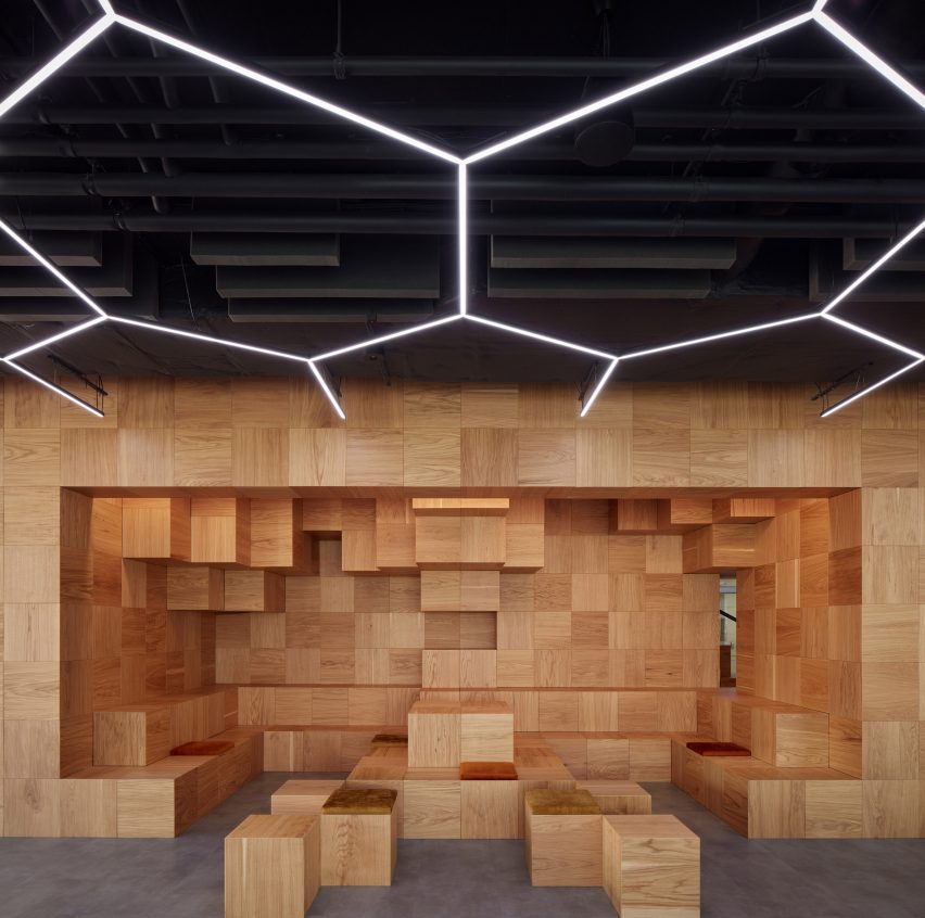
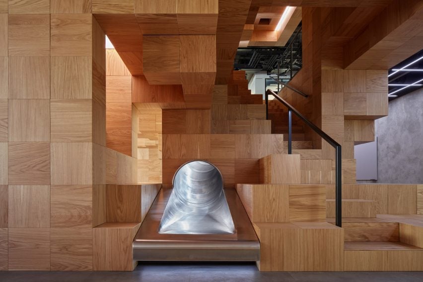
Collcoll chose to enclose the staircase with a wooden structure that conceals staff lockers, changing rooms and utility spaces. It also contains a slide that can be used as an alternative to the stairs.

Pixelated wood interiors in Pricefx office by Collcoll in PraguePixelated wood interiors in Pricefx office by Collcoll in Prague
Collcoll concealed utilities behind the “pixels” and created casual seating areas

“Vertically connecting two floors tends to be problematic if the natural flow of the space is to be maintained,” Collcoll explained.

“The two floors are tectonically connected by a structure composed of thousands of wooden pixels, which modulates the space around it and becomes its internal landmark.”

Pricefx office by Collcoll in PraguePricefx office by Collcoll in Prague
A slide can be used instead of the stairs

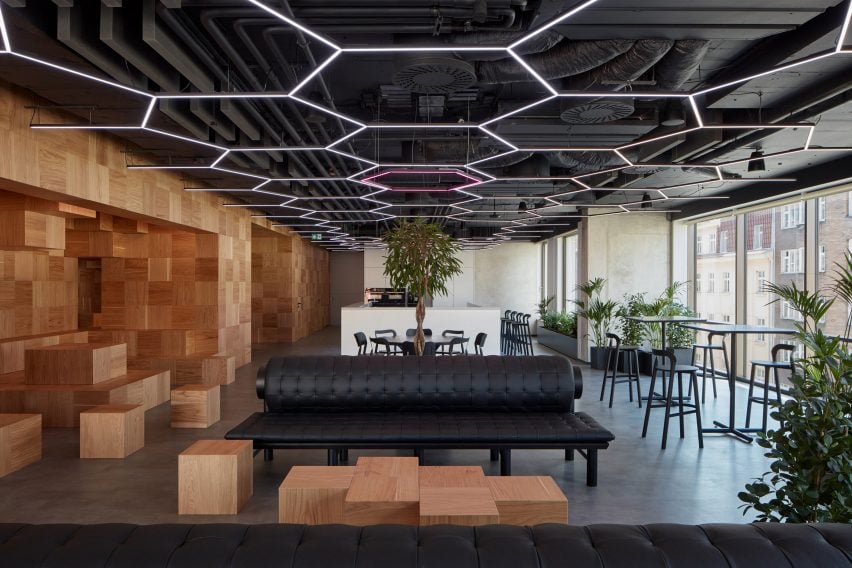
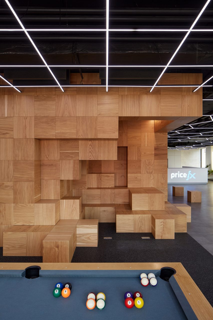
The composition of 40-centimetre-wide cubes references the blocky, pixellated world of the video game Minecraft. Its external surfaces form semi-enclosed alcoves and amphitheatres that can be used for informal work and presentations.

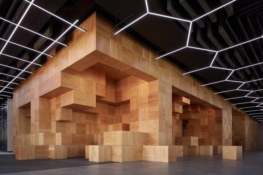
The cubes are wrapped in wood veneer that intentionally does not align so the pixels can be arranged in a completely random configuration.

The pixel motif is continued by a lighting grid that covers the entire office ceiling and by a projection screen incorporated into a bar counter that also functions as a reception desk.

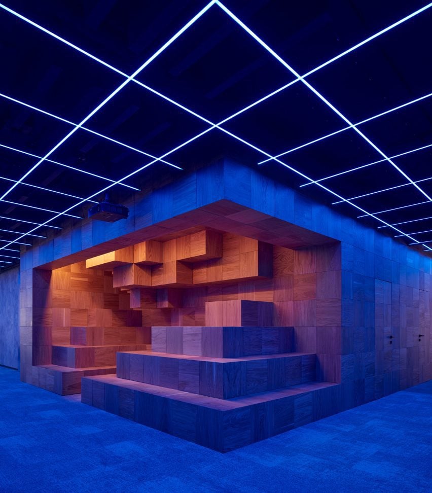
The LED light fixtures, which are clearly visible from the street, can be dynamically adjusted to provide optimal lighting during working hours or create a party atmosphere for events.

Wood structure and LED lighting in Pricefx office by Collcoll in PragueWood structure and LED lighting in Pricefx office by Collcoll in Prague
The pixel motif continues into the office’s lighting grid

The entire office floor can operate like an open conference hall containing pockets of dedicated functional space such as the cafe with its professional kitchen, bar counter and informal seating.

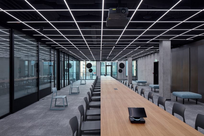
A large conference room at one end of the space is equipped with a long table that can seat up to 50 people. The table and the room itself can be divided to form smaller hot-desking spaces or meeting rooms.

Lighting on the wood structure of Pricefx office by Collcoll in PragueLighting on the wood structure of Pricefx office by Collcoll in Prague
Lighting can be adjusted to create a party atmosphere for events

A sliding acoustic partition enables the space to function as a recording studio, while transparent walls along one side can be turned opaque to provide privacy.

The office has no corridors and instead includes various unprescribed zones and circulation areas containing casual seating or lounges with amenities such as a pool table and a punchbag.

Table and concrete interiors in Pricefx office by Collcoll in PragueTable and concrete interiors in Pricefx office by Collcoll in Prague
A large conference room integrates with a table for up to 50 people

A range of presentation spaces are scattered throughout the floorplan. These include dedicated conference rooms and tiered amphitheatres with retractable screens.

Collcoll chose a neutral material palette comprising concrete, grey carpet tiles, light-grey plasterboard and black-painted ceilings to lend the office a modern, industrial aesthetic.

Pricefx office by Collcoll in PraguePricefx office by Collcoll in Prague
Collcoll chose a neutral material palette for a modern and industrial aesthetic

“The heavy black-metal tubular furniture corresponds with the concept of technological wiring,” Collcoll suggested.

“In contrast, the ephemeral changing grid of light chips and sensor systems embodies the direction of industrialism towards the world of software and information.”

Pixelated wood in Pricefx office by Collcoll in PraguePixelated wood in Pricefx office by Collcoll in Prague
The studio added amenities such as a pool table and a punchbag

Collcoll’s name stands for “collaborative collective” and reflects the collaborative approach of its team of architects, designers and researchers.

Other recently completed office interiors featuring wooden structures include a workspace in Edinburgh by Kin and a design office in Melbourne that aims to be zero-waste by using recycled materials.

The photography is by BoysPlayNice.

Reference

Sap flow sensors for smart water use
CategoriesSustainable News

Sap flow sensors for smart water use

Spotted: Agriculture production is both the largest user of water worldwide, and a major water polluter. According to the Organisation for Economic Co-operation and Development, climate-change-induced water shortages are expected to become more frequent. In addition, farmers in many regions are facing increasing competition for water due to rising urban population density and rapid growth of the energy and industry sectors. 

One way to help farmers reduce water use, as well as water pollution, is to use only as much water as each plant needs, avoiding runoff and excess usage. To make this a reality, startup Treetoscope has developed a platform that integrates AI, weather data, satellite imagery, and other remote sensing technologies to provide real-time sap and water uptake data.

Treetoscope’s sensor uses a heat dissipation model to measure the movement of water (sap flow) within the xylem of trees and vines. The sensor detects the distortion of the heat field around the probe, which is directly related to the velocity of water movement. The irrigation management platform is unique and integrates with other weather data to provide growers with insights into irrigation management.

In September last year, the company announced additional investments to its latest seed funding round, bringing the total raised in this round to over $7 million (around €6.5 million), and total investments of $10 million (around €9.3 million), including grants from the Israel Innovation Authority and the Bird Foundation. The funds will be used for research and development and speeding up the expansion across North America and beyond.

Reducing water use in agriculture is also the subject of innovations such as seeds that are more resilient to water scarcity and AI-driven irrigation.

Written By: Lisa Magloff

Reference

Michael Hennessey Architecture clads renovated California house in cedar
CategoriesArchitecture

Michael Hennessey Architecture clads renovated California house in cedar

US studio Michael Hennessey Architecture has revitalised an ageing suburban house near San Francisco, adding black cladding and bright finishes to form a family home that bridges the past, present and future.

The residence is located in Mill Valley, a town just north of San Francisco that is known for its natural terrain and cultural offerings.

Black house by Michael Hennessey ArchitectureBlack house by Michael Hennessey Architecture
Michael Hennessey Architecture created Courtyard Hous

Designed for a couple with two young children, the budget-conscious project involved the renovation of a suburban-style house that was “in sore need of upgrades”.

The aim was to create a dwelling that supported the family’s current needs while being mindful of what might be needed in the future.

Courtyard House living spaceCourtyard House living space
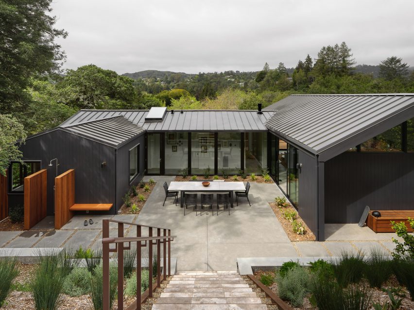
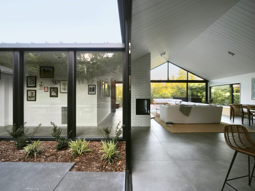
The home is U-shaped in plan

“The home was thought not only as a shelter, but also as a bridge: from past to present, from one landscape condition to another, and from what a family wanted to what they could have,” said Michael Hennessey Architecture, which is based in San Francisco.

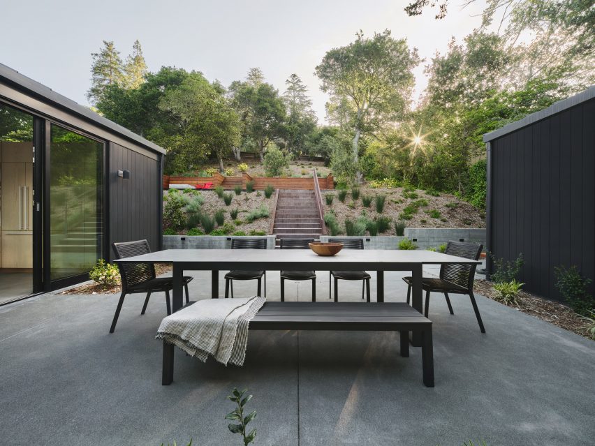
Built into a hillside, the home is U-shaped in plan, with gabled volumes organised around a central courtyard.

Vertical cedar sidingVertical cedar siding
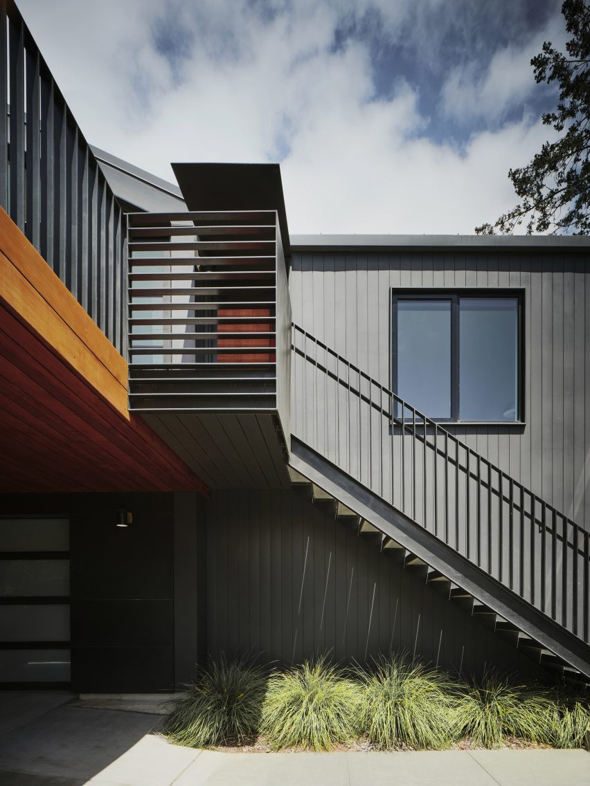
Vertical cedar siding that adds a sense of gravitas

The team opted to preserve certain elements while adding contemporary interventions.

The building’s beige exterior was replaced with black, vertical cedar siding that adds a sense of gravitas, the studio said. The roof is covered in standing-seam metal.

Open-plan kitchen Open-plan kitchen
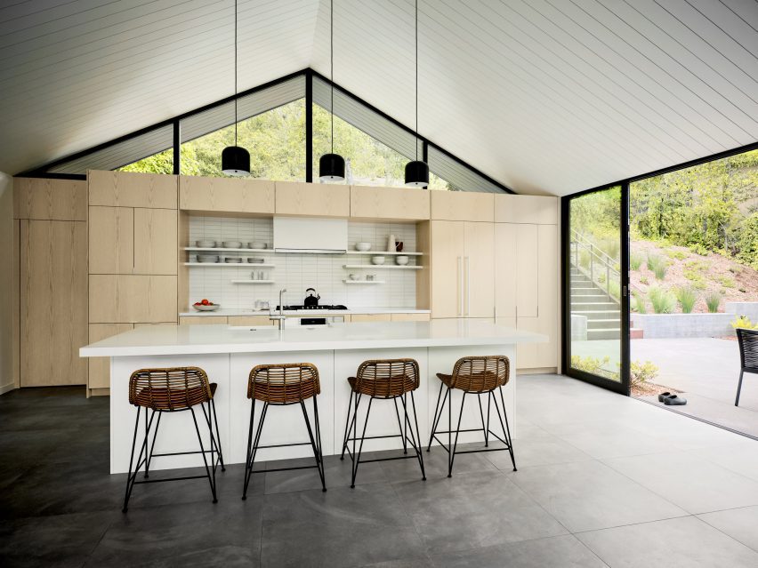
Inside there is a clear division between public and private zones

Inside, the 1,870-square-foot (174-square-metre) house features a clear division between public and private zones.

On the main level, one side holds an open-concept kitchen, dining area, and living room, while the other encompasses three bedrooms. The ground level contains a family room and a garage.

South-facing deckSouth-facing deck
A south-facing deck features outside

“Clearly delineated programmatic areas work in harmony with each other, the outside and the family’s needs,” the team said.

Interior finishes include ash cabinetry, large-format porcelain floor tiles, and ceramic tiles around the fireplace. Lofty ceilings and large stretches of glass provide an airy feel.

The outdoor spaces include a spacious, south-facing deck that receives bright sunlight. Softer light flows in through the courtyard on the north.

Proving a connection to the forested, hilly landscape was a guiding concern for the team.

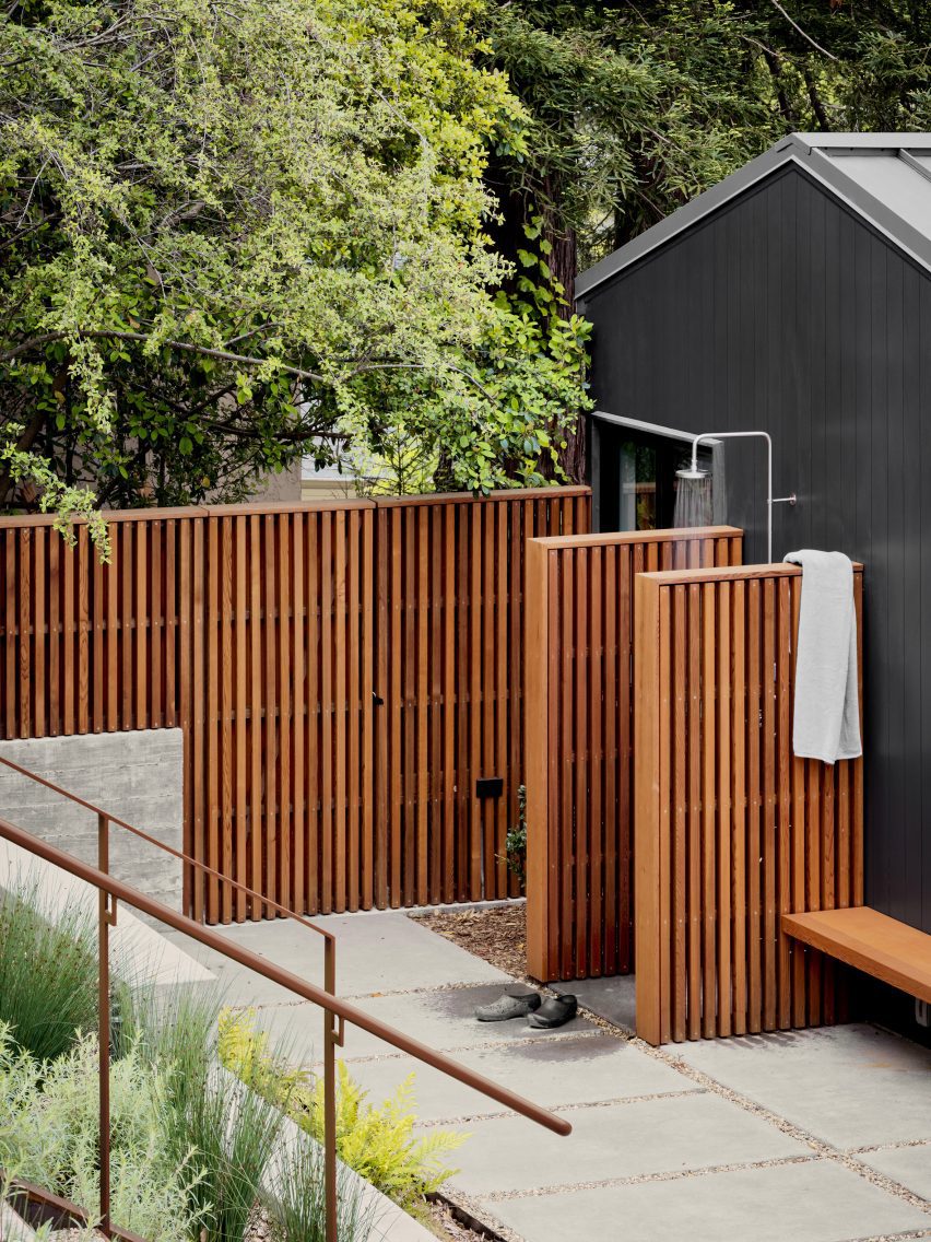
Outdoor showersOutdoor showers
Outdoor showers were also included in the design

“Every part of the house is oriented towards the landscape thanks to carefully framed views of the lush immediate vegetation, as well as the more distant valleys, resulting in a comprehensive, thoughtful and sensitive approach to creating an extraordinary daily life,” the team said.

Other projects by Michael Hennessey Architecture include a townhouse with modern bay windows that was designed to offer alternatives to “conventional building strategies” and the refurbishment of a 1960s house that was originally built by Joseph Eichler, known for his modernist housing subdivisions.

The photography is by Adam Rouse.


Project credits:

Architect: Michael Hennessey Architecture
Architecture team: Michael Hennessey, Claudia Merzario, Jason Laudat
Contractor: New Dimension Builders (Dirk Von Rueben)
Structural engineer: Berkeley Structural Design (Bill Lynch)
Landscape architect: George Loew
Title 24 consultant: EnergySoft, LLC (Hayley Monahan)
Sustainability consultant: Arcturus HD (Jeff Aalfs)

Reference

Linehouse creates greenhouse-informed food market in Shanghai
CategoriesInterior Design

Linehouse creates greenhouse-informed food market in Shanghai

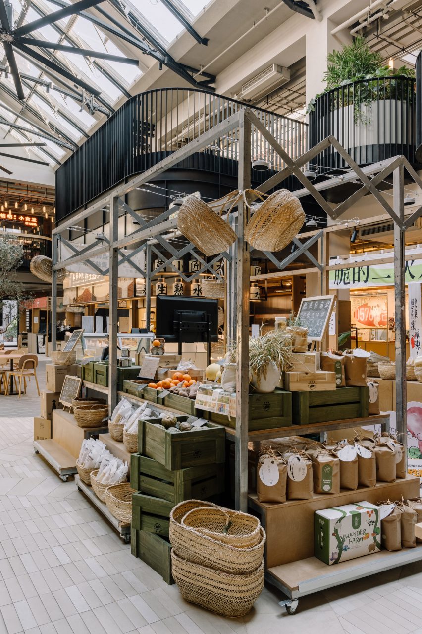
Architecture studio Linehouse has wrapped a food market in a Shanghai laneway neighbourhood around a central atrium informed by Victorian greenhouses.

Named Foodie Social, the 2,000-square-metre food market is located within the Hong Shou Fang community – a residential area in Shanghai’s Putuo district known for its classic “longtang” laneway architecture.

Linehouse Foodie SocialLinehouse Foodie Social
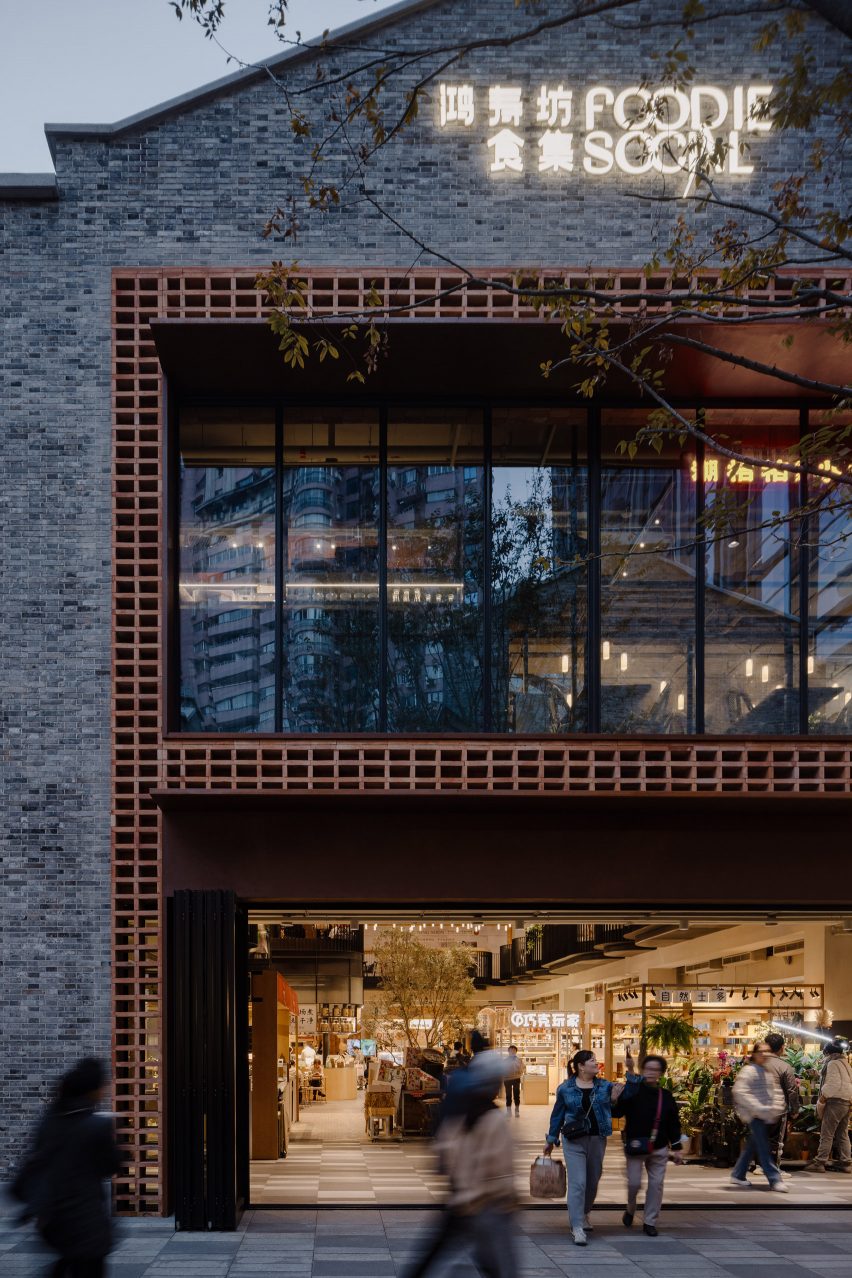
The food market is in a two-storey grey brick building in Shanghai

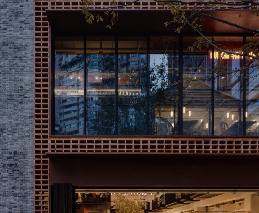
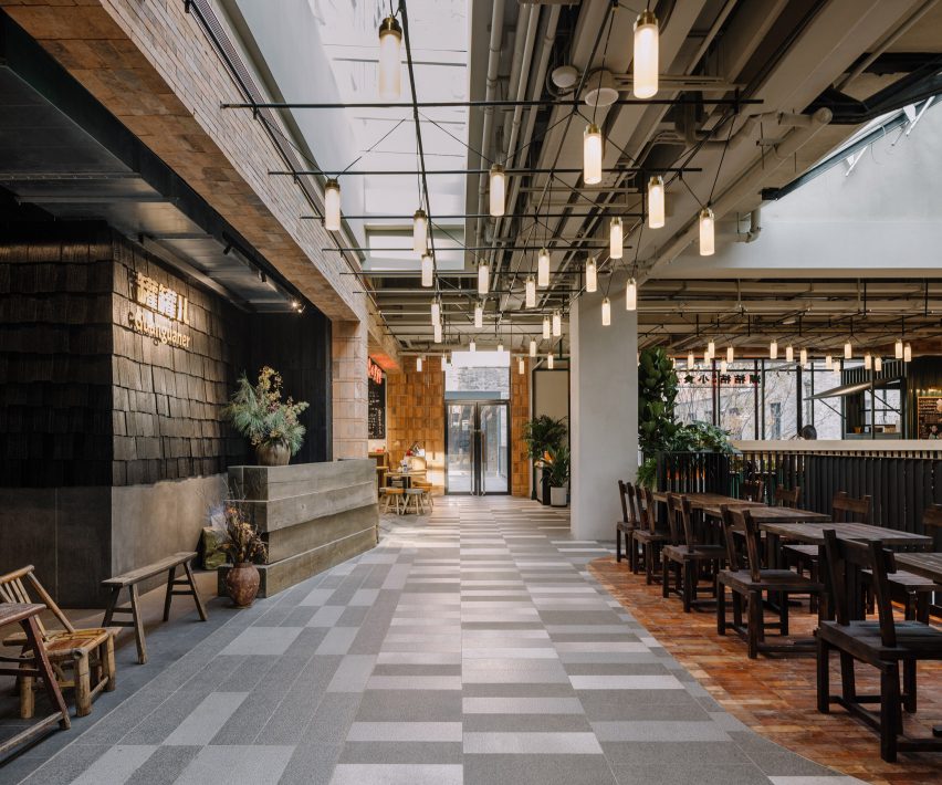
The entrance to the two-storey market was framed by a double-height arrangement of stacked recycled red bricks, with a corten steel canopy added to provide shelter.

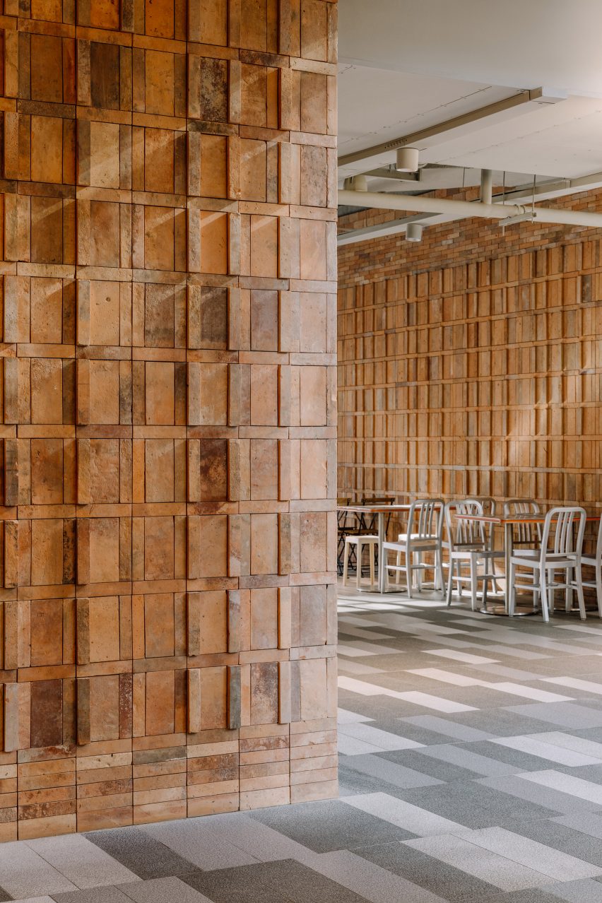
The same recycled red bricks sourced from demolished houses in China can also be found on the interior walls, stacked to create three dimensional patterns.

Linehouse Foodie SocialLinehouse Foodie Social
The glass pitched roof is lined with a gently curved metal truss

A large glass door can be pulled open on warm days, with patterned paving from the laneway outside extending to the interior of the market, fully connecting the interior and exterior.

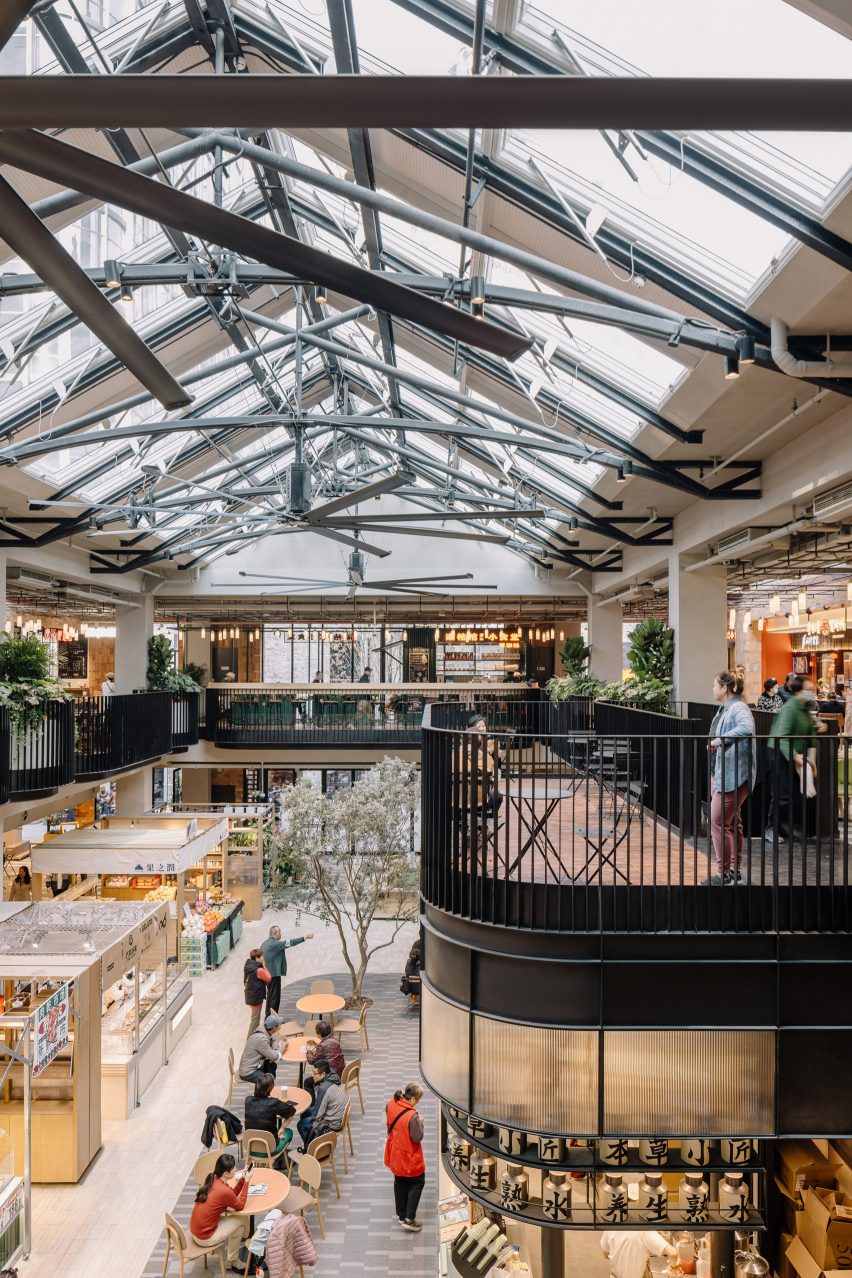
The interior of the market was designed to resemble a greenhouse, with shops and cafe’s arrranged around a central, double-height atrium.

The glass pitched roof above the atrium was lined with gently curved metal truss, in reference to Victorian greenhouses, with three large fans hanging from the metal truss to improve the air circulation.

Linehouse Foodie SocialLinehouse Foodie Social
Some vendors are designed to be retractable to allow flexibility

A cafe in the atrium, which contains an olive tree planted into the ground, integrates a metal staircase that leads to the upper floor.

A area describes as a “stage” is located by the staircase with a series of undulating balconies wrapped around the atrium on the upper floor.

Various typologies of food vendors are arranged in the open atrium on the ground floor, some of which are designed to be retractable, allowing flexibility for different types of vendors as well as a large open event space to be formed at the centre.

“This new typology brings together the local with more curated food offerings in a contemporary yet humble and sustainable way,” explained Linehouse‘s Shanghai team who are responsible for the design.

Linehouse Foodie SocialLinehouse Foodie Social
Recycled red bricks can be found both on the facade and interior walls

Smaller snack shops were positioned on the ground floor, while larger restaurants occupy the upper floor.

Each stall was assembled from a kit of parts, so that the vendors are able to create their own signage and layout, but maintain a consistent material and lighting palette.

Linehouse Foodie SocialLinehouse Foodie Social
Larger restaurants are located on the upper floor

Linehouse is a Hong Kong and Shanghai-based architecture and interior design studio established in 2013 by Alex Mok and Briar Hickling. The duo won the emerging interior designer of the year category at the 2019 Dezeen Awards.

The studio has also recently designed the facade of a shopping centre in Bangkok and the interiors for a Hong Kong residence that respond to coastal views.

The photography is by Wen Studio.


Project credits:

Design principal: Alex Mok
Associate-in-charge: Cherngyu Chen
Design team: Yeling Guo, Fei Wang, Wang Jue, Norman Wang, Aiwen Shao, Mia Zhou, Yunbin Lou, Xiaoxi Chen, Tom Grannells

Reference

Toothbrush pops open for recycling in Seymourpowell’s Un-Made concept
CategoriesSustainable News

Toothbrush pops open for recycling in Seymourpowell’s Un-Made concept

British design studio Seymourpowell has put cheap electronic goods under the spotlight with Un-Made, a project imagining four possible ways to design for quick disassembly and recycling.

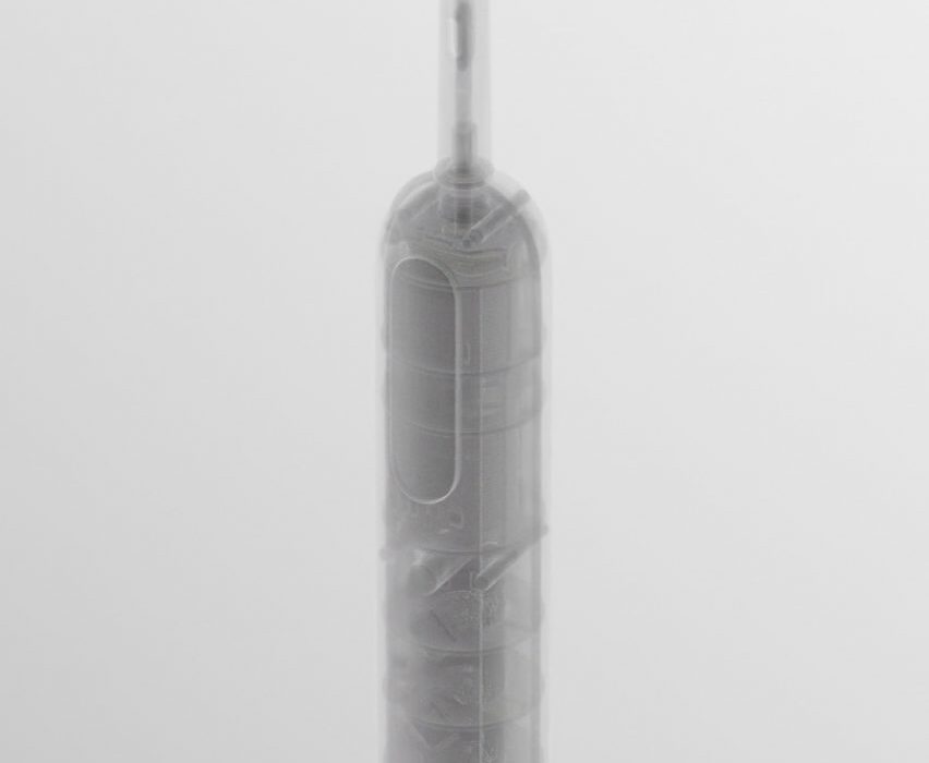
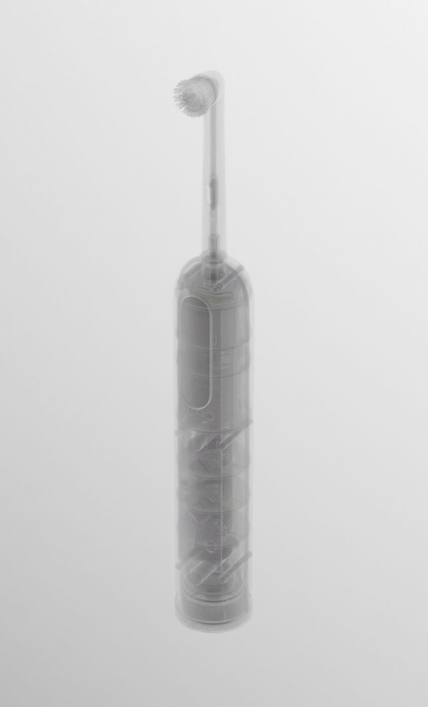
As part of the project, Seymourpowell devised four automated disassembly mechanism concepts using an electric toothbrush as an example for their animated graphics.

Each of the mechanisms could be built into a product during manufacturing and then activated in a factory at the end of the item’s life.

Rendering of a toothbrush on a white backdrop from Seymour Powell's Un-Made conceptRendering of a toothbrush on a white backdrop from Seymour Powell's Un-Made concept
Un-Made suggests automated disassembly mechanisms for an electric toothbrush

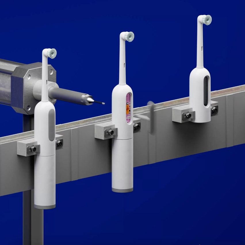
The first Un-Made concept is a pin mechanism. Similar to the action of opening a SIM card slot on a smartphone, it involves poking a pin into a small, sealed pinhole on the rear of the product to release the internal components.

The second concept is a vacuum mechanism. It involves placing the product into a vacuum, causing closed cell foams and air-sealed features within it to expand and bust the external housing open.

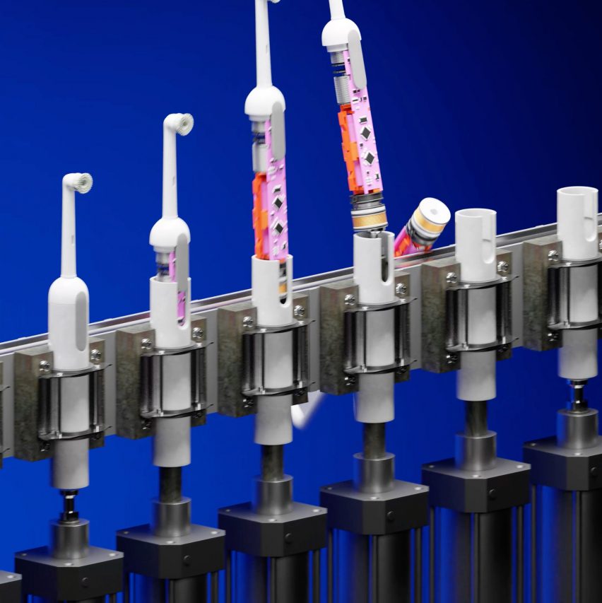
Third, there is a piston mechanism that works by pushing a piston through a cap on the bottom of a device and forcing all of the internal components upwards until they emerge through the top.

3D graphic showing a conveyer belt of electric toothbrushes being disassembled in Seymour Powell's Un-Made concept3D graphic showing a conveyer belt of electric toothbrushes being disassembled in Seymour Powell's Un-Made concept
The first concept includes a pin-triggered release mechanism

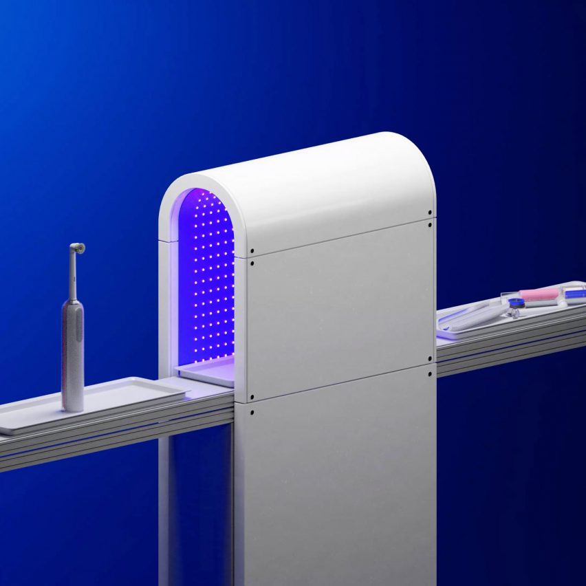
The final concept involves using UV glue – a type of adhesive that deactivates under ultraviolet light. In this concept, the product is placed into a specially lit chamber to release the clamshell construction.

The Un-Made project was led by Eddie Hamilton, a senior industrial designer at Seymourpowell, who was driven to make the work after researching what electric toothbrush to buy for himself.

“Inevitably I went for the cheap one, at which point Amazon smugly pointed out they’d sold 10k+ of that model last month alone,” said Hamilton.

3D graphic of a series of electric toothbrushes on a conveyer belt. The one on the left is whole, the one in the middle is having its casing stripped from it under a clear dome, and the one on the right has its interior components exposed3D graphic of a series of electric toothbrushes on a conveyer belt. The one on the left is whole, the one in the middle is having its casing stripped from it under a clear dome, and the one on the right has its interior components exposed
Another mechanism uses a vacuum to burst open the product’s external housing

“As an industrial designer, I spend time obsessing over the product I’m working on, typically thinking of it in isolation,” he added.

“But one thing I occasionally fail to remember or adequately picture is the true scale of that product once manufactured. 10,000 units sold per month seems vast.”

Using Amazon’s bestsellers list, Hamilton ascertained that fabric shavers, steam irons, wireless doorbells, wireless computer mice, digital tyre inflators and USB-C adaptors were all items selling in their thousands each month, at a price of less than £20.

While designing products so they can be repaired is important, the associated expense may not be something that customers can justify for small items sold at this price point, Hamilton said.

“Even if we change societal attitudes, the bottom line is whether you should open that cheap toothbrush to replace a failing battery when you only paid £24.99 for it two years ago,” he said.

“I’m optimistic for some product categories to get the ball rolling, namely expensive and bulky items. But I’m also a realist that we need alternative strategies adjacent to repair. This is where we must design for disassembly.”

In Hamilton’s view, disassembly and recycling is a worthy “next best option” to repair for cheaper objects, as it keeps the materials in a circular material flow.

3D graphic showing a conveyer belt of electric toothbrushes being disassembled by a piston mechanism pushing their internal components out from the bottom to the top of the casing from Seymour Powell's Un-Made concept3D graphic showing a conveyer belt of electric toothbrushes being disassembled by a piston mechanism pushing their internal components out from the bottom to the top of the casing from Seymour Powell's Un-Made concept
The piston mechanism disassembles a product by pushing its components up and out

The Un-Made design team took inspiration from Agency of Design’s Design Out Waste project, which looked at three strategies for keeping a toaster out of landfill. But they particularly wanted to explore just how efficient the disassembly process could be made through automation.

The cheaper and easier the process, they say, the more motivation there is for companies to pursue this approach and recover the components and materials inside their devices.

“A huge part of the reason e-waste ends up in landfill is because of product complexity and the inherent challenges involved in their disassembly,” Seymourpowell lead designer Alex Pearce told Dezeen.

“To date, because e-waste has been considered too time-consuming and costly to disassemble – there has been no (commercial) incentive strong enough to make it a viable option.”

3D graphic showing a conveyer belt of electric toothbrushes going into a purple-lit tunnel and emerging on the other side in pieces3D graphic showing a conveyer belt of electric toothbrushes going into a purple-lit tunnel and emerging on the other side in pieces
The fourth Un-Made concept uses UV light to dissolve the glue holding the device together

The materials inside even cheap devices are valuable, Pearce points out, particularly when there are supply shortages or when it comes to rare-earth minerals.

“When you consider that more gold exists within a ton of e-waste than within a ton of gold ore dug from the ground, a straightforward economic imperative becomes clear for companies who are able to recover and reuse these materials,” said Pearce.

Seymourpowell imagines disassembly taking place either at the manufacturer’s facilities following a take-back procedure, or potentially at a public recycling centre if disassembly processes have been sufficiently standardised.

The London-based studio is known for its innovative product and transport designs, as well as concepts that challenge current norms. Recent projects from the studio have included the two-in-one reusable Bottlecup and a spaceship cabin for Virgin Galactic.

Reference