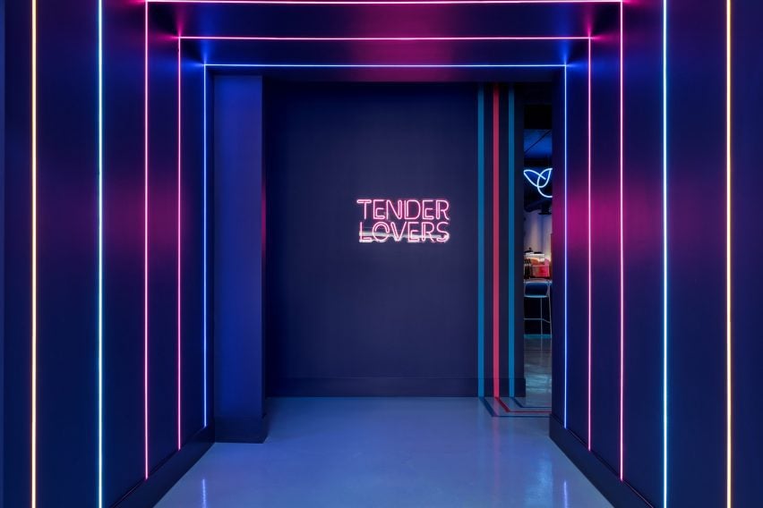
Neon lighting illuminates Strip Joint Chicken by Amanda Hamilton
Canadian studio Amanda Hamilton Interior Design has used bold colour-blocking and neon lighting to give this Calgary chicken shop a “1990s meets Memphis” feel.
Strip Joint Chicken in the city’s East Village neighbourhood is a fast-casual restaurant that serves “chicken fingers with a twist”.

The brand is fun, playful and cheeky, so the interiors of its 2,200-square-foot (204-square-metre) space needed to reflect this.
Working with a return client, Amanda Hamilton Interior Design leant fully into the “offbeat” concept, creating an elevated interpretation of a seedy bar or nightclub that founder Amanda Hamilton described as “1990s meets Memphis”.
“At times subtle (and sometimes not so subtle) design elements take a nod (or a big ol’ bow) playing to the restaurant’s name,” said the designer. “In a market saturated with options for fast casual, standing out was key.”
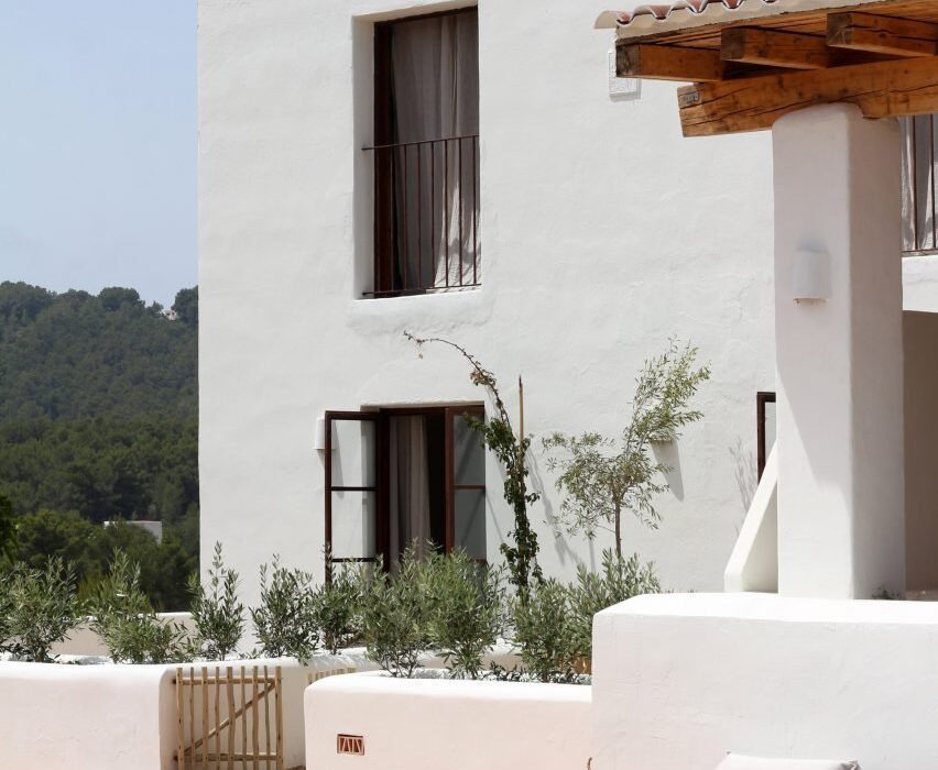
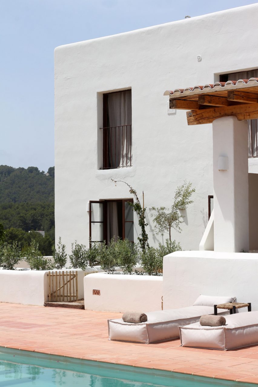
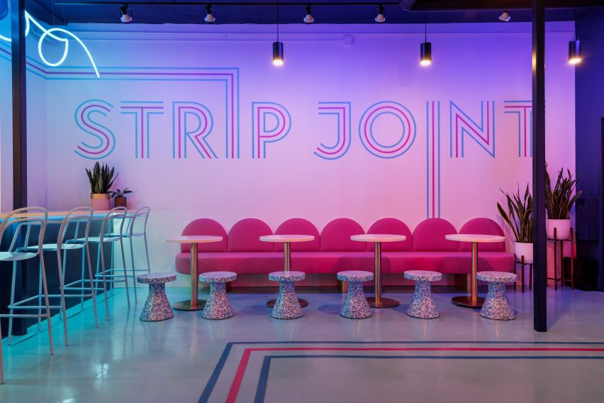
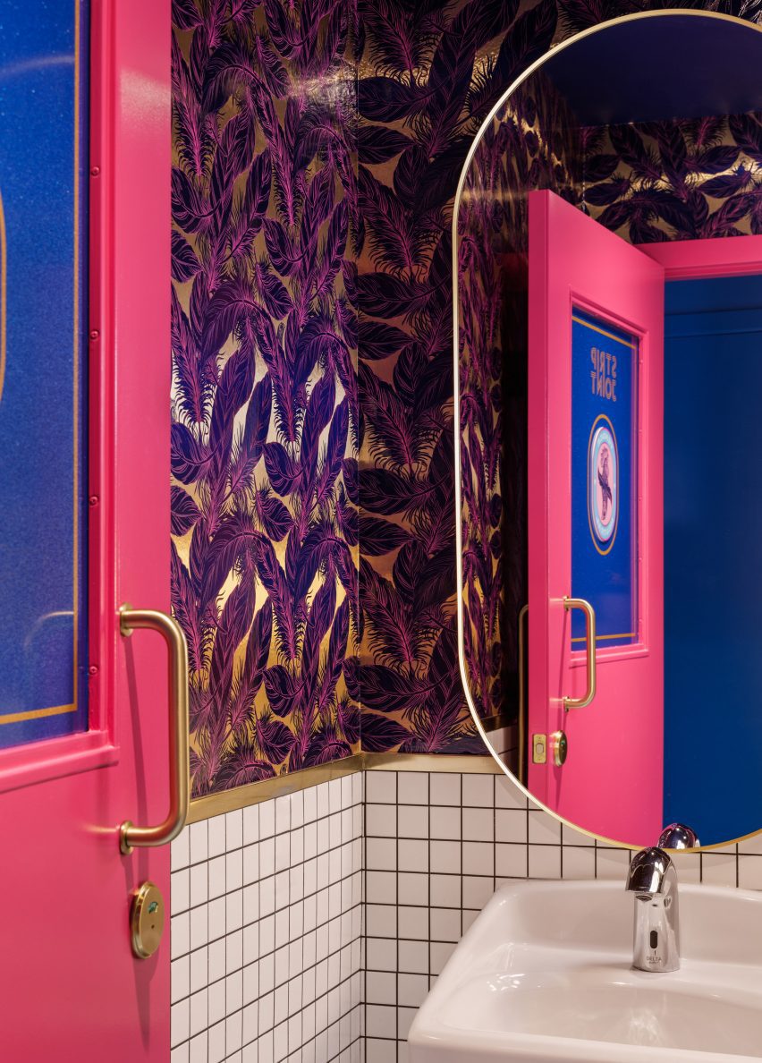
The main entrance vestibule is painted midnight blue and illuminated by vertical bands of neon lighting that connect wall-to-wall across the ceiling. This immersive passageway sets the tone for the main dining area, which is similarly lit with neon.
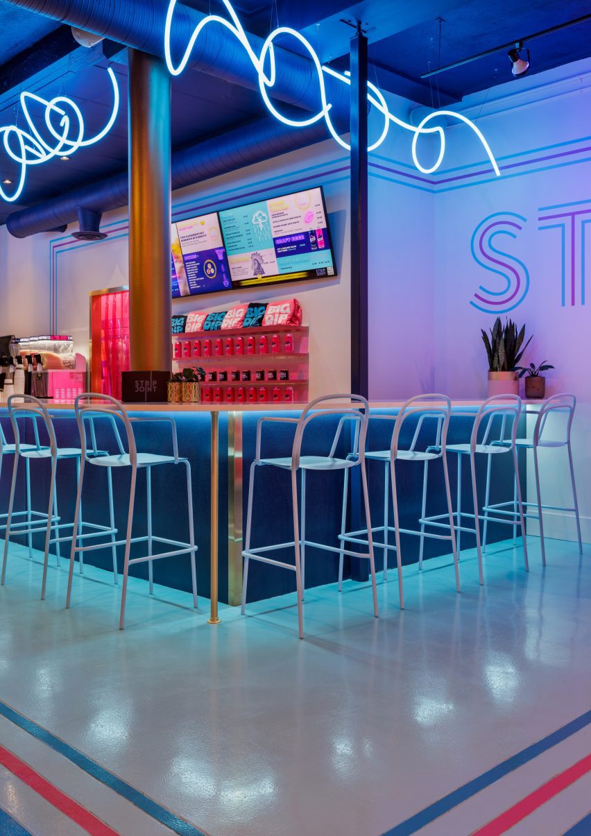
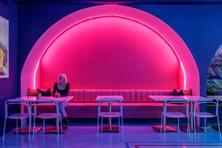
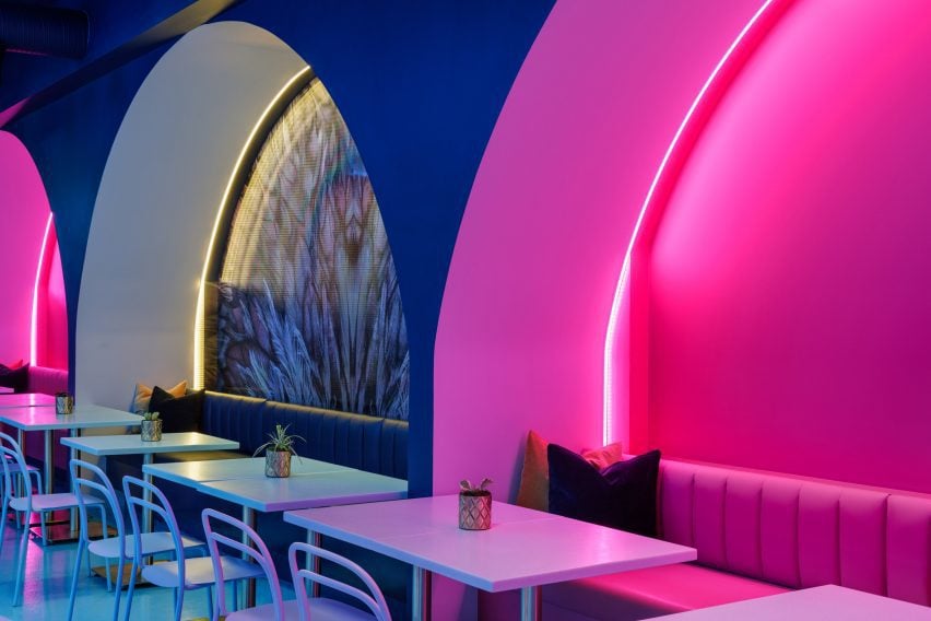
Tangled fluorescent-blue tubes are positioned above the bar and service counter, while pink and yellow glow from LED strips within large colour-blocked arches that accommodate built-in seating for a row of dining tables.
“Coloured lighting is used extensively to feature architectural details, enhance volumetric space, ground the bar and highlight seating areas,” Hamilton said.
Part of a larger retail space that was divided into four units, the chicken shop is accessible from both sides of the building.
Therefore, close attention was paid to the flow of people through the space, and wayfinding tools were implemented to assist both dine-in and take-out customers.
A trio of thin, coloured stripes are inlaid across floors to guide hungry patrons to the ordering area.
The same triple-line motif spells out the brand’s name in large letters across a wall, above a pink scallop-topped bench accompanied by small tables and terrazzo stools.
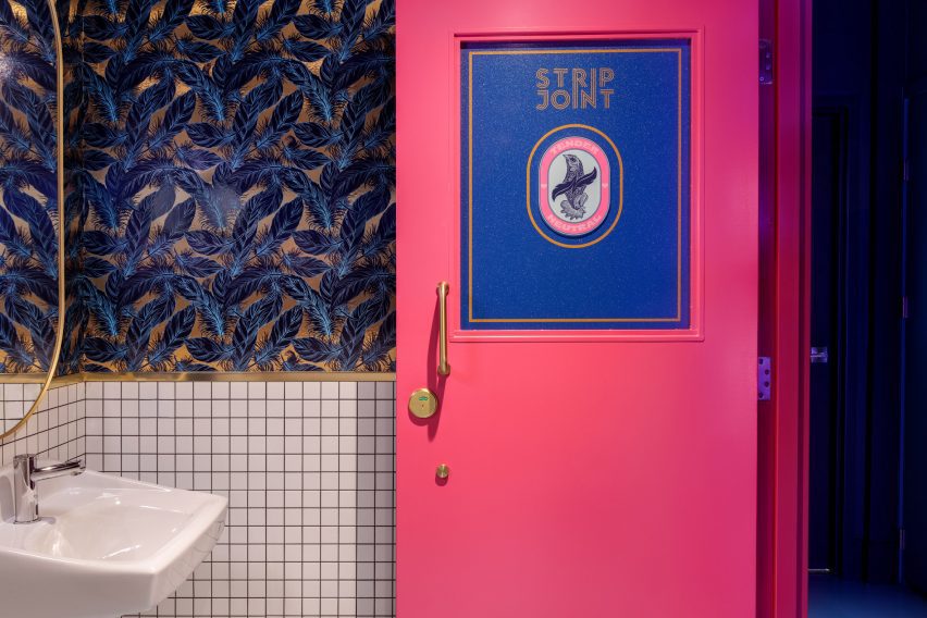
Custom-designed feathery wallpaper adorns the back of the central arch and inside the “tender neutral” bathrooms, which are tucked behind bright pink doors.
For guests wishing to stay longer, a private dining area named the Hens Den is obscured from view by gauzy drapery.
This monochromatic room features a brass pole in the centre of its dining table, around which a lazy susan for sharing food rotates.
“As an extension of the space, the predominately custom furniture is equal parts playful and sculptural, creating a conversation-worthy addition to the space,” Hamilton said.
The designer founded her eponymous studio in Calgary, where she’s based, and also operates a second location out of Vancouver.
A trend for bright psychedelia in hospitality and entertainment spaces has been gaining pace recently, with other examples found in Seattle’s Supernova nightclub and the Resonant Head music venue in Oklahoma City.
The photography is by Joel Klassen.


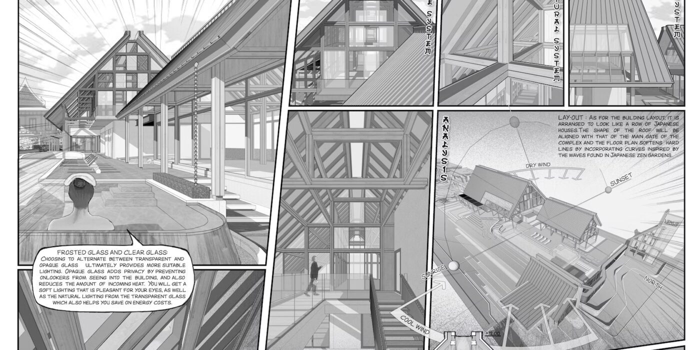
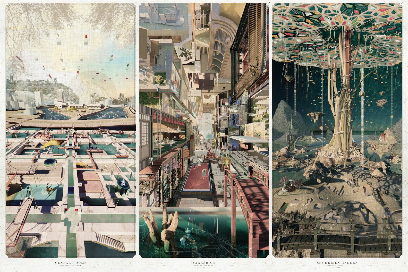
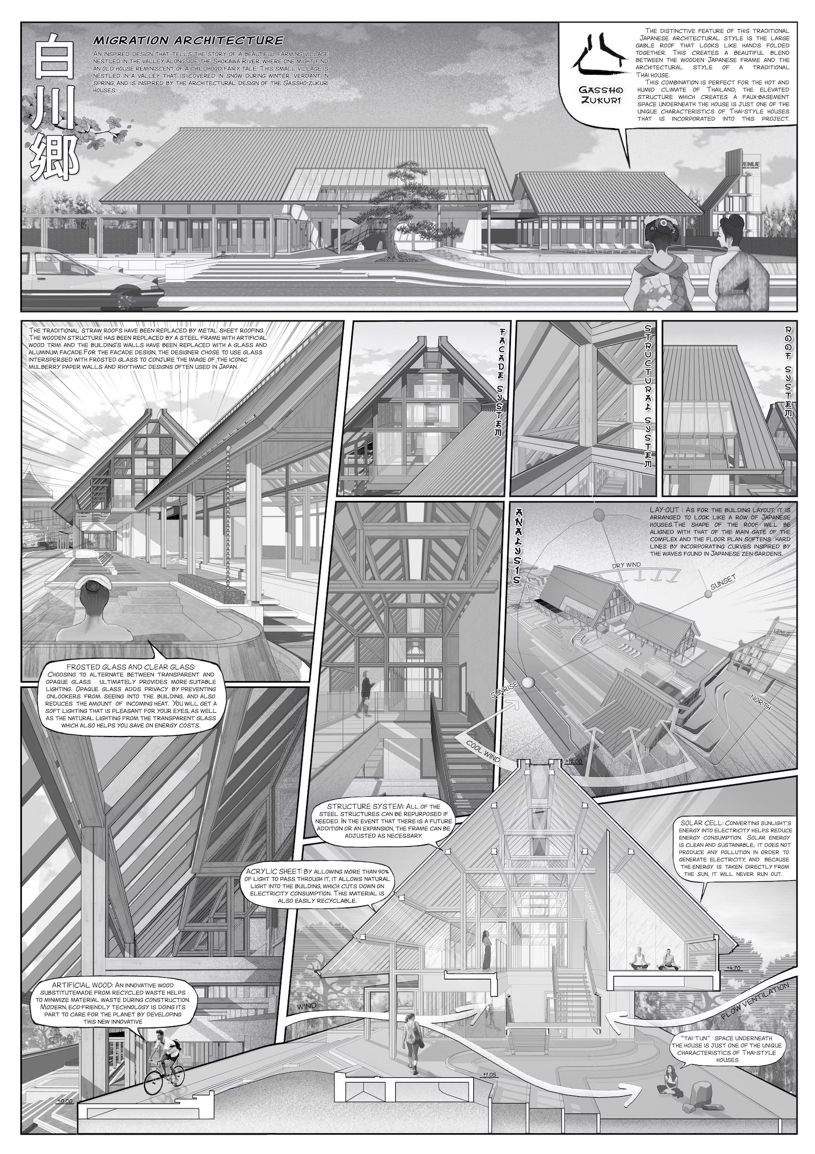 Underlining the idea that CAD drawings can be done in many different styles, the drawing VENUE ID PINKLAO-SALAYA “Shirakawa-go” by LWD.Co was the Vision Awards Studio Winner this year for Computer Aided Drawing. As the team outlines, it was made as an “inspired design that tells the story of a beautiful farming village nestled in the valley alongside the Shokawa River, where one might find an old house reminiscent of a childhood fairy tale.” Reading like a comic, the juxtaposition of angles, moments and frames moves the eye through the drawing and text.
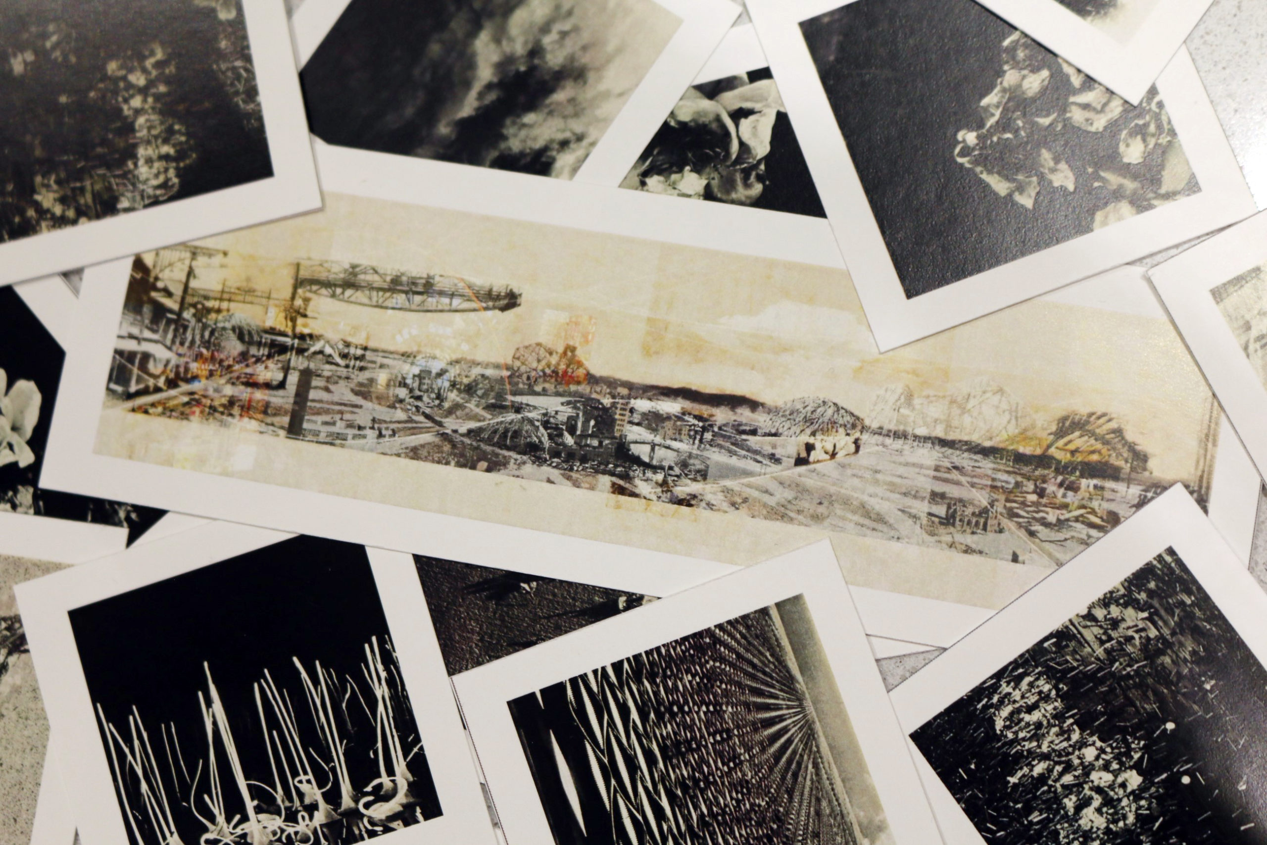
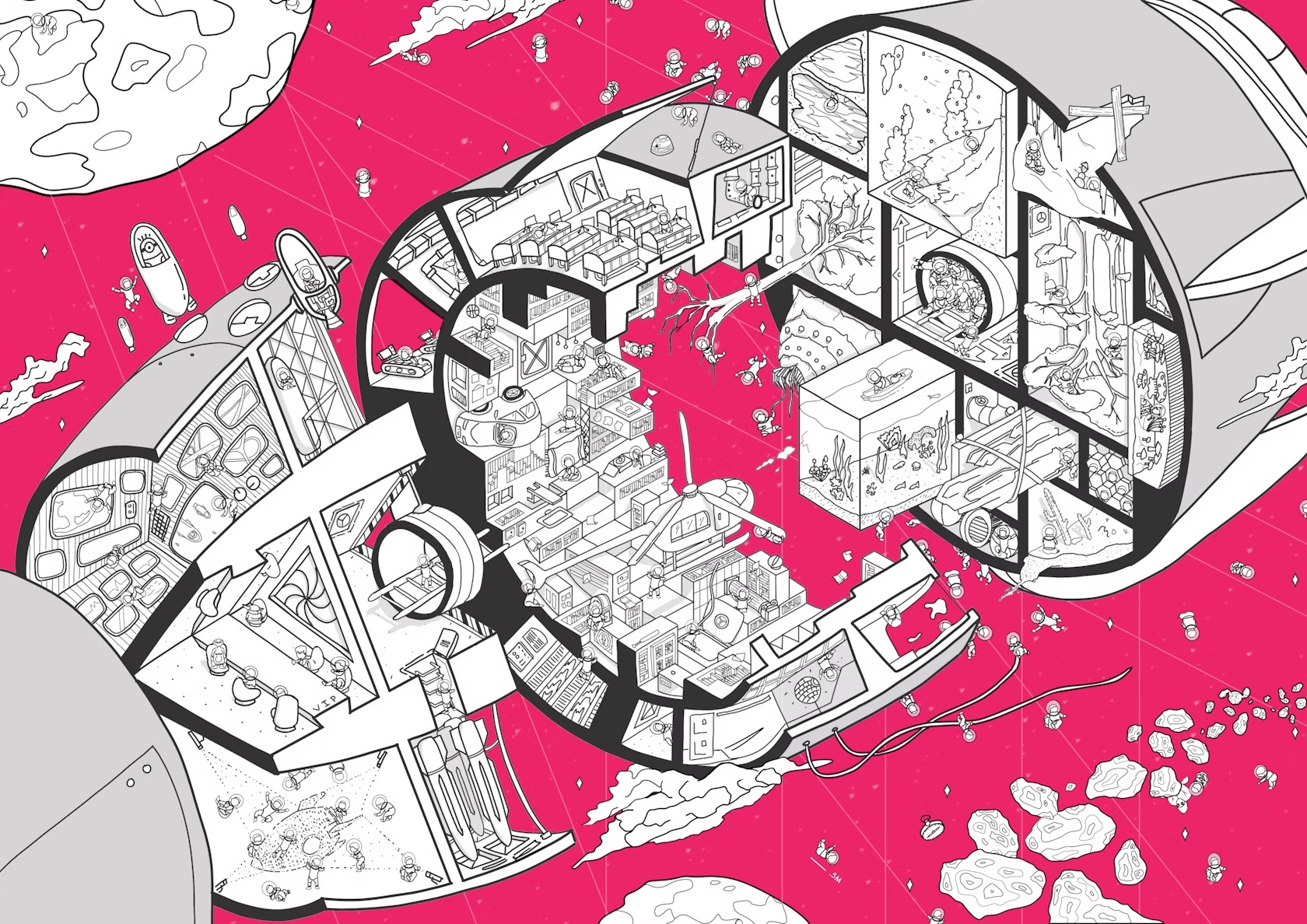 This imaginative drawing “Fable or Failure” by Alexander Jeong and Brandon Hing won the 2023 Architizer Vision Award for a Student Drawing in the Computer Aided category. Jeong and Hing’s rendering reimagines a multitude of fantastical scenarios through space travel. As the duo notes, “Fable or Failure is a project that seeks to reimagine how space travel can be conceptualized in the distant future of societal development.” Taking the shape of an exploded axonometric drawing, the winning entry uses black, white and grey linework and shading, as well as a single color to denote outer space.