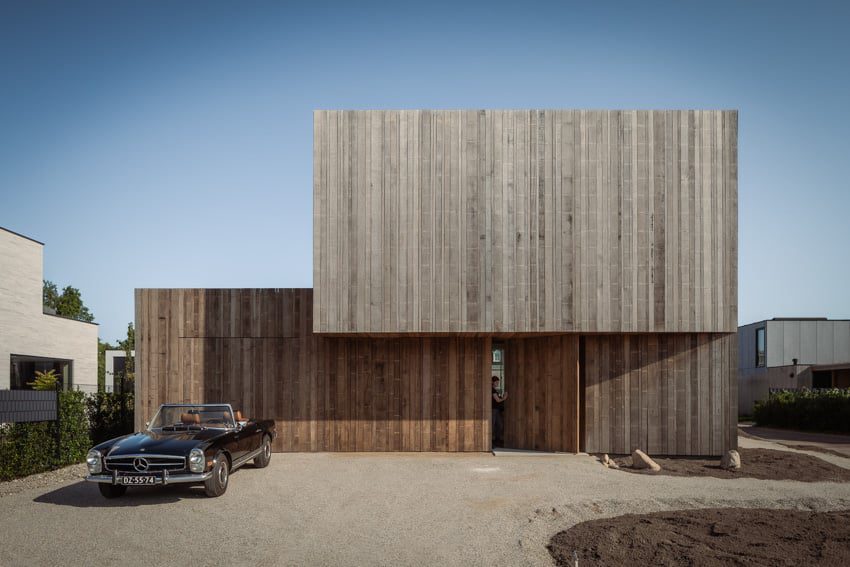
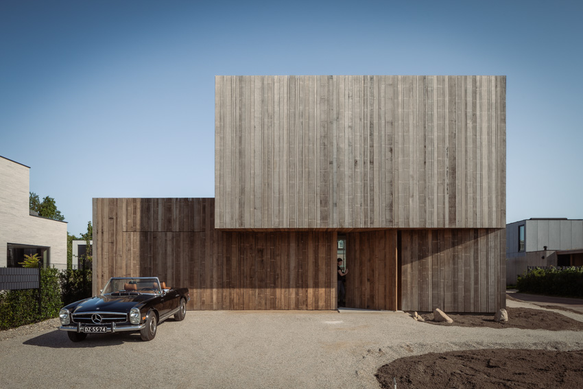
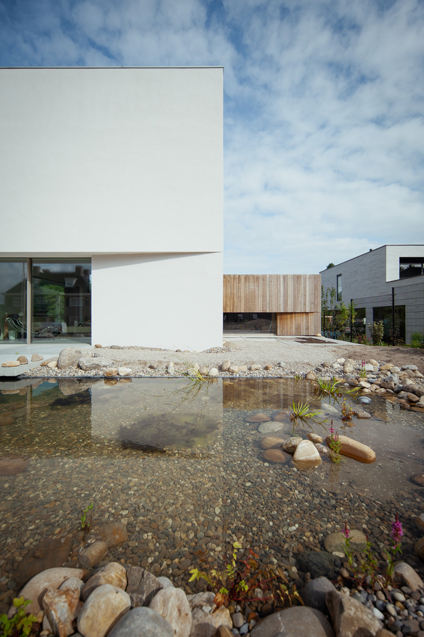
Villa K340’s Split-Level Design traces the undulating terrain
Architect Francois Verhoeven constructs Villa K340 in Vroondaal, a natural and recreational area near the Hague, aiming to blend modernity with nature. The region encompasses several designated residential complexes, such as ‘De Hoogte’ where the house stands. The area allows modern villas to be built in a landscape of artificially constructed hills.
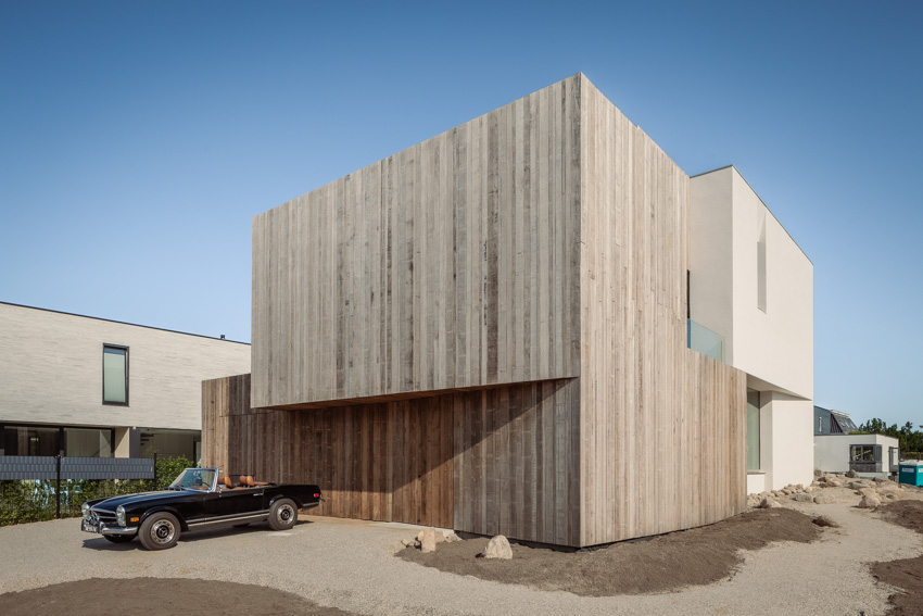
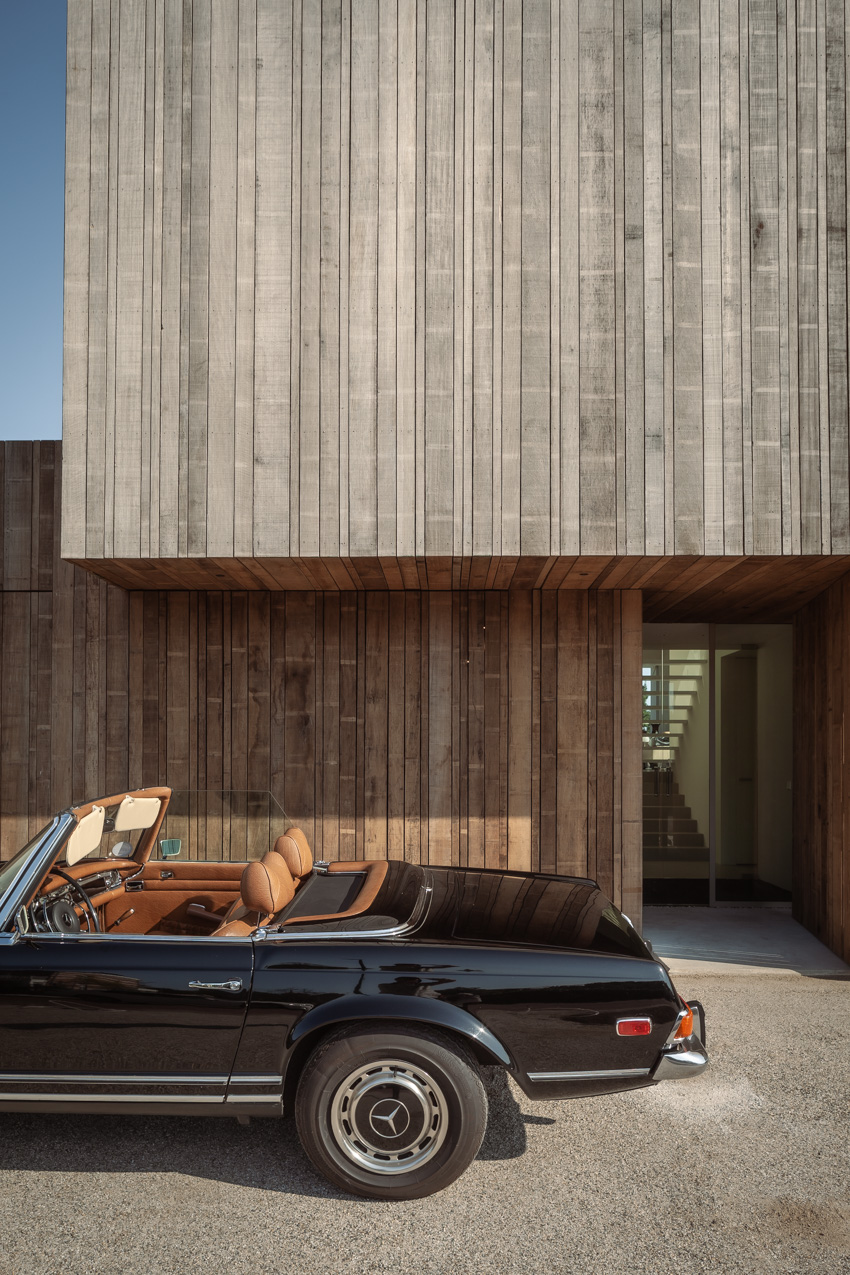
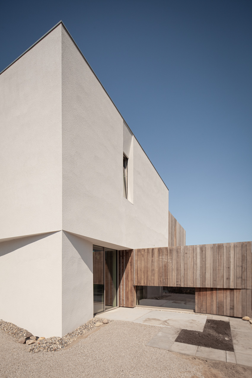
K340’s design aligns with the concept of a split-level layout that runs along the contours of the undulating terrain. The entrance rests at a lower elevation while the living areas perch atop the hill, forging a dynamic interplay between architecture and landscape. The project features a juxtaposition of raw, natural materials against sleek design elements. Wooden components and lime plaster, contrast the facade’s clean divisions and slender aluminum window frames. Wooden cladding extends in front of windows and along the front facade, creating a robust silhouette. In the evening, light shines through the gaps of the cladding elements from within the villa.
all images courtesy of Francois Verhoeven Architect
wooden cladding coats the house creating a robust exterior
A large pivot door merges into the facade when closed, offering a sense of privacy and structural delineation at the entrance area. A central staircase and adjoining outdoor spaces provide views of the villa’s various levels. The design team attends to meticulous detailing to ensure fluid transitions between interior and exterior spaces, concealing the window frames behind cladding and plasterwork. The wooden facades cover up the roof edges and blend gracefully with set-back windows, extending the main shape from the top to ground level. Floor-to-ceiling windows free of mullions and thresholds are incorporated into the interior, integrating into the walls.
the design of Villa K340 aims to blend modernity with nature
Francois Verhoeven inserts eco-Friendly Features in Villa K340
Aiming for a sustainable design, the project features triple glazing, a geothermal heat pump, CO2-controlled ventilation, and strategically designed overhangs that provide shade in the summer and allow plentiful sunlight in during the winter. Solar panels, discreetly set behind the elevated roof edge, keep the villa’s energy consumption to a minimum. The villa’s garage, thoughtfully integrated into the architectural design, features a green roof. The roof, the surrounding organic garden and pond are designed and landscaped by Biotooptuinen and complement the modern design, enhancing the house’s overall aesthetic appeal.
the project features a split-level layout
the entrance rests at a lower elevation while the living areas perch atop the hill
the surrounding organic garden and pond complement the modern design
COS architectural creative lead Marcus Cole explains how more sustainable design principles were used in its recently opened concept stores, in this exclusive video produced by Dezeen for the brand.
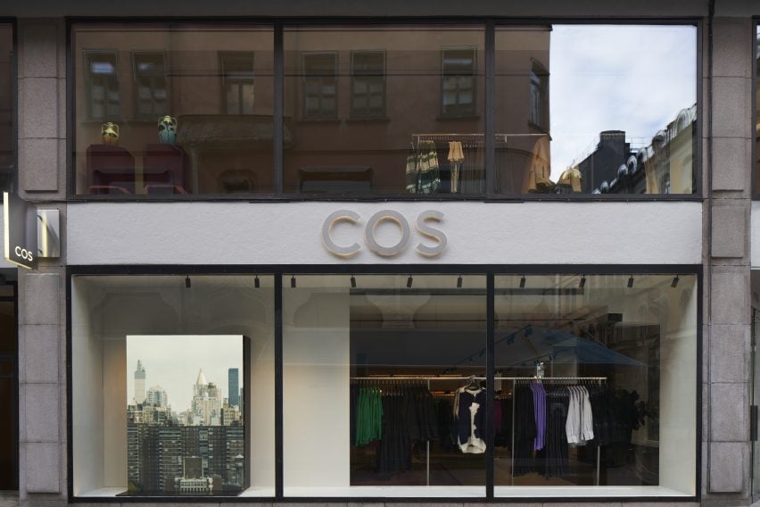
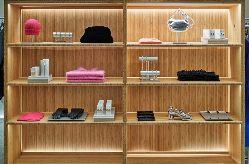
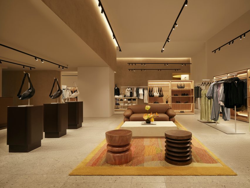
The brand recently opened two stores, located in Stockholm and Mexico City, which according to COS exemplify its commitment to sustainable building and circular design. Cole talked to Dezeen about the brand’s approach when creating the new retail spaces.
“This flagship store in Stockholm is the first in Europe to adopt the most sustainable store concept from COS to date,” he said.
The Stockholm flagship store reflects the brand’s promise to lower CO2 emissions. Photograph by Åke Lindman
At 566 metres square and spread over two floors, the store, located on Biblioteksgatan, is also the brand’s largest concept store.
When creating the space, COS wanted to address their existing waste flows, finding ways in which byproducts that would traditionally be categorised as waste could be reused and repurposed.
“The design focuses on circularity in both our material selection and our design strategy,” explained Cole.
“The floor throughout our sales area is a terrazzo tile that has been made from 90 per cent quarry waste from our own suppliers’ production line. The majority of the rugs are a collaboration using waste yarn from our suppliers’ chain, each bespoke in their own way.”
“We prioritised materials that can be easily repaired, and are designed for disassembly by avoiding mixing materials that are hard to decouple later down the line,” Cole added.
The Stockholm store uses 66 per cent more recycled materials than the original store design. Photograph by Åke Lindman
The brand also took the same approach when creating the furniture and fixtures used in the store, choosing to prioritise more sustainable and recycled materials.
“Our vitrines and wardrobes are made from a combination of recycled acrylic and bamboo,” said Cole.
“Bamboo is a more renewable choice than traditional hardwoods, because of the speed at which it grows, its carbon storage capacity, and also its durability,” he continued.
“If we look to our fitting rooms and some of the softer fixtures in our stores, the panels are made from 60 per cent recycled plastic bottles that have been spun into felt, [and] the floor consists of a PVC free linoleum, which is made from a mixture of recycled and natural materials.”
Sustainable and recycled materials were prioritised during the design process. Photograph by Åke Lindman
Other changes include 30 per cent recycled aluminium rails, 100 per cent recycled mannequins and the removal of all concrete fittings.
The brand also found it important to make use of the existing building where possible to reduce unnecessary CO2 emissions and to give new life to unused materials.
“This concept store is actually a rebuild of an existing store,” Cole explained. “We were able to reallocate and reuse 50 per cent of our interior elsewhere in our portfolio, making sure we have as much emphasis on what we’re taking out of the store as what we’re putting in it as well.”
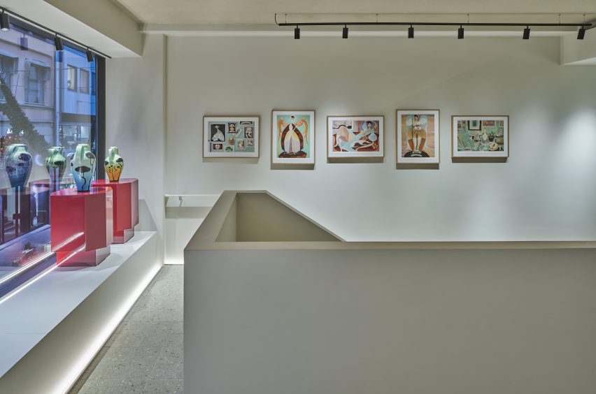
A selection of paintings and sculptures by visual artist Liselotte Watkins decorate the store interior. Photograph by Åke Lindman
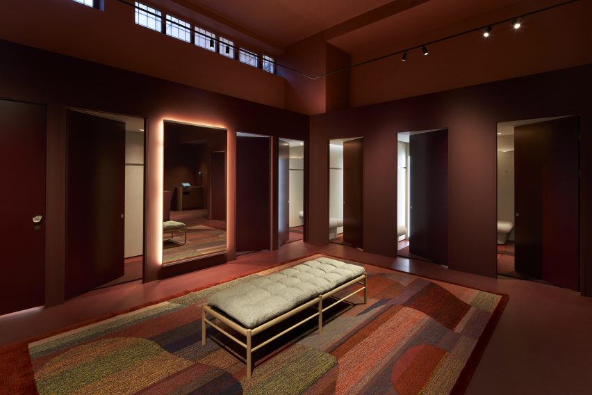
Following on from the Stockholm store, the brand also unveiled another sustainable concept store in Mexico City. The store is located in the Polanco neighbourhood, and the interior references Mexico’s artisan craft traditions.
In addition to operating as a fashion store, the shop also exhibits artworks by local creators, such as Caralarga, a female-led enterprise which focuses on sustainability and female empowerment.
The Mexico City store is the first in the Americas to embrace COS’s sustainable store concept. Photograph by Fernando Marroquin
“We have very ambitious plans to bring this sustainable approach and all of our learnings from it to more stores in the future,” Cole said.
“The stores that have adopted our new concept now have an average of 68 per cent recycled materials. And this is a percentage that we’re both really proud of because of how far we’ve come, but also challenged by because of where we want to get to,” he continued.
“Whether it’s a flagship store or a smaller activation, we worked hard to embed agility into the core of our interiors so that we’re not wasteful in the future.”
COS is a London-based fashion brand. The brand has 252 stores, spanning 47 physical markets.
Partnership content
This video is produced by Dezeen for COS as part of a partnership. Find out more about Dezeen’s partnership content here.
Spotted: Hydrogen is a promising fuel for a future decarbonised economy, but, currently, more than 99 per cent of the hydrogen produced globally comes from fossil fuels. Green hydrogen, which is produced by running a renewable electric current through water, is a leading alternative to fossil-derived hydrogen, but it comes with its own set of challenges, such as the high cost and energy demand of the electrolysers used to produce it. This has led innovators to look for further clean sources of hydrogen to supplement the nascent green hydrogen industry.
This is where US startup Koloma comes in. The company aims to extract naturally occurring hydrogen from iron-rich rocks, taking advantage of a natural process called serpentinization. During this process, groundwater reacts with iron in the Earth’s crust to create pure hydrogen in a reaction that goes on continuously, replenishing the gas at a rate of 23 megatonnes per year – which is equivalent to around 30 per cent of the world’s hydrogen demand.
Once geologic hydrogen is formed, there are several natural mechanisms by which it can become trapped to form reservoirs that can be tapped through drilling wells. Koloma is currently exploring its first test wells in the American Midwest (their precise locations are kept secret), which is yielding samples that are being analysed for volume and purity. The company’s founder, Dr. Tom Darrah, a professor of earth sciences at Ohio State University, has secured multiple patents for hydrogen extraction technologies.
The hydrogen Koloma hopes to extract promises several benefits over hydrogen produced using existing methods. According to data shared by the company, the carbon intensity of geologic hydrogen is only marginally greater than green hydrogen produced using renewable energy – the current gold standard for clean hydrogen. However, it also requires almost no external water and very little external energy as inputs, which sets it apart from all other hydrogen production methods, including green hydrogen. It also does not rely on large-scale wind turbines or solar farms, which take up a significant amount of land.
The promise of geologic hydrogen has captured the attention of several startups, but Koloma has just received $91 million of funding from the Bill Gates Foundation, meaning it is well-placed to expand its capabilities and the production of geologic hydrogen a commercial reality.
Springwise has covered several alternative sources of clean hydrogen including a company that is producing Green Hydrogen from biowaste and a process for making hydrogen and carbon black without combustion.
Through trials & tribulations, they stand strong; our defenders prove that unity can never go wrong. 6th September Pakistan Defence Day 2023 (Youm e Difa Pakistan)
The Royal Institute of British Architects has revealed the six-strong shortlist for the 2023 Stirling Prize, which is dominated by projects in London.
Three of the buildings vying for the coveted award, which is given annually to the UK’s best new building, are housing projects in London by studios Apparata, Sergison Bates and Adam Khan Architects.
This is a reflection of what the Royal Institute of British Architects (RIBA) president Muyiwa Oki said is a shortlist of community-focused and “purposeful architecture”.
A House for Artists is one of three residential projects on the shortlist
“The 2023 Stirling Prize shortlist illustrates why architecture matters to all of us,” said Oki.
“These six remarkable buildings offer thoughtful, creative responses to the really complex challenges we’re facing today. Whether it’s tackling loneliness, building communities, or preserving our heritage, these projects lay out bold blueprints for purposeful architecture.”
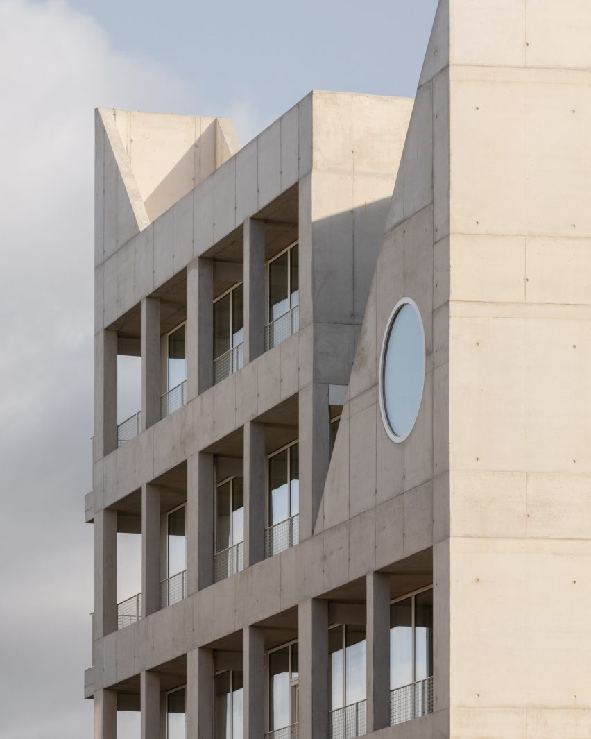
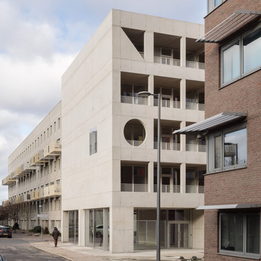
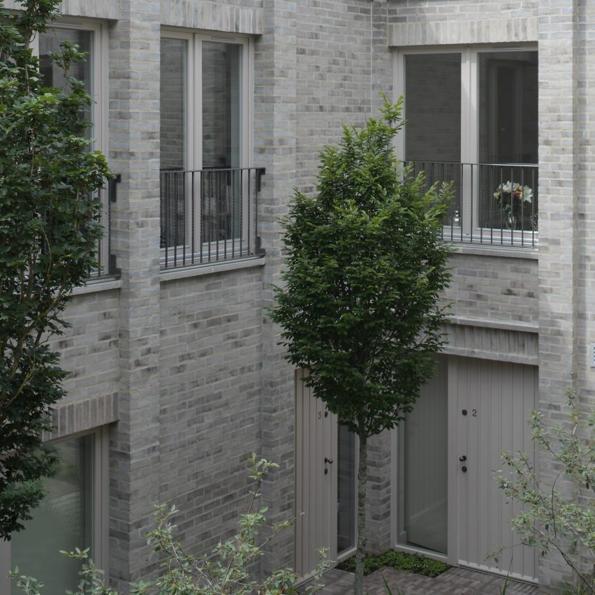
The residential projects on the list include A House for Artists, an affordable housing scheme by Apparata that was aimed specifically at creatives, and Lavender Hill Courtyard Housing, an infill project by Sergison Bates at a former sheet-metal workshop in Clapham.
A social housing block designed by Adam Khan Architects as part of the Central Somers Town masterplan in Camden is the third.
This project was animated by matching arch motifs, matching an adjoining children’s community centre that also forms a part of the project.
The University of Warwick Faculty of Arts is the only building on the list outside of London
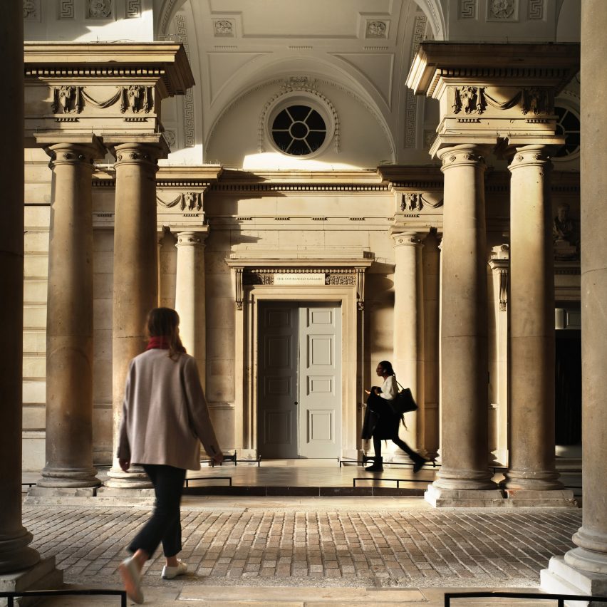
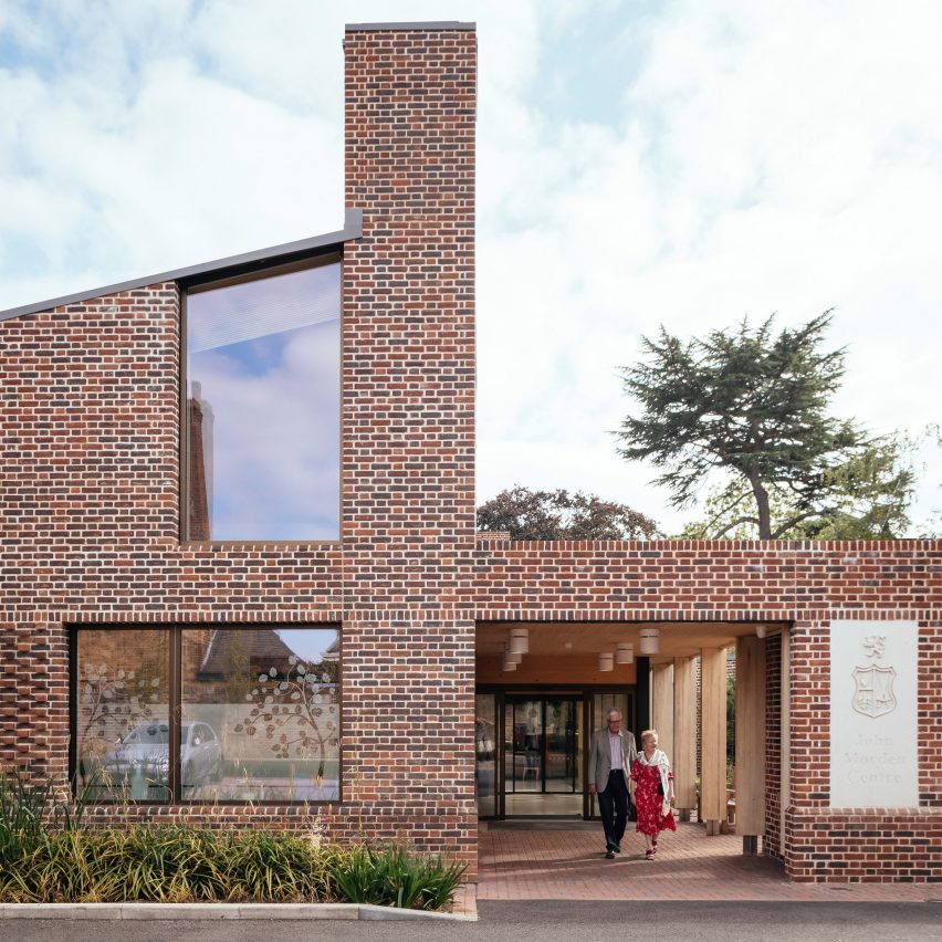
Two other buildings on the list that are also in London are Courtauld Connects by Witherford Watson Mann Architects and the John Morden Centre by Mae.
Courtauld Connects is a renovated gallery at Somerset House, while the John Morden Centre is a daycare centre for a retirement community in Blackheath.
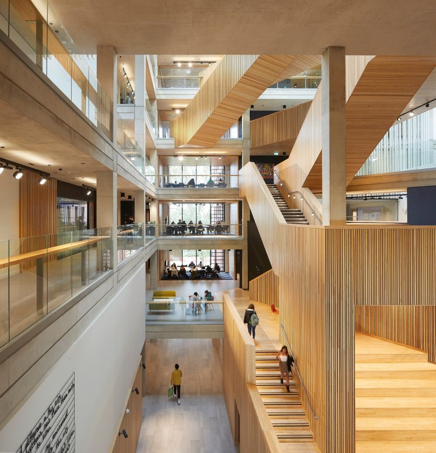
The only building on the shortlist that is not in London is the Faculty of Arts for Warwick University designed by Feilden Clegg Bradley Studios for a site in Coventry.
This university building brings together its arts departments under one roof and is formed of interconnected pavilions that draw on the surrounding nature.
Feilden Clegg Bradley Studios won in 2008 for the Accordia housing in Cambridge, which it created alongside Alison Brooks Architects and Maccreanor Lavington, while Witherford Watson Mann Architects was named winner in 2013 for Astley Castle in Warwickshire.
Last year’s recipient of the award, which is the most significant in UK architecture, was a brick and timber library that Niall McLaughlin Architects created for the University of Cambridge.
The winner of the 2023 RIBA Stirling Prize will be revealed on 19 October at a ceremony in Manchester. It will be selected by a jury headed up by OMA partner Ellen van Loon.
Read on for edited comments from the 2023 Stirling Prize jury:
Photo by Ståle Eriksen
A House for Artists, Barking, by Apparata
“A House for Artists provides an ambitious model for affordable and sustainable housing.
“Following a six-year effort by arts organisation Create London to provide affordable accommodation for creative people, the result is a flexible live-work space for 12 artists arranged across five floors.
“In exchange for reduced rent, they deliver free creative programmes for the neighbourhood through a street-facing glass-walled community hall and outdoor exhibition space on the ground floor.
“This is a thoughtful and assured piece of architecture that has been delivered with rigour and precision.”
Find out more about A House for Artists ›
Photo by Philip Vile
Courtauld Connects, Westminster, by Witherford Watson Mann Architects
“The transformation of the Courtauld Gallery in its home at Somerset House, London is the first part of a multi-phase project that aims to open up the institution both physically and culturally.
“The three main moves that transform the gallery are the insertion of a lift, the reworking of the entrance sequence, including a beautiful new stair down to the basement visitor facilities, and relevelling and opening up the vaults below the entrance to provide a flowing, level space.
“Overall, the jury thought that this was an extremely well-judged project, which lets the spirit of the historic building lead the visitor experience, but with some 21st-century creativity to solve some of its inherent complexities.”
Photo by Jim Stephenson
John Morden Centre, Blackheath, by Mae
“Founded in 1695, Morden College is a charity dedicated to providing older people in need with a home for life, including the provision of residential and nursing care. Residents live on the Grade I-listed college site in Blackheath, which is attributed to English architect Sir Christopher Wren.
“The John Morden Centre is a daycare centre housing social and medical facilities for all residents. The brief was to bring functions from across the college, including a medical centre, cafe, lounges and administrative offices, into a single building.
“The project provides a delightful set of meandering spaces, which expertly combines recreational and more tricky medical facilities without feeling institutional.
“Such stimulating spaces are vital to conquer loneliness and isolation. It is beautifully yet robustly detailed and should be a joy to use for years to come.”
Find out more about John Morden Centre ›
Photo by Johan Dehlin
Lavender Hill Courtyard Housing, Clapham, by Sergison Bates
“Tucked away down a timber-lined passageway, barely visible at the end of a Clapham mews, Lavender Hill Courtyard sees the redevelopment of a former sheet-metal workshop into nine apartments of various sizes, arranged around a courtyard space and a timber-decked terrace on the first floor.
“The judges were impressed by the project’s success at inserting a dense development into a very constrained site. The unassuming entrance to the site opens up into the welcoming courtyard that is accessible to all units and creates a sheltered communal space and sense of privacy amongst the busy surroundings.”
Find out more about Lavender Hill Courtyard Housing ›
Photo by Hufton + Crow
University of Warwick Faculty of Arts, Coventry, by Feilden Clegg Bradley Studios
“The impressive new Faculty of Arts building for the University of Warwick brings together the departments and schools of the faculty under a single roof for the first time.
“The building itself is shaped by the surrounding trees that define the parkland character of the site. This is achieved through four pavilion buildings connected by a lightweight atrium and sculptural timber larch stair.
“The combination of the client’s ambitions to create a new model of working for the faculty, and the architect’s creativity in articulating this ambition through a holistic design approach, has resulted in a building that is both inviting and flexible, enabling collaboration, creativity, and innovation.”
Photo by Lewis Khan
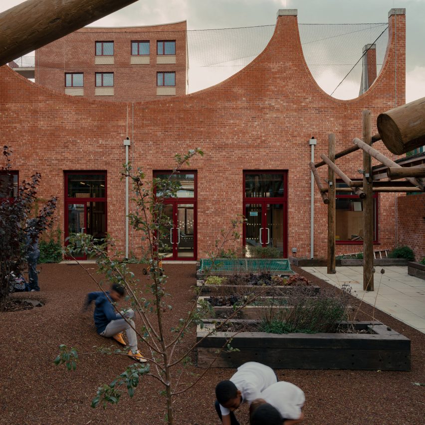
Central Somers Town Community Facilities and Housing, Camden, by Adam Khan Architects
“Central Somers Town Community Facilities and Housing are part of a larger masterplan commissioned by the London Borough of Camden for an extensive area within the very deprived Central London neighbourhood of Somers Town, adjacent to St Pancras station.
“Adam Khan Architects was assigned Plot no.10 and asked to design and supervise the construction of a flexible community children’s facility as well as that of several housing units for social rent.
“The jury commended the Central Somers Town Community Facilities and Housing as a key community asset which is a marked improvement on the previous facility on the site.”
Find out more about Central Somers Town Community Facilities and Housing ›
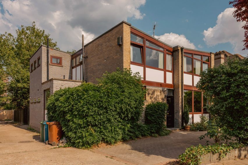
Timber ceilings and a fireplace clad in mahogany tiles feature in this London house, which its owners have renovated to honour the dwelling’s mid-century roots and nod to the colour palette of Stanley Kubrick films.
Located in north London’s Stanmore, Zero House belongs to recording artists Ben Garrett and Rae Morris, whose former home in Primrose Hill is the Dezeen Award-winning Canyon House designed by Studio Hagen Hall.
Zero House in Stanmore was built between 1959 and 1961
Unlike their previous dwelling, Garrett and Morris updated Zero House themselves but adopted the same mid-century palette when creating its interiors.
“The house was built between 1959 and 1961 by a Hungarian architect,” said Garrett, who explained that the original design was informed by Californian Case Study Houses such as Charles and Ray Eames’s 1949 home and design studio.
The two-storey dwelling was renovated by its owners
“It’s a great example of a number of imaginative mid-century domestic houses dotted around metro-land,” he told Dezeen. “Our main aim was to freshen it up relatively in keeping with the time but not to feel like we were living in a total time capsule.”
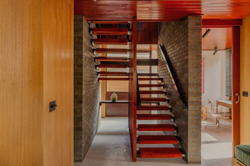
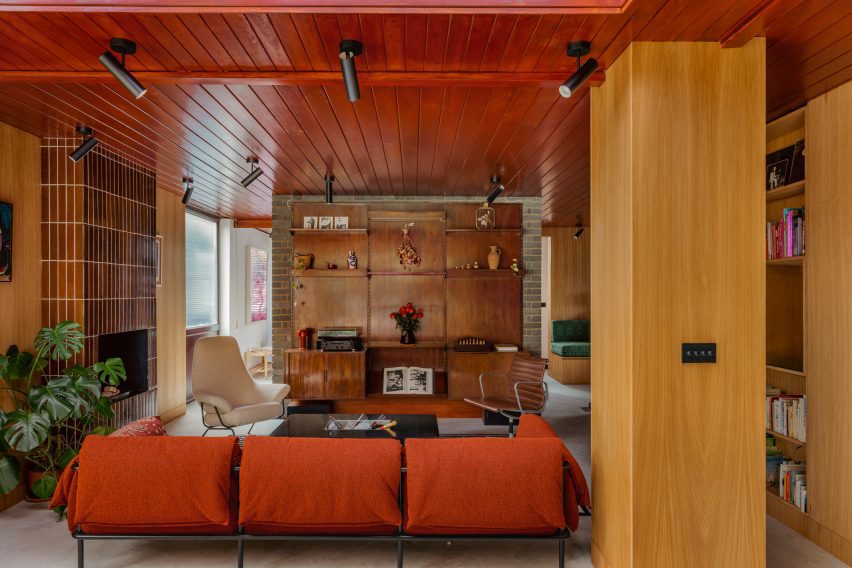
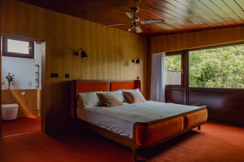
The pair maintained the matchbox timber ceilings that run throughout the two-storey home, which were stained with a dark reddish tone alongside stained wooden doors.
Slim mahogany tiles clad the floor-to-ceiling fireplace
Slim mahogany tiles clad the floor-to-ceiling fireplace in the living room, which features the same micro-cement flooring found at Canyon House and opens out onto a lush garden.
Garrett and Morris also maintained the home’s many exposed brick walls and inserted geometric timber shelving that displays eclectic ornaments including amorphous vases and a colourful set of nesting dolls.
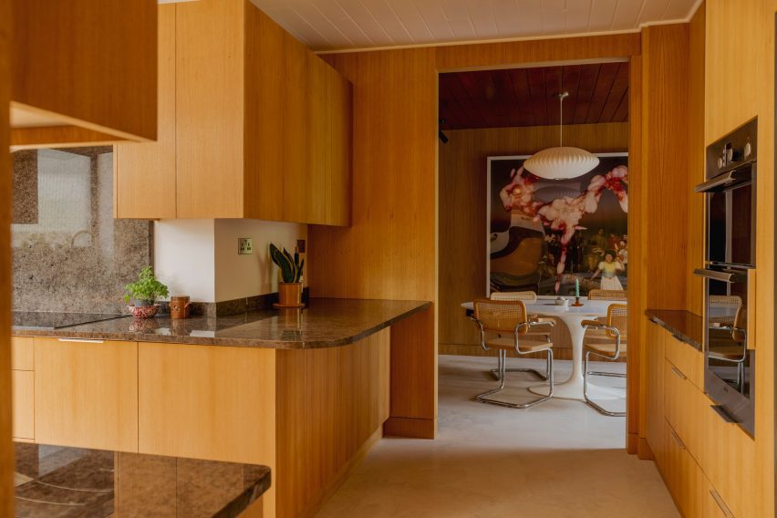
The kitchen was panelled in light-hued timber
Reeded 1970s-style glass was used to form various windows including a rectilinear opening in the kitchen that illuminates minimal timber cabinetry topped with grainy surfaces.
The pair transferred the tubular Marcel Breuer chairs and Tulip dining table by Eero Saarinen from their former home, as well as the same “heinous digital artwork” that decorated their previous living space.
Darker tones create a “horror film” feel upstairs
Upstairs, a moody mahogany carpet darkens the main bedroom, which features the same timber wall and ceiling panels as the communal areas.
“There’s a lot of dark reds and browns in the house,” said Garrett.
“We leaned into the horror film slash Kubrick feel of the upstairs and made a few more austere choices this time,” he added, referencing the late filmmaker, whose credits include the 1980 supernatural horror movie The Shining.
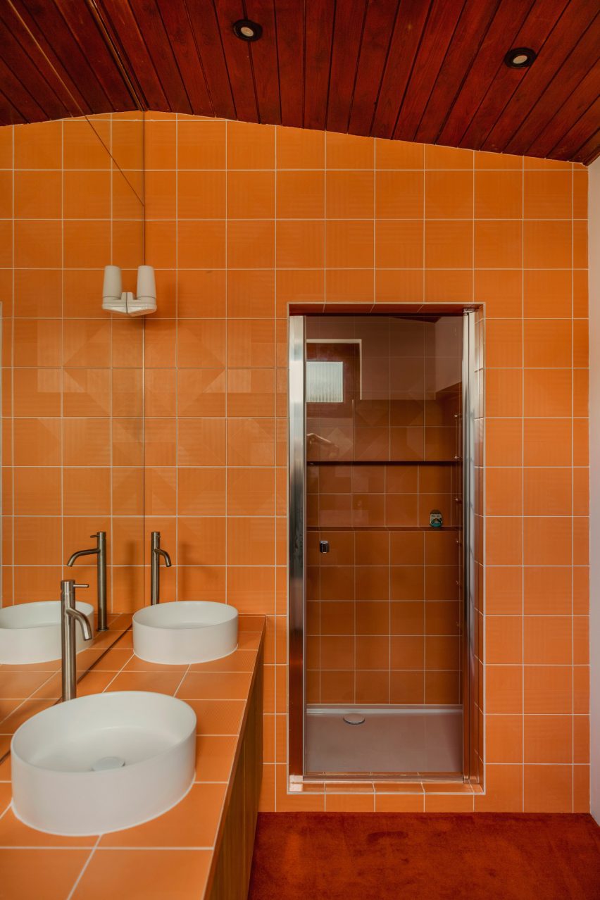
Coffee-hued cork was chosen to clad the exterior of the bathtub and the surrounding walls while another walk-in shower interrupts the dark wooden theme with bright orange tiles and deep white basins.
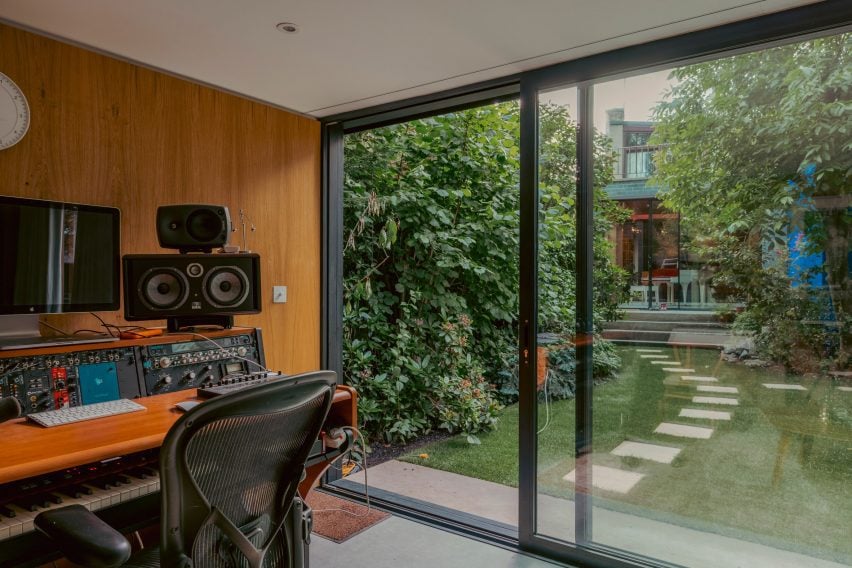
Zero House also holds a timber-panelled recording studio, which is located in a separate low-slung volume at the end of the garden and can be reached via a few stepping stones.
Bright orange tiles were chosen for a walk-in shower
Garrett and Morris left the structure of the property largely untouched. Instead, the duo chose to focus on dressing its mid-century interior.
“We didn’t have to be clever with this house as the space is abundant and the flow and design were incredibly well thought out in the early 60s,” he said. “So it was more of a cosmetic thing.”
There is a standalone recording studio in a shed at the back of the garden
Other recent mid-century renovation projects saw Design Theory update a coastal home in Perth from the 1960s while Woods + Dangaran added a koi pond among other elements to a Los Angeles dwelling built by architect Craig Ellwood during the same decade.
Spotted: As economic growth and consumption rise, so does the amount of waste produced. Statista estimates that, by 2050, the world will be producing 3.4 billion metric tonnes of municipal solid waste each year, a 70 per cent increase compared with 2016 figures. Polygreen, which operates as a network of companies to provide integrated and multi-faceted circular economy solutions, is one leading organisation tackling our growing waste problem with creative zero-waste schemes and innovative partnerships.
For instance, Polygreen recently entered into a strategic partnership with Abu Dhabi Waste Management Centre Tadweer, to bring zero-waste, circular economy, and sustainable waste management principles to the Middle East. The Memorandum of Understanding signed by the two partners will focus on sharing knowledge and best practices for high-profile global events such as COP28, United Nations events, and the Delphi Economic Forum, as well as explore the application of Polygreen’s ‘Just Go Zero’ model in Abu Dhabi.
Polygreen has already had success in implementing the Just Go Zero initiative on the Greek island of Tilos, turning the island into a zero-waste destination wherein 100 per cent of municipal solid waste is now diverted from landfill. As well as engaging with local stakeholders to achieve this fully circular zero-waste economy, Polygreen focused on resident education to encourage essential behavioural change in terms of how waste is sorted at home.
Specially designed vehicles collect and weigh the litter from every household and business on the island, and with the Tilos Just Go Zero app, locals receive important information about the programme and can track how much rubbish they have recycled in real-time. Waste is then sent to the Centre for Circular Innovation instead of landfill, where it is sorted for either recycling, reuse, compost, or turned into alternative fuel. The goal is to use similar methodology to accomplish equally impressive results in Abu Dhabi.
Other circular economy innovations recently spotted by Springwise include on-demand data that makes recycling easy, a scheme that lets residents in South Africa exchange recycling for digital currency, and a new approach to circular packaging.
Architects: Want to have your project featured? Showcase your work through Architizer and sign up for our inspirational newsletters.
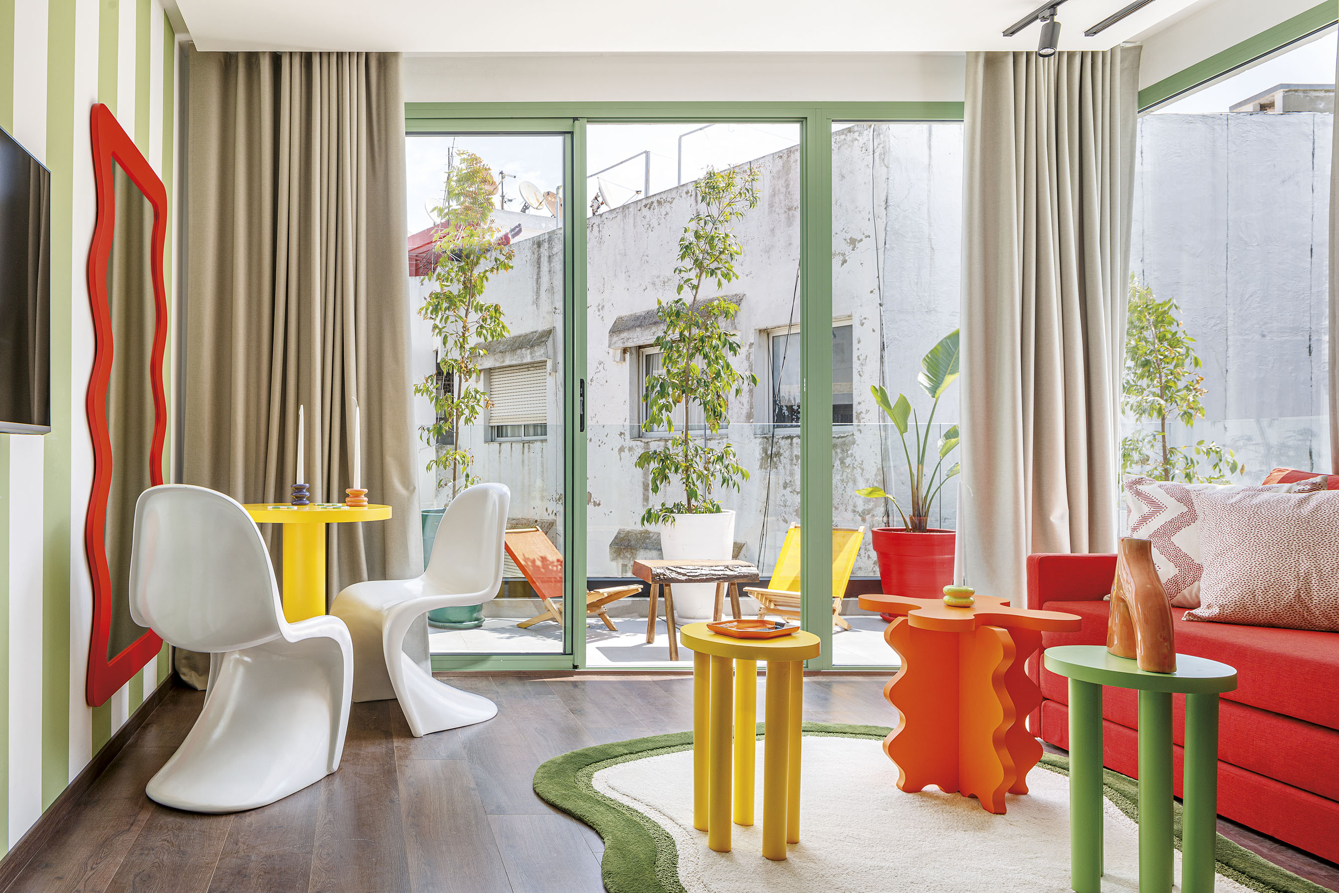
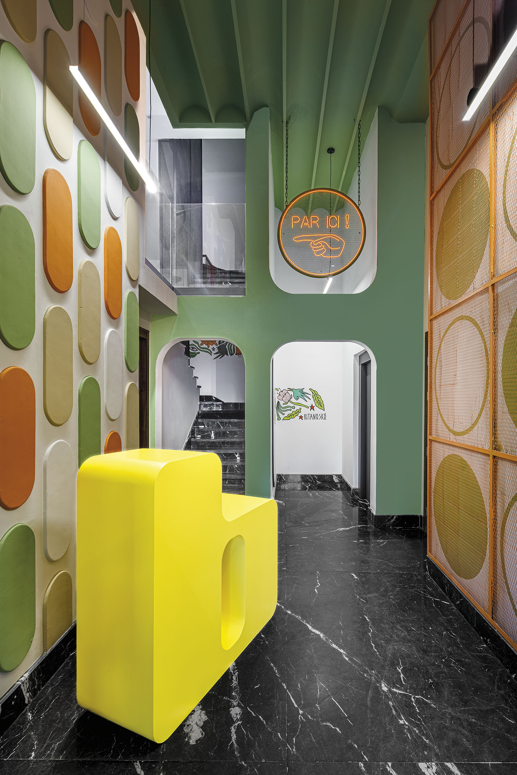
How do color, decoration and whimsy come together in modern design? Architect Ludwig Mies van der Rohe became known around the world for his seemingly simple buildings and the phrase “Less is More,” a mantra he adopted throughout his life. In turn, that phrase would come to define a generation of minimalist, modern design. As Pat Finn noted, more than 60 years after this famous statement, it seems that ornament still carries a hint of taboo. So what place does maximalism have in our everyday life?
Across architecture and interior design disciplines alike, maximalism is a reaction against minimalism, a move towards an aesthetic of excess. The philosophy is summarized as “more is more.” More color, more decoration, and the desire to celebrate the intricacies and complexity that come with them. Taking a dive into the Architizer library, the following projects represent how designers are creating maximalist interiors today. They represent multiple scales, material choices and wide-ranging geographies around the world. In turn, they show how interiors are becoming ever more playful, inclusive and inspiring.
BasilicÔ
By Studio CAYS, Casablanca, Morocco
The BasilicÔ was made to create an attractive and magnetizing place to explore. The design team wanted to imagine the impact colors can have on the occupant experience, creating an environment that stimulates the senses. As they explained, polychromy and morphology combine to create a maximalist aura. The BasilicÔ project revolves around a floral theme through which several types of apartments emerge: The CoquelicÔt, the MimÔsa, the TournesÔl, the MartagÔn and the TulipÔ.
Together, the different apartments form a “bouquet” within the building to brings vitality and freshness to raw concrete walls and subdued corridors. Each of the apartment themes has its own character which stems from a common floral personality. The differences result in different shapes, colors and materials which are reflected through wall panels and furniture.
Dream La Miro
By Wutopia Lab, Jiangsu, China
In Dream La Miro, Wutopia Lab wanted to create a place of joy for the Duoyun Bookstore. The fairytale parent-child bookstore was opened at Dream Town in Yancheng, Jiangsu. When the client showed the team the IP they had introduced, namely the three animated films created by Italian artist Cristina Làstrego: Mirò the Cat, The Circus and The Creation, they were moved by the magnificent scenes and the imagination created by the artist.
The result is a fairy tale bookstore that uses the origin of life as a base inspiration combined with elements from the other animations. Wutopia Lab chose the ark as the theme, with the yellow outside and red inside sailing ship docked in the harbor of the book sea. All the fairy tales about the Miro store of Duoyun Bookstore start from here. The team didn’t want the interior design to be boring or simple. The tent, ark, mountain and forest all became means by which they tried to break out a typical style façade.
LIÒN
By COLLIDANIELARCHITETTO, Rome, Italy
LIÒN is a restaurant and cocktail bar in the heart of Rome — halfway between the Pantheon and Piazza Navon. The project features bold lines and saturated colors in a maximalist style, contrasting with the austerity of the Palazzo that encompassed it. The idea was to give back to the city fragments of the Dolce Vita. Soft lights and mirrored surfaces envelope a sophisticated restaurant, whose terrace overlooks Largo della Sapienza.
LIÒN unfolds on two levels: the ground floor, encapsulating the restaurant, is completely projected on the outside through large windows outlined by a thick travertine frame. The basement, which is accessed via a marble staircase embellished with brass details, houses the service rooms, the kitchen and the wine cellar. The circle became the matrix of the dynamic elements, with soft and sinuous lines, which characterize the interiors, from the subtle and arched friezes that envelop the space, to the deep three-dimensional lozenge screen.
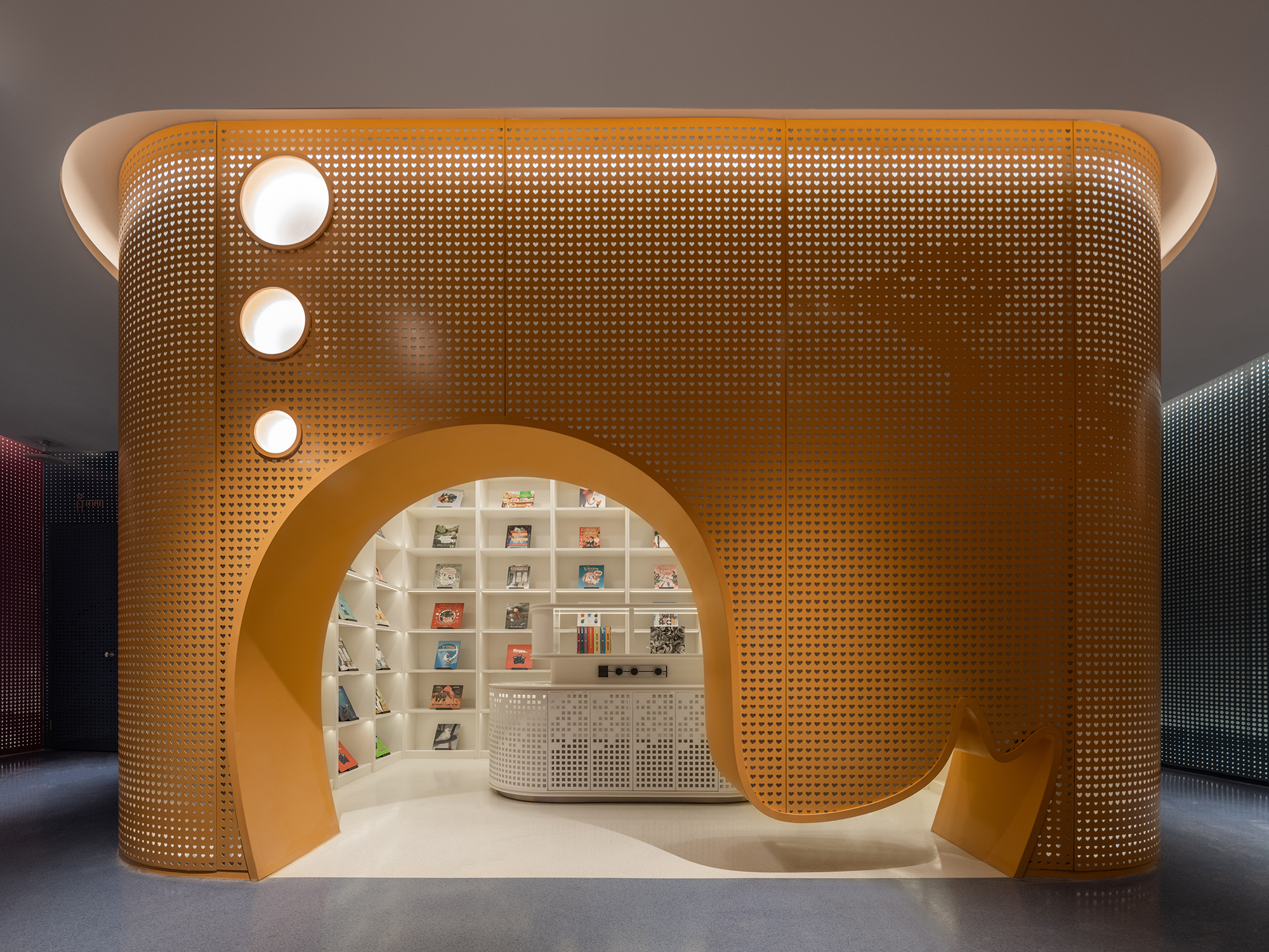
The MIXc Kunshan
By X+LIVING, China
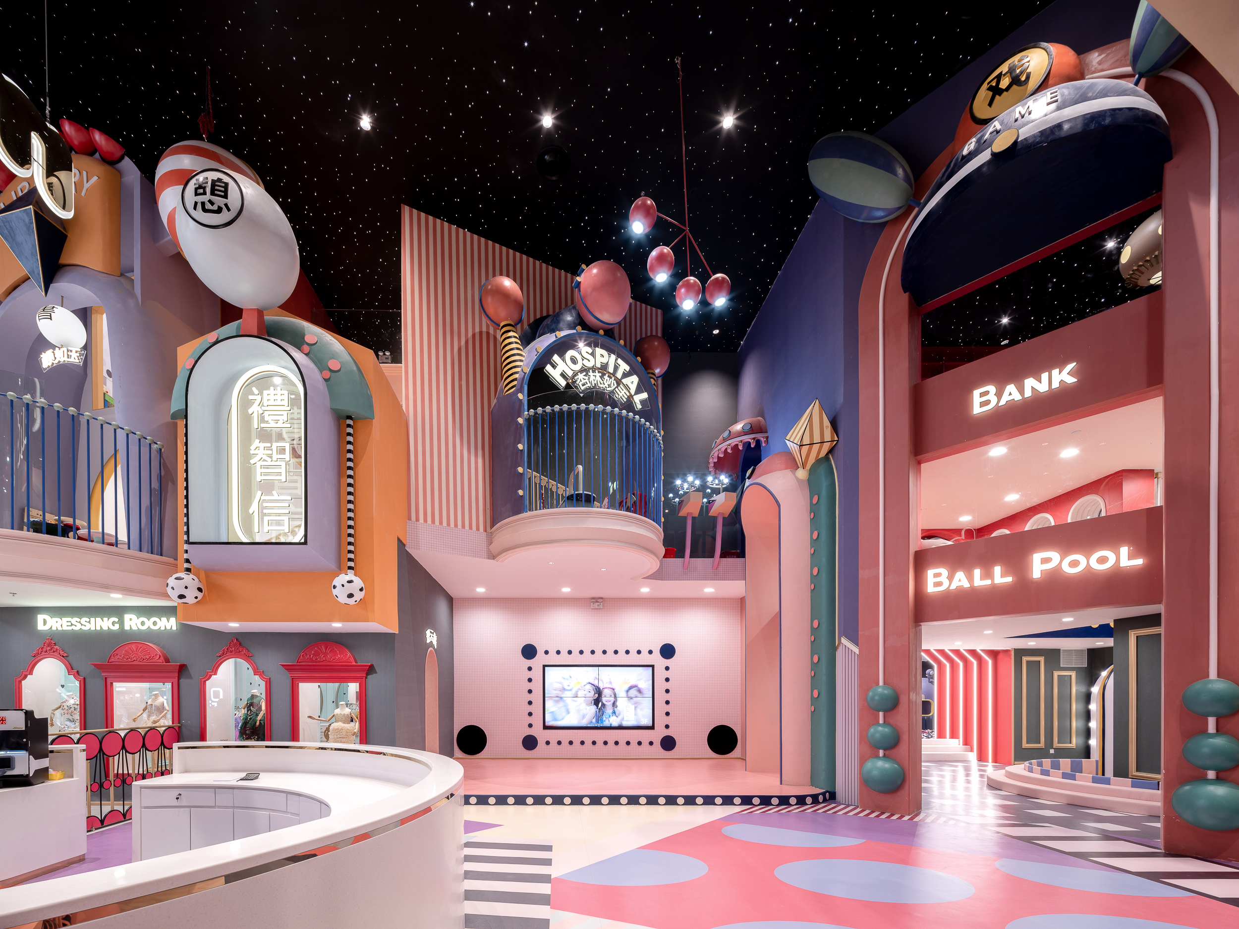
MIXc Kunshan was designed by X+LIVING to create a commercial space with an innovative strategy. The team set out to transform a public space on the third floor of a mall into a children’s section with a unity of aesthetics and theme. The result was a reimagining of public space in shopping malls. The project is located in Kunshan, Jiangsu Province, an important birthplace of Kunqu Opera. It has the nickname of “the mother of Chinese Opera”.
With the vision of creating a multifunctional experience venue that integrates parenting, leisure and education, the design team blurred the physical boundary between the public area and the retail stores through a coordinated facade design. In order to strengthen the cultural identity of the project, the team used Kunqu Opera as the origin of the design concept, and replaced the traditional aesthetic form with interesting design techniques to create a dreamlike, maximalist wonderland.
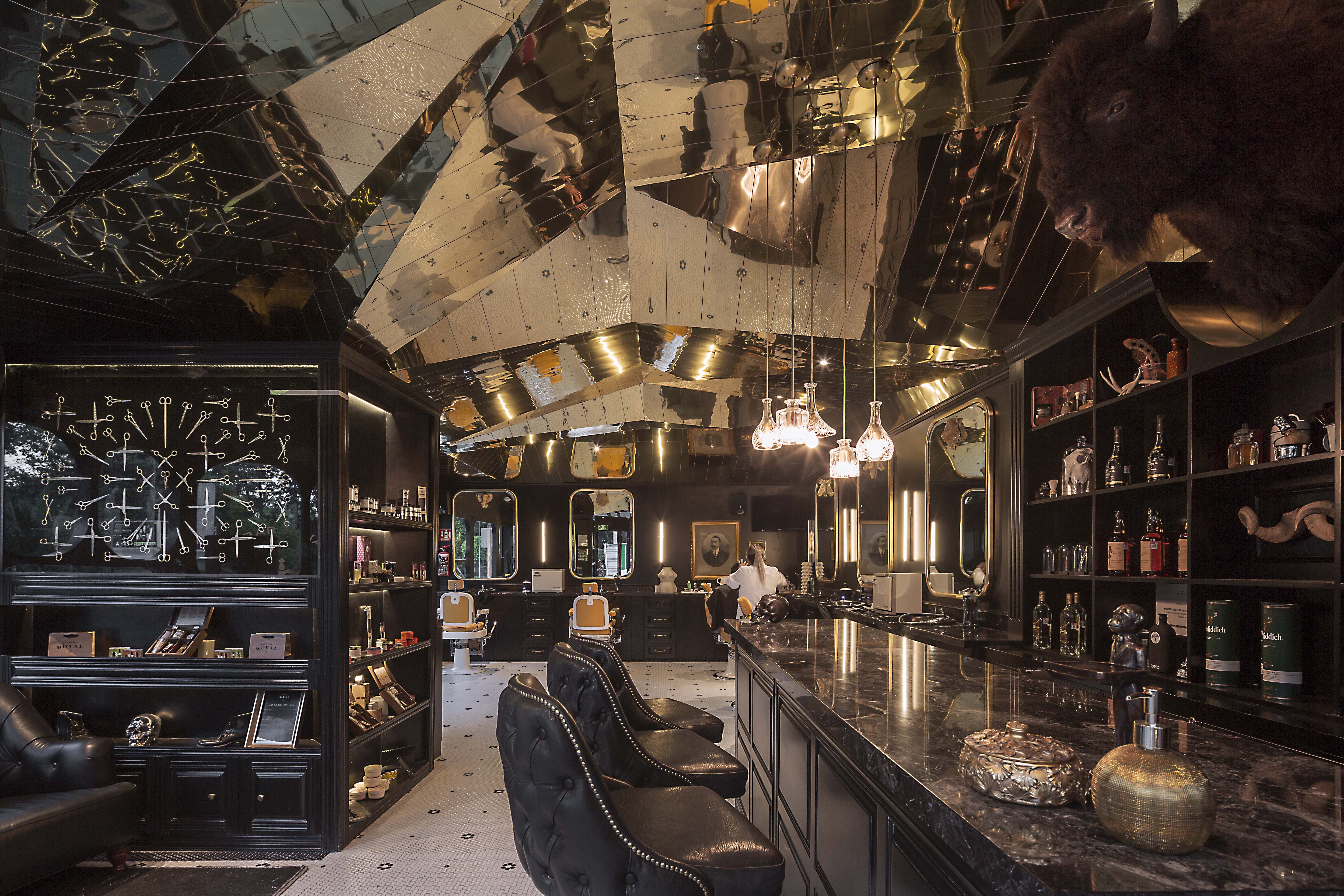
Barberia Royal
By ROW Studio, Ciudad de México, Mexico
Barberia Royal is a barbershop that offers services in an incredible location of Mexico City. ROW Studio wanted to incorporate the bits and pieces of a previous proposal that was under construction on the site for a different barbershop that was never finished, recycling mismatching moldings and other wooden elements. They put the pieces together almost randomly, fitting them in a contemporary form that still references the traditional symbols of European royalty.
The lower half of the space includes colors and materials linked to the long standing heritage of traditional barbershops, including black and white hexagonal tiles floor with a flower pattern and the Royal name greeting all the patrons at the entrance. In contrast, the ceiling is shaped with an intricate faceted surface that adapts to the changing heights of the space and the structural elements of the building finished with a laser-cut golden anodized aluminum surface.
SUNDAYS
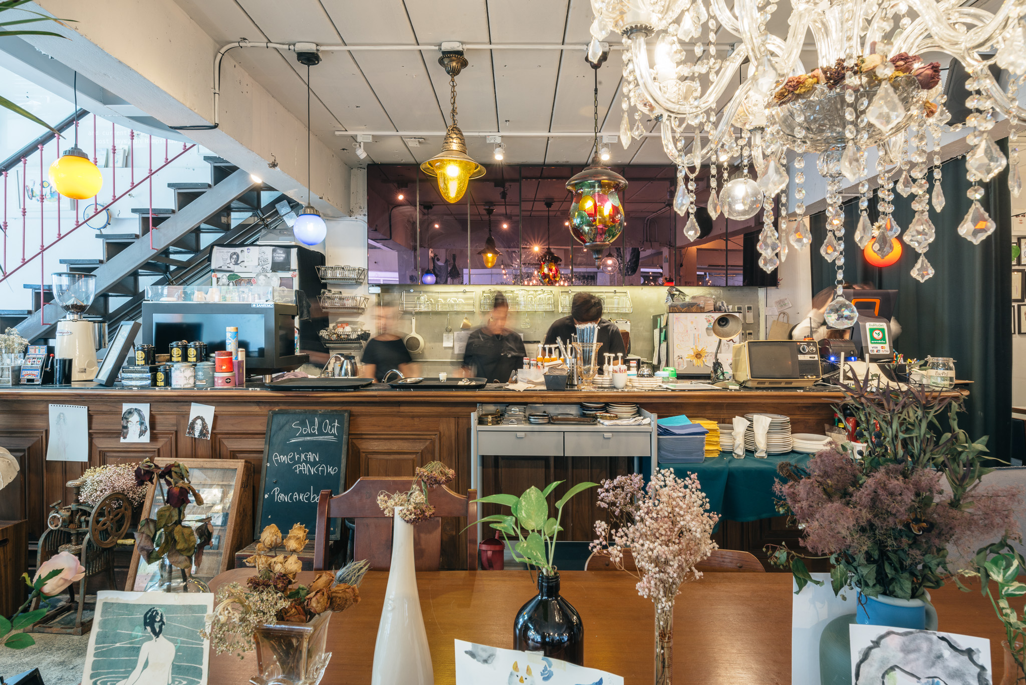
By FLAT12x, Krung Thep Maha Nakhon, Thailand
Sundays is the one-off restaurant illustrating design that is hand-crafted and built from the mindset of believing that arts can make things better. The maximalist restaurant was designed to integrate architecture, interior, graphic design and the arts in Bangkok, Thailand. Although surrounded by generic pubs and restaurants, Sundays was made to stand out. The restaurant offers customers striking experiences of what art can do to other things.
Ten pieces of drawings classically covering the unwanted old fridges or the flower bouquets that are pinned upside down to make the old structure of the building a little bit nicer. Roaming through unexpected drawings and paintings alongside with exquisite mixture of decoration styles, the restaurant expresses strong physical connection between the building to the room. Echoing this, the graphic design of the shop epitomizes the brand identity through signage and packaging of all foods and beverages.
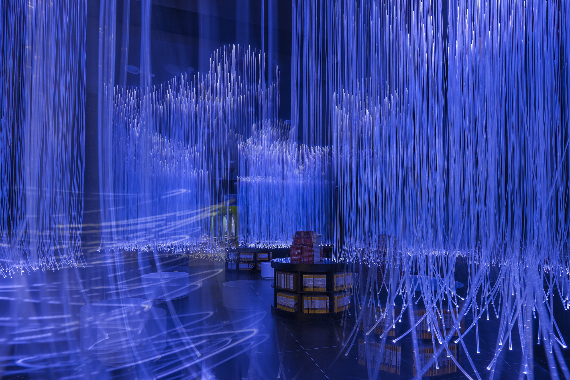
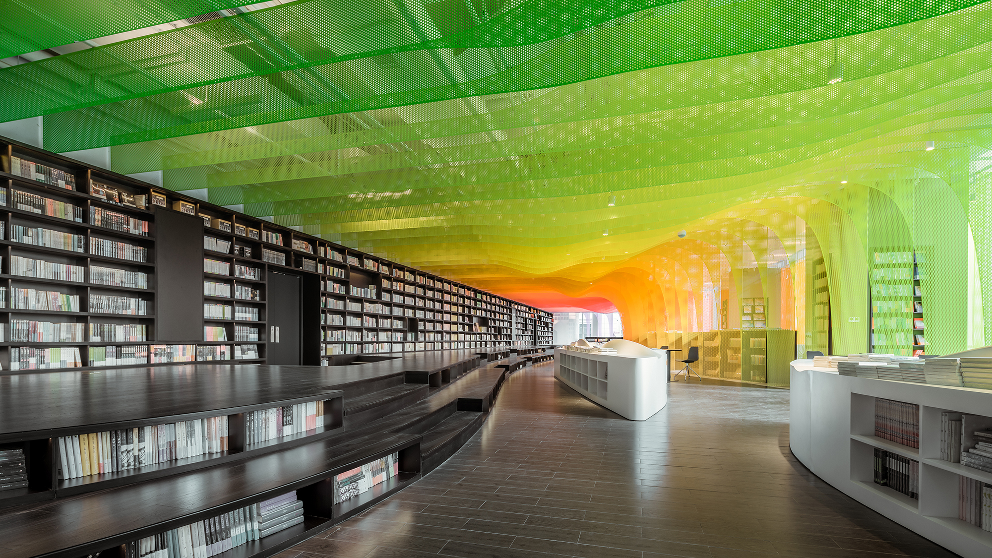
Metal Rainbow
By Wutopia Lab, Suzhou, China
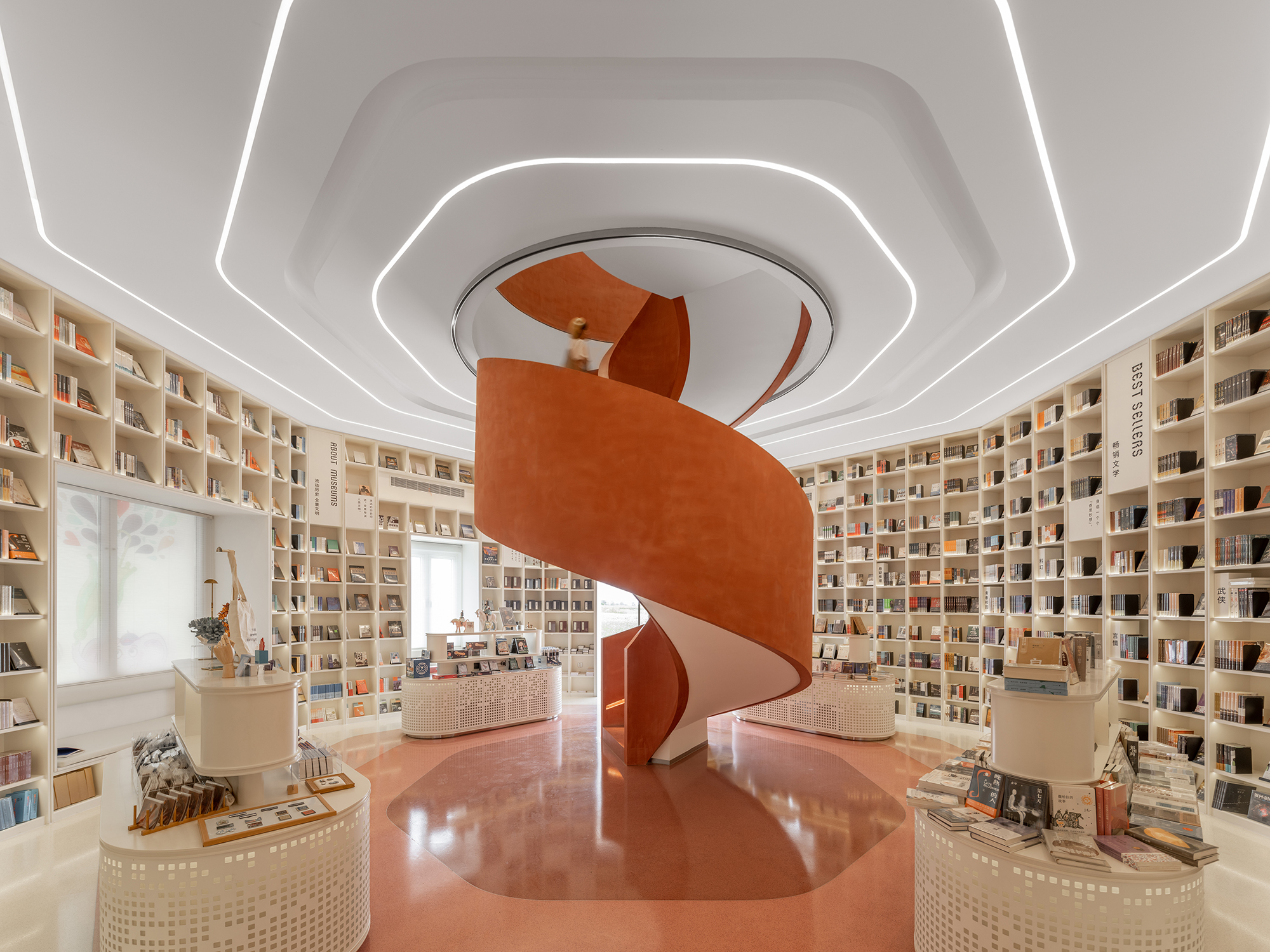
The Zhongshu Bookstore bookstore is divided into four main zones and several subdivided zones. Aiming to create a colorful new world by using symbolism, the architect gave a unique character to each zone: The Sanctuary of Crystal for new arrivals; The Cave of Fireflies for recommendations; The Xanadu of Rainbows for reading room; The Castle of Innocence for children books. As an entrance, ‘The Sanctuary of Crystal’ is a space full of books and nothing else. Using glass bricks, mirrors and acrylic, ‘The Sanctuary of Crystal’ is a shining white space, drawing customers into the heart of the store.
After a relatively narrow space, ‘The Xanadu of Rainbows’ is a large and open space. Thanks to the large windows, natural lights can pour inside. Being the most prominent space, ‘The Xanadu of Rainbows’ provides a variety of experience. Taking advantages of different heights of shelves, steps, and tables, the architect created a hyper-maximal and abstracted landscape of cliffs, valleys, islands, rapids and oases. There are also thin perforated aluminum sheets in gradient colors simulated as rainbows installed in the bookstore.
Architects: Want to have your project featured? Showcase your work through Architizer and sign up for our inspirational newsletters.
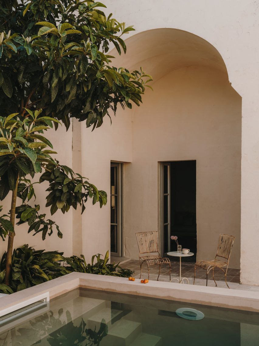
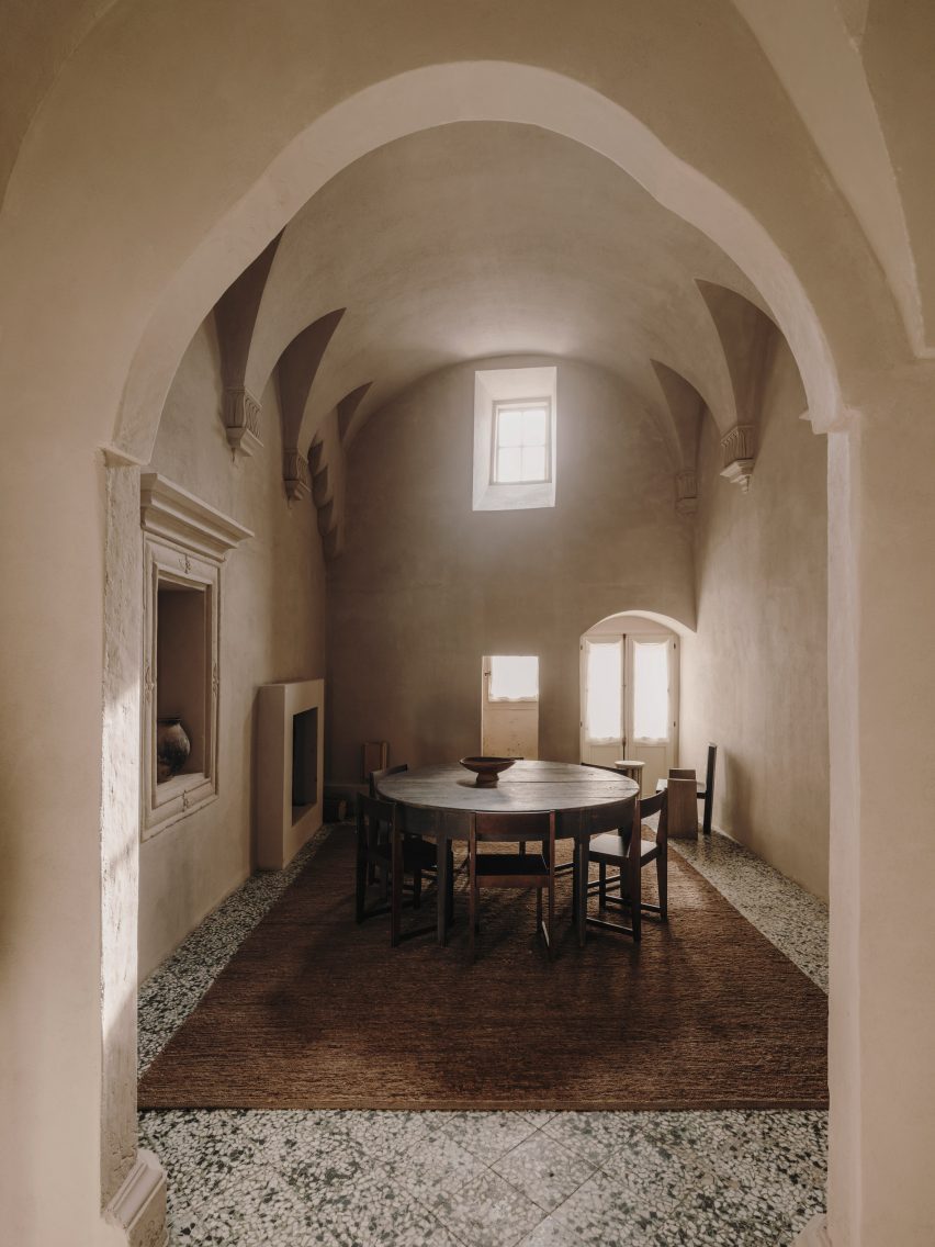
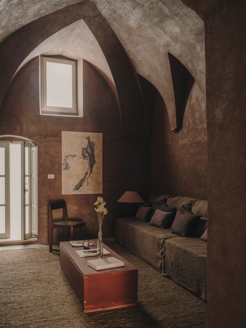
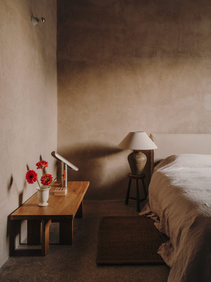
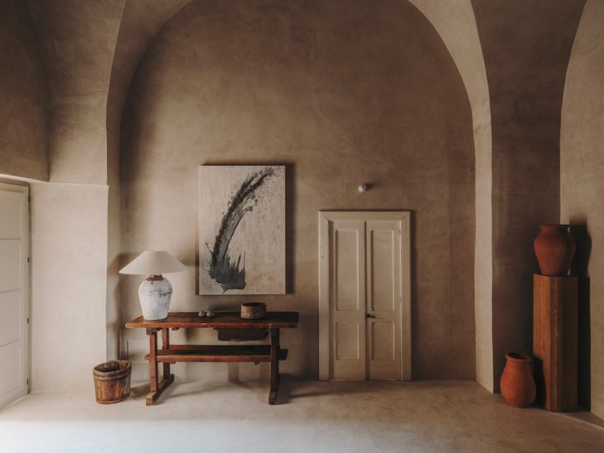
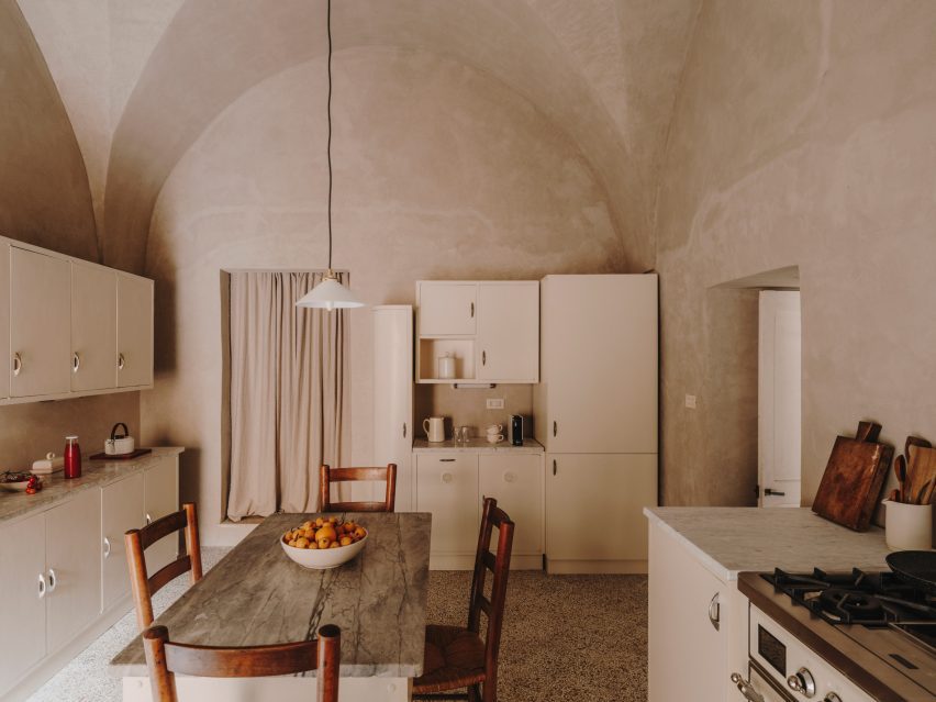
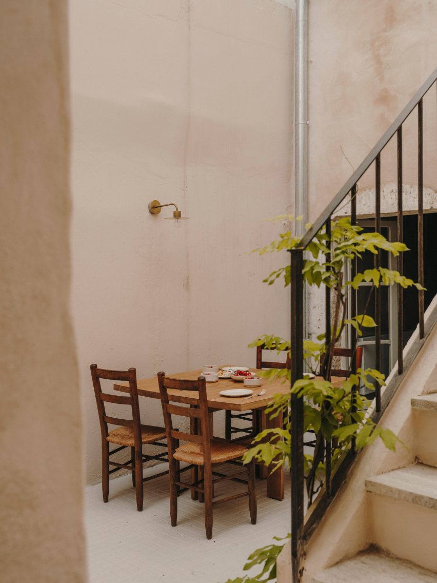
Casa Soleto, a 17th-century house in Puglia, Italy, has been carefully renovated using lime plaster, terrazzo and furniture salvaged from a monastery.
The four-bedroom house, parts of which are over 400 years old, was given a refresh by its owners – architecture firm Studio Andrew Trotter and its studio manager Marcelo Martínez.
Casa Soleto is located in southern Italy
While no structural changes were made, the designers redid some of the building’s roofs, which were falling apart, added two bathrooms and powder rooms, and swapped the living and dining spaces around.
“The street front had all the baroque details of a small palazzo and inside it was like time stood still,” Studio Andrew Trotter founder Andrew Trotter said of the house.
Parts of the house are over 400 years old
None of its walls were straight and the layout was designed for the needs of past occupants, with a chapel located behind the kitchen so that the family did not need to leave the house to pray.
This place of worship was transformed into a media room and a powder room with an outdoor shower, creating a space that can be used as an extra guestroom if needed.
A former chapel was turned into a media room that can also serve as an extra guest room
Trotter and Martínez aimed for the renovation of Casa Soleto to resemble the original building as much as possible and the team preserved much of its original flooring.
“We tried to use natural materials as much as possible,” Martínez told Dezeen.
“We used lime plasters to give a natural and raw feeling to the walls, terrazzo floors – battuto alla veneziana – in the areas where new floors had to be made, wooden windows and doors seeking to imitate the original ones, cast iron hardware and linen sofas.”
The 17th-century house was decorated with modern and antique furniture
The designers also chose a discrete colour palette for the lime plaster used on the walls of the house, which on the ground floor culminate in five-metre-high ceilings.
“We chose subtle earthy and greeny colours,” Martínez said. “Colours played a central role, as some make spaces feel light, others moody.”
Studio Andrew Trotter kept the house’s original kitchen and commissioned local woodworkers from the city of Lecce to recreate the home’s original wooden doors.
To add to the natural feel of the interior, the team used jute rugs to cover the stone floors and sourced linen upholstery and curtains from local artisans.
Lime plaster was used to give the walls a natural feel
Furniture and accessories by Danish brand Frama were juxtaposed with antique furniture pieces including an 18th-century dining table that was salvaged from an Abruzzo monastery.
The studio also sourced a late 18th- early 19th-century wardrobe from Lombardy for one of the bedrooms in Casa Soleto, which can only be accessed by going through the front patio and up an outside staircase.
The original kitchen was kept and refurbished
Studio Andrew Trotter, which has worked on a number of projects in Puglia, plans to use Casa Soleto as a rental property.
“We purchased and restored it mainly to rent it out, and also to invite creative minds that we appreciate, make gatherings and exhibitions,” Martínez said.
An exterior staircase leads up to the bedrooms
Previous projects the studio has completed in the area include a 19th-century school that was turned into a family home and an earth-toned villa made from local sandstone.
Spotted: Organic waste makes up a huge proportion of all municipal waste, with around 17 per cent of global food production going to waste at the retail, restaurant, or household level. But what if that food wasn’t all wasted? What if some of it could be turned into renewable energy? That is the question being answered by New Zealand clean-tech startup Cetogenix.
Cetogenix has designed a modular system for breaking down organic waste to generate renewable energy and other useful by-products, such as fertilisers and biodegradable plastics. The company’s technology uses a combination of chemical and microbial processes, which can be located at source and easily scaled.
The flagship product, called CETO-Boost, is currently under development. When complete, it will allow a 40 per cent increase in the production of renewable natural gas from anaerobic digestion plants. It will also be capable of being retrofitted, and the company has identified more than 15,000 anaerobic digester plants that could benefit from this retrofitting.
Cetogenix secured $4.5 million(around €4.1 million) in a 2022 seed funding round led by deep-tech investor Pacific Channel, with support from angel investors. The investment is being used to scale up the company’s technology and enable global deployment, with an initial focus on Europe and North America.
This technology aims to tackle both organic waste and natural gas issues at the same time. In the archive, Springwise has spotted other methods for tackling these issues, including turning organic waste into bio-plastic and using methane pyrolysis to generate green hydrogen.


 6th September Pakistan Defence Day (Youm e Difa Pakistan) Zarkon Group Real Estate Developer & Property Builder Facebook Post - FAH33M")


 The BasilicÔ was made to create an attractive and magnetizing place to explore. The design team wanted to imagine the impact colors can have on the occupant experience, creating an environment that stimulates the senses. As they explained, polychromy and morphology combine to create a maximalist aura. The BasilicÔ project revolves around a floral theme through which several types of apartments emerge: The CoquelicÔt, the MimÔsa, the TournesÔl, the MartagÔn and the TulipÔ.
 In Dream La Miro, Wutopia Lab wanted to create a place of joy for the Duoyun Bookstore. The fairytale parent-child bookstore was opened at Dream Town in Yancheng, Jiangsu. When the client showed the team the IP they had introduced, namely the three animated films created by Italian artist Cristina Làstrego: Mirò the Cat, The Circus and The Creation, they were moved by the magnificent scenes and the imagination created by the artist.
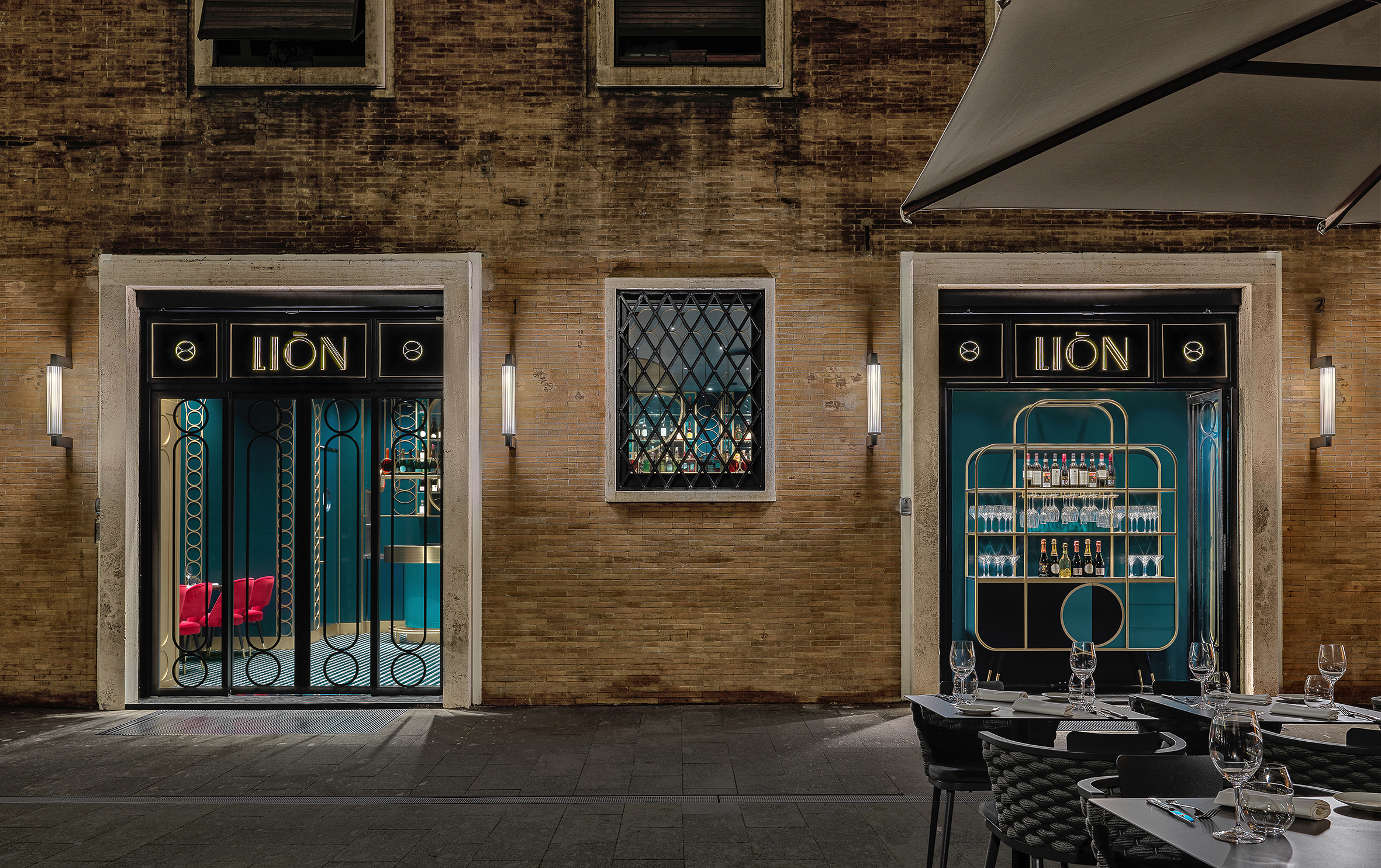
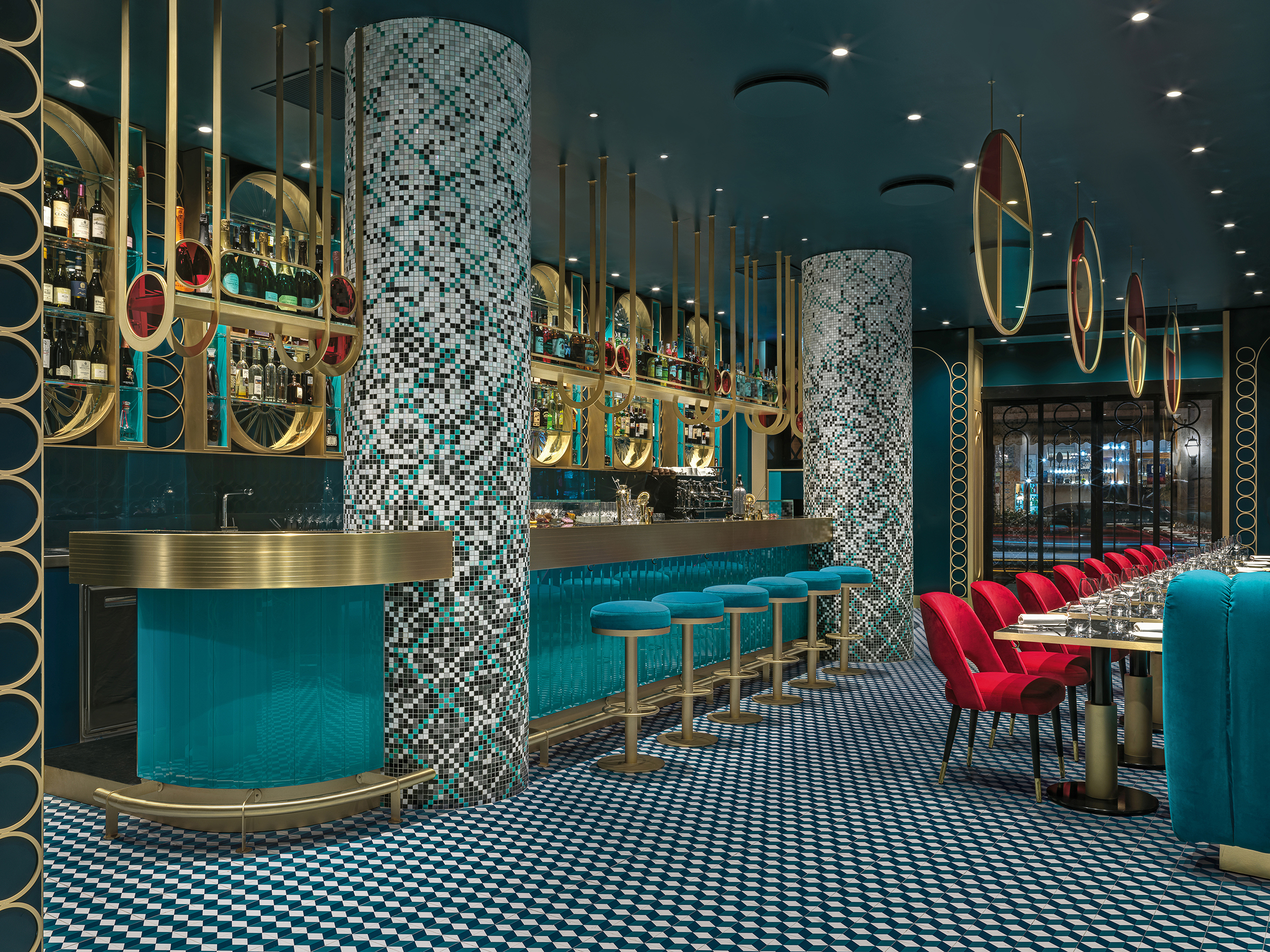 LIÒN is a restaurant and cocktail bar in the heart of Rome — halfway between the Pantheon and Piazza Navon. The project features bold lines and saturated colors in a maximalist style, contrasting with the austerity of the Palazzo that encompassed it. The idea was to give back to the city fragments of the Dolce Vita. Soft lights and mirrored surfaces envelope a sophisticated restaurant, whose terrace overlooks Largo della Sapienza.
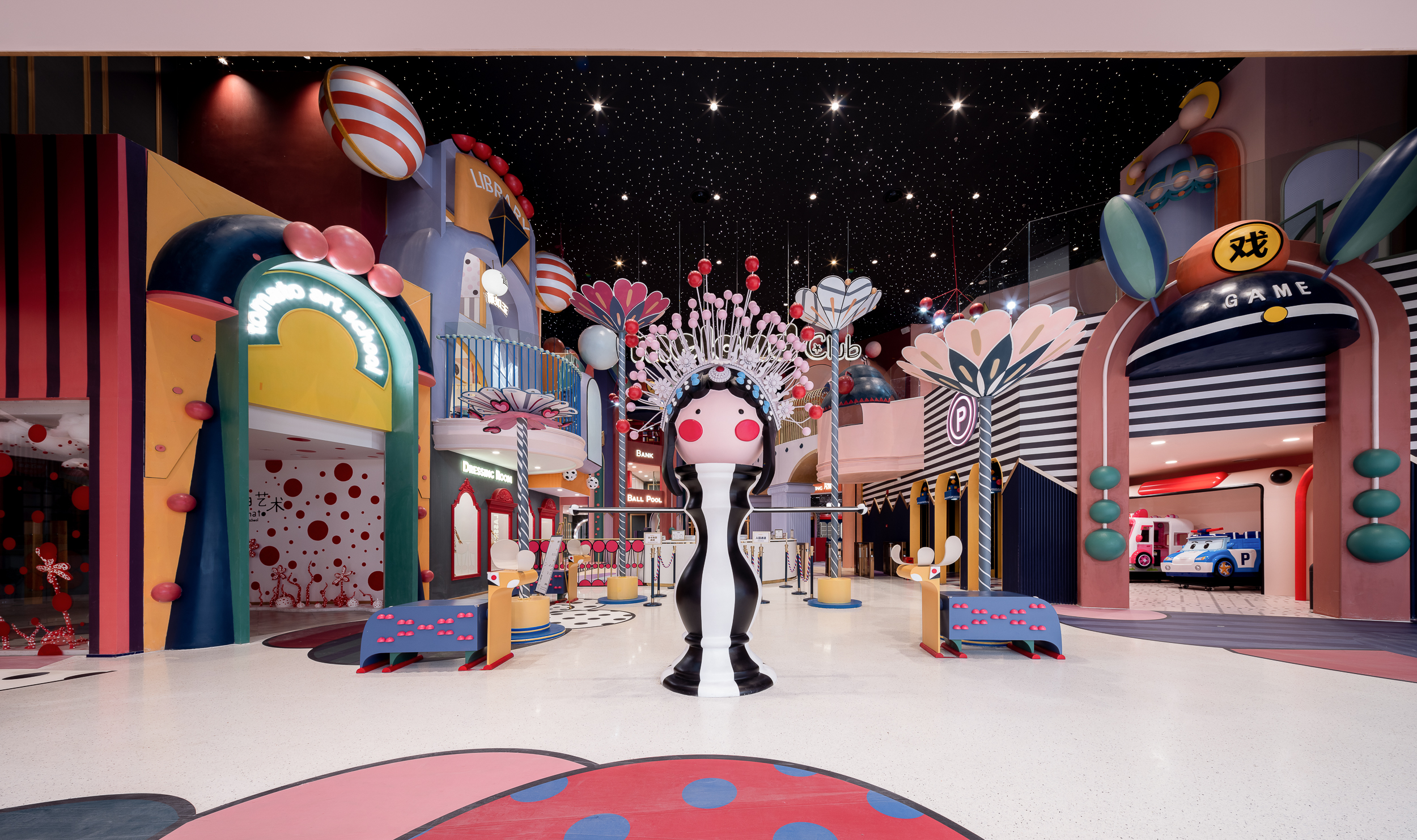
 MIXc Kunshan was designed by X+LIVING to create a commercial space with an innovative strategy. The team set out to transform a public space on the third floor of a mall into a children’s section with a unity of aesthetics and theme. The result was a reimagining of public space in shopping malls. The project is located in Kunshan, Jiangsu Province, an important birthplace of Kunqu Opera. It has the nickname of “the mother of Chinese Opera”.
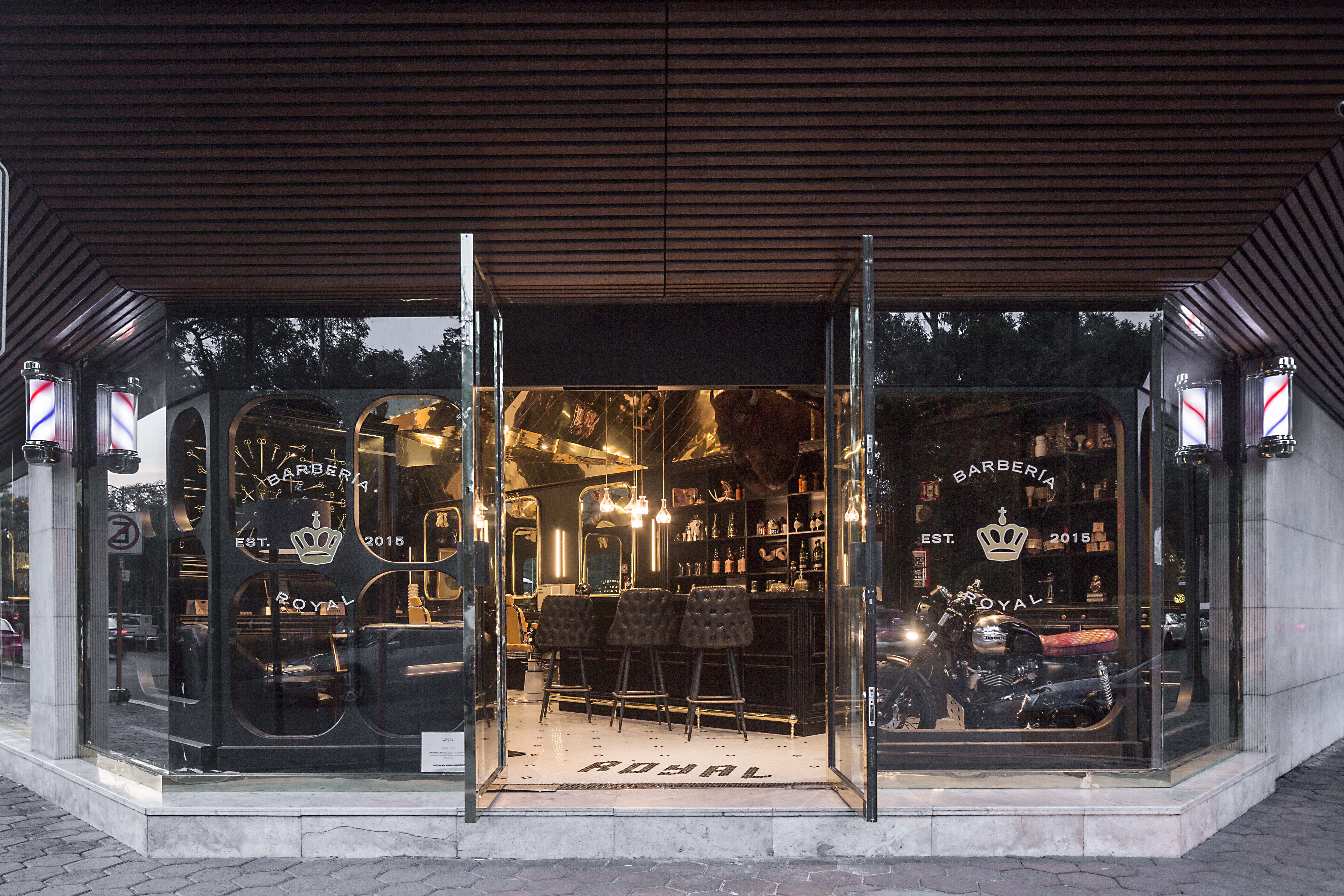
 Barberia Royal is a barbershop that offers services in an incredible location of Mexico City. ROW Studio wanted to incorporate the bits and pieces of a previous proposal that was under construction on the site for a different barbershop that was never finished, recycling mismatching moldings and other wooden elements. They put the pieces together almost randomly, fitting them in a contemporary form that still references the traditional symbols of European royalty.
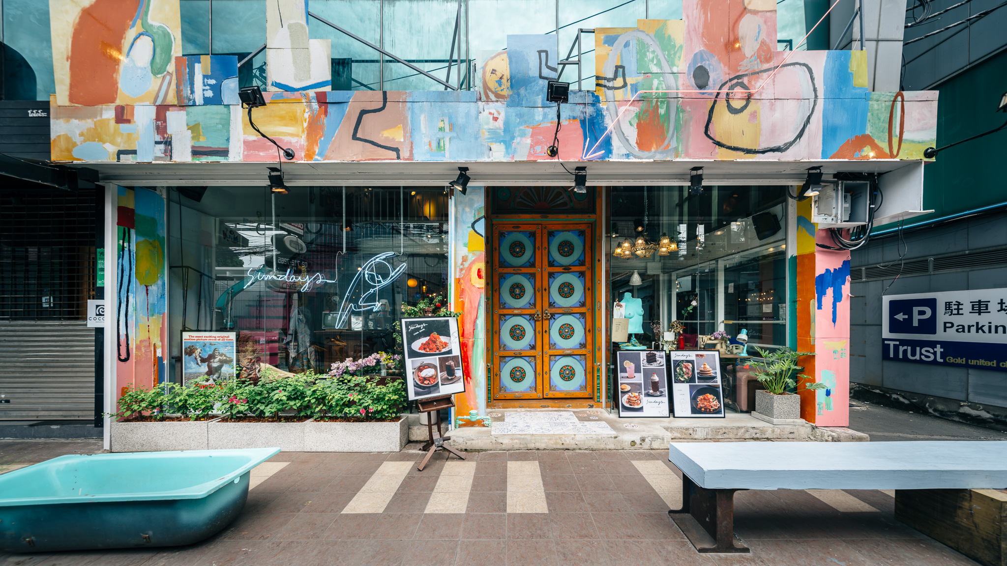
 Sundays is the one-off restaurant illustrating design that is hand-crafted and built from the mindset of believing that arts can make things better. The maximalist restaurant was designed to integrate architecture, interior, graphic design and the arts in Bangkok, Thailand. Although surrounded by generic pubs and restaurants, Sundays was made to stand out. The restaurant offers customers striking experiences of what art can do to other things.
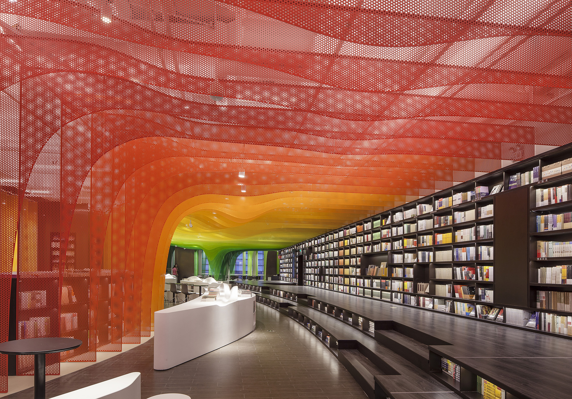
 The Zhongshu Bookstore bookstore is divided into four main zones and several subdivided zones. Aiming to create a colorful new world by using symbolism, the architect gave a unique character to each zone: The Sanctuary of Crystal for new arrivals; The Cave of Fireflies for recommendations; The Xanadu of Rainbows for reading room; The Castle of Innocence for children books. As an entrance, ‘The Sanctuary of Crystal’ is a space full of books and nothing else. Using glass bricks, mirrors and acrylic, ‘The Sanctuary of Crystal’ is a shining white space, drawing customers into the heart of the store.