Spotted: In the UK, slightly more than 80 per cent of consumers say they prefer eco-friendly packaging, and this growing trend of favouring sustainably packed items can be seen across the globe. Using recyclable materials is one way brands are becoming more sustainable, but often this isn’t enough. For example, a lot of recyclable materials aren’t disposed of correctly, so cannot be recycled properly.
Reusable packaging is an alternative solution that is gaining momentum. But the technology needed to sort and clean packaging for future reuse is not yet firmly established. Seeing a gap in the market, London-based startup Again has created an automated cleaning service that makes it possible for brands to reuse their packaging materials.
Called CleanCells, the micro-factories use robotics to bring reuse technology to businesses. The facilities service multiple organisations in each location, helping to keep costs low enough for small and medium enterprises to afford the service. And Again purposefully matches the price of its services to that of single-use plastics and other packaging in order to encourage the take-up of its circular system.
The CleanCells are situated near or within logistics hubs to reduce transport costs and each can clean up to 500,000 units of packaging per month. From visual inspection to in-line microbiological and allergenic monitoring, the company’s quality assurance ensures that food-grade packaging remains safe to use. Meanwhile, an accompanying software platform allows companies to manage and monitor their packaging supply chain.
Springwise has spotted other innovators in the archive working to turn single-use packaging into a circular model, including one for takeaway lunches and another cutting single-use food waste across US universities.
The latest edition of “Architizer: The World’s Best Architecture” — a stunning, hardbound book celebrating the most inspiring contemporary architecture from around the globe — is now available. Order your copy today.
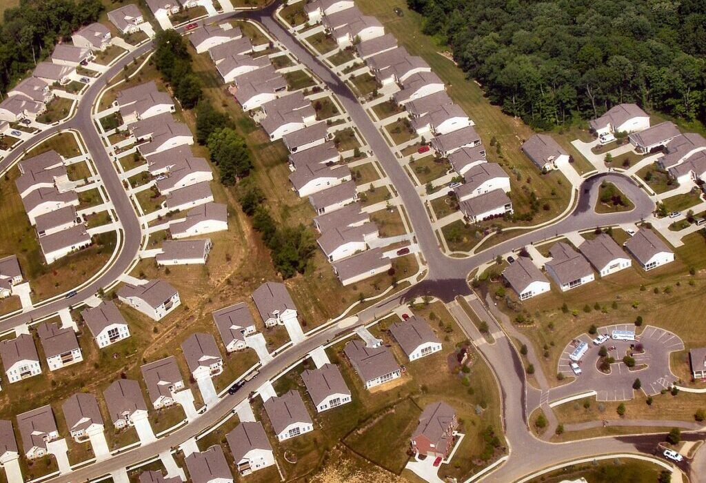
When you think of the American suburbs, what words come to mind?
No matter how much affection you have for your hometown, one of those words is probably “bleak.” While many millennials, including this author, are still moving out to the suburbs to raise children — a pattern first established by their grandparents in the post-war era — few see these car-centric communities as ideal. The charmless strip malls, the big box stores, the neglected highway medians filled with litter from passing cars — how can one contemplate all this without crying out in despair?
The question isn’t really if the suburbs are bad but why they are this way. Are the people who live in the suburbs really more boring than the people in cities? Or does the archetypal suburban ambiance of loneliness and fatigue stem instead from poor urban planning?
Tract housing in a suburb of Cincinatti, Ohio, 2005. Photo by Derek Jensen via Wikimedia Commons.
My feeling is that it is the latter. Culture happens in places where people have the opportunity to move around, observe each other, and interact. The flâneur, that prototype of the modern artist or bohemian, emerged in mid 19th century Paris at the same time that the arcades were constructed, and this was no coincidence. As Baudelaire understood, the arcades provided the first modern artists with a stage on which to observe la comédie humaine firsthand. He argued that this new way of relating to society produced modern subjectivity as we know it.
It stands to reason that the suburbs, by removing would-be flâneurs from their stage, sapped their creativity as well. A life that moves from home, to car, to cubicle, to drive-through and back provides few chances for people to observe and interact with one another. Over time, the suburbs have led to an epidemic of loneliness in America — a fact that has been recognized since at least 2000, when political scientist Robert D. Putnam published his best-selling book Bowling Alone.
This trend has only been exacerbated during and after the pandemic, as more Americans have begun not only to work from home, but to have their groceries, entertainment and other consumer goods delivered straight to their doorstep, obviating the need to go outside altogether. This has led to a shuttering of retail spaces in the suburbs, among other changes. Suddenly, people are nostalgic even for those commercialized, “fake” public spaces like the mall that were widely derided in the 90s.
The Press won the 2023 A+ Jury Award for Commerical Renovations and Additions.
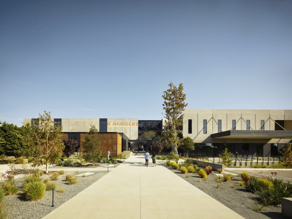
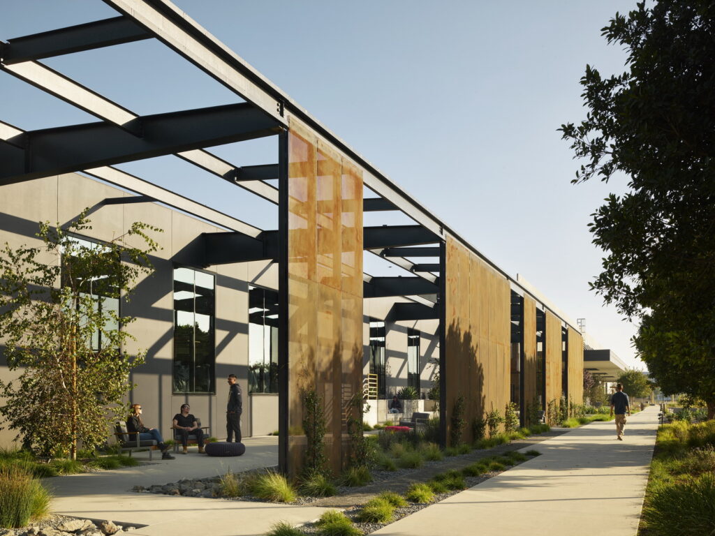
So how to fix it? What the suburbs need, most of all, are places where people can work, shop, wander and simply be. One project that tries to restore some of this urban energy to the suburbs is The Press, a former Los Angeles Times printing facility in Costa Mesa, California that was “reincarnated as a multidisciplinary workspace with a dining Canteen and a public Rail Trail on its 23.4-acre site” by Ehrlich Yanai Rhee Chaney Architects. Located in Orange County, California, Costa Mesa is a small city with a decidedly suburban feel, a place where people sit in traffic for twenty minutes to reach the In-N-Out Burger drive through.
This project, which won the 2023 A+ Jury Award in the Commercial Renovations and Additions category, stands out for seeming like a truly inviting, interesting place to spend time. Not just an office building, and not just a place to shop or eat, The Press avoids the sense of falseness or contrivance that plagues most suburban workspaces and shopping centers. While this is of course a privately owned campus, it feels more public than, for instance, a mall.
Industrial details elevate The Press above most commercial spaces one finds in the American suburbs.
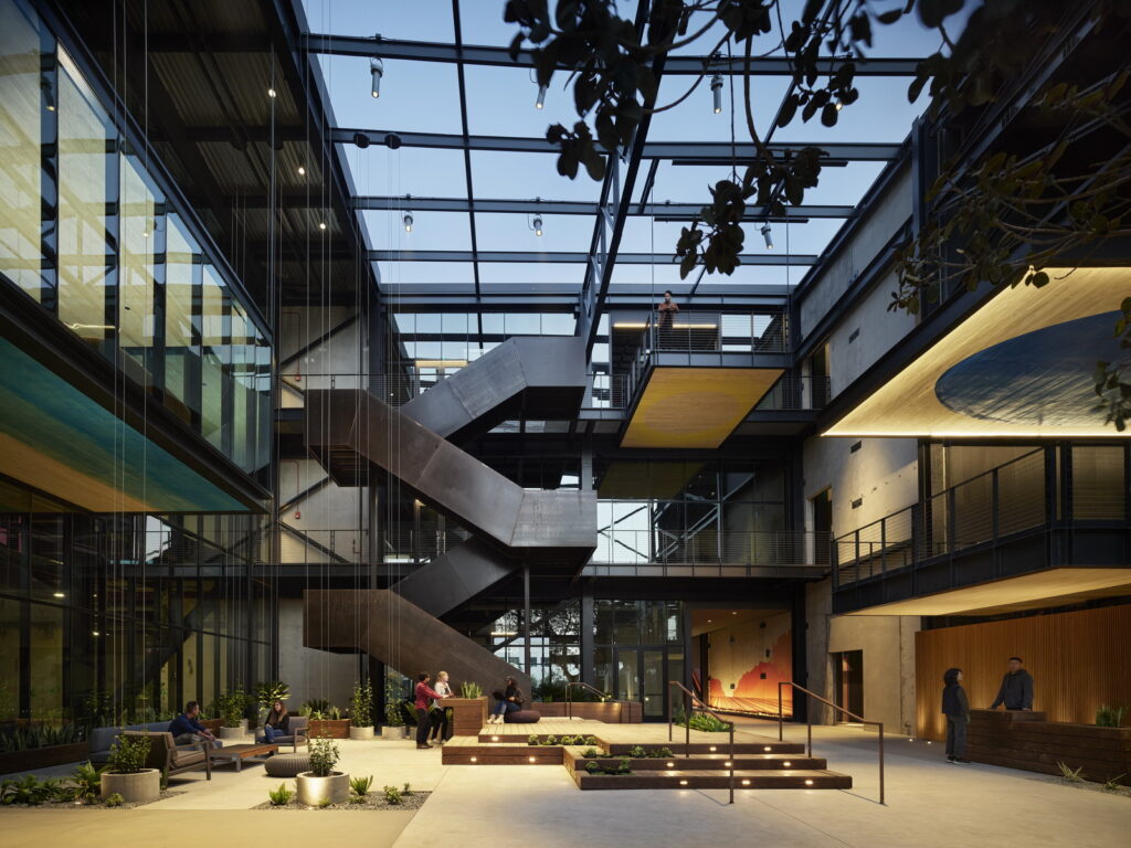
Part of this is due to the sense of history that is preserved in the space. As the architects explain in their project notes, “precise cuts through precast concrete walls and roofing bring in fresh air, daylight and views. This subtraction exposes the beauty of the existing, reviving what has since been neglected and inviting the landscape to enter in through and around the campus.” Like a repurposed Bushwick warehouse, or even a Parisian arcade, The Press preserves a sense of place that pushes against the anonymity of “cookie cutter” suburbs.
Some of the details in this project are just extraordinary. As the architects explain, “The design celebrates both material and organic markers of time. Paint chips, rail spurs and conveyor belts are left as is and an existing tree is placed to grow through the structure itself — hinting at history, site and context.” My favorite detail is probably the rail trail, a partly shaded walking path that follows the course of a former rail line. Like the now iconic New York High Line, the Rail Trail repurposes outdated infrastructure in a way that both feels perfectly natural and encourages health and interaction.
The Rail Trail gives Costa Mesa, California its own version of the High Line. A stunning feature of the project is that its campus extends over 23 acres.
Time will tell how The Press evolves with its environment. Currently, the complex has fifty-five tenants, including a number of incredible artisans and local restaurants. My hope is that, with this project, Ehrlich Yanai Rhee Chaney Architects have created a template for a new kind of suburban redevelopment, one that works with existing architecture to imprint the faceless suburbs with a vibrant sense of place.
The latest edition of “Architizer: The World’s Best Architecture” — a stunning, hardbound book celebrating the most inspiring contemporary architecture from around the globe — is now available. Order your copy today.
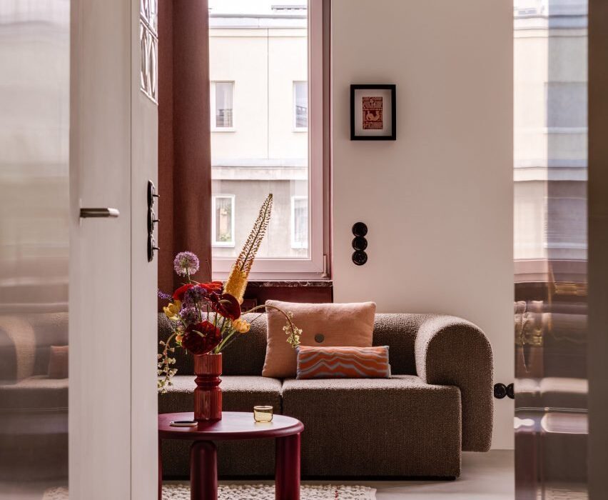
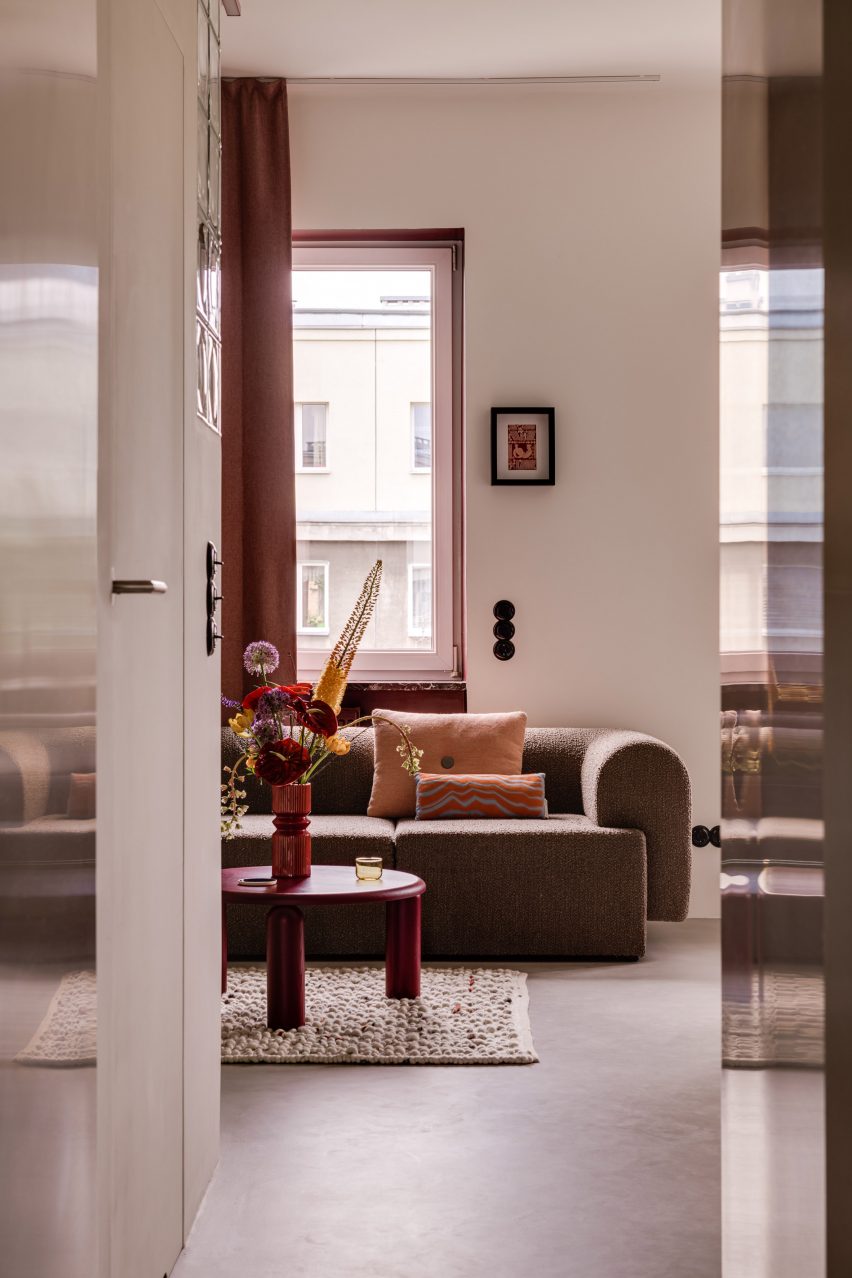
Walnut burl and terrazzo accents are combined with chunky statement furniture in this apartment in Warsaw, which Polish studio Mistovia has renovated for an art director and her pet dachshund.
Located in the city’s Praga Północ neighbourhood, the 45-square-metre flat is set within a 1950s estate designed by Polish architects Jerzy Gieysztor and Jerzy Kumelowski.
The Warsaw apartment was renovated by Mistovia
Mistovia devised an eclectic material and colour palette when updating the interior, which the studio describes as an “elaborate puzzle” of contrasting patterns.
“The apartment is based on several dominant ‘cubes’,” said Mistovia founder Marcin Czopek. “Each of them has a different function, accentuated by various patterns through the use of veneer or colour.”
Panels of swirly grey wood veneer feature in the living space
The living room is defined by a wall panelled in swirly grey wood veneer– originally designed by Memphis Group founder Ettore Sottsass for Alpi in the 1980s – while the bathroom is obscured behind a wall of glass blocks.
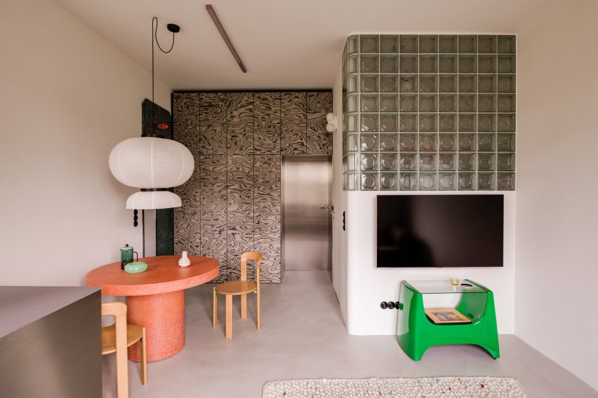
The kitchen is now connected to the lounge to create one open-plan space, filled with statement pieces including a misshapen vase and the molten-looking Plopp stool by Polish designer Oskar Zieta, set against the backdrop of floor-to-ceiling walnut-burl cabinets.
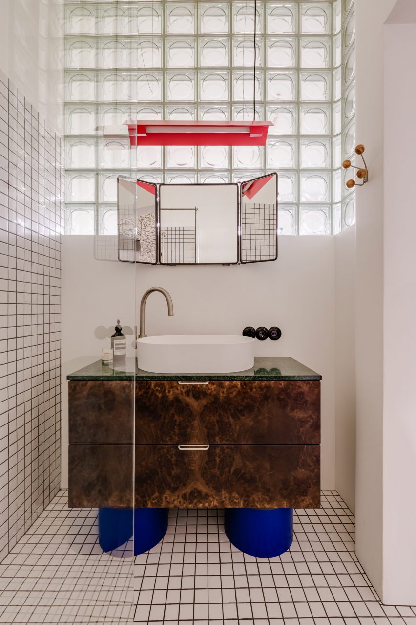
A tortoiseshell cabinet defines the bathroom
Terrazzo was used to form chunky black-and-white legs for the kitchen’s window-side breakfast bar as well as an entire burnt-orange table in the dining area.
“A muted base – bright, uniform micro cement flooring and walls with a delicate texture – allowed for the use of geometric forms, rich in interesting structures and bold patterns,” Czopek said.
Designed for an art director and her dog, the apartment features a similarly striking bathroom.
Here, gridded monochrome tiles and glass-brick walls are paired with a statement standalone sink, featuring squat cobalt-blue legs that support a tortoiseshell cabinet crowned by a triptych mirror.
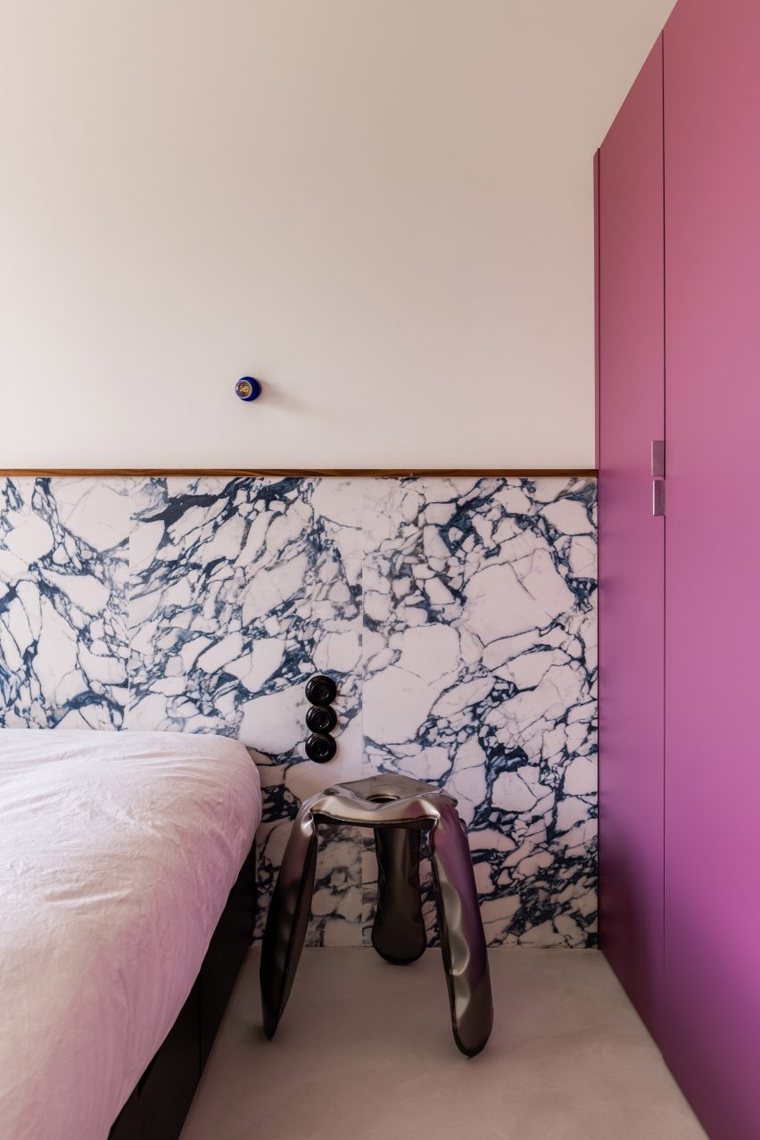
The single bedroom includes purple and marble accents
A purple wardrobe complements the rectilinear marble headboard in the apartment’s singular bedroom, adding to the boxy geometry of the home.
Also in Warsaw, Polish studio Projekt Praga incorporated mid-century elements and pops of colour into a dumpling restaurant while local firm Noke Architects referenced the high waters of Venice in a bar complete with sea-green floors and skirting tiles.
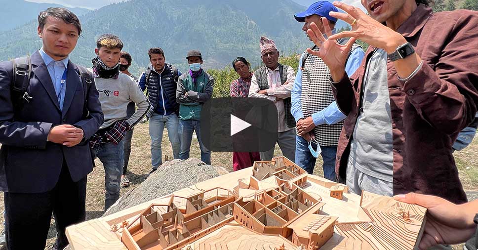
Commissioned by Nepal’s Ministry of Health & Population, this new 18,000 square foot public medical facility is located in the Jumla District, an area characterized by its inaccessibility and poverty.
Sited along the Karnali River and named after the natural hot springs, the hospital signifies a renewed emphasis on health in a region where advanced healthcare services have been historically limited due to the rugged terrain. Crafted from rammed earth using local soil and labor, the new hospital will embody sustainability, affordability, and respect for local ecology.
Comprising three interconnected volumes that encircle a healing garden with native plantings, the hospital offers panoramic views of the Karnali River valley. This low-carbon and passive solar building hosts emergency, out-patient, and administrative departments on the west side, ensuring easy access. On the eastern side, the in-patient department, surgery, and maternity ward nestle, providing the needed privacy.
Read More About the Project
Project: Tatopani Hospital Firm: Building Bureau Finalist, 11th Annual A+Awards, Unbuilt Sustainable Non-Residential Project
Spotted: As customers become increasingly aware and invested in health and wellness, demand for nutricosmetics – supplements and foods with beauty benefits – is projected to boom. Indeed, Straits Research estimates the global industry will be worth almost $16 million (around €14.5 million) by 2030.
Nourished, a UK company that creates personalised 3D-printed chewable vitamins, including chewable mouthwash alternatives made in collaboration with Colgate, is joining the growing nutricosmetics industry with new skincare supplements that were unveiled earlier this year.
The vitamins, called SkinStacks, were developed in partnership with skincare brand Neutrogena. Using a smartphone, customers scan their face, and the images are then analysed by Neutrogena’s AI-powered Skin360 software, which assesses more than 2,000 unique skin attributes. Users are then asked to consider what outcomes they’d like to see – more radiant skin or less fine lines, for example – and a recommended combination of nutrients is given. Nourished then 3D prints customised gummies that are based on these recommendations. This stands in contrast with other vitamin brands, who tend to use basic quizzes to guide the ingredients used in personalised supplements.
Because the vitamins are made-to-order, Nourished avoids wasteful overproduction that can leave excess products to expire on shop shelves. And crucially, SkinStacks and other Nourished products combine multiple science-backed ingredients in one supplement. Not only does this save customers unnecessary time and money that would be spent sourcing several different pills – it also cuts out the large volume of plastic packaging that is thrown away when customers buy multiple tubs of vitamin pills. Skinstacks and other Nourished products, in comparison, come in completely recyclable plastic-free packaging, including home-compostable wrappers.
There’s a plethora of innovators out there looking to make the beauty industry more sustainable. In the archive, Springwise has also spotted cosmetics made from unsold fruit and a plant-based beauty brand.
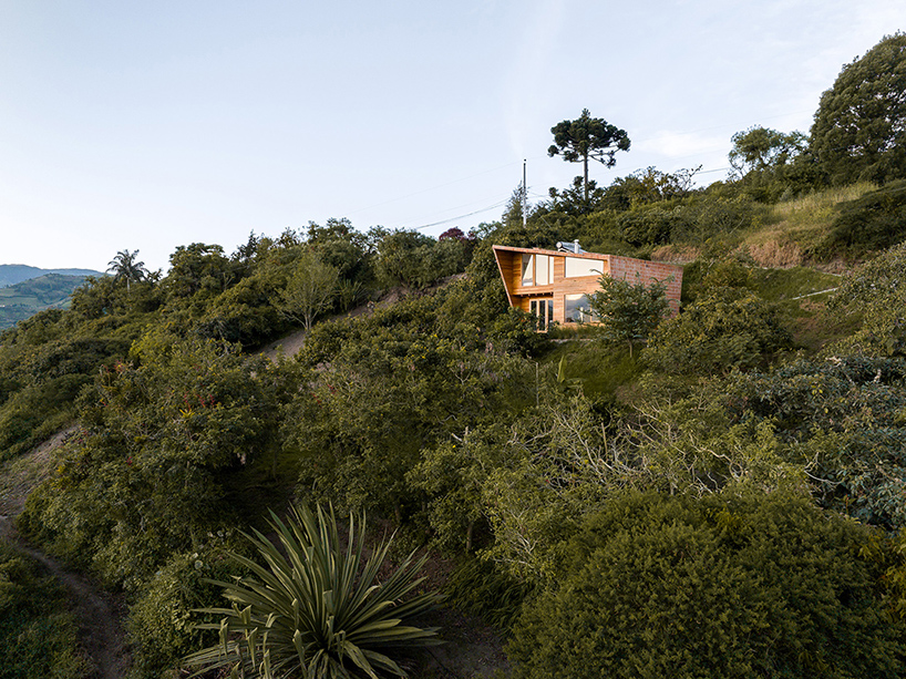
Pedro Calle and El Sindicato Arquitectura design Casa Perucho
Designer Pedro Calle and El Sindicato Arquitectura consrtuct Casa Perucho, a single-family house nestled in Perucho, a rural enclave within the Metropolitan District of Quito, Ecuador. Embracing its natural surroundings of mountains and green landscapes, the residence harmoniously coexists with nature.
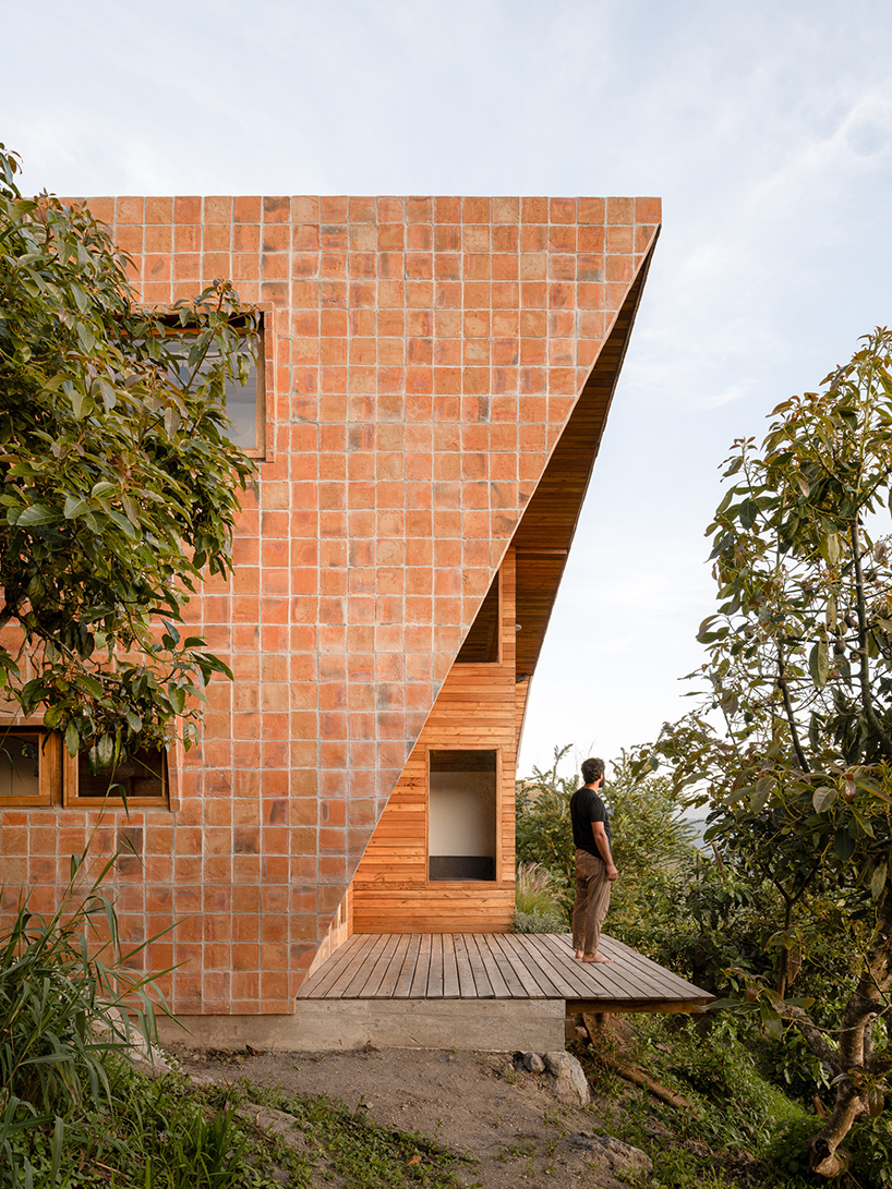
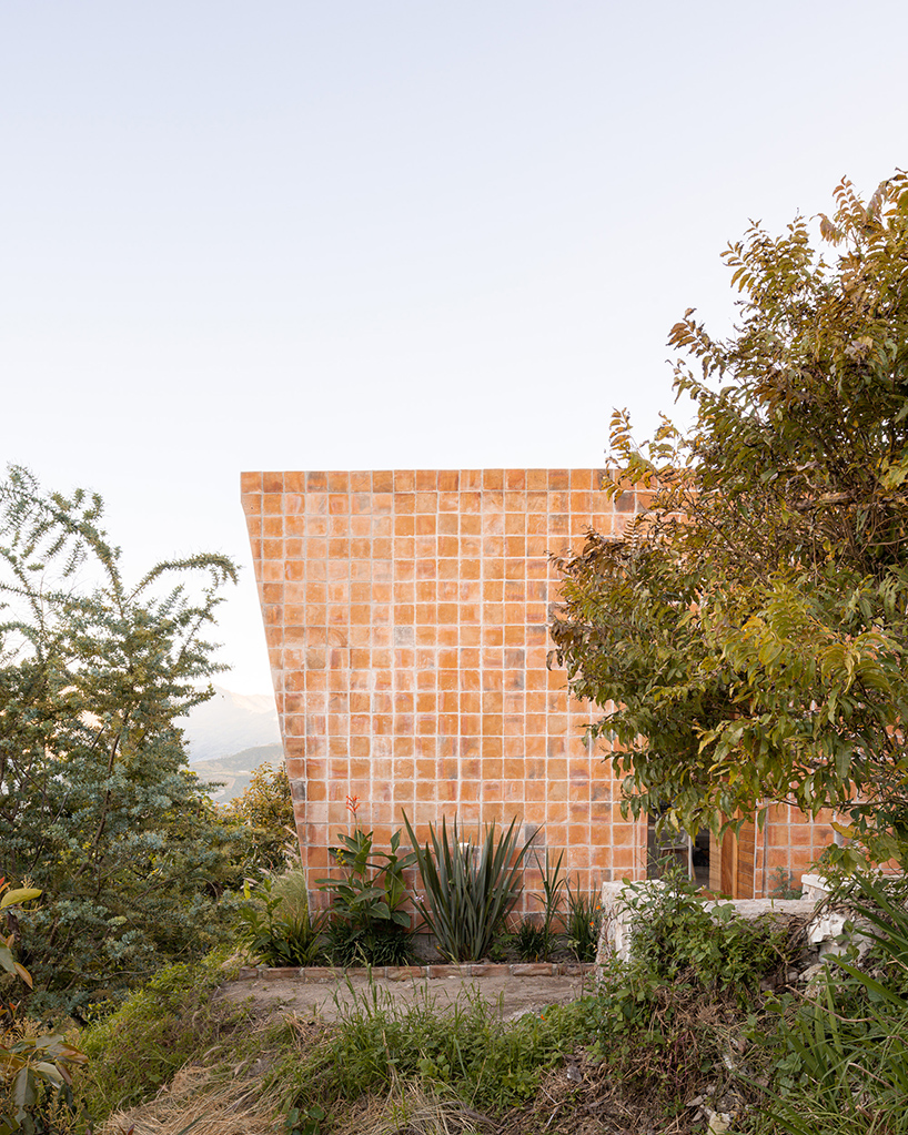
The main design principle revolves around fostering an intimate connection with the natural environment while enveloping its inhabitants in a shelter-like space. The project takes advantage of the mountain vistas employing expansive windows on the western facade. Additionally, the development ensures privacy through a continuous skin of bricks unfolding from the southern facade, transitioning into the roof, and eventually covering the northern facade. The red brick protruding formation shields the interior from both neighbors and the adjacent street, resulting in a secure living environment.
all images by Francesco Russo unless stated otherwise
Casa Perucho develops a simple and efficient layout
The design team meticulously outlines the spatial arrangement of Casa Perucho. The ground floor is dedicated to communal spaces, including a well-appointed kitchen, a living area, a dining space, a convenient bathroom, and a sheltered outdoor deck. The upper floor encompasses a bedroom, a versatile workspace, a welcoming guest area, and a well-equipped bathroom. Designed with an emphasis on simplicity and efficiency, a prefabricated structure takes center stage. Comprising robust wooden frames, this construction method ensures a seamless assembly process while minimizing environmental impact and reducing mobilization and on-site manufacturing costs.
Casa Perucho nestles in Perucho, a rural enclave within the Metropolitan District of Quito, Ecuador
a continuous skin of bricks enfolds the two-story residence
the red brick protruding formation shields the interior from both neighbors and the adjacent street
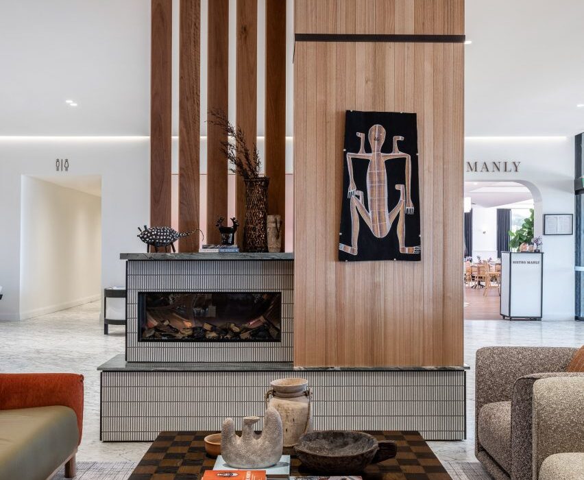
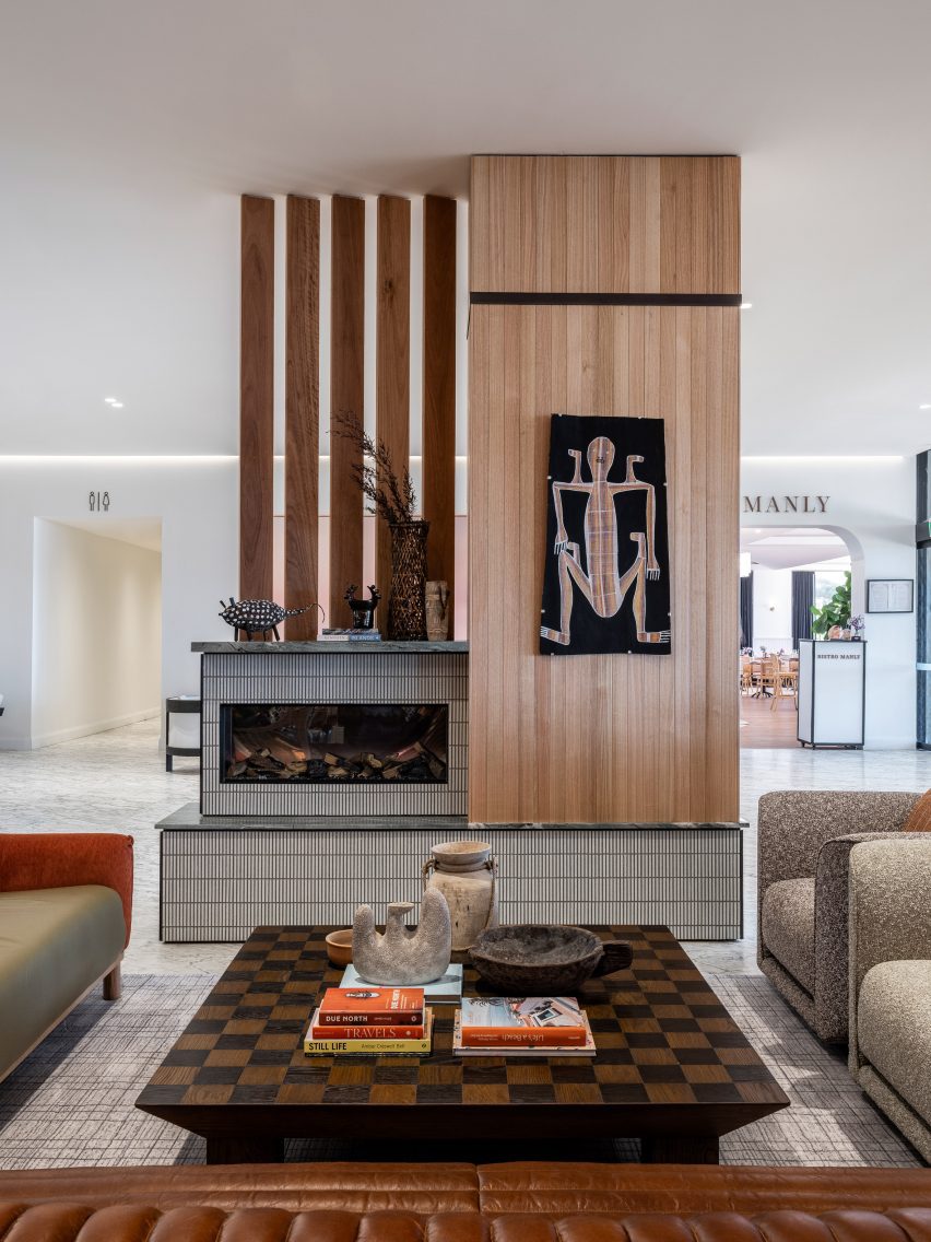
Spicy shades of turmeric, cinnamon and ginger feature alongside mosaic tiles and hand-painted murals in the public spaces of this hotel in Sydney, following a makeover from local studio Luchetti Krelle.
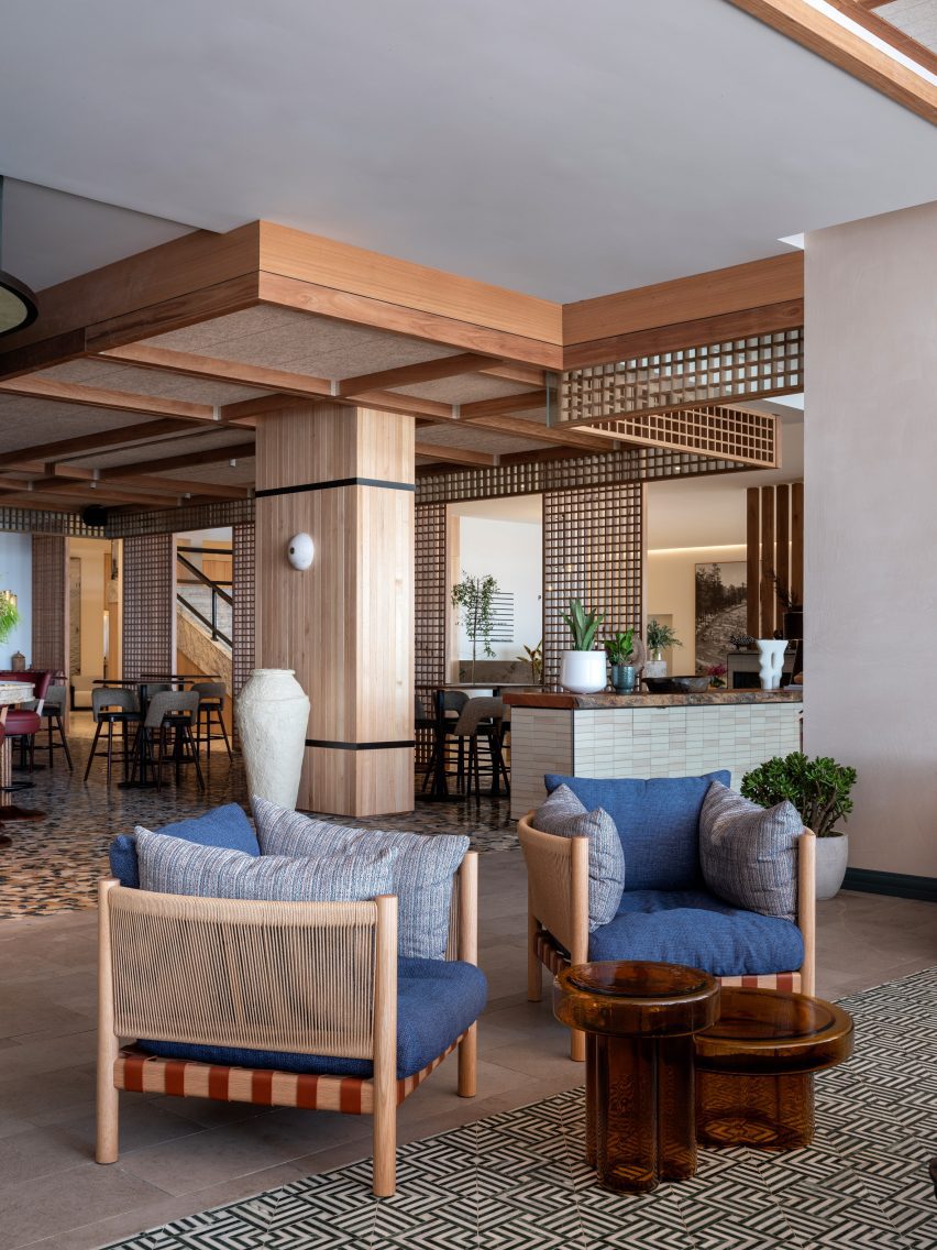
The renovation encompassed Manly Pacific‘s lobby as well as its 55 North bar and a few neighbouring lounge areas, all located on the hotel’s ground floor, which opens directly onto Manly Beach.
Luchetti Krelle has overhauled the lobby of Sydney’s Manly Pacific hotel
In the reception area, Luchetti Krelle created an intimate lounge setting to bring a sense of warmth and welcome into the otherwise vast white space while creating a link to the more richly decorated drinking spaces beyond.
Tactile sofas and clubby armchairs are clustered around a chequerboard table looking onto a fireplace that mixes tile and timber in a mid-century-influenced design.
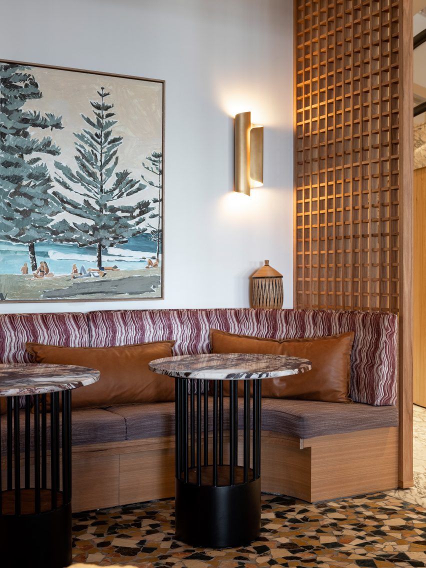
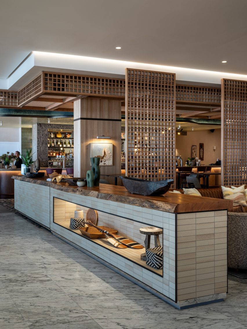
Latticed screens create a loose separation between Manly Pacific’s reception and the adjoining bar area, which introduces a richer palette of colours and materials to forge a sense of laid-back luxury.
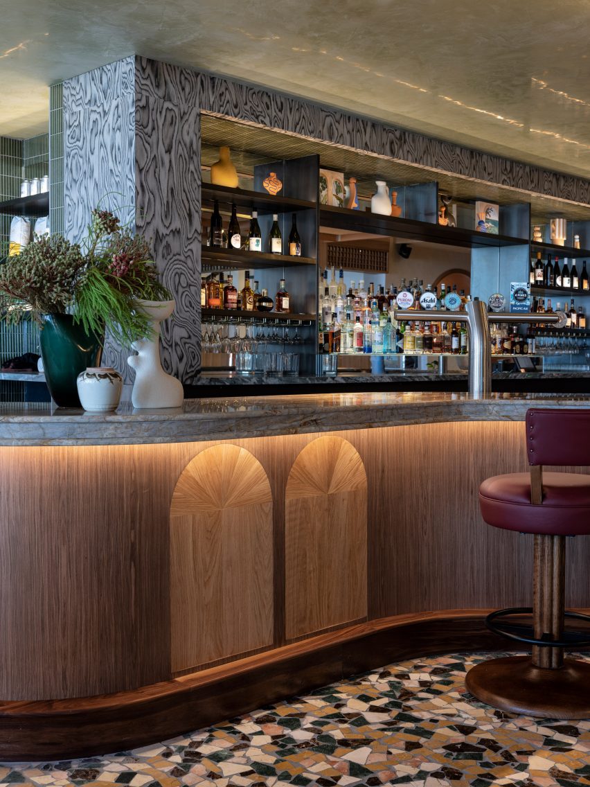
The studio also renovated the adjoining bar
“A loose luxury defines our approach to the reappointment of the bar and neighbouring lounge areas,” Luchetti Krelle said.
“Layered textures, spiced tonal triggers and punchy patterns were selected to energise the drinking spaces with a graceful attitude that prioritised home comfort.”
55 North is centred on an impressive island bar that curves outwards into the room to create a sense of welcome.
Crazy paving in autumnal hues defines the bar area
The bar’s outlines are mirrored by the lines of the bulkhead ceiling above, creating a shape reminiscent of a clamshell that draws the eye across the room and brings a cosy intimacy to the bar area.
“Hospitality design is about making people feel welcome, relaxed and confident so less noticeable elements drove our process,” the studio said.
“We lowered the bar’s original height so smaller guests didn’t feel intimidated by its stature, adding custom leather swivel stools with curved returns to encourage lengthier sittings.”
Lattice screens help to loosely divide the space
The client had originally requested a new bar closer to the lobby. But Luchetti Krelle chose instead to improve the existing design to conserve waste and save valuable build time.
“As with all hospitality projects, there is an added pressure to complete the build and installation within deadline, given commercial pressures to open for business,” the studio said.
“So we saved time finding creative solutions to transform existing elements, avoiding demolition and the waste of materials.”
A series of lounge spaces lead off the bar
Opening off the main bar area is a series of lounges.
Through the careful use of curves, arches and latticed screens, Luchetti Krelle designed these spaces to flow from one to another with a clear sense of continuity, while each area maintains its own distinct character and sense of purpose.
“We created adjoining rooms to encourage hotel guests to treat the space like an extension of their home during the day,” the studio said.
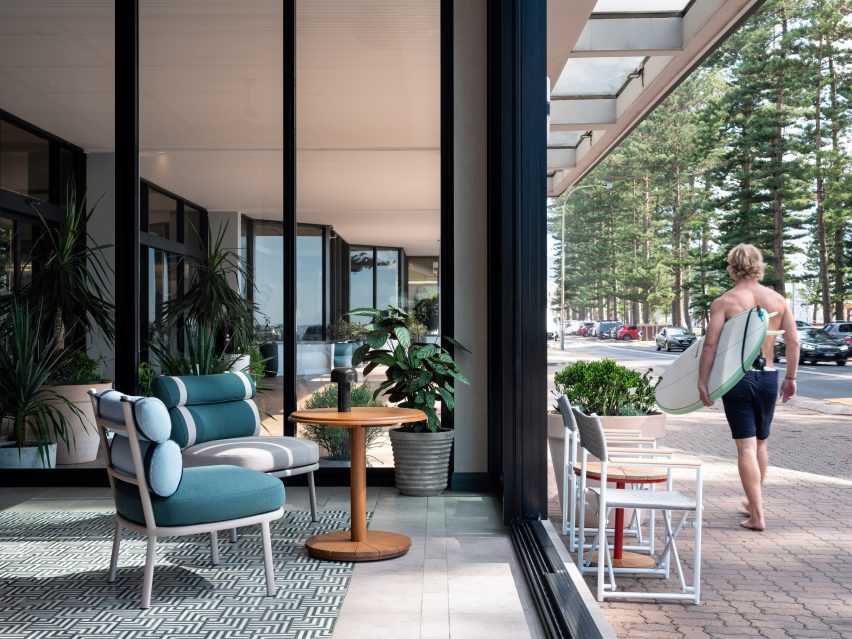
On the beach side, a sunroom takes its cues from the vista with striped and patterned upholstery in a palette of cooling blues that tether the space to the seascape beyond.
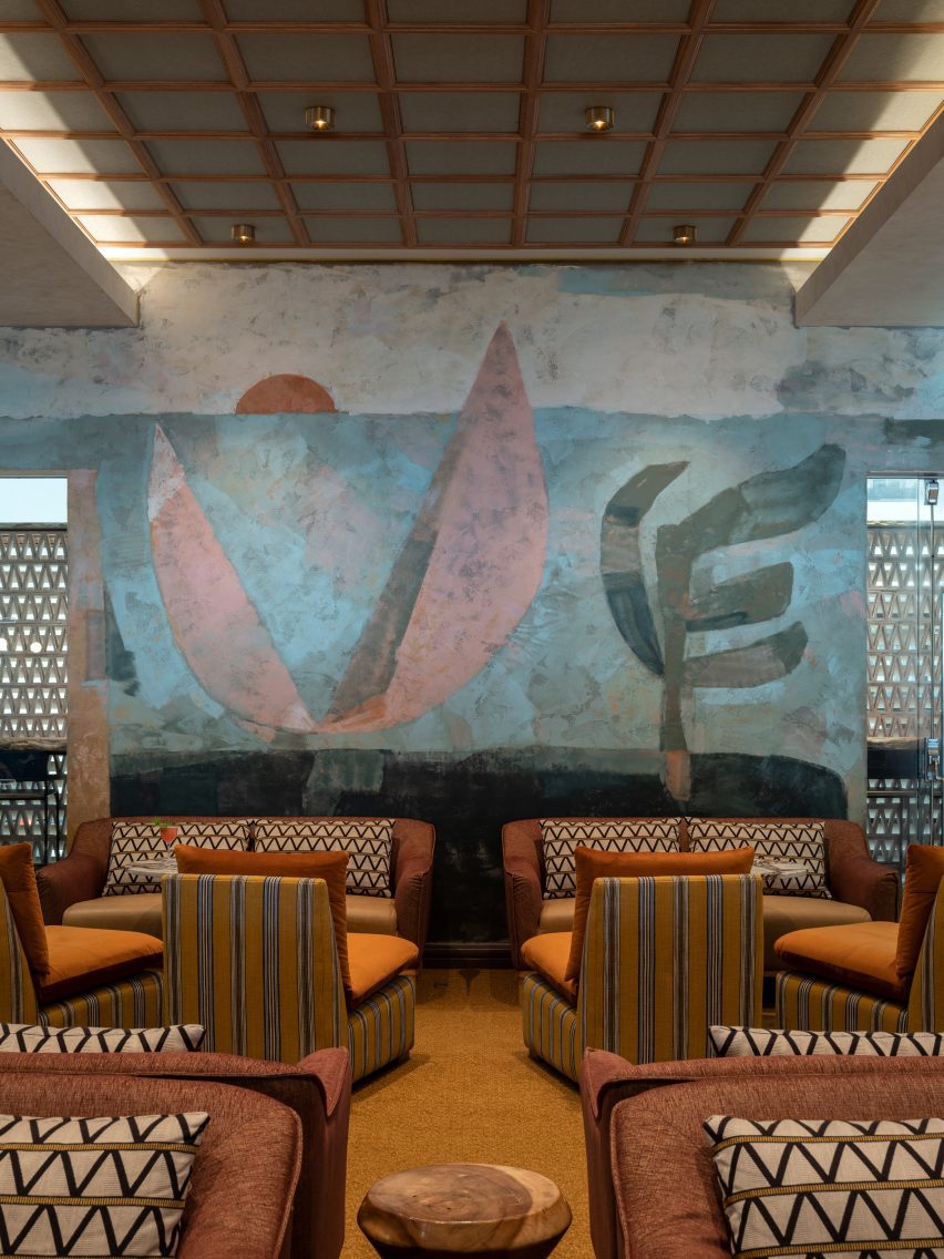
To the rear of the bar, a former gaming room has become an expansive cocktail lounge, where arches frame three intimate booths and the eye is led across the room by an underwater scene, painted onto Venetian plaster by local mural studio Steady Hand Studio.
Cool blue tones connect the sunroom to Manly Pacific’s beachside setting
Tiles are the protagonist material of this project, defining each area.
“Intricate autumnal crazy paving lures eyes through latticed screens that lightly separate the lobby and bar,” said Luchetti Krelle.
“Waves of fanned pearl-hued marble mosaics accentuate the rear lounge’s sophistication. Within the front sun lounge, tessellated Indian green and Carrara marble mosaic arrangements mimic the effect of a rug.”
The sunroom opens straight onto Manly Beach
Timber, too, plays a large part in the design, used across walls, ceilings, arches and booths – particularly in the bar.
“It was important to use varied timber species, including Blackbutt and walnut, to add textural depth and warm shades,” the studio said.
A variety of plaster finishes introduce another level of texture while helping to convey a sense of history and permanence, according to Luchetti Krelle.
A hand-painted mural dominates the cocktail lounge in the rear
These include the teal plaster applied to the bulkhead surround of the main bar, which features a glossy underside to bring a sense of lightness to the structure.
And in the ocean-side lounge, the pale sand shade of the fireplace wall cools the space during summer, reflecting the sunlight.
Seating booths are enveloped in cosy arches
The Manly Pacific is among a number of hospitality projects that Luchetti Krelle has completed in Sydney over the last two years.
Among them is a bar set inside a former butcher shop as well as the restaurant RAFI, characterised by vivid abstract paintings and patterned floors.
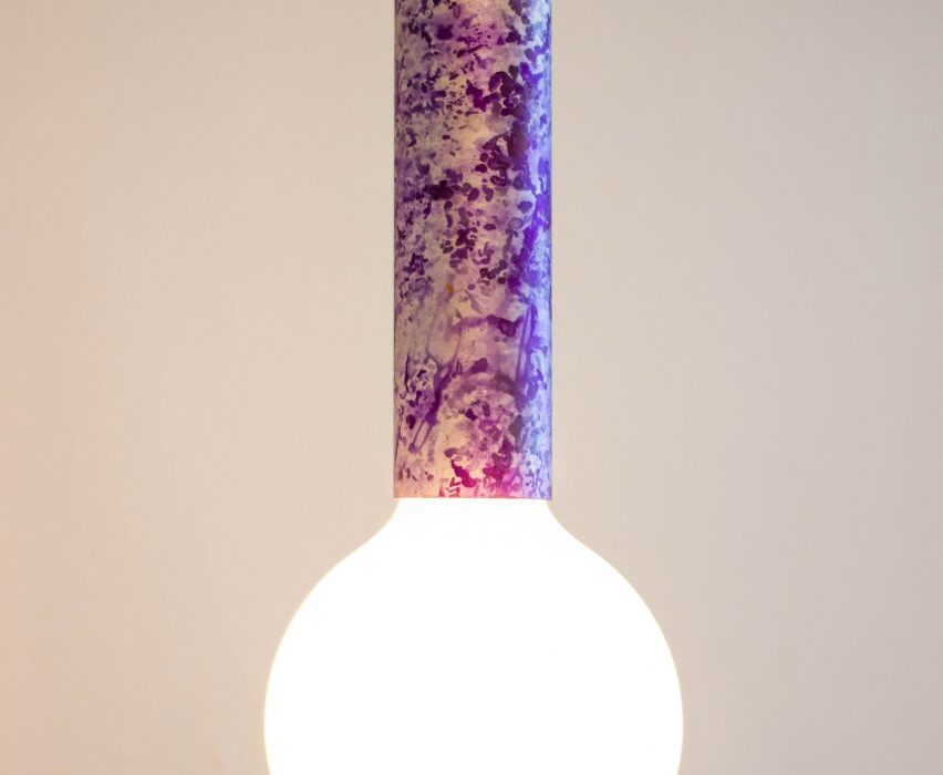
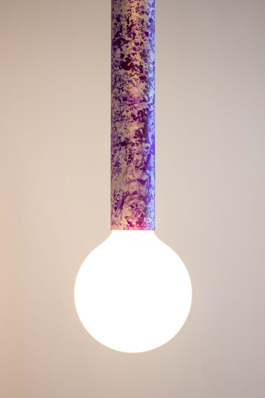
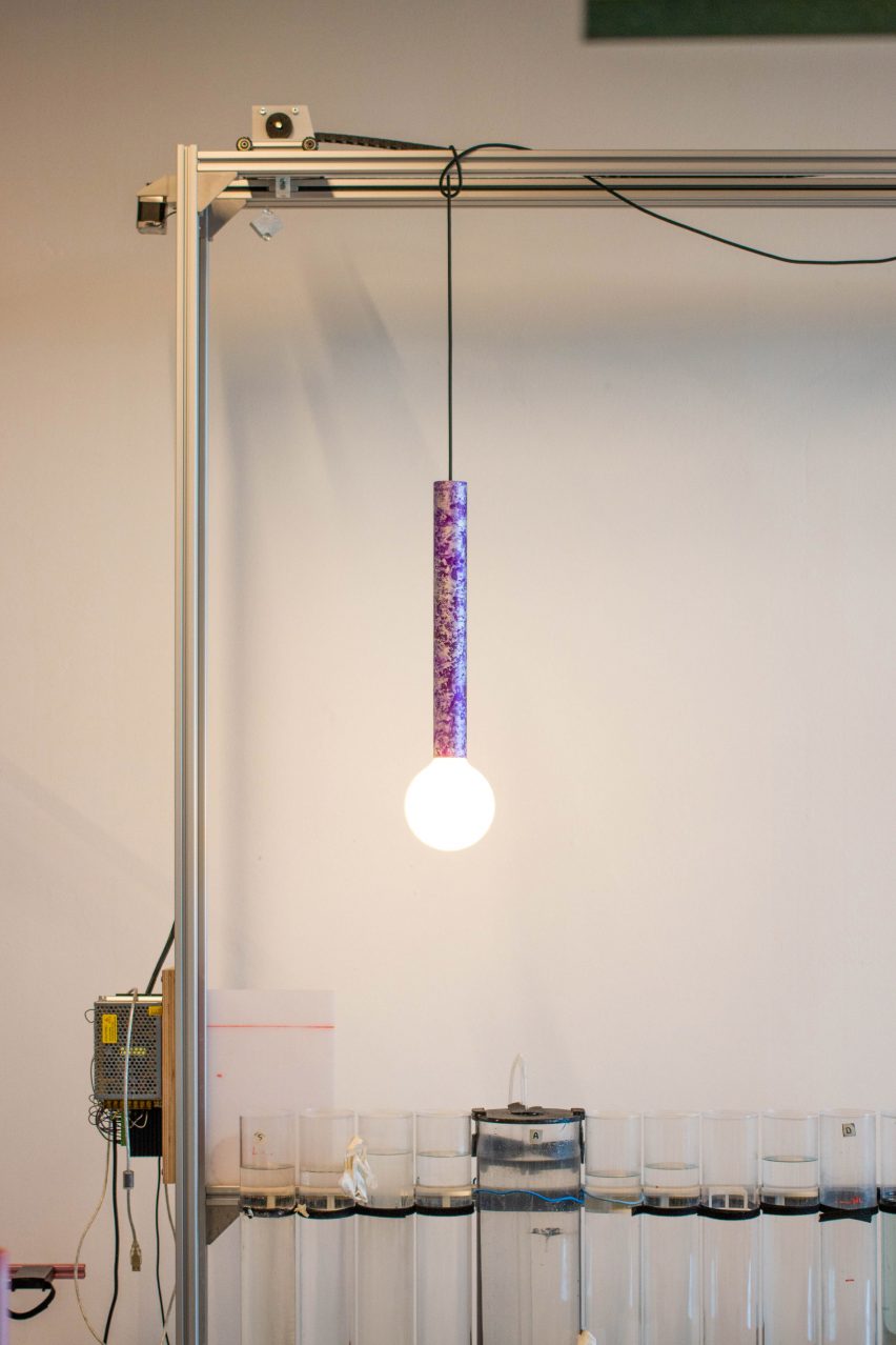
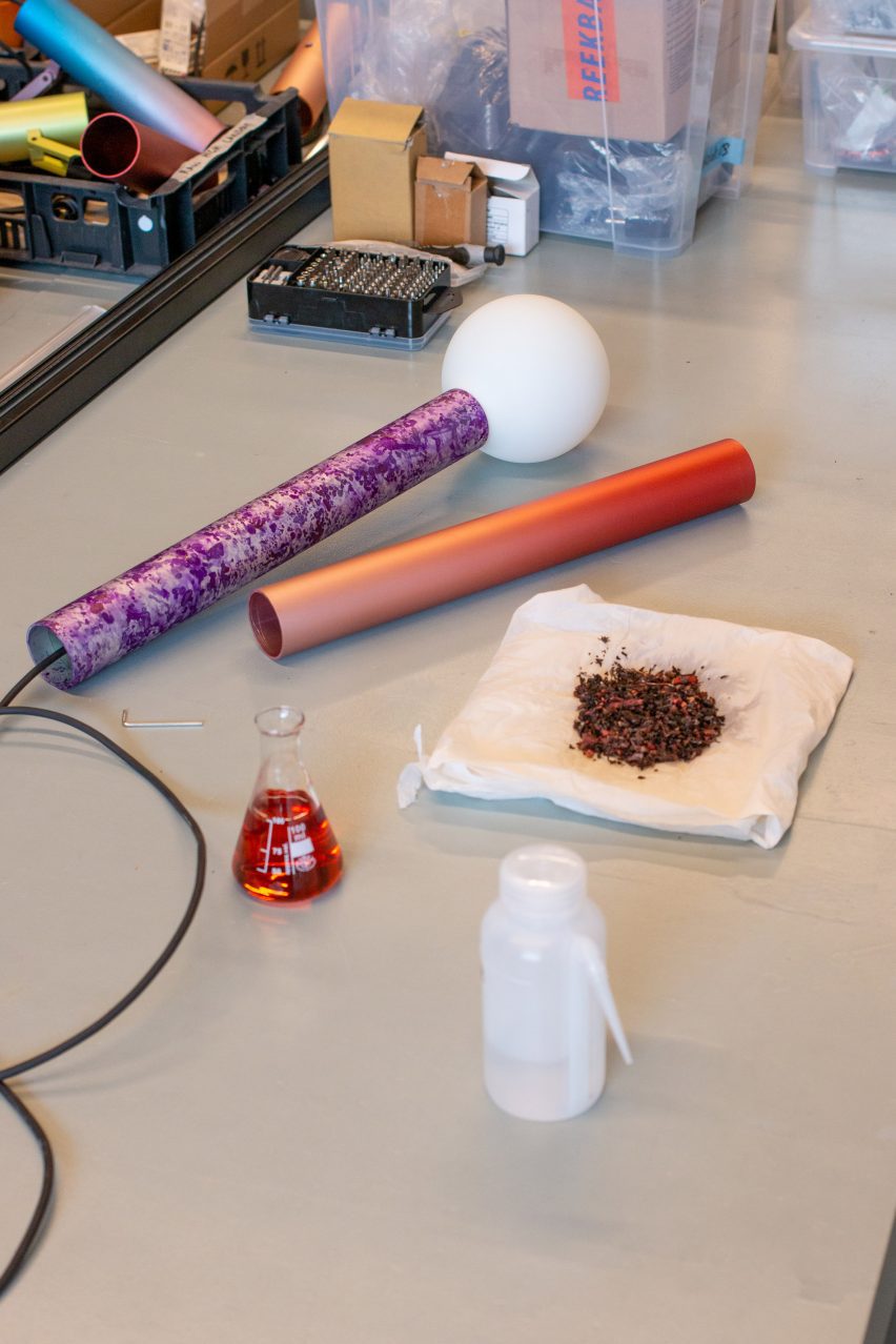
Dutch design studio Loop Loop has pioneered a process of adding colour to aluminium using pigments made from plants rather than petroleum.
Odin Visser and Charles Gateau, founders of the Rotterdam-based studio, claim to have created the “world’s first plant-based aluminium dying process”.
They have produced four bio-based pigment solutions that can be applied to aluminium through anodising, a surface treatment process that typically uses petroleum-based pigments.
Loop Loop has developed four plant-based pigments for anodising aluminium
Visser told Dezeen it was “the most complex issue” that Loop Loop had ever tackled.
“Natural pigments are being used more and more, but most of them are absolutely ineffective in the context of anodising,” he explained.
“We had to take a deep dive into chemistry, using resources from research papers to AI chatbots in order to understand the underlying principles that decide if a pigment is going to work or not.”
The colours include a warm purple derived from dyer’s alkanet flowers
Visser and Gateau are on a mission to make the process of aluminium anodising more accessible to designers, makers and small-scale manufacturers. Currently, it is largely only used in mass production.
The long-term aim is to make their designs and recipes open source, so anyone could set up a production facility.
Their journey began with the Magic Colour Machine, unveiled during Milan design week in 2022. This mobile, custom-built machine was designed to allow anyone to apply colour gradients to aluminium components, wherever they are.
Different effects can be achieved by applying the pigment in different ways
This new project, titled Local Colours, explores how the process could be made more sustainable.
“To find a way to produce the pigments for our Magic Colour Machine ourselves in a plant-based way helps us to further close the loop,” said Visser.
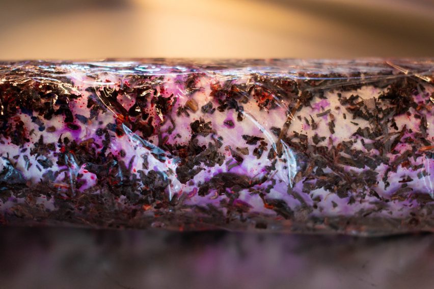
The four dyes developed so far include a warm purple derived from dyer’s alkanet flowers, a mustard yellow created with dyer’s rocket flowers, a deep pink made using madder root and a bright gold produced with red onion.
Loop Loop has explored different techniques for applying these colours to metal with different effects.
As well as smooth gradients, the pigments can be used to create textural finishes.
“The finish depends on how the pigments are applied,” explained Gateau, a Design Academy Eindhoven tutor with a background in material science.
“We can follow the standard practice of anodising and dip our pieces in a dye to obtain a uniform colour finish. In that sense, it is impossible to distinguish it from the industrial pigments,” he told Dezeen.
“It is also possible to press plant parts directly onto the surface we wish to dye; all sorts of patterns can emerge.”
A press effect results in varied textural patterns
The anodising process involves using an electric current to apply a thin aluminium oxide layer on the outer surface of the metal.
Loop Loop’s tests suggest that plant-based anodising finishes behave much the same as petroleum-based finishes, meaning they can be just as easily removed as added.
The main difference is that the colours react when exposed to direct sunlight.
“This is due to the molecular structure of the dyes, which is way more complex and diverse in the case of natural-based substances,” said Gateau. “The colours have a life of their own.”
Smooth gradients can be achieved using the Magic Colour Machine
Visser and Gateau have been growing their own plants for the dyes, supporting their commitment to localised production.
Once the recipes are made open source, they hope to encourage others to do the same. The ambition is to launch a platform that makes this possible in 2024.
“It’s still at an early stage, but we envision an ecosystem of designers, researchers and makers sharing the outcomes of work in the field of circular products and service systems,” added Visser.
Other designers exploring the possibilities of plant-based pigments include Nienke Hoogvliet, who has launched a brand working with seaweed-based textile dyes, and Studio Agne, which has created textile dye from biowaste.
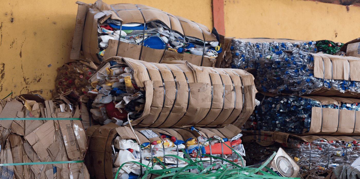
Spotted: Most people are eager to engage in recycling and want to make more sustainable choices, but logistical obstacles get in the way. In fact, a lack of recycling services was cited as the biggest barrier to recycling worldwide, according to a World Economic Forum study.
To make recycling more accessible for everyone, South-Africa-based Regenize collects separated rubbish directly from users on specified days – including recyclables and compostable organic waste – taking collections to local Decentralised Recycling Hubs (DRHs). Collection is free for lower-income areas and middle-upper communities pay a monthly fee. Once households sign up to the scheme, they receive a starter kit that includes information on how to recycle.
In exchange for their recycling, participants receive Remali – a virtual currency that can be spent with Regenize partners, including Vodacom and Telkon Mobile in return for data and minutes. Users track their recycling and Remali rewards on an easy-to-use app. But for those who don’t have access to a smartphone, Regenize also offers ‘Simplified Remali’ that can be redeemed in participating shops instead of online, which further helps to boost the local economy.
Impactful social change is at the heart of Regenize’s model, and the company chooses existing waste pickers and unemployed community members to become collectors. Collectors are given free uniforms, fossil-fuel-free bikes, equipment, mobile phones, and instead of sorting through dirty landfill sites, they have access to clean and safe rubbish. As well as providing them with a stable income, Regenize also helps the collectors get bank cards and access micro-loans.
Though currently only available in certain parts of South Africa, Regenize has plans to go national within five years, and then expand across the whole of Africa. The company recently launched more of its services at Khanyolwethu Secondary School, Lwandle in June this year.
Social change doesn’t have to come at the expense of sustainability. In fact, in the archive Springwise has spotted many innovators combining the two, including an Indian startup that employs local women and youth to create artisanal products from upcycled plastic and a Kenyan recycling company that ensures fair wages for waste pickers.
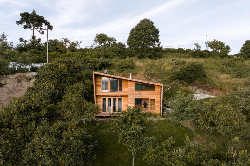
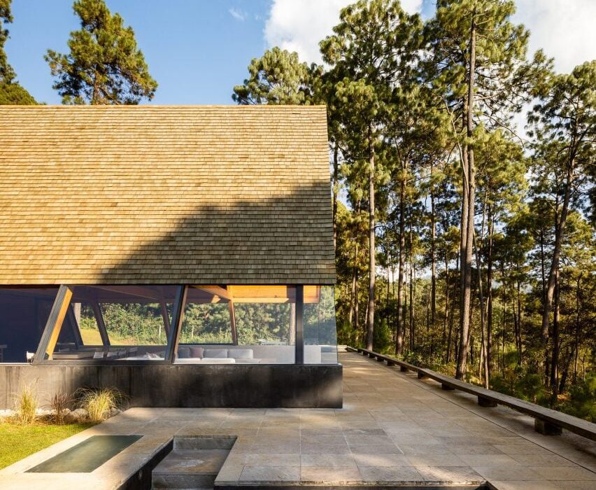
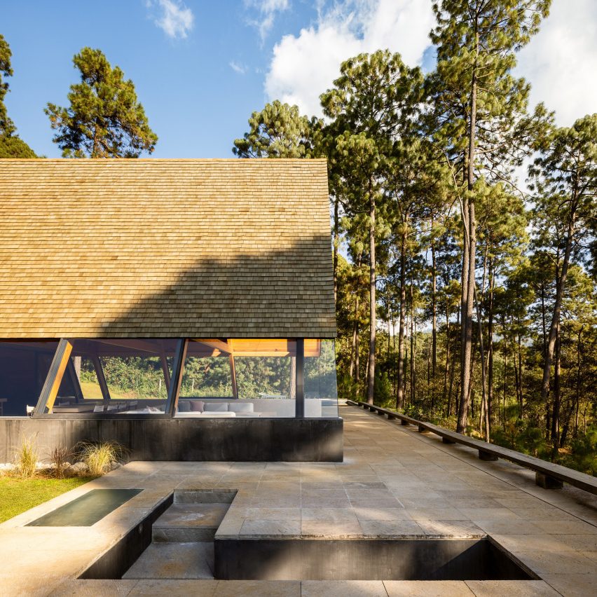
Local studio Pérez Palacios Arquitectos Asociados has completed a wooden A-Frame house with underground bedrooms in a forested area outside Mexico City.
Nestled in the forest of Valle de Bravo, the residence has two volumes stacked on top of one another, with public areas above ground and private ones below.
Pérez Palacios Arquitectos Asociados has designed an A-Frame house with underground bedrooms outside of Mexico City
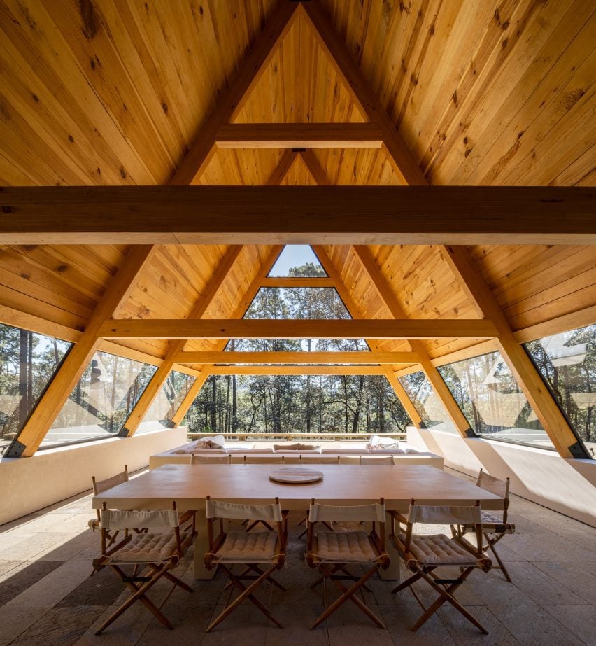
On the ground level, the A-Frame structure contains a semi-open living and dining room, kitchen, and family room, with a minimal footprint to create space for a terrace. The A-Frame structure consists of pre-fabricated elements brought to the site.
The top and sides of the A-Frame are enclosed in glass, as is the space at the back of the structure. An outdoor pool and lounge area were placed on the terrace to bring occupants closer to the surrounding forest and to take advantage of the large base where the underground aspects are located.
The residence is made of two perpendicularly stacked volumes
“The main goal of this project was to give more importance to the surroundings present and to the open space given, embracing the idea of emptiness even with the possibility of having the architecture disappear,” Pérez Palacios Arquitectos Asociados (PPAA) founder Pablo Pérez Palacios told Dezeen.
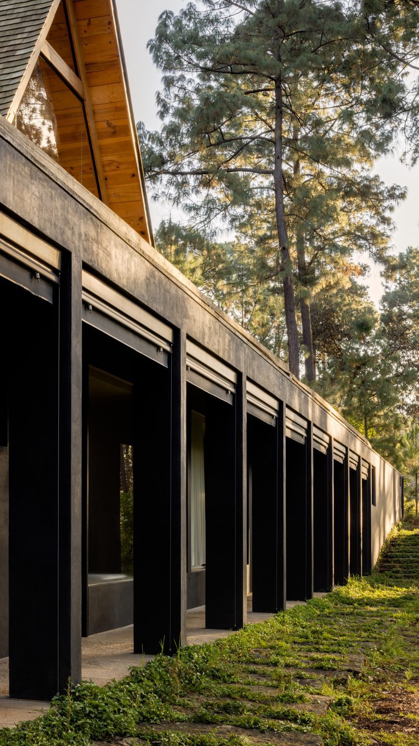
A submerged staircase on the terrace leads to the lower level, which contains three bedrooms, each with a private bath, and a small study.
The A-Frame structure contains the house’s public areas like a kitchen and living room
The sleeping areas were buried into the ground, with windows facing out and privacy offered by the surrounding trees.
“This design method gives you the possibility to really disconnect while enjoying your own solitude in the surrounding nature, gently forcing you to have that moment of relationship with the site, even if you’re just going to bed,” said Pérez Palacios
The rectangular structure beneath the A-Frame contains the house’s private sleeping areas
The black finish on the exterior of the lower volume and the dark roof tiles were selected to help the home blend into the environment.
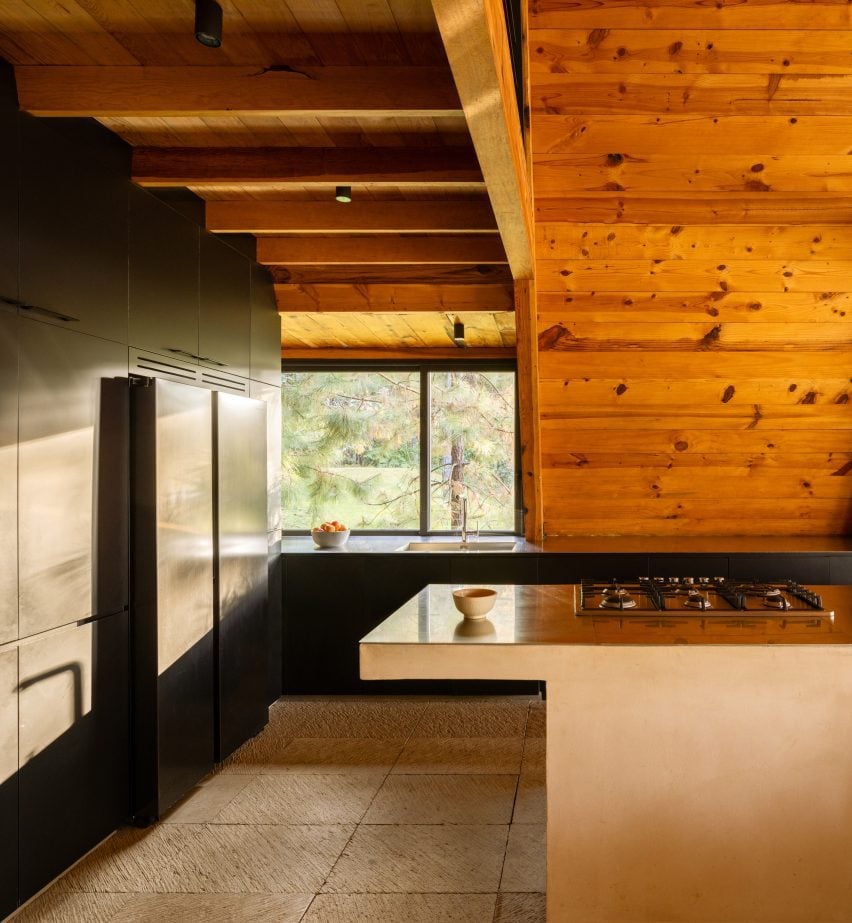
“The palette focuses on one core material – certified timber – to convey a sense of admiration and respect for the home’s surroundings,” said Pérez Palacios.
“Whilst the stainless steel, onyx joinery and hand-finished walls are used to evoke an unpretentious sensibility and as I would say ‘give prominence to the forest’.”
Rainwater is collected from the pitched roof, which is then ushered into an open water deposit for reuse.
In addition to rainwater collection, the open-air A-Frame structure also works to filter light and passively ventilate the house.
To further reduce the impact on site, the studio only removed one tree which it repurposed as a handrail on the terrace.
The underground bedrooms were designed to feel enclosed by the surrounding forest
The interiors were adorned in natural materials in neutral tones, with certified wood used also on the interior walls.
Other residential projects around Mexico City include a home with a dramatic cantilever by LBR&A and an expansive holiday home with a sunken living room by Romero de la Mora.