Entrance of Veja store in Madrid
CategoriesInterior Design

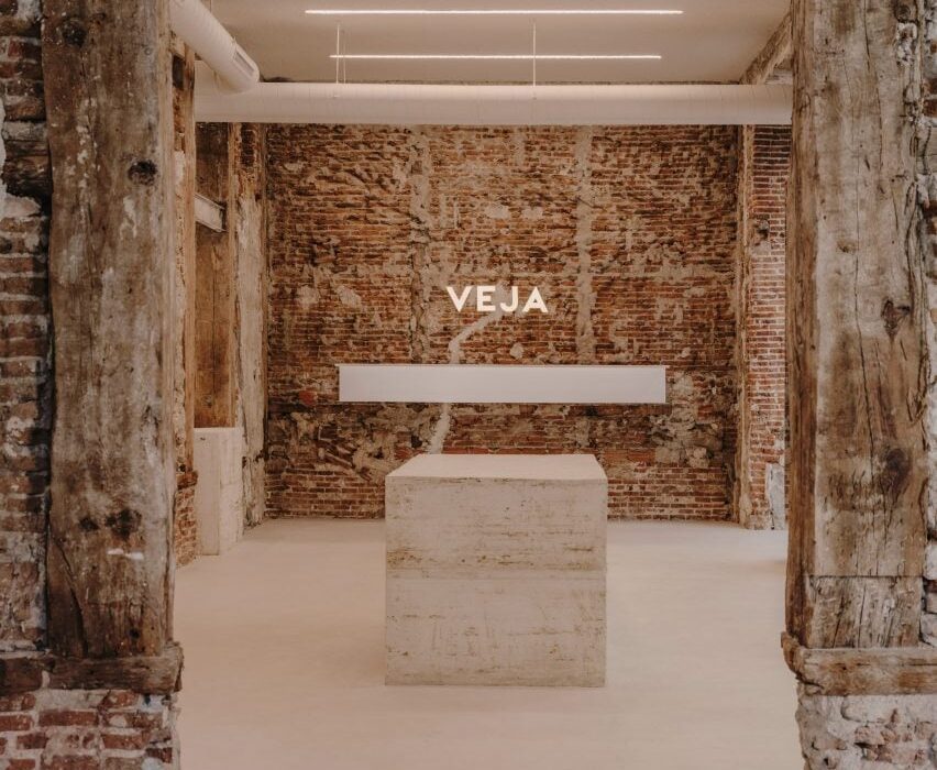
Plantea Estudio designs Veja store “to look like we didn’t do anything”

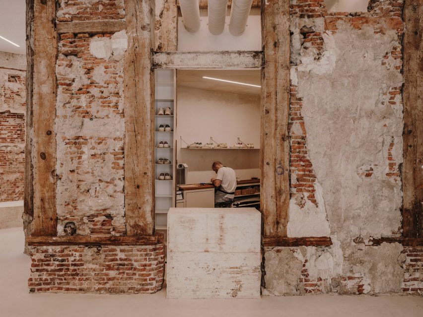
Raw finishes and brutalist interventions feature in footwear brand Veja‘s first dedicated shop in Madrid, complete with an in-house shoe repair workshop and interiors designed by local firm Plantea Estudio.

The retail space is housed in a building in the centre of Madrid, which has functioned as a shop, a restaurant and a bank office since its construction around the turn of the 20th century.

Entrance of Veja store in Madrid
Plantea Estudio has completed Veja’s Madrid store

By the time Veja took on the space, it had been stripped back to a shell and the team at Plantea Estudio immediately saw the potential in the raw, rough interior.

“That kind of brick structure brings you to the origins of architecture, to a temporal language,” the studio said. “It comes from always and goes forever, it will never be out of time or fashion.”

“For us, there was no better option than to work from there, to leave it exposed.”

Concrete display plinths in shoe store by Plantea Estudio
Monolithic concrete blocks serve as displays

The decision to work with the existing architecture rather than introducing unnecessary new materials also mirrors Veja’s idea of having in-house repair shop, encouraging customers to fix rather than simply replace their run-down trainers.

However, the shell required much more active intervention from Plantea Estudio than the store’s unfinished interior suggests.

Mirror reflecting image of man working on shoe repair in Veja store in Madrid
The shop also houses a repair workshop

“We had to work a lot for it to look like we didn’t do anything,” the studio said. “We brought the structure to its best version.”

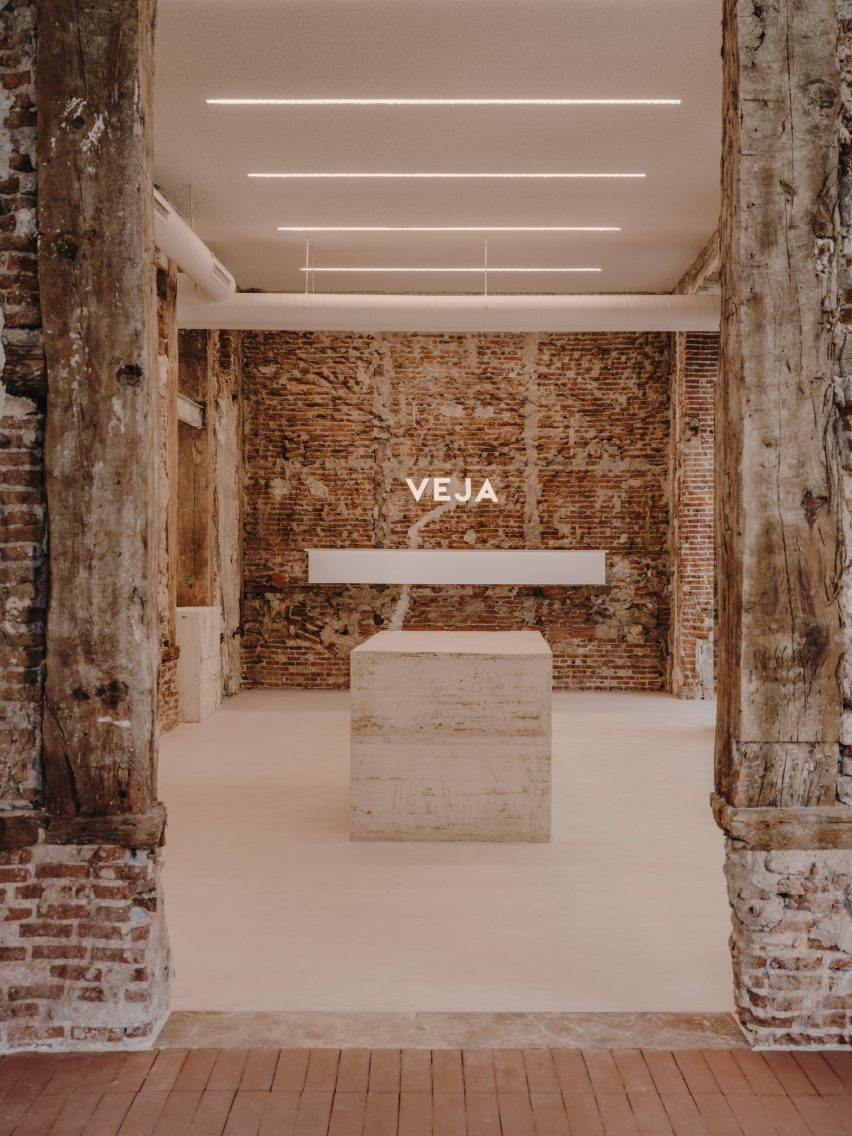
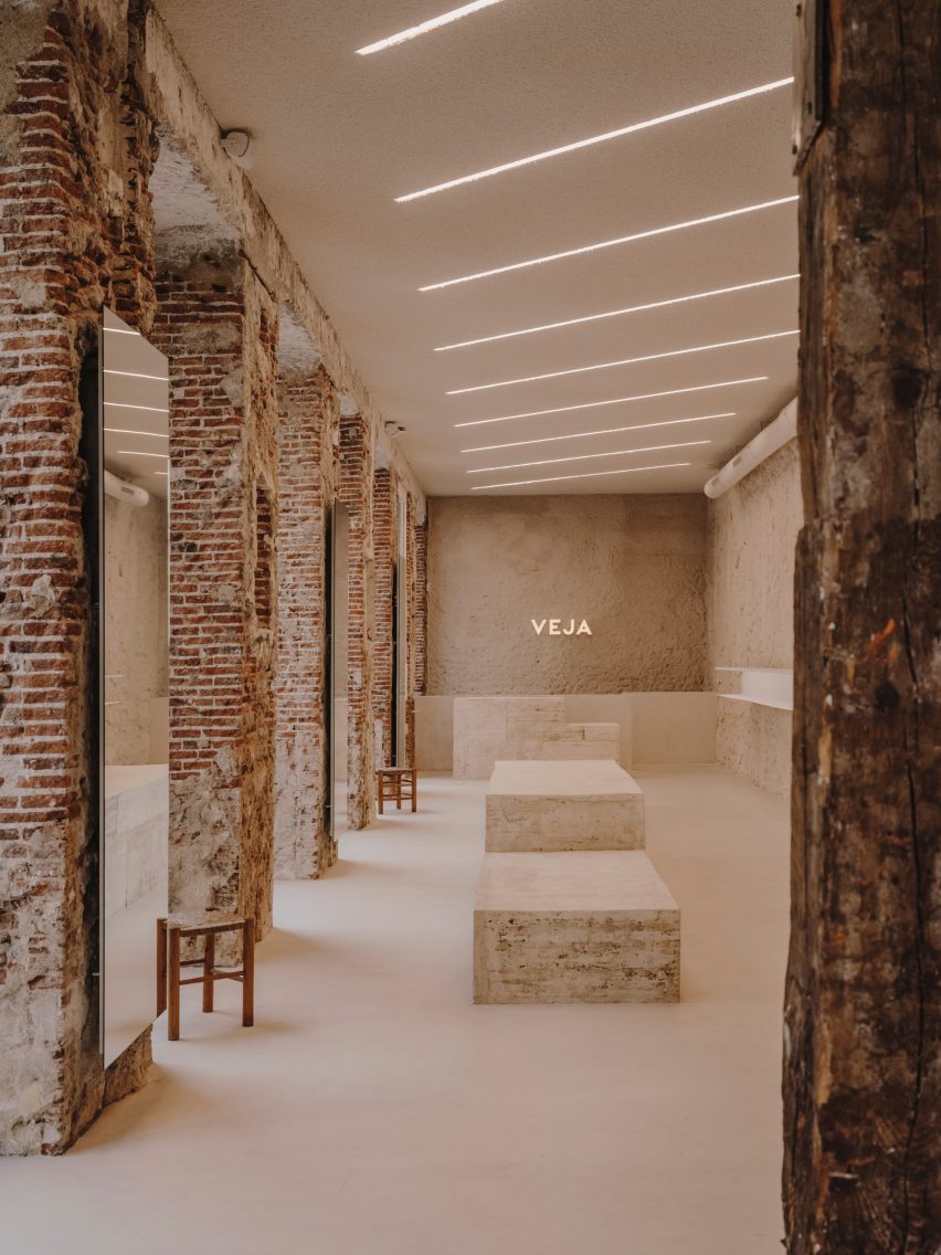
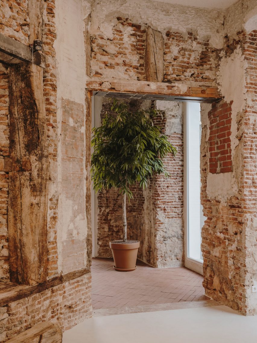
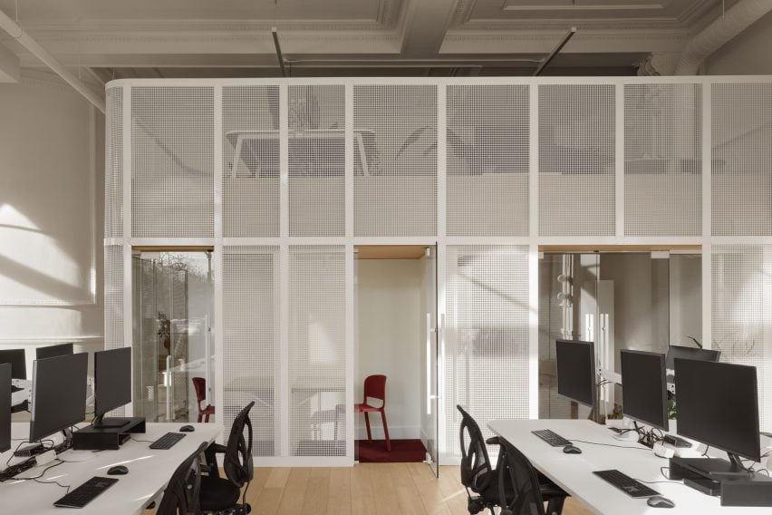
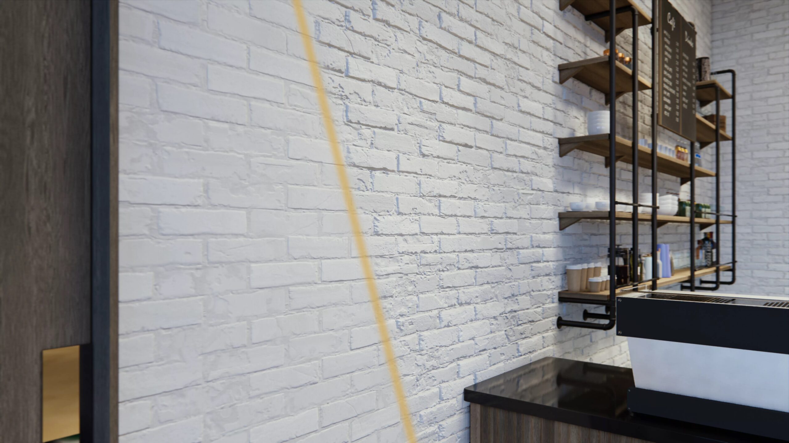
Plantea Estudio made the windows taller and brought the internal openings back up to their original height. The internal walls were cleaned up, exposing more of the brick and removing countless additions and coverings that remained from previous fitouts.

Main retail space in shoe shop designed by Plantea Estudio
Graphic strip lights are integrated into the ceiling

Where the materials were low-quality and couldn’t be removed, Plantea Estudio spray-coated the walls in a mix of plaster and Perlite mortar, “which accentuates the irregularity of the base”.

The floor was coated uniformly with cement mortar, creating a continuous surface throughout the interior while providing a contrast with the chunky cobblestones laid in the entrance hall.

The building’s functional pipes and pinewood supports were left exposed while the ceilings are clad in roughly textured sound insulation and embedded with graphic rows of strip lighting.

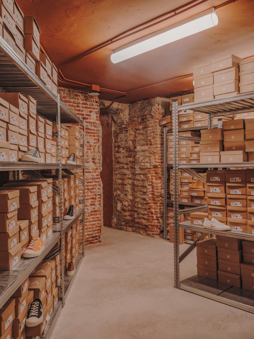
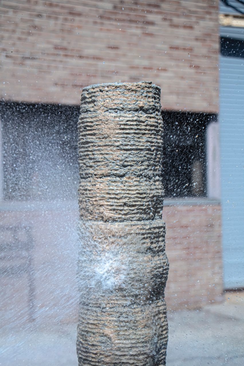
To form display areas, benches and counters, Plantea Estudio opted for stepped blocks of concrete – a favourite material of the brutalist movement – cast in situ using moulds made from old wooden boards.

Two chairs in front of a tall window in Veja store in Madrid
Vintage Joaquim Belsa armchairs were used to furnish the space

As a clear contrast to the heavy solidity of these pieces, the store’s shelving is made of folded sheets of white-lacquered steel.

“The main collection is displayed on these steel shelves, illuminated by a light that’s brighter than the general light in the store,” the studio said.

Ficus tree near entrance of shoe shop designed by Plantea Estudio
A ficus tree stands near the entrance

The space is accentuated by large-format mirrors, applied to the building’s brick pillars, where Plantea Estudio says they work at “multiplying the cross views”.

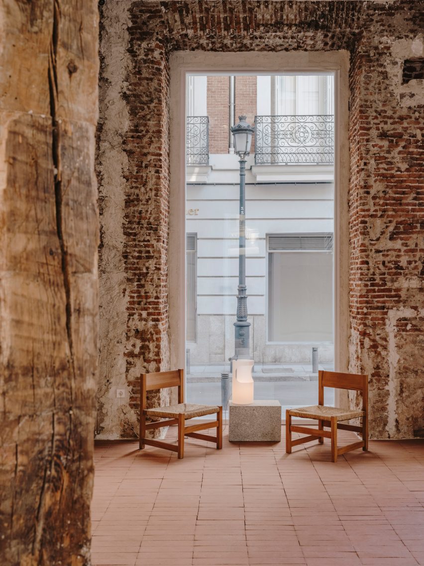
A large ficus tree marks the entrance while furniture was sourced from vintage design retailer Fenix Originals and includes 1960s armchairs by Catalan designer Joaquim Belsa.

Storage shelves holding shoes in Veja store in Madrid
Simple metal shelves provide additional storage

Plantea Estudio, which was founded by brothers Luis and Lorenzo Gil in 2008, has completed a number of interior projects in the Spanish capital.

Among them is the neutral-toned Hermosilla restaurant, as well as a bar serving wine and small plates, where a cosy red “cave” room is hidden behind the main dining space.

The photography is by Salva López.


Reference

New technology to harvest water from the air
CategoriesSustainable News

New technology to harvest water from the air

Spotted: Water plays many vital roles in our body and the environment and is needed for basic sanitation, but there are many places in the world where clean water is not readily available. While multiple factors like inadequate or damaged infrastructure, poor resource management, and pollution are contributing to low water supply, it is clear that climate change is also playing a part. 

This is where NovNat Tech comes in. With its technology, NovNat aims to improve water security and boost climate change resilience. This Birmingham-based company has developed a novel ‘atmospheric water harvester’ powered by waste heat from industrial operations, to help provide reliable and consistent water access by extracting water from the air at scale. NovNat’s proprietary porous materials act as a nano-scale selective sponge to soak atmospheric humidity and convert it into water. 

Having been rigorously tested, the harvester’s materials have demonstrated breakthrough performance in capturing and releasing water from the air – much faster and with less energy required than pre-existing atmospheric water generation (AWG) systems. The company is currently developing a prototype AWG system, funded by Innovate UK, designed to deliver water on the go for rescue and military vehicles.  

The air is filled with many valuable resources, and many innovations are looking to harness these for good use. In the archive, Springwise has also spotted a team that’s made a massive step towards providing hydrogen fuel from the air and a solar-powered panel that captures water vapour from the atmosphere. 

Written By: Anam Alam

Reference

dynamic curtain of concrete walls of varying heights engulfs japanese home by GOSIZE in tranquility
CategoriesArchitecture

GOSIZE wraps japan home in concrete walls of varying height

gosize melds external and internal spaces at ashiya s house


Amid an upscale residential neighborhood in Hyogo Prefecture, Japan, the Ashiya S House stands as a three-story block of concrete infused with a dynamic sequence of spaces. The home, conceived by Go Fujita of studio GOSIZE, fuses traditional Japanese perspectives with modern aesthetics, resulting in a space that blurs the boundaries between interior and exterior, motion and stillness, and yin and yang.


Situated in close proximity to neighboring apartment buildings and a busy road, the architects placed emphasis on blocking sightlines and noise, prioritizing privacy and tranquility for residents. The spatial solution devised a series of outer walls surrounding the building, each varying in height and strategically positioned to create an open space that fosters intimacy while inviting natural light and views inside.

dynamic curtain of concrete walls of varying heights engulfs japanese home by GOSIZE in tranquility
height-changing walls envelop the building | all images courtesy of Go Fujita / GOSIZE


fusion of traditional japanese design with modern aesthetics


Approaching the entrance, residents are guided along a semi-external path formed by gaps between overlapping exterior walls, marking a transition from public to private. Stepping inside, rough yet delicate tatami-finished walls adorned with contemporary art fuse traditional and modern elements, creating a serene ambiance that sets the tone for the rest of the Ashiya S House.


Ascending the stairs, guided by subtle indirect lighting, unveils a living area that exudes a sense of openness. The double-height windows allow sunlight to stream in, softly reflecting off the tin wallpaper and diffusing into every corner of the living space. The team at GOSIZE has carved these expansive openings into the thick walls to also serve as screens, framing the ever-changing views of the outside world, effectively merging the indoor and outdoor experiences.

dynamic curtain of concrete walls of varying heights engulfs japanese home by GOSIZE in tranquility
a walled courtyard and porch marking a transition from exterior to exterior

dynamic curtain of concrete walls of varying heights engulfs japanese home by GOSIZE in tranquility
GOSIZE’s design concept fuses traditional Japanese perspectives with modern aesthetics

dynamic curtain of concrete walls of varying heights engulfs japanese home by GOSIZE in tranquility
the living space is infused with light and openness despite the home’s location in a bustling area

Reference

Steel mesh mezzanine within historic bank building
CategoriesInterior Design

Ivy Studio converts historic bank into offices for Montreal ad agency

The offices that Montreal’s Ivy Studio has designed for digital advertising agency Cardigan include a mesh-wrapped mezzanine and a “futuristic” basement within a former bank building.

For Cardigan‘s expanding team, Ivy Studio has renovated a stone building that was built as a bank in 1907, in the Rosemont area of Montreal.

Steel mesh mezzanine within historic bank building
Ivy Studio inserted a steel mesh mezzanine inside the historic bank building to provide additional space

The structure has had many uses, including most recently a religious establishment, and boasts plenty of historic architectural details.

While the upper floor is a residential condo, Cardigan occupies 1,250 square feet (116 square metres) across the ground and basement levels – spaces with very different ceiling heights and light conditions.

Steel mesh partitions beside an oak staircase and counter
The mesh was painted white to accentuate the bright and airy feel in the office space

“One of the main challenges of working with the building was the contrasting ceiling heights between each floor,” said Ivy Studio. “This made the spacial blocking very important at the start of the project.”

To benefit from the 16.5 foot (5 metres) clearance and abundance of natural light, all the workstations are positioned on the ground level.

Glass-walled phone booth behind steel mesh
Under the mezzanine sit multiple phone booths and meeting rooms

However, the floor plate was not sufficient to accommodate all 25 employees as well as meeting rooms, so the studio took advantage of the ceiling height and added a mezzanine.

This addition was placed in a corner to avoid blocking the arched windows, and was painted entirely white to accentuate the bright and airy atmosphere of the space.

Large arched windows in office space
During the renovation, the building’s large arched windows were fully uncovered to let in more light

The structure is made from perforated steel mesh, allowing light to enter the phone booths and meeting rooms tucked underneath, and a gap was left between the mesh and the glass partitions behind to make space for planters.

Additional workstations are located on top of the mezzanine, which is curved at its corner. “The newly-built mezzanine structure interprets the curves of the existing space without competing with them,” Ivy Studio said.

To let even more light in, the boarded window arches were reopened to their original form, while the parquet flooring was replaced with natural oak to retain the warmth.

Meanwhile, in the basement, low ceiling heights and a lack of windows called for an entirely contrasting strategy.

“It is a different universe of its own,” said Ivy Studio, which took a “futuristic, in your face” approach to the sub-grade space.

Baby blue kitchen with orange portal on one side and mirror on the other
In the windowless basement, a contrasting “futuristic” aesthetic was chosen

This level accommodates the bathrooms, kitchen, lounge and storage, and features a mix of plastered ceilings, ceramic walls and epoxy floors.

In the kitchen, all of the surfaces are coloured baby blue, while the adjacent bathroom block is completely grey.

Blue kitchen with orange room beyond
The spaces are colour-blocked to heighten their visual impact

Across the kitchen island, a circular mirror faces an opening that’s exactly the same shape and leads into a room painted in orange.

“The spaces are all monochromatic, to increase the visual impact of their intense colors but also help camouflage the imperfections of the existing building,” said Ivy Studio.

Baby blue kitchen with stainless steel island and backsplash
Baby blue and stainless steel cover the kitchen

The office’s levels are linked by two staircases: an older one made from wood and a newer minimal design that emerges from under an arched portico.

Both are painted navy blue and are intended to reflect Cardigan’s contradicting “hard-working yet playful values”.

Bathroom with grey tiles viewed from blue room
The adjacent bathroom is executed entirely in grey

Ivy Studio’s portfolio of projects in its home city spans from workspaces and restaurants, to a spinning studio and a dry cleaners.

Recently completed interiors by the firm include a creative hub populated with pink and purple elements, and a renovated eatery that was damaged in a fire.

The photography is by Alex Lesage.


Project credits:

Design and architecture: Ivy Studio
Construction: Group Manovra

Reference

Recycled plastic bricks tackle homelessness
CategoriesSustainable News

Recycled plastic bricks tackle homelessness

Spotted: Plastic waste is not only a problem in developed nations – it is a major problem globally, including in Africa, where it contaminates freshwater sources and has a big health impact.

Brickify is a Nigerian company working to solve this issue – and tackle homelessness – with one solution. The company collects plastic waste from families and individuals in exchange for cash. The waste is then used to manufacture plastic bricks for use as a construction material.

The bricks are made up of around 90 per cent of plastic waste, along with other materials that give them great strength and fire-resistant properties. The bricks interlock like Lego toys, so they can be used in construction without any additional materials. They are around 30 to 50 per cent cheaper than conventional bricks and will not decompose, so are very long-lasting.

Brickify has received small amounts of funding in the form of awards from Impactionable and the Social Innovations Competition. However, the company has also partnered with several state and national government agencies, corporate and non-profit organisations.

From using recycled plastic as a building material to turning waste plastic into non-toxic resin, tackling plastic waste is now the goal of a huge number of entrepreneurs as spotted by Springwise in the archive.

Written By: Lisa Magloff

Reference

A 3D-printed column made of sawdust
CategoriesArchitecture

Material researchers create biodegradable concrete casting using sawdust

A research team at the University of Michigan has created biodegradable formwork out of sawdust in an attempt to mitigate wood waste in the process of laying concrete.

The wood-based material is a result of the BioMatters project by the Digital Architecture Research and Technologies (DART) Lab at Taubman College of Architecture and Urban Planning.

A 3D-printed column made of sawdust
A research team at the University of Michigan has created a sawdust material for concrete formwork

Led by DART director Mania Aghaei Meibodi along with researchers Muhammad Dayyem Khan and Tharanesh Varadharajan, the team sought to create a material to reuse industrial sawdust in order to lessen the waste created by formwork used in concrete construction.

The team mixed sawdust with biopolymers and additives to create its material, which can be moulded or 3D-printed into various shapes. In order to demonstrate its capabilities, the team used the material to create concrete formwork.

Two people hold a 3D-printed sawdust column
The material can be 3D-printed in order to create structural columns

The team 3D-printed a 1.8-metre structural column, pouring concrete into its centre incrementally. After the concrete was dry, the sawdust formwork was peeled off to reveal the column.

The sawdust material was then saved and recycled by adding water in order to recreate the viscosity level required for 3D printing. Using this process, the team successfully reused the same material over 25 times to create additional columns.

Concrete poured into a a column of sawdust casting
The material is created using a mixture of sawdust and biopolymers

According to the team, 15 billion trees are cut down worldwide per year, which results in three million pounds of sawdust dumped into landfills in the United States.

The sawdust may often be burned as an alternative, which can cause environmental pollution.

A column made of sawdust and bio polymers
It can be recycled by adding water

“It’s like a precious material for me because you’re cutting down a tree,” said researcher Muhammad Dayyem Khan. “I think every particle of that tree should be reused if you’re cutting it down.”

According to DART Lab, formwork contributes to up to 40 per cent of concrete construction expenses and is usually constructed from wood. After its use on construction sites, the formwork is often discarded.

The team also plans to experiment with making larger structures with the material.

“For example, some structures can be printed in a big warehouse and then you just turn them back up,” said Khan. “Just rotate them 90 degrees and you’ve got a bigger structure.”

A concrete column getting sprayed with water
The material is used to mitigate waste produced by the concrete industry

While the BioMatters team initially experimented with the material for formwork, it suggested that the potential reaches beyond just concrete construction.

“It can be anything,” said Khan. “It can be small, decorative items. It can be furniture. It can be your walls, doors, windows.”

The material can also be sanded and stained similar to wood in order to create a smoother finish. The team has yet to explore what woods perform best for the material.

For more projects that utilize sawdust, Designer Oh Geon also used it to create a blocky stool while Mater Design utilised the material for a re-released version of the Conscious Chair. 

Photography courtesy of DART Lab. 

Reference

Hotel lobby with wood shelving and floral-wrapped reception desk
CategoriesInterior Design

Giannone Petricone Associates rescues Ontario hotel from ruin

Toronto studio Giannone Petricone Associates has spent a decade restoring a dilapidated hotel in Ontario, linking the building’s past and present through regionally influenced design details.

Located in Picton, a town in Prince Edward County (PEC) that lies close to the shores of Lake Ontario, The Royal Hotel was in bad shape when the Sorbara family purchased it in 2013.

Hotel lobby with wood shelving and floral-wrapped reception desk
The Royal Hotel’s interiors draw upon a mix Victorian and contemporary influences, as seen in the reception area. Photo by Graydon Herriott

The new owners hired Giannone Petricone Associates (GPA) to save what they could of the existing building, which was first completed in 1879, and transform it into contemporary lodgings.

“Its central staircase was lined with a lush carpet of green moss, and early in the planning phase, the roof caved in,” said the hotel team.

Bar surrounded by tambour panelling
One of four hotel bars is lined with tambour panelling

“But the family vowed to restore the property and bring it back to life as a nexus for both locals and guests of PEC’s burgeoning food and wine region.”

The architects were able to salvage three of the original brick walls, and within them created a cafe, three bars, a fine-dining restaurant; and a spa, gym and sauna.

Lounge area in front of undulated plaster fireplace surround
Playful design elements include ceiling rosettes that mimic water ripples

A landscaped terrace overlooks a fourth bar and a brick patio with lounge seating, while an outdoor swimming pool flanked by a row of cabana beds lies beyond.

A total of 33 guest rooms are available: 28 in the main three-storey hotel building, and a further five suites in a rebuilt stable named The Royal Annex.

Cosy lounge with dark tambour fireplace surround
Another cosy lounge area features dark tambour panels around its fireplace

For the interiors, GPA played on tropes of Victorian railway hotels, mixing formal elements of British tradition with PEC’s more laid-back rural sensibility.

“The Royal is designed to be a transporting experience while deeply rooted in the local context,” said GPA principal Pina Petricone. “The experience benefits from the charged contrast between ‘genteel’ and ‘real’ elements.”

In the lobby, the reception desk is wrapped in a floral pattern and a wooden shelving system forms a boutique displaying items for sale.

Tambour panelling lines the adjacent bar area, which flows into a lounge where softly undulated plasterwork frames a fireplace.

Bedroom with dark wood panelling and large marbled fireplace
The hotel offers 33 guest rooms, which feature details like cross-stitched headboards

A variety of checkered and tartan patterns are found across hallway carpets, mosaic bathroom tiles and cross-stitched headboards. Ceiling rosettes throughout the spaces are designed to mimic mushrooms and water ripples.

“We wanted to have moments in the hotel that were a bit nonsensical,” Petricone said. “The Royal is about escapism, and our research into the hotel’s history demonstrated that it was always a pretty quirky place.”

Bathroom with checkered mosaic tiles
A variety of checkered patterns are found throughout the hotel, including in the mosaic bathroom tiles

Other recently opened hotels in Canada include the Ace Toronto, which boasts a suspended lobby and rooftop bar.

Last year, the 1 Hotel Toronto by Rockwell Group and The Drake Hotel Modern Wing by DesignAgency, also in the city, were longlisted in the Hotel and Short Stay Interiors category for the Dezeen Awards.

The photography is by Doublespace, unless stated otherwise. Main image is by Jeff McNeill.

Reference

Fire-proof cladding made from mycelium
CategoriesSustainable News

Fire-proof cladding made from mycelium

Spotted: Cladding is an outer layer of material that is used to improve the appearance, thermal insulation, and weather resistance of a building. The cladding used in Grenfell Tower in the UK was Aluminium Composite Material (ACM) – a highly flammable product that consistently failed fire tests. The ACM has been blamed for helping the flames spread when the infamous fire at the tower block broke out in 2017. 

To help prevent tragedies like this, scientists from RMIT have found a way to grow fungi using renewable organic materials as feedstock to form thin sheets that could be used to produce fire-retardant cladding. The final material is lightweight, thin, and versatile, making it suitable for multiple automotive, maritime, and possibly aerospace applications – as well as in construction. When mycelium is exposed to flames, it forms a protective layer of char that resists fire and heat transfer, and protects any flammable materials underneath. 

The RMIT team scientists aim to replace composite cladding panels that usually contain plastics, which produce toxic fumes and thick smoke when exposed to fire. Co-author of the research, Associate Professor Everson Kandare, highlights: “Bromide, iodide, phosphorus, and nitrogen-containing fire retardants are effective, but have adverse health and environmental effects. They pose health and environmental concerns, as carcinogens and neurotoxins that can escape and persist in the environment and cause harm to plant and animal life.” The mycelium-based material, by contrast, burns cleanly, only releasing naturally occurring water and CO2. 

RMIT scientists aim to develop an environmentally friendly fire-proofing mat that could then be used for building cladding. And to make the potential cladding sustainable and scalable, the researchers are also exploring collaborations with the mushroom industry to use fungal waste products in production. 

Mycelium has been used by many companies looking to create sustainable alternatives to everyday things. In the archive, Springwise has spotted interior design products and clothing made using mycelium.

Written By: Anam Alam

Reference

How to Create a Compelling Architectural Rendering Using Customizable Materials and Assets
CategoriesArchitecture

How to Create a Compelling Architectural Rendering Using Customizable Materials and Assets

Translating the architectural masterpiece in your head into a tangible visualization for clients and colleagues can feel like an impossible task if you don’t have the right tools in your arsenal. Fortunately, cutting-edge real-time rendering software like Enscape can help architects and designers bring their projects to life with breathtaking clarity and improve the speed and efficiency of your workflow. 

Exploring 3D models in real time allows you to quickly evaluate every facet of a design. At the ideation stage, it’s easy to identify mistakes, experiment with different solutions and make instant alterations. Furthermore, with new levels of customization now possible, you can transform your concepts into immersive worlds for clients, imparting a compelling, human perspective to each project. Most importantly, your design intent is crystal clear from the outset.

Here are five steps to creating stunning architectural visualizations with adjustable assets and real-time rendering software.

1. Perfect your perspective.

Like a photographer, it’s important to consider the composition of your renderings. There are a number of general rules you can follow to make your framing more powerful though these are yours to break.

The rule of thirds is an age-old principle. Dividing the frame into a three-by-three grid, this composition ensures the most important features fall along the lines or at their intersections. Alternatively, you could consider using one-, two-, or three-point perspectives anchored around crucial moments in the frame. If your scene is laden with multiple strong elements, it may be more impactful to hone in on one single focal point instead and tell that story succinctly.

If you’re an Enscape user, you have the ability to create handy presets for each view once you’ve settled on your composition. Every camera angle requires its own unique settings. In Enscape, you can link the preset to the view, so the visual settings will automatically change when you navigate through the different perspectives.

2. Plan your lighting setup.

Negotiating the balance between light and dark is key if you want to produce a realistic rendering. Think about what time of day your scene is set and examine the conditions in the real world. What position would the sun or moon be in? Depending on the orientation of any windows, where would shadows be cast and how dark would they be? Are there any surfaces light might reflect off? In Enscape, it’s possible to customize the time of day for each view to set the right mood for the scene.

For artificial lighting, consider the angle of the light, its strength and how intense shadows would be according to each particular lighting system. Extremely dark areas can lose detail and material quality, so ensure the frame’s main focal points are adequately lit. 

Enscape 3.5, the software’s newest iteration, features updates to their global illumination algorithm, including a host of changes to make the light quality in your renderings more lifelike. These include more accurate shading in mirror reflections and more realistic indirect lighting in interior scenes.

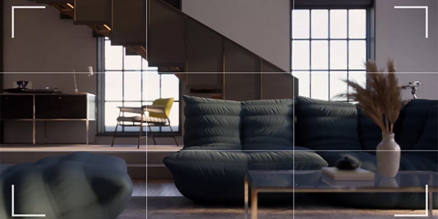
3. Customize your project materials.

Blurry and pixelated 3D textures result in lackluster visualizations. Material clarity can elevate your architectural renderings to the next level. Enscape’s Material Library offers an array of high-quality, versatile textures you can apply across interior and exterior surfaces. It’s easy to experiment with different materials and instantly swap them in and out until you arrive at the right finish. You can also import materials from other sites to expand your library. 

Textures with visual repetitions can be jarring and disrupt the illusion of realism. However, bump maps and reflections are automatically applied to materials from the Enscape Material Library to impart even more depth to your renderings. If these settings don’t align with the aesthetic you’re trying to achieve, you can use the Enscape Material Editor to customize displacement maps.

As well as the exterior and interior textures of your project, don’t neglect the other scene elements that will bring your image to life. Pay special attention to typically overlooked surfaces such as the asphalt of an adjacent road or the ripples of a lake in the background to ensure the entire composition feels palpable.

4. Utilize realistic assets.

Illustrating your renderings with the fixtures of everyday life, be it furniture, decorations, trees, vehicles and even people, can enforce your world-building and strengthen your design. Enscape’s recently released adjustable asset series offers options for you to modify assets to your liking. There are over 1,000 new 3D adjustable assets, encompassing texture alterations and variants of an item’s geometry, plus almost an infinite number of color options to choose from.

What’s more, the Enscape 3.5 update offers 93 new unique people assets to help demonstrate the functionality of your project and add a more emotive dimension to your scenes. In instances where architects and designers need specific assets, you can import your own models into the Custom Asset Library too. Check out this in-depth tutorial on harnessing Enscape’s asset library within Revit, SketchUp, Rhino, Archicad and Vectorworks.

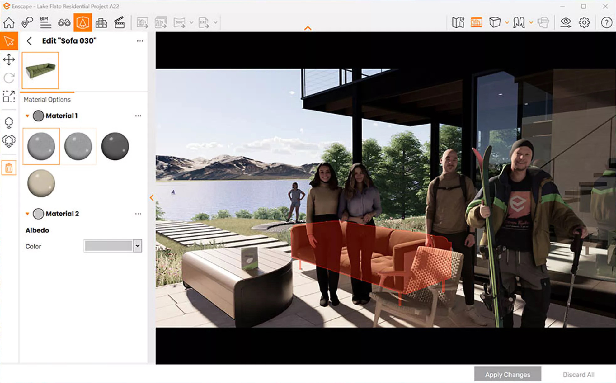
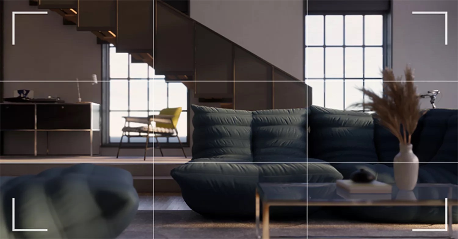
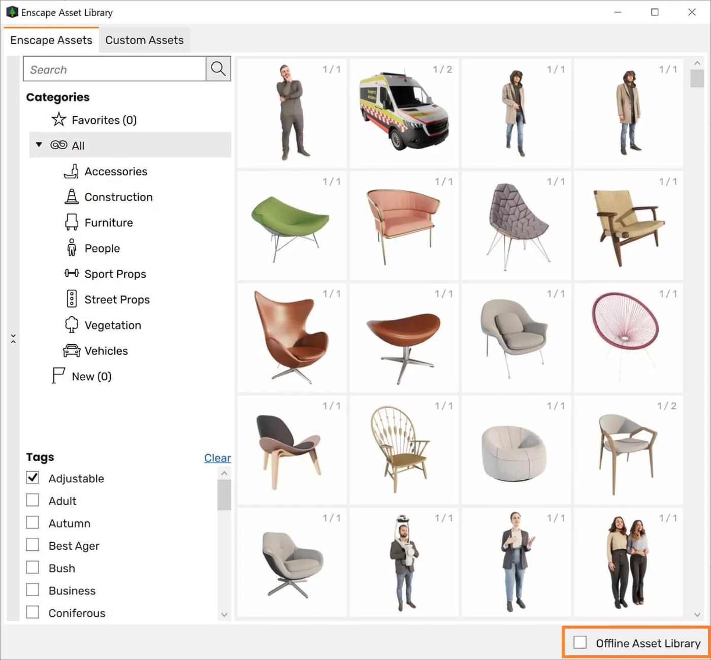
5. Fine-tune in post-production.

When you’ve finished crafting your scenes, there may be post-production tweaks you want to make to add the finishing touches to your renderings. In Enscape, you can easily export your images and continue work in any photo editing software. You can even export different types of rendering elements so you can quickly modify a specific object or material. For example, you can export object ID, material ID and channel depth for more targeted editing. 

Enscape 3.5 also benefits from improvements to the alpha channel functionality (the alpha channel is a layer that represents an image’s degree of transparency). The alpha channel export feature allows you to take renderings with a transparent background out of Enscape and edit them externally. The recent update now enables users to export semi-transparent materials too, such as windows and glass surfaces, speeding up post-processing.

Supercharge your design communication and try Enscape’s real-time rendering software for yourself with a free 14-day trial. The Enscape plug-in is compatible with popular modeling software, including SketchUp, Revit, Rhinoceros, Archicad and Vectorworks. 

Reference

Wine room in Maison du Parc by La Shed Architecture
CategoriesInterior Design

Wine storage solutions feature in this Dezeen lookbook

For those who don’t want to keep their wine collection hidden away, our latest lookbook showcases some of the most inventive ways of showcasing wine bottles within a contemporary home interior.

Wine storage solutions can be created in homes of any size, by cleverly integrating shelving into wall niches or built-in furniture.

For those with enough space for a wine cellar, or even just a dedicated wine fridge, well-designed glazing and lighting can turn these spaces into focal points.

A more casual wine drinker could simply slot a small wine rack into a kitchen island or bookshelf.

Read on for 10 examples to suit homes of any size, including a wine cellar that doubles as a lightbox and a blue wine-rack wall.

This is the latest in Dezeen’s lookbooks series, which provides visual inspiration from our archive. Other recent editions showcase serene bedrooms and wood-panelled dining rooms.


Wine room in Maison du Parc by La Shed Architecture
Photo by Maxime Brouillet

Maison du Parc, Canada, by La Shed Architecture

Visible from both the staircase and a grand basement bathroom, this wine room was designed to be a key feature in a three-storey home in Montreal.

With frosted glass walls and stark lighting, it makes the bottles visible but partially obscured. They appear as a grid of spots across the surfaces of the bright white volume.

Find out more about Maison du Parc ›


Wine rack in AML Apartment by David Ito Architecture
Photo by Pedro Kok

AML Apartment, Brazil, by David Ito Arquitetura

Bright blue wine storage extends floor to ceiling in this apartment in São Paulo, lining up exactly with a doorway in front.

The wine rack sits alongside a utility area but it is also visible from the living and dining room, so it made sense to make it a feature. It offers space for 108 wine bottles.

Find out more about AML Apartment ›


Kitchen island in Gallery House Stoke Newington by Neil Dusheiko Architects
Photo by Agnese Sanvito

Gallery House, UK, by Neil Dusheiko

Wine bottles are not the primary focus in this kitchen extension in north London, which features an entire wall of treasured objects including ceramics, glassware and framed pictures.

Instead, they neatly slot into 10 circular cubby holes within the oak kitchen island. These holes extend through, creating room for two bottles in each opening.

Find out more about Gallery House ›


Pantry with wine shelves in Casa em Cotia by Una Arquitetos
Photo by Nelson Kon

Casa em Cotia, Brazil, by Una Arquitetos

The kitchen of this family home in São Paulo centres around a full-height glass-fronted pantry, offering plenty of storage space for food and crockery.

Wine storage is located within the front cupboard, slotted in underneath shelves for mugs and glasses. This places it within easy access of the adjacent dining room.

Find out more about Casa em Cotia ›


Wine storage in City Beach residence in Perth by Design Theory
Photo by Jack Lovel

City Beach Residence, Australia, by Design Theory

Hexagonal terracotta modules are stacked up to create storage space for 50 wine bottles in this renovated 1960s beach house in Perth.

The arrangement slots into a niche in the wall, with the clay-based material helping to keep the wine at a stable temperature.

Find out more about City Beach Residence ›


Wine storage in Raft Loft by Dash Marshall
Photo by Mark Wickens

Raft Loft, USA, by Dash Marshall

There is plenty of space for storing wine in this two-level home in New York’s Tribeca, which was converted from two previously separate apartments.

In addition to the main kitchen, the residence has a kitchenette that features both a wine fridge and a wine rack that slots in above the wall-mounted high cupboards.

Find out more about Raft Loft ›


Photo by Dror Baldinger

Ski Slope Residence, USA, by LaRue Architects and Britt Design Group

The owners of this lakeside cabin in Austin, Texas, also own a vineyard in Argentina, so they were understandably keen to put their wine collection on full display.

A wine room takes pride of place near the main entrance. It is visible behind a glass door that extends from floor to ceiling, creating an unusual backdrop to a grand piano.

Find out more about Ski Slope Residence ›


Wine rack in Charred House kitchen
Photo by Adam Scott

Charred House, UK, by Rider Stirland Architects

In this London home, wine storage forms part of a bespoke kitchen created by Plykea, a British brand that specialises in customising IKEA kitchens.

The bottles are held in place by simple supports that sit within a series of shelves, offering space for 30 bottles.

Find out more about Charred House ›


Wine rack in Salva46 by Miel Arquitectos and Studio P10
Photo by Asier Rua

Salva46, Spain, by Miel Arquitectos and Studio P10

Storage helps to organise the floor plan in this highly compact Barcelona apartment.

A very simple wood-framed wine rack slots alongside a set of drawers, which together create a soft divide between the entrance lobby and the kitchen.

Find out more about Salva46 ›


Soho Loft by Julian King
Photo by Michael Moran and Julian King Architect

Soho Loft, USA, by Julian King

This warehouse apartment in New York offers a highly simple wine storage solution.

The living space features a series of shelves that together form a sizeable bookcase. A wooden rack slots into the bottom shelf, allowing wine to sit alongside the literature.

Find out more about Soho Loft ›

This is the latest in Dezeen’s lookbooks series, which provides visual inspiration from our archive. Other recent editions showcase serene bedrooms and wood-panelled dining rooms.

Reference