Image of Red Dunes Playtopia
CategoriesArchitecture

Red Dunes Playtopia features “cave-like” play spaces and undulating hills

Sloping red dunes and cavernous spaces feature in this playground, which local studio XISUI Design has created in a residential area in Guangzhou, China.

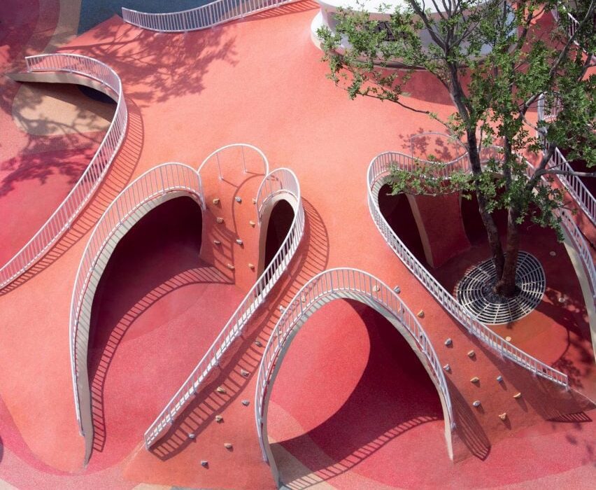
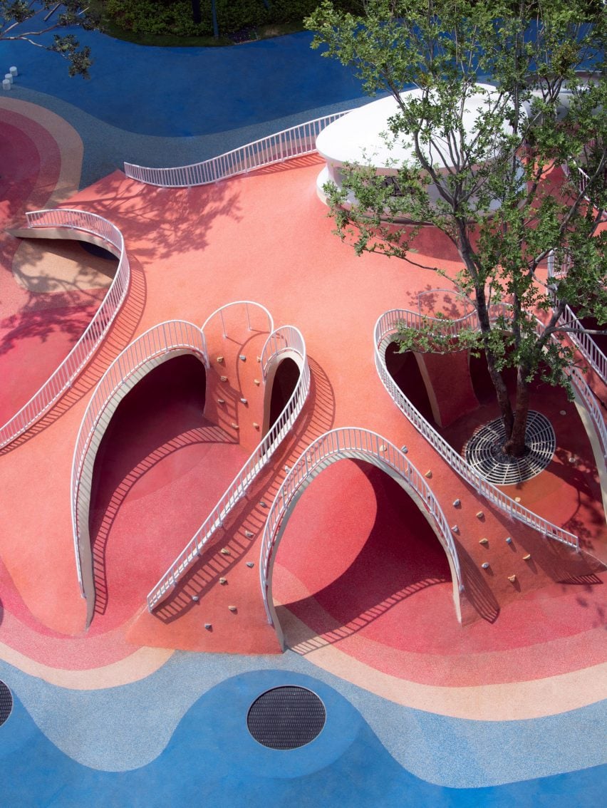
Built above an underground parking unit, the play area takes cues from natural forms including mountains and caves and comprises a playful arrangement of hills and arches designed for climbing and discovery.

“The design revolves around utilising the undulating red dunes to provide an attractive terrain for children to come and engage in activities such as running, jumping, and playing,” studio design director Hu Yihao told Dezeen.

Image of Red Dunes Playtopia
Red Dunes Playtopia was designed by XISUI Design

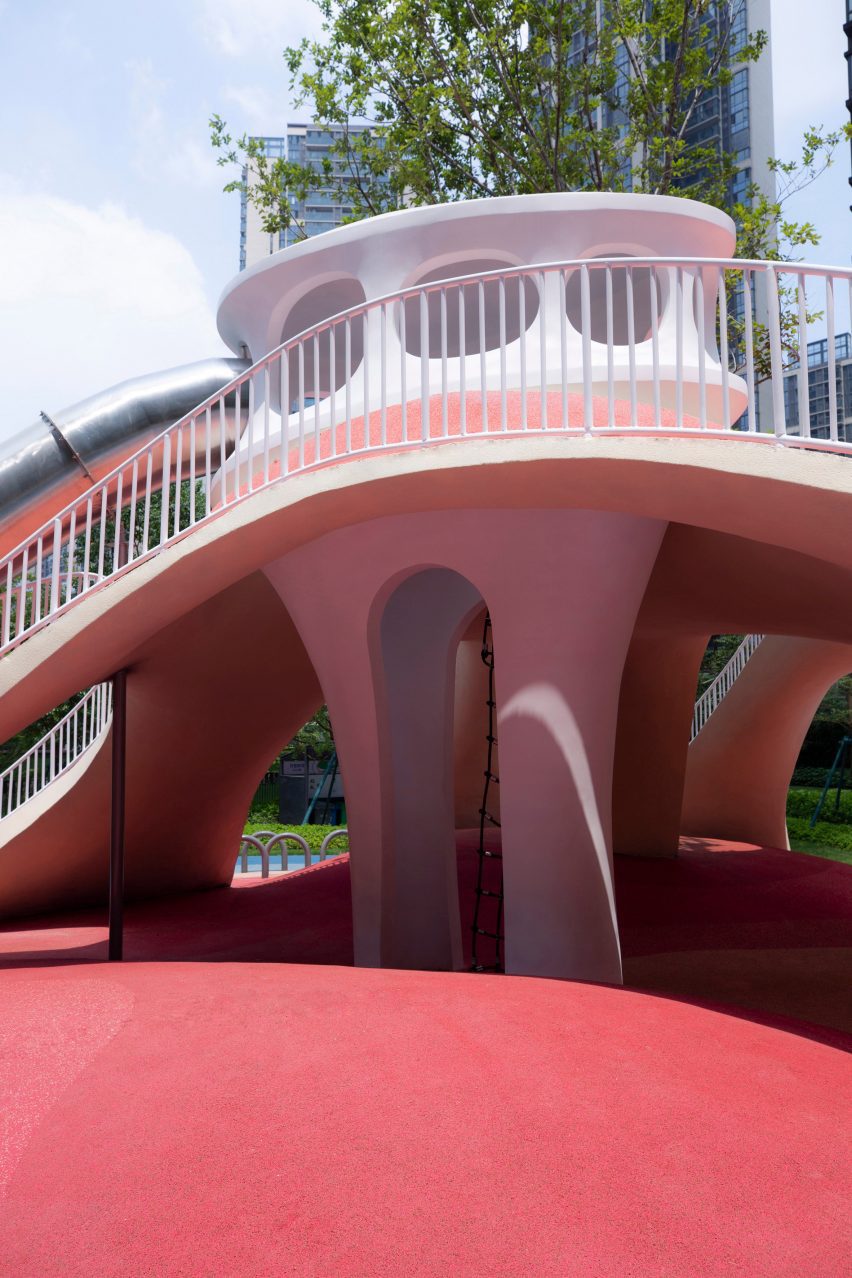
The studio used a load-bearing concrete shell for the structure of the playground, arranging the openings so that the loads are transferred to the supporting columns of the building below.

“Through concealed structural supports beneath the main weight-bearing concrete shell, the upper weight is precisely transferred to the supporting columns of the underground garage,” said Hu.

“This reduces the amount of earthwork volume used, reducing the weight of the load, and ensuring safety and stability.”

Photo of Red Dunes Playtopia by XISUI Design
The playground consists of hill-like structures

A variety of areas were hidden beneath the concrete shell, where the undulating topography of the land underneath helps to form organic landscapes designed to evoke the atmosphere of a cave.

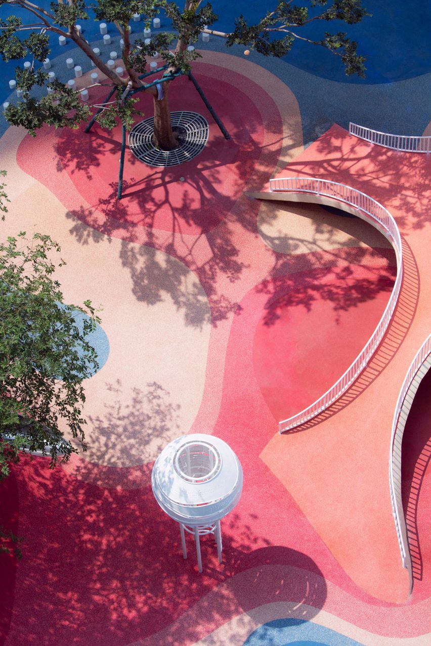
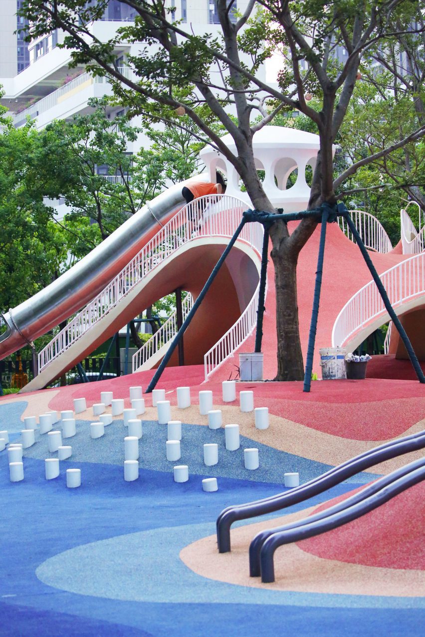
Accessed through curved openings between sloping bridges, the covered play space is punctuated by a central white column, where a ladder leads to a white playhouse that sits above the concrete shell and connects to a metal slide.

Photo of the Red Dunes Playtopia by XISUI Design
It has a concrete shell

“The use of undulating concrete shell structures creates cave-like spaces that blend harmoniously with the terrain, offering both climbing opportunities and fantastic sheltered areas,” said Hu.

“This design approach ensures seamless integration with the natural topography while minimising structural elements and maximising space utilisation.”

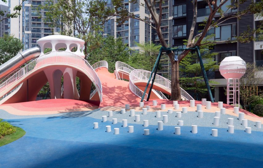
The landscape was coloured with a range of red and blue tones arranged in a blocky pattern of curving shapes that follows the topography of the playground.

“Our client expressed an interest in incorporating a celestial theme into the children’s play area, specifically referencing the concept of Mars,” said Hu.

“To balance the overall colour scheme and avoid excessive dominance of red tones, we also incorporated complementary blue hues to enhance contrast and visual interest.”

Photo of the playground
Climbing walls, slides and walkways cover the hills

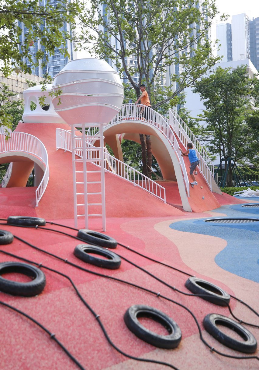
Up the sides of the shell, ropes and climbing walls provide access to the top of the hill, with white railings placed along the edges of the arches to provide additional safety.

Play equipment, including tunnels, stepping stones, slides, and tactile climbing frames, has been arranged across the rest of the site into zones suited towards different age groups, ranging from toddlers to teenagers.

“We aimed to provide a balanced range of activities that cater to different stages of child development, including exercises that enhance upper and lower body strength, balance, social interaction, and parent-child bonding,” added Hu.

Photo of the playground
The playground has an undulating topography

Flattening out towards the edges of the site to simplify access, the topography was designed around these zones, with a smaller hill to one side of the site catering to toddlers and the larger shell on the other end providing more challenging terrain for older children.

While trees are dotted around the play area, the main green spaces were placed around the edges of the site where the ground dips to absorb draining rainfall.

Photo of Red Dunes Playtopia by XISUI Design
Trees surround the playground

“Meticulous calculations and simulations have ensured a comprehensive natural drainage system, effectively managing rainwater flow despite the undulating terrain,” said the studio.

“This innovative approach eliminates the need for surface drainage outlets, allowing rainwater to naturally disperse into green spaces and designated peak drainage outlets.”

Other playgrounds recently featured on Dezeen include a tree-inspired office playground in Tel Aviv and a series of giant rocks on wheels designed to encourage adventurous play.

The photography is by Hu Yihao.

Reference

Kawakawa House by Herbst Architects
CategoriesInterior Design

Eight serene bedrooms with striking natural views

Far-flung homes from New Zealand to Patagonia feature in this lookbook that showcases bedrooms with calm interiors where glazing has been maximised and clutter minimised to keep the focus on the views.

Installing huge floor-to-ceiling windows is a no-brainer when a house is set in a prime location, whether overlooking Lake Tahoe or Chile’s craggy coastline.

But the real key is to create pared-back interiors that don’t detract from the natural vistas, using minimal furnishings and a natural material palette that brings the outside in.

Read on for eight minimalist bedroom interiors that make the view their protagonist.

This is the latest in our lookbooks series, which provides visual inspiration from Dezeen’s archive. For more inspiration see previous lookbooks featuring bedrooms with bathtubs, statement headboards and wood-panelled dining rooms.


Kawakawa House by Herbst Architects
Photo by Patrick Reynolds

Kawakawa House, New Zealand, by Herbst Architects

A clerestory window wraps all the way around this home in the surf town of Piha, New Zealand, allowing light to filter through a canopy of pōhutukawa trees and into the bedroom.

This dappled effect is mirrored in the interior through the use of dark birch on the walls and light plywood on the ceilings, which help to draw sun into the living spaces.

Find out more about Kawakawa House ›


Estancia Morro Chico, Argentinia, by RDR Architectes
Photo by Javier Agustin Rojas

Estancia Morro Chico, Argentinia, by RDR Architectes

Wood, leather and wool help to add warmth to this otherwise spartan bedroom, which belongs to a family of sheep farmers in remote Patagonia.

A floor-to-ceiling window makes the most of the region’s vacillating sunlight while providing views across the surrounding 27,000-hectare ranch and the wild steppe beyond.

“The general aesthetics of the project were inspired by the traditional architecture of the region, which demonstrated extreme austerity and an almost primitive simplicity,” said RDR Architectes.

Find out more about Estancia Morro Chico ›


Wooden bedroom in Finnish cabin
Photo by Marc Goodwin, Archmospheres

Niliaitta, Finland, by Studio Puisto

In the absence of bedside tables, most of the space inside this cabin near Finland’s Salamajärvi National Park is occupied by a custom-made bed, placed directly in front of a glazed wall.

Local practice Studio Puisto kept furnishings to a minimum and covered nearly all of the surfaces in the same pale wood, so as not to compete with the natural spectacle.

“The interior is done purposefully so that it would only serve as a neutral blank canvas, second to the nature outside,” Studio Puisto said.

Find out more about Niliaitta ›


Atelier Andy Carson finishes coastal home in Sydney with stone and bronze
Photo by Felix Forest

Matopos, Australia, by Atelier Andy Carson

When Atelier Andy Carson renovated the home of gallerist Judith Neilson, the Sydney studio set out to provide a minimalist backdrop for her personal collection of art and furniture.

Meanwhile, finishes and window placements throughout the house were chosen to honour nearby Freshwater Beach, with the best views provided by the window seat in the primary bedroom.

“Thoughtfully placed windows frame vistas of the sea, while polished plaster interior walls reflect views of the blue and yellow hues of ocean and sand back into the home,” the studio said.

Find out more about Matopos ›


Casa Ochoalcubo by Ryue Nishizawa
Photo by Cristobal Palma

House in Los Vilos, Chile, by Ryue Nishizawa

This bedroom was carved out of a cliffside on Chile’s Pacific coast, with a glass front and private terrace opening it up to views of crashing waves and craggy rocks.

The building’s board-marked concrete slab roof is left exposed throughout the interior, paired with pared-back wooden furnishings and floors.

Find out more about House in Los Vilos ›


Shelter by Vipp

Shelter, Sweden, by Vipp

A huge skylight stretches across the ceiling of this compact loft bedroom, set in a prefabricated cabin on the banks of Lake Immeln in Sweden, to create the impression of sleeping under the open sky.

To keep attention on the stars, the monochrome interior features moody lighting and slate grey felt panels that cover both the walls and the floors.

Find out more about Shelter ›


Lookout House by Faulkner Architects
Photo by Joe Fletcher

Lookout House, USA, by Faulkner Architects

A huge bed is placed diagonally at the centre of this room, effectively displacing all other furniture but taking full advantage of the home’s sweeping Lake Tahoe panorama.

For the interior, Californian studio Faulkner Architects brought together local materials including volcanic basalt, concrete made using local sand and walnut wood sourced from orchards in the nearby Sierra foothills.

“Consistent through the house, the quiet built environment is muted in colour and tonality, which allows the landscape outside to be the focus,” said the studio.

Find out more about Lookout House ›


Casa X by Branch Studio Architects
Photo by Peter Clarke

Casa X, Australia, by Branch Studio Architects

Dramatic sloped ceilings finished in pale wood panelling envelop the bedrooms of this house on Phillip Island near Melbourne, with bedside pendant lights suspended from their highest point.

Glazing covers the better part of one wall, looking out over the trees that encircle the property to provide privacy despite the home’s beachfront location.

Find out more about Casa X ›

This is the latest in our lookbooks series, which provides visual inspiration from Dezeen’s archive. For more inspiration see previous lookbooks featuring bedrooms with bathtubs, statement headboards and wood-panelled dining rooms.

Reference

Delivering nutrients to crops when they are most needed
CategoriesSustainable News

Delivering nutrients to crops when they are most needed

Spotted: Soil is a living ecosystem and soil health is vital for clean air and water, healthy crops and forests, productive grazing lands, diverse wildlife, and beautiful landscapes. However, the overuse of artificial fertilisers and pesticides can damage soil health and pollute waterways and land.

Lucent BioSciences has developed a fertiliser, called Soileos, that improves microbial biomass in the soil and enhances organic carbon levels. Soileos is made from cellulose left over from crop processing, such as pea and lentil hulls and rice husks. The startup’s scientists have developed technology to bind micronutrients to the cellulose. Natural biological activity in the soil then triggers the release of these micronutrients when they are most needed by the crop. This stands in contrast to other fertilisers which release micronutrients all in one go.

The company claims that the fertiliser is not only carbon-neutral, but climate-positive. Its manufacture uses less water and has a lower carbon footprint than conventional fertilisers. In addition, it improves microbial biomass in the soil and enhances carbon levels in the ground. This results in higher crop yields and improved soil nutrient density.

The company is currently working with food processing companies to upcycle their low-value cellulose fibres and is collaborating with several large fertiliser companies to develop custom fertiliser solutions. And, just a few days ago, Lucent Bio announced that its technology had received patent approval, a “milestone in the progression of commercializing Soileos”.

Soil health is vital for improving crop yields in a sustainable way. This knowledge has led to increased interest in financial support for regenerative agriculture and innovations in the Springwise archive such as pre and probiotics for improving soil health.

Written By: Lisa Magloff

Reference

Barcelona's Best: Enric Miralles and Benedetta Tagliabue's Poetics of Place
CategoriesArchitecture

Barcelona’s Best: Enric Miralles and Benedetta Tagliabue’s Poetics of Place

Architizer’s new image-heavy daily newsletter, The Plug, is easy on the eyes, giving readers a quick jolt of inspiration to supercharge their days. Plug in to the latest design discussions by subscribing. 

Miralles Tagliabue EMBT is one of the most renowned Spanish architectural firms in the world. It was founded in 1994 in Barcelona by the late Enric Miralles and Benedetta Tagliabue. The studio’s primary philosophy is carefully responding to each project’s context and site conditions. It employs sensitive integration practices and creates a dialogue between design and its surroundings. Mainly undertaking public projects, the office emphasizes the urban, cultural and material values of its design, resulting in unorthodox, subtle organic forms that echo the context’s history, landscape and material presence.

By faithfully addressing their surrounding environment, Miralles Tagliabue EMBT create not just space but the architecture of place — that is, space filled with strong narratives and culturally relevant symbolic gestures. For instance, by simply observing the Scottish Parliament window openings or the stair balustrades of the Palafolls Public Library, one cannot help but acknowledge the originality in their inception and form. The studio treats each brief not as a tabula rasa project but as a field of relational conditions, ready to become gestures, walls and accents to create a one-of-a-kind architectural project.


The Scottish Parliament

By Miralles Tagliabue EMBT, Edinburgh, United Kingdom

Located at the bottom of the Royal Mile, the Scottish Parliament acts as an extension of the Scottish hillside terrain. Its radical design sets it apart from the neighboring iconic, albeit classical, Palace of Holyrood. Greatly inspired by Scottish heritage elements such as the Scottish cross, Scottish paintings and the country’s natural landscape, the Parliament is comprised of a series of multifunctional, sensory spaces, each one custom-designed and exceptionally detailed. The building has seamlessly integrated within Scotland’s natural and cultural setting, while celebrating its quirky and influential design, becoming a true pioneer in the architectural field.


Palafolls Pubic Library

By Miralles Tagliabue EMBT, Palafolls, Spain

This next project is an interplay between the playfulness of the existing landscape and the functions hosted within the public library. Using the presence of agricultural land and Tordera river as gestures, the Palafolls Public Library is designed as a fluid, labyrinthine form. Its spaces are interchanging between gardens and walls, leading to interior spatial clusters, such as newspaper conferences, reading rooms and storage spaces. Finally, its low, curved walls allow for unobstructed views throughout the library visually tying all the spaces together.


Plaza Ricard Viñes

By Miralles Tagliabue EMBT, Lleida, Spain

Plaza Ricard Viñes brings together the iconic landscape of La Seu Vella — Lleida’s most prominent cultural landmark — the Spanish musician Ricard Viñes and the symbolism of the labyrinth. With the intent to design an interactive Plaza, Miralles Tagliabue EMBT used the original etymology of the word ‘labyrinth’ to create irregular, “dancing” pathways, extending in multiple levels, made out of locally sourced stone. The location of the Plaza also serves as the official entrance into the city. Its labyrinthine form regulates the different functions spreading around it and creates spontaneous interactions within the public fabric of Lleida, becoming a true architecture of place.


Utrecht Town Hall Rehabilitation

By Miralles Tagliabue EMBT, Utrecht, Netherlands

The original Utrecht Town Hall was a building with great historical value. Miralles Tagliabue EMBT used its neoclassical form as an inspiration for its extension, with spaces such as the ‘medieval room’ becoming rediscovered through its renovation. The new addition treated the municipality offices as an accumulation of different city structures, reflecting this in its inconsistent design forms and materials. In fact, to further integrate its diverse nature into the Dutch urban fabric, the building’s ground floor became a communal space fully accessible by the public.


Vigo University Campus

By Miralles Tagliabue EMBT, Vigo, Spain

The Vigo University Campus project operates in two different timescales: a short-term transformation of the university’s campus in order to establish a denser sense of community — an architecture of place — and a longer-term task to redefine the surrounding landscape. Miralles Tagliabue EMBT’s primary aim was to exaggerate the natural conditions that encompassed the campus by utilising the existing inland valleys and sloping topography. The newly constructed landscape serves as fresh ground for fostering university activities and communal gatherings.


Diagonal Mar Park

By Miralles Tagliabue EMBT, Barcelona, Spain

This next project is all about making intentional urban connections. Located next to the Barcelona waterfront as well as adjacent to some of the most vibrant areas of the city, Diagonal Mar Park is designed to bring those places together. Its design forms a series of paths for walking, biking, skating as well as for enclosing artificial ponds. The curved structure expands and thickens, sometimes becoming a surface to walk on and others a carefully curated piece of metallic and ceramic structure.


Santa Caterina Market

By Miralles Tagliabue EMBT, Barcelona, Spain

Located in Ciutat Vella, one of the oldest quarters of Barcelona, the historic Santa Caterina Market was restored by Miralles Tagliabue EMBT, who won the competition in 2005. Oddly, the market’s neighborhood appears almost as a standalone city by itself — a city within a city — and any effort for substantial intervention has been challenged by the complex, local planning regulations.

Eventually, Miralles Tagliabue EMBT restored Santa Caterina Market by designing a commercial food market, combined with a distinct residential zone and adjacent public spaces that integrated all the neighborhood activities. The market’s most prominent feature is a gleaming, colourful roof supported by old and new infrastructure and creating a hybrid design that reorganises the flows of public and private space. Santa Caterina Market operates as a true architecture of place in the heart of Barcelona.

Architizer’s new image-heavy daily newsletter, The Plug, is easy on the eyes, giving readers a quick jolt of inspiration to supercharge their days. Plug in to the latest design discussions by subscribing. 

Reference

The Architect Has Left The Building exhibition at RIBA
CategoriesInterior Design

Architectural photography is dominated by empty, glossy, new buildings

Architectural photographer Jim Stephenson explains how The Architect Has Left The Building exhibition at RIBA aims to draw attention to how people use buildings, in this interview.

Despite taking place at the Architecture Gallery at the Royal Institute of British Architects’ central London HQ, Stephenson told Dezeen that the exhibition is not focused on buildings.

“The installation is about people watching,” he said. “Although it’s at the RIBA and in the architecture gallery, it’s not really about the buildings – they’re just the backdrop, they’re the stage set really.”

“We wanted to create a meditative, large scale film piece that was all about how people use (and misuse) space once the architect’s work is done,” he continued.

The Architect Has Left The Building exhibition at RIBA
The Architect Has Left The Building is an exhibition at RIBA

As the exhibition’s title suggests, the exhibition focuses on how buildings are used after the architect’s work is finished.

It aims to show buildings in use, in contrast to the majority of architectural photography that often portrays buildings empty, at their point of completion.

“When I used to work in architecture practices, we used to design everything around people and context,” explained Stephenson. “It felt like everything was dictated by those two things and then when we would get projects photographed we’d ask the photographer to omit those two things.”

“The buildings were empty objects – sculptures,” he continued. “It always jarred with me, so in our work we focus on people using space as much as possible.”

Jim Stephenson's RIBA exhibition
The exhibition features the work of Jim Stephenson.

The exhibition include numerous photos taken by Stephenson, along with an enclosed screening room, where a film created for the exhibition was played on a dual screen.

“This film is all about the small interactions that occur in and around buildings – between individuals, groups of people and even between people and the buildings,” said Stephenson. “It’s all about the people!”

The film, which was created with artist Sofia Smith and has a soundtrack created by Simon James, contains numerous contemporary buildings from the past 15 years.

Among the buildings featured are Tintagel Castle Bridge by William Matthews Architects, Tate St Ives extension by Jamie Fobert, Sands End Arts and Community Centre by Mae Architects and London Bridge Station by Grimshaw, which were all shortlisted for the Stirling Prize.

Dual screen showing film at RIBA
The exhibition features a film screened on a dual screen

The film makes aims to makes people think about the connections between buildings and how people are connected to them.

“Watching Sofia make visual links between buildings that I hadn’t previously considered to have much in common was fascinating,” explained Stephenson.

“There’s a point in the film where we transition from Sands End Community Centre to Tintagel footbridge and it’s seamless – from a community centre in West London to a bridge over the sea in Cornwall!”

“And at London Bridge train station, Simon recorded not just the ambient sound that everyone can hear, but he also recorded the inner guts of the building with contact mics, as well as the sound in the electromagnetic spectrum,” he continued. “All those sounds get layered up in the show and I can’t go through that station now without thinking about them.”

Photo exhibition of Jim Stephenson's work
It also features photos taken by Jim Stephenson

Stephenson hopes that the film will demonstrate how people improve architectural spaces and how they are recorded.

“The history of architectural photography is dominated by empty, glossy, new buildings, photographed before people have come in,” said Stephenson.

“I think there was a fear amongst architects that people ‘mess up their building’ and photographing them empty somehow showed the architecture in a more pure and distilled way,” he continued.

“I think that’s mad. If the people you designed the building for are ‘messing it up’ then maybe there’s something wrong with the building? I’m half joking, but I’ve never documented a space that wasn’t improved by people, or at the very least a sign of life.”

One of the UK’s best-known architectural photographers, Stephenson co-founded film production studio Stephenson& with Smith. Recent projects photographed by Stephenson include a wood-lined community space in east London, a rammed-earth yoga studio to the gardens of Somerset hotel and a rolling bridge in London.

Recent buildings captured on film by Stephenson& include a visitor centre at the UK’s largest sawmill and a school theatre by Jonathan Tuckey Design in London.

The photography is by Agnese Sanvito, unless stated. The film is by Jim Stephenson and Sofia Smith with soundtrack by Simon James.

The Architect Has Left The Building is at RIBA in London until 12 August 2023. See Dezeen Events Guide for an up-to-date list of architecture and design events taking place around the world.

Reference

Superpop tables by Paolo Cappello for Miniforms
CategoriesSustainable News

Eight furniture pieces and products made out of sustainable materials

Dezeen Showroom: 3D-printed room dividers made from food waste and mycelium are among recent sustainably-designed products on Dezeen Showroom.

In order to address growing environmental concerns within the furniture and wider design industries, brands are opting to make their products using renewable, recyclable and reclaimed materials, and processes with circular principles in mind.

We’ve rounded up eight recently released furniture pieces made from recycled materials, including waste plastic from abandoned fishing nets, electronic waste from the tech industry and materials derived from the process of making paper.

From a bar stool made from coffee shells to a recycling bin made out of post-consumer plastic, read on to see our selection of the latest furniture designs made from sustainable materials on Dezeen Showroom.


Superpop tables by Paolo Cappello for Miniforms

Superpop tables by Paolo Cappello for Miniforms

Miniforms’ Superpop tables – created in collaboration with Italian designer Paolo Cappello – have a rounded rectangular form and a speckled finish reminiscent of terrazzo.

The pieces are made from recycled plastic, which creates the mottled pattern. They are lightweight and durable enough for use either indoors or outdoors and can be recycled further at the end of their lifespan.

Find out more about Superpop ›


Veggro collection by Interesting Times Gang and OBOS

Veggro collection by Interesting Times Gang and OBOS

Design studio Interesting Times Gang worked with cooperative homebuilder OBOS on a duo of screens called Loom and Jugoso.

Loom has a pale finish and is made from mycelium, whereas mustart-hued Jugoso is made out of orange rinds. Both are created using 3D-printing techniques and have biomorphic patterns representing the natural materials they are made from.

Find out more about Veggro ›


Eternity high stool by Space Copenhagen for Mater

Eternity high stool by Space Copenhagen for Mater

Danish furniture brand Mater has created its Eternity high stool in collaboration with designers Space Copenhagen, which is made from Matek – the brand’s patented circular waste material.

The material contains both e-waste and coffee shells leading to the stool’s characteristically dark colour. It can be upholstered with Kvadrat’s Re-wool material,  which is made from 45 per cent recycled wool.

Find out more about Eternity ›


Alted H01 tile by Berta Julià Sala for Alted Materials

Alted H01 tiles by Berta Julià Sala for Alted Materials

Spanish brand Alted Materials worked with product designer Berta Julià Sala on a range of tiles made from cellulose waste, a byproduct of the paper industry. The tiles are also coated with a water-based sealant distilled from waste vegetables.

Alted H01 tiles come in three grooved patterns and various earthy colourways. The material allows the tiles to be recycled circularly, preventing material from ending up in landfill as is the case with traditional construction materials.

Find out more about Alted H01 ›


Matt black Ovetto bin in kitchen

Ovetto waste bin by Gianluca Soldi for SoldiDesign

Italian design brand SoldiDesign has released an egg-shaped waste bin named Ovetto that is both made from recycled materials and is designed to contain them in different compartments for easy disposal.

The bins are made from post-consumer recycled ABS and polypropylene in different amounts depending on its colour. The matt black Ovetto bin is made from 100 per cent recycled content.

Find out more about Ovetto ›


Wooden coffee table in living room

Centenniale coffee table by Joanna Laajisto for Nikari

The Centenniale coffee table was made for Finnish brand Nikari by architect and designer Joanna Laajisto out of 100-year-old wood.

The table’s angular top is supported by contrasting chunky, rounded legs. It can be made from solid oak or ash wood, and emphasises the importance of utilising existing renewable materials.

Find out more about Centenniale ›


Black task chair by Humanscale

Liberty Ocean chair by Humanscale

Office furniture brand Humanscale used up to one kilogram of plastic derived from disused fishing nets for its Liberty Ocean task chair.

The chair represents the next evolution of the brand’s classic Liberty chairs. It shares the same ergonomic technology and comfort as the other chairs in Humanscale’s catalog but is made from sustainably-conscious materials.

Find out more about Liberty Ocean ›


Stack of earthy coloured materials on outdoor table with trees in background

Gaia recycled upholstery fabric collection by Skopos

British brand Skopos has created a collection of materials made out of recycled textiles and post-consumer plastic waste.

Gaia mimics the appearance of textured wool boucle and comes in a selection of 21 earthy colourways.

Find out more about Gaia ›

Dezeen Showroom

Dezeen Showroom offers an affordable space for brands to launch new products and showcase their designers and projects to Dezeen’s huge global audience. For more details email [email protected].

Dezeen Showroom is an example of partnership content on Dezeen. Find out more about partnership content here.

Reference

3D weaving tackles fashion waste
CategoriesSustainable News

3D weaving tackles fashion waste

Spotted: The fashion industry has been getting a lot of criticism lately for its unsustainable practices. And for good reason – 87 per cent of the fibres and materials used to make clothing will end up in either incinerators or landfills. Luckily, many companies are now working to solve this problem, including startup Unspun.

Unspun has developed a unique solution to make textile production more sustainable. The company has developed automated, 3D weaving micro-factories, called Vega, that can weave a pair of trousers in 10 minutes. The factories allow brands to make products locally, reducing the need for manufacturing in large quantities – a major cause of waste.

Unspun highlights that the textile industry’s slow adoption of new technologies has hindered progress in addressing fashion’s impact on climate change. The company hopes to change this by decentralising fashion production and reducing greenhouse gas emissions from shipping and waste.

Unspun recently announced it has raised $14 million (around €17.6 million) in a series A funding round led by Lowercarbon, which will be used to support the development of Vega micro-factories. The company is also developing techniques to ‘unspin’ garments back into yarns, so that they can be re-woven into new products. The ultimate goal is to help brands achieve a local, circular supply chain for woven products.

In addition to Unspun, Springwise has spotted a number of other innovations in the archive that are helping create a more sustainable fashion industry. These include the development of regenerative fibres and carbon-negative textiles.

Written By: Lisa Magloff

Reference

tubular membrane roof casts a soft glow over this two-story house in tokyo
CategoriesArchitecture

membrane roof casts a soft glow over two-story house in tokyo

house with a membrane roof in tokyo, japan 


House with a Membrane Roof is a private dwelling located in a dense residential area of Tokyo. Designed for an owner with a nomadic lifestyle, the project takes on a camping-like aesthetic with adaptive functions and spaces. Yuko Nagayama & Associates teamed up with Shohei Yoshida + Associates and architect Asuka Fujita to complete the 60 sqm residence enclosed by surrounding buildings on all sides except for the narrow frontage facing the street. These site conditions restrict from having large openings in the exterior walls, pushing the trio to introduce natural light from above through a tubular membrane roof. As a result, a diffused glow engulfs the roof volume before pouring into the second floor and atrium, reaching as far down as the ground floor.


Bathed in ample daylight, the second floor serves as a lively public area, whereas the ground floor shelters private quarters like the bedroom and bathroom, which, although basking in subduded lighting, provide a serene sanctuary akin to a tranquil cave, ideal for unwinding and slumbering peacefully. To optimize the site’s limited space, an indoor garden, complete with a flourishing tree, graces the skylit atrium, replacing the conventional outdoor garden. ‘By incorporating it  indoors, the owner enjoys an immersive experience, directly engaging with nature rather than merely observing it through a window,’ notes the team. 

tubular membrane roof casts a soft glow over this two-story house in tokyo
all images © Satoshi Takae


changing lights inform about outdoor conditions


The Yuko Nagayama Associates team collaborated with Fujita and Shohei Yoshida + Associates (more here) to incorporate a flexible membrane material onto the roof, allowing it to take on a visually striking contorted shape. It consists of a dual-layer structure, with an upper and lower membrane enclosing the structural components and thermal insulation. The lower membrane follows a graceful catenary curve, attaching to T-shaped structural beams, resulting in a ceiling adorned with semi-circular light tubes. Meanwhile, the airspace within the roof serves as an insulating layer and facilitates natural ventilation. This allows air to circulate from bottom to top, ensuring a comfortable indoor environment.


While the sky is not directly visible through the membrane roof, the changing light conditions give cues about the surrounding environment. At sunrise, the space gradually brightens, and warm light tinges the area with a reddish hue during the evening. The brightness also varies depending on whether it is sunny or cloudy. ‘In this way, the roof acts as a skin-like layer, transmitting the exterior changes to the interior and transforming one’s sensory experience,’ reflects Yugo Nagayama. The House with a Membrane Roof took two years to complete. 

tubular membrane roof casts a soft glow over this two-story house in tokyo
a skylight at the entrance of House with a Membrane Roof

tubular membrane roof casts a soft glow over this two-story house in tokyo
the membrane material introduces a soft glow to the interiors

tubular membrane roof casts a soft glow over this two-story house in tokyo
attaching semi-circular light tubes to the lower membrane

Reference

Kitchen with chrome counter in JJ16 apartment by Lucas y Hernández-Gil
CategoriesInterior Design

JJ16 apartment in Madrid features curves and colour blocking

Madrid studio Lucas y Hernández-Gil has completed a family home that makes the most of every inch, with details including a yellow storage wall, a corridor kitchen and a hidden closet.

JJ16 is a three-bedroom apartment in Madrid’s Salamanca district, but until recently it had been used as an office.

Kitchen with chrome counter in JJ16 apartment by Lucas y Hernández-Gil
JJ16 is a three-bedroom apartment for a family of four

Lucas y Hernández-Gil, a specialist in interior architecture, converted the property back into a residence for a family that includes a mother, three teenage children and their dog.

The challenge was not only to make it feel like a home again but also to create space for everyone’s personality within the 165 square-metre footprint.

Kitchen with chrome counter in JJ16 apartment by Lucas y Hernández-Gil
The kitchen occupies a corridor space between the entrance lobby and the living room

The designers achieved this by combining space-saving strategies with statement details, providing both functionality and character.

“Everyone had a clear idea of what they needed, which translated directly into the spaces,” said studio founders Cristina Domínguez Lucas and Fernando Hernández-Gil Ruano.

“Far from generating a conflict, different colours and materials give the house a richness, a harmonic heterogeneity,” they told Dezeen.

Pink, grey and chrome Kitchen in JJ16 apartment by Lucas y Hernández-Gil
The room is defined by shades of soft pink and grey

Optimising JJ16’s layout was crucial but difficult given the irregularity of the floor plan.

Lucas y Hernández-Gil’s strategy was to make every space, including the corridors, as useful as possible.

Utility area in corridor of JJ16 apartment by Lucas y Hernández-Gil
The utility area also occupies a corridor space

The kitchen now occupies a connecting space between the entrance lobby and the living room, freeing up space at the front of the apartment for a spacious main bedroom.

Meanwhile, the corridor leading to the main bathroom and the third bedroom incorporates a mini library and a utility area.

“The main challenge was the deep layout and long corridor,” said the architects.

“We provided circulation with content by creating spaces within it. This turned out to be one of the best design decisions of the project.”

Bedroom with curved wall in JJ16 apartment by Lucas y Hernández-Gil
A curved wall frames the main bedroom

Curved partitions create variety within JJ16’s layout. The largest of these separates the living room from the main bedroom, but other curves can be found in the second bedroom and a shower room.

Many spaces have their own colours, which contrast with the bright white tones that otherwise dominate the interior.

Bedroom with orange walk-in closet in JJ16 apartment by Lucas y Hernández-Gil
The third bedroom is a twin room with a hidden walk-in closet

The bright yellow bookshelf wall is the most striking, while the adjacent kitchen offers a two-tone effect with shades of soft pink and grey, and matt chrome finishes.

Bedrooms have a minimal feel, but they boast colourful dressing rooms and en-suites. Bright orange was chosen for the hidden walk-in closet, located in the twin third bedroom, while deep purple adds a luxury feel in the main bedroom.

Bedroom and en-suite with patterned floor tiles
Patterned tiles feature in the bathroom and en-suite areas

Floor surfaces provide more visual interest. Living spaces feature oak parquet, while bathrooms are all finished with patterned cement tiles.

This bold approach to colour and texture is a common feature in the work of Lucas y Hernández-Gil, whose other recent projects include the sunset-inspired Naked and Famous bar and the stylish Casa A12.

Bathroom with orange counter and chequered tiles
The main bathroom also features a curved shower room

“The approach to colour is a constant in our design process,” said Lucas and Hernández-Gil Ruano.

“It is about activating spaces and achieving a warm and joyful domestic atmosphere.”

The photography is by Jose Hevia.


Project credits

Architecture: Lucas y Hernández-Gil
Collaborators: Lucía Balboa, María Domínguez, Sara Urriza

Reference

CategoriesSustainable News

Reducing inefficiencies in plant protein production

Spotted: With the United States approving commercial sales of lab-grown chicken, the country joins Singapore as the world’s first two nations where cell-cultured food is available. The main drawback to accessing this new food category is its cost, which is so high that the two companies approved to sell the new type of chicken in the States will be supplying high-end West Coast restaurants rather than grocery stores.  

Plant-based meat alternatives also face the challenge of high costs of production, which often makes the products too expensive for consumers to buy regularly. Having realised that most plant-based meats use off-the-shelf manufacturing equipment, former aerospace engineer Christie Lagally put her expertise to work to improve the efficiency of the production process. 

Lagally is the founder of Rebellyous Foods, a foodtech company creating vegan chicken and developing automated plant-protein meat manufacturing systems and processes. The patented technology cleans up the manufacturing processes, reducing inefficiencies and manual processes and replacing them with smart automation systems designed specifically for the task at hand. 

The company’s chicken is available as tenders, patties, and nuggets, and the system – called Mock Two – is designed specifically to produce those sizes and shapes. Because much of it is automated, the new production process can run continuously, making it possible to increase the volume of output without a parallel rise in labour and machine costs.  

Once at industrial scale levels of production, Rebellyous Foods’ manufacturing technology could produce enough plant-based chicken to make products competitive with animal meat versions. Investors recognising the significance that the technology could have on the global market for healthier proteins recently contributed $9.5 million (around €8.6 million) in an equity round of funding. 

New sources of protein are much needed globally, with Springwise’s archive highlighting surprising ingredients such as cabbage and broccoli used for alternative proteins.

Written By: Keely Khoury

Reference