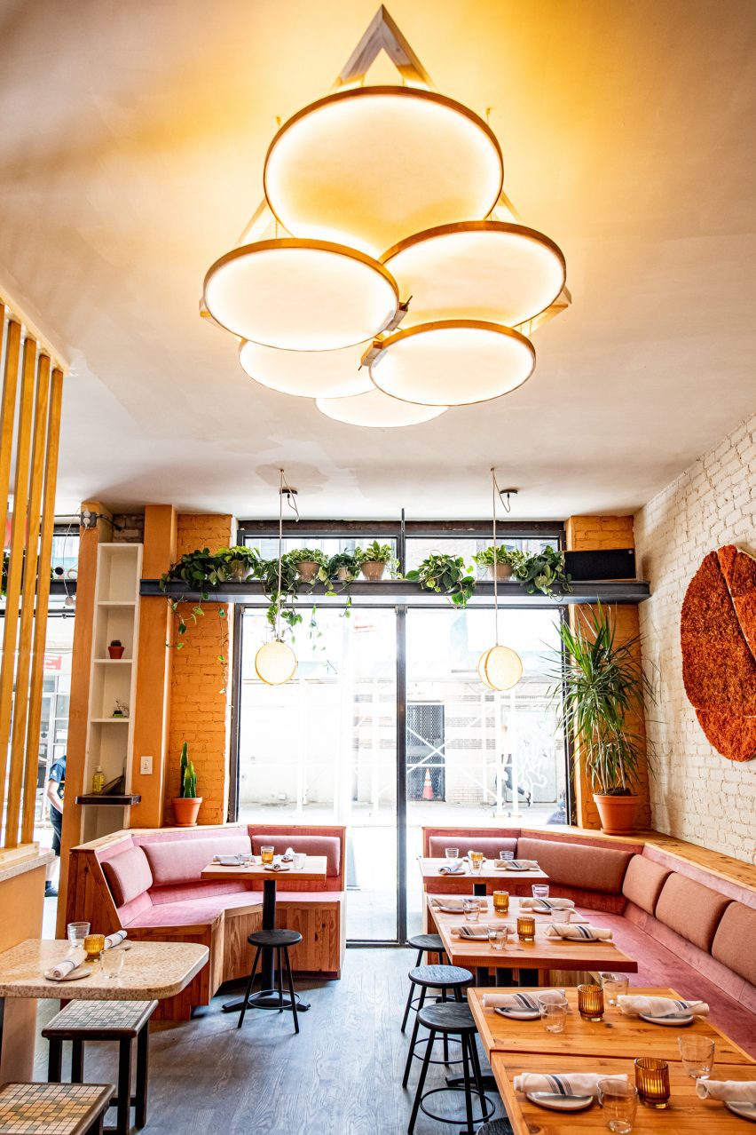
Architizer is thrilled to announce the winners of the 11th Annual A+Awards! Interested in participating next season? Sign up for key information about the 12th Annual A+Awards, set to launch this fall.
Rooftops have traditionally been the domain of mechanical equipment, line-drying laundry and the occasional playground for kids. Panoramic views and good weather make the perfect setting for sunset drinks (bars, restaurants and hotels got it right!), but expansive areas of residential building rooftops remain underused around the world. These spaces are waiting to be transformed into pleasant outdoor environments — and not necessarily for lucrative purposes. The benefits of transforming rooftops extend not only to residents but to entire cities at large.
In densely populated areas where scant land is available, underused roofs offer the opportunity to expand green urban areas, promoting urban biodiversity, improving the well-being of city dwellers and reducing negative environmental impact. With green roof technology, rooftops no longer accumulate heat during the day, creating the so-dreaded heat island effect. Instead, they retain rainwater and capture CO2 and pollutants. Turning rooftops into pleasant outdoor spaces accessible to building residents is an effective use of otherwise wasted built space and offers the opportunity to replace lost habitats.
Improving the Quality of Life for City Dwellers
Architects, developers, builders, landscape architects/designers and product manufacturers are the ideal team to create cohesive, functional and sustainable buildings that improve city dwellers’ quality of life. Architectural examples worldwide demonstrate that the effort to counter the overpopulation of urban areas and the scant green spaces is global. They differ, however, in the architectural vocabulary, which, in each case, facilitates the integration of buildings into their specific context, taking into account cultural, climatic and economic factors.
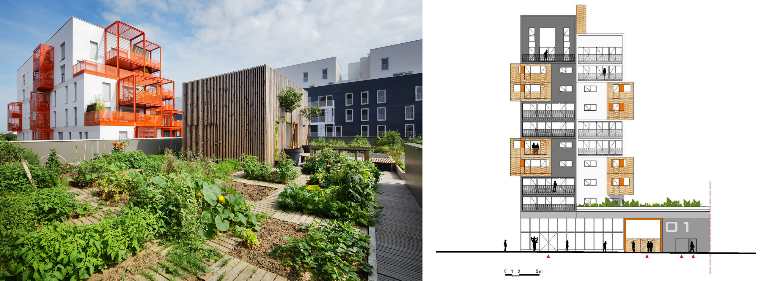
90-unit housing development in Saint-Ouen, France, by Atelier du Pont. Photo by Takuji Shimmura.
Take, for example, Atelier du Pont 90-unit mixed-use building in Saint-Ouen, near Paris, France, which draws inspiration from the city’s industrial heritage. The project offers private open spaces at various levels and a shared community garden, a gathering spot for the building’s residents.
The building’s overall massing of staggered concrete “boxes” maximizes natural daylight, while brightly colored metal balconies provide private outdoor spaces. On the sixth floor, a community garden offers open space for residents to grow their own organic vegetables and socialize. As open spaces in cities dwindle, rooftops and terraces open a world of opportunities.
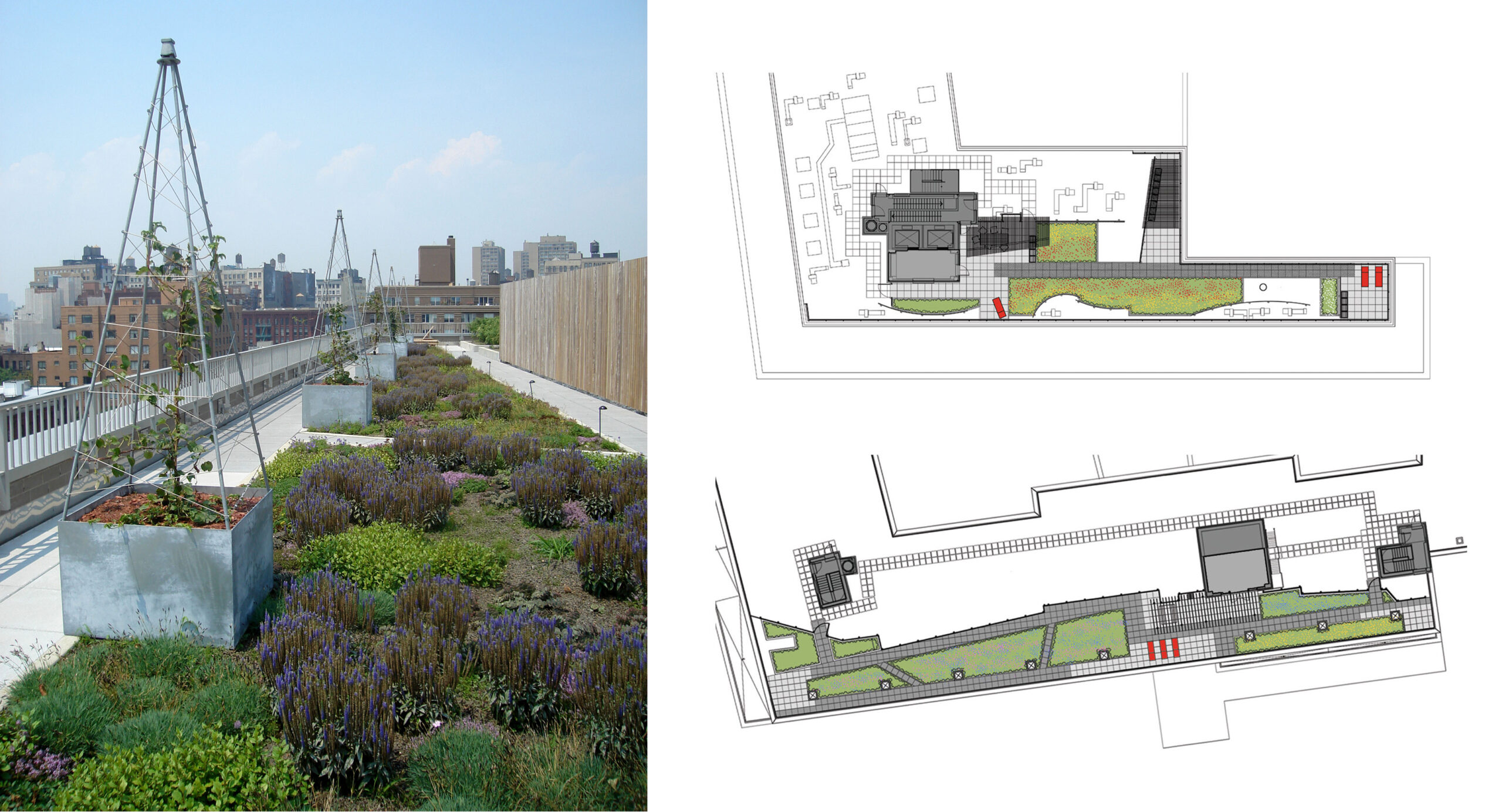
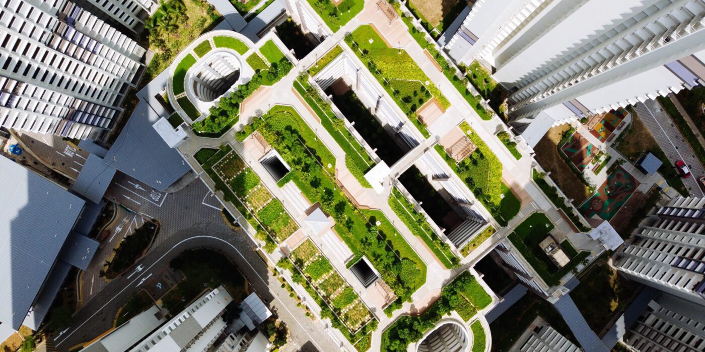
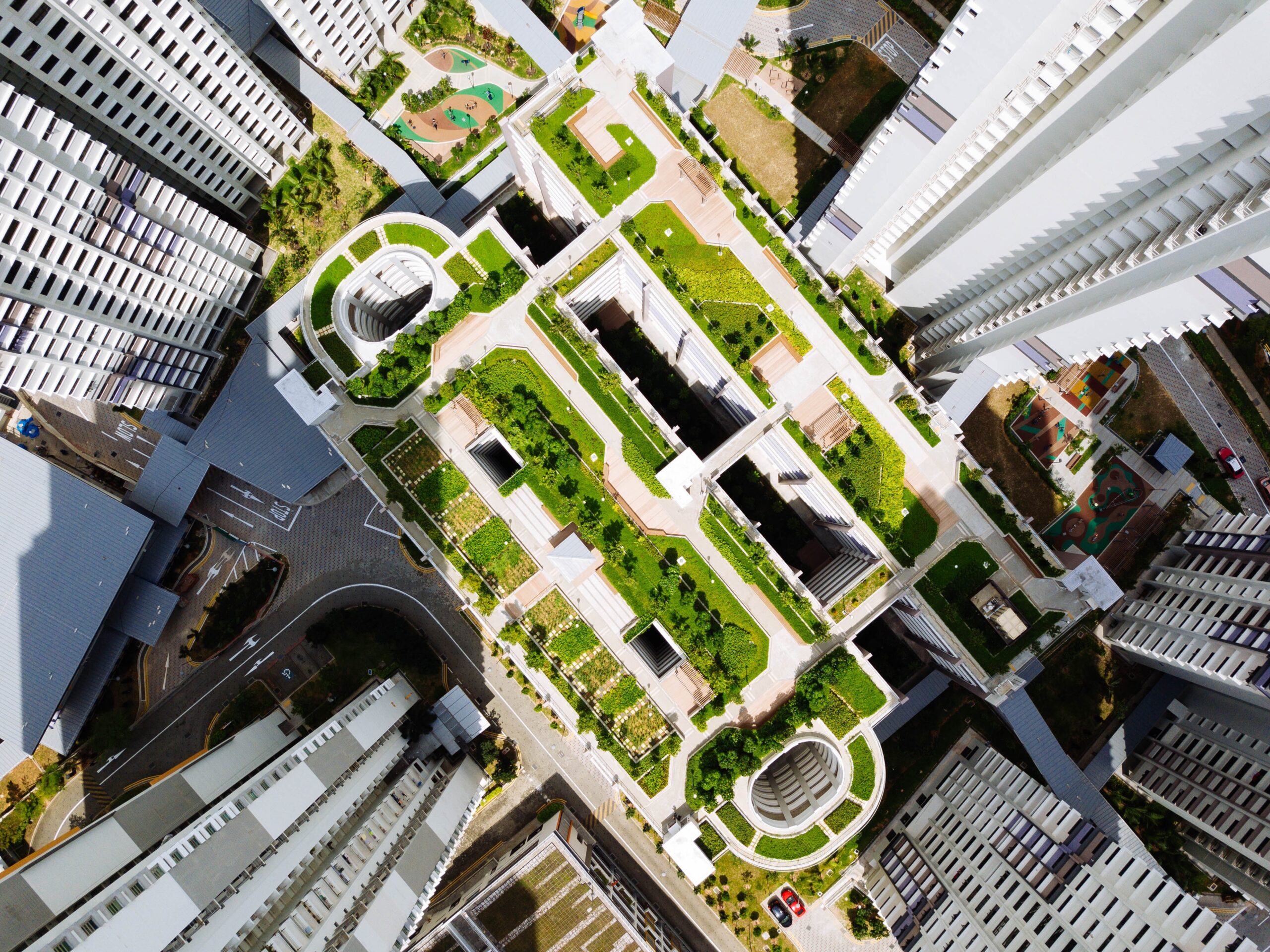
Avalon Bay Urban Housing Landscape by Todd Rader + Amy Crews Architecture Landscape Architecture LLC, New York City, NY
Meanwhile, our next case study brings us to the New York City, where Todd Rader + Amy Crews designed the landscapes at Avalon Bowery Place in the heart of the concrete jungle, where scant land is available. The new landscapes root the project in the urban context and provide open space for the building’s residents and the neighborhood.
The project includes three landscapes at the ground level and two on building rooftops. While the ground-level landscapes unify the complex through visual connection and material selection, the roof terraces are physically isolated landscapes in the sky, where they enjoy sunny exposure and participate in the aerial archipelago formed by the landscape of city rooftops.
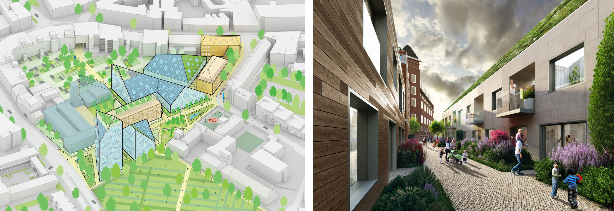
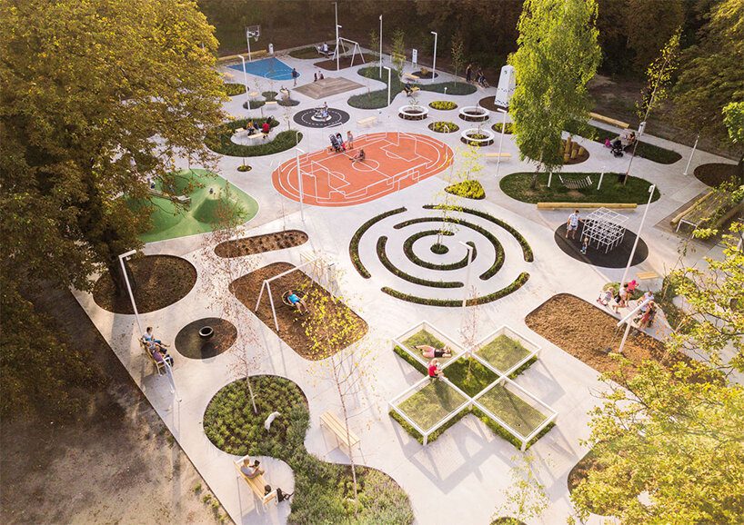
Nieuw Bergen by MVRDV, Eindhoven, The Netherlands
Finally, let’s take a look at The Nieuw Bergen — a multi-unit housing development in Eindhoven, the Netherlands. Its design responds to an urban strategy tool that the architects, MVRDV, have been developing and implementing in cities on the way to sustainable densification. This strategy establishes environmentally friendly and dynamic living conditions for residents. The sloped roofs maximize sunlight for the buildings and the public spaces at street level, resulting in significant energy savings. The diverse roofscape of solar panels and greenery complement the area’s architectural character of new and existing buildings.
So, given all of the clear urban benefits demonstrated by the private initiatives explored in these examples, what would it look like to implement green roof design at an urban scale? Well, one European city has already recognized the broader benefits of mandating this architectural upgrade and is exploring ways to provide impetus for designers to incorporate green roofs in their plans.
Barcelona Living Terrace Roofs and Green Roofs Initiative
Following the example of other European cities, Barcelona has been promoting environmentally conscious initiatives, offering sustainable solutions to reduce pollution and increase access to green areas (internationally, Barcelona’s popular superblock concept has received a lot of coverage). Now, the Living Roofs and Green Covers initiative highlights the social and environmental benefits of green roofs and, since 2017, has been the platform to launch the Green Roof Competitions to promote the creation of green rooftops in privately owned residential buildings.
Initiatives like this one are paramount to raising environmental awareness. According to the Guide to Living Terrace Roofs and Green Roofs published by the City of Barcelona in 2014, it is estimated that 67% of the surface area of roofs in Barcelona (1,764.4 hectares) could be landscaped. If this could ever be achieved, the temperature in the city would drop by approximately two degrees, the green area per resident would more than double and the levels of air pollution would be considerably lower.
The Expansion of the Green Roof Market
The surface area that city building roofs cover is vast, and the social and environmental benefits of greening these surfaces are considerable. Building owners invest in green roofs, designers dream up the plans, and city authorities play a major role in spreading the practice. Choosing between living in the suburbs close to nature and living in the city near work is no longer necessary. Building residents are looking for homes with outdoor access, especially since the pandemic.
Aware of the increasingly popular demand, the real estate industry sees multi-unit residential buildings with partially or entirely planted rooftops as an architectural trend that adapts to a contemporary lifestyle. But how fast is the green roof market expanding? Studies indicate that the global green roof market has been steadily growing at a rate of 17% since 2020 and is expected to grow at this same rate through 2027. Limitations for this growth? Unfavorable climate conditions and maintenance requirements.
Architizer is thrilled to announce the winners of the 11th Annual A+Awards! Interested in participating next season? Sign up for key information about the 12th Annual A+Awards, set to launch this fall.