yabashi architects ezu house
CategoriesArchitecture

yabashi architects stacks minimalist house and café in japan

ezu house and café: multi-uses in harmony


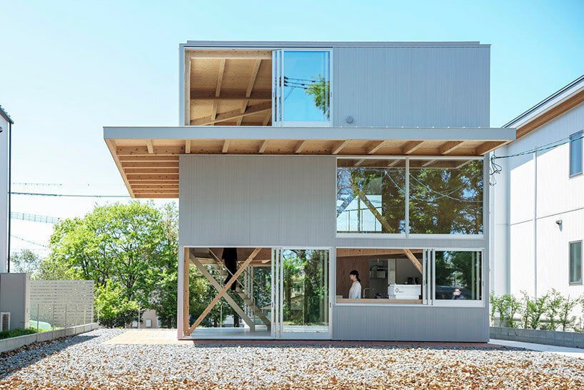
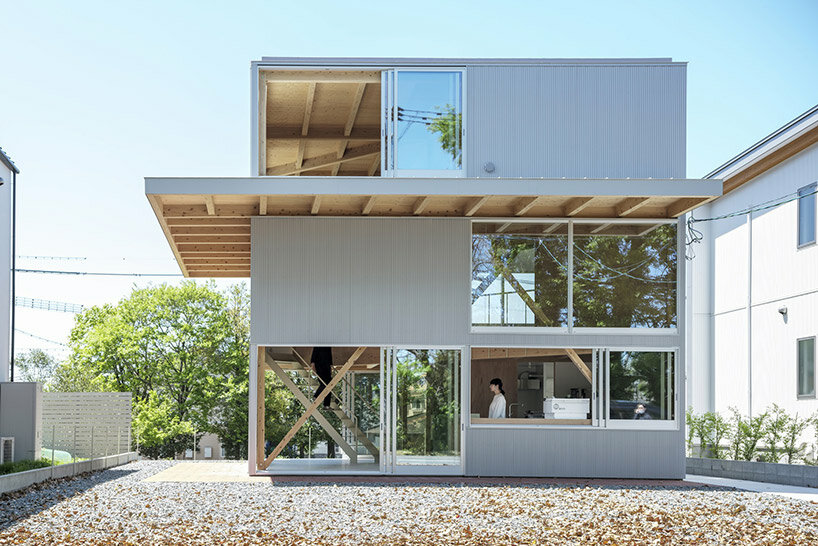
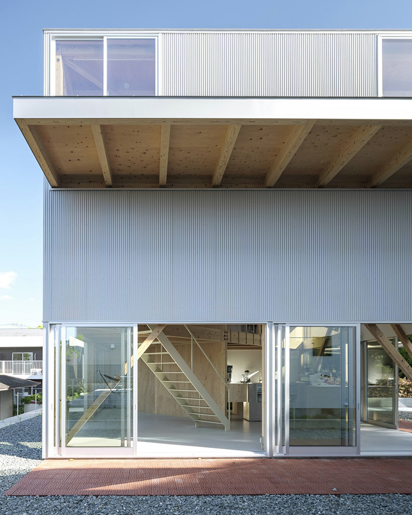
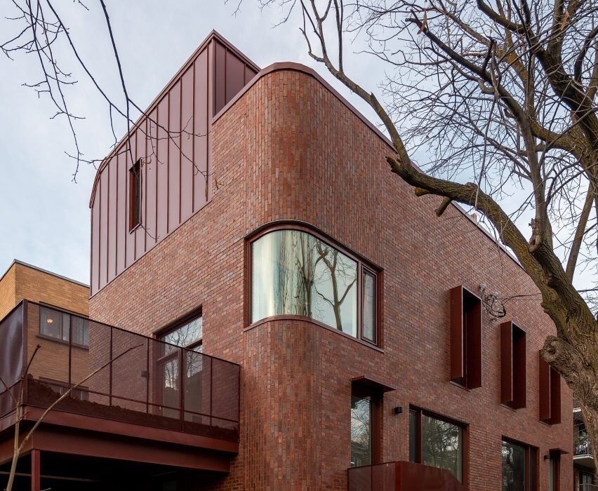
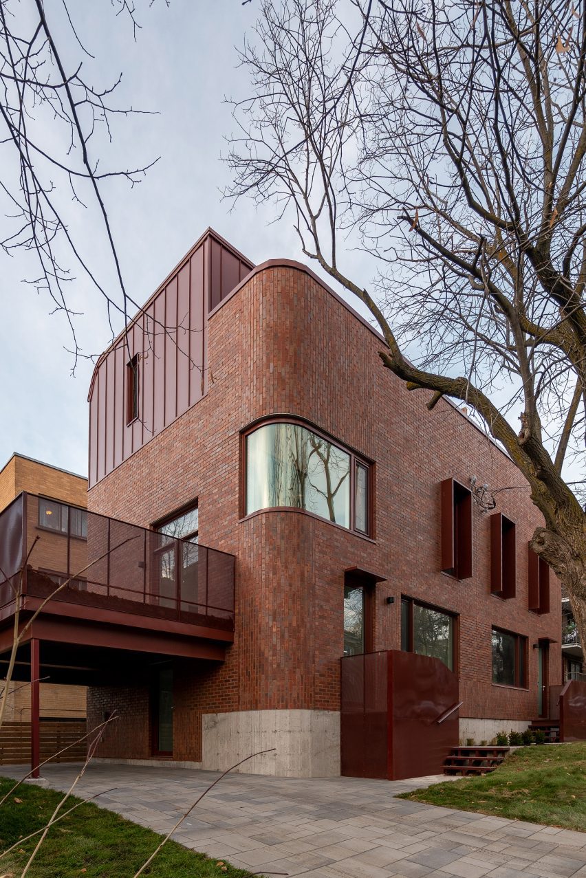
Nestled in a tranquil corner of a lakeside residential area in Kumamoto, Japan, the recently completed ‘EZU House and Café‘ stands as a testament to innovative architectural design, crafted by Yabashi Architects and Associates (YAA). this structure opens broadly out toward its surroundings to provide a unique experience for its occupants. The site’s terrain, with its stepped landscape along the lakeside, offers breathtaking views of nearby gardens, private house roofs, and distant mountains. By skillfully incorporating these elements into the design, the architects have created a multi-layered structure that fosters a sense of harmony between its retail and residential programs.

yabashi architects ezu houseimages © Yashiro Photo Office


the Vertical Spiral Movement


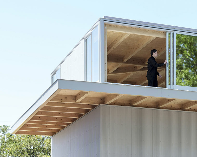
At the core of the design philosophy is a square plan that encompasses the site. The upper floors of the building are ingeniously divided diagonally, establishing a dynamic interplay of spaces. By shifting the floors to increase the parameter with the ground and connecting them through a spiral vertical movement, the architects have achieved a three-layered structure that presents an array of viewpoints at every turn. This deliberate arrangement allows for a varied experience on each floor, with minimal necessary functions, furniture, and plants. The result is a space that transcends conventional definitions, offering an open canvas for inhabitants to freely create their own personalized environments.

yabashi architects ezu house


Seamless Integration of Functions


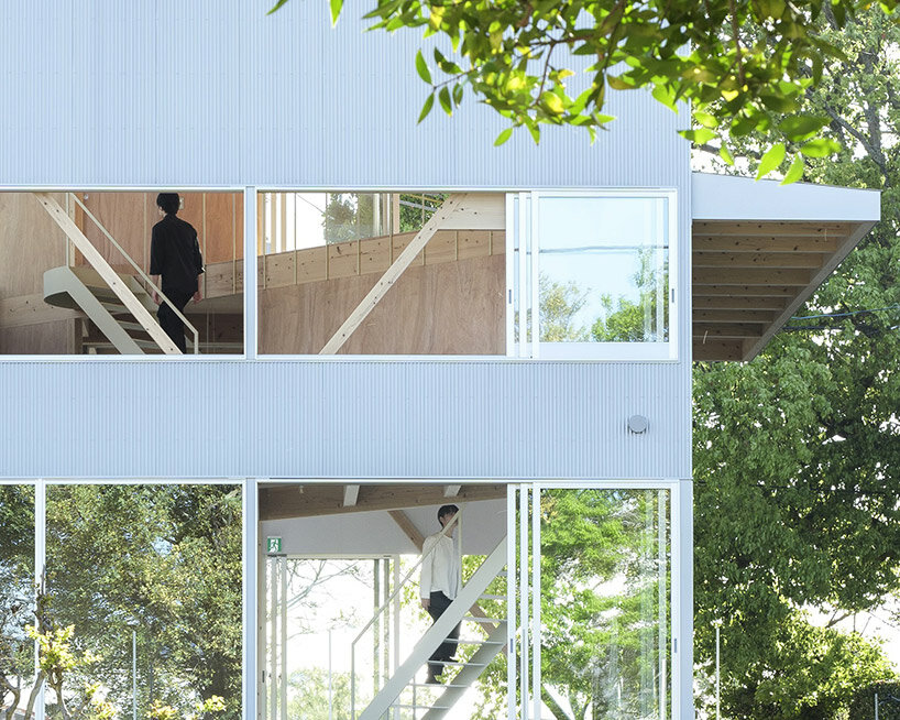
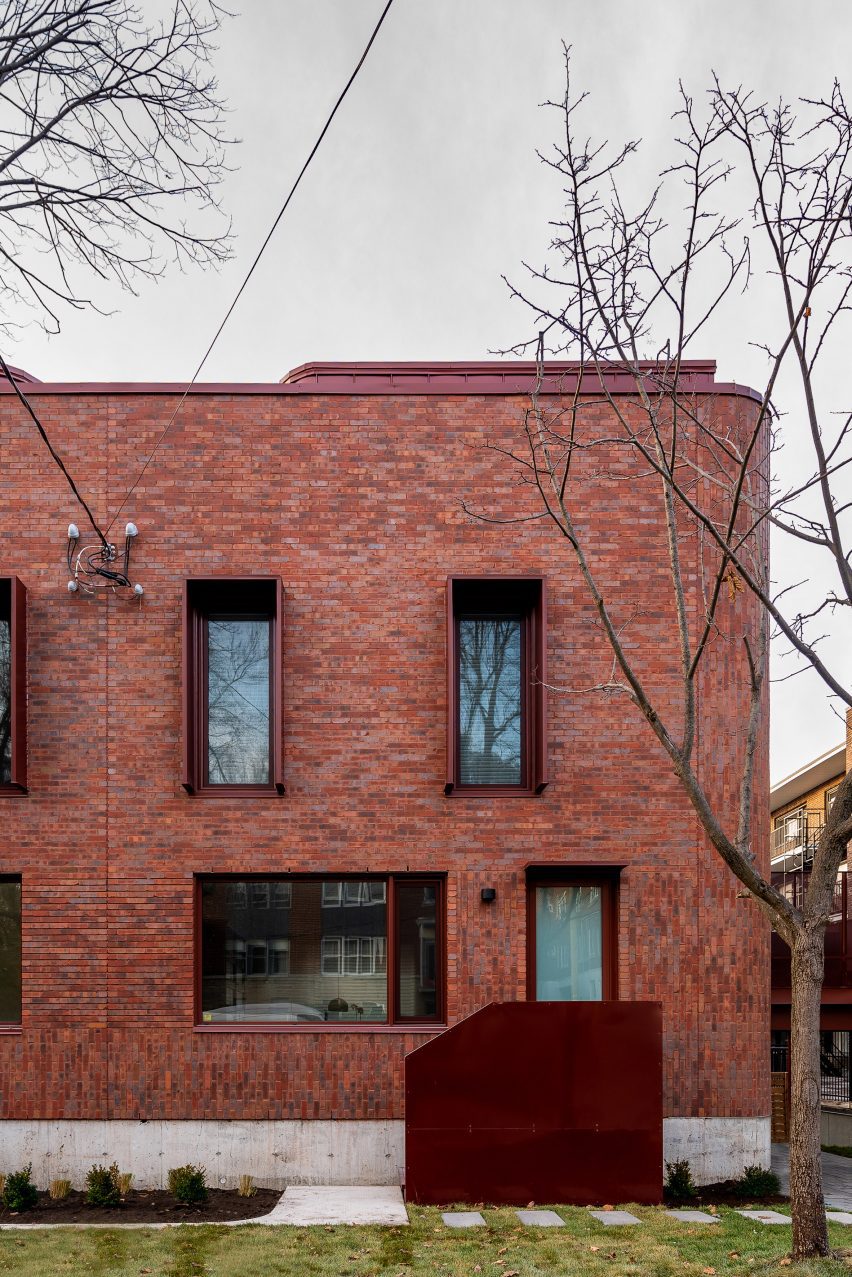
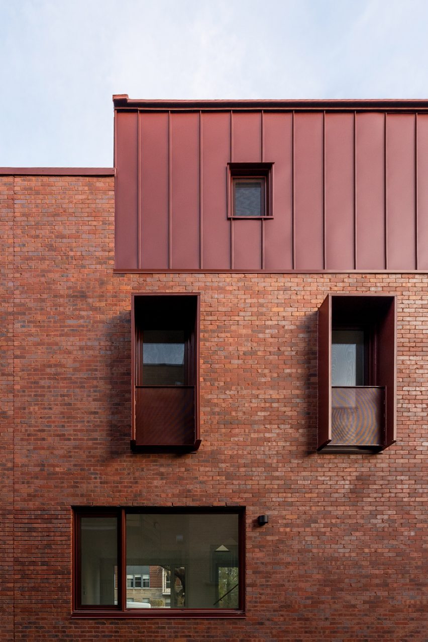
The ground floor of the EZU House and Café serves as a retail area, seamlessly transitioning into the residential space on the upper floor. The distinction between these two sections is purposefully fragmented, employing diagonal load-bearing walls that create a continuous three-dimensional living space. This approach fosters a sense of connectedness and flow throughout the entire structure. Furthermore, the architects have emphasized the integration with the natural surroundings by incorporating a double structure. This design envelops the earthquake-resistant framework with elements dedicated to wind resistance and heat insulation, while the outer skin of the building serves as a gateway to the outdoor environment.

yabashi architects ezu house


Unobstructed Views by yabashi architects


The absence of partitions between spaces is a deliberate choice that enhances the occupants’ experience of the surrounding environment. Depending on one’s body position and movement, glimpses of the sky, verdant greenery, or sudden visual breaks may appear through the windows on adjacent floors. This design creates a spatial experience that emphasizes the inherent richness of the location and the generosity of life itself. In essence, the EZU House and Café may appear as a mere assembly of floors, outer panels, and openings. However, it transcends its utilitarian nature, transforming into a powerful tool that allows individuals to perceive the external environment as an integral part of the internal space.

yabashi architects ezu house
a double structure wraps earthquake-resistant elements with wind resistance and heat insulation yabashi architects ezu house
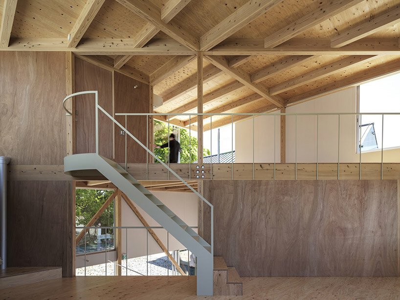
the multi-use space is flexible with a spiral vertical movement and minimal necessary functions

Reference

Lounge of 1 Warwick members’ club
CategoriesInterior Design

Fettle channels Soho’s “grittier” years at 1 Warwick members’ club

Interiors studio Fettle drew on the neo-baroque architecture of this Edwardian building in London’s Soho when converting it into a members’ club, as well as nodding to the area’s colourful history of the 1950s and 60s.

Owned by Maslow’s, the group behind Fitzrovia club Mortimer House, 1 Warwick features mid-century furniture and lighting along with bespoke designs that reimagine the furniture of the period.

Lounge of 1 Warwick members’ club
Fettle has designed the 1 Warwick members’ club in London

The mix includes jaunty elements such as splayed-leg easy chairs and scallop-edged rattan lighting.

“During this period of history, Soho was much grittier than we find it today, so we wanted to underplay the more elevated finishes that you would typically find in a members’ club,” Fettle‘s director Andy Goodwin told Dezeen.

“We have referenced the less polished nature of Soho in this period with raw plaster wall finishes and exposed brick.”

Yasmin restaurant by Fettle
The club has a rooftop restaurant called Yasmin

Fettle juxtaposes these references with some influences from the neo-baroque mansion itself, reworking its sense of assured comfort in a contemporary way with richly toned wood panelling and elaborate chandeliers.

“We wanted to ensure that we referenced this period within the final design,” Goodwin said. “We simplified a traditional Edwardian baroque skirting and architrave style within the bespoke joinery that was designed for the ground and first floors.”

“Typically, buildings of a similar age had common features, including bold geometric floor patterns within the entrances. And as such we reimagined a pattern from the period in the lobby of 1 Warwick.”

Balcony of Yasmin restaurant at 1 Warwick members’ club
Its wraparound roof terrace offers views across Soho

While drawing on the history of the building and the area, Fettle worked hard to ensure that the club feels fresh, welcoming and contemporary.

“We have mixed furniture, lighting and accessories from a variety of different eras and curated a space that feels relaxed and residential in its aesthetic,” he continued.

“When designing furniture specifically for the project, we referenced more traditional designs, however. We looked at the details through a modern lens to make the space feel familiar yet contemporary.”

Set over six floors, the crowning glory of 1 Warwick is the rooftop bar and restaurant Yasmin with its wraparound roof terrace and views across Soho.

Here, pink mohair-upholstered bar stools nestle against a wood-clad marble-topped bar while the menu is Middle Eastern, inspired by executive chef Tom Cenci’s time in Istanbul.

Two lounge spaces – the Living Room and adjoining Den – are at the heart of the club, where Fettle used an earthy-toned palette, along with exposed brick walls and geometric patterned rugs to bring a sense of warmth to the interior.

Shared workspace in 1 Warwick members’ club
The club has several co-working areas

“We wanted to let the existing architectural features be visible within the final design to create a more neutral backdrop, onto which we layered playful choices across the furniture and fittings,” said Goodwin.

“We used deep, saturated, colourful fabrics for the upholstered pieces and we have looked to mix mohairs and velvets with more vibrant leathers and patterned fabrics to give an eclectic feel to the space,” said Goodwin.

In the daytime, 1 Warwick offers spaces to suit different kinds of working styles, from private studies and rentable desks to the Pied-à-Terre – an open-plan workspace featuring long, library-style tables and comfortable lounge seating.

Office space by Fettle
Members can also work in private meeting rooms

At ground level, there’s the neighbourhood bistro and bar Nessa, open to all and offering a playful take on British classics while the more intimate, horseshoe-shaped bar serves up its own menu of small plates.

With a colour palette of warm, autumnal tones and a material mix of exposed brick, wood panelling and marble-topped tables, the atmosphere here is welcoming and down-to-earth.

Nessa restaurant at 1 Warwick members’ club
The Nessa restaurant is set on the ground floor and open to the public

Founded in 2013, Fettle has a long history in hospitality design with previous projects including the Schwan Locke Hotel in Munich, which was conceived as an homage to early German modernism.

Elsewhere in London, the studio was also responsible for designing The Gessner apartment block to resemble a hotel, complete with a cafe and co-working area.

The photography is by Simon Brown.

Reference

Growing crops in saltwater - Springwise
CategoriesSustainable News

Growing crops in saltwater – Springwise

Spotted: Climate change is leading to the increased scarcity of fresh water – just as food production needs to increase. According to one study by the Food and Agriculture Organization of the United Nations, increases in the global population will require raising overall food production by some 70 per cent between 2005 and 2050. Production in developing countries would need to almost double.

Scottish company Seawater Solutions has developed a novel approach to growing more food with less water, specialising in using seawater to grow salt-tolerant crops. Seawater Solutions takes flood-affected or degraded farmland and turns it into an artificial saltmarsh ecosystem by pumping seawater over the area or flooding it.

Farmers use the flooded land to grow crops, called halophytes, that thrive in waters with a high percentage of salt. Examples of halophyte crops include samphire, mangrove, and Salicornia. Some of these crops are in demand as food specialities, and others can be used to produce oil for cosmetics, as biofuels, or for fodder.

Halophyte crops also provide protection against erosion and carbon sequestration – the plants absorb 30 times more carbon than rainforests do. Seawater Solutions estimates that farmers who adopt their artificial ecosystems could sell €2,600 worth of carbon credits per year for each hectare farmed. On top of this, Seawater’s artificial salt marshes are powered entirely by renewable energy systems.

Climate change has given a new urgency to finding solutions. Recent ideas spotted by Springwise include a greenhouse designed to grow crops in hot, dry climates and using extremophile bacteria to improve crop yields.

Written By: Lisa Magloff

Reference

Red brick building with curved edges and metal top floor
CategoriesArchitecture

Naturehumaine draws on Streamline Moderne for Montreal duplex

Local studio Naturehumaine has completed a two-family housing block located in the Côte-des-Neiges borough of Montreal that draws on 1930s architectural styles.

The project comprises 297 square metres of housing on a narrow urban strip, which formerly served as a large swimming pool site for a neighbouring building.

Called Le Paquebot – or The Steamer– the project references and builds on the architectural styles of the surrounding neighbourhood, which is made up of 1950s multi-residential buildings that surround the project on three sides.

Red brick building with curved edges and metal top floor
Naturehumaine created a structure that holds two homes in Montreal

It includes two semi-detached duplex units spread over four floors with outdoor space on the rooftop and at the sides.

Round corners, various masonry configurations, strict symmetrical layouts and refined geometries characterise the structure.

Its form was influenced by the Streamline Moderne architectural style, commonly associated with the 1930s interwar art deco movement.

Curved brick facade with metal staircase and winter greenery
It has a brick-clad facade with curved edges

“Since we found in the immediate neighbourhood various beautiful examples of art deco residential projects from the 1930s, it became obvious for us from the start that we wanted to revive in a contemporary way some of the features of that period in architecture,” Naturehumaine told Dezeen.

The facade is clad in red clay brick with steel details that have been painted wine red.

Privacy screens as well as the terrace railings were made from perforated steel painted in a terracotta colour, along with the curved roofs of the mezzanine floors.

Red brick building with metal top and metal privacy screens
The top floor has a metal exterior that matches the privacy screens on the windows below

“Our first intention was to choose a burgundy colour that would contrast and stand out with respect to the immediate neighbours where both are in tones of light and darker brown,” Naturehumaine told Dezeen.

“What turned out to be interesting is the variation perceived in the tonality of the brick based on lighting; the brick becomes particularly warm and orangey when directly exposed to the sun.”

The primary bedroom and mezzanine are on the top floor

The homes are set up symmetrically, with four bedrooms each. There are semi-submerged basements that hold single bedrooms and a family room, while the ground floor holds the common areas.

The third floor is dedicated to two bedrooms meant for children, while the top floor, which acts as a mezzanine, holds the primary bedroom.

A central staircase bisects each of the homes and each has a carport topped by a terrace that extends from the ground floor

Sunlight on top of red brick building in Montreal
It has curved windows and terraces that act as car ports

The ornate masonry work exists in its usual horizontal layout until coming to head at the curved windows, where it has been turned vertically and tilted toward the two front corners of the home in order to accentuate the curve.

The corner masonry comes to a halt at large, curved-corner windows.

Because the large window needed double-glazing and used curved glass, the windows had to be fabricated by specialists in Texas and then shipped north to the site in Montreal.

“For a modest residential project like ours, it was effectively a challenge to build the rounded roofs and curved metal lintel needed to support the brickwork above our rounded corner window.

“All of these elements needed to be perfectly erected one above the other on the same radius,” said the studio.

Red brick and curved glass windows on housing block
The windows were shipped from fabricators in Texas

Nonetheless, the strict geometric identity of the construction adds to the strong identity of the building. Curves and colours of the project aid in making this home a statement piece in the area.

Naturehumaine has completed other multi-family projects in the area such as a project with twisting yellow external staircases and single-family projects such as a home with a staircase inspired by Dutch artist MC Escher.

The photography is by Ronan Mézière.

Reference

Red-stained plywood volume within apartment
CategoriesInterior Design

Another Seedbed is an apartment that doubles as a performance space

In this renovated loft in Brooklyn, the owner both resides and hosts public art performances within a space divided by a variety of inserted volumes.

The loft is located in a late 19th-century cast iron building in Williamsburg that once served as a hat factory, and was renovated by a team of architects.

Red-stained plywood volume within apartment
A team of architects renovated the loft, inserted volumes to conceal private areas

Ignacio G Galán, Jesse McCormick, Khoi Nguyen and Julie Tran of Future Projects collaborated to turn the industrial space into a residence that could also serve as a venue for artistic performances and other public events.

Named Another Seedbed, the project recalls the use of lofts in New York City by artists in 1960s to 1980s for developing experimental works.

Red-stained plywood with concertina door
The bedroom is hidden behind red-stained plywood panels and accessed through a concertina door

The owner and activator of this apartment began organising parties, performances and other events in a similarly industrial space in Bushwick.

He then decided to create a dedicated space for himself to live and work, as well as host other artist friends who needed square footage to bring their ideas to life.

Hand-troweled earthen clay plaster wall in front of plywood doors
Hand-troweled earthen clay plaster covers the bathroom volume

“Neither just a private studio nor an art gallery, the space is equipped to welcome gatherings that operate between a dinner party and a public performance,” said the project team.

“Artists appropriate the space and become hosts themselves, expanding the communities which the project brings together.”

Bathroom lined with blue penny-round tiles
Inside, the bathroom is lined with blue penny-round tiles

The apartment is organised as a largely open-plan space, with private areas concealed inside inserted volumes.

Red-stained pine plywood panels hide the bedroom, which is accessed via a concertina door, and also contain storage.

Living room with open-shelf storage and ochre-coloured sofa
Moveable furniture helps to arrange the apartment for performances

The bathroom occupies another volume that’s covered in hand-troweled earthen clay plaster outside and lined entirely is blue penny-round tiles inside.

An open kitchen with grey cabinetry sits below a framework of coloured wood, featuring smokey polycarbonate panels that are lit from behind.

This frame extends into the living area to form a floor-to-ceiling shelving unit, on which books and objects are displayed, and a projector for screening videos onto the opposite wall is housed.

A variety of moving furniture pieces, including an ochre-toned sofa on wheels, help to choreograph the events and arrange the apartment as desired by whoever is using it.

Dark room illuminated by projector and neon lights
The owner and his artist friends are able to transform the space to present their work

“The space will not advertise its performances,” said the team.

“Some neighbors might not know of its existence. Others will hear about an event through friends. Some might find themselves there often and will develop networks of neighbourliness within it.”

Silhouetted figures sweep the ground of the dark room
Performances are open to the public but not advertised

Brooklyn has both a thriving arts scene and a wealth of defunct industrial buildings for hosting exhibitions, performances and events.

Herzog & de Meuron recently completed the transformation of a derelict power plant in the borough into arts centre, while the Public Records creative venue added a bar and lounge on an upper floor of its former warehouse building earlier this year.

Reference

A platform helps producers track and collect post-consumer products
CategoriesSustainable News

A platform helps producers track and collect post-consumer products

Spotted: According to the World Bank, each year 4.9 million tons of plastic waste in Indonesia is goes uncollected, is left in open dumpsites, or is leaked from inadequately managed landfills. This ‘wasted waste’ blights neighbourhoods, damages wildlife, and leaches chemicals into the water. To find a solution, Jakarta-based startup Octopus has developed a circular economy platform to collect and dispose of waste. 

Octopus offers two main kinds of service. In one, consumers download an app and book a time slot for waste pickers – called pelestari – to collect their trash. The rubbish is then sold on to recycling businesses.  

The role of waste picker already exists in Indonesia. However, by taking waste directly from consumers instead of sifting through landfills, the pelestari can work in a safer way and earn higher prices. And, because the app formalises their labour, the pickers can build a verifiable employment history, making it easier to open bank accounts and gain access to credit. Octopus also provides a training programme through its app.  

The other part of Octopus’ business model is to provide data on waste collection and recycling to fast-moving consumer goods (FMCG) brands that help them meet their Environmental, Social, and Governance (ESG) targets. Octopus also runs a deposit refund system for larger producers and brands. The startup already has more than 150,000 users and raised $5 million (around €4.7 million) last year, in a funding round led by Openspace and SOSV. 

Plastic waste is a huge concern, so it is no surprise that Springwise has spotted a lot of energy being put towards developing innovative solutions. These range from recycling tyres into green roof panels to using fungi to break down hard-to-recycle plastics.

Written By: Lisa Magloff

Reference

Rendering the Future: An Architecture of Matte Black Façades
CategoriesArchitecture

Rendering the Future: An Architecture of Matte Black Façades

The winners of this year’s A+Product Awards have been announced. Stay tuned for the year’s edition of the A+Product Awards ebook in the coming months.

We first experience architecture through a façade. Whether made with an overhang for shelter, lively colors, or clear sight lines inside, buildings with a thoughtfully designed façade invite exploration. Over time, architects have worked with builders and manufacturers to rethink cladding, glazing, and doors to shape the entry sequence and building styles. Today, this exploration continues with the design and detailing of matte façades. Through diverse material and finish choices, designers are reimagining the building envelope.

Matte façades have increased in popularity around the world and across project types. By reflecting less light, these buildings hold a strong presence and become focal points in rural and urban environments. Depending on the type of material and color, the matte finish can highlight the cladding, structure or façade system in place. These projects have a textural look and feel, inviting interaction and connection. In turn, they can also be used as a counterpoint to other colors, textures or finishes. The surfaces can contrast glazing or the interior design to delineate between the interior and exterior. Representing the integration of materials and finishes in different climates and contexts, each of the following projects explores what it means to create matte façades today.


Sauna R

Designed by Matteo Foresti, Värmdö, Sweden

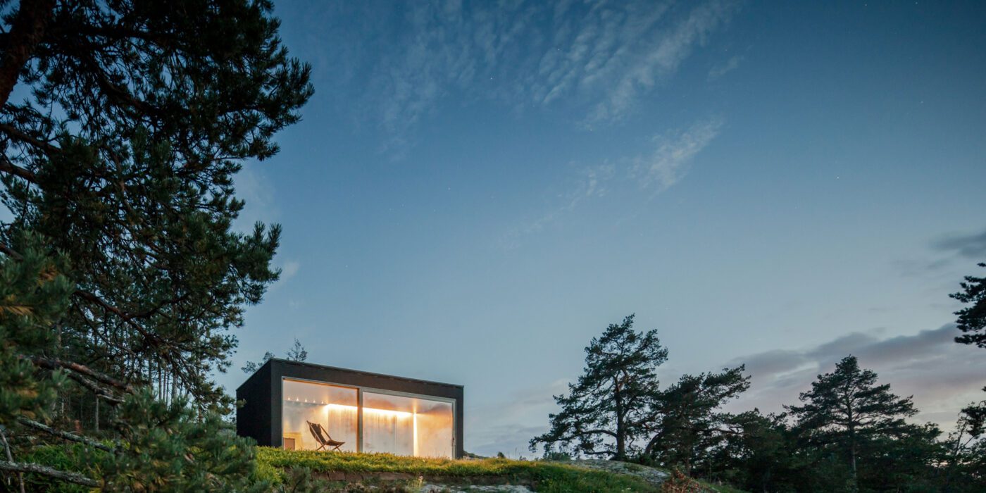
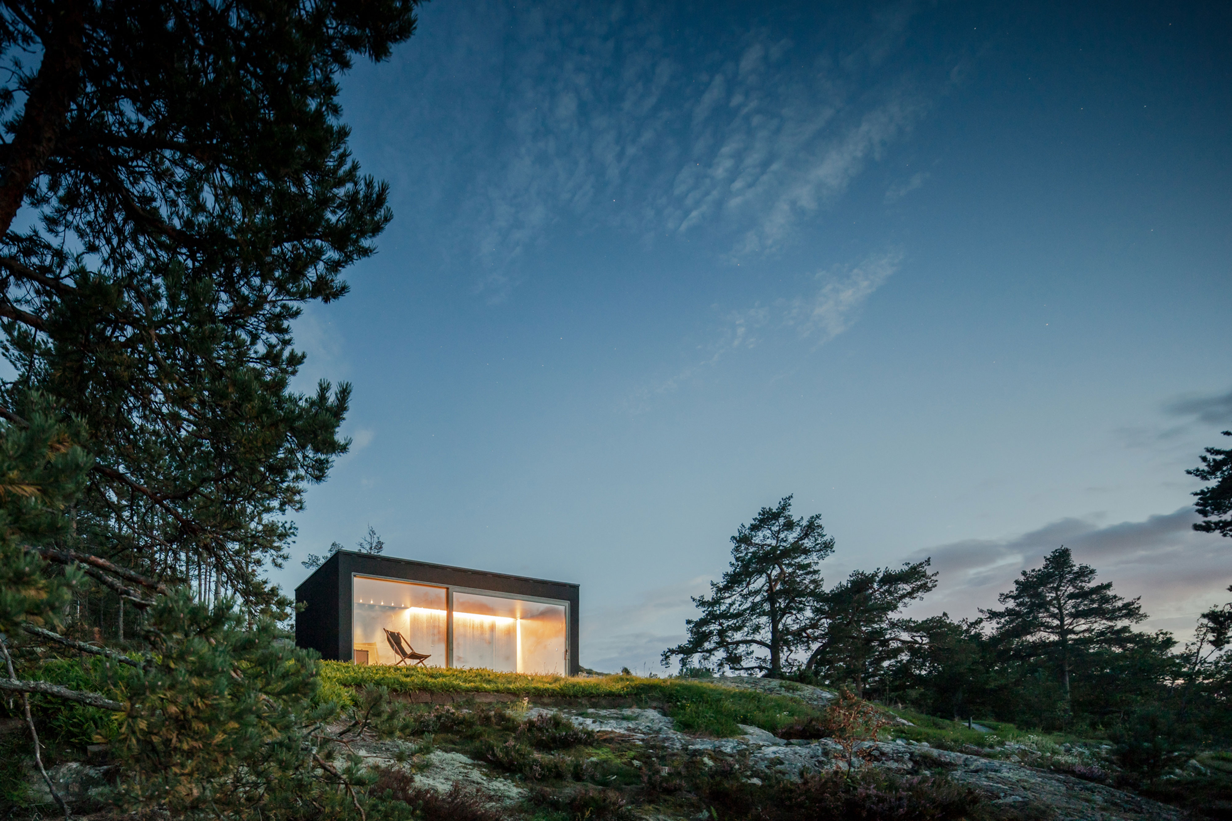
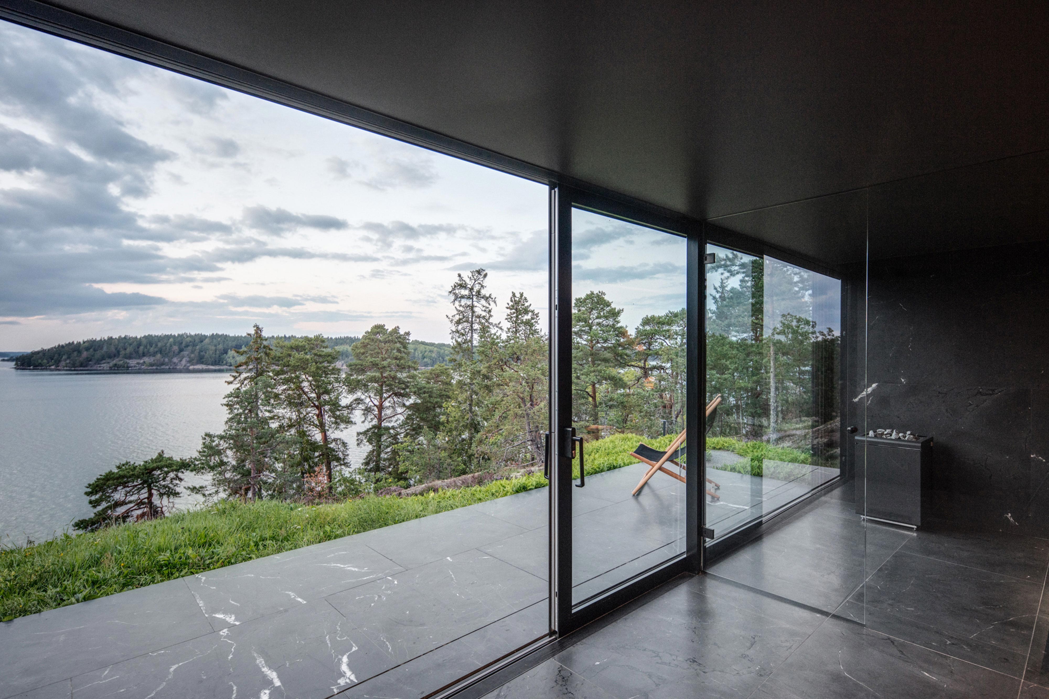
Made of black granite (Negresco) and dark wood (Oak), this sauna was designed to be a camera obscura, a box drawn to shape views of the landscape. Located in the middle of Stockholm’s archipelago, a narrow pathway brings the visitors to the sauna: a black box embedded in the rocks. The matte finish can be seen both inside and as part of the structure’s façade. As the team outlines, inside is a monolithic stone bench that faces the water through a large sliding window. On the back, a thick wall contains all the services: a small kitchen hidden behind the sliding doors and a bathroom illuminated by a skylight. At night, the small sauna resembles a lighthouse, a warm and cozy space illuminated from the inside.


Textilmacher

Designed by Tillicharchitektur, Munich, Germany

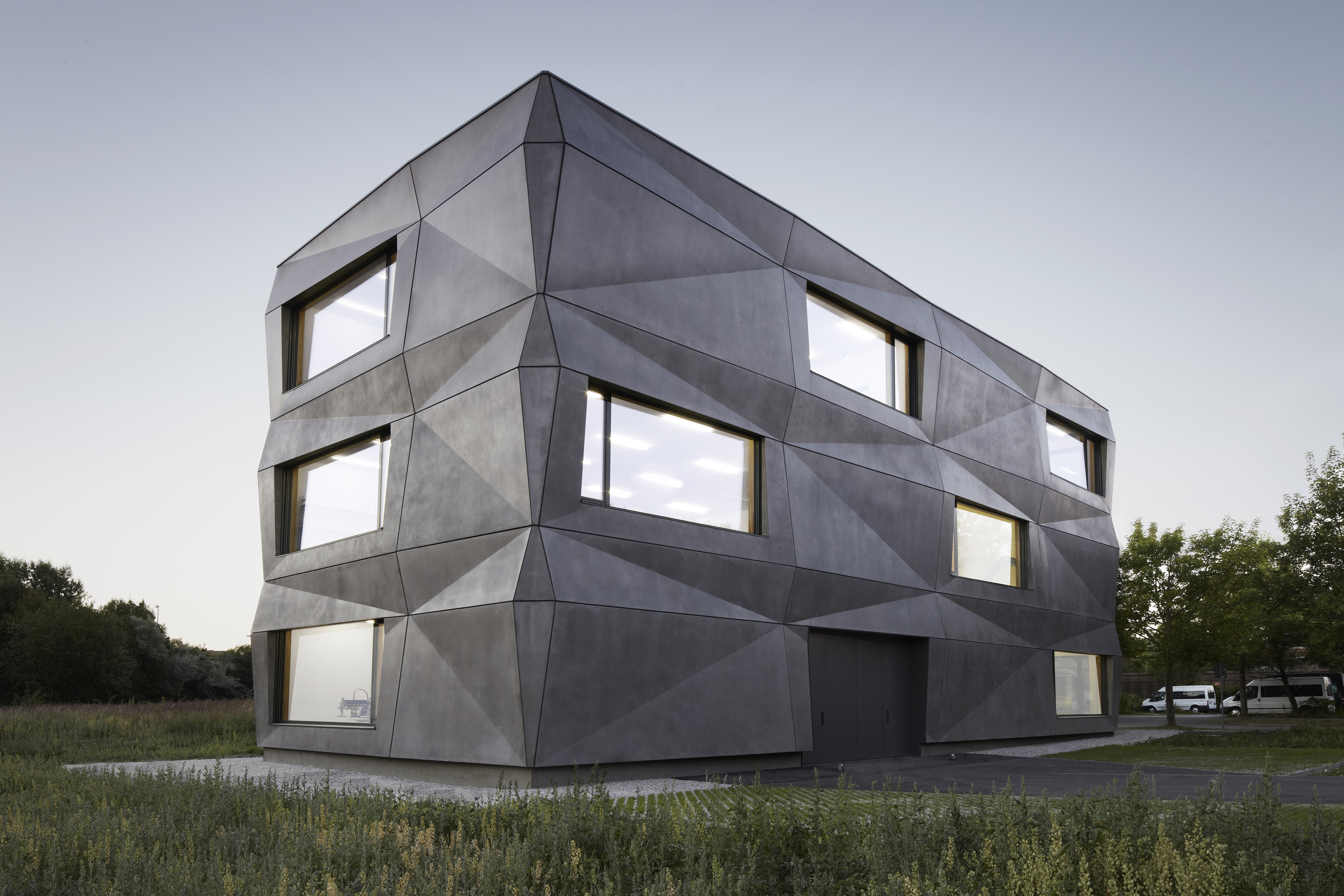
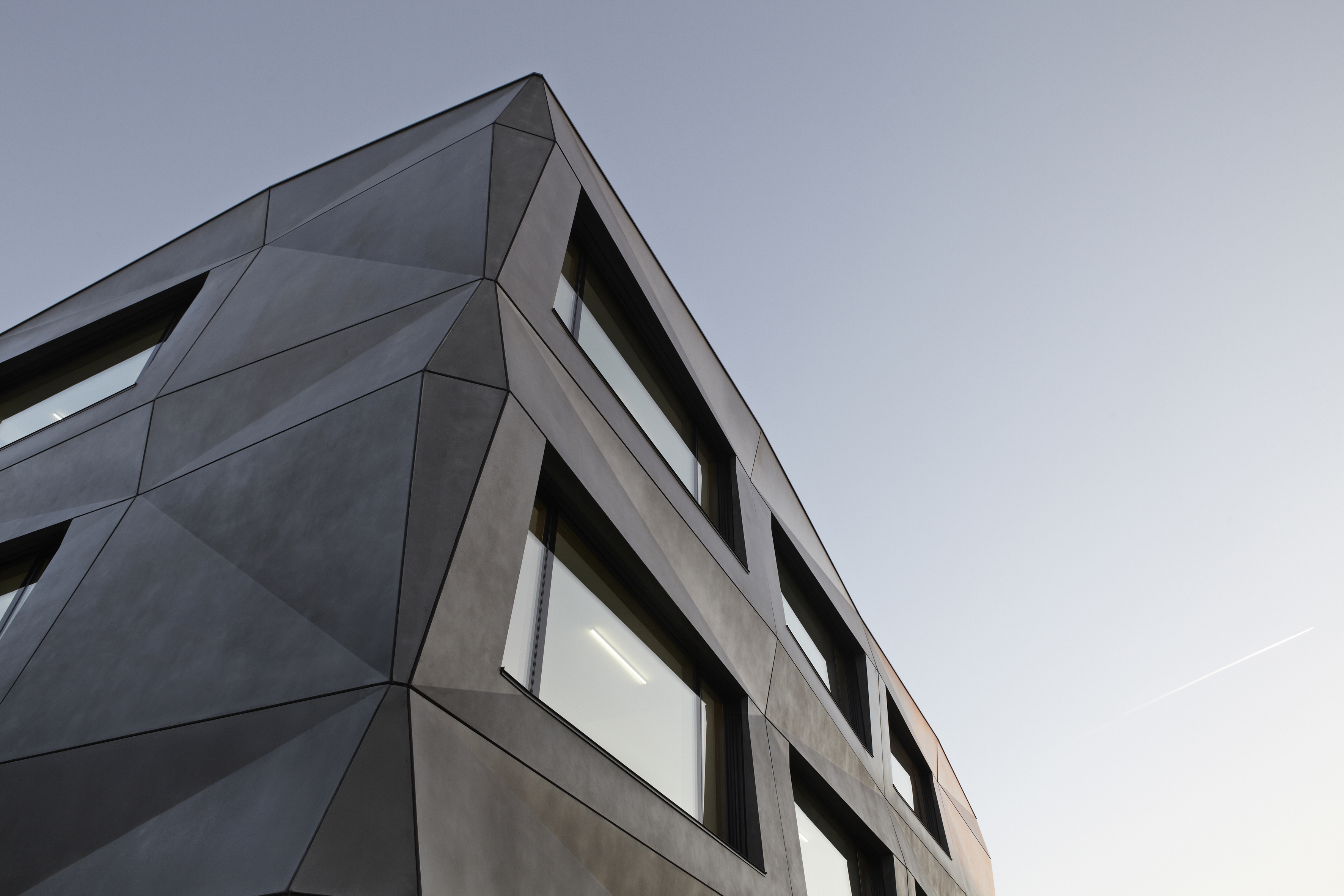
Tillicharchitektur designed this building to host production and office spaces for a textile finishing and vending firm. Its iconic feature is the folded façade, which reimagines the simple cube. The matte bright surface of the anthracite pigmented concrete responds to its environment. Depending on the season, time of day, weather, and lighting, the façade continuously changes its character. In contrast to the expressive façade, the interior design leaves more space for the production process and the products in the showroom. The team explains that the limitation on few, but high class materials, is the main factor driving the interior.


LOU – Einfamilienhaus

Designed by AllesWirdGut, Lower Austria, Austria

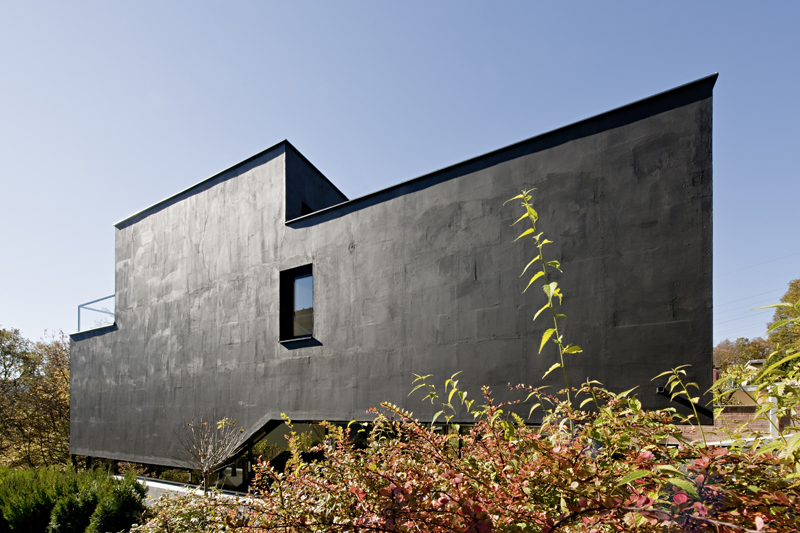
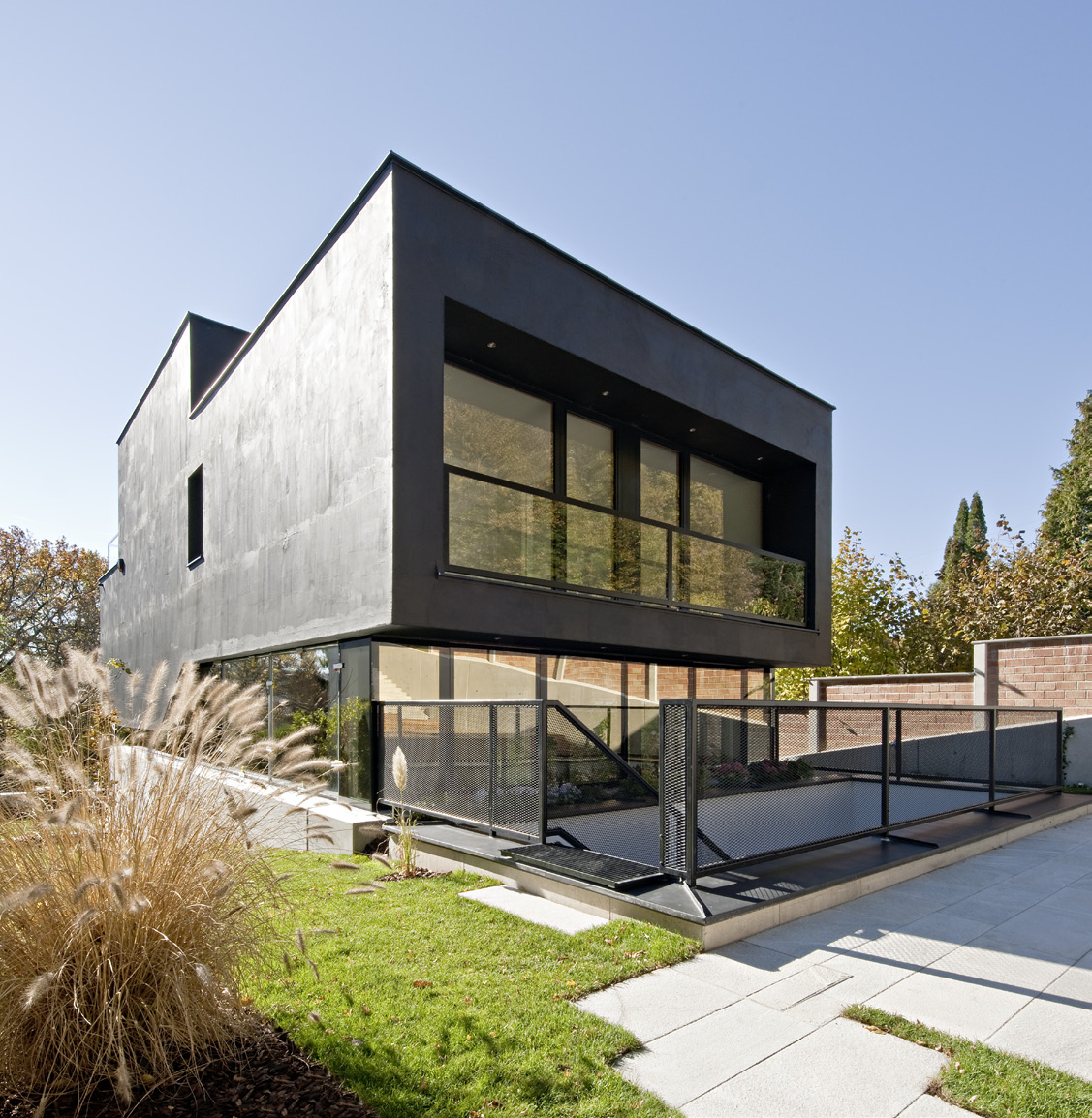
On the fringe of the Vienna Woods sits this compact single-family house LOU. Resting on a steeply sloping site, the designers wanted the first impression to be reinforced by the matte black skin of the building. Inside, the project offers a spacious and varied living environment on staggered half-story levels. As the team notes, at each level, the house opens differently to the outside world. The main residential levels are nestled against the slope, separated from the garden only by an all around-strip of windows which allows looking and stepping out in every direction.


Four Seasons House

Designed by Joris Verhoeven Architecture, Tilburg, Netherlands

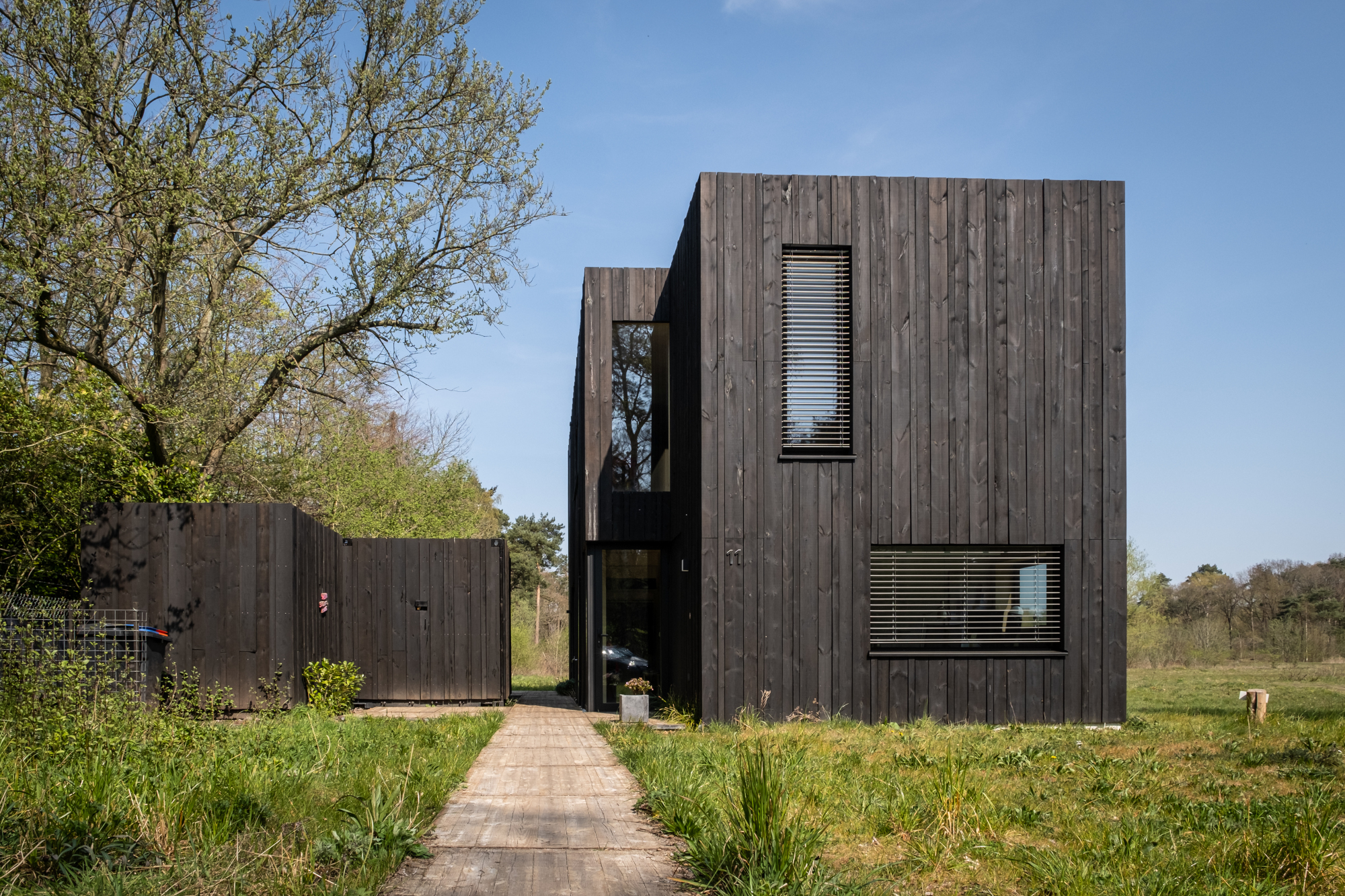
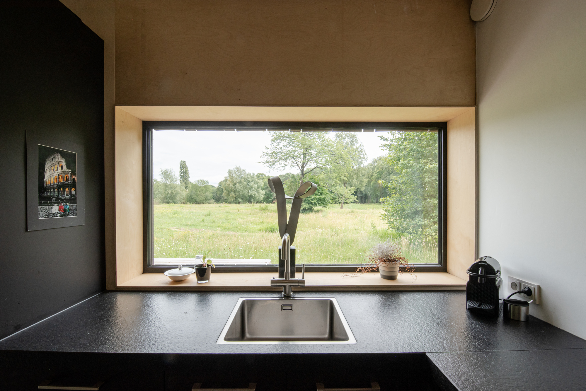
This compact wooden house was designed by architect Joris Verhoeven for himself. Located within the Drijflanen nature reserve in Tilburg, the matte building is designed to be a part of nature. With its rough black façade, it was made to fit within the context of surrounding tree trunks. The cottage house is prefabricated and constructed out of wooden cassettes filled with flax insulation. In turn, the interior of the cassettes is made of birch plywood. Other parts of the interior, such as the interior door, kitchen and stair railing, are finished in matte black, just like the exterior window frames. In this way the inside and outside of the house were made to relate to one another.


Muangthongthani Carcare

Designed by Archimontage Design Fields Sophisticated, Nonthaburi, Thailand

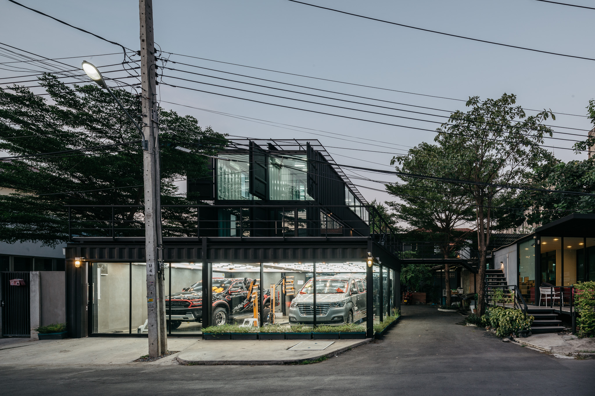
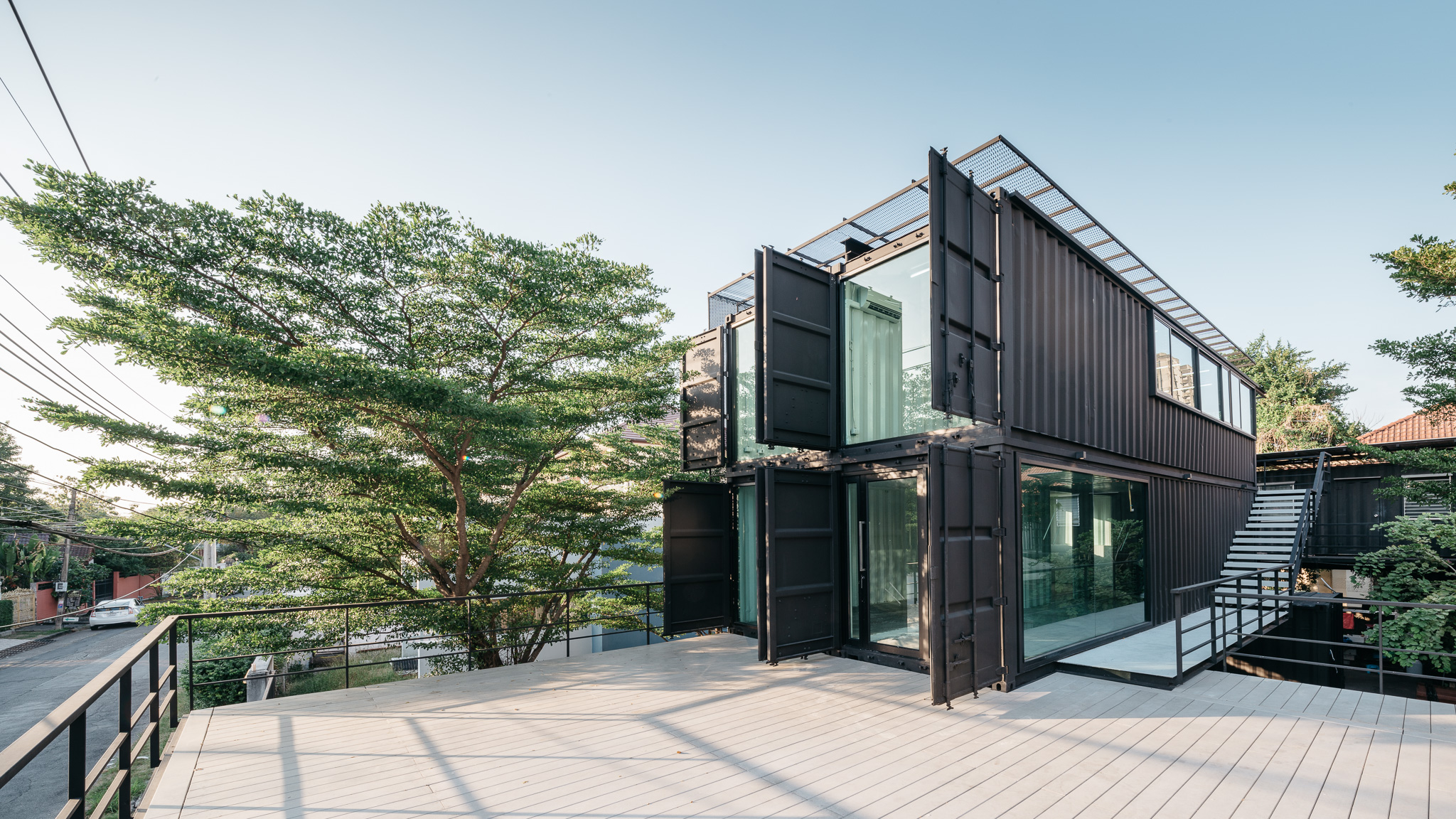
Located in Muang Thong Thani, this project is the expansion of a car care center. The building is located on a 3230-square feet (300-meter) plot of land, with a long and narrow plot that required an in-depth organization of the building. Since the space of the car care center was too limited, a new space was necessary for project extension. The building consists of four small containers and four large containers. The design team made the building exterior to be painted in matte black but the interior is white. The external envelope includes the west façade and the roof, which have metal sunshades to reflect sunlight and protect the building from the heat.


The Wetlands

Designed by Alain Carle Architect, Wentworth-Nord, Canada

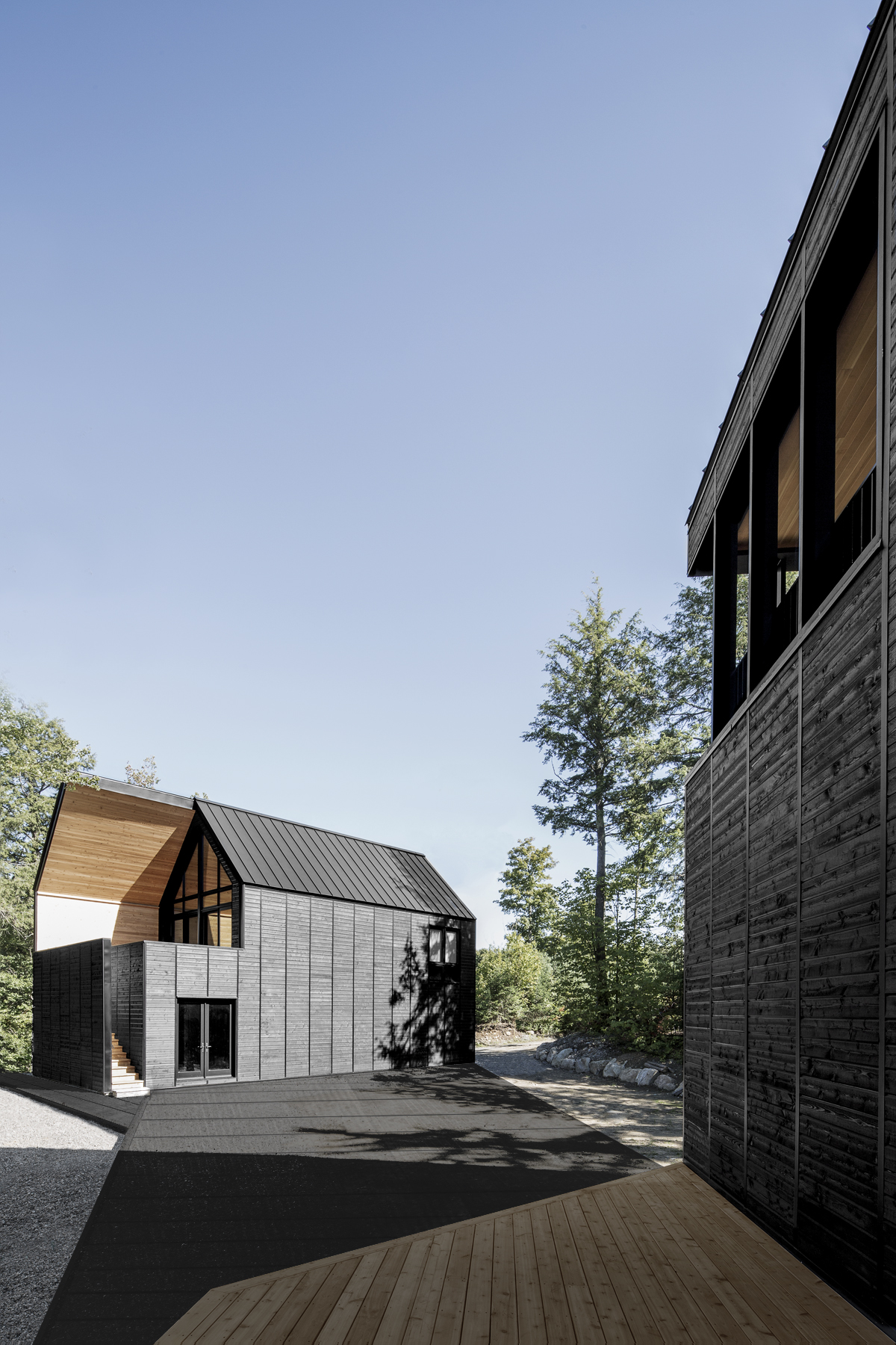
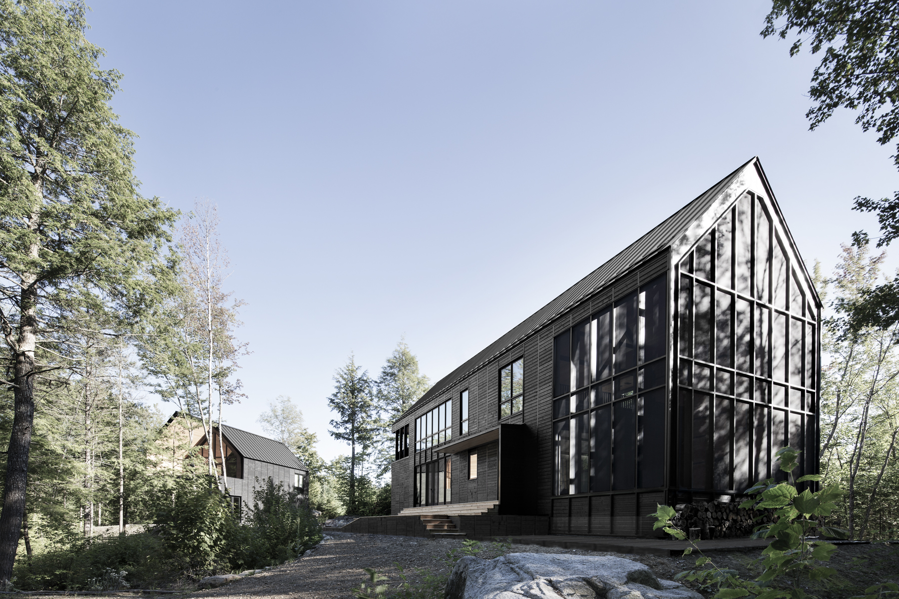
The ‘Les Marais’ project started with the design team’s fascination for the built landscape of the empty space that characterizes North American rural areas. For this design, depending on the observer’s location in the neighboring forest, the scales of the buildings are relative. The team explains that the wetland nature of this lakeside property was preserved and then the collective landscape of the built complex was designed. A large ‘plate’ of black wood links the three structures to establish a common base, while large cutouts were made in each ‘shape’, also of black painted wood, to reveal the interior materiality of the red cedar buildings.


JianYe LanHai ZhengFeng Hotel

Designed by Lacime Architect, Xinzheng, China

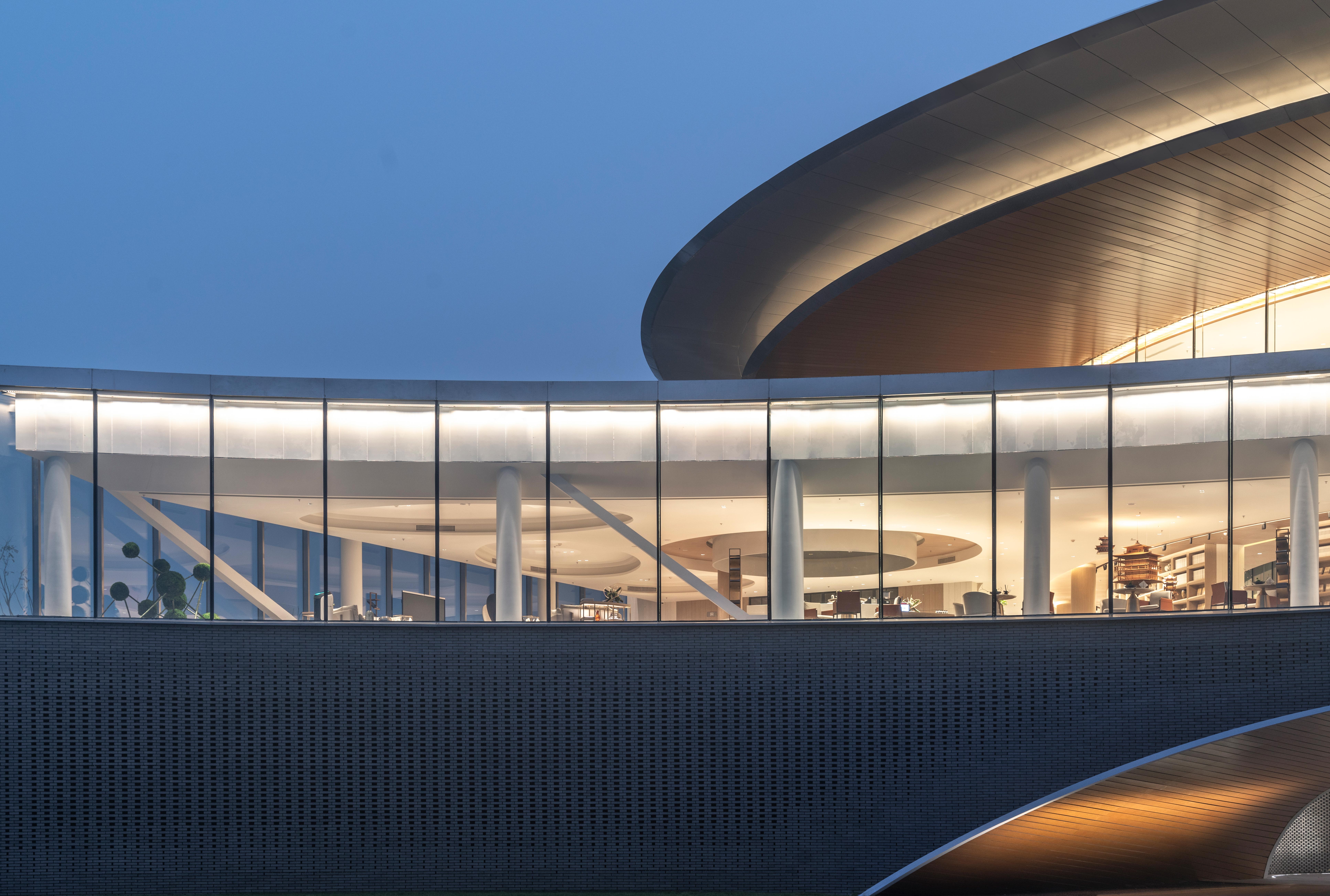
Sited at the future land-air transport hub of Henan, this hotel was made as a “paradise city with national customs” in Zhengzhou. Ideas of Chinese ancient garden construction were introduced into the “south garden” that make the most important building the starting point of the entire array. Moreover, the matte building façade is presented in the shape of arc to match the main garden in the front. The team choose a range of matte-finish materials like frosted earthenware tile, matte composite aluminum-plastic sheet and brushed stainless steel. It is the first floor of the building that is composed of external matte façade built from 100,000 earthenware tiles.

The winners of this year’s A+Product Awards have been announced. Stay tuned for the year’s edition of the A+Product Awards ebook in the coming months.

Reference

Bedroom, Casa Tres Árboles in Valle de Bravo by Direccion
CategoriesInterior Design

Eight calming bedrooms with minimalist interiors from across the world

For our latest lookbook, we’ve gathered ten minimalist bedrooms with peaceful designs, ranging from a Mexican bedroom with a concrete bed to a cosy space in a former girls’ school in Puglia.

Natural materials including wood and stone were used to finish these eight bedrooms, which also feature muted colour palettes and little in the way of decoration.

Leaving walls bare and keeping the amount of artworks and personal items to a minimum can help create a more soothing and clutter-free bedroom.

Beige, grey and warm brown hues, meanwhile, make for relaxing spaces free from eye-catching colours.

This is the latest in our lookbooks series, which provides visual inspiration from Dezeen’s archive. For more inspiration see previous lookbooks featuring terraces and balconies, marble-lined bathrooms and cave-like interiors.


Bedroom, Casa Tres Árboles in Valle de Bravo by Direccion
Photo by Fabian Martinez

Casa Tres Árboles, Mexico, by Direccion

Designed to resemble a “monastic sanctuary”, this weekend retreat in Valle de Bravo, Mexico, aims to celebrate the contrast between shadow and light in its interior.

In the pared-down bedrooms, the walls were painted in dark colours to contrast the warm wooden ceiling beams. A wooden bench at the end of the bed and tactile linen textiles give the room a slightly rustic feel.

Find out more about Casa Tres Árboles ›


Bedroom inside Bangalore home
Photo by Aaron Chapman

Cabin House, India, by Taliesyn

Cabin House’s interior was informed by the vernacular architecture of its location in south Bangalore’s Jayanagar neighbourhood.

Earthy finishes were used for the home, which features bare concrete walls and plenty of wood details. A wooden bedframe and flowers create a friendly atmosphere in the mezzanine bedroom.

Find out more about Cabin House ›


Bedroom interior of Pacific House designed by Alexander & Co
Photo by Anson Smart

Pacific House, Australia, by Alexander & Co

Australian studio Alexander & Co aimed to create contemplative spaces inside Pacific House in Sydney.

In the minimalist bedroom, walls were rendered in concrete and matched with carpet in a darker grey colour. Sculptural bedside lamps and transparent floor-to-ceiling curtains add a softer feel to the spartan interior.

Find out more about Pacific House ›


Bedroom of Tokyo apartment by Keiji Ashizawa
Photo by Tomooki Kengaku

Hiroo Residence, Japan, by Keiji Ashizawa

Custom-made wooden furniture and art pieces are dotted throughout Hiroo Residence. Designer Keiji Ashizawa used muted tones to make the most of the sunlight in the central Tokyo apartment, which has several large windows.

In the bedroom, wood panels cover entire walls and hide away technical functions behind the beds. Organically shaped ceramics add discrete decorative touches.

Find out more about Hiroo Residence ›


Interiors of Fisherman's cottage
Photo by Gavin Green

Fisherman’s Cottage, Australia, by Studio Prineas

The bedroom in this Australian home is located inside a concrete extension to an old fisherman’s cottage.

Here, a solid-stone bath doubles as a bedhead and mirrored walls were used to make the small room feel bigger. To not clutter the space, accessories were restricted to a few glass trays and vases as well as a striped throw.

Find out more about Fisherman’s Cottage ›


Bedroom in brutalist home
Photo by Rory Gardiner

Casa Alférez, Mexico, by Ludwig Godefroy

A bedside nook sits underneath a high window inside this brutalist holiday home, which features wooden floors and walls made of board-formed concrete.

Architect Ludwig Godefroy also designed built-in concrete furniture for the house, including a concrete bed. A pale grey version of designer Verner Panton’s classic Flowerpot lamp adds a glossy detail to the room’s rough texture.

Find out more about Casa Alférez ›


Interior of Casolare Scarani in Puglia by Studio Andrew Trotter
Photo by Salva López

Casolare Scarani, Italy, by Studio Andrew Trotter

Architecture practice Studio Andrew Trotter converted a girls’ school in Puglia that dates back to 1883 into a grand family home with plenty of decorative arches.

In the cosy minimalist bedroom, a jute rug covers the stone floor made from crushed rocks and mortar, while the colour palette was kept to creamy whites as well as warm brown and tan hues.

Find out more about Casolare Scarani ›


Bedroom interior of Palau apartment by Colombo and Serboli Architecture
Photo by Roberto Ruiz

Palau apartment, Spain, by Colombo and Serboli Architecture

“Imperfect” original features were highlighted during the renovation of this apartment in Barcelona, which features white-washed walls and wooden floors.

In the mezzanine-level bedroom (above and top image), wicker doors front an entire wall and cover the closet. An organically shaped mirror and an orange chair make the calm space feel more playful.

Find out more about Palau apartment ›

This is the latest in our lookbooks series, which provides visual inspiration from Dezeen’s archive. For more inspiration see previous lookbooks featuring terraces and balconies, marble-lined bathrooms and cave-like interiors.

Reference

An inclusive approach to upcycling low-value plastics into new products
CategoriesSustainable News

An inclusive approach to upcycling low-value plastics into new products

Spotted: Every year, between 8 to 10 million metric tonnes of plastic end up in our oceans. Countries in Southeast Asia are among the major offenders – many lack the infrastructure to collect and process plastic waste. Vietnam, which only recycles around a third of its plastic waste, is one of these. But a startup called ReForm Plastic is aiming to change this, as well as improve the lives of Vietnamese waste pickers – who are largely women. 

ReForm focuses on repurposing different types of waste plastic into moulded plastic products such as: construction tiles, tables, chairs, waste bins, playground equipment, and holds for rock-climbing walls. However, the startup is also repurposing the waste system by transforming existing collection centres into small production facilities. 

The small recycling centres are equipped with efficient low-cost machinery, collection and processing equipment. Each centre is partially locally owned and managed, but generates products that are centrally purchased and distributed by ReForm.  

ReForm already has four factories in operation in Vietnam – and is building six more in partnership with organisations in Thailand, Bangladesh, Laos, Mozambique, and the Philippines. In addition to providing work for thousands of workers, the circular system also formalises a large proportion of the informal waste sector. 

One way that innovators are tackling plastic waste is by collecting it and turning it into new products – reducing waste as well as the use of fossil fuels to make virgin plastics. Springwise has spotted a startup making backpacks from recycled plastic and a refillable and decomposable replacement for plastic pill bottles.

Written By: Lisa Magloff

Reference

Straight Down the Line: 8 Tectonic Tennis Court Designs in Plan and Section
CategoriesArchitecture

Straight Down the Line: 8 Tectonic Tennis Court Designs in Plan and Section

The One Rendering Challenge is now part of the Architizer Vision Awards, honoring the best architectural photography, film, visualizations, drawings, models and the talented creators behind them. Winners are published in print! Start your entry >

Tennis is the perfect combination of athleticism and spectating. What makes the sport unique ranges from how it is scored to the variety of environments and playing surfaces used. In turn, the architecture of tennis has been continuously reimagined over time. That evolution can be seen from the early pavilions and stands adjacent to a court to the vast sports halls and modern complexes built around the world.

Dating back to the 12th century in France, tennis was originally called jeu de paume, or “game of the palm,” before rackets were introduced. Today, many features of the modern tennis court can be found around the world: baselines, service boxes, ideally a north-south orientation, and a three-foot net. Designed with spaces for athletes and spectators, these structures are centered around the same standard-sized court. With the French Open currently underway, we’ve rounded up the following projects to showcase the nuance and diversity that can be found in tennis architecture. Located in different climates and countries, the projects range from intimate and private pavilions to large, expansive facilities housing multiple courts.


Tennis Terraces

Designed by GRAS Reynés Arquitectos, Santa Ponsa, Spain

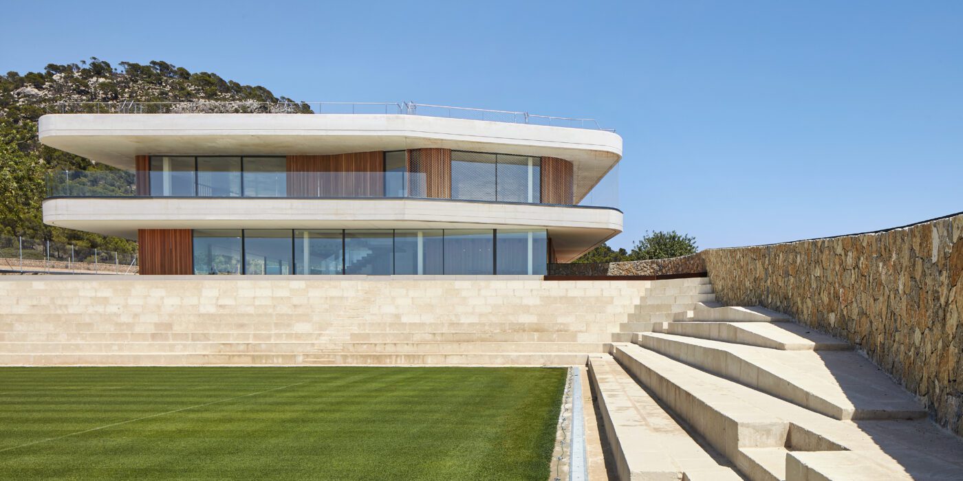
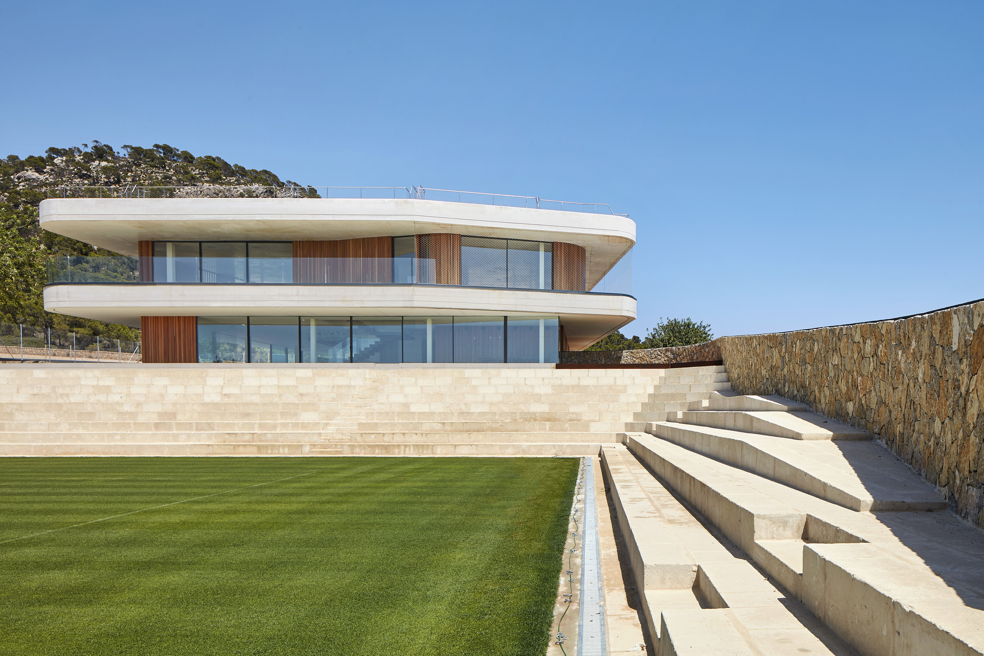
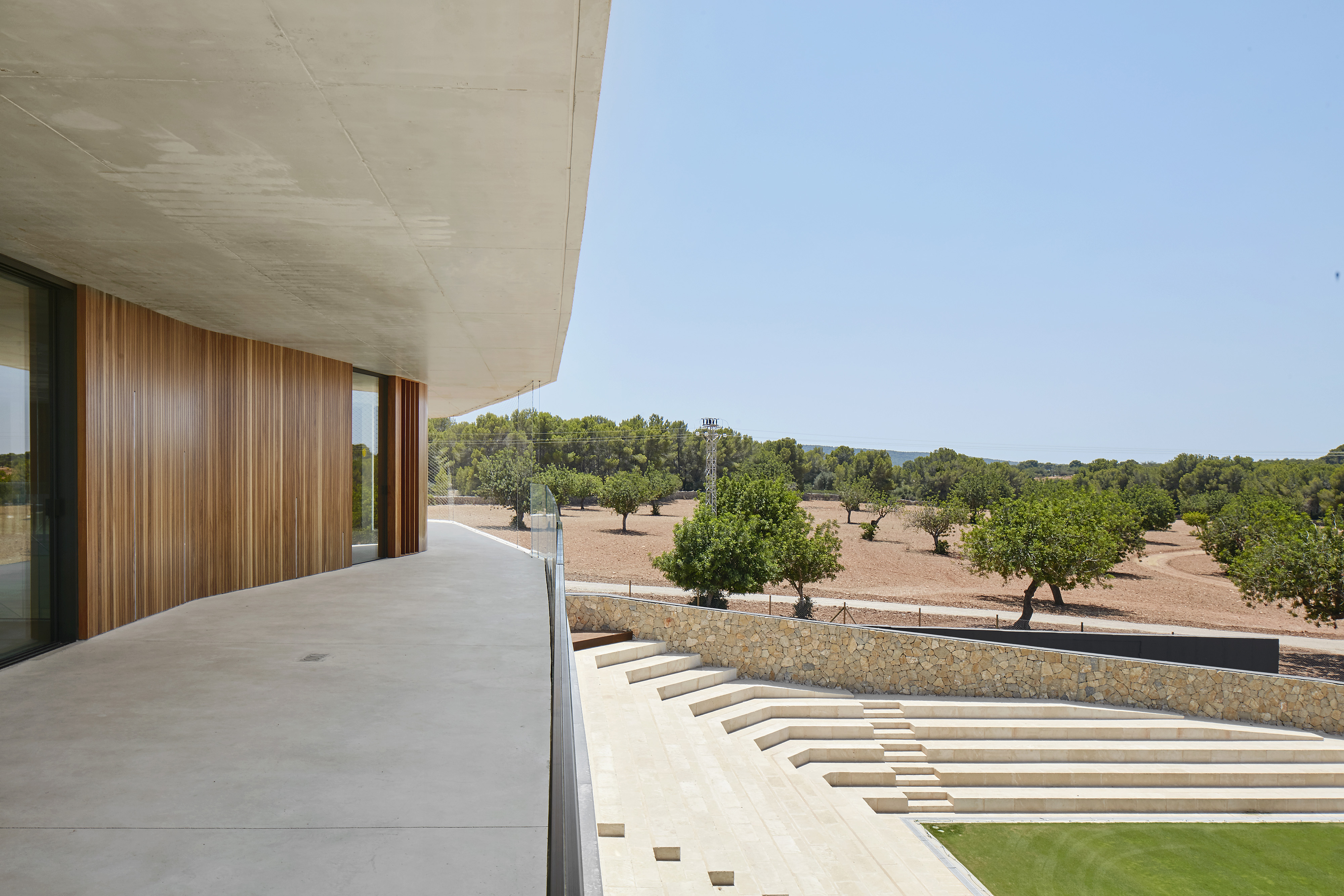
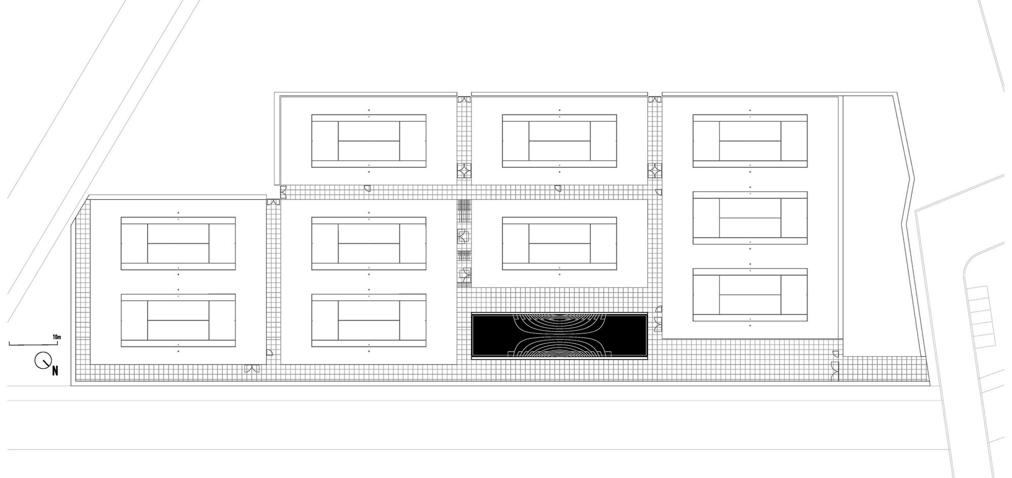
This elegant tennis facility is defined by white concrete and cantilevered slabs in Spain. The complex includes a total of seventeen courts of all surfaces, from grass to clay. The topography of the land called for a terracing strategy in order to place the different courts at different levels following the slope of the hill. As a result, the team set out to design the building as a continuation of that terracing: as seen in section, multiple floating terraces overlook the tennis compound. The Centre Court is the heart of the project. A series of terraces are carved in the hill create a natural stone stadium to seat up to 1500 spectators.


Tennis Club Strasbourg

Designed by Paul Le Quernec architect, Strasbourg, France

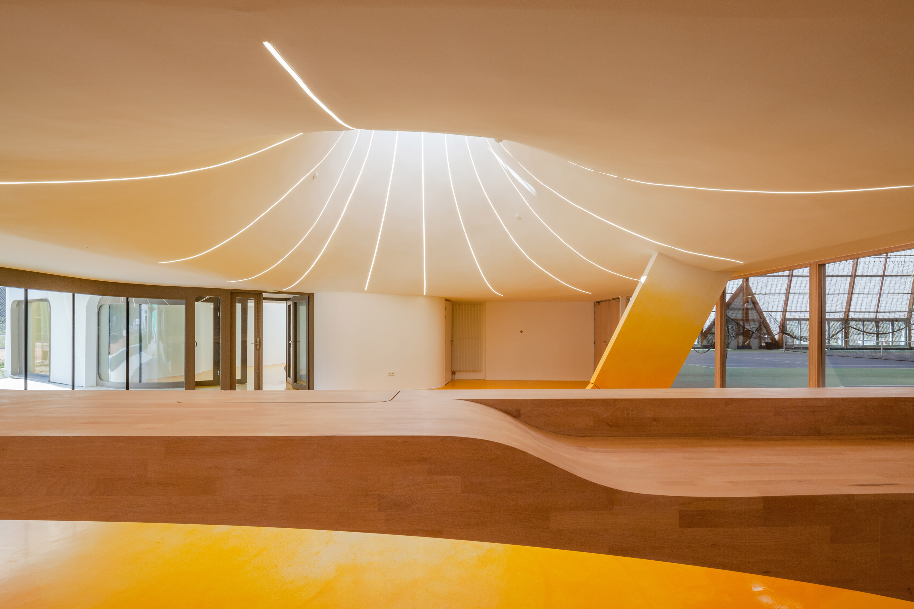
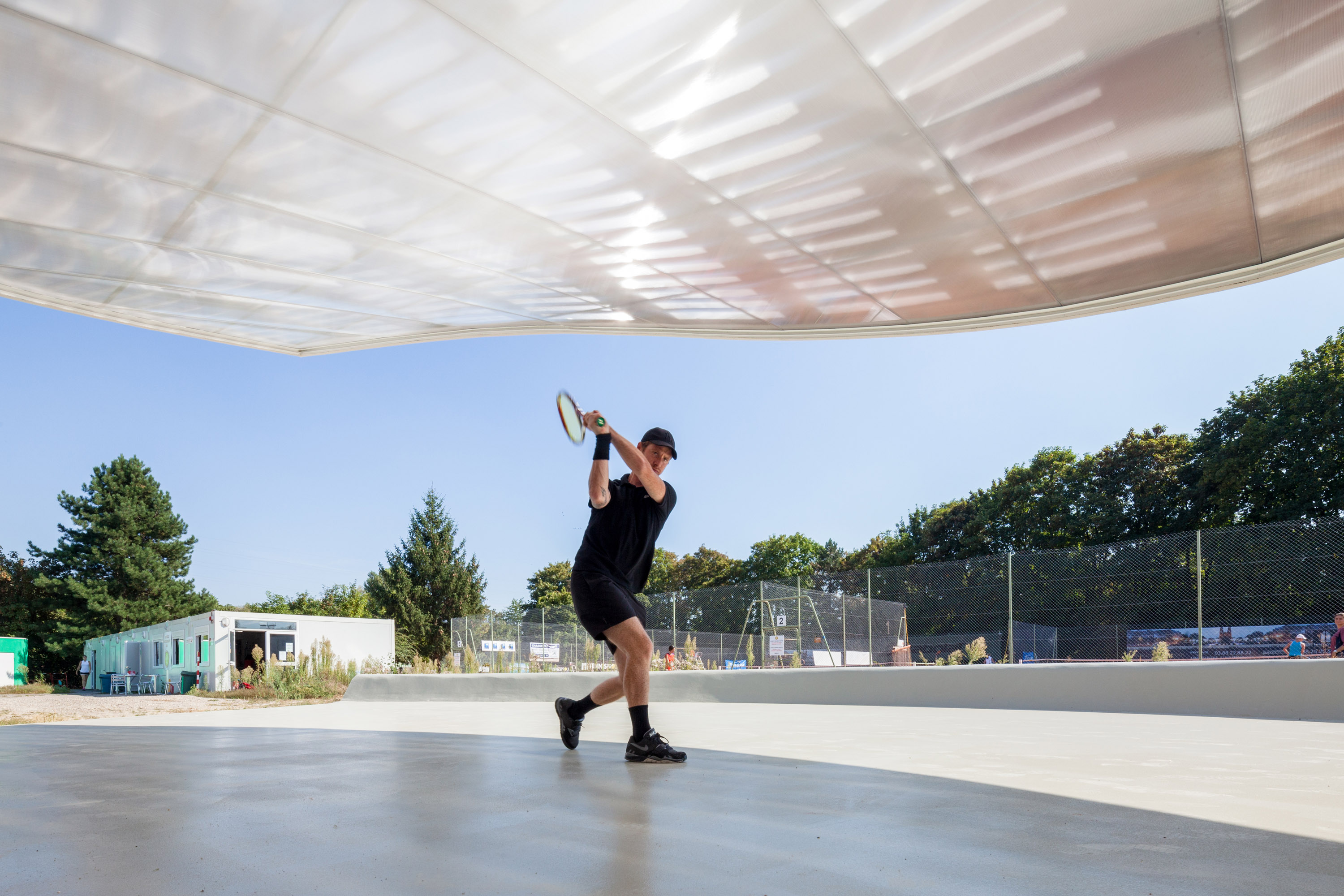
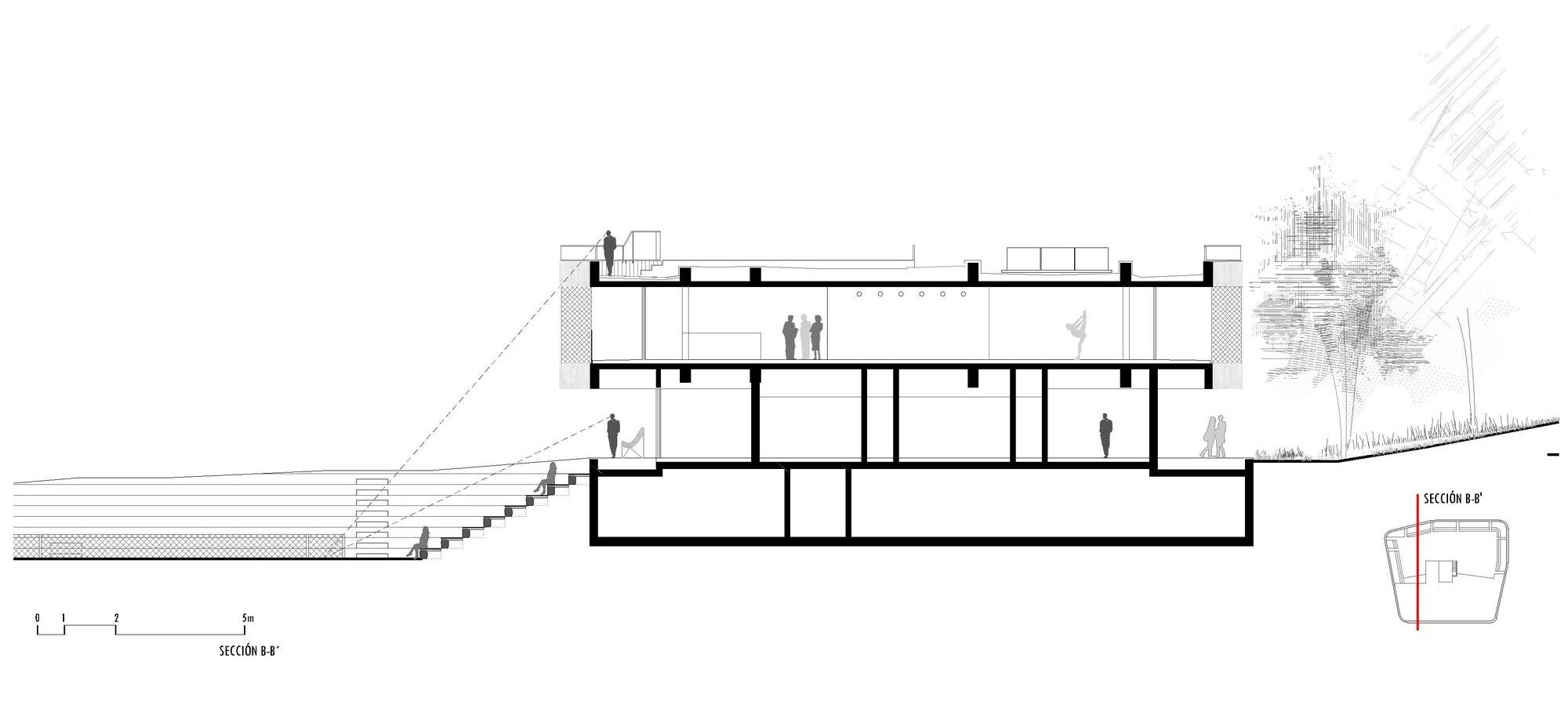
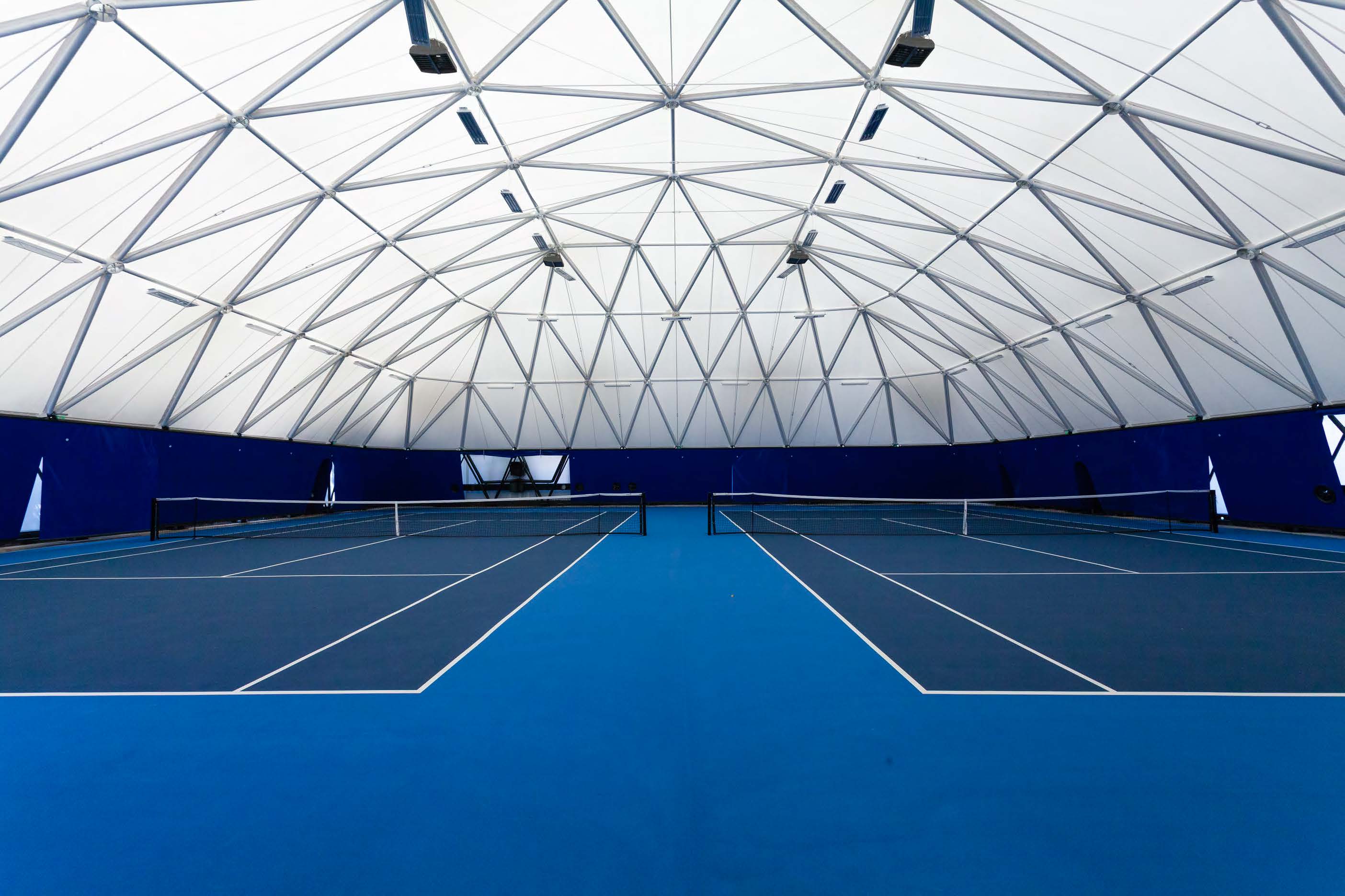
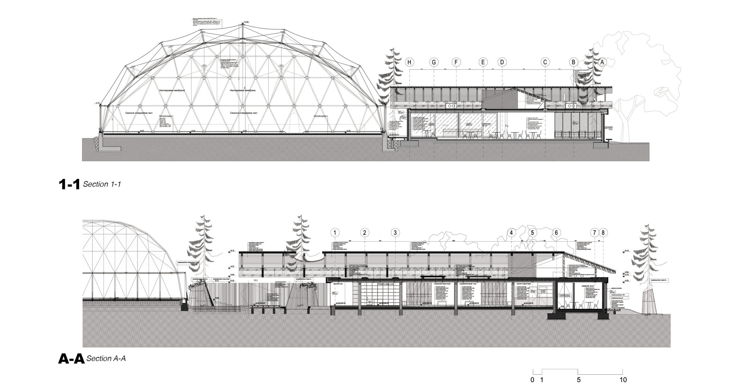
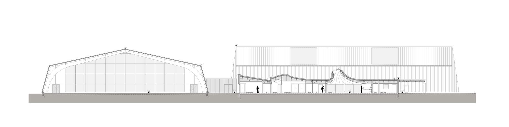
In Strasbourg, the idea was to create a new tennis hall building for three covered tennis courts and and a new club house. The design is directly inspired by people and how they flow in and through the building. Inside, sky domes and a special color treatment on the floor was chosen to increase day light. Areas where natural light falls were treated with a beige resin, while the room borders and corners are treated with a deep orange resin. The soaring roof forms and domes are readily seen in section, and how the building compares in scale to adjacent structures.


Team Rooms, Gatehouse and Tennis Complex Glen Lake

Designed by Mathison Mathison Architects, Maple City, MI, United States

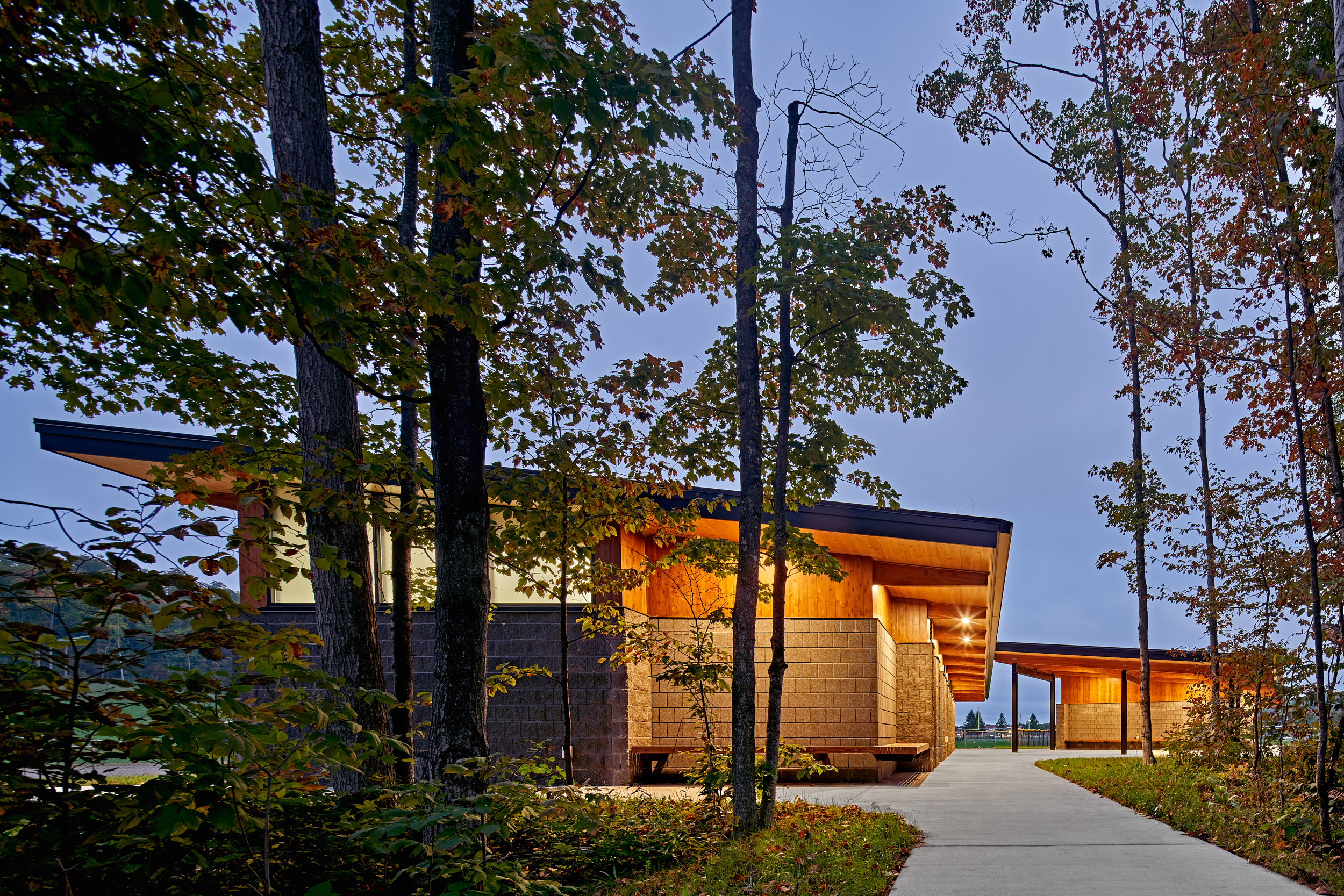
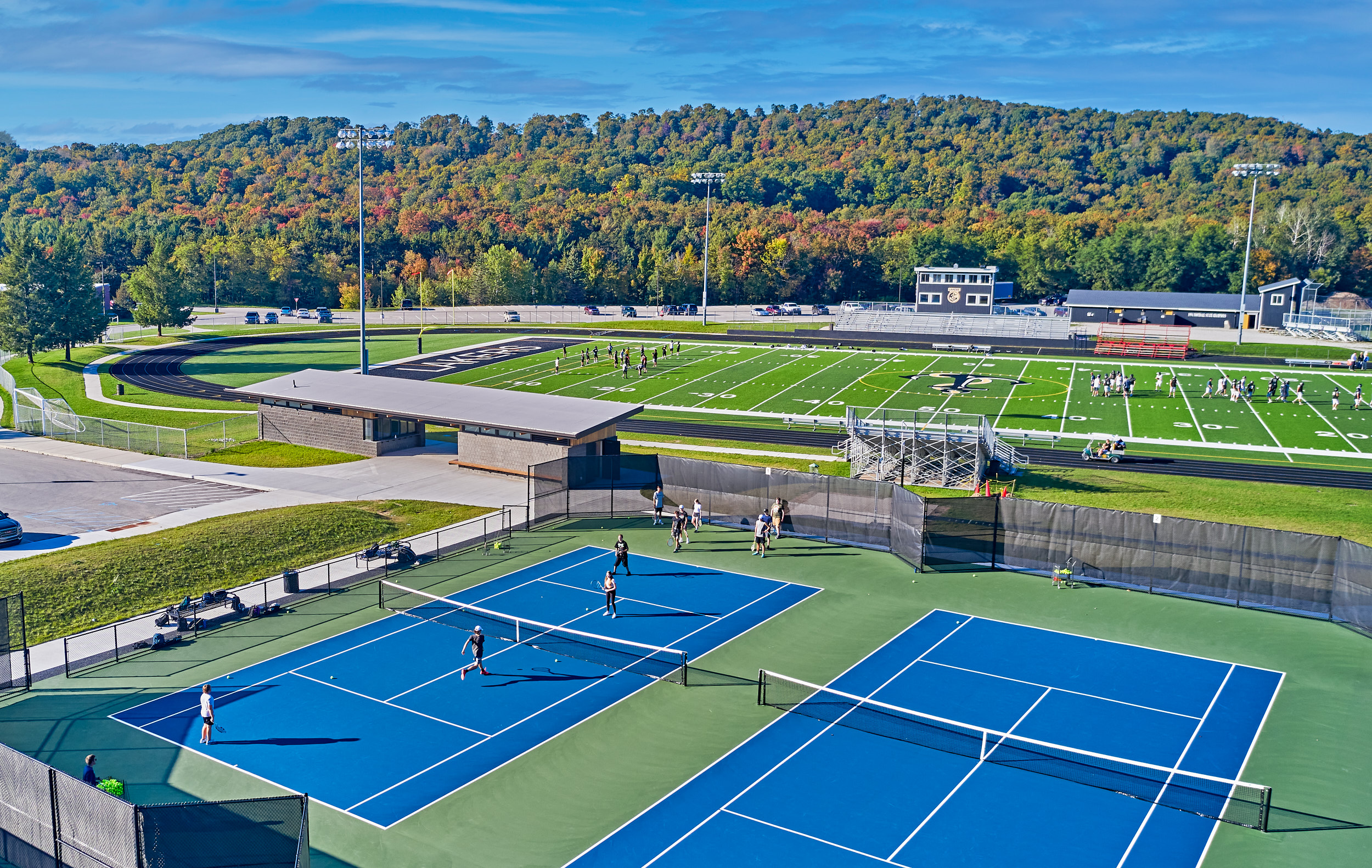
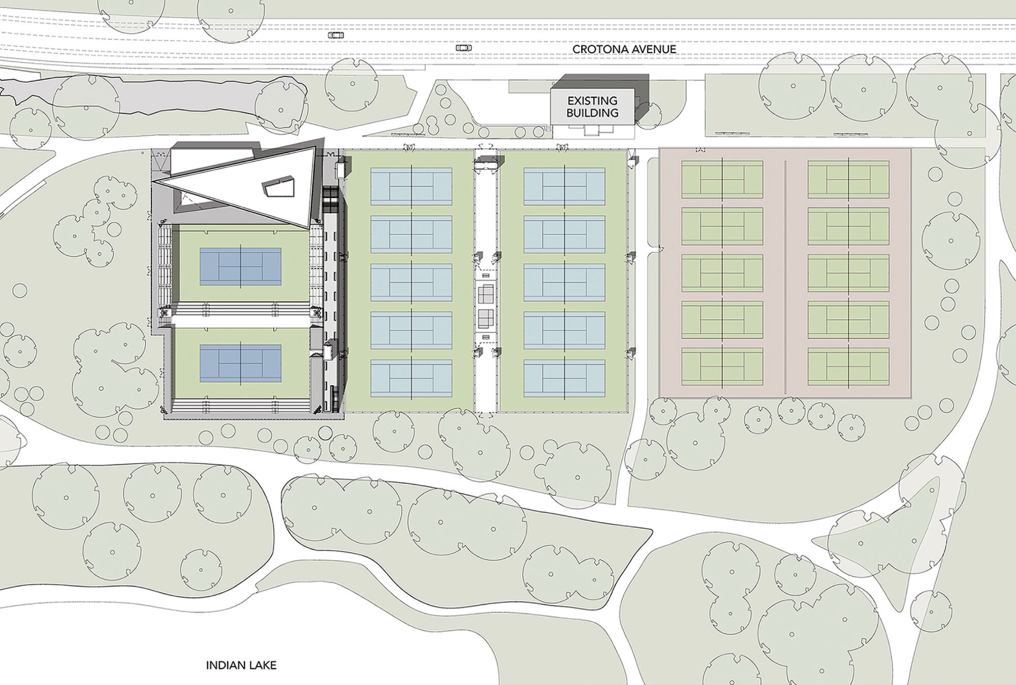
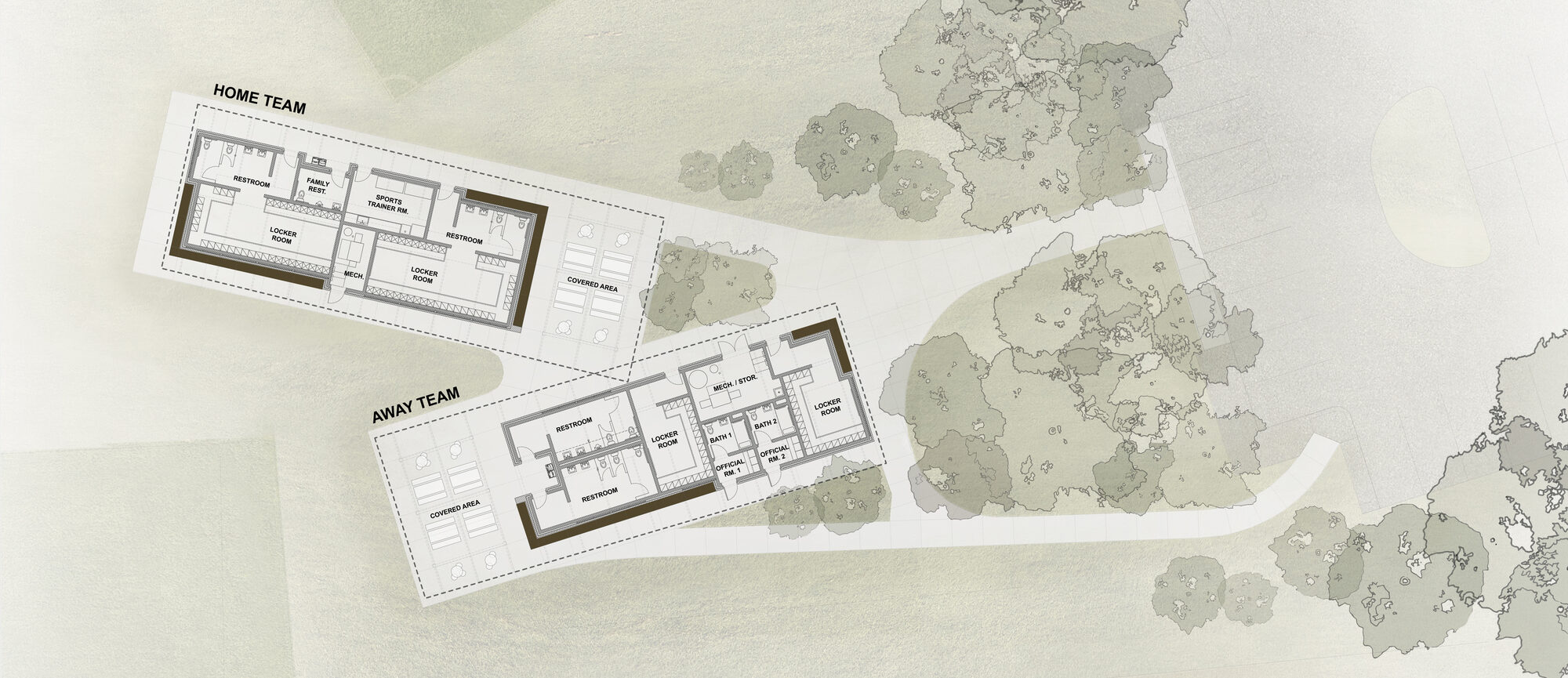
The Glen Lake Community Schools project was made with three components: a new bus garage; new team rooms for home team and visitor teams for soccer and softball; and a new tennis complex with a gateway building. The floor plan drawing for the team rooms showcases how the pavilion structures were organized and designed, emphasizing connection to the outdoors and with a series of welcoming overhangs. By opening to natural light, using natural materials like glulam beams, and the use of insulated roof panels, the team wanted to highlight the uniqueness of the Glen Lake community and its commitment to the natural environment and energy efficiency.


Cary Leeds Center for Tennis & Learning

Designed by GLUCK+, NY, United States

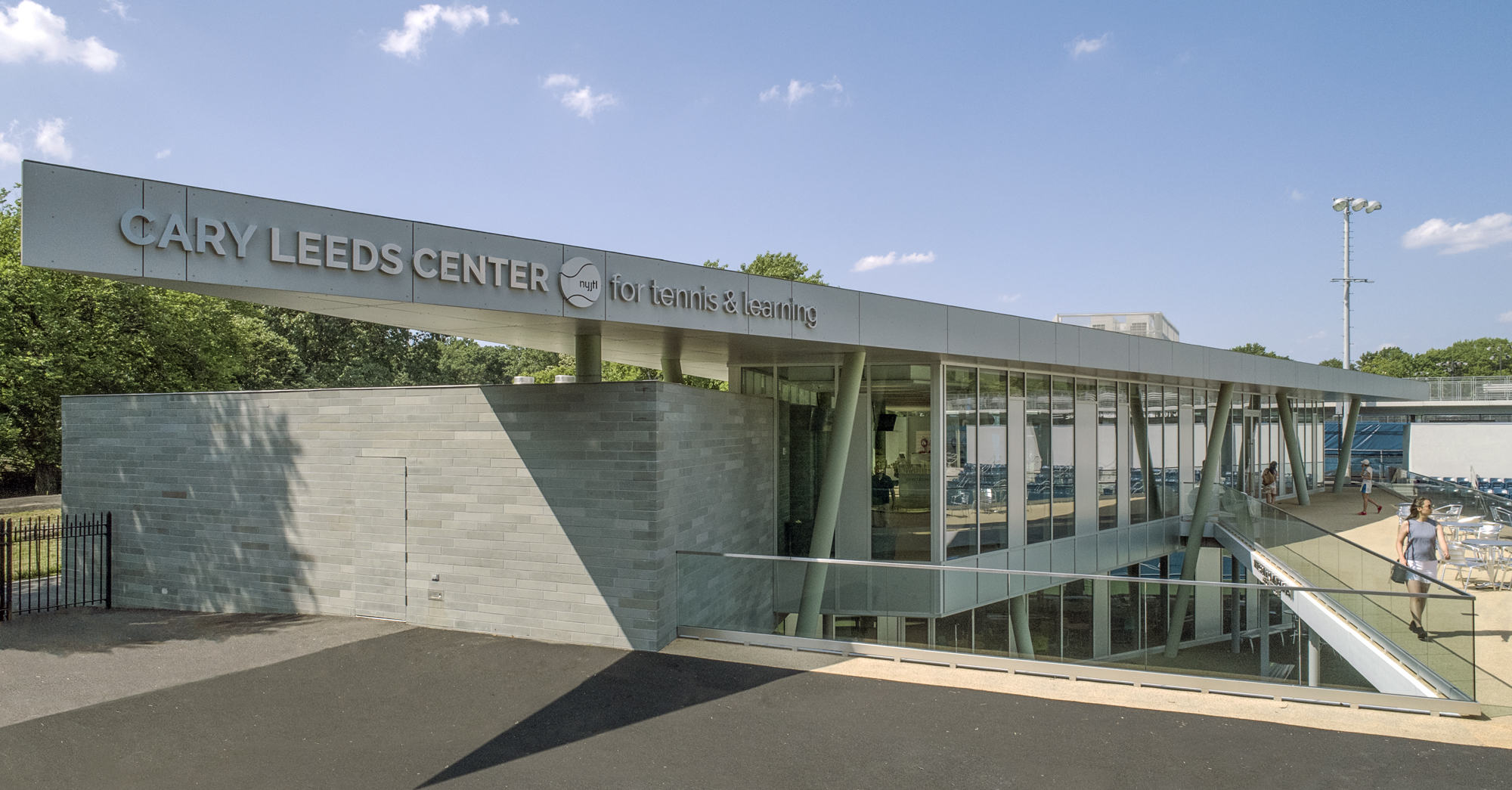
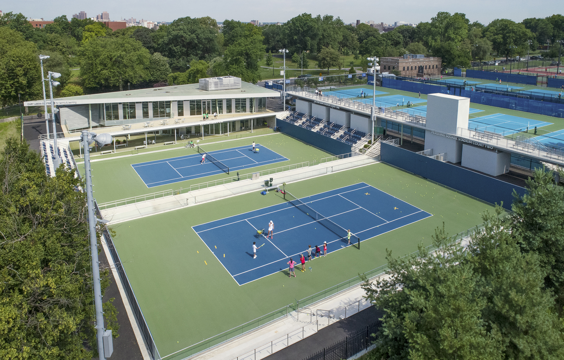
GLUCK+ designed the Cary Leeds Center for Tennis & Learning as a multi-use facility. The complex is where underserved youth in New York City can receive free tennis lessons and academic help. As the flagship site for New York Junior Tennis & Learning, the center was made to host local, national and international tournaments. Sited in the natural parkland of Crotona Park, the project included a clubhouse, public tennis courts, and sunken exhibition courts. The building and stadium courts were partially buried as a strategy to minimize the impact of a large structure in the park and also to take advantage of geothermal heating and cooling.


MG Tennis Courts

Designed by T.T.H.R. Aedes Studio, Sofia, Bulgaria

This intervention of an existing sports facility in Zaimov Park aimed to renew and reorganize spaces dedicated to tennis. MG Tennis Academy is situated in the heart of Sofia, amidst the greenery of the urban park. The complex was made with two open courts and three courts covered with a vinyl membrane. The main issue of the project was to reconnect the park and the courts. Preserving the existing layout of the courts and the building, two more entrances were added and all three are offset in-between the courts. Now, visitors of the complex can enjoy the game as well as the park without distractions.


Diamond Domes Tennis & Event Hall

Designed by Rüssli Architects AG, Nidwalden, NW, Switzerland

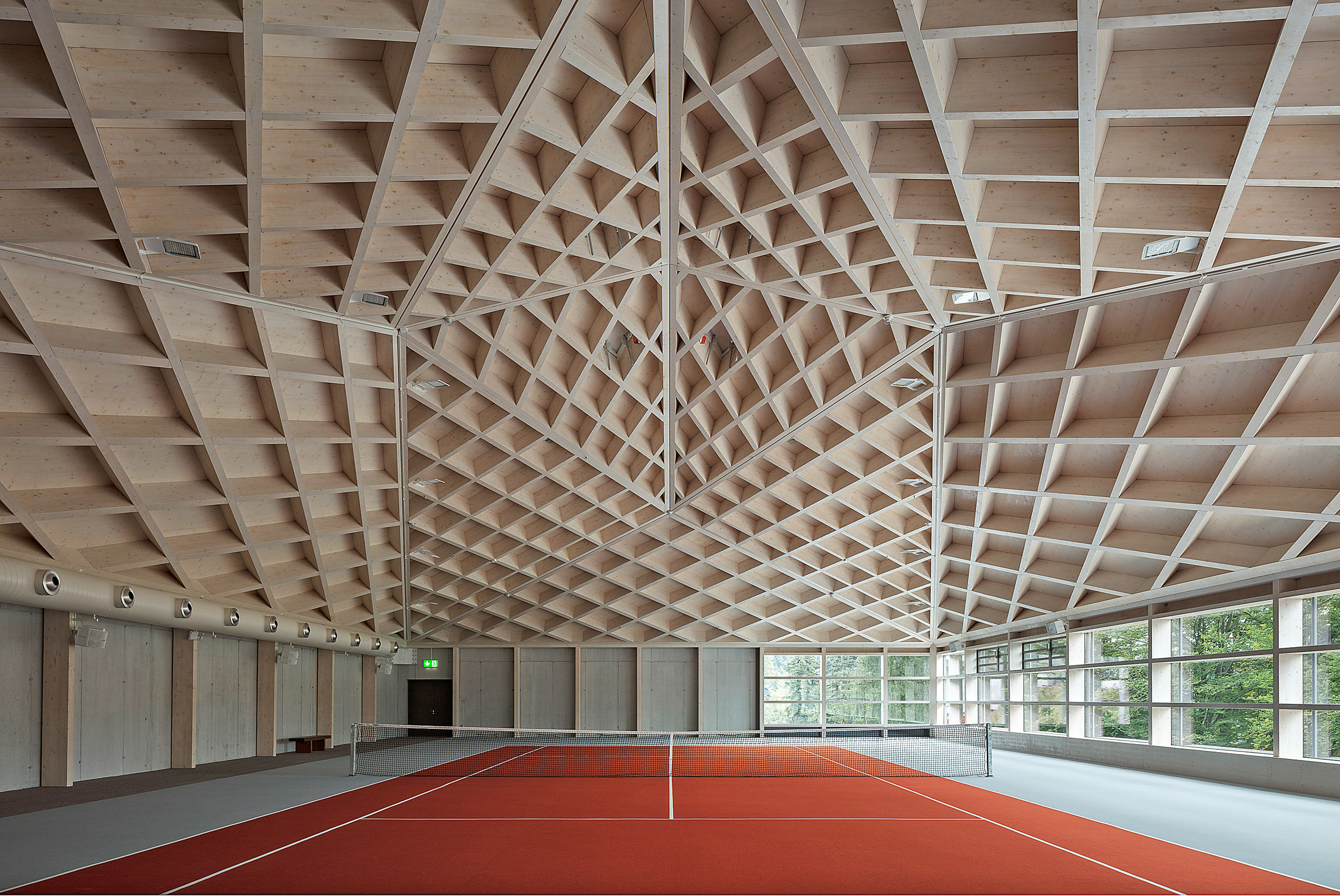
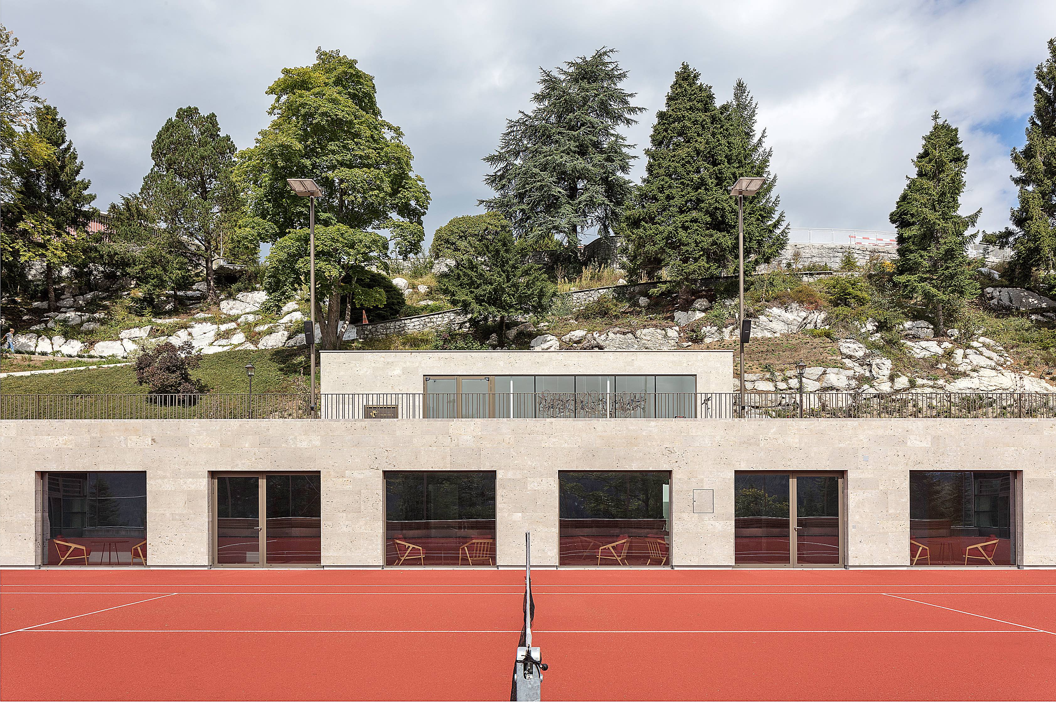
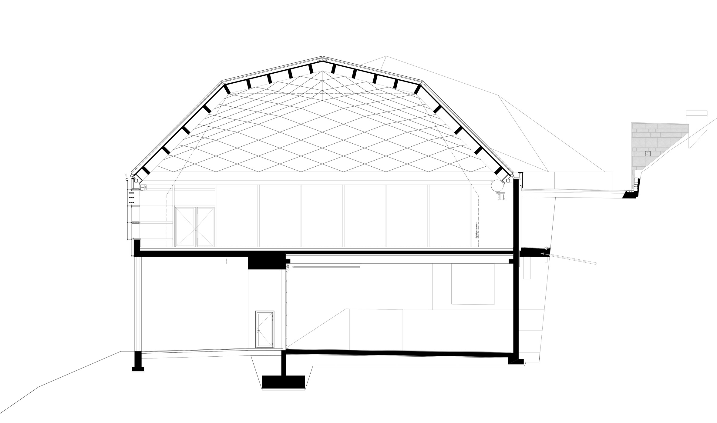
This temple to tennis was built in Switzerland. As seen in the drawings, the building sections were symmetrically arranged around a central outdoor tennis court. In turn, two identical tennis halls with crystal-shaped roofs border the transverse sides of the court. The original clubhouse was relocated underground and is accessed from street via an entrance pavilion. A core concept of the project was to emphasizes views into the valley. The façades are finished in natural stone in harmony with the resort on site, while the “fifth facade” features beautiful, polygonal roof panels that were clad in aluminum.


Portsea Sleepout

Designed by Mitsuori Architects, Portsea, Australia

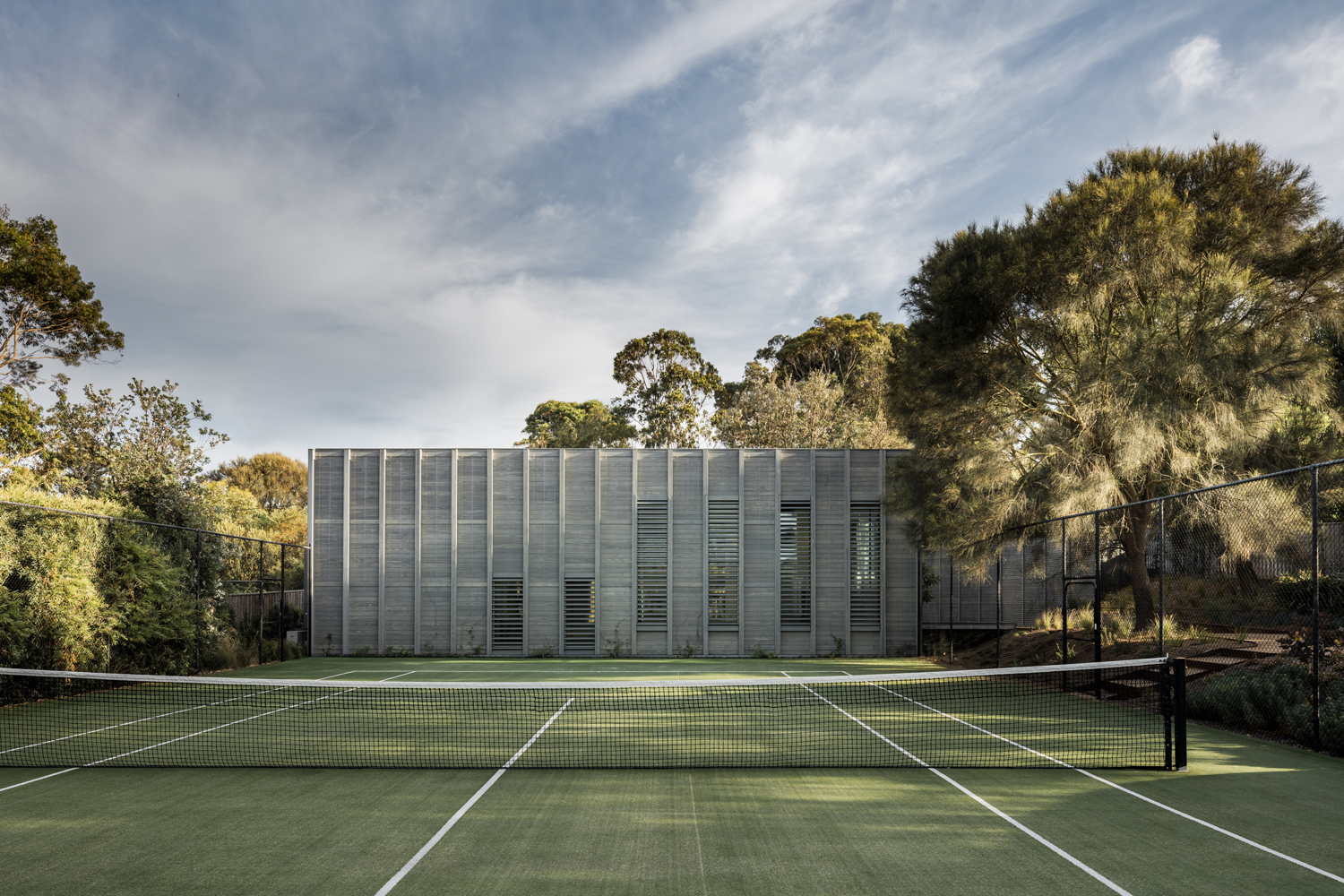
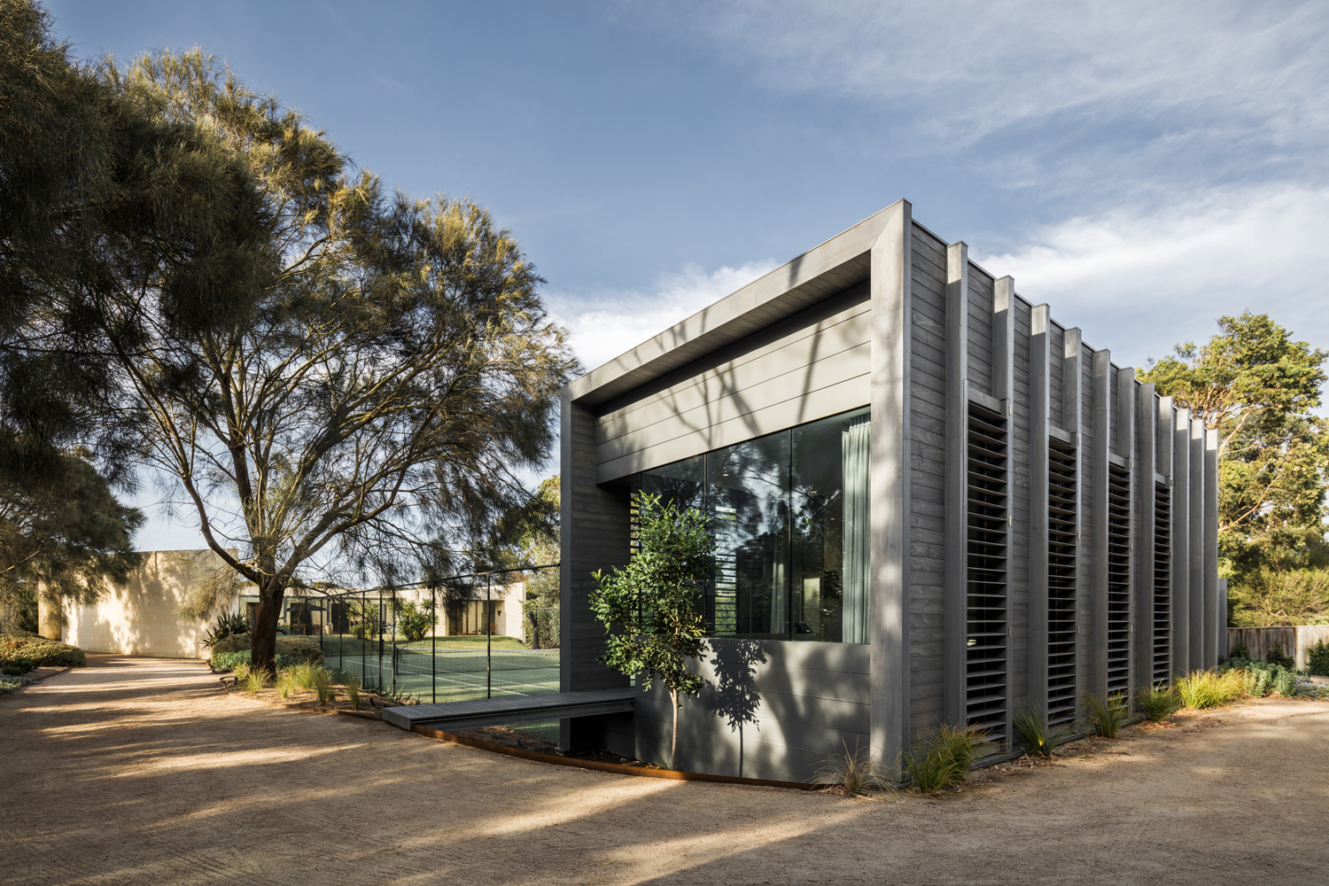
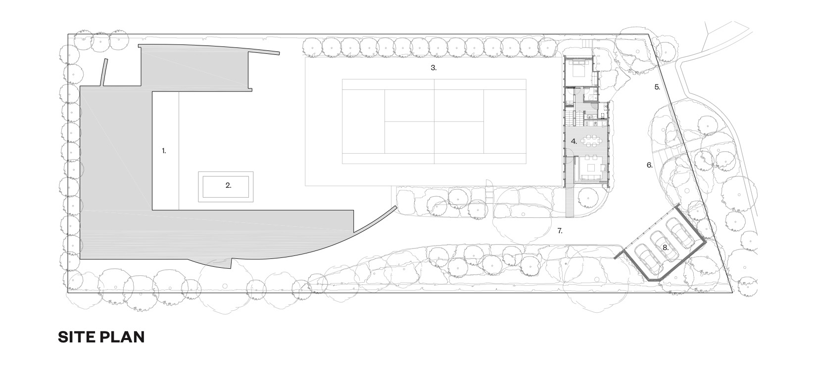
Adjacent to the court, this guest house is located within the grounds of an existing family beach house in a secluded coastal setting. The client required a guest house that would embrace the native landscape while establishing its own identity distinct from the existing house. The team’s design concept was to create a building as a landscape element that forms a backdrop to the existing tennis court and is nestled within the surrounding vegetation. A rectilinear timber pavilion was built with weathered grey cladding and climbers growing up over the walls to give the appearance of a simple timber fence within the landscape.


The Couch

Designed by MVRDV, IJburg, Netherlands

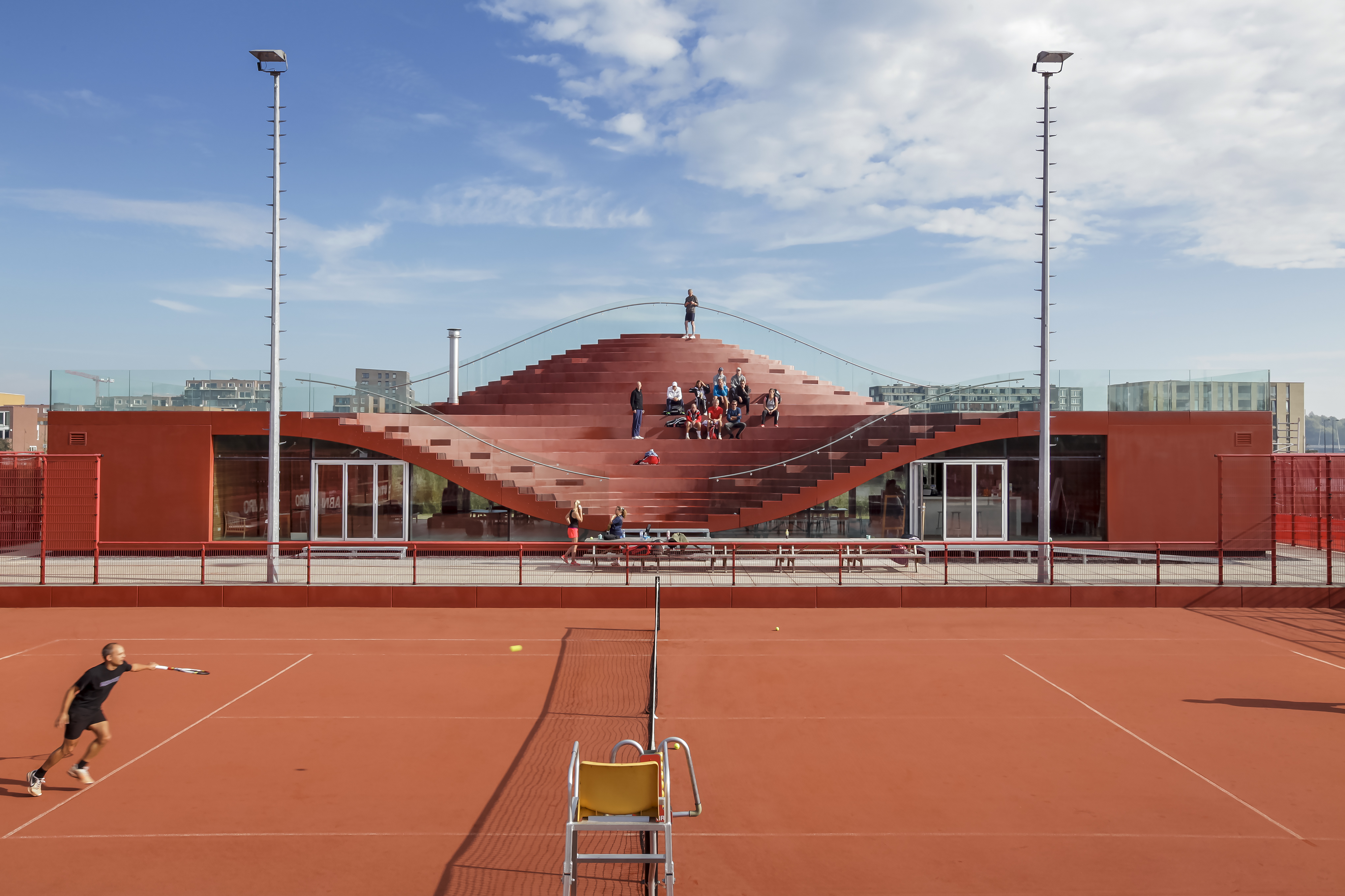
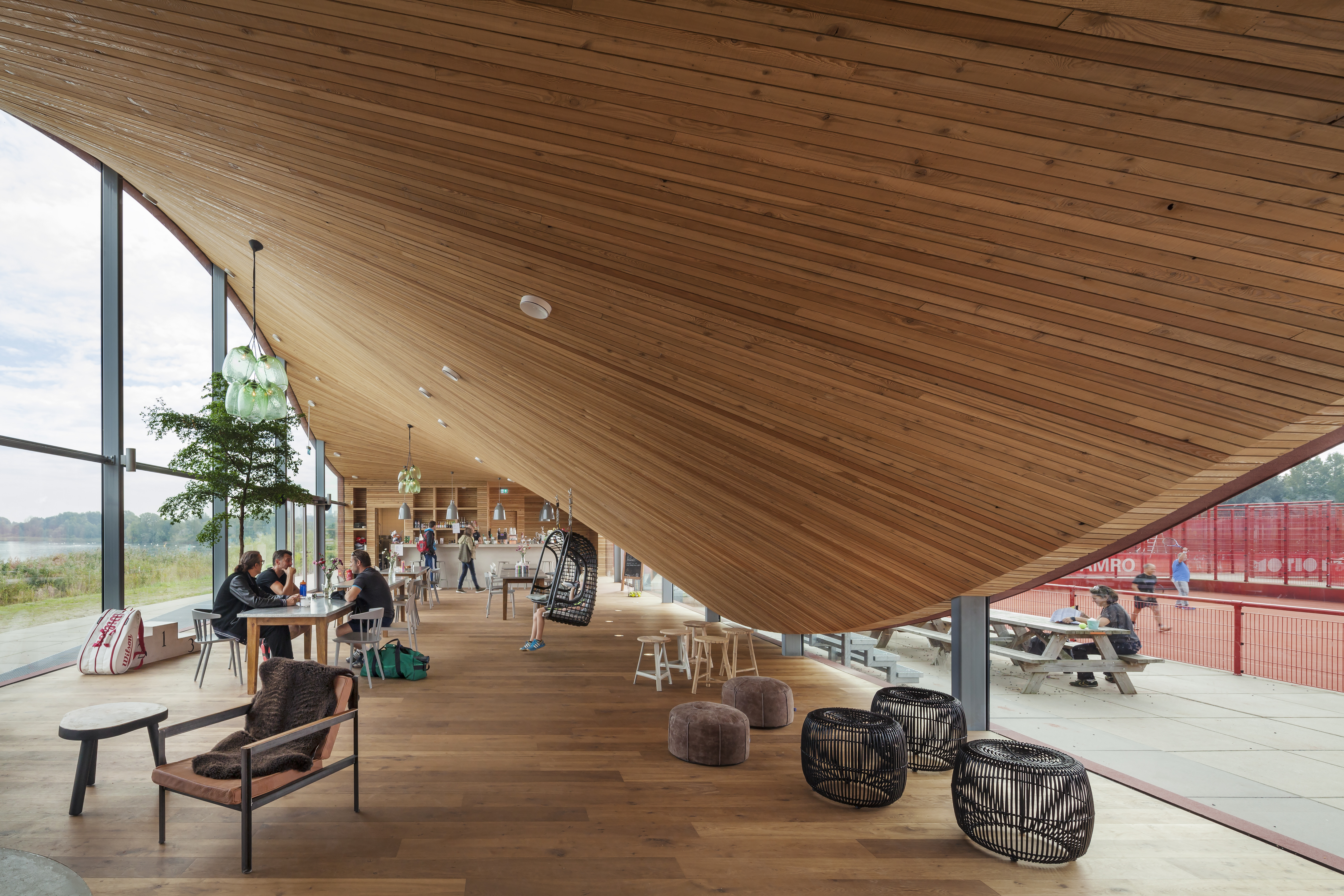
MVRDV’s famous Couch project was built in IJburg, a new district to the east of Amsterdam. The newly formed IJburg Tennis Club included ten clay courts and a tennis school. The clubhouse was made to be the heart of the center, providing both a viewing platform and a club overlooking the water. The challenge was to create a building that worked as a central gathering area, a living room for IJburg. The result is a clubhouse with a roof dipping down towards the south and raised towards the north, creating an informal tribune for the club. Inside, the construction is clad with FSC-certified wood, with the outside fully sealed with an EPDM polymer hotspray in the same color and texture as the clay tennis courts.

The One Rendering Challenge is now part of the Architizer Vision Awards, honoring the best architectural photography, film, visualizations, drawings, models and the talented creators behind them. Winners are published in print! Start your entry >

Reference