Architects' Guide To Midjourney: An Adventure in AI-Generated Imagery for Concept Development
CategoriesArchitecture

Architects’ Guide To Midjourney: An Adventure in AI-Generated Imagery for Concept Development

Architizer’s Vision Awards is celebrating the innovative minds propelling architectural visualization forward with a special AI-Generated Visualization Category. Learn more and start your submission before the Early Entry Deadline on May 5th.  

You’ve probably heard by now: the AI revolution is well and truly upon us. And while it doesn’t quite resemble Spielberg and Haley Joel Osment’s 2001 vision, it’s clear that AI is moving in, and its moving in faster than your first love into that studio apartment you used to have.

While some industries rush to bolster their roles and justify their positions as AI proves that, in many instances, it can comfortably complete tasks to the same and often higher standards than its human counterparts, architects and the design industry as a whole are pondering with enthusiasm, how we can most effectively adopt this groundbreaking technology to explore, enhance, and streamline our practice.

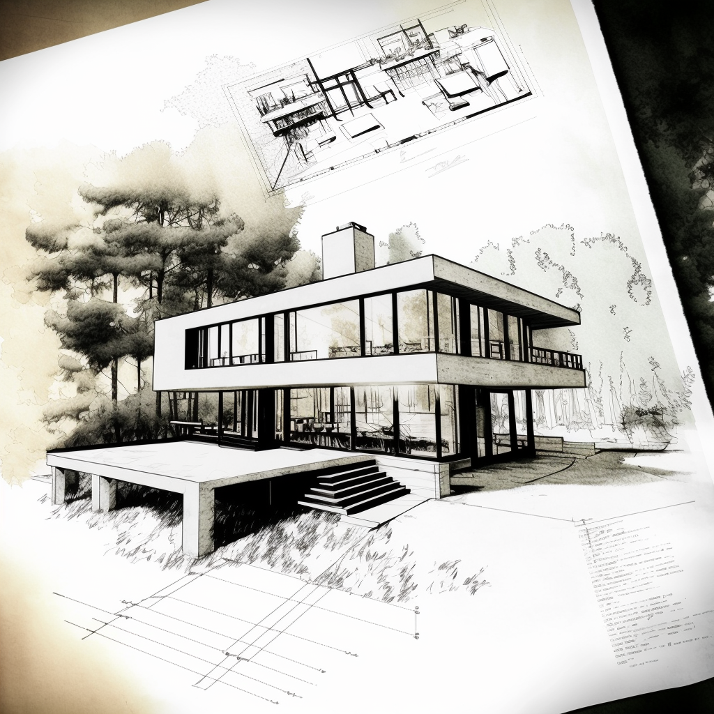
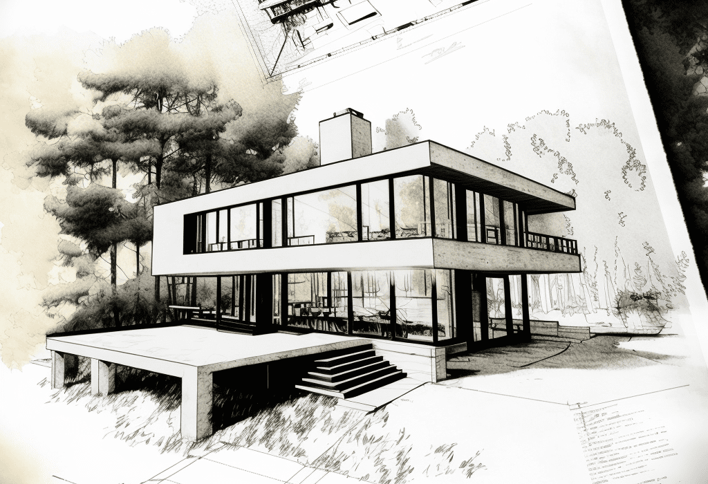
Prompt: /imagine Architecture, concept sketch and plan, residential, modern, contemporary, handdrawn, in the style of Alvar Aalto

Change is daunting, and it’s safe to say we’re on the cusp of one of the most significant workflow conversions many of us have ever experienced, perhaps since the transition from drafting to CAD. So, in case you feel like you’re out of your depth or just haven’t yet had the time to explore the wonders of Midjourney, we thought it was important to show you why and how AI can be used to support your creative vision.

Let us start at the beginning. Midjourney is the brainchild of David Holz, the visionary mind behind Leap Motion. The company is a pioneering research lab that specializes in text-to-image AI technology. It offers a refreshingly simple and user-friendly interface through a platform named Discord. Users can seamlessly communicate with the AI “bot” using elementary commands without any coding experience whatsoever (phew!). The mission is to “expand the imaginative powers of the human species.” To say this tool has been popular is an understatement: The new company is making an indelible mark in the AI realm and proudly announced its profitability within a month of its open beta release in 2022.

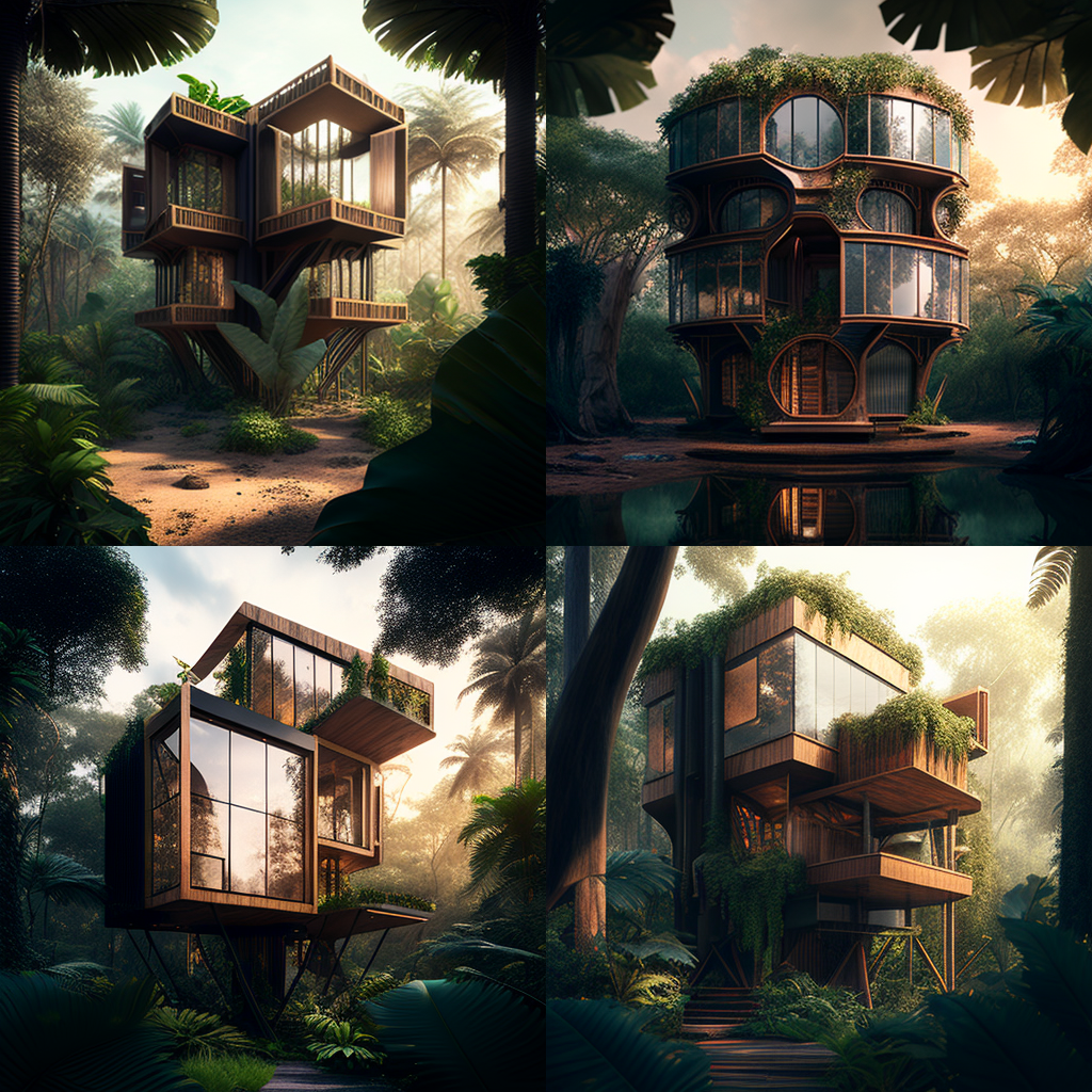
Prompt: /Imagine Contemporary architecture, treehouse hotel, luxury, tropical jungle, hyperrealism, hyperrealistic, photorealistic, daylight, 8K Ultra HD

Now, where does architecture come into all this? Well, as we all know, as architects and designers, we regularly use imagery to express our vision, harnessing photographs, sketches and all sorts of visual aids to interpret and represent our ambitions. Yet, it can be tricky when the thing in your head doesn’t exist yet; how can you show what you mean using vague and abstract similarities, especially if your vision is unique? It’s the skill that has separated the good designers from the great designers, and Midjourney is here to make you even better.

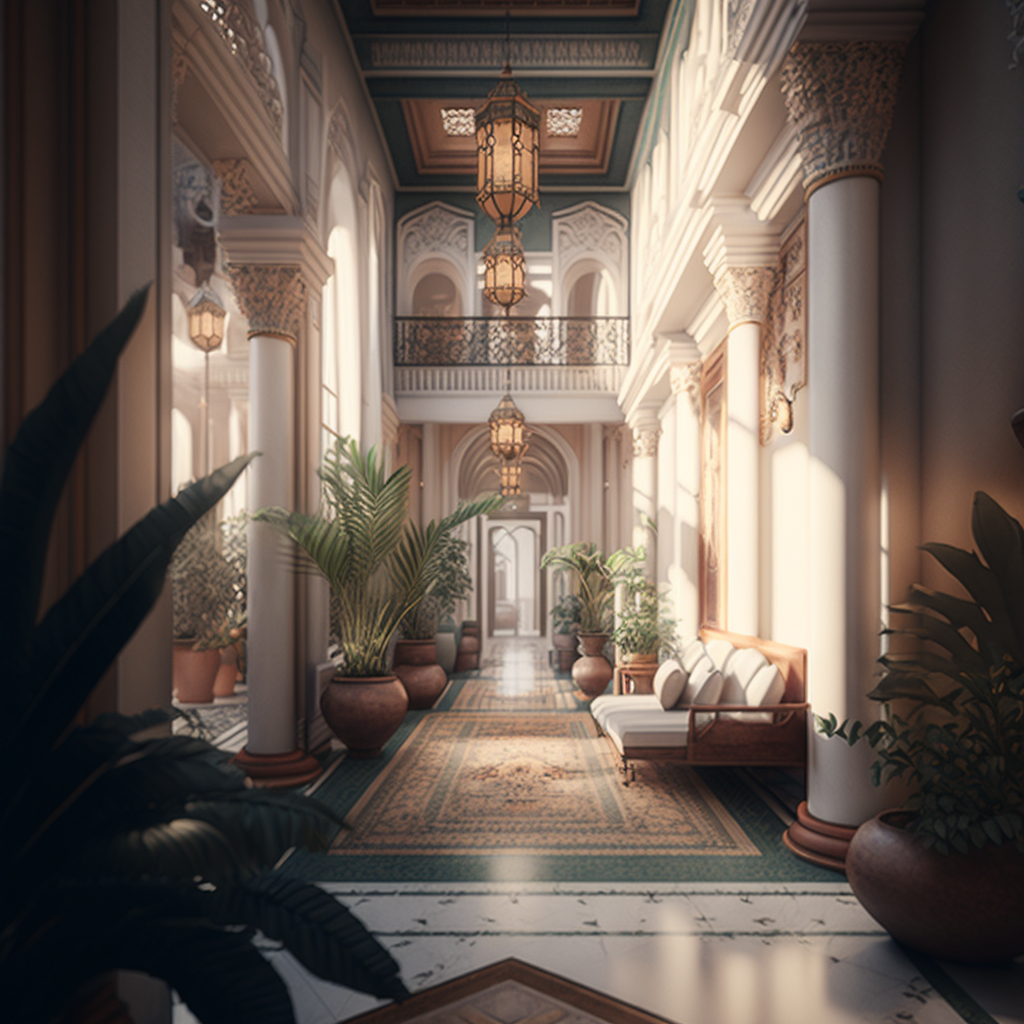
Prompt: /imagine Hotel lobby, Moroccan, luxury, serene, wellness, airy, bright, hyperrealism, hyperrealistic, photorealistic, cinematic lighting, 8K Ultra HD

Midjourney offers a groundbreaking solution to some of these challenges by incorporating AI-generated images into our design process, we can dictate our thoughts using descriptive language to generate images that can loosely interpret our ideas. I say loosely because, understandably and thankfully, in my opinion — AI can’t read your mind. Your images are only as good as your descriptions, and even then, often, the results are far from what you imagined. However, we’re still in the early stages and with time, practice and further technological development, these things will surely improve rapidly.

So down to the fun part, how do we actually use it? Honestly, it’s pretty simple once you’ve gone over it a couple of times. Midjourney has been designed to be user-friendly, and it takes only a few steps to create your first image.

To begin your adventure with Midjourney, simply follow these steps:

1. Install Discord and create a free account.

You can use a desktop or a mobile device. I’ve found the mobile interface a little more comprehensive for novices, but both work equally as well.


2. Visit Midjourney’s website and click on the “Join the Beta” to be given access to their Discord channel.


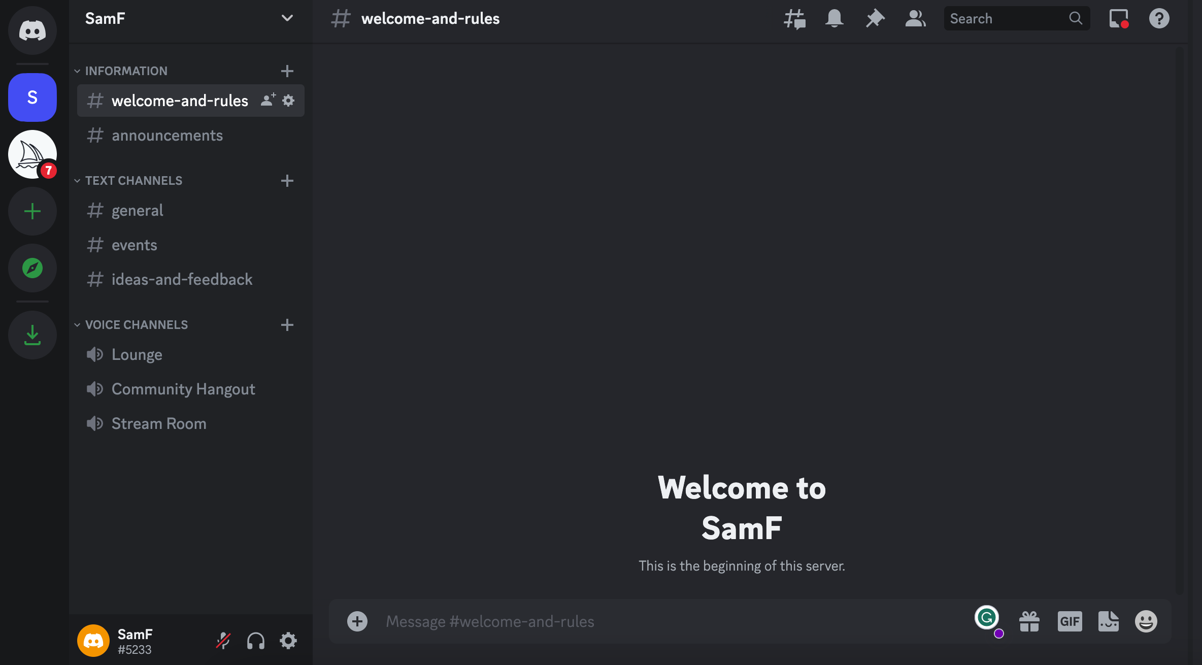
Once you’re all set up, head back to Discord and from the list on the left-hand side, locate the Midjourney Channel (a white icon with a sailboat) and select a Room in the Newcomer Rooms section within the channel.

These channels are available to use without any sort of subscription while your first getting started. Your free trial gives you about 25 image creations to start out. Subscriptions start at $10 a month, depending on your requirements.

Be aware that these rooms are public, so everyone else in the room can see your creations.


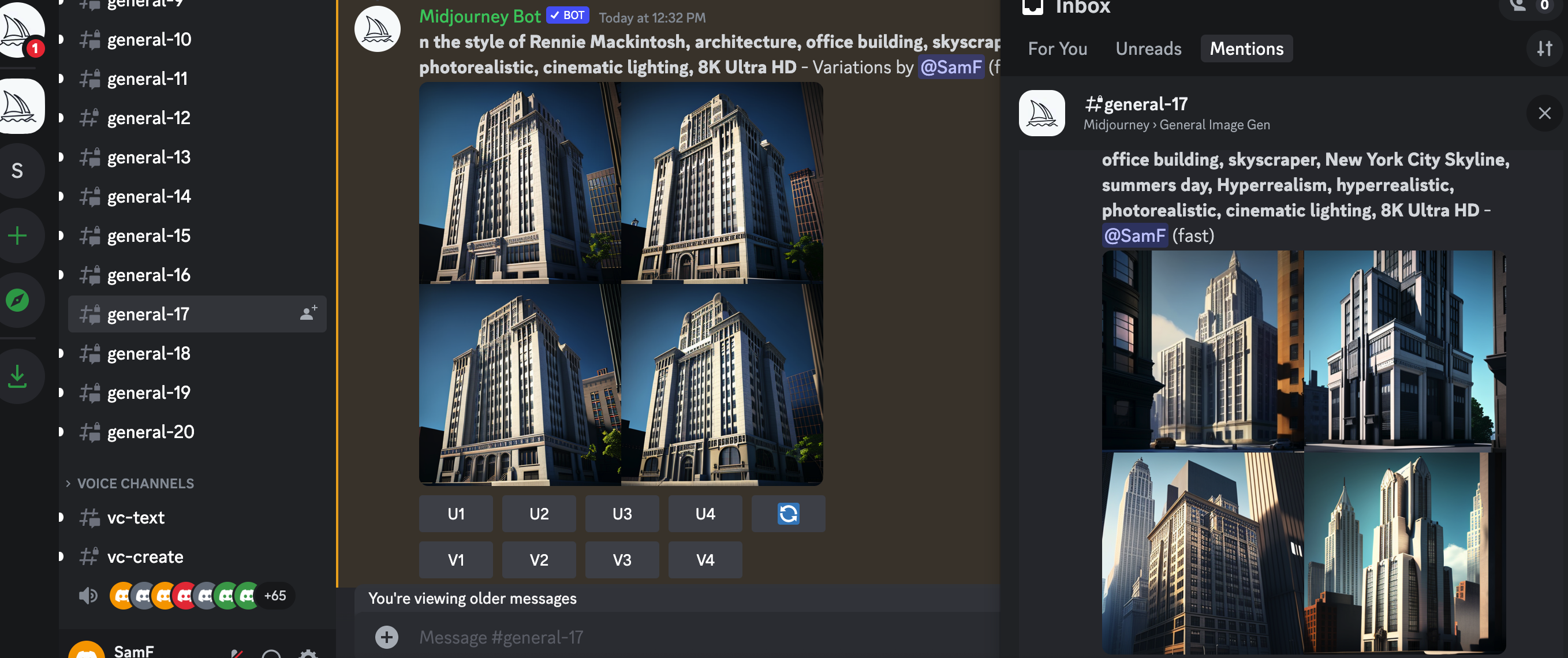
3. Activate the AI bot

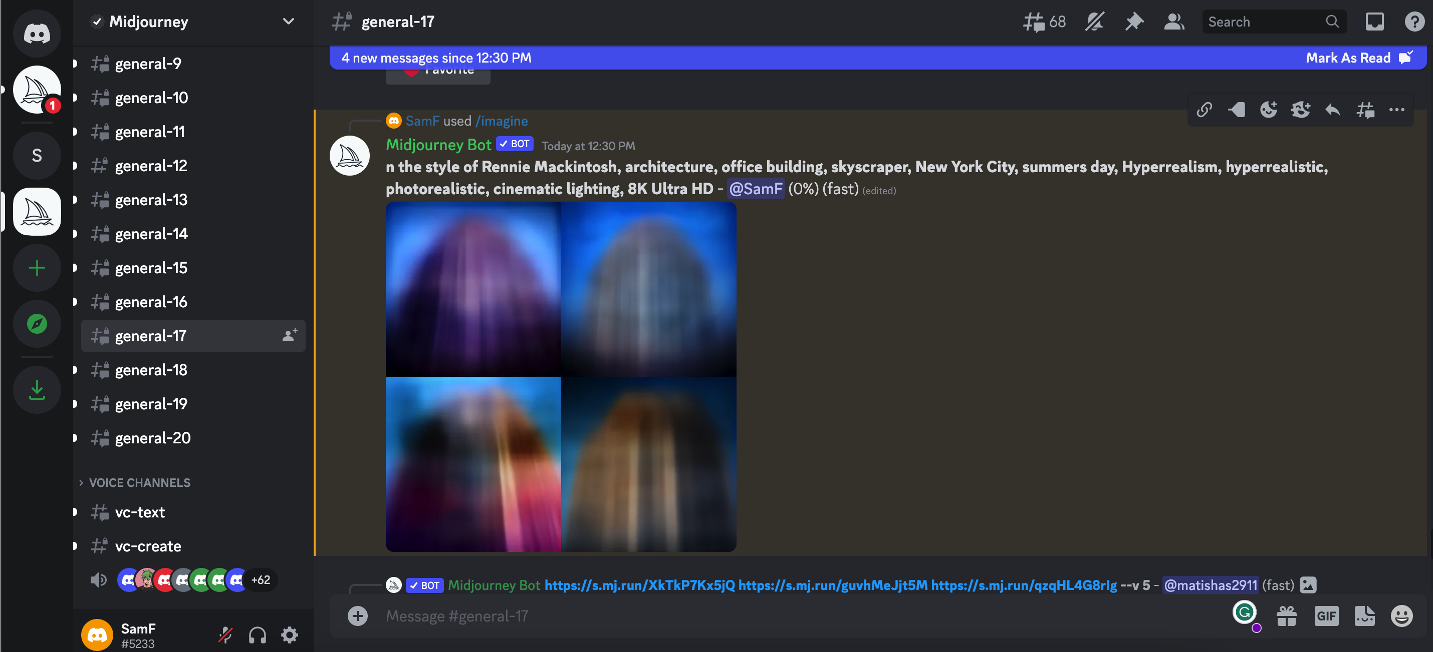
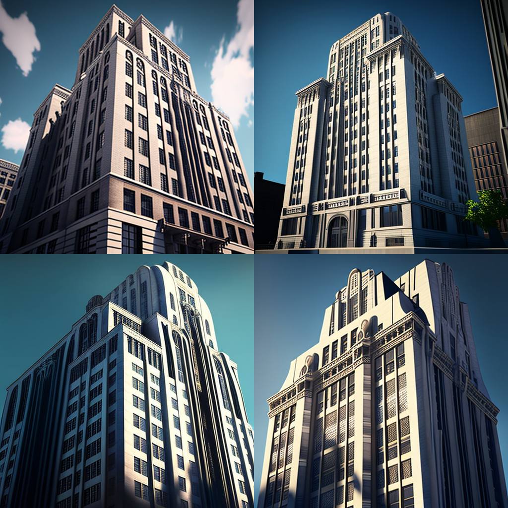
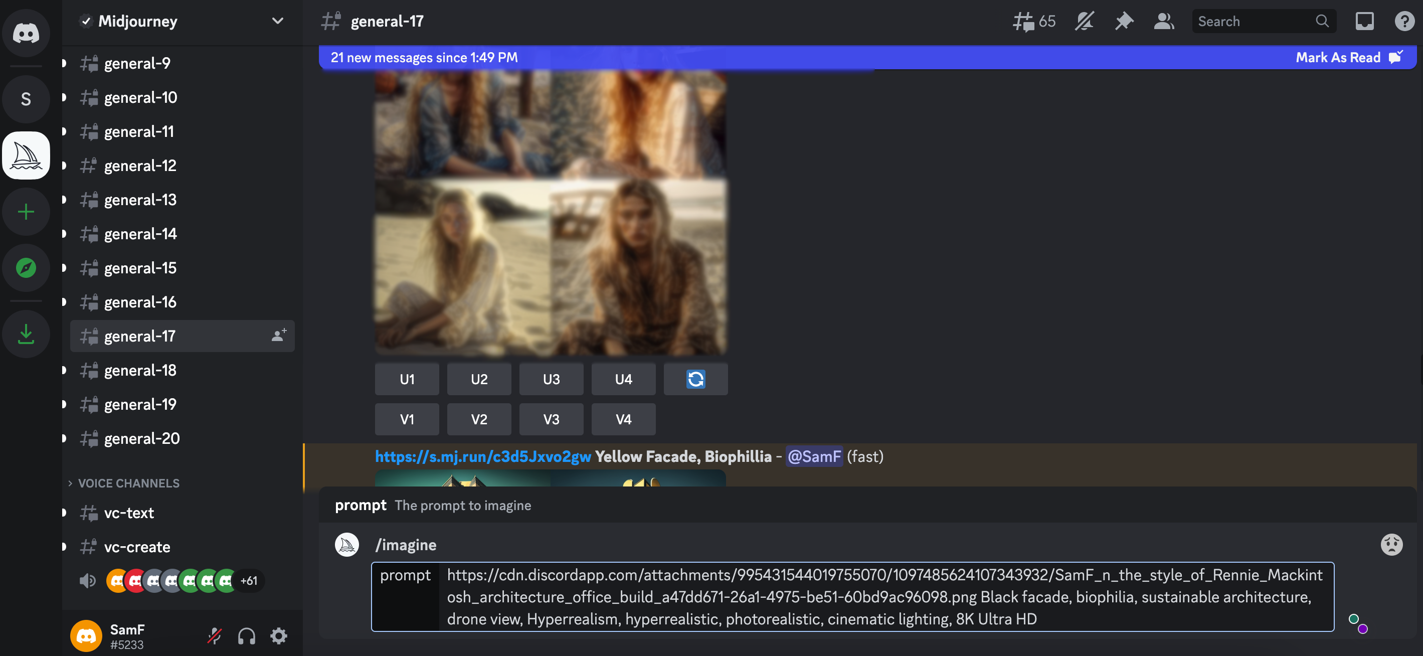
Prompt: /imagine In the style of Rennie Mackintosh, architecture, office building, skyscraper, New York City, summers day, Hyperrealism, hyperrealistic, photorealistic, cinematic lighting, 8K Ultra HD

Once you’re all set up and settled in, you can get started by typing “/imagine” into the messaging bar at the bottom of the conversation window, followed by a spacebar. This starts your “prompt” and you can let your imagination go wild from here. Enter any descriptive words that come to mind, and let the magic unfold as the program renders an image based on your input.


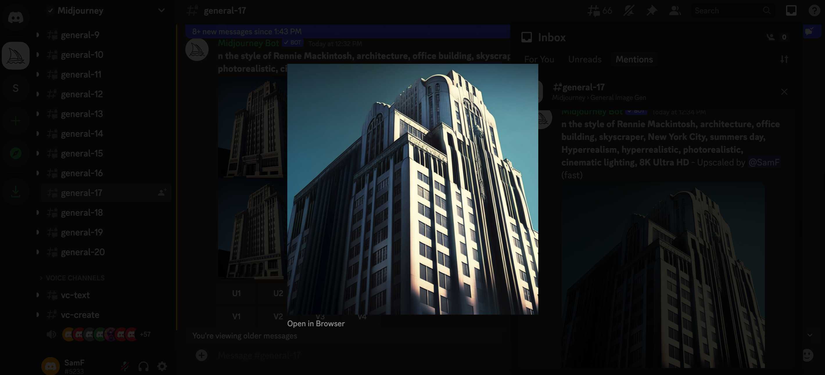
4. Select your preferred image
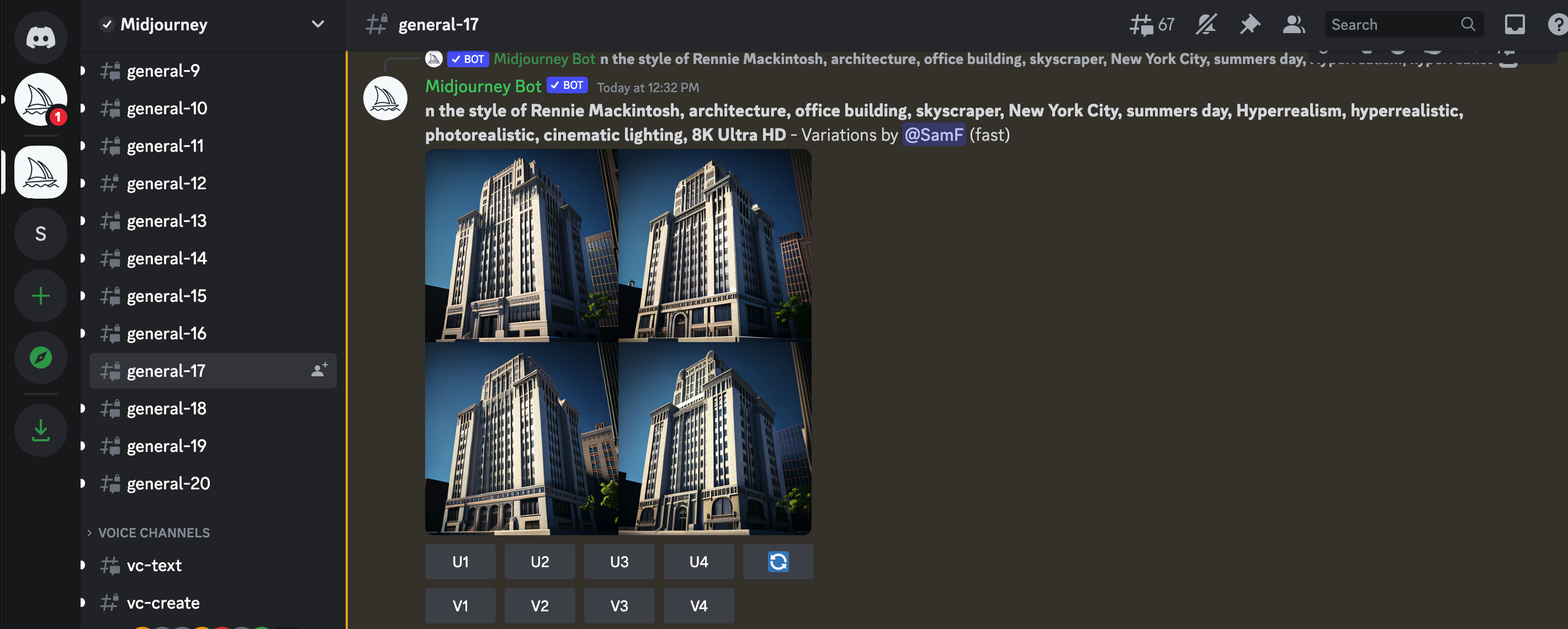
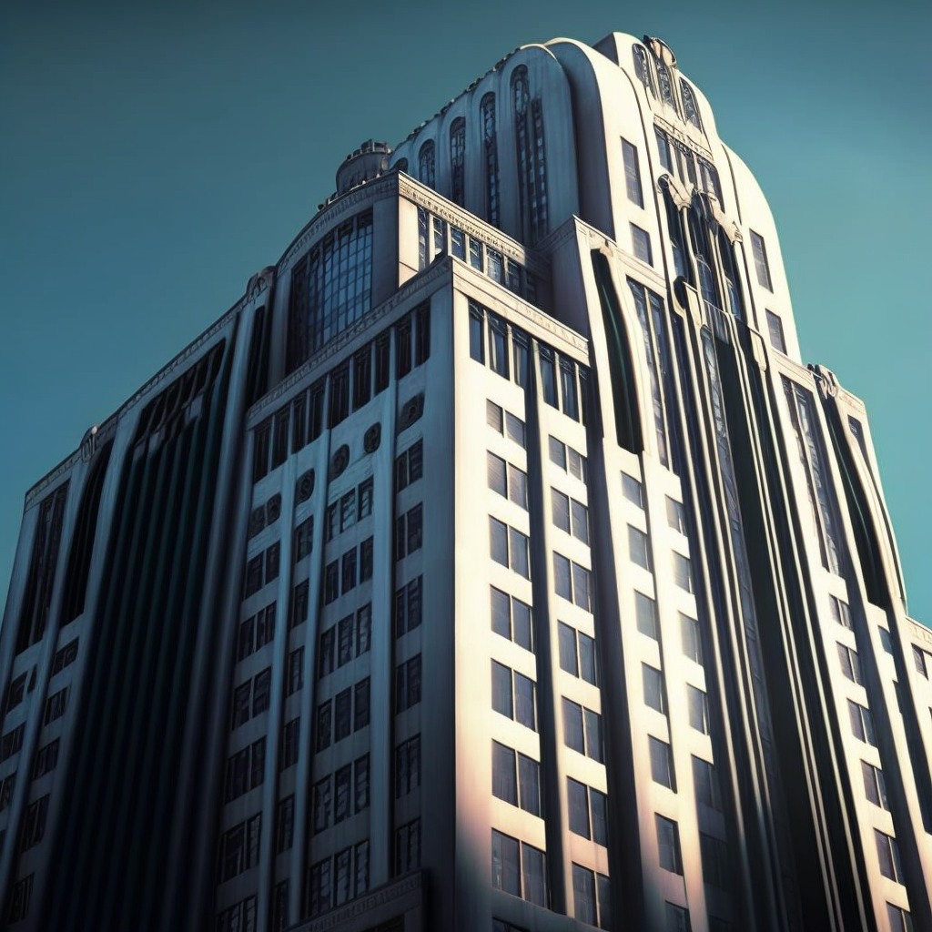
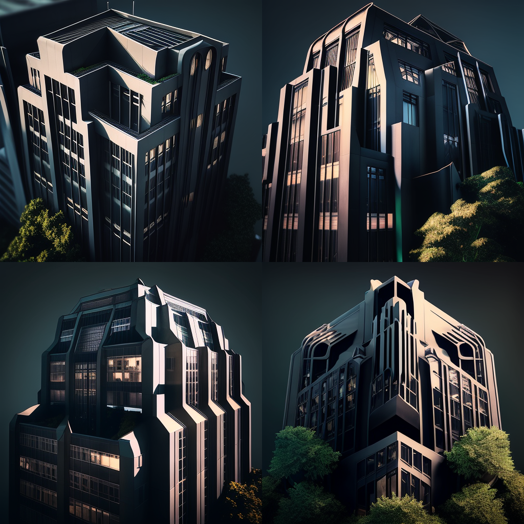
Image 3 – Upscaled

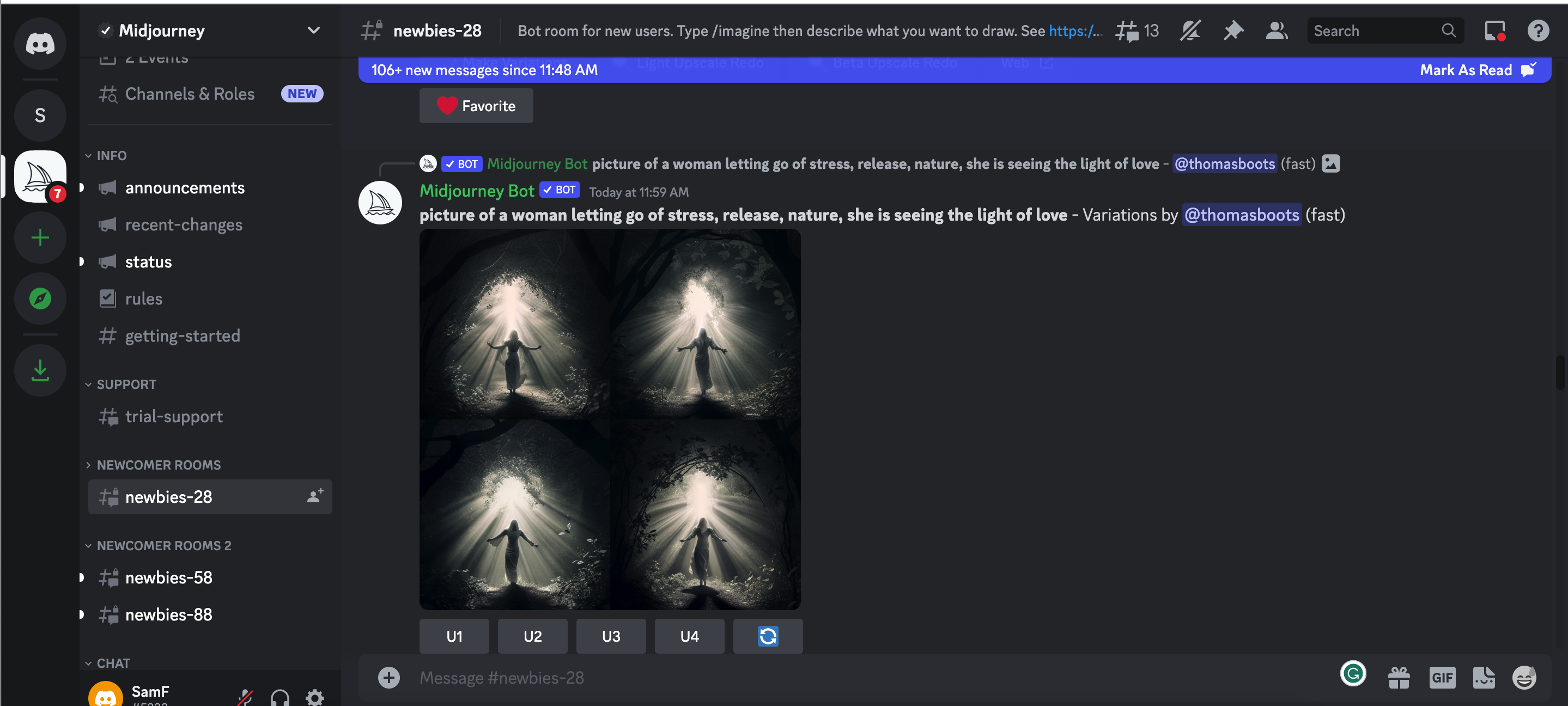
Midjourney will give you a grid of four images with several commands beneath it. U means “upscale,” and V means “Variation.” Upscale will provide you with a better quality and larger image. Variation will give you an additional four images similar to your chosen one. The numbers correspond from left to right. The top left is U1, and the bottom right is U4.


5. Keep track of your image in the constantly evolving message

With all the users on Midjourney it’s really easy to lose track of your message. If this happens, just head to the top right corner of your window, look for your inbox and hit mentions. Here you’ll see all the messages you have been tagged in, including your images, variations and upscales.


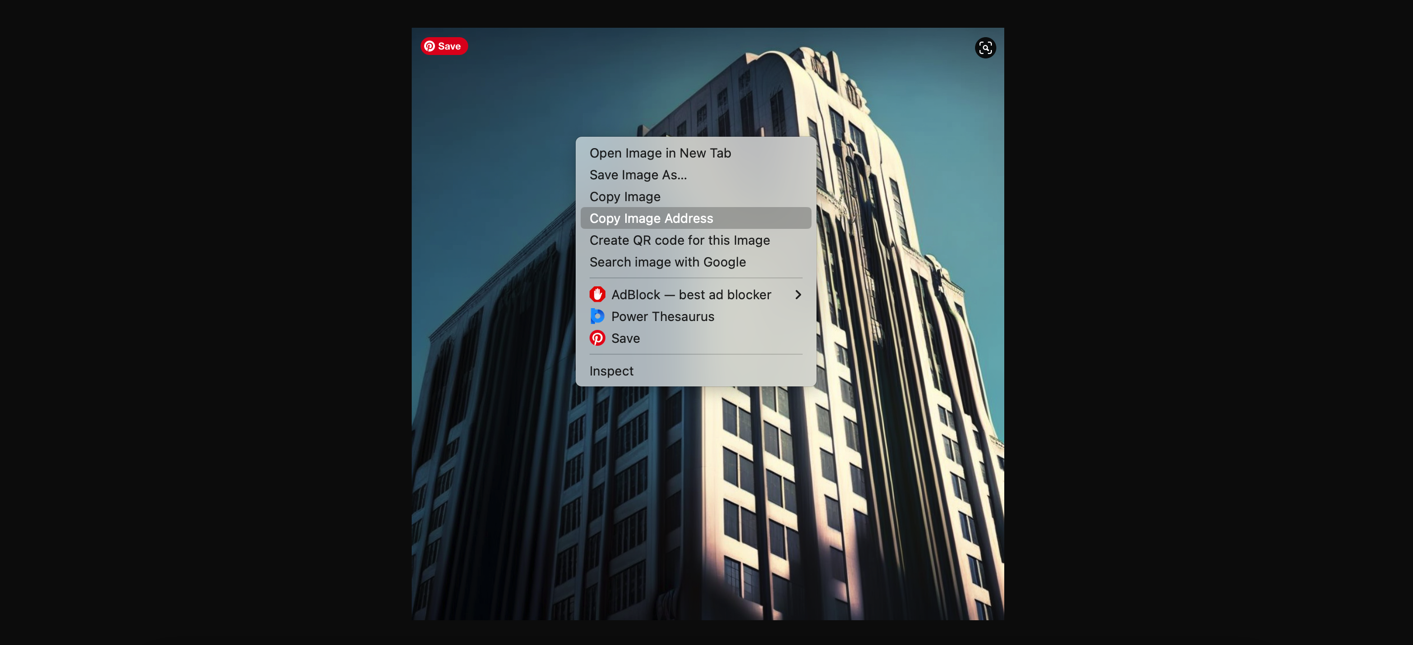
6. Integrate Midjourney into your creative process

From this point on, you’re free to develop and adjust to your heart’s content. Simply open up you upscaled image into a browser window, copy the URL, start a new /imagine prompt and post the URL followed by any adjustments.

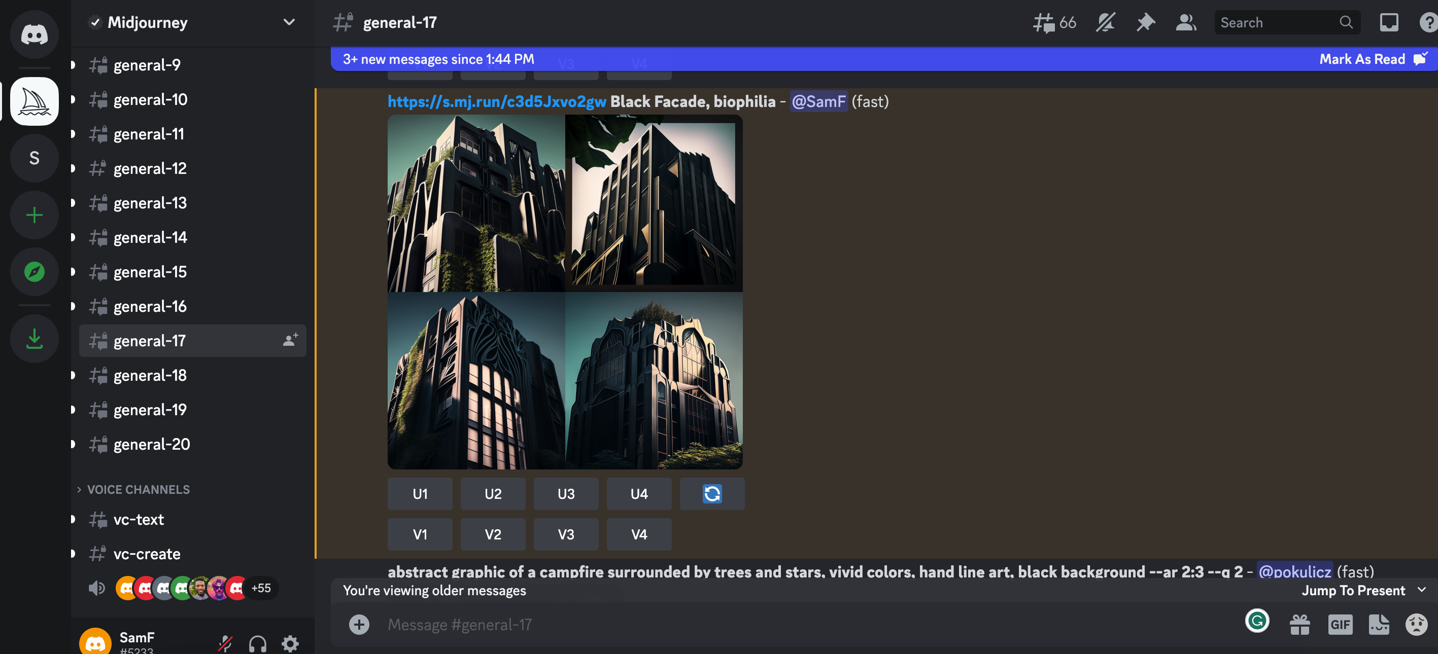
Prompt: /imagine (ORIGINAL IMAGE URL) Black facade, biophilia, sustainable architecture, drone view, Hyperrealism, hyperrealistic, photorealistic, cinematic lighting, 8K Ultra HD


It’s that simple. As you hone your prompts, you can develop your technique to get the desired image style you are looking for. A single change of word can create an entirely new set of images.

As the AI-generated images from Midjourney continue to inspire architects worldwide, real-world applications are becoming more common. From initial mood boards to fully realized designs, architects have found new ways to incorporate AI-generated visuals into their creative processes. The innovative approach pushes the boundaries of conventional architectural design, allowing architects to explore ideas faster and more effectively, bypassing the need for exhaustive online image searches.

As we become more familiar with the software, daring architects are venturing even further by crafting AI-encouraged designs, generating photorealistic renderings of architectural structures using Midjourney, and creating 3D models based on the AI-generated concepts. With the development of these models in familiar architectural software, AI generated concepts can quickly become reality. Watch this space!

Architizer’s Vision Awards is celebrating the innovative minds propelling architectural visualization forward with a special AI-Generated Visualization Category. Learn more and start your submission before the Early Entry Deadline on May 5th.  

The images used are all author’s own.

Reference

Bench in Alpine Rising exhibition by Markus Benesch
CategoriesInterior Design

Markus Benesch designs Alpine Rising home for tuntschi doll

A vengeful doll from an Alpine folk tale was the imagined occupant of this colourful cabin-style home created by German designer Markus Benesch at Milan design week.

The maximalist Alpine Rising installation featured decorative Alpine-style furniture and multi-coloured wall coverings, all filled with references to life in the mountains.

Benesch developed the design after becoming fascinated by the fabled character of the “tuntschi” doll.

Bench in Alpine Rising exhibition by Markus Benesch
The exhibition featured Alpine-style furniture and multi-coloured wall coverings

According to the story, the tuntschi is fashioned out of wood, straw and cloth by herdsmen who spend the summer tending cattle on the mountain and crave female company.

The doll comes to life, yet the herdsmen continue to objectify her. So when the time comes for them to return home, she takes murderous revenge on one of them.

This got Benesch thinking about what happens after the story finishes.

Chairs at Alpine Rising exhibition by Markus Benesch
Stui dining chairs and Hockerl stools both combine ash wood with colourful resin

“I wondered, what is this doll doing when she is alone in the wintertime?” he told Dezeen. “I thought, maybe she has the time of her life.”

One of the starting points for the design was to think about the types of pastimes that the doll might enjoy.

Cabinet in Alpine Rising exhibition by Markus Benesch
The Tuntschis Chapel cabinet is based on traditional Alpine architecture

One idea was that she might ski. This resulted in swirling motifs – reminiscent of snow tracks – that appeared throughout, plus a pair of bespoke skis.

Benesch also thought the doll might take up pottery, which led him to the work of Austrian ceramicist Florian Tanzer, founder of Vienna-based studio Luma Launisch.

Tanzer’s rough and enigmatic ceramics often depict unusual characters.

For Alpine Rising, he created vases and vessels that integrate the face of the tuntschi. Some pieces had more than one face, in reference to her two-faced nature.

Dining table in Alpine Rising exhibition by Markus Benesch
The wallpaper combines images of wooden shingles with different colours and tones

Benesch and his small-production furniture, textile and wallpaper company Curious Boy created a completely custom interior for the tuntschi’s Alpine cabin.

Divided into rooms, it was filled with farmhouse-style furniture pieces that combined traditional Alpine woodcraft with colourful motifs typical of Benesch’s designs.

Benesch creates these patterns by inlaying wood with pigmented resin.

Wardrobe at Alpine Rising exhibition by Markus Benesch
The zigzag-patterned Hochzeitsschrank wardrobe was crafted from pine

In ash wood, designs on show included the cabin-style Tuntschis cabinet, the elaborate Himmibed and the playful Stui dining chairs.

Walnut was used for the amorphous Splügen lamp, while the zigzag-patterned Hochzeitsschrank wardrobe was crafted from pine.

Ceramics by Florian Tanzer
Florian Tanzer created ceramics that refer to the two-faced nature of the doll

For the wallpaper and textiles, Benesch created repeating patterns using images of wooden shingles that typically clad Alpine chalets, then overlaid them with various colours and tones.

Underlying the entire design was an idea about getting away from today’s digital world and the harmful effects it can have on mental health, and instead celebrating “an analogue lifestyle”.

Alpine Rising spoons
Benesch also produced hand-carved ash and walnut spoons

This idea was emphasised by hand-carved ash and walnut spoons and a pack of custom-designed playing cards.

“We want to disconnect from the crazy of our today’s world and reconnect more with ourselves in nature,” added Benesch.

The exhibition formed part of the 5Vie district during Milan design week, where other exhibitions included Artemest’s L’Appartamento, a 1930s apartment redesigned by six different studios.

Following Milan design week, we collected ten standout installations and projects on show during the week.

Alpine Rising was on show from 15 to 21 April 2023 as part of Milan design week. See Dezeen Events Guide for more architecture and design events around the world.

Exhibition and furniture photography is courtesy of Markus Benesch Creates. Ceramic photography is by Gregor Hofbauer.

Reference

A natural solution making plants more resilient to drought
CategoriesSustainable News

A natural solution making plants more resilient to drought

Spotted: Sustainably strengthening economies and agriculture is foundational to the attainment of the UN Sustainable Development Goals (SDGs). But climate change is putting increasing pressure on agriculture – with fluctuating seasons, changing rainfall patterns, extreme weather, and drought all becoming more common. Now, French agrobiotechnology company Elicit Plant uses plant-derived molecules called phytosterols to help crops survive dry periods. 

Phytosterols are lipids that activate a plant’s resistance to environmental stressors. The compound is applied to plants early in their growth to encourage the development of characteristics that maximise the efficiency of water use. 

Longer roots combined with reduced evapotranspiration help global cereal crops such as soybean and corn better survive the increasingly challenging environments within a changing climate. Elicit Plant’s trials show an increase in yield of between 13 and 22 per cent per crop, with a monetary value increase of up to $240 (around €219) per hectare.  

The company’s first product is called BEST-a and is designed for soybeans. It can be used on corn, too, although a compound specifically for corn is nearing availability. As well as waiting for the final regulatory approvals, the company is also developing additional products to expand the range of crops it supports. BEST-a not only helps farmers grow more in drier conditions, the product also makes it possible to stretch available water supplies over a longer period of time.  

Innovations that help farmers grow enough food for the world’s expanding population are crucial. Some that Springwise has spotted include urine-based fertilisers and sensors that optimise water usage for crops.

Written By: Keely Khoury

Reference

4 Novels About Architecture That Are Better Than "The Fountainhead"
CategoriesArchitecture

4 Novels About Architecture That Are Better Than “The Fountainhead”

Sooner or later, every architect is gifted The Fountainhead. Usually, this is done with good intentions: someone reads Ayn Rand’s 1943 novel about an idealistic architect at war with a cynical society and is reminded of the architect in their own lives, their friend or nephew or whomever. They buy the architect a copy, thinking they will appreciate seeing their profession represented in literature. 

Sometimes though, Fountainhead pushers have another agenda. Rand’s 753 page doorstop was not just a work of imaginative literature; it was a vehicle for Ayn Rand to push her political ideology, an extreme form of capitalist individualism called Objectivism. Rand hoped readers of The Fountainhead would be convinced of the evils of collectivism, especially any kind of socialism, which in her view suppresses the entrepreneurial spirit of geniuses like her architect hero Howard Roark. She wanted to change the way people voted, not just how they thought about architecture. 

As it is a work of political propaganda, The Fountainhead falls short of John Keats’s standard for authentic literature. In an 1817 letter to his brothers George and Thomas, the poet coined the term “negative capability” to describe the ability of great authors to put their own opinions to the side when they set out to write. The role of the author, in Keats’s view, is not to push an agenda but to give life to whatever ideas emerge organically within the imaginative space of the poem or novel. 

A lofty standard? Maybe. But the novels listed here come closer to the mark than The Fountainhead. They run where Rand’s book only walks — that is, they give authentic literary expression to architectural ideas.


Daniel Burnham’s “White City,” constructed in 1893 for the Chicago World’s Fair. Unidentified Photographer, Public Domain via Wikimedia Commons.

The reader might here exclaim that I am cheating. “The Devil in the White City is not a novel at all,” they’ll say, “it is a work of non-fiction!”

True as that may be, The Devil in the White City is by Keats’s standard a clear example of imaginative literature. In re-telling the events surrounding the 1893 Chicago World’s Fair and its architect, Daniel Burnham, author Erik Larson set out, above all else, to tell a story and to do so as powerfully as he could. As New York Times critic Janet Maslin gushed, Larson “relentlessly fuses history and entertainment to give this nonfiction book the dramatic effect of a novel, complete with abundant cross-cutting and foreshadowing.” 

Larson’s approach is well suited to his dramatic subject matter. The story alternates between two narratives: the planning and development of the World’s Fair under architect Daniel Burnham, who used the fair as an opportunity to showcase the grandeur of the Beaux Arts Style, and the exploits of serial killer H.H. Holmes, who used the fair as an opportunity to prey on naive out-of-towners.

In a grim ironic twist, Holmes was something of an architect himself, transforming a Chicago rooming house into a “Murder Castle” complete with trapdoors, greased chutes and soundproof rooms. Indeed, the parallels between Burnham and Holmes are the thematic heart of the book, lending this true story literary gravitas. 


Italo Calvino riding a bike in 1970. Unknown Photographer, Public Domain via Wikimedia Commons.

Like a great building, Invisible Cities is a book that was designed to be inhabited rather than simply experienced once. The allegorical novel is structured as a series of conversations between Marco Polo, the 13th century Italian explorer, and Kublai Khan, the Mongol emperor of China. 

Polo and Khan did meet in history, but this book is not drawn from any historical sources. The conversations are merely a framing device, allowing Polo to describe 55 fictitious cities to the emperor, places he claims to have visited. Each city is a parable for a different aspect of human nature, and as the novel progresses, it becomes clear that the subject Polo has learned the most about in his travels is himself. Places, it seems, are illuminated by the preconceptions we bring to them.

While the story has a free-floating and dreamlike structure, there is a plot twist that occurs halfway through the novel. Pressed by Kubla Khan to describe his home city of Venice, Polo explains that he has been doing that all along. Fedora, Zoe, Zenobia, and all the other fictional cities he recounts are all just Venice seen from different vantage points. 


House of Leaves by Mark Z. Danielewski (2000) 

Leaves are much more intricate than they appear to be at first. Photo by Jon Sullivan, 2003, Public Domain via Wikimedia Commons.

House of Leaves is sort of like the reading equivalent of being trapped within H.H. Holmes labyrinthine Murder Castle. The text is laid out in a fashion that is anything but linear, with copious footnotes leading to their own footnotes which themselves have footnotes, all making copious references to books and films that are sometimes real, sometimes not. At times, the text is arranged unusually on the page and the book must be rotated to be read. At other times, multiple narrators interrupt one another in a disorienting fashion. Even the genre is hard to determine. While most readers consider House of Leaves a horror story, the author himself has described it — bafflingly perhaps — as a love story. 

But House of Leaves offers the reader much more than mere confusion. By traversing this experimental book, the reader is able to share in the protagonists’ disorientation, offering a unique, sometimes claustrophobic experience of imaginative identification. The book follows a family whose house contains an endless series of hidden rooms — an allegory, perhaps, for the psyche, family dynamics, academic criticism, history  and more. (Perhaps the list is also endless). For architects, the mysteries of this novel are a potent reminder that clarity, rationality, and openness are not always preferable. Sometimes people are drawn to the darkness.


Am Gestade, one of many Viennese streets Austerlitz traverses as he searches for his hidden past. Photo by Jorge Franganillo, CC BY 2.0 <https://creativecommons.org/licenses/by/2.0>, via Wikimedia Commons

Can a work of art speak to both the heart and head at the same time? Or do the intellect and the emotions respond to different kinds of artistic experience, one craving critical distance and the other empathic closeness? These are not just questions that Austerlitz poses to the reader, they are the questions faced by the novel’s eponymous protagonist. 

Jacques Austerlitz is an architectural historian who lives a solitary, itinerant life. He is fascinated with the way buildings and street layouts can reveal the buried histories of places, leaving behind an objective record of how people lived — ordinary people, that is, not just the type of people whose names end up in history books. One day, Austerlitz stumbles across a startling fact about himself. He learns that the couple who raised him in England were not his biological parents. His actual parents were a Jewish couple from Vienna who perished in the Holocaust. They had sent their young son, then aged three, to safety in England using an underground program known as the kindertransport

Austerlitz applies his skills as an architectural historian to research the buried history of his own parents, who seem to have left few traces behind. He is then faced with the possibility that he had unknowingly been looking for them all along. Could his interest in architectural history have been, unconsciously, a way of trying to uncover his own roots? This question, which would intrigue Calvino’s Marco Polo, is just one of the many tantalizing mysteries of this masterful novel about memory and loss. 

Cover Image: Freepik, Attribution via Wikimedia Commons

Reference

Farrell Centre in Newcastle
CategoriesInterior Design

Farrell Centre opens with exhibition showcasing mycelium and fake fur

An architecture centre founded by British architect Terry Farrell has opened in Newcastle, England, with an exhibition exploring building materials of the future and “urban rooms” for local residents.

The Farrell Centre is an exhibition gallery, research centre and community space that aims to provoke conversation about architecture and planning, both in the city and at a global scale.

The project was instigated by Farrell, who donated his architectural archive and put £1 million towards the build.

Farrell Centre in Newcastle
The Farrell Centre occupies a former department store building in Newcastle

The inaugural exhibition, More with Less: Reimagining Architecture for a Changing World, looks at how buildings might adapt to the climate crisis.

Fake fur, mycelium and wool insulation feature in a series of installations designed to challenge traditional methods of producing architecture.

Elsewhere, three urban rooms host workshops and other events where locals can learn about the past and future of Newcastle and voice their opinions on development plans.

Staircase in Farrell Centre in Newcastle
The ground floor is designed to encourage people in, with glazed facades on two sides

“The centre is here to bring about a better, more inclusive and more sustainable built environment,” said Farrell Centre director and Dezeen columnist Owen Hopkins during a tour of the building.

“The belief that underpins everything we do is that we need to engage people with architecture and planning, and the transformative roles that they can have,” he told Dezeen.

“Architecture and planning are often seen as something that’s imposed from above. We need to shift that perception.”

Staircase in Farrell Centre in Newcastle
Seating bleachers create an informal space for talks and presentations

Forming part of Newcastle University, the Farrell Centre occupies a four-storey former department store building in the heart of the city.

Local studios Space Architects and Elliott Architects oversaw a renovation that aims to make the building feel as open and welcoming as possible.

HBBE installation at More with Less exhibition at the Farrell Centre
The exhibition More with Less includes an installation by HBBE made from mycelium, sawdust and wool

The ground floor has the feel of a public thoroughfare, thanks to glazed facades on two sides, while bleacher-style steps create a sunken seating area for talks and presentations.

A colourful new staircase leads up to the exhibition galleries on the first floor and the urban rooms on the second floor, while the uppermost level houses the staff offices.

McCloy + Muchemwa installation at More with Less exhibition at the Farrell Centre
McCloy + Muchemwa’s installation is a table filled with plants

According to Hopkins, the launch exhibition sets the tone for the type of content that visitors can expect from the Farrell Centre.

The show features installations by four UK architecture studios, each exploring a different proposition for future buildings.

“We wanted to create something that expands people’s understanding of what architecture is, beyond building an expensive house on Grand Designs,” Hopkins said, referencing the popular television show.

Dress for Weather installation at More with Less exhibition at the Farrell Centre
Dress for the Weather has created a mini maze of insulation

Newcastle University’s Hub for Biotechnology in the Built Environment (HBBE) has created Living Room, a cave-like structure made by cultivating a mixture of mycelium and sawdust over a giant wool blanket.

Next, a mini maze created by Glasgow studio Dress for the Weather aims to showcase the thermal and experiential qualities of building insulation, with varieties made from low-grade wool and plastic bottles.

Office S&M installation at More with Less exhibition at the Farrell Centre
Office S&M’s installations include a silhouette of the head of Michelangelo’s David made from pink fur and a chaise longue covered in expanding foam

London-based Office S&M proposes low-tech but fun solutions for making buildings more comfortable.

These are represented by a silhouette of the head of Michelangelo’s David made from pink fur, a metallic space blanket, a chaise longue topped covered in expanding foam and a dichroic-film window covering that casts colourful reflections onto the floor.

“This whole room is about actually doing really simple mundane stuff, but in a way that is joyful and tells a story,” said Hopkins.

In the final room, an installation by London-based McCloy + Muchemwa brings nature indoors with a boardroom table covered in plants.

Urban rooms at the Farrell Centre
The urban rooms host events where people can learn about the development of the city

On the floor above, the three urban rooms have been fitted out by Mat Barnes of architecture studio CAN with custom elements that make playful references to building sites.

They are filled with historic maps, interactive models, informal furniture, display stands made from scaffolding poles, and architecture toys that include building-shaped soft play and Lego.

Urban rooms at the Farrell Centre
In one of the rooms, planning proposals are displayed on stands made from scaffolding poles

The idea of setting up an urban room in Newcastle was the starting point for the creation of the Farrell Centre.

A decade ago, Farrell was commissioned by the UK government to produce a report on the state of the UK’s architecture and planning system.

One of the key recommendations in the Farrell Review, published in 2014, was to create an urban room in every major city, giving local people of all ages and backgrounds a place to engage with how the city is planned and developed.

Urban rooms at the Farrell Centre
One urban room contains a model of a Terry Farrell-designed masterplan for Newcastle

As Farrell grew up in the Newcastle area and studied architecture at the university, he became keen to make this concept a reality in this city.

Although the Farrell Centre is named in his honour, Hopkins said that Farrell is happy for the facility to forge its own path in terms of programme and approach.

“He established the idea and vision for the centre, but he is happy for us to build out that vision in the way that we think is best,” added Hopkins.

Farrell Centre in Newcastle
The Farrell Centre forms part of Newcastle University

The director is optimistic about the centre’s potential to engage with the community.

“Newcastle is a city like no other,” he said. “The civic pride here is off the scale. People have such a deep-rooted love of where they live.”

“It’s amazing to be able to tap into that as a way of creating a better built environment.”

More with Less: Reimagining Architecture for a Changing World is on show at the Farrell Centre from 22 April to 10 September 2023. See Dezeen Events Guide for more architecture and design events around the world.

Reference

A wound dressing that changes colour to reveal infection
CategoriesSustainable News

A wound dressing that changes colour to reveal infection

Spotted: The World Health Organization (WHO) identifies antibiotic resistance as one of today’s biggest threats to global health, food security, and development. One way to reduce the need for antibiotics is to lessen the number of infections requiring additional care. With a lot of outpatient healthcare resources spent on wound treatment, a reduction in the rate of infection would drastically affect the amount of antibiotics prescribed.  

A team of Linköping University researchers, in collaboration with colleagues from Örebro and Luleå Universities, has created a new material that helps reduce infections in healing wounds. Traditionally, healthcare workers lift a dressing to visually evaluate the healing process. With each exposure, there is an increased risk of infection. Continual disturbance of the wound also slows the healing process.  

The new material is a tight mesh made of nanocellulose that allows gases and liquids through. Loaded onto the material is a nanoscale silica compound containing bromthymol blue dye. The dye reacts to a pH level of more than seven by turning from yellow to blue. Non-infected wounds have a pH level of approximately 5.5, meaning that any increase will begin to cause a reaction in the dressing. 

As the dressing changes colour, healthcare teams can consider treatments far earlier than if they had to wait for a full-blown infection to develop. Because the dressing allows air to pass through, it is designed to stay on the wound during the entire healing process. In a best-case scenario, a patient wouldn’t ever have to change the dressing, meaning that wounds could heal faster because the scabbing process is never disturbed.  

The flexible material is ideal for use in hard-to-reach and hard-to-bandage areas of the body. Alongside the dressing, the researchers are also developing anti-microbial substances to further strengthen the dressings. The dressing could be available in five to ten years, depending on the speed with which it can pass through the required healthcare regulatory checks.  

Smart bandages are being tested out in a multitude of ways, with Springwise spotting innovations that include a dressing that releases antibiotics when bacteria are detected and a bandage that glows when an infection develops.

Written By: Keely Khoury

Reference

glossy red tiles contrast with lime green counter within spazio maiocchi's new bar in milan
CategoriesArchitecture

glossy red tiles dynamically contrast with lime green counter within spazio maiocchi’s new bar

Spazio Maiocchi’s bar extension in milan 


Spazio Maiocchi, a contemporary art space and cultural hub in the heart of Milan, has recently unveiled its new extension, a vibrant and modern bar. Its striking design, conceptualized by Capsule magazine and architect Paul Cournet, features a bold use of color and clear forms, creating a dynamic contrast between the intense shades of red and green. The eye-catching aesthetic is the result of collaborations with renowned designers, including Konstantin Grcic, and Ettore Sottsass among others. This new extension adds to the already rich cultural scene offered by Spazio Maiocchi, providing a stylish and welcoming environment where visitors can enjoy the Milanese energy.

glossy red tiles contrast with lime green counter within spazio maiocchi's new bar in milan
all images by Capsule


One year after the launch of Capsule magazine (see more here), Capsule Plaza was created as a hybrid between a fair and a collective exhibition. This initiative brought together designers and companies from various creative fields, injecting fresh energy into Milan Design Week. The inaugural edition of Capsule Plaza coincided with milan design week 2023, celebrating the city’s lively design scene. On this occasion, Capsule Plaza unveiled the new extension of Spazio Maiocchi — a striking former garage across the street, renovated by architect Paolo Caracini and Laboratorio Permanente, reaching a footprint of over 1600 sqm and reasserting its presence as a new cultural hub.

glossy red tiles contrast with lime green counter within spazio maiocchi's new bar in milan

wooden wall tiles by Ettore Sottsass incorporate natural warmth and texture into the space


a Symphony of Materials


The new bar is a natural extension of Spazio Maiocchi’s mission to bring together artists, creatives, and the community to foster cultural exchange. The space boasts a stunning design, featuring a striking combination of materials, such as Mutina DIN tiles in glossy red and matte black, created by Konstantin Grcic, and wooden wall tiles by the renowned designer Ettore Sottsass. The resulting aesthetic is bold and contemporary, while also incorporating natural warmth and texture into the space.


Adding to the design’s glossy are the horizontal suspended lamps by Ronan & Erwan Bouroullec and a USM bar counter in lime green. This diverse material choice imparts a sophisticated and timeless aesthetic to the overall composition, with the patterns and forms lending an illusion of space extension. Other details from aluminum shelves and wall sconces to a pedestal sink in rust-colored reinforced concrete contribute their own unique flair to the imposing design.

glossy red tiles contrast with lime green counter within spazio maiocchi's new bar in milan
the lime green USM bar counter creates a dynamic contrast against the red background.

glossy red tiles contrast with lime green counter within spazio maiocchi's new bar in milan
horizontal suspended lamps by Ronan & Erwan Bouroullec generate intricate reflections on the glossy walls

glossy red tiles contrast with lime green counter within spazio maiocchi's new bar in milan
a unique combination of materials, textures, and colors

glossy red tiles contrast with lime green counter within spazio maiocchi's new bar in milan glossy red tiles contrast with lime green counter within spazio maiocchi's new bar in milan


1/2

glossy red tiles contrast with lime green counter within spazio maiocchi’s new bar in milan


glossy red tiles contrast with lime green counter within spazio maiocchi’s new bar in milan


project info:


name: Spazio Maiocchi‘s new Bar | @spaziomaiocchi

designed by: Capsule and architect Paul Cournet

location: Milan

christina petridou I designboom

may 01, 2023


Reference

Storefront of Billie Le Kid Boutique by Vives St-Laurent
CategoriesInterior Design

Vives St-Laurent creates Billie Le Kid boutique in Mont-Tremblant ski resort

Harnessing soft colours and gentle curves, interior design studio Vives St-Laurent has completed a shop for children’s boutique Billie Le Kid in Mont-Tremblant – a Canadian ski resort known for its colourful architecture.

Following on from Billie Le Kid‘s first store in Montreal, the brand brought in Vives St-Laurent to create a new outpost that captured the spirit of the brand while reflecting its location.

Storefront of Billie Le Kid Boutique by Vives St-Laurent
Vives St-Laurent designed the interiors for Billie Le Kid’s Mont-Tremblant boutique

Its storefront was designed to resemble a theatre, showcasing the brand’s wholesome edit of children’s clothes, toys and books.

Custom-made awnings recall the idea of a general store, while the front was repainted in a vibrant blue-on-blue palette to reflect Mont-Tremblant’s colourful charter.

Counter and changing room in boutique by Vives St-Laurent
Painted tongue-and-groove panelling adds a touch of nostalgia

Referencing the facade, arched openings throughout the boutique bring a whimsical touch to the transitions between different sections.

Rounded corners were used to soften the edges of the display cabinets, adding character and creating a playful and welcoming atmosphere.

Storage wall in Billie Le Kid Boutique
Integrated display cabinets provide plenty of storage

Bianco Carrara marble was used on top of the checkout counter to convey a sense of timeless luxury, while moss-coloured velvet changing room curtains reference the theatre concept and bring softness and tactility to the space.

The polished concrete floor was a practical choice, as the low-maintenance material allows skiers to visit the store in their ski boots.

Storage cupboard and counter in store interior by Vives St-Laurent
Bianco Carrara marble covers the store’s counter

Painted tongue-and-groove panelling was added to give the boutique a touch of nostalgia.

“We combined classic and contemporary materials to create a harmonious yet unique ambience,” Vives St-Laurent’s interior designer Léa Courtadon told Dezeen.

Courtadon said she chose the store’s calming colour palette of stone beige and sage green to create “a whimsical mood that recalls the playful world of childhood while maintaining sophistication and ensuring the products stand out”.

Sturdy vintage Canadian furniture was chosen to draw on the idea of the general store and family home. Long wooden refectory tables were repurposed as displays for toys and clothing, adding visual interest while paying homage to the brand’s Canadian heritage.

A row of vintage frilled-glass pendant lights creates a feature above the counter.

“The lamps’ rippled globes resemble ballerina tutus, adding a delicate touch to the overall design,” Courtadon said.

Integrated storage in Billie Le Kid Boutique
Rounded corners give the storage units a playful edge

In contrast, the main lighting system with its matt white finish was chosen to blend seamlessly with the store’s high ceiling. The railing system allows for precise positioning to highlight different items within the display cabinets.

Vives St-Laurent used baskets for storage to contribute to the nostalgic, homespun aesthetic as well as offering a practical way to store and display plush toys.

Changing room of Billie Le Kid Boutique
Changing rooms are hidden behind velvet curtains

“They create an impression of abundance and allow children to interact with the toys, promoting a sense of independence and autonomy,” said Courtadon. “It all contributes to a playful and engaging atmosphere that’s ideal for a kids’ store.”

Since its founding in 2018, Vives St-Laurent has completed a range of projects across Canada. Among them is a tactile home in Montreal with a grey-heavy colour scheme.

The photography is by Alex Lesage.

Reference

Cranes in mist
CategoriesSustainable News

“The hollowness of Architects Declare should serve as a warning”

Climate network Architects Declare has failed to live up to its ambitions and now represents a cautionary tale about setting sustainability commitments, writes Chris Hocknell.


After all the press releases, announcements, and LinkedIn posts it has become clear that four years on from its launch, Architects Declare is collecting dust. Speaking from experience of working with hundreds of architecture firms, I can tell you that the number that have loudly signed up to the climate network and yet are demonstrably not implementing or even properly advocating its agenda on live projects is startlingly high.

The so-called green transition is the most important industrial issue of our generation. When crucial climate-target commitments slowly die, so do our chances of decarbonising our economies. The failure of Architects Declare shows us that for true progress to be made we need realistic, achievable and accountable target-setting processes that cut across industries.

What emerged as a positive movement appears to have become a damp squib

Architects Declare certainly made waves when it was established as the UK architecture industry’s response to the climate crisis in May 2019. Among many similar networks emerging across sectors, it was particularly high-profile and ambitious. Sustainability specialists were impressed, if a little sceptical at its scale and boldness.

Its lofty aims included commitments to “establish climate and biodiversity mitigation principles as the key measure of our industry’s success: demonstrated through awards, prizes, and listings” and to “advocate for faster change in the industry towards regenerative design practices and a higher government funding priority to support this”.

The movement received more than 1,274 signatories from firms in the UK, and has now hit 7,000 signatories in 23 countries across the globe.

We were embedded in Architects Declare from the beginning, hosting an event where we encouraged studios to get involved and offering surgeries for technical queries about achieving the aims. But after that much-heralded birth, what emerged as a positive movement combining some of the key players in the industry appears to have become a damp squib.

Some saw the high-profile departures of Zaha Hadid Architects and Foster + Partners from Architects Declare amid a row over their work on airports as evidence of signatories failing to honour their commitments.

But I believe that for true progress to be made in decarbonising the entire economy, companies need to collaborate across sectors instead of refusing to work on airports and other infrastructure projects haphazardly deemed to be high carbon. Practices like Zaha and Fosters should proudly work with these projects. Airports aren’t going away, so we need architecture firms to work alongside them and get them ready for low- or zero-carbon operation in the coming years.

Far more concerning are the countless firms that have waxed lyrical about their “bold new ambitions” and commitment to Architects Declare online while quietly continuing with business as usual.

Many of the commitments included within declarations often simply fall outside of an architecture firm’s direct control, dependent on clients further up the food chain. Architects know this well, as it’s the first reason they give you if you ask them whether they’re honouring their Architects Declare commitment (try it at your next design team meeting).

Failing to meet targets undermines faith and discourages others from taking collective action

For example, the ambition to “include life-cycle costing, whole-life carbon modelling, and post-occupancy evaluation as part of the basic scope of work, to reduce both embodied and operational resource use” requires a specialist appointment and the inclination to utilise these disciplines into the project.

Especially for post-occupancy evaluation, which occurs after the development has been completed and potentially sold, and there will be no architecture firm involved. Achieving these commitments requires the engagement of developers, specialist designers and managers.

Similar is the commitment to “accelerate the shift to low embodied carbon materials in all work”. It is certainly true that progressively shifting specifications towards lower embodied carbon materials can reduce the carbon footprint of the construction industry significantly over time, as well as driving desperately needed innovation in the development of new, low-carbon materials and processes.

However, a non-trivial number of material specifications and construction systems are not made by architectural companies, and architects make that point abundantly clear when asked about the low-carbon material commitment.

Signatories may well argue that government inaction is the root cause for the programme’s stalling. Architects Declare sought government funding to support the shift to “regenerative design practices”. Yet we must understand that ultimately it is developers who build, not governments.

Governments simply cannot regulate net-zero into existence. While next-generation, low-carbon materials are in development, they are not yet commercially available. Many developed nations still suffer from a housing and infrastructure shortage, and mandating low-carbon buildings without the supply side of the equation would only exacerbate this crisis. It is not reasonable to simultaneously masquerade as an agent of change whilst passing the buck to the government. Decarbonisation is, and will always be, a symbiotic effort between the public and private sector with each actor playing their own part.

Here lies a cautionary tale for climate commitments, especially in the run-up to the controversial COP28 conference. While bold and splashy commitments may make for impressive LinkedIn posts, failing to meet those targets undermines faith in the power of commitments and discourages others from taking the collective action required to effect real change.

My lessons would be as follows: climate commitments must be realistic and actionable. Honest introspection about one’s capacities should be a precursor to setting bold targets. Many of the ambitions set out by Architects Declare are simply too big for architects alone to achieve. If Architects Declare was really intended to be a lobbying group or awareness-raising campaign with actions optional, then that should have been made clear from the off.

The architecture profession now stands out by the breadth of the shortfall between its words and its actions

As it is, the architecture profession now stands out by the breadth of the shortfall between its words and its actions. From my experience the average company in other construction professions are also only partially active in terms of sustainability, but they have not set out such ambitious targets and been so vocal about their commitment and devotion to the cause. This is not necessarily a question of the level of action per se, it’s about making big claims and failing to live up to them.

When it comes to climate-target setting, no commitment is often better than a failed one. Every empty climate pledge only erodes public trust in commitments, adding to a growing sense of fatigue, apathy, and helplessness in achieving a sustainable future. Sustainability is a marathon, not a sprint. It’s better to repeatedly achieve small carbon reductions from multiple compounding, unsexy, and hard-won optimisations than to make lofty promises that rely on the good graces of an aloof and unknown party.

The hollowness of Architects Declare should serve as a warning to the industry. To avoid eroding public trust and accusations of greenwashing, bold promises require concrete action. Otherwise, we may soon find ourselves asking: “what’s the point?”.

Chris Hocknell is director of UK sustainability consultancy Eight Versa.

Reference

A modular system of 3D-printed bricks for restoring reefs
CategoriesSustainable News

A modular system of 3D-printed bricks for restoring reefs

Spotted: Less than 45 per cent of original global reefs remain, and scientists predict that by 2070, they could disappear altogether. Reefs are declining at twice the pace of rainforests and stopping the damage requires swift, focused actions at sites around the world. One company, Swiss-based Rrreefs, creates bespoke coral reef replacements that provide multiple environmental benefits. The company’s goal is to revive one per cent of coastal coral reefs by 2033. 

Video source Rrreefs

Using pure clay, the company 3D prints reef bricks that are customised to best suit the nearest shoreline and local environment. By understanding water flows and marine topography, the company builds structures that provide microenvironments for thousands of animals and plants to thrive. Protecting shores from erosion improves the growing environments for underwater forests of mangroves and seagrass, both of which are crucial to the capture of carbon dioxide. And a single cubic metre of the reef blocks provides a new home to more than 20,000 tiny animals, 20 corals, 60 fish, and more.  

The surface of the bricks is designed specifically to support a variety of coral larvae contributing to the genetic diversity of the new reef. The natural clay material contains no artificial ingredients or chemicals, making it a healthy choice that contributes no new pollution to the world’s oceans.  

Using 3D printing allows for modular production and complete customisation of height, width, and length of the overall reef structure. The process also allows for local manufacturing, which further reduces the carbon footprint of each reef.  

The innovations seeking to help stop the irreversible destruction of the world’s coral reefs are many and varied. Recent ones spotted by Springwise include a global cat food brand supporting new reefs and a company making leather out of an invasive fish that threatens reef health.

Written By: Keely Khoury

Reference