Judging for the 11th A+Awards is now underway! While awaiting the Winners, prepare for the upcoming Architizer Vision Awards, honoring the best architectural photography, film, visualizations, drawings, models and the talented creators behind them. Learn more and register >
A building’s façade is like the skin that does not only allow the building to breathe but also allows it to see and converse with its context and users, responding to many social, environmental and historical factors, such as climate, building identity, program, interior-exterior relationships and user experience, among other considerations. Through this collection, the innovative façade designs of a number of higher education buildings are shown, with more responsibility falling on the façades of this building typology for the way they are expected to show and not only teach students about architectural design and the values of the educational organizations they represent.
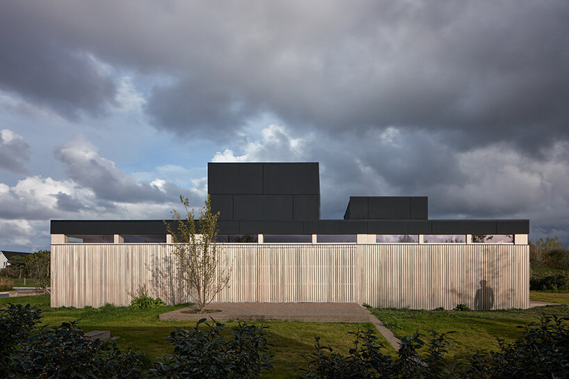
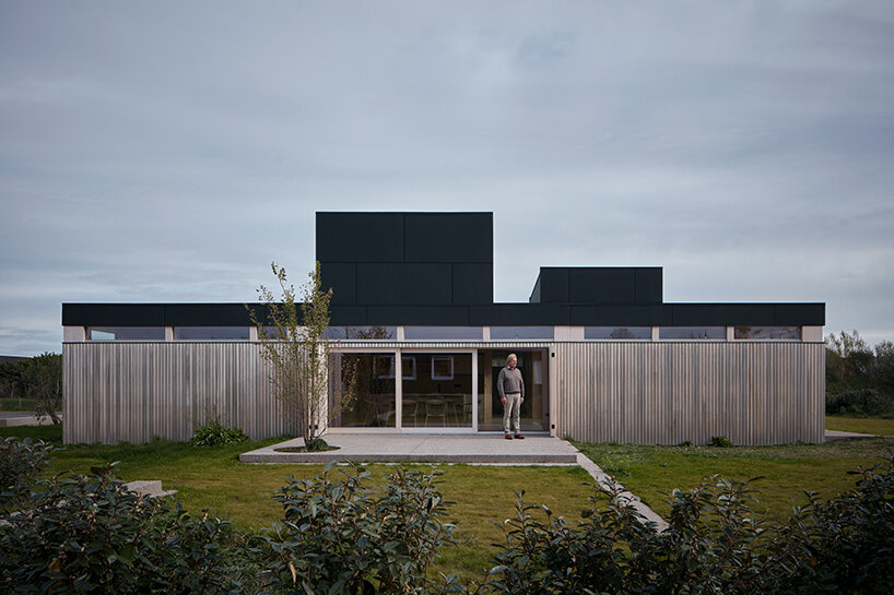
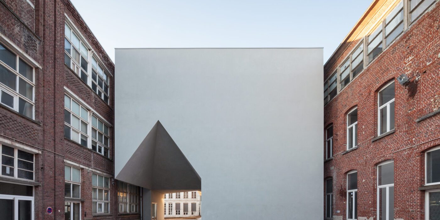
Architecture Faculty in Tournai
By Aires Mateus, Tournai, Belgium
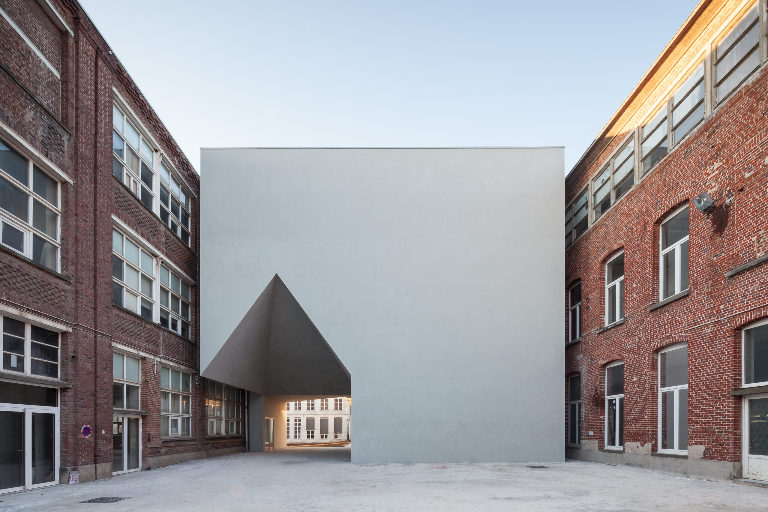
Photo by Tim Van de Velde Photography

Photo by Tim Van de Velde Photography
The new Architecture Faculty in Tournai building has its form shaped by the surrounding historical city block, both used and getting used by the adjoining buildings that manage to coexist, despite the difference in their identities and time periods. Designed to connect the existing structures together through a set of vertical and horizontal circulation elements while housing different interior spaces for architectural education, the building evokes the architectural heritage of the city through its use of iconography.
The completely solid main elevation, constructed out of concrete and steel and covered with sanded plaster and grey paint, diverts the attention to the neighboring buildings and allows the new building to comfortably fit into the context, boldly subtracted with a distinctively house shaped three dimensional volume that accentuates the entrance and welcomes users.
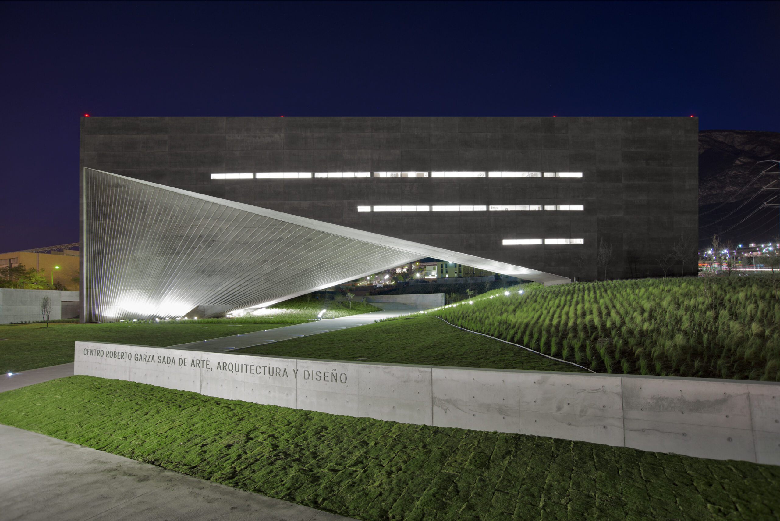
Photo by Roberto Ortiz Giacoman and Jorge Taboada
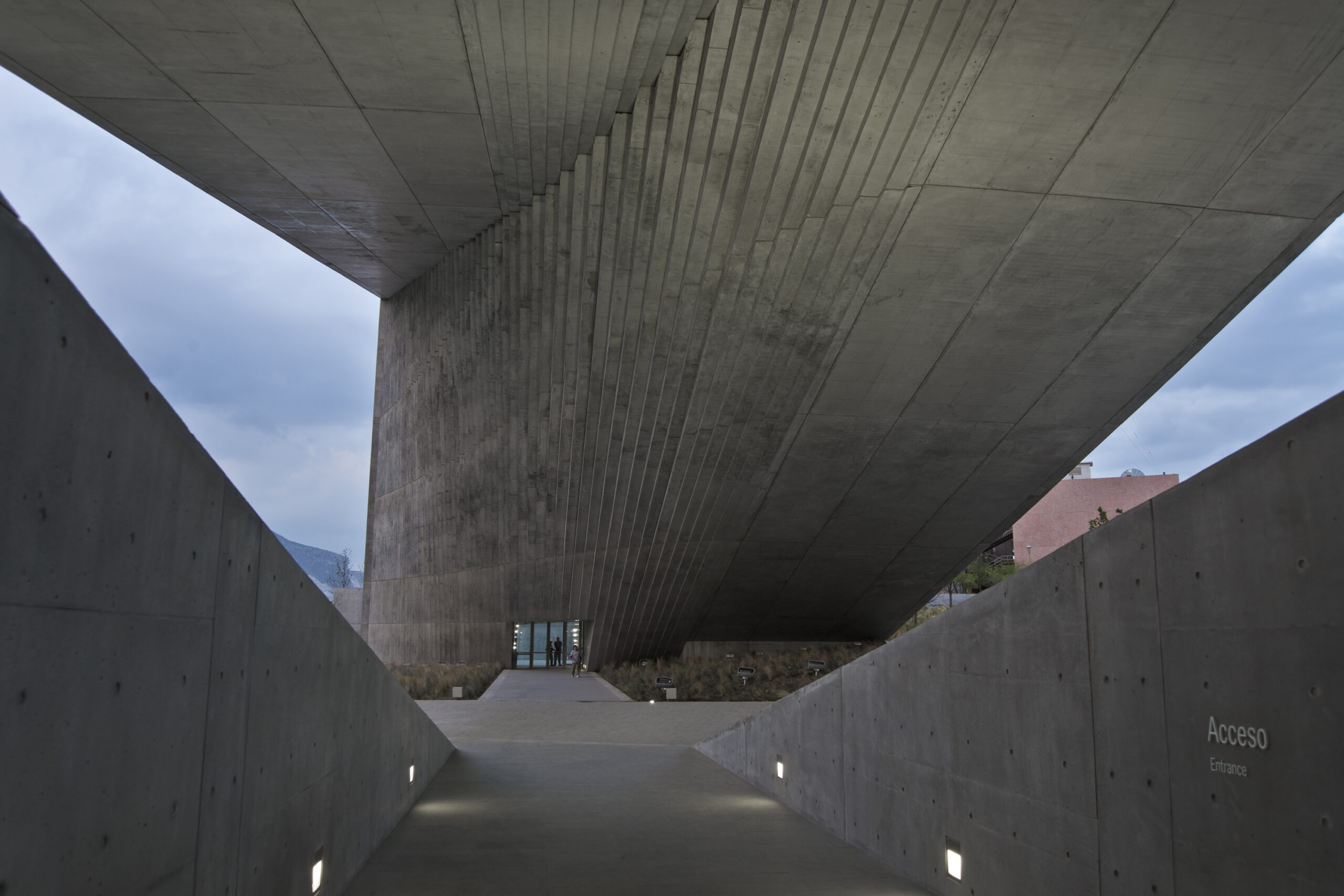
Photo by Roberto Ortiz Giacoman and Jorge Taboada
The façade of this majestic concrete building is three-dimensional, changing directions between the vertical and horizontal planes and artfully mastering the relationship between the building’s interior and exterior while blurring the lines between both, framing the ‘Sierra Madre’ mountain range and opening up the building to the sky and the surrounding landscapes.
The three-dimensional volume that is called “The Shell” almost looks like a solid shape from a distance, especially for the way it spans a distance as long as 80 meters and the way its concrete panels seamlessly align across the building’s several sides and faces. The design of “The Shell” would have not been possible without its innovate structural design, utilizing a principle called composite action where concrete works alongside the structural steel to carry the weight of the building and its materials.
Masdar Institute
By Foster + Partners, Abu Dhabi, United Arab Emirates

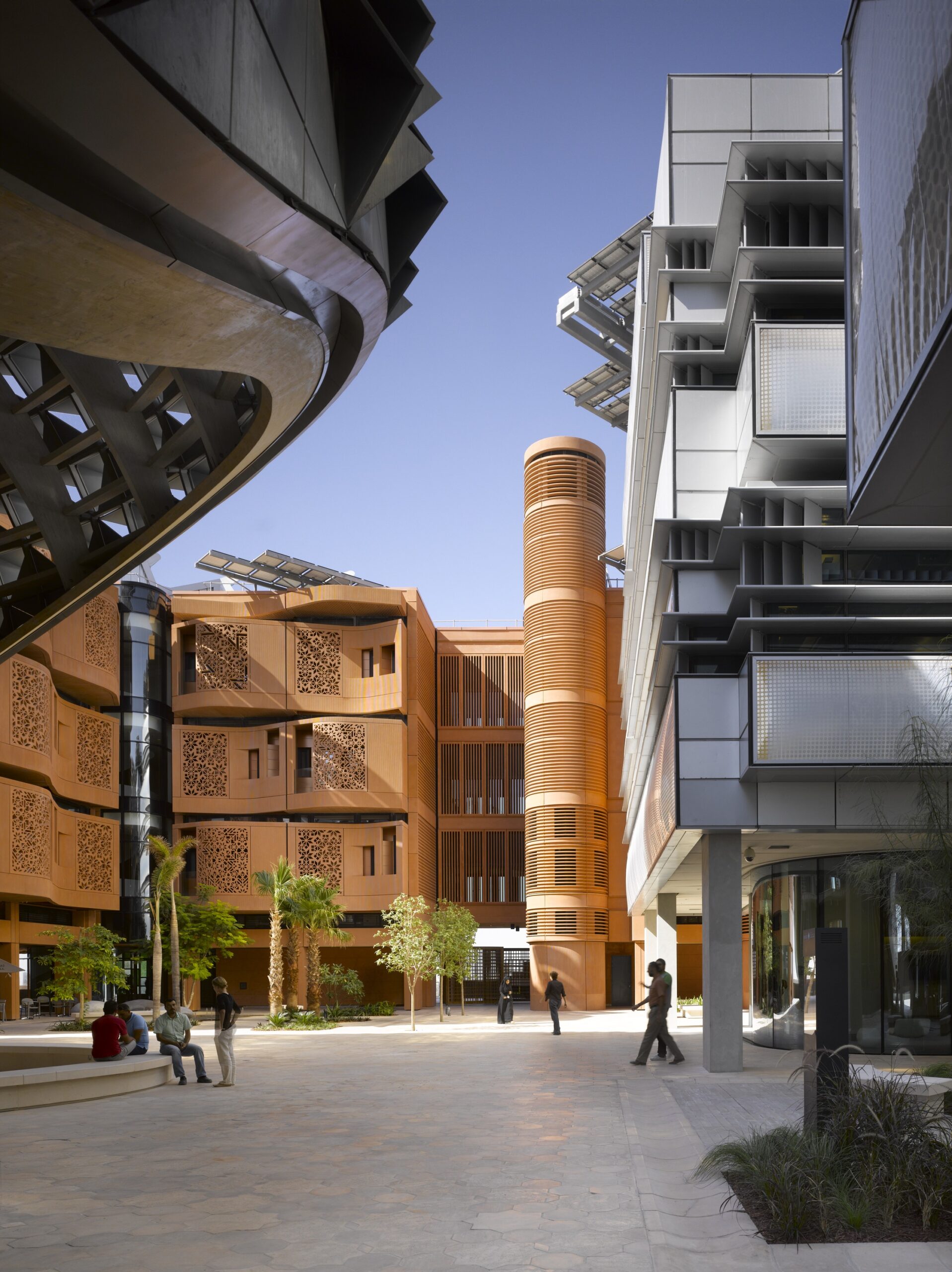 The façade design of the residential buildings at the Masdar Institute offers a modern interpretation of Al Mashrabiya, which is a traditional Islamic architecture element where turned wood is used to produce latticed patterns adorning oriel windows facing that face the streets, for shading and privacy. For materials, the façades are constructed out of sustainably developed glass-reinforced concrete and colored with local desert sand to integrate the building with the context, with the buildings being completely powered by solar energy. Through an alternation of the façade elements between recession and protrusion and proper building orientation, the building is not only self-shading but is also sheltering of the neighboring buildings and the pedestrians at street level.
Scottsdale Community College Business School And Indigenous Cultural Center
By Architekton,Scottsdale, AZ, United States
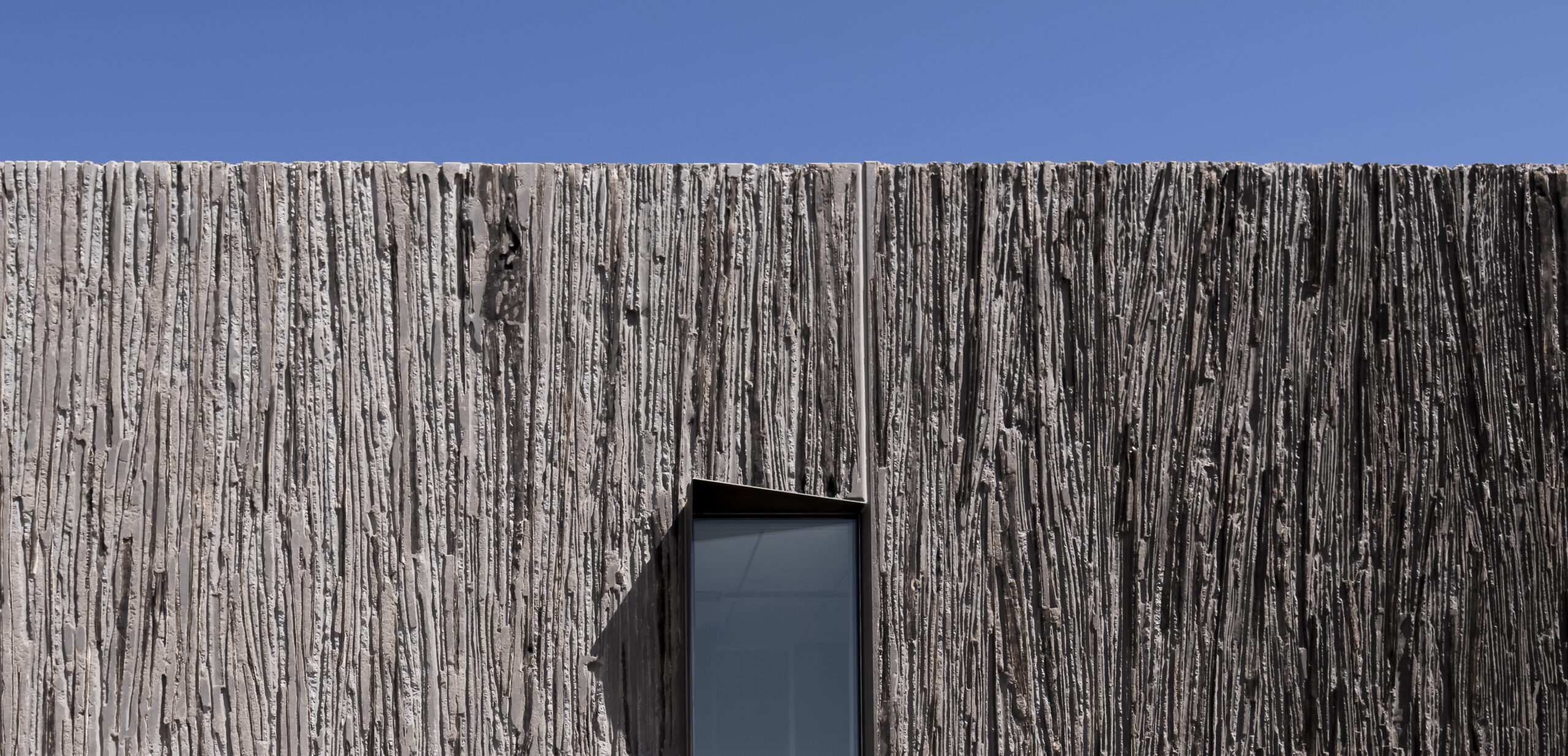
 Built on the land of the Salt River Pima Maricopa Indian Community (SRP-MIC) in Arizona, the building rose from the ground holding traces of the native saguaro cactus, in a notion that celebrates the indigenous community’s connection to their land. Technically speaking, the façade design utilized imbedding saguaro ribs into concrete tilt panels, organized into the formwork during construction and protected against concrete by pouring sand into the ribs.
After the panels were cast, the architectural team and the contractor determined the final appearance of the building by deciding which saguaro to burn, remove or conceal. The design of the façade allowed the building, which also houses the Business School, to visually converse and connect with the context and the adjacent east Red Mountain, while also teaching visitors about the native history of the community who views the saguaro as a symbol of life.
Faculty of Architecture and Environmental Design
By Patrick Schweitzer et Associés Architectes, Kigali, Rwanda
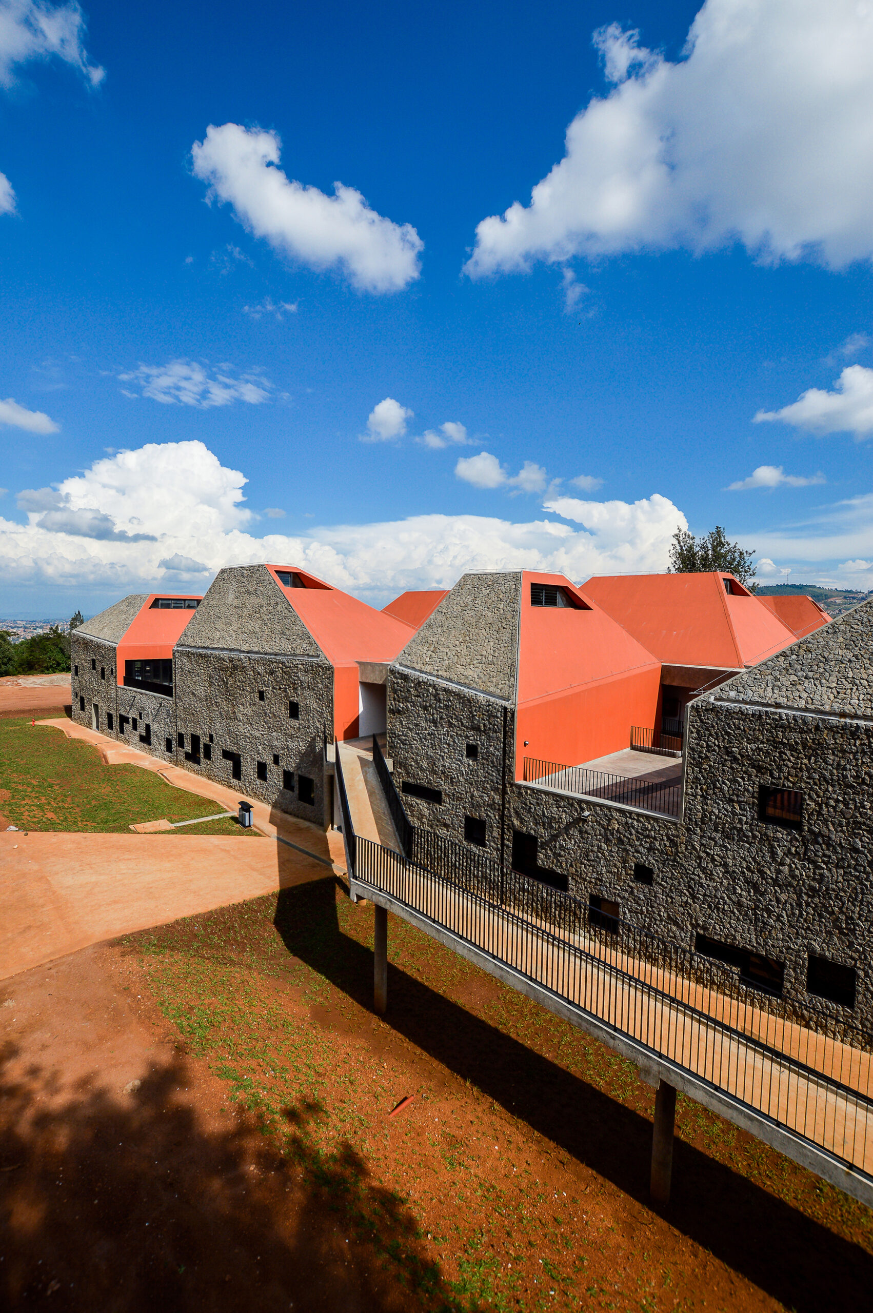
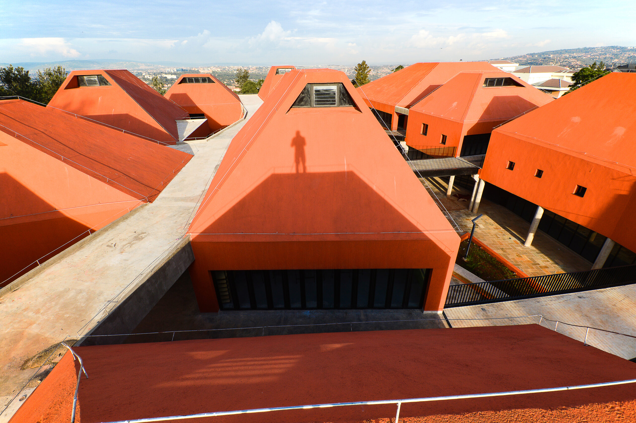 For design of the new Faculty of Architecture and Environmental Design in Kigali, the architectural team drew inspiration from the surrounding landscape and topography, reflected on the thirteen distinctively shaped prism volumes that house the classrooms and design studios. The façade design further emphasized the distinctiveness of the prism shapes, alternating in materials between the local lava rocks and rammed earth on the exterior side of the prisms and a striking orange color on the interior sides.
The use of the former represents Earth and the later represents Fire, as part of the four natural elements that guided the design conception, alongside Water represented in the inner gardens and Air in the building’s circulation. The design of the openings on the building’s exterior aimed to maximize the use of natural sunlight to reduce running costs and create more pleasant interiors, with the project serving as a pedagogic tool that shows and not only tells students how to design.
Coil School for the Arts, Riverside Community College
By LPA, Riverside, CA, United States
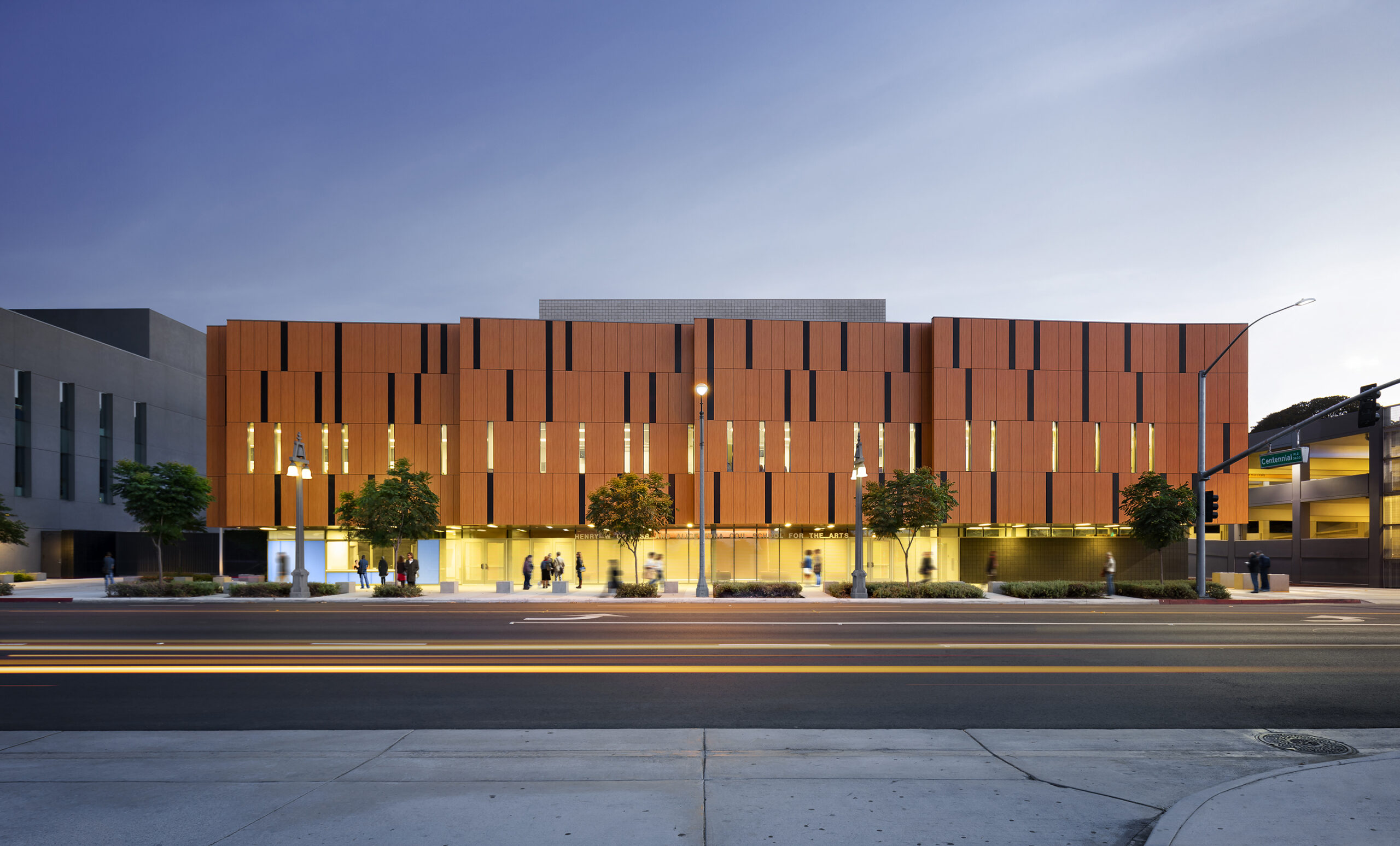
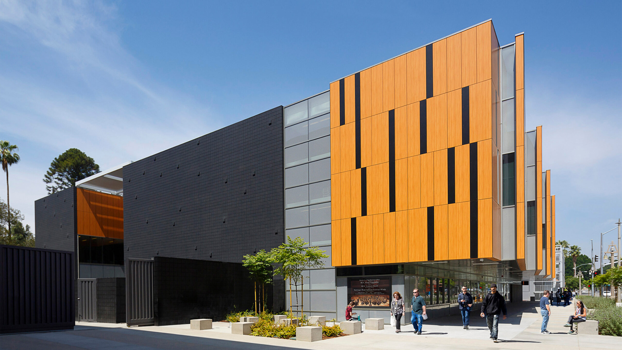 The music that plays inside the new Coil School for the Arts could be seen reflected on the façade design of the main elevation, constructed out of phenolic wood panels that evoke the craftsmanship of wooden music instruments, with a pattern that is inspired by the sheet music notations. In response to the desert climate of the area and the building program’s acoustical requirements, heavy concrete grouted masonry was used as the main construction material of the LEED Silver certified building, with openings kept minimum on the building’s exterior and the building mass pushed back at street level to create a sheltered outdoor lobby where visitors can gather. On the southeast façade, an intimate courtyard is designed for students for gatherings and informal concerts, shaded with a trellised structure that filters out the noise from the street and the harshness of the sun.
Judging for the 11th A+Awards is now underway! While awaiting the Winners, prepare for the upcoming Architizer Vision Awards, honoring the best architectural photography, film, visualizations, drawings, models and the talented creators behind them. Learn more and register >

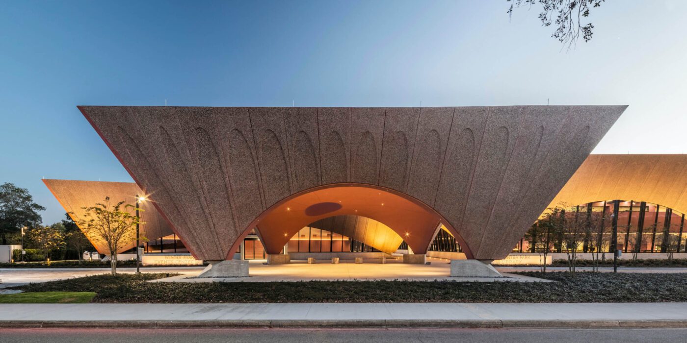
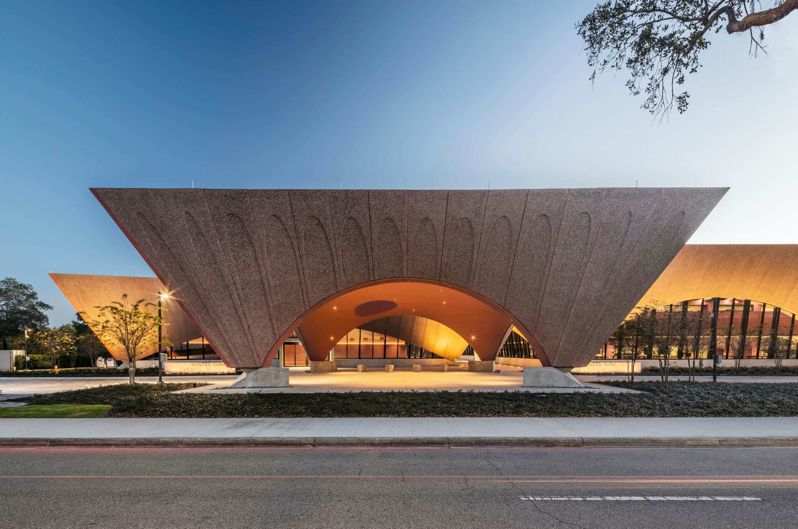
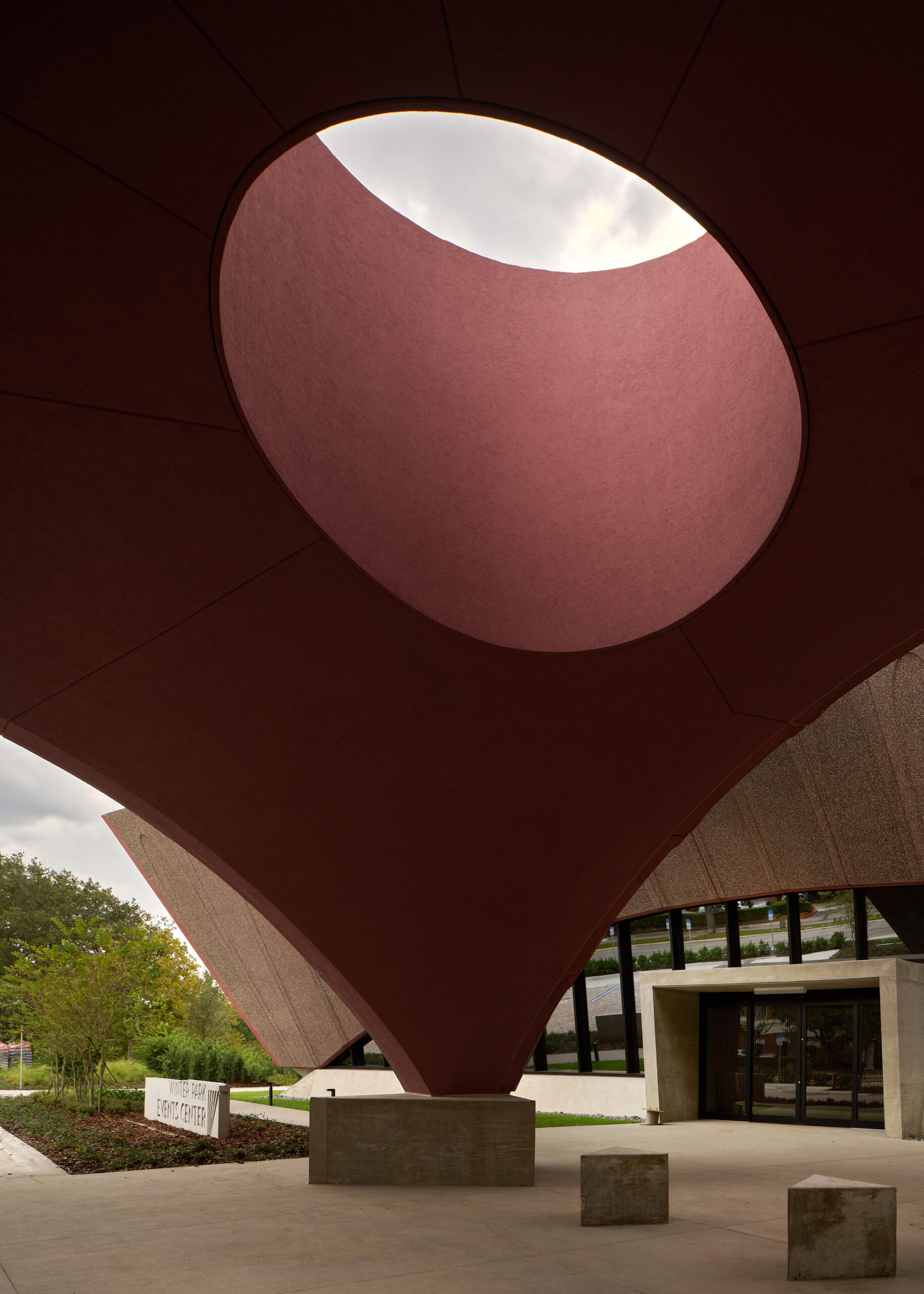
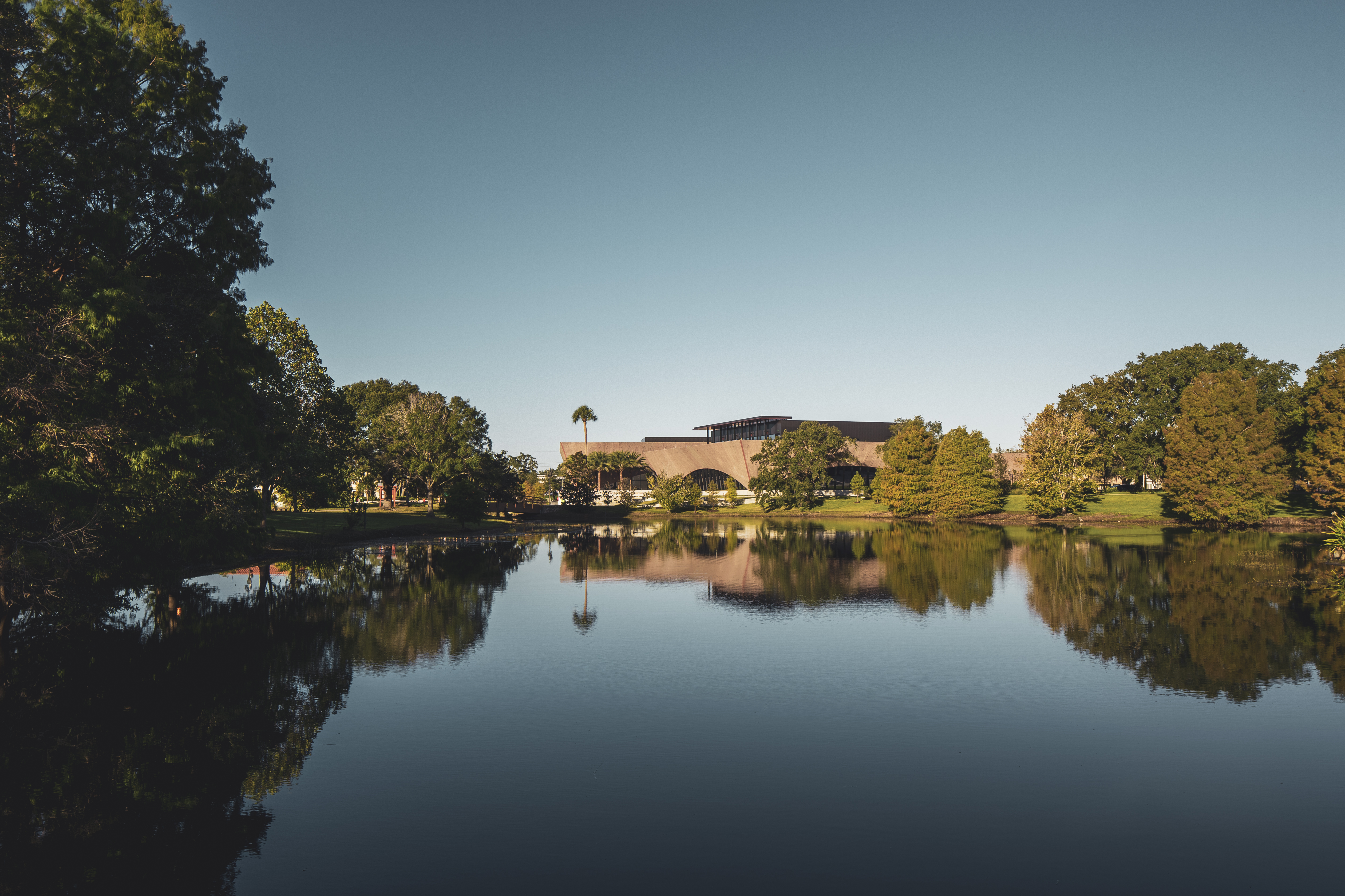
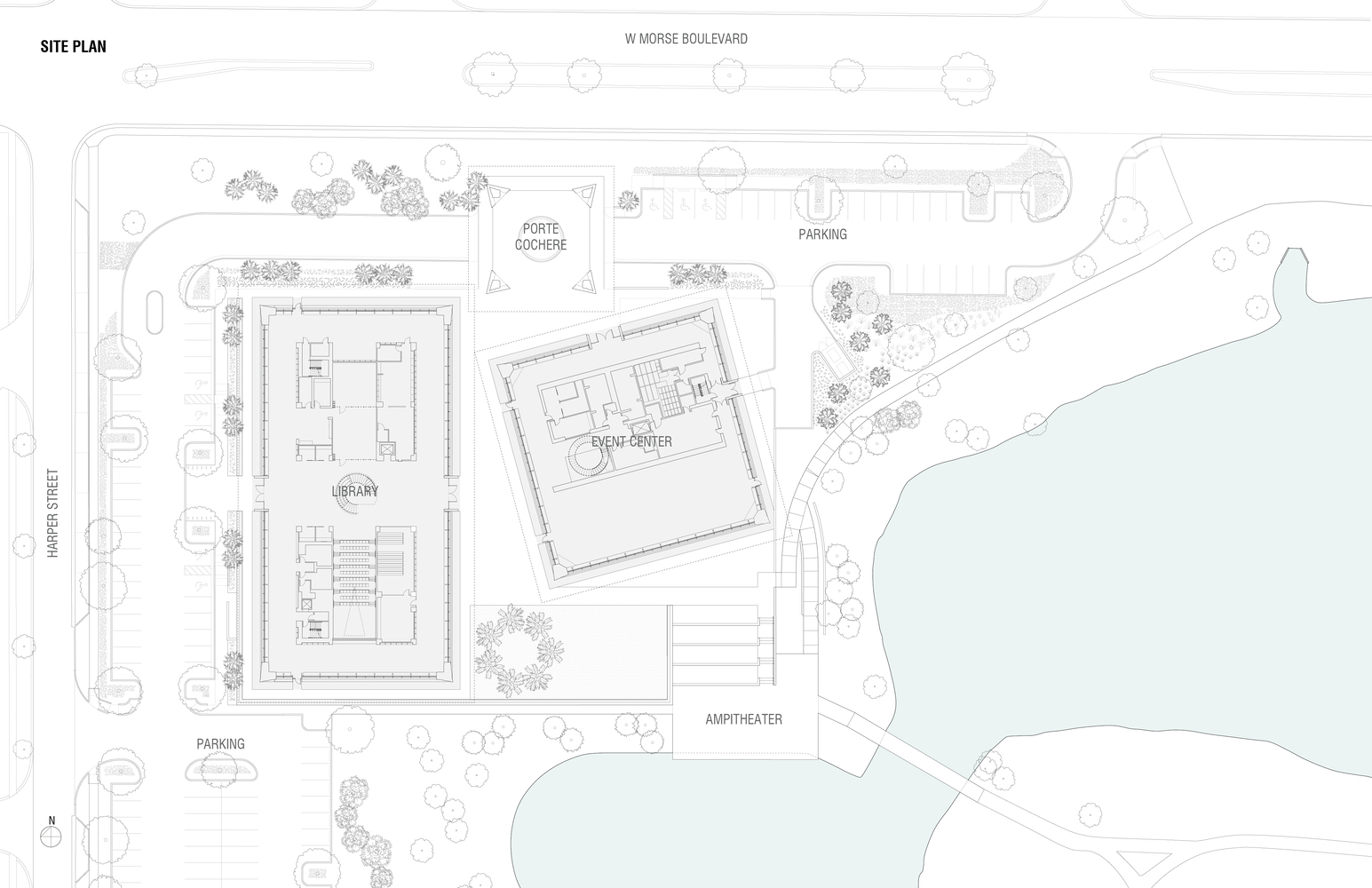 The library’s design team aspired to establish a new civic and cultural hub on the northwest corner of Martin Luther King, Jr. Park in Winter Park, Florida. The library was made to embody the values of the park’s namesake as a space for community empowerment. Seven years in the making, the project spans 50,000 square feet across a trio of canted pavilions.
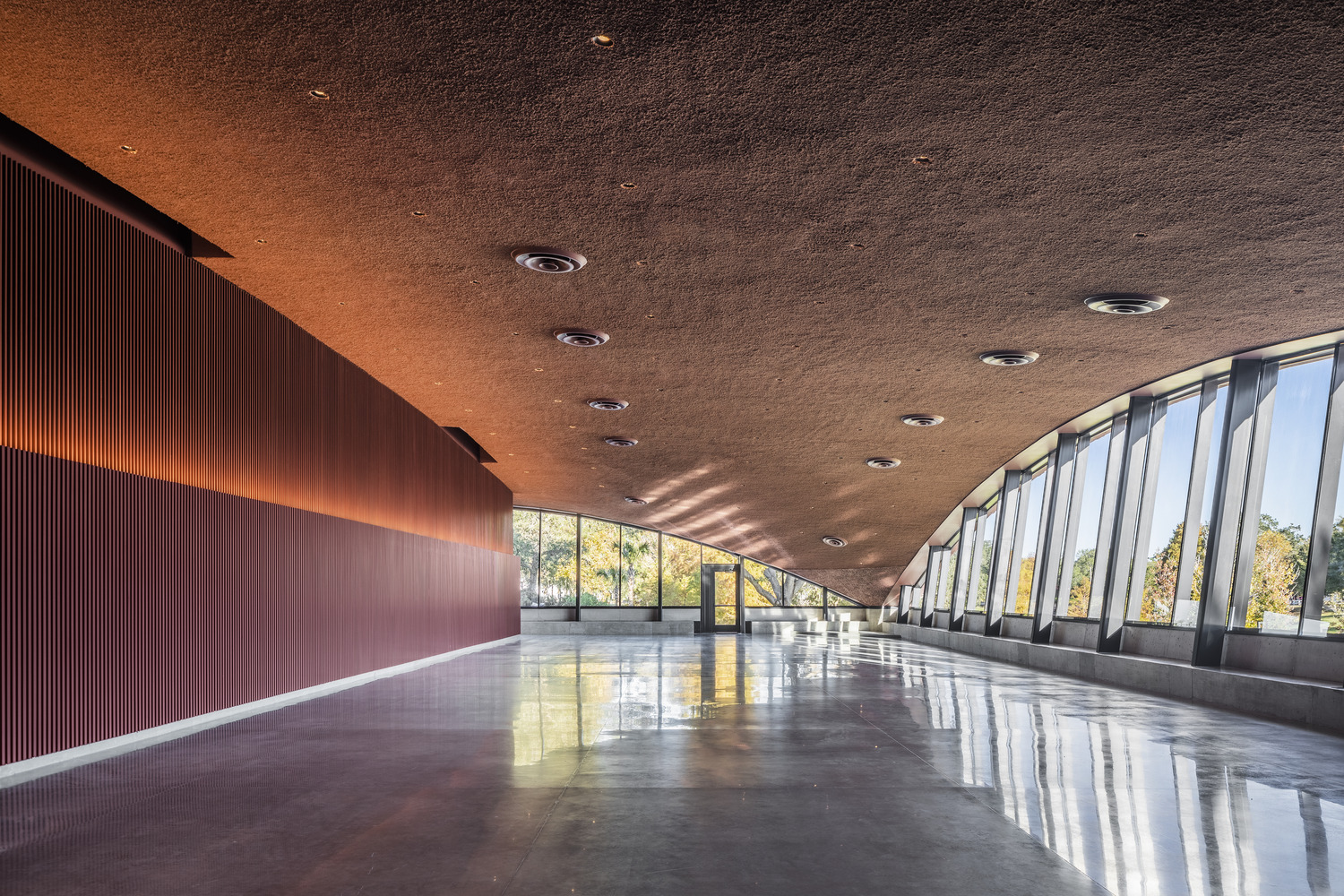
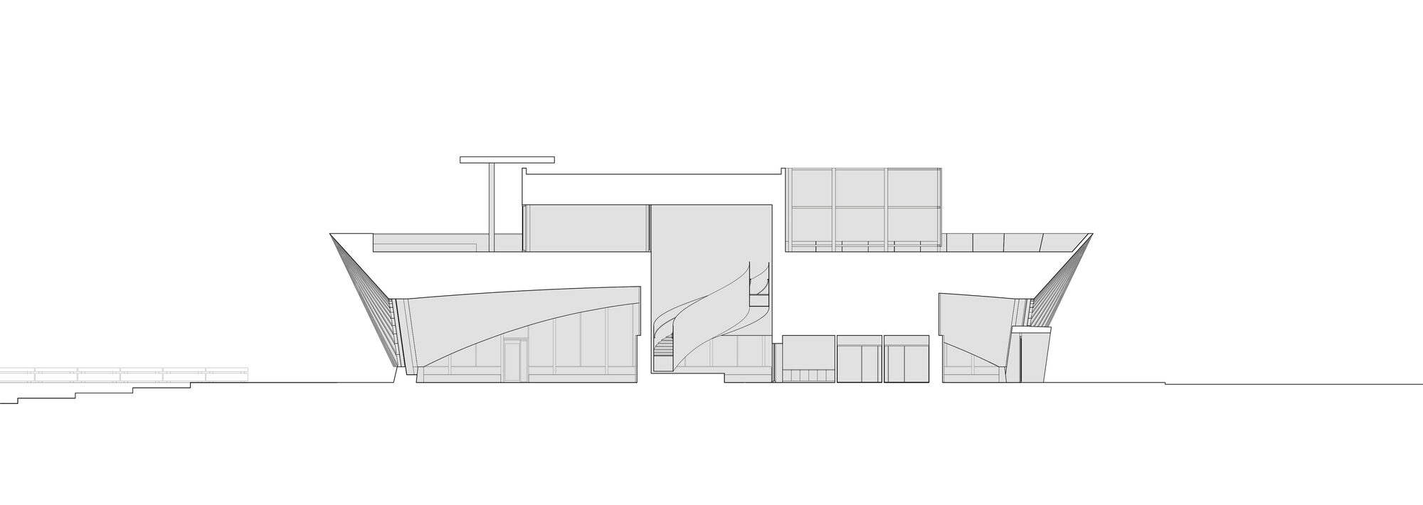 Arches establish the form of the pavilions, where compound, convex exterior walls are made with a series of scalloping, frond-like patterns. The volumes of the library, events center, and porte cochère come very close to touching. Hoping to draw light deep into the new library, the team created the angled exterior walls that lean outward as they rise from the base.
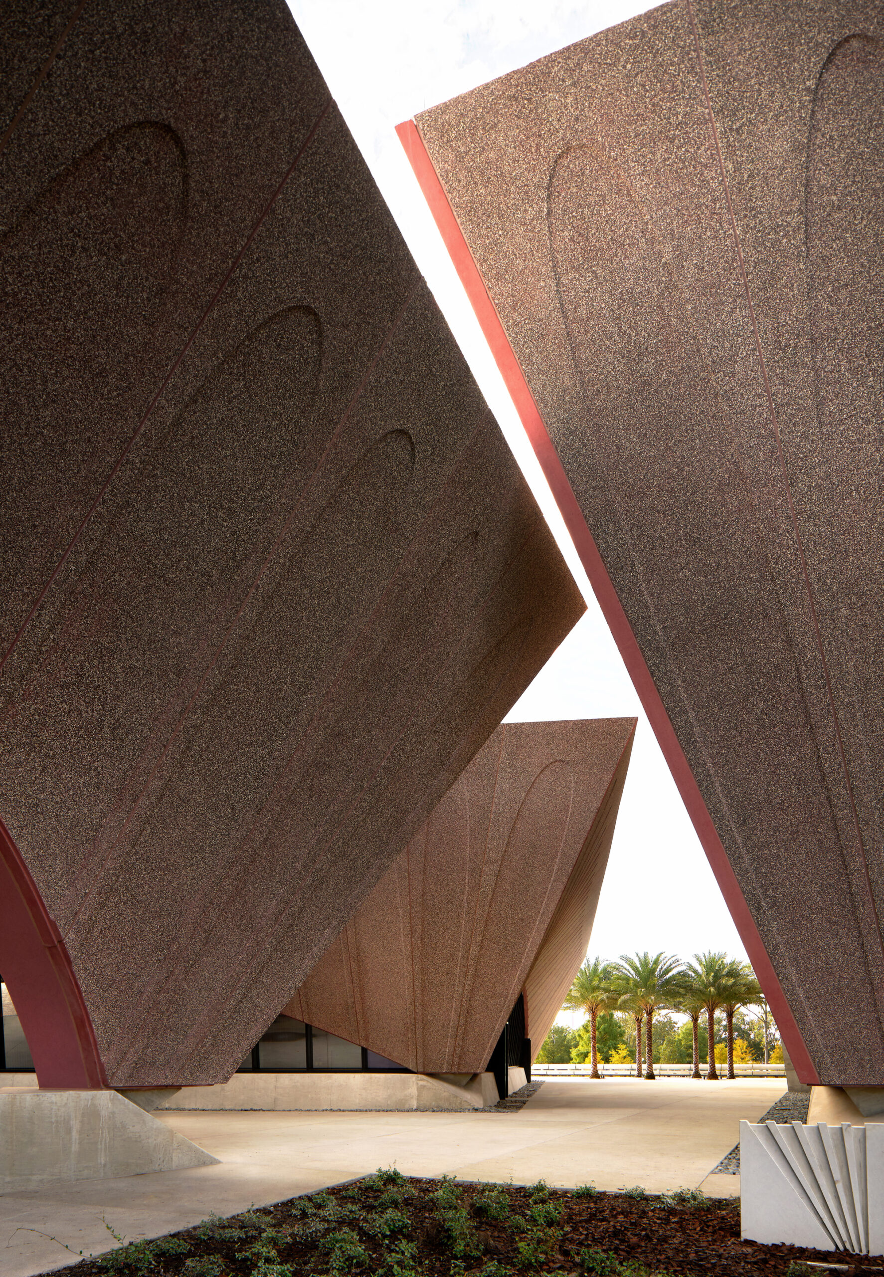 For the precast façade, it was determined that concrete was the only cladding material that could achieve the quality and durability needed for the exterior walls. The texture, color, aggregates and concrete matrix were carefully selected for aesthetics, durability and low maintenance. The curved walls are realized with back-up framing made up of structural steel.
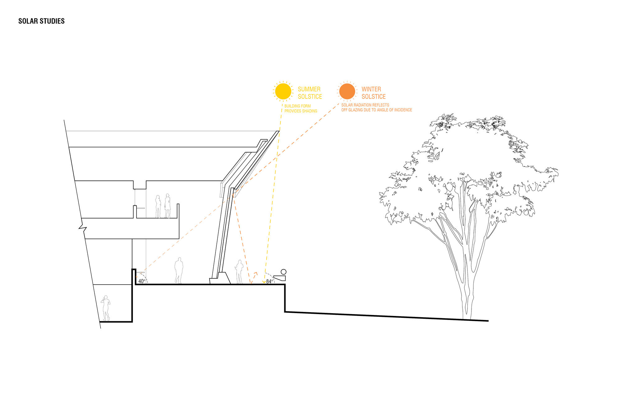 In turn, a series of sloping, arched curtainwalls in the enclosed buildings meet the curved, solid surfaces. The architects mirrored the concrete edge to create continuous seating along the curtain wall. Shallow foundations are used to support the building loads, while the elevated floor and roof are framed using structural steel beams and girders.
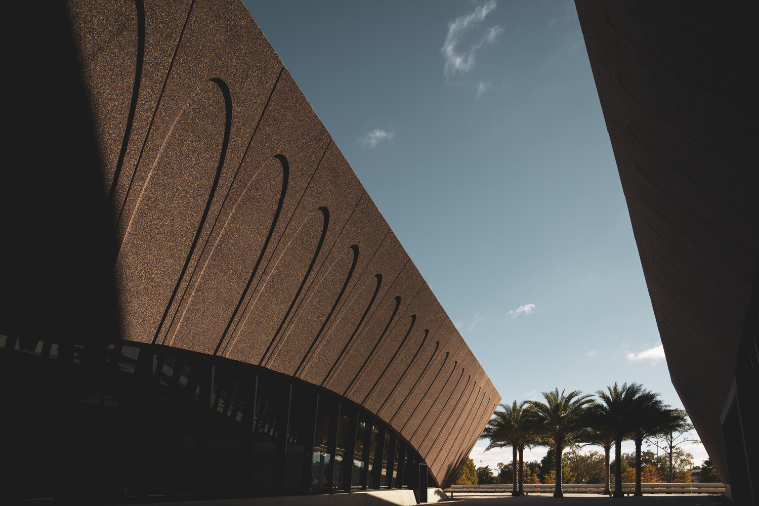
 The site’s physical constraints required efficient use of space for the buildings, the belvedere and parking. The team worked with
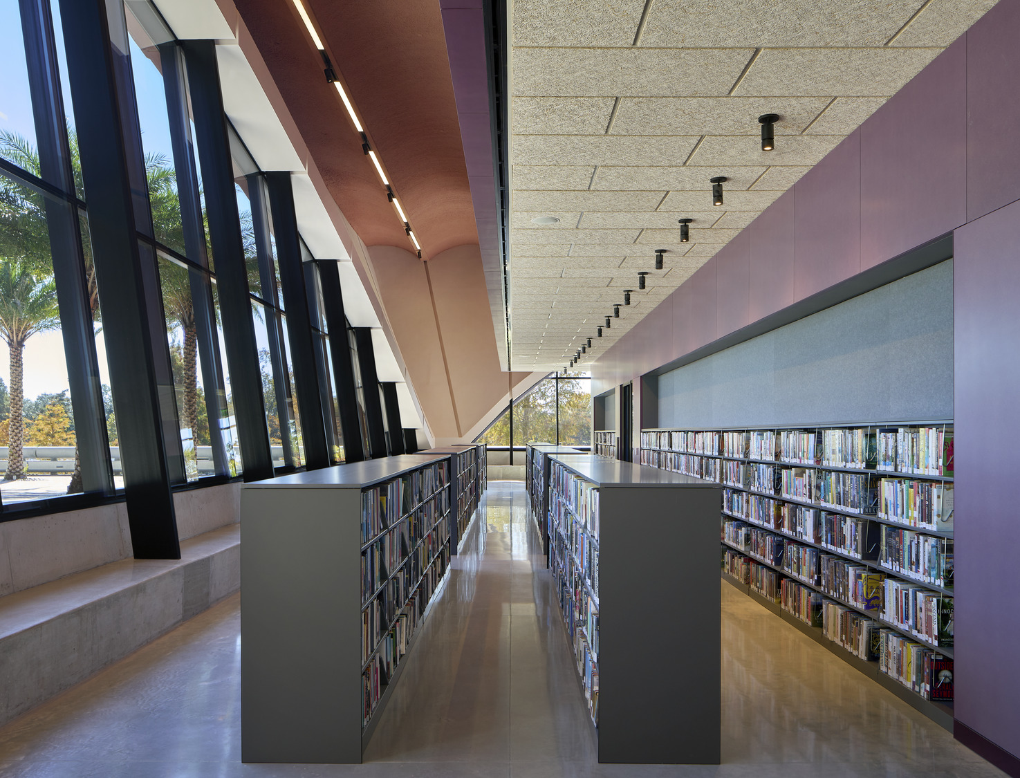
 The library has become a place where the entire community can interact, learn and gather. Inside, open spaces are framed by four timber-lined cores that contain Winter Park’s historical and archival collection spaces, support zones, and private reading rooms. Designing with the community in mind, the event center was made with a flexible auditorium space and a rooftop terrace that offers views of the lakeside park setting.