Portrait of Lasse Lind of GXN
CategoriesSustainable News

“The approach should be to minimise concrete and steel” says Lasse Lind

Mass timber could become a key tool in reducing waste from the construction industry, GXN partner Lasse Lind tells Dezeen in this interview for our Timber Revolution series.

GXN was founded in 2007 as the research arm of Copenhagen-based architecture studio 3XN.

GXN looks at circular and low-carbon design, behavioural design – including the social aspect of buildings – and technologies that can help the industry transition to a more sustainable future.

Use of timber “exploded”

Its use of timber has “exploded” recently, with around half of its buildings now having a significant element of wood in their structure, up from almost none five years ago, Lind said.

“We’ve always been very interested in materials and material technology,” Lind told Dezeen.

“Our material focus has evolved to change over the years and now we’re extremely focused on recyclability, recycled content, low-carbon, natural biogenic materials – that is our absolute focus.”

Portrait of Lasse Lind of GXN
Above: Lasse Lind is a partner at GXN. Top: A CLT-framed hotel on Bornholm is among the studio’s projects. Photo by Adam Mørk

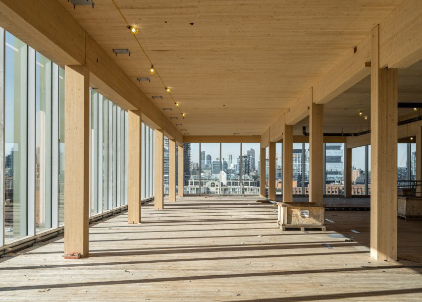
The majority of the studio’s work at the moment is in mass timber, which Lind says has many advantages over other building materials.

“The first one is obviously lower carbon, which is a big advantage, and the fact that it’s kind of regenerative as a material,” he said.

“There are other aspects as well, which are related to build-ability,” he added. “Timber tends to be lighter than, for example, concrete construction. So you need less transport and, in principle, fewer crane lifts.”

Timber helps you “close the loop on waste”

The fact that everything is prefabricated when it comes to mass-timber construction also means it is possible to work with more precise tolerances and cut down on waste, according to Lind.

In a recent project, a full-timber hotel extension on the island of Bornholm, Denmark, the studio even used offcuts from the cross-laminated timber (CLT) used for the building to create furniture and furnishings.

“You don’t have a lot of waste, potentially, in the production,” he said. “Especially if you think about it like we did in the prototype on Bornholm, where we used all the offcuts for furniture – you can actually close the loop on waste in the production chain a bit.”

Construction waste currently accounts for more than a third of all waste generated in the EU.

Wooden building designed by GXN
The studio’s use of timber has “exploded”. Photo by Paul Casselman

As part of its research in this area, GXN is also experimenting with using offcuts from CLT boards as slabs in its buildings.

“You would have to live with the fact that it’s different thicknesses and you would have to look at the grid because if it’s offcut materials, you cannot get everything in eight metres,” he said.

“You have to have some substructure to accommodate a variety of sizes, so you need to spend a little bit more energy on the substructure but then you can actually use these offcuts as actual slabs.”

At the moment, the addition of concrete to the slabs is one of the things that makes it hard to design fully reversible timber buildings.

“In larger timber structures, where you have slabs, the standard practice is to cast everything out due to sound and vibration,” Lind explained.

“So essentially, if you have a timber slab, you cast a screed of concrete on top, and that actually messes up the reversibility of a lot of the structure,” he added.

GXN has attempted to create buildings that use alternatives to concrete slabs, including a version that saw the studio use egg crates filled with sand instead of the slabs.

“What we tried to do on the project on Bornholm is to have these crates and fill them with granite dust, waste production from granite, but the engineers wouldn’t sign off on it, unfortunately, so we weren’t able to do that for that project,” Lind said.

“But we are doing a building right now where we are getting rid of that concrete screed,” he continued.

“It’s something we’re always aware of when we’re building with timber – if we can get away from that detail, we’d like to, because it’s a small detail but it messes up the reversibility of the whole structure.”

Carbon budget “structures the discussion”

Lind believes that in the future, we will see a lot of hybrid timber systems as the industry figures out when wood is best to use.

“We [need to] figure out what timber is really good for, what concrete is really good for and what steel is really good for,” he said.

“The approach should be to minimise the use of concrete and steel, but there are just parts of a building where [those materials] makes more sense,” he added.

“I’m very interested that we use materials where they are best, and I think there are a lot of places where we could easily replace concrete or steel with timber.”

Timber building by GXN
The Lemvig climate centre features a wavy wooden facade. Photo by Adam Mørk

To help minimise carbon emissions, GXN sets carbon budgets for each of its projects that vary depending on the type of project and country it’s built in.

“The one thing we always try to do is bring a carbon budget, because it puts carbon up for discussion with every material choice and in that sense, it structures the discussion, like a financial budget does,” Lind said.

As timber buildings become more popular, Lind believes that as well as having an impact on carbon emissions, the material will also impact the way that buildings look, behave and feel.

“I think we will begin to explore, as designers, the vocabulary of what we can do, which I think will be very interesting,” he said.

“I don’t think it will be the same as architecture was 50 years ago when we kind of discovered the computer, but if you think about it, there are a lot of really creative half-timber buildings in Europe that have all kinds of weird ornaments and shapes and forms,” he added.

But though the use of timber and mass-timber is becoming more popular, there are still challenges facing architects when designing timber buildings. One of these is conveying the safety of the buildings to insurance companies.

“What we’re seeing as a challenge for timber buildings right now is generally insurance, because it’s a different material from what people usually use,” Lind said.

“We often find that insurers need to get on board and understand that it’s different. Because you can secure timber buildings, you can build them in a way where they are safe to operate and they’re safe as an asset, but there is a degree of scepticism from insurers.”

Designers should love timber’s “natural patina”

There are also sometimes regulatory difficulties as fire safety rules are often based on buildings made from steel or concrete.

“Inherently timber structures burn in a different way than steel or concrete does,” Lind said.

“And you can build safely with timber, but the way that you measure and regulate it needs to be different because it’s not steel,” he continued.

“Steel gets extremely hot and then it snaps, timber burns very slowly. It’s just a different strategy, fire-wise, that you need to apply.”

Timber interior by GXN
GXN uses a carbon budget for its projects. Photo by Rasmus Hjorthøj

Architects and clients also need to get used to the fact that timber is a living material, which means it will change in ways that concrete and steel buildings might not, he argued.

“There’s a certain degree of natural patina that you should love as a designer,” Lind said.

“You should love the fact that it’s a material that changes over time – it’ll change colour, maybe have some cracks, it’s not going to look the same forever,” he added.

“So there’s some aesthetical considerations that you should be able to take your client through and understand that this is a living material and performs in a different way than an inorganic material.”

The architect believes that we’re only at the beginning of seeing the possibilities of timber and mass timber.

“There are loads of things that you could do even with fairly simple timber construction; there’s a whole field of investigation that we’re getting into which will be very interesting,” Lind concluded.


Timber Revolution logo
Illustration by Yo Hosoyamada

Timber Revolution

This article is part of Dezeen’s Timber Revolution series, which explores the potential of mass timber and asks whether going back to wood as our primary construction material can lead the world to a more sustainable future.

Reference

St Regis Kanai
CategoriesArchitecture

Constellations and mangroves inform design of St. Regis Resort Kanai

Architecture studio Edmonds International has created a hotel near Playa del Carmen in Mexico that comprises a series of interlocking circular forms embedded in a mangrove forest.

Made up of a series of pavilions, the hotel is sited near the Sian Ka’an Reserve on the Yucatán coast near the vacation towns of Playa del Carmen and Cancún.

In order to tread lightly on the delicate mangrove swamp during construction, Edmonds International utilised prefabricated elements and worked closely with the local environmental authorities.

St Regis Kanai
Edmonds International created a resort on the Mayan Riviera near a nature reserve

The result was a series of circular and semi-circular pavilions that were raised above the mangrove, while the orientation of the facades was designed to open the resort up to the natural surroundings, and to the sea.

“Surrounding natural landscape was physically protected during construction while assuring constant natural water flow to surrounding mangrove under the constant guidance and supervision of the governmental environmental protection agency,” studio founder Michael Edmonds told Dezeen.

“The extensive use of prefabricated elements and precast concrete foundations together with above-grade steel structure was used to avoid excessive onsite concrete pours during construction.”

Water and wood siding with trees
It comprises a series of circular and semi-circular forms

A series of white translucent panels line the sides of the structures that face away from the sea. Giving the structure an airy appearance, the panels were made from Teflon-coated Ferrari textile stretched over powder-coated steel frames.

The residential areas of the resort are semi-circular, while the public areas are circular with courtyards in the middle that hold amenities.

Metallic sculpture with white collumns
Open-air terraces and spaces are found throughout the resort

According to the studio, the circular program was influenced by Mayan cosmology.

“Its architecture stems from organic integration within the geometry of the mangrove where it’s situated and the Mayan idea of ​​following the Pleiades formation centering its structures,” said Edmonds International.

“The design comes forth as two intersected circles that contain public areas, the BOH and three semicircles of larger radius that open towards the mangrove and in a second plane to the ocean.”

Throughout, a series of elevated walkways connect the different programs and, when viewed from above, complement geometrically the semi-circular residential envelopes.

In the courtyards and walkways, gardens, pools and other water features weave in and out of lounge areas and amenity spaces, including a spa and eight separate restaurants.

Hallway with glass and fabric shades
The residential units are located in the semi-circular structures

A driveway leads up to an entryway below a cantilevered terrace, leading into the lobby area, which sits at the conjunction of multiple programs.

The lobby is a three-storey, partially open-air space, characterised by the limestone, walnut and textiles that interior designer Chapi Chapo Design carried through the entirety of the resort.

Three-storey lobby interior
The interiors were designed by Chapi Chapo

The Mayan Riviera is known for a profusion of similar resorts, and in 2019 Italian architect Stefano Boeri even proposed building a smart city in the region to mitigate the environmental effects of development.

Other recent projects in the area include an apartment block built in the city of Cancún that was designed to break down the boundaries between tourists and the local workers who maintain the tourism industry.

Photography is courtesy of Courtesy of St. Regis Hotels & Resorts.

Reference

Curtain pulled back to reveal a mirror
CategoriesInterior Design

Lovers Unite wraps Bar Chelou in Pasadena with expressive drapery

Late artists Christo and Jeanne-Claude influenced the dramatic drapery around this restaurant in Pasadena, California, designed by Los Angeles studio Lovers Unite.

Conceived by chef-owner Douglas Rankin as a take on a Parisian bistro, Bar Chelou opened earlier this year in a building in a Spanish Colonial Revival plaza next to the Pasadena Playhouse.

Curtain pulled back to reveal a mirror
Natural muslin is draped around Bar Chelou, emulating the works of Christo and Jeanne-Claude

Lovers Unite had just a few weeks to transform the space into an operational dining room, so looked to ways it could make maximum impact with minimal time.

The studio found inspiration in the legacy of Christo and Jeanne-Claude, who famously wrapped some of the world’s most recognisable monuments in giant swaths of fabric – most recently the Arc du Triomphe in Paris, which was realised a year after Christo’s death.

The duo’s seemingly effortless but meticulously planned drapery is echoed on a much smaller scale around the Bar Chelou space, which was formerly a Baroque-themed restaurant called Saso.

Dining room with copper tables and green floor
The restaurant in Pasadena features copper-topped tables that reflect light from an amber glass chandelier

“We felt the spirit of Christo and Jeanne-Claude’s work was a good conceptual fit for a project, which is supposed to evolve over time, but we’re able to be referential while being playful with our approach,” Lovers Unite told Dezeen.

“Translating the gesture of the wrap to a human scale and a hospitality context changes the meaning and impact of the gesture — it’s not necessarily an artwork but it’s evocative and surprising.”

Patrons enter via an arched doorway, and are immediately met with the sight of natural muslin fabric hung around the walls and above the bar.

Curtains surrounding dining room
Curtains surround the dining room and offer glimpses of the kitchen in places

“Upon entering, one might feel as if they are visiting an expansive and uncluttered artist’s studio in a transitory state; hints abound that change is coming,” said the Bar Chelou team.

Lifts and pleats in the curtains created by thick ropes reveal the chefs at work in the kitchen, as well as framing views of the arched windows seen in mirrored panels.

A dark shade of green was chosen to contrast the natural muslin and is used across the dining room floor and built-in leather banquettes.

Similarly coloured tiles clad the front of the walnut-topped bar counter at the front, which is slightly lower that the main dining area and offers additional seating.

Bar clad in glossy green tiles
A dark shade of green chosen to contrast the fabric covers the front of the bar counter

Thonet-style bistro chairs accompany polished copper cafe tables, which reflect the light from a custom, amber glass chandelier that spans the length of the room.

Walls were painted to match the hue of the curtain fabric, and the window frames are bright green.

Bar area illuminated by green-framed arched windows
Light pours into the bar area through arched windows with frames painted bright green

Pasadena located is northeast of Los Angeles, where many new restaurants with notable interiors have opened over the past few months.

Among them are the retro-futurist 19 Town designed by Jialun Xiong, and Great White Melrose, which offers outdoor dining on a pink-plaster patio.

The photography is by Chris Mottalini.

Reference

Using magnets for net-zero cooling solutions
CategoriesSustainable News

Using magnets for net-zero cooling solutions

Spotted: Fluorinated gases (F-gas) are so harmful to the environment that the EU is phasing out their use, aiming to get down to 20 per cent of the 2014 amount by 2030, and banning their use in new devices where “less harmful alternatives are widely available.” German company Magnotherm is one of the companies creating alternatives that provide refrigeration without the environmental toxins. 

Taking advantage of the magnetocaloric effect (MCE) – a process in which some materials heat up when magnetised – the Magnotherm team uses surges in magnetic fields to heat and cool products. The process uses no F-gases and produces zero direct carbon dioxide emissions. When materials are placed in thermally insulated chambers and a magnetic force is applied, the materials heat up. Extracting the heat then allows for products to be heated or cooled, as needed.

The company recently introduced its first product available for commercial sale. The Polaris refrigerator is a fully magnetic beverage cooler that holds up to 150 drinks and cools them down to five degrees Celsius. Importantly, the system requires little power for its low-pressure processes, making it almost noise-free. Magnotherm builds bespoke cooling systems that can be set to specific temperatures, making the technology usable in many industries. Efficiency remains steady regardless of the size of the system.  

Cooling is so important to the modern food industry that innovators are improving almost every aspect of the cold chain. Springwise has spotted a supercooling system that prevents ice formation as well as solar-powered refrigerated trucks.  

Written By: Keely Khoury

Reference

© Zone of Utopia + Mathieu Forest Architecte
CategoriesArchitecture

How Ice Cubes by Zone of Utopia + Mathieu Forest Architecte is Changing the Skyline of Northern China


Ice cubes – The question we were asked was that of the spirit of a place. The client imagined a flat building, we proposed a tower: to conquer the sky, mark the territory and put the whole commercial district in tension with the future ski slope on the other side. In this commercial environment, our cultural center says “I am here!“. You can see it everywhere, day and night. The city is conceived from landmarks and vanishing points.

Architizer chatted with Mathieu Forest, Founder of Mathieu Forest Architecte, and Qiang Zou, Design Principal at Zone of Utopia, to learn more about this project.

Architizer: What inspired the initial concept for your design?

We are starting from a virgin site with only fields and sky as the landscape. We wanted a building that captures the “thickness of the air”, the only tangible context, which by its material and its form is anchored in the sky: the gray and misty skies, the sunbeams which pierce it, the snowy skies, the steely blue skies so characteristic of northern China, the skies overwhelming with light in summer, the golden evening horizons, the bluish mornings… our building continually changes its appearance with the rhythm of the seasons, the variations of the climate and hours, and like a mirror reveals the beauty of a changing sky and landscape. Its facades are a gigantic glass printed fresco according to a unique design, without any repetition. It is also an echo of the representations of landscapes in Chinese painting, whose mystery arises from the immensity and detail.

© Zone of Utopia + Mathieu Forest Architecte

© Zone of Utopia + Mathieu Forest Architecte

© Zone of Utopia + Mathieu Forest Architecte

© Zone of Utopia + Mathieu Forest Architecte

This project won in the 10th Annual A+Awards! What do you believe are the standout components that made your project win?

It is a poetic architecture, for which the technique, as advanced as it is, is at the service of emotion. We think that we must refuse generic, cloned, sanitized, standardized architectures, such as the current world produces too much. We must rediscover the sense of geography and context and never forget that the only goal to be achieved is that of the pleasure of living. As urban art, architecture must address everyone. We are looking for several degrees of mystery: we can see in this architecture the evocation of a mass of ice floating on a lake or that of a lantern and marvel at it, but going deeper, there is a more impressionist vision of capturing the effects of light, with a certain form of abstraction and constant renewal.

© Zone of Utopia + Mathieu Forest Architecte

© Zone of Utopia + Mathieu Forest Architecte

© Zone of Utopia + Mathieu Forest Architecte

© Zone of Utopia + Mathieu Forest Architecte

What was the greatest design challenge you faced during the project, and how did you navigate it?

The greatest challenge was the realization of the facade supposed to evoke a form of immateriality. Many prototypes had to be made to properly adjust the quality and color of the glass, the density and the color of the printed patterns. It was also necessary to work closely with the engineers to design the most absent structures possible. The nicest compliment we often get is that people think when they see the photos that they are perspectives when the building is well constructed!

© Zone of Utopia + Mathieu Forest Architecte

© Zone of Utopia + Mathieu Forest Architecte

© Zone of Utopia + Mathieu Forest Architecte

© Zone of Utopia + Mathieu Forest Architecte

How did the context of your project — environmental, social or cultural — influence your design?

We started from an almost virgin site, the most difficult situation for a contextual architect. There was only a master plan and a bird’s eye view of a future residential area organized along the lake, headed by a tourist area and shops and, as a highlight, a future artificial ski slope to attract future residents and tourists. This district of 10,000 housing units will accommodate approximately 30,000 inhabitants and will be part of the future new town of Pinyuan which will accommodate a total of 500,000 inhabitants.

We took advantage of the incredible dynamism of Chinese industry: in the glass sector in particular. Large samples manufactured in record time allowed us to develop the exact colors and ink densities desired, with exceptional thermal performance.

© Zone of Utopia + Mathieu Forest Architecte

© Zone of Utopia + Mathieu Forest Architecte

© Zone of Utopia + Mathieu Forest Architecte

© Zone of Utopia + Mathieu Forest Architecte

What drove the selection of materials used in the project?

It is a steel and glass building. Steel is adapted to an architecture of lightness and audacity, but also to allow prefabrication and great speed of implementation. We used glass for its advantages while avoiding its disadvantages, taking into account the continental climate, with cold and dry winters and hot and rainy summers. We have designed a waterproof double skin with controlled ventilation: in winter, the double skin is closed and the greenhouse effect makes it possible to avoid almost any heating. In summer, the air cooled by evaporation at the water surface is collected and circulates in the double skin to evacuate heat accumulations and cool the thermal facade and therefore reduce air conditioning needs.

© Zone of Utopia + Mathieu Forest Architecte

© Zone of Utopia + Mathieu Forest Architecte

© Zone of Utopia + Mathieu Forest Architecte

© Zone of Utopia + Mathieu Forest Architecte

What is your favorite detail in the project and why?

We want the structure to disappear so that only the effects remain. The details of the suspended facade were the most sensitive to develop, in the common parts as much as for the details of angles, overhangs and transition between volumes. We worked with our facade engineer on minimalist principles. Each glass of the double skin is only held by 4 pieces of steel of a few centimeters and a simple bead of transparent silicone ensures the seal.

© Zone of Utopia + Mathieu Forest Architecte

© Zone of Utopia + Mathieu Forest Architecte

© Zone of Utopia + Mathieu Forest Architecte

© Zone of Utopia + Mathieu Forest Architecte

How important was sustainability as a design criteria as you worked on this project? 

This question is of course a major one at the present time. This is why we have designed a double-skin façade which considerably reduces energy requirements. In winter, there is no need to heat the building. Dynamic thermal studies have shown that our design saves 50% energy compared to a traditional double-glazed facade. After a few years, the investment in the double glass skin is fully compensated and after 50 years, the gain is considerable.

© Zone of Utopia + Mathieu Forest Architecte

© Zone of Utopia + Mathieu Forest Architecte

© Zone of Utopia + Mathieu Forest Architecte

© Zone of Utopia + Mathieu Forest Architecte

In what ways did you collaborate with others, and were there any team members or skills that were essential in bringing this Award winning project to life?

We collaborated very efficiently, mainly through video conferences. The engineers for the structure and the facade were particularly called upon to be able to build the project and in general, all the actors worked very intensely with the will to be able to achieve this result.

© Zone of Utopia + Mathieu Forest Architecte

© Zone of Utopia + Mathieu Forest Architecte

Were any parts of the project dramatically altered from conception to construction, and if so, why?

Surprisingly, nothing has changed. The process was very fast and the building constructed is very faithful to the sketch.

© Zone of Utopia + Mathieu Forest Architecte

© Zone of Utopia + Mathieu Forest Architecte

How have your clients responded to the finished project?

The client is extremely satisfied with the project and its numerous publications. More generally, all the feedback tells us that the building is very well received by visitors and users.

© Zone of Utopia + Mathieu Forest Architecte

© Zone of Utopia + Mathieu Forest Architecte

What key lesson did you learn in the process of conceiving the project?

Having to go fast does not prevent designing with complexity and accuracy.

© Zone of Utopia + Mathieu Forest Architecte

© Zone of Utopia + Mathieu Forest Architecte

How do you believe this project represents you or your firm as a whole?

It is a contextual project, even if the urban context was almost non-existent. It exactly answers a question asked by a program and a site. In this, it represents our architectural philosophy well.

© Zone of Utopia + Mathieu Forest Architecte

© Zone of Utopia + Mathieu Forest Architecte

How has being the recipient of an A+Award evoked positive responses from others?

It is a great honor for us to receive such a distinction. Especially because we are a young architecture firm and that encourages us enormously to continue our work. This also contributes to our positive image for clients and our partners. It is very important for us.

© Zone of Utopia + Mathieu Forest Architecte

© Zone of Utopia + Mathieu Forest Architecte

How do you imagine this project influencing your work in the future?

We believe that projects always ask new questions for new answers. Each project teaches us, of course, but we will never do the same thing twice.

© Zone of Utopia + Mathieu Forest Architecte

© Zone of Utopia + Mathieu Forest Architecte

Is there anything else important you’d like to share about this project?

The project was designed and carried out during the COVID, in a very short time. There were 20 months between sketch and delivery. Challenge increased by the pandemic which banned travel and stopped the construction site for 4 months. We had to invent, like others, new methods. We worked and checked the site from photos and videos. We had daily video meetings. Paradoxically, the COVID has reinforced the good coordination between all.

For more on Ice cubes, please visit the in-depth project page on Architizer.

Ice cubes Gallery

Reference

Modular offices with timber frames and glass walls
CategoriesInterior Design

KKDW Studios creates offices for a yoga teacher in Austin

Austin-based KKDW Studios has designed the headquarters for a yoga subscription app called Find What Feels Good, including a space for filming instructional videos.

KKDW Studios founder Kelly DeWitt collaborated with yoga teacher Adriene Mishler – who became well-known through her Yoga With Adriene instructional videos – to create a base for Find What Feels Good, the platform she co-founded that offers video tutorials for at-home workouts.

Modular offices with timber frames and glass walls
KKDW Studios used a modular system to build offices within the space for Find What Feels Good

Located in East Austin, the 5,000-square-foot (465-square-metre) space was previously an empty shell with blue walls and a high-gloss, yellow-tinged concrete floor.

DeWitt’s team described an intention to create “a space to evolve in and experiment with, a place to be inspired and inspired others.”

Open workspace featuring large wood tables
Communal workstations are positioned in front of private offices

“The space should feel welcoming with a warm, homey ambiance that makes you want to take a deep exhale,” the team added.

To add this warmth, the majority of the interventions were made with wood, which forms wall panelling, louvred partitions, frames for glass walls, and furniture. The concrete floors were refinished in matte grey.

Bright kitchen with a moveable island
A bright kitchen includes an island mounted on castors, which can be moved when needed

Designed for a quickly growing team and to be multi-functional, all the elements of the interiors are either bolted together or mounted on wheels, so they can be easily moved if needed.

The linear space is divided up along its fenestrated facade. At one end is a cosy lounge area for receiving visitors or communal work, while a bright, fully equipped kitchen is located at the other.

Beige sofa in front of glass-walled offices
Warm-toned materials were chosen for the space

In between, the modular timber-framed glazed walls form a row of private offices, while an open workspace with large tables is positioned in front.

Facing the windows is an uninterrupted wall that stretches 80 feet (24 metres), which is used by Mishler and her team as a backdrop for filming yoga videos for their app and Youtube channel.

Air ducts and other visual obstacles had to be moved to ensure that the shot is unobstructed, while the vertical slat in the lounge partition pivot to ensure the lighting is just right.

“Natural light can be inspiring, but when filming, sometimes what they need is control – this allows them the best of both worlds,” said KKDW Studios.

Welcome lounge in a corner of the office
Slats in a partition can be adjusted to control light levels when filming in the space

Cushions for sofas and armchairs are wrapped in tufted, textured beige fabric in a variety of tones that are echoed in the rugs.

From the exposed, angled ceiling hang a series of spherical pendant lamps, as well as power outlets on retractable cords for use at the workstations.

Find What Feels Good founder Adriene Mishler holds a yoga pose next to her dog
An uninterrupted wall provides a backdrop for Adriene Mishler’s instructional yoga videos

“All furniture is completely custom, designed after getting to know Adriene and her team, their needs, workflow, etc,” said KKDW Studios, which also acted as general contractor for the project.

Yoga – a group of physical, mental, and spiritual practices – continues to grow in popularity around the world, and demand for at-home workouts like those facilitated by Find What Feels Good skyrocketed during the Covid-19 pandemic.

Here are 10 homes with dedicated spaces for practising yoga and meditation.

The photography is by Andrea Calo.

Reference

Data optimises agricultural water use 
CategoriesSustainable News

Data optimises agricultural water use 

Spotted: As climate change makes weather and water supplies more unpredictable, it is vital that farming develops ways to use resources more efficiently. Data is playing an increasing role in this, by giving farmers better information on which to base decisions. One startup taking the lead on this is AguroTech. Founded in 2020, the company focuses on providing data and insights to farmers to help them use resources – such as water – more efficiently.

AguroTech has developed a platform that uses sensors, satellite and drone imagery, weather stations, crop and soil models, and more to provide unique and actionable recommendations to help farmers enhance their farm’s performance. The hardware and software provide farmers with real-time, artificial-intelligence-powered (AI) insights that can help them to better manage water, fertiliser, and pesticide use. The company will also soon be able to help farmers earn credits based on the amount of carbon stored in the soil.

The company is taking part in “LIFE – The Future of Farming”, an EU-sponsored initiative promoting collaboration between agricultural groups, farms, colleges, scientists, and municipal governments across Europe on mitigating damages caused by climate change.

AguroTech recently raised €1.5 million in a series A funding round led by VC Navus Ventures and ROM InWest. With this extra funding, AguroTech plans to scale further and expand internationally.

Improving farming yields while using fewer resources is the goal of a number of innovations Springwise has recently spotted. And it is a vital part of the response to global warming. These innovations include everything from a unique approach to regenerating desert lands to spreading rocks on farmland to capture carbon.

Written By: Lisa Magloff

Reference

Rectilinear brick-clad CLT building on a corner site in Dalston
CategoriesSustainable News

Dalston Works by Waugh Thistleton Architects became world’s biggest CLT building

Up next in our Timber Revolution series is a look at the Dalston Works apartment complex in London by Waugh Thistleton Architects, which is the world’s largest cross-laminated timber building.

Completed in 2017, Dalston Works is a 10-storey residential development in east London that contains 121 apartments with balconies as well as two ground-level courtyards, retail and restaurant space and an integrated flexible workspace.

Upon its completion, the project became the world’s largest cross-laminated timber (CLT) building, was its uses more of the material by volume – 3,852 cubic metres – than any other building. Dezeen is not aware of any larger CLT buildings constructed since.

Rectilinear brick-clad CLT building on a corner site in Dalston
Dalston Works is a mixed-use development in east London

It was designed by local architecture studio Waugh Thistleton Architects – a Shoreditch-based timber specialist that has been predominantly working with engineered wood since 2003.

Waugh Thistleton Architects also designed Murray Grove, which was previously profiled as part of Dezeen’s Timber Revolution series.

CLT is a panel material made by gluing at least three layers of wood at right angles to each other, which is significantly less carbon-intensive than other structural materials such as concrete or steel.

The panels are characterised by structural rigidity in two directions thanks to the arrangement of the layers and are cut to size before being assembled on-site.

Dalston Works has external, party and core walls as well as flooring and stairs made entirely from pieces of CLT that were delivered to the formerly neglected brownfield site over 374 days.

Brickwork facade of Dalston Works in east London by Waugh Thistleton Architects
It is the world’s largest CLT building

“[CLT] is replenishable, beautiful, healthy, fast and economic,” Andrew Waugh told Dezeen, who co-founded the architecture studio with Anthony Thistleton in 1997.

“Timber is easy to cut and to build with, so the buildings are easy to adapt – so they last longer,” he added.

“This also makes the material easier to use as part of a prefabricated system so that we can make higher quality buildings faster and with better working conditions for those involved.”

Ground-floor courtyard within brick-clad Dalston Works
Two ground-floor courtyards feature in the design

The development is separated into several boxy volumes, while the CLT frame was clad in traditional bricks chosen to reference the Edwardian and Victorian architecture of nearby warehouses and terraced properties.

“[The brickwork] was important to the client and to the planners,” reflected Waugh. “I am happy with the way it looks but would have preferred a lightweight cladding material.”

“We needed to greatly increase the amount of timber in the structure just to hold the bricks up in the air,” Waugh explained.

Brickwork facade on Dalston Works in east London
The CLT structure is clad in traditional bricks

Despite this, Dalston Works weighs a fifth of a concrete building of its size, according to the studio, which reduced the number of deliveries required during construction by 80 per cent.

Creating a lighter core meant that the project could reach much higher than if it had been constructed in concrete, since the development sits above the underground Elizabeth Line railway.

The project’s CLT frame also has 50 per cent less embodied carbon than a traditional concrete one. This refers to the amount of energy required to produce and form a material or object.

Perspective of the sky above the brick-clad Dalston Works building
A timber core means that the building weighs less than a similarly sized concrete structure

“There wasn’t a great deal of client motivation or legislative demand for any measures beyond meeting BREEAM and building regulations,” Waugh recalled, referring to standards that limit operational emissions as opposed to embodied emissions.

“My own view is that building regulations are pretty effective – and if you have an efficient, airtight building which is passively designed to suit its location then the operational carbon demand will be pretty low, and you have to assume that we will generate it from renewable energy in the near future.”

“Lots of stuff and complex gear designed to very slightly reduce the energy demand is a bit of a waste of resources. The real issue here is reducing the use of concrete and steel – the carbon savings from doing that are immense.”

According to project engineer Ramboll, more than 2,600 tonnes of carbon dioxide is stored within Dalston Works’ CLT frame.

Nearly six years on from Dalston Works’ completion, Waugh reflected on the significance of the world’s largest CLT building.

“At the time it was an important milestone – to demonstrate that timber is a viable alternative to concrete and steel – and at scale,” reflected the architect. “But I think it’s dangerous to measure a building’s success by its size,” he warned.

Rectilinear brick-clad residential complex building in Dalston
Andrew Waugh has called for action from the UK government to encourage more mass timber architecture

Known as a long-time campaigner for the use of mass timber in architecture, Waugh said that he recently wrote a “big piece” to the UK government calling for it to invest more in sustainable architecture practices, explaining that the UK has been “left way behind” compared with various mass-timber projects being created in other parts of the world.

“The UK is behind in terms of timber because we have a government that does not prioritise carbon reduction – and is heavily influenced by lobbying from both construction companies and the manufacturing industry,” said the architect.

“Architects need to start driving demand – seeking out opportunities to design in timber and build a market. Designers need to prioritise carbon reduction in their work and start reconsidering how they think about success in the buildings they design.”

The photography is courtesy of Waugh Thistleton Architects.


Timber Revolution logo
Illustration by Yo Hosoyamada

Timber Revolution

This article is part of Dezeen’s Timber Revolution series, which explores the potential of mass timber and asks whether going back to wood as our primary construction material can lead the world to a more sustainable future.

Reference

Is This the Most Beautiful Architecture School Project Ever Designed?
CategoriesArchitecture

Is This the Most Beautiful Architecture School Project Ever Designed?

“Artisanal” is a word one hears a lot these days, especially in Brooklyn. Consumers are getting tired of the same old same old and long for one-of-a-kind products, preferably those made by hand. Artisans themselves are looking to escape a mainstream workforce where workers rarely get to take ownership over their own projects.

When she was an architecture student, Joanne Chen seized on this trend in an imaginative manner, designing a factory where master craftsmen could work alongside one another. Her drawings are the kind that would be perfect for Architizer’s inaugural Vision Awards, a competition that gives talented creators — including architectural photographers, filmmakers, visualizers, drawers, model-makers and more — a chance to showcase their work. With categories for students and professionals, the awards recognize emerging and established talent.

Pre-launch Registration is open today — sign up for the Vision Awards to be the first to receive updates and begin preparing your entries:

Register for the Vision Awards

In Chen’s vision, artisans would not only ply their trades but would also have access to recreational and educational facilities. It is a unique facility designed for those who wish to find enjoyment in their work.

“The project raises a critique on the contemporary view of work as compensatory toil rather than fulfillment and pleasure,” said Chen. “The building adopts an interwoven spatial language, interspersing production spaces with gardens and waterscapes to create a multi-orientational experience while preserving the building’s sense of transparency.”

The proposal places the factory on the picturesque banks of the river Thames in London and includes workshops for stained-glass-makers, weavers, furniture designers and more. Courtyards featuring pensive lily ponds are laced throughout the scheme. Although this is a workplace, beauty is integrated into the functional spaces. Decorative doorways connect rooms with stunning glazed ceilings, and walls are lined with wallpaper featuring intricate vegetal motifs.

“The ornate design is a reaction against the minimalist Scandinavian design that is ubiquitous in today’s homes thanks to furniture manufacturers like Ikea,” explained Chen.

Readers might be surprised to learn that disenchantment with mass production is nothing new. In Victorian England, members of the Arts and Crafts movement called for an integration of the arts with everyday life.

They privileged the handmade over the factory-made and wrote treatises that romanticized the medieval guilds of centuries past, an age in which the products of daily life were built by master craftsmen who honed their skills over a lifetime.

One of the most interesting figures of the Arts and Crafts movement was the writer, textile designer and socialist thinker William Morris (1834–1896). In essays like “Art and Life,” Morris outlined his proposal to transform society in a way that would eliminate drudgery.

His dream was a world in which work was a sphere of life where people could feel independent, creative and fulfilled. “The true secret of happiness,” he once wrote, “lies in taking a genuine interest in all the details of daily life.”

Morris’s idealism was a major inspiration for Chen, whose factory is modeled on design principles set down in one of Morris’s texts. Like Morris, Chen wishes to reimagine the factory as a space for joy and exploration, rather than mere industrial efficiency. Many of the details of her proposal — including the striking wallpaper designs — are inspired by Morris’s own sketches and textile designs.

In terms of architectural inspirations, the project possesses a resemblance to Carlo Scarpa’s Brion Cemetery, a moving project defined by pristine concrete forms and reflecting pools.

Chen’s project was completed as part of her Masters program at the Bartlett School of Architecture in London. She worked in collaboration with the architect Niall McLaughlin as well as Michiko Sumi and Yeoryia Manolopoulou.

Architizer’s Vision Awards seeks to honor theoretical works that, like Chen’s imaginative drawing, might never result in a built project, but deserve recognition for the inspiration they spark. From fantastical renderings to intricate drawings, conceptual works tell powerful stories about architecture and form a creative catalyst for the profession:

Register For Updates

All images courtesy of Bartlett School of Architecture

Reference

Kith Williamsburg
CategoriesInterior Design

Kith creates “industrial ambiance” for its Williamsburg store

American clothing brand Kith has created a flagship store in Williamsburg, Brooklyn, that uses brick, wood and steel to reference the industrial history of the neighbourhood.

Designed by Kith‘s founder Ronnie Fieg and the brand’s in-house team of architects, the Williamsburg location is located in the Gensler-designed 25 Kent Plaza office building, where Kith also has its corporate offices.

Kith Williamsburg
Kith designed a store for its apparel in Williamsburg

The design takes elements that carry through some of the other Kith stores, such as marble finishes and metal fins, and adds details that situate it in the context of Williamsburg.

These include a massive circular structure at the heart of the store that is covered with red brick on the outside and lined with white oak inside. The piece was custom-made at a nearby, undisclosed wood workshop.

Kith Williamsburg
It features a central structure made of brick and wood

This central element has a domed wooden ceiling with a wooden column and circular light fixtures that radiate out towards the edges concentrically.

A number of sloping arched voids in the structure have metal-lined undersides and provide an entryway on two sides and display cases for the brand’s collection of sneakers on another.

“We constructed the central dome completely from scratch and created the exterior from the same exact bricks used on the outside of the main building so it feels very cohesive as you enter,” said Fieg.

“Every inch of that dome is custom which meant our precision down to the last minute detail was crucial.”

“Outfitting the interior with rounded wood panels, shaping the footwear shelves to sit flush within the windows, every detail was poured over.”

Kith polished concrete floor
It steps down from an outdoor plaza

Outside the circular area, the lights radiate perpendicularly, like sun rays, towards the walls.

The perimeter of the store is lined with metal fins that block the sun from the glass-lined eastern exposure while also creating a massive logo when viewed from outside.

Also lining the perimeter of the store are custom wooden clothing racks.

Mosiac in polished concrete flooring
A custom mosaic was placed in the floor

Polished concrete flooring runs through the space, which steps down from the public plaza at the centre of 25 Kent.

The designers oriented the entrance towards the plaza and placed garden boxes in the corners of the store to better connect it with the public space outside.

Marble snack bar
Marble clads the snack bar

“The industrial ambiance is balanced with lush oak trees outside, and an abundance of greenery spread throughout the store,” the brand said.

The Kith Treats Area at the entrance – where a combination of ice cream and cereal are served – was lined with Rosa Aurora marble and has a to-go window that opens up to the plaza.

Wooden dome inside Kith store
The wooden elements were custom made nearby

A wall of stainless steel panels separates the treats area from the retail space, while the walls opposite the street-facing glass are matte concrete with wooden insets for further display and service areas.

On the floor, Kith installed a brand logo made of mosaic tiles.

It is the third store in New York City for the brand, which was founded in 2011, and creates apparel for men, women and children.

To celebrate the opening, the brand launched a sneaker with footwear companies Clarks and Adidas.

Gensler Williamsburg Kent
It is in a Gensler-designed building in Williamsburg

This is the twelfth store opened by Fieg, who moved to Williamsburg himself with his family in 2017, and the Kith headquarters there in 2021.

“The restaurants, the shops, the people, and the atmosphere make it a very special area in New York and were all factors in us moving our brand HQ there in 2021,” he said.

“It’s my home, our team’s home, and it only made sense for us to make it a home for our community.”

Many of Kith’s prior locations, in Miami and Los Angeles, for instance, were designed by designer Daniel Arsham and his studio Snarkitecture.

In both the Paris and original downtown Brooklyn locations, Kith installed chandeliers made up completely of Nike Air Max sneakers.

Reference