recessed angular frames form art house cinema's facade in france
CategoriesArchitecture

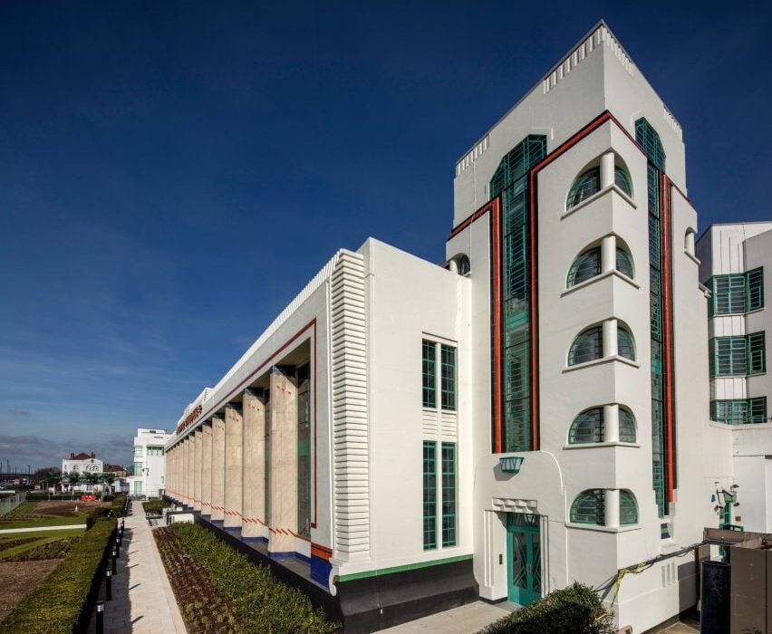
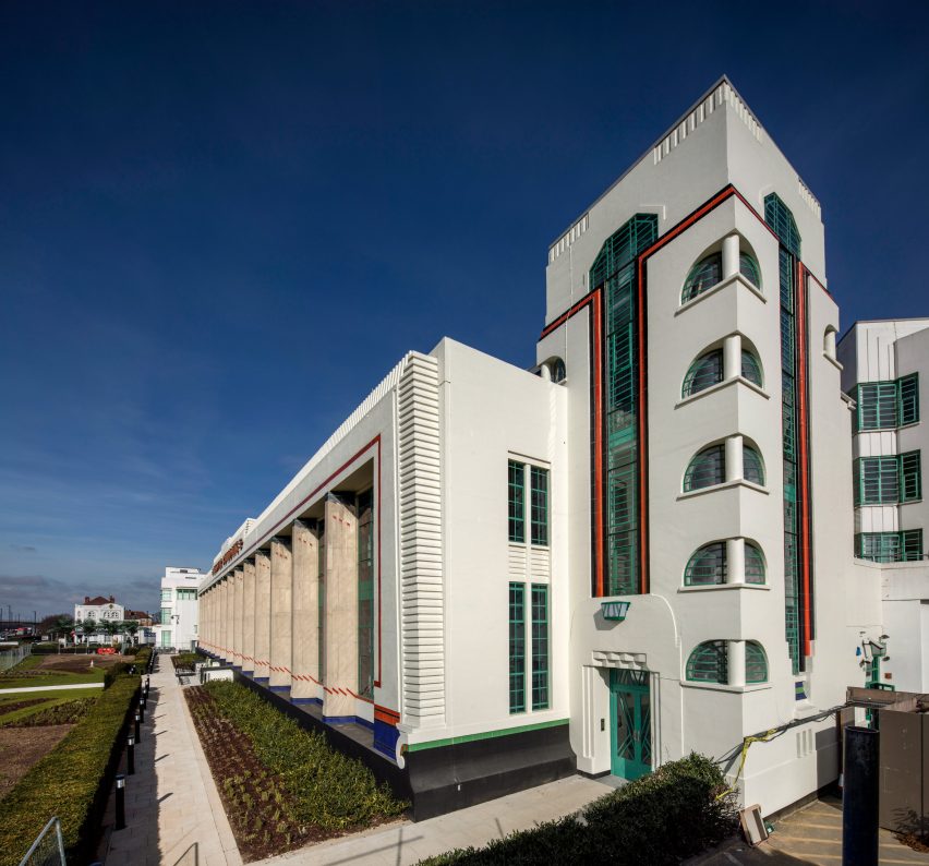
recessed angular frames form art house cinema’s facade in france

L’Atalante art house cinema by Farid Azib in Bayonne


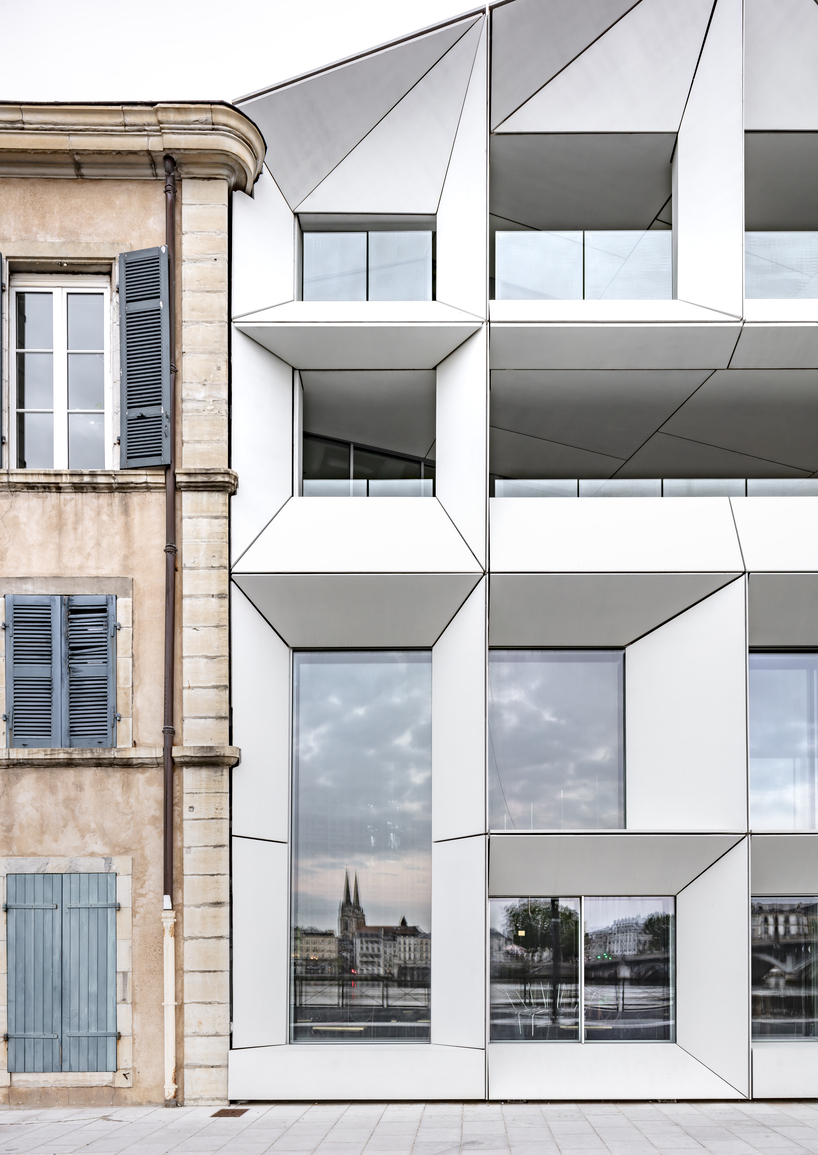
Paris-based architectural firm Farid Azib reconstructs L’Atalante art house cinema in the center of Bayonne, France, forming a contemporary white angular facade. Originally built in 1990, the edifice is located on the waterfront of Amiral-Antoine-Sala on the right bank of the Adour, just below the Saint-Esprit bridge leading to the city center. The refurbishment program demanded the conjunction of two cinemas adjoining one building and expanding the dedicated theater plan. Aiming for a design that retains the historical character of the site yet explores the possibilities of architectural modernity, the project shapes contrasting forms and materials displaying its dynamic frame in striking white color, standing out between the rest of the buildings on the embankment.

recessed angular frames form art house cinema's facade in france
L’Atalante art house cinema | all images by Luc Boegly


angular frames are a conceptual nod to the Seventh Art


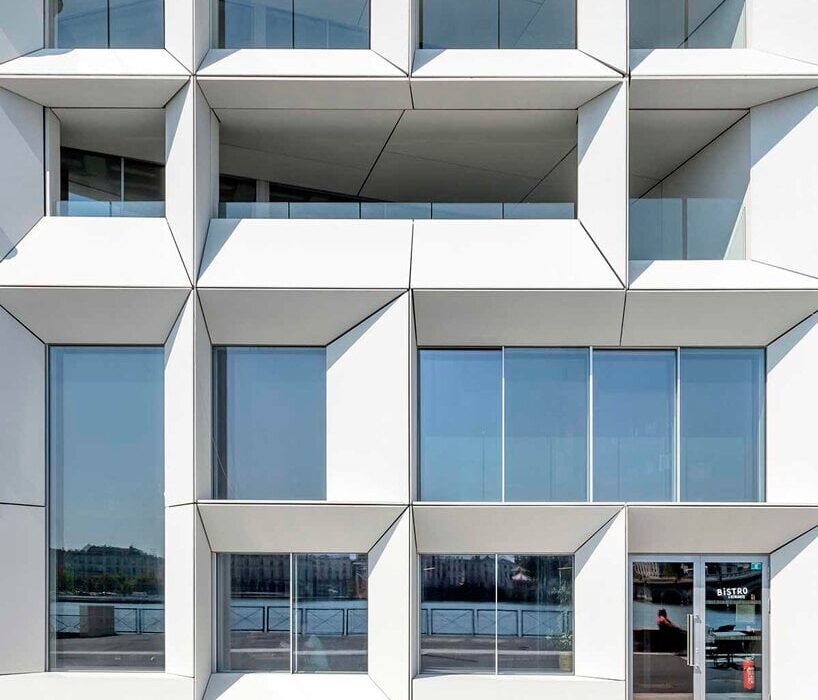
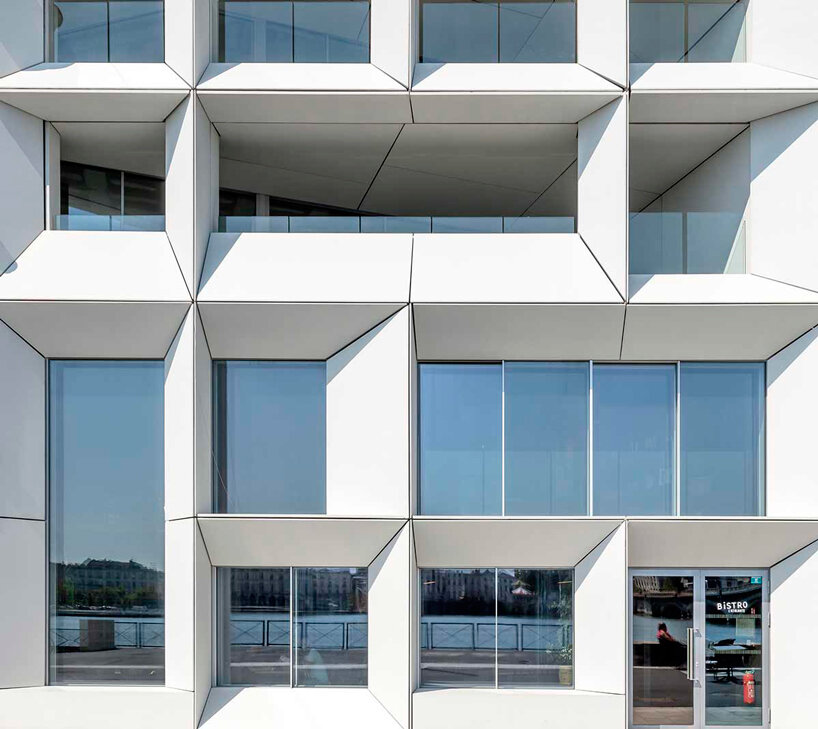
Drawing from a conceptual take on windows and frames in connection to the Seventh Art, the design team at Farid Azib Architects focuses on the main feature of the facade’s openings to form the building’s external identity, sharing ‘the cinema facade is essential in enhancing our visibility with its openings on to the river and its uniqueness which makes it very cinematic-like’


The frames are exposed to the southwest allowing the light on each side to pass through both the interior and the exterior, regarding natural and artificial light respectively. ‘The facade stands all at once discreet and surprising, integrated and singular, asymmetrical, deconstructed and harmonious, angular and wise, soft and open’. The glass apertures project landscapes, movements, silhouettes, and lights like an ever-changing film scene underlined by the orientations of the different viewpoints. Thus the facade is made up of prismatic projecting volumes, created with light prefabricated elements forming an interaction between the interior and exterior space.

recessed angular frames form art house cinema's facade in france
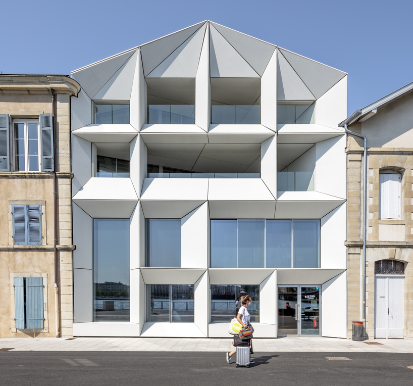
the project sets up a contemporary white angular facade


The cinema hall undergoes specialized interior planning


The interior arrangement of the building consists of a new hall, a bar-restaurant, and cinema zones, combining the reception and dining area through a system of a wooden mesh on three levels channeling the flows and allowing the installation of access control points to the cinema halls. Two apartment units are housed within the plot of L’Atalante, setting sound protection as one of the major planning factors.


The transversal bar-restaurant forms the strategic link between the existing transformed spaces and the extension, shaping a long wooden counter made of oak wood sourced from the original building’s flooring construction. Thus, the cinema and music bar-restaurant rooms are designed as airtight boxes to avoid any sound leaks. Acoustic lining and independent double wall, double frame, uncoupled from the structure, as well as floors with independently treated slabs complement the protected framework. The restoration remodels the screening rooms providing expanded seating areas and larger projection screens. The structure opens toward the city and the riverbank shaping wide frames along with loggias and terraces.

L'Atalante art house cinema
recessed prismatic frames form the building’s external identity

Reference

Concrete bath and Crittal screen in bathroom of Untiled House extension by Szczepaniak Astridge in London
CategoriesInterior Design

Eight practical and beautiful concrete bathrooms around the world

Our latest lookbook explores eight bathrooms with striking concrete interiors, ranging from a Mexico City bathroom that also features a rough-hewn stone bathtub to a UK bathroom built around a “concrete sculpture”.

Concrete is a practical choice for bathroom interiors since the material is water-resistant, hardwearing and easy to clean. It can also be a decorative option – the material has a rugged, industrial look that gives bathroom interiors a brutalist feel.

This is the latest in our lookbooks series, which provides visual inspiration from Dezeen’s archive. For more inspiration see previous lookbooks featuring interiors that prove beige doesn’t have to be boring, tidy kitchens with slick storage solutions and save-saving pocket doors.


Concrete bath and Crittal screen in bathroom of Untiled House extension by Szczepaniak Astridge in London
Photo by Nicholas Worley

Untitled House, UK, by Szczepaniak Astridge

This residential extension in south London was designed around a “concrete sculpture”, a concrete-walled void that travels through the house from the kitchen up to the bathroom.

Here, concrete was poured in situ to form the foundations, floors, walls and ceilings. A monolithic bathtub, also made from concrete, adds to the brutalist feel of the bathroom.

Find out more about Untitled House ›


Concrete bathroom in Cloister House
Photo by Givlio Aristide

Cloister House, Australia, by MORQ

The almost-windowless Cloister House in Perth surrounds a plant-filled courtyard and was designed to have a sense of privacy.

Made from thick concrete, its interior walls only have thin, arrow-slit openings. In the home’s bathroom, the rammed-concrete finish of the walls was left exposed and softened with a floor made from wooden slats and a red hardwood ceiling.

Find out more about Cloister House ›


Sunken Bath by Studio 304
Photo by Radu Palicica

Sunken Bath, UK, by Studio 304

Sunken Bath is a glazed bathroom that local studio Studio 304 designed for a London flat to create space for Japanese ritual bathing – a relaxation practice.

The shower and toilet are separated from the concrete bathtub, which is enclosed by glass walls and a glass roof and offers views of the peaceful bamboo-filled garden.

Find out more about Sunken Bath ›


House and Studio Lambeth by Carmody Groarke
Photo by Gilbert McCarragher

House and Studio Lambeth, UK, by Carmody Groarke

Architecture office Carmody Groarke designed House and Studio Lambeth to slot inside the fabric of an old warehouse. Its design combines a brick “skin” with a smooth concrete interior.

A concrete bathroom unit finished with a large shadow gap underneath the ceiling divides one of the home’s four bedrooms. This is contrasted with a decorative marble sink and copper-hued taps and details.

Find out more about House and Studio Lambeth ›


Concrete bathroom in Habitat 67 building
Photo by Maxime Brouillet

Unit 622, Canada, by Rainville Sangaré

Moshe Safdie’s famous brutalist Habitat 67 in Montreal is home to this apartment, which is one of 158 homes in 354 stacked, prefabricated concrete “boxes”.

Its bathroom features a shower fronted by dichroic glass that changes colour depending on which angle it’s viewed from. Vertical concrete wall tiles were designed in a nod to the brutalist building’s structure.

Find out more about Unit 622 ›


Bathtub in Mexico City concrete bathroom
Photo by Edmund Sumner

Pedro Reyes House, Mexico, by Pedro Reyes and Carla Fernandez

This Mexico City home was made primarily from concrete, applied in varying degrees of coarseness, and was designed for and by a Mexican sculptor and fashion designer.

In the bathroom, the sink was moulded into a shape that resembles pottery and the bathtub is made from stone to look like a rock pool. The rough-hewn shapes match the rough feel of the concrete walls and ceiling.

Find out more about Pedro Reyes House ›


Concrete bathroom in Costa Rica
Photo by BoysPlayNice

Art Villa, Costa Rica, by Formafatal and Refuel Works

The Art Villa is nestled into the Costa Rican jungle and was designed to reference the tropical landscape and buildings by architect Paulo Mendes da Rocha, which are known for their monolithic concrete forms.

The concrete walls and ceilings in its bathroom match the large stone bathtub and contrast the wood used for the floor. Large floor-to-ceiling windows offer views of the verdant countryside.

Find out more about Art Villa ›


Concrete bathroom in New York apartment
Photo by Amy Barkow

S-M-L Loft, US, by BC–OA

Located in a cast-iron building dating from 1880 in New York’s Soho district, the S-M-L Loft draws on its past as a warehouse.

The functional, industrial vibe of the flat can also be seen in the bathroom, which has solid walnut millwork paired with raw concrete panels and white porcelain tiles.

Find out more about S-M-L Loft ›

This is the latest in our lookbooks series, which provides visual inspiration from Dezeen’s archive. For more inspiration see previous lookbooks featuring interiors that prove beige doesn’t have to be boring, tidy kitchens with slick storage solutions and save-saving pocket doors.

Reference

Make-up wipes that dissolve in water
CategoriesSustainable News

Make-up wipes that dissolve in water

Spotted: Though wipes are quick and convenient for taking off your make-up, they are an extremely wasteful product, with 11 billion thrown away every year. And each of these wipes take 100 years to biodegrade. To tackle this, Conserving Beauty has created InstaMelt, a make-up wipe made with patented fabric technology that dissolves in water after use, leaving no microplastics or waste. And, they’re vegan.

Conserving Beauty’s fabric has coveted Fine to Flush Certification by Water UK and will not block sewer pipes like other disposable wipes. The company recommends dissolving where many might already have a water footprint, like in the shower, kitchen sink, or toilet. The wipes are also packed into home-compostable packaging, including sachets and cartons. If the wipes are accidentally thrown away, they will biodegrade within 14 days in landfill with no adverse impact on our environment or wildlife. 

InstaMelt delivers the benefits of an oil cleanser through its make-up wipe. It contains eight oils – including olive-based squalane, hemp seed, sunflower seed, and jojoba oil – to dissolve make-up while gently exfoliating the skin. The wipes are made ethically in Australia using traceable ingredients from the company’s global supply chain. 

Conserving Beauty is committed to creating beauty products that help our skin and save water, carbon, and waste at the same time. The company is the first beauty member of The Water Footprint Network, which allows it to research and sustainably manage its water footprint.  

More and more companies are preventing products from ending in landfills. For example, Springwise has spotted baby shoes that dissolve in water at the end of their usable life, and a sustainable medicine packaging system.

Written By: Anam Alam

Reference

Bridge over garden at Hosono House in San Francisco
CategoriesArchitecture

Ryan Leidner adds bridge to geometric San Francisco house

Local studio Ryan Leidner Architecture renovated a 1940s home in the Bernal Heights neighbourhood of San Francisco, resolving entry access with a bridge over the front garden.

Ryan Leidner Architecture completed the 2,500-square-foot (230-square metre) Hosono House in 2021, cladding the house in charcoal-stained cedar siding with a copper, standing seam roof.

Bridge over garden at Hosono House in San Francisco
Hosno House features a statement bridge

The original structure was built at the rear of a steeply sloped 2750-square-foot (255-square-metre) lot, “giving the home a unique sense of privacy and a feeling of being a true retreat,” the studio said.

However, the setback challenged the home’s circulation, causing people to cross the yard, descend a long staircase, and climb back up three flights to access the primary living space.

Ryan Leidner Architecture house in San Francisco
The bridge is arranged over the front garden

During an initial walkthrough with the clients, founding principal Ryan Leidner threw out a “crazy idea” – to redirect access from the street to a new front door with a bridge.

The bridge would span the lush front garden and connect to the house between the top and middle stories.

“The front entrance sequence was totally reimagined,” Leidner told Dezeen.

Blackened facade featuring a circular pivot window
A circular pivot window marks the front facade

The studio rebuilt the front facade – now marked by a circular pivot window that replaced a leaking solarium – gutted the interior and rearranged spaces.

“Wanting to preserve the historic character of the house, the existing wood beams and ceiling were refinished and left exposed while all of the original windows, floors and finishes were replaced, creating a greater sense of material continuity throughout the house,” Leidner said.

Wood-toned interior within Hosono House with skylights
Natural wood tones and white surfaces characterise the interior

The subtle palette of natural wood tones and white surfaces allows the interior spaces to serve as a canvas for the owners’ affinity for design.

“The interior spaces are filled with a mix of vintage Italian furnishings and custom pieces, while the overall sensibility of the space was inspired by trips to Norway and Japan, and the ethos of Californian hippie modernism,” Leidner noted.

Nobuto Suga dining table within Hosono House by Ryan Leidner
A custom Nobuto Suga dining table is framed by statement chairs

The top-floor kitchen, living and dining areas enjoy sweeping views of the San Francisco skyline through a variety of window shapes.

Plant-filled niches that reference 1960s and 70s Italian projects surround a space that holds accent furniture including a custom Nobuto Suga dining table, vintage Guido Faleschini chairs and a Gae Aulenti armchair.

Bedroom by Ryan Leidner
Two bedrooms are on the second floor

The second floor contains two bedrooms, a Venetian-plastered primary bathroom and a lounge space inspired by a Tokyo whiskey bar with warm wide-plank white oak and a custom velvet daybed.

A large opening in the lounge leads to the lower courtyard, which was reimagined by landscape architect Stephen Design Studio.

The lowest level boasts one of the home’s most unique spaces: the guest bedroom.

“A textured hemp-plaster was used on the walls and ceiling, and a custom tiled bed frame and furnishings give a nod to the history of Italian modernism,” the studio said.

Ryan Leidner interiors
Ryan Leidner added luxurious touches throughout the home

Throughout the home, custom fabricated brass details – like countertops, sinks and CNC Dieter Rams-inspired exhaust covers – add a luxurious touch that will patina over time.

Ryan Leidner Architecture had previously collaborated with Stephen Design Studio to remodel a midcentury Eichler home, complete with twin gables and a lush central courtyard.

The photography is by Joe Fletcher.


Project credits:

Architects: Ryan Leidner Architecture
Landscape Design: Stephens Design Studio
General Contractor: DKG Construction
Landscape Contractor: Ground Cover Landscaping

Reference

Hallway of Hiroo Residence
CategoriesInterior Design

Wooden furniture and artworks decorate Hiroo Residence in Tokyo

Designer Keiji Ashizawa used muted tones to make the most of the sunlight in this apartment in central Tokyo, which features wooden art pieces and furniture that was specially designed for the space.

For the Hiroo Residence, named after its location in the city’s Hiroo neighbourhood, Ashizawa wanted to underline the quality of the light in the flat.

Hallway of Hiroo Residence
A cut-out wall lets light into the hallway, which has an artwork by Sara Martinsen

In the open-plan kitchen and living room, light streams in from a balcony, and the designer took advantage of this light source by creating a cut-out wall so that the light carries through to the hallway next to it.

“I think you can see we have a very nice sunlight here,” he told Dezeen during a walkthrough of the apartment. “So I didn’t want to use white, as it would be too bright – instead I used muted, subtle tones.”

Living room corner in Hiroo Residence
A wooden artwork by Atelier Plateau and a slatted sideboard decorate the living room

He also wanted Hiroo Residence to feel like a peaceful place to come home to in a busy city, using natural materials to create a calm ambience.

“Outside it’s super noisy but inside it’s very quiet, so I chose muted tones that also fuse with the materials; the wood and the stone,” Ashizawa said.

The tranquil 200-square-metre apartment, which overlooks the Arisugawanomiya Memorial Park, has three bedrooms and two bathrooms, as well as a kitchen and dining area, a small workspace and plenty of storage spaces.

Wooden furniture in Tokyo apartment by Keiji Ashizawa
Shaker-informed chairs and a wooden light were used for the kitchen

Before designing the interior, Ashizawa changed the layout of the flat to make it more open, taking out an existing hallway to create a bigger dining space.

“Our goal was to design a space that can only be created by meticulously crafting from the smallest detail to the furniture, resulting in a quiet, comforting, and inspiring atmosphere with little noise, surrounded by natural materials crafted with tactility,” Ashizawa said of the design.

Sofa and coffee table in Hiroo Residence
Keiji Ashizawa used a neutral colour palette for the home

He worked with the Japanese wooden furniture company Karimoku on the project, which is the eighth in its Karimoku Case Study series that sees it collaborate with architects on bespoke furniture and interior projects.

As a result, wood was used throughout Hiroo Residence, with white-stained oak covering many of the floors.

Ashizawa also worked with Karimoku to create wooden window frames and sliding doors, which were placed throughout the flat to add privacy without taking up too much space.

The furniture matches the wooden interior details and includes two pieces created especially for the project – a sideboard with decorative wooden slats and a dining chair with a woven seat that was inspired by both Shaker designs and classic Scandinavian chairs.

Bedroom of Tokyo apartment by Keiji Ashizawa
Wooden panels cover the bedroom walls

In the bedroom of Hiroo Residence, wooden wall panels add a tactile and more natural feel, which is echoed in the built-in shelves and drawers in the en-suite walk-in closet.

Cabinets were also used to hide different functions in the kitchen, where a large wooden unit takes up an entire wall.

Kitchen by Karimoku for Tokyo flat
An entire wall is taken up by a wooden kitchen unit

Even smaller details in the flat, such as the long kitchen lamp, were made from the material.

Artworks in wood by Danish art studio Atelier Plateau and the artist Sara Martinsen, which were created especially for the space,  decorate the walls.

Karimoku has worked with Ashizawa on a number of projects, including its second showroom which just opened in Kyoto, Japan, and the Azabu Residence Case Study, where the designer referenced mid-century American design.

The photography is by Tomooki Kengaku.

Reference

Feeding fish with plastic-eating insects 
CategoriesSustainable News

Feeding fish with plastic-eating insects 

Spotted: Seafood is one of the most highly traded commodities in the global food system, and in 2018, for the first time in history, global farmed fish production surpassed that of beef production. And experts expect demand for aquatic foods to double by 2050. How to sustainably farm fish to meet such high levels of global demand is a pressing concern for the aquaculture industry.  

Part of that concern lies in finding the best solution to the challenge of what to feed farmed fish. Many growers seek circular solutions that minimise waste at all stages of the production process, including Glasgow-based researchers who recently discovered a surprising option for fishmeal. The team found that waxworms fed on plastic appeared more digestible to salmon than those fed on a regular diet. 

Set up by Dr. Martin Llewellyn at the University of Glasgow, SalmoSim is an in-vitro Atlantic Salmon gut simulator that helps those in the aquaculture industry test out new medicines or feedstock for farmed fish. The team provides tailored experiments that analyse the absorption of sugars, volatile fatty acids, amino acids, and more throughout a salmon’s digestive process, and it was in one of these experiments that plastic-fed waxworms were found to be a highly digestible feed.  

By reducing demand for marine-grown fish meal, plastic-fed waxworms could provide a dual purpose – reducing plastic waste while feeding the high volumes of fish demanded by a growing global market. The research team’s next steps include assessing the healthfulness of the salmon fed on the waxworms for human consumption.  

Springwise has spotted other innovations improving the sustainability of the aquaculture industry, including tiles made from fish scales and a cellular growth technology used to make cultivated seafood.

Written By: Keely Khoury

Reference

© DXA studio
CategoriesArchitecture

SoHo’s 49 Greene Street Embraces the Modern Concept of Loft Living


49 Greene Street – a 6-story building in NYC’s historic SoHo district, is an extant example of the mixed iron-and-masonry construction of the post-Civil War era. The client’s brief was to restore the building’s masonry façade and cast-iron storefront, and to convert the interiors into four high-end residential units. To do this, we drew inspiration from the makers and artist ls that once occupied this previously manufacturing building to create units that embrace modern concept of ‘loft living’, in which open, non-programmed flexible spaces meet highly crafted, millworked moments, adding warmth throughout with the use of woods, marbles, and ironwork.

Architizer chatted with Jordan Rogove, Co-Founder and Principal of DXA studio, to learn more about this project.

Architizer: What inspired the initial concept for your design?

Jordan Rogove: We wanted to speak to the various movements that helped form SoHo’s unique character and charm. Much like the artists who were attracted to the neighborhood’s empty lofts in the 1960’s, we too were drawn to the building’s high ceilings, abundant light, and expansive floor plates. For this reason, we are committed to leaving the spaces as open, fluid, and customizable as possible.

However, we were acutely aware that we were designing a home, so introducing a residential scale was important to make the otherwise large space comfortable and inviting. To achieve this, we lowered the ceiling in select rooms and introduced a high level of craft and tactility – our way of communicating with the by-gone manufacturing era of SoHo.

Throughout these rooms, we created a material theme of oak wood paneling, blackened steel, fluted glazing and various marbles. These materials are not only visually exquisite, but very in their tactile qualities, which we believe to be crucial adding warmth and comfort to a home.

© DXA studio

© DXA studio

© DXA studio

© DXA studio

© DXA studio

© DXA studio

This project won in the 10th Annual A+Awards! What do you believe are the standout components that made your project win?

The kitchen and den–the hearth of the home–are the showpieces of each unit, as they are not only beautiful and practical, but speak to each other in their materiality and detailing.

In the kitchen, the appliances, storage, and secondary scullery kitchen are all seamlessly hidden behind white oak paneling with beautifully crafted integrated pulls. This paneling wraps onto the ceiling to cleverly integrate recessed lighting and HVAC diffusers. The island is crafted out of a single slab of Fior di Pesco marble, known for its ability to add calm and serenity to a space, while the upper cabinetry is clad in blackened steel and fluted glass.

This millwork detailing continues into the den, where white oak paneling and a built-in desktop can be closed off from the main living spaces by large blackened steel and fluted glass doors. Alternatively, these doors can perfectly tuck away into the oak millwork to allow flexible space programming.

Many of these materials can be found throughout the unit, creating an overarching theme. For instance, the blackened steel of the den’s custom doors is mirrored in the steel frames of the bathroom vanities, the plumbing fixtures, and even the column cladding.

© DXA studio

© DXA studio

© DXA studio

© DXA studio

What was the greatest design challenge you faced during the project, and how did you navigate it? 

Renovating a manufacturing building from the 1800’s was an exciting challenge, both in terms of design and coordination. On the design side, we believe that as architects, it is our duty to celebrate the area’s rich history in an authentic yet contemporary manner. This is why we wanted to keep the open nature of these spaces as much as possible. It is also why we used wood and iron in a way that is reminiscent of previous eras, while using contemporary detailing to bring these materials to the present day.

On the coordination side, working with existing buildings in NYC is always a challenge. As precisely as we survey all historic projects, we often encounter surprises during construction that require us to tweak our design on the fly–and 49 Greene was no exception. Furthermore, we had to design an entirely new roof structure, as the existing roof was significantly sloped, which meant giving the 200-year old structure upgrades to account for modern building technologies.

© DXA studio

© DXA studio

© DXA studio

© DXA studio

What is your favorite detail in the project and why? 

Although it is one of the smallest rooms in each unit, we think the powder room really packs a punch. The vanity and sink are entirely made out of Fior di Bosco marble, which marries well with the ebony black wood veneer panels to create a dark yet calming atmosphere.

© DXA studio

© DXA studio

© DXA studio

© DXA studio

In what ways did you collaborate with others, and were there any team members or skills that were essential in bringing this Award winning project to life?

The nature of this project required us to closely collaborate with millworkers, iron workers, and various craftspeople to get the detailing down. We worked with Canova on all of the millwork, Manhattan Steel Door Co. on the large den doors, and with Sage Construction on the stonework and other general detailing. We had many pencil sessions and back-and-forth shop drawing reviews to better understand how to achieve the level of craftsmanship that we envisioned–and we really refined our knowledge of interior detailing along the way.

© DXA studio

© DXA studio

© DXA studio

© DXA studio

For more on 49 Greene Street, SoHo, please visit the in-depth project page on Architizer.

49 Greene Street, SoHo Gallery

Reference

Lobby of Mammertsberg hotel
CategoriesInterior Design

Mammertsberg by Space Copenhagen pays homage to historic features

A sculptural spiral staircase, floor-to-ceiling windows and panelled walls have been paired with contemporary furnishings in Space Copenhagen’s renovation of a restaurant and hotel in Switzerland.

Called Mammertsberg, the combined hotel and restaurant is housed within a 1911 villa that overlooks the Alps mountain range in Freidorf, Switzerland.

Lobby of Mammertsberg hotel
Top: a spiral staircase takes centre stage in Mammertsberg. Above: Space Copenhagen has renovated the Swiss hotel and restaurant

Danish design studio Space Copenhagen focused on the restaurant and lounge, which were totally refurbished to transform the interior from its previous status as a Swiss-food restaurant.

Meanwhile, the adjacent six hotel guest rooms were given a light refresh.

A lounge area interior by Space Copenhagen
Contemporary furniture was added to the lounge

“We embraced the idea of keeping key historic, listed, and structural features, defining for the building and its architectural heritage,” Space Copenhagen told Dezeen.

“For the transformation towards something new, it felt important to add a diverse mix of furniture, lighting, materials, art and books, all of which could have been collected slowly over time,” the studio added.

The interior of Mammertsberg restaurant
Linen curtains frame the large windows

Due to the building’s historic status, Space Copenhagen faced certain refurbishment restrictions, which resulted in the studio adapting its design around existing features within the property.

These included a large central staircase by architect Tilla Theus that connects the restaurant on the ground floor to the bar and lounge on the first floor.

The ground floor of the Mammertsberg
Natural materials were used throughout the interior

In the 42-seat fine-dining restaurant, which serves up locally sourced dishes, the studio embraced the high ceilings and large windows by adding floor-to-ceiling curtains in tactile, heavy linen.

“The building overlooks the impressive landscape and alpine scenery that characterises Switzerland and this inspired our design choices and approach,” said Space Copenhagen.

“It felt natural to treat the house as a large country home from which to enjoy the surrounding nature; offering guests the opportunity to contemplate and recharge.”

The interior of a restaurant in Switzerland
The restaurant has a walnut and linen colour palette

The surrounding nature was referenced in the material and colour choices, with solid oak tables in varying shapes and sizes dotted throughout the restaurant and lounge.

Elsewhere in the Mammertsberg restaurant, Scandinavian chairs were upholstered in subdued colour tones such as walnut and light linen, while petrol blue leather was added for contrast.

“We wanted to create a warm and inviting scene to balance the vibrant dishes while simultaneously seeking a high level of detailing, quality, and refinement in the curation of materials and furniture pieces,” explained Space Copenhagen.

“We worked with a new approach to solve the layout for the restaurant. Being a small restaurant allowed us to create a sense of familiarity with a variety of different tables – round, square and longer styles – all with different configurations and possibilities.”

A guest room inside the Mammertsberg
Six guest rooms were given a light refresh

The project also involved updating Mammertsberg’s guest rooms. Each of the six rooms was individually decorated to feel like someone’s private residence, with sculptural lighting and soft furniture to encourage rest and relaxation.

According to the designers, the limited time frame meant that finer details such as adding new finishes were prioritised over a larger overhaul.

A neutral coloured guest hotel room
Each hotel suite is individually furnished

“We couldn’t change the polished stone floors in certain public areas such as the restrooms, bathrooms and guestrooms,” Space Copenhagen said.

“We solved this by applying a different finish which honed them as much as possible towards a more matt and subdued hue, settling into the overall colour and material palette.”

Space Copenhagen was established in Denmark in 2005 and is best known for its restaurant interior design projects.

Among them is the Blueness restaurant in Antwerp, which is decorated with bespoke furnishings and Le Pristine, a restaurant that the company renovated with a moody aesthetic.

The photography is by Joachim Wichmann.

Reference

Upcycling food waste into dried fruit snacks
CategoriesSustainable News

Upcycling food waste into dried fruit snacks

Spotted: Faced with the knowledge that California throws away more peaches than the entire state of Georgia produces in a year, The Ugly Company founder Ben Moore wanted to help put a stop to such waste. Rather than discarding fruits that are too misshapen to be sold to supermarkets, The Ugly Company upcycles them into healthy dried fruit snacks.  

Run by a team with close ties to the farming industry, the startup sources most of its product locally from the San Joaquin Valley in California. Cherries, peaches, apricots, kiwis, and nectarines are dried and packaged for sale in individual snack packs. It takes eight pounds of fresh fruit to create one pound of dried fruit, so each pack of Ugly fruit represents two and a half pounds of fruit rescued from waste.  

As well as preventing food waste, the company adds value to the local farming economy. Farmers no longer have to pay for the collection and dumping of their unused fruit. Instead, The Ugly Company pays growers for crops that are good to eat but deemed ‘too ugly’ for general wholesale, whether that be because they are too small, or have an odd colour or shape. 

Buyers can find the fruit in several grocery chains, including Krogers’s, Hy-Vee, and Whole Foods, as well as online and via subscription boxes. Thanks to a recent Series A funding round that raised $9 million (about €8.4 million), the company plans to expand its processing capacity and keep up with growing national demand.  

Other ways in which Springwise has spotted innovations reducing food waste include turning broccoli stems into alternative proteins, and using AI-powered scanners to track the freshness of produce.

Written By: Keely Khoury

Reference

Hoover Building by Interrobang
CategoriesSustainable News

Smith Mordak named CEO of UKGBC at “critical period” for sector

The UK Green Building Council has announced that architect and Dezeen columnist Smith Mordak will become the charity’s chief executive officer.

Mordak will be leaving their current role as the director of sustainability and physics at British engineering firm Buro Happold to take up the full-time advocacy role and help the UK’s built environment sector to halve its emissions by 2030.

“We look forward to their leadership of the team in this critical period for taking urgent and effective action to limit and reverse environmental degradation,” said Sunand Prasad, the chair of UKGBC’s board of trustees.

“Smith combines a deep, science-based and systemic understanding of the climate emergency with a clear-sighted, principled and pragmatic approach for what needs to be done in response.”

“Our actions over the next few years will have an outsized impact”

Mordak is a multi-award-winning architect and engineer, having co-founded London firms Interrobang and Studio Weave before going on to work at Buro Happold.

Alongside this, Mordak has a long-standing history in driving industry action on climate change, as a board member of the Journal of City Climate Policy and Economy, a former design advocate for London mayor Sadiq Khan and a steering committee member at climate action group Architects Declare.

Hoover Building by Interrobang
Smith Mordak (top) is an architect and engineer known for award-winning projects such as the residential conversion of London’s Hoover Building (above)

As a nationally elected councillor at the Royal Institute of British Architects (RIBA), they also edited the landmark Built for the Environment report that was published by RIBA and Architects Declare ahead of COP27.

“We live in existentially challenging times,” Mordak said. “Our actions over the next few years will have an outsized impact on the Earth’s ecosystems and on many generations to come.”

“I’m honoured that I’ll be playing my part in this crucial period as part of this powerful change-making coalition.”

UKGBC also names new deputy chief executive

Mordak will be taking over the role from Julie Hirigoyen in June, who last year announced her decision to step down after more than eight years at the helm.

“My decision to stand down was a challenging one,” Hirigoyen said at the time. “But I believe that fresh direction will allow for an infusion of new creative ideas at a pivotal moment in time, ahead of the step-change required to 2030.”

UKGBC set out a new strategy for 2025 just last May, in recognition of the fact that more ambitious short-term targets need to be set to help the industry halve its emissions by 2030 and stabilise global warming around the crucial 1.5-degree threshold.

The charity is also promoting Simon McWhirter, its current director of communications, policy and places, to deputy chief executive to strengthen his role ahead of the UK’s next general election.

In his new role, McWhirter will have a “laser focus across international, national and local policy work”, UKGBC said.

Previously, Mordak has reported on two different Conferences of the Parties for Dezeen – both COP26 and COP27 – as well as penning opinion pieces on everything from strategies for passively cooling buildings to the green jobs transition.


Reference