Seagrass regeneration backed by science
CategoriesSustainable News

Seagrass regeneration backed by science

Spotted: Seagrass is the only flowering plant that grows in marine environments, living in shallow, sheltered coastal areas and forming dense, underwater meadows. These meadows support thousands of marine species, provide vital sources of food for human communities, store carbon, prevent land erosion, and help keep coastal waters clean.

But seagrass is also under significant threat — almost 20 per cent of seagrass meadows have been lost since the late 19th century. Working to turn this around is non-profit Project Seagrass. Founded in 2013 by four scientists, the non-profit works to protect seagrass around the globe through research, conservation action, education, and collaboration with local communities and stakeholders.

The organisation recently worked with the WWF in the UK’s first substantial seagrass restoration project, alongside Swansea University, North Wales Wildlife Trust, and Pen Llyn. Up to 92 per cent of UK seagrass has been lost, and the Seagrass Ocean Rescue Upscaling Project (SORUP) in Wales involved trialling various techniques to restore seagrass meadows at scale. These include the use of a robot developed by San Francisco-based Reefgen called Shack, that helped plant seagrass seeds on site. Shack can hold up to 20,000 seeds mixed with mud, which it injects into sediment within the seabed.

The results of the trials will inform SORUP and others on how to improve the cost and time efficiency of seagrass restoration, including whether it is more effective to plant new meadows by hand or using robots like Shack. The aim is to create a restoration blueprint that can be applied to other countries.

Project Seagrass and SORUP are not the only ones working to restore ocean plants. Springwise has also spotted seagrass grain being used for sustainable feed production and the use of AI-powered robots to farm seaweed more efficiently.

Written By: Lisa Magloff

Reference

Can You Really Grow a City? The Truth About Mycelium
CategoriesArchitecture

Can You Really Grow a City? The Truth About Mycelium

Architizer’s 12th Annual A+Awards are officially underway! Sign up for key program updates and prepare your submission ahead of the Final Entry Deadline on January 26th.  

The architecture industry is looking for alternatives to concrete, the world’s most widely used building material. Cheap, versatile and strong, concrete is one of the most revolutionary substances in history. It would not be an exaggeration to say that cities as we know them today would not have been possible without reinforced concrete. However, the carbon footprint of cement production is enormous, accounting for 8% of global emissions each year. For comparison, this is a far higher share than the aviation industry, which is responsible for 2% of emissions. It is not hard to see why architects are interested in moving away from concrete — and quickly.

Among the alternatives to concrete being researched, a material derived from fungus called mycelium is by far the most romantic. In 2024, everyone knows someone obsessed with mushrooms and their alleged nutritional, medicinal and psychotropic virtues. For these types, it just makes sense, in an artistic or spiritual way, that fungi will rescue us from the climate crisis we’ve created.

I mean this with no condescension whatsoever: fungi are fascinating and inspiring. They have also been around far longer than animals and plants. Personally, I adore the idea of a future world where we live in homes made of mycelium. There is an undeniable Richard Scarry-esque charm to the image of living inside a mushroom.

Close up of mycelium network. Rob HilleMycelium RH (3)CC BY-SA 3.0

So what exactly is mycelium? Briefly, mycelium is the root-like structure of a fungus. It functions both as a root system as we would think of it — that is, a fungus transports nutrients through its mycelium — but also as a kind of giant brain. The mycelium of a fungal system sends electrical signals to different parts of the organism to warn of changes in the environment.

In some cases, a mycelium system can span thousands of acres, as is the case in Oregon’s Malheur National Forest. Individual mushrooms are simply the “fruiting bodies” of this vast organism, which is estimated to be at least 2,400 years old.

Mycelium is widely used in the world of packaging, with companies like Ikea and Dell using it instead of polystyrene, which is not biodegradable. The process for creating mycelium packaging is the same as for creating mycelium bricks, which are used for building.

First, organic waste is cleaned and then combined with mycelium, which grows around the waste and digests the material. (Remember: fungi eat their nutrients like we do. They are actually more closely related to animals than plants biologically). Then, the remaining material is placed into a mould. It continues to grow to fit the shape of the mould, and when it is dried, voila! A mycelium brick is born. This process is quick, taking only five days.

The Growing Pavilion by Biobased Creations, Eindhoven, Netherlands, 2019. Finalist, 2021 A+Awards, Architecture +New Materials

Certified Energy, an environmental consulting firm in Australia, aptly describes the virtues of mycelium construction: “Through bio fabrication a carbon neutral building process can be achieved eliminating such products as artificial insulation used in walls, MDF and other non load bearing structures.” In addition, “Mycelium products can also provide other benefits such as termite proofing, with products being created which attract termites but when eaten cause a fungus spore to activate within the termite killing it and creating a fungus whose spores repel other termites.”

Stunningly, Certified Energy explains that “relative to its weight a mycelium brick is stronger than concrete with a cubic meter of mycelium brick weighing 43 kilograms and a cubic meter of concrete weighing 2400 kilograms” (95 pounds versus 5,290 pounds). Unfortunately, this is not the most relevant metric. By volume, rather than weight, mycelium has nowhere near the compressive strength of concrete, clocking in at 30 pounds per square inch versus 4000 pounds per square inch for concrete. These bricks will not be used to build a home near you in the near future.

Hy-Fi by The Living, New York City, New York 

And yet, there is still something inspiring about mycelium’s capacities. In 2014, The Living New York exhibited a tower called Hy-Fi in front of MoMA PS1. Standing 43 feet (13 meters) tall, the structure was made of 10,000 compostable mycelium bricks. As mycelium bricks are created through the process of organic decomposition, the manufacture of the bricks for this tower resulted in fertile soil as an output, which is obviously vastly preferable to the carbon released in cement production. Indeed, The Living New York donated this soil to local community gardens.

Another incredible feature of mycelium bricks: they are technically still alive when they are used. This allows them to bond to each other without mortar and even heal themselves when cracks appear. Can you imagine? A crack in your wall healing on its own.

Mycelium is certainly cool, and shows promise as a material for insulation, furniture, and the construction of temporary structures. However, it is unfortunately not a realistic alternative to concrete or even wood. Researchers should consider the way mycelium elements can complement sustainable architecture rather than pitching it as a building material on its own.

Cover Image: Mushrooms by Bernard Spragg. CC BY-SA 3.0 via Negative Space

Architizer’s 12th Annual A+Awards are officially underway! Sign up for key program updates and prepare your submission ahead of the Final Entry Deadline on January 26th.  

Reference

White Aloop clinic reception
CategoriesInterior Design

Keiji Ashizawa adds “residential calm” to Aloop clinic in Ginza

Japanese architect Keiji Ashizawa has created the interior for a skincare clinic in Tokyo, using textiles and custom-made furniture to make it feel more residential than medical.

The Aloop Clinic & Lab, which provides “skin cure and care”, is located in the city’s upscale Ginza area and run by Japanese beauty company POLA. Ashizawa wanted to give it an interior that would feel peaceful, while also representing the brand.

White Aloop clinic receptionWhite Aloop clinic reception
The Aloop clinic has a calm minimalist interior

“As a clinic that uses medical technology to deal with beauty, we thought that the space should have sincerity, calmness, and beauty in order to create a comfortable time for customers to feel at ease,” Ashizawa told Dezeen.

“In addition, considering that this is a completely new business for the POLA beauty brand, we felt that it was necessary to create a space that would enhance the brand.”

Wooden panelling inside Aloop clinicWooden panelling inside Aloop clinic
Wood was used throughout the space

To do so, Ashizawa looked at the design of the 210-square-metre clinic like he would if he were designing a residential space, giving it a calm, minimalist interior.

“Although it is a clinic, I considered the space to be similar to a hotel or a living space,” he said. “Therefore, I used materials that I use in designing living spaces and hotels.”

“The walls are plaster and the floor is a wool rug from Hotta Carpet,” he added. “The sofa and furniture at the characteristic entrance are made of Kvadrat wool textile to create a pleasant texture.”

Treatment room in Japanese skincare clinicTreatment room in Japanese skincare clinic
Treatment rooms were designed to have a residential feel

The architect used a clean, simple colour palette throughout the space, with white-painted walls contrasting against wooden panelling and wooden doors.

“Wood was used for doors, furniture and details because we wanted to create a residential calm rather than a clinic,” Ashizawa said. “We felt that a bright and healthy atmosphere was necessary.”

“The extensive use of wood was to create a residential atmosphere, and we wanted the space to be as far away from a typical clinic as possible,” he added.

Sofas by KarimokuSofas by Karimoku
Keiji Ashizawa created custom-made sofas with furniture brand Karimoku

His studio worked together with wooden furniture brand Karimoku to design the custom-made sofas for the space, which welcome customers as they enter the clinic.

“Of particular importance to this project were the custom sofas,” Ashizawa said.

“We asked Karimoku, with whom we communicate on a daily basis for furniture development and wood projects, to work with us on the development of the furniture.”

He compared his collaboration with the brand to that of mid-century modern Finnish architect Alvar Aalto and furniture brand Artek.

“For me, Karimoku has become an indispensable partner in thinking about space, just as Aalto is for Artek,” he explained.

Calm treatment room in TokyoCalm treatment room in Tokyo
Neutral colours contrast against pale wood

By creating the sofas with rounded edges, Ashizawa aimed for them to “gently envelop” customers after their treatments.

“The mere fact that something looks hard or painful makes the body tense, so we thought it would be desirable to eliminate such things,” he said.

“However, in order to maintain a comfortable sense of tension in the room, delicate details of metal and wood were used to achieve a balance.”

Sculptures in Aloop clinicSculptures in Aloop clinic
Small sculptures decorate the space

Small sculptures were dotted throughout the Aloop clinic, including in the treatment rooms.

Ashizawa has previously designed an interior with a similar colour palette for the Hiroo Residence in Tokyo, and also used plenty of wood for his and Norm Architects minimalist Trunk Hotel design.

The photography is by Tomooki Kengaku.

Reference

Satellites predict extreme weather in the tropics
CategoriesSustainable News

Satellites predict extreme weather in the tropics

Spotted: Rainfall affects many aspects of a farmer’s work. Deciding when to sow seeds, where to pasture cattle and other animals, and when to harvest are some of the many daily, weather-dependent decisions farmers make. For smallholder farmers, a miscalculation leading to crop failure could severely impact an entire family’s health. 

For farmers living in the tropical regions of the world, forecasts are often of little help as rainstorms come and go quickly and can be very localised. Seeking to make weather forecasting more predictable for these regions, Swedish technology company Ignitia has developed a new method. The results are proving to be far more accurate than current global climate forecast models, something that Ignitia achieves by focusing on hyperlocal climates and analysis based on high-resolution satellite imagery. 

Ignitia’s forecasts are detailed enough to provide farm-level predictions, and because the company uses satellite data, they do not require information from ground stations – infrastructure that is frequently unavailable in tropical regions. For farmers, adjustments that range from when to move heavy machinery to when to hire additional workers have direct financial results.   

The startup’s insights are available in four different packages, starting with a mobile app for seven-day weather forecasts that include wind, heat, rain, and humidity for a three-kilometre area. Ignitia Smart adds in customised alerts for farm-specific needs, suggestions for possible actions, and rainfall predictions up to six months in advance.   

Ignitia API provides regular updates on the client’s platform of choice and allows larger producers, distributors, and others in the agricultural supply chain to better predict crop yield and forecast risks. The most substantial service the company offers is Ignitia Enterprise, gathering climate intelligence from multiple locations for business-wide insights and information for decision-making.  

Satellites are helping farmers in a number of ways, with innovations featured in Springwise’s library including using imagery to help unbanked growers access loans and to provide real-time yield predictions.

Written By: Keely Khoury

Reference

Coastal Modernism: California's New Class of Single-Family Homes
CategoriesArchitecture

Coastal Modernism: California’s New Class of Single-Family Homes

Architects: Want to have your project featured? Showcase your work through Architizer and sign up for our inspirational newsletters.

California’s residential architecture represents a long history of experimentation and testing new ideas. As the demand for sustainable, innovative and beautiful residences continues to grow, architects and designers are redefining the concept of modern living in the Golden State. Now, there’s a wave of single-family homes built around the idea of Coastal Modernism, reinterpreting the past while building for today. This class of residences goes beyond the conventional, blending form and function to create living spaces that resonate with the demands of modern life.

Drawing inspiration from California’s unique topography, climate and culture, architects are embracing design approaches that harmonize with the natural surroundings. Whether perched on the picturesque hills of Northern California or nestled in the vibrant urban centers of SoCal, these homes are made to engage with their environment in a balance of aesthetics and practicality. From diverse design principles and layouts to environmentally conscious construction methods, discover the architectural landscape of California’s latest residential projects.
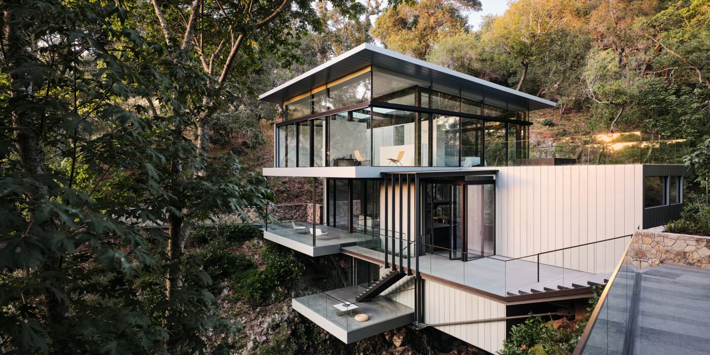
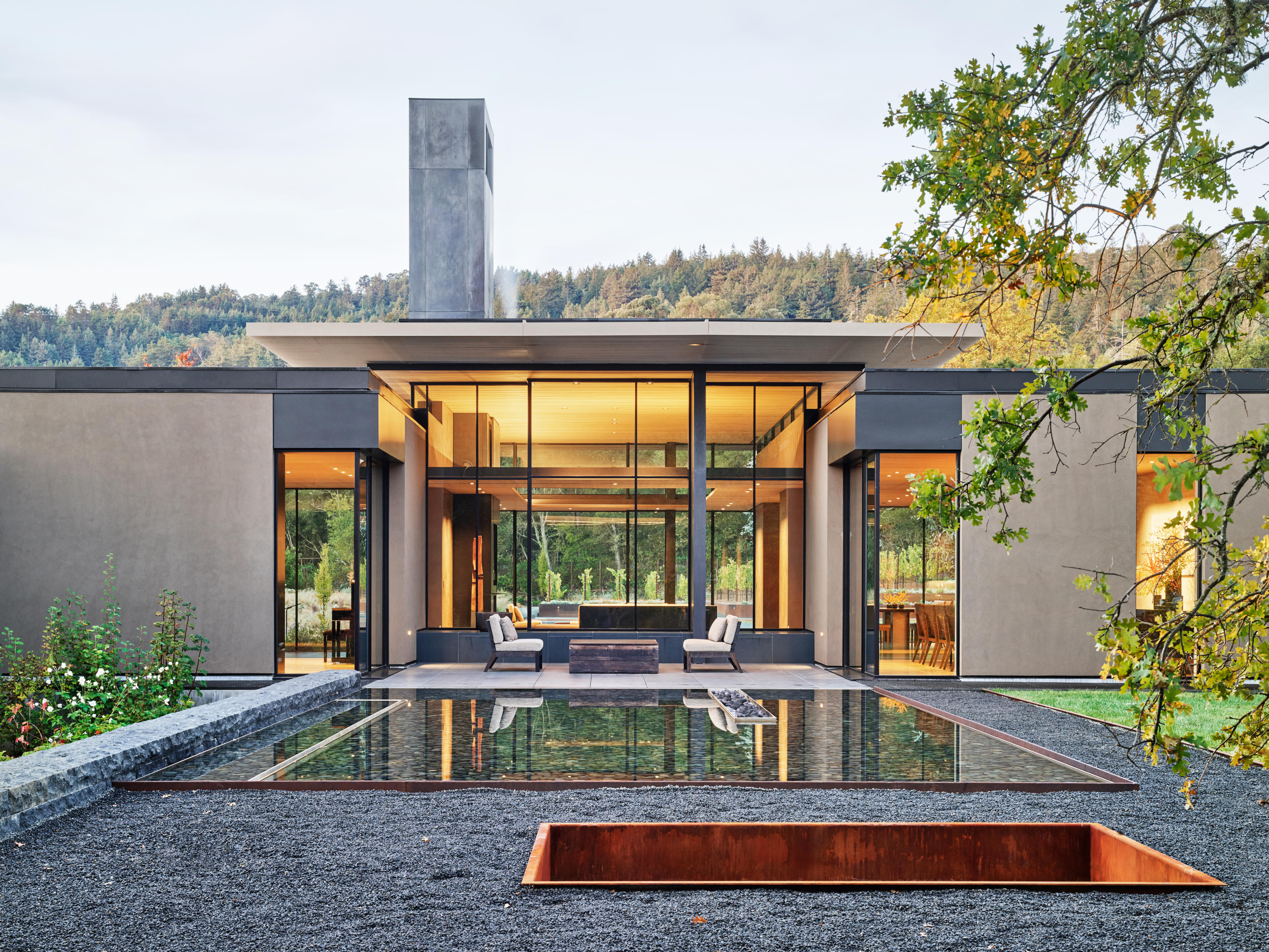
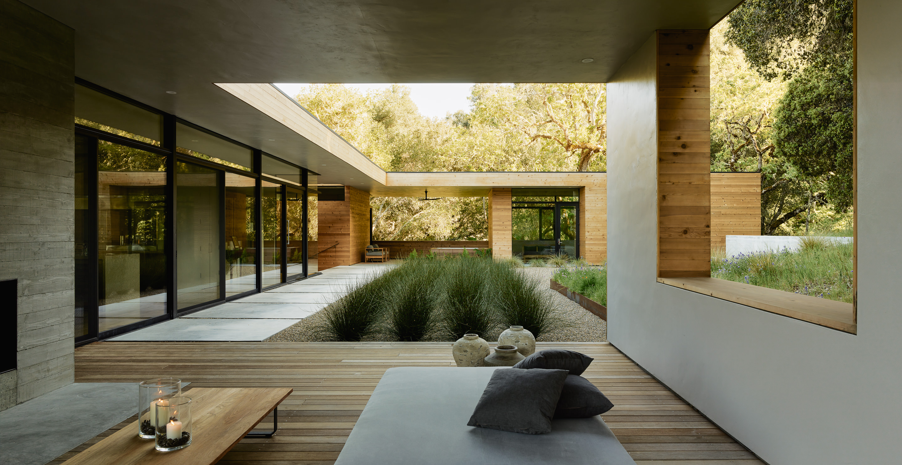

Suspension House

By Fougeron Architecture, California

Jury Winner, 11th Annual A+Awards, Renovations + Additions


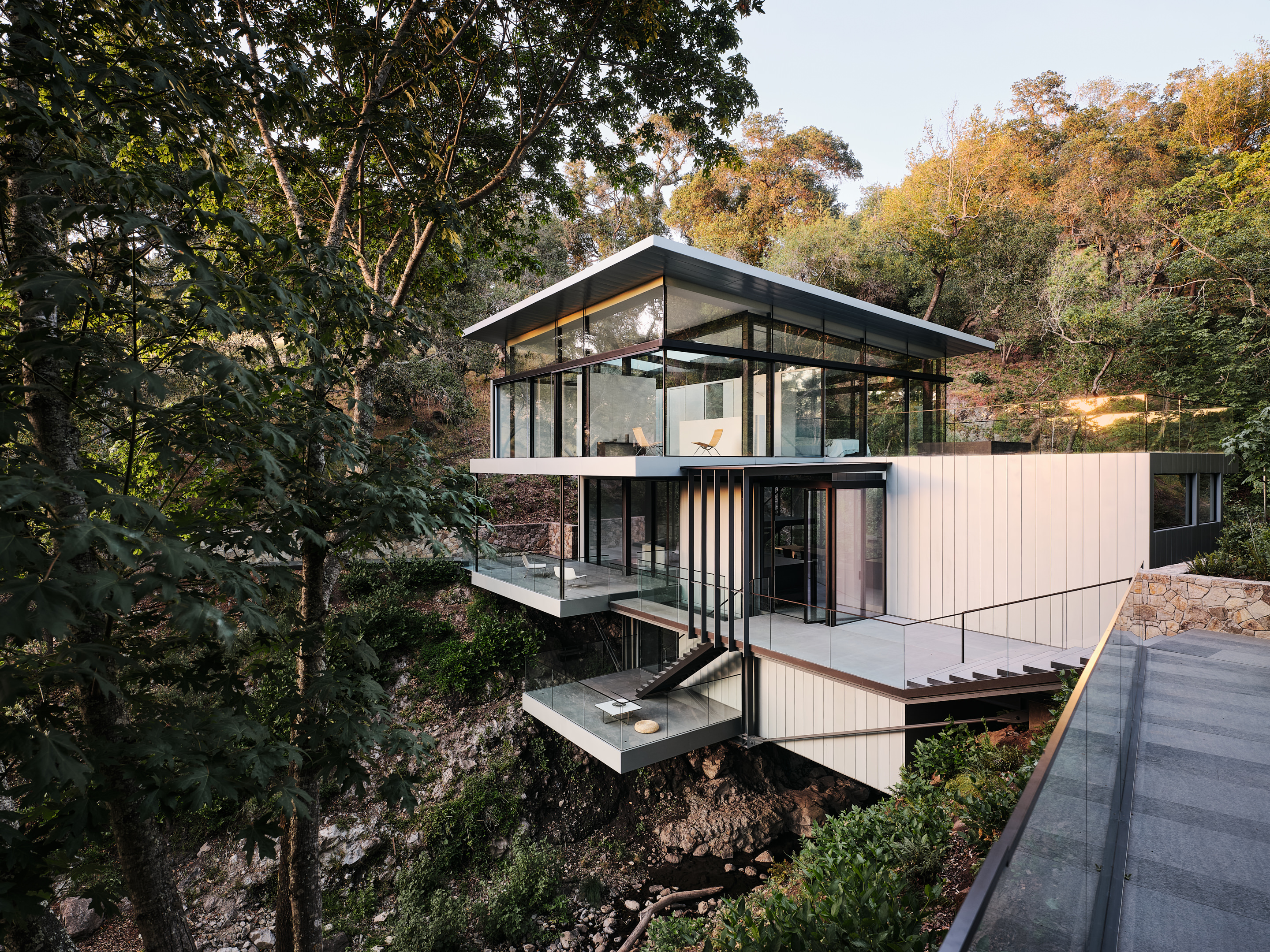
Perched between two Californian hills with a creek and waterfall in the backyard, this remodel aimed to seamlessly integrate the structure into the environment within strict legal guidelines. The new home maintains the exact outline of the existing house and decks, anchoring itself to the bedrock instead of disturbing the creek below. Transparent materials, floor-to-ceiling windows and open-concept outdoor spaces offer unobstructed views of natural water features.

Retaining 50% of the existing wood structure, a steel frame supports the home, exposed on all floors. The third floor rotates for better site relation, breaking up the mass and creating a dynamic, light-filled space. The Suspension House achieves a delicate balance between modern architecture and its natural surroundings.


Mar Vista

By WOODS + DANGARAN, Los Angeles, California

Jury Winner, 9th Annual A+Awards, Residential Interiors (>3000 sq ft)

Perched on a downsloped lot, this 6,000 square-foot house maximizes views with strategic placement of the entry and master suite. The L-shaped footprint incorporates an in-ground pool. The street view features a grounded elevation with a privacy wall, floating second floor, and cedar louvers for visual interest.

The entry sequence includes a courtyard with a gingko tree. The main level boasts a modern palette of metal, polished concrete, and glass, emphasizing indoor-outdoor living. The sculptural stair leads to warmer personal spaces on the second level, with custom furnishings that help to soften the architecture.


California Meadow House

By Olson Kundig, Woodside, California

Designed by Jim Olson, this family estate seamlessly integrates architecture, interior design, art and landscape into a unified whole. The central “home base” living area serves as the core, with views extending in four directions across reflecting pools, gardens, and the Santa Cruz Mountains. The estate includes auxiliary buildings and outdoor living areas, made to blend into its verdant surroundings. The 3.5-acre site is divided into two interconnected parts, with cultivated areas featuring old-growth olive trees, a vineyard, and a succulent garden.

The “wild” half includes private spaces like the master suite and children’s bedrooms, with fluidity between inside and outside. Retracting window walls and trellises maximize outdoor living and natural ventilation. The earthy exterior palette continues inside, integrating with custom furniture and an international contemporary art collection. The home, designed for energy efficiency, incorporates solar panels, geothermal and hydronic systems, achieving a practical integration with nature.


Carmel Valley Residence

By Piechota Architecture, Healdsburg, California


Nestled in Carmel Valley’s Santa Lucia Preserve, the residence aptly was named after the surrounding area. It embraces an L-shaped plan, naturally integrating into the landscape. Located in a sunny clearing, the home features concrete, weathered steel, and cedar, mirroring the hues of the hills. Custom floor-to-ceiling glass offers breathtaking views of rolling hills, wildlife, and the valley.

The program divides between two structures forming the “L,” connected by an enclosed second-story bridge. This layout separates living spaces from suites, maximizing outdoor living. The house, oriented for views, follows the forest perimeter, with expansive windows framing oak trees as natural elements of focus.


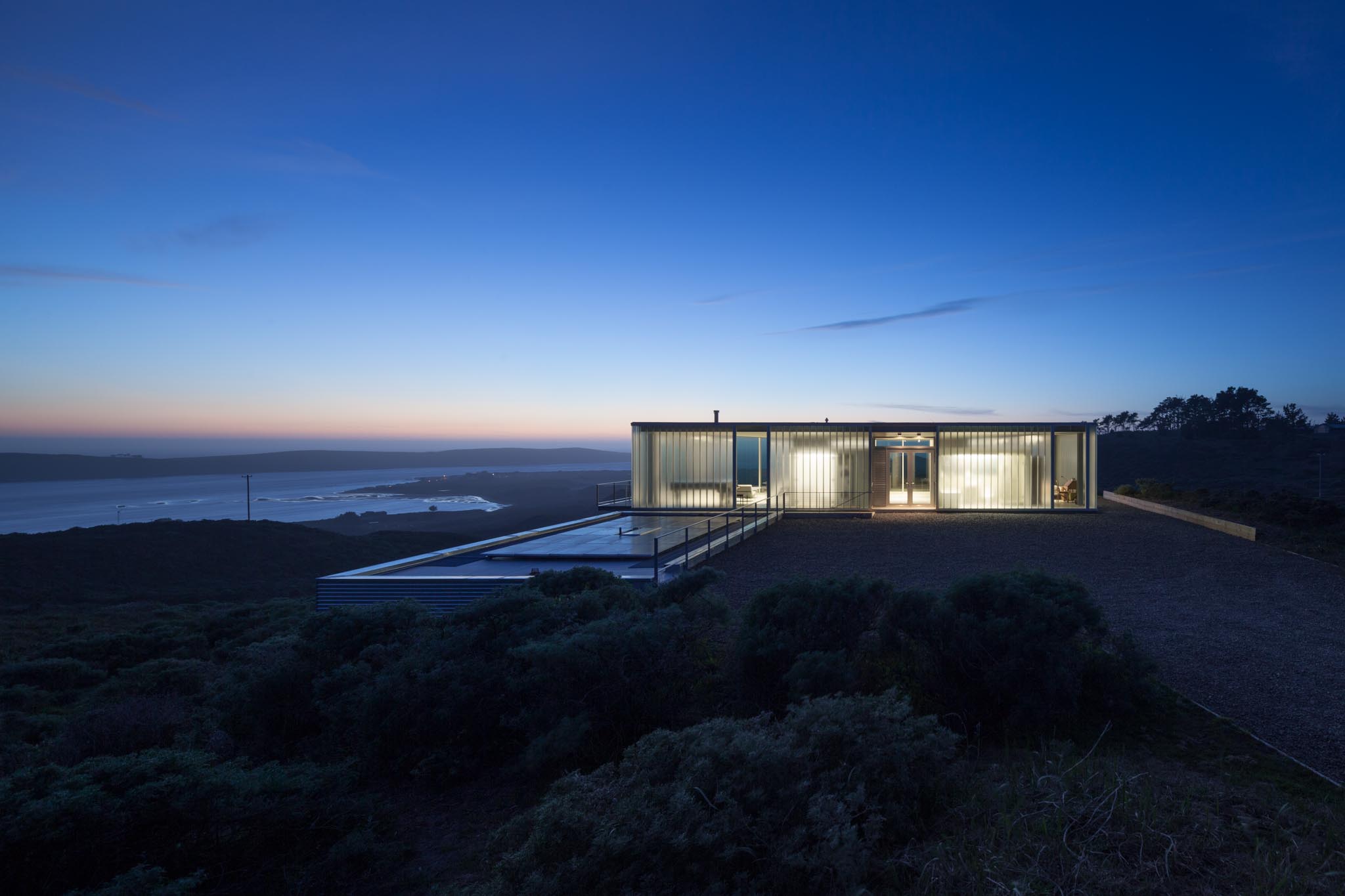
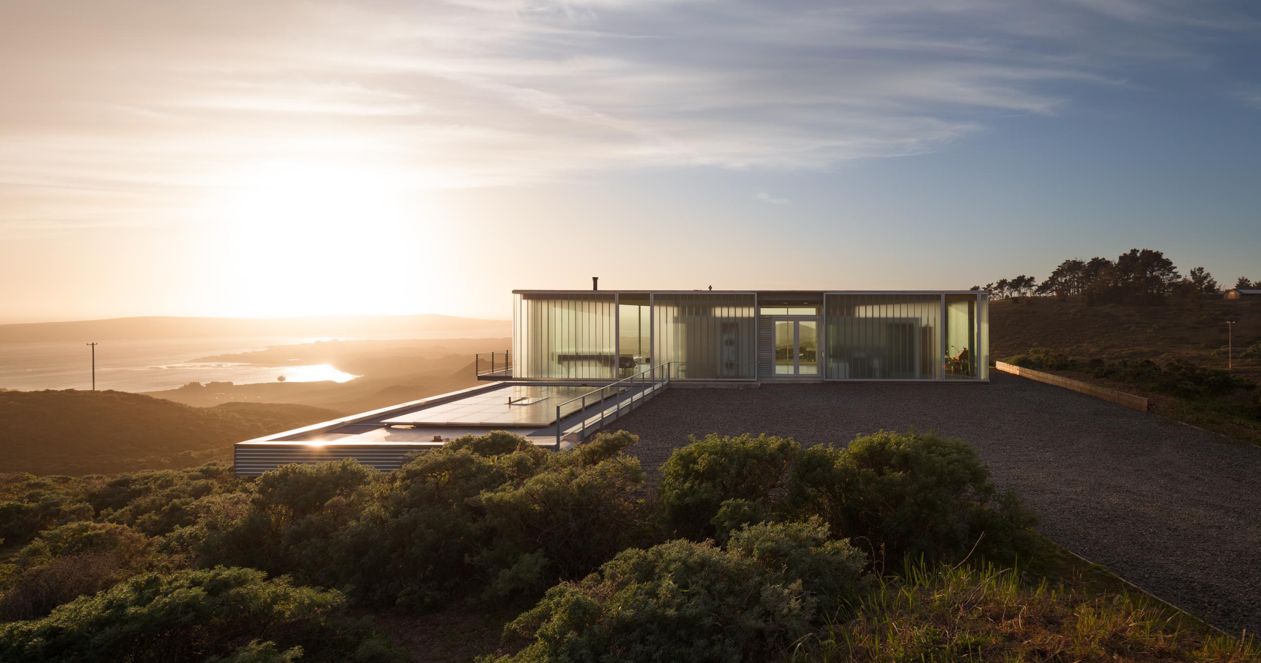
Off-Grid Guest House

By ANACAPA, Santa Barbara, California


Situated on a pristine coastal wildlife preserve in California, this modern guest house achieves a harmonious blend of residential development and ecological preservation. Tucked into a hillside with minimal visual impact, the home offers panoramic views of the Pacific Ocean and hills through expansive sliding glass and cantilevered decks. Architect Dan Weber and designer Steve Willson prioritized environmental sensitivity, employing green building practices and sustainable systems.

The off-grid residence relies on a photovoltaic energy system, LED lighting, and low-usage appliances. With a private well, septic tank, and green roof for insulation, the house integrates seamlessly with its surroundings. Elemental materials like steel, concrete and glass, complemented by walnut accents, create a warm and characteristic space.


Lattice House

By Aidlin Darling Design, Belvedere, California


This coastal home, perched on a precipice, offers breathtaking views from San Francisco to Mount Tamalpais. Nestled amid live oak trees and Monterey pines, it maintains intimacy. Inspired by terraced landscapes, its design responds to the steep terrain, protecting occupants from the elements. Earth-toned concrete and stone walls retain the hillside, shaping living spaces.

Shifting floor plates and roof planes maximize solar exposure, creating sheltered gardens. Cedar slats filter sunlight into open-air terraces, enhancing the indoor-outdoor experience. The architecture is both grounded and dynamic, providing a sense of protection and comfort amid stunning views.


RidgeView House

By Zack | de Vito Architecture + Construction, Saint Helena, California

Nestled amongst the natural rock outcroppings, and native Oak and Manzanita trees, the RidgeView House sits atop the western edge of the Vaca Range overlooking St. Helena and the Napa Valley. Perched on a ridge, it offers valley views to the west and forest views to the east. Every room utilizes doors, windows and materials to integrate inside and outside spaces, maximizing views and bathing the interior in natural light.

The structure’s exposed interior materials contrast elegance and strength, while the exterior features a natural palette of materials – concrete, corten and cedar – allowed to patina and blend into the California flora. Expressive details showcase the materials and craft, reflecting the successful creative partnership of the owner, architect and builder.
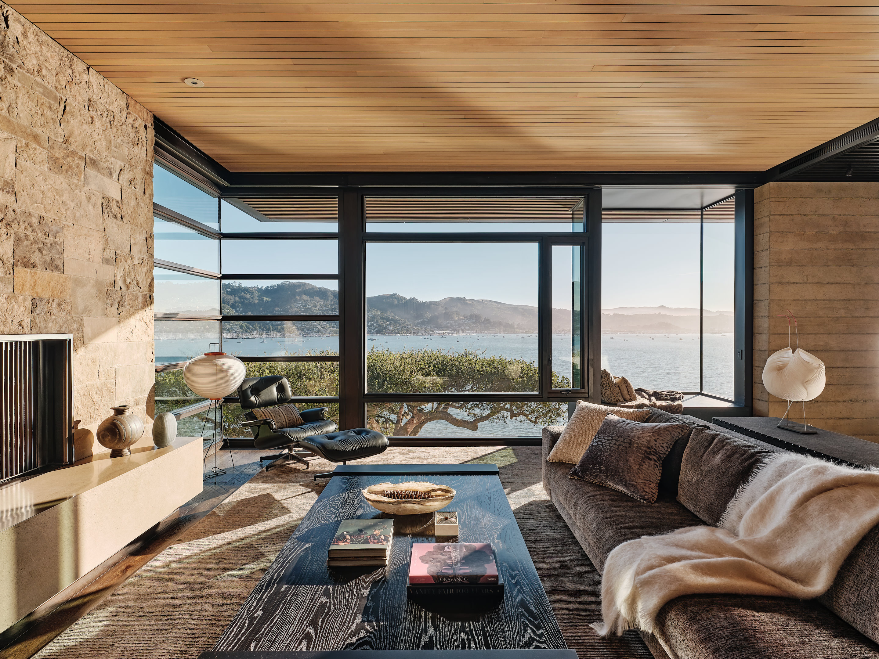
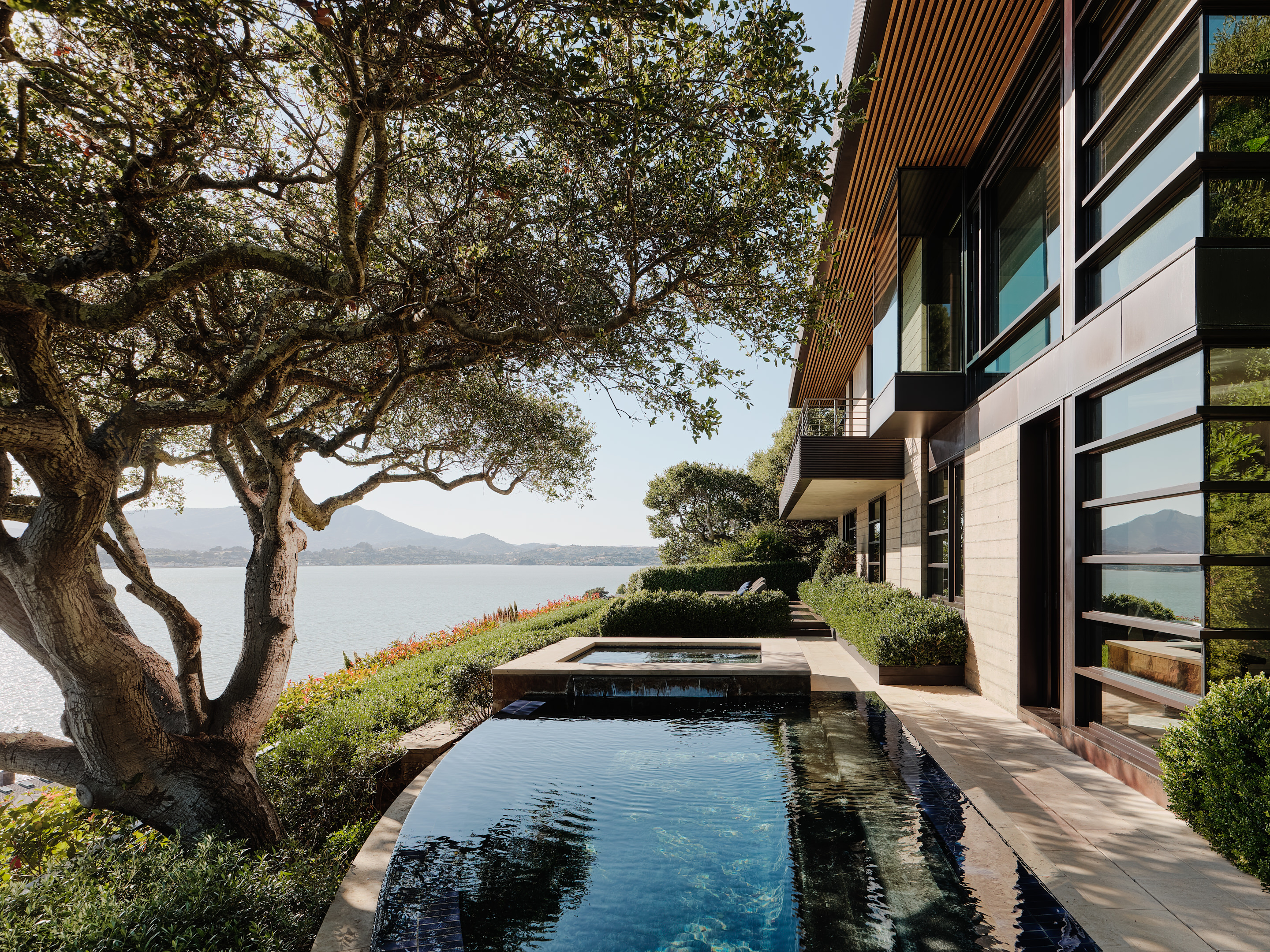

C-Glass House

By deegan day design, Marin County, California

The C-Glass House, a 2,100 square foot retreat in northern California, stands on a wind-swept site with a panoramic view of Tomales Bay and the open ocean. Designed with inspiration from Philip Johnson’s Glass House and Mies van der Rohe’s Farnsworth House, it also draws from California legacies like Elwood and Koenig. Unlike earlier ‘vitrines in a garden,’ this glass house on the west coast prioritizes its environment, using framing, cantilever, and directional enclosure to capture the beauty of the surroundings.

The residence navigates between the precision of high modern glass houses and the Case Study generation. While influenced by architectural lineage, the C-Glass House is equally indebted to artists like Larry Bell and Dan Graham, incorporating reflective and refractive elements. It bridges these influences to open up to a panoramic vista, reflecting on architecture’s evolving role in the American landscape.


Camp Baird

By Malcolm Davis Architecture, Healdsburg, California


In search of a weekend escape, the owners of this compound sought a retreat from their central urban house. The design was made in consideration of both the client’s active children and a steep slope. Rehiring architect Malcolm Davis, who designed their primary residence, they envisioned a rural counterpoint to their urban dwelling. The goal was to create a camp-like structure focused on the outdoors, inspired by images of tents on a deck and a possible prefabricated structure.

Davis, drawing on his Northern California Regionalist background, embraced the concept defined by Louis Mumford as “a native and humane form of modernism.” Camp Baird, located on 165 acres in a coastal valley, is completely off the grid. Comprising two structures — an L-shaped main pool house and a car barn — it offers multi-functional spaces for various activities amid the natural surroundings.


House Set on the Valley Floor

By ATELIER JØRGENSEN, Napa County, California


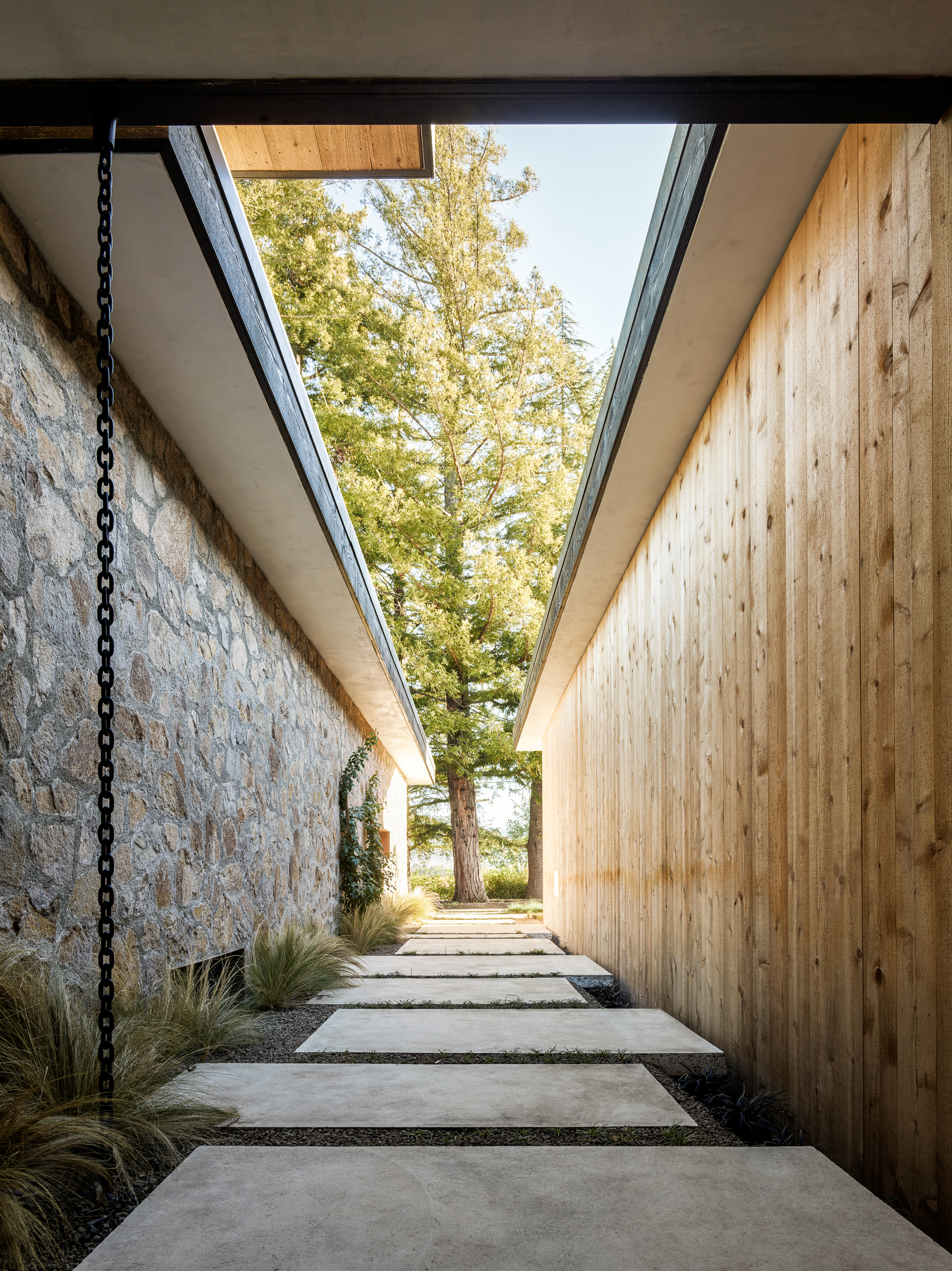
Nestled within vineyards near the town center, this house features two interconnected structures protected by ‘L’ shaped walls, one stone and one cedar, shielding them from a busy road. Courtyards and terraces emerge behind these walls, forming individual gardens that seamlessly blend with the landscape. Slender pathways connect gardens, courtyards and interior spaces, respecting the surrounding environment. The entrance garden, resembling a porch-like atrium, leads to a solid redwood door crafted from a tree on the site.

The foyer connects the main walls, with a cedar gateway to guest rooms and a stone portal to the family art collection and main house. Expansive eaves offer year-round outdoor enjoyment and shield from the summer sun, while the house’s envelope balances privacy with large openings to the landscape, reflecting its rural setting.

Architects: Want to have your project featured? Showcase your work through Architizer and sign up for our inspirational newsletters.

Reference

A cluster of houses in The Sims 1
CategoriesInterior Design

The Sims is a key part of why I ended up in interior design

The Sims has been allowing players to act out their architecture and interior design fantasies for more than two decades. Jane Englefield finds out how the makers of the iconic life-simulation video game keep up with shifting trends.

“People laugh when I mention playing The Sims, but it was hugely significant in terms of spatial planning and was a key part of how and why I have ended up in the line of interior design work that I have,” interiors stylist and editor Rory Robertson told Dezeen.

“The Sims offered people the opportunity to get a feel for design,” he reflected. “You could be as extravagant and outrageous, or as briefed and restricted as you liked.”

A cluster of houses in The Sims 1A cluster of houses in The Sims 1
The Sims was first released in 2000 with three sequels since developed

Created in 2000 by American game designer Will Wright, The Sims is a video game where players make human characters – or “sims” – and build their virtual houses and lives from scratch, catering to their needs and desires.

With four iterations of the main game and dozens of themed expansion packs focussing on topics such as university, parenthood and cottage living, The Sims is one of the best-selling video-game franchises of all time.

“It’s really accessible”

Architecture and interior design has been a major part of The Sims experience from the very beginning.

Having previously created the city-building game SimCity in 1989 – which itself has been credited with inspiring a generation of urban planners – Wright was originally motivated to develop The Sims after losing his home in the Oakland firestorm of 1991 in California.

In fact, early designs were for an architecture game, with the shift to focus on people a relatively late addition to the concept, according to one of the game’s first art directors, Charles London.

Design remained a core part of the offering, however, and the interface features tools that allow players to instantly build structures and decorate and furnish them from an extensive inventory of items.

Decorated bedroom in a house in The Sims 1Decorated bedroom in a house in The Sims 1
Players can choose from a wide inventory of decor and furnishing options

“It’s really accessible, so I think a lot of people get into it without even realising that they’re playing with architecture and playing with space,” said video-games expert and historian Holly Nielsen.

“While it was like catnip for design budding minds, it was also just a wonderful opportunity for procrastination and frivolity for people who aren’t particularly confident or tuned in to interiors or architecture,” echoed Robertson.

Since the original The Sims, a broad set of options has been available for players to suit their tastes and imaginations.

Possibilities have ranged from minimalist bungalows filled with neutral furniture to more outlandish dwellings, such as castles defined by Dalmatian-print wallpaper or hot tubs parked in the middle of multiple living rooms.

“We’ll take any source”

The team behind these possibilities described how they ensure that the architecture and interior design options stay feeling fresh and contemporary with each new game in the series.

“Since we’re a game about real life, anytime we step outside our door we have inspiration by just looking at what’s in our immediate environment,” game designer Jessica Croft told Dezeen.

Art director Mike O’Connor added that he and his team scour the real world and the web for up-to-date references.

“We’ll take any source,” he said. “We’re looking for patterns. If we start to see round furniture, or bouclé, or whatever the trend is, [we ask] has it already gone?”

“The internet doesn’t scrub old ideas. So you know, it’s seeing if there’s a trend, is it sticking, does it apply to what we’re doing now?”

Minimal Sims kitchenMinimal Sims kitchen
The in-game design possibilities have evolved over time to keep up with trends

Furniture and appliances within the game are regularly revised over time to reflect cultural and technological progression in the real world, Croft explained.

“In Sims 2 [released in 2004] I would not be surprised if there was a landline phone – and there definitely isn’t a landline phone in my own house, or Sims 4,” she said.

“Even things like VR [virtual reality] didn’t really exist back in The Sims 2 days, so things like VR consoles, computers – we just added dual-monitor computers, and LEDs are now in most households,” she continued.

That in turn sees the team take a surprisingly deep dive into how interiors are changing, O’Connor acknowledged.

“Over the life of this game, you see an evolution,” he said. “Electronics are probably the biggest category [of change]. Even just how people use TVs, how they place them, has changed.”

The idea, says Croft, is to ensure that The Sims players feel a close connection to the world they are building for their sims.

“The most fun thing for me is being able to allow players to craft stories that are relatable to them,” she said. “So, looking for opportunities to make players feel seen.”

“An element of freedom and fantasy-building”

But, as Nielsen points out, there is an additional aspect to the game’s architecture and design possibilities that is central to its appeal.

“In one sense, it’s reflective of society, but in another way, it’s aspirational,” she said.

“There’s an element of freedom and fantasy-building to playing The Sims,” she continued. “Homeownership is a thing that a lot of us will not get to do.”

As in real life, everything you build or buy in The Sims has a cost.

However, unlike in real life, punching “motherlode” into The Sims cheat-code bar will immediately add a healthy 50,000 simoleons to your sim’s bank account, putting that luxury sofa easily within reach.

Low-lit house within The Sims 4Low-lit house within The Sims 4
The game offers people “the opportunity to get a feel for design”

That possibility remains central to Robertson’s nostalgia for playing The Sims as a young would-be interior designer.

“Once you double-clicked The Sims graphic on your Microsoft desktop, a multi-roomed mansion cost nothing to design,” he said.

This aspirational element has become an increasingly large part of The Sims’ commercial model over the years.

The Sims 4, as an example, is accompanied by 19 purchasable “Stuff Packs” that expand the options of items available to buy, including “Perfect Patio”, “Cool Kitchen” and one based on the products of Milan fashion label Moschino.

And the latest of the more extensive expansion packs is For Rent, which allows players to build rental houses where some sims are landlords and others are tenants.

Within the game, landlords encounter various true-to-life issues, including the potential for toxic mould build-up in their properties – although, unlike in the real world, the mould feature can be toggled on and off.

Inclusivity has also become an increasing focus of The Sims, with integral features now including options to choose sims’ sexual orientation, for instance.

For Nielsen, that traces back to a significant foundational element of the game’s widespread appeal – as well as being one of the reasons it has had such strong interior-design influence.

“It didn’t feel like it was aiming for anyone,” she explained. “One of the things that people bring up a lot is that it has a very female player base.”

“For me, it was a big turning point – it was getting to create the spaces but also play around with the people inside them. It felt like a socially acceptable way to play dollhouses.”

The images are courtesy of Electronic Arts.

Dezeen In Depth
If you enjoy reading Dezeen’s interviews, opinions and features, subscribe to Dezeen In Depth. Sent on the last Friday of each month, this newsletter provides a single place to read about the design and architecture stories behind the headlines.


Reference

Photo of plastic bottles
CategoriesSustainable News

We need to design for human behaviour to get rid of single-use plastics

Packaging designs aimed at boosting recycling rates and reducing the prevalence of single-use plastics are destined to fail unless they help to change people’s behaviour, writes Matt Millington.


No one is particularly happy when they find out there’s plastic waste on Mount Everest, or in the deep oceans, or in human blood. It’s not controversial to say that we need to stop churning the stuff out and throwing it away.

One way for businesses to tackle single-use plastics is to design their packaging to be reusable, but so far efforts have not succeeded at scale.

For example, reusable McDonald’s cups are only getting a 40 per cent return rate from customers in Germany, despite consumers paying a €2 deposit. When Starbucks trialled reusable cups in the closed environment of its Seattle HQ, where returning them is presumably straightforward, the return rate still didn’t exceed 80 per cent.

We weren’t exactly succumbing to dehydration on the streets before coffee shops designed takeaway cups

It’s not that we don’t care: research suggests consumer motivation towards environmentally positive behaviour is high. It’s that as a society we have developed an expectation of convenience: to have what we want, when we want it, without any consequences.

This is entirely unreasonable – we weren’t exactly succumbing to dehydration on the streets before coffee shops designed takeaway cups – but while it persists, consumers are very unlikely to switch to reusable alternatives if it puts them out. And without a high return-and-reuse rate, reusable packaging is usually worse for the environment, owing to the much higher quantities of plastic involved.

This is why we need to design for human behaviour if we’re ever to get rid of single-use plastics. You cannot control what people will do with packaging once it leaves your premises, but you can influence them by factoring behavioural psychology into the design of the packaging itself.

The first step is understanding how consumers interact with the pack, throughout its lifecycle. Where are they and what are they doing when they open it? What’s their headspace? How about when they’re finished with it? There’s a big difference between how someone interacts with a reusable plate after a meal in a cafeteria, and how they interact with the reusable salad bowl they’re gobbling from on the lunchtime rush back to the office.

Then it’s about understanding the levers you can pull to nudge people towards more planet-positive decisions. Behavioural psychology shows there are three factors that work together to drive behavioural change: increasing consumer motivation to recycle or reuse, raising their ability to do so, and providing a trigger to remind them.

Take plastic bags. While usage of single-use bags has dramatically decreased in the UK since legislation requiring retailers to charge for them came into force in 2015, reusable alternatives have had mixed success. According to a report by the Environmental Investigation Agency and Greenpeace, 57 “bags for life” were sold for each household in the country in 2019 – more than one a week.

It’s possible to go too far in signalling that a pack isn’t disposable

Online grocer Ocado uses recyclable bags instead, but it has had success in achieving returns because it pulls all three behavioural psychology levers. Consumers are happy to receive bonus reward points for each bag they give back (motivation).

The bags are straightforward to return and customers know not to throw them away because of their clear messaging and distinct off-grey colour, which follows from not using harmful bleaching agents (ability). And because the driver usually asks for old bags after delivery, they’re unlikely to forget (trigger).

Ability is the key consideration. If you wanted to return the packaging from a takeaway burger meal, it would mean washing and then carrying around a bulky burger box, fries box and cup, and either making a special trip to the restaurant or waiting until you happen upon another branch.

New Zealand start-up FOLDPROJECT has done some interesting work here, trying to make boxes more portable. It’s a simple idea: a machine-washable lunch kit that packs down to a flat sheet. The challenge is that because it is so minimal, its form and material make it look disposable.

One way to ensure a reusable design communicates its intended purpose is through material choice. For example, using explicitly post-consumer recycled plastic could be a visual shorthand to communicate a planet-positive intent, as could using longer-lasting materials like glass or stoneware.

Interestingly, it’s possible to go too far in signalling that a pack isn’t disposable. When McDonald’s introduced reusable packaging in its restaurants in France, it found the packaging kept disappearing, only to reappear on eBay. It looked reusable and on-brand, but was too novel for some, defeating the object.

So long as we have bins on every street that lead directly to landfill, we are going to struggle

Businesses cannot just switch to reusable packaging – even when intelligently designed – and expect results. So long as we have bins on every street that lead directly to landfill we are going to struggle.

We therefore need to think beyond just designing the packaging to be sustainable, and think about how we design systems to be sustainable. In a circular economy that means service and experience design, packaging, industrial design, marketing, data, artificial intelligence and logistics all working hand-in-hand to keep the pack “in the loop”. It will therefore need to be an ecosystem effort.

We’re already seeing innovations that can help make reuse and return viable in the age of convenience. For example, when is a bin not a bin? When it’s a Bjarke Ingels Group-designed TURN system – a remote, digitally connected, RFID-enabled, packaging-asset reclaim and sorting network, which rejects unwanted trash.

Similarly, we’re seeing nudge messaging along the pack journey, and even packs that communicate their status themselves. Scottish start-up Insignia has designed colour-changing labels that reveal how long a pack has been exposed to the environment. Imagine taking this further, with reusable packaging telling you what to do with it, and offering prompts or rewards to encourage you.

Reusability hasn’t hit scale yet, but we should be optimistic that it can, not least because we’ve been there before. Milk deliveries were once the norm, with bottles returned, not discarded.

There’s no reason that we can’t get back to this more sustainable approach across the board, without having to endure too much inconvenience. All that’s required is a little ingenuity, and a lot of collaboration.

The photography is by Jas Min via Unsplash.

Matt Millington is a sustainable-design strategist at PA Consulting.

Dezeen In Depth
If you enjoy reading Dezeen’s interviews, opinions and features, subscribe to Dezeen In Depth. Sent on the last Friday of each month, this newsletter provides a single place to read about the design and architecture stories behind the headlines.

Reference

Green goals: recycled and bio-based sports balls
CategoriesSustainable News

Green goals: recycled and bio-based sports balls

Spotted: Sports are a cultural staple for countries around the world, whether you enjoy watching matches on TV, attending games, or playing yourself. And, according to FIFA, there are five billion football fans across the globe, making it the world’s most popular sport. To meet this popular demand, over 40 million footballs are made every year, relying on tonnes of crude-oil-based synthetic, animal leather, and rubber for their production. 

This is where the Rebond Project comes in. The French organisation is rethinking traditional manufacturing to create balls that contribute to a circular economy and are made from clean and sustainably sourced materials

The initial problem the Rebond team had to solve was finding an adequate recyclable substitute for the internal or inflatable part of a football (the balloon). Rebond settled on recycled plastic bottles and a natural latex inner tube to make, what the company claims is, the first bio-sourced and recycled balloon that met competition standards. To make the ball completely ‘clean’, Rebond chose to create the external part of the football entirely out of natural vegetable-based biomaterials.  

According to the company, 85 per cent of current ball production occurs in the Punjab region in India. Wanting to boost local production of “Made in France” balls, Rebond set up a French production line in Loire-Atlantique in 2019. Rebond highlights, though, that the goal isn’t to replace Punjabi workshops, but instead to use the France production line to complement them. 

According to Rebond Founder and CEO Simon Mutschler, the company is now aiming to get the FIFA-accredited logo on its balls so they can be sold to official football clubs. 

Springwise has spotted other innovations seeking to make sports more sustainable, including inclusive tennis programmes that recycle used balls and eco-friendly wetsuits for women. 

Written By: Archie Cox

Reference

OTHERWORLDS' como agua resto-bar unfolds like a huge bird's nest in the indian forest
CategoriesArchitecture

OTHERWORLDS’ como agua resto-bar unfolds like a huge bird’s nest in the indian forest

como agua by otherworlds completes in North Goa, India


Step inside Como Agua, a new bar and restaurant on the Vagator cliff overlooking the sea in North Goa, India. Conceived by multidisciplinary practice OTHERWORLDS, the design combines sustainably sourced bamboo and a wild shrub, Lanternna Camara, a combination that playfully alludes to dining in an overgrown and enlarged weaver’s nest surrounded by lush tropical paradise. As an invasive species of plants widespread in the Western Ghats, the Lantenna Camara claims agriculture, forest growth, wildlife and tribal livelihood every year — yet, by repurposing it as a building material, ‘the project displays innovative building practices using biological materials while creating emphasis on lantenna removal, use and restoration,’ comments principal architect Arko Saha. 

OTHERWORLDS' como agua resto-bar unfolds like a huge bird's nest in the indian forest
all images © Fabian Charuau, Studio Charuau


evoking the wild nest of weaverbirds


The design of Como Agua is heavily inspired by forms found in natural environments. ‘We were fascinated by the wild women nests of weaverbirds. The weavers are social birds, usually nesting and feeding in colonies. They collect all sorts of natural materials like twigs, fibres and leaves to weave a membrane that acts as their nest, usually hanging from the branch of a tree,’ notes the studioMaterials used for building nests include fine leaf fibers, grass, and twigs. Many species weave very fine nests using thin strands of leaf fiber, though some, like the buffalo-weavers, form massive untidy stick nests in their colonies, which may have spherical woven nests within. OTHERWORLDS, therefore, wanted to explore the experience of dining within and around a weaver’s nest. Like the weaver, the team also foraged into the forests of the Ghats to collect wild Lantenna and weave them to create spatial structures for the space.

OTHERWORLDS' como agua resto-bar unfolds like a huge bird's nest in the indian forest
Como Agua by OTHERWORLDS


The top deck of the Como Agua restaurant houses two nests where one can sit and dine while enjoying the extensive views of the beach and sea of North Goa. On the ground floor, an undulating lantenna membrane wraps the bar and pizza counters and houses a wooden bench in between, offering a cozy corner for dinner. The wire mesh lamps spread across the bar-resto to light up the tables are also inspired by hanging nests found in trees; these lamps hang at different heights, creating a whimsically warm atmosphere that mimicks the organic nature of their biological counterparts found in the forests. 

OTHERWORLDS' como agua resto-bar unfolds like a huge bird's nest in the indian forest
the resto-bar sits on the Vagator cliff overlooking the sea in North Goa


building with bamboo and repurposed lantenna camara


Lantenna Camara has been listed as one of the ten worst invasive species in the world, invading over 40% of the Western Ghats, a total of 13 million hectares. Arriving in India as an ornamental plant in the early 1800s, predominantly by the British, Lantana has escaped from gardens and taken over entire ecosystems through its multiple hybrid varieties. In the 200 years of its arrival, the plant has evolved to now climb up the canopy as a woody vine, entangle other plants by forming a dense thicket, and spread on the forest floor as a scrambling shrub. Lantana is mainly dispersed by fruit-eating birds, monkeys, bears, and the like, but it also capable of growing from its root-stock, and nodes. This results in its widespread growth, ultimately affecting biodiversity, livelihoods, and human and animal health — from displacing native plants and reducing productivity in pasture through dense thickets formation to making it exceedingly difficult for tribal communities to access the forest for edible tubers and firewood collection. 

OTHERWORLDS' como agua resto-bar unfolds like a huge bird's nest in the indian forest
an undulating lantenna membrane wraps the bar and pizza counters


These alarming issues and threats expose the imminent danger of Lantenna growth, highlighting its eradication and the urgency of exploring new methods of removal/restoration. For Como Agua, OTHERWORLDS has repurposed Lantenna from Western Ghats, bringing it on site to cut, trim, bend, and wrap around metal mesh structures to create a membrane used for railings, compound wall partitions, nest-like structures, facades, and canopies. Completing the design is bamboo, sourced jointly with Bangalore-based company Bamboopecker. Native to the region, Bamboo is extensively used for structure and facade treatment. Varying thicknesses and sizes are first treated with saltwater and then used in the space. OTHERWORLDS recycled local wood pieces to create custom patterns for the bar counter tops and facade. Even the outdoor built-in benches are made using reclaimed pieces of Matti wood. Indian Kota stone makes up the interior flooring, while larger Kota stone slabs of varying polished and colors (rough to smooth) are cut into thinner pieces and then laid on site to interlock with the outdoor wooden deck. Locally available Matti wood comprises the furniture and outdoor decking.

OTHERWORLDS' como agua resto-bar unfolds like a huge bird's nest in the indian forest
outdoor built-in benches are made using reclaimed pieces of Matti wood

OTHERWORLDS' como agua resto-bar unfolds like a huge bird's nest in the indian forest


Reference

Living room with patchy brown and beige paintwork
CategoriesInterior Design

Plus One Architects uncovers paintwork of century-old Czech apartment

Prague studio Plus One Architects has restored the “original splendour” of this 1902 apartment in Karlovy Vary, Czech Republic, by reinstating some of its original features.

Located in a turn-of-the-century apartment block, the two-bedroom flat was renovated by Plus One Architects, who exposed the original paintwork present on the walls and ceilings.

Living room with patchy brown and beige paintworkLiving room with patchy brown and beige paintwork
The Karlovy Vary Apartment features minimal furnishings

The studio also streamlined the circulation inside the apartment by removing doors to open up pathways, as well as undoing dated additions that had been installed over the top of the original walls and floors.

“We think the first renovation was probably done in the late 70s,” architect Kateřina Průchová told Dezeen. “It was full of wooden cladding on the walls, a lot of doors and carpet that covered the original floors.”

Corridor with flaky pink paintworkCorridor with flaky pink paintwork
Transom windows let light flood through the rooms

The revamped interior has a bright, airy atmosphere, as natural sunlight comes in through the large unobstructed windows and continues deeper into the rooms thanks to the addition of transom windows on some of the interior walls.

Remnants of colourful mottled paintwork appear on the walls and ceilings alongside brown and beige sections of plaster.

Chair in front of mottled painted wallChair in front of mottled painted wall
Mottled blue and yellow paintwork decorates the primary bedroom

Neutral-coloured paint and plasterwork feature in the kitchen and living room, where Plus One Architects retained the apartment’s original masonry heater clad in glossy brown tiles.

Painted details are also apparent on the ceiling, with concentric bands of red, blue and yellow delineating the perimeter of the room.

Doors were removed to improve the flow between spaces

Pink paint appears in the corridor and smaller bedroom while blue paintwork can be seen in the primary bedroom, complementing the restored wooden floorboards.

In the bathroom, white tiling lines the walls, interspersed with iridescent tiles and sections of exposed paintwork.

The rooms are sparingly furnished, allowing the paintwork to be the interior’s focal point.

Plus One Architects brought in furniture with minimalist forms by Czech design studio Janský & Dunděra alongside decorative pieces from local design brand Todus.

Photograph showing sink in bathroom with round mirror abovePhotograph showing sink in bathroom with round mirror above
The bathroom is fitted with white flooring, tiling and fixtures

“I hope we managed to return the apartment to the original splendour of the period, in which the house was built,” said Průchová.

“You can feel how the building looks from the outside – it is an old house in the historic part of a spa town.”

Round dining table and chairs in front of open window in narrow roomRound dining table and chairs in front of open window in narrow room
The kitchen and dining room overlook neighbouring rooftops

Kateřina Průchová and Petra Ciencialová founded Plus One Architects in 2019. The studio is based in Prague and works on projects across the Czech Republic.

Other apartment interiors that have recently been featured on Dezeen include a home in Milan centred around a monolithic green marble partition wall and a pastel-decorated apartment in Kraków.

The photography is by Radek Úlehla.


Reference