SML reinterprets ginseng cultivation structure as contemporary retail interior in seoul
CategoriesArchitecture

SML reinterprets ginseng cultivation structure as retail store, seoul

an exhibition-like retail space for punggi


In Seoul, SML translates the traditional structure used to cultivate ginseng into a contemporary interior feature for the exhibition, promotion store, and sales center for Korean brand Punggi. The minimal, all-white space pays homage to the history of the plant, reimagining the traditional ‘Sampoeojang’ module with modern timber flair that weaves through the space to shape a retail area. With a modular form, products presented in a museum-like manner invite visitors to learn more about ginseng’s cultivation processes and the brand’s identity, as well as to purchase Punggi’s creations at the end of their journey

SML reinterprets ginseng cultivation structure as contemporary retail interior in seoul
all images by Kyungsub Shin


SML tells the story of ginseng amid the white walls


Embracing a passive branding strategy, SML’s design focuses on forming a spatial image that conveys the reputation of Punggi Korean Ginseng to a broader audience by spotlighting a differentiated, and yet-unknown image of the brand. The exhibition space, cloaked in pure white, serves as a canvas for the story of ginseng, with sophisticated wooden furniture embodying the brand’s inherent values. This design further seeks to subtly guide visitors through a journey that integrates brand exploration with the natural progression towards consumption.


The promotion wall takes center stage, transforming the main products into objects of art through careful curation. In a thoughtful play of physical materials and display methods, the wooden furniture-type structure of the display stand introduces a compelling contrast, as well as exuding a sense of warmth into the space. Each display case, set against the whiteness of the room, showcases products along a circular wooden member that softly circulates the space.  

SML reinterprets ginseng cultivation structure as contemporary retail interior in seoul
Punggi Ginseng Cooperative Association store in Seoul


The Korean Peninsula, famed for being the world’s premier ginseng producer, owes its reputation to a blessed natural environment. The Punggi Korean Ginseng, which is recognized as the best quality among them, is a perennial plant with a slow growth rate and specific cultivation requirements, is grown in a sunshade system called Sampoeojang over three to six years. In this way, this structure is considered a ‘ground for cultivation’, the very ‘house of ginseng’, recalled in SML’s design concept.

SML reinterprets ginseng cultivation structure as contemporary retail interior in seoul
SML creates an exhibition, promotion store, and sales center for the Korean brand

SML reinterprets ginseng cultivation structure as contemporary retail interior in seoul
the promotion wall takes center stage, transforming the products into objects of art through careful curation

Reference

Small restaurant with dark blue-green counters and burl wood walls
CategoriesInterior Design

Bird feathers inform Bar Miller interior by Polonsky & Friends

New York design studio Polonsky & Friends has lined this tiny New York omakase restaurant with burl wood veneer panels, while its counters and cabinetry are coloured to resemble bird feathers.

Designed as a sister location of Rosella, an East Village sushi spot that opened in 2020, Bar Miller is located a few blocks away in Alphabet City.

Small restaurant with dark blue-green counters and burl wood wallsSmall restaurant with dark blue-green counters and burl wood walls
The compact Bar Miller space seats eight covers around a counter made from rare Avocatus stone

The owners brought back Polonsky & Friends to complete the interiors so that the two outposts could share the same “warm, welcoming energy”.

Although the menu borrows from traditional sushi craft, it’s not authentically Japanese, so the designers wanted to steer clear of any tropes that might deceive customers.

Burl wood veneer panels framed in white oak on the wallsBurl wood veneer panels framed in white oak on the walls
Burl wood veneer panels on the walls are framed in white oak, matching the building’s original floors

“The design had to incorporate local and craft-centric elements and honour the food’s Japanese inspiration, but not fall into any folklore since the team isn’t Japanese and the menu is untraditional,” studio founder Anna Polonsky told Dezeen.

The restaurant only seats eight covers, which surround the open kitchen in the centre of the compact space.

Trio of panels with hand-painted wallpaper displaying bird feathersTrio of panels with hand-painted wallpaper displaying bird feathers
Custom wallpaper hand-painted by Hollie M Kelley displays the feathers of an eastern rosella bird

Deep blue-green Avocatus stone – a rare quartzite with a leathered finish – forms the entire bar counter

A custom ceiling pendant by Madrid-based designer Pablo Bolumar is suspended above the counter like a string of pearly beads.

Blue-green counter with ceramic vase and flowers, in front of a wood-panelled wallBlue-green counter with ceramic vase and flowers, in front of a wood-panelled wall
Pieces by several local designers are featured in the restaurant, including ceramic vases by Fefostudio

On the walls, panels of burl wood veneer are framed in white oak, which matches the refinished original parquet floors.

“We were able to sand back [the flooring] after it was hidden for years in the previous restaurant,” Polonsky said.

Glossy maroon kitchen cabinetsGlossy maroon kitchen cabinets
To contrast the blue-green dining area, kitchen cabinetry is coloured maroon as another nod to the rosella bird’s feathers

A trio of panels feature a custom wallpaper drawn by artist Hollie M Kelley, displaying the feathers of an eastern rosella bird.

Kelley also drew the icon for the sister restaurant, a western rosella, which has different colours in its plumage.

The maroon hues in the wallpaper are echoed on the cabinetry behind the kitchen counter, differentiating the food preparation area from the blue-green of the dining space.

Other details include a panel of vertical wood slats for storing plates above the sink and moulded-glass scones shaped like scallop shells.

Vertical wood slats provide spaces for storing dishesVertical wood slats provide spaces for storing dishes
Vertical wood slats provide spaces for storing dishes

The bar stools were crafted by Maderas Collective in Nicaragua and upholstered by Ecua in Queens, while ceramic vases were sourced from New York-based Fefostudio.

In the bathroom, green tiles laid in a herringbone pattern cover the walls and a rice paper pendant light hand-painted by Claire Dufournier hangs from the ceiling.

Bathroom featuring dark green tiles and a hand-painted rice paper pendant lightBathroom featuring dark green tiles and a hand-painted rice paper pendant light
The bathroom features dark green tiles and a hand-painted rice paper pendant light

For those looking for more Japanese restaurants with notable interiors, New York City has plenty of options to choose from.

Check out the Rockwell Group-designed Katsuya close to Hudson Yards, Rule of Thirds by Love is Enough in Greenpoint, and Tsukimi in the East Village designed by Post Company – formerly known as Studio Tack.

The photography is by Nicole Franzen.


Reference

A new method helps make the most of mushrooms
CategoriesSustainable News

A new method helps make the most of mushrooms

Spotted: Every year, the world generates two billion metric tonnes of municipal solid waste (MSW), with thousands of tonnes of that rubbish sent to landfills every day. A significant proportion of this is plastic or petroleum-based products that take hundreds of years to decompose, leaching harmful chemicals and shedding toxic microplastics into the environment as they break down. 

Shifting to natural materials that can biodegrade safely is crucial in tackling our waste problem – an increasingly popular option being those made from mycelium (fungi). The problem is that when mycelial fibres are extracted from the fungi, either mechanically or chemically, the process often results in discolouration, or the delicate fibrous structures becoming damaging, which can compromise their beneficial properties. 

Researchers at Shinshu University in Japan have now developed a novel method for collecting mycelial pulp that retains the physical structures of the mycelium. The team, led by Assistant Professor Satomi Tagawa, began by treating reishi and enoki mushrooms with sodium hydroxide and hydrogen peroxide, before bleaching them using sunlight. Then, the researchers defibrillated the material using ultrasonic treatments. The result was a pulp containing micrometre-sized mycelium fibres that still had their fibrous mycelial structures intact. 

Now, the research team is exploring other mushrooms that could be utilised to produce even higher quality materials, or create materials with different properties. They hope to take advantage of Japan’s position as one of the world’s largest mushroom producers, including through the creation of the Mycomaterial Technology Consortium – an initiative that focuses on maximising the utility of mushrooms.  

New and more sustainable materials are being developed every day. Springwise has also spotted the use of this plant as a plastic alternative in straws as well as this company that is upcycling cardboard into foam packaging. 

Written By: Archie Cox 

Reference

El Retiro residential extension
CategoriesArchitecture

Juan Alberto Andrade adds workspace to multifamily housing in Ecuador

Ecuadorian architect Juan Alberto Andrade has completed an extension to a multifamily housing complex with rammed earth walls in Guayaquil.

Known as El Retiro, the nine-square metre (97-square foot) addition doubles the common space of a 305-square metre (3,282-square foot) residential complex, protruding into the front setback along the street and blurring the line between the private housing and urban realm.

El Retiro residential extensionEl Retiro residential extension
El Retiro is a residential extension to an Ecuadorian home

Following Mexica architect Lucía Martín López’s idea of “the growing house,” Juan Alberto Andrade utilised a strategy for adapting housing López calls “crystallographic growth”: intervening within the limits of the property and following the area and height limits of the neighbourhood.

“Architecture is a response to the continuous need for the reinvention of a habitat,” the team told Dezeen. “Housing is an activity, a built process.”

Rammed earth residential extensionRammed earth residential extension
Rammed earth clads the external walls

Completed in 2022, the simple square addition is composed of a load-bearing, 30-centimetre-thick rammed earth wall – set on top of a limestone rock base – and bahareque masonry, which is a combination of a bamboo frame and clay plaster.

Despite being a different colour than the existing structure, the shape and materiality of the addition works to blend it with the house and the neighbourhood, as does the leafy landscaping along the street.

Communal workspaceCommunal workspace
Juan Alberto Andrade added a workspace to the house

A lightweight pine roof structure slopes from the existing exterior wall to the edge of the addition and is topped by a green metal roof.

Inside, the resin floor serves as a smooth contrast to the raw wooden ceiling and built-in millwork.

Resin flooringResin flooring
Resin floors serve as a smooth contrast to the raw wooden ceiling

A sliding iron door opens to the compact interior, which houses a social space, library, and storage along the street and steps up to a common workspace within the existing floor plan.

A freestanding metal core was inserted into the centre of the plan, joining the addition to the existing room with a kitchenette and bathroom.

Tree within the centre of the extension planTree within the centre of the extension plan
A planted atrium allows a tree to rise in the centre of the plan

A small planted atrium allows a 25-year-old tree to rise in the centre of the plan and light to filter into the building.

A square wooden window – protected by sliding metal shutters – looks across the street to a community park. The pivoting window frame can be opened and the deep structural wall becomes a secondary desk space.

“El Retiro is a project of extension and attachment from an independent body to a multifamily housing, that serves and transforms preexistence into a productive habitat,” the team said.

It was an opportunity to “build specific, viable and productive solutions that attend the progressive growth of housing, and to take advantage of the residual spaces generated by Ecuador’s policies”.

Window with sliding metal shuttersWindow with sliding metal shutters
A square wooden window is protected by sliding metal shutters

Maximizing small spaces is a pillar of Andrade’s practice. He previously designed a flexible installation for a micro apartment in Quito and converted a 1993 Chevy van into a plywood “house-on-wheels” with María José Váscones.

The photography is by JAG Studio.


Project credits:

Architect: Juan Alberto Andrade
Team: Cuqui Rodríguez, María José Váscones, Melissa Toasa, Victoria Peralta, Duda Rodriguez
Suppliers: Baldosas del Ecuador, Acesco, Megakywi

Reference

The exterior of a small, modern grocery store
CategoriesInterior Design

Side Angle Side transforms Austin post office into restaurant

Texas architecture studio Side Angle Side has adapted a 1960s post office into a food market and restaurant in Austin.

Opened in October 2023 in the Hyde Park area, Tiny Grocer serves as a speciality market, bar and cafe while Bureau de Poste is a modern French bistro led by celebrity chef Jo Chan.

The exterior of a small, modern grocery storeThe exterior of a small, modern grocery store
Side Angle Side has transformed a 1960s post office into a food market and restaurant

Austin-based commercial and residential architecture firm Side Angle Side renovated the 3,500-square foot (325-square metre) 1967 US Post Office building and added a 1,500-square foot (140-square metre) outdoor dining patio.

“The Hyde Park U.S. Post Office was an important neighborhood hub in the 1960s – so we were especially careful to keep the integrity and spirit of the mid-century-utilitarian design,” Arthur Furman, founding partner of Side Angle Side, told Dezeen.

A grocery market with green shelvingA grocery market with green shelving
The team sought to preserve the building’s history as a community hub

“As the anchor tenant in the space, Tiny Grocer continues to be the centre of the community, a place to gather, shop, eat and drink.”

The shell of the white brick building was left intact, but the street-facing facade was previously used as a loading dock so the team transformed the back-of-house edge into a welcoming patio for the neighbourhood by removing the asphalt and adding two large live oak trees and a steel trellis and planters.

A bar in a grocery and marketA bar in a grocery and market
The exterior of the building was kept intact

A cast-in-place concrete banquette holds the edge of the patio that is paved with antique red brick.

The steel planter forms a boundary between the parking area and the dining space, while the other edge is held by a light grey-coloured stucco restroom building. White metal furniture from Isimar and Portofino was used to furnish the patio.

“The patio and wine garden is the real heart of the project,” the team said, mentioning that it wasn’t within the original scope of the project but added later when its larger value was realized. “This is where all the care and thought of the interior spills to the outside, creating a lively environment.”

Wooden tables in front of a black framed windowWooden tables in front of a black framed window
The renovated building has exposed concrete floors from the original building

On the interior, Side Angle Side complemented the original ceiling and open web joists with metal decking and industrial warehouse pendants by AQ Lighting. The polished concrete floors expose the weathered imperfections and show the history of the building.

Upon entering, shoppers take in the colourful selection of curated products displayed on white oak mercantile shelving. Green millwork hugs one wall and the space widens to an open interior plan.

A patio with white metal seating and plantsA patio with white metal seating and plants
A patio and wine garden is at the heart of the project

A central deli and coffee bar floats in the middle of the room and creates a transition from the market to the bistro. The bar is wrapped in Seneca terracotta tile and topped with grey and white quartz countertops. Wooden Soule barstools are tucked under the waterfall counter.

The back-of-house spaces hold a kitchen office, storage, and bar equipment.

“Working closely with the owner, design finishes hint at the building’s midcentury past,” the team said, referencing the custom, built-in leather banquette by Undercover Austin Upholstery that lines the bistro’s back wall.

Above the banquette and Second Chance Custom wooden dining tables hang black cone light pendants by All Modern.

A patio with white metal seatingA patio with white metal seating
The patio features brick flooring and white metal furniture

“The single biggest sustainable feature of this project is one that is often overlooked,” the team said, noting the adaptation of the structure. “The ‘loose fit, long life’ style of these old buildings leads to more reuse and far less waste.”

Recent adaptive reuse projects in Austin include a 1900s house converted to a luxury office by Michael Hsu and commercial units converted to an architecture studio by Baldridge Architects.

The photography is by Likeness Studio and Mackenzie Smith Kelly.


Project credits:

Structural engineer: Creative Engineering
MEP engineer: ATS Engineers
Builder: Archive Properties
Commercial interior design: Side Angle Side
Architects: Side Angle Side
Building shell: Thought Barn Studio
Landscape design: Side Angle Side & Wild Heart Dirt
Owner: Steph Steele


Reference

Image of an army green bed
CategoriesSustainable News

Layer rethinks bed design with Mazzu disassemblable mattress

British design studio Layer has aimed to bring sustainability to mattress design in a collaboration with Chinese start-up Mazzu, creating a modular, foamless product made up of textile-covered springs.

The Mazzu Open mattress was designed to have the comfort of a traditional sprung mattress while being adaptable, repairable and easy to pack down when moving house, so as to prolong the product’s life.

The design features row upon row of individually textile-wrapped pocket springs, which sit sandwiched between a base “matrix” and a cushioned topper to hold them in place.

Image of an army green bedImage of an army green bed
The Mazzu Open mattress is foamless and made up of modular, textile-covered springs

All its components are either recyclable or biodegradable, and no glue was used in the construction of the mattress.

The structure — left open at the sides for a distinctive, utilitarian look — also has the benefit of being hygienic, according to the studio, as users can check the inside of the mattress and take it apart to clean every element.

The modular design of the mattress means buyers can treat the springs like “pixels”, choosing between three levels of firmness for each point in the matrix to create a support pattern of their choosing. This also allows couples to customise their own side of the bed.

Exploded image of the Mazzu Open mattress, showing a base layer, a matrix layer, a layer of springs stacked into a mattress shape and a cushioned top layerExploded image of the Mazzu Open mattress, showing a base layer, a matrix layer, a layer of springs stacked into a mattress shape and a cushioned top layer
The springs are held in place by a grid layer

Additional spring modules and a different base and topper can be added to change the size of the mattress, and the whole kit can compress down to around 80 per cent of its size when disassembled.

The mattress comes in a reusable packaging system, also designed by Layer, that sees it divided into small components and split across several cartons, each weighing less than 10 kilograms. The spring modules compress from 250 millimetres to 50 millimetres in height as part of this.

Layer founder Benjamin Hubert told Dezeen that the studio tried to tackle multiple problems with current mattresses in one go with Mazzu, ranging from the impracticability of transporting them to the lack of customisation.

Close-up of a bed with an open mattress made of textile-covered springs stacked densely togetherClose-up of a bed with an open mattress made of textile-covered springs stacked densely together
The mattress has an open structure that gives it a unique aesthetic

“They are too bulky once you unpack them and they ‘inflate’ from their compressed shipped form,” said Hubert. “They contain huge amounts of foam, which is next to impossible to recycle, and for the most part you can’t pack them down again for storage or transport.”

The studio wanted to avoid using polyurethane foam, a common mattress material, because as well as being difficult to recycle, it is energy intensive to produce and generates volatile organic compounds (VOCs) that are harmful to health.

The material is technically recyclable, but most mattresses do not reach the scarce recycling facilities, and they are often discarded before their time. In the UK, for instance, around 6.4 million mattresses are thrown away each year — about one for every ten people — and only around 14 per cent of them are recycled.

Instead of foam, the Mazzu Open mattress’s hourglass-shaped springs are shrouded in a two-tone 3D-knit polyester sleeve. The other materials used are steel for the springs, ABS plastic for the connection system and wool for the topper. The wool is biodegradable, while all the other materials are recyclable.

Image of a spring with plastic connectors, and on the left-hand side of it, a textile-covered cylinder in the same size and shapeImage of a spring with plastic connectors, and on the left-hand side of it, a textile-covered cylinder in the same size and shape
The metal springs are wrapped in a 3D-knit textile

Hubert describes Mazzu as “leading the way” in delivering sustainable, high-performance bedding, and says the companies worked together for three years through the pandemic.

They went through many iterations of the mattress design in that time, as the studio tried to find a connection solution that would be both simple and comfortable.

“We must have tried about 20 different connection techniques,” said Hubert. “We had to find an optimum size that could be calibrated to fit all the standard mattress sizes too — not easy given there are a lot of international sizes.”

Image of an open carton storing a number of green coloured discs, which are shown in their popped-up, slightly hourglass-shaped cylindrical form outside of the boxImage of an open carton storing a number of green coloured discs, which are shown in their popped-up, slightly hourglass-shaped cylindrical form outside of the box
The springs compress to one-fifth of their full height for transport and storage

“The system needed to be highly cost-effective by using the least amount of parts and the simplest connection feature,” he continued. “The design of the connection systems changed dozens of times as we tested strength, ease of use, noise and comfort — we had hundreds of springs in the studio at times!”

Other recent designs from the London-based design studio have included sustainable dog toys for Canadian company Earth Rated and a green hydrogen vehicle retrofitting system for US start-up Croft.

Mazzu and Layer launched the Mazzu Open mattress at the German furniture fair IMM Cologne, which was held from 14 to 18 January. See Dezeen Events Guide for an up-to-date list of architecture and design events taking place around the world.

Reference

Superconducting cables: powering tomorrow's grids
CategoriesSustainable News

Superconducting cables: powering tomorrow’s grids

Spotted: As electrification of power grids continues around the world, ageing infrastructure is slowing down the global transition to green energy. In the EU, analysts warn that the region’s annual investment in the grid is around €15 billion short of what it needs to be to meet carbon emission reduction goals, highlighting the need for physical modernisation and digitalisation to expand grid capacity. 

Subra A/S, a spin-off from the Technical University of Denmark, may be able to provide the equipment needed to meet those growth goals – with its superconducting Subracables. 

Older grids largely rely on copper cabling, a material that heats up during the transmission of power, resulting in a loss of up to 13 per cent of the total energy. Superconductors, by contrast, transmit electricity with no resistance when cooled. Currently, most high-temperature superconducting cables are flat tapes that have both capacity and strength limitations, and can only be used across relatively short distances. 

Subra’s solution is to bundle high-temperature superconductors together for huge gains in strength, efficiency, and scalability. The company’s cables could be used across distances of 100 kilometres or more and reduce energy loss during transmission by 90 per cent. Subra says that this energy saving is the equivalent of the energy produced by 45 nuclear power plants.  

Subracables take up less space, making it easier for governments to expand infrastructure. A huge problem faced by some of the oldest electric grids is that they cannot connect to new sources of power, but Subracables are designed explicitly for use with renewable energy. 

A €3.5 million funding package from the European Innovation Council’s (EIC) Accelerator programme awarded in 2023 is helping Subra take its technology from prototype to production.  

Distributed networks such as low-voltage connections and an all-in-one solar power generator and water purifier are innovations featured in Springwise’s library that showcase the ways in which innovators are bringing power and electricity to remote areas with smaller, more portable, and often modular structures.

Written By: Keely Khoury

Reference

Architectural Gems: Explore the Stunning Winners of the 6th "Best of LaCantina" Competition!
CategoriesArchitecture

Architectural Gems: Explore the Stunning Winners of the 6th “Best of LaCantina” Competition!

Architizer is excited to reveal the champions of one of the year’s most inspiring architectural design contests!

Returning for its sixth year, the renowned Best of LaCantina Design Competition attracted submissions from innovative architecture and design firms across the United States. Each participant seamlessly incorporated LaCantina’s exquisite doors and windows into their projects in inventive ways. Although the entries varied in location, building type and scale, they all shared a commonality: The ingenious integration of LaCantina products, fostering a seamless connection between indoor and outdoor spaces, accentuated by using beautiful and durable materials.

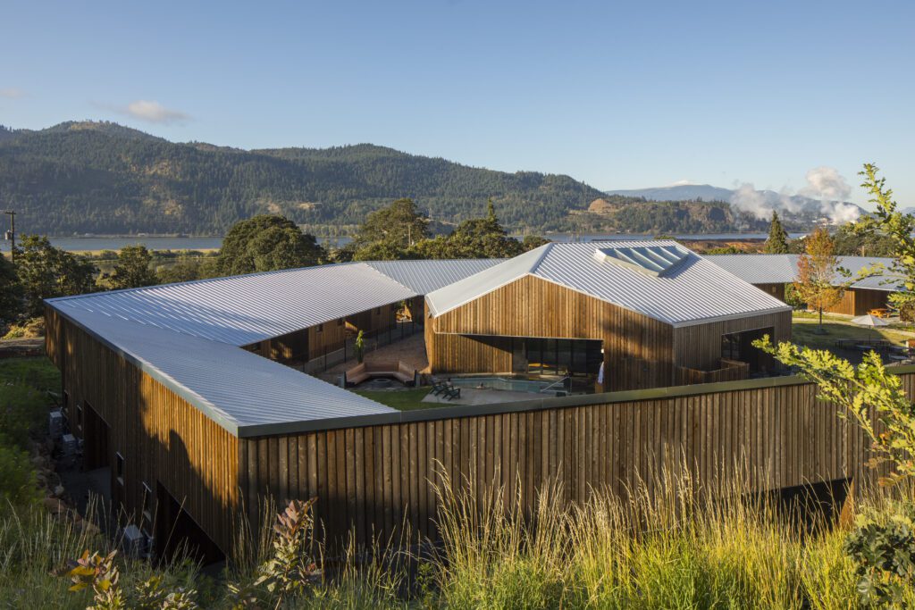
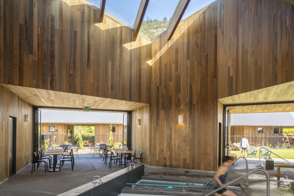
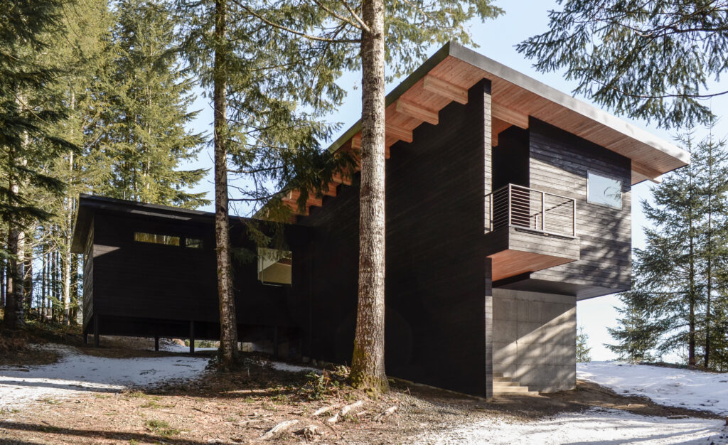
Taking the coveted Best in Show title this year is the Society Hotel in Bingen, Washington, designed by Waechter Architecture. As part of their winnings, the firm will enjoy an all-expenses-paid trip for two to the 2024 AIA Conference, covering both travel and accommodation. Be sure to stay tuned for an in-depth exploration of their award-winning project, which will soon be featured on Architizer!

Without further ado, delve into each winning design from this year’s competition — projects that truly embody “The Best of LaCantina.”


Best in Show and Best Commercial Project: Society Hotel by Waechter Architecture, Bingen, Washington

Photos by Lara Swimmer

Located in the Columbia River Gorge National Scenic Area, The Society Hotel offers stunning views of the river, surrounding hills and basalt outcroppings. The program includes the adaptive reuse and conversion of a former schoolhouse and gymnasium, twenty new cabins and terraces linked by a covered pathway, and an iconic, freestanding spa.

The spa employs a similar material palette of striated cedar as the surrounding cabins, yet has a distinctly volumetric form. Avoiding a singular front entrance, the building opens onto each side of the ring with dynamic apertures and floor-to-ceiling folding doors by LaCantina. Within, the structure expands upward to a large skylight, which washes light over a series of pools below. Four “hollow” piers shape this collective space while containing more private areas, including changing rooms, a sauna, a kitchen and two massage rooms.

Through its composition and pairing of historic and new architecture, the Society serves as a model for how buildings can reconcile the needs of a sensitive site, visitors and the local community, and maximize connection to the surrounding landscape.


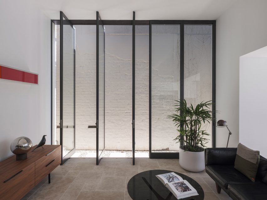
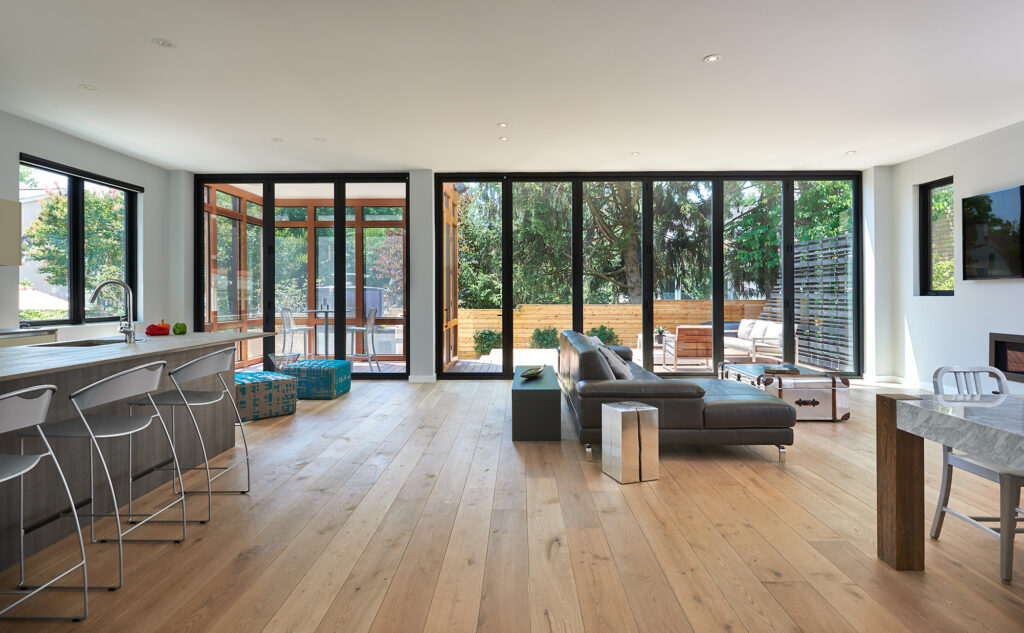
Best Urban Residential Project: Wilson Lane Residence by Michael Belisle Design, Bethesda, Maryland
Consulting Architect: Will Cawood; Interior Design: Renato Parisotto; Lighting Design: Quinn Murph

Photos by Anice Hoachlander, Hoachlander Davis Photography

Wilson Lane Residence sits on a small urban lot within walking distance to downtown Bethesda, Maryland. The client desired to be close to the city center and wanted something drastically different form the more conventional housing styles in the area. The house was designed for entertainment, with open interior spaces, well-conceived exterior spaces and an abundance of natural light.

LaCantina’s Aluminum Outswing 3 and 6 Panel doors allowed for the interior to merge with the exterior, literally and figuratively: in the open position, the family room, deck and patio merge seamlessly; in the closed position they frame a view of the exterior with minimal obstruction.


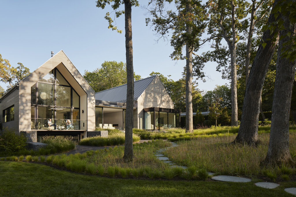
Best Suburban Residential Project: Two Gables by Wheeler Kearns Architects, Glencoe, Illinois

Photos by Kendall McCaugherty

Located on a one-acre wooded ravine site north of Chicago, the house is strategically positioned within existing trees on the site to take advantage of the picturesque views. Twin gabled volumes — one for sleeping and one for living — are connected by a glazed breezeway that fuses house and landscape. The home, situated upward and slightly angled away from the street, creates an eccentric approach that delays frontal views and enhances privacy.

The frontal procession presents the flanking gabled volumes as solids, composed of warm gray Accoya siding, zinc colored standing seam roofing, punctuated by deeply inset windows. LaCantina Doors were utilized to address unique challenges within the project by incorporating thermally broken construction and optimizing the scale of units. They also enhance visibility and create spacious open areas when the units are opened.


Best Rural Residential Project: Ranch Poolside Retreat by Cabana Concepts / Imagine Beyond, Murrieta, California
Designed by Imagine Beyond; Installed by Cabana Concepts

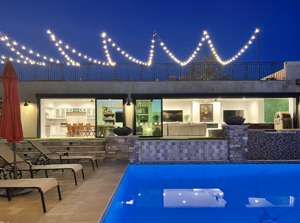
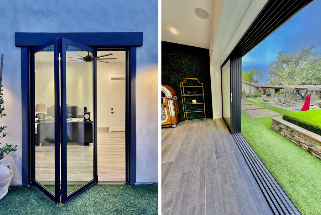
Photos by Cabana Concepts

Cabana Concepts and Imagine Beyond completed a new poolside retreat for a ranch house, in Murrieta California, featuring a rooftop sunset deck designed for entertaining over 100 guests. The retreat can sleep up to 12 and includes a full kitchen, bar, office, garage, laundry and craft room. The property features a range of sliding, folding and swing doors by LaCantina, all unified by a beautiful finish: Bronze anodized aluminum equipped with flush bottom tracks and black hardware.


Most Innovative Project: Topanga Canyon Hunting Cabin by MSP Design Inc., Topanga, California

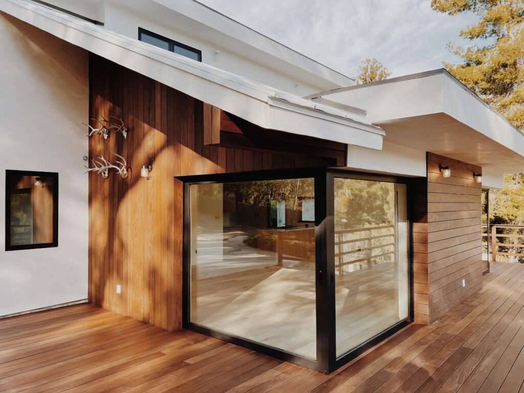
Photos by Mason St. Peter

The Topanga hunting cabin features indoor-outdoor living, featuring two open corners aided by LaCantina double pocket doors, an open plan and a large wraparound deck. What was once literally a room, added onto a room, added onto a room, added onto a room with a stairway to another room above is now a very simple and elegant 2-bedroom-2-bath, open living home, that welcomes the outside in and embraces it.


Best Compact Project: Swift Cabin by Ment Architecture LLC, Cougar, Washington

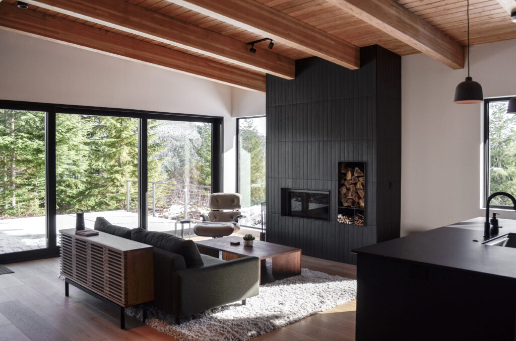
Photos by Luke and Mallory Leasure

This linear cabin stretches out along the length of a site that overlooks a reservoir in southwest Washington, with spectacular views of Mt. St. Helens beyond. A shed roof allows for a vast array of solar panels for this off-grid cabin, which power the main cabin, a custom-designed sauna building and a garage for the family boat.

A warm interior palette is defined by exposed Douglas fir glulam beams and tongue and groove decking at the ceiling, along with warm wood floors and exterior charred wood cladding wrapping through to the interior. The large deck can be enjoyed by walking directly from the living room through a 12-foot-wide opening featuring LaCantina sliding doors.


Best Renovation Project: Waverly Residence by Sasquatch Architecture, Portland, Oregon
Interior Design by Kami Gray Interiors

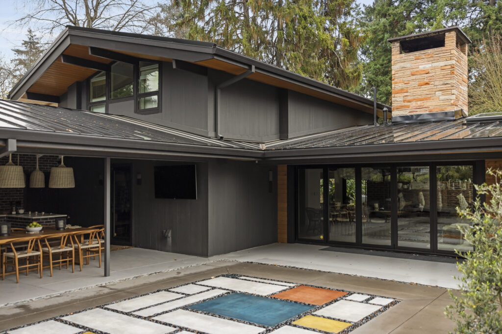
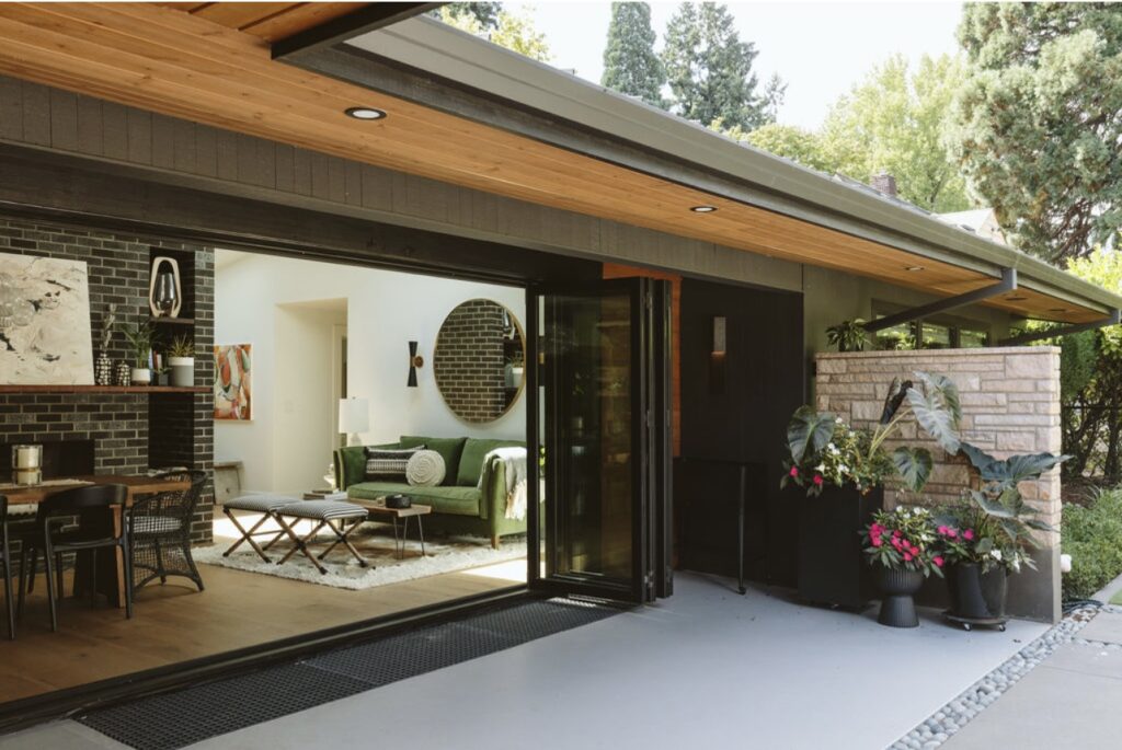
Photos by Crosby Dove

Located in the Waverly neighborhood in Portland, Oregon, the existing midcentury modern home went through an entire remodel on both the interior and exterior. The interior was transformed with updated floor plans and new finishes by Kami Gray. On the exterior, Sasquatch Architecture designed all of the windows and doors to be replaced and resized, while new paint, cedar soffits and siding were added to warm up the exterior of the home.

The standout feature is a new 16′ wide La Cantina bifold door, seamlessly connecting the interior and exterior. With careful attention to detail, the architects blended the old with the new, creating a timeless and elegant space bringing the beauty of nature inside and enhancing the home’s overall charm.


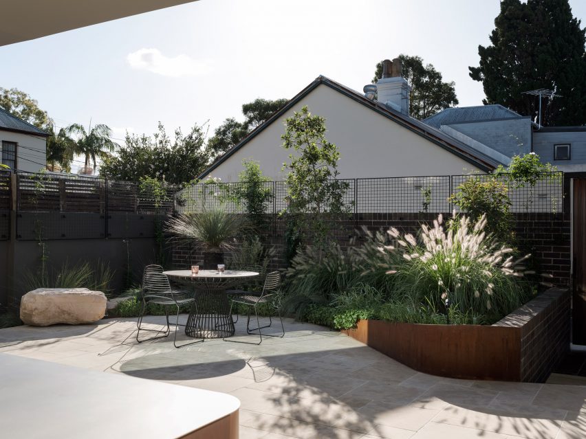
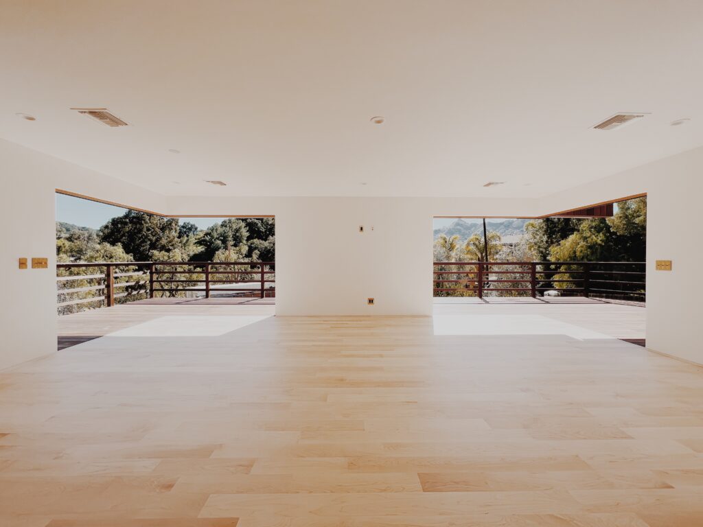
Best Unbuilt/Planned Project: Contemporary Respite by Sutton Suzuki Architects, Mill Valley, California

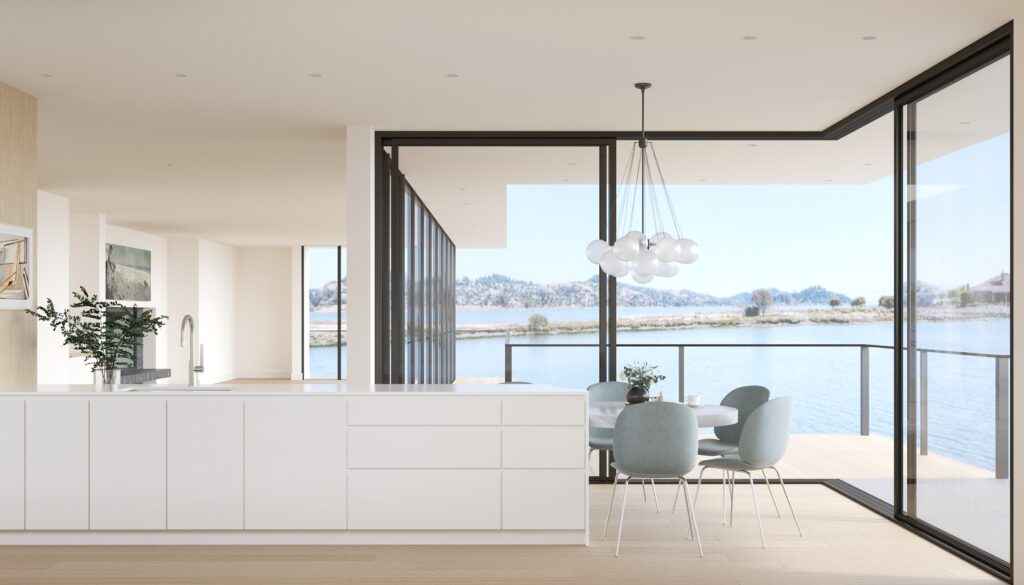
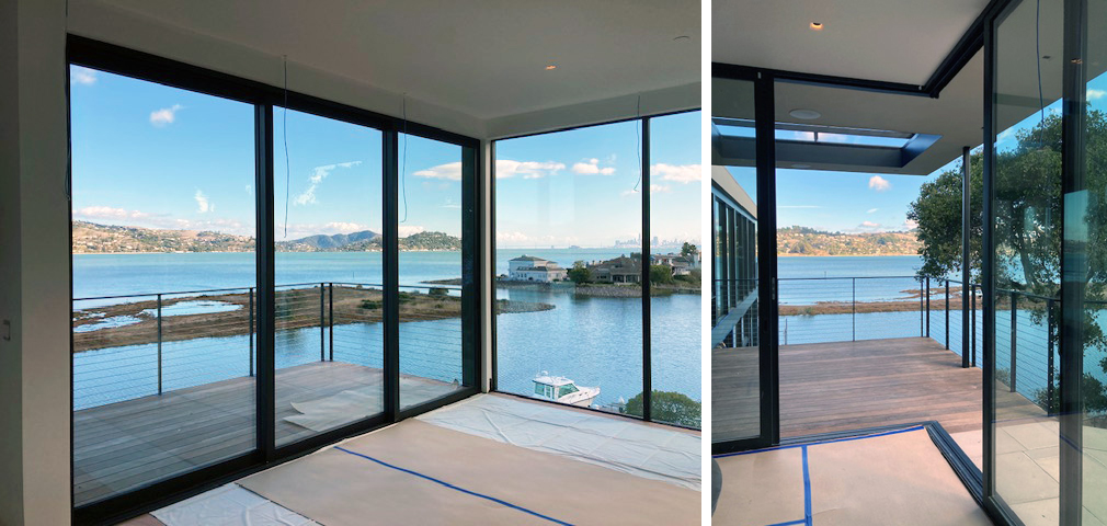
Renderings by Sunny Render Studio, photos by Sutton Suzuki Architects

Perched above a sleepy inlet of the San Francisco Bay, this now contemporary home was originally built in 1966. Over the years a number of insensitive additions were built, resulting in a maze-like home disconnected from the surrounding natural beauty. After an extensive remodel and addition of square footage, the home now offers floor to ceiling glazing and a number of water-facing decks where the owners can watch pelicans fish and nature unfold. The flow between rooms is ideal for entertaining, providing a mix of open spaces and cozy corners. Neutral finishes with hints of blue evoke the nearby water and offer a calm respite from the world beyond.

LaCantina’s Zero Post Corner System increases the sense of spaciousness from the kitchen into the slender side yard. When the project is complete, it will be hard to tell whether one is inside or outside, and each respective space will feel doubly as large.


These eight award-winning projects show just a glimpse of the incredible architecture and interiors made possible with the help of LaCantina’s versatile range of contemporary doors and windows. See more amazing case studies like these and learn more about the systems behind them over at LaCantinaDoors.com.

Reference

Entryway of Hidden Garden House by Sam Crawford Architects
CategoriesInterior Design

Sam Crawford Architects tops Sydney home renovation with “garden oasis”

A private roof terrace enclosed by greenery features in Hidden Garden House, a Sydney home reconfigured by Australian studio Sam Crawford Architects.

Situated within a conservation zone, the home has been updated by Sam Crawford Architects to brighten its dark interior and transform it into an urban “sanctuary”.

Entryway of Hidden Garden House by Sam Crawford ArchitectsEntryway of Hidden Garden House by Sam Crawford Architects
An open-tread staircase has been added to the hallway

Alterations to the 198-square-metre home’s interior are first seen in its entrance, where a stair with open treads and a white-steel balustrade replaces a solid timber structure that previously restricted light from a skylight above.

Down from the entry hall is a spacious ground-floor kitchen and dining area, which is illuminated by 4.5-metre-high glass openings that lead out to a landscaped patio. The patio is paved with limestone tiles that extend out from the interior.

Renovated kitchen and dining area in Sydney home by Sam Crawford ArchitectsRenovated kitchen and dining area in Sydney home by Sam Crawford Architects
A curved concrete roof features in the kitchen

“By extending the ground floor finishes through the full-width doors into the rear yard, the garden and high-level green trellises at the rear of the site form the fourth wall to the rear wing,” studio director Sam Crawford told Dezeen.

“They create a sense of enclosure that draws the occupant’s eye up to the expanse of the sky rather than surrounding suburbia.”

Bathroom interior at Hidden Garden House in AustraliaBathroom interior at Hidden Garden House in Australia
Angled timber screens and greenery ensure privacy for the bathroom

A concrete ceiling in Hidden Garden House’s kitchen curves upwards to help draw in the winter sun and provide summer shading, while operable clerestory windows allow natural ventilation.

Above, this curved ceiling forms a sloped roof terrace filled with plants, which is situated off the main bedroom on the upper floor.

An ensuite bathroom, also lined with limestone floor tiles, has expansive openings offering a scenic yet private bathing experience enabled by angled timber screens and the terrace’s greenery.

“The rolling green roof serves as a visual barrier to the surrounding suburb, whilst allowing the occupants to occupy their private garden oasis,” added Crawford.

Living space interior of Hidden Garden House in SydneyLiving space interior of Hidden Garden House in Sydney
White walls and wooden furniture feature throughout the interior

Hidden Garden House’s consistent material palette of bright white walls and wooden furniture ties its living spaces together, while decorative square tiles line both the kitchen and bathrooms.

Curved details, such as the patio’s shape and the kitchen island and splashback, also feature throughout.

Terrace of Hidden Garden House in Sydney designed by Sam Crawford ArchitectsTerrace of Hidden Garden House in Sydney designed by Sam Crawford Architects
The home aims to be an urban “sanctuary”

Other alterations that were made to improve Hidden Garden House’s layout include the relocation of entrances to the ground floor laundry room and bathroom.

Elsewhere, Sam Crawford Architects has also created a restaurant topped with an oversized steel roof and a bridge modelled on the curving shape of eels.

The photography is by Tom Ferguson.


Project credits:

Architect: Sam Crawford Architects
Builder:
Toki
Structural engineer: Cantilever Engineers
Civil & hydraulic engineer: Partridge
Acoustic engineer: Acoustic Logic
Heritage consultant: Damian O’Toole Town Planning
Quantity Surveyor: QS Plus
Landscape design: Gabrielle Pelletier, SCA
Roof garden supplier: Fytogreen Australia

Reference

Liam Young Planetary Redesign interview
CategoriesSustainable News

Our biggest climate challenge is no longer denial, but despair

Climate fatalism stands in the way of a sustainable future but designers and architects are in an ideal position to overcome it, writes Katie Treggiden.


The mainstream media is finally waking up to the realities of climate change. As wildfires, floods and storms wreak havoc across the world, journalists and activists far braver than me are speaking truth to power to make sure we all know just how serious this thing is. And that is vital and right and proper.

However, fear doesn’t motivate action. The biggest obstacle for the environmental movement is no longer climate-change deniers – the evidence is incontrovertible to all but conspiracy theorists. It is those who are fully on board with the fact that humans are the root cause of some very real problems, but just don’t believe that we have what it takes to solve them. Our biggest climate challenge is no longer denial, but despair.

Fear doesn’t motivate action

To spark meaningful change, we need hope. We need to believe not only that a better world is possible, but that we each have the power to help bring it about.

I’m not talking about blind faith or passive optimism. I’m talking about active hope. I’m talking about waking up every morning and making a choice to believe that we can solve this wicked problem, and then choosing to act accordingly. And in today’s climate – political, economic and social as well as environmental – hope is an act of defiance.

So, how can architects and designers inspire defiant hope?

The Berkana Institute’s “two loops” model of systems change proposes multiple roles that people and institutions can play in the transition from a declining system to an emerging one. As the dominant system begins its decline, “stabilisers” keep what is required in place until something better is ready, while “hospice workers” support the process of decline, minimising harm to those still within it.

In turn, the emergent system gathers pace as “pioneers” come up with new ideas, products and systems and they are joined together into networks by “connectors”. Together, they form supportive “communities of practice” that enable them to grow their influence and, eventually, rise up to replace the old system.

In the transition from the declining linear take-make-waste economy to an emerging regenerative and circular economy, we might cast architects and designers in the role of “pioneers” – problem-solvers who can create pragmatic ways to move society towards a better world.

And that is valid; if architecture and design solve problems, then surely they should contribute genuine, impactful, and replicable solutions to arguably the biggest problem ever to have faced humanity.

In today’s climate – political, economic and social as well as environmental – hope is an act of defiance

However, I believe they can also play another part. On the emerging-system loop, there is a role for “illuminators”: people who paint a picture of what a better world might look like.

You see, there is no point in the model where the two loops touch, no simple juncture where people can step off one system and onto the next – they must take a leap of faith. Illuminators are the people who can give them the courage to do that.

One of the questions I get asked most often when I speak at conferences about craft and design in the transition to a circular economy is: “Okay, but how does it scale?”

Firstly, I would contend that scalability is what got us into this mess, and what we need instead are locally replicable solutions, but increasingly I am questioning whether everything we propose as an industry even needs to do that. Perhaps part of our role is simply to inspire hope – defiant, stubborn, active hope.

Kyloe Design’s kelp chair, showcased recently as part of Green Grads at the London Design Festival, may never make it into production and it’s highly unlikely that it will drive the wholesale replacement of leather across the furniture industry. But it does showcase the potential of this incredibly renewable, climate-positive, underutilised material, while provoking the curiosity to learn more.

From responsible material sourcing and advocating for worker welfare to using smartphone components anyone can switch out, Fairphone is offering real-world solutions. But its founder, Bas Van Abel, was realistic about what he could achieve directly, so launched the company with the stated aim of motivating the rest of the industry.

There is little doubt that his efforts have had a hand in both the incoming EU legislation that will require smartphone batteries to be “easily replaceable” and the recent launch of a repairable Nokia phone.

Part of our role is simply to inspire hope – defiant, stubborn, active hope

Zaha Hadid Architects principal Patrik Schumacher might have criticised the “lack of architecture” at last year’s Venice Architecture Biennale, but what if contributions such as the German pavilion (pictured), which he described as nothing more than “piles of construction material”, are exactly what we need to inspire alternative ways of working? Entitled Open for Maintenance, the exhibition was billed as “an action framework for a new building culture” and collated materials recovered from previous installations to be used for repairing and upgrading buildings and public spaces all over Venice.

One of my favourite quotes about hope is from the author Arundhati Roy, who says: “Another world is not only possible, she is on her way. On a quiet day, I can hear her breathing.” The question I would like to pose is: how can we, as an industry, help everyone to hear the sound of her breath?

Katie Treggiden is the founder and director of Making Design Circular, a membership community and online-learning platform for sustainable designers and makers, and the author of Broken: Mending and Repair in a Throwaway World (Ludion, 2023).

Dezeen In Depth
If you enjoy reading Dezeen’s interviews, opinions and features, subscribe to Dezeen In Depth. Sent on the last Friday of each month, this newsletter provides a single place to read about the design and architecture stories behind the headlines.

Reference