Spotted: Spent grain from brewing practices is usually burned, sent to landfill, made into gas, or used as cheap feed for livestock. All of these are low-value enterprises. So, instead, one startup, Arda Biomaterials, is utilising this cheap waste product to create leather, without needing to farm animals for their hides.
Arda Biomaterials is currently working with breweries from South London’s ‘Bermondsey Beer Mile’, which was once the leather tanning district of the City of London, to make its leather alternative.
The material is produced by taking the grain that has had its sugar removed for brewing purposes, also known as brewer’s spent grain (BSG). This grain is rich in protein and fibre, which makes it an ideal blueprint for an alternative to conventional leather. It is chemically treated and manipulated in order to create a material that resembles conventional animal leather, a process developed by the company’s founders Edward TJ Mitchell and Brett Cotton.
Arda Biomaterials has just received a £1.1 million (around €1.3 million) investment led by Clean Growth Fund, a UK cleantech venture capital fund. Now, the company is hoping to both reach a completed product and subsequently start launching its material in a limited capacity next year, and scale the business from there.
Reimagining material production is one important step we must take towards net zero. Springwise has also spotted one company that makes plastic alternatives out of invasive plant species, as well as one startup in the archive that aims to replace plastic bubble wrap with a wool-based alternative.
Building professionals can use the resource to inform clients and help explain sustainable design-build processes that maximize energy efficiency and cost-effectiveness. All eight pages are easily integrated into PowerPoints, and are free to share with colleagues. A builder’s or architect’s website can reference the steps as a proven methodology that is part of their corporate mission. And it’s easy to write and post case studies that show how a project successfully followed the steps.
The design and construction team work together to integrate each step’s purpose and strategies. So the 7 Steps spur discussions on where additional evaluations and expertise may be required, and how the different trades can be impacted. There are reminders that existing buildings are all different and that upgrades will interact with each other, so sequencing and phased implementation require careful consideration. Future maintenance requirements and expected lifetimes of different systems are major factors in determining the lifecycle cost and carbon accounting.
Think globally, act locally
The ZERO Coalition unites businesses, nonprofits, and local governments to propel our shared goal to change how we build and retrofit our homes and businesses. We seek to reduce buildings’ carbon footprint and electrify them with clean energy. As a coalition, we are accelerating the transition to a decarbonized building sector in Oregon. But builders, designers, policymakers, and other members of the sustainable building industry can use the 7 Steps to advance building decarbonization anywhere in North America, and beyond.
Buildings in Oregon account for about 30% of Oregonians’ energy use and 40% of our GHG emissions, the most significant chunk after transportation. According to Rocky Mountain Institute, buildings also account for 40% of global energy GHG emissions. Architecture 2030 found that “To accommodate the largest wave of building growth in human history, from 2020 to 2060, we expect to add about 2.6 trillion ft2 (240 billion m2) of new floor area to the global building stock, the equivalent of adding an entire New York City to the world, every month, for 40 years.” This is why building decarbonization is finally getting wider attention. The time is now.
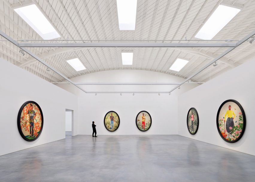
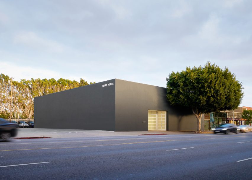
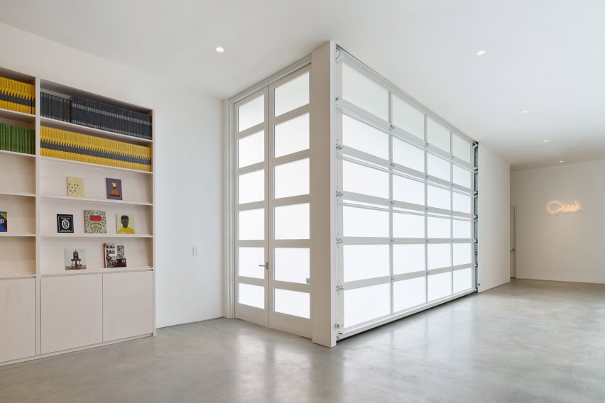
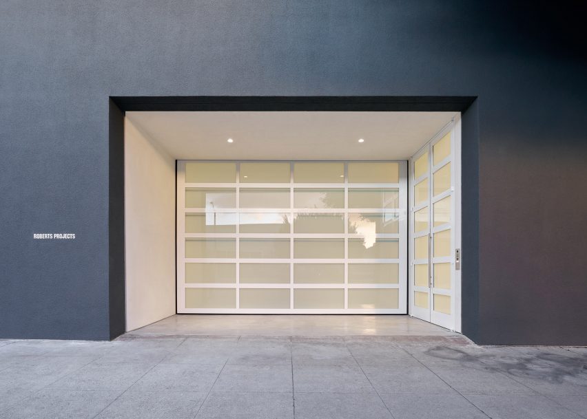
A vaulted ceiling punctured with skylights features in a 1940s auto dealership that architectural studio Johnston Marklee has converted into a bright home for the Roberts Projects art gallery.
Roberts Projects chose the local studio to transform the brick and cinder-block building into its new home as it moved from Culver City to the mid-Wilshire district, which has seen an influx of art galleries in recent years.
Johnston Marklee has converted a Los Angeles car showroom into an art gallery
The architects conceived a total overhaul of the 10,000-square-foot (929-square-metre) former auto dealership, which was built in 1948 and features an arched, 30-foot-high (nine-metre) ceiling.
For many years, the building housed a Chrysler-Plymouth dealership known as the “Auto Dealer to the Stars”, as it drew celebrity clients such as actors Fred Astaire, Lucille Ball and Bob Hope.
Roberts Projects acquired a historic building in the area
“We searched for a space for over four years and felt this building was ideal due to the raw talent of the structure, incredible ceiling height and great location,” said Roberts Projects co-owner Julie Roberts.
The exterior of the building – which once featured large stretches of glass for the display of cars – was replaced with solid walls in grey stucco, which suits the “gallery’s minimalist aesthetic”, the gallery said.
The exterior was replaced with solid walls in grey stucco
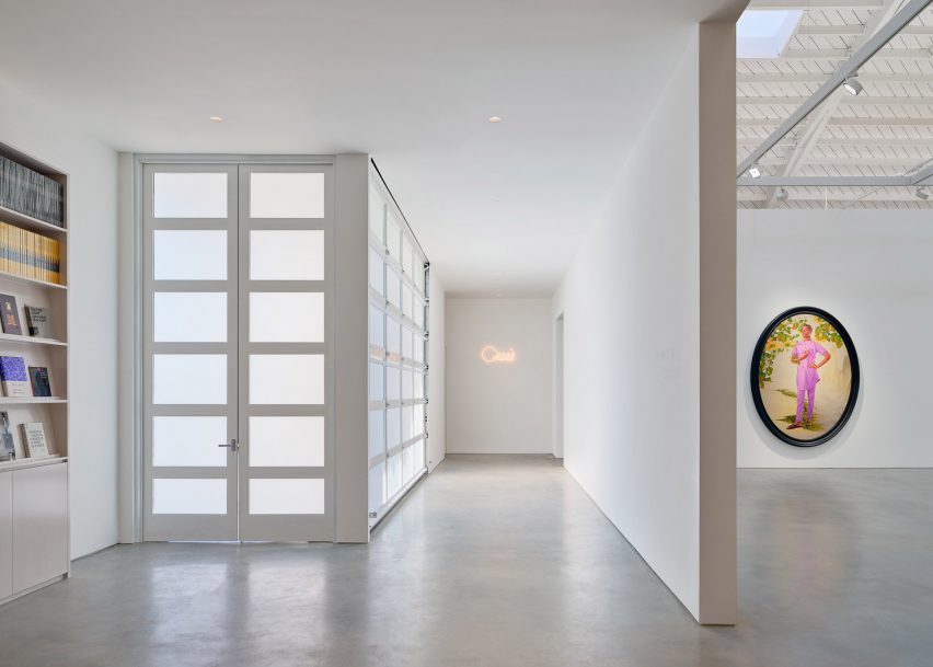
Marking the entrance are a glazed garage door and an existing ficus tree.
“The elemental facade and building mass will integrate the new gallery into the cultural landscape of the arts and architecture across the city,” Johnston Marklee founding partner Sharon Johnston said.
Johnston Marklee conceived a total overhaul of the car showroom
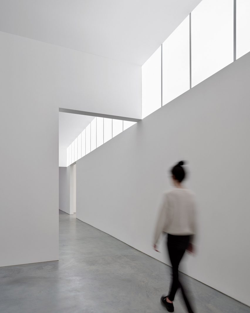
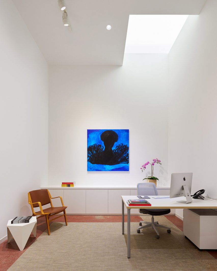
Inside, the building houses four exhibition spaces, offices, study areas and a reception with a bookshop.
Throughout the building, “cavities of light” reveal architectural elements and enhance the viewing experience, the architects said.
A glazed garage door marks the entrance
The main exhibition space sits under the vaulted ceiling, which was given a fresh layer of paint.
Here, skylights usher in daylight. In other areas, illumination is provided by “clearstories” made of panels uplit by LEDs.
Concrete flooring and bright white walls lend to the gallery’s austere character. Furnishings include pieces by Alvar Aalto, Gijs Bakker and Jean Prouvé. Shelving is made of birch plywood.
Illumination is provided by “clearstories” made of panels
In the office area, the flooring consists of red-tinted concrete with exposed aggregate, which is original to the space. The concrete was polished and given a terrazzo-like appearance.
The gallery’s new home was inaugurated with an exhibition of colourful portraits by renowned US painter Kehinde Wiley, whom Roberts Projects has represented for over two decades.
“This new space is the next chapter in our long history of being at the forefront of the Los Angeles art scene,” said gallery co-owner Bennett Roberts, who said that LA is in the midst of a “creative renaissance”.
“With access to outstanding exhibitions year-round, dedicated collectors, and creative energy from those who call this city home, Los Angeles is poised to be one of the most important creative hubs for years to come,” he added.
In the office area, the flooring consists of red-tinted concrete with exposed aggregate
The opening of Roberts Projects’s new home follows a period of continual growth for the city’s arts scene.
Galleries such as Hauser & Wirth and The Future Perfect have recently opened venues in Los Angeles, and an annual edition of the Frieze Art Fair was introduced here in 2019.
Other art-related buildings in Los Angeles include a new home for auction house Phillips that was designed by local studio Formation Association, and the recent completion of a 20-year renovation and expansion of the Hammer Museum that was overseen by Michael Maltzan Architecture.
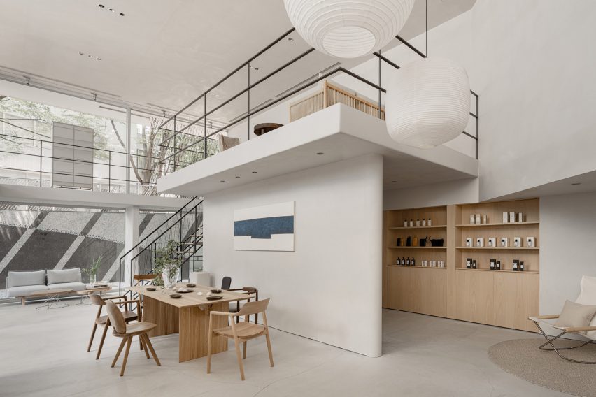
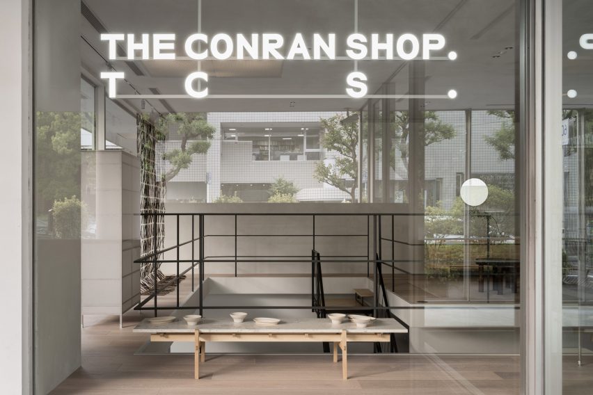
Designer Keiji Ashizawa has devised the interiors of The Conran Shop Daikanyama in Tokyo, which is located inside a building by architect Fumihiko Maki and spotlights products from Japan and Asia.
The latest outpost from British retailer The Conran Shop is located in the modernist Hillside Terrace in Daikanyama, a quiet area close to the Tokyo city centre.
The complex was designed by Pritzker Prize-winner Maki and constructed between 1967 and 1992.
The Conran Shop Daikanyama was designed to resemble someone’s home
Ashizawa aimed to take the existing architecture of the two-storey building into consideration when designing the interior of The Conran Shop.
“Since the existing space had great potential, we knew that the work had to be put into elevating what was already there – thinking about the proportions of the space, the dry area and so on,” he told Dezeen.
“Although it is inside a well-known architecture, there were elements where we thought we could bring change to the inside.”
It features pieces by Japanese and Asian designers
These changes included turning one glass section into a solid wall.
“Glass walls were used extensively as part of the architectural concept so that the store space could be viewed through the layers of glass,” Ashizawa said.
“While building the store, we decided that there wouldn’t be a problem in making a section of the glass wall become a solid wall, considering its serenity as a space and its relationship with the street.”
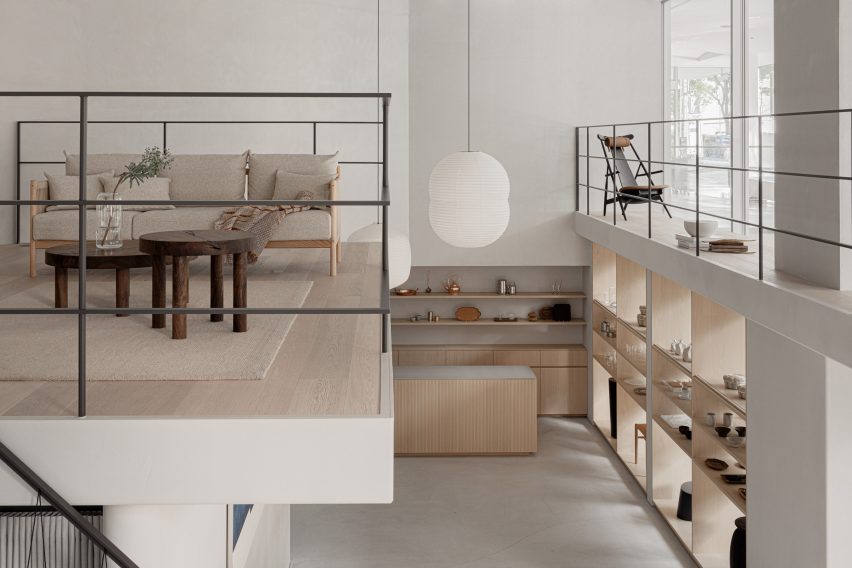
A mezzanine showcases a sofa and other living room furniture
The designer created the 200-square-metre store to look like someone’s home, in a nod to the peaceful nature of the surrounding area. It features a large atrium on the ground floor, connecting it to an adjoining courtyard.
“Daikanyama is a very calm neighbourhood in Tokyo, where we wished to design a store where people could feel relaxed and away from the stimulation of the city,” Ashizawa said.
“We intended to create a space for people to stay for a long period of time and feel the space.”
The store is located in the iconic Hillside Terrace complex
The interior design was also based on The Conran Shop’s three keywords – plain, simple and useful – CEO of The Conran Shop Japan Shinichiro Nakahara told Dezeen.
The store’s product selection also places a special focus on Japanese and Asian design.
“Specifically for The Conran Shop Daikanyama, the selections were focused on objects from Asia, including Japan,” Nakahara said.
“The process of [founder] Terence [Conran] travelling around the world, finding and buying items in each place by himself, has not changed,” he added. “Many of the objects selected by the Conran team in Japan have a sense of craftsmanship.”
“We created the space by imagining a situation in which such objects would be displayed alongside each other. For example, the details of the objects are reflected in the interior design.”
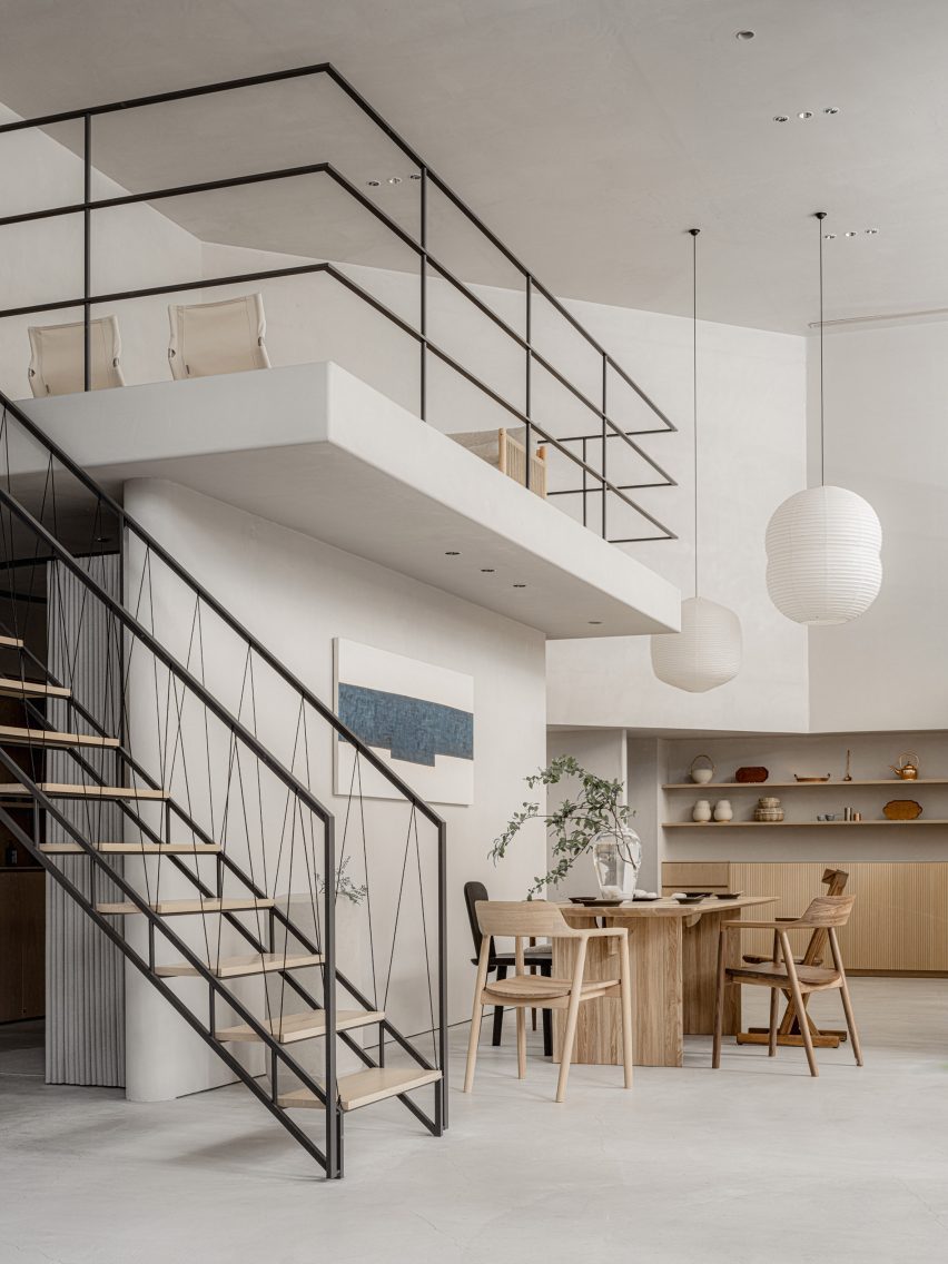
It features a staircase with a handrail made from black paper cords
The interior uses materials that are common in Japan including concrete, steel, wood, plaster, Japanese stone and paper.
“The use of Japanese paper in interior design is an element that is distinctively Japanese,” Ashizawa explained.
“Shoji screens are an important element in creating a Japanese-style room but I realize that they can also be well used in both functional and aesthetic ways in a modern space.”
Concrete walls and shoji screens were used for the interior
The studio also used Japanese paper that had been dyed in a grey hue as wallpaper to give the space a “soft and contemporary feel.”
“Since we weren’t building an actual house but rather a home-like Conran store, the materials were thoughtfully instrumented to achieve a balance,” Ashizawa said.
The ground floor of the store holds furniture, homeware and apparel, and also has a mezzanine floor that is accessible by a staircase featuring a handrail made from black paper cords.
A gallery-like space is located on the basement floor
Ashizawa designed the basement floor, which functions both as an additional shopping area and a gallery space, to have a calmer atmosphere.
“Filled with natural light, the ground floor uses colours that bring grandeur and a sense of calmness,” he said.
“The basement floor is toned to create a more private feeling. We respected the natural colours of the materials as much as possible, while also considering the harmony with the objects on display and in the gallery.”
The store has a neutral colour palette and wooden details
The Conran Shop Daikanyama also has an adjoining bar where visitors can enjoy teas such as sencha and macha.
Ashizawa has previously worked on a number of other projects in Tokyo, including the Bellustar Tokyo “hotel in the sky” and the Hiroo Residence.
Spotted: The United Nations Environment Programme (UNEP) says in a recent report that plastic pollution could be reduced by 80 per cent by 2040 if reuse, recycling, and reorienting and diversifying techniques are adopted worldwide. New Zealand company Nilo’s repurposing technology could be an important strand in that push towards circularity.
Nilo’s patent-pending technology makes use of plastics that are not normally recycled, such as food film packaging and post-industrial waste. The company focuses its work around the Māori concept of Kaitiakitanga, or environmental guardianship, and as part of that, is developing a process in which Nilo pays people in the informal garbage picking industry to collect plastic waste.
By making plastic waste collection a valuable part of a new economy, Nilo hopes to contribute to broader economic growth. The company’s technology is scaleable, and because the upcycled plastic waste is so versatile, local production plants can customise outputs for each region’s particular needs.
Currently, the plastic that Nilo recycles is used as a binding agent in manufactured wood and on roads. The binder can be used as a direct replacement for Urea-Formaldehyde (UF), one of the most commonly used chemicals in the building industry. Largely because of the substantiveness of its carbon footprint, the European Union is working to restrict the use of UF by 2026.
Nilo’s binder, on the other hand, is non-toxic and the boards it is used to create can be continually recycled when a product reaches the end of its lifespan. IKEA recently acquired a 12.5 per cent stake in the company, which allows it to use Nilo’s adhesive in its wood-based board products. Bringing the binder to commercial market is a key focus of the company’s current work.
Plastic pollution is such a difficult task that the Springwise archive contains myriad innovations – such as a jellyfish-like robot that cleans ocean plastic and a type of fungi that can break down polypropylene – working to reduce the problem.
Architizer is thrilled to announce the winners of the 11th Annual A+Awards! Interested in participating next season? Sign up for key information about the 12th Annual A+Awards, set to launch this fall.
Now home to 1.4 billion people, India, the most populous nation on Earth, is under immense pressure across numerous socio-economic factors. This is rarely more evident than the challenge of developing urban areas in livable ways.
The United Nations predicts that by 2030 around 40% of the country will be living in cities, a four-fold increase on figures from the turn of the 20th century and significantly more than the 28% recorded in a 2001 census. An astounding rate of urbanization, according to a 2019 study by Manish Ramaiah and Ram Avtar, “Urban Green Spaces and Their Need In Cities of Rapidly Urbanizing India,” these booming centers of human activity are struggling when it comes to public realms and natural assets.
Looking across India’s densest cities with populations over one million, none offer more than 410 square feet (38 square meters) of green space per capita. In Mumbai, it’s less than 110 square feet (10 square meters). We tend to think about the introduction of parkland as a major undertaking that needs vast amounts of potentially profitable real estate to realize, but there’s much to be said about smaller interventions that reuse and rethink infrastructure to address the imbalance between built and living environment.
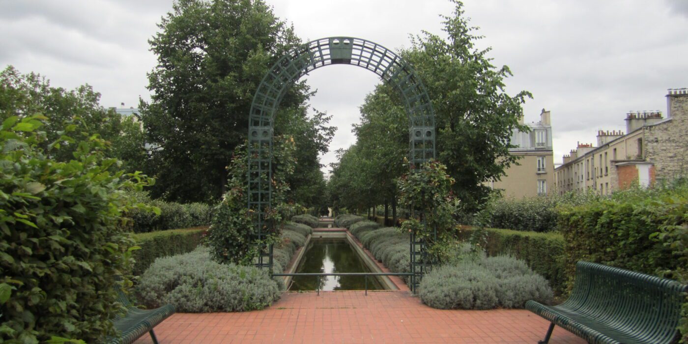
Promenade Plantée in Paris (C) La Citta Vita
Arguably the most famous example in recent memory is New York’s High Line. A 1.5 mile (2.5 kilometer) stretch of former elevated rail turned into a greenway, although actually modelled on Promenade Plantée in Paris, which opened 20 years earlier, the Big Apple take made the biggest noise and catalyzed similar ideas in other cities.From Atlanta and Los Angeles to Manchester, taking disused transportation routes and creating gardens or parks on them is now relatively commonplace.
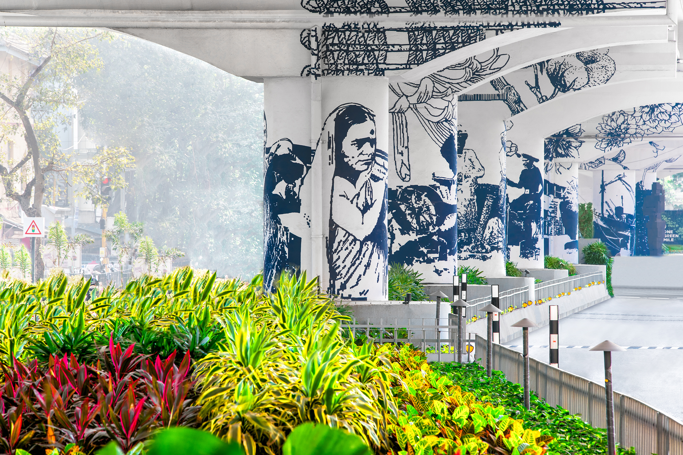
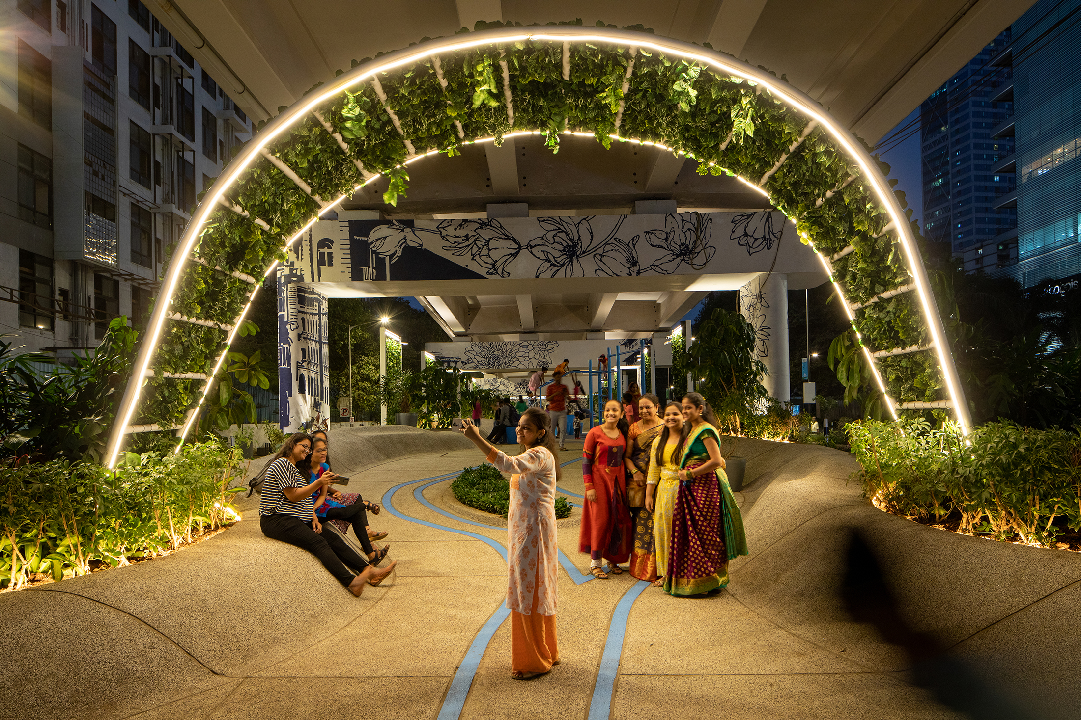
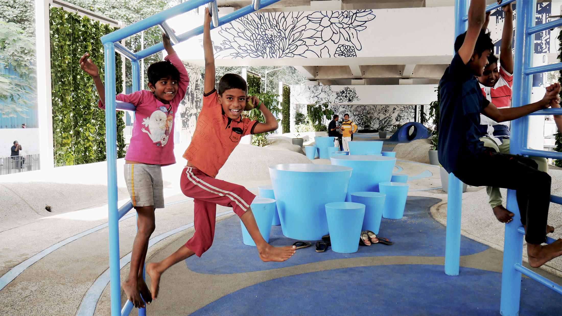
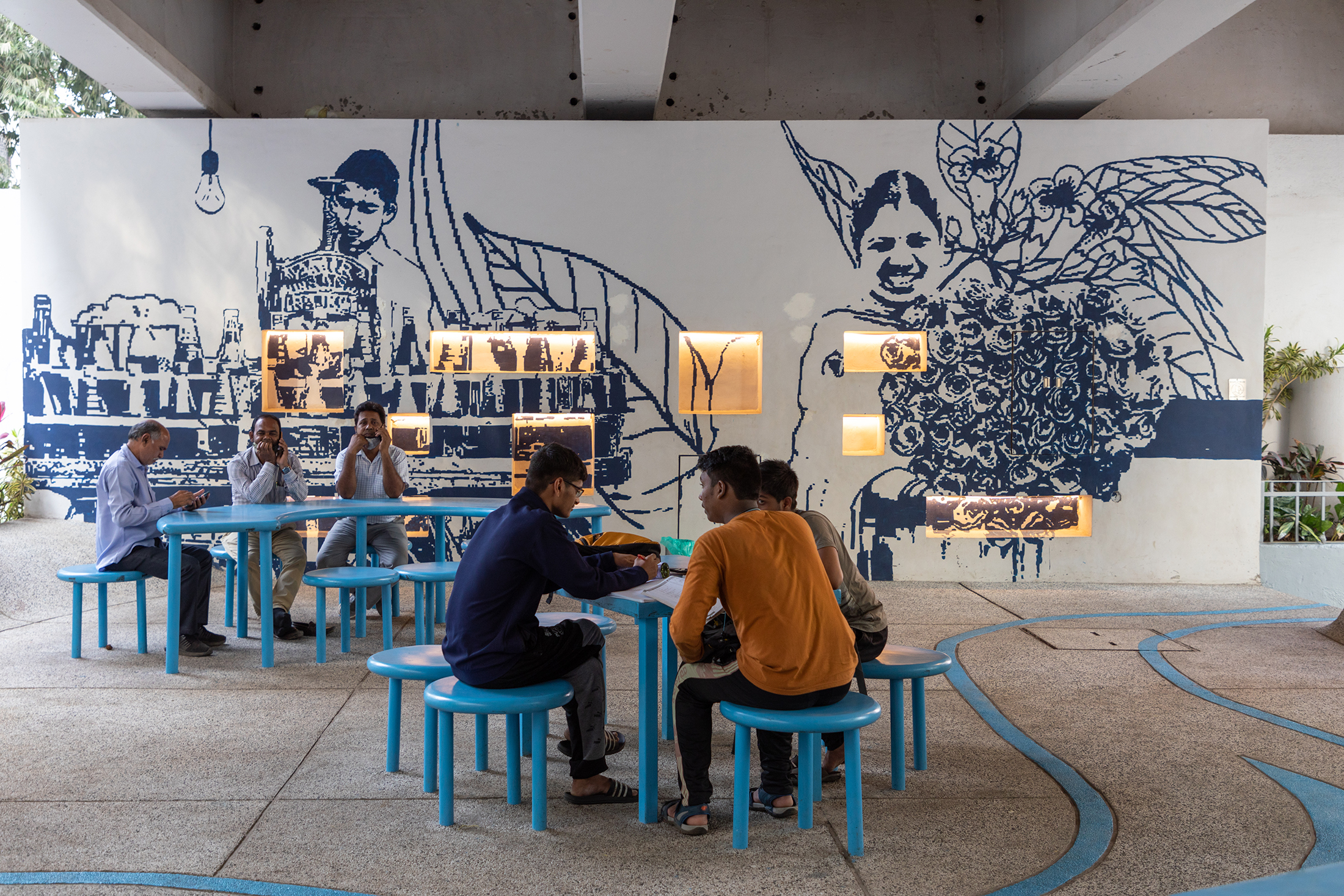
Others — for example Toronto and San Francisco — have set out to place modern green spaces on the roof of in-service interchange hubs. Rather than looking up, Mumbai’s One Green Mile offers a narrow 1-mile-long (2-kilometer) public realm at ground level because the street offers one of few potential spaces in the locality. Winning the Jury Award for Built Sustainable Transport at this year’s Architizer A+Awards, the project is located partly beneath the flyover of a major commuter route and alongside a busy street.
Artwork, planting and public realms within One Green Mile, Mumbai, by StudioPOD
Efforts began with an analysis of existing conditions in the area, unsurprisingly concluding there was a severe shortage of open space. Stakeholder consultations also offered an insight into how interventions should and could be made. Three priorities were identified: streamlining traffic movement and street geometry, equitable allocation of space for all and the creation of high quality public realm beneath the road.
Designed by StudioPOD, and completed in 2022, the results are impressive. Play and seating areas, an amphitheatre, Vachanalaya and 130 trees now sit under the flyover. Vertical sections are painted with imagery reflecting the story of the Lower Parel district and have been extensively planted with native species.
Back out on the street, road capacity has been reduced to allow more room for people, to add greenery, open up space for bus stops and to lay street furniture in place. In total, 2.3 acres (1 hectare) of public space has been added to the area, with 21, 500 square feet (2,000 square meters) under the flyover alone. A route taken by more than 150,000 people each day, in the centre of Mumbai’s frantic financial district, has been not only improved but turned into a destination in itself.
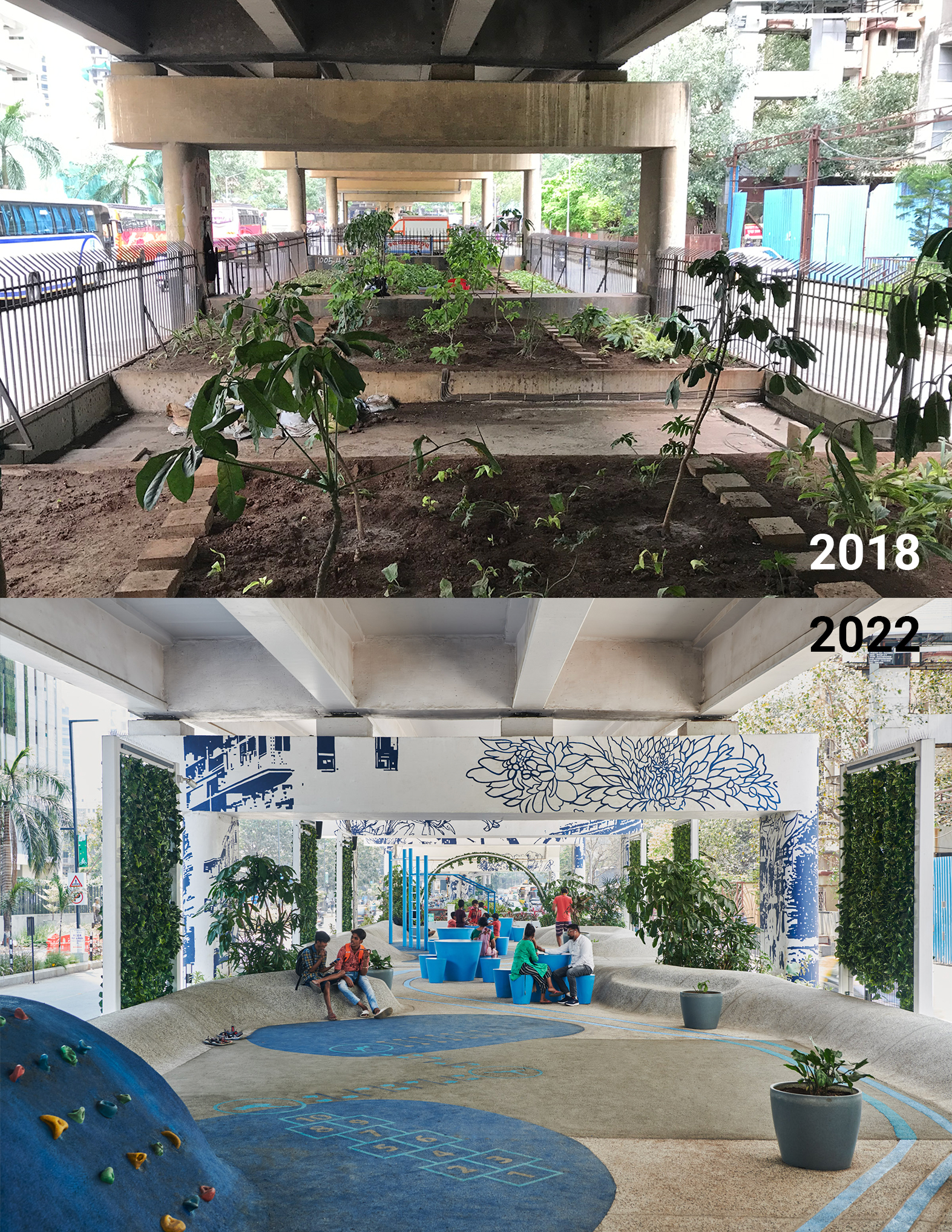
One Green Mile’s covered public realm, before the project began in 2018 and today, by StudioPOD
Countless studies have identified a strong link between access to urban space and health, not least in terms of green areas. Physically, we know exercise and active lifestyles keep our bodies in better condition, and One Green Mile clearly answers a call for active travel in Mumbai. But the benefits are also evident in terms of psychological wellbeing, too.
Earlier in 2023, Finish researchers presented one of the latest studies on this subject, concluding that visiting urban green space three or four times a week significantly reduces the likelihood of drug use to combat mental health, high blood pressure and respiratory illness. Rates fell by one third, asthma dropped by a quarter. This was true of parks and community gardens.
A children’s play area (top) and communal seating form part of Mumbai’s One Green Mile, by StudioPOD
Adding further evidence to the benefit of smaller interventions of this type, in 2019 University of Wollongong experts published a paper that showed a tree canopy alone can lower psychological distress by as much as 31%.It’s also important to consider the specifics of One Green Mile’s masterplan when gauging its success. Of course there are designated areas — the children’s playground is specifically for children to play — but much of the space is adaptable.
Sites of loose congregation, to some extent they reflect the public realms celebrated in the book Designing for Disorder. A conversation between architects Pablo Sendra and Richard Bennett responding to the former’s 1970 publication, The Uses Of Disorder, both texts and practitioners see static, planned and specific as negative public realm planning because they do not reflect human life, nor evolution. Truly worthwhile interventions must offer use cases that become apparent in the eye of the beholder ,or risk falling into neglect, effectively becoming another waste of space.
Architizer is thrilled to announce the winners of the 11th Annual A+Awards! Interested in participating next season? Sign up for key information about the 12th Annual A+Awards, set to launch this fall.
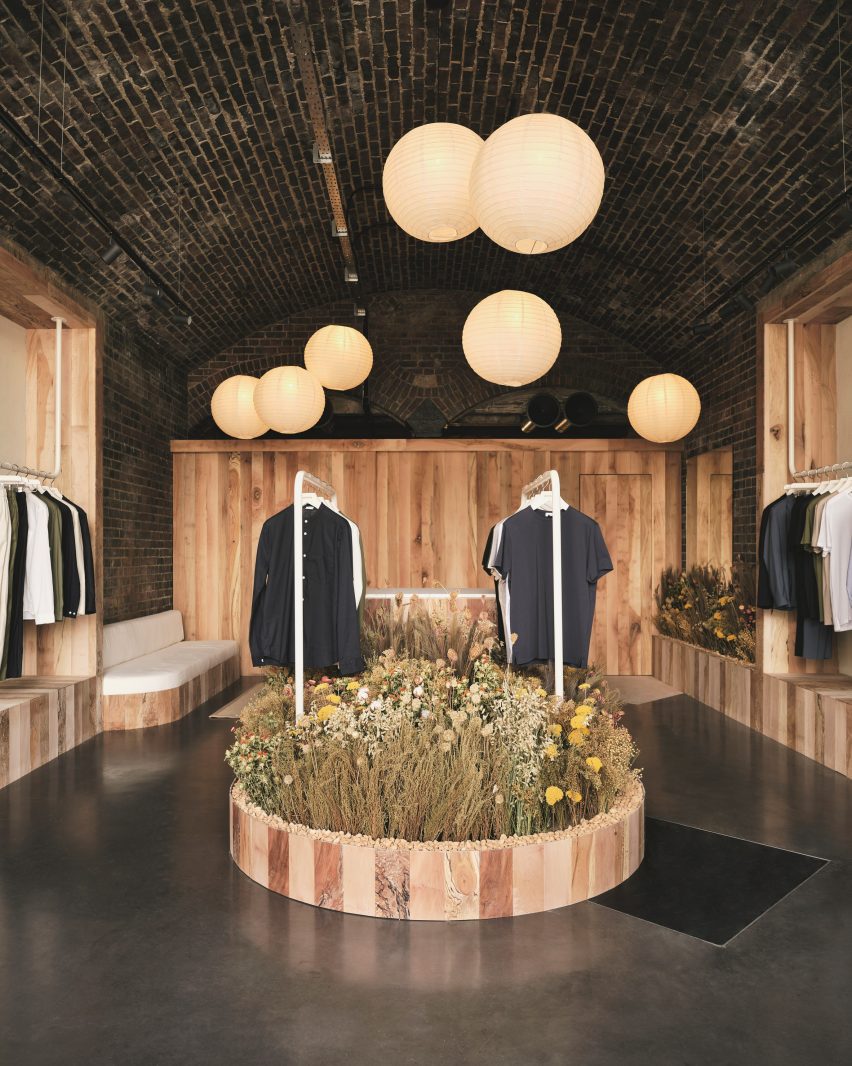
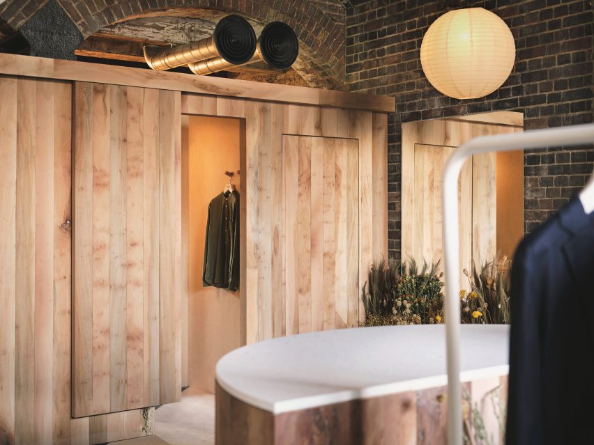
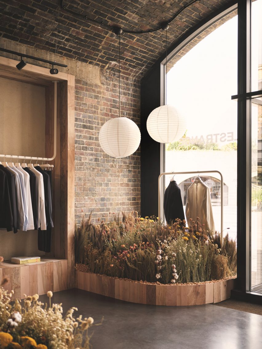
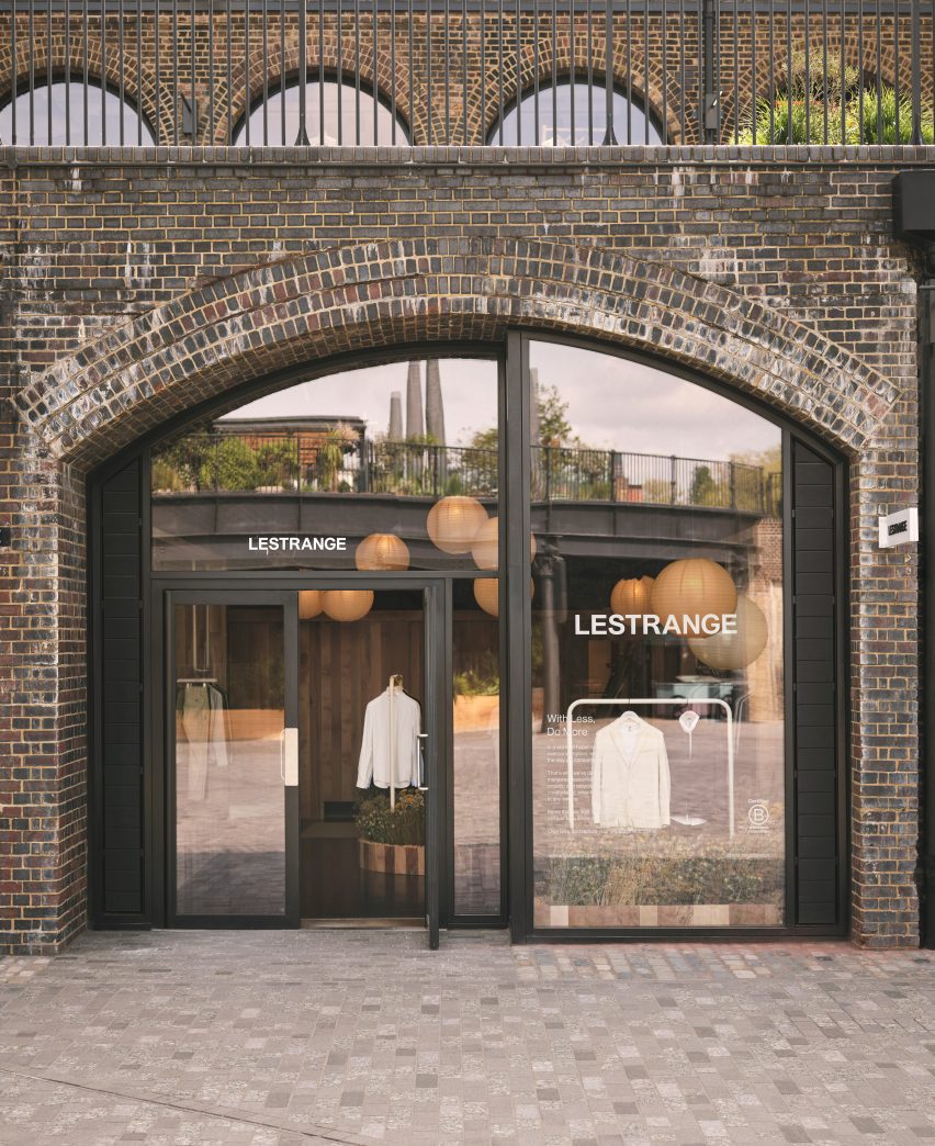
Forest sounds and furnishings made from storm-stricken trees bring elements of nature into this menswear boutique in London’s King’s Cross, designed by local practice Fred Rigby Studio.
The store is the fourth outpost from men’s fashion brand Lestrange and was conceived based on blueprints by biophilic design expert Oliver Heath, combining greenery with reclaimed and natural materials to forge a greater connection to the outdoors.
Fred Rigby Studio has designed the latest Lestrange boutique in London
According to Fred Rigby Studio, this approach was chosen to reflect the brand’s philosophy of using renewable and recycled fibres to produce clothing with longevity.
“We wanted to create a sense of calm within the space, which didn’t feel like a generic shop but an interior which told a story behind the clothing and the brand’s ethos,” explained the studio’s eponymous founder.
Rice paper lanterns are suspended at varying heights throughout the space
The Lestrange store is set inside the Thomas Heatherwick-designed Coal Drops Yard shopping centre, formed of two converted warehouses that were originally built in the Victorian era to store the vast quantities of coal needed by the capital.
Rigby wanted to incorporate this imposing brick structure into his final design.
Tactile plaster was used to cover the walls
“We didn’t want to hide this history by covering it up, which would have also entailed using construction materials,” he told Dezeen.
“So we celebrated it, breaking the space up using timber walls and cladding, then adding the rice paper lights to give the space a more intimate feel.”
The same finish was also applied to a trio of display shelves
Using the existing site as his canvas, Rigby focused on sourcing a tight edit of natural and reclaimed materials.
“There are lots of new materials on the market, but finding those that are produced in quantity and applicable to commercial use can be a challenge,” he said.
London plane timber – harvested from “storm-stricken and diseased trees” within a few miles of King’s Cross – was used to form the partitions that define the store’s display and changing areas, as well as some bespoke furniture pieces.
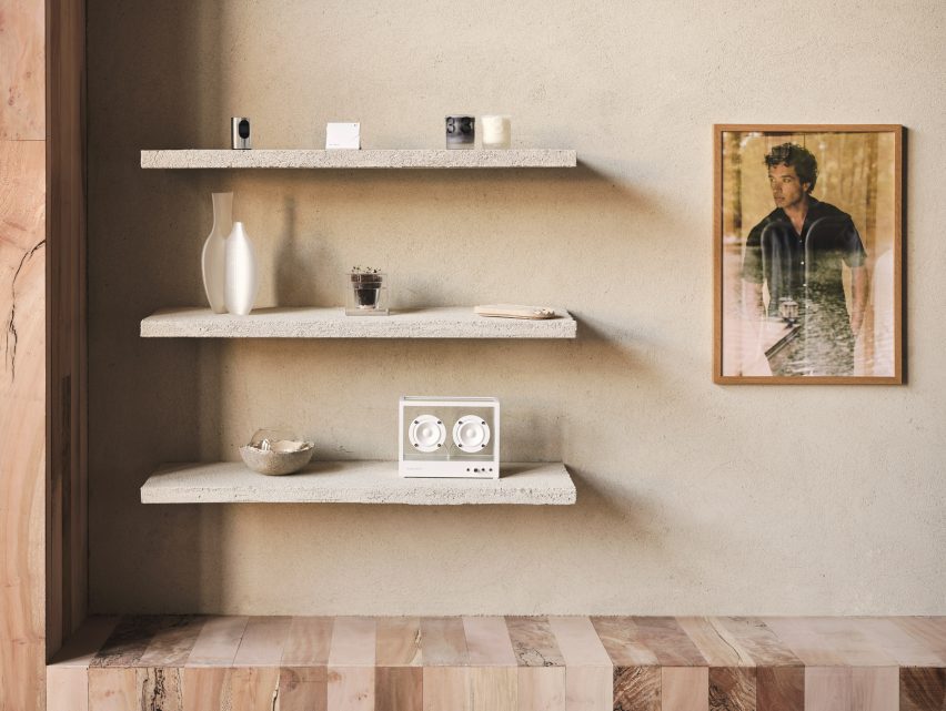
British manufacturer Clayworks blended unfired clays with minerals and natural pigments to create the tactile wall finishes, while the terrazzo-style countertops were made by Welsh company Smile Plastics using a mix of recycled plastics from discarded mobile phone casings and chopping boards.
The changing rooms are clad in panels of London plane timber
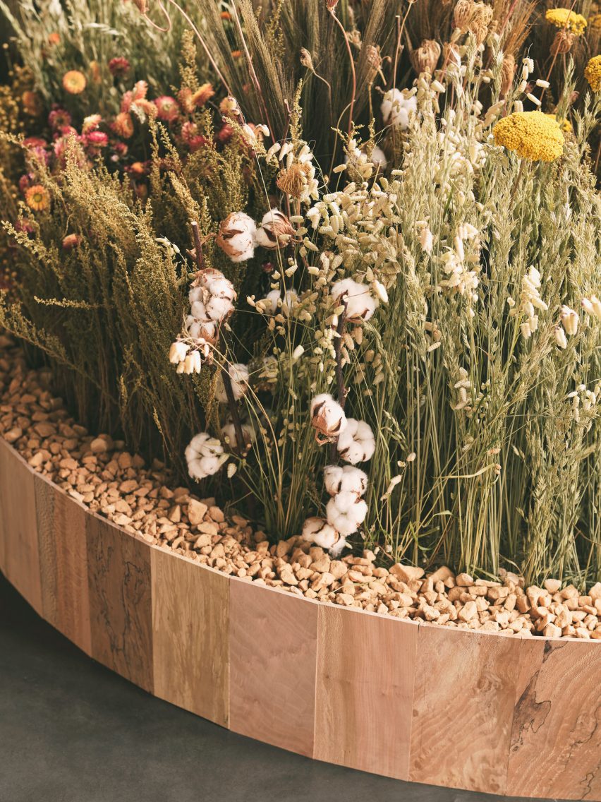
As the ultimate counterpoint to the mass and severity of the brick, Rigby conceived the idea of an indoor meadow that meanders through the Lestrange store.
The arrangement of natural dried flowers and grasses was realised by award-winning garden designer Lottie Delamain, integrating a carefully chosen mix of species to reflect the fibres commonly used in apparel manufacture such as cotton and flax.
“We wanted to bring nature inside, using plants linked to the clothes while creating a touch point to the materiality,” said Rigby.
Garden designer Lottie Delamain created a dried flower meadow for the store
Clothes are displayed on simple white metal rails and the capacious open-topped dressing rooms feature speakers playing forest sounds, complemented by discreet wall lights that cast a subtle glow.
There are also subtle nods to Japanese design in the form of the rice paper lampshades that float at varying heights throughout the store.
The flowers are set in wood-framed stone beds
“We started with a mixture of initial references, one of which was a teahouse designed by Charlotte Perriand,” said Rigby.
“We wanted to create a material-focused space with nods to natural materials such as the rice paper lights, which we felt would add to the space and create a sense of calm and stillness.”
The Lestrange shop is set inside the Coal Drops Yard shopping centre
Previous projects from Rigby, who founded his studio in 2008, include bespoke furnishings for a renovated 1920s office building in London as well as the interiors of Bath’s Francis Gallery, which is set inside a Georgian townhouse.
Spotted: Quantum computing is an early-stage technology that offers far higher processing speeds than even the most advanced conventional supercomputers. This represents an extraordinary opportunity for business, with McKinsey forecasting that quantum computing could capture nearly $700 billion (around €642 billion) in value by 2035. However, today’s quantum computing hardware is still underdeveloped and largely confined to use by specialists in research labs.
The company has developed a software-as-a-service platform – called Singularity –that provides non-specialist employees with an intuitive interface that connects to quantum computers on the Cloud.
Today’s quantum computers are most advanced when it comes to problems that involve optimisation, and Singularity’s first use case is in financial services. Employees in the sector can use Singularity to maximise returns from their investment portfolios through a plugin added to a regular Excel spreadsheet.
Users input data, such as the expected returns and volatilities of different financial assets, and set parameters such as the total amount to be invested. This information is pre-processed by the software to determine the best algorithms and quantum computers to use. The data is then sent to the computing hardware and the results are returned to the user in an easy-to-understand format. In a matter of minutes, Singularity can identify the optimum allocation of assets in a portfolio, delivering higher returns than industry standard solvers for any given risk level.
The Singularity platform enables companies to gain some of the promised benefits of quantum computing immediately, even though quantum computing hardware remains in its infancy.
Quantum computing is only just starting to reveal its full potential. In the archive, Springwise has also spotted it being used for cybersecurity and to tackle the climate crisis.
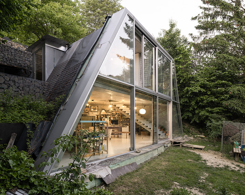
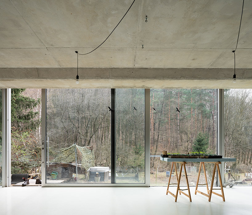
Design studio Studeny Architekti has recently completed a contemporary house in the scenic village of Pernek, Slovakia. Embedded into the earth a vast plot of land surrounded by the pristine beauty of the Small Carpathians, the Family House in Pernek embodies the studio’s vision of a simple dwelling existing in dialogue with its natural surroundings.
The primary objective of this project was to create a residence that makes use of the contours of the land but also harmonizes with the environment. By strategically placing the concrete house beneath a slope below the road, the architects ensured that the residents would have unobstructed views of the opposite forest, allowing them to connect with nature effortlessly. This underground placement also freed up the flat portion of the plot, which was reserved for a wide, open front yard.
the concrete shell structure by studeny architekti
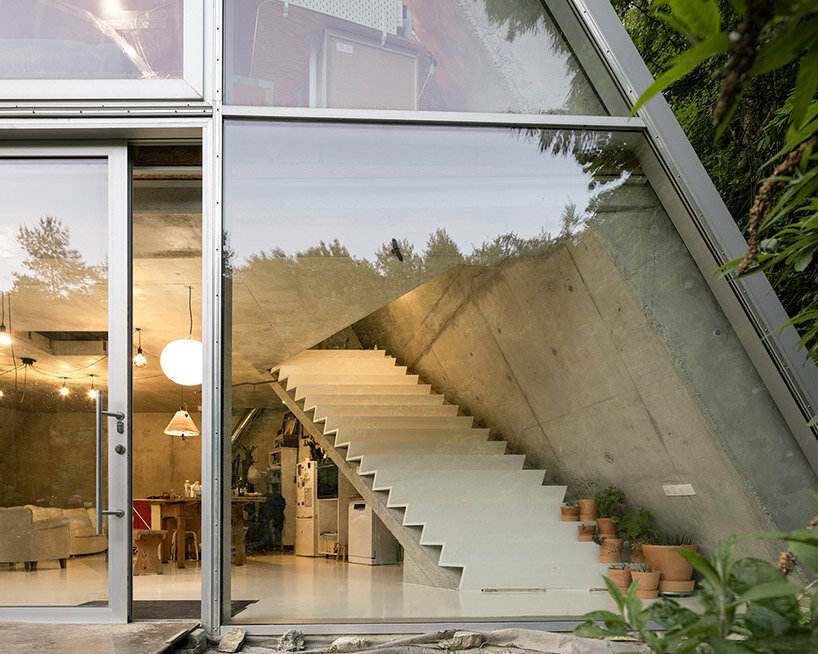
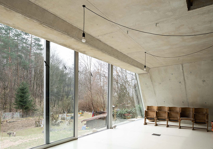
Studeny Architekti constructs its Family House in Pernek with a unique design element — a monolithic concrete shell without internal supports. This choice not only adds structural integrity to the building but also contributes to its aesthetic appeal. Inside the house, the concrete shell remains exposed, creating a distinct visual feature. However, the facade opening out toward the south is defined by its large glass wall, opening the interior spaces broadly outward to gaze onto the wooded mountains beyond.
inside the family house in pernek
Studeny Architekti organizes the floor plan of its Family House in Pernek in the shape of an isosceles trapezoid, mirroring its longitudinal profile. This unique layout results in an interior space that feels open and free-flowing. The house consists of two floors interconnected by a stylish staircase.
The ground floor, in direct contact with the garden, encompasses a multifunctional area housing the living room, a work corner, the parents’ bedroom, a kitchen with a dining room, and the technical facilities of the house. On the upper floor, two children’s bedrooms, a bathroom, and an entrance area can be found. All the living spaces benefit from ample natural light and are oriented towards the garden and the forest through expansive windows.
the house is built as a concrete shell with no internal supports full height glazing opens onto the forest beyond through a trapezoidal frame sliding glass doors fills the underground home with natural breezes and sunlight
Rounded walls and archways create a flow through this Montreal boutique, designed by local studio MRDK for Canadian sportswear brand Ciele Athletics.
The first boutique for Ciele, which sells technical headwear and apparel for running, opened in April 2023 on Notre-Dame Street in Montreal – the brand’s hometown.
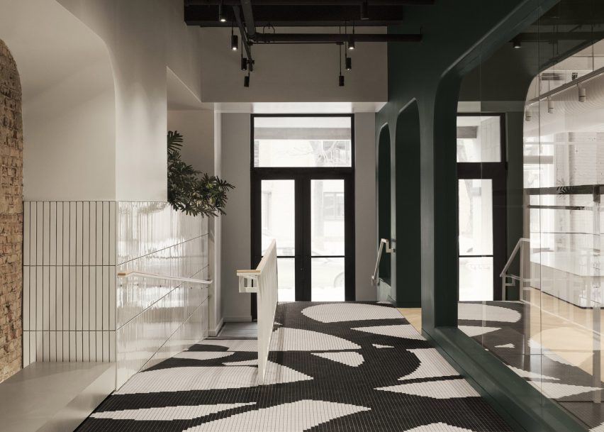
Black and white mosaic tiles form a pattern based on Ciele’s apparel at the entrance to the store
The 3,000-square-foot (279-square-metre) flagship store was designed by MRDK to be as much a boutique as a community space for runners to meet and socialise.
Along the narrow entryway, flooring comprises black and white mosaic tiles that form a graphic pattern based on select items of the brand’s apparel.
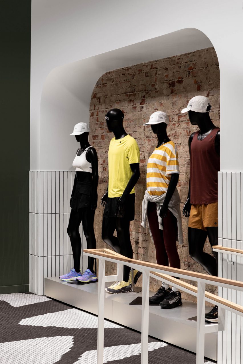
Visitors are lead past a quartet of mannequins to a community lounge area
Ascending four steps or a ramp leads visitors past a large white-tiled planter, then a display of mannequins lined up in front of a brick wall.
A lounge area at the end is designated for gathering and conversation, offering “anyone with an interest in movement and connection a chance to experience running and the many facets of its dynamic community through regular meet-ups and events”, said MRDK.
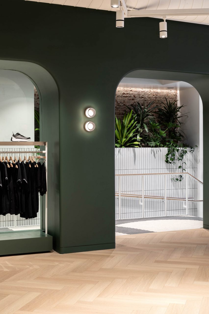
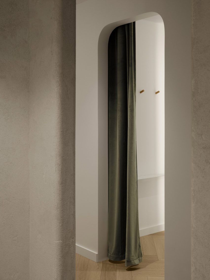
Access to the main retail space is via an archway that punctures a dark green partition
Access to the main retail space is through an archway with rounded corners that punctures a deep, dark green partition.
“An arched wall gracefully separates the more public community area from the rest of the store, creating a sense of intrigue and inviting exploration,” MRDK said.
The green hue continues behind the fluted white service counter
Other similar openings in this spatial divider are used to display clothing on single or double-stacked rails.
The same forest green shade continues on the wall behind the service counter, which is fronted by a white fluted panel and includes a small glass vitrine set into its top.
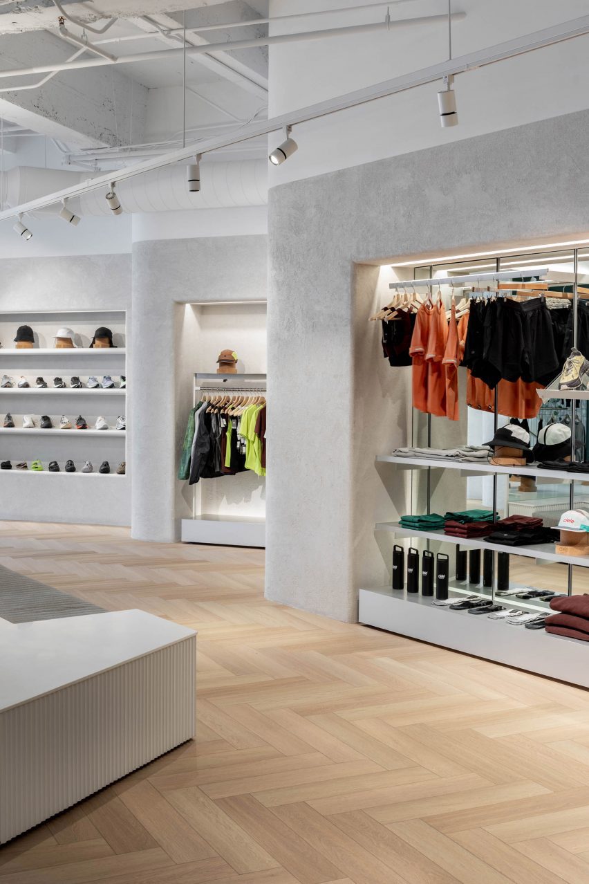
Lime plaster covers the angled walls, which feature bull-nose edges that soften their appearance
Herringbone white oak parquet floors are laid wall to wall, running beneath a low central island that is designed to be broken apart and moved around the store depending on merchandising needs.
A textured lime plaster finish was applied to the walls, wrapping around the bull-nosed corners that soften the angles created by the offset displays.
“The play of light and shadows on these textured surfaces creates a sense of dynamism, accentuating the uniqueness of the space,” said MRDK.
In one corner, a 12-foot-tall (3.7-metre) shelving system presents Ciele’s range of hats on cork mannequin heads.
A tall shelving system displays Ciele’s hat collection
Fitting rooms at the back of the store are kept minimal, with green velvet curtain draped behind the arched openings to the cubicles.
“The thoughtful combination of materials, textures, and colours creates an atmosphere that seamlessly blends modernity with a touch of timeless elegance,” said MRDK.
The fitting rooms are kept minimalist and feature green velvet curtains
Formerly known as Ménard Dworkind, the studio was founded by Guillaume Ménard and David Dworkind, and has completed a variety of retail spaces in Montreal and beyond.
Most recently, these have included a store for plastic-free beauty brand Attitude.
The photography is by David Dworkind and Alex Lesage.
Project credits:
Team: David Dworkind, Benjamin Lavoie Laroche Contractor: Groupe Manovra Ceramic floor tile: Daltile Lighting: Sistemalux Lime plaster: Venosa Wood profiles: Brenlo


 images ©
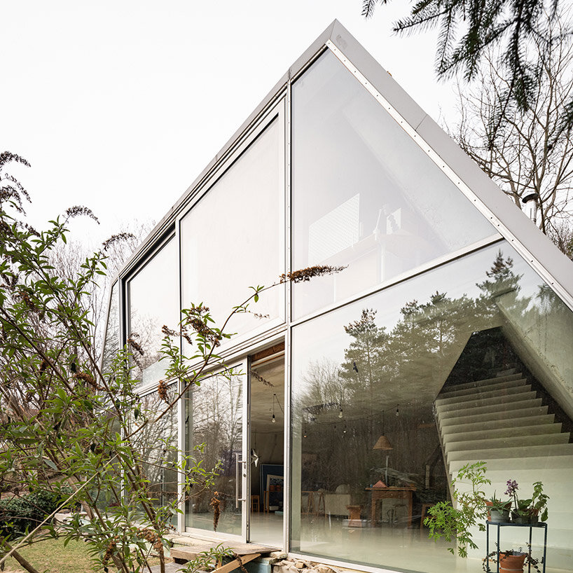
 sliding glass doors fills the underground home with natural breezes and sunlight