Spotted: Pesticides and fertilisers are widely used in food production. But while they can have important benefits, they are expensive, and their use creates numerous environmental problems impacting human health, biodiversity, and water and soil ecosystems. Now, startup Pluton Biosciences is identifying microbial solutions that could provide chemical-free crop protection and enhancement.
Pluton is working to identify novel microbes with commercial applications using its proprietary Micromining Innovation Engine. Pluton has already discovered multiple previously unknown bacteria that can protect against several agriculturally relevant plant pests, including the fall armyworm. The active anti-pest molecule has been isolated and is being developed into a natural pesticide.
The company is also developing a microbial cover crop that captures and sequesters carbon and nitrogen in the soil – providing soil enhancement as well as carbon sequestration. The company claims that applying the microbial spray at planting and harvest could scrub nearly two tonnes of carbon from the air per acre of farmland each year, while also replenishing nutrients in the soil.
Microbial solutions are not only good for crops and the environment, they are also a potentially valuable market, and investors agree. In 2021, Pluton raised $6.6 million (around €6 million) in a seed round and more recently it completed a series A round for $16.5 million (around €15.2 million).
Nature can be very effective at solving problems, a fact that has not escaped the notice of those searching for more sustainable ways to grow crops. In the archive, Springwise has spotted a number of innovations in this space, including a maggot-based fertiliser and nature-inspired insecticides that protect biodiversity.
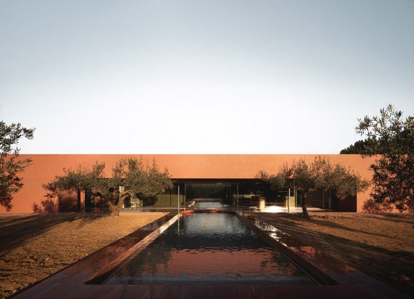
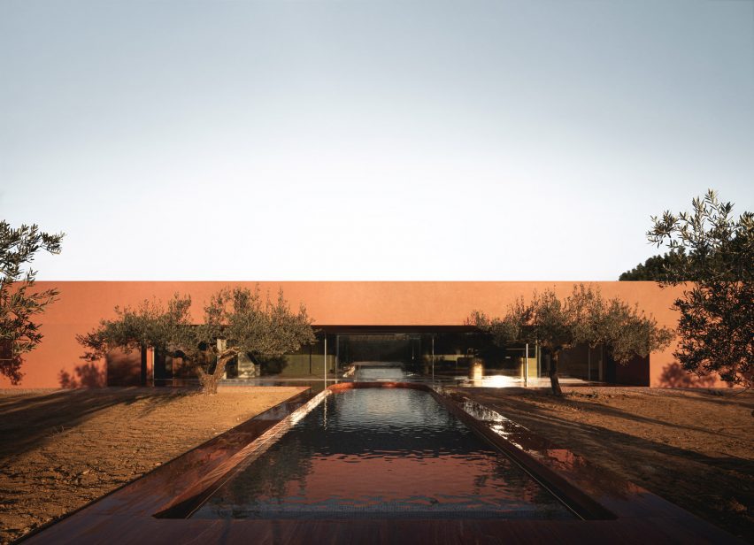
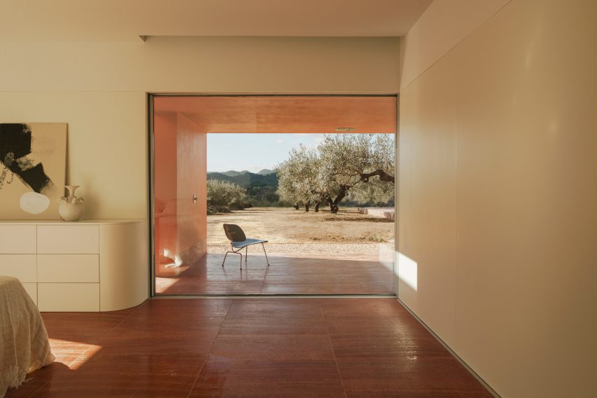
Spanish studio Balzar Arquitectos has added a copper-toned family house named La Casa de los Olivos to an olive grove in Valencia, Spain.
Aiming to blend into its site in the town of Quesa, the long and low-lying home has been finished with a red-hued lime mortar that mimics the surrounding soil.
Balzar Arquitectos also preserved as much of the existing planting as possible by designing the house with a linear form that fits within a grid of trees.
Balzar Arquitectos has added a copper-toned house to an olive grove
“The landscape was already wonderful as it was, so when it came to the intervention, we wanted to respect this place, trying to keep as many olive trees as possible,” said studio co-founder Laura Moreno Albuixech.
“We wanted to create a dialogue between the natural and the artificial, between the olive trees and the house,” Moreno Albuizech told Dezeen.
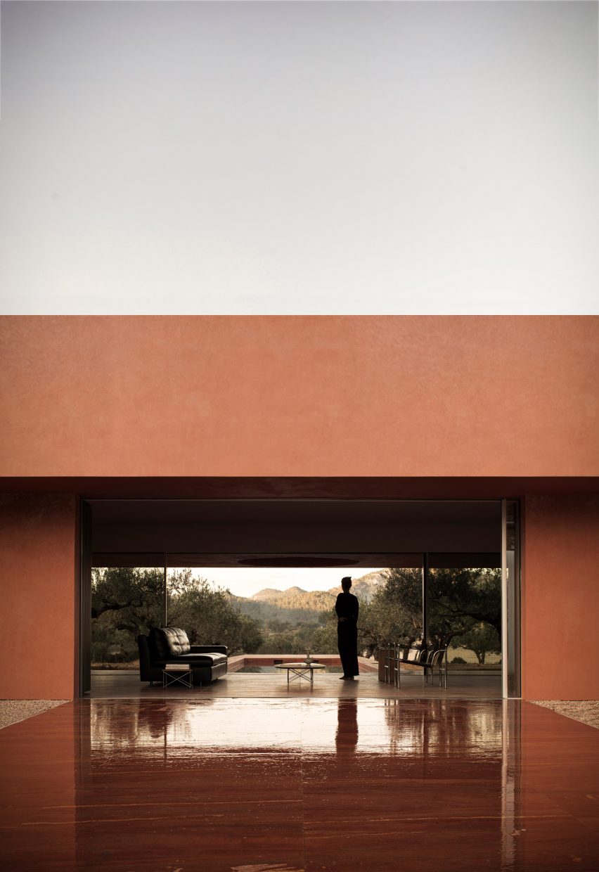
Built with a steel frame, the copper-toned home is nestled into the gaps of the eight-by-eight-metre grid of trees. Inside, rooms are arranged across a single floor.
La Casa de los Olivos is designed to blend in with its surroundings
“The olive trees are arranged in a perfect grid of eight by eight metres and this was a key factor in the geometry of the house,” said Moreno Albuixech.
“Both the house and the swimming pool take advantage of the free spaces left in the grid of olive trees and insert themselves between them.”
Its red exterior mimics the colour of soil nearby
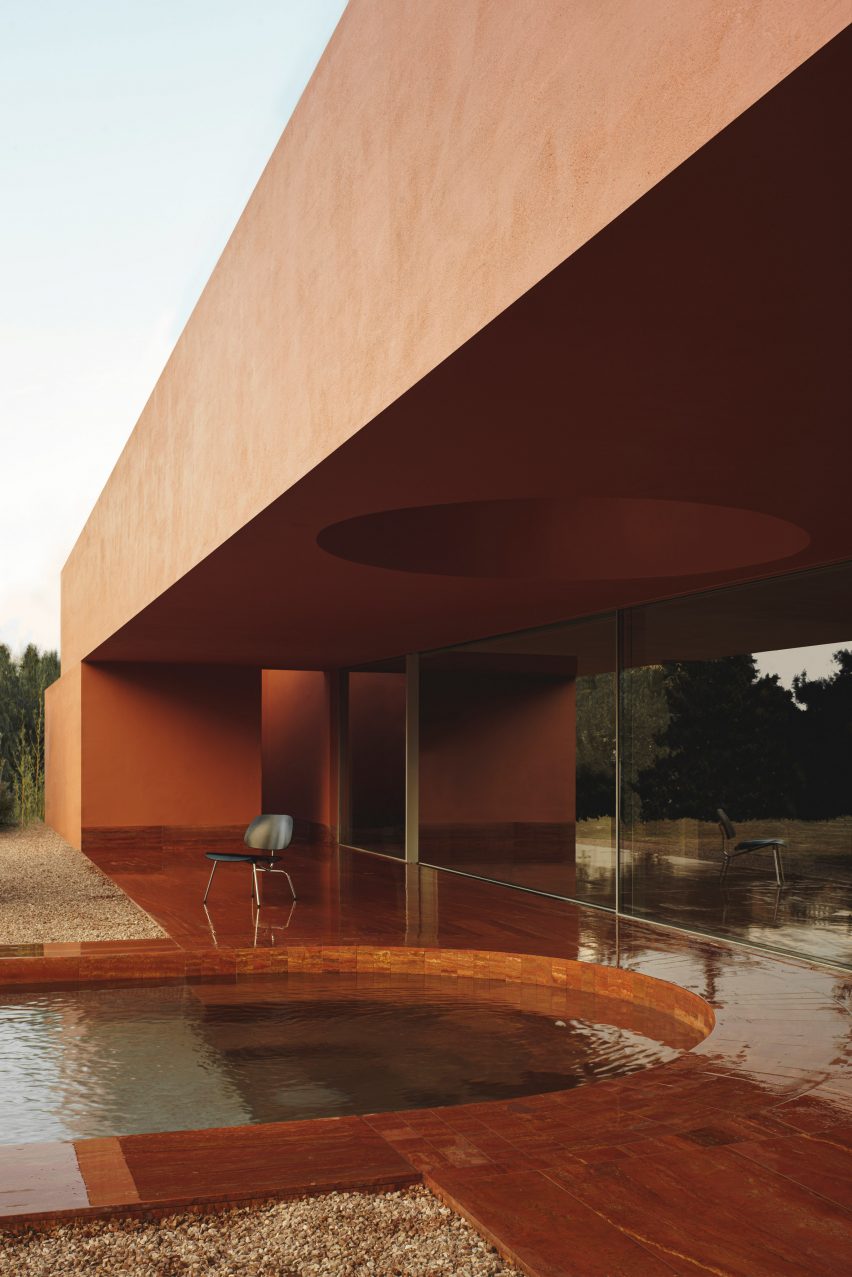
Running down the centre of a gravelled courtyard is a long swimming pool. It extends towards the main building, curving to meet a porch that is covered by an overhang perforated with a circular skylight.
A large glass door separates this porch from the open living space, which extends into a dining area and kitchen with green-toned cupboards and brass surfaces.
“The muted green colour of the leaves of the olive trees was used for the woodwork and the gold of the sun at sunset was reinterpreted in the kitchen with natural brass,” said Moreno Albuixech.
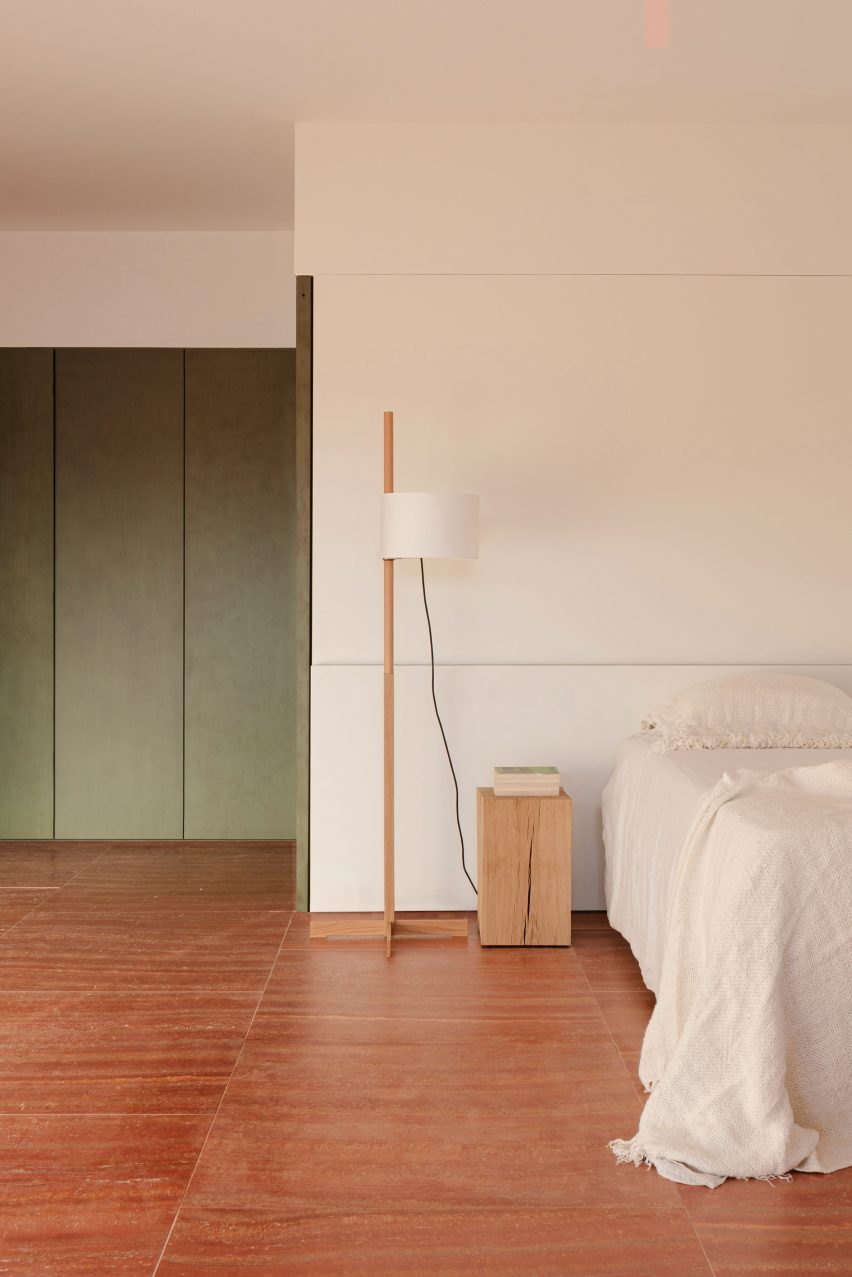
Throughout the home, red walls and accents mimic the soil-informed colour of the exterior, including terracotta-toned floors and Iranian travertine marble surfaces that feature in the bathrooms and interior pool.
The reddish tones continue inside the home
“The choice of materials and colours was clear from the beginning,” said Moreno Albuixech. “Both the clients and we were looking for colours that respected the chromatic range that the plot already had when we visited it for the first time.”
Two ensuite bedrooms branch off from the main living space and open onto private patios that frame views of the surrounding olive trees.
Green elements mirror the leaves of the olive trees
“The home integrates with the rural environment through patios that embrace the existing olive trees and a longitudinal platform that reinforces the linear perspective towards the horizon,” said the studio.
“Through the patios, the olive trees and the wide terrain become part of the dwelling and lives of the people.”
Other Spanish homes recently featured on Dezeen include a narrow home designed for indoor and outdoor living and a house spread across six pavilions arranged around a courtyard.
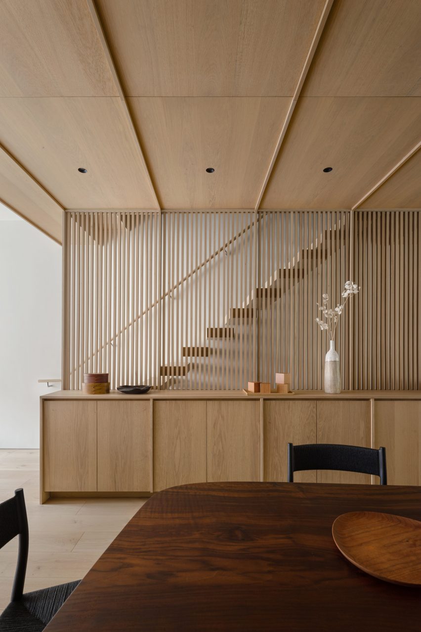
For our latest lookbook, we’ve selected eight dining rooms from the Dezeen archive where wooden panelling was used to create cosy, earthy environments with an organic feel.
From South America to Europe, these wood-panelled dining rooms serve as focal points in the interiors and create social spaces for residents and guests.
Whether they’re made from timber, pine or plywood, the wooden finishes on these statement walls and ceilings have been used to create welcoming environments with peaceful atmospheres.
This is the latest in our lookbooks series, which provides visual inspiration from Dezeen’s archive. For more inspiration see previous lookbooks featuring homes with focal point wardrobes, statement headboards and homes with pergolas.
Photography is by Fran Parente and image production is by Victor Correa
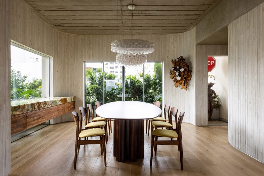
ER Apartment, Brazil, Pascali Semerdjian Arquitetos
This apartment in São Paulo has an exposed concrete ceiling and uses natural materials, such as walnut, bronze, onyx and stone in its furnishings and finishes.
Pascali Semerdjian Arquitetos used vertical timber cladding, local art and furniture by Brazilian architects and designers Oscar Niemeyer and Claudia Moreira Salles in the dining room to make the space “deeply Brazilian and vividly cosmopolitan”.
Find out more about ER Apartment ›
Photography is by Eric Petschek
Carroll Gardens Townhouse, US, Starling Architecture and Emily Lindberg Design
Starling Architecture and Emily Lindberg Design combined two units in a Brooklyn townhouse to create this family home. The townhouse features Belgian white oak on the flooring and along the corridor, stairs, mudroom, kitchen and dining area.
The New York-based studios used neutral tones to decorate the five-story house. In the dining room, wooden cabinets and decorative lamellas match the floor and ceiling.
Find out more about Carroll Gardens Townhouse ›
Photography is by Tim Croker
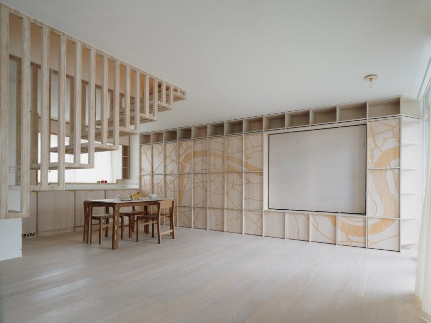
Dragon Flat, UK, Tsuruta Architects
Artificial intelligence (AI) was used to design the patterns engraved on plywood panels that decorate the dining room of the Dragon Flat in London’s Notting Hill. Tsuruta Architects used a CNC router – a computer-controlled cutting machine – to engrave a pattern of the River Thames on the wall.
The architecture studio also updated the two-level maisonette to include a walk-in wardrobe and tatami room, which features an engraved design on its panelled walls.
Find out more about Dragon Flat ›
Photography is by David Grandorge
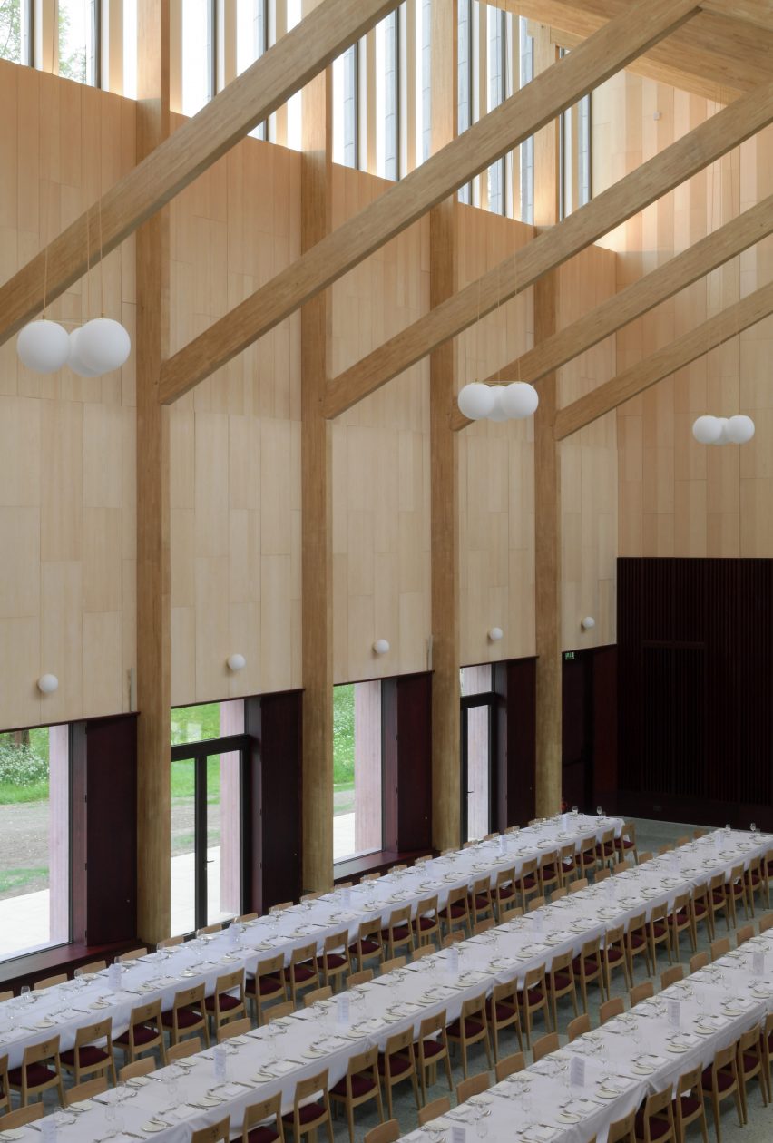
Homerton College, UK, Feilden Fowles
Homerton College at the University of Cambridge includes a dining hall by London architecture studio Feilden Fowles made from concrete, timber and 3,200 faience tiles.
The building, which was constructed with chestnut-laminated timber frames and clerestory windows, features a larger eating space, a smaller eating room, the kitchen and staff amenities.
It was designed to celebrate handcrafting techniques and contemporary construction and engineering.
Find out more about Homerton College ›
Photography is by Roland Halbe
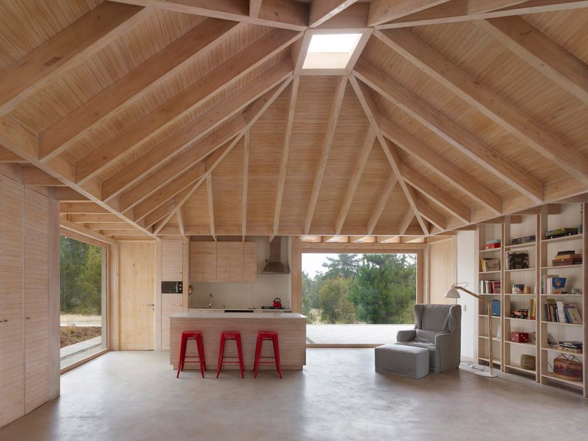
House in El Peumo, Chile, Cristián Izquierdo Lehmann
This house, designed by Cristián Izquierdo Lehmann, centres around an open-plan kitchen and dining room with a vaulted ceiling that is used for cooking, dining and socialising.
A minimalist decor compliments the dramatic ceiling, with red stools used for dining and a bookcase lining the wall.
Located in El Peumo, Chile, the house was clad with laminated pine and features concrete floors and large windows for the owners to enjoy the green exterior.
Find out more about House in El Peumo ›
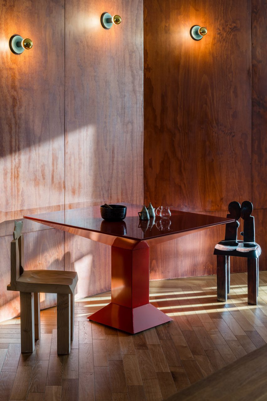
Another Seedbed, US, Future Projects
The Another Seedbed loft in Williamsburg, Brooklyn, serves as both a home and performance space for its owner. To function as both, the space is predominately open, with hidden rooms located around the apartment.
Warm pine walls mark the dining space, which features a complementary red angular table and wooden sculptural chairs.
Other walls in the loft are covered in hand-troweled earthen clay plaster, blue penny-round tiles and floor-to-ceiling shelving.
Find out more about Another Seedbed ›
Photography is by Art Gray
Stone Creek Camp, US, Andersson-Wise Architects
US-based Andersson-Wise Architects designed the Stone Creek Camp in Big Fork, Montana, as a family retreat of cabins and cottages.
While it is wood-clad, the kitchen and dining area does not feature traditional panelled walls. Instead, one wall is made from wooden logs that have been assembled to create an unusual wall with a highly textured surface.
The ceiling was clad in wooden panels that match the floorboards in the home.
Find out more about Stone Creek Camp ›
Photography is by Marc Goodwin
Geilo Valley Cabin, Norway, Lund Hagem
Panelled with blackened timber, this Norwegian ski cabin shelters residents from harsh weather conditions and offers panoramic views of the Geilo Valley. The cabin’s exterior concrete walls have also been tinted black to reflect the interior panels.
The walls and ceiling of the dining room use the same timber cladding, matching the kitchen island to create a cosy, coherent atmosphere.
“The dark tone allows the nature outside to come closer and creates a darkness that contrasts with the white winter landscape,” said the project’s architects Lund Hagem.
Find out more about Geilo Valley Cabin ›
This is the latest in our lookbooks series, which provides visual inspiration from Dezeen’s archive. For more inspiration see previous lookbooks featuring homes with focal point wardrobes, statement headboards and homes with pergolas.
Spotted: The average baby goes through approximately 7,000 nappies before they are potty trained, and the vast majority of nappies used around the world are disposable. Considering that there are over 400,000 babies born in Rwanda and over 46 million across Africa annually, the number of nappies generated is staggering. The problems posed by single-use nappies are two-fold: there is a financial burden, with some mothers even needing to delay changing to reduce cost; and the environmental impact of disposing of that many plastic-based nappies.
Founded with the goal of helping mothers and families provide their babies with a sanitary and dignified alternative to rationing disposable nappies, Kigali-based Toto Safi gives mothers the ability to subscribe and save money on reusable nappies, while also eliminating the wastefulness of single-use alternatives.
Toto Safi’s nappies are designed and produced in Rwanda through partnerships with local women tailor cooperatives. By choosing Toto Safi, parents can not only make a positive impact on the environment, then, but also contribute to community development and the well-being of local economies.
The final products are high-quality, affordable, adjustable, and environmentally sustainable. They are also made with breathable and waterproof materials like cotton or bamboo, which means the nappies are gentle on babies’ skin, highly absorbent, and free from chemicals. Customers can either purchase the reusable nappies outright or subscribe for weekly sanitised nappy deliveries, along with the pickup of soiled nappies for cleaning. This system reduces waste and offers parents long-term cost savings.
Toto Safi is currently testing and developing new product lines, including two-in-one diapers, pocket diapers, and adult diapers, to meet diverse customer needs. The aim is to offer a comprehensive range of reusable items like padded underwear, period pants, and incontinence products, providing sustainable and comfortable solutions for people of all ages.
Springwise has recently spotted other sustainable nappies, such as a reusable nappy made from seaweed, and another disposable one made from biodegradable bioplastic.
The One Rendering Challenge is now part ofthe Architizer Vision Awards, honoring the best architectural photography, film, visualizations, drawings, models and the talented creators behind them. Winners are published in print! Start your entry >
Rendering transformed how architecture was visualized and shared. As one of the most common ways that designs are communicated to clients and the public today, these constructed images have become central to practice. Increasingly more realistic as technology has evolved, firms have been exploring diverse ways to understand the impact and potential of renderings. Now more than ever, designers and artists can make visualizations in less time and create new visions of what could be.
For interdisciplinary design practice Morphosis, the firm has made a name for itself by pushing boundaries. In their own words, the designers are “enthusiastically wondering at the future” as they test out new forms and building technologies. Founded in 1972, the firm’s work ranges in scale from residential, institutional, and civic buildings to large urban planning projects.
Like the practice itself and implied in the firm’s name, the renderings produced by Morphosis have shifted and evolved over time. However, a central theme is a blurred entourage and context, creating a sense of movement within an image. The following projects showcase renderings from the firm’s portfolio and photography of their built architecture. As a collection, they show how the practice continues to set the stage for innovation.
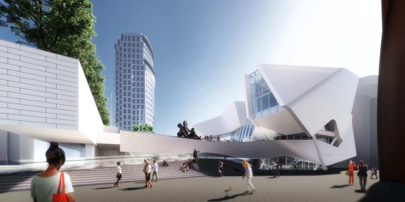
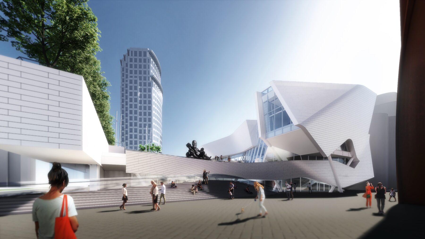
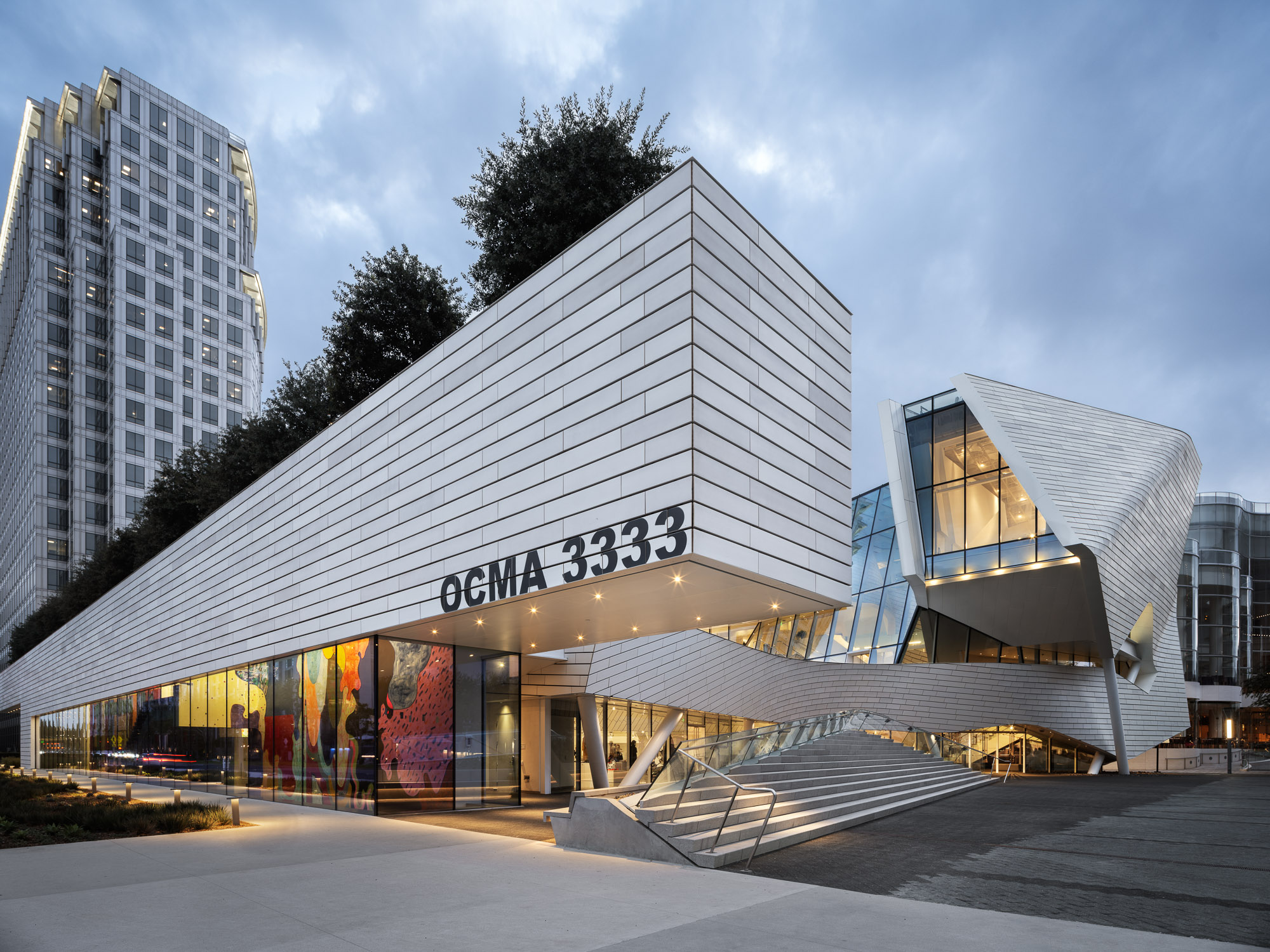
Orange County Museum of Art
Costa Mesa, CA, United States
Jury Winner, 2023 A+Awards, Museum
The design of the new Orange County Museum of Art addresses the need for museum space to be both flexible and functional as well as inviting and memorable. With flexible exhibition galleries, dedicated space for educational programming, and areas for public gathering, the new building was made to provide expanded access to the museum’s permanent collection and its world-class special exhibition program. The main floor is dedicated to reconfigurable open-span exhibition space, complemented by mezzanine, black-box, and jewel-box galleries that can accommodate temporary and permanent collection exhibitions spanning scales and mediums.
A spacious roof terrace, equivalent in size to 70 percent of the building’s footprint, serves as an extension of the galleries with open-air spaces that can be configured for installations, a sculpture garden, outdoor film screenings, or events. While the interaction and entrance to this terrace changed over the course of the design, later renderings more closely echo the final project. A sculptural wing hovers over the lobby atrium and creates a prominent location for the educational hall, a dynamic architectural space illuminated by a full-height window overlooking the terrace.
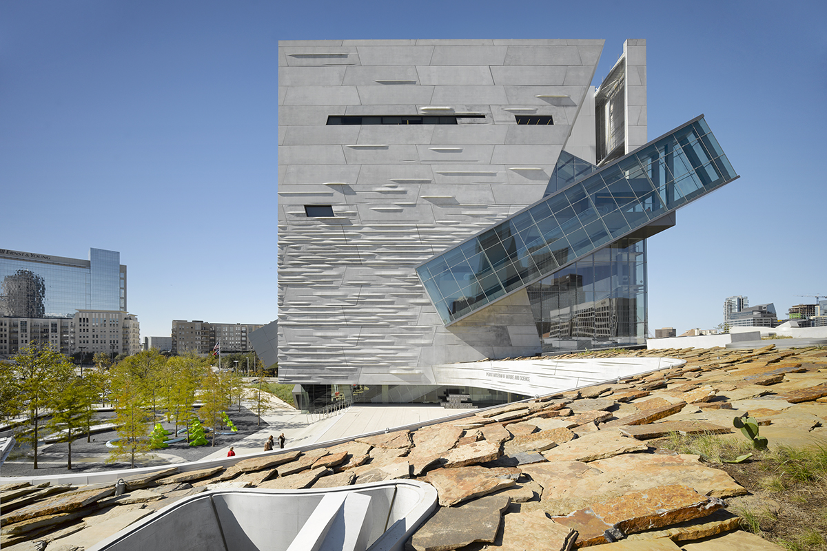
Perot Museum of Nature and Science
Dallas, TX, United States
Giving shape to concrete, Morphosis Architects explored the material’s potential through the Perot Museum of Nature and Science in Dallas. Built to bring a simple cube and plinth into high relief, the Perot Museum showcases a precast-concrete panel façade. As a material investigation integrating structure and formwork, the elegant cladding solution was made possible through computer aided modeling and a collaboration with Gate Precast of Hillsboro, Texas.
The Perot Museum is a showcase of versatility and technical ability. Its design creates a distinct identity for the new institution and enriches the urban environment of the emerging cultural district of Victory Park. The overall massing for the building floats a cube of galleries above a thickened landscape containing classrooms, a theater and support spaces. Breaking the solid geometry of the museum cube, a glass-encased 54-foot (16-meter) continuous flow escalator moves patrons up from the ground floor to a cantilevered platform, which is seen in both renderings of the project and the completed building.
Bloomberg Center
New York, NY, United States
Designed to become a net-zero building, The Bloomberg Center forms the heart of the Cornell Tech campus on Roosevelt Island. The Bloomberg Center was made to reflect the school’s joint goals of creativity and excellence by providing academic spaces that foster collective enterprise and collaboration. The four-story, 160,000-square-foot (14,865-square-meter) academic building is named in honor of Emma and Georgina Bloomberg in recognition of a $100-million gift from Michael Bloomberg, who was responsible for bringing Cornell Tech to New York City while serving as the city’s 108th Mayor. The four-story building is set beneath a photovoltaic canopy with a low and narrow profile framing views across the island.
One of the building’s most distinctive features is its façade, optimized to balance transparency — optimizing daylighting and exterior views — while maximizing insulation and reducing thermal bridging. As the renderings echo the building’s form, they also hint at this texture created along the building facade. Designed as a rain screen system, the outermost layer of the façade is composed of aluminum panels surfaced in an iridescent, PPG polymer coating. Viewed from afar, the aluminum panels register a continuous image that merges the river-view scenery from Cornell Tech’s Roosevelt Island location and Cornell University’s idyllic campus in Ithaca, New York.
Emerson Los Angeles has emerged as a significant landmark in Los Angeles. As a backdrop for student filmmakers, the building weaves an urban fabric of outdoor and indoor spaces together with two slender residential towers bridged by a multi-use platform. With over 180 student rooms, four faculty apartments, film and video production labs, and classrooms, the project combines both a sculptural central mass and an undulating, textured metal scrim. At over 100,000 square feet (9,290 square meters) and ten stories high, the project spurred redevelopment as part of a larger transformation in Hollywood.
As the most distinctive element of the project, the building features a custom metal panel systems manufactured by Zahner. These screens and panels were made to provide shade and privacy, and are composed of seventeen different folded aluminum components. This screen is seen in both renderings of the design, as well as in the heart of the finished building. Zahner used 3D models to produce and fabricate the curvatures. The eight-story sunscreen was made using computational scripting to determine the final geometry that would shade the internal façades.
Sited in Seoul, Kolon’s new flagship research and development facility brings together researchers, leadership and designers in one location. The building combines flexible laboratory facilities with executive offices and active social spaces that encourage greater interaction and exchange across the company. The four-acre project site sits adjacent to Magok’s central park — a prominent location for what will be the district’s first major completed building. The building folds towards the park, providing passive shading to the lower floors.
Bridging the three extending laboratory wings, the building’s folding volume contains conference rooms and social spaces, augmented by flagship retail and exhibition galleries at the street level to communicate the brand’s vision to the public. A transparent ground plane extends the landscape into the interior, drawing light and movement towards an open pedestrian lane-way and grand entry. The distinctive brise-soleil system on the western façade is both a performative and symbolic feature of the building; the façade units have been parametrically shaped to balance shading and views, and are made from a GFRP formulation that uses one of Kolon’s own high-tech fabrics.
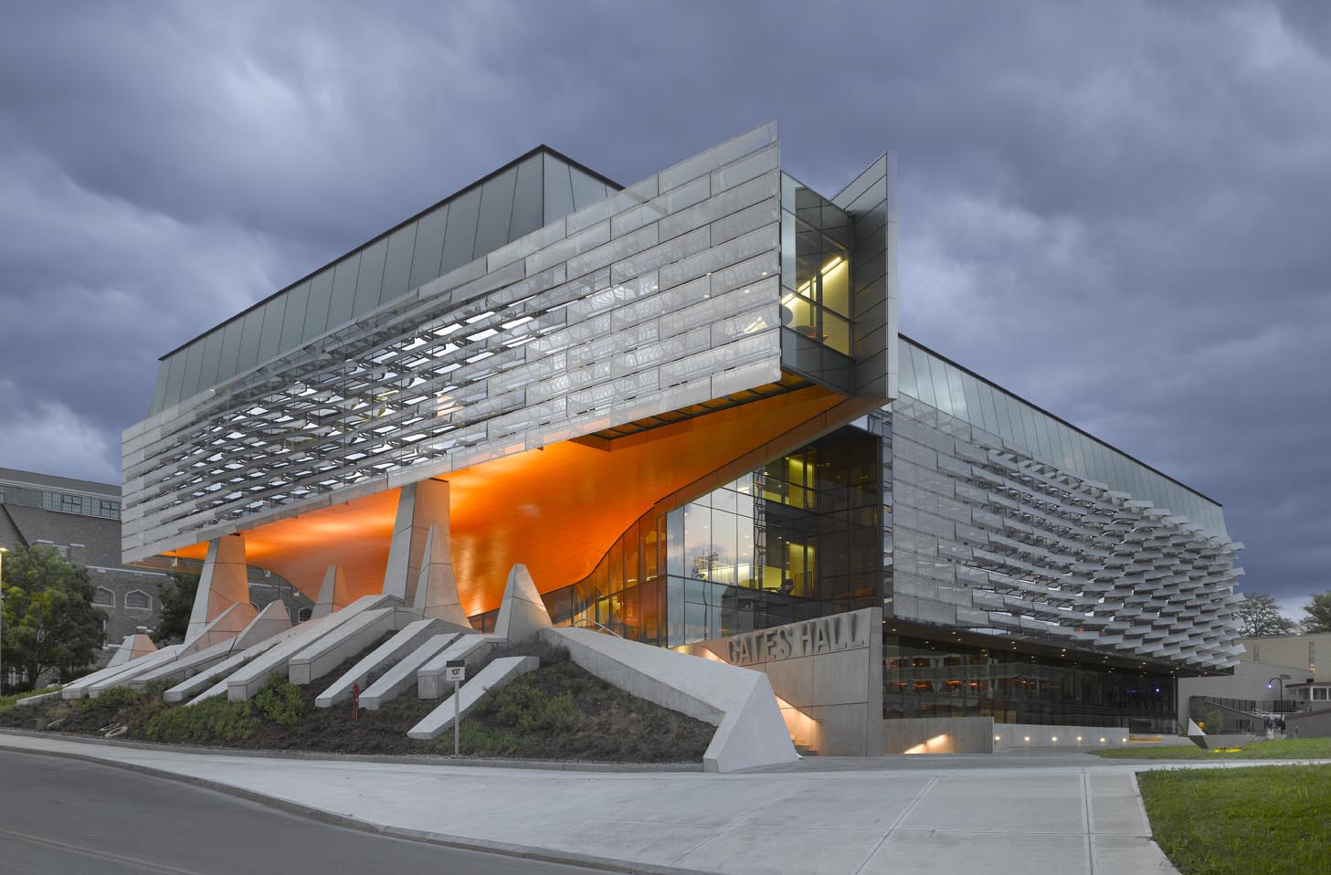
Gates Hall
Ithaca, NY, United States
The Bill & Melinda Gates Hall brings together the faculty and students of Cornell University’s Computer Science and Information Science departments. Housed within a single structure, the project was designed to facilitate collaboration and spontaneous discourse between disciplines. Projecting westward from the building, a two-story cantilever creates a dramatic canopy over the elevated Entry Plaza to establish a new visual gateway to the campus. Advanced digital modeling tools are used to map a double skin of undulating, perforated stainless steel panels, which envelop the reflective glass curtain wall on the second and third levels.
The complex patterning of the façade causes the building to appear to shift throughout the day, evening and seasons, as the sun reflects off this textural surface. The renderings of the project produced for Cornell echo the final design. Performative as well as aesthetic, the metal screen shades the building from the sun, while admitting diffuse daylight and affording exterior views. Accentuated by fritted interior glazing, active social spaces interweave with academic program to extend education beyond traditional classroom settings. Public activity is organized around a dynamic, multi-level atrium on the west side of the building, with an efficient layout of classroom, laboratories and offices to the east.
The One Rendering Challenge is now part ofthe Architizer Vision Awards, honoring the best architectural photography, film, visualizations, drawings, models and the talented creators behind them. Winners are published in print! Start your entry >
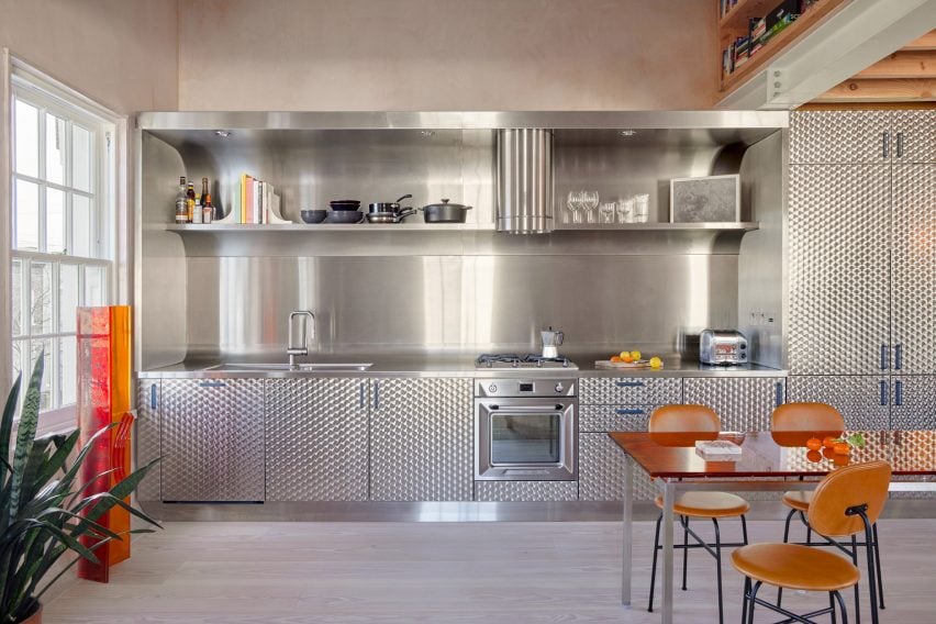
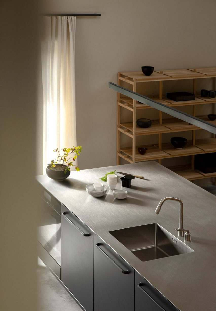
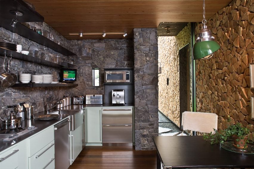
Sometimes the simple solutions are the best, as seen in this lookbook featuring tidy kitchen interiors where minimalist closed cabinets are combined with decorative materials.
In these kitchens, found in homes from Sweden to Mexico, architects and designers largely chose simple storage solutions but added material interest in the form of marble, steel and brick details.
By hiding utensils and crockery away, benches and kitchen islands are freed up to use for food preparation. In some of these kitchens, open shelves above the work areas also provide spaces to hold decorative plates, bowls and cookbooks.
This is the latest in our lookbooks series, which provides visual inspiration from Dezeen’s archive. For more inspiration see previous lookbooks featuring homes where the wardrobe is the focal point, bedrooms with statement headboards and homes with pergolas.
Photo by Lorenzo Zandri
Steele’s Road House, UK, by Neiheiser Argyros
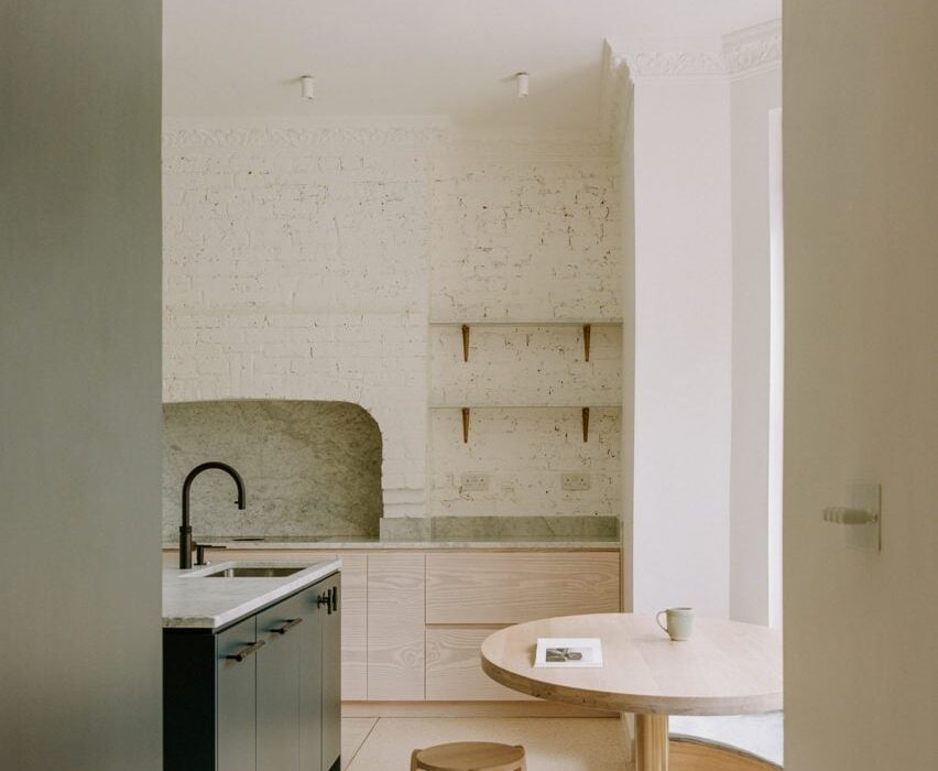
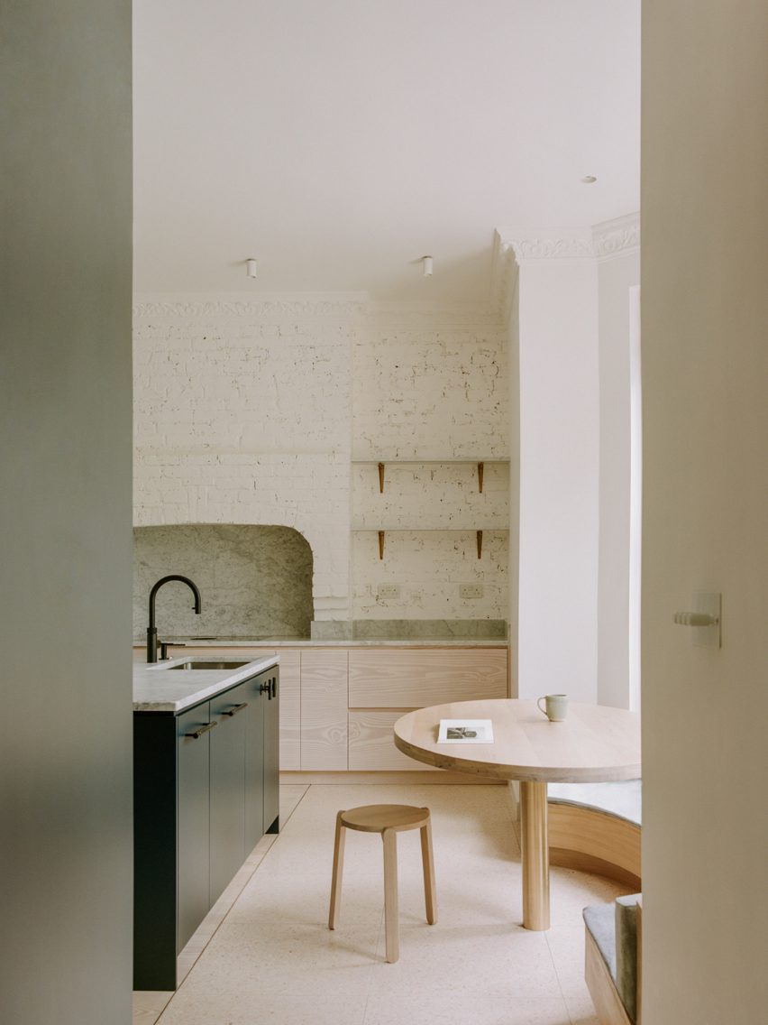
The original brickwork was uncovered in parts of this London flat, including in the kitchen where it forms the backdrop to the room’s minimalist cabinets.
Pale-wood cupboards sit underneath the brick wall, which also features shelves to add more storage.
Designers Neiheiser Argyros added a curved window seat, as well as a wooden kitchen table and stool to match the cabinets and give the room a more natural feel.
Find out more about Steele’s Road House ›
Photo by Giulio Ghirardi
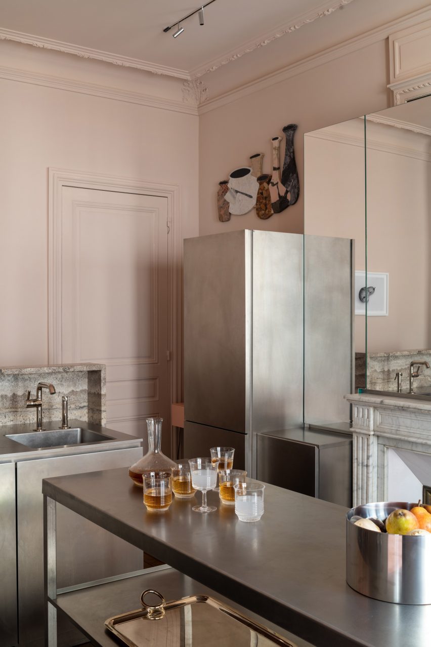
Hausmann apartment, France, by Rodolphe Parente
This Parisian apartment in a 19th-century Haussmann building in Paris was given an overhaul by interior designer Rodolphe Parente, who took cues from the owner’s art collection.
In the kitchen, stainless steel cabinets were used to form storage and workspaces, creating an industrial feel that is tempered by pastel-pink walls.
“The kitchen is a deconstructed block sitting in the Haussmanian environment,” Parente told Dezeen. “It is connected to the historical elements through its composition.”
Find out more about the Hausmann apartment ›
Photo by Scott Norsworthy
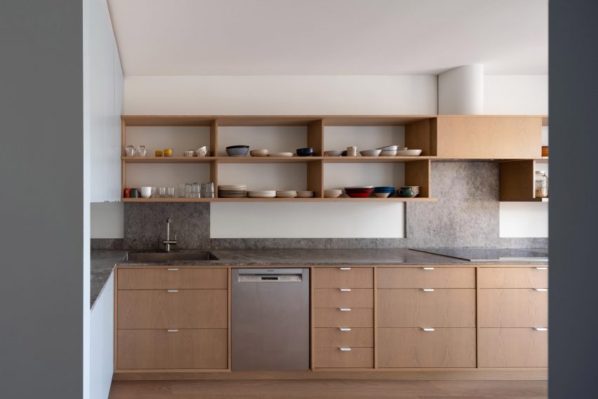
House M, Canada, by Studio Vaaro
Studio Vaaro used oak cabinetry for the kitchen of this home in Canada, while matching oak shelving provides additional storage above the workspaces.
To contrast the warm wood, the studio chose grey marble for the countertops and splashbacks, which gives the kitchen an organic feel. Additional storage can be found in the pale grey cabinets that frame the kitchen.
Find out more about House M ›
Photo by Edmund Dabney
London apartment, UK, by Holloway Li
A kitchen clad in circle-brushed stainless steel clads one wall in this London flat by local studio Holloway Li. Designed in reference to the city’s many fish-and-chip shops, it features a striking curved splashback.
Above the workspaces, a built-in open shelf provides space to store glasses and cooking utensils, with the rest of the storage is hidden behind patterned-steel cabinet doors.
Find out more about London apartment ›
Photo by Ronan Mézière
Montreal apartment, Canada, by Naturehumanie
Fresh minty hues decorate the kitchen of this Montreal apartment, which was given a modern update while retaining many of its traditional details.
The green colour matches that of the apartment’s existing stained glass doors. And the kitchen island and cabinets both have inviting curved forms, finished in a glossy paint that complements the rougher tiles above the counters.
Find out more about the Montreal apartment ›
Photo by Gareth Hacker
Highbury House, UK, by Daytrip
Located in Highbury in north London, this home juxtaposes a gallery-like minimalism with more organic forms.
This is evident in the kitchen, where pared-back storage cabinets in an unusual rectangular shape sit underneath a decorative marble countertop.
Sculptural vases, plates and cooking utensils decorate the matching marble kitchen island as well as a small ledge that functions as both storage and display counter.
Find out more about Highbury House ›
Photo by Yoshihiro Makino
Eastern Columbia Loft, US, by Sheft Farrace
Architecture studio Sheft Farrace renovated this flat, which is located in the iconic art deco Eastern Columbia building in Los Angeles, creating minimalist interiors that draw on the building’s exterior.
In the kitchen, this can be seen in the curved corners of the counters and the elongated cabinet hardware, which reference 1930s design. Florida Brush quartzite was used to cover much of the kitchen, adding a striking decorative detail that is complemented by white oak.
Find out more about Eastern Columbia Loft ›
Photo courtesy of Jonas Bjerre-Poulsen of Norm Architects
Archipelago House, Sweden, by Norm Architects
Danish studio Norm Architects designed this home on the west coast of Sweden to embody both Scandinavian and Japanese aesthetics.
In the white-walled kitchen, a stainless-steel kitchen island offers both a practical workspace and cupboards for storage. Open wood shelving was decorated with black ceramics to create an art installation-style feature on one wall.
Find out more about Archipelago House ›
This is the latest in our lookbooks series, which provides visual inspiration from Dezeen’s archive. For more inspiration see previous lookbooks featuring homes where the wardrobe is the focal point, bedrooms with statement headboards and homes with pergolas.
Spotted: Exacerbated by recent extreme weather temperatures and drought across the country, the UK’s production of greenhouse-grown vegetables decreased in 2022 for the seventh year in a row. At the same time, the need for increased irrigation plus rising costs of fuel, energy, and plant protection products means that traditional field agricultural methods remain stressed.
Innovators everywhere are struggling to reduce carbon emissions as quickly as possible. UK agtech company Albotherm’s founding team identified greenhouses and commercial high rises as two of the areas with the greatest opportunities for savings. Set up as a means of using science for good, the company created a reversible coating for glass that transitions between transparent in cool temperatures to opaque in heat.
Because the coating changes format depending on the temperature it has been programmed to respond to, there is little to no maintenance required after application, and it can be left on year-round with no risk of blocking essential sunlight in the winter months. The coating can be set to transition at any temperature between 18 and 45 degrees Celsius.
The traditional technique of painting greenhouses with opaque white, chalk-based paint in spring and then removing it in autumn is effective at blocking heat, yet it can also limit crop growth. In contrast, Albotherm’s technology increased crop yields by up to 34 per cent in trials. And with the closing of its £1.6 million (around €1.9 million) seed funding round, the company plans to scale up its manufacturing capabilities, complete large-scale commercial pilots in 2024, and prepare for a 2025 official product launch. Further development will focus on expanding the company’s product line for use on commercial buildings, where energy efficiency could save millions in heating, ventilation, and air conditioning (HVAC) costs.
Two other innovations spotted in Springwise’s archive that focus on reducing HVAC costs are net-zero glass and adjustable sunshades.
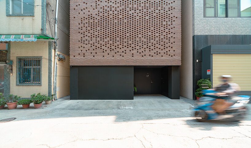
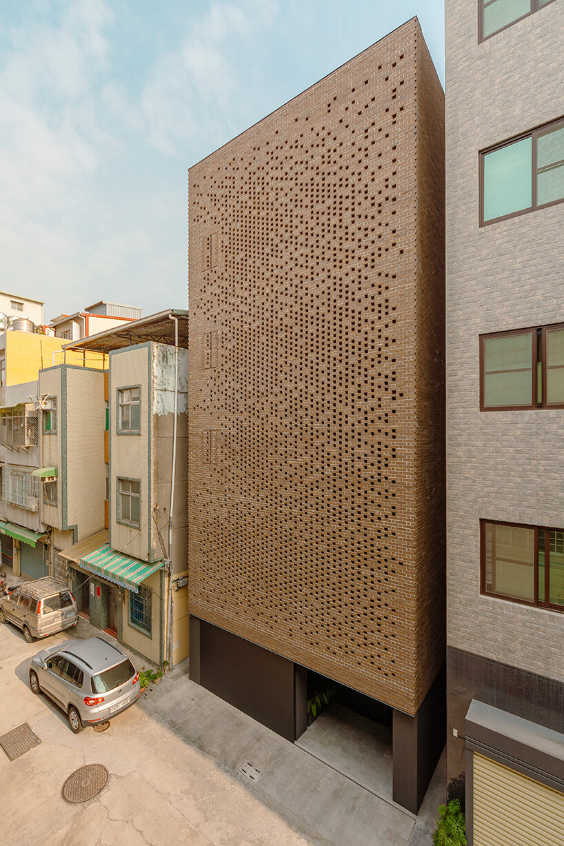
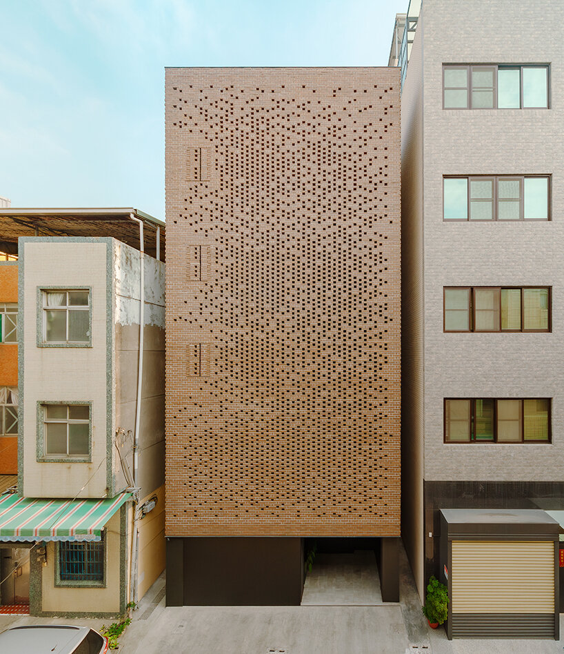
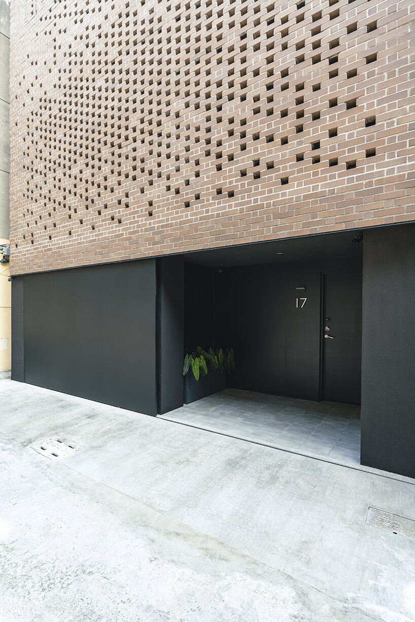
veil house: challenging public/private of compact urban living
Situated near the historic ‘Taiwan-Renga’ (台灣煉瓦) brick kiln from 1899 that prospered in this working-class district in Kaohsiung, Taiwan, the Veil House by Paperfarm revisits this history by weaving a modern, tapestry-like facade using floating clay bricks. In such an area with very narrow streets, and a hyperactive social fabric, privacy is often compromised. To maintain boundaries, windows are often shaded throughout the day; outdoor spaces, such as balconies and terraces, are left largely unused. The project challenges this public/private dynamic of compact urban living, creating a peaceful retreat that redefines this neighborhood’s typical house character: a perforated brick facade liberates the need for window treatments, still allowing filtered light into all the living spaces and bedrooms.
using clay bricks to create a breathable, permeable facade
‘The impetus for security and privacy reimagines the home as a body with a breathable, permeable skin. Like skin’s pores, perforation density is devised according to the functional needs behind the enclosures. With cored bricks secured by rebars, shelf angles, and steel channels, the brick veil is designed to withstand the local challenges of earthquakes and typhoons. There are also three emergency exits, engineered with saw-tooth pivots, seamlessly inserted onto the facade,’ explains Paperfarm (see more here).
On the street level, automobile storage is provided without visually distracting pedestrian entry. The powder-coated stainless-steel door is 12 ft by 7 ft (366 cm by 214 cm) in size and is two inches thick. The door and its mechanical track are hung from above, installed behind five courses of veneer bricks with a guide rail below. The entry, through an interior garden, helps quiet the transition from the bustling city streets and provides a deep threshold into the heart of the Veil House, thus acting as a type of perforation
challenging the public/private dynamic of compact urban living
paperfarm defines veil house around an atrium + rich materials
The residents circle an open atrium clad with 2×6 vertical aluminum louvers to enter the main living area on the second floor. This materiality pays homage to another Taiwanese vernacular of protected fenestrations while enhancing the home’s verticality. Programmatically, this atrium is the engine of the house: an urban garden on the ground floor; a light well introducing natural illuminance into the rooms on the bedroom’s balconies; an airshaft for cross-ventilation with the brick veil at the front facade; and a connector that ties circulation and program together across multiple floors. Behind the veil, this shifting perspective and the vertical stratification of the program accentuate public versus private relationships. This forms the central discourse on the introverted approach to the Veil House by Paperfarm.
using floating clay bricks to create a breathable facade
Throughout the Veil House interior, custom-designed terrazzo flooring defines spaces within the larger, open-plan living floors, while full-length, custom white-oak millwork conceals the kitchen and the entertainment and storage spaces. The reductive use of materials enhances the focus on the brick veil and the respite gained in the quiet, minimal interior. ‘Ultimately, the defining characteristic of the Veil House is the desire to build a cozy, airy lifestyle behind an urban façade that successfully withdraws from the frenetic street life,’ concludes Daniel Yao from Paperfarm.
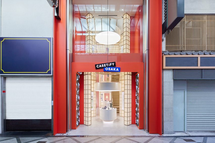
Hong Kong-based architect and interior designer André Fu has completed the first global flagship store for electronic accessory brand Casetify in Osaka, combining traditional Japanese shoji paper lanterns with bright colours.
The store, which marks the first retail project by Fu in Japan, was informed by the urban landscape of the Shinsaibashi neighbourhood in Osaka where the store is located.
The store is located in Shinsaibashi, the main shopping area in Osaka
According to Fu, the interiors aim to bring “the allure of the dynamic Shinsaibashi neighbourhood into the store”.
“The overall concept is rooted in a vision to celebrate the distinct context of the project with contrasting shapes and forms, capturing the neighbourhood’s cinematic streetscape in a world where bold geometries juxtapose against each other,” said Fu.
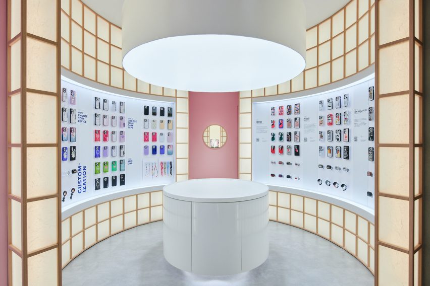
Curved shoji screens form the product display wall
The storefront was designed as a floor-to-ceiling shoji lantern framed in bright orange. Customers are greeted by a round display table encircled by cylindrical shoji screens, with the same circular arrangement mirrored at the back of the store and its upper floor.
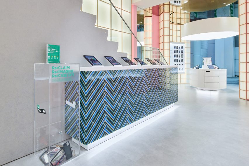
At the centre of the Casetify store sit cabinets that have been decorated with old phone cases, donated by customers in the recycling box located next to them.
A secret shoji window at the rear of the ground floor can be slid open to unveil customised online purchases.
“A lot of my work is rooted in the idea of a journey that takes the contextual quality of each project into an architectural medium,” Fu explained.
“The world of shoji lanterns that goes around you, that folds and unfolds, creates that effect,” he added.
“It transports you from the everyday reality of the neighbourhood to an imaginary, illusionistic expression that blends a relaxed sense of luxury with the popping Casetify colours that the brand is so well known for.”
Cabinets are covered with materials made from recycled phone cases
Fu is known for his work on luxury hotels and restaurants, including the Upper House hotel in Hong Kong, the Berkeley London, and the Mitsui hotel in Kyoto.
More recently, he created a two-person “conversation” chair in collaboration with Louis Vuitton’s Objects Nomades, and furnished a model apartment inside the Jean Nouvel tower in New York with his homeware collection.
The cost of employee turnover is difficult to quantify, but one estimate from Gallup suggests that voluntary employee turnover costs US businesses $1 trillion (around €915 billion) per year. And, according to payroll firm Remote, turnover rates have increased by nine per cent in the UK and US since 2019.
While the importance of talent retention is well understood, it can be difficult for HR departments to be proactive in holding onto their most valuable employees. By using algorithms to analyse masses of data, startup HR Signal is making it easy for companies to predict the chances that any employee will leave in the near future.
The startup’s software assigns each employee a ‘Retention Risk’ score that represents the likelihood that they will voluntarily leave their role in the next 90 days. This score is based on information on the current job market and patterns in career progression taken from millions of anonymised CVs. This is then supplemented by salary information and other forms of public data. So far, the startup has harvested data on over 50,000 job positions across all sectors.
If an employee’s Retention Risk score exceeds a certain level, they are automatically flagged to the HR team. The software then provides a step-by-step suggested workflow so that companies can plan suitable interventions and record the outcomes.
Using additional data about tenure trends both inside and outside the company, HR Signal’s platform also highlights potential promotion opportunities to encourage employee development – thereby increasing worker satisfaction and corresponding retention rates.
In the archive, Springwise has spotted many other innovations looking to improve employee well-being and boost retention, including workplace digital counselling services and smart greening solutions for the office.


 The design of the new Orange County Museum of Art addresses the need for museum space to be both flexible and functional as well as inviting and memorable. With flexible exhibition galleries, dedicated space for educational programming, and areas for public gathering, the new building was made to provide expanded access to the museum’s permanent collection and its world-class special exhibition program. The main floor is dedicated to reconfigurable open-span exhibition space, complemented by mezzanine, black-box, and jewel-box galleries that can accommodate temporary and permanent collection exhibitions spanning scales and mediums.
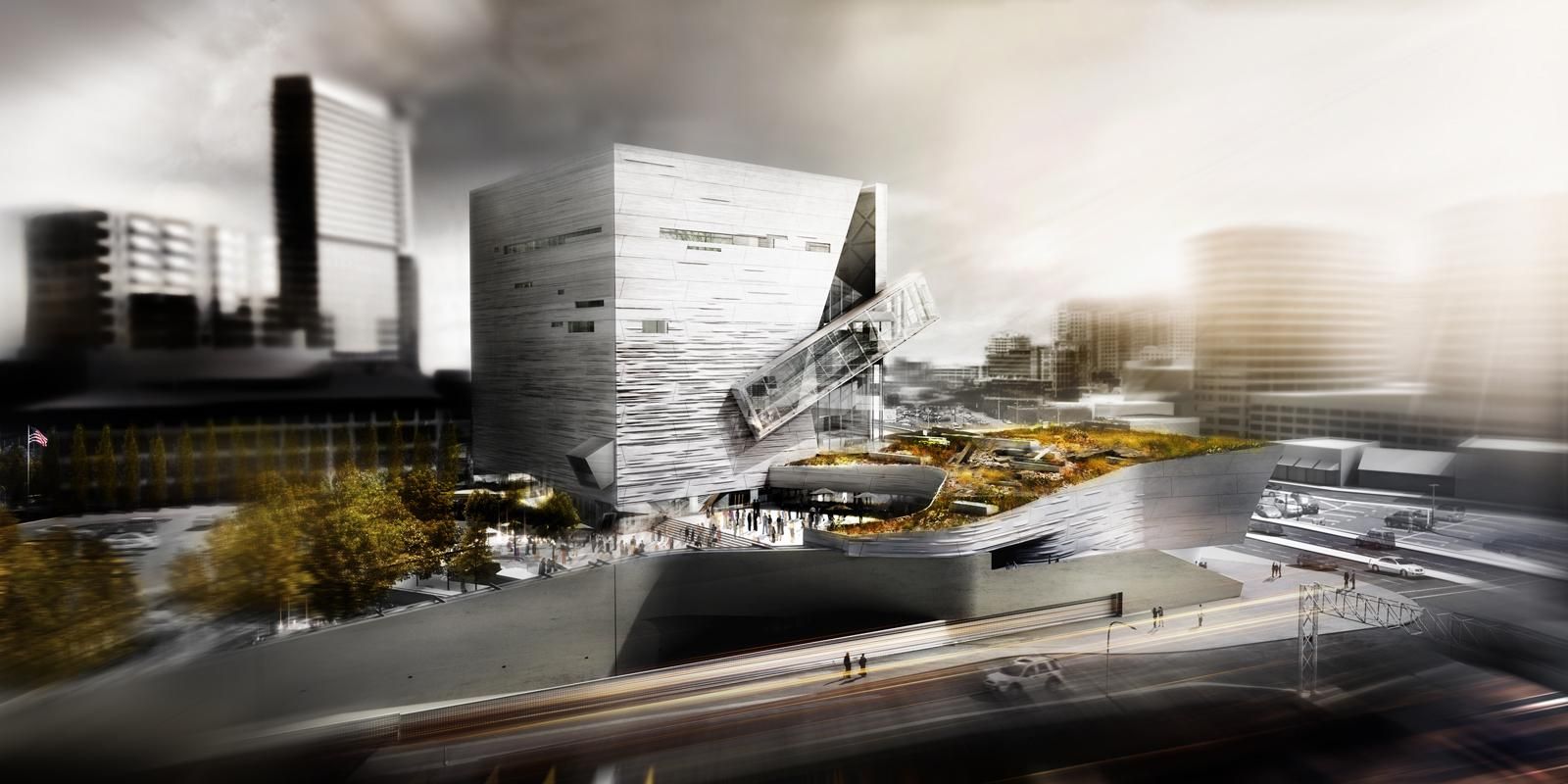
 Giving shape to concrete, Morphosis Architects explored the material’s potential through the Perot Museum of Nature and Science in Dallas. Built to bring a simple cube and plinth into high relief, the Perot Museum showcases a precast-concrete panel façade. As a material investigation integrating structure and formwork, the elegant cladding solution was made possible through computer aided modeling and a collaboration with Gate Precast of Hillsboro, Texas.
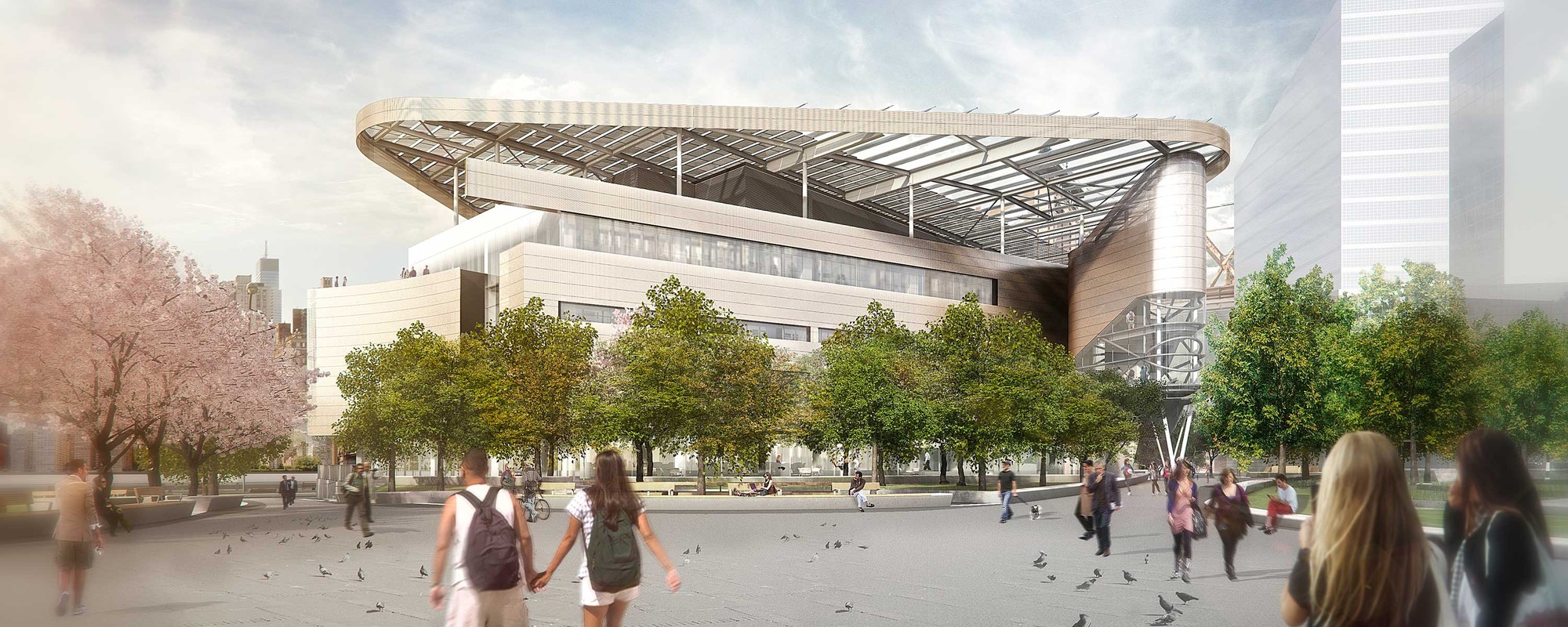
 Designed to become a net-zero building, The Bloomberg Center forms the heart of the Cornell Tech campus on Roosevelt Island. The Bloomberg Center was made to reflect the school’s joint goals of creativity and excellence by providing academic spaces that foster collective enterprise and collaboration. The four-story, 160,000-square-foot (14,865-square-meter) academic building is named in honor of Emma and Georgina Bloomberg in recognition of a $100-million gift from Michael Bloomberg, who was responsible for bringing Cornell Tech to New York City while serving as the city’s 108th Mayor. The four-story building is set beneath a photovoltaic canopy with a low and narrow profile framing views across the island.
 Emerson Los Angeles has emerged as a significant landmark in Los Angeles. As a backdrop for student filmmakers, the building weaves an urban fabric of outdoor and indoor spaces together with two slender residential towers bridged by a multi-use platform. With over 180 student rooms, four faculty apartments, film and video production labs, and classrooms, the project combines both a sculptural central mass and an undulating, textured metal scrim. At over 100,000 square feet (9,290 square meters) and ten stories high, the project spurred redevelopment as part of a larger transformation in Hollywood.
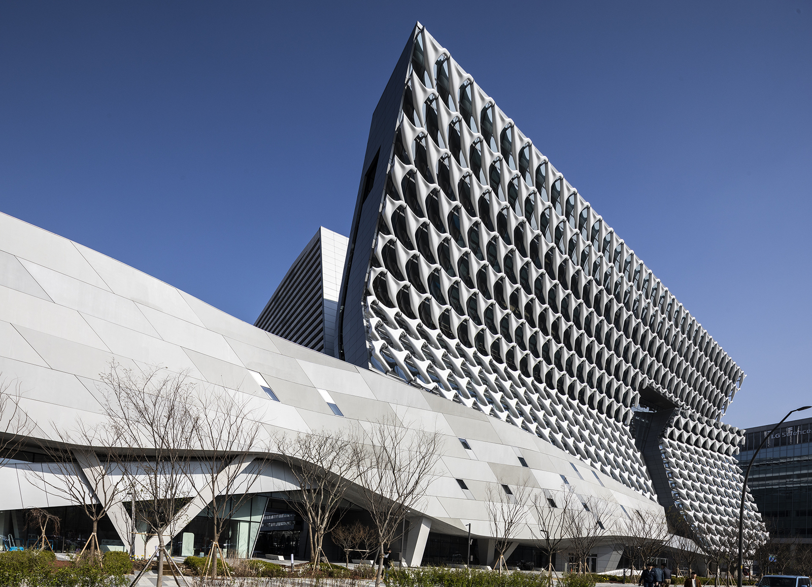 Sited in Seoul, Kolon’s new flagship research and development facility brings together researchers, leadership and designers in one location. The building combines flexible laboratory facilities with executive offices and active social spaces that encourage greater interaction and exchange across the company. The four-acre project site sits adjacent to Magok’s central park — a prominent location for what will be the district’s first major completed building. The building folds towards the park, providing passive shading to the lower floors.
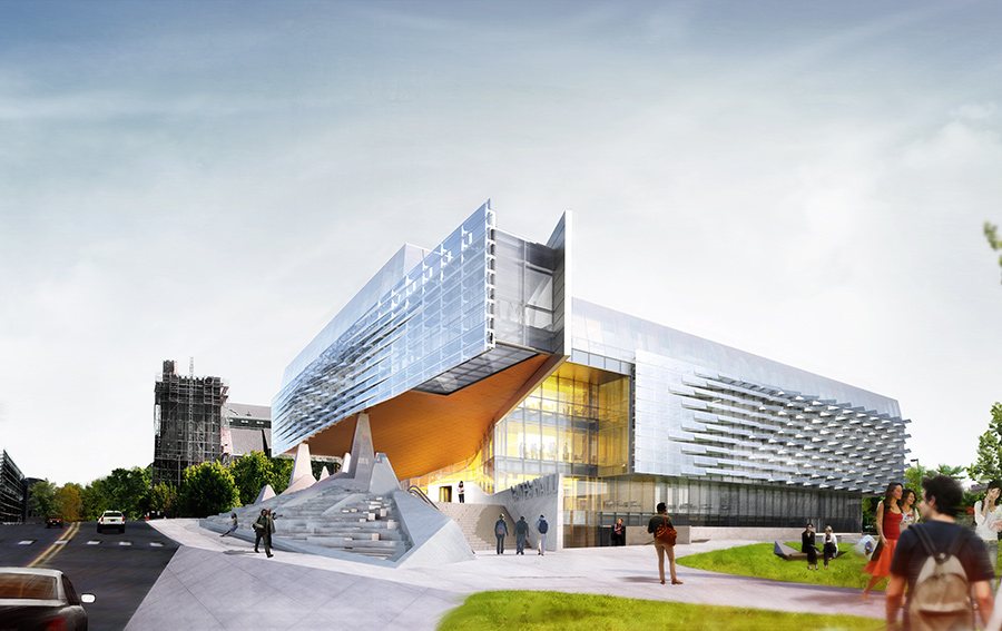
 The Bill & Melinda Gates Hall brings together the faculty and students of Cornell University’s Computer Science and Information Science departments. Housed within a single structure, the project was designed to facilitate collaboration and spontaneous discourse between disciplines. Projecting westward from the building, a two-story cantilever creates a dramatic canopy over the elevated Entry Plaza to establish a new visual gateway to the campus. Advanced digital modeling tools are used to map a double skin of undulating, perforated stainless steel panels, which envelop the reflective glass curtain wall on the second and third levels.